

Pastel pink, green, and yellow is a go-to trio for designs that should feel bright, gentle, and welcoming at the same time. It brings “spring energy” without heavy saturation, so it works across digital and print.
Below you’ll find 20 ready-to-use pastel pink green yellow color palette ideas with HEX codes, plus practical tips for contrast, balance, and real-world use.
In this article
- Why Pastel Pink Green Yellow Palettes Work So Well
-
- blush meadow
- lemon sorbet garden
- mint macaron
- spring picnic
- cotton candy lime
- pistachio petals
- soft citrus bouquet
- dewy rose morning
- pastel market
- sunny studio
- playful preschool
- retro gelato
- botanical stationery
- minimal web ui
- wedding brunch
- skincare shelfie
- tea party poster
- garden journal
- cozy baby room
- fresh farmstand
- What Colors Go Well with Pastel Pink Green Yellow?
- How to Use a Pastel Pink Green Yellow Color Palette in Real Designs
- Create Pastel Pink Green Yellow Palette Visuals with AI
Why Pastel Pink Green Yellow Palettes Work So Well
Pastel pink adds warmth and human softness, pastel green adds freshness, and pastel yellow brings light—together they create a friendly, optimistic mood that still feels modern. Because the tones are gentle, the palette rarely looks “too loud,” even when used in larger blocks.
This trio is also naturally versatile: it can lean romantic (more blush and ivory), botanical (more mint and sage), or playful (more butter yellow highlights). That flexibility makes it a strong default for branding, UI, and seasonal campaigns.
Finally, these colors pair beautifully with off-whites and muted dark accents (like sage-gray). That gives you an easy path to legible typography and clear hierarchy without sacrificing the airy pastel look.
20+ Pastel Pink Green Yellow Color Palette Ideas (with HEX Codes)
1) Blush Meadow
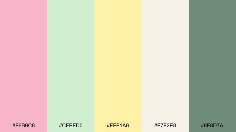
HEX: #F6B6C8 #CFEFD0 #FFF1A6 #F7F2E8 #6F8D7A
Mood: airy, floral, optimistic
Best for: spring wedding stationery
Airy and floral, like a meadow at golden hour with soft petals and fresh leaves. This pastel pink green yellow color palette is ideal for invitations, menus, and day-of signage where you want romance without feeling overly sweet. Pair it with warm ivory paper stock and a muted green ink for body text. Tip: use the deeper sage as the only dark tone to keep everything light and readable.
Image example of blush meadow generated using media.io
Media.io is an online AI studio for creating and editing video, image, and audio in your browser.

2) Lemon Sorbet Garden
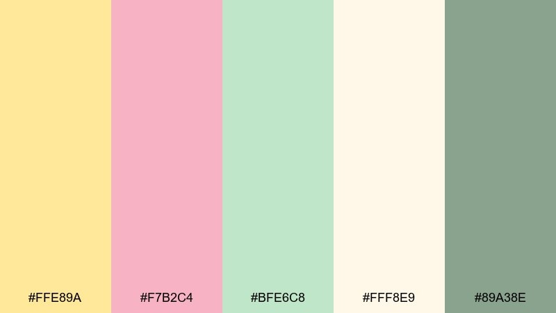
HEX: #FFE89A #F7B2C4 #BFE6C8 #FFF8E9 #89A38E
Mood: sunny, fresh, friendly
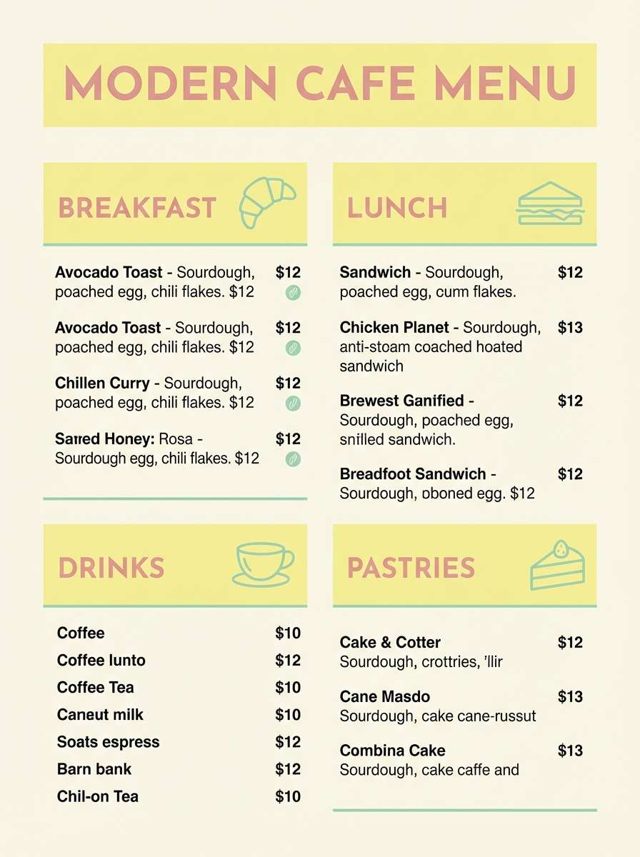
Best for: cafe menu design
Sunny and fresh, like lemon sorbet served beside a vase of garden blooms. These pastel pink green yellow color combinations work beautifully for a cafe menu where you want warmth and approachability without loud saturation. Keep backgrounds creamy and let the yellow lead for section headers while blush supports callouts. Tip: use the muted green for icons and price separators to bring order to the layout.
Image example of lemon sorbet garden generated using media.io
3) Mint Macaron
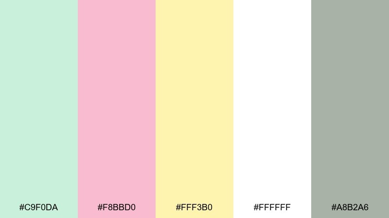
HEX: #C9F0DA #F8BBD0 #FFF3B0 #FFFFFF #A8B2A6
Mood: sweet, clean, modern
Best for: skincare packaging
Sweet and clean, like a pastry box in a bright boutique. The tones feel modern when you keep the design minimal and give white space room to breathe. Use the mint as the hero color, then add blush for secondary labels and soft yellow for limited-edition badges. Tip: choose a cool gray-green for fine print so the packaging stays premium and legible.
Image example of mint macaron generated using media.io
4) Spring Picnic
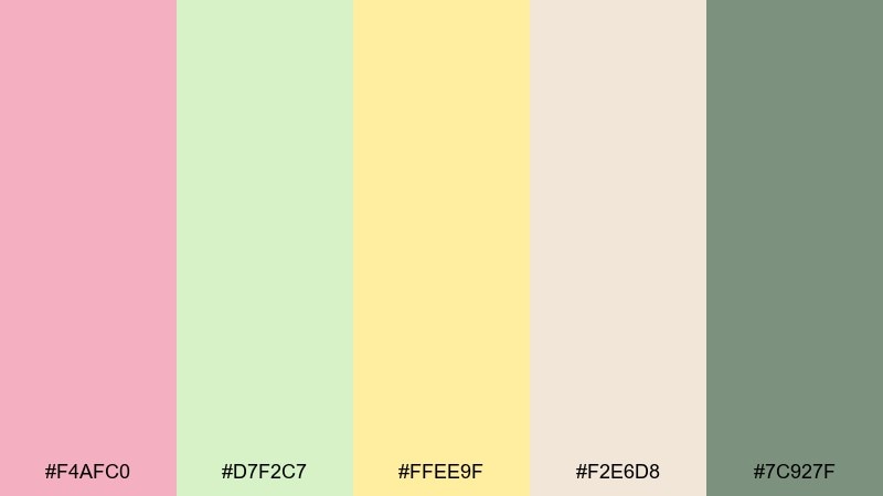
HEX: #F4AFC0 #D7F2C7 #FFEE9F #F2E6D8 #7C927F
Mood: playful, outdoorsy, cozy
Best for: family event flyer
Playful and outdoorsy, like a picnic blanket laid out under new leaves. It fits community flyers and family events where you want cheerful color without harsh contrast. Keep the beige as your background and reserve the strongest pink for the main headline. Tip: add a thin sage border to frame the layout and stop the pastels from feeling washed out.
Image example of spring picnic generated using media.io

5) Cotton Candy Lime
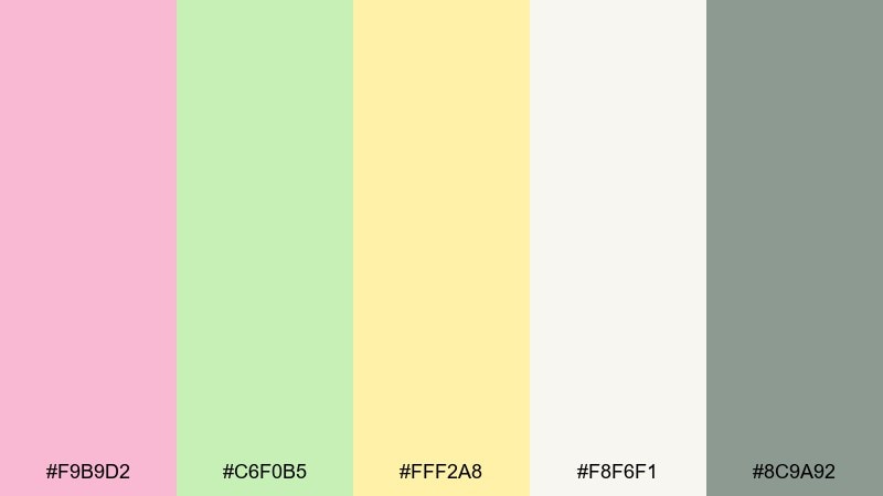
HEX: #F9B9D2 #C6F0B5 #FFF2A8 #F8F6F1 #8C9A92
Mood: zesty, youthful, upbeat
Best for: app onboarding screens
Zesty and youthful, like cotton candy with a squeeze of lime. The mix is great for onboarding screens where you need friendly energy and clear hierarchy. Use the lime green for progress states, blush for illustrations, and keep yellow for small reward moments. Tip: balance the palette with plenty of off-white so buttons and text stay crisp.
Image example of cotton candy lime generated using media.io
6) Pistachio Petals
HEX: #CFE7C4 #F6A9C4 #FFE7A1 #FFF7EA #758B7E
Mood: soft, botanical, calm
Best for: botanical illustration set
Soft and botanical, like pistachio leaves scattered with delicate petals. It suits illustrated sticker packs, surface patterns, and gentle social graphics. Let the green carry most shapes, then use pink for blossoms and yellow as the light-catching highlight. Tip: keep outlines in the muted green-gray instead of black for a softer finish.
Image example of pistachio petals generated using media.io
7) Soft Citrus Bouquet
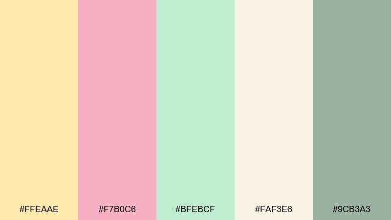
HEX: #FFEAAE #F7B0C6 #BFEBCF #FAF3E6 #9CB3A3
Mood: bright, breezy, welcoming
Best for: brand moodboard
Bright and breezy, like a citrus bouquet on a sunny counter. These pastel pink green yellow color combinations feel especially strong for lifestyle branding when you want optimism with a soft edge. Pair the palette with natural textures like linen, recycled paper, and light wood photography. Tip: limit yellow to 10 to 15 percent so it reads as sparkle rather than a wash.
Image example of soft citrus bouquet generated using media.io
8) Dewy Rose Morning
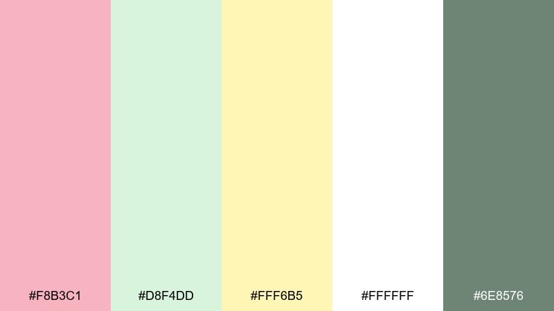
HEX: #F8B3C1 #D8F4DD #FFF6B5 #FFFFFF #6E8576
Mood: fresh, light, serene
Best for: wellness newsletter layout
Fresh and serene, like a dewy rose morning with soft sunlight through leaves. It works well for wellness emails and blog headers where you want calm optimism. Use white as the main canvas, then set blush for section dividers and mint for buttons. Tip: keep the darker green for links only so the page remains airy.
Image example of dewy rose morning generated using media.io
9) Pastel Market
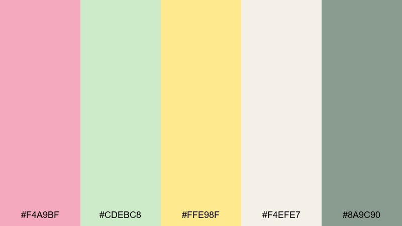
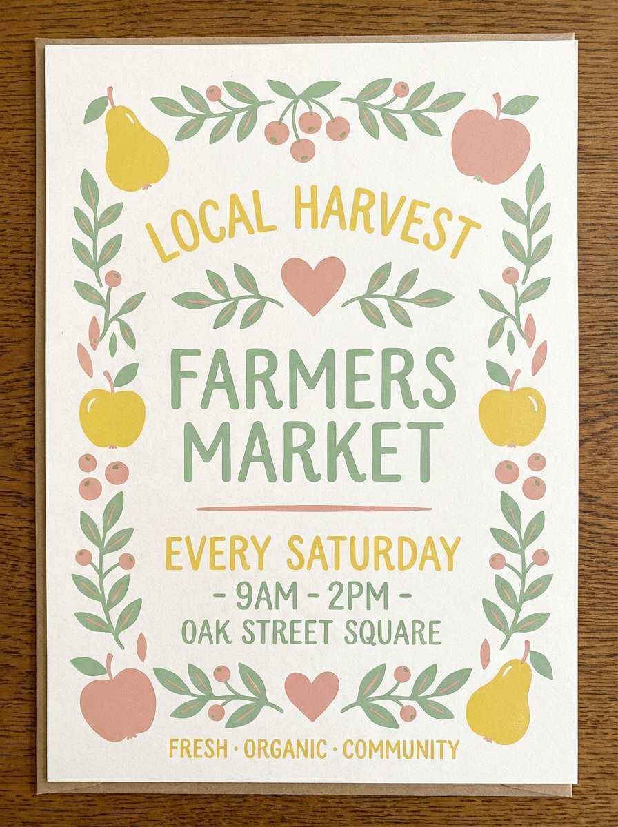
HEX: #F4A9BF #CDEBC8 #FFE98F #F4EFE7 #8A9C90
Mood: wholesome, friendly, local
Best for: farmers market poster
Wholesome and friendly, like hand-lettered signs at a weekend market. The tones are perfect for posters, tote designs, and local event graphics that need charm without feeling rustic. Use the buttery yellow behind the date and time to spotlight key info. Tip: choose one chunky display font and keep the rest simple so the soft colors do the talking.
Image example of pastel market generated using media.io
10) Sunny Studio
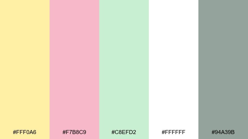
HEX: #FFF0A6 #F7B8C9 #C8EFD2 #FFFFFF #94A39B
Mood: clean, upbeat, contemporary
Best for: social media templates
Clean and upbeat, like a sunlit studio wall with pastel props. It shines in social templates where you want consistency across posts and stories. Make yellow the background for quote cards, then rotate blush and mint for frames and highlights. Tip: keep text in the cool gray-green so it stays readable on every pastel block.
Image example of sunny studio generated using media.io
11) Playful Preschool

HEX: #F7AFC7 #D4F3C2 #FFF2A1 #F7F7F2 #6F8875
Mood: cute, energetic, approachable
Best for: kids learning app UI
Cute and energetic, like craft paper shapes on a classroom wall. The colors are friendly for a kids UI when you still want a polished, modern look. Use the green for success states and progress bars, with pink for characters and stickers. Tip: keep the cream tone as your main background to avoid visual fatigue.
Image example of playful preschool generated using media.io
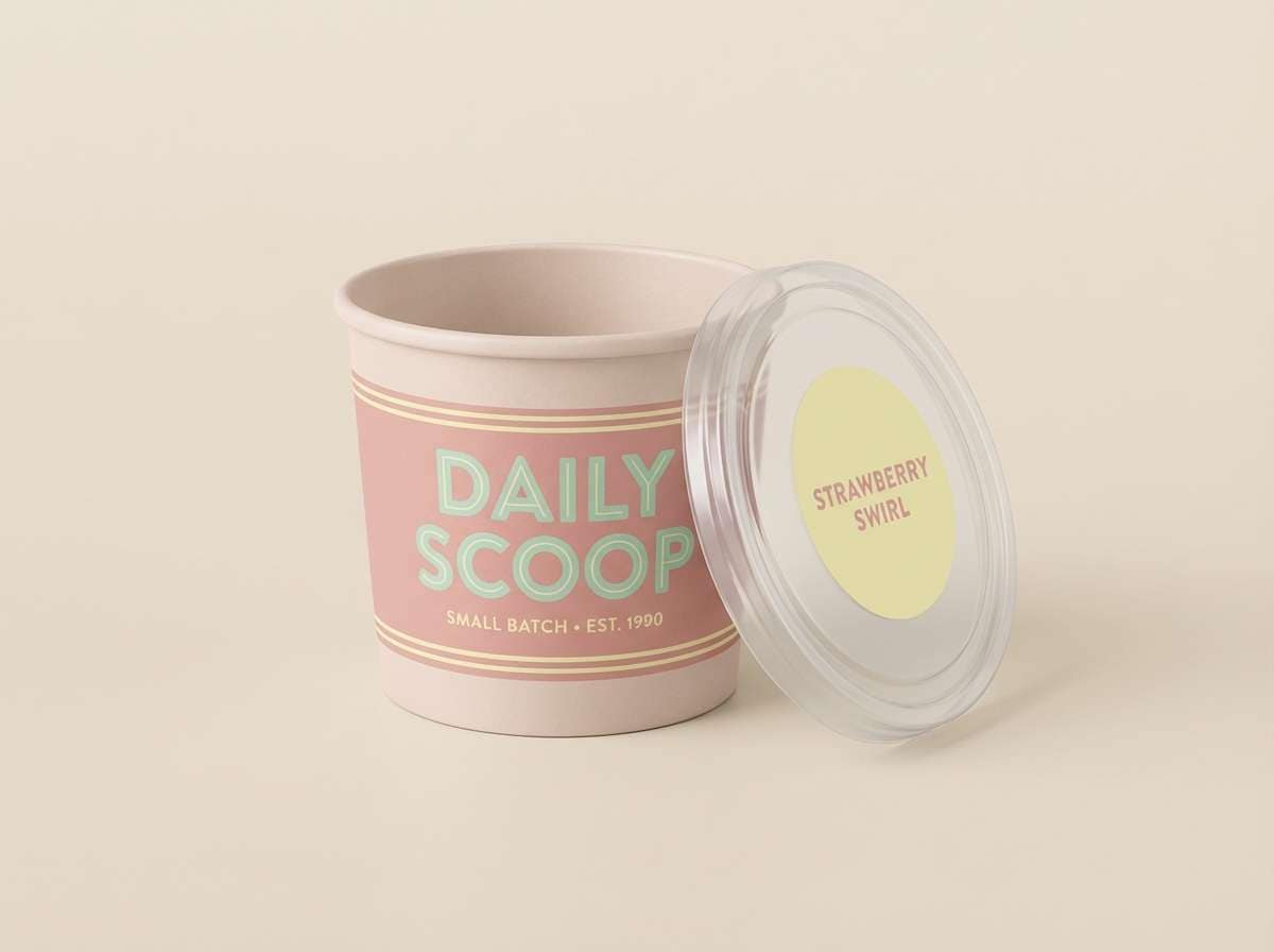
12) Retro Gelato
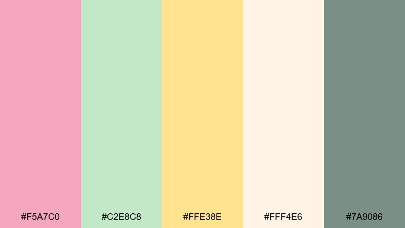
HEX: #F5A7C0 #C2E8C8 #FFE38E #FFF4E6 #7A9086
Mood: nostalgic, sweet, fun
Best for: ice cream shop branding
Nostalgic and fun, like a retro gelato counter with soft neon swapped for pastels. These tones suit logos, cups, and signage where you want sweetness without the sugar rush. Use pink as the brand anchor, then let yellow pop on badges and price bubbles. Tip: add the muted teal-gray only for outlines and small type to keep the vibe playful.
Image example of retro gelato generated using media.io
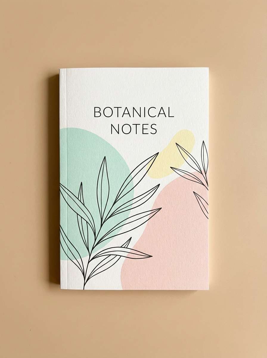
13) Botanical Stationery
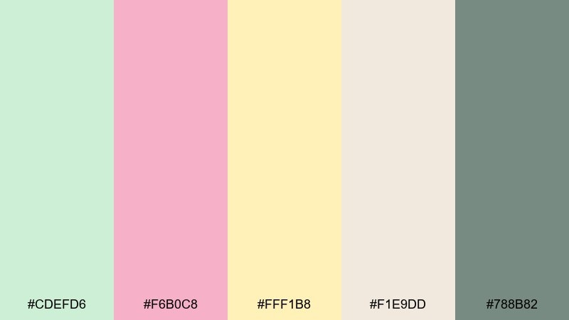
HEX: #CDEFD6 #F6B0C8 #FFF1B8 #F1E9DD #788B82
Mood: gentle, crafted, nature-inspired
Best for: notebook cover design
Gentle and crafted, like stationery with pressed flowers and soft paper fibers. It works well on notebook covers, journals, and printable planners where you want a calming routine vibe. Keep the beige as the base, then layer mint blocks and blush motifs for contrast. Tip: emboss or add subtle grain to the green areas for a tactile feel in print.
Image example of botanical stationery generated using media.io
14) Minimal Web UI
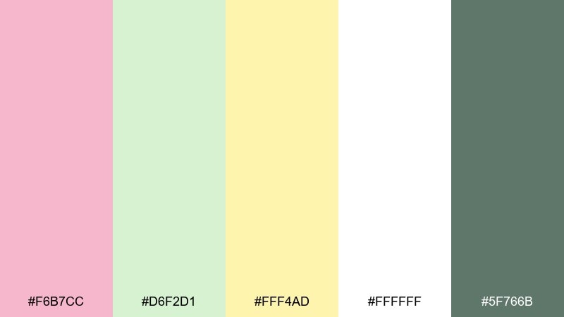
HEX: #F6B7CC #D6F2D1 #FFF4AD #FFFFFF #5F766B
Mood: minimal, modern, friendly
Best for: SaaS landing page UI
Minimal and modern, like a tidy dashboard with a soft spring glow. The pairing is strong for SaaS pages because it feels friendly while staying professional. Let white dominate, then use mint for primary buttons and blush for secondary CTAs. Tip: apply yellow only to micro-elements like tags, highlights, and small illustrations.
Image example of minimal web ui generated using media.io
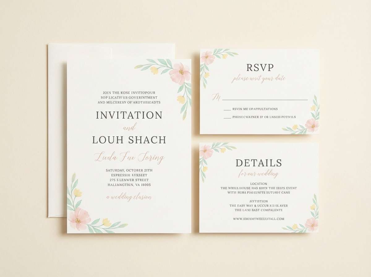
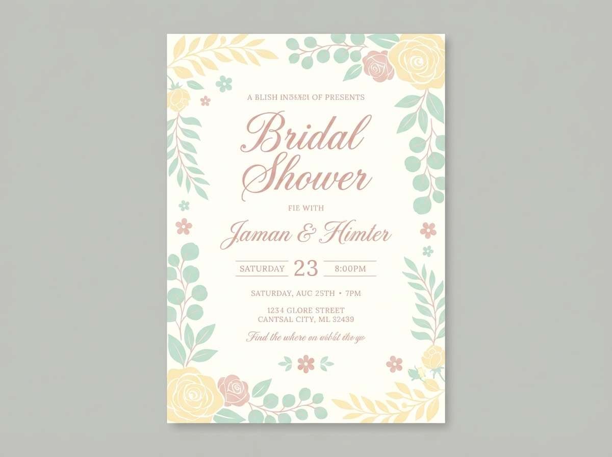
15) Wedding Brunch
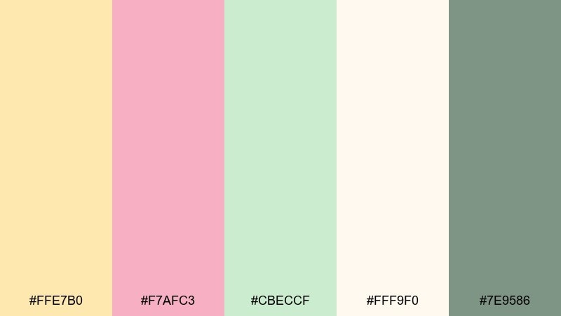
HEX: #FFE7B0 #F7AFC3 #CBECCF #FFF9F0 #7E9586
Mood: romantic, light, celebratory
Best for: bridal shower invite
Romantic and light, like mimosas and fresh florals on a bright brunch table. The tones are flattering on printed invites and matching social announcements. Use blush for the names, yellow for borders or small icons, and keep the background near-white. Tip: pick one metallic ink, like soft gold, as an optional accent in print.
Image example of wedding brunch generated using media.io
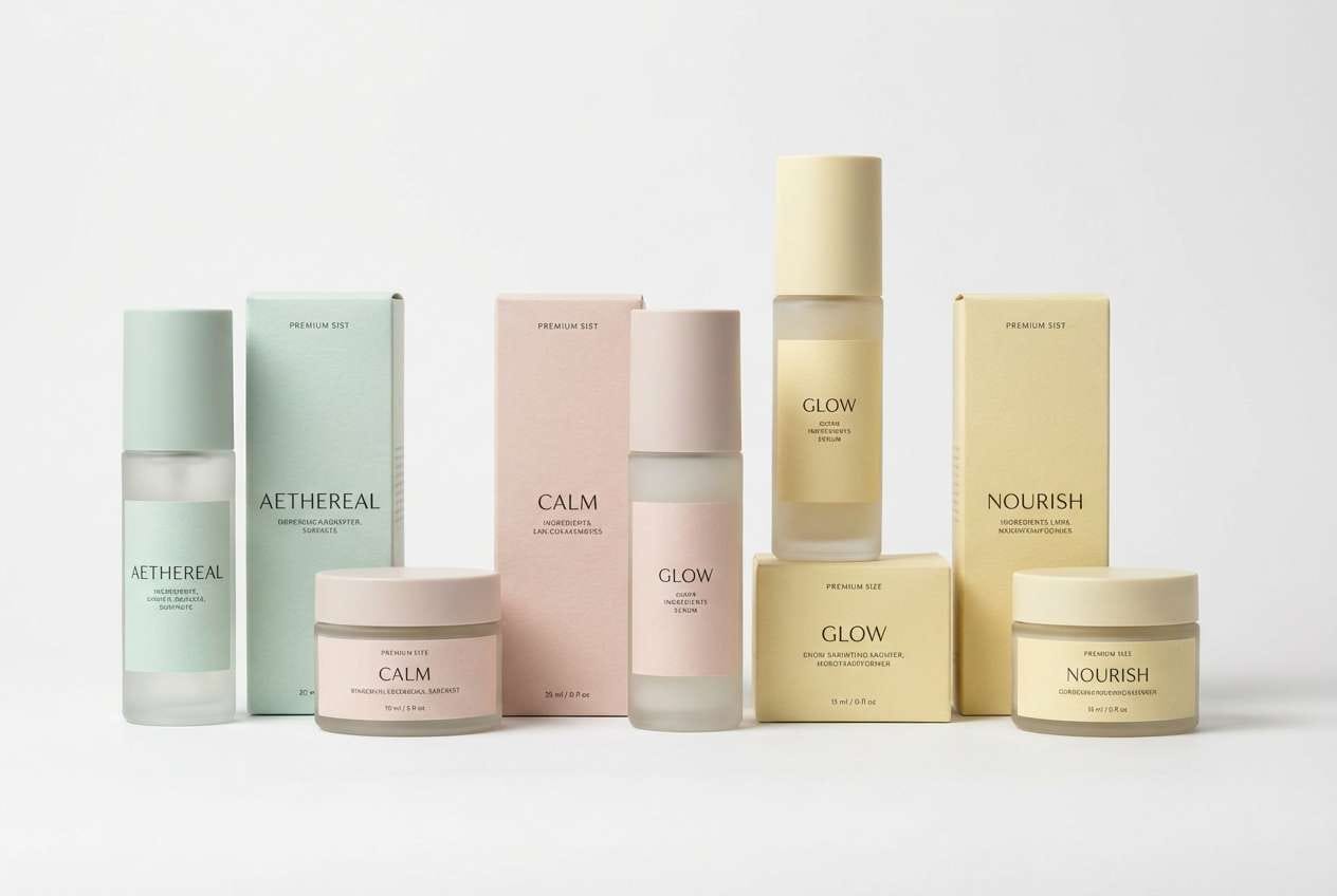
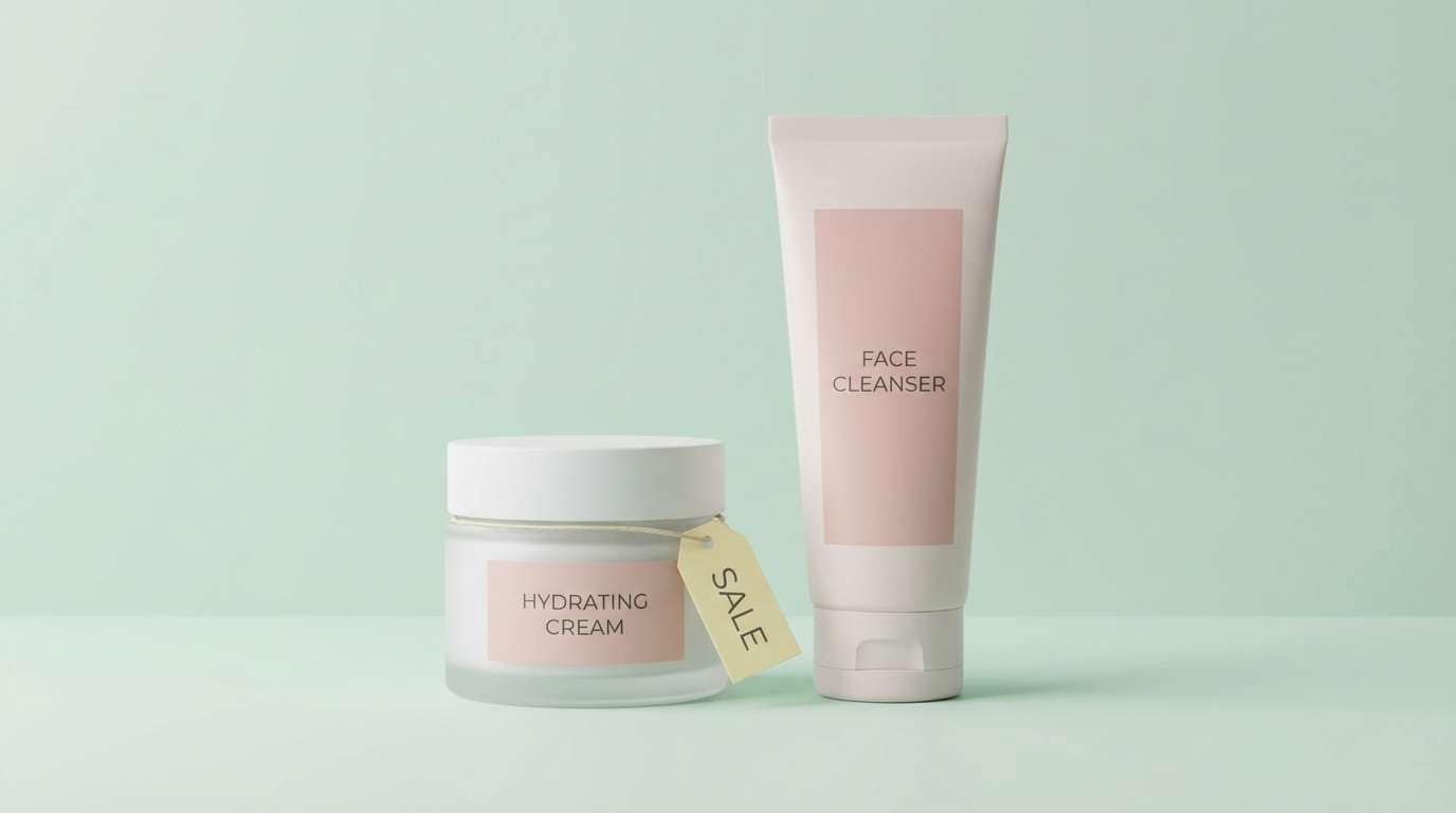
16) Skincare Shelfie
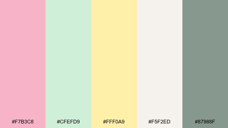
HEX: #F7B3C8 #CFEFD9 #FFF0A9 #F5F2ED #87988F
Mood: fresh, clean, gentle
Best for: product ad banner
Fresh and gentle, like a spotless bathroom shelf with soft daylight. This pastel pink green yellow color palette helps product ads feel clean while still standing out in a feed. Use mint for the background gradient, blush for the product name, and yellow for a small offer tag. Tip: keep shadows soft and avoid pure black text to maintain the airy mood.
Image example of skincare shelfie generated using media.io
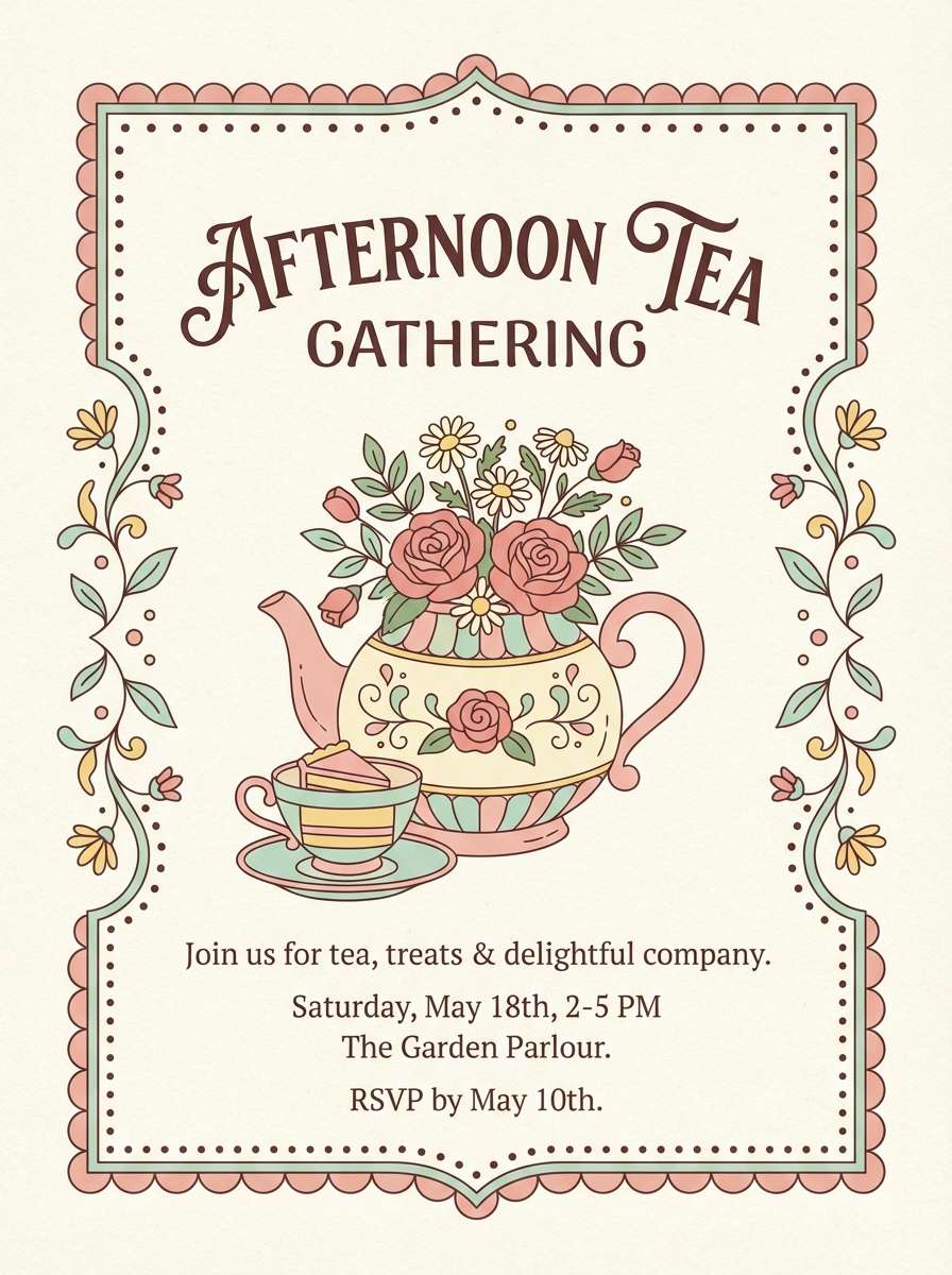
17) Tea Party Poster
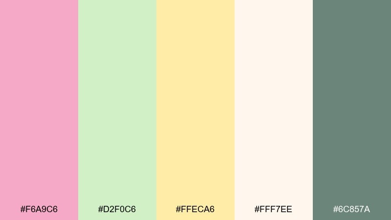
HEX: #F6A9C6 #D2F0C6 #FFECA6 #FFF7EE #6C857A
Mood: whimsical, sweet, charming
Best for: afternoon tea event poster
Whimsical and charming, like porcelain cups and tiny cakes in soft sunlight. The mix suits event posters where you want a handmade vibe without looking childish. Keep the cream background, then place blush typography over mint shapes for easy contrast. Tip: use yellow sparingly as sparkle on stars, dots, or small decorative frames.
Image example of tea party poster generated using media.io
18) Garden Journal
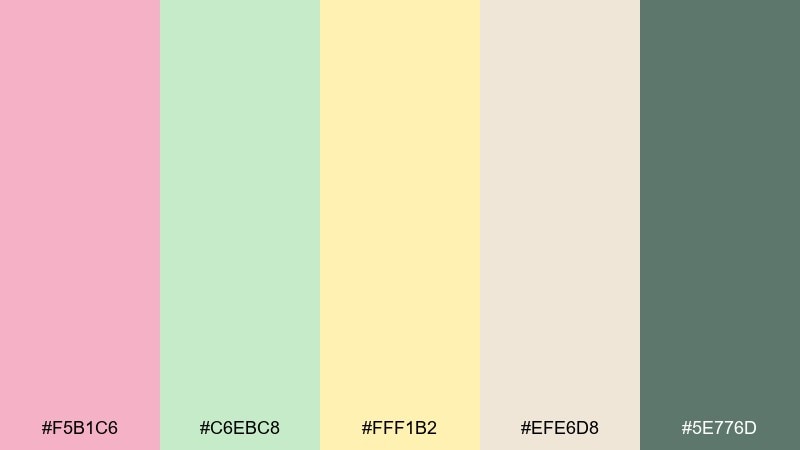
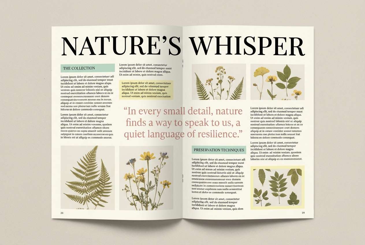
HEX: #F5B1C6 #C6EBC8 #FFF1B2 #EFE6D8 #5E776D
Mood: calm, grounded, mindful
Best for: editorial magazine spread
Calm and grounded, like a garden journal filled with sketches and notes. These pastel pink green yellow color combinations feel sophisticated in editorial layouts when paired with plenty of margins. Use the beige and cream as the spread background, with blush for pull quotes and mint for section bars. Tip: choose one deep green for captions and page numbers to unify the whole issue.
Image example of garden journal generated using media.io
19) Cozy Baby Room
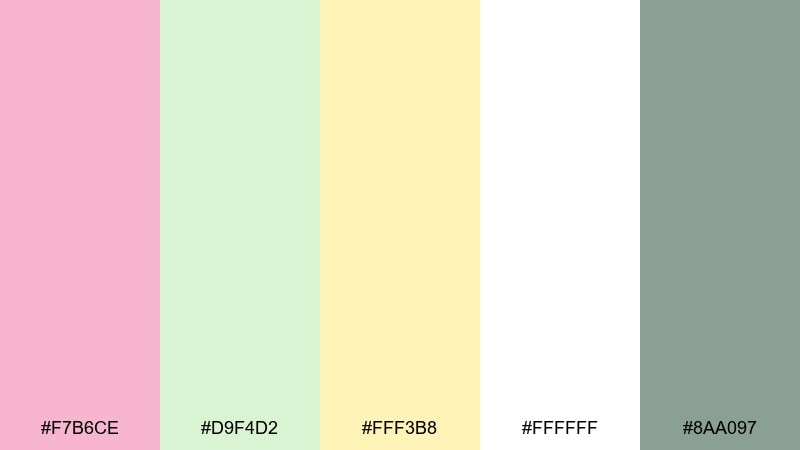
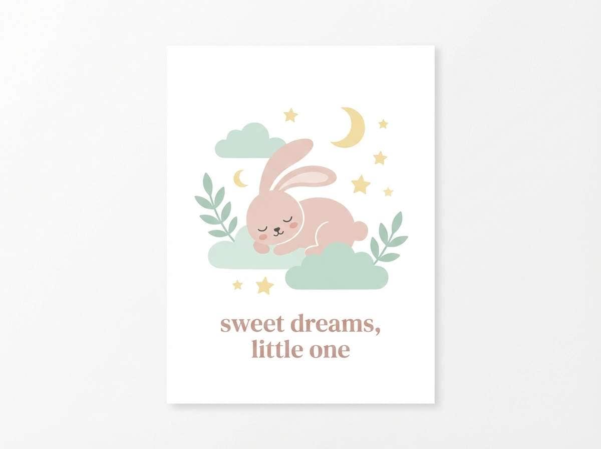
HEX: #F7B6CE #D9F4D2 #FFF3B8 #FFFFFF #8AA097
Mood: soft, comforting, safe
Best for: nursery wall art print
Soft and comforting, like a quiet nursery with warm light and plush fabrics. The colors make sweet wall art prints, milestone cards, and gentle baby shower decor. Use blush for the main illustration, mint for secondary shapes, and keep yellow as a tiny halo highlight. Tip: print on bright white stock to keep the pastels clean and not muddy.
Image example of cozy baby room generated using media.io
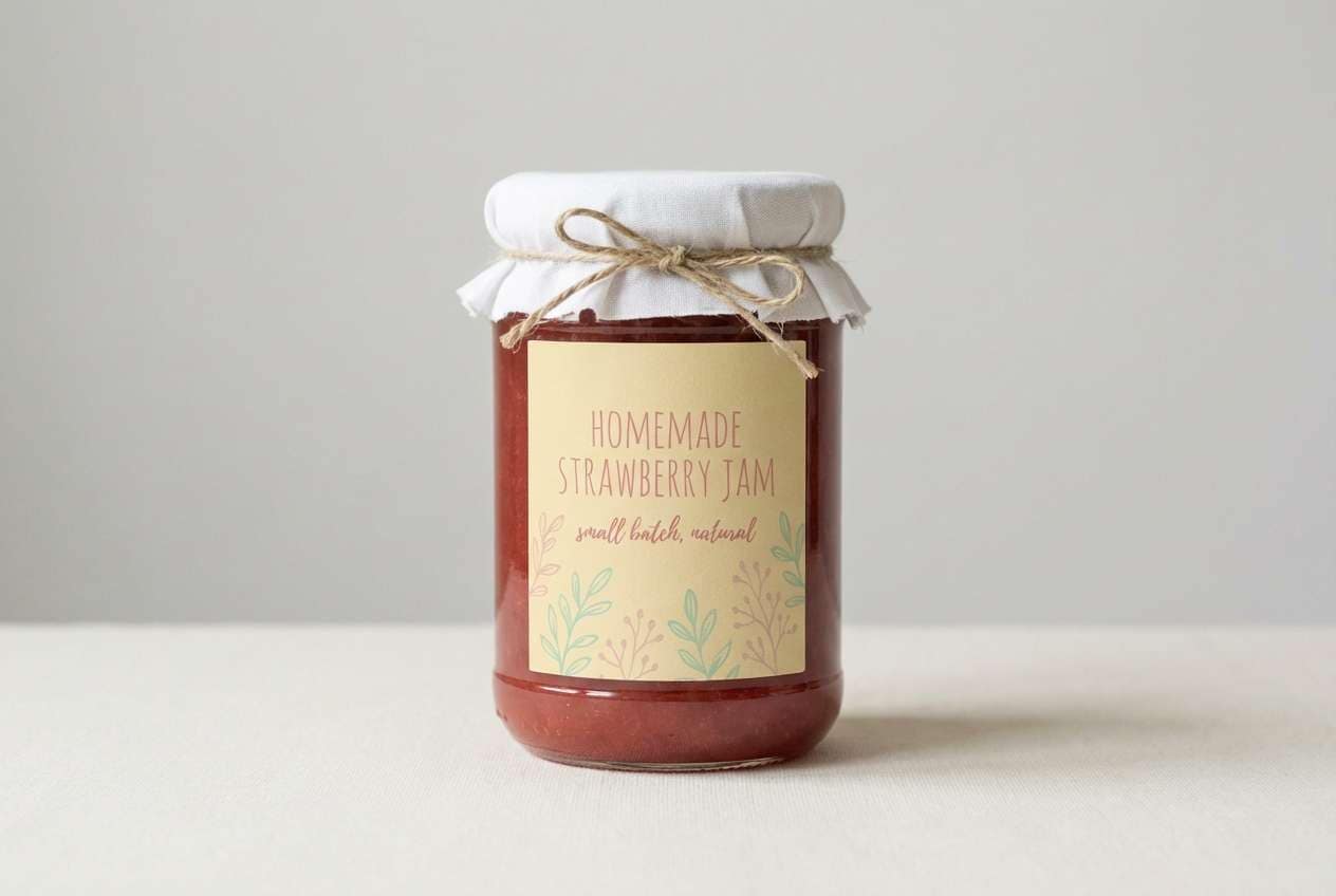
20) Fresh Farmstand
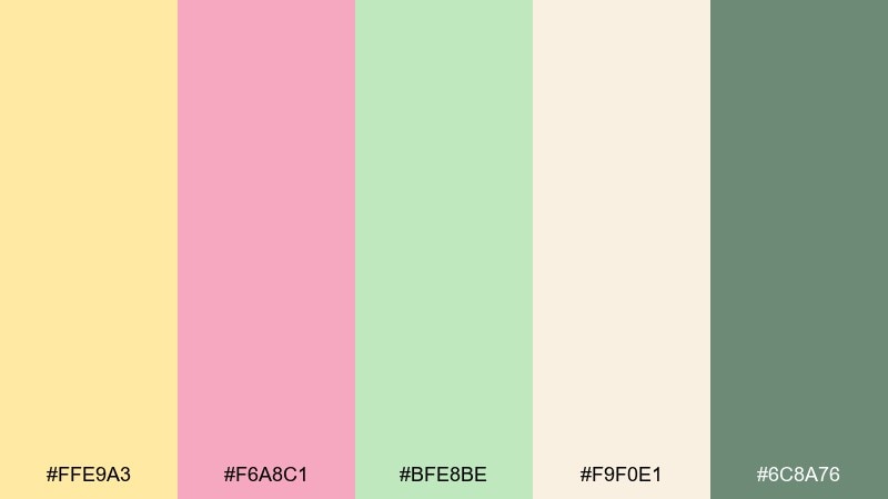
HEX: #FFE9A3 #F6A8C1 #BFE8BE #F9F0E1 #6C8A76
Mood: fresh, inviting, nostalgic
Best for: label design for jams
Fresh and inviting, like handwritten labels on jars at a small farmstand. This pastel pink green yellow color palette feels especially friendly for artisanal food packaging and seasonal flavors. Use yellow as the base label color, blush for the flavor name, and mint for small botanical illustrations. Tip: add a thin dark-green rim line so the label stays readable at thumbnail size.
Image example of fresh farmstand generated using media.io
What Colors Go Well with Pastel Pink Green Yellow?
Neutrals are the easiest match: warm ivory, cream, and soft beige keep the palette airy and prevent the yellow from feeling too “highlighter.” For UI, white backgrounds and subtle gray dividers make the pastels look clean and intentional.
For contrast, use muted darks rather than pure black—think sage-gray, eucalyptus, or deep gray-green. If you want a slightly richer accent, a warm clay/terracotta note can add depth while staying friendly.
Metallics also pair well in print: soft gold foil or champagne ink elevates wedding, beauty, and lifestyle designs without overpowering the pastel tones.
How to Use a Pastel Pink Green Yellow Color Palette in Real Designs
Start with one “lead” color (often mint or blush), then use the other two as support. Pastels can look washed out if all three fight for attention, so assign roles: backgrounds, components, accents, and text.
Keep readability top of mind. Use a darker sage/gray-green for body text, links, and icons, and reserve the lightest tones for backgrounds, cards, and decorative shapes. This is especially important for onboarding screens, emails, and posters viewed at a distance.
Finally, add breathing room. Pastel palettes look most premium when there’s generous whitespace and a simple type system—clean sans for UI, or a refined serif + sans pairing for editorial and events.
Create Pastel Pink Green Yellow Palette Visuals with AI
If you want to preview these palettes on real assets (posters, packaging, UI screens, invites), generating quick mock visuals helps you validate balance and contrast before committing to a full design.
With Media.io’s text-to-image tool, you can paste a prompt, describe the layout, and specify the vibe (minimal, editorial, whimsical) while guiding the output with your pastel pink green yellow colors.
Try generating a few variations—swap which color leads, change the background from white to cream, and test a darker sage for type—to find the most readable combination for your project.
Pastel Pink Green Yellow Color Palette FAQs
-
What does a pastel pink green yellow palette communicate in branding?
It usually signals softness, friendliness, and optimism. Blush adds warmth, mint/green adds freshness, and pale yellow adds a “sunny” highlight—popular for wellness, beauty, cafes, and family-focused brands. -
How do I keep pastel pink green yellow from looking washed out?
Anchor the palette with one deeper neutral (like sage-gray) for text and outlines, and use off-white/cream as the main background. Limiting yellow to small accents also helps preserve contrast. -
What text color works best on pastel backgrounds?
Avoid pure black when you want a soft look; use deep gray-green or muted charcoal. On very light pastels, a darker sage tone often stays readable while matching the palette. -
Is this palette good for UI design and accessibility?
Yes, if you treat pastels as surfaces and use a darker accent for typography and key UI elements. Always check contrast ratios for buttons, links, and form fields—pastels alone often won’t meet accessibility targets. -
What’s a good accent color to add depth to pastel pink green yellow?
A muted terra cotta/clay, warm tan, or deeper eucalyptus green adds sophistication and structure. Use it sparingly for headings, borders, or small badges. -
Which industries use pastel pink green yellow palettes most?
Common matches include skincare and beauty packaging, spring wedding stationery, cafes and dessert brands, kids products, and lifestyle creators who want a clean, gentle aesthetic. -
Can I generate matching mockups for these palettes quickly?
Yes—use Media.io text-to-image to generate posters, UI screens, packaging, or invitations from prompts, then iterate by changing which pastel leads and how much white space you use.


