

Tiffany blue (#81D8D0) sits in that sweet spot between mint and turquoise, so it reads fresh, premium, and instantly recognizable in both print and digital design.
Below are 20 curated Tiffany blue color palettes with HEX codes, plus practical pairing tips for branding, weddings, UI, and marketing graphics.
In this article
- Why Tiffany Blue Color Combinations Work So Well
-
- sea glass minimalist
- breakfast at blue
- powder mint and pearl
- coastal poster pop
- modern clinic calm
- citrus sorbet accent
- gallery white and graphite
- lavender ice cream
- midnight pool
- desert breeze
- nordic winter mint
- retro diner aqua
- botanical spa watercolor
- champagne and blue box
- tech startup bright
- soft kids room
- monochrome mint steps
- coral sunset wedding
- black tie mint
- artisan coffee shop
- What Colors Go Well with Tiffany Blue?
- How to Use a Tiffany Blue Color Palette in Real Designs
- Create Tiffany Blue Palette Visuals with AI
Why Tiffany Blue Color Combinations Work So Well
Tiffany blue feels clean and optimistic, so it naturally suggests freshness, clarity, and modernity. It also carries a “gift box” association that can elevate even minimal layouts.
From a design perspective, the hue is versatile: it can act as a hero color for backgrounds and panels, or as a controlled accent for borders, icons, and highlights.
It also pairs well with both cool anchors (navy, charcoal, deep teal) and warm counterpoints (champagne, beige, soft coral), making it easy to build contrast and hierarchy.
20+ Tiffany Blue Color Palette Ideas (with HEX Codes)
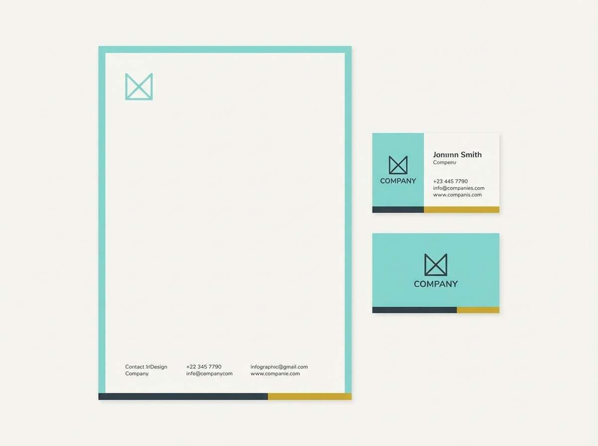
1) Sea Glass Minimalist
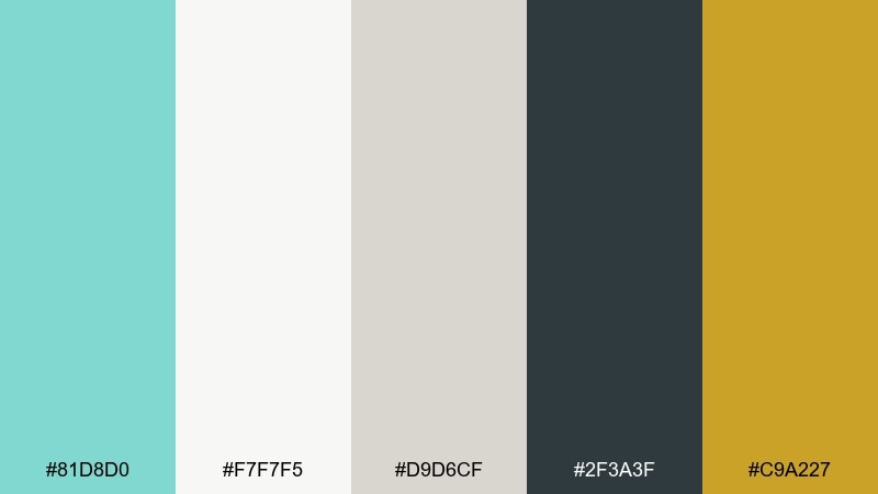
HEX: #81D8D0 #F7F7F5 #D9D6CF #2F3A3F #C9A227
Mood: airy, polished, coastal
Best for: clean brand identity and stationery
Airy coastal calm comes through like sea glass on a bright shoreline. Use the mint as your hero color, then lean on warm ivory and greige to keep layouts breathable. Charcoal adds readable contrast for headlines, while muted gold works as a premium foil accent. Tip: reserve the gold for tiny details like rules, icons, or a seal to avoid visual noise.
Image example of sea glass minimalist generated using media.io
Media.io is an online AI studio for creating and editing video, image, and audio in your browser.

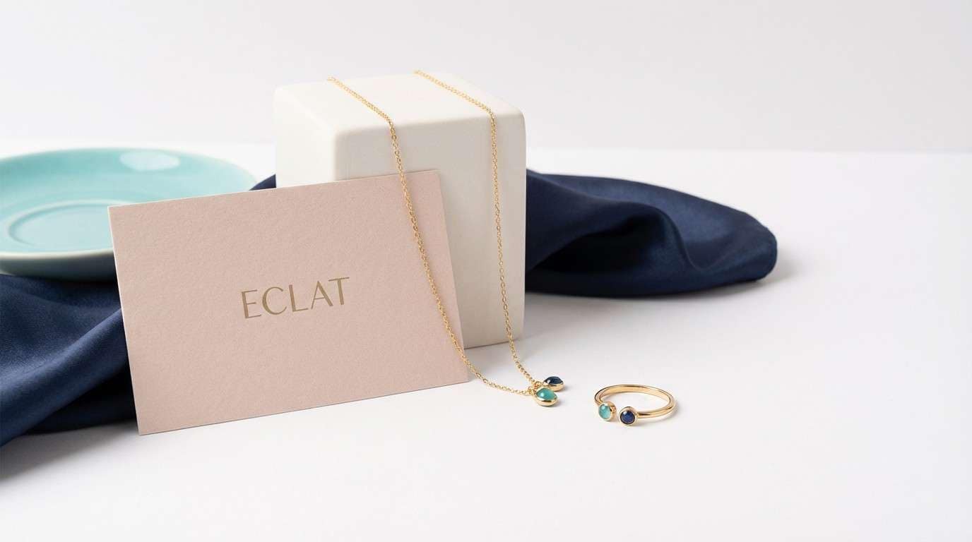
2) Breakfast at Blue
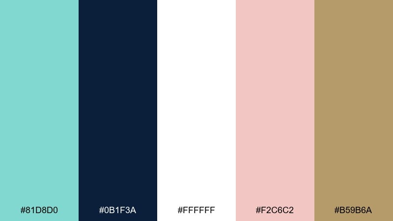
HEX: #81D8D0 #0B1F3A #FFFFFF #F2C6C2 #B59B6A
Mood: luxury, cinematic, chic
Best for: high-end jewelry ad creative
Chic and cinematic, it feels like satin gloves, city lights, and a signature gift box. Deep navy gives the mint a luxe stage, while blush softens the mood for lifestyle warmth. Add white for sparkle and a muted champagne tone for metal-like highlights. Tip: keep copy in navy on white for legibility, and let the mint sit behind the product as a clean color block.
Image example of breakfast at blue generated using media.io
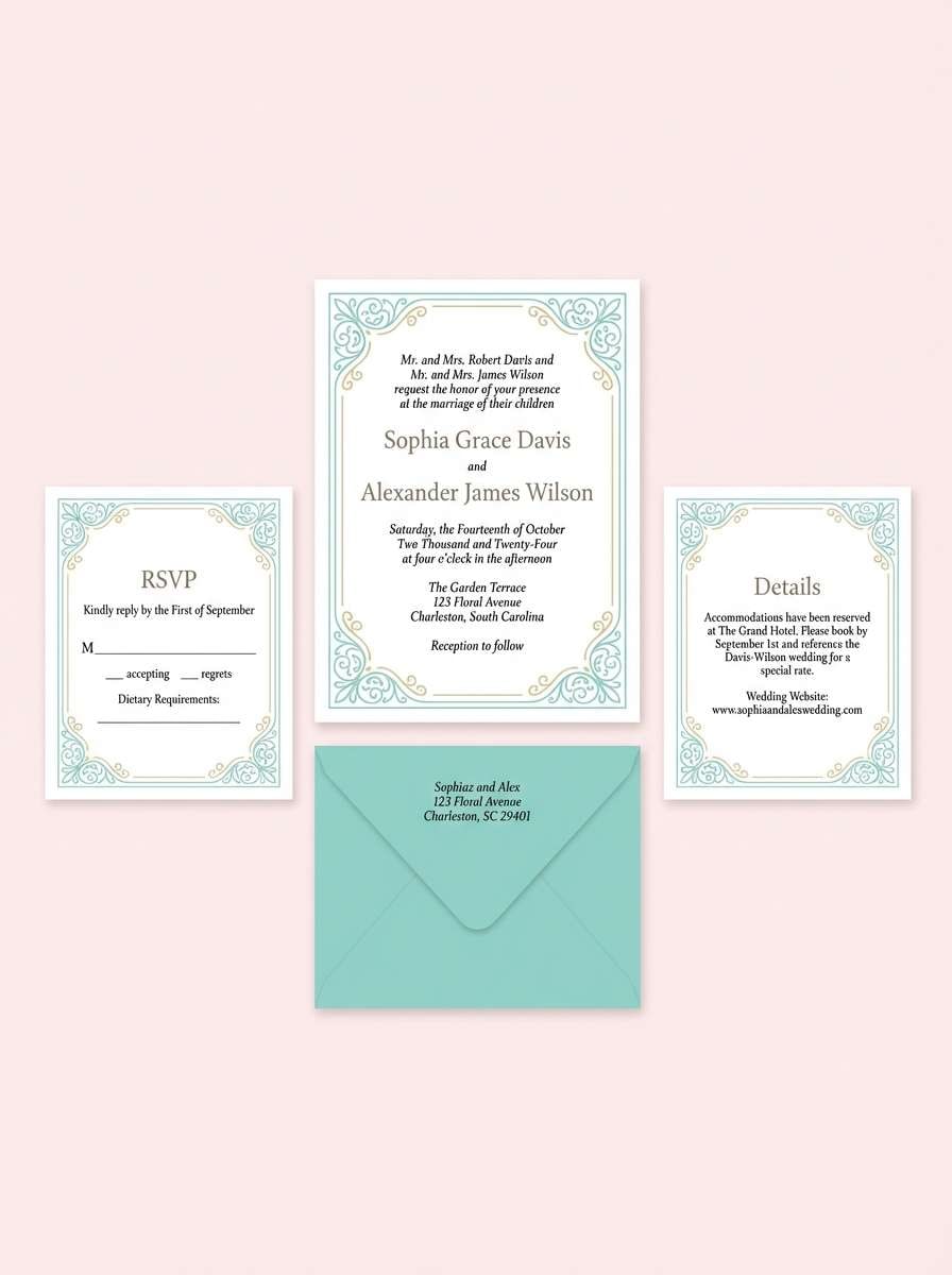
3) Powder Mint and Pearl
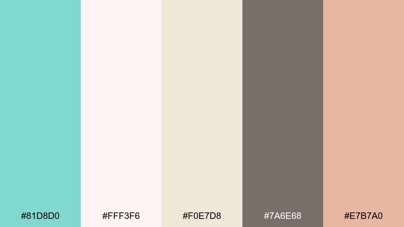
HEX: #81D8D0 #FFF3F6 #F0E7D8 #7A6E68 #E7B7A0
Mood: romantic, light, elegant
Best for: bridal invitations and RSVP cards
Romantic and weightless, it evokes pearls, silk ribbon, and soft daylight. This tiffany blue color palette works beautifully when the mint is used sparingly as a border, monogram, or wax-seal highlight. Pair it with blush and linen neutrals for a timeless print feel, then ground the typography with warm taupe. Tip: use uncoated paper textures to keep the pastels from feeling too glossy.
Image example of powder mint and pearl generated using media.io
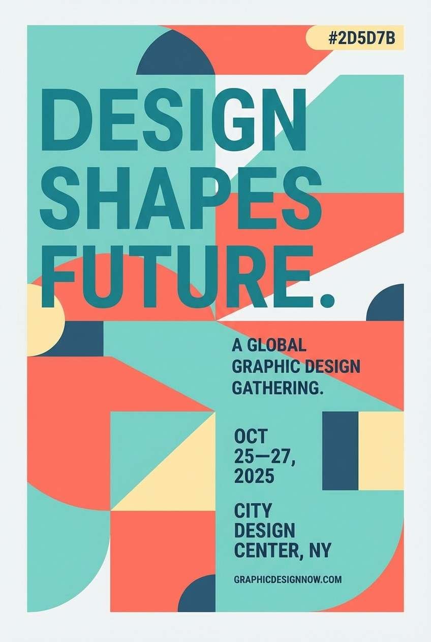
4) Coastal Poster Pop
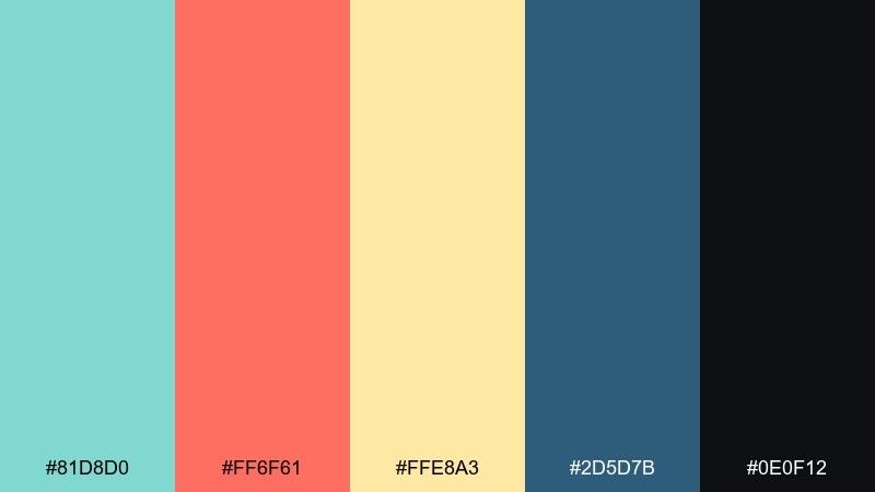
HEX: #81D8D0 #FF6F61 #FFE8A3 #2D5D7B #0E0F12
Mood: playful, sunny, energetic
Best for: summer event posters and flyers
Playful and sunlit, it feels like boardwalk signs and bright umbrellas. Let the mint and coral do the talking, then use the buttery yellow to add warmth without overpowering. Navy-blue tones add structure for titles and schedules, while near-black is perfect for small print. Tip: keep the background light and push the coral into calls to action for instant attention.
Image example of coastal poster pop generated using media.io
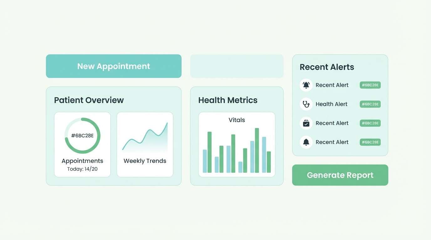
5) Modern Clinic Calm
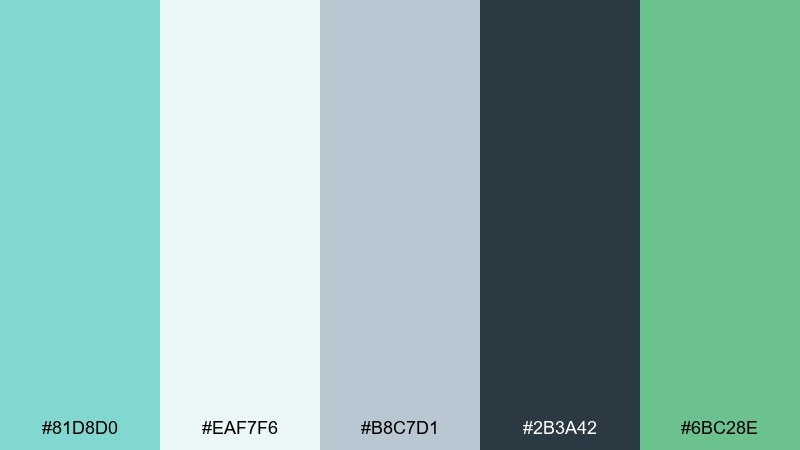
HEX: #81D8D0 #EAF7F6 #B8C7D1 #2B3A42 #6BC28E
Mood: clean, reassuring, modern
Best for: healthcare and wellness app UI
Clean and reassuring, it suggests fresh air, clarity, and trust. Use the pale aqua as the main canvas, then bring in the mint for key UI highlights like active states and progress indicators. Slate and blue-gray keep text accessible, while the soft green reads as positive status feedback. Tip: test button contrast with slate text when the mint is used as a fill color.
Image example of modern clinic calm generated using media.io
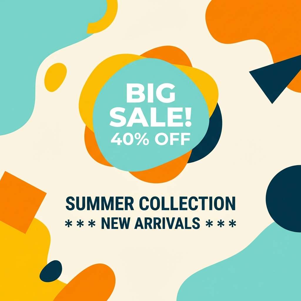
6) Citrus Sorbet Accent
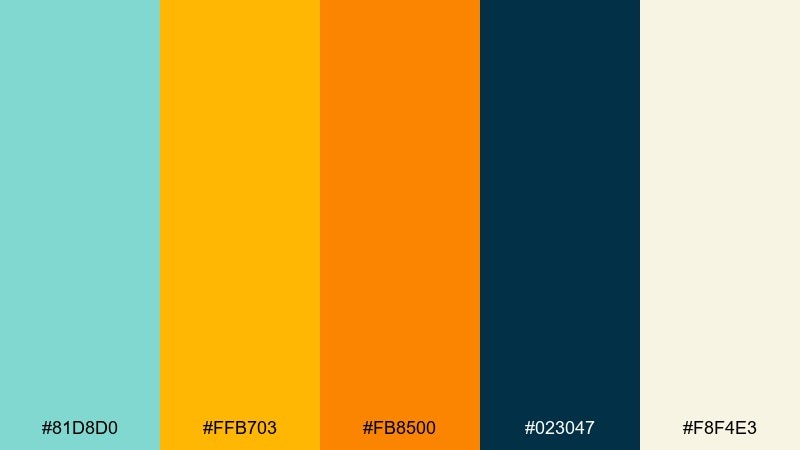
HEX: #81D8D0 #FFB703 #FB8500 #023047 #F8F4E3
Mood: bold, zesty, confident
Best for: social media promo graphics
Bold and zesty, it feels like fizzy citrus and a cool poolside breeze. These tiffany blue color combinations shine when you keep the mint as the base and use the warm oranges as punchy accents for offers and badges. Navy brings strong hierarchy for headlines, while the creamy off-white softens large blocks of color. Tip: limit orange to one primary accent per layout to avoid competing focal points.
Image example of citrus sorbet accent generated using media.io
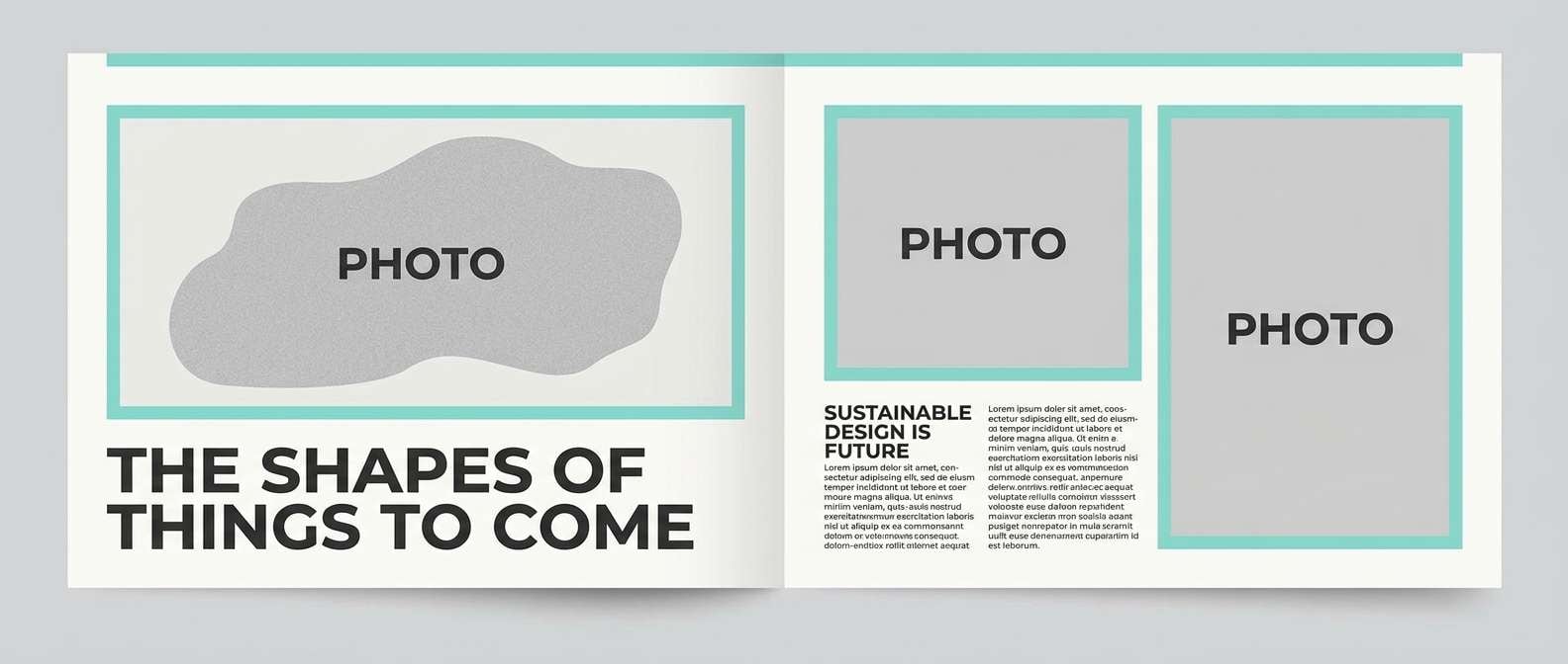
7) Gallery White and Graphite
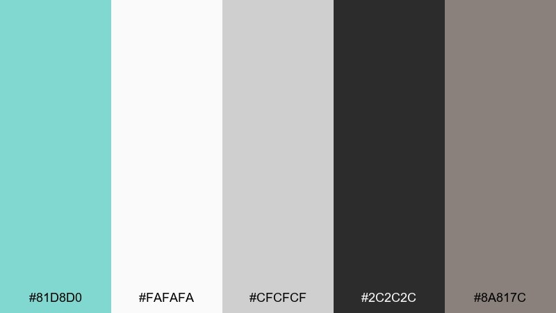
HEX: #81D8D0 #FAFAFA #CFCFCF #2C2C2C #8A817C
Mood: editorial, refined, neutral
Best for: magazine and editorial layouts
Refined and editorial, it evokes a bright gallery wall with a single statement piece. Use white and light gray for generous negative space, then bring the mint in as a restrained highlight for pull quotes or section markers. Graphite handles body copy with excellent readability, and warm taupe prevents the page from feeling cold. Tip: keep mint accents consistent in size to make the layout feel intentional.
Image example of gallery white and graphite generated using media.io
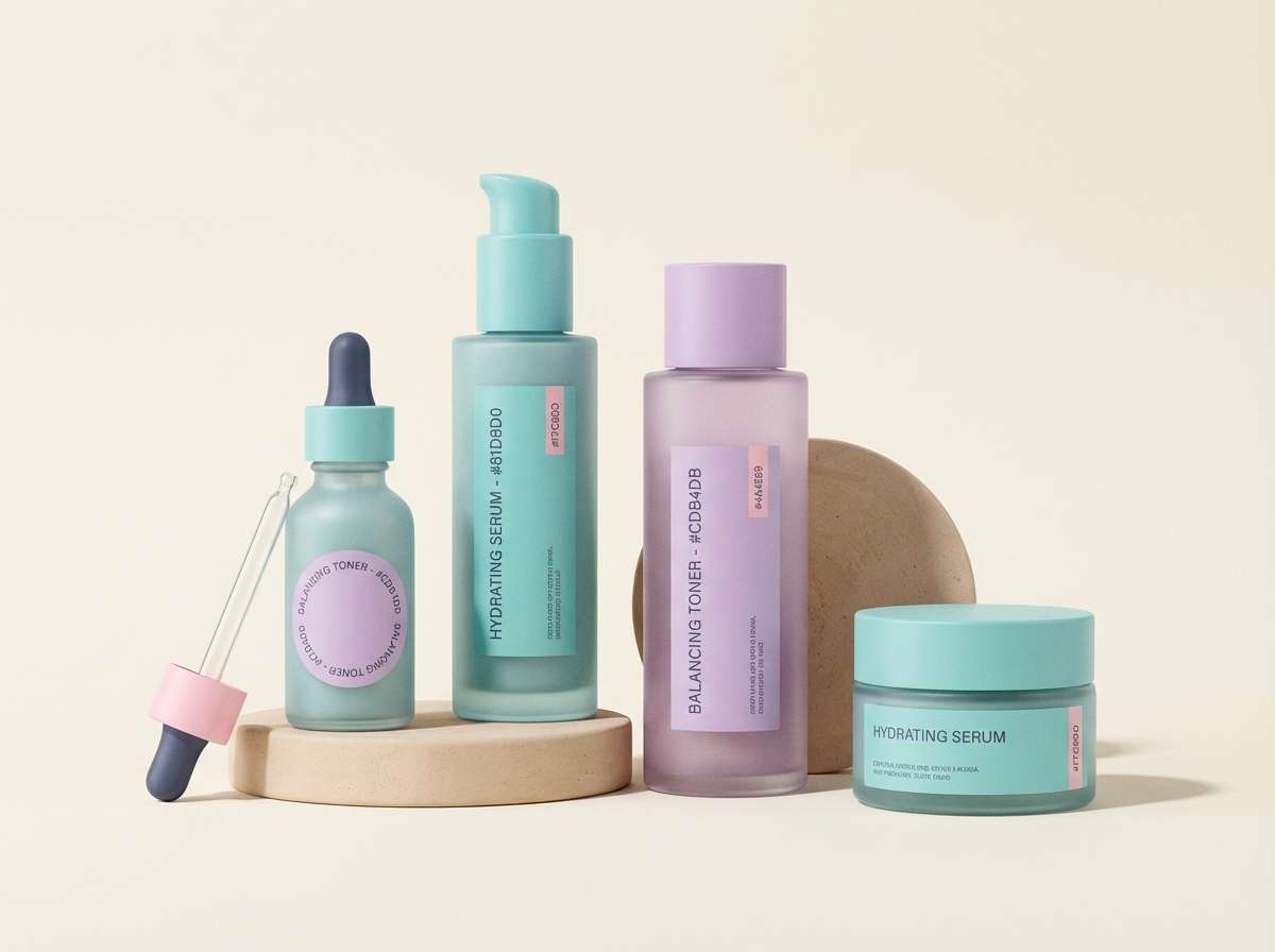
8) Lavender Ice Cream
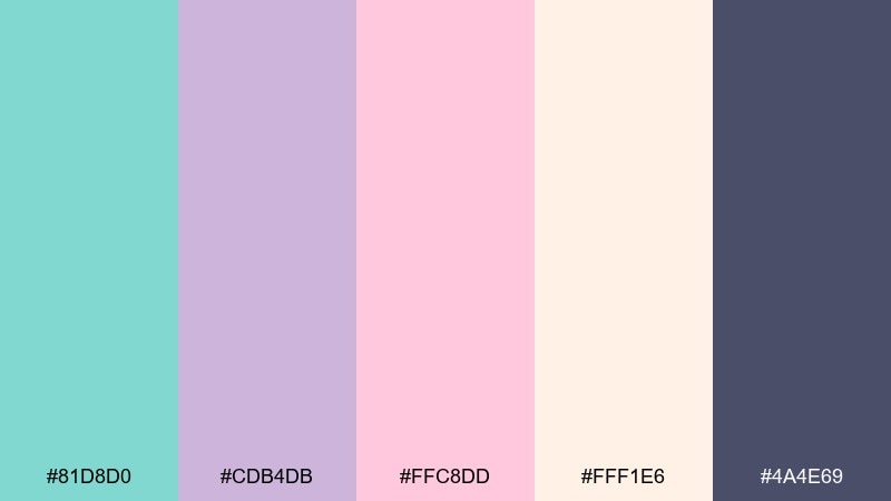
HEX: #81D8D0 #CDB4DB #FFC8DD #FFF1E6 #4A4E69
Mood: sweet, dreamy, modern
Best for: beauty packaging and labels
Sweet and dreamy, it brings to mind pastel gelato and soft studio lighting. The mint and lavender create a gentle contrast that reads modern instead of childish, while blush adds warmth for skincare and cosmetics. Use the deep mauve as your type color to keep labels crisp and premium. Tip: choose one pastel as the bottle color and let the others appear in secondary graphics to reduce clutter.
Image example of lavender ice cream generated using media.io
9) Midnight Pool
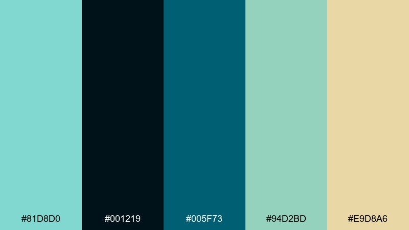
HEX: #81D8D0 #001219 #005F73 #94D2BD #E9D8A6
Mood: moody, modern, aquatic
Best for: app splash screens and hero headers
Moody and aquatic, it feels like a pool at night with reflections on the water. Use near-black and deep teal for drama, then let mint and seafoam create depth in gradients or overlays. The pale sand tone is great for subtle highlights and secondary buttons. Tip: avoid using mint text on teal backgrounds; reserve mint for shapes, icons, or glow accents.
Image example of midnight pool generated using media.io

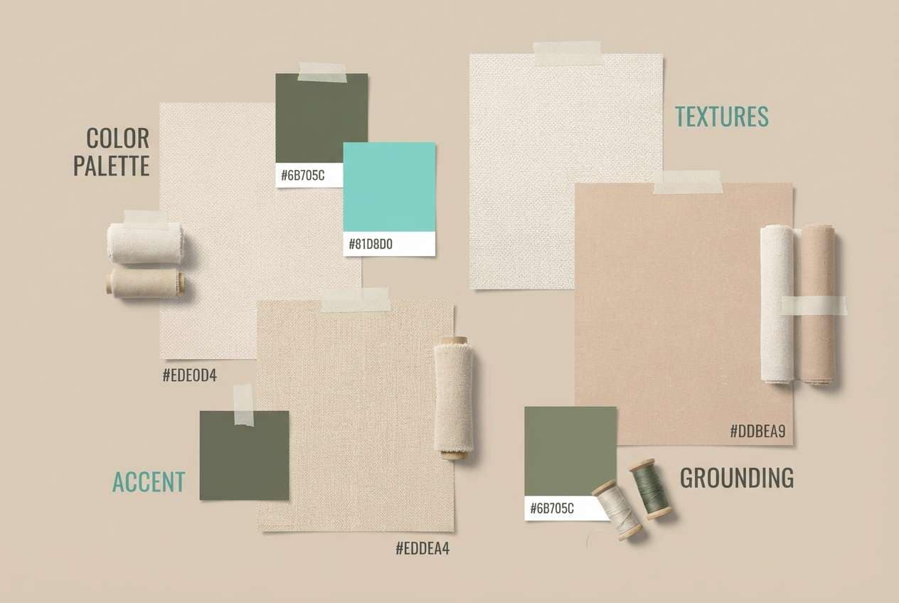
10) Desert Breeze
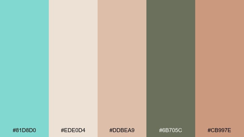
HEX: #81D8D0 #EDE0D4 #DDBEA9 #6B705C #CB997E
Mood: warm, earthy, relaxed
Best for: interior design mood boards
Warm and relaxed, it suggests sun-washed adobe with a cool breeze passing through. Let the sandy neutrals take up most of the space, then add mint as a refreshing counterpoint in textiles, accents, or headings. Olive-gray grounds the palette and keeps it sophisticated rather than beachy. Tip: use mint in small repeated touches across the board to create cohesion.
Image example of desert breeze generated using media.io
11) Nordic Winter Mint
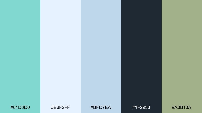
HEX: #81D8D0 #E6F2FF #BFD7EA #1F2933 #A3B18A
Mood: crisp, calming, airy
Best for: ecommerce UI and product listing pages
Crisp and calming, it feels like clear winter light and frosted glass. The pale icy blue works as a soft background, while mint draws attention to key actions like add to cart and filters. Deep slate keeps text highly readable, and the muted green is a natural fit for sustainability or organic product cues. Tip: keep buttons solid mint and links slate to avoid confusing affordances.
Image example of nordic winter mint generated using media.io
12) Retro Diner Aqua
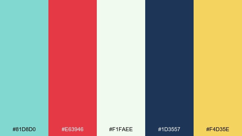
HEX: #81D8D0 #E63946 #F1FAEE #1D3557 #F4D35E
Mood: retro, fun, punchy
Best for: menu designs and cafe signage
Retro and punchy, it brings back neon signs, checker tiles, and classic soda fountains. Use mint and cream as the base to keep the design friendly, then add red for standout prices and specials. Navy gives you solid type contrast, and the sunny yellow is perfect for badges like new or popular. Tip: keep the red reserved for 10 to 15 percent of the layout so it reads like an accent, not a takeover.
Image example of retro diner aqua generated using media.io
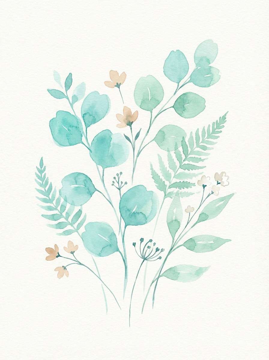
13) Botanical Spa Watercolor
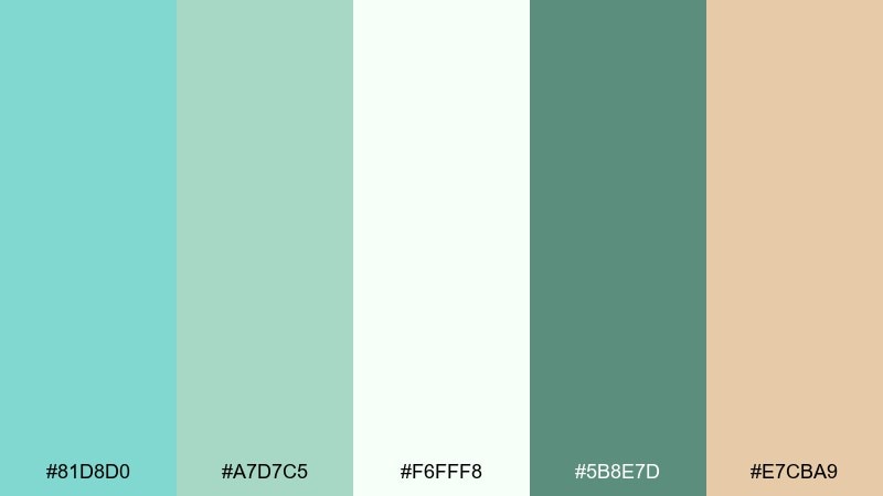
HEX: #81D8D0 #A7D7C5 #F6FFF8 #5B8E7D #E7CBA9
Mood: fresh, natural, soothing
Best for: spa brochures and botanical illustrations
Fresh and soothing, it feels like cucumber water, eucalyptus, and a quiet morning. The mint and soft green layer naturally in watercolor washes, while creamy white keeps the page light and breathable. Deep sage provides readable headings without breaking the calm, and the warm beige adds a skin-friendly touch. Tip: use large soft gradients for backgrounds and keep text blocks on the lightest tones for clarity.
Image example of botanical spa watercolor generated using media.io
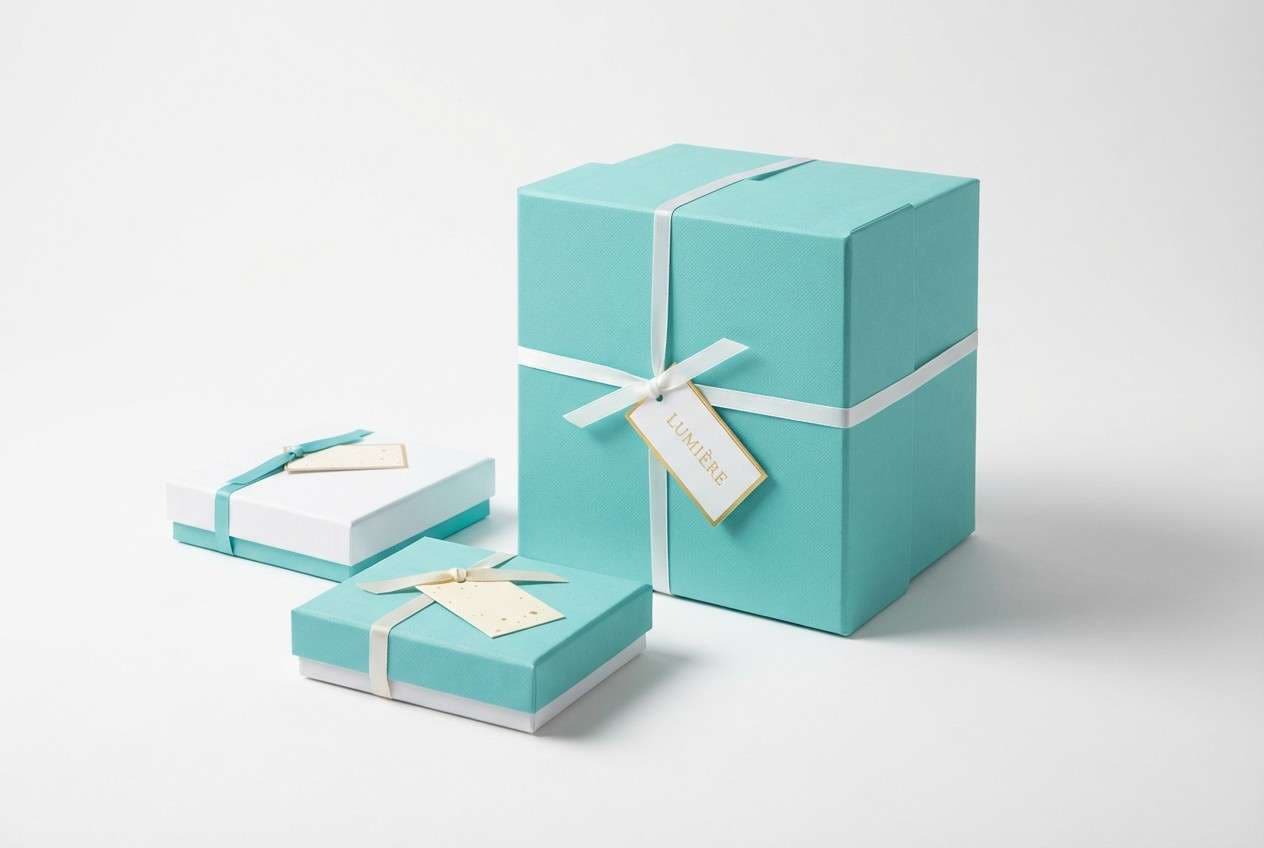
14) Champagne and Blue Box
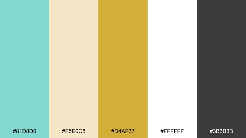
HEX: #81D8D0 #F5E6C8 #D4AF37 #FFFFFF #3B3B3B
Mood: celebratory, elegant, premium
Best for: gift packaging and wedding welcome cards
Celebratory and premium, it recalls champagne bubbles and a perfectly wrapped present. This tiffany blue color palette is especially strong for packaging when you balance the mint with creamy neutrals and keep metallic gold as a refined accent. Charcoal handles typography cleanly, so logos and messages stay sharp on print. Tip: try a white background with mint panels, then add gold only to a monogram or border line.
Image example of champagne and blue box generated using media.io
15) Tech Startup Bright
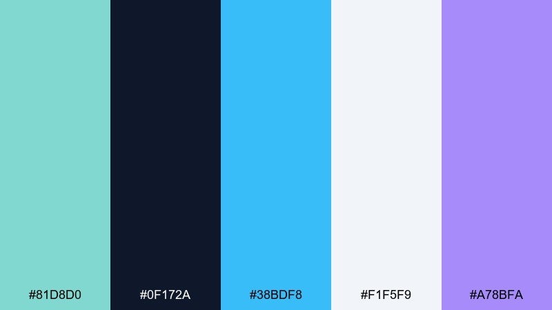
HEX: #81D8D0 #0F172A #38BDF8 #F1F5F9 #A78BFA
Mood: modern, energetic, digital
Best for: SaaS landing pages and hero sections
Modern and energetic, it feels like a crisp interface with a confident glow. Use the dark navy as the backdrop, then layer mint and sky blue for gradients, graphs, and feature highlights. The soft near-white keeps content blocks readable, while violet adds a distinctive secondary accent for tags or illustrations. Tip: keep your primary CTA mint and your secondary CTA outlined to preserve hierarchy.
Image example of tech startup bright generated using media.io

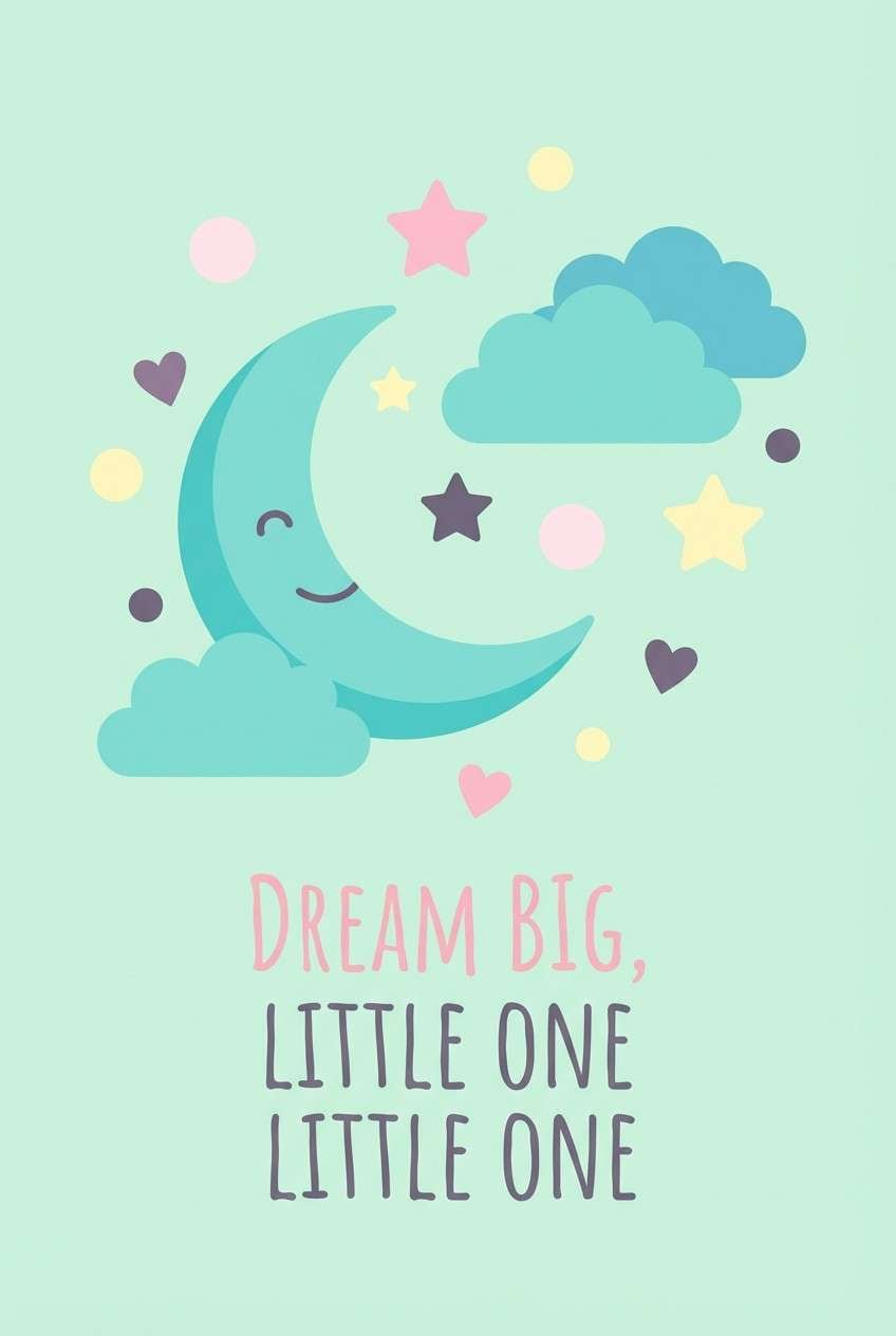
16) Soft Kids Room
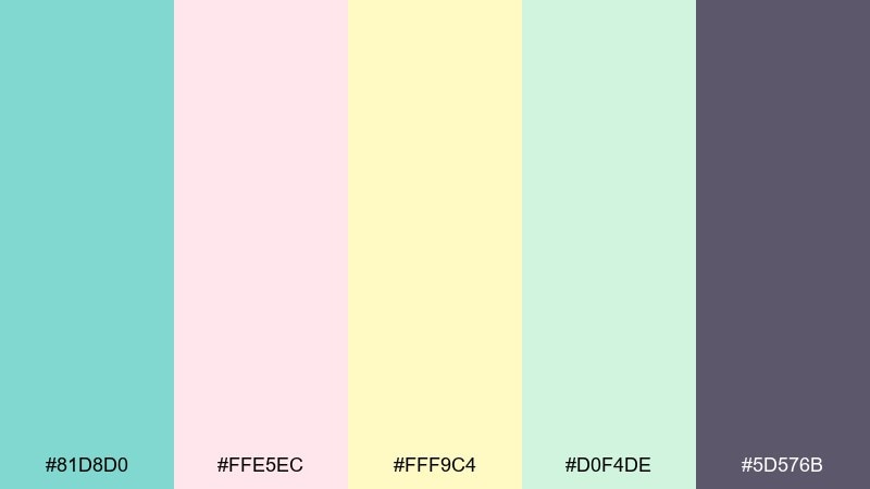
HEX: #81D8D0 #FFE5EC #FFF9C4 #D0F4DE #5D576B
Mood: gentle, cheerful, playful
Best for: nursery prints and kids room decor
Gentle and cheerful, it reads like storybooks, cotton candy, and a sunny afternoon. Keep mint and soft green as the main fields, then add blush and butter yellow in small character details or patterns. The muted purple is useful for outlines and text that still feel friendly. Tip: use big simple shapes and plenty of white space so the pastels do not look busy.
Image example of soft kids room generated using media.io
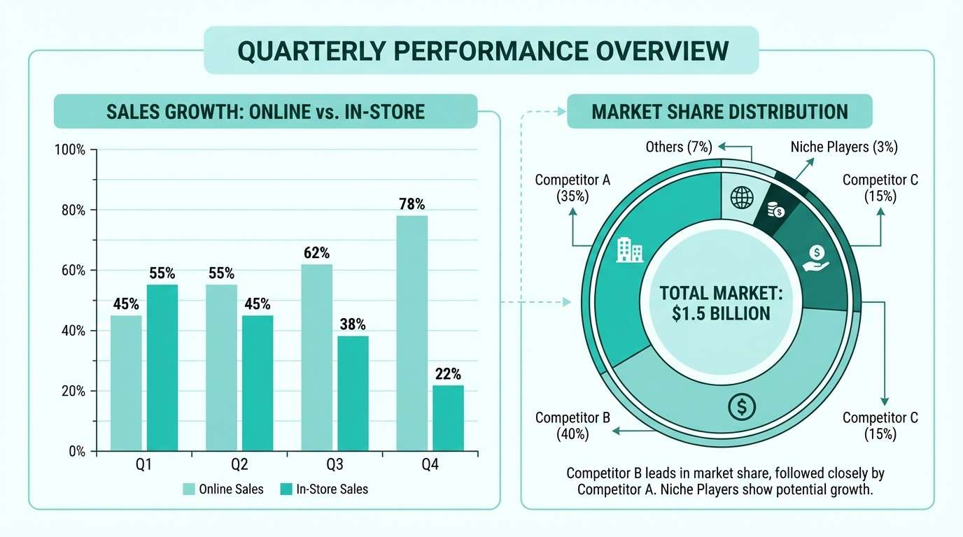
17) Monochrome Mint Steps
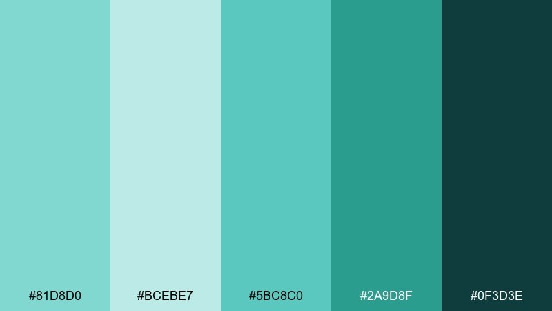
HEX: #81D8D0 #BCEBE7 #5BC8C0 #2A9D8F #0F3D3E
Mood: structured, clear, contemporary
Best for: infographics and data visualizations
Structured and contemporary, it feels like clean charts and clear decisions. The stepped mint range makes it easy to build depth for bars, maps, and multi-series graphs without introducing new hues. Use the deep teal for labels and axes so data stays legible. Tip: assign the lightest mint to background fills and reserve the darkest for the key metric callout.
Image example of monochrome mint steps generated using media.io
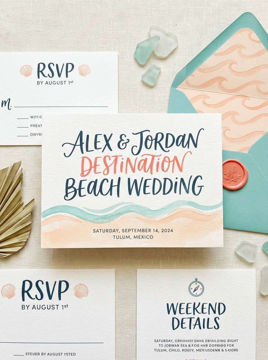
18) Coral Sunset Wedding
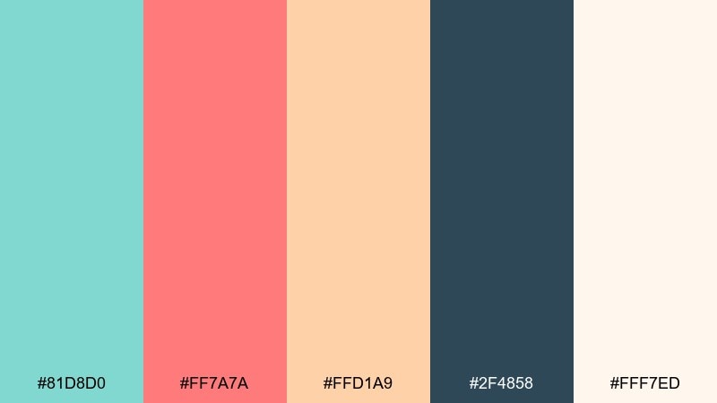
HEX: #81D8D0 #FF7A7A #FFD1A9 #2F4858 #FFF7ED
Mood: romantic, sunny, destination
Best for: beach wedding invitation suite
Romantic and sunny, it evokes a pastel sunset over calm water. Tiffany blue color combinations like mint with coral create an inviting contrast that photographs beautifully in print and digital invites. Use warm cream as the background, then anchor details with the deep slate for times, locations, and RSVP info. Tip: keep the coral on names or key motifs and let mint frame the layout for a balanced look.
Image example of coral sunset wedding generated using media.io
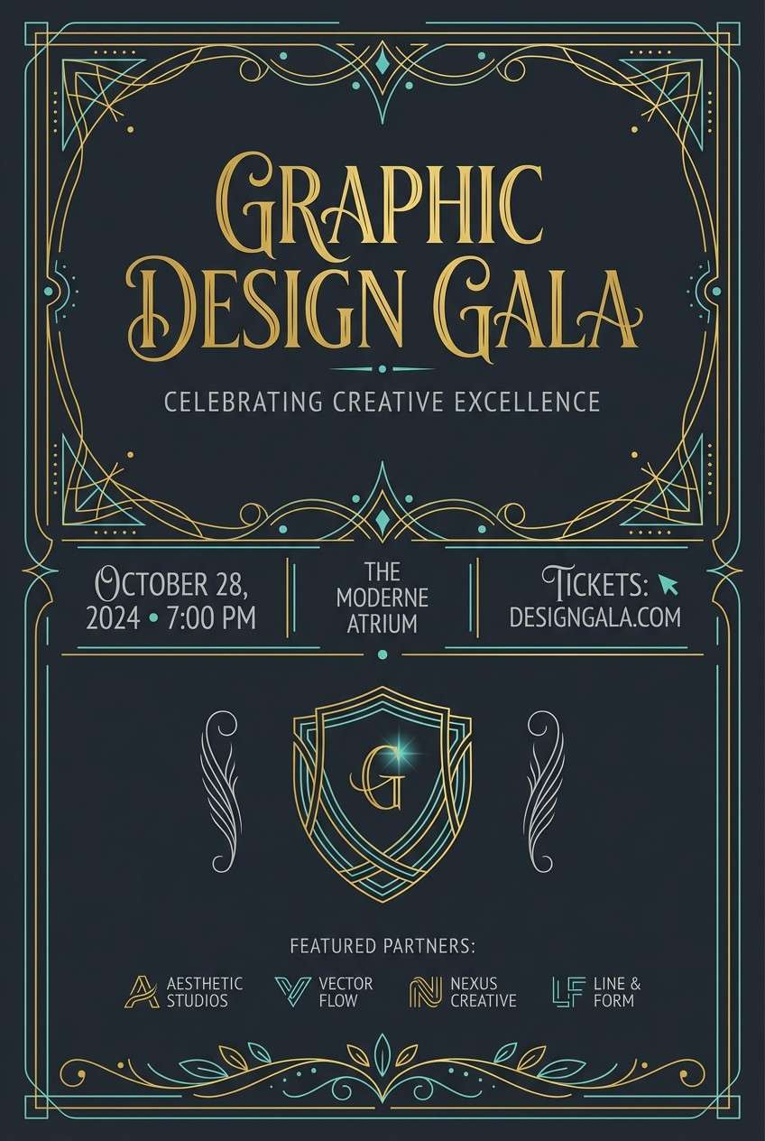
19) Black Tie Mint
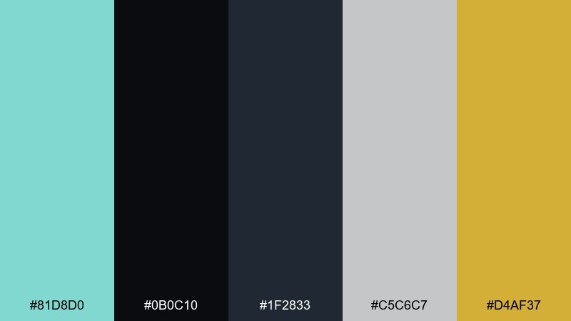
HEX: #81D8D0 #0B0C10 #1F2833 #C5C6C7 #D4AF37
Mood: formal, dramatic, upscale
Best for: gala event flyers and RSVP emails
Formal and dramatic, it feels like velvet tuxedos under soft spotlights. Use black and steel tones for the main canvas, then introduce mint as a crisp accent for lines, icons, or a monogram. A small touch of gold elevates the look without turning it flashy. Tip: keep the mint to 5 to 10 percent of the layout so the black tie mood stays dominant.
Image example of black tie mint generated using media.io
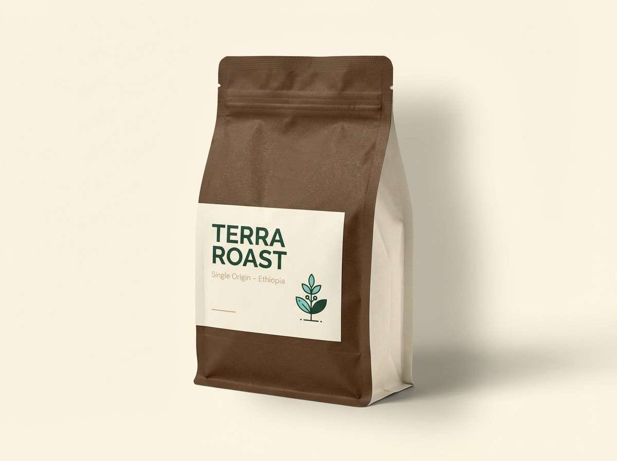
20) Artisan Coffee Shop
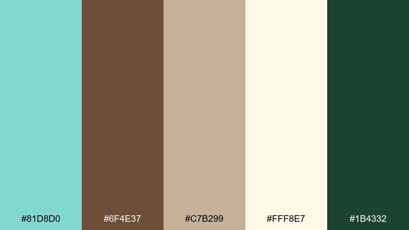
HEX: #81D8D0 #6F4E37 #C7B299 #FFF8E7 #1B4332
Mood: cozy, handcrafted, modern-vintage
Best for: coffee bag packaging and labels
Cozy and handcrafted, it brings to mind roasted beans, kraft paper, and a mint-painted storefront. The warm browns and cream make the mint feel intentional and modern instead of overly sweet. Deep green adds an earthy note that suits origin stories, tasting notes, and sustainability messaging. Tip: print mint as a solid label panel and keep the rest of the bag in kraft-like neutrals for a premium artisan feel.
Image example of artisan coffee shop generated using media.io
What Colors Go Well with Tiffany Blue?
For a timeless, premium look, pair Tiffany blue with deep navy, charcoal, and crisp white. These darker anchors make #81D8D0 feel brighter and keep typography easy to read.
If you want a softer, romantic direction, mix it with blush, warm ivory, and linen-like neutrals. The result is light, airy, and ideal for invitations, packaging, and lifestyle branding.
For bold contrast, try warm accents like coral, marigold, or orange—then control them in small doses (CTAs, badges, key details) so Tiffany blue stays the hero.
How to Use a Tiffany Blue Color Palette in Real Designs
Start by deciding whether Tiffany blue is your background color or your accent color. As a background, keep text on top in navy/charcoal; as an accent, apply it consistently to interactive states, dividers, icons, or highlights.
Use neutrals to control the “sweetness” of minty tones—white, warm gray, greige, and cream create breathing room and help layouts feel more editorial than playful.
For accessibility, avoid placing Tiffany blue text on similar blue/green backgrounds. When in doubt, reserve #81D8D0 for fills and shapes, and use a dark anchor for labels and body copy.
Create Tiffany Blue Palette Visuals with AI
If you already have HEX codes, you can generate matching visuals (posters, packaging mockups, UI concepts, invites) by describing your layout and pasting your palette colors into the prompt.
To keep results consistent, specify your dominant colors first, then list accents, style (vector, editorial, realistic studio shot), and the aspect ratio you need for your platform.
Tiffany Blue Color Palette FAQs
-
What is the HEX code for Tiffany blue?
A commonly used Tiffany blue-like HEX is #81D8D0. It’s a minty turquoise that works well for branding, weddings, and UI accents. -
Is Tiffany blue closer to mint or turquoise?
It sits between them: it has the freshness of mint with enough blue to feel turquoise. That balance is why it pairs well with both warm neutrals and deep cool anchors. -
What colors pair best with Tiffany blue for luxury branding?
Deep navy or charcoal for contrast, plus white/ivory for negative space, and a restrained gold/champagne accent for a premium finish. -
What are good wedding colors with Tiffany blue?
Blush, warm cream, sand, and soft coral create a romantic look; add taupe or deep slate for readable typography on invitations and signage. -
What should I avoid when using Tiffany blue in UI design?
Avoid mint-on-teal or mint-on-aqua text combinations. Use a dark text color (navy/charcoal) on light backgrounds, and keep Tiffany blue for buttons, highlights, and icons. -
Can Tiffany blue work as a background color?
Yes—especially for hero panels, packaging blocks, or section headers. Just keep large areas balanced with white/cream and use dark text to maintain contrast. -
How do I generate Tiffany blue palette images with AI?
Use a text-to-image tool, describe the design type (poster, invite, UI, packaging), then include your five HEX codes in the prompt and specify the style (vector or realistic) and aspect ratio.
Next: Wild West Color Palette


