

Green, blue, and pink can look surprisingly “modern” together: green brings freshness, blue adds trust, and pink delivers a clear focal accent. The result is a palette family that works for UI, branding, print, and even neon-style digital layouts.
Below are 20+ curated green blue pink color palette ideas with HEX codes, plus quick guidance on what to pair them with and how to apply them in real projects.
In this article
- Why Green Blue Pink Color Schemes Work So Well
-
- mint lagoon blush
- sea glass rose
- tropical bubblegum
- nordic sprout
- candy kelp
- poolside peony
- sage denim pink
- aloe sky sorbet
- emerald cyan petal
- forest azure fuchsia
- soft matcha wave
- retro miami garden
- lotus lagoon
- glacier bloom
- botanical pop
- studio pastel punch
- neon aquarium
- calm clinic ui
- editorial spring spread
- kids party confetti
- harbor blossom
- aqua rose clay
- What Colors Go Well with Green Blue Pink?
- How to Use a Green Blue Pink Color Palette in Real Designs
- Create Green Blue Pink Palette Visuals with AI
Why Green Blue Pink Color Schemes Work So Well
A green blue pink color scheme balances “cool clarity” with “human warmth.” Blue and green naturally feel clean and reliable (great for interfaces and brands), while pink acts as an attention cue that keeps the scheme from feeling sterile.
It’s also flexible across styles. Desaturate the trio for minimal Scandinavian UI, push saturation for retro or neon looks, or move into pastels for soft invitations and lifestyle branding—all without changing the core harmony.
Practically, these palettes are easy to build systems with: use navy/charcoal for readable type, keep teal/blue for surfaces and components, and reserve pink for a single hero action (CTA, highlight, or key metric).
20+ Green Blue Pink Color Palette Ideas (with HEX Codes)
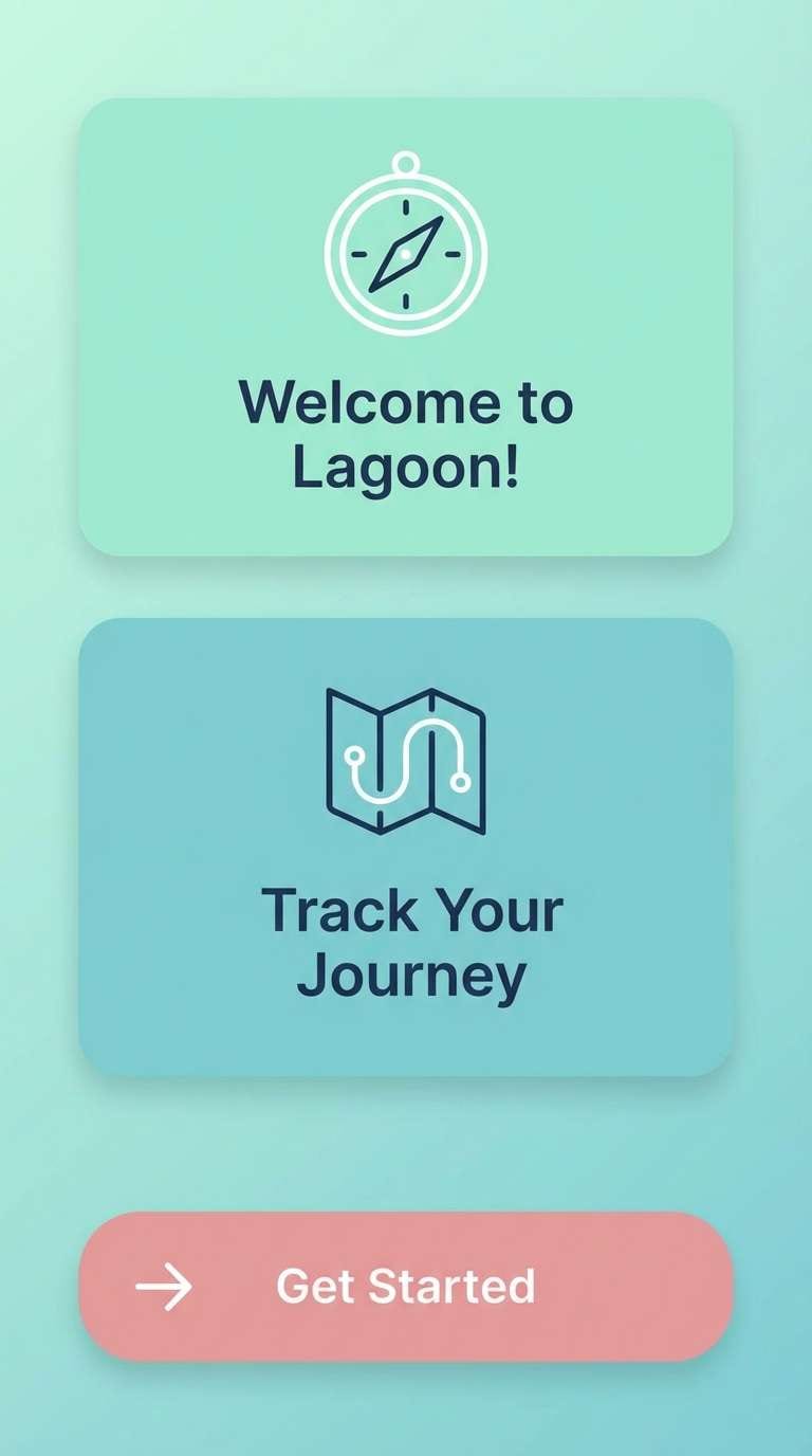
1) Mint Lagoon Blush
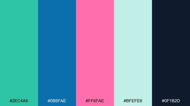
HEX: #2EC4A6 #0B6FAE #FF6FAE #BFEFE6 #0F1B2D
Mood: fresh, optimistic, clean
Best for: app onboarding screens
Fresh seaside energy meets playful blush accents, like sun on shallow water. This green blue pink color palette works best with lots of white space and simple icon shapes. Use the deep navy as your type color to keep accessibility strong, then reserve the pink for primary CTAs. Pair it with rounded sans fonts and subtle gradients for a modern, friendly feel.
Image example of mint lagoon blush generated using media.io
Media.io is an online AI studio for creating and editing video, image, and audio in your browser.

2) Sea Glass Rose
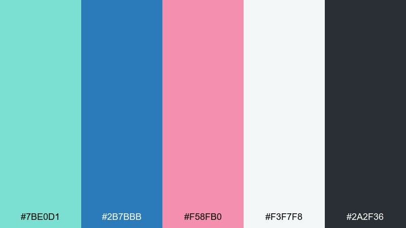
HEX: #7BE0D1 #2B7BBB #F58FB0 #F3F7F8 #2A2F36
Mood: airy, coastal, soft
Best for: wellness branding
Airy sea glass tones and a gentle rose note evoke calm mornings by the coast. The cool blues keep the look trustworthy while the pink adds warmth without feeling sugary. Try using the off-white as a generous background, then build a simple badge system with the teal and blue. For print, keep the pink to small highlights like seals or subhead lines.
Image example of sea glass rose generated using media.io
3) Tropical Bubblegum
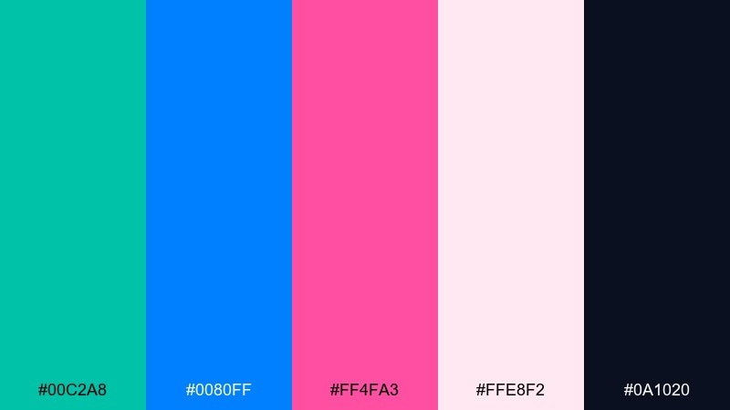
HEX: #00C2A8 #0080FF #FF4FA3 #FFE8F2 #0A1020
Mood: playful, punchy, energetic
Best for: summer event poster
Punchy tropical energy and bubblegum sweetness make this feel loud in the best way. Go bold with big type in the electric blue, then use hot pink for dates and tickets. The pale blush background keeps it readable while still on-theme. Add simple geometric shapes and keep shadows minimal to avoid visual noise.
Image example of tropical bubblegum generated using media.io

4) Nordic Sprout

HEX: #7FD8B3 #3A7CA5 #F2A1B8 #E9EEF2 #1F2933
Mood: minimal, calm, modern
Best for: SaaS dashboard UI
Calm Nordic simplicity comes through in the muted sprout green and softened blue. The pink reads as a polite accent, great for status states or small alerts. Keep cards and tables in light gray, and use the dark charcoal for labels and data. For a crisp finish, limit gradients and lean on spacing and hierarchy instead.
Image example of nordic sprout generated using media.io
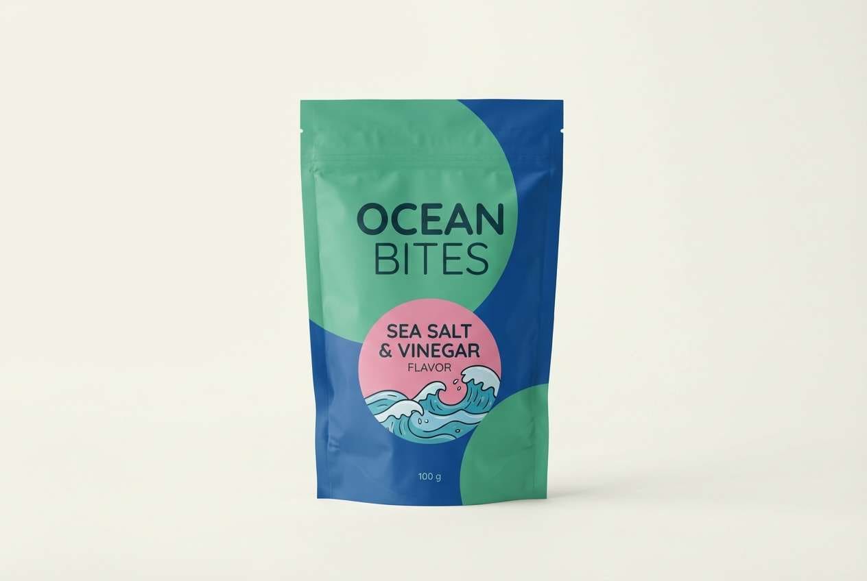
5) Candy Kelp
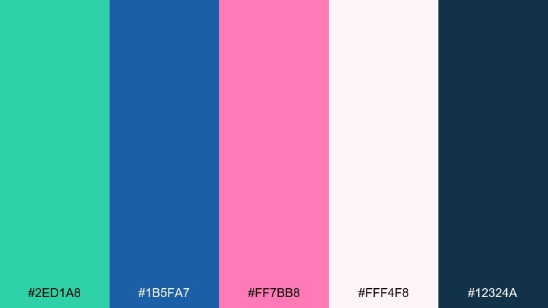
HEX: #2ED1A8 #1B5FA7 #FF7BB8 #FFF4F8 #12324A
Mood: quirky, youthful, bright
Best for: snack packaging
Quirky candy brightness with an ocean-kelp twist makes the colors feel both fun and fresh. Use the deep blue for brand credibility and barcode areas, while the pink can headline flavor cues. The minty green works well for illustrations and playful patterns. A matte finish with a small glossy pink spot varnish can make the pack pop on shelf.
Image example of candy kelp generated using media.io
6) Poolside Peony
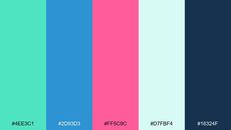
HEX: #4EE3C1 #2D93D3 #FF5C9C #D7FBF4 #16324F
Mood: sunny, social, upbeat
Best for: social media promo graphics
Sunny poolside vibes and peony pink highlights make the layout feel instantly shareable. This green blue pink color scheme shines when you let teal carry the background shapes and use pink sparingly for the hook line. Keep text in the dark slate so it stays readable on bright blocks. Try a simple two-column grid with one bold badge for the offer.
Image example of poolside peony generated using media.io

7) Sage Denim Pink
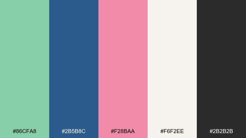
HEX: #86CFA8 #2B5B8C #F28BAA #F6F2EE #2B2B2B
Mood: grounded, cozy, approachable
Best for: handmade shop branding
Grounded sage and denim blue feel like a favorite jacket, warmed up by a soft pink accent. The creamy neutral keeps everything cozy, especially for labels and hang tags. Use the blue for logotypes and navigation, and keep pink for occasional highlights like sale stickers or illustrated details. Pair with textured paper or subtle grain overlays for an artisanal finish.
Image example of sage denim pink generated using media.io
8) Aloe Sky Sorbet

HEX: #6FE7B8 #5BA7FF #FF93C7 #FFFFFF #1B2A41
Mood: light, friendly, airy
Best for: email newsletter design
Light aloe green and sky blue read crisp and friendly, with sorbet pink adding a gentle nudge. Use white as the primary canvas and keep sections separated by thin teal rules. Headlines can sit in navy for contrast, while pink works best for buttons and tiny icons. If you add imagery, choose bright high-key photos so the palette stays airy.
Image example of aloe sky sorbet generated using media.io
9) Emerald Cyan Petal
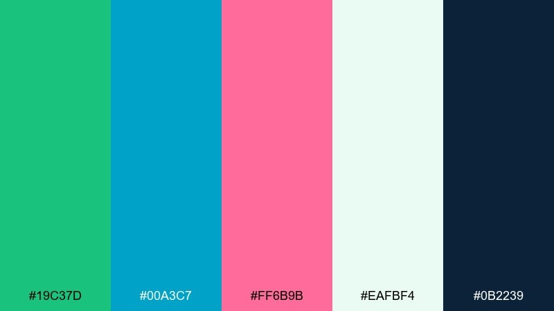
HEX: #19C37D #00A3C7 #FF6B9B #EAFBF4 #0B2239
Mood: confident, crisp, contemporary
Best for: tech brand landing page
Confident emerald and cyan feel crisp and contemporary, like glassy UI highlights. Pink petals add personality without breaking the professional tone. Use the dark navy for long-form copy and footers, then let cyan handle links and interactive states. Keep the pink to one key conversion action so it stays special.
Image example of emerald cyan petal generated using media.io

10) Forest Azure Fuchsia
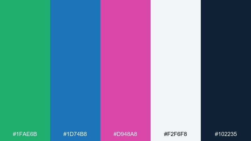
HEX: #1FAE6B #1D74B8 #D948A8 #F2F6F8 #102235
Mood: bold, creative, high-contrast
Best for: music festival flyer
Bold forest green and azure set a high-contrast stage for fuchsia accents that feel electric. Use the bright hues in big blocks and keep backgrounds pale to avoid muddy mixes. The deep navy is perfect for type overlays and sponsor rows. For extra impact, stick to two dominant colors per section and let the third act as a spotlight.
Image example of forest azure fuchsia generated using media.io

11) Soft Matcha Wave
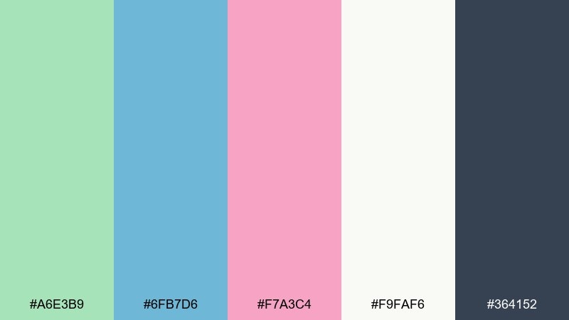
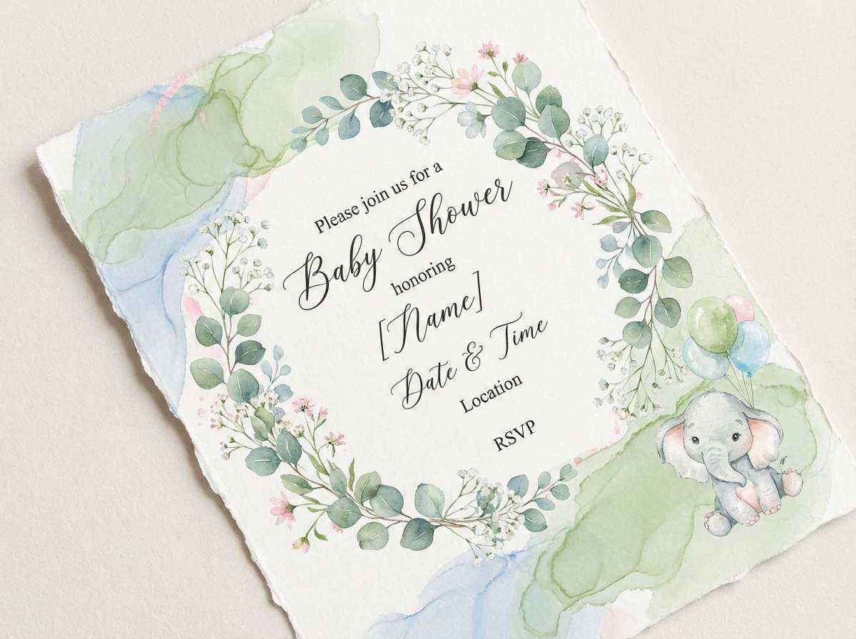
HEX: #A6E3B9 #6FB7D6 #F7A3C4 #F9FAF6 #364152
Mood: gentle, soothing, pastel
Best for: baby shower invitation
Gentle matcha and soft blue wash together like a calm watercolor wave, with a sweet pink finish. Keep typography light and airy, using the charcoal for names and details. The pastel trio works beautifully with floral line art and subtle paper texture. A good tip is to keep the invitation border in blue and reserve pink for small icons like hearts or ribbons.
Image example of soft matcha wave generated using media.io
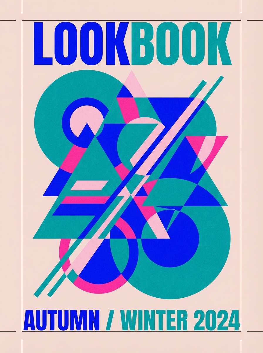
12) Retro Miami Garden
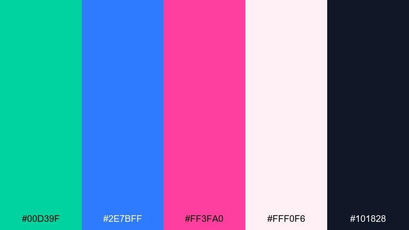
HEX: #00D39F #2E7BFF #FF3FA0 #FFF0F6 #101828
Mood: retro, neon-leaning, fun
Best for: streetwear lookbook cover
Retro Miami energy comes through with high-saturation teal and electric blue, softened by a candy pink. Use the light blush as negative space to keep the cover from feeling too neon. The near-black anchors headlines and makes small text sharp. Add simple halftone dots or stripes to push the vintage vibe without clutter.
Image example of retro miami garden generated using media.io
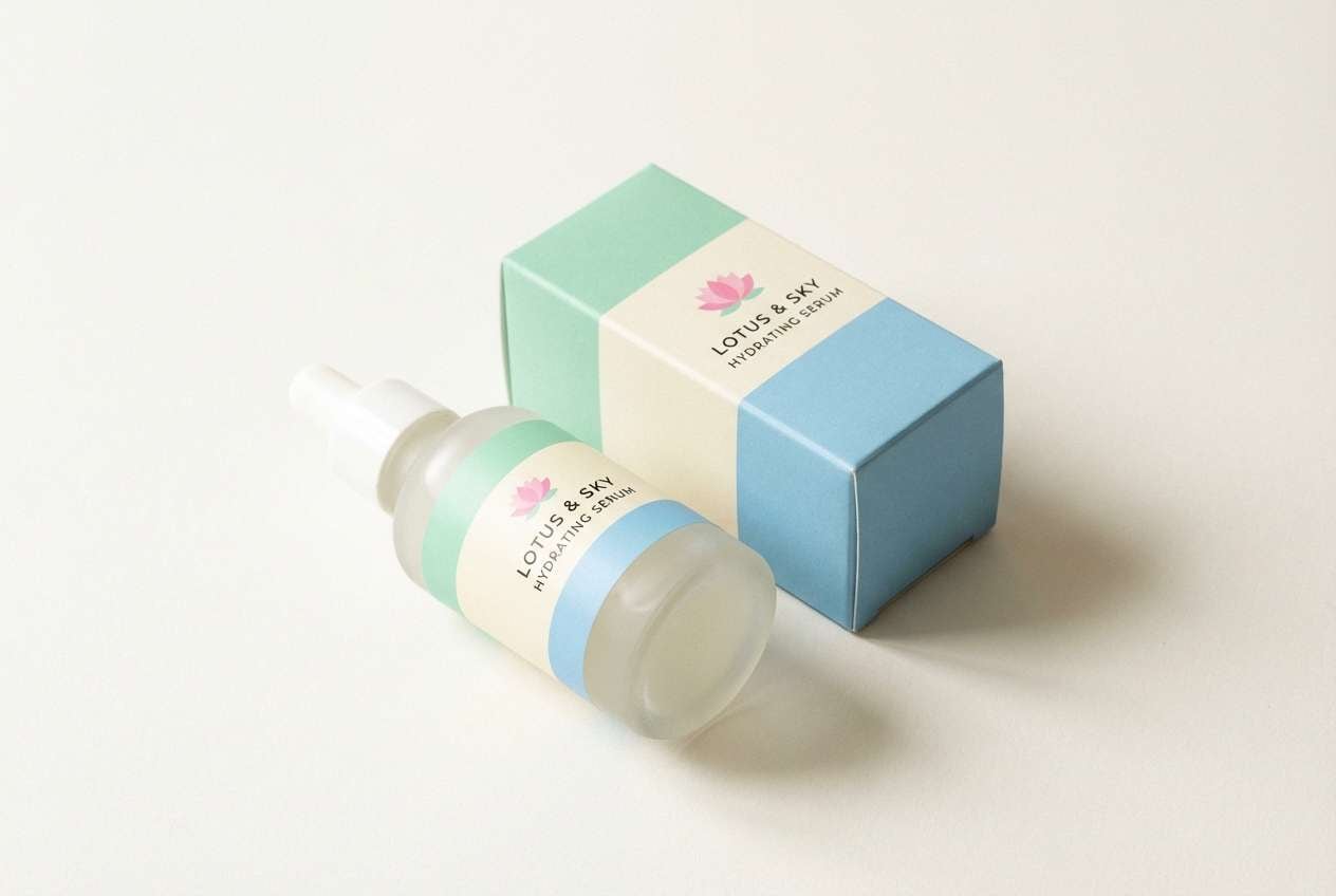
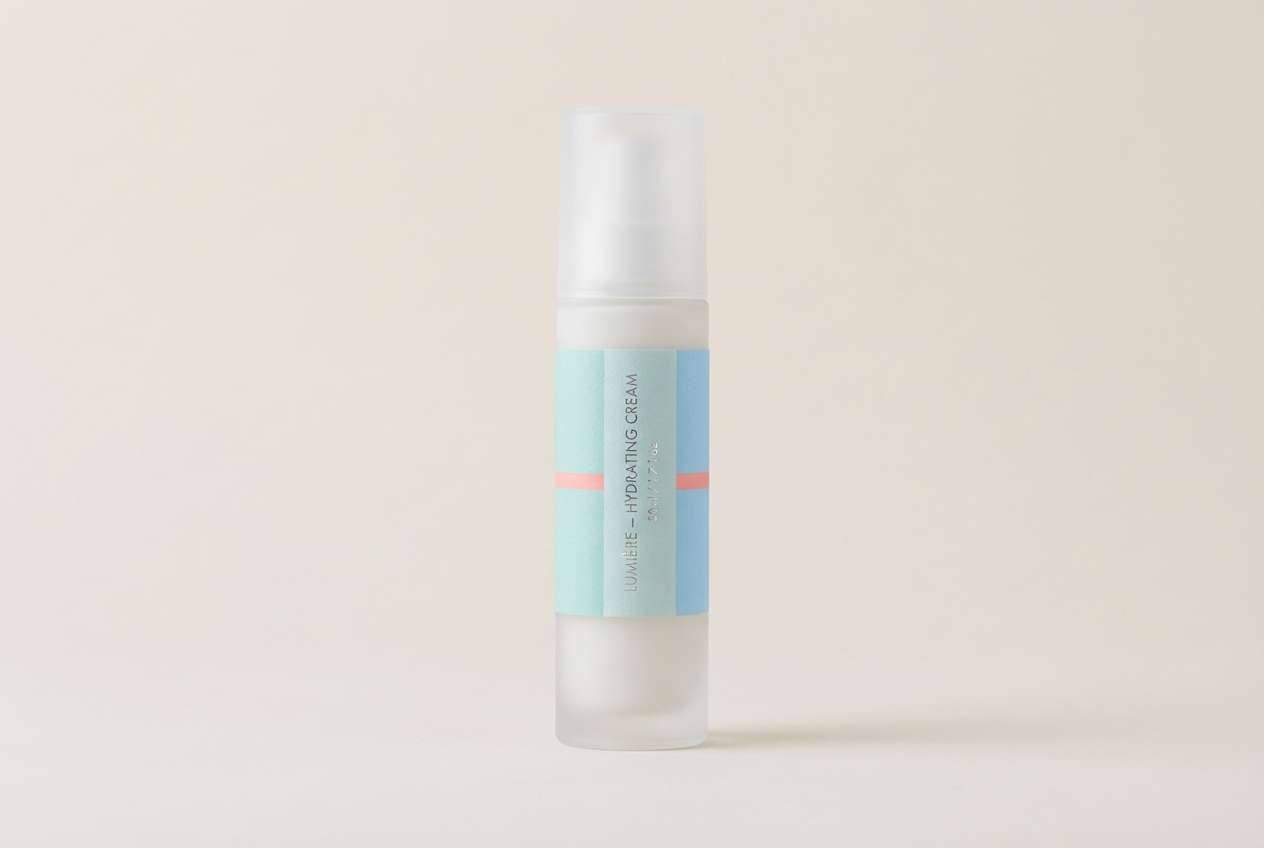
13) Lotus Lagoon
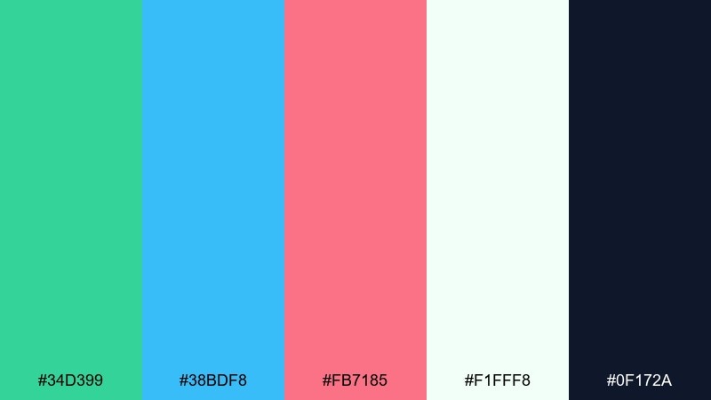
HEX: #34D399 #38BDF8 #FB7185 #F1FFF8 #0F172A
Mood: refreshing, clean, uplifting
Best for: skincare product ad
Refreshing lagoon blues and lotus-like pink feel clean, dewy, and uplifting. This green blue pink color palette pairs well with minimal packaging shapes and lots of breathing room. Use the mint-green for freshness cues, then bring the pink into small claims like hydration or glow. Keep lighting bright and shadows soft to maintain a spa-like look.
Image example of lotus lagoon generated using media.io
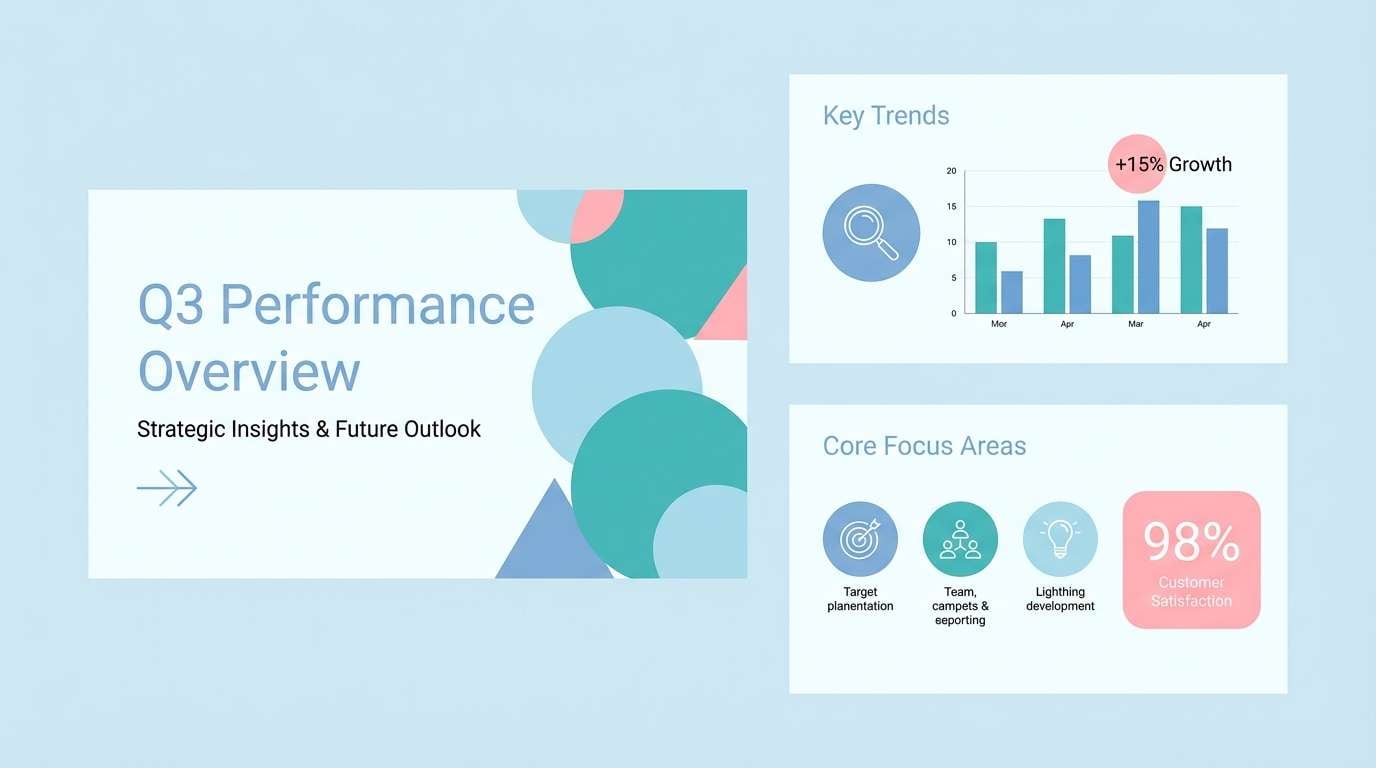
14) Glacier Bloom
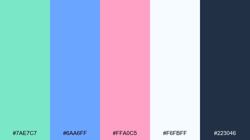
HEX: #7AE7C7 #6AA6FF #FFA0C5 #F6FBFF #223046
Mood: cool, polished, modern
Best for: presentation slide theme
Cool glacier tones feel polished and modern, with a bloom of pink that keeps slides from looking cold. Use the pale icy background for most slides, then build section headers in blue. Teal works well for charts, while pink is ideal for one standout metric or callout. Keep icons thin-line and avoid heavy gradients for a crisp deck.
Image example of glacier bloom generated using media.io
15) Botanical Pop
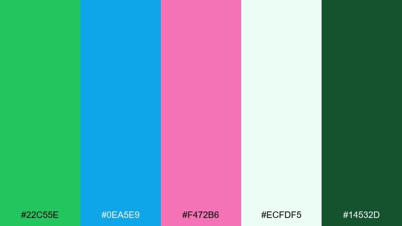
HEX: #22C55E #0EA5E9 #F472B6 #ECFDF5 #14532D
Mood: lively, botanical, bright
Best for: watercolor floral illustration
Lively botanical greens and clear sky blues pop against a playful pink bloom. Keep the green as your leaf mass, then use blue for shadowed petals or background washes. Pink is strongest when concentrated in focal flowers rather than spread everywhere. For balance, add plenty of pale minty negative space so the illustration stays light.
Image example of botanical pop generated using media.io

16) Studio Pastel Punch

HEX: #63E6BE #74C0FC #FAA2C1 #FFF7FA #1C1F26
Mood: clean, trendy, studio-bright
Best for: cosmetics packaging label
Clean studio pastels with a punchy pink accent feel trendy and editorial. Let the light blush serve as the label base so product names stay readable. Use blue for ingredient sections and teal for secondary marks like vegan or cruelty-free. A thin black type treatment keeps everything sharp and premium.
Image example of studio pastel punch generated using media.io
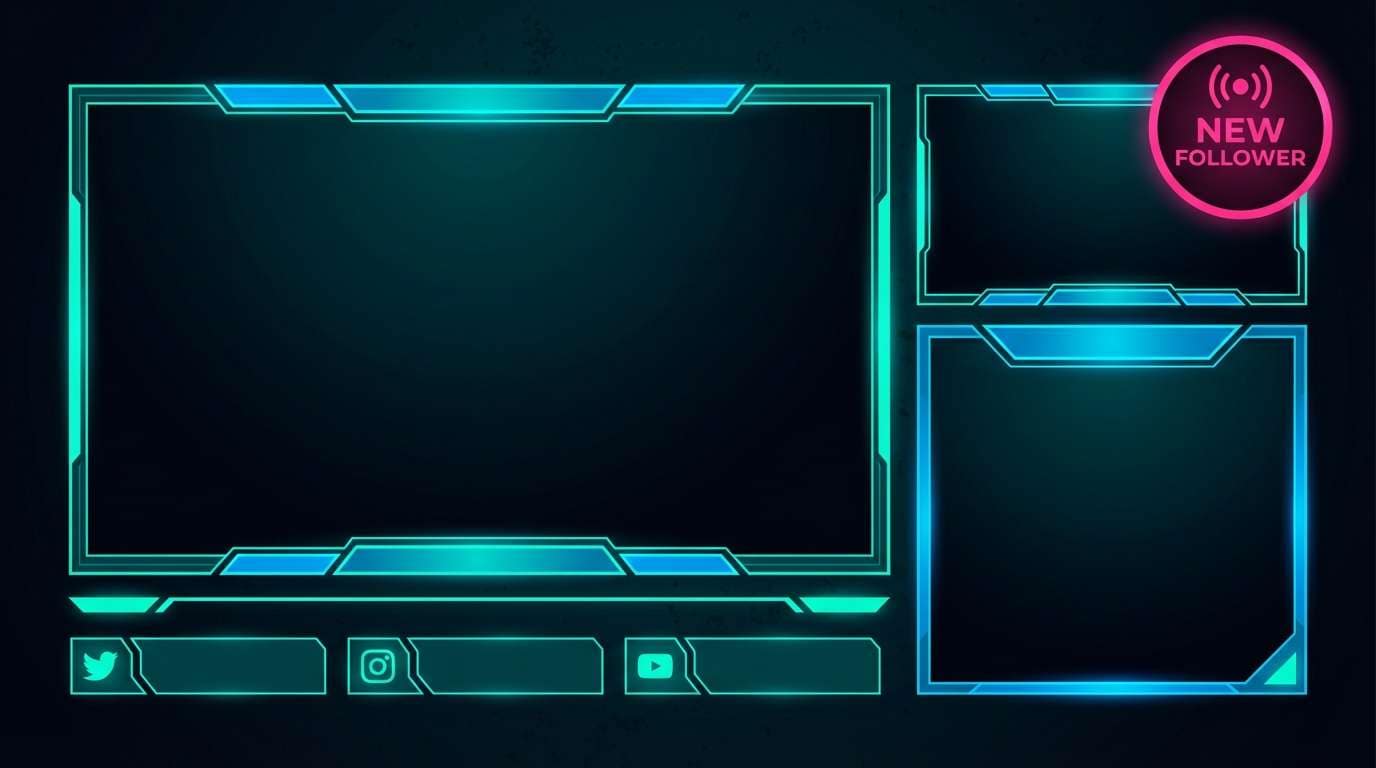
17) Neon Aquarium
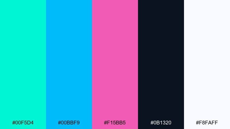
HEX: #00F5D4 #00BBF9 #F15BB5 #0B1320 #F8FAFF
Mood: neon, futuristic, nightlife
Best for: gaming stream overlay
Neon aquarium vibes feel futuristic and a little nocturnal, perfect for high-energy screens. Use the deep near-black as your base layer so the teal and blue glow naturally. Pink can mark live alerts, new followers, or the active scene label. Keep strokes thick and shapes simple to avoid color fringing on video.
Image example of neon aquarium generated using media.io
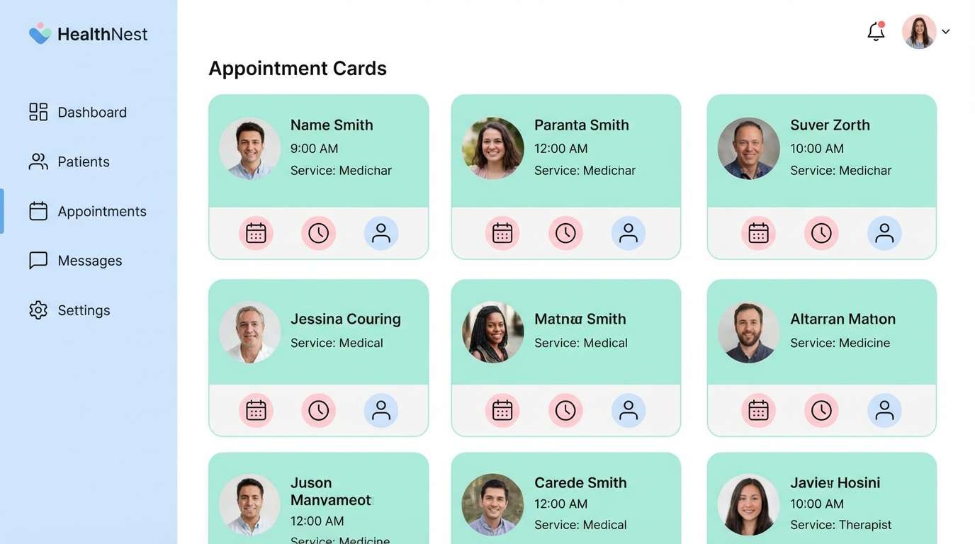
18) Calm Clinic UI
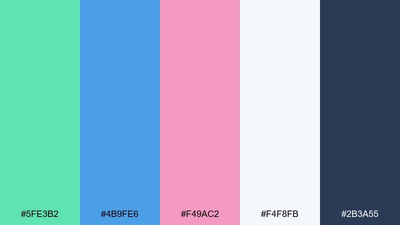
HEX: #5FE3B2 #4B9FE6 #F49AC2 #F4F8FB #2B3A55
Mood: reassuring, clinical, calm
Best for: healthcare web app UI
Reassuring clinic calm comes from the soft blue foundation and gentle mint support. The pink reads as a humane touch, great for appointment highlights or friendly empty states. If you want a green blue pink color scheme that still feels professional, keep pink under 10 percent of the interface. Use the slate for headings and ensure form fields sit on the cool gray background for clarity.
Image example of calm clinic ui generated using media.io
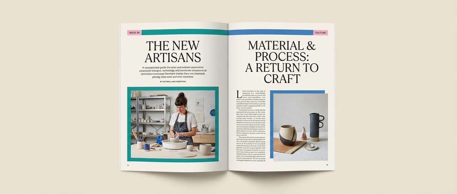
19) Editorial Spring Spread
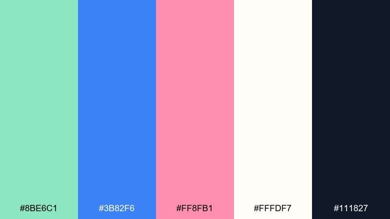
HEX: #8BE6C1 #3B82F6 #FF8FB1 #FFFDF7 #111827
Mood: editorial, bright, refined
Best for: magazine layout
Bright spring freshness feels refined when you balance the saturated blue with lots of warm paper-white. Teal can run through pull quotes and small rules, while pink works best for section tabs and page numbers. These green blue pink color combinations look especially sharp with serif headlines and minimal photo borders. Keep one dominant accent per spread so the design stays editorial, not playful.
Image example of editorial spring spread generated using media.io
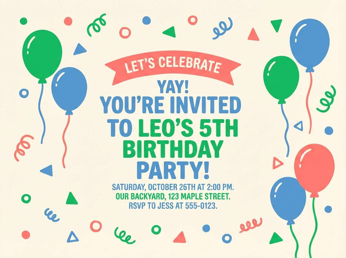
20) Kids Party Confetti

HEX: #4ADE80 #60A5FA #FB7185 #FFF7ED #1F2937
Mood: cheerful, kid-friendly, bright
Best for: birthday party invitation
Cheerful confetti energy comes through with bright green, friendly blue, and a coral-pink accent. Use the warm cream as the base so the colors feel welcoming rather than harsh. Keep text in dark gray and reserve the brightest tones for balloons, dots, and big headers. For a playful touch, add simple cut-paper shapes and limit outlines to avoid busy pages.
Image example of kids party confetti generated using media.io
21) Harbor Blossom
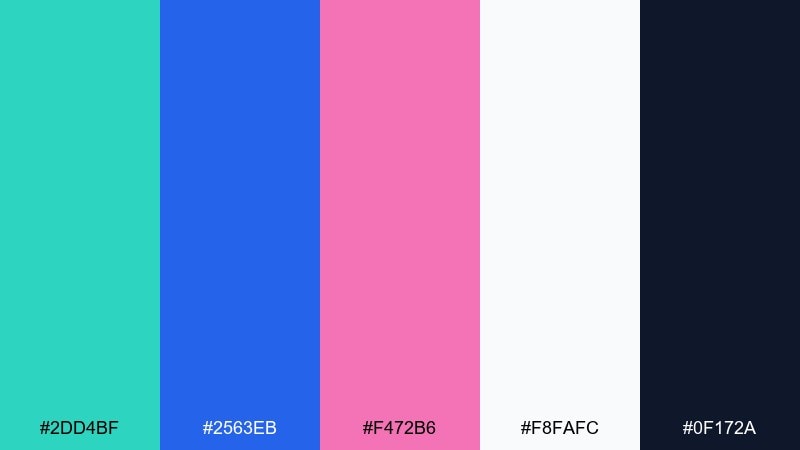
HEX: #2DD4BF #2563EB #F472B6 #F8FAFC #0F172A
Mood: fresh, nautical, polished
Best for: restaurant menu design
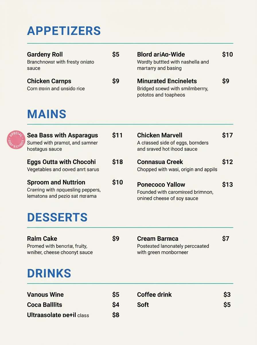
Nautical harbor blues feel polished, while blossom pink adds a modern, welcoming note. Keep the background near-white for readability and use teal for dividers and small icons. Blue works well for headings and prices, with pink reserved for specials or seasonal callouts. A simple two-column structure and generous line spacing will keep the menu easy to scan.
Image example of harbor blossom generated using media.io
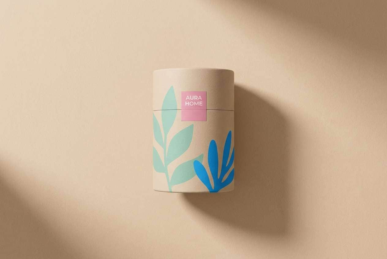
22) Aqua Rose Clay
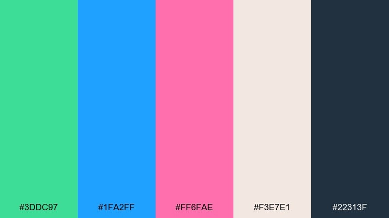
HEX: #3DDC97 #1FA2FF #FF6FAE #F3E7E1 #22313F
Mood: modern, warm-cool balance, stylish
Best for: home decor product ad
A stylish warm-cool balance pairs aqua tones with a rosy accent and a clay-like neutral. These green blue pink color combinations feel more grown-up when you keep the clay as the dominant surface. Use blue for headings and teal for supporting shapes, then drop in pink as a small focal point. In photography, choose matte textures like ceramic or linen so the colors look premium.
Image example of aqua rose clay generated using media.io
What Colors Go Well with Green Blue Pink?
Neutrals are your best stabilizers: white, off-white, and cool light grays keep green/blue surfaces feeling clean, while charcoal or navy makes body text accessible. If your pink is bright, a darker neutral (near-black) helps it look intentional instead of candy-like.
For extra depth, add a “bridge” tone that connects green and pink—like mauve, dusty rose, or a muted plum—especially in editorial layouts. Warm clay, sand, or creamy beige can also make the palette feel more premium and less techy.
If you want higher energy, a small hit of neon yellow or bright orange can work as a micro-accent, but keep it rare (icons, tags, tiny badges) so it doesn’t compete with the pink CTA.
How to Use a Green Blue Pink Color Palette in Real Designs
Build hierarchy first: pick one dominant background family (often blue or a pale mint), then choose one supporting color for components (teal/green for cards, charts, or dividers). Use pink last, mainly for a single action or highlight per screen/spread.
For UI, keep contrast predictable: dark slate/navy for text, soft neutrals for surfaces, and reserve saturated blue/teal for interactive states like links and hovers. Pink performs best for primary buttons, key alerts, or one “hero metric” callout.
For print, test how the pink reproduces on your chosen paper (coated vs uncoated) and consider a restrained ink coverage strategy: large pale backgrounds, smaller saturated blocks, and plenty of spacing to prevent muddiness.
Create Green Blue Pink Palette Visuals with AI
If you’re pitching a client or iterating fast, it helps to see the palette in context (UI screens, posters, packaging, brand boards) instead of isolated swatches. With AI mockups, you can validate balance, contrast, and “where the pink goes” before committing.
Start with one palette above, then generate a few variations by changing the background neutral or swapping the pink intensity (blush vs fuchsia). Keep your prompt specific about layout type, lighting style, and “no device frame” if you want clean design-only outputs.
Green Blue Pink Color Palette FAQs
-
How do I keep green blue pink from looking too “kids” or candy-like?
Use a deep neutral (navy/charcoal) for typography, add a soft off-white background, and limit pink to one clear role (usually the primary CTA or a single highlight). Muted greens/blues also push the palette toward modern and premium. -
Which color should be dominant in a green blue pink UI palette?
Most interfaces work best when blue or a pale neutral is dominant, green/teal supports secondary components, and pink is reserved for emphasis. This keeps the visual system calm while still making key actions stand out. -
What’s a safe ratio for using pink in a professional design?
A common guideline is keeping pink under about 10% of the composition, especially in healthcare, finance, or SaaS UI. Use it where you want attention, not as a large background area. -
What text color works best on bright teal/blue backgrounds?
In many of these palettes, deep navy or near-black (#0F172A to #111827 range) stays readable and consistent. Always check contrast for accessibility, especially for small labels and UI controls. -
Can I use green blue pink for print like flyers or menus?
Yes—choose a light background (off-white, blush, or cool gray) for readability and use saturated colors in smaller blocks. Print a quick proof if possible, since pinks can shift depending on paper and ink coverage. -
What extra color pairs well with green blue pink as a fourth accent?
Warm clay/beige adds a premium, home-decor feel, while mauve/plum can add depth for editorial layouts. If you want a high-energy look, a tiny neon yellow micro-accent can work, but keep it minimal. -
How can I quickly visualize these palettes in real layouts?
Generate mockups with an AI text-to-image tool using prompts that specify the layout type (dashboard, poster, packaging) and your dominant/background color. Then iterate by adjusting only one variable at a time (pink intensity, background neutral, or contrast level).
Next: Fantasy Color Palette


