

Celadon is that modern “soft green” sweet spot: airy enough for clean layouts, but grounded enough to feel premium and calm. It’s a go-to for brands and spaces that want freshness without loud saturation.
Below are 20 celadon color palette combinations with HEX codes, plus practical pairing tips and AI prompts you can reuse for quick mockups, branding boards, and UI concepts.
In this article
- Why Celadon Color Combinations Work So Well
-
- misty ceramic
- sage and sandstone
- sea glass brunch
- antique jade studio
- minted linen
- tea garden calm
- coastal celadon
- modern apothecary
- eucalyptus office
- verdigris accent
- clay pottery
- rainy atrium
- garden typeface
- soft concrete
- spring herbarium
- nordic kitchen
- botanical poster
- calm wellness ui
- celadon noir
- sunlit patio
- What Colors Go Well with Celadon?
- How to Use Celadon Color Combinations in Real Designs
- Create Celadon Palette Visuals with AI
Why Celadon Color Combinations Work So Well
Celadon sits between mint and sage, so it reads as clean and contemporary while still feeling natural. That “quiet green” energy makes designs feel breathable, especially when paired with off-whites and light neutrals.
Because celadon is muted, it plays nicely with both warm and cool accents. You can push it coastal with sandy beiges, make it editorial with brass-gold tones, or turn it luxe by anchoring it with near-black greens.
From a usability perspective, celadon palettes are easy to build into clear hierarchies: pale tints for backgrounds, mid greens for components, and deep greens for text, icons, and contrast states.
20+ Celadon Color Palette Ideas (with HEX Codes)
1) Misty Ceramic
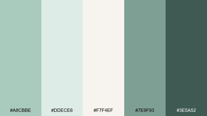
HEX: #A8CBBE #DDECE6 #F7F4EF #7E9F93 #3E5A52
Mood: quiet, clean, spa-like
Best for: ceramic product ad
Quiet and porcelain-soft, these misty greens feel like a glazed cup cooling on a windowsill. The light neutrals keep the look airy, while the deep green anchors headlines and shadows. Use it for skincare, ceramics, or lifestyle ads where you want calm trust without looking bland. Tip: let the off-white carry most of the space, then add the darker green only for contrast and legibility.
Image example of misty ceramic generated using media.io

Media.io is an online AI studio for creating and editing video, image, and audio in your browser.

2) Sage and Sandstone

HEX: #A2C7B4 #CBBBA0 #F3E8D7 #6B7D63 #2F3A33
Mood: earthy, balanced, grounded
Best for: rustic living room interior
Earthy and sun-warmed, this celadon mix feels like sage leaves against sandy stone. The beige and cream tones soften the greens and keep the palette welcoming in larger spaces. It works beautifully for cozy interiors, café branding, and packaging that needs a natural story. Tip: repeat the sandstone tone in textiles to tie green accents together.
Image example of sage and sandstone generated using media.io

3) Sea Glass Brunch

HEX: #B3D7CB #E8F5F1 #FFE9D6 #8FB2A6 #E3B7A0
Mood: fresh, friendly, coastal
Best for: brunch cafe menu design
Fresh and breezy, these celadon tones look like sea glass beside a peachy sunrise. The pale mint and foam colors are perfect for clean layouts, while the blush accent adds appetite and warmth. Use it for café menus, spring social posts, and hospitality branding that should feel light and inviting. Tip: keep the blush as a small highlight for prices or calls to action.
Image example of sea glass brunch generated using media.io

4) Antique Jade Studio

HEX: #9FC6B8 #6F9689 #2E4C45 #E2D8C7 #B48C6A
Mood: heritage, crafted, museum-like
Best for: artisan brand identity
Heritage-rich and slightly smoky, these celadon color combinations evoke antique jade under gallery lights. The deep forest tone gives you serious contrast, while the warm clay accent keeps it handmade rather than corporate. For an artisan brand identity, this celadon color palette shines on labels, stamps, and packaging sleeves. Tip: pair the darkest green with the parchment neutral for logos to keep fine details crisp.
Image example of antique jade studio generated using media.io

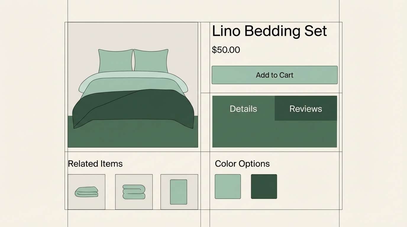
5) Minted Linen

HEX: #B8DCCF #F1F0EA #D6C7B8 #86A99A #556B63
Mood: soft, minimalist, airy
Best for: minimalist bedding product page
Soft and breathable, these celadon tones feel like freshly pressed linen with a hint of mint. The warm taupe keeps the greens from turning icy, making it a great fit for home goods and calm ecommerce layouts. Use the mid green for buttons and icons, then reserve the deep green for hover states or key labels. Tip: avoid pure black text and use the deeper green for a gentler read.
Image example of minted linen generated using media.io
6) Tea Garden Calm

HEX: #A9D0C0 #CFE7DD #F6F1E8 #9A8F78 #5B6E63
Mood: soothing, mindful, botanical
Best for: tea packaging design
Soothing and herbal, this celadon color scheme reads like steam rising from a quiet tea garden. The creamy base keeps it approachable, while the olive-taupe adds a grounded, organic note. It works especially well for tea tins, wellness labels, and calm blog headers. Tip: use the taupe as a secondary text color to maintain a natural, paper-like feel.
Image example of tea garden calm generated using media.io

7) Coastal Celadon

HEX: #A6CFC3 #6FA79B #2F6B66 #F2E6D2 #C9A27C
Mood: relaxed, nautical, sun-faded
Best for: beach house exterior paint planning
Relaxed and sun-faded, these celadon color combinations feel like coastal shutters and weathered boardwalks. The tan and sand tones keep the palette warm, while the teal-leaning dark green brings crisp structure. Use it for exterior paint planning, travel branding, and airy landing pages. Tip: keep the mid green as the main field color and use the darkest shade for trim and navigation.
Image example of coastal celadon generated using media.io

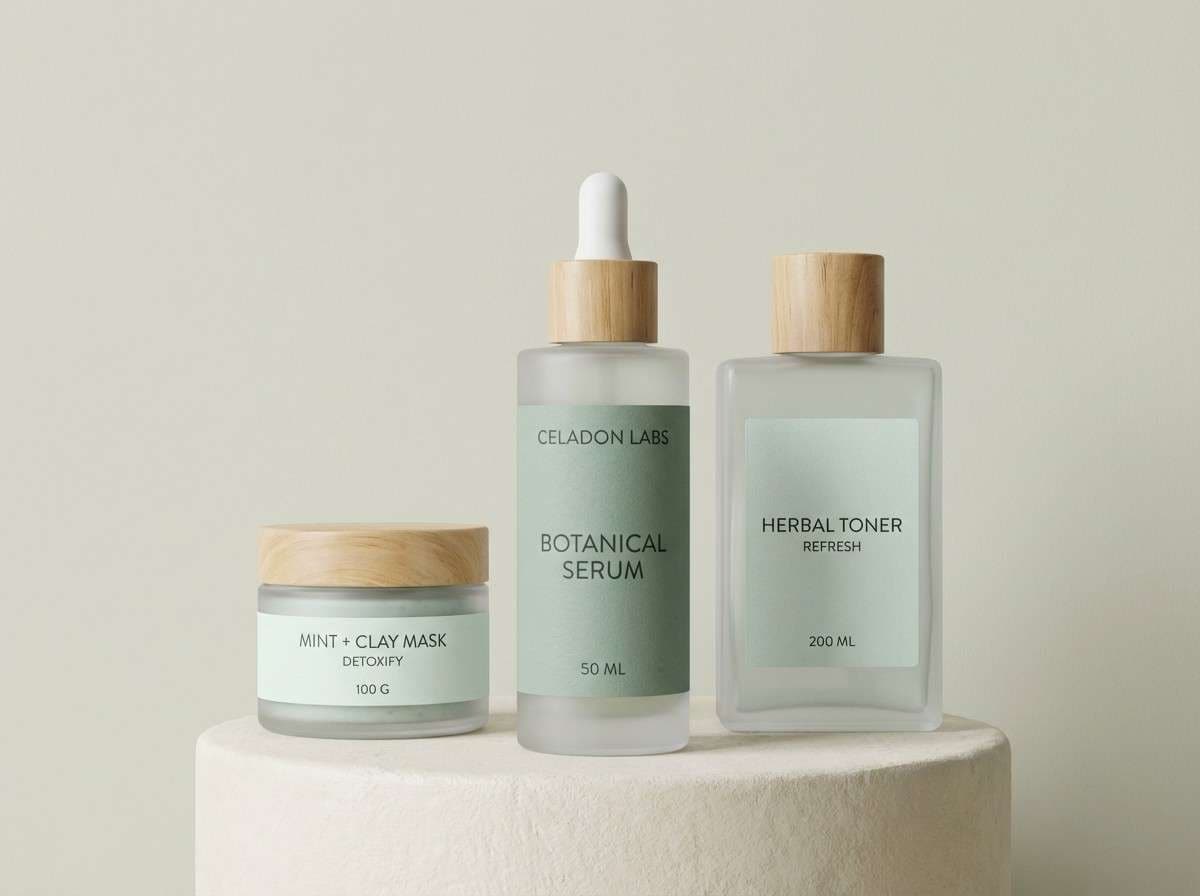
8) Modern Apothecary

HEX: #A3C8BA #D8E7E1 #F8F9F7 #6C7F79 #2B3532
Mood: clinical-calm, modern, trustworthy
Best for: skincare packaging and labels
Clinical-calm and modern, these cool greens suggest glass bottles, clean counters, and quiet confidence. The near-white and pale mint create an upscale base for minimal layouts. For skincare packaging and labels, this is an easy route to a refined celadon color combination that still feels human. Tip: print the darkest ink sparingly and let the pale tones do the heavy lifting for a premium look.
Image example of modern apothecary generated using media.io
9) Eucalyptus Office

HEX: #9EC3B1 #B9D7C9 #E6E2D9 #6D8D7F #3D4E47
Mood: focused, calm, professional
Best for: workspace UI dashboard
Focused and calm, these eucalyptus greens feel like a tidy desk and a clear plan. The warm gray-beige keeps charts and tables from looking too cold, while the darker green supports high-contrast data. Use it for workspace UI dashboards, productivity tools, and admin panels that should feel approachable. Tip: pick one green for interactive states and keep the rest as supportive background layers.
Image example of eucalyptus office generated using media.io

10) Verdigris Accent
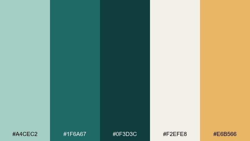
HEX: #A4CEC2 #1F6A67 #0F3D3C #F2EFE8 #E6B566
Mood: bold, artsy, confident
Best for: event poster design
Bold and artsy, these celadon hues feel like oxidized metal with a flash of golden light. The dark verdigris tones give dramatic contrast, while the soft neutral keeps the layout breathable. Use these celadon color combinations for event posters, album art, or campaigns that need energy without neon. Tip: treat the gold as a single spotlight color for dates, tickets, or key icons.
Image example of verdigris accent generated using media.io

11) Clay Pottery

HEX: #A7CDBF #E8E0D6 #C86F4A #8B9B8F #3D5047
Mood: handmade, warm, rustic-modern
Best for: pottery workshop flyer
Handmade and warm, these celadon colors evoke clay-dusted hands and soft studio light. The terracotta accent brings instant craft energy against the muted greens and parchment neutral. Use it for workshop flyers, maker markets, and small-batch product cards. Tip: place terracotta only on headers or badges so it reads as intentional, not noisy.
Image example of clay pottery generated using media.io

12) Rainy Atrium
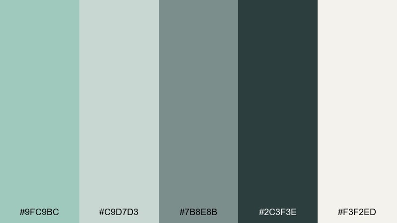
HEX: #9FC9BC #C9D7D3 #7B8E8B #2C3F3E #F3F2ED
Mood: moody, modern, reflective
Best for: architectural presentation slides
Moody and reflective, these celadon tones feel like a glass atrium on a rainy afternoon. The gray-green steps create clear hierarchy, from airy backgrounds to deep structural elements. Use it for architectural slide decks, proposals, and portfolios where images should stay the focus. Tip: keep the darkest shade for titles only and use the softer grays for body text blocks.
Image example of rainy atrium generated using media.io

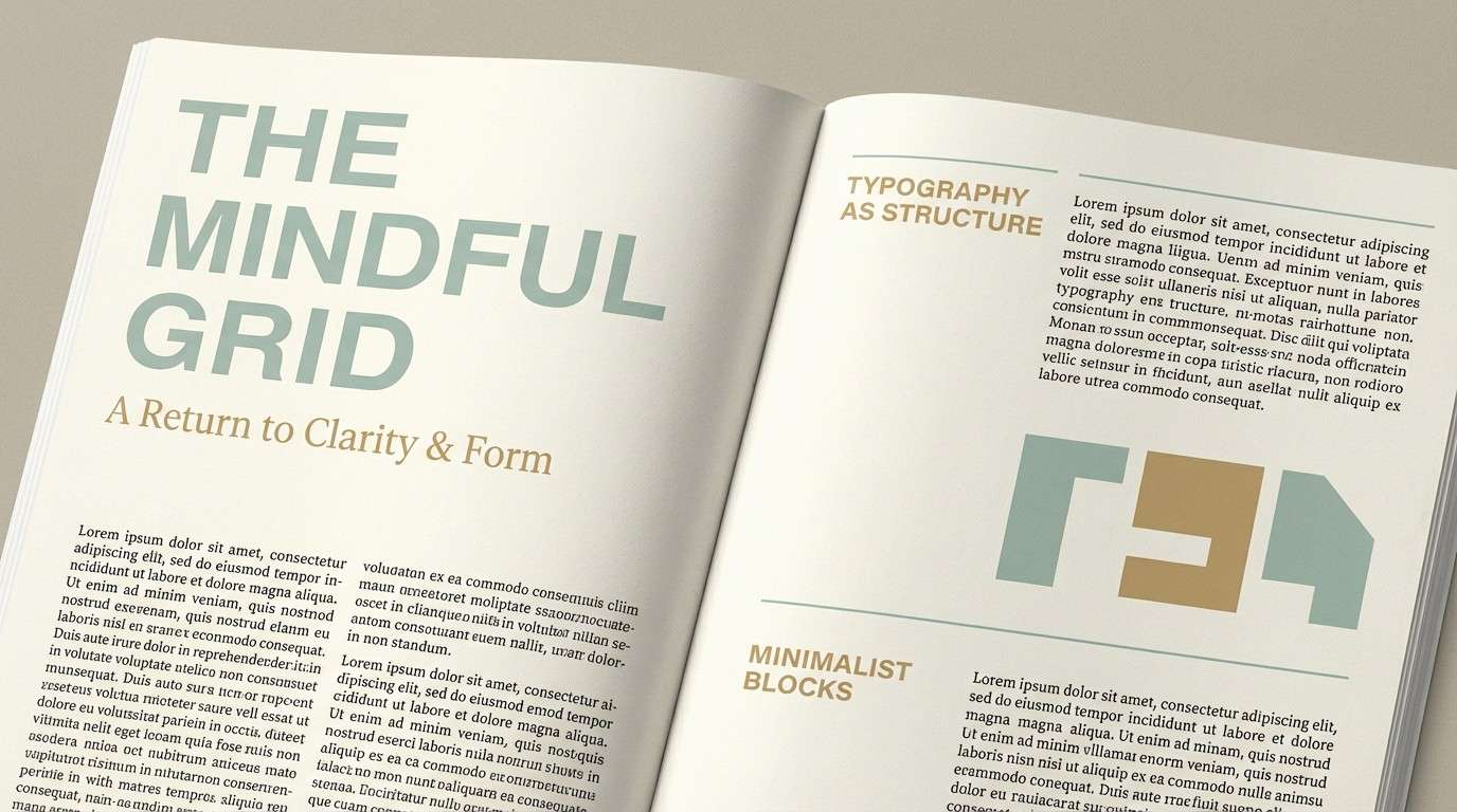
13) Garden Typeface
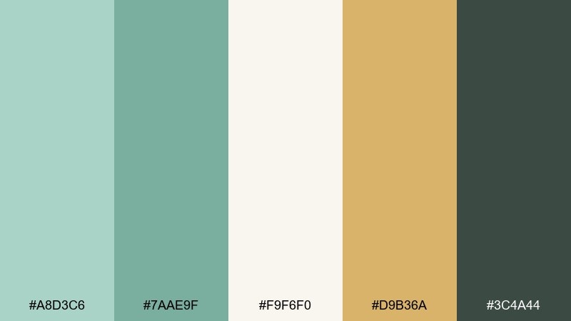
HEX: #A8D3C6 #7AAE9F #F9F6F0 #D9B36A #3C4A44
Mood: editorial, upbeat, boutique
Best for: magazine feature layout
Editorial and boutique, these greens look like fresh stems beside a warm brass bookmark. The cream background keeps type readable, while the gold-tan adds a refined highlight for pull quotes. It fits magazine features, lookbooks, and portfolio pages that need personality without clutter. Tip: use the darker green for body text instead of black to keep everything cohesive.
Image example of garden typeface generated using media.io
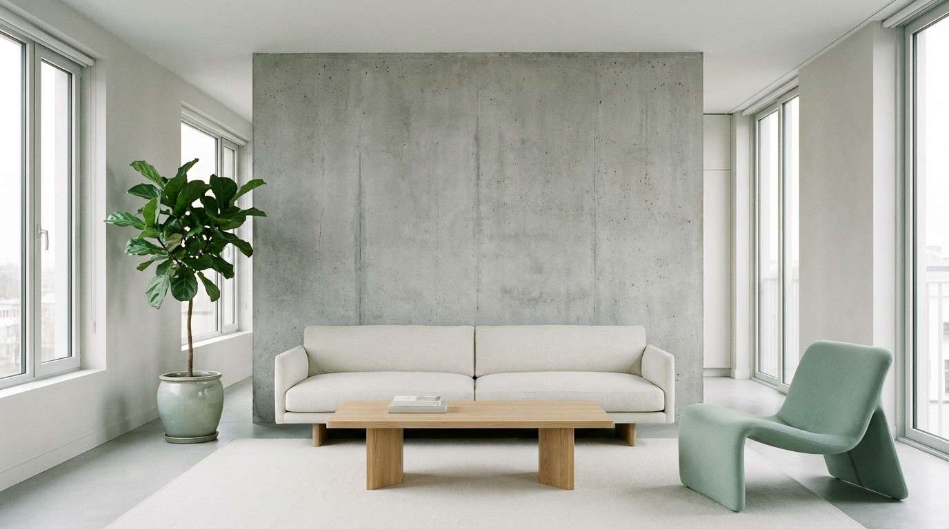
14) Soft Concrete
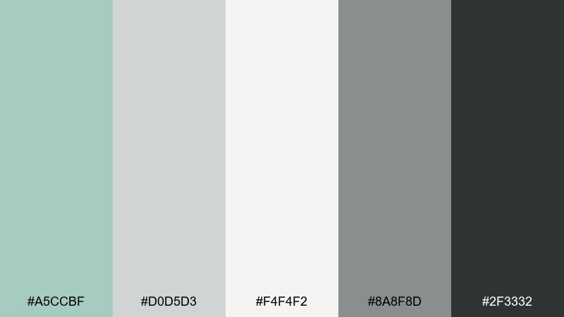
HEX: #A5CCBF #D0D5D3 #F4F4F2 #8A8F8D #2F3332
Mood: urban, neutral, understated
Best for: modern apartment interior styling
Urban and understated, these shades feel like softened concrete warmed by a muted green plant. The grays keep the palette mature and minimal, while the celadon tint prevents it from going sterile. Use it for modern apartment styling, tech branding, or calm hero sections with lots of whitespace. Tip: introduce texture through materials, not extra colors, to keep the look elevated.
Image example of soft concrete generated using media.io
15) Spring Herbarium
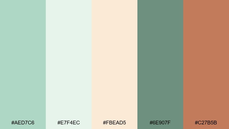
HEX: #AED7C6 #E7F4EC #FBEAD5 #6E907F #C27B5B
Mood: springtime, gentle, illustrated
Best for: botanical watercolor illustration
Springtime and gentle, these celadon colors feel like pressed leaves on creamy paper with a hint of clay. The pale greens create airy space, while the warmer accents make it feel handcrafted and nostalgic. Use it for botanical watercolor illustration, stationery, and seasonal posts. Tip: keep outlines in the darker green to stay soft and natural.
Image example of spring herbarium generated using media.io

16) Nordic Kitchen
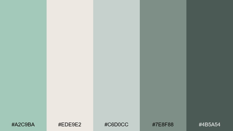
HEX: #A2C9BA #EDE9E2 #C6D0CC #7E8F88 #4B5A54
Mood: cozy-clean, nordic, functional
Best for: kitchen remodel moodboard
Cozy-clean and functional, this celadon color palette reads like a Nordic kitchen with painted cabinets and stone counters. The layered grays make the green feel modern and architectural, not overly cute. Use it for remodel moodboards, home renovation posts, and product catalogs. Tip: apply the lightest neutral to walls and keep the green for cabinetry or tile to avoid visual fatigue.
Image example of nordic kitchen generated using media.io

17) Botanical Poster

HEX: #A9D2C2 #F7F2E8 #E2C4A1 #6E8E83 #2A3F38
Mood: vintage-botanical, calm, gallery-ready
Best for: gallery wall art print
Vintage-botanical and calm, these tones suggest museum prints, dried petals, and soft paper edges. The warm beige pairs naturally with the greens, creating a balanced, collectible feel. Use it for gallery wall art prints, book covers, or brand posters with a timeless tone. Tip: keep the darkest green for small text and borders so the artwork stays airy.
Image example of botanical poster generated using media.io

18) Calm Wellness UI

HEX: #A6CEC0 #EAF3EF #FFFFFF #7C9D90 #22332E
Mood: light, reassuring, modern
Best for: meditation app UI
Light and reassuring, these celadon color combinations feel like a quiet breath and a clean morning. The near-white base makes screens feel open, while the darker greens keep accessibility strong. Use it for a meditation app UI, health portals, or onboarding flows that should reduce anxiety. Tip: reserve the darkest green for primary text and use the mid green for active toggles and progress.
Image example of calm wellness ui generated using media.io

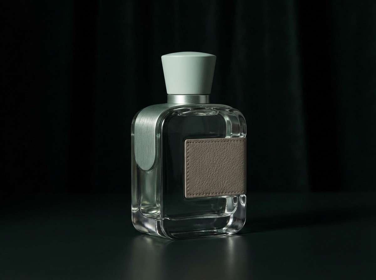
19) Celadon Noir

HEX: #9CC7B7 #D7E6E0 #1A1F1E #5D746B #BFAF9A
Mood: dramatic, cinematic, upscale
Best for: luxury fragrance ad
Dramatic and cinematic, these hues look like celadon glass against a dark evening backdrop. The black-green base makes the lighter mint and taupe feel expensive and intentional. This celadon color palette works well for luxury fragrance ads, premium landing pages, and packaging that needs contrast. Tip: keep backgrounds dark and add the pale mint as a glow highlight around the product silhouette.
Image example of celadon noir generated using media.io
20) Sunlit Patio

HEX: #A8D1C3 #FCEFD9 #F7C7A1 #79A394 #2F4C45
Mood: sunny, social, relaxed
Best for: summer party invitation
Sunny and social, these celadon color combinations feel like a late-afternoon patio with citrus drinks and soft shade. The creamy yellow brightens the greens, while the peach adds a friendly, celebratory note. Use this celadon color combination for summer party invitations, seasonal promos, and cheerful email headers. Tip: put text on the cream tone and use peach only for RSVP buttons or small icons.
Image example of sunlit patio generated using media.io

What Colors Go Well with Celadon?
Celadon pairs beautifully with soft whites, warm creams, and light grays—these keep the look open and “spa-clean” while letting the green stay the hero. For a natural feel, add sand, taupe, or parchment neutrals.
If you want more punch, celadon also works with terracotta, clay, and peach accents for a handcrafted warmth. For a premium or cinematic direction, anchor it with deep forest, charcoal-green, or near-black and use celadon as a glow-like highlight.
Metallic-inspired hues (gold-tan, brass, warm ochre) add editorial polish without competing. Keep the accent small and repeat it consistently across key touchpoints like buttons, dates, or pull quotes.
How to Use Celadon Color Combinations in Real Designs
Start by assigning roles: use the lightest tint for backgrounds, a mid celadon for surfaces and components, and the darkest green for text, icons, and dividers. This makes the palette feel intentional instead of “all the same green.”
In branding, celadon is strongest when balanced with a warm neutral (cream, sand, taupe) that prevents it from turning icy. In interiors, use celadon on larger elements (cabinetry, walls, upholstery) and keep deeper greens for trim, frames, or hardware-like details.
For UI, prioritize legibility: dark green text on off-white or pale mint reads softer than pure black, while still offering strong contrast. Use a single accent color (peach, gold, terracotta) for CTAs and status moments to avoid visual noise.
Create Celadon Palette Visuals with AI
If you already have HEX codes, the fastest way to validate a celadon color scheme is to generate a few concept visuals: a product ad, a UI screen, and a poster-style layout. You’ll quickly see whether your contrast and warmth levels feel right.
Reuse the prompts above, then swap subjects (packaging, interior, dashboard) to match your project. Keep lighting and background descriptions consistent so the palette does the talking.
Celadon Color Palette FAQs
-
What is celadon color?
Celadon is a muted, gray-leaning green often described as soft sage or sea-glass green. It’s calm, modern, and easy to pair with both warm neutrals and deep dark greens. -
What is a common celadon HEX code?
Celadon doesn’t have one single HEX, but popular celadon-like picks include #A8CBBE and #A6CEC0. Use lighter tints for backgrounds and deeper green shades for readable text and UI contrast. -
Does celadon work for branding?
Yes—celadon signals cleanliness, balance, and nature without feeling overly “eco” or loud. It’s especially effective for skincare, wellness, home goods, and boutique lifestyle brands. -
What colors go with celadon for a warm look?
Pair celadon with cream, sand, taupe, terracotta, or peach. Warm neutrals stop celadon from feeling cold and help it look more organic and inviting. -
What colors go with celadon for a modern, high-contrast look?
Use charcoal, deep forest green, or near-black as an anchor, then add pale celadon as highlights. This approach is great for luxury packaging, hero banners, and cinematic ads. -
Is celadon good for UI design and accessibility?
It can be, as long as you don’t rely on light celadon for text. Use dark green/charcoal for primary text and icons, and reserve pale celadon for backgrounds, cards, and subtle dividers. -
How do I create celadon palette mockups fast?
Generate quick visuals (product ads, posters, UI screens) using AI, then iterate by adjusting one accent color at a time. Media.io’s text-to-image tool makes it easy to test multiple celadon color combinations in minutes.
Next: Jungle Color Palette


