

A green maroon color palette blends nature-first calm (greens) with grounded drama (maroons), making it feel both timeless and intentional. It’s a go-to pairing when you want “earthy” without looking plain.
Below are 20 curated green and maroon combinations with HEX codes, plus practical tips for branding, UI, print, and décor—so you can pick a combination that fits your project’s tone fast.
In this article
- Why Green and Maroon Combinations Work So Well
-
- forest merlot
- moss and wine
- heritage tartan
- botanical burgundy
- vintage library
- cedar and cranberry
- garden dinner
- rustic vineyard
- modern chalet
- sage velvet
- artisan market
- evening conservatory
- classic winery label
- soft meadow merlot
- urban botanical ui
- holiday evergreen
- terra bistro
- muted orchard
- luxury spa retreat
- cabin candlelight
- What Colors Go Well with Green Maroon?
- How to Use a Green Maroon Color Palette in Real Designs
- Create Green Maroon Palette Visuals with AI
Why Green and Maroon Combinations Work So Well
Green and maroon sit in a “natural luxury” zone: green suggests growth, stability, and freshness, while maroon adds depth, tradition, and a premium finish. Together, they read sophisticated without feeling flashy.
Another reason this pairing works is contrast. Deep greens and wine-like reds create clear hierarchy for headlines, buttons, and focal elements, while creams and warm neutrals keep the palette breathable.
Finally, green maroon combinations are highly adaptable across seasons. Lean into evergreen and merlot for winter/holiday work, or shift toward sage and dusty wine for spring lifestyle, wellness, and editorial designs.
20+ Green Maroon Color Palette Ideas (with HEX Codes)
1) Forest Merlot
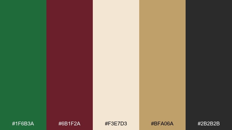
HEX: #1F6B3A #6B1F2A #F3E7D3 #BFA06A #2B2B2B
Mood: earthy, upscale, grounded
Best for: branding and logo systems
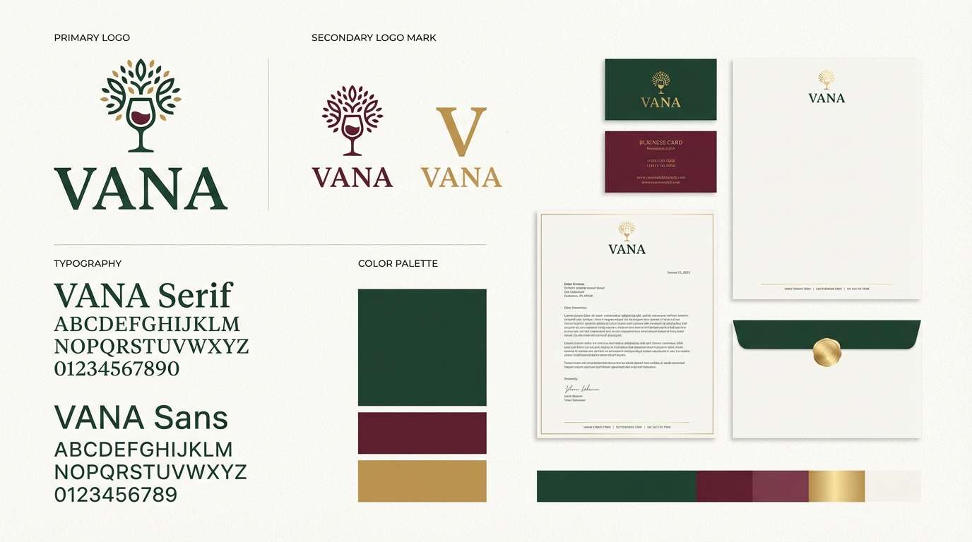
Earthy and upscale like a candlelit lodge with deep evergreens and a glass of merlot. Use it for premium branding, wine labels, or boutique packaging where contrast needs to feel refined. Pair the cream for breathing room and reserve the gold for small highlights like rules, icons, or foil accents. Tip: keep maroon for headlines and let green lead as the main field color to avoid heaviness.
Image example of forest merlot generated using media.io
Media.io is an online AI studio for creating and editing video, image, and audio in your browser.

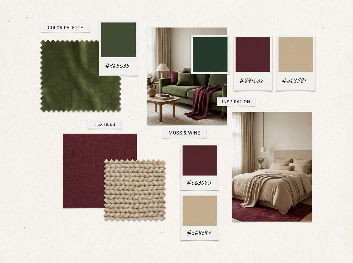
2) Moss and Wine
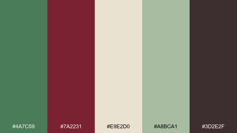
HEX: #4A7C59 #7A2231 #E9E2D0 #A8BCA1 #3D2E2F
Mood: soft, natural, cozy
Best for: home decor mood boards
Soft and natural, like moss on stone and a quiet sip of red wine at dusk. It works beautifully for interior styling guides, Pinterest mood boards, and cozy lifestyle content. Let the beige and sage do most of the surface area, then punctuate with the wine tone for focal points. Tip: use the deep cocoa shade for text so the palette stays warm instead of stark.
Image example of moss and wine generated using media.io
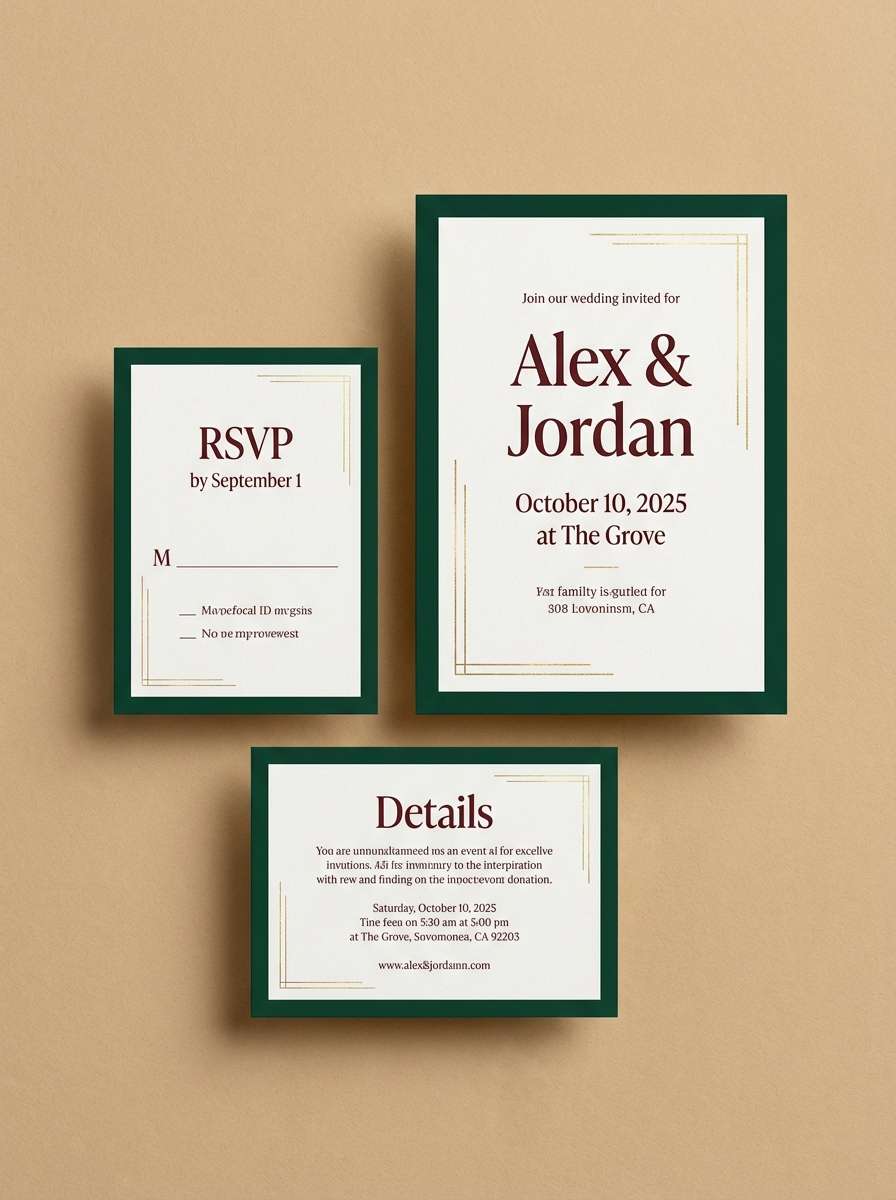
3) Heritage Tartan
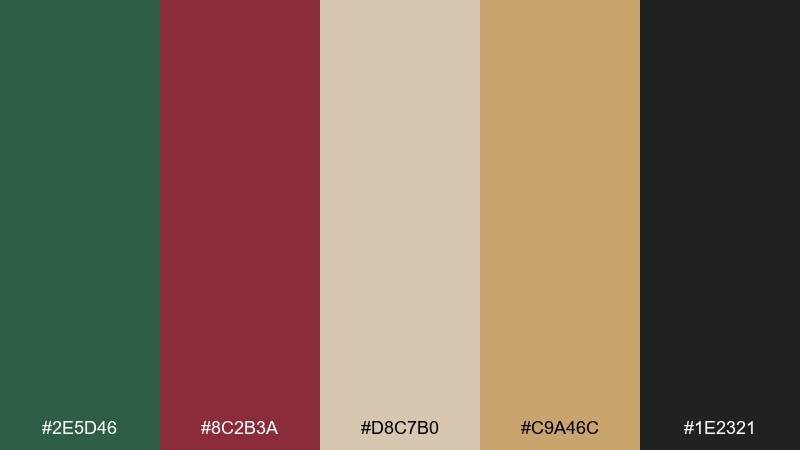
HEX: #2E5D46 #8C2B3A #D8C7B0 #C9A46C #1E2321
Mood: classic, autumnal, heritage
Best for: fall wedding invitations
Classic and autumnal, evoking tartan scarves, old oak, and brass details. This green and maroon color palette feels timeless on invitations, menus, and day-of signage, especially with textured paper. Keep the beige as the base, then use maroon for names and the deep green for borders or monograms. Tip: add gold only as a thin line or small motif so it reads elegant, not busy.
Image example of heritage tartan generated using media.io
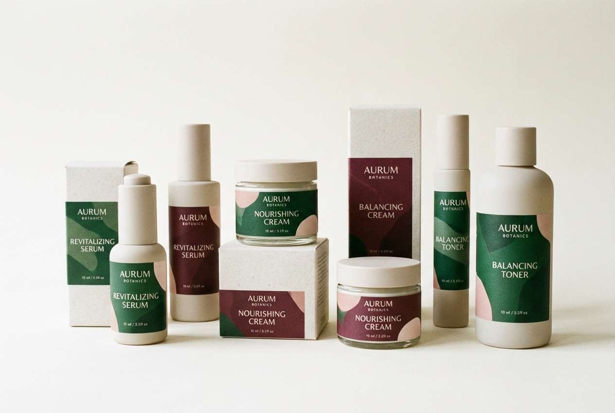
4) Botanical Burgundy
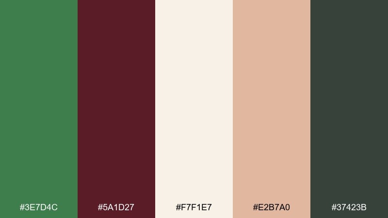
HEX: #3E7D4C #5A1D27 #F7F1E7 #E2B7A0 #37423B
Mood: romantic, botanical, calm
Best for: skincare packaging
Romantic and botanical, like pressed leaves beside a muted burgundy bloom. It suits skincare packaging, apothecary labels, and wellness brands that want calm sophistication. Use the ivory as the carton base, with green for botanical icons and burgundy for the product name. Tip: keep the blush tone for secondary panels or ingredient callouts to soften contrast.
Image example of botanical burgundy generated using media.io
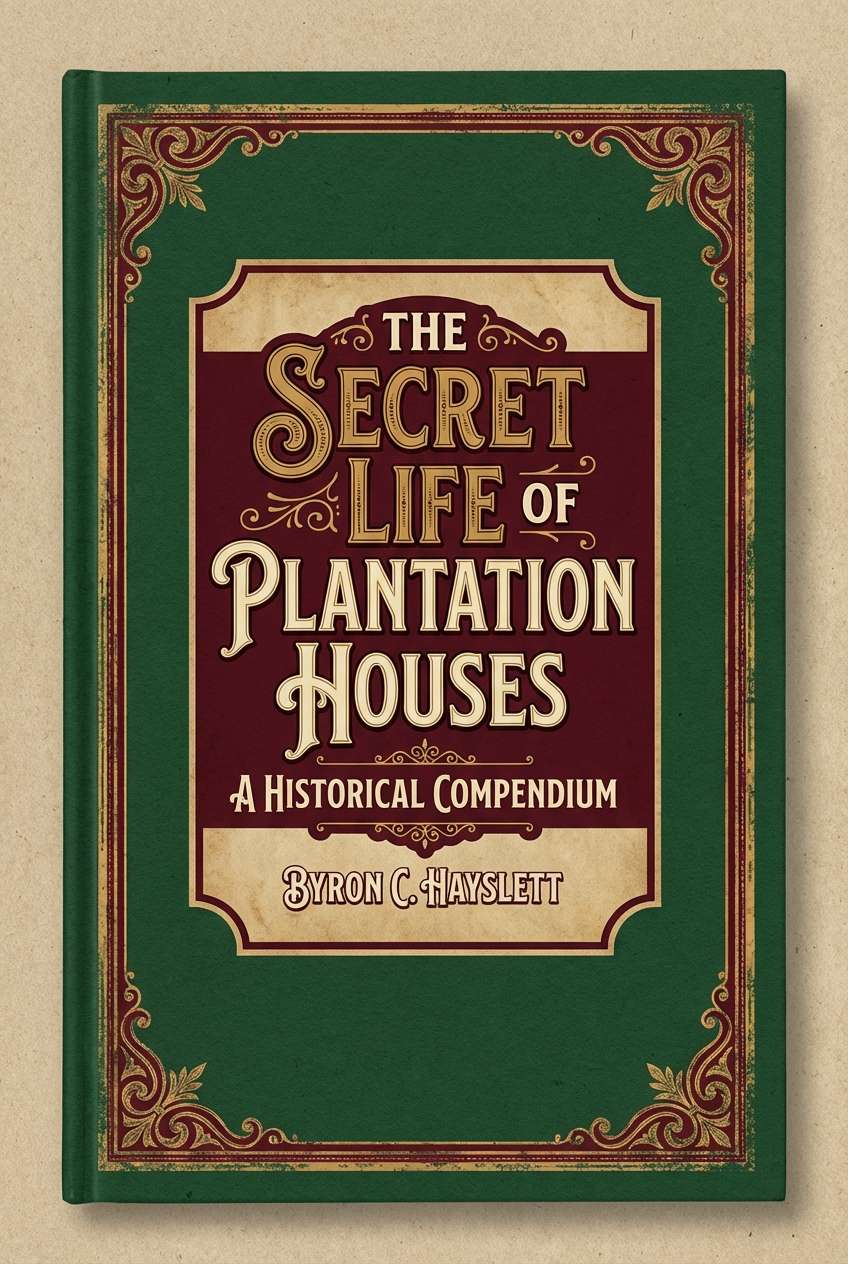
5) Vintage Library
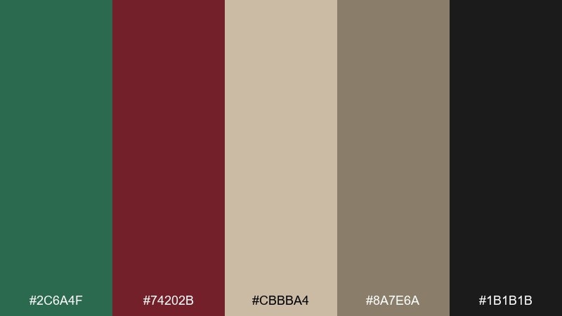
HEX: #2C6A4F #74202B #CBBBA4 #8A7E6A #1B1B1B
Mood: moody, scholarly, vintage
Best for: book cover designs
Moody and scholarly, like worn leather bindings and green reading lamps. These green maroon tones shine on book covers, posters for talks, and literary branding where depth matters. Let the tan and taupe create a paper-like ground, then set maroon for title blocks and green for ornamental frames. Tip: use near-black sparingly for author names and small typography to keep it readable.
Image example of vintage library generated using media.io
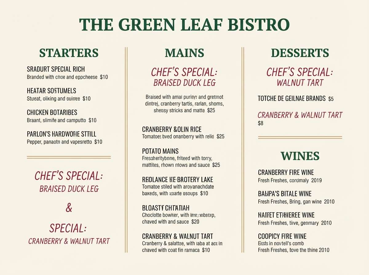
6) Cedar and Cranberry
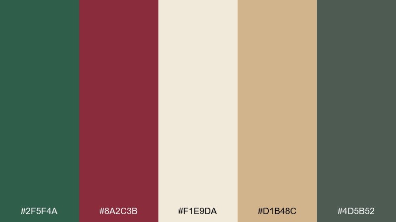
HEX: #2F5F4A #8A2C3B #F1E9DA #D1B48C #4D5B52
Mood: warm, rustic, inviting
Best for: restaurant menu design
Warm and rustic, like cedar planks and a cranberry glaze. It fits restaurant menus, coffee shop boards, and catering collateral that should feel handcrafted but polished. Use the cream for the menu background, then anchor headings in green and accent prices or specials with cranberry. Tip: keep the wood-toned tan for section dividers to guide the eye without clutter.
Image example of cedar and cranberry generated using media.io
7) Garden Dinner
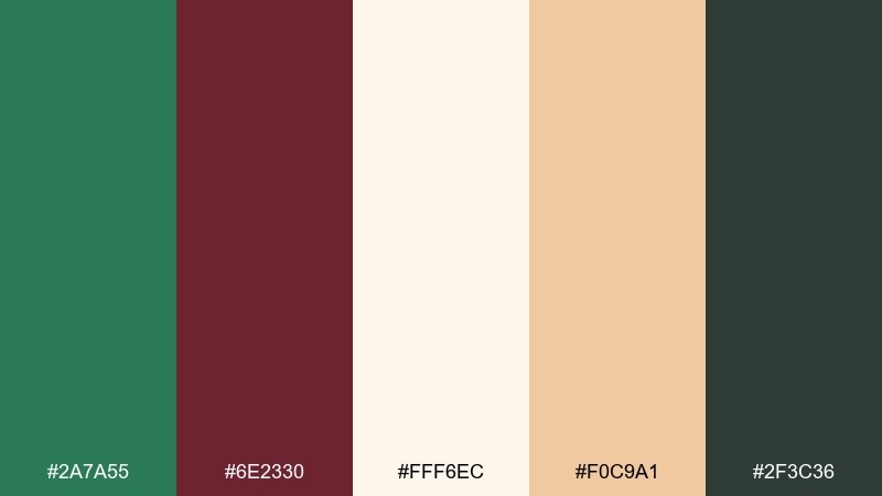
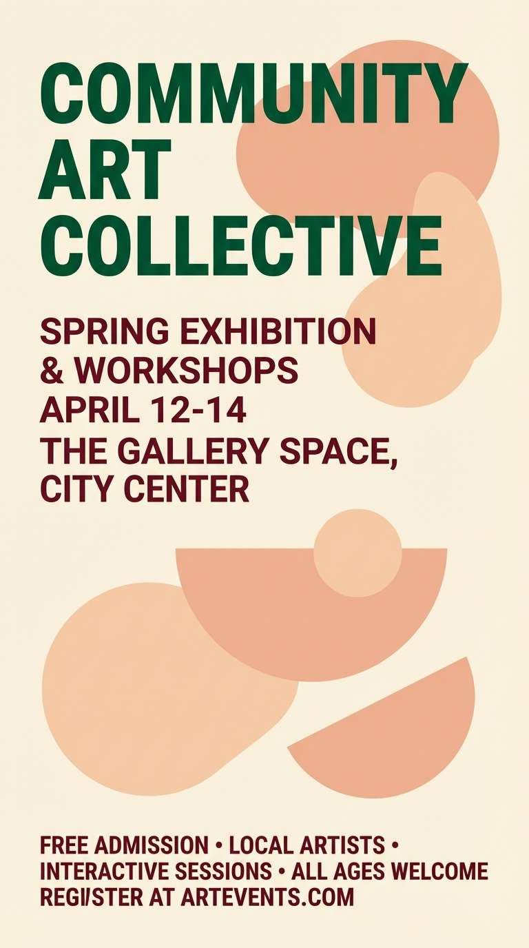
HEX: #2A7A55 #6E2330 #FFF6EC #F0C9A1 #2F3C36
Mood: festive, fresh, intimate
Best for: event flyers and posters
Festive and fresh, like a garden dinner under string lights with warm bread and herbs. This green and maroon color combination works well for event posters, wine tastings, and pop-up dinner announcements. Put the creamy tone behind the typography and use the peach as a soft spotlight shape to create hierarchy. Tip: keep the dark slate for body text so the maroon can stay reserved for key details like date and location.
Image example of garden dinner generated using media.io
8) Rustic Vineyard
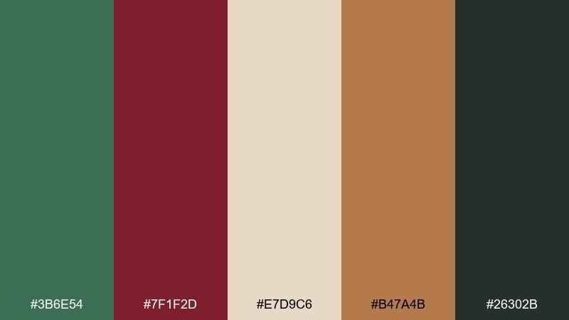
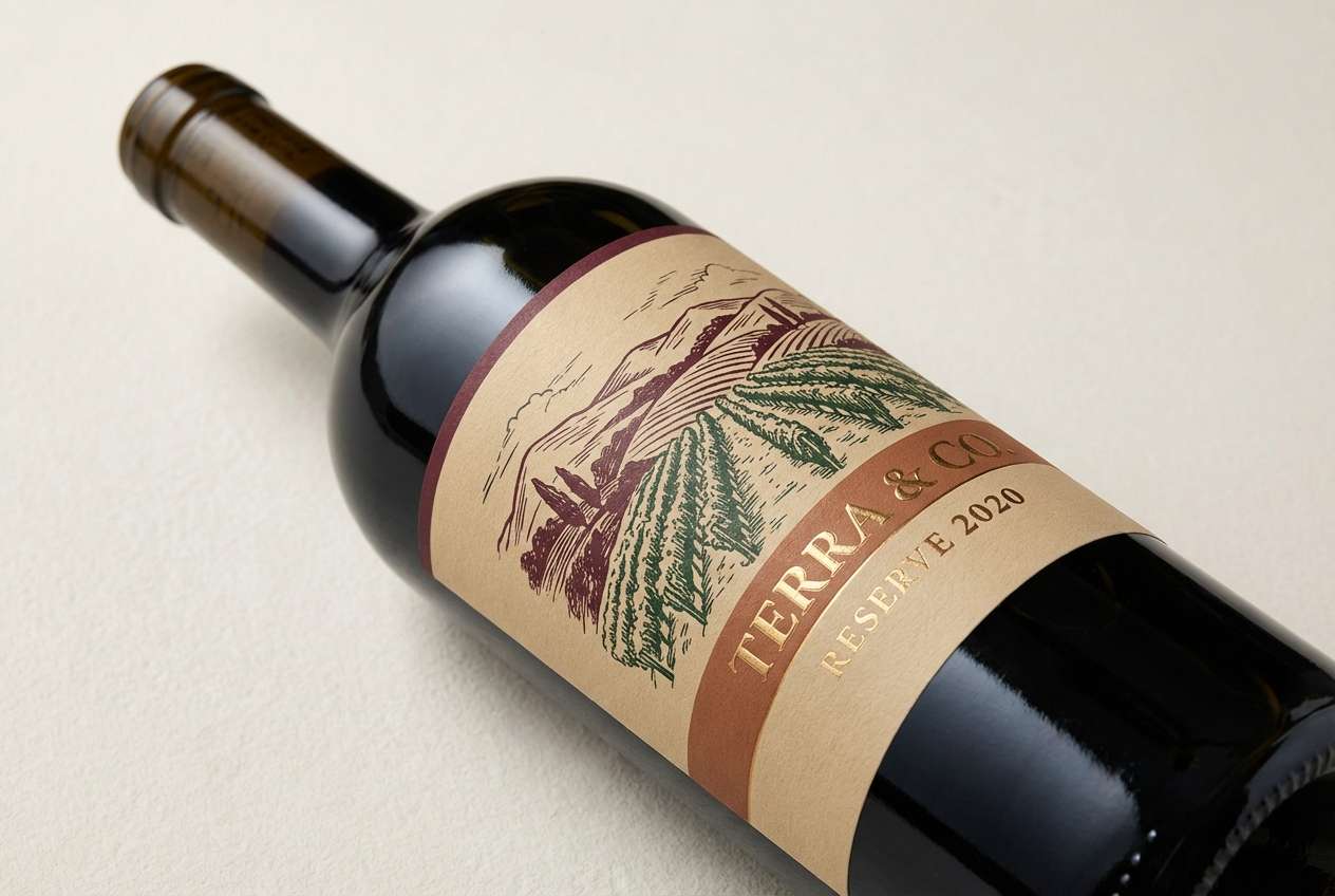
HEX: #3B6E54 #7F1F2D #E7D9C6 #B47A4B #26302B
Mood: bold, rustic, sunbaked
Best for: wine label designs
Bold and rustic, recalling vine rows, terracotta soil, and dark grapes. It is a strong fit for wine labels, craft beverage packaging, and tasting room signage. Use the sand tone as the label stock color, then place maroon for the varietal and green for vineyard cues or stamps. Tip: bring in the clay brown as a secondary band so the near-black can be saved for small text and barcodes.
Image example of rustic vineyard generated using media.io
9) Modern Chalet
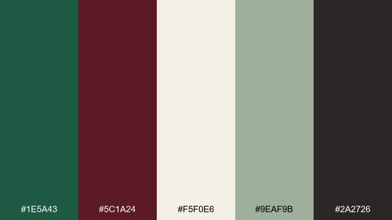
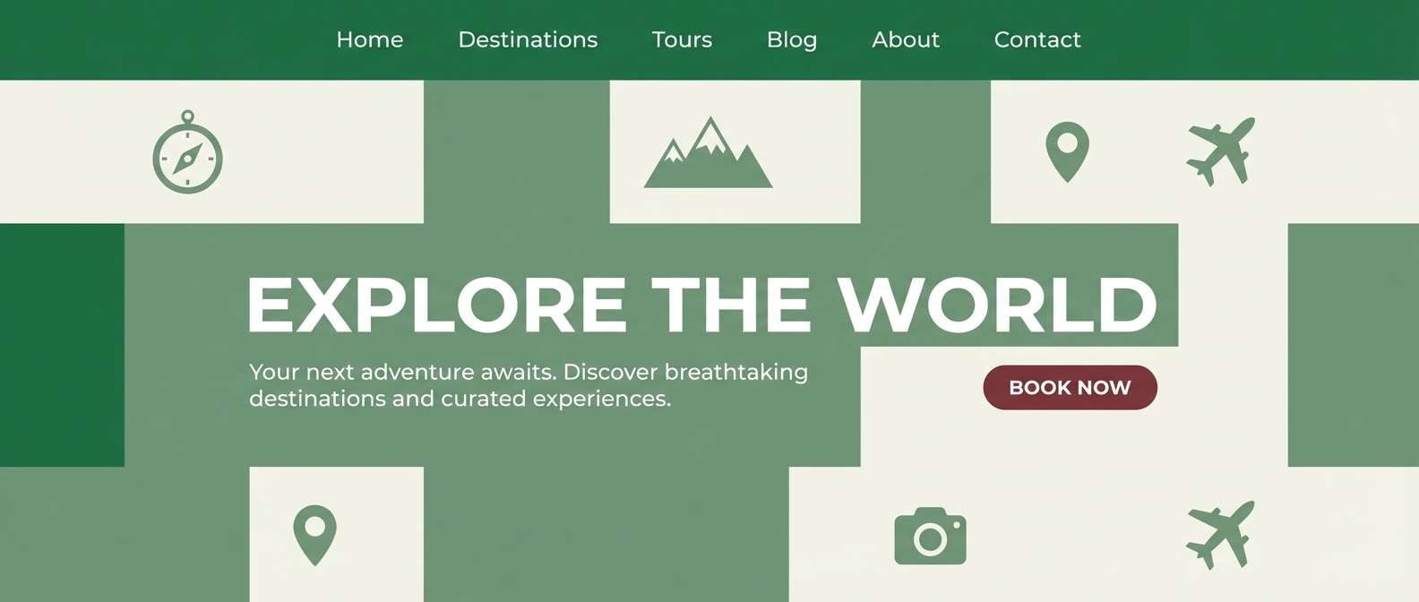
HEX: #1E5A43 #5C1A24 #F5F0E6 #9EAF9B #2A2726
Mood: clean, alpine, modern
Best for: travel blog headers
Clean and alpine, like a modern chalet with pine views and warm wood inside. Use this green and maroon color palette for travel blog headers, feature images, and site sections where you want a calm, outdoorsy vibe. Let the off-white and soft gray-green carry most of the layout, then add maroon as a compact badge or callout. Tip: avoid full maroon backgrounds here; it reads best as a punchy accent.
Image example of modern chalet generated using media.io
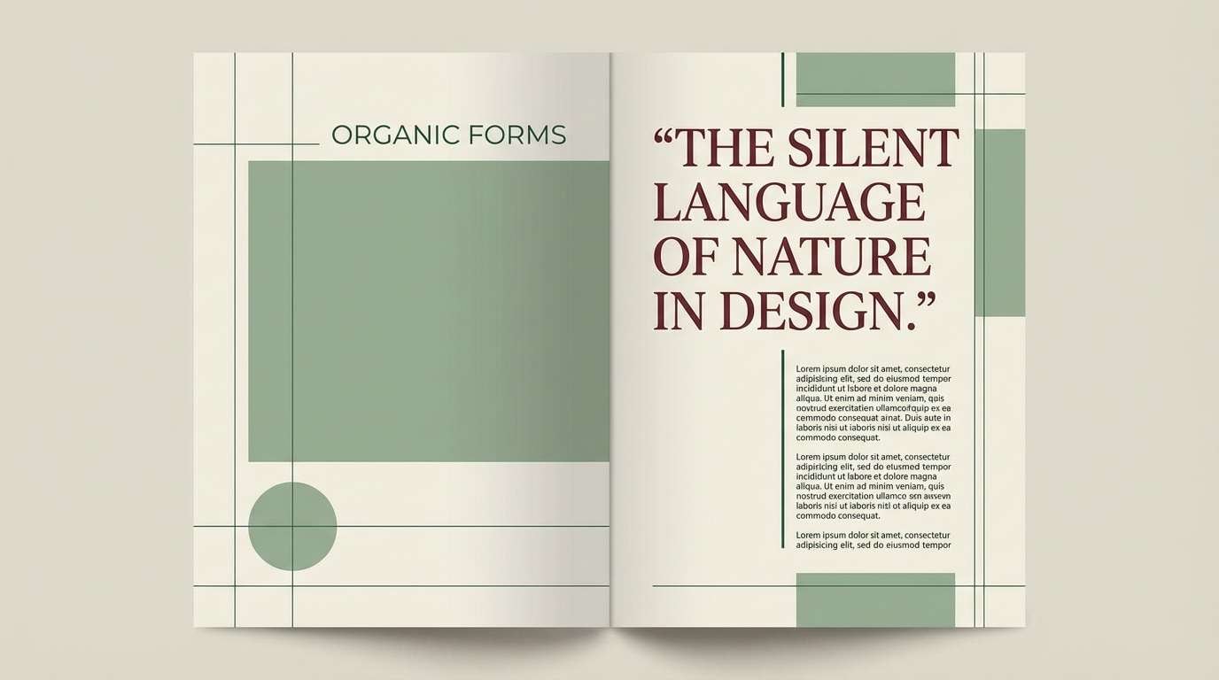
10) Sage Velvet
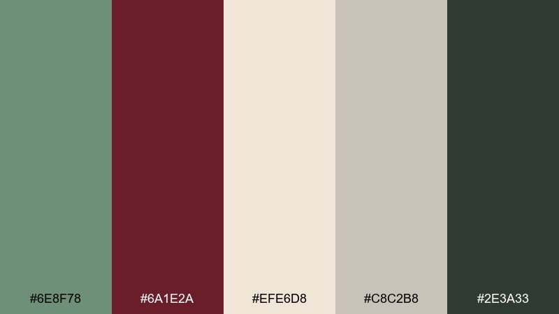
HEX: #6E8F78 #6A1E2A #EFE6D8 #C8C2B8 #2E3A33
Mood: muted, elegant, velvety
Best for: editorial magazine layouts
Muted and velvety, like sage upholstery and a deep wine lip tint. It is ideal for editorial spreads, lookbooks, and minimal product stories that need restrained drama. Use the cream for margins, the gray for grids, and let maroon carry pull quotes or section numbers. Tip: keep the darkest green for small caps and rules so pages feel structured, not heavy.
Image example of sage velvet generated using media.io
11) Artisan Market
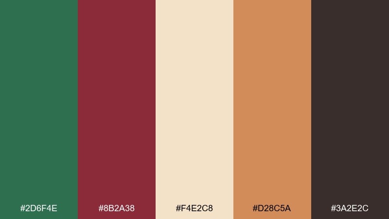
HEX: #2D6F4E #8B2A38 #F4E2C8 #D28C5A #3A2E2C
Mood: lively, handcrafted, warm
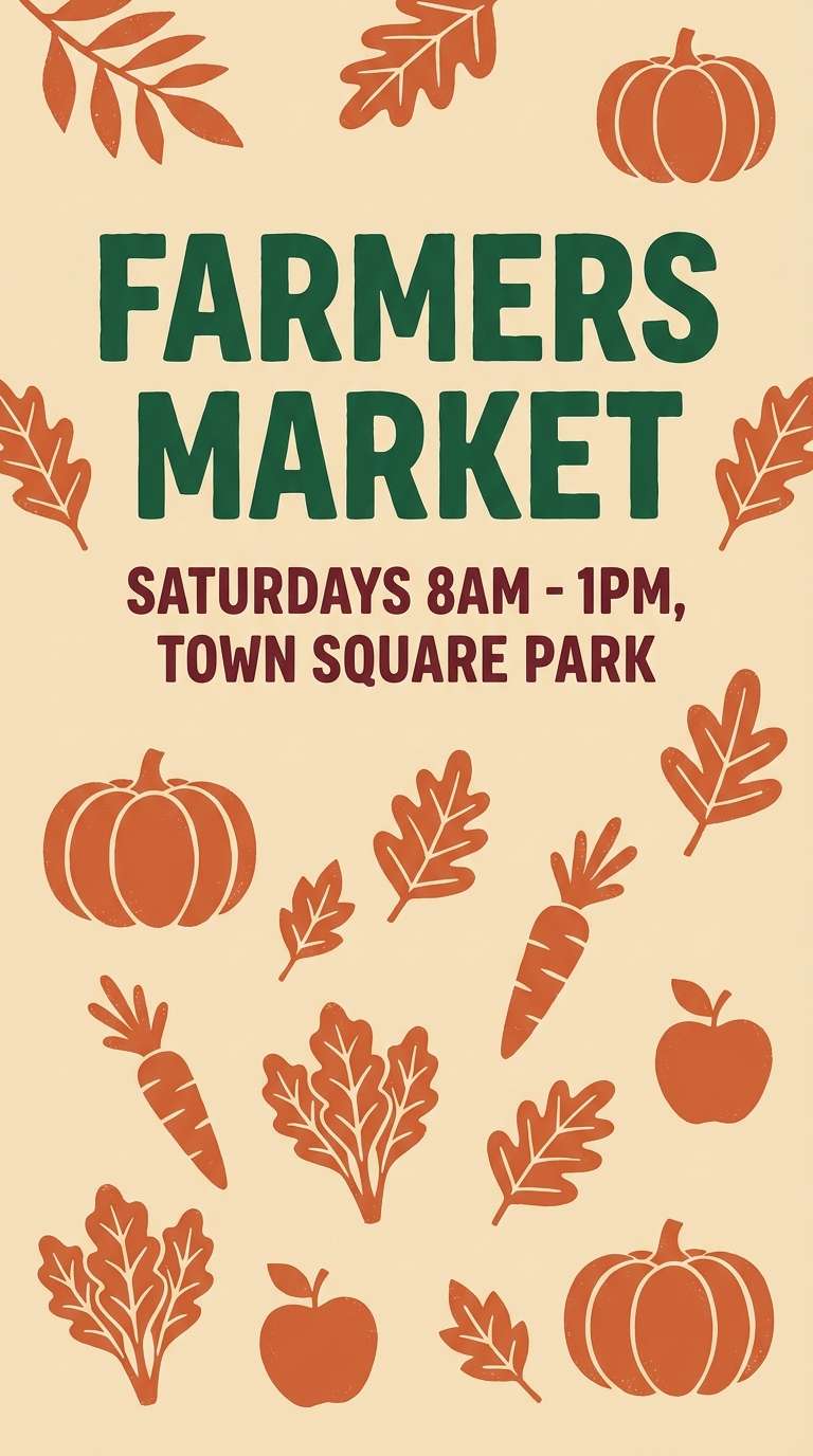
Best for: farmers market posters
Lively and handcrafted, like produce crates, stamped paper tags, and warm spice notes. These green and maroon color combinations are great for farmers market posters, craft fair flyers, and community event promos. Let the buttery base keep things friendly, then use green for headings and maroon for dates and vendor highlights. Tip: the terracotta accent is perfect for illustrated icons so the design feels local and artisanal.
Image example of artisan market generated using media.io
12) Evening Conservatory
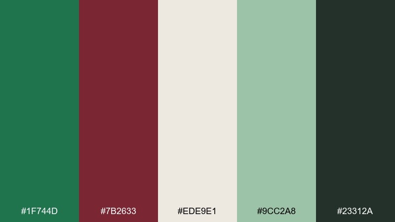
HEX: #1F744D #7B2633 #EDE9E1 #9CC2A8 #23312A
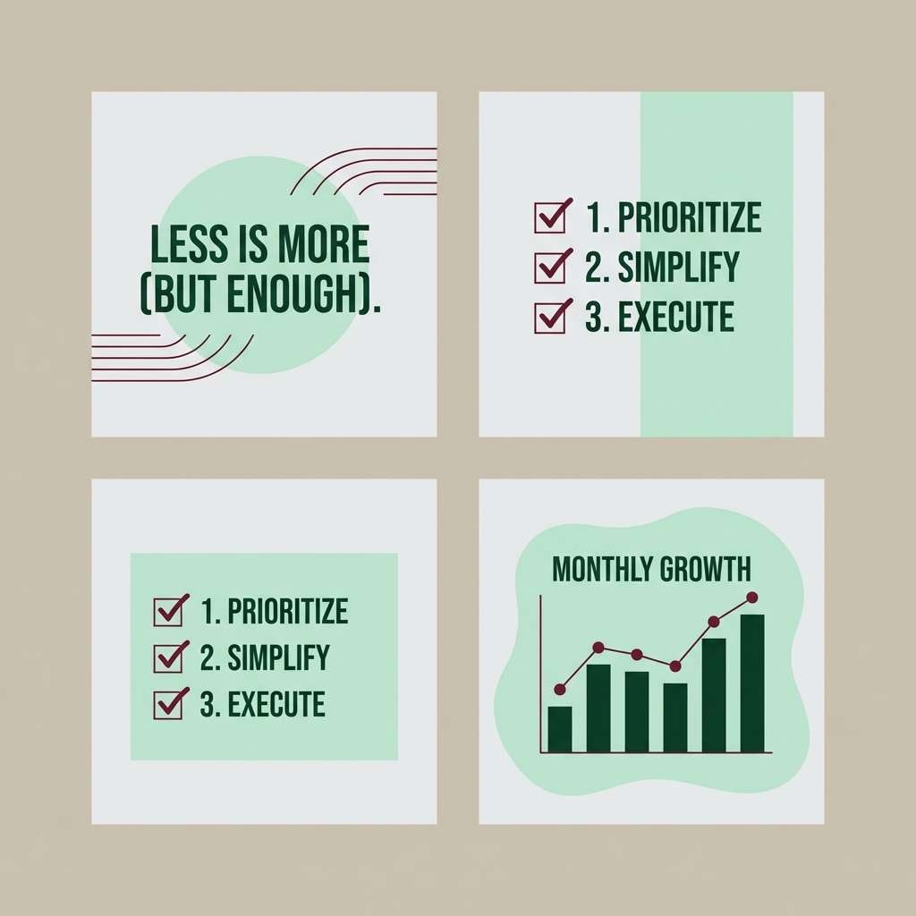
Mood: lush, quiet, sophisticated
Best for: social media templates
Lush and quiet, like a conservatory after hours with glossy leaves and low light. It works for social templates where you want a calm grid, consistent headlines, and subtle brand cues. Use the pale gray as the canvas, the minty green for panels, and keep maroon for a signature highlight line. Tip: stick to one bold color per slide so the feed stays cohesive.
Image example of evening conservatory generated using media.io
13) Classic Winery Label

HEX: #255E45 #8E1F34 #F7EBDD #C9B37E #2B1E20
Mood: traditional, premium, ceremonial
Best for: certificate and award designs
Traditional and premium, like a cellar tour ending with a formal toast. These green and maroon tones feel right for certificates, awards, and formal programs where hierarchy and gravitas matter. Use the cream as the main paper color, then place maroon for titles and seals with gold for a subtle border. Tip: keep the near-black for the body copy so the ornamental elements do not compete with readability.
Image example of classic winery label generated using media.io

14) Soft Meadow Merlot
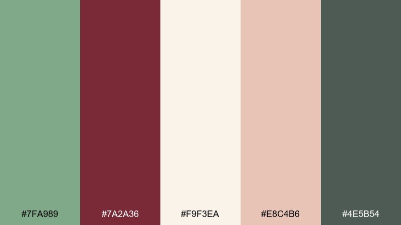
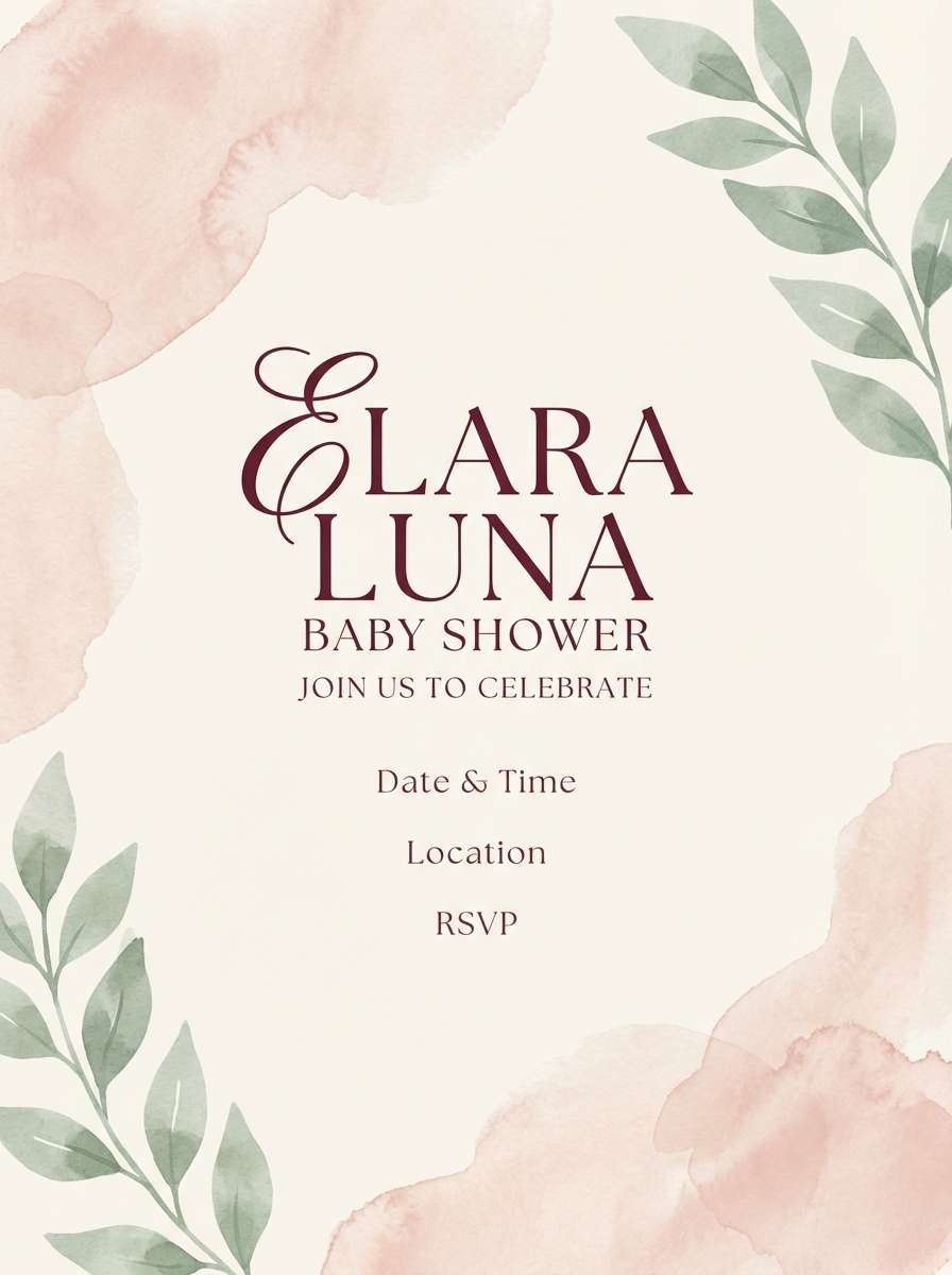
HEX: #7FA989 #7A2A36 #F9F3EA #E8C4B6 #4E5B54
Mood: airy, gentle, romantic
Best for: baby shower invitations
Airy and gentle, like meadow greens washed with a rosy dusk. It is lovely for baby shower invites, brunch stationery, and soft seasonal announcements. Let the cream dominate, with the dusty blush as a background shape and the merlot for names or key lines. Tip: choose rounded typography and keep the darkest tone for tiny details only, so the design stays sweet and light.
Image example of soft meadow merlot generated using media.io
15) Urban Botanical UI
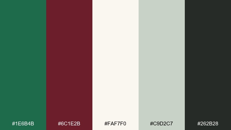
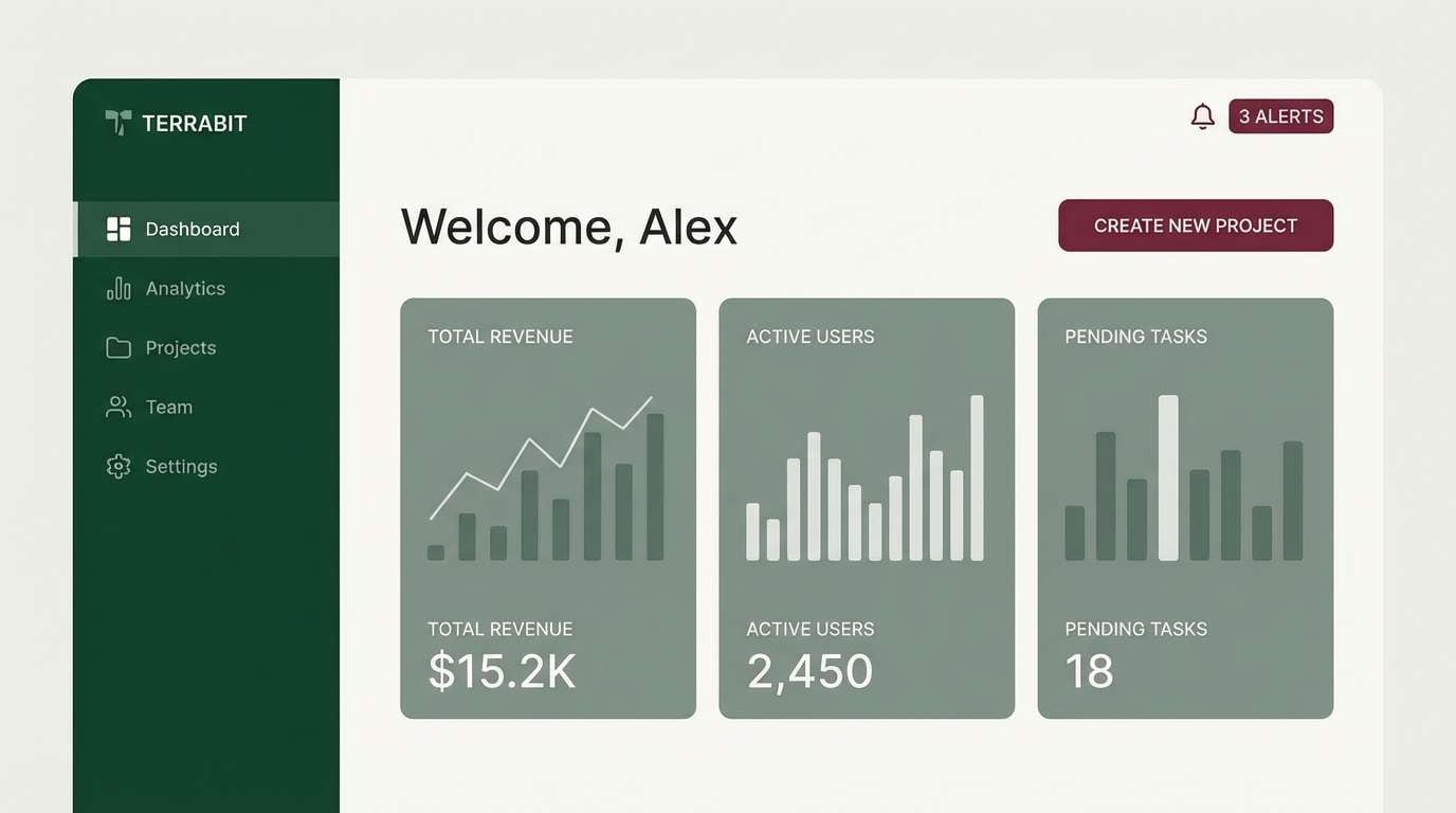
HEX: #1E6B4B #6C1E2B #FAF7F0 #C9D2C7 #262B28
Mood: modern, crisp, confident
Best for: dashboard UI design
Modern and crisp, like concrete planters filled with glossy greens and a rich burgundy accent wall. This green maroon color palette is built for dashboards, SaaS UI, and data-heavy screens that need strong contrast without neon. Use off-white for surfaces, deep green for navigation, and maroon for key actions like alerts or primary buttons. Tip: keep maroon to one action type so users learn the system quickly.
Image example of urban botanical ui generated using media.io
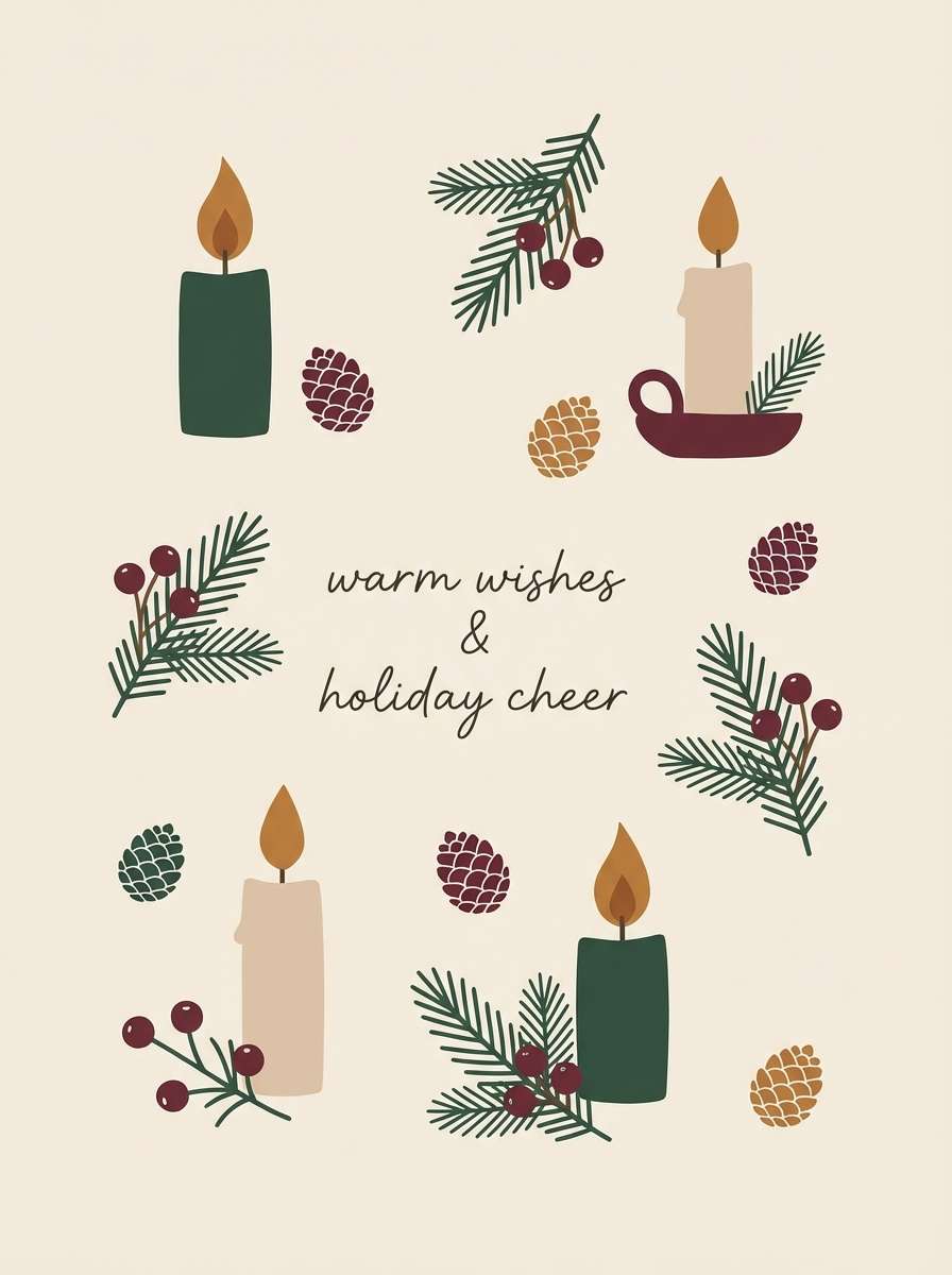
16) Holiday Evergreen
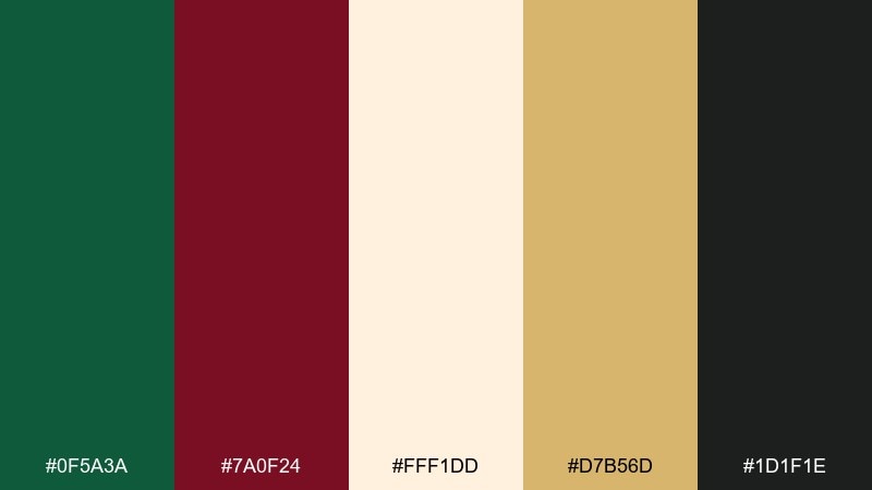
HEX: #0F5A3A #7A0F24 #FFF1DD #D7B56D #1D1F1E
Mood: festive, bold, classic
Best for: holiday promo banners
Festive and bold, like evergreen garlands with a deep red ribbon and warm candlelight. It is perfect for seasonal promo banners, email headers, and storefront sale graphics. Use the cream as a warm winter backdrop, then set evergreen for big blocks and the red wine tone for the offer. Tip: add gold only as small sparkles or thin frames to keep the message loud and clear.
Image example of holiday evergreen generated using media.io

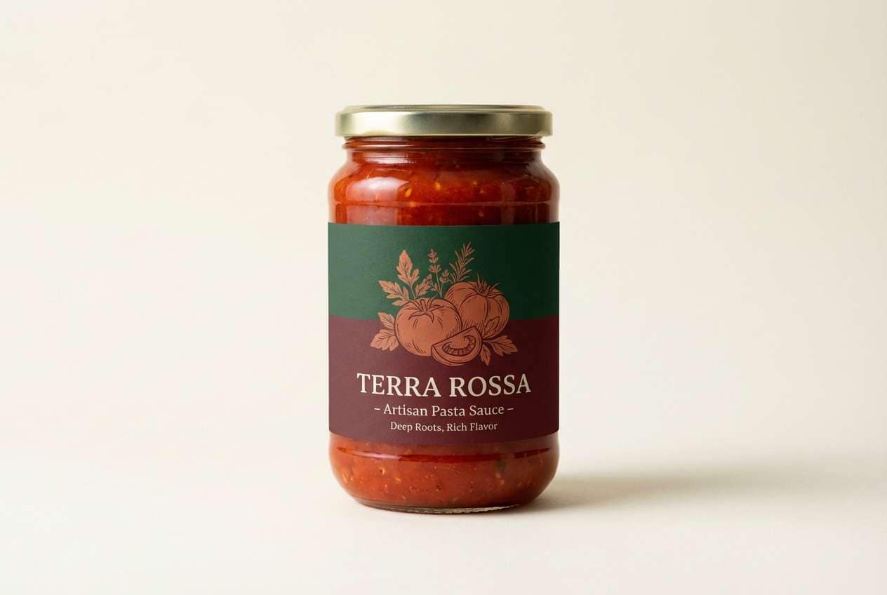
17) Terra Bistro
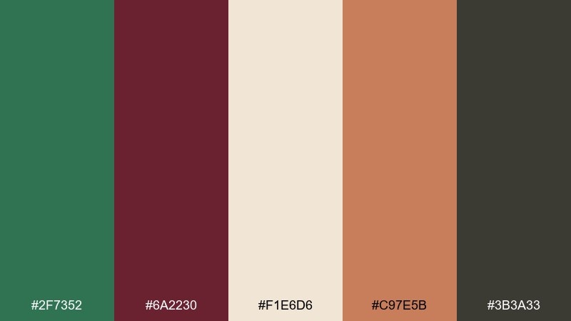
HEX: #2F7352 #6A2230 #F1E6D6 #C97E5B #3B3A33
Mood: earthy, appetizing, relaxed
Best for: food product ads
Earthy and appetizing, like herbs, wine sauce, and warm terracotta plates. It fits food product ads and small-batch goods where you want a natural, honest tone. Let the creamy base keep the ad bright, then use green for ingredient cues and maroon for the headline or flavor name. Tip: keep the terracotta as a secondary block behind the product to make it pop without looking flashy.
Image example of terra bistro generated using media.io
18) Muted Orchard
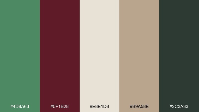
HEX: #4D8A63 #5F1B28 #E8E1D6 #B9A58E #2C3A33
Mood: muted, organic, steady
Best for: presentation slide themes
Muted and organic, like orchard leaves under overcast skies with a dark berry note. It is a dependable choice for presentations, reports, and pitch decks that should feel mature and calm. Use the light stone tone for slides, green for section headers, and maroon for key metrics or emphasis. Tip: keep charts mostly green and neutrals, then use maroon for one highlight series to avoid visual noise.
Image example of muted orchard generated using media.io
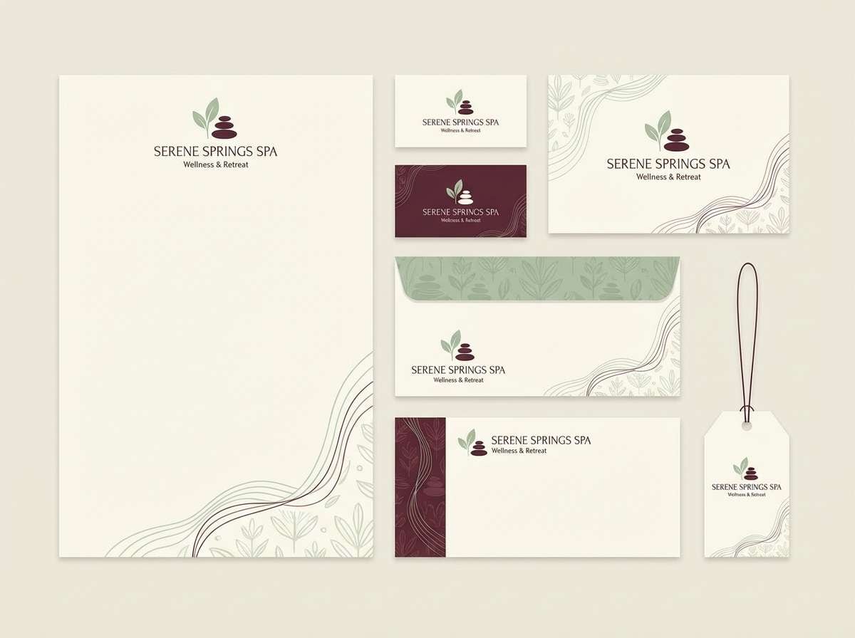
19) Luxury Spa Retreat
HEX: #3F8362 #6B2433 #F8F0E4 #AFC7B8 #514645
Mood: serene, luxe, restorative
Best for: spa and wellness branding
Serene and luxe, like a warm robe, herbal steam, and a hint of rosewood. These green and maroon color combinations work for spa branding, appointment cards, and calm landing pages that need a premium edge. Keep the cream and misty green as the foundation, then use maroon for a signature stamp or small button states. Tip: choose plenty of whitespace so the darker brown can be limited to typography and fine lines.
Image example of luxury spa retreat generated using media.io
20) Cabin Candlelight
HEX: #2B5B44 #7D2D3A #F2E3D0 #B58C62 #2B2423
Mood: cozy, nostalgic, intimate
Best for: greeting cards
Cozy and nostalgic, like a cabin table lit by candles with evergreen sprigs nearby. It is a great fit for greeting cards, seasonal postcards, and small print pieces that should feel personal. Use the warm cream for the card stock, then balance green and maroon in simple illustrated shapes. Tip: add the caramel tone as a soft shadow color so the design gains depth without introducing new hues.
Image example of cabin candlelight generated using media.io
What Colors Go Well with Green Maroon?
Warm neutrals are the easiest match: cream, ivory, sand, taupe, and stone help green and maroon breathe and keep layouts readable. They’re especially useful as backgrounds for print, packaging, and UI surfaces.
For accents, muted gold/brass and terracotta amplify the “heritage” and “artisan” feel, while soft blush can make the combo more romantic and modern. If you need stronger contrast for text or icons, near-black (charcoal) usually looks better than pure black with these earthy tones.
When in doubt, choose one lead color (green or maroon), one neutral foundation, and one small highlight color. This keeps the palette intentional and prevents the red-green pairing from feeling too heavy.
How to Use a Green Maroon Color Palette in Real Designs
In branding, treat green as the primary field color and maroon as the “signature” accent (or vice versa) to create a recognizable system. Pair with a warm neutral for stationery, packaging, and social templates so your logo and typography stay crisp.
In UI, reserve maroon for a single meaning (primary button, alerts, or key status) and keep most surfaces off-white or light stone. Use deep green for navigation or section headers to guide the eye without overwhelming content.
For print and décor, texture matters: uncoated paper, linen, or natural materials make green maroon palettes feel richer. Add thin gold lines or subtle patterns for a premium look, but keep accents minimal to maintain elegance.
Create Green Maroon Palette Visuals with AI
If you want to see your green maroon color palette in action, generate quick mock visuals—brand boards, menus, invitations, UI screens, and posters—before committing to a final direction.
With Media.io’s text-to-image tool, you can paste a prompt (like the examples above), tweak style words (modern, rustic, editorial), and iterate until the colors feel right for your project.
Once you have a favorite, keep your HEX codes consistent across assets so your palette stays cohesive from web to print.
Green Maroon Color Palette FAQs
-
What does a green maroon color palette communicate?
It usually signals “natural + premium”: green brings calm and growth, while maroon adds depth, tradition, and sophistication. Together they feel grounded, mature, and intentional. -
Is maroon and green a good combination for branding?
Yes—especially for wine, wellness, food, boutique retail, and heritage-inspired brands. Use a warm neutral (cream/ivory) for breathing room and keep gold/terracotta as small highlights. -
How do I keep green and maroon from looking too heavy?
Let neutrals dominate large surfaces (off-white, beige, stone) and use green/maroon as structured accents (headers, frames, buttons). Avoid making both colors full-page backgrounds at the same time. -
What’s a good text color on green maroon palettes?
Charcoal or near-black often reads cleaner than pure black, and it matches the warm, earthy character. On dark green or maroon, use warm off-white (not stark white) for softer contrast. -
Can I use green maroon colors in UI and dashboards?
Yes. Keep off-white surfaces, use deep green for navigation, and reserve maroon for one key action type (like alerts or primary CTAs) so users learn the hierarchy quickly. -
What accent colors pair best with green and maroon?
Muted gold/brass, terracotta/clay, blush, and sage-gray are reliable choices. Pick one accent and keep it minimal to avoid visual noise. -
How can I preview these palettes quickly?
Generate mockups with AI: create a brand board, invitation, menu, or UI hero using your chosen HEX codes and iterate prompts until the mood matches your project.


