

Chartreuse sits right between green and yellow, so it reads as energetic, fresh, and attention-grabbing without feeling as heavy as pure neon green. In design systems, it’s a reliable “highlight” color that instantly signals action, status, or emphasis.
Below are 20+ chartreuse color combinations with HEX codes, mood notes, and practical pairing tips for branding, UI, and print—plus AI prompts you can reuse to generate matching visuals.
In this article
- Why Chartreuse Color Combinations Work So Well
-
- neon grove
- lime & linen
- citrus noir
- spring botanica
- retro tennis club
- minimal dashboard lime
- art poster pop
- matcha marble
- electric orchid
- urban safety sign
- desert succulent
- nordic kitchen
- tech startup bright
- kids learning app
- night garden
- coastal chartreuse
- luxe gold leaf
- streetwear tag
- eco packaging fresh
- festival wristband
- museum minimal
- What Colors Go Well with Chartreuse?
- How to Use a Chartreuse Color Combination in Real Designs
- Create Chartreuse Palette Visuals with AI
Why Chartreuse Color Combinations Work So Well
Chartreuse is naturally high-visibility, so it performs brilliantly as an accent: it draws the eye to CTAs, key numbers, and interactive states. Because it carries both yellow’s warmth and green’s “go” signal, it often reads as optimistic and forward-moving.
It also plays well with contrast strategies. Pair it with deep charcoals or navies to make it feel premium and controlled, or with soft off-whites and stone neutrals to keep it airy and editorial.
Most importantly, chartreuse adds personality fast. Even in minimal layouts, a small chartreuse highlight can make a brand system feel more modern, more playful, or more tech-forward—depending on what you pair it with.
20+ Chartreuse Color Palette Ideas (with HEX Codes)
1) Neon Grove
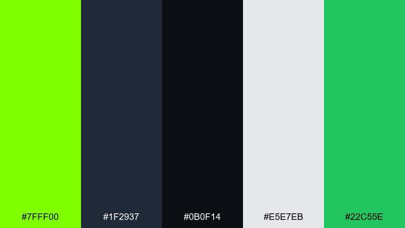
HEX: #7FFF00 #1F2937 #0B0F14 #E5E7EB #22C55E
Mood: electric, modern, high-contrast
Best for: tech branding and hero sections
Electric and urban, this chartreuse mix feels like glowing leaves against midnight concrete. Use the deep charcoals to ground the neon green so it reads premium rather than loud. It works beautifully for tech branding, landing pages, and product highlights where clarity matters. Tip: reserve #7FFF00 for CTAs and key metrics, and let #1F2937 carry most text for comfortable readability.
Image example of neon grove generated using media.io
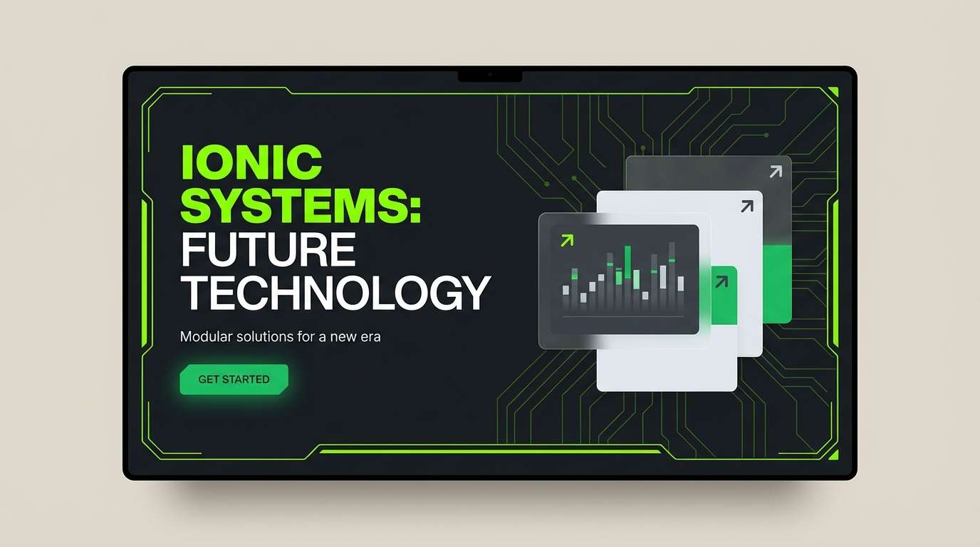
Media.io is an online AI studio for creating and editing video, image, and audio in your browser.

2) Lime & Linen

HEX: #B7FF2A #F4F1E8 #C7B299 #2E2A24 #8FB339
Mood: soft, airy, natural
Best for: lifestyle blogs and stationery
Soft and sunlit, it looks like fresh citrus laid on warm linen. This chartreuse color palette stays friendly by pairing pale neutrals with an earthy espresso for type. It suits lifestyle blogs, minimal stationery, and calm social templates. Tip: keep the background in #F4F1E8 and use #B7FF2A as a small accent line or header highlight.
Image example of lime & linen generated using media.io
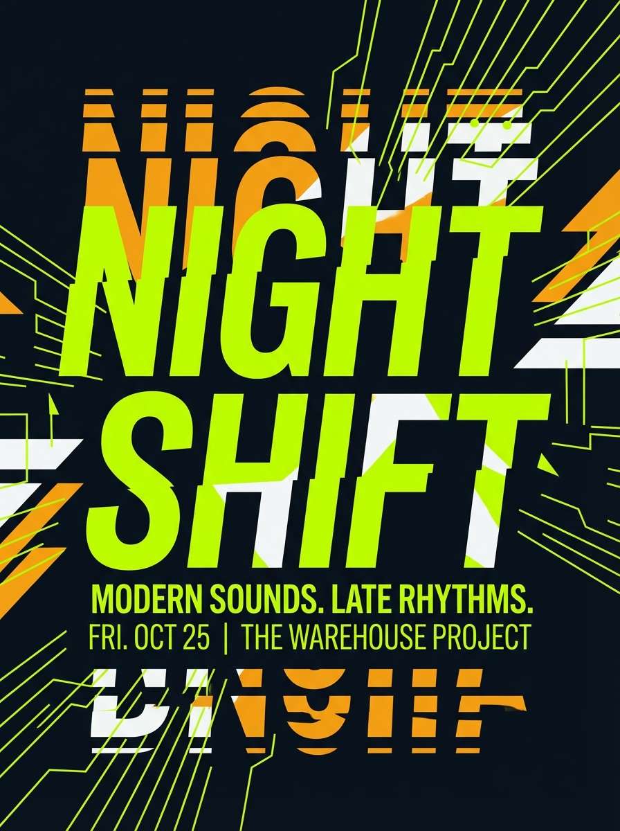
3) Citrus Noir

HEX: #9DFF00 #111827 #374151 #F9FAFB #F59E0B
Mood: sleek, punchy, nocturnal
Best for: posters and nightlife promos
Sleek and punchy, it feels like a neon sign cutting through a dark alley. The near-black base makes the green pop, while amber adds a warm spark for badges or dates. It fits event posters, club flyers, and bold campaign graphics that need instant contrast. Tip: set large type in #F9FAFB and use #F59E0B for secondary emphasis so the green stays the hero.
Image example of citrus noir generated using media.io
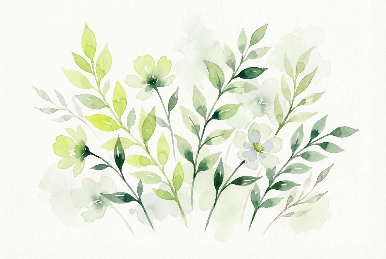
4) Spring Botanica
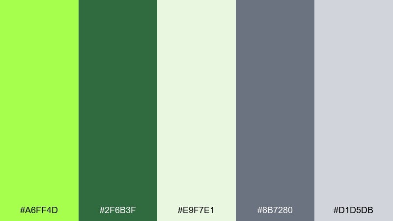
HEX: #A6FF4D #2F6B3F #E9F7E1 #6B7280 #D1D5DB
Mood: fresh, botanical, optimistic
Best for: wellness illustrations and blog headers
Fresh and botanical, these chartreuse tones evoke new leaves, herbal tea, and clean morning air. Pair the vivid green with deep forest for headings, then soften the scene with pale minty whites. It's ideal for wellness illustrations, eco blog headers, and gentle explainer graphics. Tip: keep shadows and outlines in #6B7280 so the greens stay luminous instead of muddy.
Image example of spring botanica generated using media.io
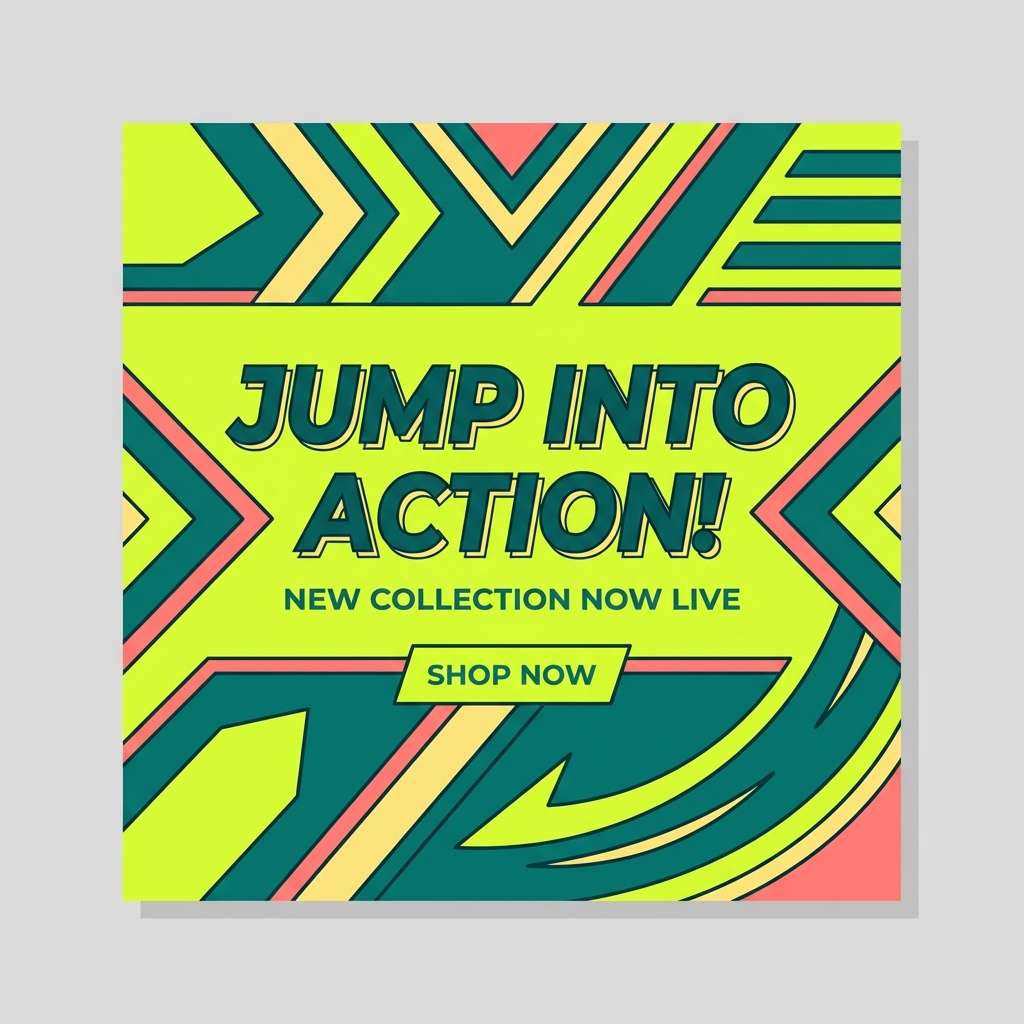
5) Retro Tennis Club
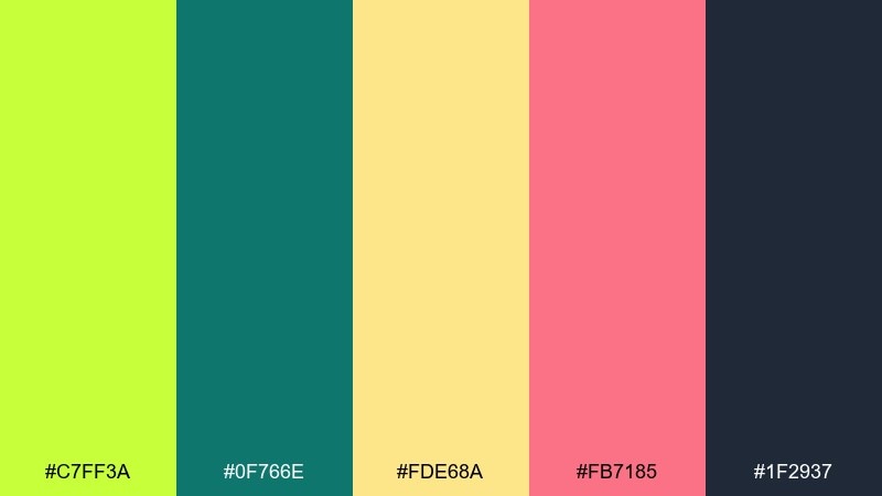
HEX: #C7FF3A #0F766E #FDE68A #FB7185 #1F2937
Mood: playful, sporty, nostalgic
Best for: summer merch and social posts
Playful and sporty, this chartreuse color combination recall vintage courts, sun-faded towels, and bubblegum accents. Teal brings cool balance to the bright green, while buttery yellow warms the overall feel. Use it for summer merch, social post templates, and playful brand systems that still need structure. Tip: keep body text in #1F2937 and let #FB7185 show up only as a tiny highlight for a retro wink.
Image example of retro tennis club generated using media.io
6) Minimal Dashboard Lime
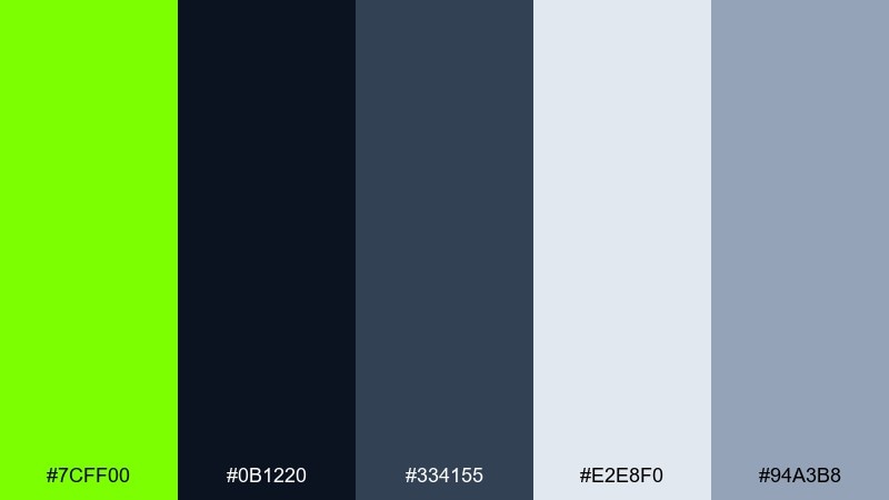
HEX: #7CFF00 #0B1220 #334155 #E2E8F0 #94A3B8
Mood: focused, clean, data-driven
Best for: analytics UI and SaaS dashboards
Focused and clean, it feels like sharp indicators on a dark control panel. This chartreuse color scheme is ideal for analytics UI because the accent reads instantly against deep navy. Use #E2E8F0 and #94A3B8 for hierarchy, then apply #7CFF00 to key states like success or active tabs. Tip: avoid using the bright green for long text; keep it to icons, badges, and short labels.
Image example of minimal dashboard lime generated using media.io

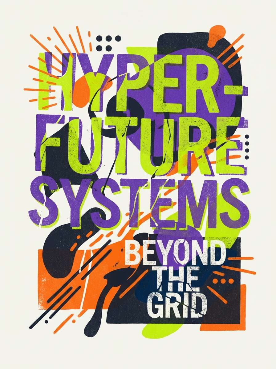
7) Art Poster Pop
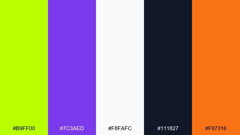
HEX: #B9FF00 #7C3AED #F8FAFC #111827 #F97316
Mood: bold, artsy, energetic
Best for: gallery posters and promo flyers
Bold and artsy, it looks like fluorescent ink over a printed zine. The violet creates instant tension with the green, while orange adds a playful punch for subheads. Use it for gallery posters, promo flyers, and cover graphics where you want modern pop without chaos. Tip: keep the background mostly #F8FAFC to let saturated accents breathe.
Image example of art poster pop generated using media.io
8) Matcha Marble
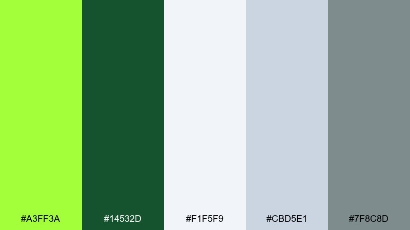
HEX: #A3FF3A #14532D #F1F5F9 #CBD5E1 #7F8C8D
Mood: calm, refined, spa-like
Best for: beauty packaging and spa brands
Calm and refined, these chartreuse hues evoke matcha foam on cool stone. The forest green gives it a premium base, while the slate neutrals add a clean, modern finish. It's a strong fit for beauty packaging, spa brands, and minimalist product pages. Tip: use #14532D for logos and headings, then add #A3FF3A as a thin accent stripe or seal mark.
Image example of matcha marble generated using media.io
9) Electric Orchid
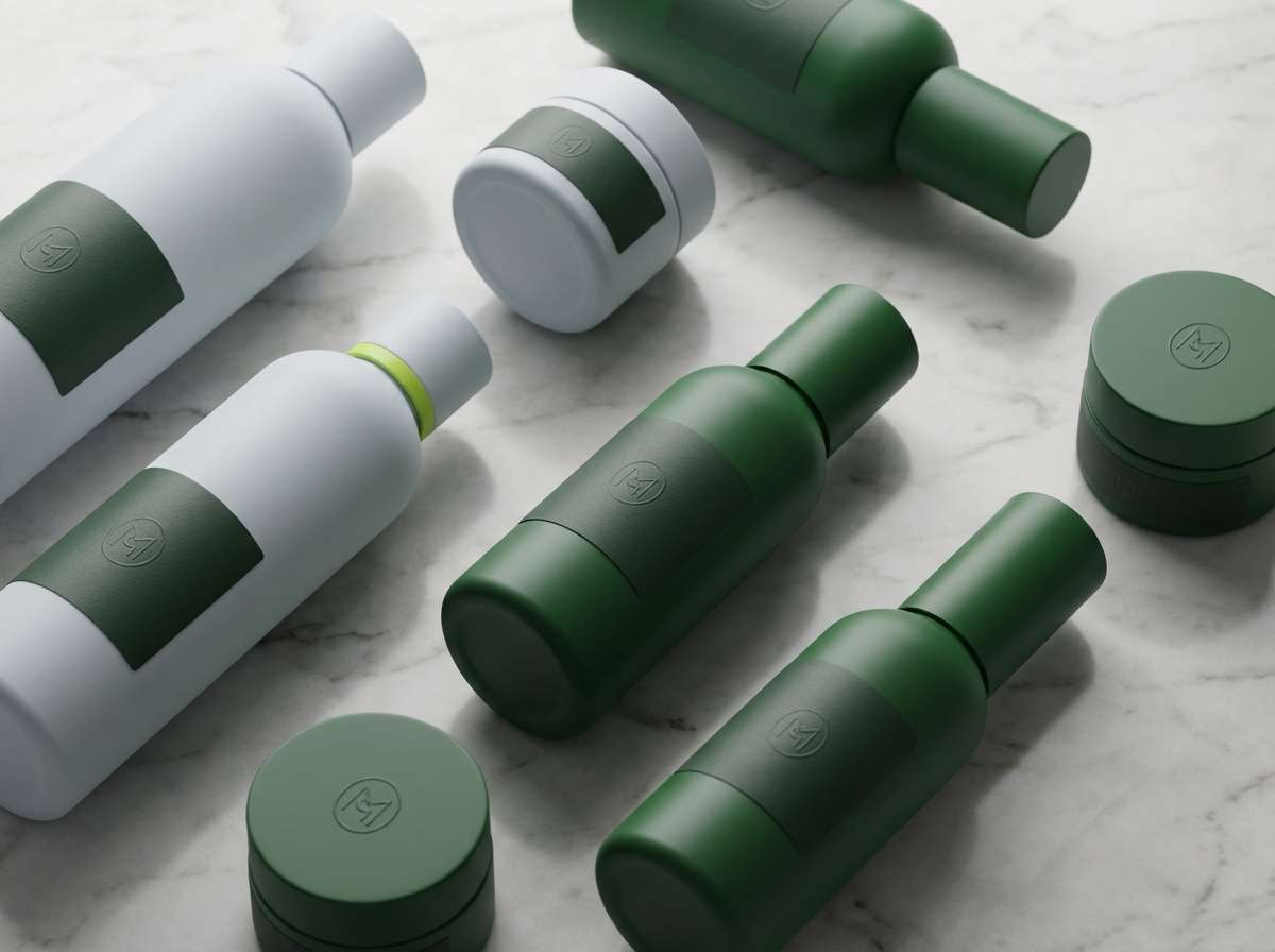
HEX: #7FFF00 #C026D3 #0F172A #FCE7F3 #A3A3A3
Mood: neon, glam, futuristic
Best for: music promo graphics and thumbnails
Neon and glam, it feels like club lights reflecting on glossy petals. A chartreuse color combination with magenta creates instant energy, while near-black keeps it sharp and modern. It works for music promo graphics, streaming thumbnails, and bold cover art where you want drama in small sizes. Tip: keep gradients subtle and let solid blocks of #7FFF00 and #C026D3 do the heavy lifting.
Image example of electric orchid generated using media.io
10) Urban Safety Sign

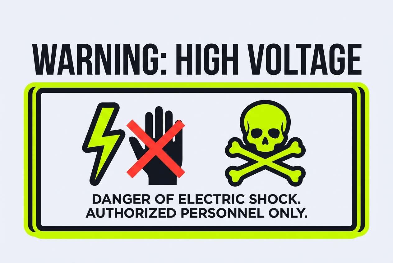
HEX: #BFFF00 #FF3B30 #1C1C1E #F2F2F7 #8E8E93
Mood: urgent, punchy, industrial
Best for: warning labels and bold CTAs
Urgent and industrial, it channels safety tape, street signs, and high-visibility gear. The red is a deliberate counterpoint that makes the green feel even brighter and more attention-grabbing. Use it for warning labels, high-impact CTAs, and bold announcement banners. Tip: let #1C1C1E handle text and outlines so the bright tones stay readable and controlled.
Image example of urban safety sign generated using media.io
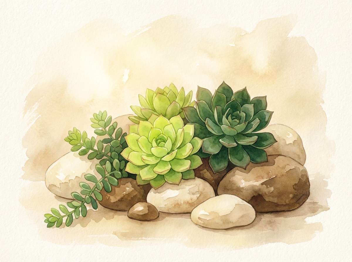
11) Desert Succulent
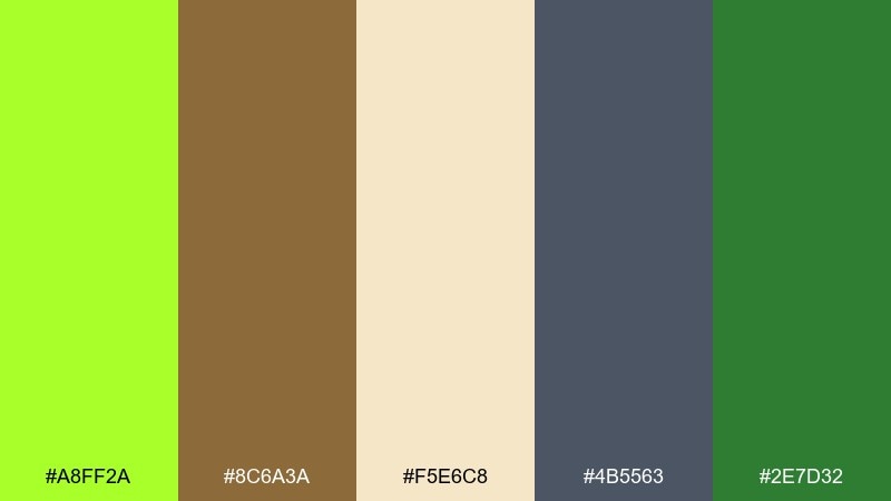
HEX: #A8FF2A #8C6A3A #F5E6C8 #4B5563 #2E7D32
Mood: earthy, warm, outdoorsy
Best for: eco blogs and outdoor brands
Earthy and warm, it brings to mind succulents, sand, and sunbaked trails. The tan and clay notes keep the bright green grounded and approachable. It's great for eco blogs, outdoor brands, and packaging that wants a natural story without going dull. Tip: use #F5E6C8 as your main background and sprinkle #A8FF2A in small, plant-like accents.
Image example of desert succulent generated using media.io
12) Nordic Kitchen
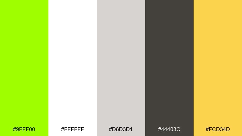
HEX: #9FFF00 #FFFFFF #D6D3D1 #44403C #FCD34D
Mood: clean, cozy, modern
Best for: recipe cards and food blogs
Clean and cozy, this chartreuse color scheme feels like a bright herb garnish in a white ceramic bowl. The stone grays and warm charcoal create a Scandinavian base, while sunny yellow adds appetite and friendliness. Use it for recipe cards, food blog layouts, and cooking newsletters that need clarity. Tip: keep the green for section tabs or ingredient highlights, and let #44403C handle long-form text.
Image example of nordic kitchen generated using media.io

13) Tech Startup Bright
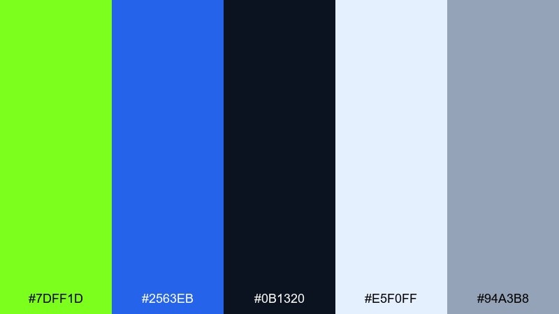
HEX: #7DFF1D #2563EB #0B1320 #E5F0FF #94A3B8
Mood: confident, crisp, contemporary
Best for: startup branding and pitch decks
Confident and crisp, it reads like a fresh launch with polished edges. This chartreuse color palette pairs a bold green with a clean blue for a trustworthy, high-energy brand presence. It shines in startup branding, pitch decks, and product UI where you need both excitement and credibility. Tip: use the blue for primary navigation and reserve the green for conversions and success states.
Image example of tech startup bright generated using media.io

14) Kids Learning App

HEX: #B6FF00 #06B6D4 #FDE047 #FB7185 #1F2937
Mood: cheerful, friendly, energetic
Best for: education apps and onboarding
Cheerful and bouncy, it feels like stickers, highlighters, and playroom energy. The cyan and yellow keep the green from feeling too intense, while a dark slate anchors text and icons. It's ideal for education apps, onboarding screens, and kid-friendly brand systems. Tip: keep backgrounds light and use the bright colors for buttons, progress, and rewards.
Image example of kids learning app generated using media.io
15) Night Garden

HEX: #8CFF00 #0B3D2E #0F172A #E7F9D9 #A78BFA
Mood: mysterious, lush, dreamy
Best for: book covers and editorial art
Mysterious and lush, it suggests glowing plants under moonlight with a hint of violet haze. These chartreuse color combinations look best when the greens are used as highlights over the deep teal and navy base. It's a strong choice for book covers, editorial art, and moody campaign visuals. Tip: add #A78BFA sparingly as a secondary accent so the glow effect stays believable.
Image example of night garden generated using media.io
16) Coastal Chartreuse
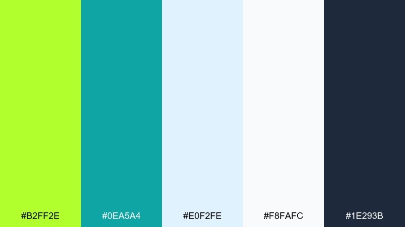
HEX: #B2FF2E #0EA5A4 #E0F2FE #F8FAFC #1E293B
Mood: breezy, clean, summery
Best for: travel sites and resort ads
Breezy and clean, it feels like sea glass and lime zest in bright sun. Teal and pale sky tones cool the green so the overall look stays refreshing instead of neon. Use it for travel sites, resort ads, and airy newsletters that need a modern twist. Tip: keep #E0F2FE as the main canvas and use #1E293B for crisp navigation and captions.
Image example of coastal chartreuse generated using media.io

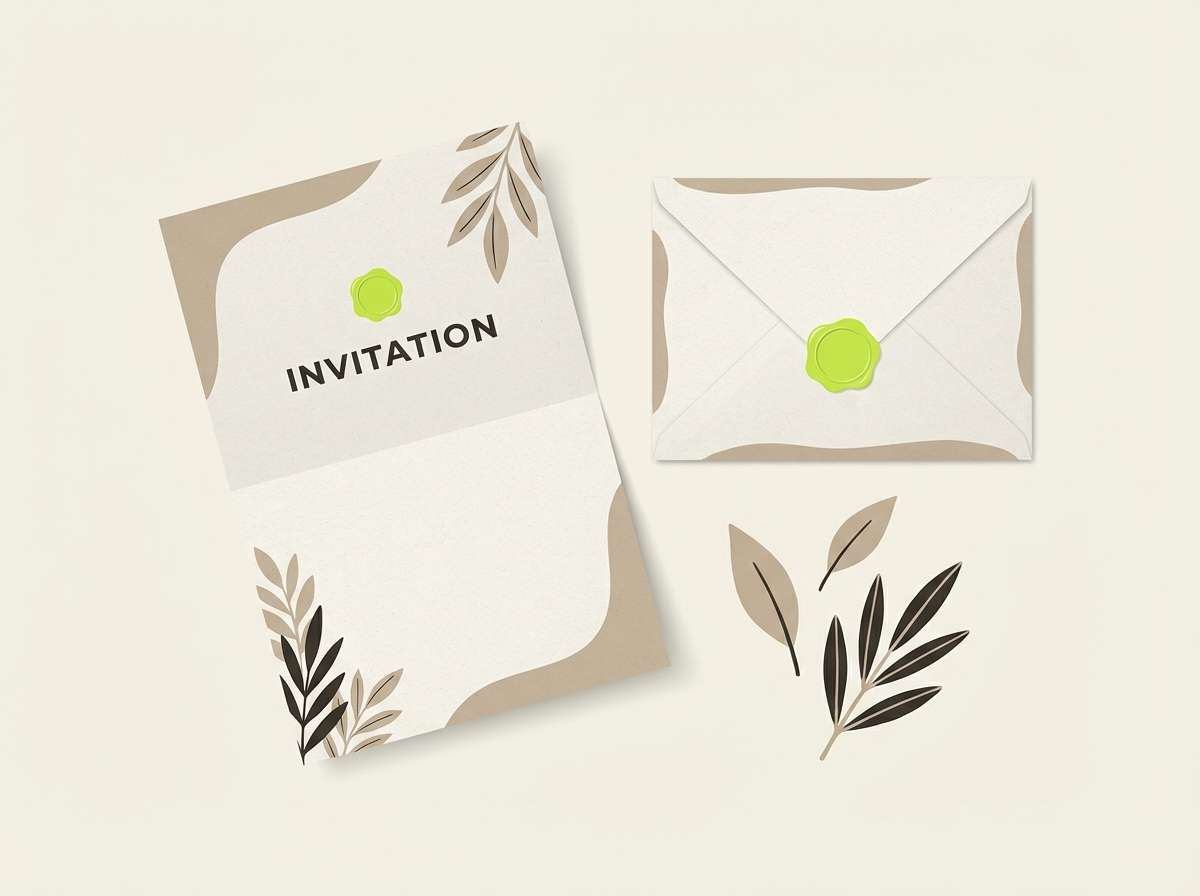
17) Luxe Gold Leaf
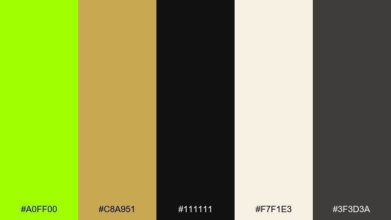
HEX: #A0FF00 #C8A951 #111111 #F7F1E3 #3F3D3A
Mood: luxurious, dramatic, editorial
Best for: premium packaging and fashion ads
Luxurious and dramatic, these chartreuse tones evoke gilded foil catching light beside a vivid green highlight. Gold brings elegance, while deep black makes the palette feel editorial and high-end. Use it for premium packaging, fashion ads, and event invitations where you want a bold twist on luxury. Tip: treat the green as an accent line or seal mark, and lean on gold for larger decorative areas.
Image example of luxe gold leaf generated using media.io

18) Streetwear Tag

HEX: #7BFF00 #FF6B00 #121212 #E5E5E5 #3B82F6
Mood: edgy, youthful, kinetic
Best for: streetwear labels and drop graphics
Edgy and kinetic, it looks like a graffiti tag under bright street lamps. The orange adds heat, and a punch of blue helps balance the palette without losing attitude. Use it for streetwear labels, drop announcements, and bold social graphics with strong type. Tip: keep #121212 as your base and use the bright hues in short bursts to avoid visual noise.
Image example of streetwear tag generated using media.io

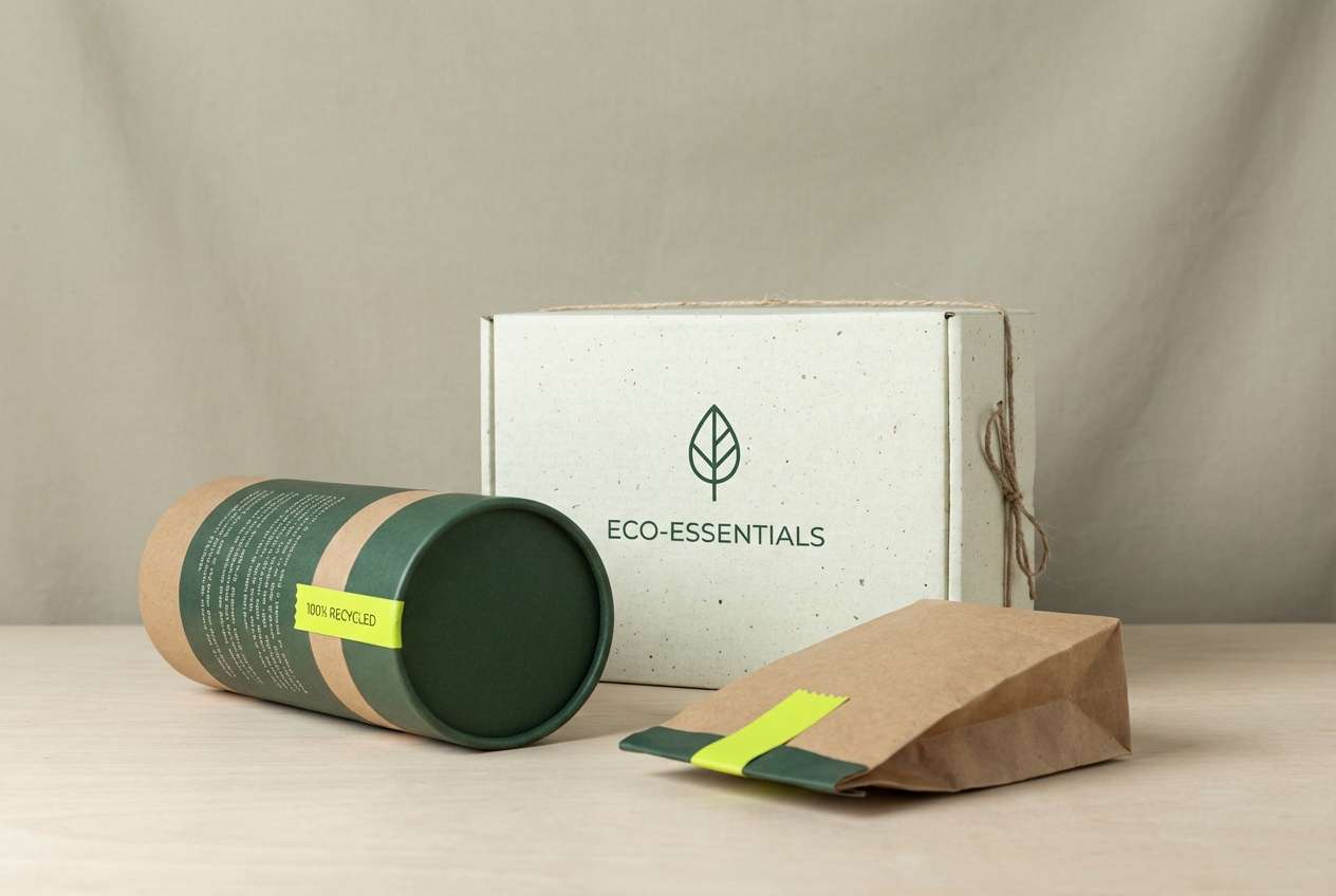
19) Eco Packaging Fresh

HEX: #AFFF2F #2D6A4F #F1FAEE #B7B7A4 #1B4332
Mood: fresh, responsible, organic
Best for: sustainable product packaging
Fresh and responsible, it feels like a farmers market label with modern restraint. Deep greens communicate trust, while the pale off-white keeps everything clean and legible. It's well suited to sustainable product packaging, ingredient-focused brands, and eco certifications. Tip: print the bright green as a spot accent for badges or icons, and use #2D6A4F for the main brand mark.
Image example of eco packaging fresh generated using media.io
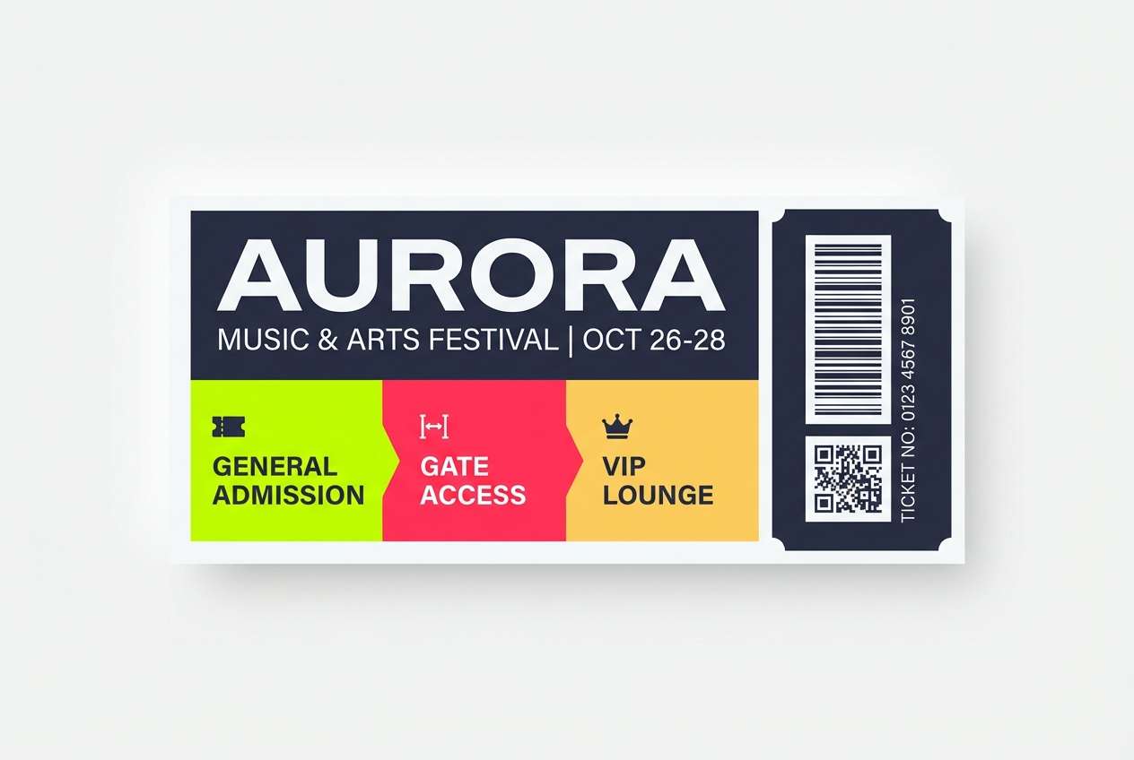
20) Festival Wristband

HEX: #B8FF00 #FF2D55 #2B2D42 #F8F9FA #FFD166
Mood: fun, loud, celebratory
Best for: event tickets and festival promos
Fun and celebratory, it recalls wristbands, confetti, and bright stage lighting. The pink and yellow add playful warmth, while the deep slate keeps layouts from feeling chaotic. Use it for event tickets, festival promos, and punchy email headers that need quick scanning. Tip: set information blocks on #F8F9FA and use the saturated colors as section markers and icons.
Image example of festival wristband generated using media.io
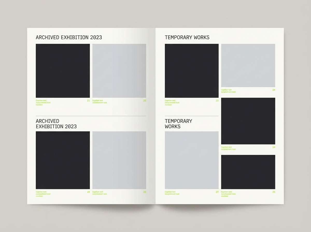
21) Museum Minimal
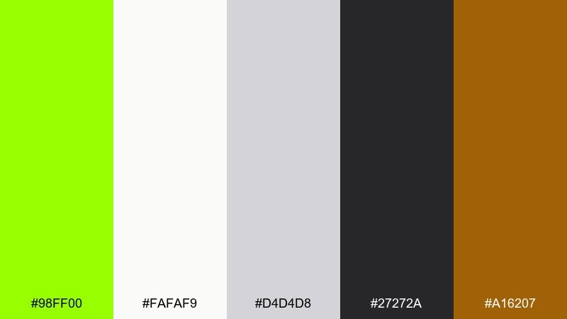
HEX: #98FF00 #FAFAF9 #D4D4D8 #27272A #A16207
Mood: quiet, curated, contemporary
Best for: exhibition guides and catalogs
Quiet and curated, it feels like a gallery wall with a single vivid highlight. The warm brown-gold adds an archival touch, while the neutrals keep the layout crisp and modern. Use it for exhibition guides, catalogs, and signage where you want one confident accent. Tip: keep margins generous and apply the green to wayfinding arrows or section tabs for a clean museum-ready look.
Image example of museum minimal generated using media.io
What Colors Go Well with Chartreuse?
Chartreuse pairs best with deep neutrals (charcoal, near-black, navy) when you want a premium, high-contrast look that keeps the brightness under control. This is a go-to approach for UI, product pages, and bold CTAs.
For a softer, more natural feel, combine chartreuse with warm off-whites, linen tones, sand, and muted greens. These pairings make chartreuse feel botanical and approachable—great for wellness, eco, and lifestyle brands.
If you want something louder and more expressive, try opposing accents like magenta, violet, or hot orange. Keep backgrounds light or very dark so the saturated accents stay readable and intentional.
How to Use a Chartreuse Color Combination in Real Designs
Use chartreuse as a controlled accent first: buttons, links, badges, toggles, progress states, or small graphic marks. Let your dark neutral handle body copy and long reading areas for comfortable accessibility.
In print and branding, chartreuse works well as a “signature” highlight—think seal marks, lines, stickers, or spot color moments. Pair it with paper-like off-whites or deep blacks to keep it from feeling overly fluorescent.
For UI systems, define chartreuse roles clearly (CTA, success, active state) and set rules for saturation and spacing. This helps you keep consistency across dashboards, onboarding flows, and marketing pages.
Create Chartreuse Palette Visuals with AI
If you want to see these chartreuse color combinations in context, generating quick mockups is the fastest way to validate contrast, hierarchy, and vibe. You can also reuse the prompts above to create hero sections, posters, packaging shots, and UI screens in a consistent style.
With Media.io’s text-to-image tool, you can iterate rapidly: swap the palette, change aspect ratios, or try different design formats (ads, social posts, thumbnails) while keeping the same chartreuse “signature” accent.
Chartreuse Color Palette FAQs
-
What is the HEX code for chartreuse?
A widely used digital chartreuse is #7FFF00, a vivid yellow-green that sits between pure green and yellow. -
Is chartreuse a warm or cool color?
Chartreuse can read as both: it leans warm because of its yellow component, but it can feel cooler when paired with teals, navies, or bluish grays. -
What colors pair best with chartreuse for a modern UI?
Deep navy/charcoal backgrounds with soft light grays for text create clean hierarchy, then use chartreuse for active states, success indicators, and primary CTAs. -
How do I keep chartreuse from looking too neon?
Use it sparingly, surround it with neutrals, and avoid placing it next to other highly saturated brights unless you’re intentionally going for a bold, pop-art look. -
Does chartreuse work for luxury branding?
Yes—when treated as an accent. Pair chartreuse with black, cream, and metallic gold tones to make it feel editorial and premium rather than sporty. -
What’s a good complementary accent to chartreuse?
Magenta/violet accents add dramatic contrast, while warm orange/amber adds energetic contrast. Keep one accent dominant and the other minimal for balance. -
What background color is easiest to read with chartreuse accents?
Very dark neutrals (near-black, navy, charcoal) or soft off-whites work best. They maximize contrast and make chartreuse feel intentional and legible.


