

Sea green sits right between green and blue, so it naturally feels calm, clean, and fresh. It works beautifully in branding, UI, and interiors when you want a modern look without harsh contrast.
Below are sea green color combinations with HEX codes, mood notes, and practical ways to use each set—plus AI image prompts you can paste into Media.io to visualize the vibe fast.
In this article
- Why Sea Green Color Combinations Work So Well
-
- coastal calm
- sage surf
- lagoon pop
- eucalyptus linen
- deep harbor
- pearl and seaweed
- minted matcha
- seaglass blush
- tidepool neutrals
- rainy fern
- aloe and clay
- evergreen mist
- saltmarsh gold
- breeze and basalt
- coral reef balance
- botanical glasshouse
- vintage marina
- clean clinic green
- forest pool
- aqua chalkboard
- sea green and copper
- What Colors Go Well with Sea Green?
- How to Use Sea Green Color Combinations in Real Designs
- Create Sea Green Palette Visuals with AI
Why Sea Green Color Combinations Work So Well
Sea green is a naturally “balanced” hue: it carries the calm of blue with the life and positivity of green. That makes it easy to use in designs that should feel trustworthy, restorative, or contemporary.
It also pairs well with both warm and cool supporting colors. You can keep things airy with off-whites and misty aquas, or add energy using coral, clay, copper, or gold accents.
Finally, sea green holds up across formats—from UI components to printed packaging—because it can act as a bold anchor color or soften into gentle tints for backgrounds.
20+ Sea Green Color Palette Ideas (with HEX Codes)
1) Coastal Calm
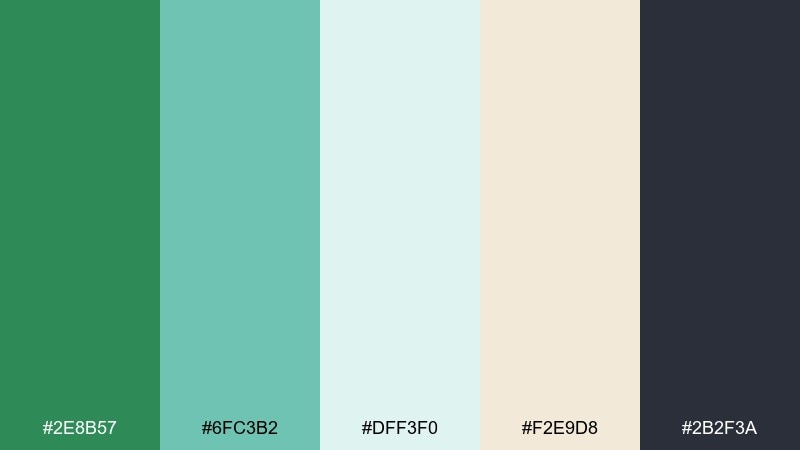
HEX: #2E8B57 #6FC3B2 #DFF3F0 #F2E9D8 #2B2F3A
Mood: airy, restorative, coastal
Best for: wellness branding and calm website headers
Airy coastal tones that feel like a quiet morning by the water. Use the deep sea green as your anchor, then let mint and misty aqua carry backgrounds and sections. Creamy sand keeps it warm, while charcoal adds readable contrast for headlines and buttons. Tip: reserve the darkest shade for CTAs to keep the layout light but still crisp.
Image example of coastal calm generated using media.io

Media.io is an online AI studio for creating and editing video, image, and audio in your browser.

2) Sage Surf
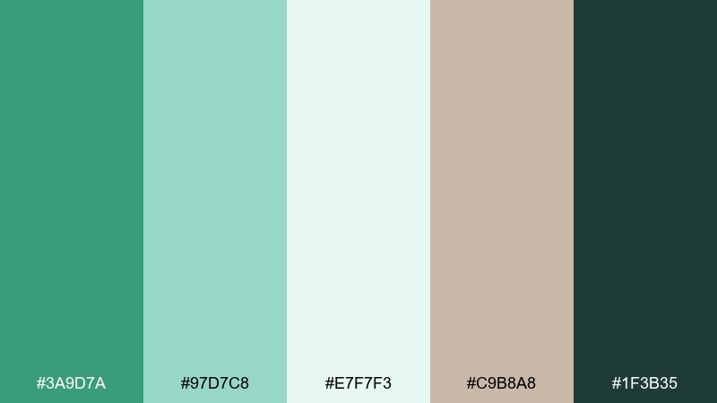
HEX: #3A9D7A #97D7C8 #E7F7F3 #C9B8A8 #1F3B35
Mood: soft, sun-faded, natural
Best for: eco packaging and organic product labels
Soft, sun-faded greens that read organic and trustworthy. The sea green base works beautifully on matte labels, while pale aqua supports whitespace and ingredient blocks. Add the warm taupe to avoid a sterile look, and use the deep pine tone for legal text and barcodes. Tip: keep the label background in the lightest tint to make the product name feel premium.
Image example of sage surf generated using media.io
3) Lagoon Pop
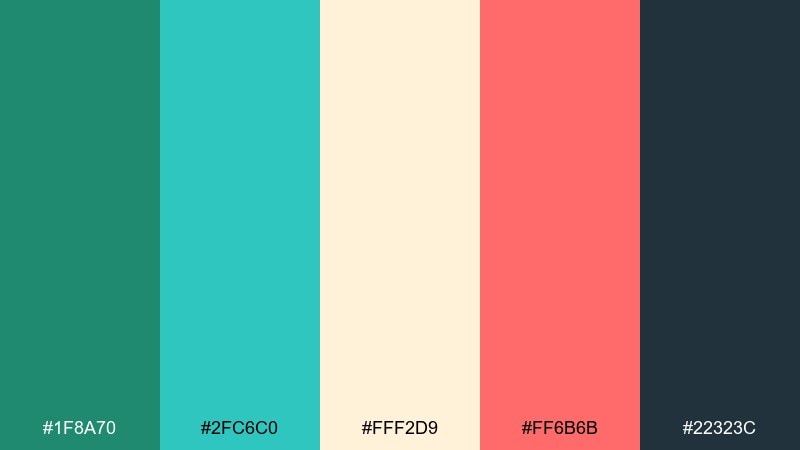
HEX: #1F8A70 #2FC6C0 #FFF2D9 #FF6B6B #22323C
Mood: playful, energetic, summery
Best for: social posts and event promo graphics
Playful lagoon greens with a punchy coral accent, like a summer market poster. This mix makes sea green color combinations feel modern instead of sleepy, especially when coral is used in small bursts for prices or dates. Cream keeps the overall design friendly, while slate adds structure for text. Tip: limit coral to one highlight element per layout to keep the palette from turning loud.
Image example of lagoon pop generated using media.io
4) Eucalyptus Linen
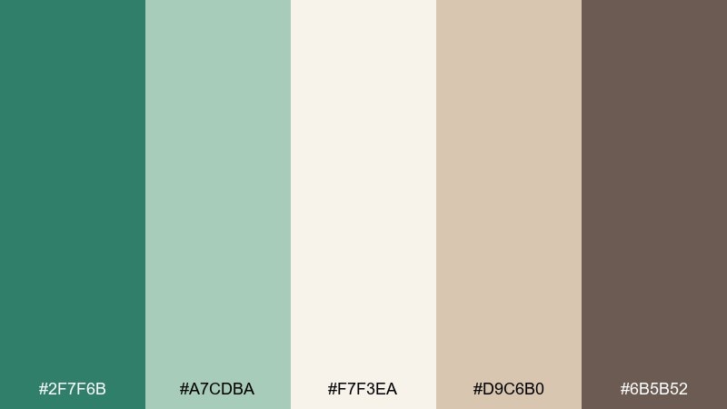
HEX: #2F7F6B #A7CDBA #F7F3EA #D9C6B0 #6B5B52
Mood: quiet, cozy, earthy
Best for: home decor lookbooks and interior mood boards
Quiet eucalyptus greens paired with linen neutrals for a lived-in, cozy feel. Use the muted green for large blocks like room backdrops or section dividers, then layer creams and oat tones for softness. The cocoa brown is ideal for typography, frames, and icons. Tip: repeat the warm beige in small details to keep the palette from skewing too cool.
Image example of eucalyptus linen generated using media.io
5) Deep Harbor
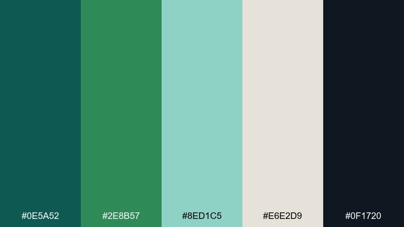
HEX: #0E5A52 #2E8B57 #8ED1C5 #E6E2D9 #0F1720
Mood: moody, refined, nautical
Best for: finance dashboards and professional SaaS UI
Moody harbor greens with near-black contrast, like a polished marina at dusk. The darkest teal and ink are perfect for navigation bars, while sea green and soft aqua can signal success states and data highlights. Keep the light gray as the canvas so charts stay readable. Tip: use aqua sparingly for key metrics to avoid visual noise in dense screens.
Image example of deep harbor generated using media.io
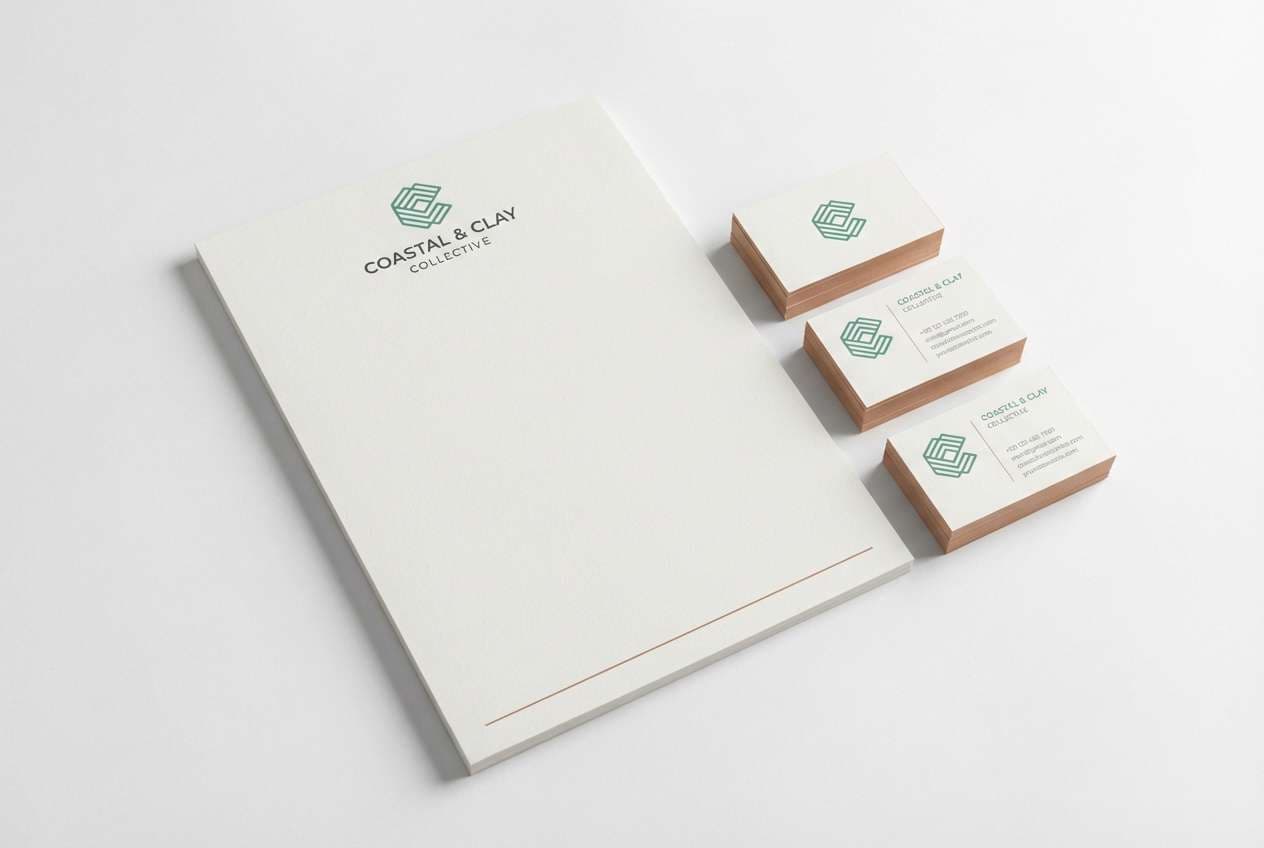
6) Pearl and Seaweed
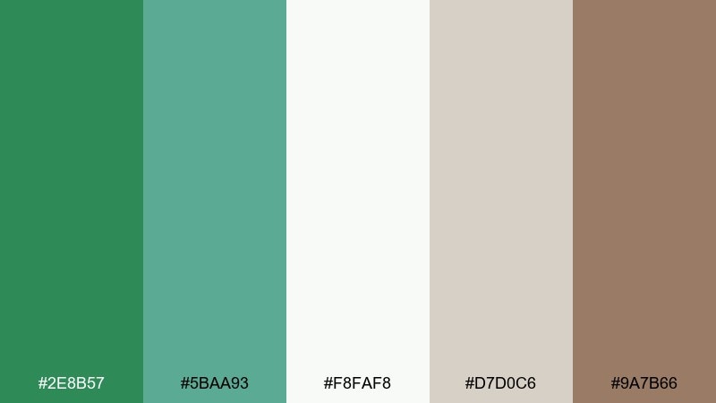
HEX: #2E8B57 #5BAA93 #F8FAF8 #D7D0C6 #9A7B66
Mood: clean, natural, understated
Best for: minimal brand identities and stationery
Clean greens with pearly whites that feel crisp, natural, and understated. This sea green color palette works well for logos, letterheads, and subtle patterns where you want calm confidence. Warm clay-brown adds a handcrafted touch without overpowering the neutrals. Tip: keep the green in thin lines and marks, then let white space do most of the work.
Image example of pearl and seaweed generated using media.io
7) Minted Matcha
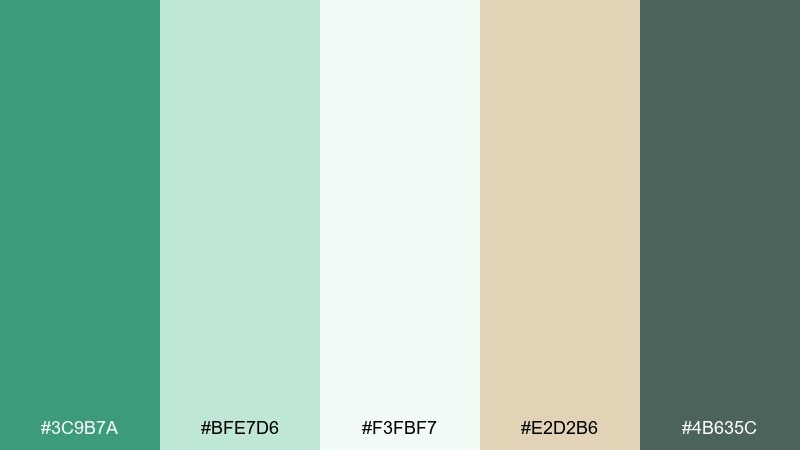
HEX: #3C9B7A #BFE7D6 #F3FBF7 #E2D2B6 #4B635C
Mood: fresh, wholesome, light
Best for: cafe menus and beverage branding
Fresh matcha-like greens with a creamy oat note, perfect for a welcoming counter vibe. Use the deeper green for section titles and pricing, while mint tints keep the menu airy and easy to scan. The warm beige pairs well with paper textures and natural photography. Tip: add subtle green blocks behind featured items to guide the eye without clutter.
Image example of minted matcha generated using media.io
8) Seaglass Blush
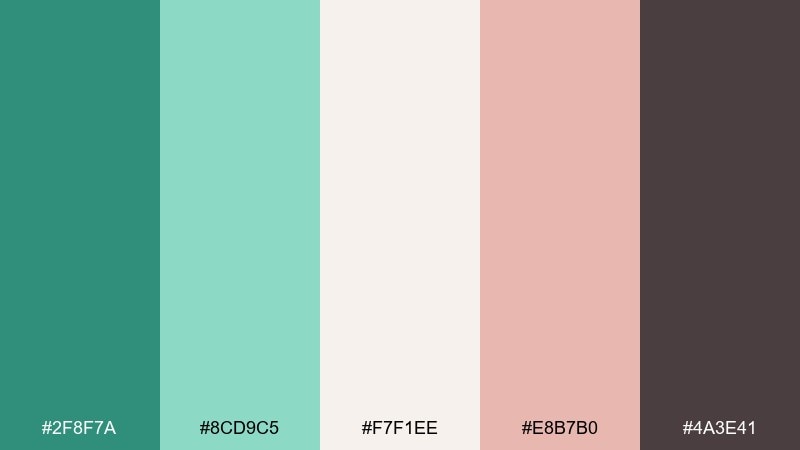
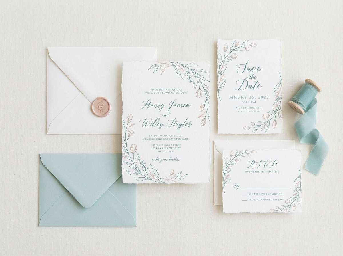
HEX: #2F8F7A #8CD9C5 #F7F1EE #E8B7B0 #4A3E41
Mood: romantic, soft, modern
Best for: wedding invitations and save-the-dates
Romantic seaglass greens with a gentle blush, like satin ribbon against coastal stone. This pairing makes elegant sea green color combinations for invitations, RSVP cards, and monograms. Use blush for names and small motifs, then keep most copy in the deep warm gray for legibility. Tip: print the greens on textured stock to enhance the airy, upscale feel.
Image example of seaglass blush generated using media.io
9) Tidepool Neutrals
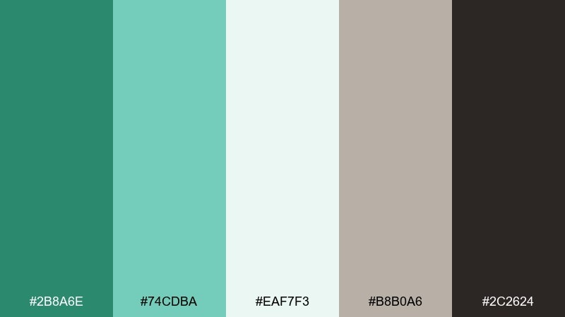
HEX: #2B8A6E #74CDBA #EAF7F3 #B8B0A6 #2C2624
Mood: balanced, grounded, contemporary
Best for: portfolio websites and case study pages
Balanced tidepool greens grounded by stone and espresso tones. The mid sea green color scheme reads confident on headers, while pale aqua keeps long pages feeling light. Use the warm gray for dividers and captions, and save the dark brown for key text and links. Tip: keep imagery slightly desaturated so the greens remain the star.
Image example of tidepool neutrals generated using media.io
10) Rainy Fern
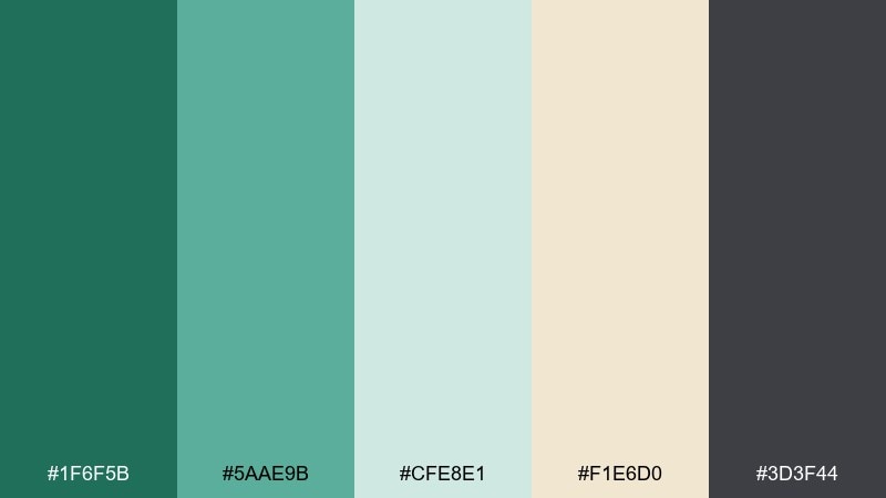
HEX: #1F6F5B #5AAE9B #CFE8E1 #F1E6D0 #3D3F44
Mood: calm, overcast, thoughtful
Best for: editorial layouts and magazine spreads
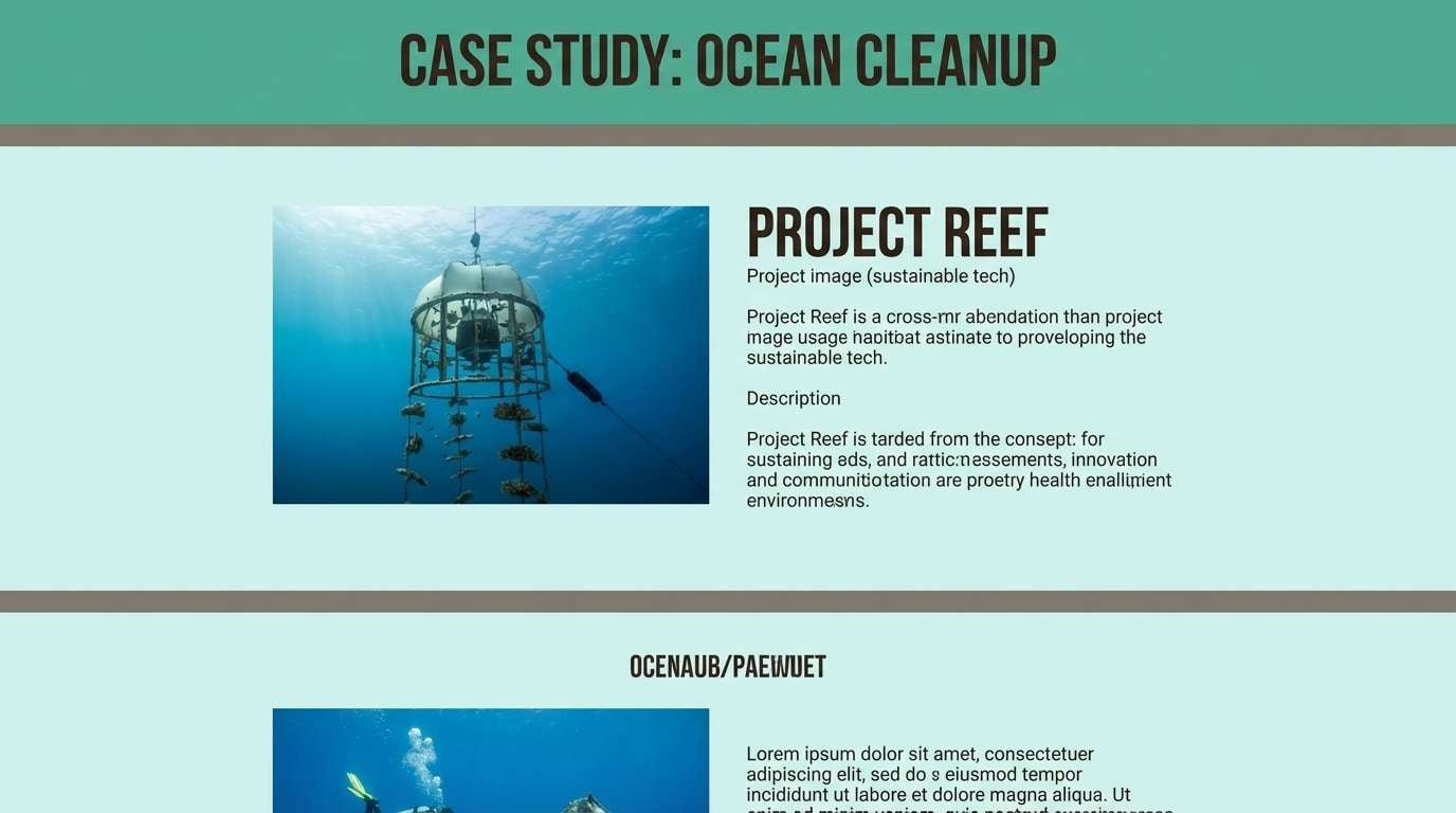
Calm rainy-fern tones that feel reflective and literary. Use the deep green for pull quotes and section openers, then let the pale misty teal support columns and callouts. Cream adds warmth like aged paper, while graphite gives strong hierarchy. Tip: pair with serif headlines and plenty of leading for a premium editorial rhythm.
Image example of rainy fern generated using media.io
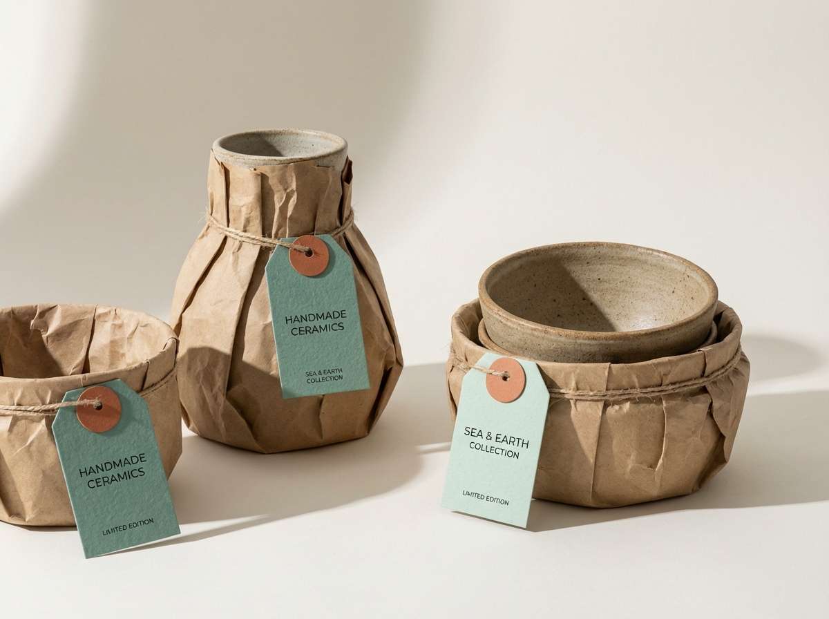
11) Aloe and Clay
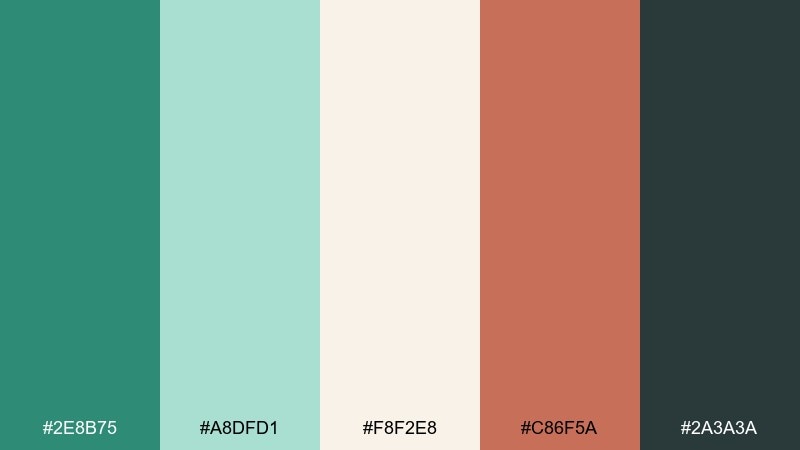
HEX: #2E8B75 #A8DFD1 #F8F2E8 #C86F5A #2A3A3A
Mood: warm, artisan, inviting
Best for: ceramics shops and handmade product pages
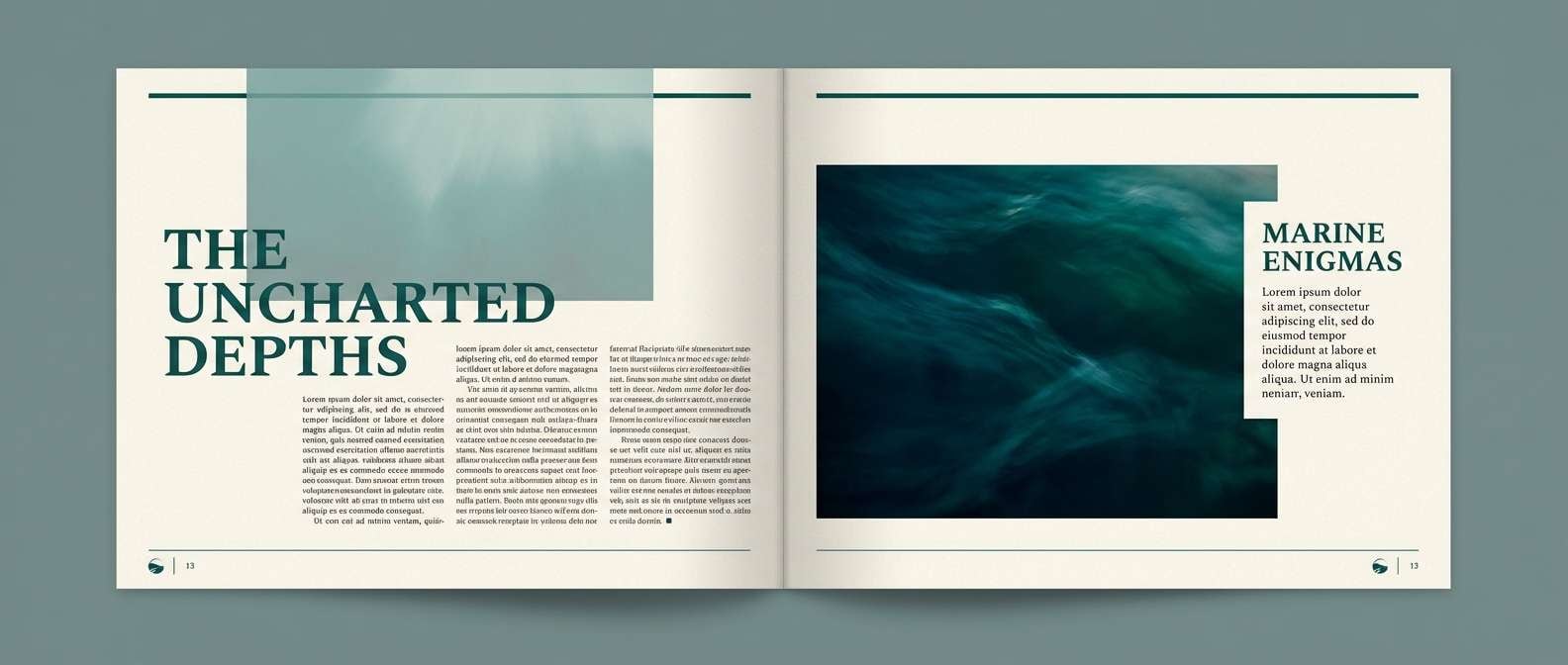
Warm artisan greens with clay-red energy, like glazed pottery on a studio shelf. The green and mint keep pages fresh, while terracotta brings a handmade accent for buttons, badges, or sale tags. Off-white makes product photos pop without harsh contrast. Tip: use clay tones for small highlights only, so the green stays dominant and soothing.
Image example of aloe and clay generated using media.io
12) Evergreen Mist
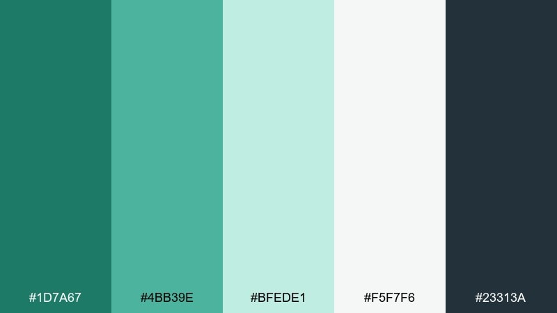
HEX: #1D7A67 #4BB39E #BFEDE1 #F5F7F6 #23313A
Mood: modern, clean, optimistic
Best for: mobile app onboarding screens
Modern evergreen tones softened by misty tints for a bright, optimistic UI feel. Use the darkest shade for nav and primary buttons, then let the minty teal guide illustrations and progress indicators. White keeps screens spacious, while the blue-charcoal supports readable text. Tip: use the lightest green as a subtle background wash behind feature highlights.
Image example of evergreen mist generated using media.io
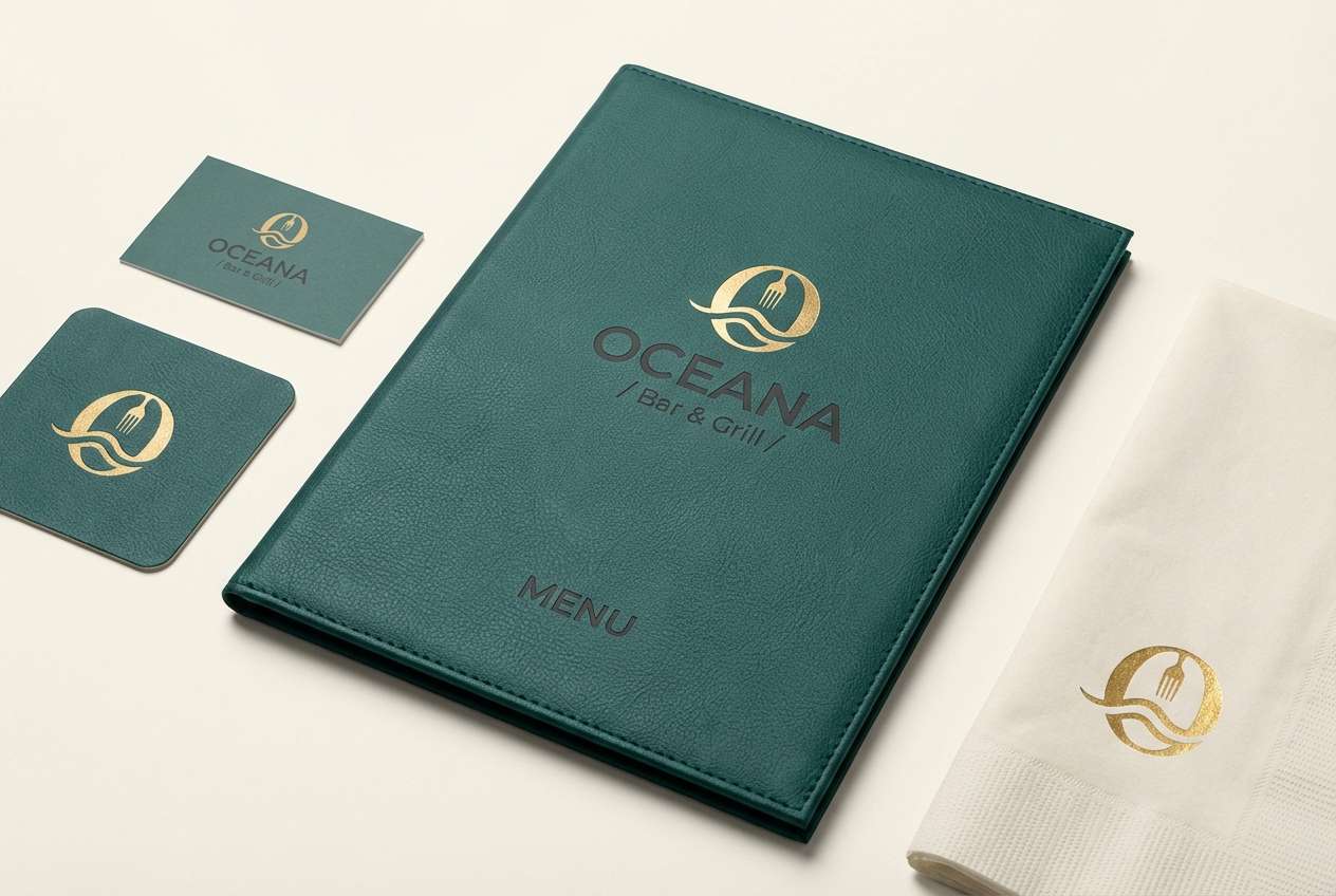
13) Saltmarsh Gold
HEX: #2B8C6B #7FD2B9 #FAF2DF #D8B25C #3B3A37
Mood: sunlit, upscale, welcoming
Best for: restaurant branding and menu covers
Sunlit marsh greens with a tasteful gold, like afternoon light on rippling water. The green base feels fresh for food branding, while gold acts as a refined accent for borders, icons, or foil touches. Cream keeps it approachable, and dark gray anchors typography. Tip: use gold only on key touchpoints like the logo mark or section headers to maintain elegance.
Image example of saltmarsh gold generated using media.io
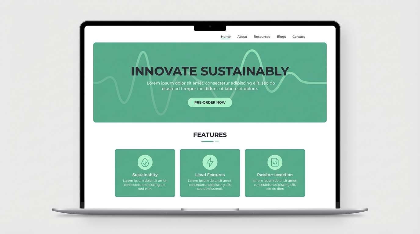
14) Breeze and Basalt
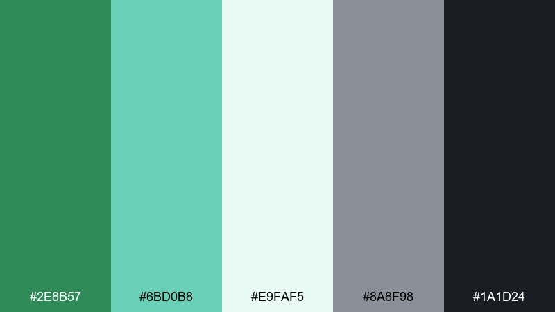
HEX: #2E8B57 #6BD0B8 #E9FAF5 #8A8F98 #1A1D24
Mood: cool, techy, confident
Best for: product landing pages and feature sections
Cool breezy greens set against basalt grays for a confident, tech-forward look. If you want a sea green color scheme that still feels sharp, let the near-black handle typography and nav while minty tones highlight feature cards. The soft green-white keeps long landing pages from feeling heavy. Tip: use the medium gray for secondary buttons and helper text to preserve hierarchy.
Image example of breeze and basalt generated using media.io
15) Coral Reef Balance
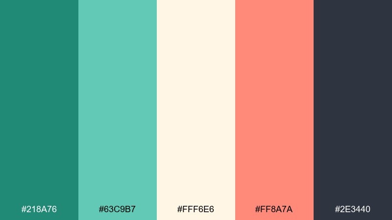
HEX: #218A76 #63C9B7 #FFF6E6 #FF8A7A #2E3440
Mood: lively, friendly, tropical
Best for: travel ads and summer campaign banners
Lively reef-inspired tones that feel like sun, sea spray, and coral shells. These sea green color combinations work best when coral is treated as a headline accent and the greens do the heavy lifting in backgrounds and shapes. Cream adds a warm vacation glow, while charcoal keeps copy crisp. Tip: keep coral to about 10 to 15 percent of the layout for a clean, modern banner.
Image example of coral reef balance generated using media.io

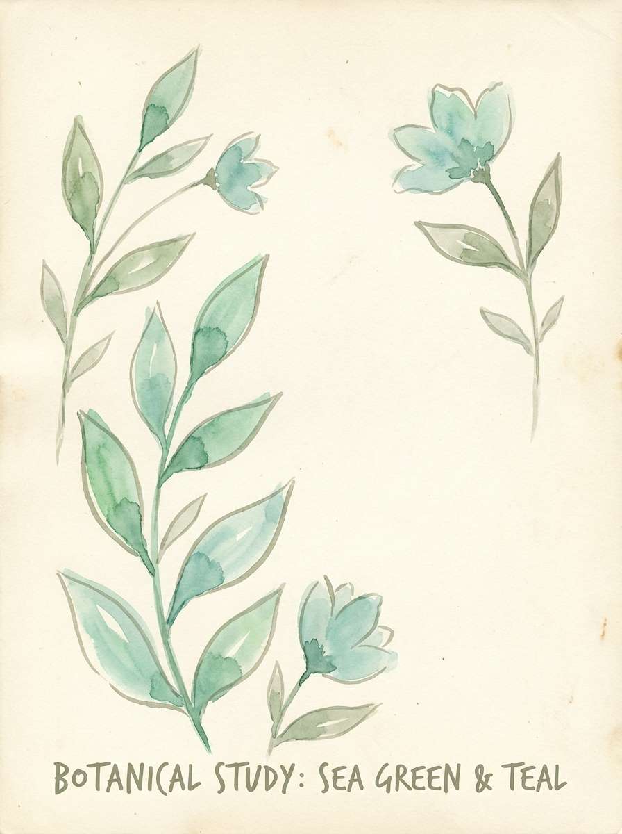
16) Botanical Glasshouse
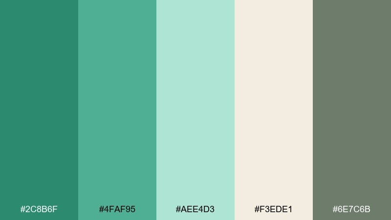
HEX: #2C8B6F #4FAF95 #AEE4D3 #F3EDE1 #6E7C6B
Mood: botanical, fresh, gentle
Best for: plant shop posters and spring illustrations
Botanical greens that feel like leaves seen through greenhouse glass. Layer the deeper tones for stems and shadows, then use the pale aqua as airy highlights and negative space. Cream keeps the illustration warm and giftable, while the muted olive-gray can outline details. Tip: pick two greens for the main foliage and reserve the lightest tint for glow and dew effects.
Image example of botanical glasshouse generated using media.io
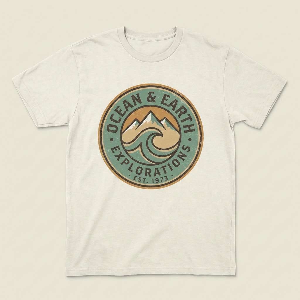
17) Vintage Marina
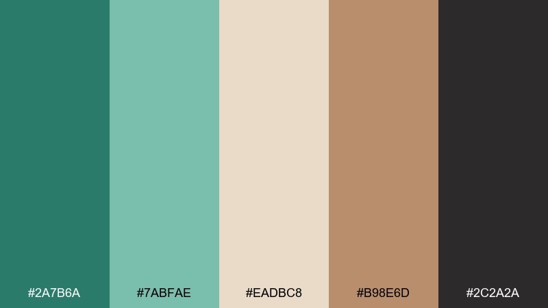
HEX: #2A7B6A #7ABFAE #EADBC8 #B98E6D #2C2A2A
Mood: nostalgic, warm, maritime
Best for: retro logos and merch graphics
Nostalgic marina greens mixed with warm tan and caramel, like a vintage travel label. The muted sea tones are great for badge logos, while the sandy beige can fill backgrounds or distressed textures. Use caramel for small highlight stripes and the deep espresso for linework. Tip: add grain and subtle halftone shading to push the retro print vibe without losing readability.
Image example of vintage marina generated using media.io
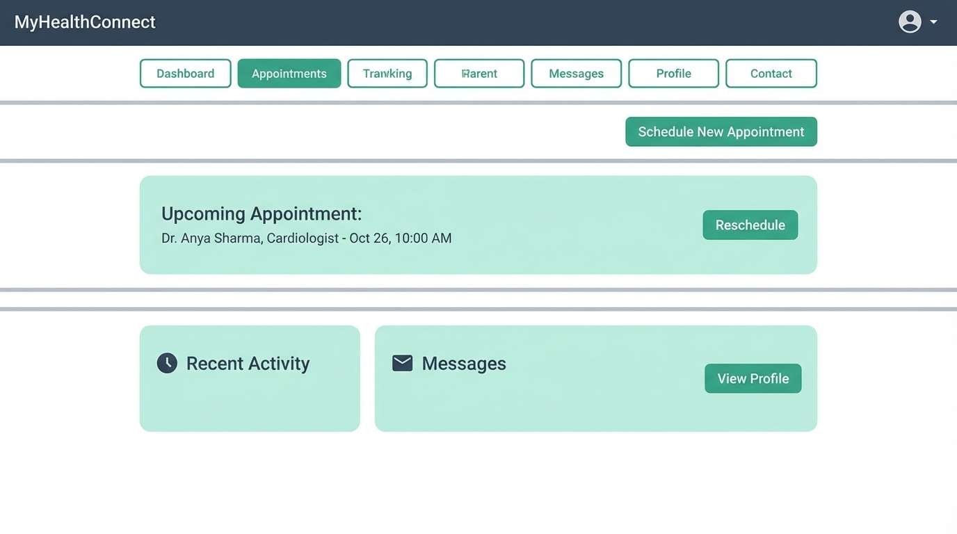
18) Clean Clinic Green
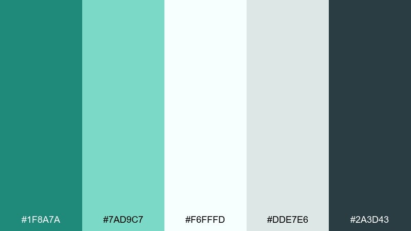
HEX: #1F8A7A #7AD9C7 #F6FFFD #DDE7E6 #2A3D43
Mood: clinical, reassuring, bright
Best for: healthcare portals and appointment UI
Bright, clinical greens that feel reassuring and hygienic. Use the strongest green for primary actions like Book and Confirm, then rely on pale mint backgrounds for forms and cards. The cool gray supports dividers and table rows, while deep blue-gray keeps text readable. Tip: keep error and warning colors minimal and use the greens for most status messaging to reduce anxiety.
Image example of clean clinic green generated using media.io
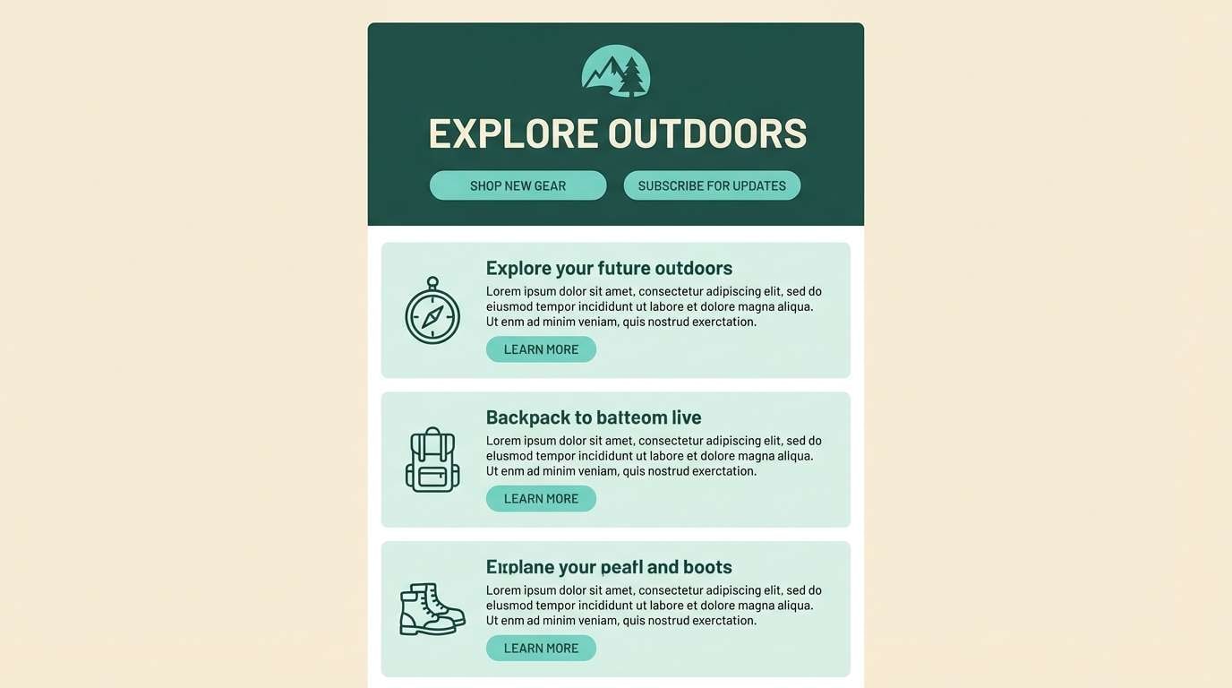
19) Forest Pool
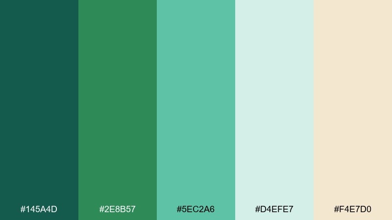
HEX: #145A4D #2E8B57 #5EC2A6 #D4EFE7 #F4E7D0
Mood: lush, serene, outdoorsy
Best for: outdoor brands and adventure newsletters
Lush pool greens with a soft sand note, like a hidden swimming spot under trees. The darker tones are strong for mastheads and section bars, while the aqua works as a lively accent for icons and links. Pale mint and warm cream make great background layers for long reads. Tip: pair with nature photography that has warm highlights to keep the palette from feeling too cool.
Image example of forest pool generated using media.io
20) Aqua Chalkboard
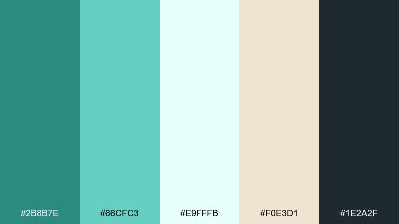
HEX: #2B8B7E #66CFC3 #E9FFFB #F0E3D1 #1E2A2F
Mood: smart, friendly, classroom-ready
Best for: online course slides and webinar graphics
Smart aqua-greens with a chalkboard-dark base, ideal for teaching visuals. Use the dark shade for title bars and speaker notes, then bring in mint and aqua for charts, callouts, and step markers. Cream adds warmth so slides do not look sterile on screen. Tip: stick to two accent levels per slide to keep learning content easy to follow.
Image example of aqua chalkboard generated using media.io
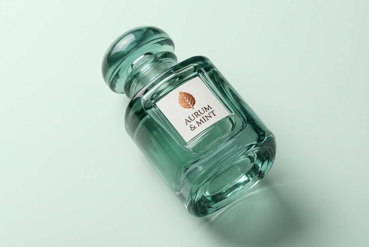
21) Sea Green and Copper
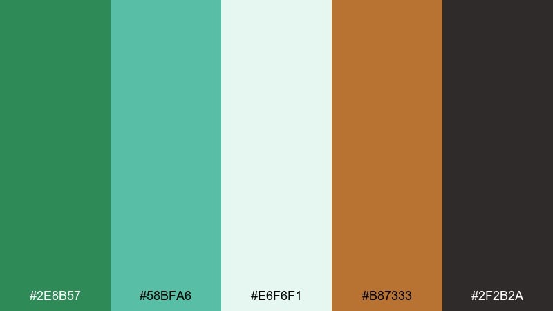
HEX: #2E8B57 #58BFA6 #E6F6F1 #B87333 #2F2B2A
Mood: premium, bold, contemporary
Best for: luxury branding and product ads
Premium greens with a copper accent that feels like polished metal against cool water. The contrast makes a sea green color combination that stands out in ads, especially when copper is used for small type, borders, or foil effects. Keep the pale mint as breathing room and the deep brown-black for high-end typography. Tip: use copper on one focal element only, like the logo stamp or product name, to avoid visual clutter.
Image example of sea green and copper generated using media.io
What Colors Go Well with Sea Green?
Sea green pairs effortlessly with calm neutrals like ivory, cream, warm sand, and light gray—perfect when you want a clean, coastal baseline. For text and structure, deep charcoal or near-black keeps contrast crisp without feeling harsh.
If you want a modern accent, try coral, blush, terracotta, copper, or muted gold. These warm tones create a stylish push-pull against sea green, helping CTAs, badges, or headlines stand out.
For cooler combos, mint, aqua, teal, and blue-gray create a cohesive ocean-forward look. Keep at least one “ink” shade (charcoal/navy) to maintain readability.
How to Use a Sea Green Color Combinations in Real Designs
Start with role-based color usage: pick one sea green as the primary brand color, one very light tint for backgrounds, and one dark neutral for typography. This simple structure prevents the palette from looking washed out.
For UI, use sea green for positive states, progress, and primary actions—but balance it with plenty of white space and cool grays. In print, sea green looks especially premium on textured stock or matte packaging.
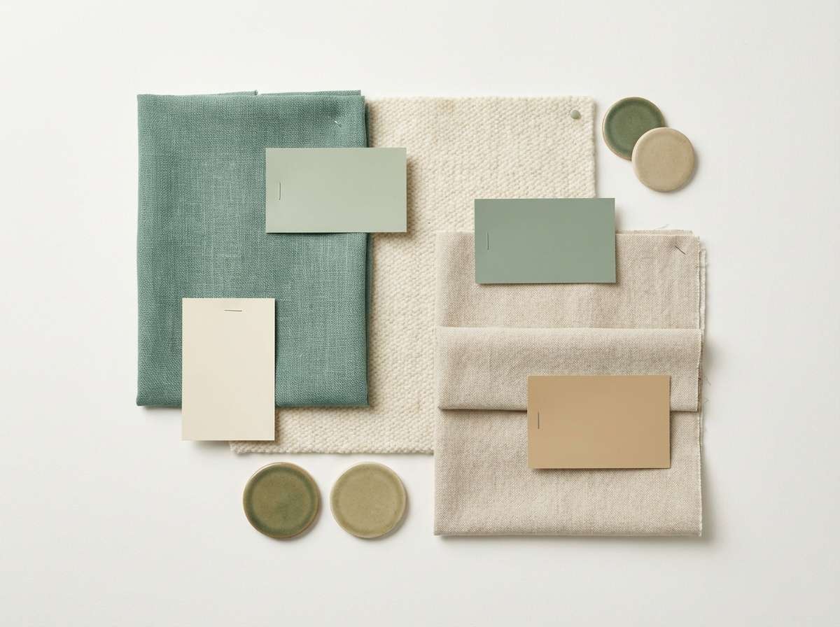
For interiors and mood boards, pair sea green walls or textiles with linen whites, oat beiges, and natural wood. Add small warm accents (clay, brass, copper) to keep the space from skewing too cool.
Create Sea Green Palette Visuals with AI
If you have HEX codes but need to “see” the palette in action, generate quick mockups with AI. This is a fast way to test whether your sea green color scheme reads more coastal, clinical, botanical, or luxury.
Paste one of the prompts above into Media.io Text-to-Image, then iterate by swapping one accent color (coral vs copper) or changing the context (app UI vs packaging). Small changes in setting can completely shift the mood.
Sea Green Color Palette FAQs
-
What is the HEX code for classic sea green?
A commonly used “classic” sea green is #2E8B57. Many sea green palettes build around this shade and then add lighter mints, sandy neutrals, and a dark charcoal for contrast. -
Is sea green the same as seafoam or teal?
Not exactly. Seafoam is usually lighter and milkier (more white mixed in), while teal is often deeper and bluer. Sea green typically sits between green and blue with a medium, natural saturation. -
What colors complement sea green best?
Warm complements like coral, blush, terracotta, copper, and muted gold pop against sea green. For a calmer look, pair it with cream, sand, light gray, and charcoal. -
How do I keep sea green from looking too “beachy” in branding?
Use modern neutrals (cool gray, basalt, near-black) and treat sea green as a structured UI/brand color rather than a background wash. Adding copper or slate accents can make it feel more premium and tech-forward. -
What’s a good sea green palette for a website UI?
Try a set with a dark ink/charcoal for text, a light gray or near-white for surfaces, and sea green for primary actions—like Deep Harbor or Clean Clinic Green above. -
Can sea green work for luxury design?
Yes—pair sea green with high-contrast dark typography and a metallic-style accent like copper or gold. Keep accents minimal and rely on clean layouts and whitespace for a premium feel. -
How can I preview sea green color combinations quickly?
Use an AI generator to create mockups (packaging, landing pages, posters) using your chosen HEX direction. With Media.io Text-to-Image, you can test multiple sea green palette moods in minutes.
Next: Raspberry Color Palette


