

Royal purple sits right at the intersection of bold and elegant, which makes it unusually versatile across branding, UI, and print. It can feel luxurious, creative, calm, or electric depending on what you pair it with.
Below are 20 ready-to-use royal purple color palette ideas with HEX codes, plus quick pairing tips and AI image prompts you can reuse for mockups.
In this article
- Why Royal Purple Palettes Work So Well
-
- royal velvet neutrals
- lavender gilded luxe
- midnight orchid
- amethyst blush
- plum and sage balance
- regal pop art
- royal purple night sky
- vintage tapestry
- soft lilac minimal ui
- berry chocolate comfort
- iris and steel
- ultra violet citrus
- dusty mauve romance
- deep royal gradient
- royal purple and teal splash
- orchid pearl wedding
- cosmic neon accent
- heritage library
- modern gallery white space
- winter royal frost
- What Colors Go Well with Royal Purple?
- How to Use a Royal Purple Color Palette in Real Designs
- Create Royal Purple Palette Visuals with AI
Why Royal Purple Palettes Work So Well
Royal purple is naturally “premium” because it reads as deep, saturated, and intentional. Even a small amount can make a layout feel more curated than basic primary colors.
It also adapts well across mediums: dark purples hold up in print (rich ink coverage), while lighter lilacs and lavenders look clean in digital UI backgrounds and gradients.
Most importantly, royal purple pairs easily with both warm accents (gold, tan, blush) and cool accents (teal, sky blue, steel gray), letting you steer the mood without changing your brand anchor.
20+ Royal Purple Color Palette Ideas (with HEX Codes)
1) Royal Velvet Neutrals
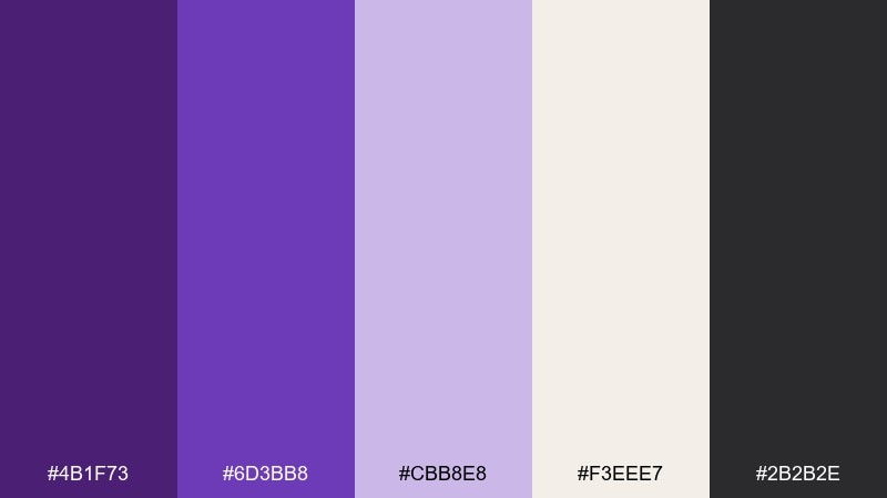
HEX: #4B1F73 #6D3BB8 #CBB8E8 #F3EEE7 #2B2B2E
Mood: regal, calm, polished
Best for: luxury branding and editorial layouts
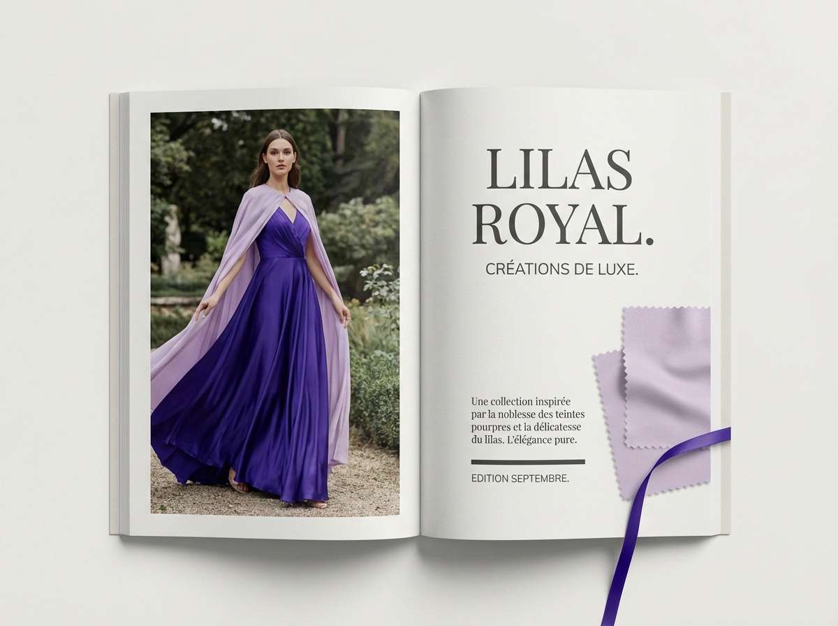
Velvety and composed, these tones feel like a tailored suit in a candlelit gallery. The deep purples land confidently against soft lilac and warm parchment, while charcoal keeps everything grounded. Use this royal purple color palette for premium packaging, lookbooks, and high-end service brands. Pair it with serif typography and subtle foil textures, and keep the light neutral as your breathing room.
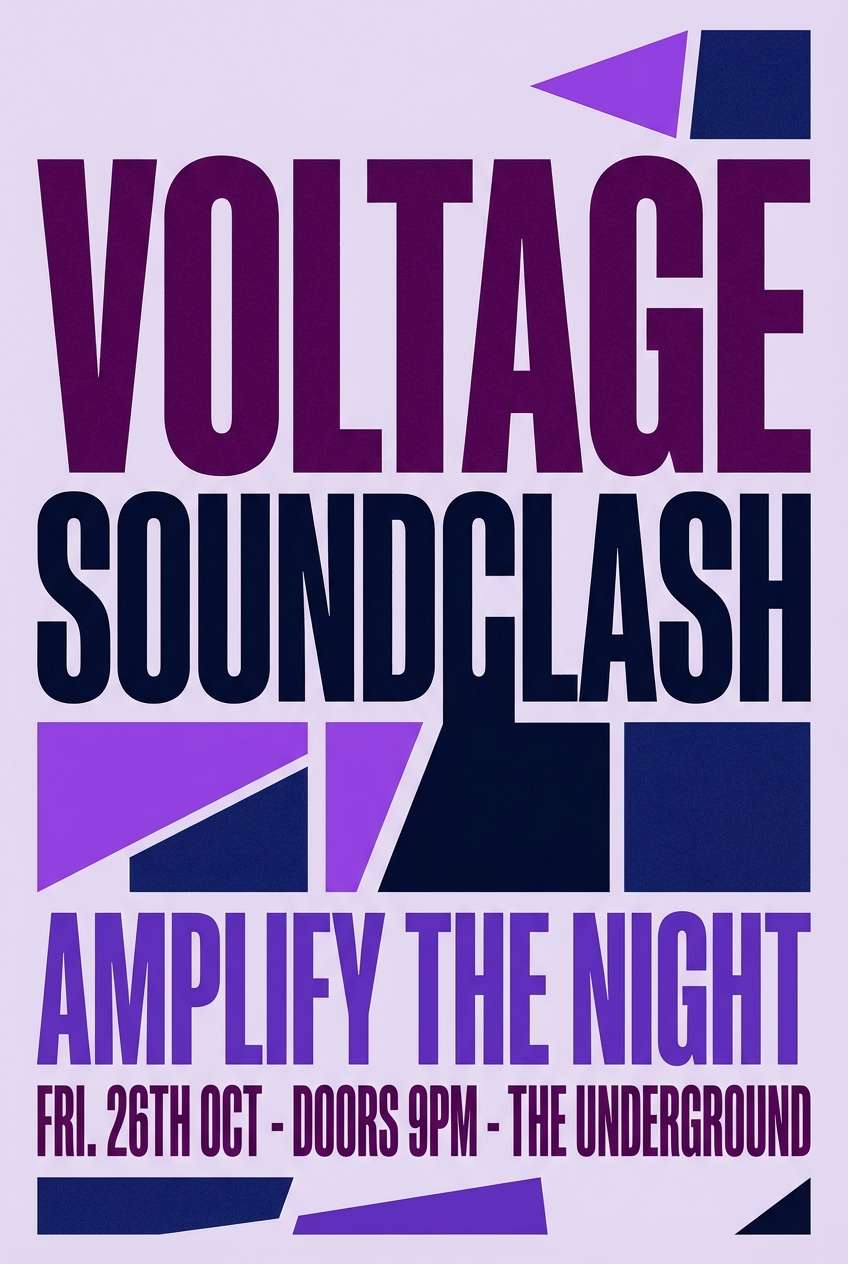
Image example of royal velvet neutrals generated using media.io
Media.io is an online AI studio for creating and editing video, image, and audio in your browser.

2) Lavender Gilded Luxe
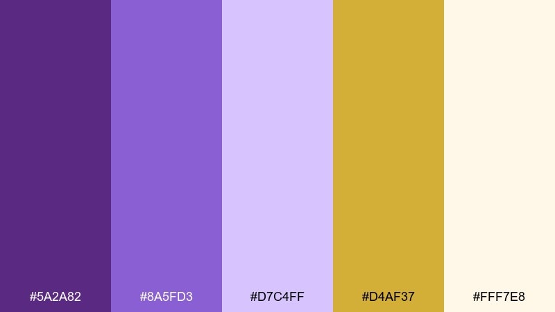
HEX: #5A2A82 #8A5FD3 #D7C4FF #D4AF37 #FFF7E8
Mood: opulent, radiant, celebratory
Best for: beauty packaging and premium gift sets
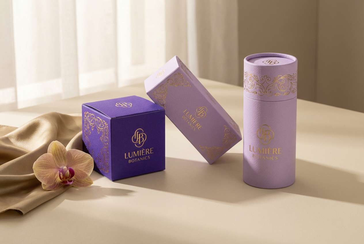
Radiant and indulgent, this mix evokes lavender silk with a flash of gold jewelry. Royal purple and violet read as the hero tones, while creamy ivory keeps the look expensive rather than loud. It works beautifully on cosmetic boxes, candles, and seasonal gift kits when you want instant shelf appeal. Use the gold as a restrained accent on borders or logos to avoid overpowering the purples.
Image example of lavender gilded luxe generated using media.io
3) Midnight Orchid
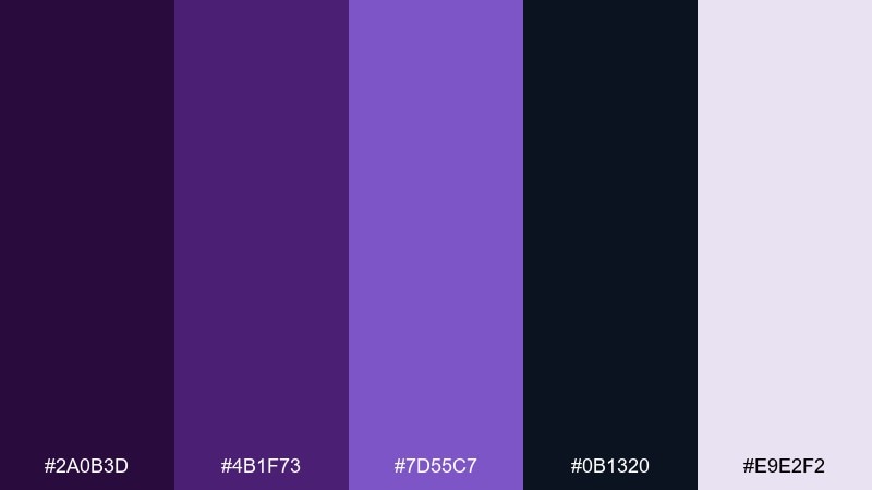
HEX: #2A0B3D #4B1F73 #7D55C7 #0B1320 #E9E2F2
Mood: mysterious, cinematic, nocturnal
Best for: music posters and film titles
Moody and cinematic, these hues feel like orchids lit by neon under a midnight sky. The inky navy and deep violet create drama, while the pale lavender gives just enough contrast for headlines. Use it for concert posters, streaming thumbnails, and title cards where you want intensity without going full black. A simple tip: reserve the light tint for key text and let the darks carry the background.
Image example of midnight orchid generated using media.io
4) Amethyst Blush
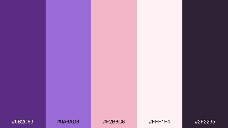
HEX: #5B2C83 #9A6AD6 #F2B6C6 #FFF1F4 #2F2235
Mood: romantic, soft, modern
Best for: wedding invitations and beauty socials
Romantic and airy, this palette feels like amethyst light spilling over blush petals. The purple anchors the design, while pink and soft white keep it sweet and contemporary. It shines on invitations, Instagram carousels, and skincare branding that needs a gentle, elevated vibe. Keep body text in the deep plum and use blush as a large background wash for an effortless look.
Image example of amethyst blush generated using media.io
5) Plum and Sage Balance
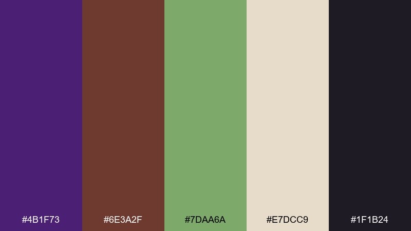
HEX: #4B1F73 #6E3A2F #7DAA6A #E7DCC9 #1F1B24
Mood: earthy, grounded, boutique
Best for: wellness brands and cafe menus
Grounded and boutique-like, these colors evoke dried herbs, plum jam, and warm paper. The sage green softens the purple's intensity and makes the whole set feel approachable. Try it for wellness packaging, artisanal food labels, or a cozy cafe menu. Use the cream as the main canvas and keep the brown for supporting dividers or icon strokes.
Image example of plum and sage balance generated using media.io
6) Regal Pop Art
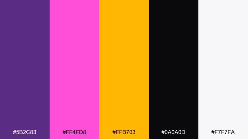
HEX: #5B2C83 #FF4FD8 #FFB703 #0A0A0D #F7F7FA
Mood: bold, playful, high-contrast
Best for: event flyers and streetwear drops
Bold and punchy, this set feels like a pop-art poster under nightclub lights. Royal purple holds the center while hot pink and golden yellow crank up the energy. These royal purple color combinations are perfect for flyers, merch graphics, and campaign headlines that need instant impact. Keep the black for outlines and use white space to prevent the brights from competing.
Image example of regal pop art generated using media.io

7) Royal Purple Night Sky
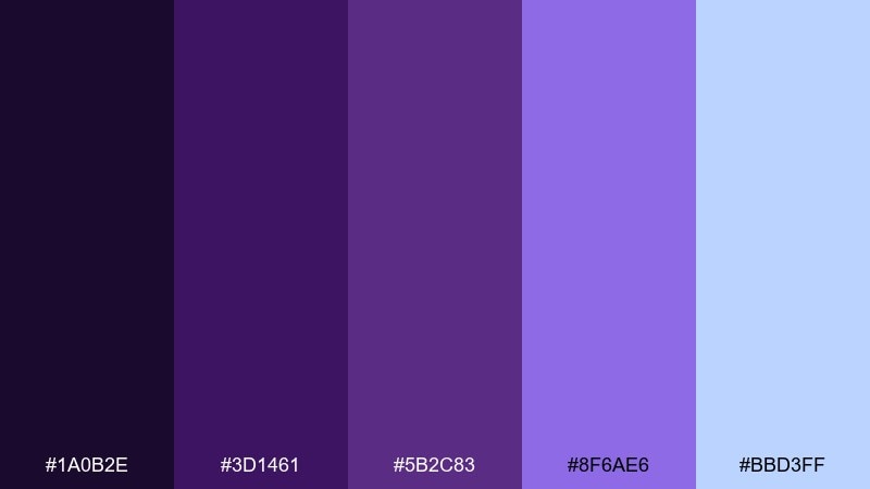
HEX: #1A0B2E #3D1461 #5B2C83 #8F6AE6 #BBD3FF
Mood: dreamy, cosmic, serene
Best for: app splash screens and meditation brands
Dreamy and cosmic, these tones look like twilight fading into starlight. The layered purples build depth, and the soft sky blue brings a calm, breathable highlight. Use it for onboarding screens, meditation apps, or audio branding where you want soothing but memorable color. A gradient from deep plum to violet can do most of the visual work without extra decoration.
Image example of royal purple night sky generated using media.io
8) Vintage Tapestry
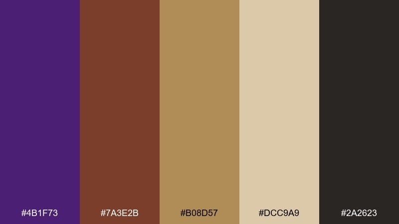
HEX: #4B1F73 #7A3E2B #B08D57 #DCC9A9 #2A2623
Mood: heritage, warm, artisanal
Best for: book covers and craft branding
Warm and heritage-inspired, this set feels like a woven tapestry with aged leather edges. The purple becomes richer next to copper and antique gold, while the tan adds a sunlit, paper-like softness. It's a strong fit for book covers, apothecary labels, and artisan craft brands. Use the tan as your primary background to keep the darker tones from feeling heavy.
Image example of vintage tapestry generated using media.io
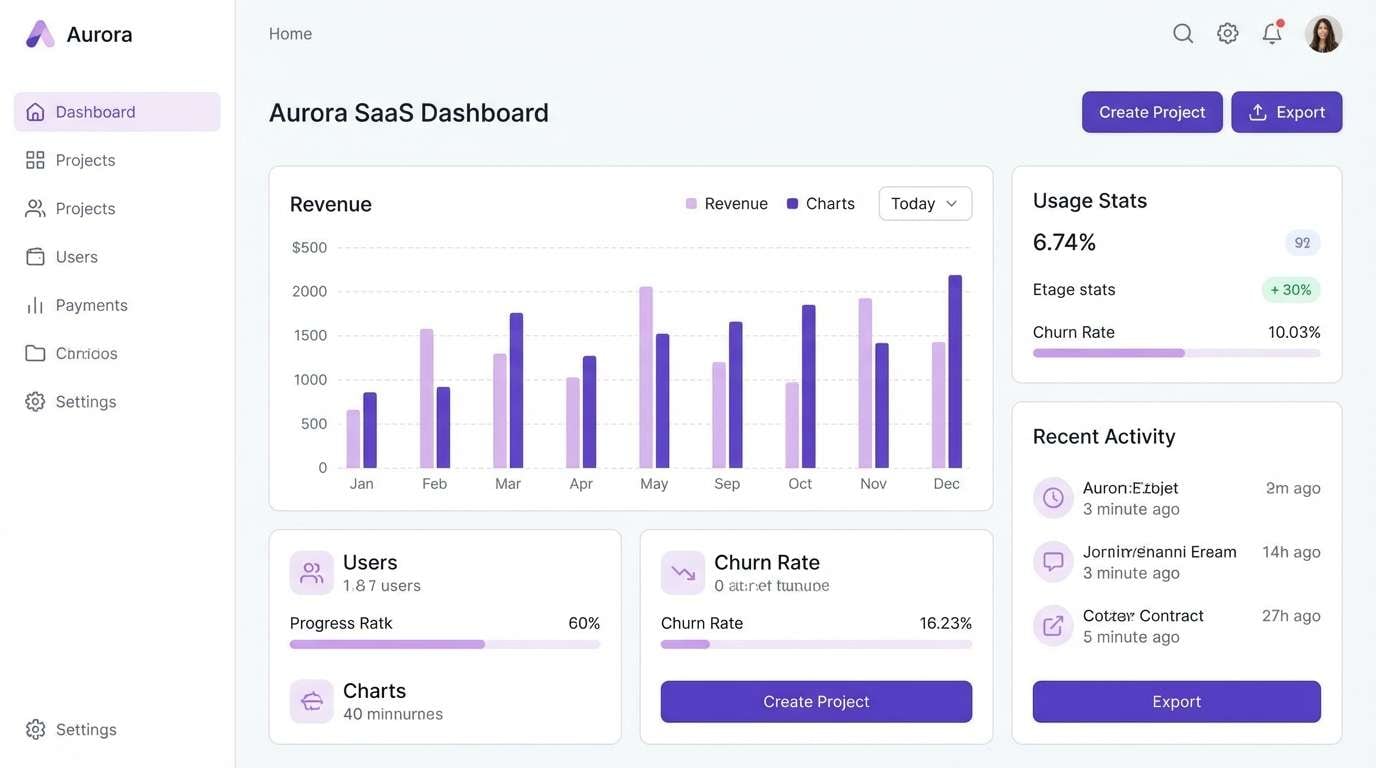
9) Soft Lilac Minimal UI
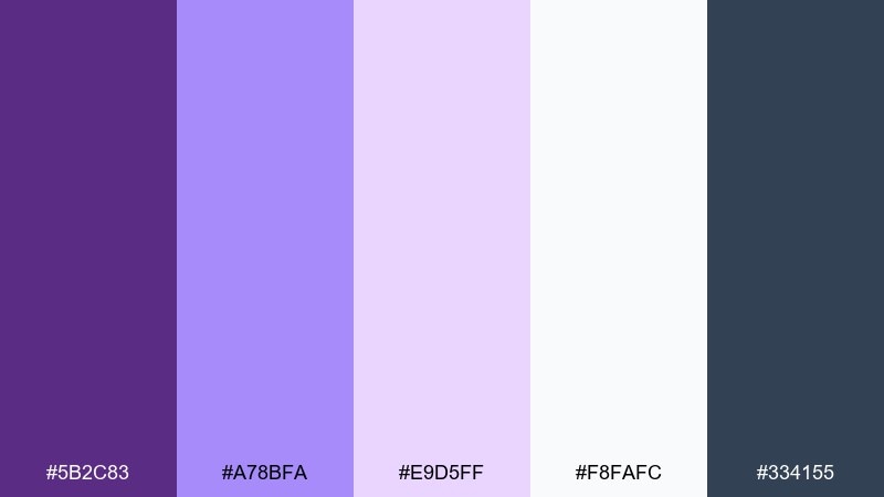
HEX: #5B2C83 #A78BFA #E9D5FF #F8FAFC #334155
Mood: clean, friendly, modern
Best for: SaaS dashboards and productivity apps
Clean and friendly, these lilac tints feel like a bright workspace with a subtle purple glow. The slate gray adds readable structure, and the near-white keeps components looking crisp. It's ideal for dashboards, settings screens, and onboarding flows where you want color without clutter. Tip: use the darkest purple for primary buttons and the palest lavender for card backgrounds.
Image example of soft lilac minimal ui generated using media.io
10) Berry Chocolate Comfort
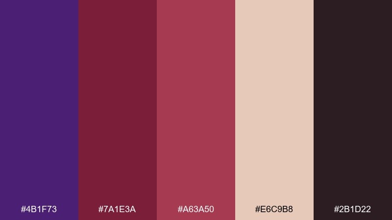
HEX: #4B1F73 #7A1E3A #A63A50 #E6C9B8 #2B1D22
Mood: cozy, rich, indulgent
Best for: dessert branding and seasonal campaigns
Cozy and indulgent, these shades bring to mind berry ganache and dark chocolate on a warm plate. The creamy beige keeps the reds and purples from turning too heavy, especially in print. Use it for dessert packaging, winter promos, and boutique food photography overlays. Keep the deepest tone for type and use the berry hues as appetizing accents around product shots.
Image example of berry chocolate comfort generated using media.io
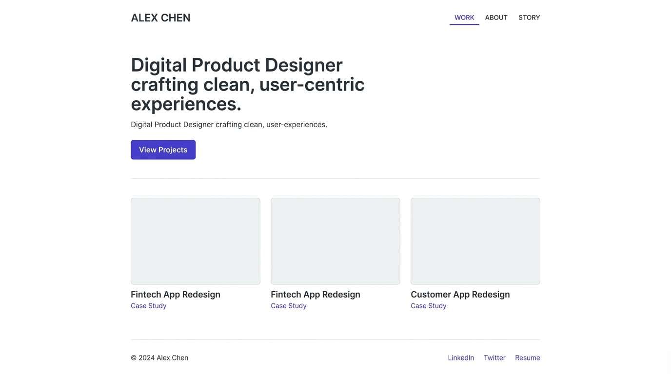
11) Iris and Steel
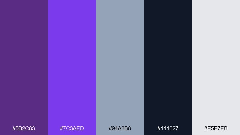
HEX: #5B2C83 #7C3AED #94A3B8 #111827 #E5E7EB
Mood: sleek, confident, tech-forward
Best for: fintech products and B2B websites
Sleek and confident, this mix reads like iris ink against brushed steel. The grays bring professionalism, while the purples add personality without sacrificing trust. For a royal purple color scheme in fintech or B2B, this set keeps interfaces sharp and content easy to scan. Use the brightest violet sparingly for active states and reserve the near-black for navigation and headings.
Image example of iris and steel generated using media.io
12) Ultra Violet Citrus
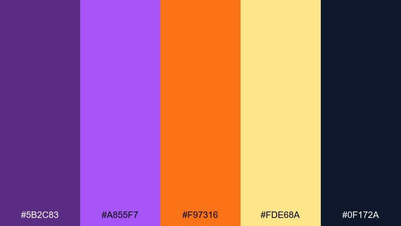
HEX: #5B2C83 #A855F7 #F97316 #FDE68A #0F172A
Mood: energetic, youthful, bright
Best for: startup branding and promo banners
Energetic and youthful, this palette feels like citrus zest over a violet smoothie. Orange and buttery yellow add sunny momentum, while the deep navy keeps contrast strong for digital banners. It works well for startups, campus events, and limited-time promotions that need to stand out. Tip: let purple and orange do the heavy lifting, then use yellow as a highlight for badges or price tags.
Image example of ultra violet citrus generated using media.io

13) Dusty Mauve Romance
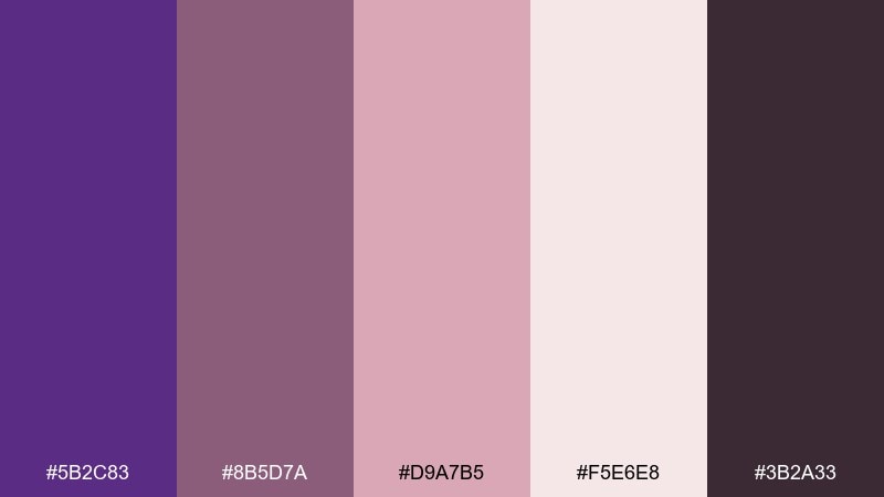
HEX: #5B2C83 #8B5D7A #D9A7B5 #F5E6E8 #3B2A33
Mood: nostalgic, intimate, soft
Best for: boutique stationery and lifestyle blogs
Nostalgic and intimate, these dusty hues feel like pressed flowers in an old journal. The muted mauve bridges purple and blush, creating an easy, wearable look for lifestyle design. Use it for stationery sets, blog headers, and gentle product storytelling. Keep backgrounds airy with the pale pink and use the darkest plum for small, crisp text.
Image example of dusty mauve romance generated using media.io
14) Deep Royal Gradient
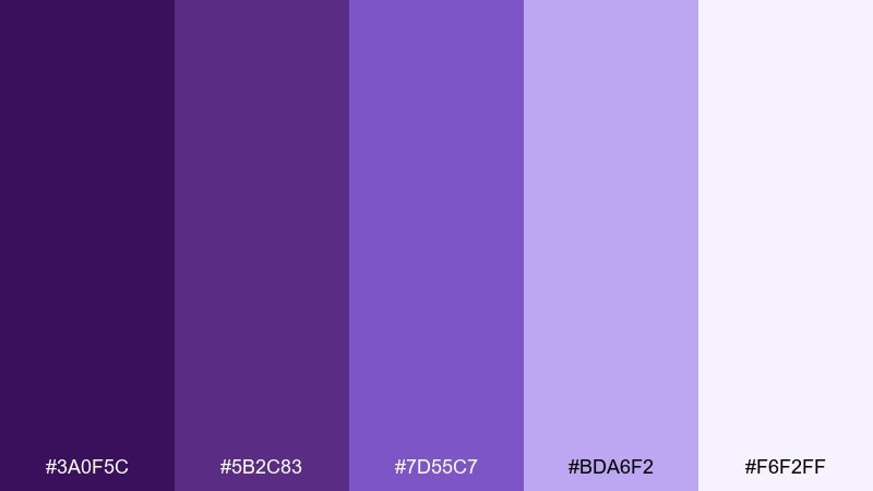
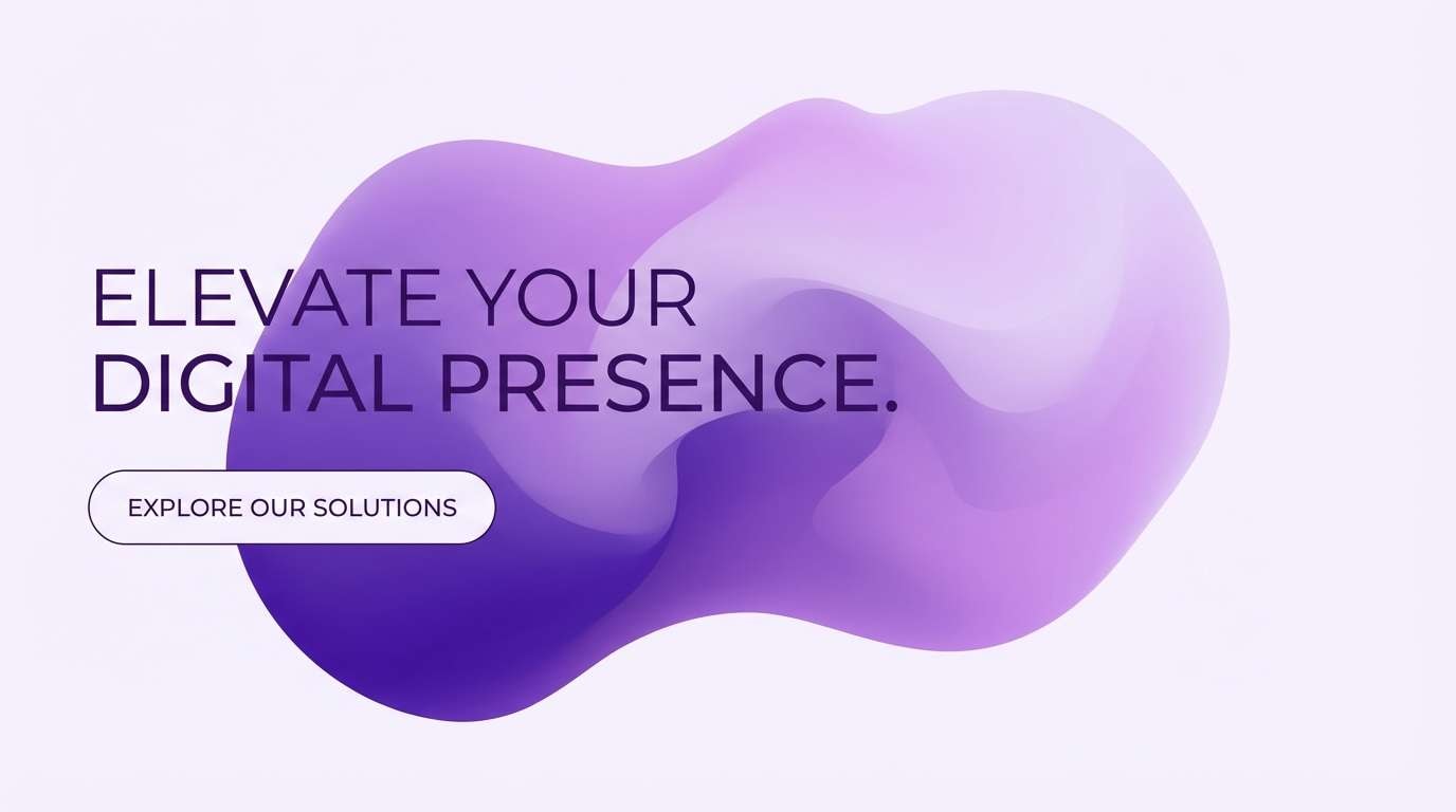
HEX: #3A0F5C #5B2C83 #7D55C7 #BDA6F2 #F6F2FF
Mood: luxe, immersive, dimensional
Best for: hero sections and brand refreshes
Luxe and immersive, these purples look like stage lighting fading from velvet to lilac mist. The smooth progression makes it easy to build depth with gradients, shadows, and layered shapes. Use this royal purple color palette in hero headers, brand refresh decks, and motion graphics where a single hue range can carry the whole story. Tip: place white or near-white text over the two darkest stops for maximum readability.
Image example of deep royal gradient generated using media.io
15) Royal Purple and Teal Splash
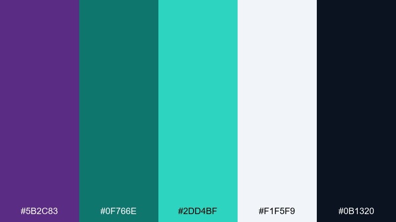
HEX: #5B2C83 #0F766E #2DD4BF #F1F5F9 #0B1320
Mood: fresh, confident, contemporary
Best for: app marketing pages and tech posters
Fresh and contemporary, this pairing feels like teal water against a purple sunset. The aqua tones brighten the deep purple instantly, giving you sharp contrast without relying on harsh primaries. These royal purple color combinations are great for tech posters, app marketing pages, and product feature highlights. Tip: use teal for icons and micro-interactions, and keep purple as the brand anchor for headers and CTAs.
Image example of royal purple and teal splash generated using media.io

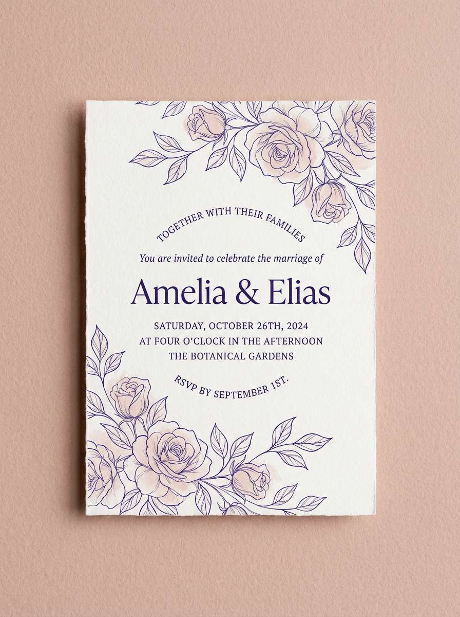
16) Orchid Pearl Wedding
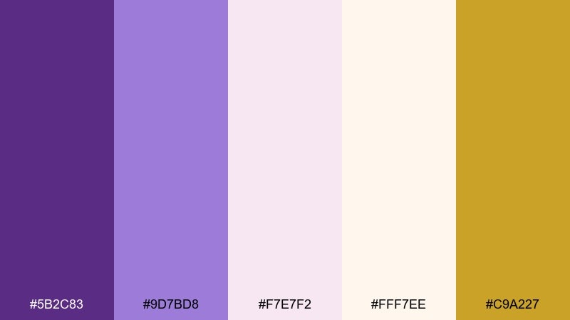
HEX: #5B2C83 #9D7BD8 #F7E7F2 #FFF7EE #C9A227
Mood: elegant, romantic, luminous
Best for: wedding suites and formal events
Elegant and luminous, this set evokes orchids, pearls, and a soft champagne glow. The warm ivory keeps the purples airy, while the muted gold adds just enough formality for special occasions. It's perfect for full wedding suites, gala invitations, and refined event signage. Keep gold limited to monograms or thin rules so the purples remain the main story.
Image example of orchid pearl wedding generated using media.io
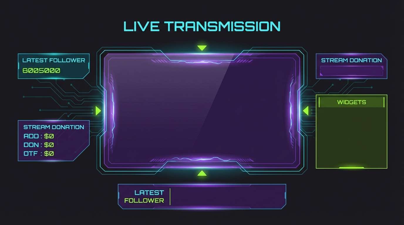
17) Cosmic Neon Accent
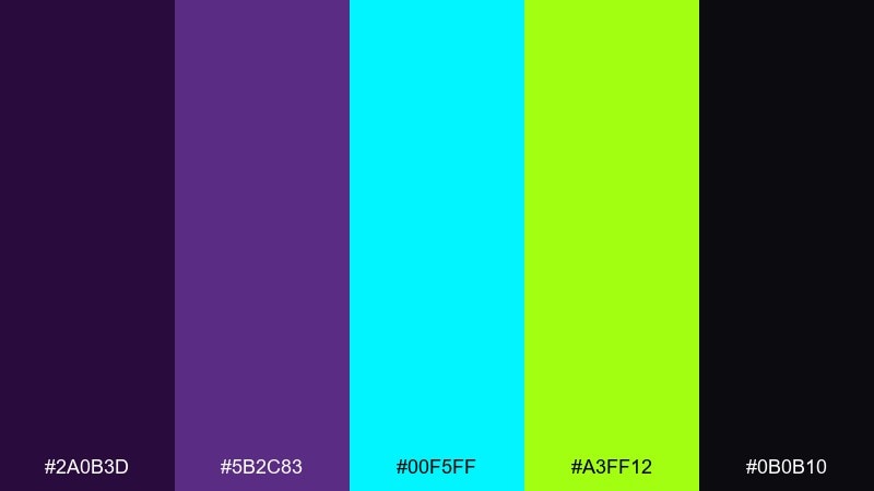
HEX: #2A0B3D #5B2C83 #00F5FF #A3FF12 #0B0B10
Mood: electric, futuristic, high-energy
Best for: gaming overlays and cyberpunk promos
Electric and futuristic, these colors feel like neon signage cutting through a purple haze. The bright cyan and acid green are best used as accents, while the deep purples and near-black create a powerful base. Use it for gaming overlays, esports banners, and cyberpunk promo art where contrast is the point. Tip: keep neon to small UI highlights and let the dark background dominate for readability.
Image example of cosmic neon accent generated using media.io
18) Heritage Library
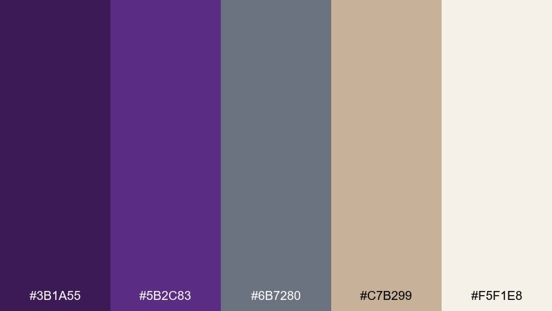
HEX: #3B1A55 #5B2C83 #6B7280 #C7B299 #F5F1E8
Mood: classic, scholarly, warm
Best for: museum flyers and academic brands
Classic and scholarly, these tones suggest linen pages, quiet stacks, and a deep purple book spine. Warm beige and soft gray make the palette feel trustworthy and timeless rather than flashy. It's a great choice for museums, academic programs, and heritage-focused nonprofits. Use the beige as the primary field and reserve purple for section titles and seals.
Image example of heritage library generated using media.io
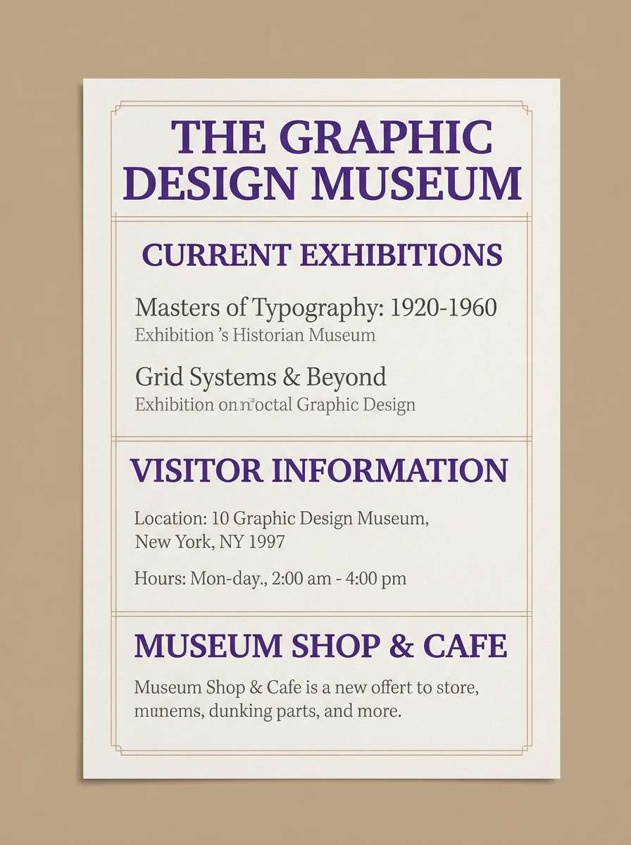
19) Modern Gallery White Space
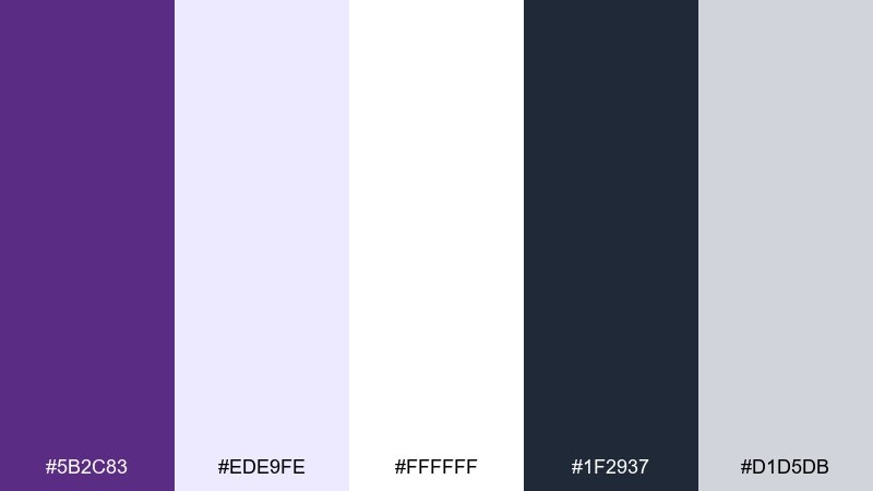
HEX: #5B2C83 #EDE9FE #FFFFFF #1F2937 #D1D5DB
Mood: minimal, airy, curated
Best for: portfolio sites and clean branding
Minimal and curated, this set feels like a modern gallery with one bold purple artwork on a white wall. The pale lavender creates gentle separation for cards and sections, and the charcoal keeps text crisp. It's ideal for portfolio websites, creative studios, and brands that want restraint with a signature hue. Tip: use purple only for key interactions and keep most surfaces white to preserve the airy effect.
Image example of modern gallery white space generated using media.io
20) Winter Royal Frost
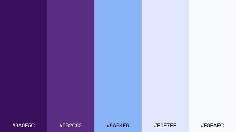
HEX: #3A0F5C #5B2C83 #8AB4F8 #E0E7FF #F8FAFC
Mood: cool, crisp, luminous
Best for: seasonal promos and wellness campaigns
Cool and luminous, these hues evoke frost on glass with a rich purple glow beneath. The icy blues brighten the palette while keeping the temperature refreshingly modern. Use it for winter promos, wellness campaigns, or skincare launches that want clean freshness without going all-blue. Tip: let the pale tints handle backgrounds and reserve the deep purple for logos and key headlines.
Image example of winter royal frost generated using media.io
What Colors Go Well with Royal Purple?
Royal purple pairs beautifully with soft neutrals like ivory, parchment, and near-white because they let the purple read as intentional (not heavy). Charcoal and near-black also enhance the “regal” effect while keeping typography sharp.
For warmer contrast, try gold, copper, tan, blush, or berry reds—these push purple toward luxury, romance, or heritage. If you want something fresher, teal, aqua, and sky blue create a modern complementary tension that works well in tech and app design.
When in doubt, keep purple as the anchor, choose one accent (warm or cool), and use a light neutral as your main background to maintain breathing room.
How to Use a Royal Purple Color Palette in Real Designs
In branding, use royal purple for your primary identity touchpoints (logo, headline, key packaging panels) and let neutrals carry most surfaces. This keeps the brand feeling premium rather than saturated everywhere.
In UI, reserve the deepest purple for primary CTAs and navigation, then use lilac tints for cards, sections, and subtle highlights. Add one high-contrast accent (teal, gold, or orange) only for states that need attention like “active,” “new,” or “sale.”
For print, test dark purple ink coverage and contrast early—pair it with warm papers (cream/tan) for richness, or with cool off-whites for a crisp, modern finish.
Create Royal Purple Palette Visuals with AI
If you already have HEX codes, the fastest way to validate a palette is to generate realistic mockups—posters, packaging, hero headers, or UI screens—and see how the colors behave together.
With Media.io, you can reuse the prompts above, tweak the subject (cosmetics, dashboards, invitations), and quickly iterate until the purple feels balanced with your accent and background tones.
Generate a few options at different contrast levels (dark background vs. light background) so you can choose the version that fits your brand voice.
Royal Purple Color Palette FAQs
-
What HEX code is closest to a classic royal purple?
A commonly used royal purple for modern design is #5B2C83, which is deep, saturated, and works well as a primary brand color. -
Does royal purple work better with warm or cool accents?
Both work: warm accents like gold or tan make it feel luxurious and heritage-inspired, while cool accents like teal or sky blue make it feel contemporary and tech-forward. -
What background color is easiest with royal purple?
Off-white and ivory backgrounds (for example #F8FAFC or #FFF7EE) are the safest because they keep layouts airy while letting purple stay the focal point. -
How do I keep royal purple from looking too dark or heavy?
Use purple as an anchor (headlines, buttons, key panels) and let light neutrals dominate. Add mid tints like lilac for spacing and softness instead of increasing saturation. -
Is royal purple a good color for UI and app design?
Yes—royal purple is strong for CTAs and navigation, and lilac tints are great for cards and section backgrounds. Just check contrast for accessibility, especially on buttons and links. -
What colors should I avoid pairing with royal purple?
Avoid using too many highly saturated brights at once (for example neon green + hot pink + bright yellow) unless you want a deliberate pop-art look, because they can compete with purple and reduce readability. -
Can I build a full palette using only purple shades?
Yes—use a gradient-style set from deep plum to pale lavender, then add one neutral (near-white or charcoal) for text and layout structure.


