

Russet is a rich, earthy orange-brown that instantly adds warmth, depth, and a handcrafted feel to modern design. It’s a go-to for autumn palettes, rustic branding, and cozy interiors—without looking dated when paired with clean neutrals.
Below are 20+ russet color combinations with HEX codes, plus practical tips for using them in UI, print, and real-world layouts.
In this article
- Why Russet Color Combinations Work So Well
-
- autumn hearth
- desert clay
- spice market
- copper dusk
- rustic vineyard
- canyon sunset
- terracotta linen
- bronze espresso
- pumpkin cream
- cedar cabin
- burnt sienna studio
- paprika punch
- clay and sage
- antique leather
- harvest brunch
- moody library
- minimalist adobe
- festive fall
- coastal rust
- modern rust and charcoal
- apricot orchard
- What Colors Go Well with Russet?
- How to Use a Russet Color Palette in Real Designs
- Create Russet Palette Visuals with AI
Why Russet Color Combinations Work So Well
Russet sits in that sweet spot between burnt orange, terracotta, and brown—so it feels energetic but still grounded. It brings warmth to minimalist layouts and adds natural character to otherwise neutral schemes.
Because russet has built-in depth, it pairs beautifully with creams, tans, and near-blacks for readable typography and strong hierarchy. You can also cool it down with blue-gray or teal accents to keep the look contemporary.
Most importantly, russet communicates “real materials”: clay, wood, leather, copper, spice. That makes it ideal for brands and interfaces that want to feel trustworthy, tactile, and human.
20+ Russet Color Palette Ideas (with HEX Codes)
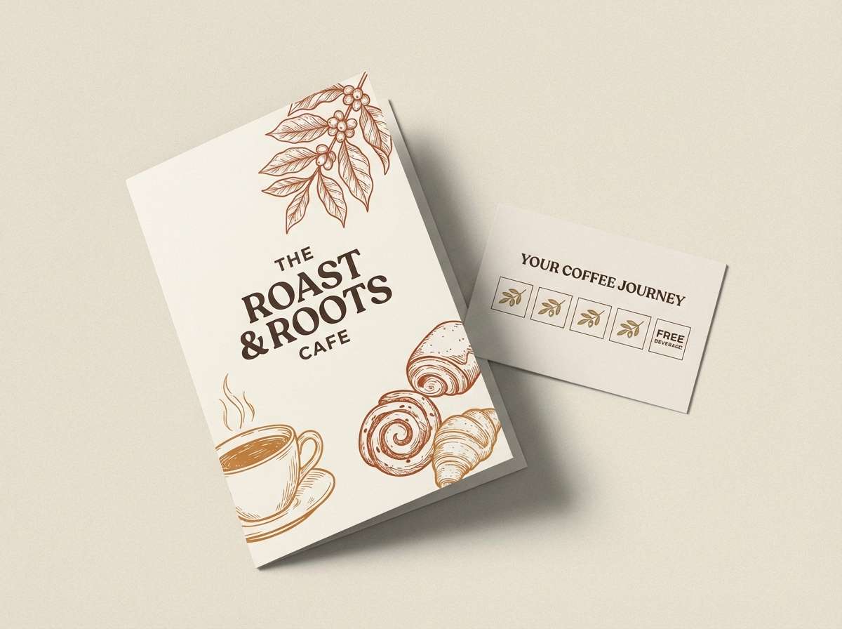
1) Autumn Hearth
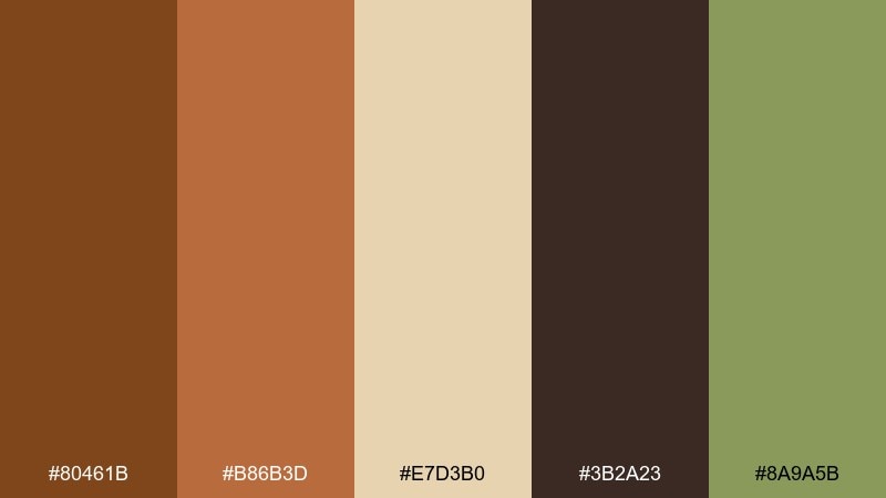
HEX: #80461B #B86B3D #E7D3B0 #3B2A23 #8A9A5B
Mood: cozy, grounded, welcoming
Best for: cafe branding and menu design
Cozy and grounded like a crackling fireplace and warm cider. Pair the deep russet with creamy beige for readable type, then use espresso brown for strong headings and icon strokes. Olive works best as a small accent for badges or highlights. For menus, keep the background light and let russet carry the section dividers and callouts.
Image example of autumn hearth generated using media.io
Media.io is an online AI studio for creating and editing video, image, and audio in your browser.

2) Desert Clay
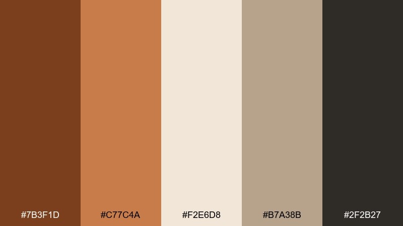
HEX: #7B3F1D #C77C4A #F2E6D8 #B7A38B #2F2B27
Mood: sunbaked, minimal, calm
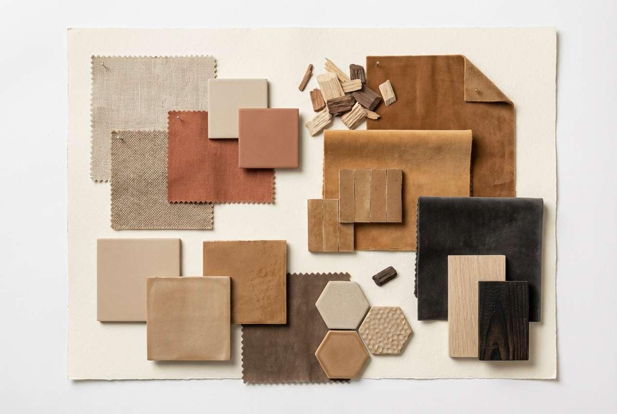
Best for: interior mood boards and home decor
Sunbaked and calm, like adobe walls under late-afternoon light. Use the pale sand as the main field color, then layer clay and caramel for textiles, ceramics, and wood finishes. Charcoal anchors frames and hardware without turning the room cold. A practical tip: keep the darkest shade to 10 to 15 percent to maintain an airy feel.
Image example of desert clay generated using media.io
3) Spice Market
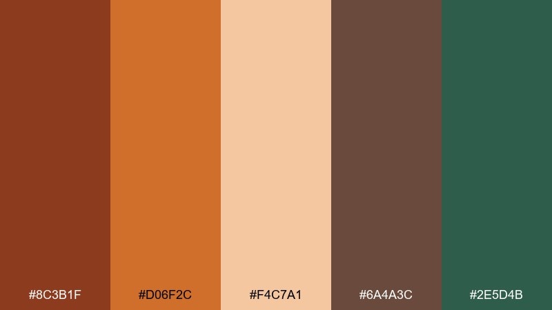
HEX: #8C3B1F #D06F2C #F4C7A1 #6A4A3C #2E5D4B
Mood: bold, aromatic, lively
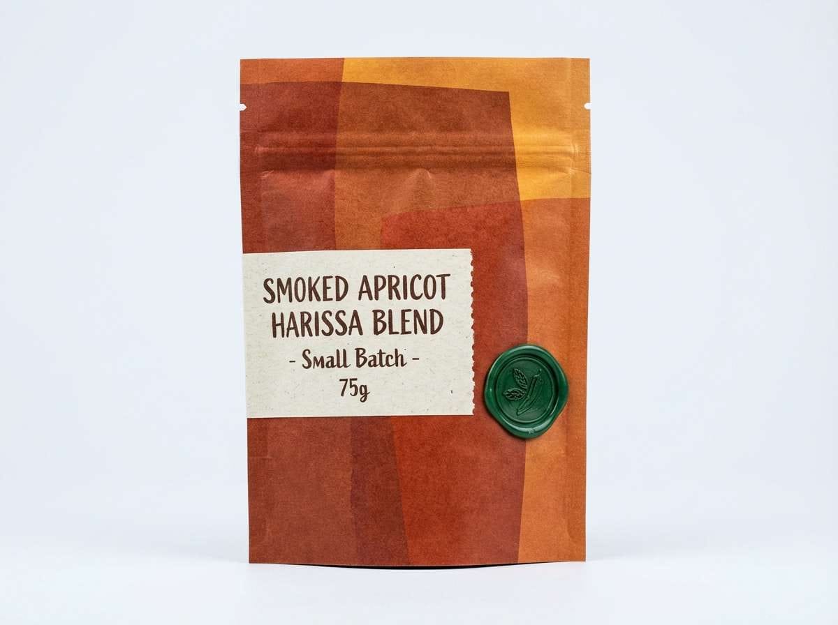
Best for: food packaging and label design
Bold and aromatic, like jars of paprika and toasted cumin lined up on a stall. These russet color combinations shine on packaging when orange carries the hero panels and the pale apricot softens ingredient lists. Use the deep brown for barcode areas and fine print, and save the green for a small freshness cue. Tip: add subtle grain texture so the warm tones feel crafted, not flat.
Image example of spice market generated using media.io
4) Copper Dusk
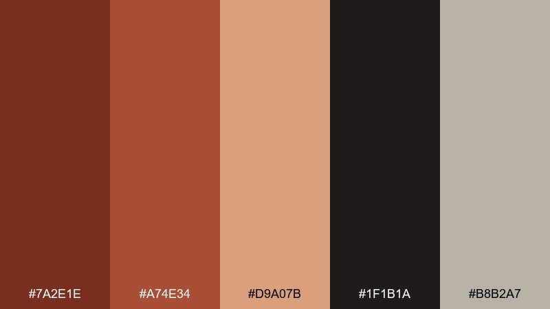
HEX: #7A2E1E #A74E34 #D9A07B #1F1B1A #B8B2A7
Mood: moody, refined, cinematic
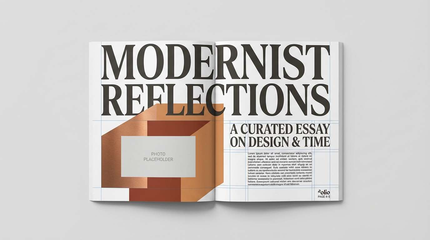
Best for: editorial layouts and magazine spreads
Moody and refined, like copper catching the last light before night. The warm midtones work beautifully for pull quotes and section headers against a stone-gray base. Add near-black for sharp grids, captions, and photo credits. For a premium look, keep the rosy tan as a soft highlight on rule lines and small shapes.
Image example of copper dusk generated using media.io
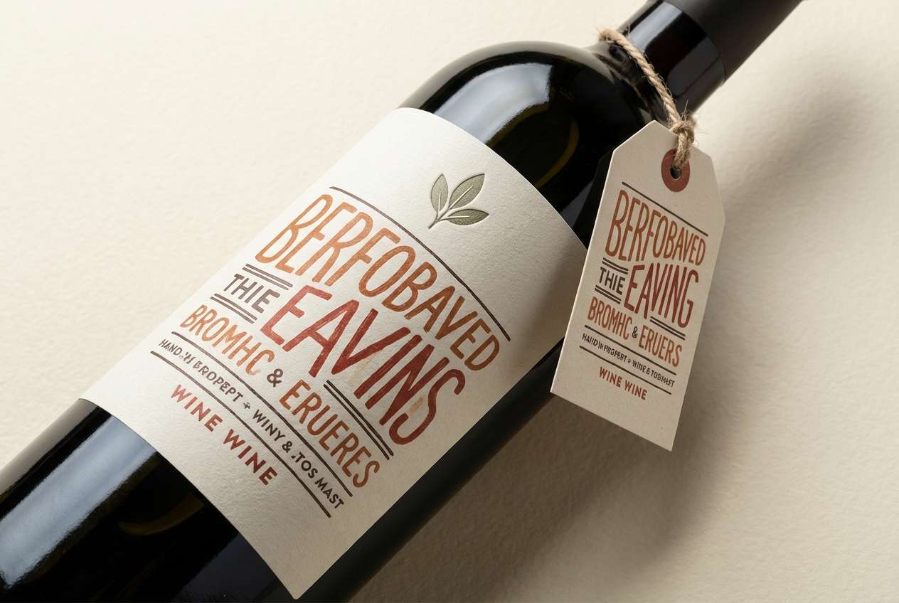
5) Rustic Vineyard
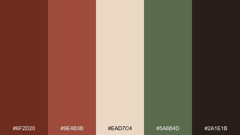
HEX: #6F2D20 #9E4B3B #EAD7C4 #5A6B4D #2A1E1B
Mood: earthy, romantic, artisanal
Best for: wine labels and tasting room signage
Earthy and romantic, like vineyard rows after rain and a wooden barrel room. Cream keeps labels legible while the russet and brick tones convey age and warmth. Sage green is best as a secondary badge color for varietals or estate marks. Tip: use the darkest brown for foil-stamp mockups to preview how the label will read at distance.
Image example of rustic vineyard generated using media.io
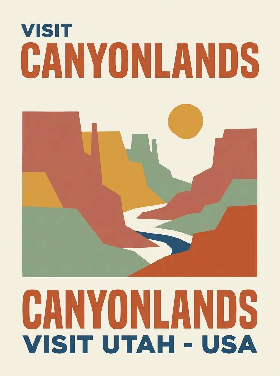
6) Canyon Sunset
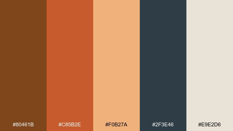
HEX: #80461B #C85B2E #F0B27A #2F3E46 #E9E2D6
Mood: adventurous, warm, expansive
Best for: travel posters and outdoor campaigns
Adventurous and expansive, like canyon walls glowing at golden hour. This russet color palette feels modern when cooled with blue-gray for type and shadows. Use the pale cream as sky or negative space so the oranges do not overwhelm the layout. Tip: keep the peach tone for gradients and atmospheric depth rather than solid blocks.
Image example of canyon sunset generated using media.io
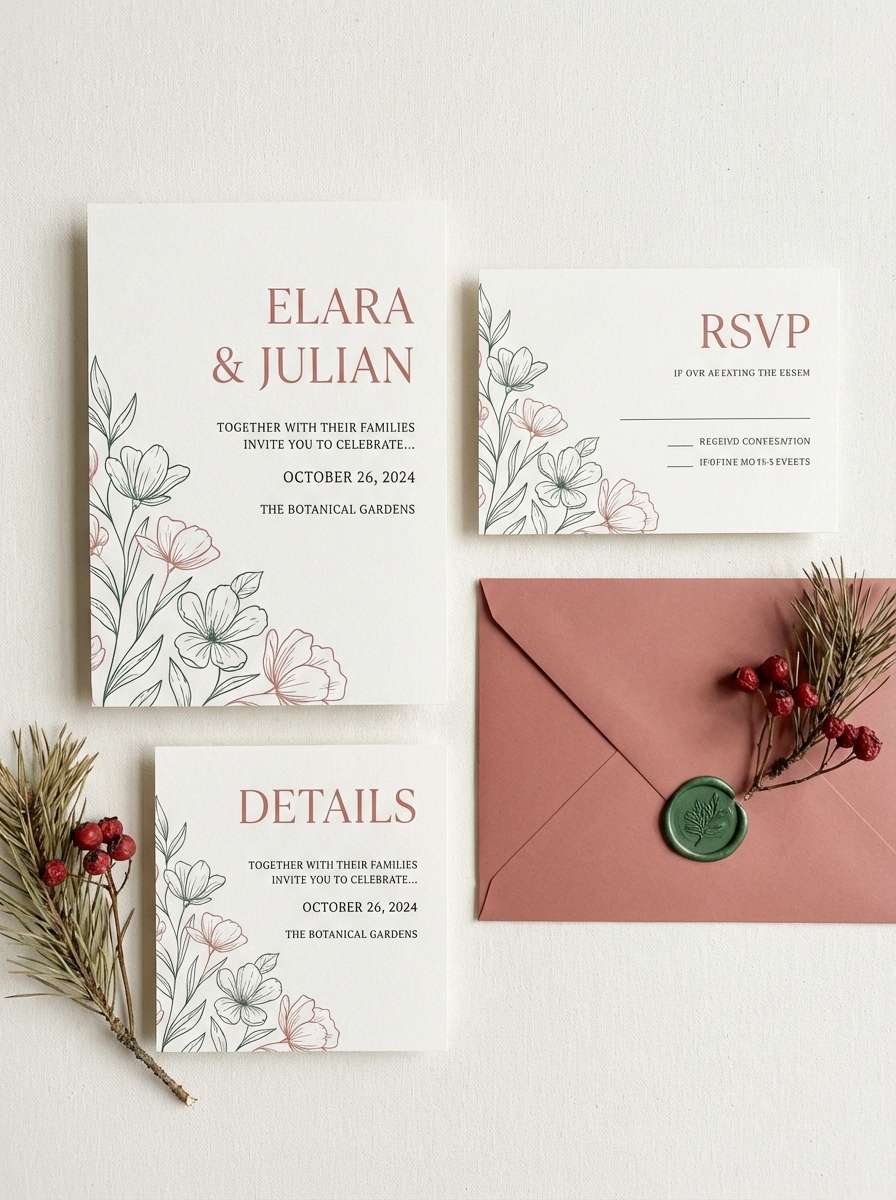
7) Terracotta Linen
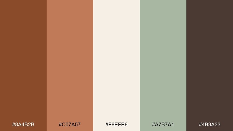
HEX: #8A4B2B #C07A57 #F6EFE6 #A7B7A1 #4B3A33
Mood: soft, natural, airy
Best for: wedding invitations and stationery
Soft and natural, like terracotta planters beside freshly pressed linen. The off-white sets an elegant base while the warm clay tones frame names and monograms. A whisper of green keeps the palette feeling botanical without going overly rustic. Tip: print the darker brown sparingly for small type so the invitation stays light and refined.
Image example of terracotta linen generated using media.io
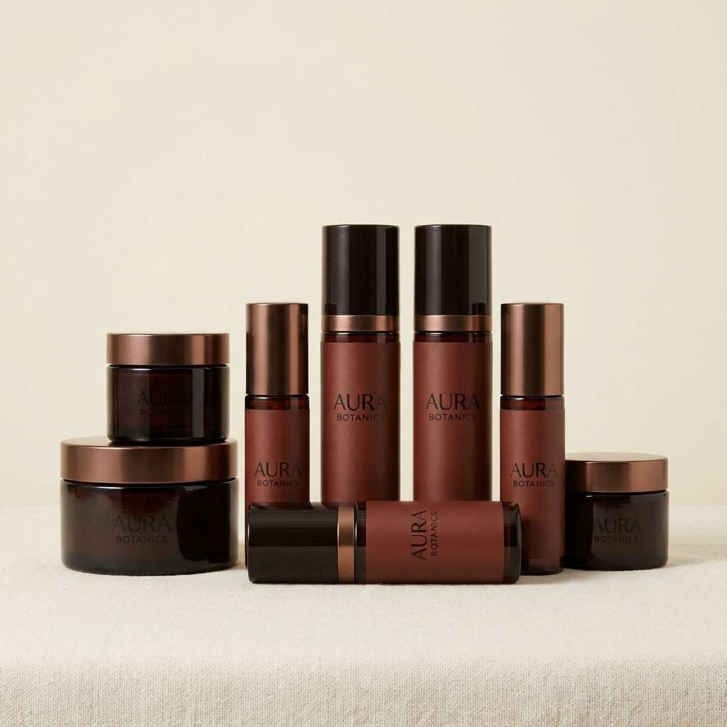
8) Bronze Espresso
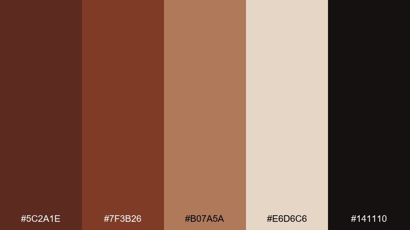
HEX: #5C2A1E #7F3B26 #B07A5A #E6D6C6 #141110
Mood: luxurious, strong, intimate
Best for: premium product ads and cosmetics packaging
Luxurious and intimate, like espresso crema under warm pendant lights. Use the near-black for high-contrast branding and let bronze-tan carry shine and depth on packaging edges. The lighter cream keeps ingredient panels readable without feeling clinical. Tip: reserve the brightest tan for small reflective accents to mimic metallic foil.
Image example of bronze espresso generated using media.io
9) Pumpkin Cream
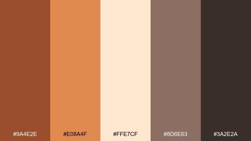
HEX: #9A4E2E #E08A4F #FFE7CF #8D6E63 #3A2E2A
Mood: friendly, sweet, approachable
Best for: social media graphics for seasonal promotions
Friendly and sweet, like pumpkin foam on a cozy latte. Use the creamy peach as a background for bold headlines in the darker cocoa shade. The bright orange is perfect for buttons, stickers, and price tags that need quick attention. Tip: keep shadows soft and warm so the design stays inviting rather than harsh.
Image example of pumpkin cream generated using media.io
10) Cedar Cabin
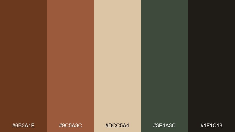
HEX: #6B3A1E #9C5A3C #DCC5A4 #3E4A3C #1F1C18
Mood: outdoorsy, sturdy, nostalgic
Best for: camping gear branding and badges
Outdoorsy and sturdy, like cedar planks, smoke, and pine needles. This russet color combination works well for patches and badges when the tan plays as a background and the dark ink handles linework. Add forest green for a single emblem detail to signal nature without turning the whole mark green. Tip: test the palette on textured materials so contrast remains strong.
Image example of cedar cabin generated using media.io
11) Burnt Sienna Studio
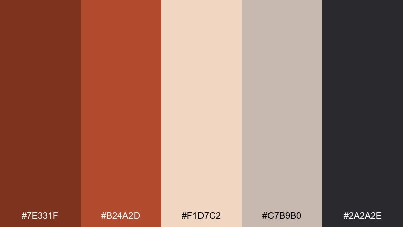
HEX: #7E331F #B24A2D #F1D7C2 #C7B9B0 #2A2A2E
Mood: creative, modern, gallery-like
Best for: portfolio websites and UI case studies
Creative and gallery-like, like a studio wall washed in warm light. Use the pale peach as the main canvas, then let sienna and brick carry highlights, links, and chart accents. A cool gray keeps the layout contemporary and prevents the warmth from feeling vintage. Tip: stick to one warm accent per section for cleaner scanning in long case studies.
Image example of burnt sienna studio generated using media.io
12) Paprika Punch
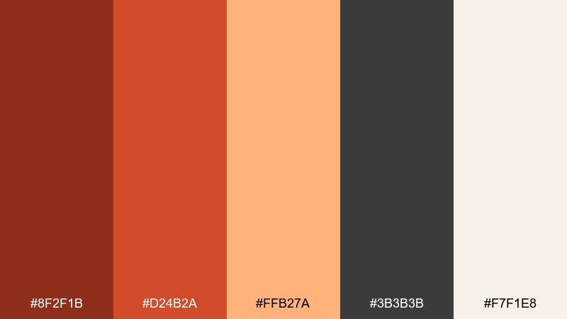
HEX: #8F2F1B #D24B2A #FFB27A #3B3B3B #F7F1E8
Mood: energetic, punchy, youthful
Best for: event flyers and music posters
Energetic and punchy, like a burst of paprika against a clean kitchen counter. The vivid orange-red grabs attention fast, while cream and charcoal keep the typography crisp. Use the peach tone for halftone overlays or gradients behind the headline. Tip: keep small text on cream blocks to avoid vibrating contrast on screens.
Image example of paprika punch generated using media.io
13) Clay and Sage
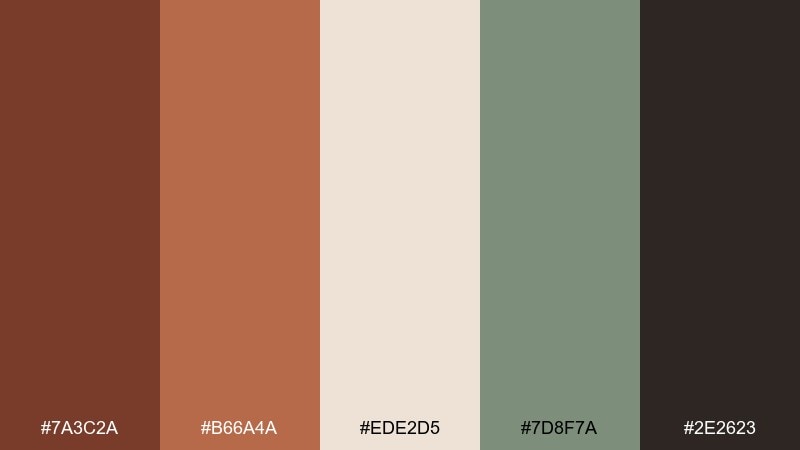
HEX: #7A3C2A #B66A4A #EDE2D5 #7D8F7A #2E2623
Mood: balanced, organic, soothing
Best for: wellness brand identity and packaging
Balanced and soothing, like clay masks and fresh herbs on a bathroom shelf. The warm browns feel human, while sage brings a calming, clean-note contrast. Use the light cream for plenty of negative space and let the darkest shade define logos and ingredient hierarchies. Tip: pair with uncoated paper to make the tones feel soft and natural.
Image example of clay and sage generated using media.io
14) Antique Leather
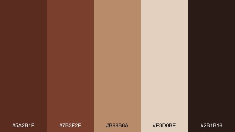
HEX: #5A2B1F #7B3F2E #B88B6A #E3D0BE #2B1B16
Mood: heritage, classic, tactile
Best for: book covers and craft goods branding
Heritage and tactile, like worn leather, stitching, and old paper edges. Use the mid-brown for large fields and keep the deepest tone for title type and ornaments. The lighter tans help with subtitle readability and give you room for emboss or deboss effects. Tip: add subtle vignette shading so the palette feels like real material, not flat color.
Image example of antique leather generated using media.io
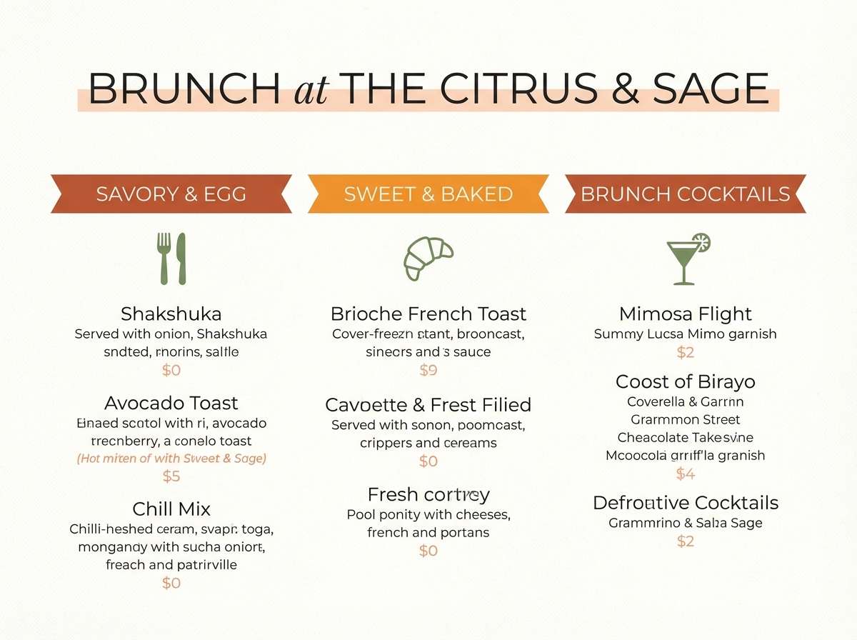
15) Harvest Brunch
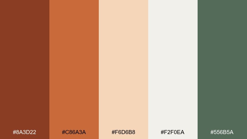
HEX: #8A3D22 #C86A3A #F6D6B8 #F2F0EA #556B5A
Mood: cheerful, seasonal, inviting
Best for: restaurant promos and brunch menus
Cheerful and seasonal, like roasted squash, fresh bread, and herb garnish. The warm tones pop against a soft off-white background, while the green works as a restrained garnish color for icons or callouts. Use the peach for section headers so the page stays light and readable. Tip: keep photos warm-toned to avoid clashing with the palette temperature.
Image example of harvest brunch generated using media.io
16) Moody Library
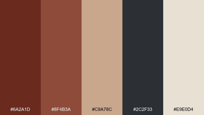
HEX: #6A2A1D #8F4B3A #C9A78C #2C2F33 #E9E0D4
Mood: academic, quiet, sophisticated
Best for: publishing sites and longform blog UI
Academic and quiet, like a leather chair under a reading lamp. Use cream for the content background, charcoal for body text, and russet for link states and section markers. The tan makes a great sidebar fill that still feels warm. Tip: choose a slightly condensed serif for headings to match the thoughtful mood.
Image example of moody library generated using media.io
17) Minimalist Adobe
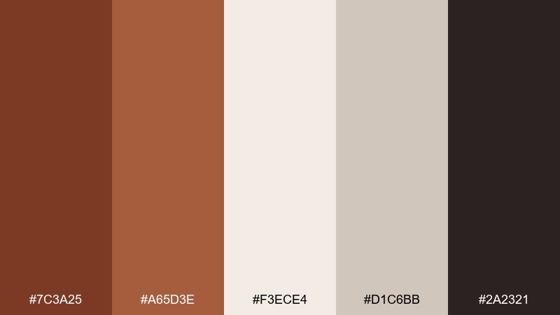
HEX: #7C3A25 #A65D3E #F3ECE4 #D1C6BB #2A2321
Mood: clean, warm, contemporary
Best for: brand guidelines and presentation decks
Clean and contemporary, like smooth plaster and simple geometry. The off-white and warm grays build a quiet base, leaving russet to do the heavy lifting for charts and key slides. Use the darkest shade for headers and footers to maintain contrast in bright rooms. Tip: keep icon strokes consistent and avoid adding extra accent colors.
Image example of minimalist adobe generated using media.io
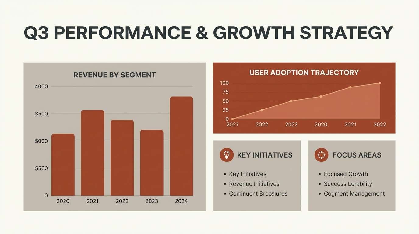
18) Festive Fall
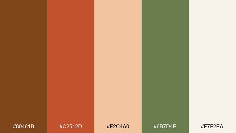
HEX: #80461B #C2512D #F2C4A0 #6B7D4E #F7F2EA
Mood: bright, celebratory, cozy
Best for: holiday invites and seasonal email headers
Bright and celebratory, like autumn garlands and baked treats cooling on a counter. This russet color palette feels extra friendly when you keep the background creamy and let orange lead the decorative shapes. Olive green adds a subtle seasonal twist without overpowering the warm center. Tip: use the peach tone for soft borders so layouts do not look too heavy.
Image example of festive fall generated using media.io
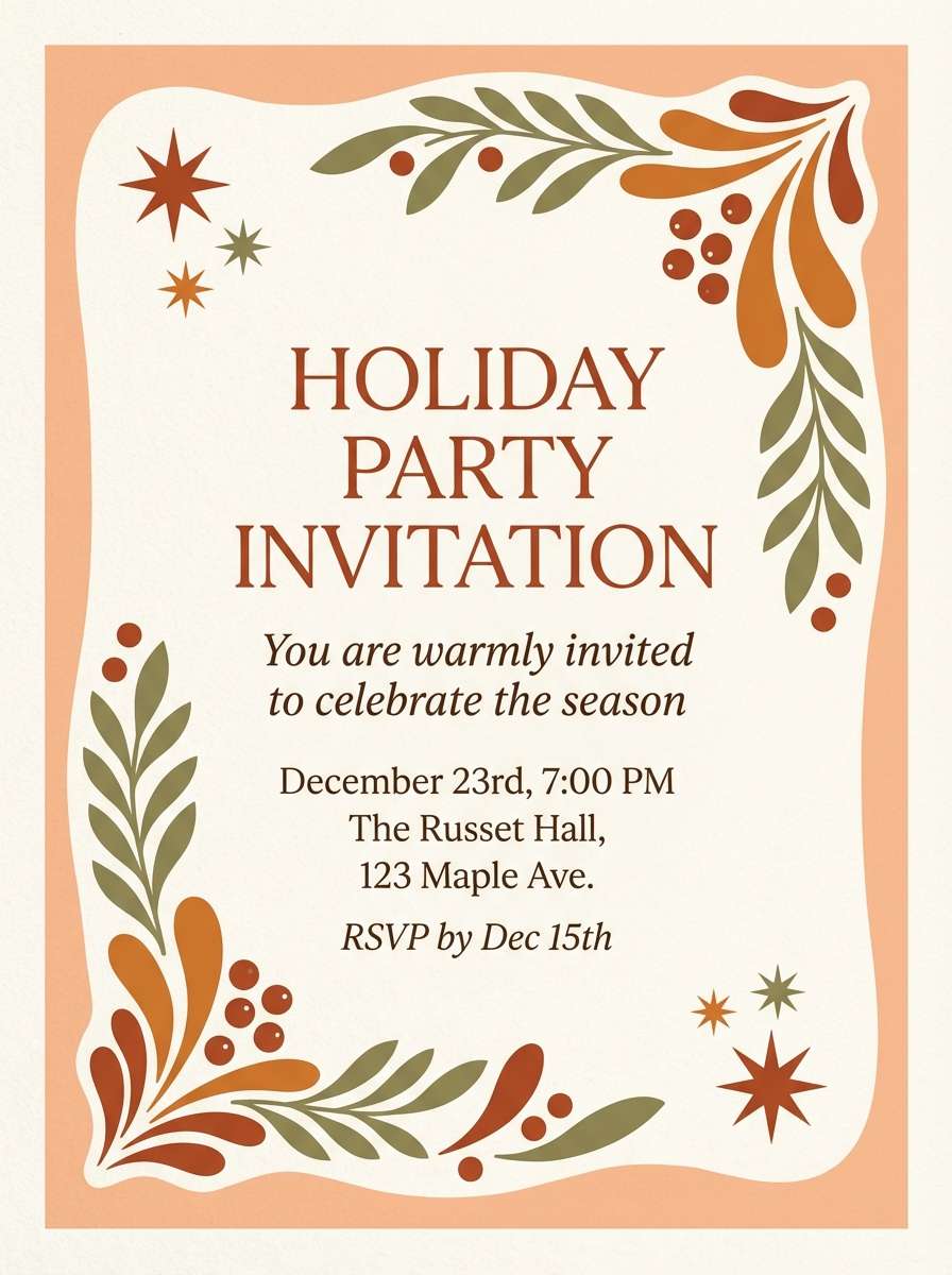
19) Coastal Rust
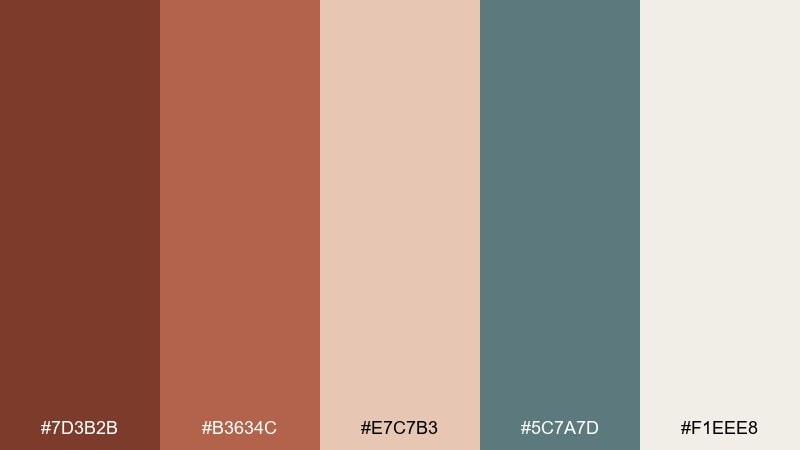
HEX: #7D3B2B #B3634C #E7C7B3 #5C7A7D #F1EEE8
Mood: weathered, relaxed, coastal
Best for: boutique hotel branding and signage
Weathered and relaxed, like sun-faded docks and sea air on old metal. The dusty teal cools the warmth just enough for a coastal twist, especially on wayfinding signs. Use the pale cream for wide margins and the blush-tan for secondary text blocks. Tip: keep teal to small directional elements so the brand stays anchored in warm tones.
Image example of coastal rust generated using media.io
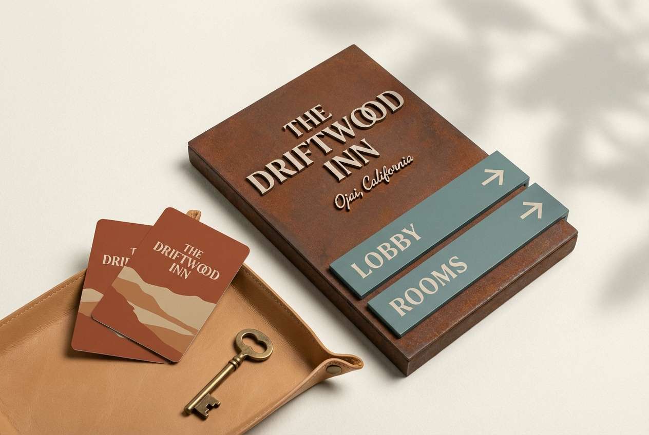
20) Modern Rust and Charcoal
HEX: #7A2F21 #A84633 #E8CBB7 #3A3F44 #F5F3EF
Mood: confident, modern, high-contrast
Best for: SaaS dashboards and data visuals
Confident and modern, like matte charcoal paired with warm metal accents. Use the off-white as the main UI surface, charcoal for navigation, and rust for active states and key metrics. The blush-tan is perfect for subtle charts, hover fills, and empty states. Tip: cap the accent usage to one primary button style so analytics screens stay calm.
Image example of modern rust and charcoal generated using media.io
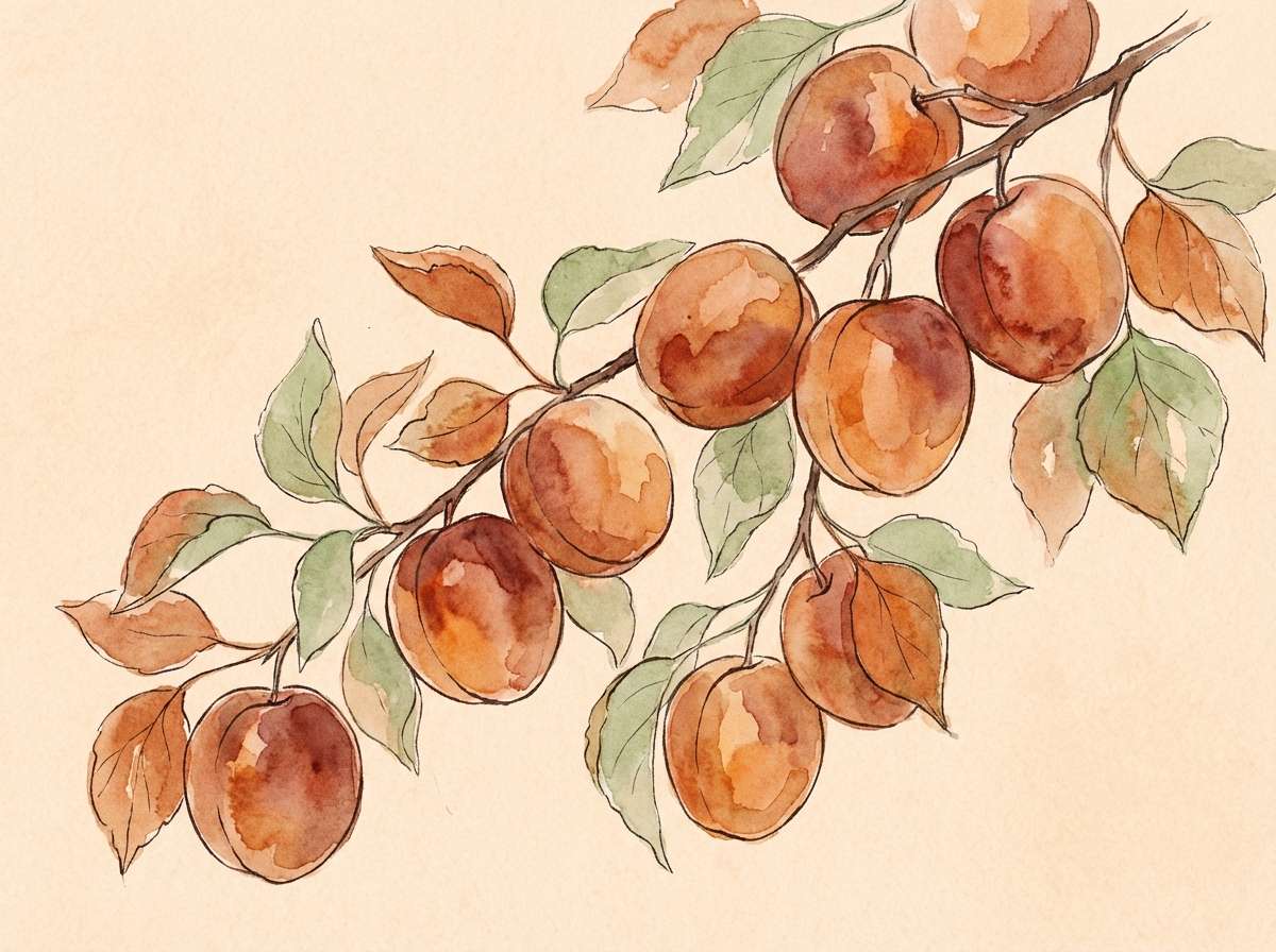
21) Apricot Orchard
HEX: #8B3A24 #C96B45 #FFDFC7 #9BB08A #3B2C27
Mood: fresh, sunny, natural
Best for: botanical illustrations and spring campaigns
Fresh and sunny, like apricots ripening on warm branches. The creamy apricot background makes the darker tones feel friendly, while the soft green supports leaves and stems. Use the deep brown for fine outlines so illustrations stay crisp. Tip: keep gradients gentle and watercolor-like for a hand-painted feel.
Image example of apricot orchard generated using media.io
What Colors Go Well with Russet?
Russet pairs best with warm neutrals like cream, sand, and oat for a soft, modern base. These keep layouts readable while letting russet carry emphasis in headlines, buttons, or key illustration shapes.
For contrast, reach for charcoal, espresso brown, or near-black—especially for typography and UI navigation. If you want a cooler counterbalance, muted teal, blue-gray, sage, and olive create a refined “warm + cool” tension that still feels natural.
When building a russet brown palette, reserve the most saturated orange-russet tone for small bursts (CTAs, badges, price tags). Use lighter peaches and tans for large surfaces to avoid visual heaviness.
How to Use a Russet Color Palette in Real Designs
In branding, use russet as the primary brand color when you want warmth and heritage, then support it with a light neutral background and a dark ink color for logos and type. This combination reads well in print, packaging, and signage.
In UI design, russet works best as an accent: active states, highlights, and key metrics. Pair it with off-white surfaces and charcoal text, and use blush-tan shades for subtle chart fills and hover states.
For interiors or mood boards, treat russet like a material: clay walls, leather accents, terracotta ceramics, or warm wood. Balance it with airy creams and keep the darkest shade limited to fixtures, frames, or hardware.
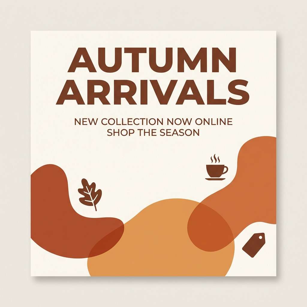
Create Russet Palette Visuals with AI
If you already have HEX codes, you can quickly turn a russet color scheme into polished mockups—menus, labels, UI screens, invites, posters, and mood boards—by generating images that match your palette and style.
Start with a clear subject (e.g., “wedding invitation suite” or “SaaS analytics dashboard”), specify your materials (paper texture, foil, matte UI), and keep lighting consistent so the warm russet tones look intentional.
Use Media.io to iterate fast: generate multiple variations, compare contrast and mood, then refine prompts until the visuals match your brand direction.
Russet Color Palette FAQs
-
What is russet in HEX?
Russet is commonly represented around #80461B, but it can shift warmer (more orange) or deeper (more brown) depending on the palette and medium. -
Is russet the same as terracotta or burnt orange?
Not exactly. Terracotta is usually lighter and clay-like, burnt orange is brighter and more saturated, while russet is typically deeper and browner—closer to leather, wood, or oxidized copper. -
What colors go best with russet for modern design?
Off-white/cream, charcoal, warm gray, and muted greens (sage/olive) are reliable modern pairings. For a cooler twist, add dusty teal or blue-gray as a restrained accent. -
How do I keep a russet palette from feeling too heavy?
Use light neutrals (cream, sand, blush-tan) for large backgrounds, and limit the darkest browns/near-blacks to typography and small structural elements. -
Is russet good for UI and dashboards?
Yes—especially as an accent for active states, KPIs, and primary buttons. Pair it with off-white surfaces and charcoal text to maintain clarity and accessibility. -
What’s a good complementary accent for russet?
Muted teal and blue-gray provide a balanced counterpoint to russet’s warmth. They’re especially effective for navigation, shadows, and secondary UI components. -
Can I generate russet palette mockups with AI?
Yes. With Media.io’s text-to-image tool, you can generate posters, packaging, invitations, and UI mockups using prompts that describe the subject, lighting, materials, and your russet-led color scheme.
Next: Peacock Color Palette


