

Maroon and gold is a classic pairing that feels both warm and elevated—perfect when you want designs to look premium without turning cold or minimal.
Below are modern maroon and gold color palettes you can use for branding, weddings, packaging, and cozy interiors, with ready-to-copy HEX codes and AI image prompts.
In this article
- Why Maroon and Gold Palettes Work So Well
-
- velvet opera
- antique manor
- gilded merlot
- autumn brocade
- royal hearth
- saffron cabernet
- brass and bordeaux
- candlelit garnet
- desert maroon
- garnet and champagne
- library leather
- midnight brass
- regal ribbon
- burgundy glow
- harvest medal
- rosewood goldleaf
- fireside velvet
- majestic marzipan
- imperial tapestry
- spice route
- gold dust rose
- What Colors Go Well with Maroon Gold?
- How to Use a Maroon Gold Color Palette in Real Designs
- Create Maroon and Gold Palette Visuals with AI
Why Maroon and Gold Palettes Work So Well
Maroon brings depth, emotion, and authority—while gold adds warmth and a “finished” premium cue. Together, they deliver instant hierarchy: maroon can hold large areas, and gold can guide the eye with small accents.
This combination also adapts across styles. Push maroon toward wine or bordeaux for luxury, or soften it with cream and champagne for a brighter, celebratory look.
Most importantly, maroon and gold are naturally flattering in print and digital: they look strong on packaging and signage, and they create elegant contrast when paired with readable neutrals like cream or near-black.
20+ Maroon Gold Color Palette Ideas (with HEX Codes)
1) Velvet Opera
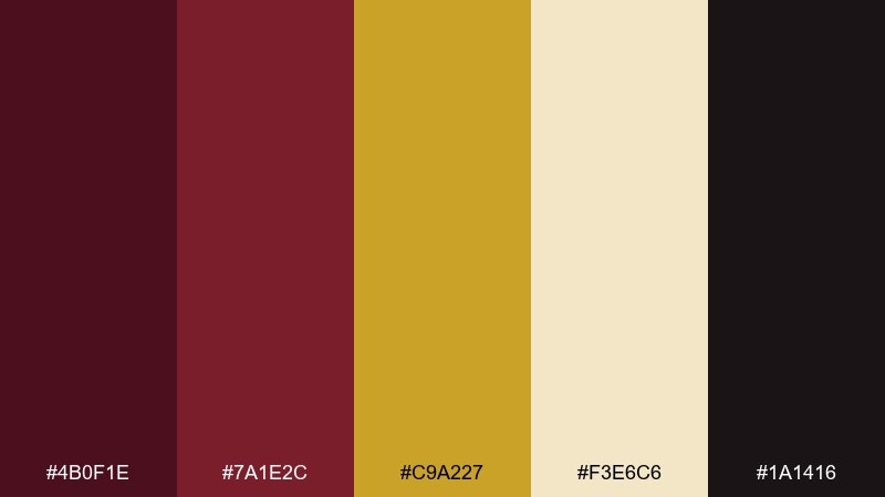
HEX: #4B0F1E #7A1E2C #C9A227 #F3E6C6 #1A1416
Mood: luxurious and dramatic
Best for: theater poster design
Luxurious and dramatic like velvet curtains and a warm spotlight, these tones feel instantly elevated. The maroon gold color palette works beautifully for headline-driven layouts where contrast matters. Pair it with cream space for readability and use gold as a restrained accent for titles and rules. Tip: keep maroon as the dominant field color and let gold appear in 10 to 15 percent of the design.
Image example of velvet opera generated using media.io
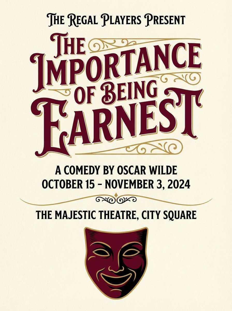
Media.io is an online AI studio for creating and editing video, image, and audio in your browser.

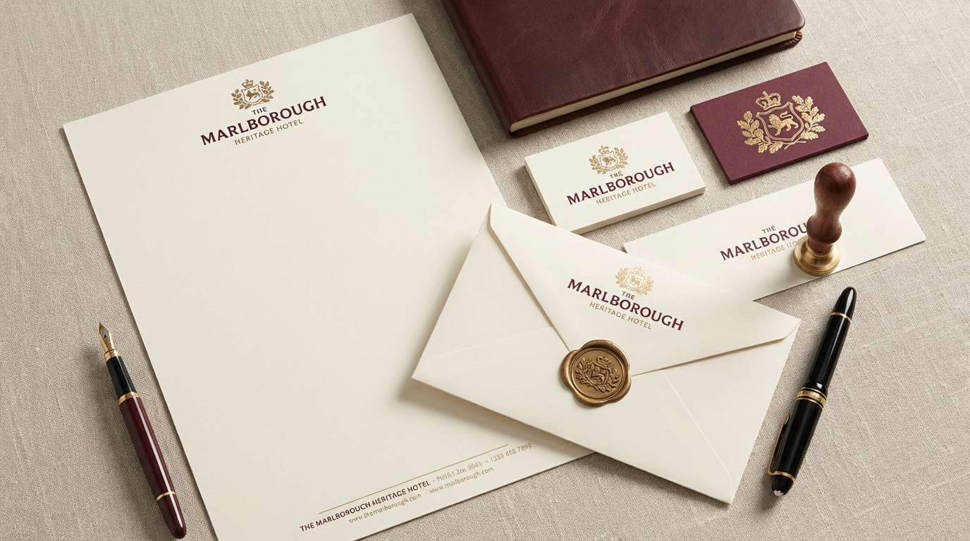
2) Antique Manor
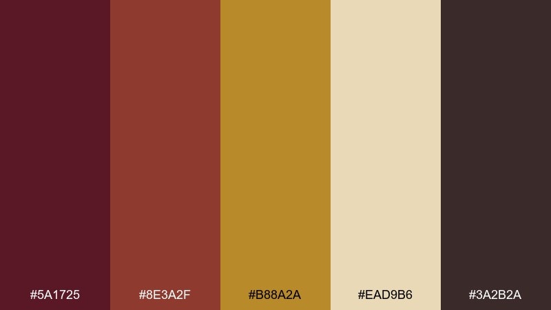
HEX: #5A1725 #8E3A2F #B88A2A #EAD9B6 #3A2B2A
Mood: heritage and inviting
Best for: heritage hotel branding
Heritage and inviting, it evokes carved wood, worn leather, and a soft lamp glow. The warm gold reads like antique brass against grounded maroons and browns. Use it for logos, stationery, and signage where a classic feel is the point. Tip: choose one maroon for the mark and reserve the lighter gold for foil or emboss finishes.
Image example of antique manor generated using media.io
3) Gilded Merlot
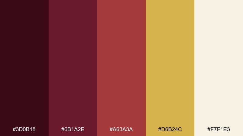
HEX: #3D0B18 #6B1A2E #A63A3A #D6B24C #F7F1E3
Mood: romantic and refined
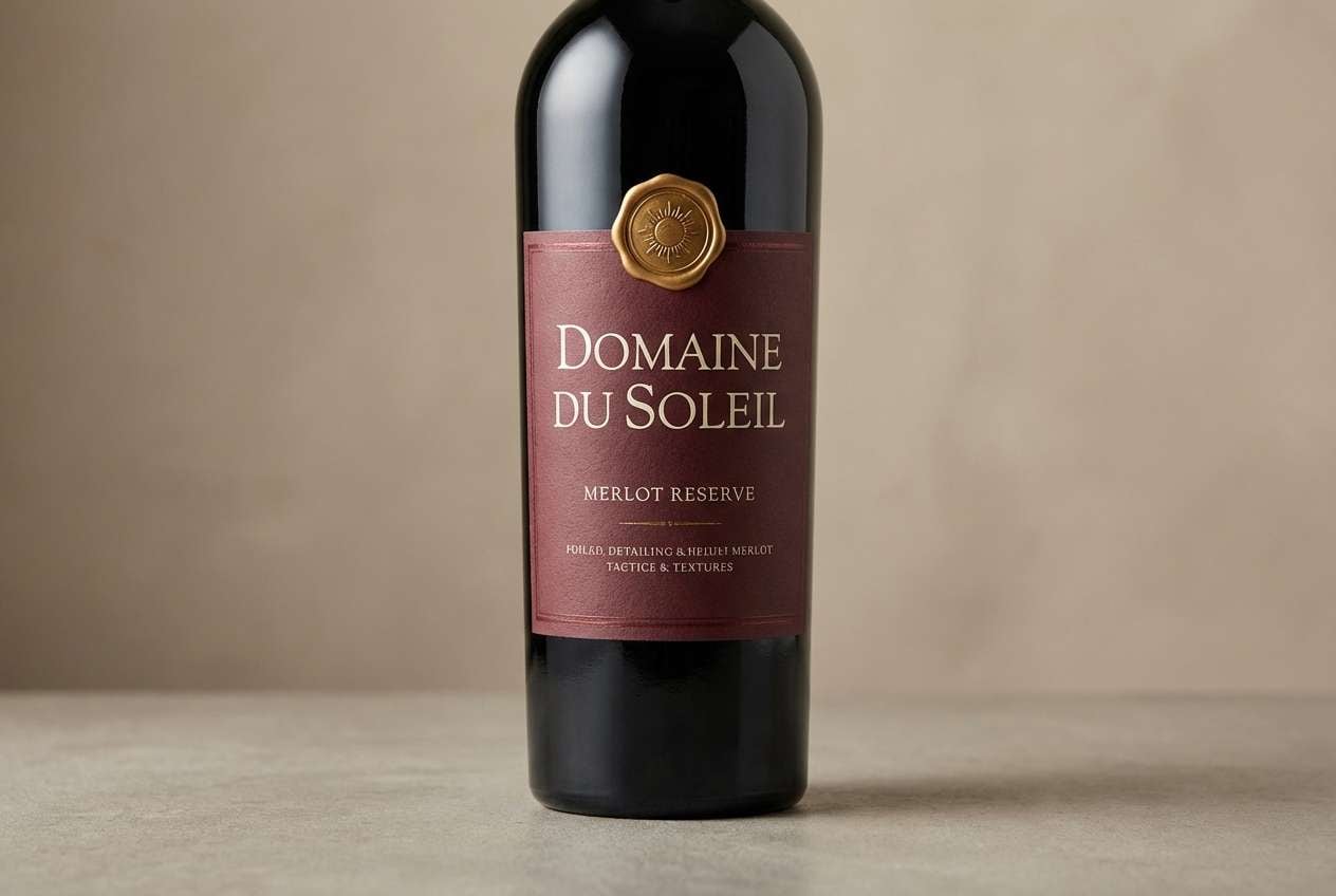
Best for: wine label packaging
Romantic and refined, it feels like a candlelit tasting with dark fruit notes and a golden finish. The merlot reds stay rich while the gold adds just enough sparkle for premium cues. Keep the background light for legibility or go deep maroon with cream type for a bolder shelf presence. Tip: use a single metallic gold element, like a seal, to avoid over-decorating.
Image example of gilded merlot generated using media.io
4) Autumn Brocade
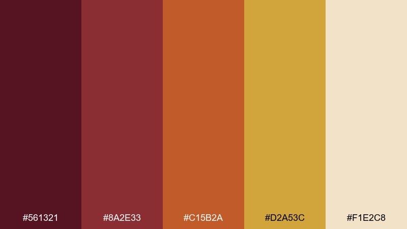
HEX: #561321 #8A2E33 #C15B2A #D2A53C #F1E2C8
Mood: warm and festive
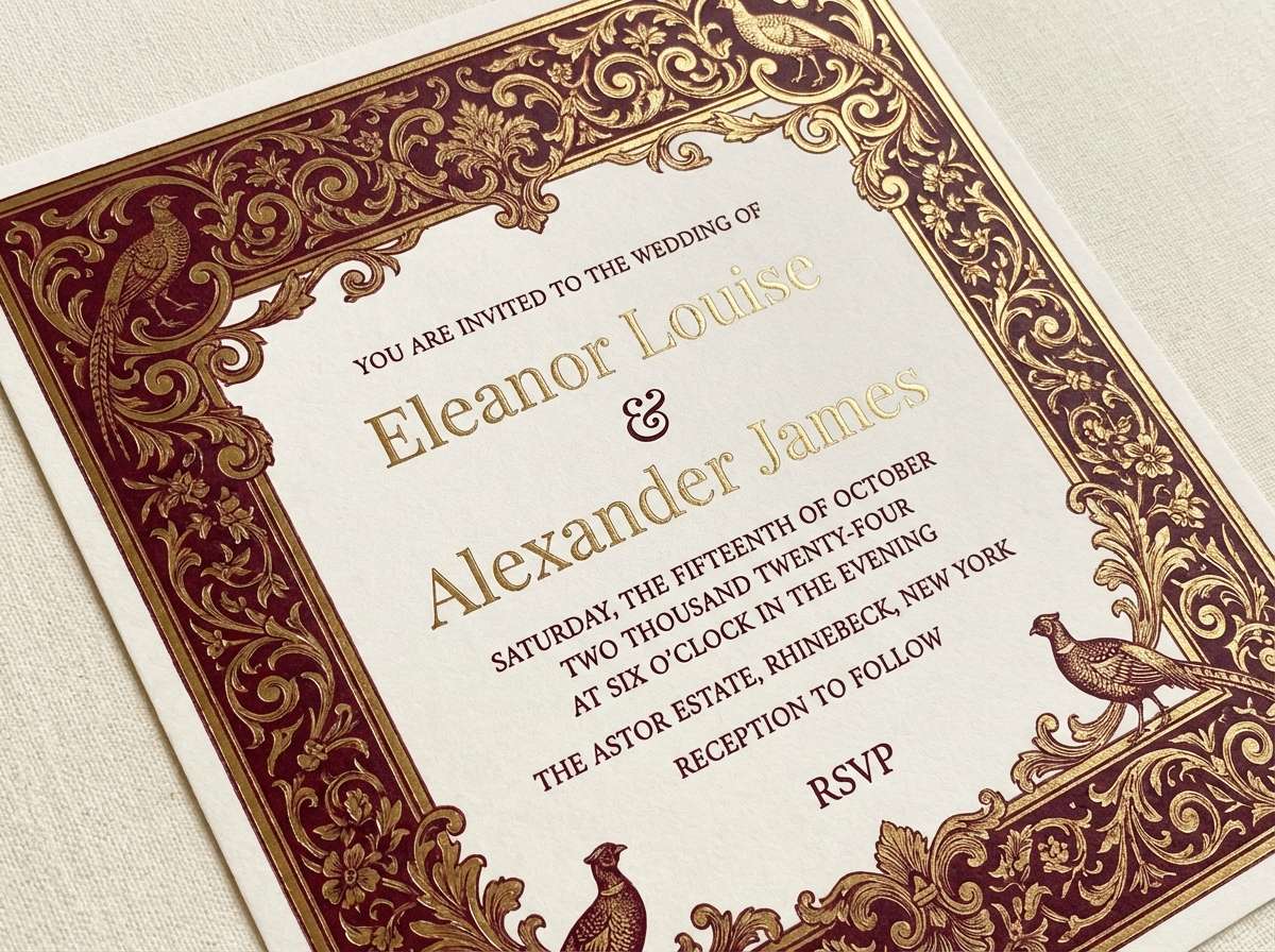
Best for: fall wedding invitation
Warm and festive, it brings to mind brocade fabric, dried leaves, and golden hour light. The terracotta note softens the reds so the palette feels welcoming rather than formal. Use it for invitations and day-of stationery with cream paper and gold foil details. Tip: keep body text in a deep brown or near-black for crisp readability.
Image example of autumn brocade generated using media.io
5) Royal Hearth
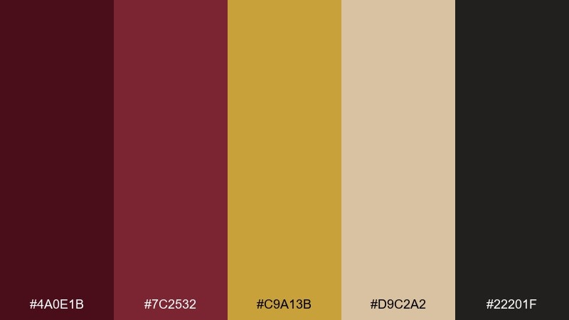
HEX: #4A0E1B #7C2532 #C9A13B #D9C2A2 #22201F
Mood: cozy and regal
Best for: living room interior moodboard
Cozy and regal, it feels like a crackling fireplace under framed art and warm brass lighting. These maroon gold color combinations shine when you balance depth with soft tan textiles. Use maroon for a feature wall or rug accents, then echo gold in hardware, lamps, or picture frames. Tip: repeat gold in small touches across the room rather than one big statement piece.
Image example of royal hearth generated using media.io
6) Saffron Cabernet
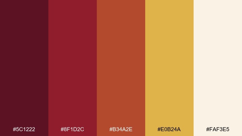
HEX: #5C1222 #8F1D2C #B34A2E #E0B24A #FAF3E5
Mood: energetic and upscale
Best for: restaurant menu design
Energetic and upscale, it suggests spiced sauces, aged wine, and glowing pendant lights. The saffron gold brings appetite appeal while the cabernet tones keep it sophisticated. Use cream as the main canvas, with maroon for section headers and gold for icons or dividers. Tip: limit the bright orange-red to small highlights so the menu stays elegant.
Image example of saffron cabernet generated using media.io
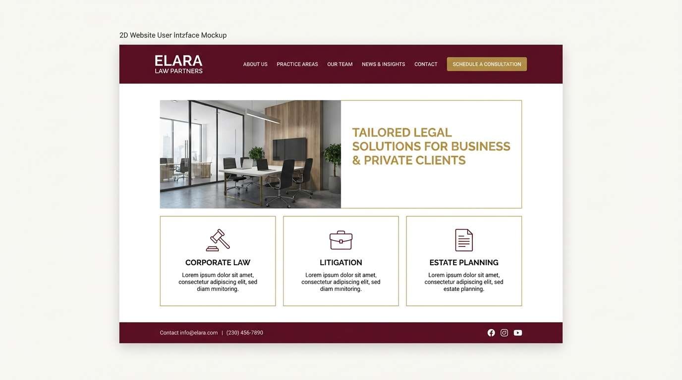
7) Brass and Bordeaux
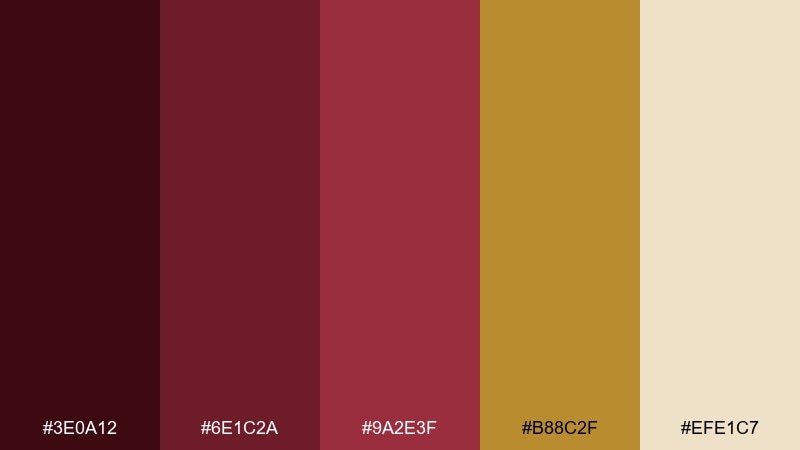
HEX: #3E0A12 #6E1C2A #9A2E3F #B88C2F #EFE1C7
Mood: classic and polished
Best for: legal firm website UI
Classic and polished, it reads like a brass plaque on a bordeaux door. The deep base tones add authority while the muted gold provides a trustworthy highlight. Use it for navigation bars, call-to-action buttons, and subtle separators without turning the UI flashy. Tip: keep the main background light and reserve the darkest shade for headers and footers.
Image example of brass and bordeaux generated using media.io
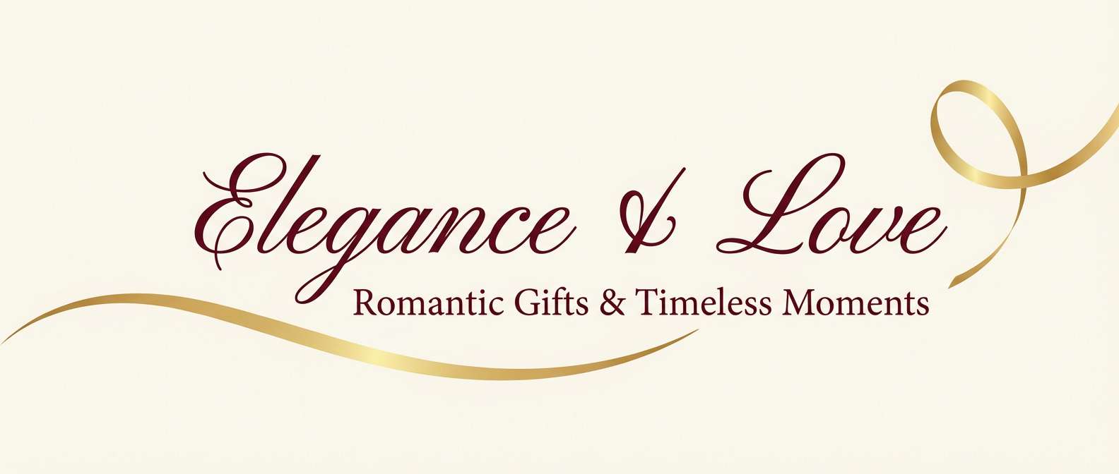
8) Candlelit Garnet
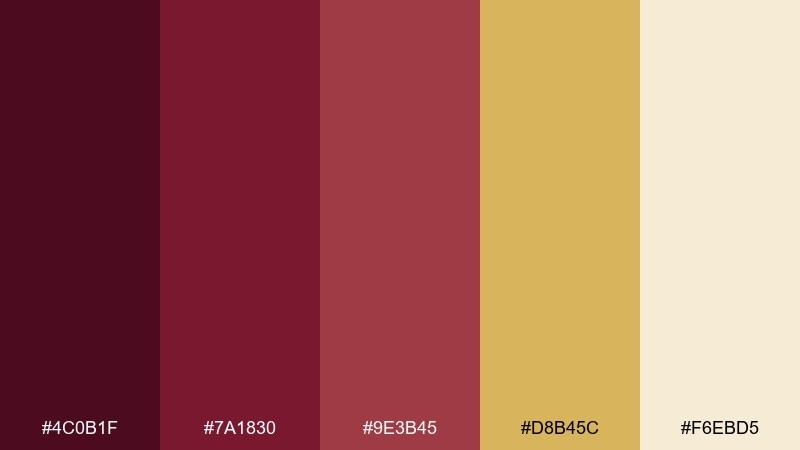
HEX: #4C0B1F #7A1830 #9E3B45 #D8B45C #F6EBD5
Mood: soft and romantic
Best for: valentine campaign banner
Soft and romantic, it evokes garnet jewelry and candlelit reflections. The cream keeps everything airy while gold adds a gentle glow instead of harsh shine. Use it for seasonal promos, email headers, and hero banners that need warmth without being loud. Tip: choose one heart or ribbon motif in gold and let typography do the rest.
Image example of candlelit garnet generated using media.io
9) Desert Maroon
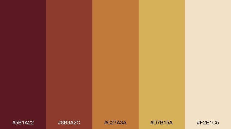
HEX: #5B1A22 #8B3A2C #C27A3A #D7B15A #F2E1C5
Mood: sunbaked and earthy
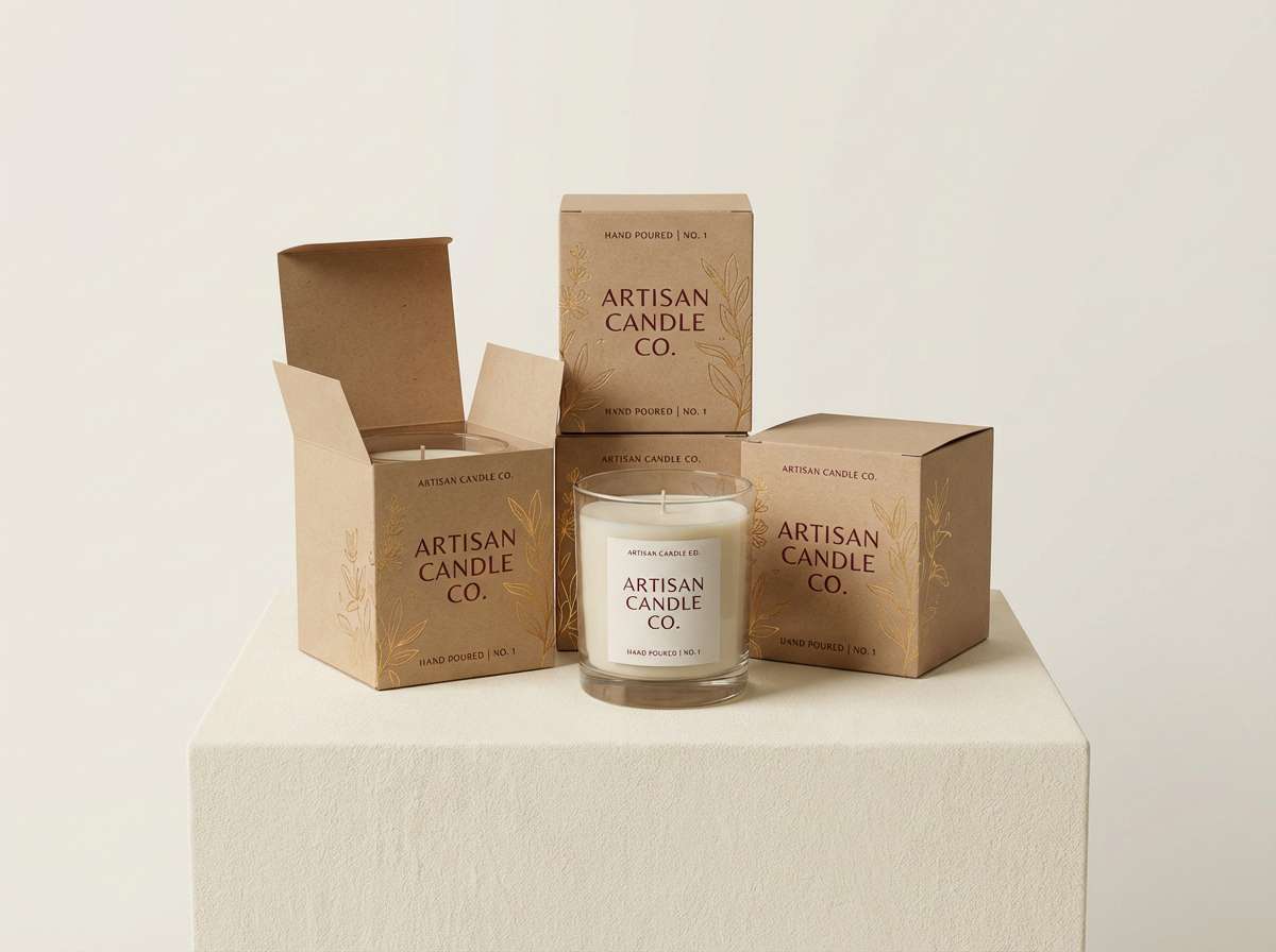
Best for: artisan candle packaging
Sunbaked and earthy, it feels like clay pots, spice markets, and late-afternoon sun. The warm browns and golds make the maroon feel grounded rather than formal. Use it on kraft labels, wax stamps, and minimalist packaging where texture matters. Tip: print the darkest shade for text and use gold as a thin border or small badge.
Image example of desert maroon generated using media.io
10) Garnet and Champagne
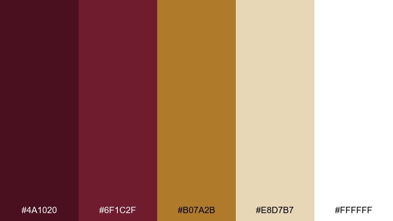
HEX: #4A1020 #6F1C2F #B07A2B #E8D7B7 #FFFFFF
Mood: bright and celebratory
Best for: new year party flyer
Bright and celebratory, it suggests champagne bubbles against a dark garnet dress. The white and champagne tones keep the layout clean while gold brings a festive edge. Use it for flyers and social posts with big type and plenty of negative space. Tip: add a single gold gradient element only if the rest of the design stays flat and simple.
Image example of garnet and champagne generated using media.io

11) Library Leather
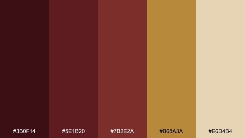
HEX: #3B0F14 #5E1B20 #7B2E2A #B68A3A #E6D4B4
Mood: scholarly and grounded
Best for: book cover design
Scholarly and grounded, it recalls leather-bound spines and warm desk lamps. The deep reds create seriousness while the gold reads like stamped foil on a classic cover. Use it for nonfiction, historical fiction, or any title that benefits from authority and warmth. Tip: keep the background dark and set the title in cream for high contrast.
Image example of library leather generated using media.io
12) Midnight Brass
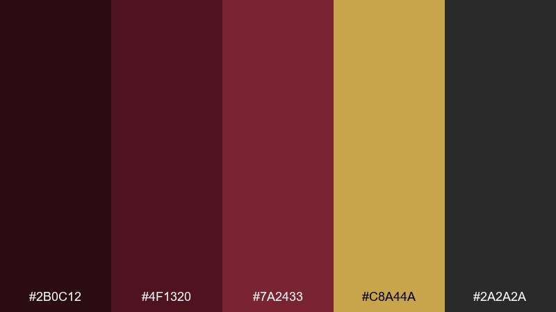
HEX: #2B0C12 #4F1320 #7A2433 #C8A44A #2A2A2A
Mood: moody and premium
Best for: luxury watch product ad
Moody and premium, it feels like a midnight showroom with a warm brass glint. The near-black support tone makes the gold look richer and the maroon more saturated. Use it for high-end product ads where you want drama without loud color. Tip: place the brightest gold behind the product as a soft rim highlight, not a full background.
Image example of midnight brass generated using media.io

13) Regal Ribbon
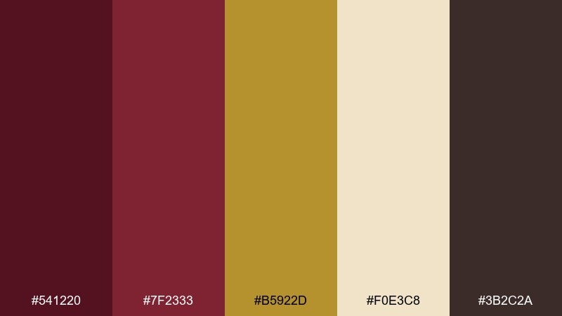
HEX: #541220 #7F2333 #B5922D #F0E3C8 #3B2C2A
Mood: formal and celebratory
Best for: award certificate template
Formal and celebratory, it brings to mind velvet ribbons and embossed seals. A maroon gold color palette like this looks strongest with symmetrical layouts and classic serif type. Use cream paper tones for the base, then apply gold to borders, seals, and signature lines. Tip: keep the text color in dark brown for a softer, more archival look than pure black.
Image example of regal ribbon generated using media.io

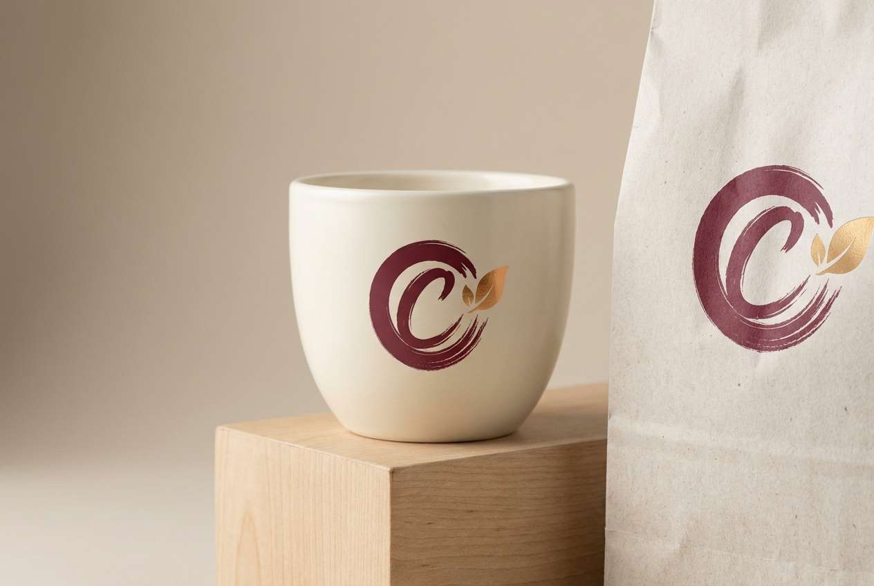
14) Burgundy Glow
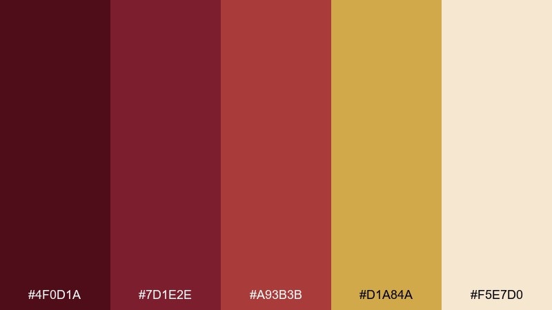
HEX: #4F0D1A #7D1E2E #A93B3B #D1A84A #F5E7D0
Mood: bold and welcoming
Best for: coffee shop logo and cup
Bold and welcoming, it feels like a cozy booth, warm pastries, and a burgundy neon sign toned down to classier hues. The gold adds a friendly glow without leaning overly luxe. Use it on cups, loyalty cards, and storefront marks where strong contrast is helpful. Tip: simplify the logo to one maroon and one gold for cleaner printing.
Image example of burgundy glow generated using media.io
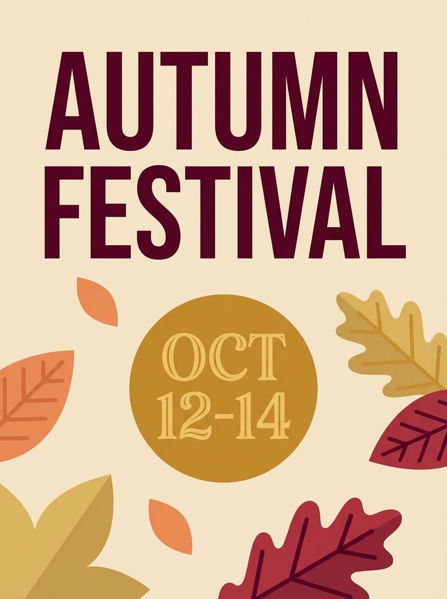
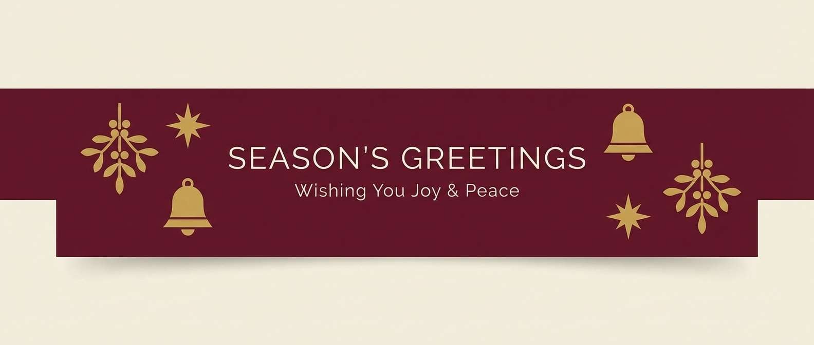
15) Harvest Medal
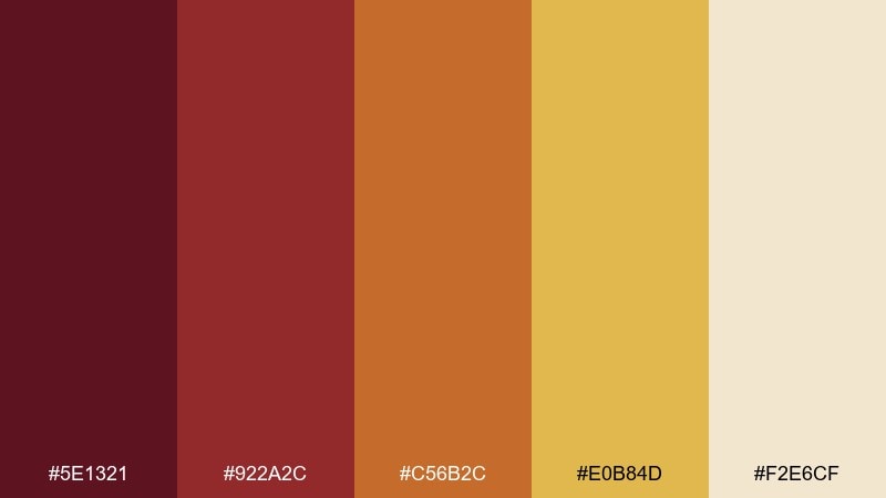
HEX: #5E1321 #922A2C #C56B2C #E0B84D #F2E6CF
Mood: seasonal and spirited
Best for: autumn festival poster
Seasonal and spirited, it evokes pumpkin spice, paper lanterns, and a golden medal catching the light. The orange note bridges maroon and gold so the palette feels cohesive in large blocks. Use it for posters, banners, and event signage that needs warmth and energy. Tip: set long text in a dark maroon and reserve gold for dates and key calls to action.
Image example of harvest medal generated using media.io
16) Rosewood Goldleaf
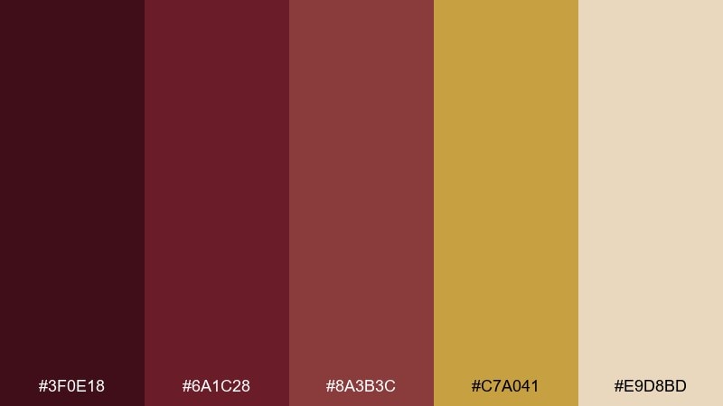
HEX: #3F0E18 #6A1C28 #8A3B3C #C7A041 #E9D8BD
Mood: artisanal and elegant
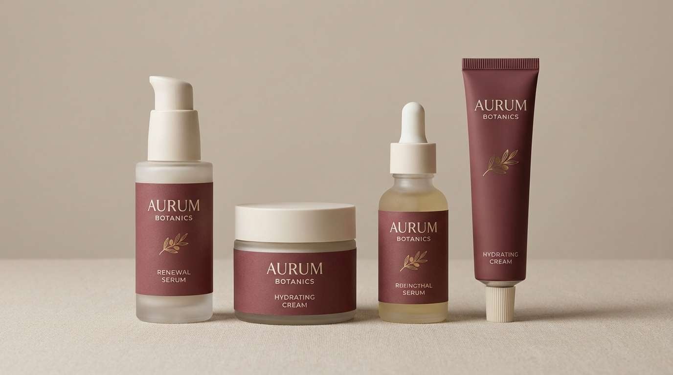
Best for: skincare packaging set
Artisanal and elegant, it suggests rosewood shelves and delicate goldleaf details. The muted reds keep the look mature, while the light neutral supports clean labeling. Use it for skincare or fragrance lines that want warmth without looking overly sweet. Tip: keep the container matte and use gold only on a small brand mark for a premium finish.
Image example of rosewood goldleaf generated using media.io
17) Fireside Velvet
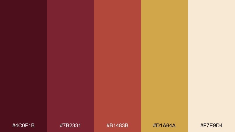
HEX: #4C0F1B #7B2331 #B1483B #D1A64A #F7E9D4
Mood: comforting and rich
Best for: holiday email header
Comforting and rich, it feels like mulled wine, soft velvet throws, and a warm glow in the window. These maroon gold color combinations are perfect for seasonal messaging that stays classy. Use maroon for the header bar, cream for body space, and gold for small icons or CTA outlines. Tip: keep imagery minimal so the colors do most of the storytelling.
Image example of fireside velvet generated using media.io
18) Majestic Marzipan
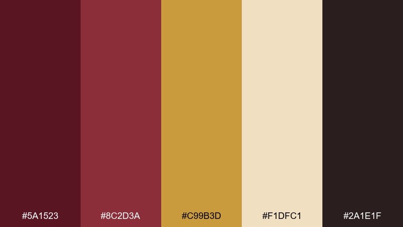
HEX: #5A1523 #8C2D3A #C99B3D #F1DFC1 #2A1E1F
Mood: sweet and sophisticated
Best for: bakery box design
Sweet and sophisticated, it brings to mind marzipan sweets wrapped in satin ribbon. The creamy neutral keeps packaging light while the darker tones add an upscale edge. Use it on pastry boxes, labels, and thank-you cards for a boutique feel. Tip: choose a simple maroon pattern and keep gold as a small stamp or sticker.
Image example of majestic marzipan generated using media.io
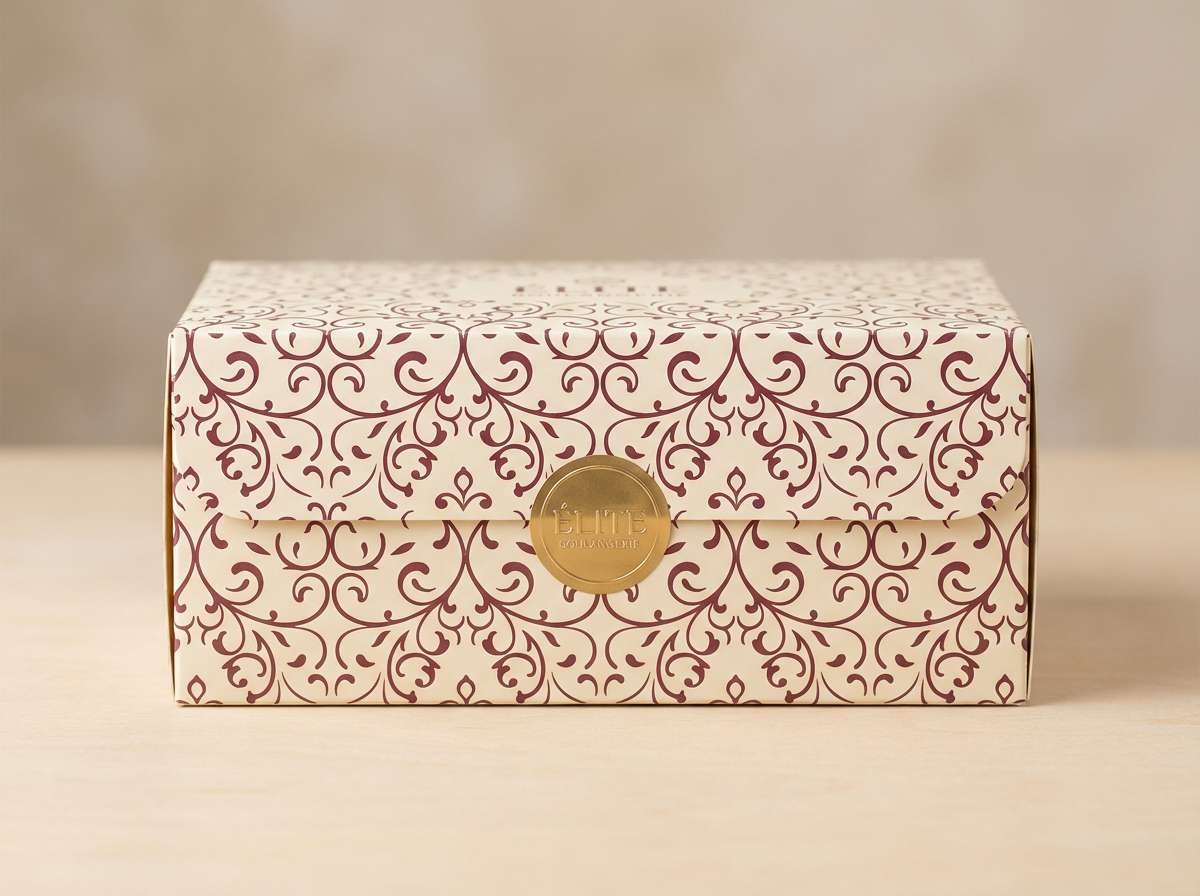
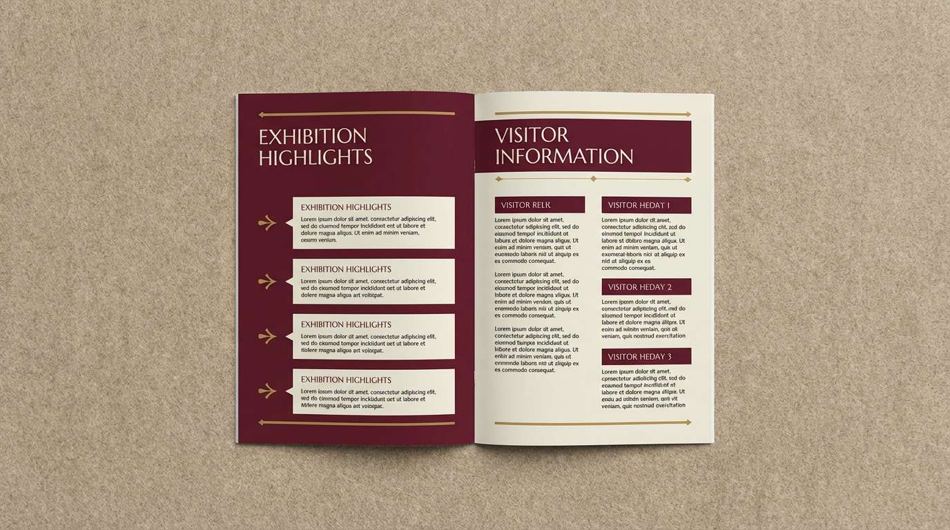
19) Imperial Tapestry
HEX: #3A0A14 #6C1D2C #9B3140 #D0A23F #EADDBF
Mood: grand and curated
Best for: museum exhibition brochure
Grand and curated, it feels like an exhibition hall lined with textiles and gilded frames. A maroon gold color combination like this supports strong hierarchy and confident editorial typography. Use cream for long reads, maroon for section openers, and gold for small navigational markers. Tip: align gold accents to a grid so the brochure stays crisp and modern.
Image example of imperial tapestry generated using media.io
20) Spice Route
HEX: #5D0F1C #8A2A2A #B55A2E #CFA23A #F4E6CD
Mood: adventurous and warm
Best for: travel blog header UI
Adventurous and warm, it suggests bazaars, spices, and sunlit stone streets. The mix works well for navigation and category tags where you need contrast without harshness. Use maroon for the top bar, tan for content background, and gold for active states or highlights. Tip: keep iconography simple so the color story stays the focus.
Image example of spice route generated using media.io
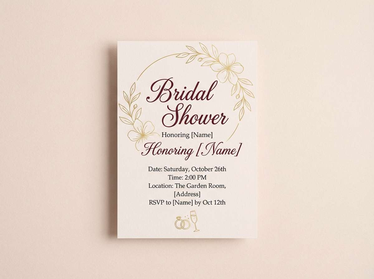
21) Gold Dust Rose
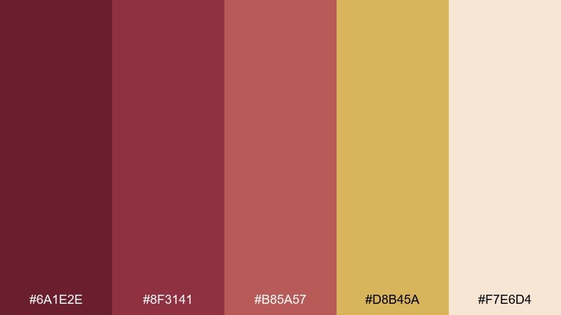
HEX: #6A1E2E #8F3141 #B85A57 #D8B45A #F7E6D4
Mood: modern and romantic
Best for: bridal shower invite
Modern and romantic, it feels like rose petals with a dusting of shimmer. The softer rose-maroon makes the gold look luminous rather than heavy. Use it for invites, social graphics, and day-of signage with airy spacing and delicate line work. Tip: keep the blush tone as the main background and use maroon only for names and key details.
Image example of gold dust rose generated using media.io
What Colors Go Well with Maroon Gold?
Neutrals are the easiest match: cream, ivory, champagne, warm beige, and soft tan keep maroon readable and make gold feel intentional instead of loud.
For deeper, moodier work, pair maroon and gold with near-black, espresso brown, or charcoal. This creates a premium contrast that works well for luxury products and editorial layouts.
If you want a fresher twist, add muted greens (sage, olive, deep pine) or dusty rose tones. These complements soften the palette while keeping the overall look warm.
How to Use a Maroon Gold Color Palette in Real Designs
Assign roles to each color: one maroon as the main brand or background, one lighter red for secondary blocks, a neutral for breathing room, and gold strictly for emphasis (icons, rules, seals, or key numbers).
For UI, keep gold for states and highlights rather than large fills—think active tabs, badges, and subtle separators—so it reads as “quality” instead of “glitter.”
For print packaging and event stationery, maroon looks rich on matte stock while gold shines as foil, emboss, or spot details. Use cream for long text areas so everything stays legible.
Create Maroon and Gold Palette Visuals with AI
If you want to see your maroon gold color scheme in context, generate quick mockups like invitations, menus, labels, or web banners before committing to a full design.
Start with a simple prompt, specify a clean background, and mention where maroon and gold should appear (typography, borders, seals, accents). Then iterate by adjusting mood words like “heritage,” “cozy,” or “premium.”
Maroon Gold Color Palette FAQs
-
What does a maroon and gold color scheme communicate?
It usually signals warmth, tradition, and premium quality. Maroon adds depth and authority, while gold adds a refined highlight that feels celebratory or luxurious depending on how sparingly it’s used. -
Is maroon and gold good for branding?
Yes—especially for hospitality, beauty, food & beverage, events, and heritage-inspired brands. Keep the palette grounded with cream or near-black so the gold stays an accent, not the main fill. -
How do I keep gold from looking too flashy in design?
Use gold in small areas (around 10–15% of the layout), prefer muted antique-gold tones for UI, and pair it with matte neutrals like cream, tan, charcoal, or espresso. -
What background color works best with maroon and gold?
Cream/ivory is the safest for readability and a modern look. For a dramatic premium style, use near-black or very deep brown and set text in cream, reserving gold for select highlights. -
What are good accent colors for maroon gold palettes?
Sage or olive green adds balance, dusty rose softens the feel, and terracotta can bridge maroon and gold for a warmer, more seasonal vibe. -
Can I use maroon and gold in a website UI without hurting accessibility?
Yes—keep most text on light neutrals, use maroon for headers/navigation, and check contrast ratios for buttons and links. Treat gold as an accent for icons, borders, and small emphasis elements rather than body text. -
How can I quickly preview maroon gold color combinations in real scenes?
Use an AI text-to-image tool to generate mockups like posters, menus, packaging, or invitations. Specify “clean background,” “flat layout,” and where gold should appear (seal, border, divider) for more controllable results.
Next: Cozy Color Palette


