

A retro gaming color palette is built for instant clarity: bold brights, deep shadows, and high-contrast accents that read fast—just like classic HUDs and arcade screens.
Below are 20+ pixel-inspired retro gaming color combinations with HEX codes you can use for posters, UI, branding, and modern nostalgic visuals.
In this article
- Why Retro Gaming Palettes Work So Well
-
- crt glow arcade
- 8 bit bubblegum
- neon dungeon
- pixel sunset run
- cartridge desert
- laser grid nights
- pastel power up
- boss fight crimson
- space invader mint
- arcade carpet
- synthwave stadium
- mystic mana
- coin op gold
- glitchy teal screen
- joystick jungle
- monochrome console
- candy cabinet lights
- night city savepoint
- rainbow scanlines
- turbo snow day
- pixel meadow
- What Colors Go Well with Retro Gaming?
- How to Use a Retro Gaming Color Palette in Real Designs
- Create Retro Gaming Palette Visuals with AI
Why Retro Gaming Palettes Work So Well
Retro gaming palettes are designed around readability and impact—deep bases with bright accent colors that stand out like score counters, power-ups, and warning flashes.
They also trigger nostalgia fast: neon magenta, electric cyan, and arcade gold instantly evoke CRT glow, pixel art, and 8-bit/16-bit interfaces.
Because the contrast is so intentional, these palettes translate well to modern UI, branding, and social graphics where you need hierarchy, focus, and quick scanning.
20+ Retro Gaming Color Palette Ideas (with HEX Codes)
1) CRT Glow Arcade
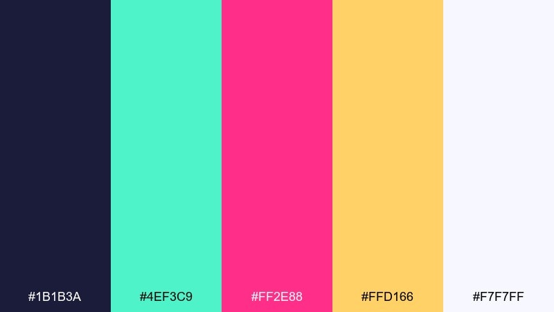
HEX: #1b1b3a #4ef3c9 #ff2e88 #ffd166 #f7f7ff
Mood: electric, nostalgic, high-contrast
Best for: 2D game UI mockup
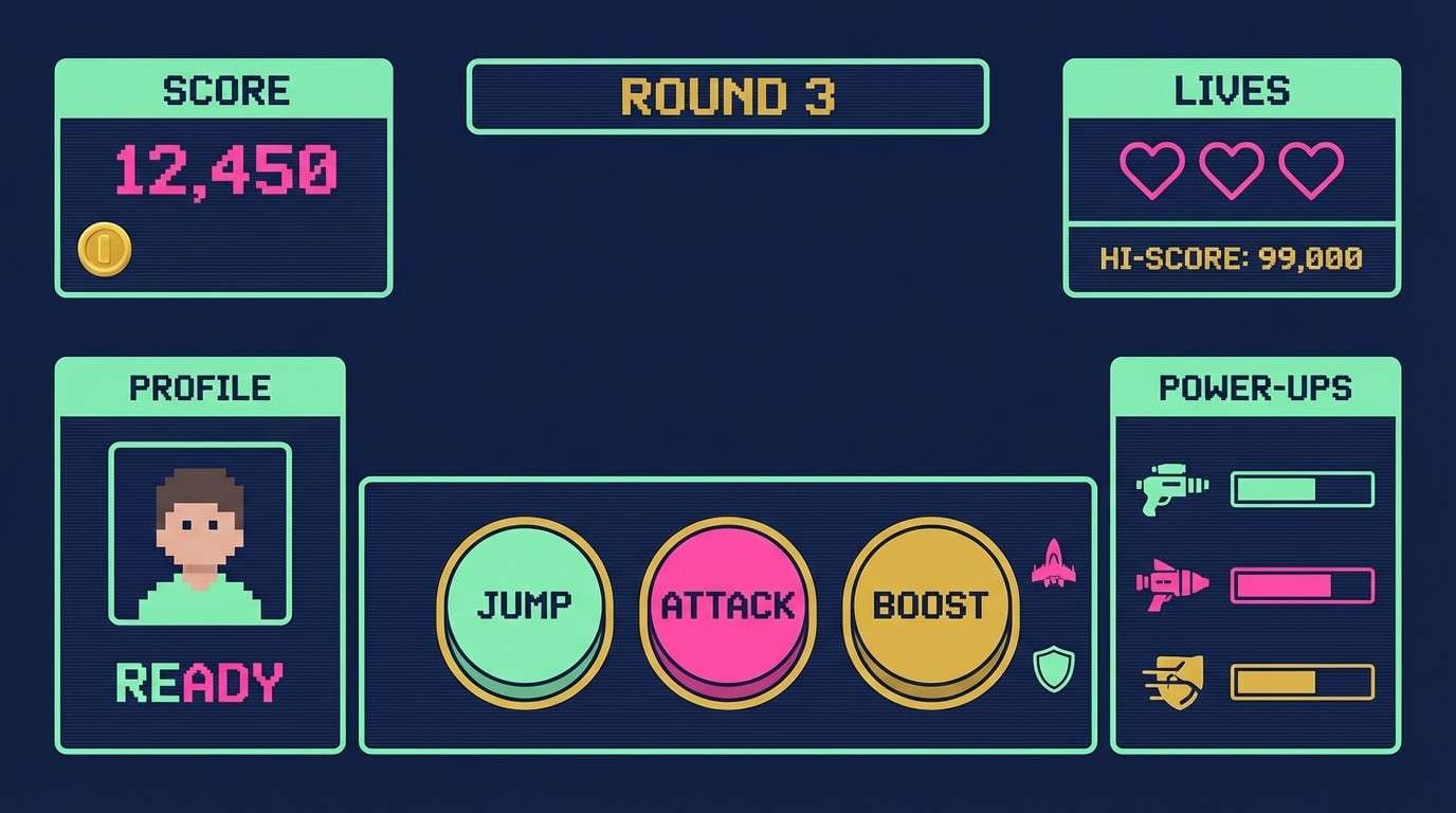
Electric CRT glow and late-night arcade vibes come through in the deep navy, mint pop, and hot pink spark. It works brilliantly for HUDs, menus, and score screens where contrast must read fast. Pair the navy with mint for structure, then use pink or gold only for alerts and calls to action. Tip: keep body text in off-white and reserve pink for the single most important interaction on each screen.
Image example of crt glow arcade generated using media.io
Media.io is an online AI studio for creating and editing video, image, and audio in your browser.

2) 8 Bit Bubblegum
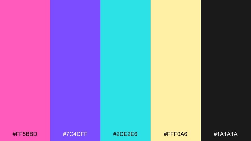
HEX: #ff5bbd #7c4dff #2de2e6 #fff0a6 #1a1a1a
Mood: playful, candy-bright, pop
Best for: stream overlay graphics
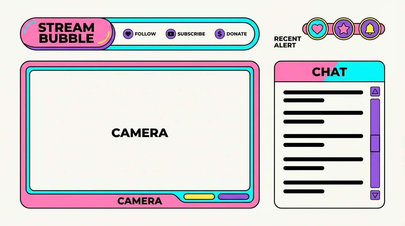
Bubblegum pink and neon cyan feel like a cheery character select screen, with purple adding that classic console punch. Use it for stream overlays, badges, and animated lower thirds where you want instant personality. Keep the black for outlines and legibility, and let the yellow act as a small highlight for notifications. Tip: use thick strokes and simplified shapes so the bright tones do not blur together at small sizes.
Image example of 8 bit bubblegum generated using media.io
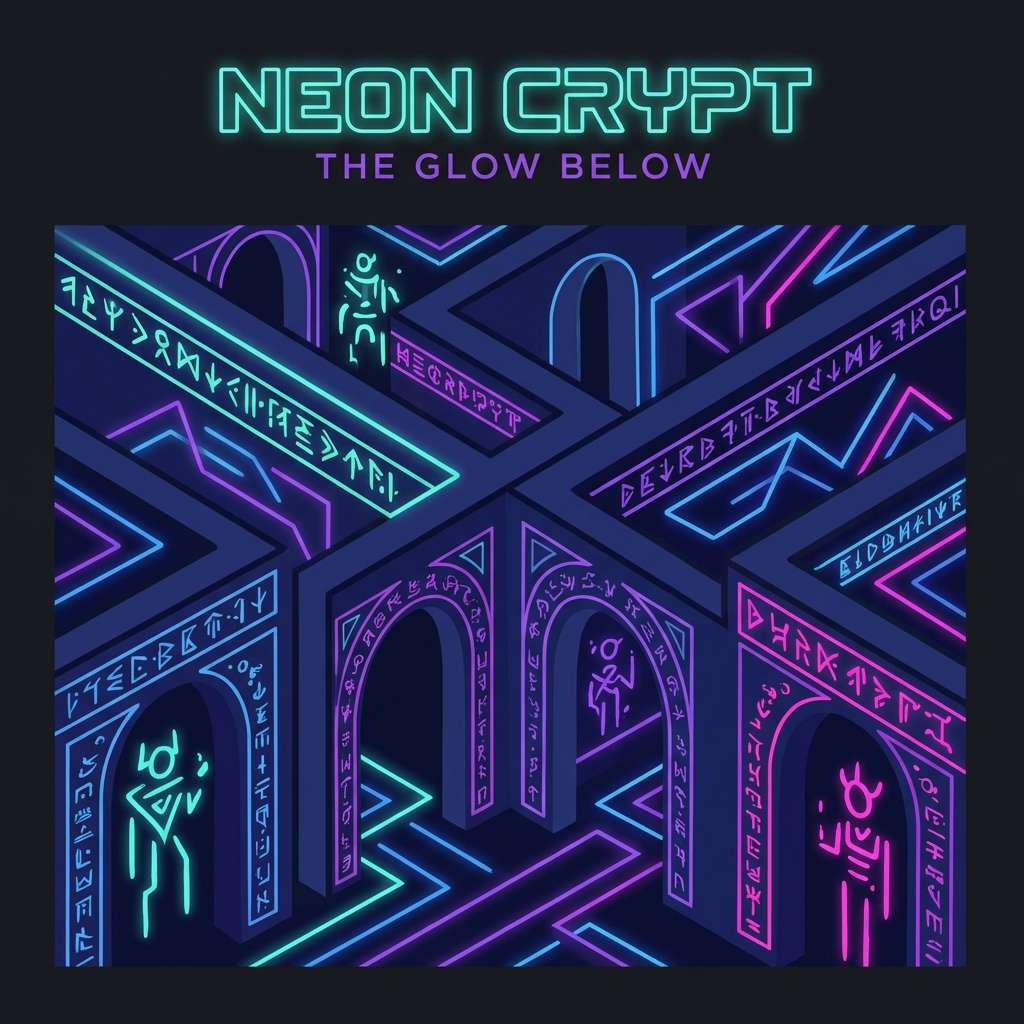
3) Neon Dungeon
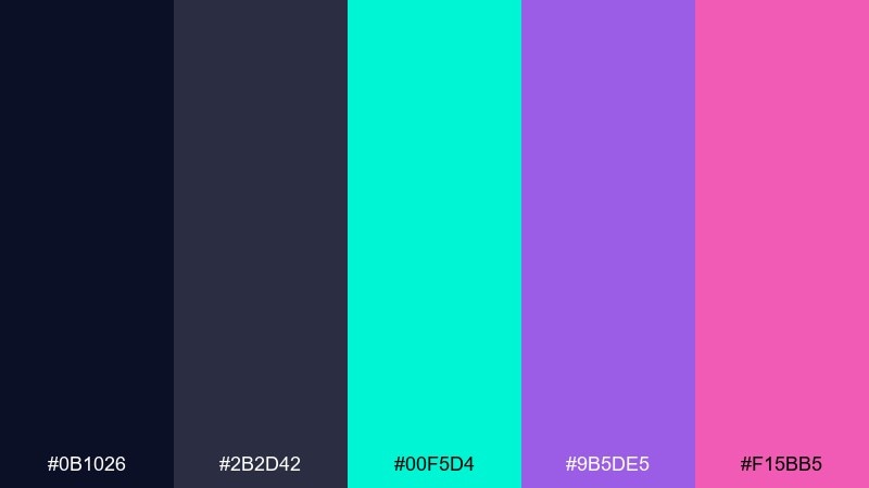
HEX: #0b1026 #2b2d42 #00f5d4 #9b5de5 #f15bb5
Mood: moody, cyber, adventurous
Best for: album cover artwork
Moody midnight blues with neon teal feel like torchlight in a futuristic dungeon crawl. The purple and magenta bring spell-cast energy without losing the dark atmosphere. Use it for covers or hero graphics where you want a deep backdrop and luminous highlights. Tip: add a soft teal glow around key elements to mimic a light source and keep the composition readable.
Image example of neon dungeon generated using media.io
4) Pixel Sunset Run
HEX: #ff9f1c #ff4d6d #845ec2 #2ec4b6 #0b1320
Mood: energetic, warm, fast-paced
Best for: event poster design
A sunset sprint of orange and raspberry feels like a side-scroller level at golden hour. The violet keeps the warmth grounded while teal adds a cool speed-line contrast. Use it for posters and promos where you need bold headlines and a sense of motion. Tip: set the background in the deep near-black and stack warm gradients behind the main title for instant depth.
Image example of pixel sunset run generated using media.io
5) Cartridge Desert
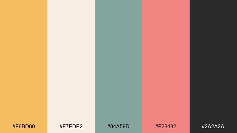
HEX: #f6bd60 #f7ede2 #84a59d #f28482 #2a2a2a
Mood: dusty, warm, nostalgic
Best for: product packaging mockup
Dusty sand, soft cream, and muted teal feel like a well-loved cartridge pulled from a drawer. The coral adds a friendly accent that reads great on labels without shouting. Use it for packaging, merch tags, or minimalist branding that hints at nostalgia with modern restraint. Tip: keep the cream as the base, then use coral for a single badge element so the design stays calm.
Image example of cartridge desert generated using media.io
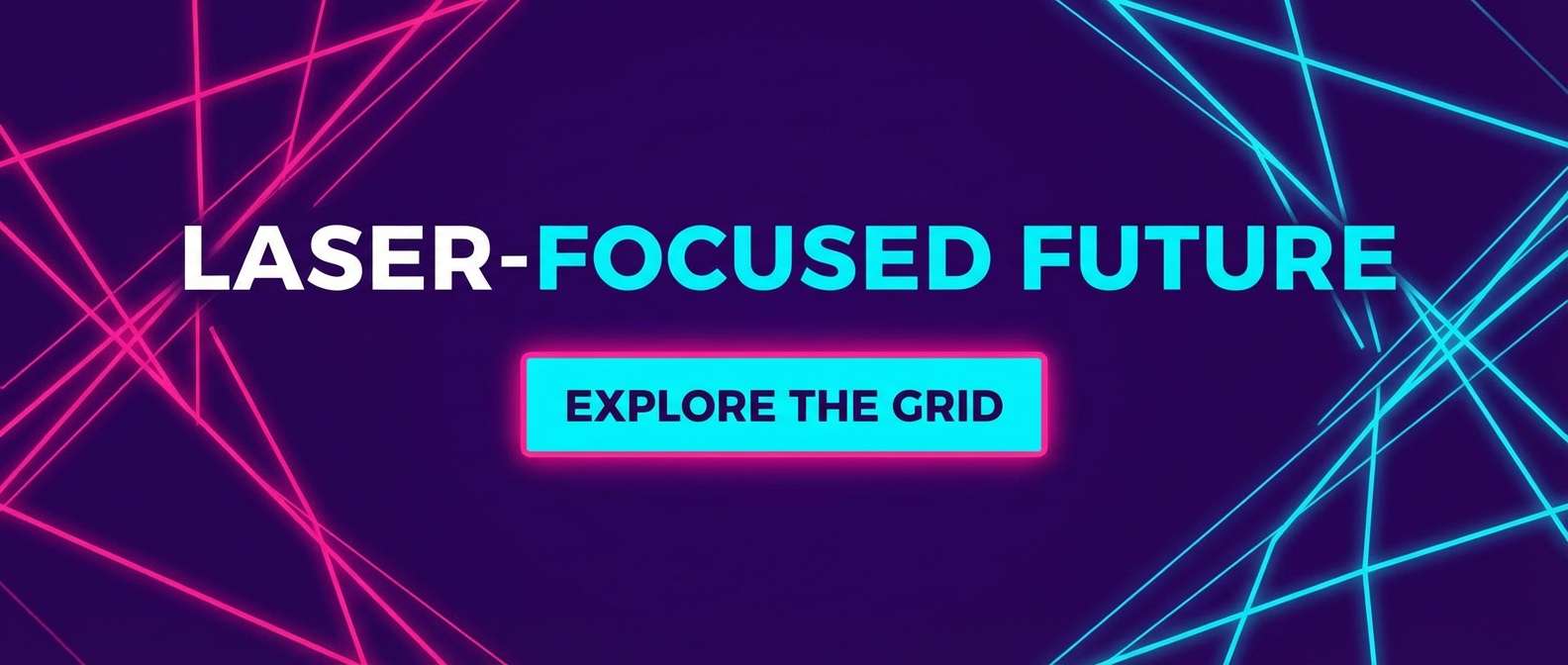
6) Laser Grid Nights
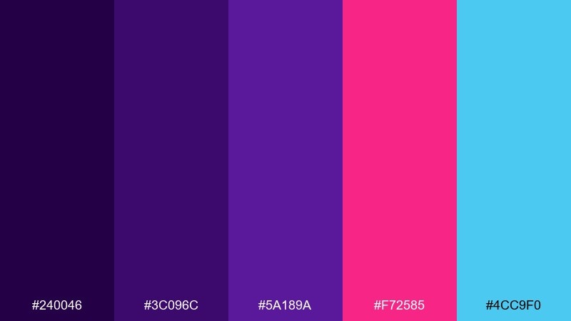
HEX: #240046 #3c096c #5a189a #f72585 #4cc9f0
Mood: synthy, bold, night-time
Best for: website hero banner
Deep violets and laser pink look like a glowing grid stretching into the night. Cyan brings that sharp highlight that makes buttons and links pop on dark layouts. Use it on hero banners, landing pages, and campaign headers where you want instant drama. Tip: keep gradients subtle and let cyan handle interactive states like hover and focus.
Image example of laser grid nights generated using media.io
7) Pastel Power Up
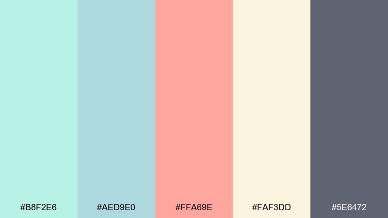
HEX: #b8f2e6 #aed9e0 #ffa69e #faf3dd #5e6472
Mood: soft, friendly, airy
Best for: app onboarding screens
Soft mint and sky tones evoke a calm power-up animation with a gentle, modern twist. The peach accent feels welcoming for tips, badges, and progress states. Use it for onboarding, tutorials, and product tours where readability matters more than spectacle. Tip: set most surfaces in cream and apply the dark gray only for headings to keep the palette light.
Image example of pastel power up generated using media.io
8) Boss Fight Crimson
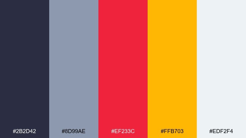
HEX: #2b2d42 #8d99ae #ef233c #ffb703 #edf2f4
Mood: intense, competitive, punchy
Best for: sports team branding
Crimson and gold hit like a boss fight warning flash, while cool grays keep it sharp and modern. It is ideal for esports branding, jerseys, and high-impact social graphics. Use crimson for primary marks, gold for highlights, and keep the light gray for breathing room. Tip: limit crimson fills to large shapes and use it as a stroke on smaller elements to avoid visual fatigue.
Image example of boss fight crimson generated using media.io
9) Space Invader Mint
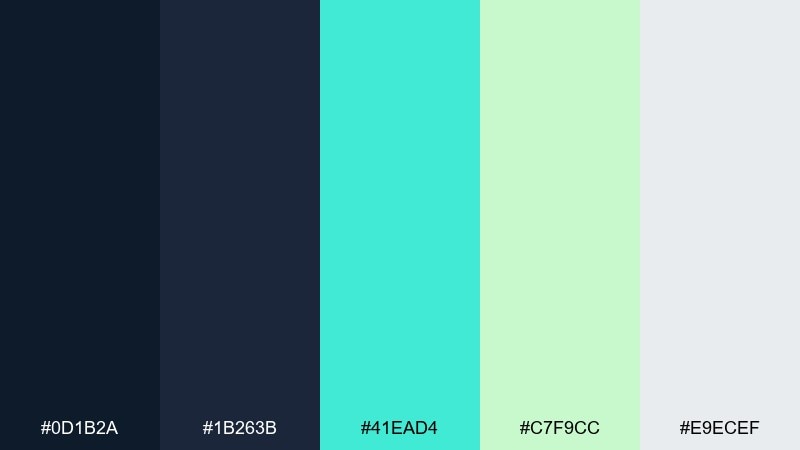
HEX: #0d1b2a #1b263b #41ead4 #c7f9cc #e9ecef
Mood: cool, clean, sci-fi
Best for: dashboard UI theme
Cool navies and minty greens bring to mind vector aliens and clean starfield HUDs. It is a great fit for dashboards where you want a dark mode base without harsh neon. Pair the two greens for charts and status, and keep the light gray for cards and table rows. Tip: use the brighter mint only for active toggles and key metrics so hierarchy stays clear.
Image example of space invader mint generated using media.io
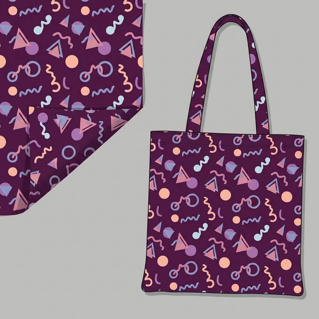
10) Arcade Carpet
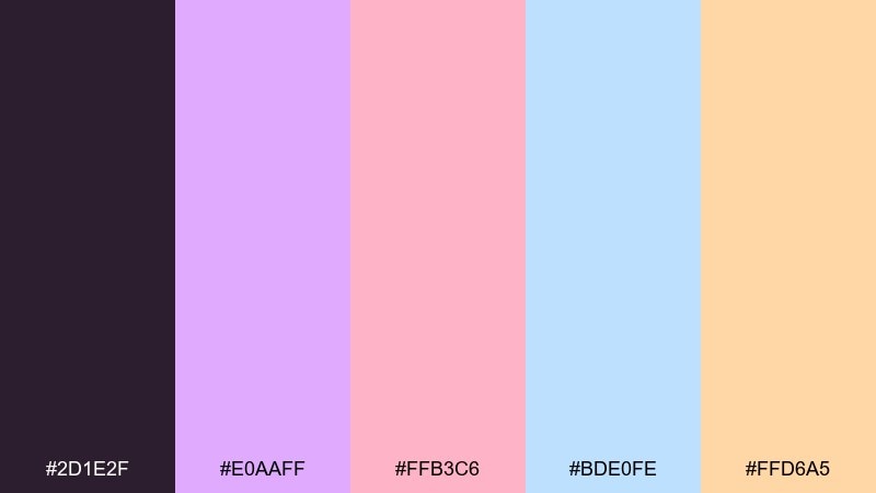
HEX: #2d1e2f #e0aaff #ffb3c6 #bde0fe #ffd6a5
Mood: whimsical, cozy, nostalgic
Best for: pattern design for merch
These soft brights feel like an arcade carpet pattern under dim lights, playful without being loud. Lavender and blush keep it friendly, while pale blue adds airy contrast. Use it for merch patterns, stickers, and backgrounds behind bold logos. Tip: anchor the pattern with the deep plum so the pastels do not wash out on print.
Image example of arcade carpet generated using media.io
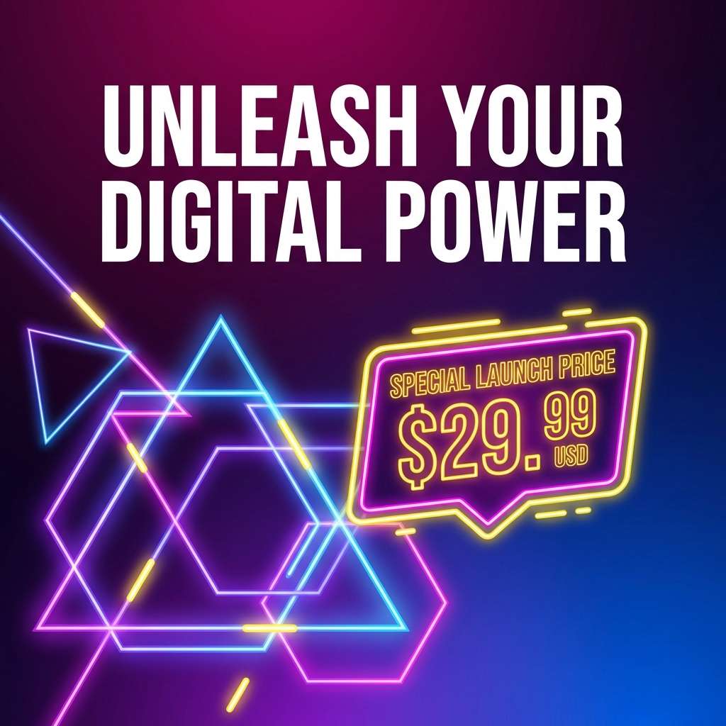
11) Synthwave Stadium
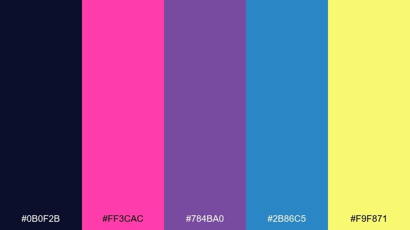
HEX: #0b0f2b #ff3cac #784ba0 #2b86c5 #f9f871
Mood: flashy, energetic, futuristic
Best for: social media ad creative
Hot magenta and electric blue feel like stadium lights over a synthwave match. The violet bridges the two brights, while yellow makes the offer or price tag impossible to miss. Use this set when you need retro gaming color combinations that stop the scroll, especially for drops, sales, and event promos. Tip: keep yellow to small callouts and let blue-magenta gradients carry the background.
Image example of synthwave stadium generated using media.io
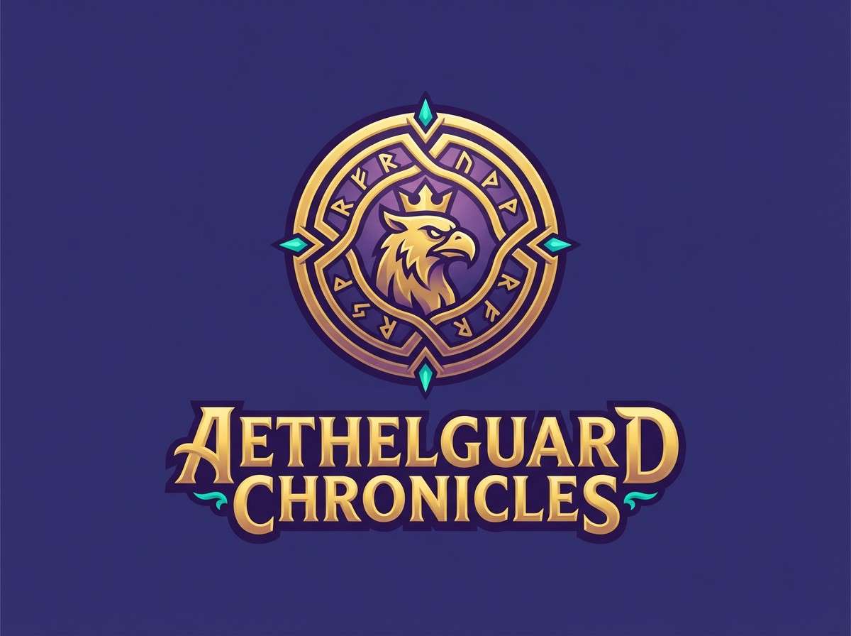
12) Mystic Mana
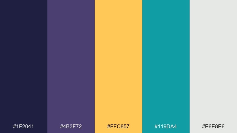
HEX: #1f2041 #4b3f72 #ffc857 #119da4 #e6e8e6
Mood: mystical, balanced, story-driven
Best for: fantasy game logo design
Deep indigo and dusky purple suggest old-school magic menus, with gold like a rare item drop. Teal keeps it fresh and adds an alchemy vibe for secondary elements. Use it for fantasy logos, guild marks, and title treatments where you want depth without going full neon. Tip: build the mark in gold on indigo, then use teal sparingly as a rune-like detail.
Image example of mystic mana generated using media.io
13) Coin Op Gold
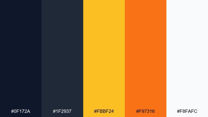
HEX: #0f172a #1f2937 #fbbf24 #f97316 #f8fafc
Mood: confident, warm, premium
Best for: product ad banner
Gold and orange glow like a coin slot light against a clean, dark cabinet. It is perfect for product ads that need a premium feel while still nodding to arcade nostalgia. Pair the two dark tones for backgrounds and shadows, then use gold for the hero message and orange for urgency. Tip: add a thin gold border to frame the layout and make the banner feel intentional.
Image example of coin op gold generated using media.io
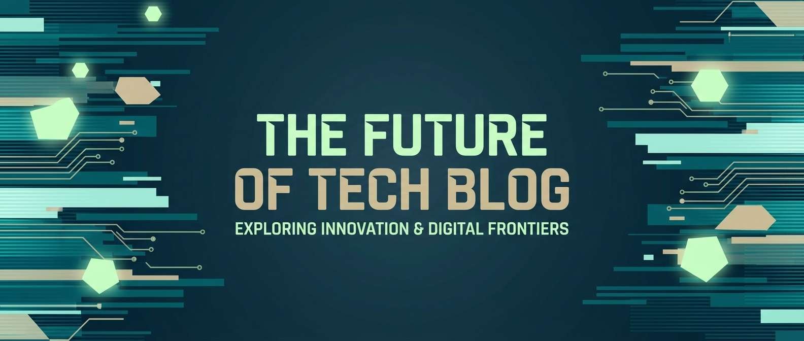
14) Glitchy Teal Screen
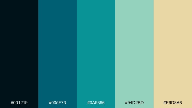
HEX: #001219 #005f73 #0a9396 #94d2bd #e9d8a6
Mood: techy, aquatic, calm
Best for: tech blog header
Layered teals read like a glitching monitor that somehow feels soothing, not aggressive. The pale green and sand tone soften the look for long-form content and editorial layouts. Use it for blog headers, thumbnails, or section dividers where you want a cohesive gradient story. Tip: build a teal-to-teal background and let the sand color highlight only links or tags.
Image example of glitchy teal screen generated using media.io
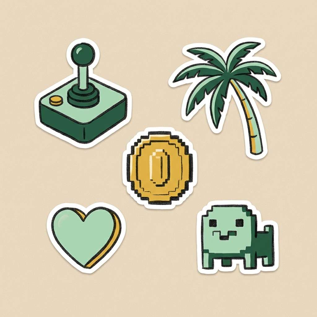
15) Joystick Jungle
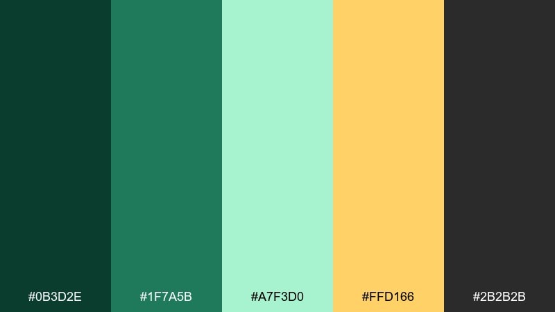
HEX: #0b3d2e #1f7a5b #a7f3d0 #ffd166 #2b2b2b
Mood: fresh, playful, outdoorsy
Best for: illustrated sticker set
Leafy greens and mint feel like a pixel jungle level with hidden bonuses. The warm yellow adds collectible sparkle without pushing into neon territory. Use it for stickers, icons, or playful brand assets that want a fresh spin on nostalgia. Tip: outline stickers in charcoal to keep edges crisp on any background color.
Image example of joystick jungle generated using media.io
16) Monochrome Console
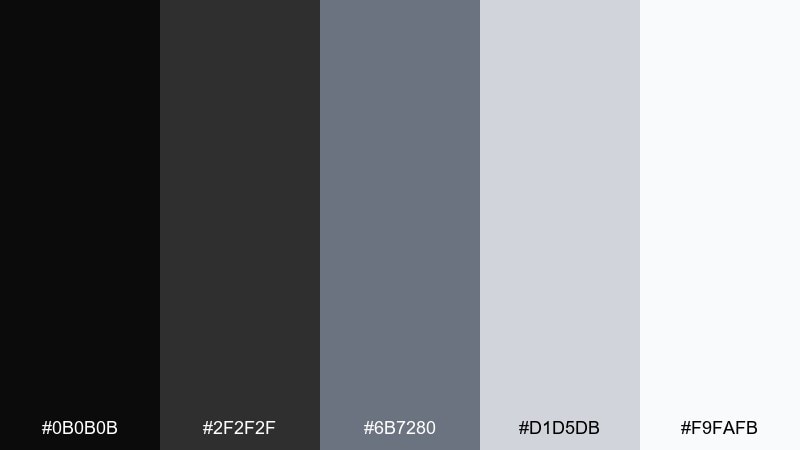
HEX: #0b0b0b #2f2f2f #6b7280 #d1d5db #f9fafb
Mood: minimal, timeless, utilitarian
Best for: editorial layout
These console-like grays feel like a clean handheld interface and keep attention on content. It is ideal for editorial spreads, documentation, and product pages that need structure more than spectacle. Pair the darkest tone for headlines with light surfaces for generous whitespace. Tip: introduce one accent color only for links, and keep every other element within the grayscale for consistency.
Image example of monochrome console generated using media.io
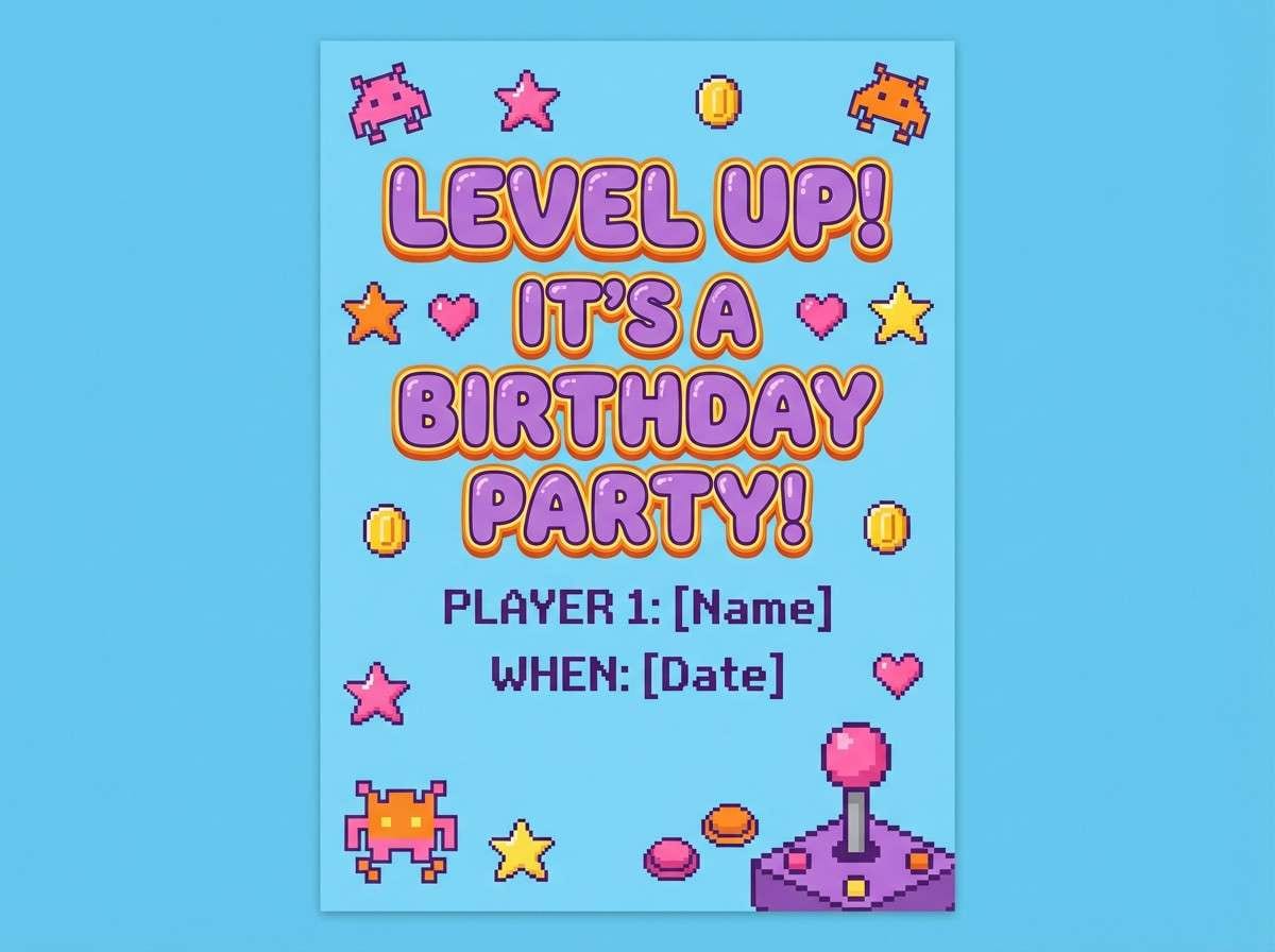
17) Candy Cabinet Lights
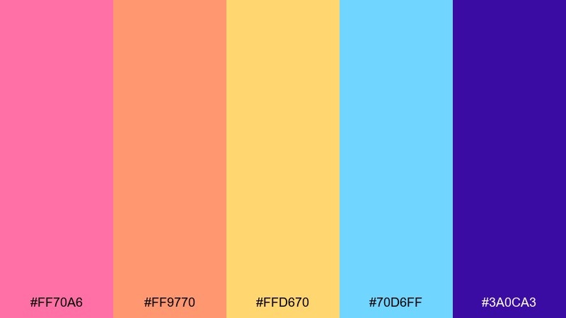
HEX: #ff70a6 #ff9770 #ffd670 #70d6ff #3a0ca3
Mood: bright, cheerful, arcade-pop
Best for: birthday party invitation
Candy brights feel like cabinet lights in a family arcade, happy and a little chaotic in the best way. The deep purple helps anchor the sweetness so text and icons stay readable. Use it for invitations, flyers, and party graphics where you want instant fun. Tip: set the background in pale yellow and use purple for all typography, then sprinkle the other colors as confetti accents.
Image example of candy cabinet lights generated using media.io
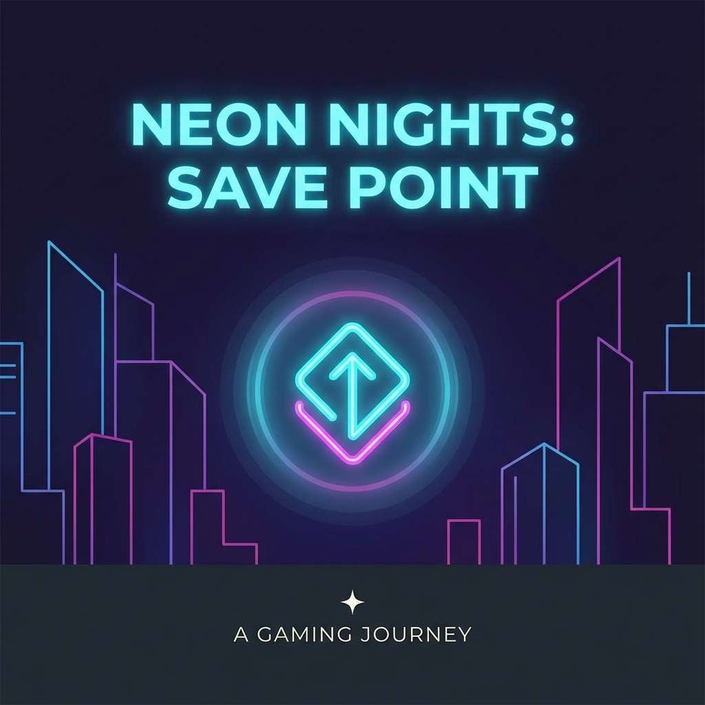
18) Night City Savepoint
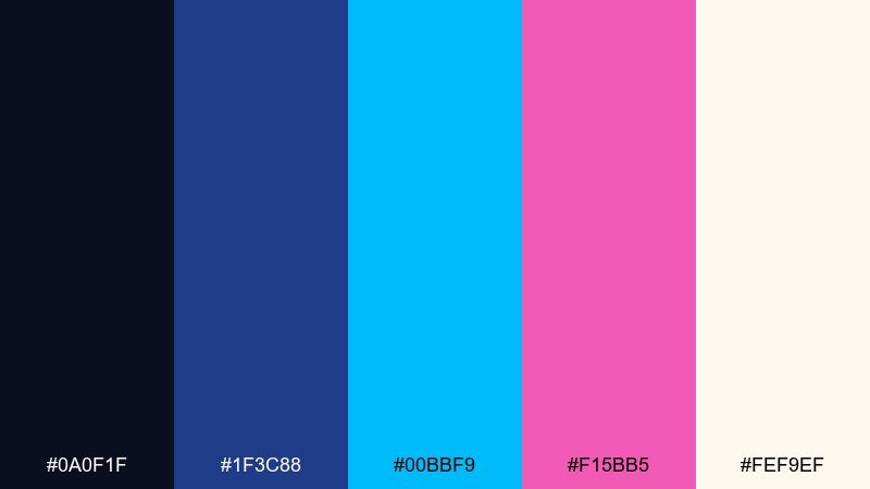
HEX: #0a0f1f #1f3c88 #00bbf9 #f15bb5 #fef9ef
Mood: urban, sleek, neon-lit
Best for: podcast cover art
Neon blue and pink over deep night tones evoke a savepoint glowing on a rainy city street. It is great for podcast covers, thumbnails, and headers that need to read at small sizes. Pair the night base with cyan for the main title, then use pink as a secondary highlight for episode numbers. Tip: keep the background mostly dark and limit bright colors to the center to focus the eye.
Image example of night city savepoint generated using media.io
19) Rainbow Scanlines
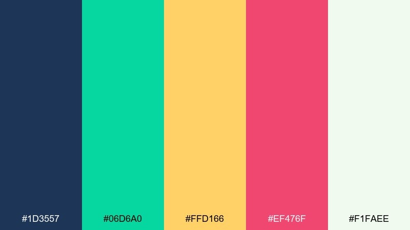
HEX: #1d3557 #06d6a0 #ffd166 #ef476f #f1faee
Mood: optimistic, classic, lively
Best for: presentation template
Bright scanline energy comes through with teal, gold, and pink balanced by a smart blue base. It is a flexible set for slides and decks where you want playful color without losing professionalism. Use the navy for titles and structure, then rotate the three brights as section colors. Tip: keep charts to two highlight colors per slide so the story stays easy to follow.
Image example of rainbow scanlines generated using media.io
20) Turbo Snow Day
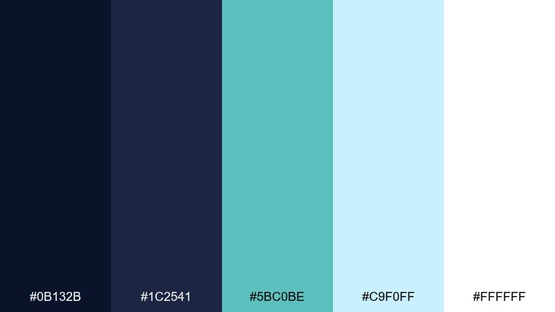
HEX: #0b132b #1c2541 #5bc0be #c9f0ff #ffffff
Mood: cool, crisp, fast
Best for: winter sale promo banner
Icy cyan and clean whites feel like a speed run through snow levels with crisp UI clarity. The layered blues give you depth without muddying the highlights. Use it for winter promos, sale banners, or seasonal landing pages that need freshness. Tip: keep the background nearly white and use the darkest blue only for headline text to maximize contrast.
Image example of turbo snow day generated using media.io

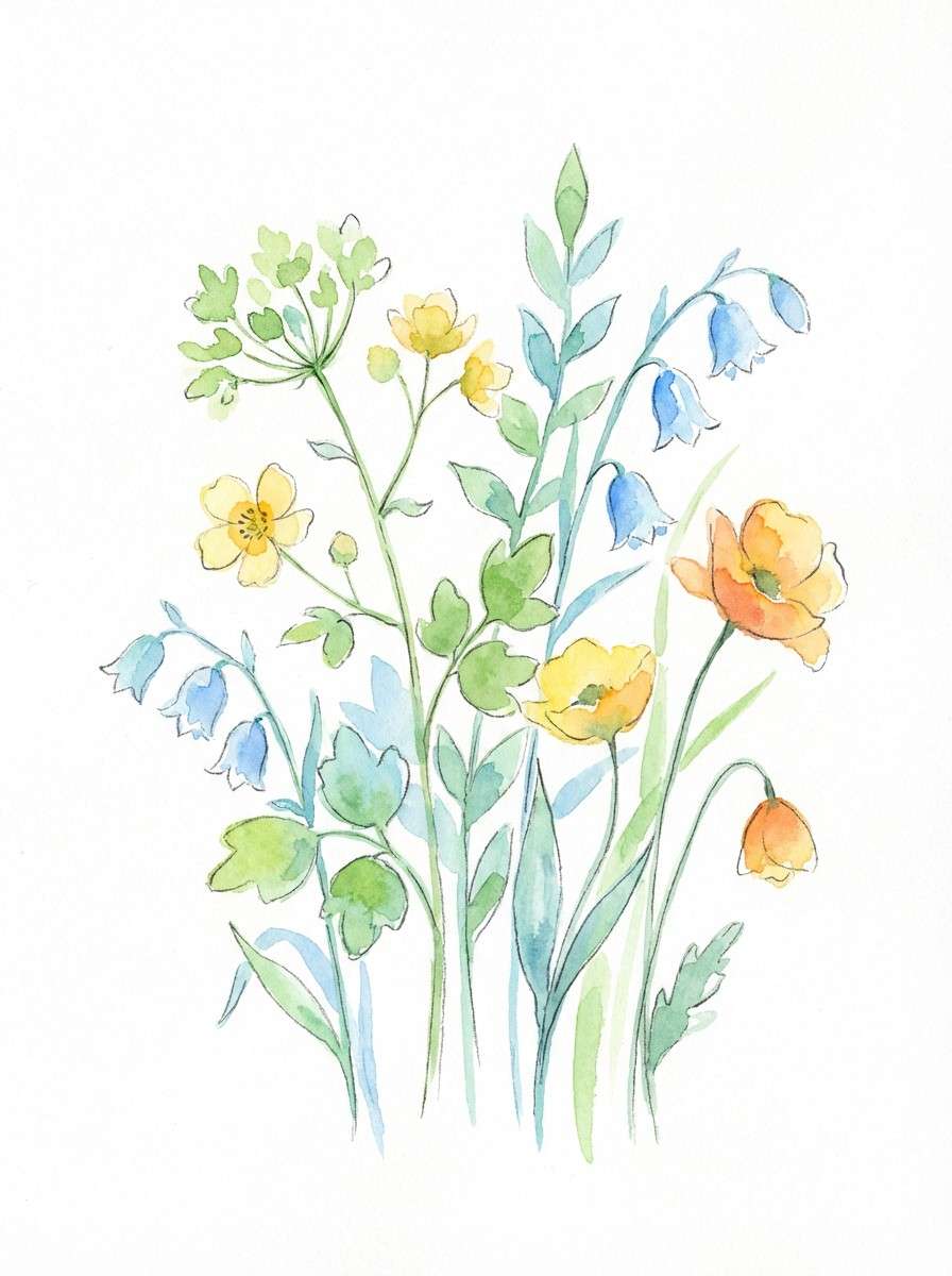
21) Pixel Meadow
HEX: #2f2d2e #3a86ff #06d6a0 #ffbe0b #fb5607
Mood: bright, outdoorsy, upbeat
Best for: watercolor botanical illustration
Fresh green and sky blue feel like a cheerful overworld map, with warm sun and ember accents for contrast. It is a lively mix for illustrations that need clear, separated shapes and a playful vibe. Pair the green with blue for leaves and shadows, then use yellow and orange for blooms and focal points. Tip: keep the charcoal as a light outline wash so the botanical elements stay readable on white paper textures.
Image example of pixel meadow generated using media.io
What Colors Go Well with Retro Gaming?
Retro gaming palettes usually work best with a dark “cabinet” base (navy, charcoal, deep purple) plus one or two neon accents (cyan, magenta, lime) for interactivity and highlights.
Warm tones like arcade gold and orange add reward/coin energy and are excellent for badges, prices, and “new” labels. Off-white or light gray is the safest choice for readable body text.
If you want a modern-retro look, mix one bright neon with a softer pastel (mint, peach, cream) so the design feels nostalgic without looking overly aggressive.
How to Use a Retro Gaming Color Palette in Real Designs
Start with a clear role system: pick one background color, one text color, one primary accent (CTA), and one secondary accent (status/hover). Retro gaming color schemes can get noisy if every bright is used equally.
For UI and dashboards, keep high-saturation colors for states (active, error, success) and use muted surfaces for cards and panels. That preserves the “pixel pop” while staying comfortable to read.
For posters and social graphics, lean into gradients, glow, and scanline-inspired textures—but keep typography crisp and high-contrast so the message stays instant.
Create Retro Gaming Palette Visuals with AI
If you have a retro gaming color palette you like, you can generate matching visuals (UI mockups, posters, logo explorations, and pattern ideas) by turning the palette into a simple prompt.
Use your HEX codes as guardrails: specify the dominant colors, reserve one accent for CTAs, and ask for clean vector shapes if you need pixel-friendly results.
With Media.io Text to Image, you can iterate fast—swap moods (8-bit, synthwave, CRT glow) while keeping the same core palette.
Retro Gaming Color Palette FAQs
-
What defines a retro gaming color palette?
A retro gaming color palette typically uses high-contrast pairings (dark bases + bright accents) inspired by CRT glow, arcade cabinets, and 8-bit/16-bit pixel art. Common accents include neon cyan, magenta, and warm gold/orange for “coin” highlights. -
What are the best retro gaming colors for UI design?
Deep navy or charcoal for backgrounds, off-white for text, and a single neon accent (like cyan or magenta) for active states and CTAs. This keeps the interface readable while still feeling arcade-inspired. -
How do I keep neon retro palettes from looking messy?
Limit the number of saturated colors used at once and assign roles: one dominant background, one primary accent, one secondary accent, plus neutrals. Use brights for small elements (buttons, icons, alerts) instead of large blocks. -
Are retro gaming color schemes good for branding?
Yes—especially for esports, streaming, apps, and digital-first brands. They create instant personality and strong recognition, as long as you keep contrast and typography legible across sizes. -
What’s the difference between synthwave and retro gaming palettes?
Synthwave palettes lean heavily on purple, magenta, and cyan gradients with a nightlife feel. Retro gaming palettes can include that look, but also span cartridge neutrals, pixel pastels, and classic arcade primary colors. -
Which background color works best with retro gaming accents?
Near-black, deep navy, or dark violet backgrounds make neon accents pop and help mimic CRT/arcade lighting. For softer retro styles, cream or light gray backgrounds pair well with muted teal and coral. -
Can I generate retro gaming visuals from these HEX codes?
Yes. Add your HEX colors to a prompt (dominant + accents), specify the style (8-bit UI, arcade HUD, scanlines, vector), and generate variations until the composition matches your use case.
Next: Aquamarine Color Palette


