

Aquamarine is a bright blue-green that instantly reads as clean, airy, and modern. It’s popular in UI, branding, and decor because it feels fresh without looking harsh.
Below are 20 curated aquamarine color palette ideas with HEX codes, plus practical pairing tips and AI prompts you can reuse to generate matching visuals.
In this article
- Why Aquamarine Color Combinations Work So Well
-
- sea glass morning
- lagoon coral pop
- arctic mint minimal
- tropical resort
- coastal neutrals
- deep reef
- vintage pool tile
- fresh eucalyptus
- mermaid metallics
- aqua blush wedding
- stormy aquamarine
- citrus splash
- nordic ice
- ocean ink branding
- desert oasis
- retro surf poster
- spa serenity
- tech gradient ui
- botanical watercolor
- evening yacht club
- What Colors Go Well with Aquamarine?
- How to Use a Aquamarine Color Palette in Real Designs
- Create Aquamarine Palette Visuals with AI
Why Aquamarine Color Combinations Work So Well
Aquamarine sits between blue and green, so it can feel both calming (like blue) and lively (like green). That balance makes it easy to use as a primary brand color or as an accent that still feels “active.”
It also pairs well with a wide range of neutrals—from crisp white to warm creams to deep charcoals—so you can tune the mood from coastal and light to premium and moody.
In digital design, aquamarine is great for hierarchy: darker teals and navies handle legible text and structure, while brighter aqua tones create clear CTAs, highlights, and state changes.
20+ Aquamarine Color Palette Ideas (with HEX Codes)
1) Sea Glass Morning
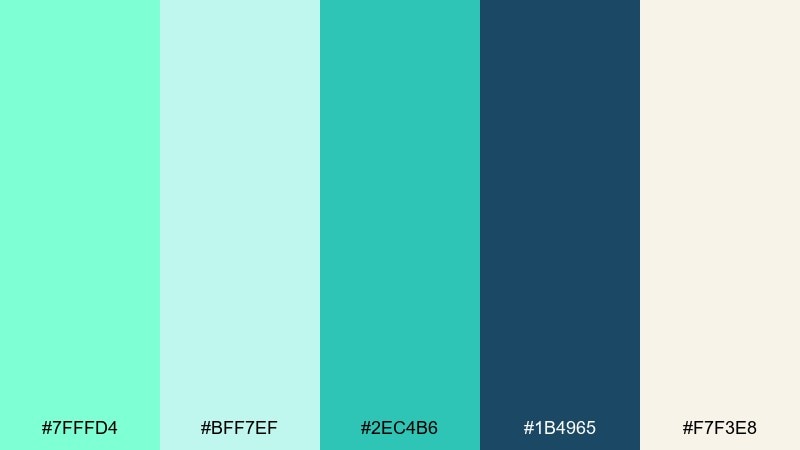
HEX: #7FFFD4 #BFF7EF #2EC4B6 #1B4965 #F7F3E8
Mood: fresh, coastal, light
Best for: lifestyle branding hero banner
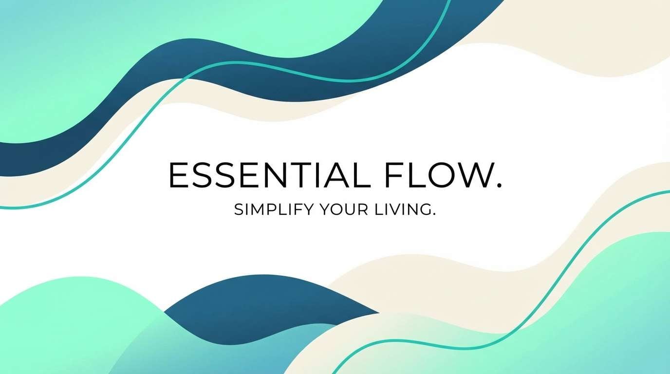
Fresh shoreline air and tumbled sea glass set a clean, optimistic tone. This aquamarine color palette balances bright aqua with deep ocean blue and a soft creamy backdrop for easy readability. Use it for wellness, travel, or sustainable brands where you want calm energy without feeling cold. Pair the navy with the cream for text-heavy areas, then add aquamarine as a confident highlight for buttons or badges.
Image example of sea glass morning generated using media.io
Media.io is an online AI studio for creating and editing video, image, and audio in your browser.

2) Lagoon Coral Pop
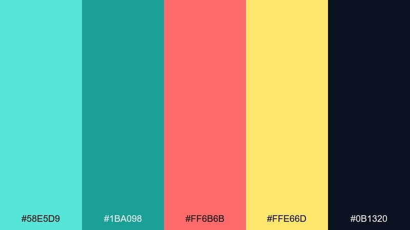
HEX: #58E5D9 #1BA098 #FF6B6B #FFE66D #0B1320
Mood: playful, vibrant, summery
Best for: social media promo carousel
Sunlit lagoon water meets a punchy coral accent for a lively, attention-grabbing look. The warm coral and lemon yellow keep the aqua from feeling too serene, making it great for campaigns and seasonal drops. Use the near-black for crisp type and icons, and reserve coral for the main call to action. A simple tip: keep backgrounds mostly aqua or dark to let coral pop without turning busy.
Image example of lagoon coral pop generated using media.io
3) Arctic Mint Minimal
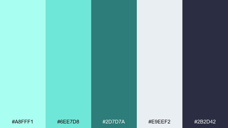
HEX: #A8FFF1 #6EE7D8 #2D7D7A #E9EEF2 #2B2D42
Mood: minimal, airy, modern
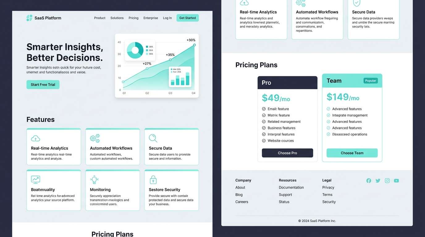
Best for: saas landing page UI
Cool mint air and frosted neutrals create a crisp, modern calm. These aquamarine tones work especially well for dashboards and fintech where clarity matters and color should support hierarchy. Use the dark slate for headings and navigation, then apply the mint as status states, toggles, and micro-interactions. Tip: keep the light gray as the main canvas to avoid eye fatigue on long sessions.
Image example of arctic mint minimal generated using media.io
4) Tropical Resort
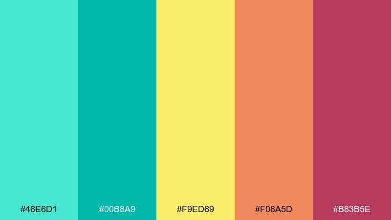
HEX: #46E6D1 #00B8A9 #F9ED69 #F08A5D #B83B5E
Mood: tropical, energetic, sunny
Best for: travel poster graphic
Warm sunshine, pool water, and fruity accents make this feel like vacation in a single glance. Among aquamarine color combinations, this one shines when you want bright optimism without going neon. Let aqua lead with large shapes, then use yellow for highlights and the warm reds for small focal points like dates or prices. Tip: keep warm tones under 20 percent of the layout to maintain that refreshing, watery feel.
Image example of tropical resort generated using media.io

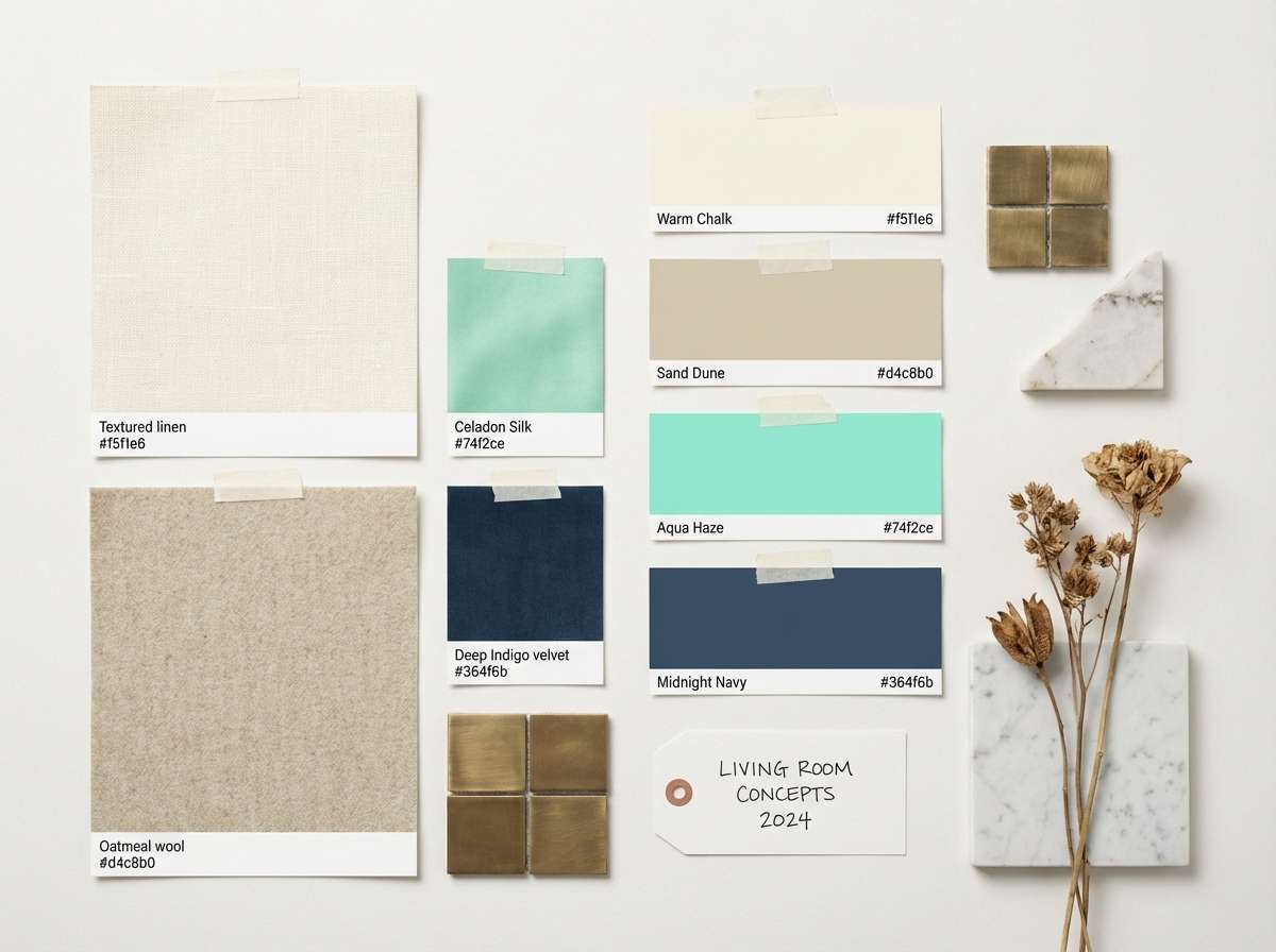
5) Coastal Neutrals
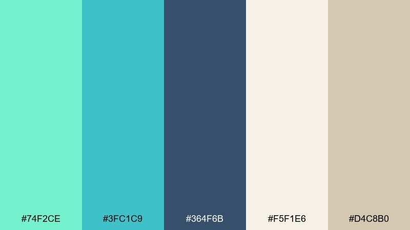
HEX: #74F2CE #3FC1C9 #364F6B #F5F1E6 #D4C8B0
Mood: relaxed, natural, balanced
Best for: interior mood board
Driftwood neutrals and calm aqua tones evoke an easy coastal weekend. The sandy beige and soft ivory keep the blues grounded, which helps in home decor, hospitality, and boutique branding. Use the slate blue for structure like headings, frames, and outlines, then layer aqua in textiles or accent blocks. Tip: repeat the beige in multiple spots to unify the composition and prevent the aqua from floating alone.
Image example of coastal neutrals generated using media.io
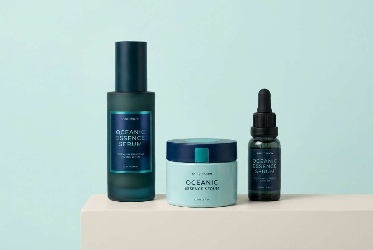
6) Deep Reef
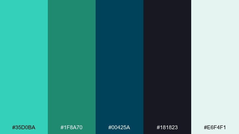
HEX: #35D0BA #1F8A70 #00425A #181823 #E6F4F1
Mood: moody, oceanic, premium
Best for: luxury skincare packaging
Shadowy reef water and inky depth give this set a high-end, underwater elegance. This aquamarine color scheme works beautifully for premium products where you want rich contrast without harsh black. Use the pale aqua as a clean label base, then bring in the deep teal and blue for caps, borders, and key claims. Tip: add subtle matte textures so the dark tones feel tactile rather than flat.
Image example of deep reef generated using media.io
7) Vintage Pool Tile
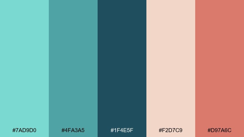
HEX: #7AD9D0 #4FA3A5 #1F4E5F #F2D7C9 #D97A6C
Mood: nostalgic, warm, retro
Best for: cafe menu design
Retro pool tiles and sun-faded terracotta bring a friendly, nostalgic warmth. The blushy neutrals keep the cool teals approachable, perfect for cafes, boutiques, and casual hospitality. Use the deep teal for headings and section dividers, then sprinkle coral for prices or special highlights. Tip: choose a slightly textured paper background to reinforce that vintage vibe.
Image example of vintage pool tile generated using media.io
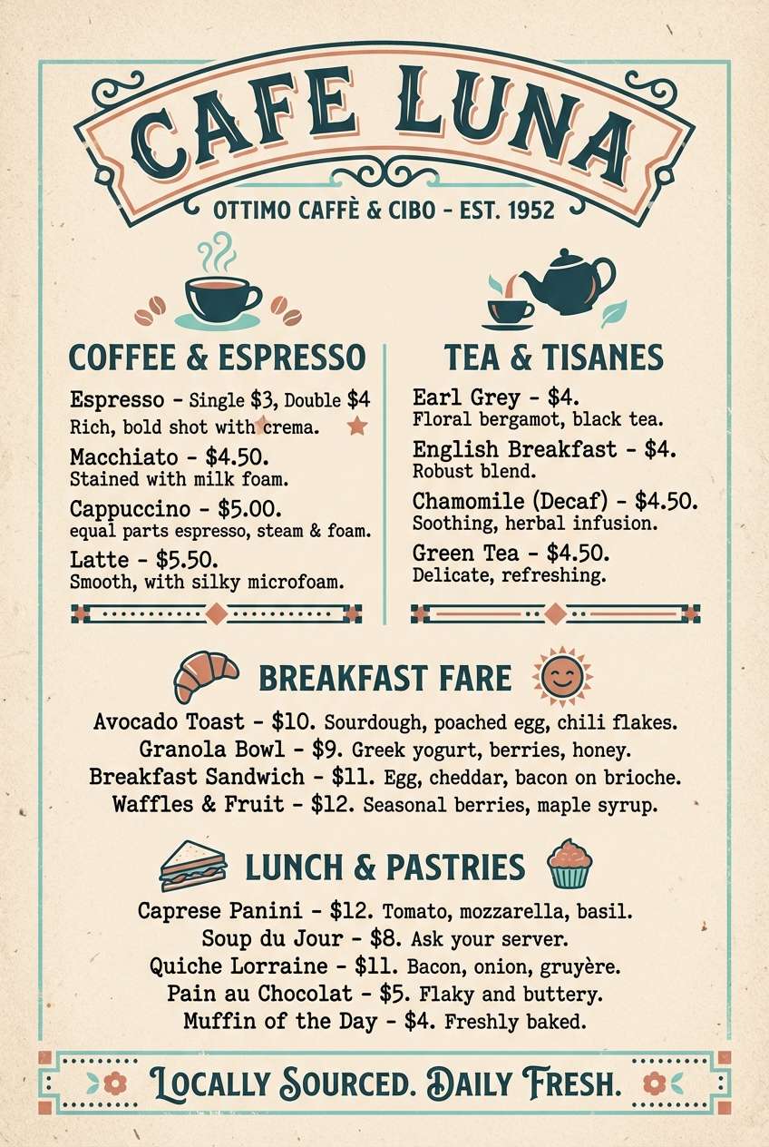
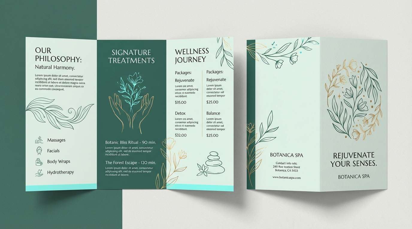
8) Fresh Eucalyptus
HEX: #8FFFEA #58D6BF #2F6F64 #E7F0EA #C9B28A
Mood: herbal, calming, earthy
Best for: spa brochure layout
Herbal greens and cool aqua feel like eucalyptus steam in a quiet spa. The soft sage-gray and warm sand tone keep it grounded, making it ideal for wellness, yoga, and clean beauty. Use the dark green-teal for body text and section headers, then keep aqua for icons and gentle gradients. Tip: pair with airy photography and lots of whitespace to maintain the calm.
Image example of fresh eucalyptus generated using media.io
9) Mermaid Metallics
HEX: #66F2D5 #2AC9B0 #6C63FF #B8B8D1 #1E1E2E
Mood: dreamy, futuristic, bold
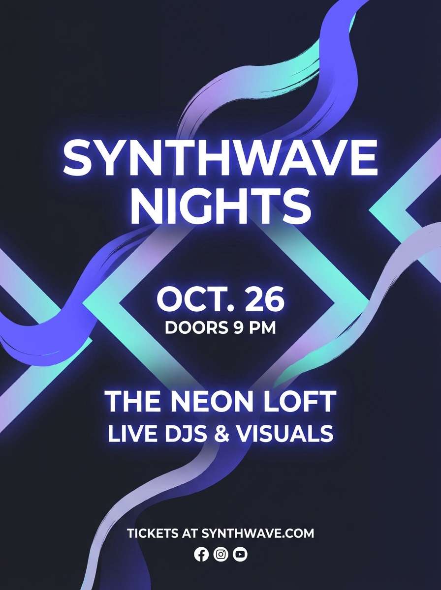
Best for: music event flyer
Shimmery aqua and electric violet create a dreamy, nightlife glow. The near-black base adds instant drama while the lavender-gray keeps transitions smooth for gradients. Use violet for the headline and aqua for secondary highlights like venue details or QR accents. Tip: add soft glow effects sparingly so the design stays readable from a distance.
Image example of mermaid metallics generated using media.io
10) Aqua Blush Wedding
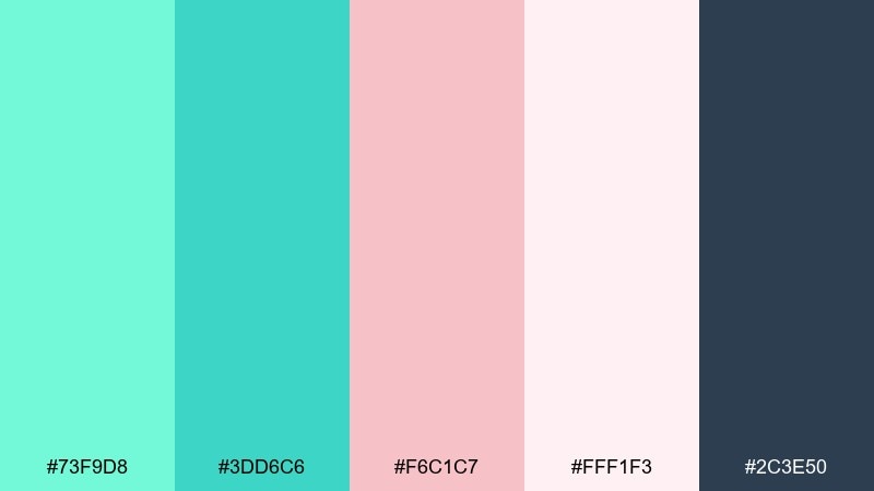
HEX: #73F9D8 #3DD6C6 #F6C1C7 #FFF1F3 #2C3E50
Mood: romantic, soft, airy
Best for: wedding invitation suite
Soft blush petals and watery aqua feel light, romantic, and modern. The pale pink-white background gives you plenty of breathing room for elegant type, while the deep slate anchors names and dates. Use aqua for borders, monograms, or small motifs, then keep blush as the main wash. Tip: choose one accent only for foil or embossing to avoid a busy finish.
Image example of aqua blush wedding generated using media.io
11) Stormy Aquamarine
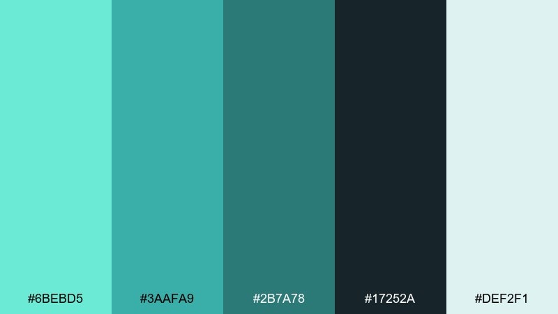
HEX: #6BEBD5 #3AAFA9 #2B7A78 #17252A #DEF2F1
Mood: confident, crisp, professional
Best for: annual report cover
Cool sea mist and stormy depth create a confident, corporate-ready look. The dark charcoal-teal provides strong contrast for titles, while the pale mint keeps pages feeling open. Use the mid teals for charts and infographics to maintain clarity across multiple data states. Tip: set one consistent tint scale so visuals stay cohesive from cover to appendix.
Image example of stormy aquamarine generated using media.io

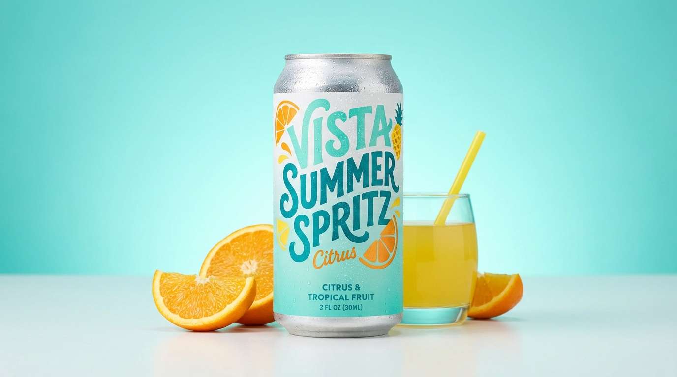
12) Citrus Splash
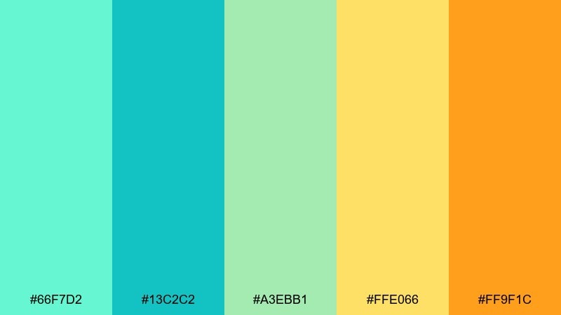
HEX: #66F7D2 #13C2C2 #A3EBB1 #FFE066 #FF9F1C
Mood: zesty, cheerful, youthful
Best for: summer drink product ad
Sparkling aqua and citrus tones feel like a fizzy sip on a hot day. The yellows and orange bring instant appetite appeal, great for beverages, snacks, or seasonal promos. Use aqua as the background field, then place orange on the product name or burst shapes for energy. Tip: keep typography bold and simple so the bright colors stay the hero.
Image example of citrus splash generated using media.io
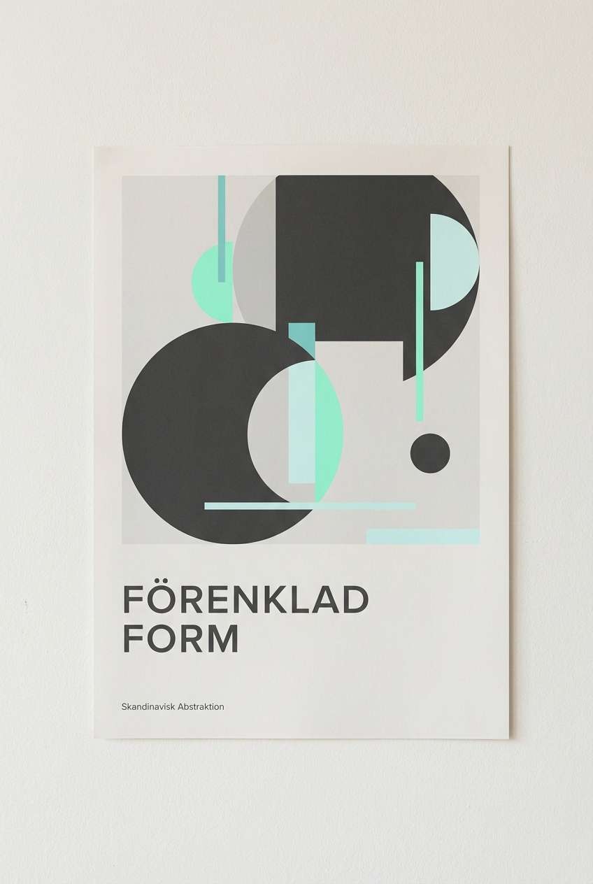
13) Nordic Ice
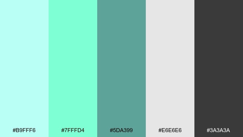
HEX: #B9FFF6 #7FFFD4 #5DA399 #E6E6E6 #3A3A3A
Mood: clean, Scandinavian, quiet
Best for: minimal poster print
Icy mint and soft gray feel calm, tidy, and quietly modern. The charcoal offers strong legibility while the aquas keep the mood light and airy for home prints. Use the gray as the main background, then place aquamarine in large simple shapes for a gallery-like effect. Tip: limit yourself to one font family and play with weight for a true Nordic look.
Image example of nordic ice generated using media.io
14) Ocean Ink Branding
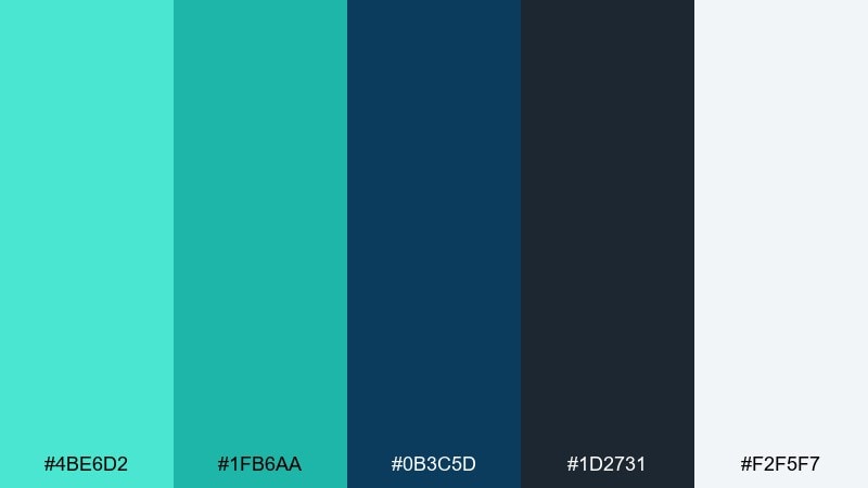
HEX: #4BE6D2 #1FB6AA #0B3C5D #1D2731 #F2F5F7
Mood: sleek, trustworthy, modern
Best for: brand identity kit
Inky ocean blues with bright aqua accents feel polished and dependable. This aquamarine color palette is a strong fit for tech services, finance, and agencies that want a fresh edge without losing credibility. Use the darkest tones for the logo and typography, then reserve aqua for links, highlights, and motion accents. Tip: test contrast on small UI components so the teal stays accessible across states.
Image example of ocean ink branding generated using media.io
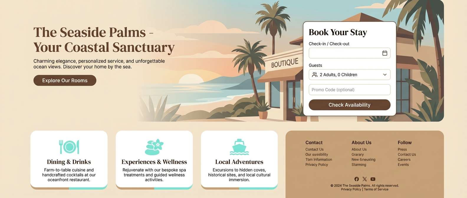
15) Desert Oasis
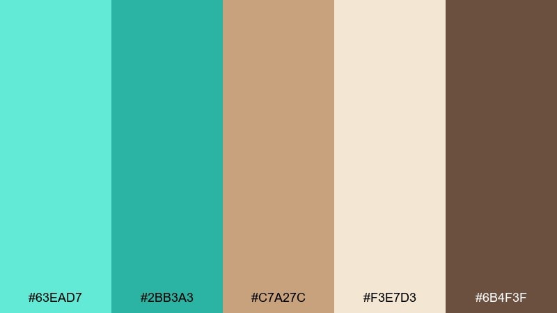
HEX: #63EAD7 #2BB3A3 #C7A27C #F3E7D3 #6B4F3F
Mood: warm, grounded, inviting
Best for: boutique hotel website
Cool oasis water against warm desert sand creates an inviting, travel-ready contrast. The browns and creams keep the aqua from feeling too aquatic, making it perfect for hospitality and lifestyle storytelling. Use aqua for CTAs and highlights, then rely on the cocoa brown for navigation and body text. Tip: add soft gradients between cream and sand to mimic natural light and keep pages feeling warm.
Image example of desert oasis generated using media.io
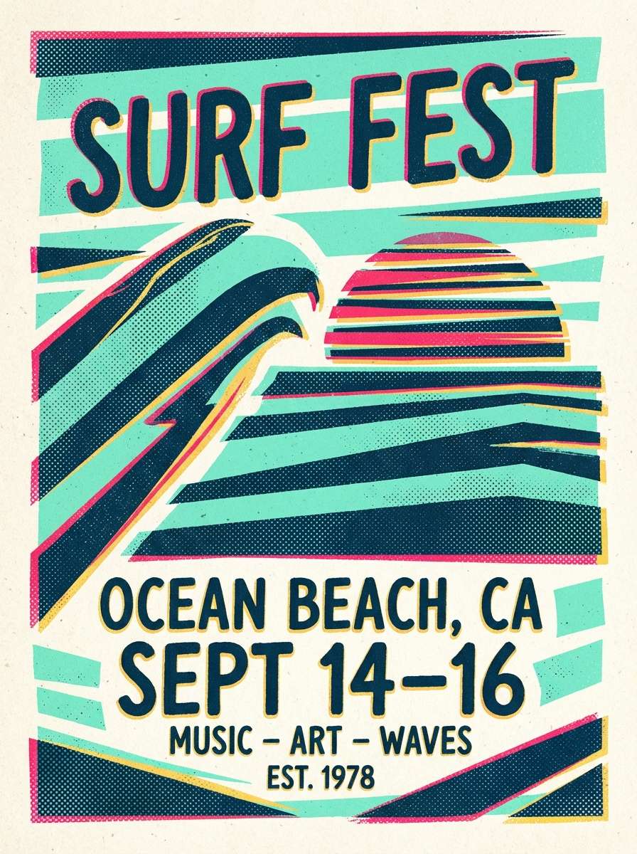
16) Retro Surf Poster
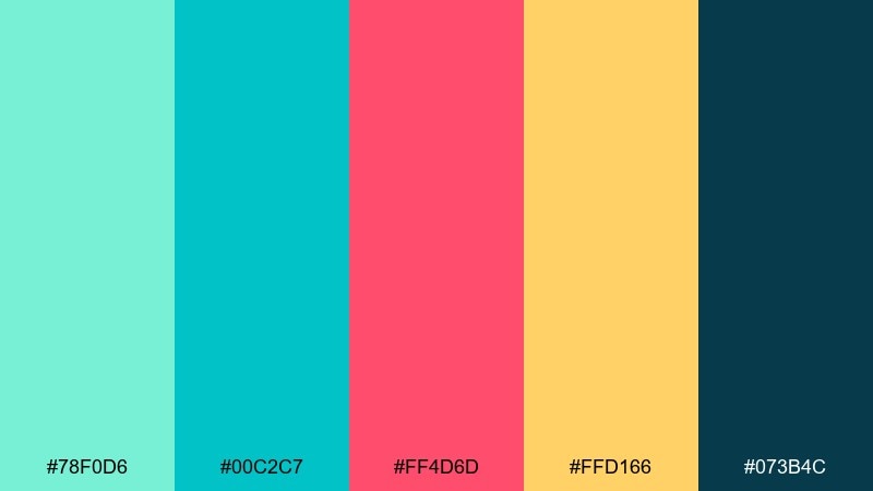
HEX: #78F0D6 #00C2C7 #FF4D6D #FFD166 #073B4C
Mood: bold, retro, sporty
Best for: festival poster design
Punchy surf energy with bright accents feels bold, sunny, and a little rebellious. Among aquamarine color combinations, the hot pink and golden yellow make the aqua read more athletic and youthful. Use the deep blue as a grounding base for type, then keep aqua as the main field with pink for the headline. Tip: try halftone textures or simple stripes to lean into the retro vibe without clutter.
Image example of retro surf poster generated using media.io
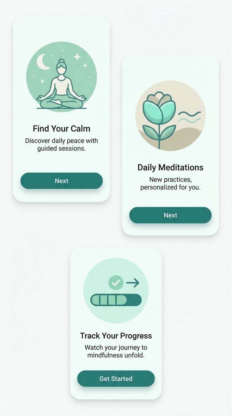
17) Spa Serenity
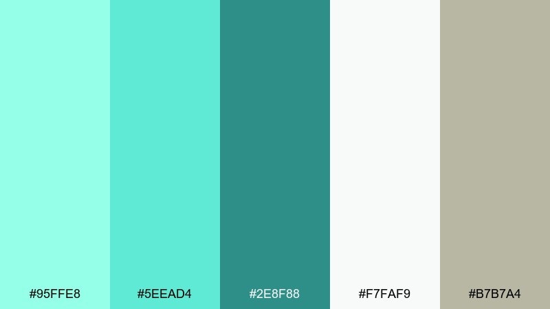
HEX: #95FFE8 #5EEAD4 #2E8F88 #F7FAF9 #B7B7A4
Mood: soft, soothing, clean
Best for: meditation app onboarding
Soft aqua and gentle neutrals feel like a slow exhale in a quiet room. The off-white and muted olive-gray add warmth, keeping the interface welcoming rather than clinical. Use the deeper teal for primary buttons and progress indicators, with the light aqua for backgrounds and cards. Tip: keep animation subtle and slow to match the calming tone of the colors.
Image example of spa serenity generated using media.io
18) Tech Gradient UI
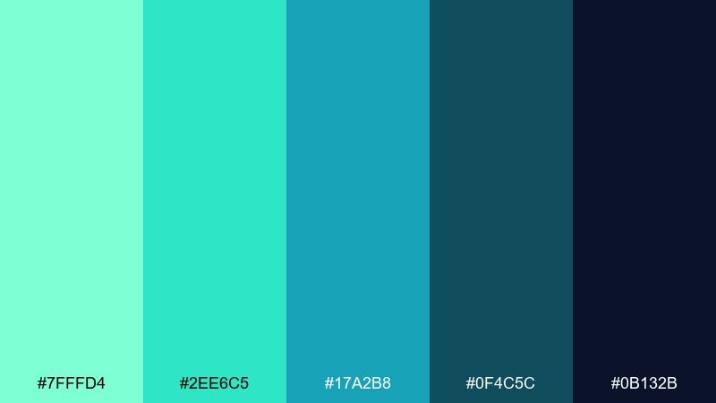
HEX: #7FFFD4 #2EE6C5 #17A2B8 #0F4C5C #0B132B
Mood: digital, sharp, futuristic
Best for: analytics dashboard UI
Glassy aquas and deep navy create a sleek, high-contrast tech feel. The palette is ideal for data products where you want clear hierarchy and modern gradients for depth. Use navy as the canvas, then build charts with aqua-to-teal ramps for quick scanning. Tip: reserve the brightest aqua for selected states so users always know what is active.
Image example of tech gradient ui generated using media.io

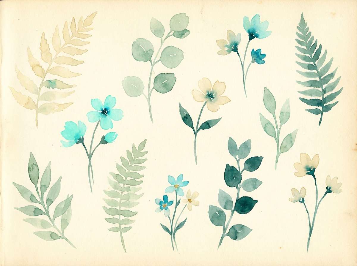
19) Botanical Watercolor
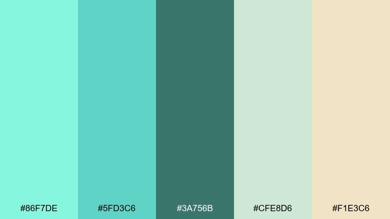
HEX: #86F7DE #5FD3C6 #3A756B #CFE8D6 #F1E3C6
Mood: organic, gentle, springlike
Best for: botanical illustration set
Soft watercolor greens and aquas feel like new leaves after rain. The creamy paper tone adds warmth, making it perfect for stationery, labels, and nature-forward content. Use the darker green-teal for stems and outlines, then wash in the pale aqua and mint for petals and shadows. Tip: keep edges slightly imperfect so the illustration stays hand-made and airy.
Image example of botanical watercolor generated using media.io
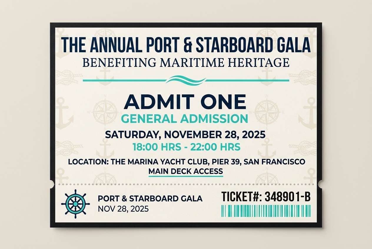
20) Evening Yacht Club
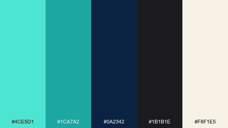
HEX: #4CE5D1 #1CA7A2 #0A2342 #1B1B1E #F8F1E5
Mood: nautical, upscale, nocturnal
Best for: event ticket design
Midnight navy and crisp aqua accents feel like harbor lights at dusk. The warm cream keeps the dark tones from becoming severe, giving you a refined, classic look for events. Use navy and near-black for typography and barcodes, then add aqua for section labels and subtle patterning. Tip: try a thin aqua line rule to separate information blocks without heavy boxes.
Image example of evening yacht club generated using media.io
What Colors Go Well with Aquamarine?
Neutrals are the easiest match: crisp white, soft gray, cream ivory, and sandy beige all make aquamarine look brighter and cleaner. For legibility and structure, pair it with deep navy, charcoal, or blue-black.
For a more energetic contrast, add warm accents like coral, terracotta, peach, golden yellow, or orange—use these in small doses so aquamarine stays the “water” of the composition.
If you want a nature-forward feel, mix aquamarine with sage, eucalyptus green, and muted olive. This shifts the palette from coastal to botanical while still keeping that fresh, modern tone.
How to Use a Aquamarine Color Palette in Real Designs
Start with roles, not just colors: choose one dark tone for text/navigation, one light neutral for the background, and reserve aquamarine for emphasis (CTAs, highlights, badges, active states). This keeps pages readable and avoids “too much aqua.”
For branding, let aquamarine lead in large fields (hero blocks, packaging panels), then anchor with navy or slate for typography. In print, creamy off-whites often feel more premium than pure white next to aquamarine.
In UI, build a small tint scale (e.g., light aqua for surfaces, mid teal for borders, deep teal for primary actions). Consistent tints make charts, alerts, and hover states feel cohesive across screens.
Create Aquamarine Palette Visuals with AI
If you already have HEX codes, the fastest way to validate a palette is to generate a few consistent mock visuals—posters, UI screens, packaging, or mood boards—and compare contrast and mood side by side.
Media.io Text-to-Image makes this easy: paste a prompt, include your HEX colors, and iterate quickly until the palette feels right for your brand, product, or room style.
Use the prompts above as templates—swap the layout type (poster/UI/packaging) and keep the HEX line consistent to maintain color accuracy across variations.
Aquamarine Color Palette FAQs
-
What is the HEX code for aquamarine?
A common digital reference for aquamarine is #7FFFD4. Many palettes use nearby aqua/teal tints for depth and contrast. -
Is aquamarine more blue or green?
Aquamarine is typically a blue-green (cyan-leaning) tone. Slight shifts toward teal feel deeper and more “ocean,” while shifts toward mint feel lighter and more “spa.” -
What colors complement aquamarine best?
Deep navy and charcoal create strong contrast, while warm accents like coral, terracotta, and golden yellow add energy. Cream and sand neutrals soften the overall look. -
Can I use aquamarine as a main brand color?
Yes—use aquamarine as the primary accent and pair it with a dark text color (navy/charcoal) and a calm neutral background (white/cream/gray) for a reliable, readable system. -
How do I keep an aquamarine UI accessible?
Don’t rely on aquamarine alone for text on light backgrounds. Use darker teals/navies for typography, and test contrast for buttons, links, and states (hover/disabled/selected). -
What mood does aquamarine create in interiors?
It usually reads as coastal, fresh, and airy. Paired with beige/ivory it feels relaxed; paired with dark navy it becomes more nautical and upscale. -
How can I generate images that match my aquamarine palette?
Use an AI prompt that includes your HEX codes, then specify a clear design type (e.g., “dashboard UI,” “event flyer,” “packaging”) so the model applies the colors consistently.


