

Purple wine is the kind of color family that instantly feels intentional: deep, moody purples with red undertones that read as refined rather than loud. It’s a go-to for premium branding, romantic event design, and modern dark UI.
Below you’ll find 20 purple wine color palette ideas with HEX codes, plus practical pairing tips for neutrals, greens, terracotta, and metallic accents.
In this article
- Why Purple Wine Palettes Work So Well
-
- cellar velvet
- orchard merlot
- gilded cabernet
- plum smoke ui
- velvet theater
- rose cellar editorial
- berry ink stationery
- mulberry minimal
- dusk vineyard
- autumn grapes botanical
- nightfall orchid social
- copper cork
- lavender baroque
- noir truffle
- blush tannin
- sage cellar pairing
- champagne plum
- terracotta merlot
- frosted berry
- antique winery sign
- What Colors Go Well with Purple Wine?
- How to Use a Purple Wine Color Palette in Real Designs
- Create Purple Wine Palette Visuals with AI
Why Purple Wine Palettes Work So Well
Purple wine tones sit in a sweet spot between classic burgundy and modern plum, so they feel luxurious without leaning too formal. They carry emotional weight—romance, mystery, warmth—while still looking structured and “designed.”
They also pair beautifully with readable neutrals (cream, warm greige, charcoal) which makes them practical for real layouts like labels, menus, and websites. You can keep things minimal and premium, or push into dramatic, high-contrast looks.
Finally, these palettes scale: deep wines work as hero backgrounds, while mauves and blushes handle accents, UI states, and editorial blocks. That range makes purple wine one of the most flexible moody color directions.
20+ Purple Wine Color Palette Ideas (with HEX Codes)
1) Cellar Velvet
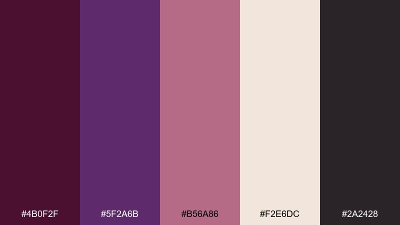
HEX: #4B0F2F #5F2A6B #B56A86 #F2E6DC #2A2428
Mood: moody, luxe, intimate
Best for: wine bar branding and menus
Moody velvet shadows and candlelit pours set the tone, like a quiet corner table in a cellar bar. Use the deep wine and aubergine as the base, then soften with dusty rose for warmth. Cream works best for readable menu sections, while charcoal keeps everything grounded and premium. Tip: print on uncoated stock to make the dark tones feel even richer.
Image example of cellar velvet generated using media.io
Media.io is an online AI studio for creating and editing video, image, and audio in your browser.

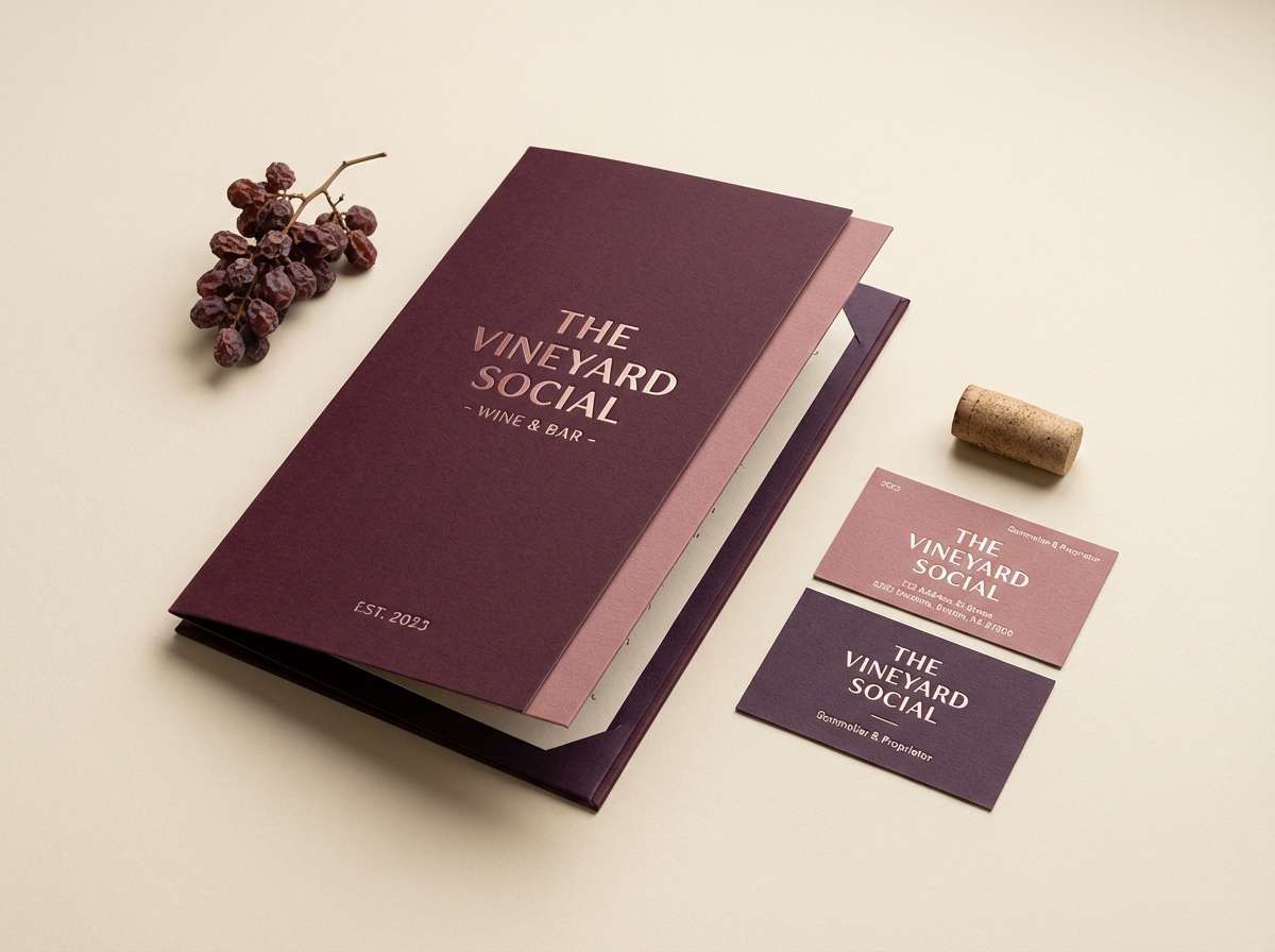
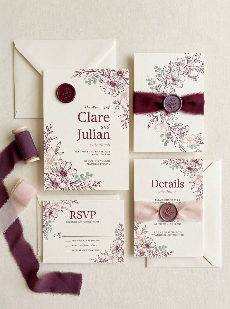
2) Orchard Merlot
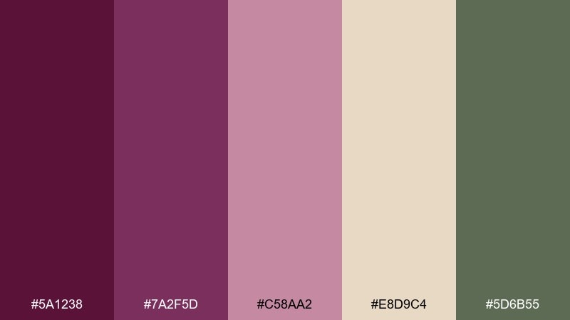
HEX: #5A1238 #7A2F5D #C58AA2 #E8D9C4 #5D6B55
Mood: romantic, rustic, inviting
Best for: wedding invitations and save the dates
Romantic and harvest-kissed, it feels like late-afternoon light over a vineyard orchard. Let merlot and plum handle headings and monograms, then bring in blush for soft flourishes. Cream is ideal for the paper base, with sage as a fresh botanical counterpoint. Tip: keep sage to small leaves or border lines so the wine tones stay dominant.
Image example of orchard merlot generated using media.io
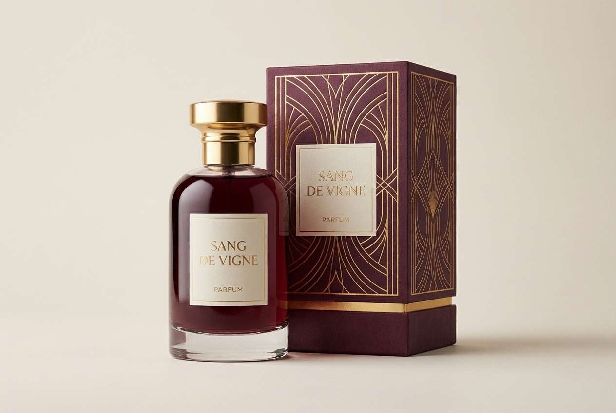
3) Gilded Cabernet
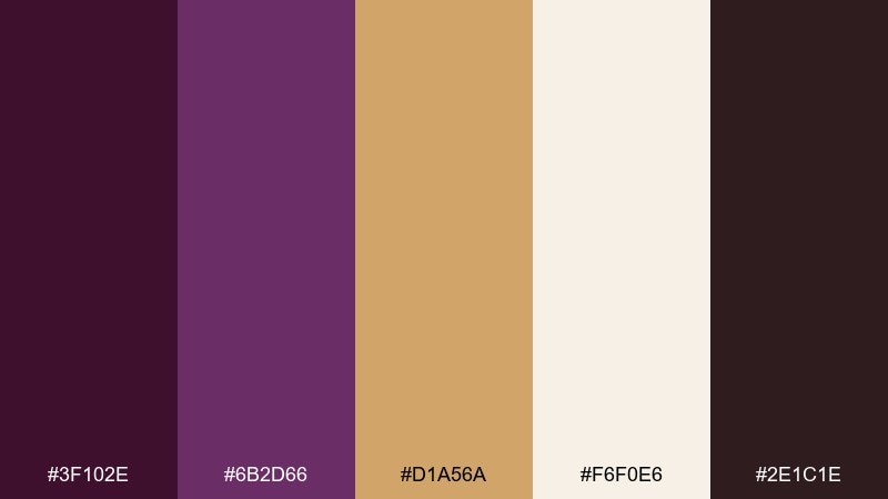
HEX: #3F102E #6B2D66 #D1A56A #F6F0E6 #2E1C1E
Mood: opulent, classic, high-end
Best for: luxury product packaging and labels
Opulent and old-world, it recalls cabernet stains, gilt frames, and dim boutique lighting. Use the darkest wine tone for the label background and bring in gold for borders, seals, or foil elements. A bone-white highlight keeps small text crisp, while espresso adds depth in shadows and barcodes. Tip: reserve gold for 10 to 15 percent of the layout so it reads premium, not flashy.
Image example of gilded cabernet generated using media.io
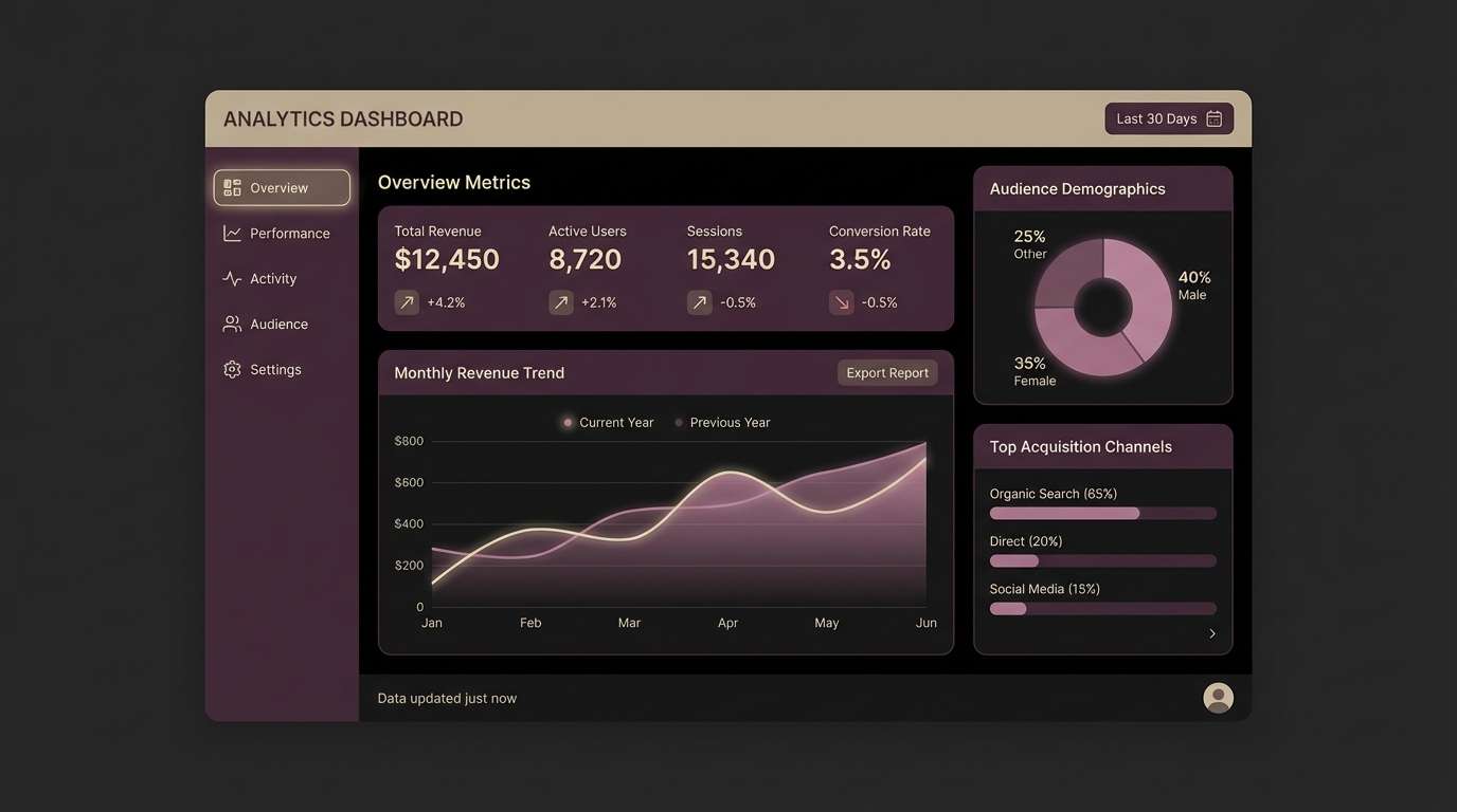
4) Plum Smoke UI
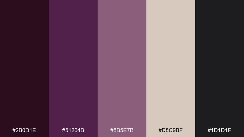
HEX: #2B0D1E #51204B #8B5E7B #D8C9BF #1D1D1F
Mood: sleek, modern, nocturnal
Best for: dark-mode dashboards and analytics UI
Sleek and nocturnal, it feels like soft smoke drifting over polished plum glass. In a purple wine color scheme like this, keep the near-black as the main canvas and use plum for navigation and key surfaces. Mauve works well for secondary charts, while the warm greige keeps labels legible without the harshness of pure white. Tip: use the light neutral only for active states and critical numbers to control contrast.
Image example of plum smoke ui generated using media.io
5) Velvet Theater
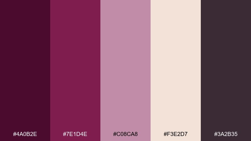
HEX: #4A0B2E #7E1D4E #C08CA8 #F3E2D7 #3A2B35
Mood: dramatic, glamorous, bold
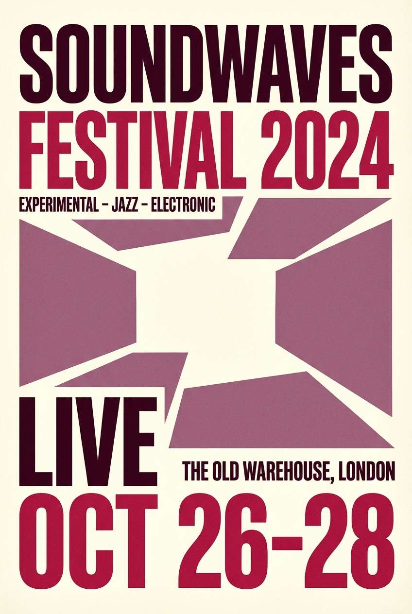
Best for: concert posters and event flyers
Dramatic and glamorous, it brings to mind velvet curtains, spotlight haze, and a glass of something dark and sweet. These purple wine color combinations shine on big typography, where plum and raspberry can alternate for hierarchy. Add blush for supporting text blocks and keep the cream for negative space so the poster does not feel heavy. Tip: run a subtle grain texture over the dark tones to make the design feel printed and tactile.
Image example of velvet theater generated using media.io
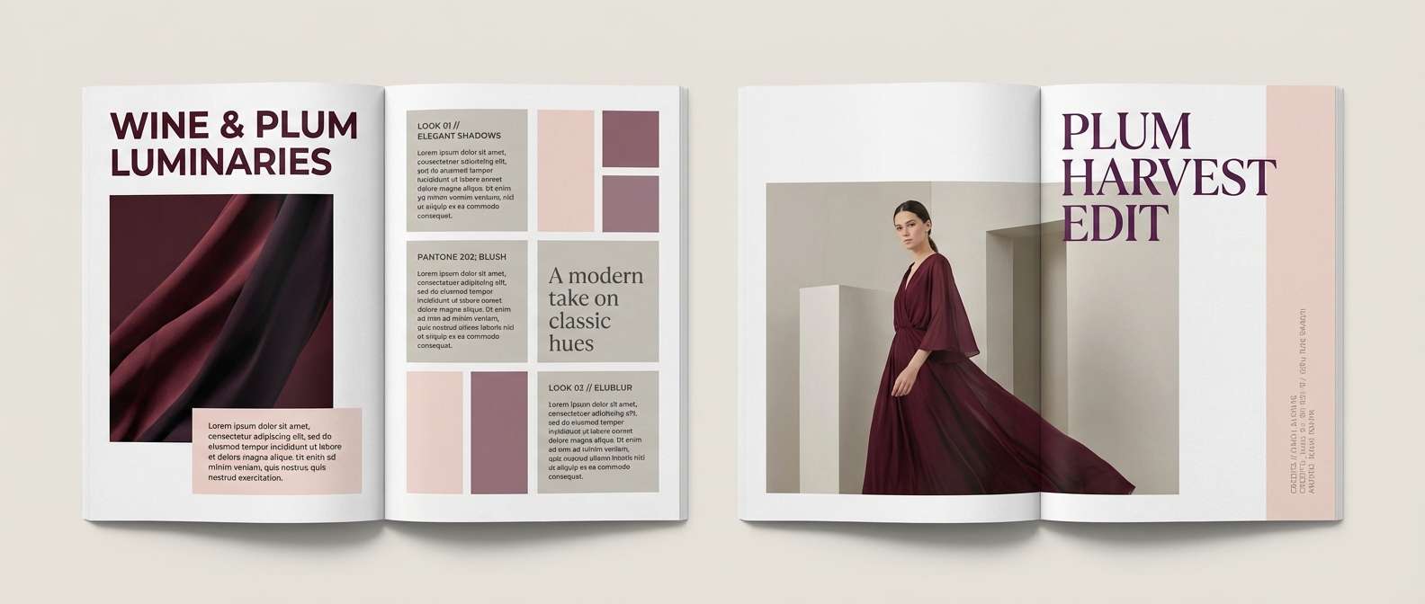
6) Rose Cellar Editorial
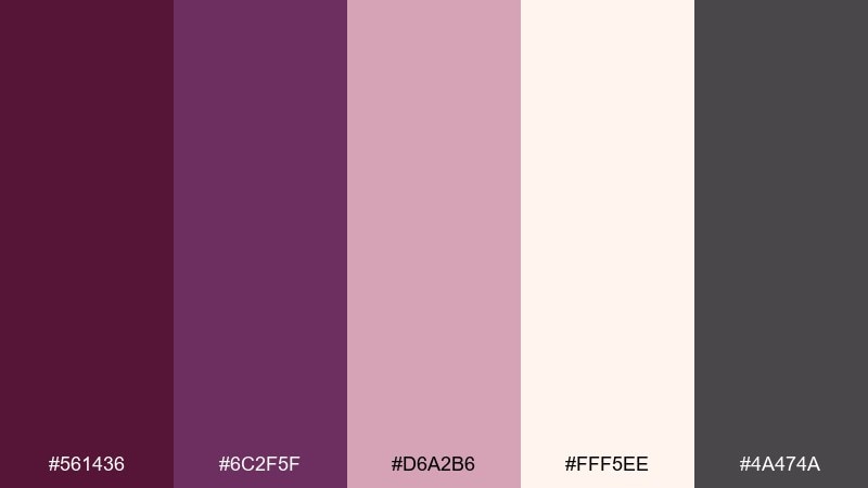
HEX: #561436 #6C2F5F #D6A2B6 #FFF5EE #4A474A
Mood: editorial, refined, soft
Best for: magazine spreads and lookbooks
Refined and airy, it feels like a glossy editorial shot with a rose-tinted shadow. Use the wine tones for headings, pull quotes, and section dividers to add structure without shouting. The blush works beautifully for oversized background blocks, while the off-white keeps layouts breathable. Tip: keep body text in the warm gray to preserve a premium, print-like feel.
Image example of rose cellar editorial generated using media.io
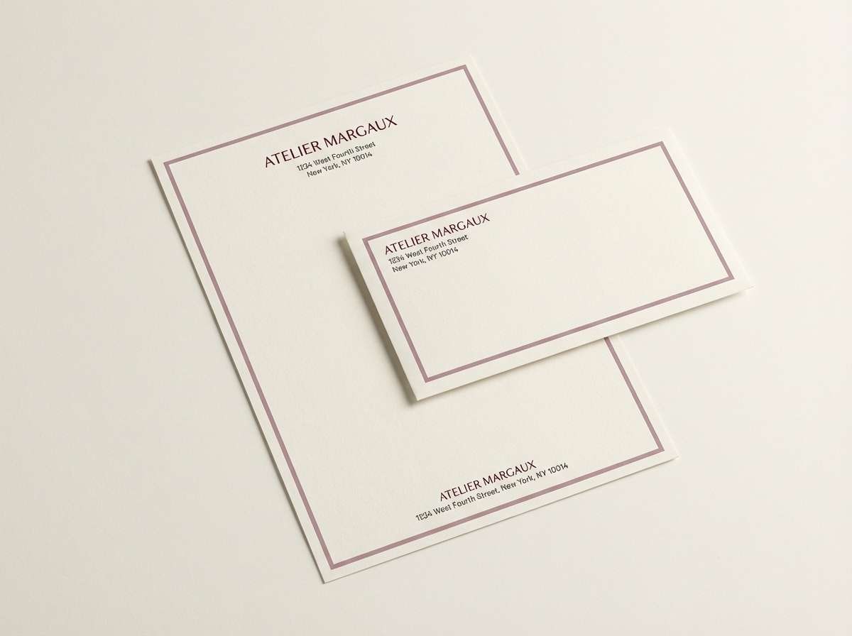
7) Berry Ink Stationery
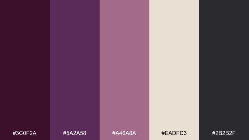
HEX: #3C0F2A #5A2A58 #A46A8A #EADFD3 #2B2B2F
Mood: thoughtful, literary, calm
Best for: personal stationery and thank-you cards
Thoughtful and literary, it evokes berry ink in a fountain pen on creamy paper. Use deep wine for letterheads and signatures, then introduce mauve for subtle borders or envelopes. The warm cream keeps everything soft and approachable, while charcoal adds crisp contrast for addresses. Tip: pair with a classic serif and generous margins for a timeless, handwritten vibe.
Image example of berry ink stationery generated using media.io
8) Mulberry Minimal
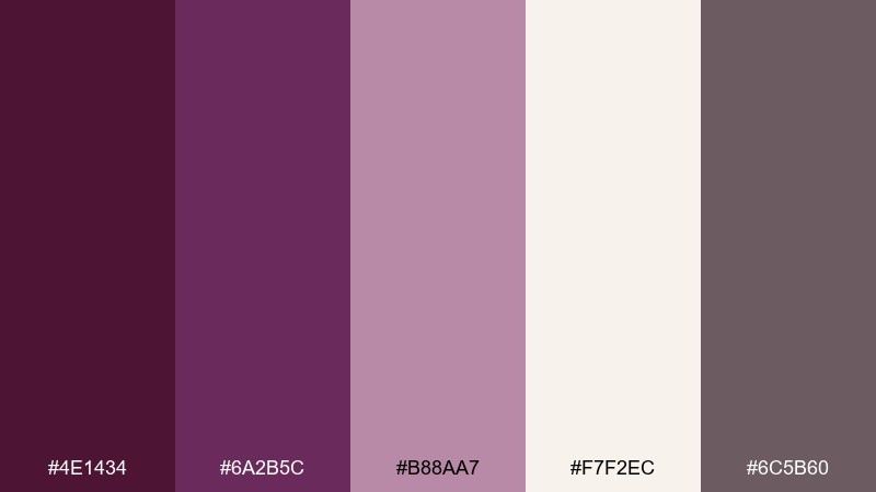
HEX: #4E1434 #6A2B5C #B88AA7 #F7F2EC #6C5B60
Mood: minimal, warm, contemporary
Best for: portfolio websites and landing pages
Minimal and warm, it feels like mulberry silk against sunlit linen. Use the off-white as the main page background, then bring in wine and plum for headers, buttons, and key links. The muted mauve works well for section separators and card backgrounds without adding clutter. Tip: keep one primary call-to-action color and use the other purple tone only for hover states.
Image example of mulberry minimal generated using media.io
9) Dusk Vineyard
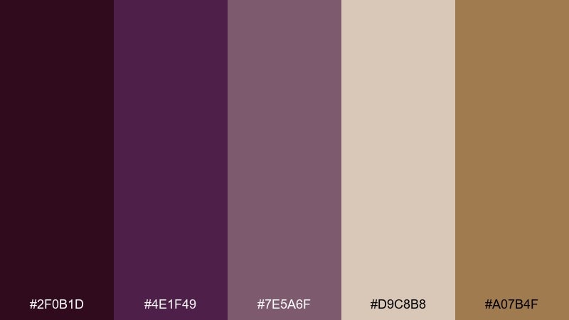
HEX: #2F0B1D #4E1F49 #7E5A6F #D9C8B8 #A07B4F
Mood: earthy, cozy, sophisticated
Best for: interior design mood boards and styling
Earthy and cozy, it looks like dusk settling over vines with a warm lantern glow. A purple wine color palette like this works best when the light neutral leads, letting the deep tones appear as upholstery, art, or trim. Add the muted tan as a wood note to keep the room from feeling too cool. Tip: repeat the darkest shade in two small places, like a frame and a pillow, to create intentional balance.
Image example of dusk vineyard generated using media.io
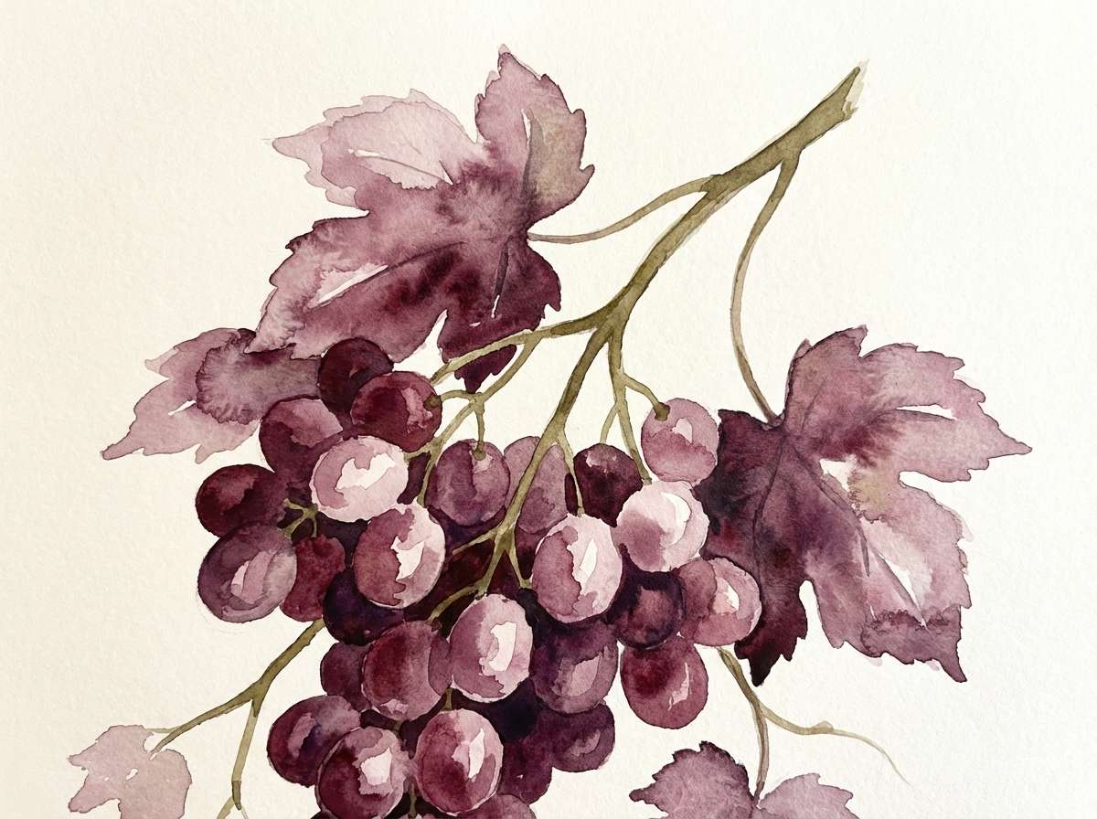
10) Autumn Grapes Botanical
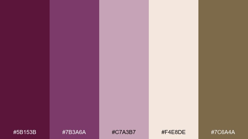
HEX: #5B153B #7B3A6A #C7A3B7 #F4E8DE #7C6A4A
Mood: botanical, artisanal, gentle
Best for: watercolor illustrations and packaging motifs
Gentle and artisanal, it suggests pressed grape skins, dried stems, and watercolor washes. Use the deep tones for outlines and shadows, then layer the pale mauve for soft gradients. Cream keeps the illustration airy, while the olive-brown adds a natural stem and leaf note. Tip: limit hard edges and lean into transparent layers to keep the palette feeling organic.
Image example of autumn grapes botanical generated using media.io
11) Nightfall Orchid Social
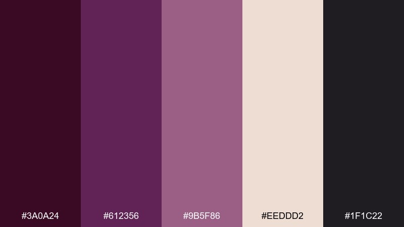
HEX: #3A0A24 #612356 #9B5F86 #EEDDD2 #1F1C22
Mood: stylish, confident, modern
Best for: social media templates and story graphics
Stylish and confident, it feels like an orchid bouquet under city-night lighting. For a purple wine color combination that pops on small screens, use the near-black for the base and reserve the mid-plum for bold headers. The soft neutral works as a readable caption panel, while mauve adds depth in icons or gradients. Tip: keep text large and high-contrast, and use mauve only for secondary emphasis.
Image example of nightfall orchid social generated using media.io

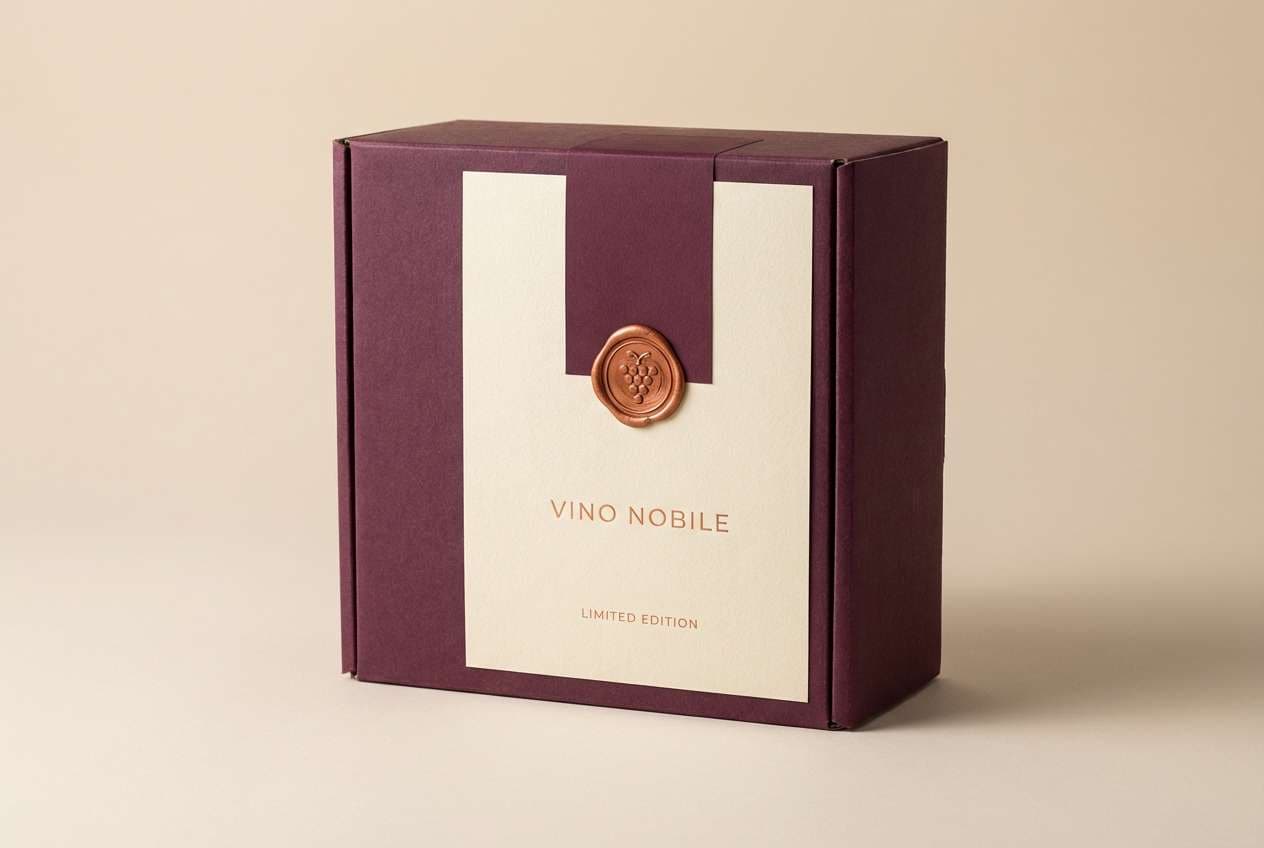
12) Copper Cork
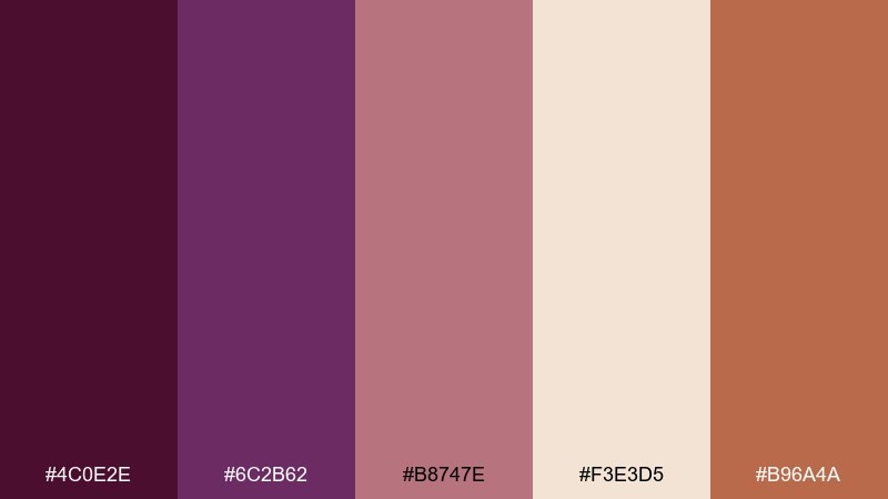
HEX: #4C0E2E #6C2B62 #B8747E #F3E3D5 #B96A4A
Mood: warm, crafted, premium
Best for: wine packaging and gift boxes
Warm and crafted, it recalls copper foil, cork texture, and a freshly opened bottle. Let the wine tones handle the brand block and typography, then use copper as the hero accent on seals and trim. The light neutral keeps the box looking upscale and prevents the design from feeling too heavy. Tip: use copper in matte metallic finishes for a modern, less flashy look.
Image example of copper cork generated using media.io
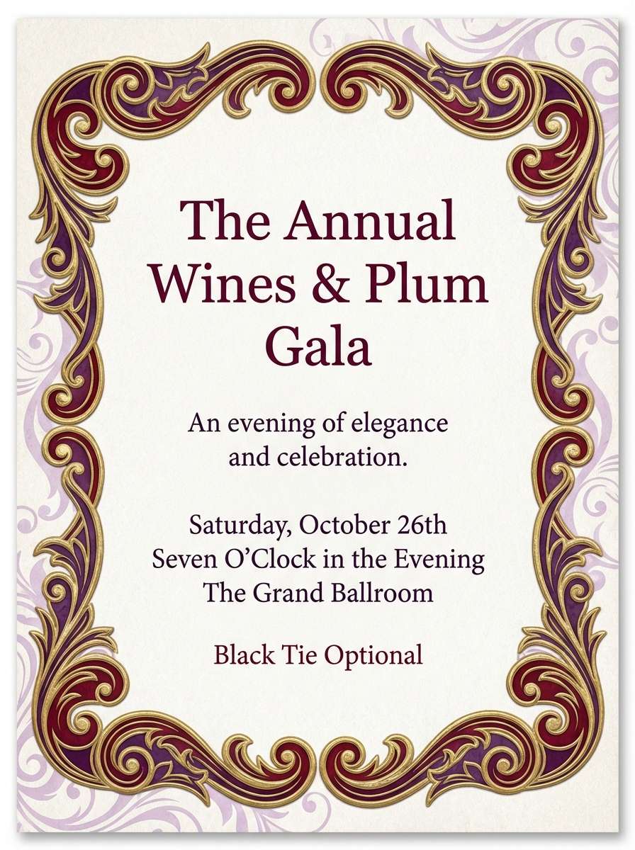
13) Lavender Baroque
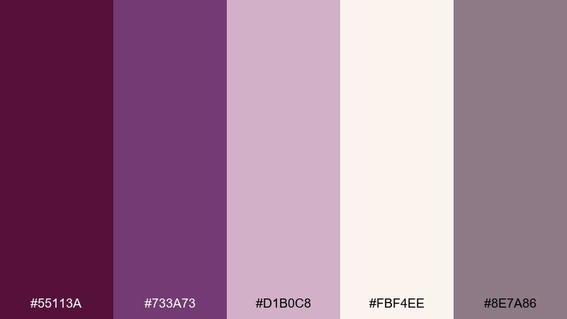
HEX: #55113A #733A73 #D1B0C8 #FBF4EE #8E7A86
Mood: ornate, romantic, soft
Best for: formal invitations and gala programs
Ornate and romantic, it feels like baroque scrollwork dusted in lavender light. Use the deeper shades for crest marks, borders, and venue details to keep the layout structured. Pale lilac is perfect for subtle patterns behind text, while the warm off-white reads elegant in print. Tip: pair with thin-line flourishes so the palette stays delicate, not busy.
Image example of lavender baroque generated using media.io
14) Noir Truffle
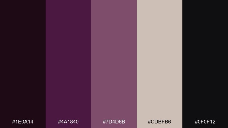
HEX: #1E0A14 #4A1840 #7D4D6B #CDBFB6 #0F0F12
Mood: dark, modern, dramatic
Best for: dark mode app interfaces
Dark and dramatic, it evokes black truffle shavings and a sip of aged red under low light. Use the two near-blacks for depth across surfaces, then bring in plum for active states and primary actions. The muted mauve is ideal for charts, tags, and secondary buttons that should not compete. Tip: keep the light neutral for tooltips and key metrics to avoid eye fatigue.
Image example of noir truffle generated using media.io
15) Blush Tannin
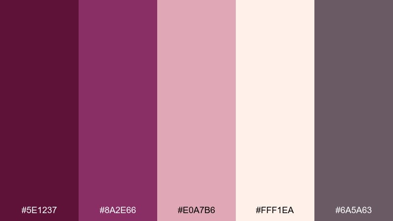
HEX: #5E1237 #8A2E66 #E0A7B6 #FFF1EA #6A5A63
Mood: beauty-forward, soft, elevated
Best for: cosmetics ads and skincare branding
Beauty-forward and soft, it feels like rosy tannins lingering on satin lips. The purple wine color palette works especially well for cosmetics when plum anchors the logo and blush carries product callouts. Use the warm off-white as negative space for a clean, clinical touch, and keep gray for ingredient lists. Tip: add a gentle gradient between plum and blush to create a luxe, airbrushed finish.
Image example of blush tannin generated using media.io
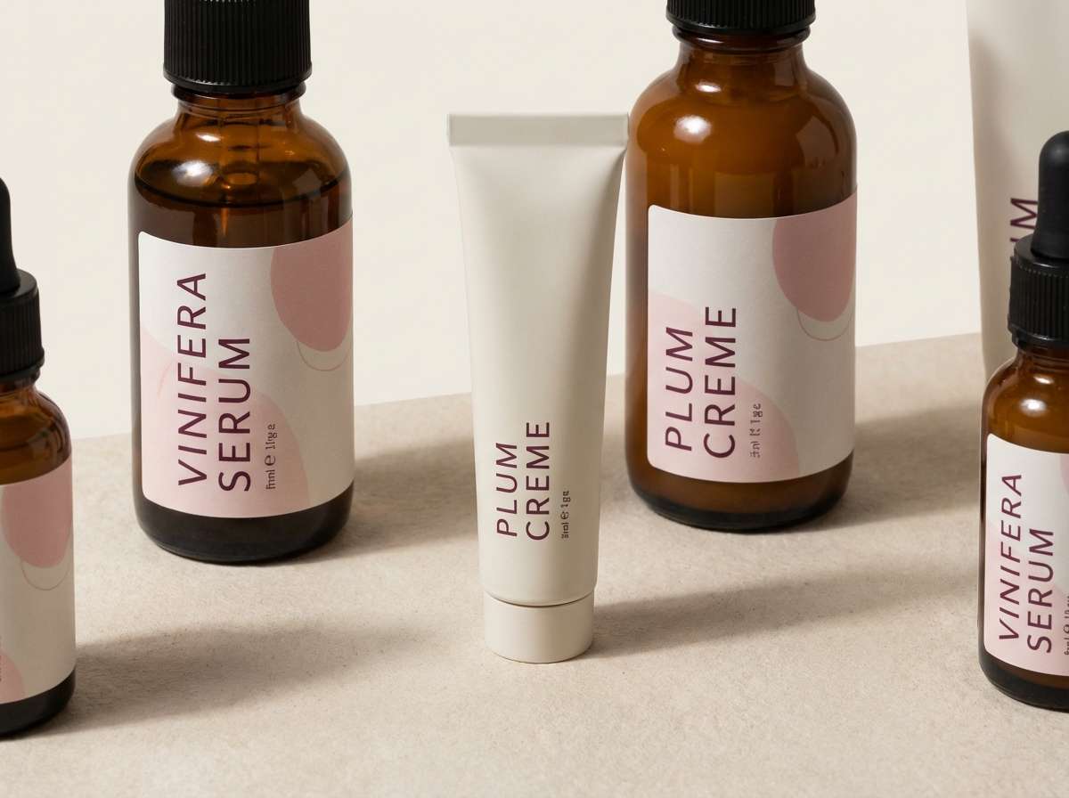
16) Sage Cellar Pairing
HEX: #4B0F31 #6B2B60 #9E6A86 #EFE3D3 #6E7B67
Mood: balanced, calm, natural
Best for: artisan food labels and kitchen goods
Balanced and calm, it brings to mind sage leaves on a cutting board beside a glass of wine. Use the cream for the label base and keep plum for the brand mark so it reads clearly at small sizes. The green is a natural pairing for herbs, olive oil, or spice jars, while mauve can highlight flavor notes. Tip: keep illustrations single-color line art to maintain a clean, craft feel.
Image example of sage cellar pairing generated using media.io
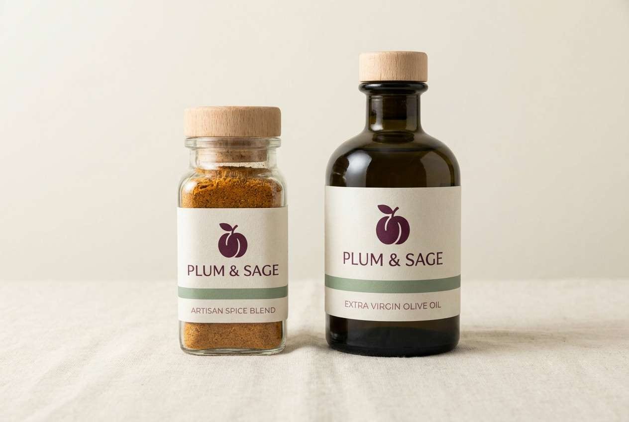
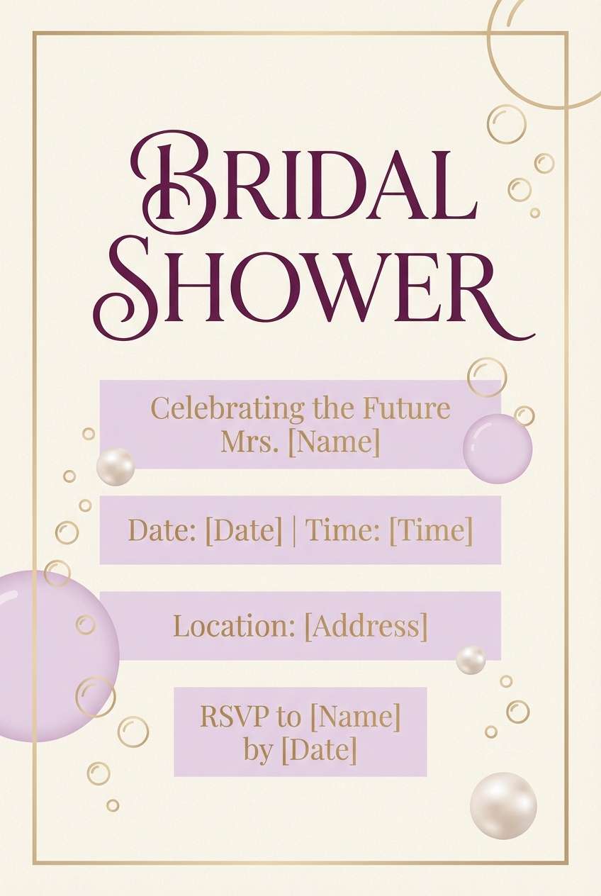
17) Champagne Plum
HEX: #4A1032 #6F2A61 #C9A0B3 #F7EDE4 #D6B37C
Mood: celebratory, elegant, light
Best for: bridal shower flyers and party invites
Celebratory and elegant, it feels like champagne bubbles over a plum-tinted toast. Use the pale neutral as the main background, with plum for headings and RSVP details. The soft pink-lilac keeps things friendly, while the golden beige adds a festive sparkle in small icons or borders. Tip: stick to one metallic accent area, like a header rule, to avoid visual clutter.
Image example of champagne plum generated using media.io
18) Terracotta Merlot
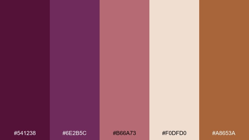
HEX: #541238 #6E2B5C #B66A73 #F0DFD0 #A8653A
Mood: earthy, warm, Mediterranean
Best for: home decor branding and lifestyle content
Earthy and warm, it evokes terracotta pots, sun-baked walls, and a merlot spritz at golden hour. Pair the wine tones with terracotta for an inviting, lived-in look across social posts and packaging. Use the light neutral for backgrounds so the colors feel airy instead of heavy. Tip: repeat terracotta in small graphic elements like icons to tie the whole system together.
Image example of terracotta merlot generated using media.io
19) Frosted Berry
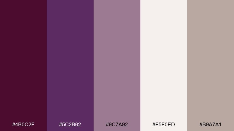
HEX: #4B0C2F #5C2B62 #9C7A92 #F5F0ED #B9A7A1
Mood: cool, cozy, wintery
Best for: holiday email headers and seasonal campaigns
Cool and cozy, it feels like frosted berries on a porcelain plate. Use plum and wine for strong seasonal headlines, then bring in the soft mauve-gray for background bands and dividers. The icy off-white keeps the layout clean and helps product photos stand out if you add them later. Tip: avoid pure black text and use the warm gray instead for a softer winter contrast.
Image example of frosted berry generated using media.io

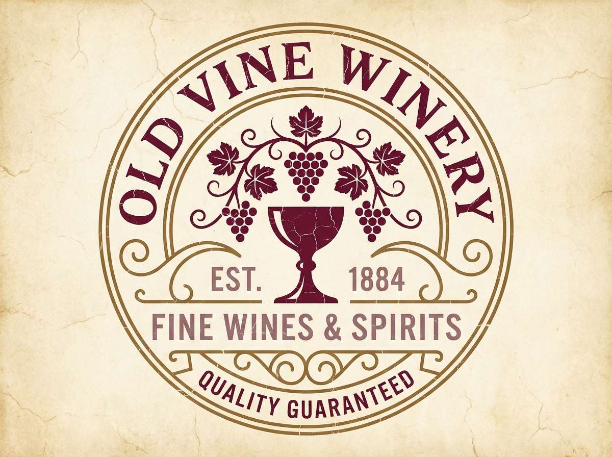
20) Antique Winery Sign
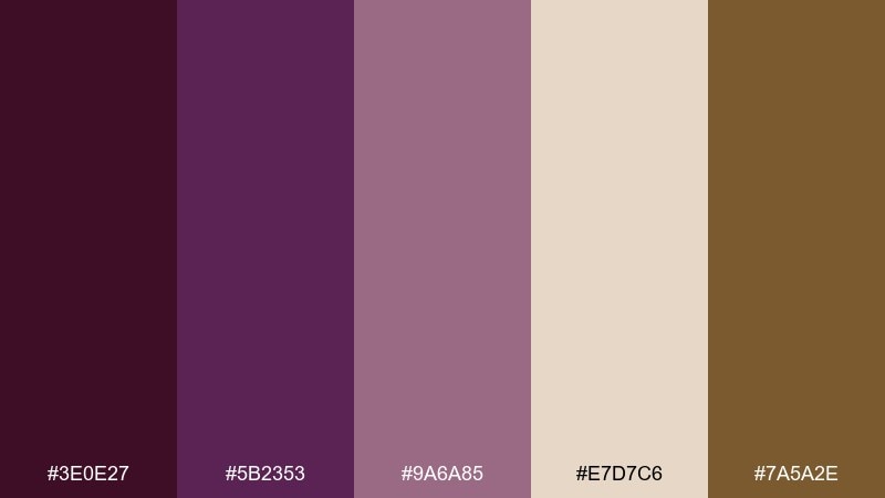
HEX: #3E0E27 #5B2353 #9A6A85 #E7D7C6 #7A5A2E
Mood: heritage, artisanal, storied
Best for: logo marks and vintage-style signage
Heritage and storied, it suggests an antique winery sign with worn paint and sun-faded edges. Use the deep wine for the main mark, then pull in brass-brown for outlines, badges, or stamp details. The warm parchment tone is perfect for backgrounds that need a vintage paper feel. Tip: add subtle distressing to the edges, but keep the logo shapes crisp for modern readability.
Image example of antique winery sign generated using media.io
What Colors Go Well with Purple Wine?
Purple wine pairs best with warm, readable neutrals like cream, bone, warm greige, and charcoal. These keep layouts from feeling too heavy while preserving the “cellar-luxe” mood that wine tones naturally create.
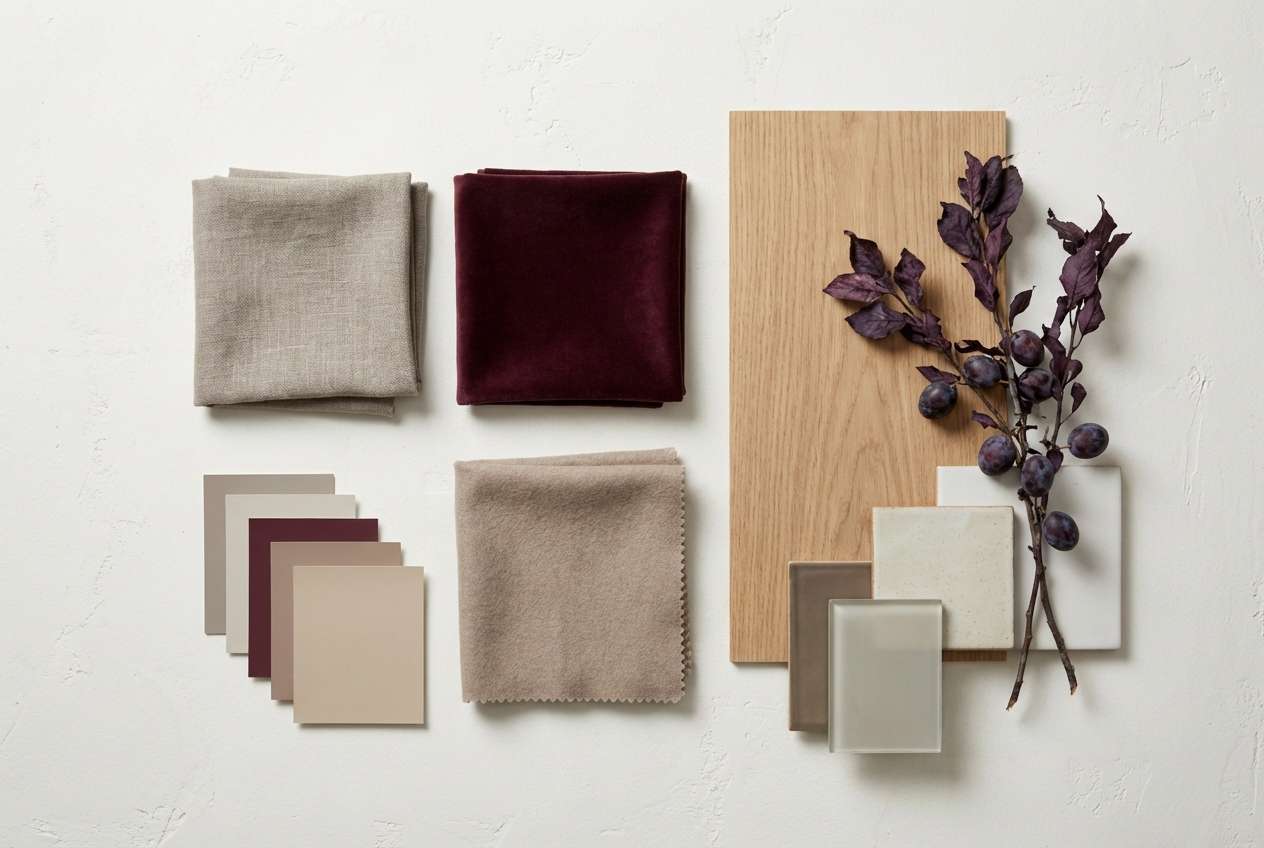
For contrast, try muted greens (sage, olive) to add a botanical note, or terracotta and tan to bring warmth and a Mediterranean feel. If you want a premium finish, add metallic accents sparingly—gold, copper, or brass work especially well with burgundy-purple undertones.
For modern UI, combine near-black surfaces with a plum primary action color, then reserve off-white for key metrics and active states. This keeps contrast controlled and reduces eye fatigue in dark-mode designs.
How to Use a Purple Wine Color Palette in Real Designs
Start with a role-based system: pick one deep wine as the brand anchor (headers, logo block, primary panels), one mid-plum for secondary emphasis (buttons, subheads), and one soft mauve/blush for supporting areas (cards, tags, background blocks).
Balance is key: let your light neutral handle most of the canvas for print and web, then “pour” the dark tones into fewer, intentional areas. This keeps the palette elegant rather than overwhelming and helps typography stay readable.
If you’re using metallics, treat them like jewelry—small borders, seals, icons, or foil accents. Keeping metallic coverage low makes the whole design feel more expensive and less decorative.
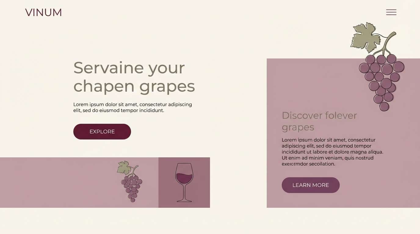
Create Purple Wine Palette Visuals with AI
If you want to preview how purple wine tones look on packaging, invitations, menus, or UI, generating mock visuals is the fastest way to validate contrast and mood. A single prompt can help you test different materials (uncoated paper, foil, matte labels) and lighting styles.
With Media.io Text to Image, you can iterate quickly: keep the same layout prompt and swap HEX-driven color direction, props, or aspect ratio. This is especially useful when you need multiple brand assets that still feel consistent.
Purple Wine Color Palette FAQs
-
What is a “purple wine” color palette?
It’s a set of colors built around deep wine-like purples (plum, merlot, burgundy-purple) paired with supportive neutrals and accents such as blush, mauve, charcoal, sage, or metallic gold/copper. -
Is purple wine closer to burgundy or plum?
Purple wine sits between them: it has the richness of burgundy (red undertones) but leans more violet like plum. Exact direction depends on how much red vs. blue is in your chosen base HEX. -
What neutral colors work best with purple wine?
Warm neutrals like cream, bone, warm greige, and parchment tend to look most premium and readable. Charcoal or espresso also pairs well for grounding and typography. -
Does purple wine work for modern UI and dark mode?
Yes—purple wine is great for dark mode when paired with near-black surfaces and a warm off-white for key text. Use plum as the primary action color and keep light neutrals for active states and critical numbers. -
What metallic accents match purple wine?
Gold, brass, and copper are the most natural matches. Use metallics sparingly (borders, seals, icons, foil type) so the design stays elegant rather than flashy. -
How do I keep a purple wine palette from feeling too dark?
Let the light neutral lead (backgrounds, whitespace, paper base) and use wine tones in focused blocks like headers, labels, or hero sections. Add one soft mauve/blush to brighten transitions. -
Can I generate purple wine palette mockups with AI?
Yes—use Media.io’s text-to-image tool to generate menus, invitations, packaging, or UI screens with purple wine tones, then iterate prompts to test contrast, materials, and lighting.
Next: Pale Brown Color Palette


