

Platinum is the ultimate “quiet luxury” neutral: soft, metallic-leaning, and flexible enough to read modern in UI, premium in branding, and calm in interiors.
Below are 20+ platinum color palette ideas with HEX codes, plus practical pairing tips and AI prompts you can use to generate on-brand visuals fast.
In this article
Why Platinum Palettes Work So Well
Platinum sits between soft white and light gray with a subtle metallic feel, so it looks clean without the starkness of pure white. That makes it a reliable base for layouts, packaging, and spaces that need to feel premium and calm.
Because platinum is naturally low-saturation, it plays well with both warm accents (taupe, copper, brass) and cool accents (navy, teal, lilac). You get flexibility without losing cohesion.
It also supports contrast and hierarchy. You can build a full system—from airy backgrounds to deep charcoal text—while staying inside a neutral family that feels consistent across screens and print.
20+ Platinum Color Palette Ideas (with HEX Codes)
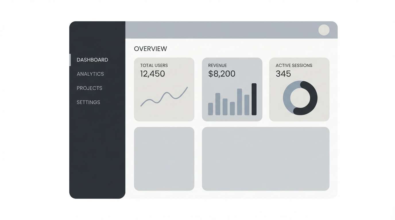
1) Silver Fog
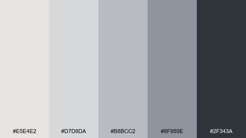
HEX: #e5e4e2 #d7d8da #b8bcc2 #8f959e #2f343a
Mood: clean, airy, modern
Best for: minimal UI and dashboard layouts
Clean foggy silvers feel like early morning light on glass and brushed metal. The gentle contrast keeps interfaces calm while still readable on dark text. Pair it with black typography and a single muted accent for states and highlights. Tip: reserve the deepest charcoal for headings and navigation so the mid-grays stay spacious.
Image example of silver fog generated using media.io
Media.io is an online AI studio for creating and editing video, image, and audio in your browser.

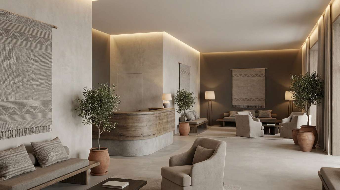
2) Champagne Concrete
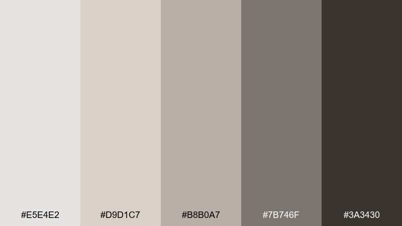
HEX: #e5e4e2 #d9d1c7 #b8b0a7 #7b746f #3a3430
Mood: warm, urban, refined
Best for: boutique hotel interiors and mood boards
Warm stone and champagne undertones evoke polished concrete floors and soft lobby lighting. These platinum color combinations work beautifully with walnut wood, linen textures, and matte black fixtures. Use the mid-tone greige on large surfaces and keep the deepest brown for trim and signage. Tip: add subtle texture instead of extra colors to keep the look upscale.
Image example of champagne concrete generated using media.io
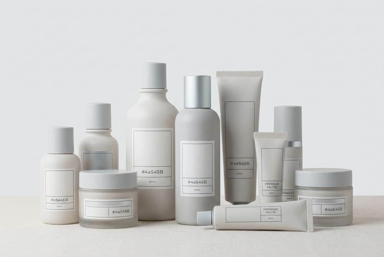
3) Glacier Linen
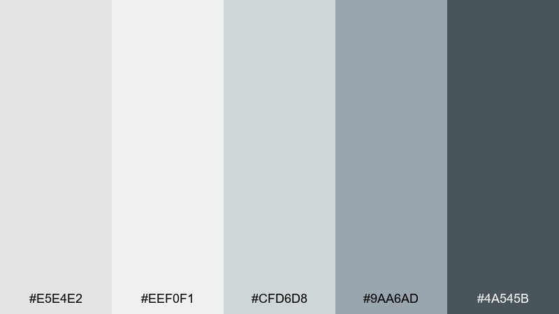
HEX: #e5e4e2 #eef0f1 #cfd6d8 #9aa6ad #4a545b
Mood: fresh, crisp, calm
Best for: skincare packaging and clean product labels
Fresh icy neutrals read like folded linen and cool spa tiles. A platinum color palette like this makes ingredient lists and icons feel clinical in the best way, without turning harsh. Pair it with minimal sans-serif type and plenty of whitespace for a premium look. Tip: print the lightest shades as soft tints to avoid labels looking pure white.
Image example of glacier linen generated using media.io
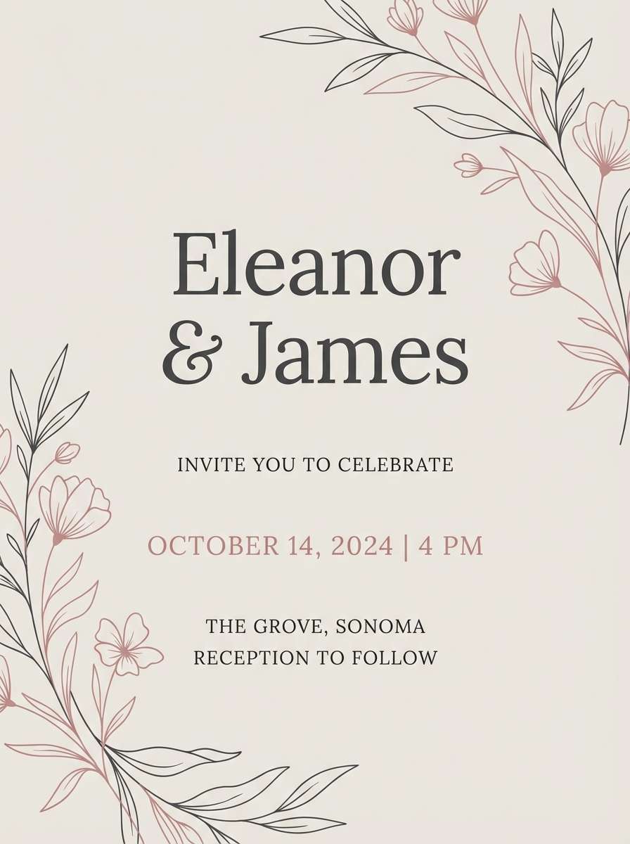
4) Rose Alloy
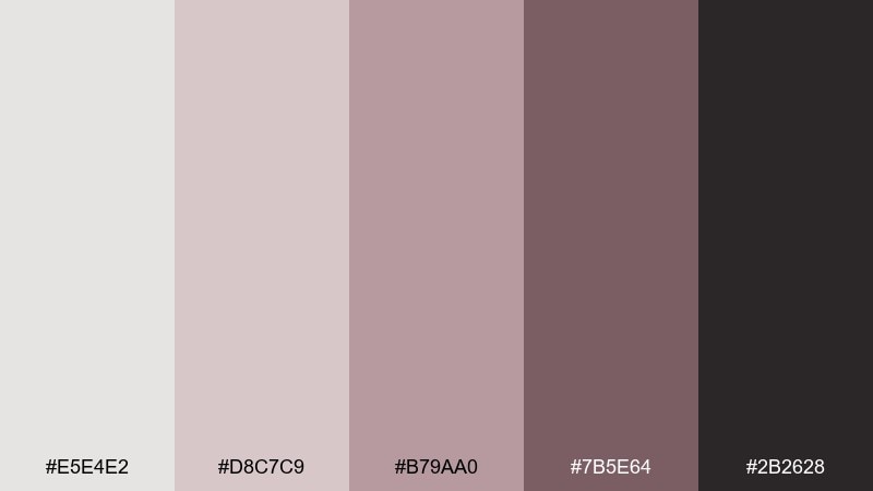
HEX: #e5e4e2 #d8c7c9 #b79aa0 #7b5e64 #2b2628
Mood: romantic, modern, elegant
Best for: wedding invitations and save the dates
Soft rose-metal tones feel like satin ribbons and vintage jewelry in a modern setting. The dusty mauves add warmth while the platinum base keeps everything bright and sophisticated. Pair with creamy paper stock and delicate line art for florals or monograms. Tip: use the darkest plum only for names and dates to keep the layout airy.
Image example of rose alloy generated using media.io
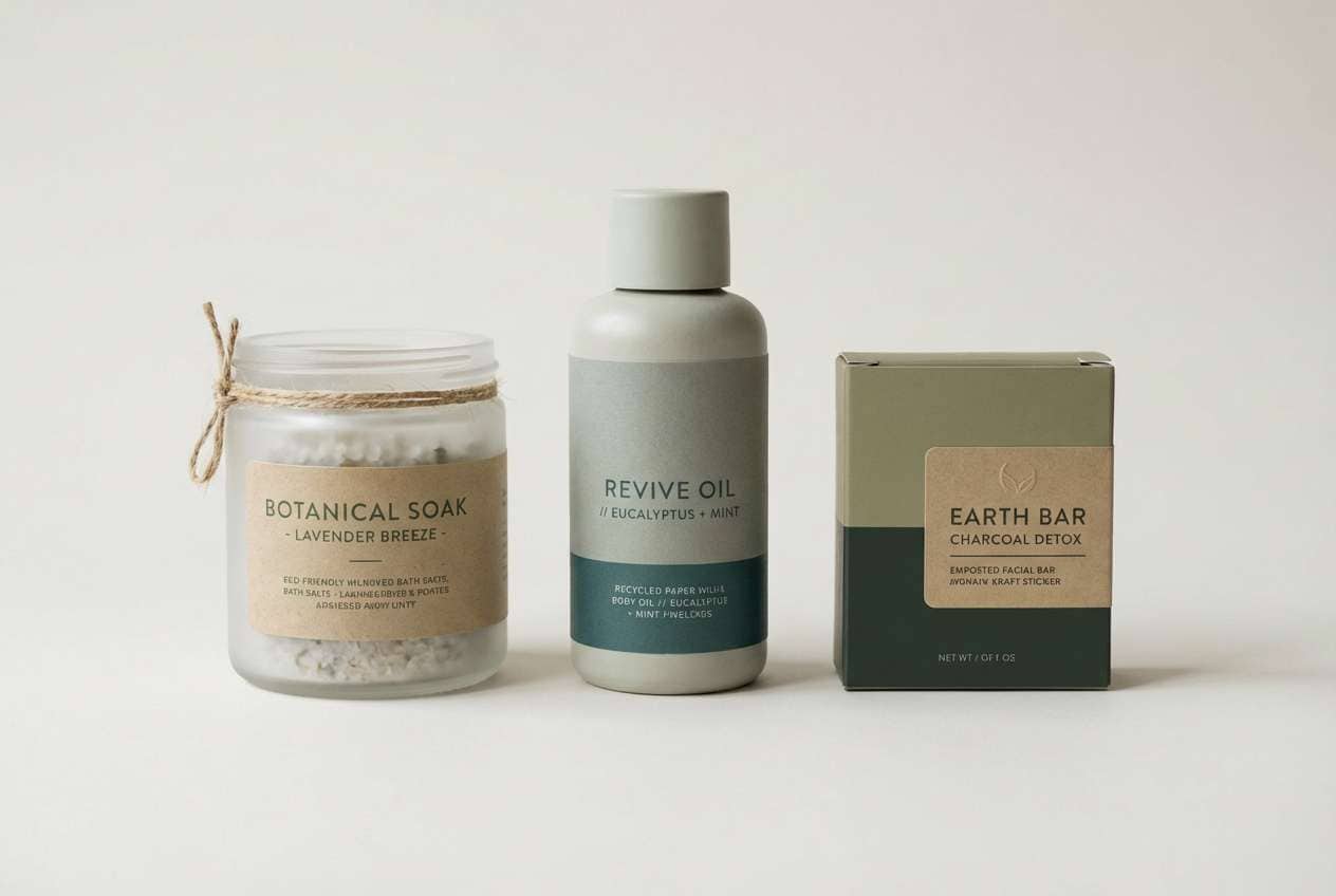
5) Sage Platinum
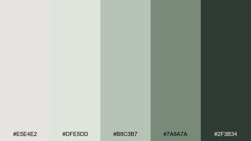
HEX: #e5e4e2 #dfe5dd #b8c3b7 #7a8a7a #2f3b34
Mood: natural, balanced, soothing
Best for: wellness branding and eco product packaging
Sage-tinted neutrals evoke herbal steam, stone sinks, and quiet routines. The platinum color combination here keeps greens grounded and professional instead of overly rustic. Pair with recycled paper textures and simple icons for a clean eco feel. Tip: use the mid sage for callouts and badges while keeping backgrounds nearly platinum.
Image example of sage platinum generated using media.io
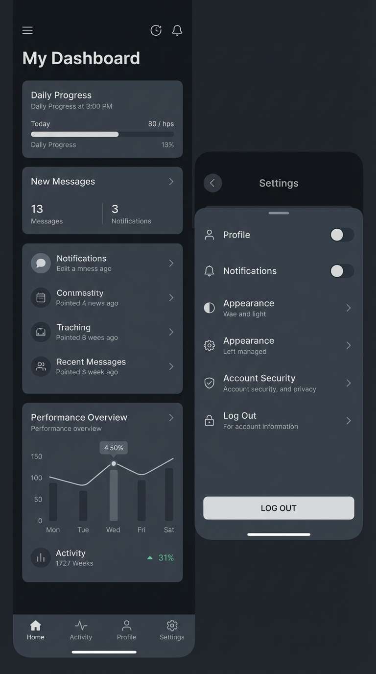
6) Midnight Platinum
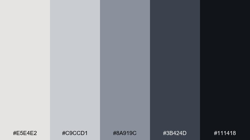
HEX: #e5e4e2 #c9ccd1 #8a919c #3b424d #111418
Mood: sleek, dramatic, high-contrast
Best for: tech branding and dark mode interfaces
Sleek silvers against near-black feel like night city reflections on chrome. The range of grays supports strong hierarchy for buttons, panels, and data-heavy screens. Pair with a single cool accent color for primary actions and keep secondary elements neutral. Tip: use the light platinum for key metrics and keep the mid grays for dividers to reduce glare.
Image example of midnight platinum generated using media.io
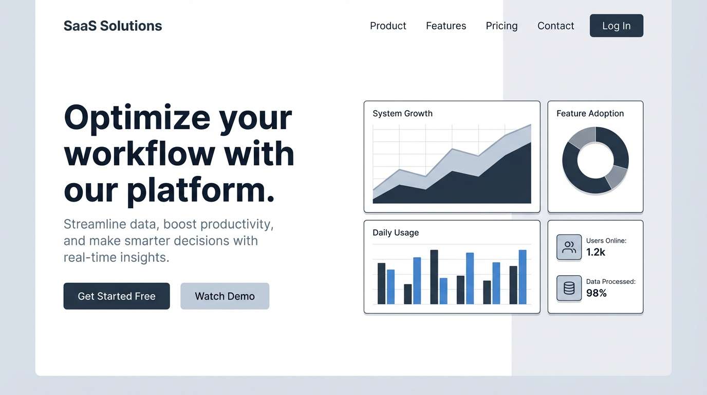
7) Pearl Blueprint
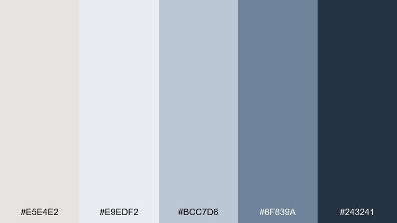
HEX: #e5e4e2 #e9edf2 #bcc7d6 #6f839a #243241
Mood: smart, cool, structured
Best for: SaaS landing pages and presentation decks
Cool pearly neutrals with blueprint blues evoke planning tables, grids, and crisp documentation. As a platinum color scheme, it stays professional while giving just enough color to guide the eye. Pair with geometric shapes and clear spacing for a product-led look. Tip: keep body text on the palest gray and use the deep navy for headlines and charts.
Image example of pearl blueprint generated using media.io
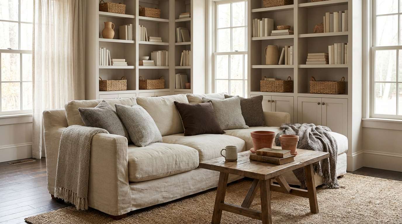
8) Oat Silk
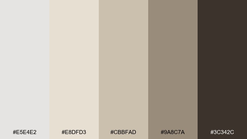
HEX: #e5e4e2 #e8dfd3 #cbbfad #9a8c7a #3c342c
Mood: cozy, creamy, understated
Best for: lifestyle blog headers and cozy interiors
Creamy oat and soft platinum tones feel like knit throws, steamed milk, and quiet Sunday mornings. The warm neutrals are ideal for long-form reading because they stay gentle on the eyes. Pair with natural wood photos, hand-drawn icons, and soft shadow cards. Tip: use the darker cocoa only for links and key UI controls to keep the page calm.
Image example of oat silk generated using media.io
9) Iris Chrome
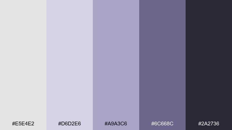
HEX: #e5e4e2 #d6d2e6 #a9a3c6 #6c668c #2a2736
Mood: dreamy, futuristic, polished
Best for: music posters and album cover graphics
Dreamy lavender-metal hues suggest stage lights bouncing off chrome and satin. A platinum color palette with violet undertones feels modern without going neon. Pair with bold condensed type and abstract gradients for a sleek nightlife vibe. Tip: keep the deepest eggplant for titles and let the pale platinum carry the negative space.
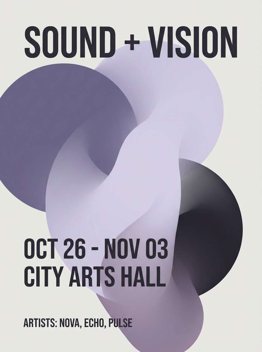
Image example of iris chrome generated using media.io
10) Copper Sheen
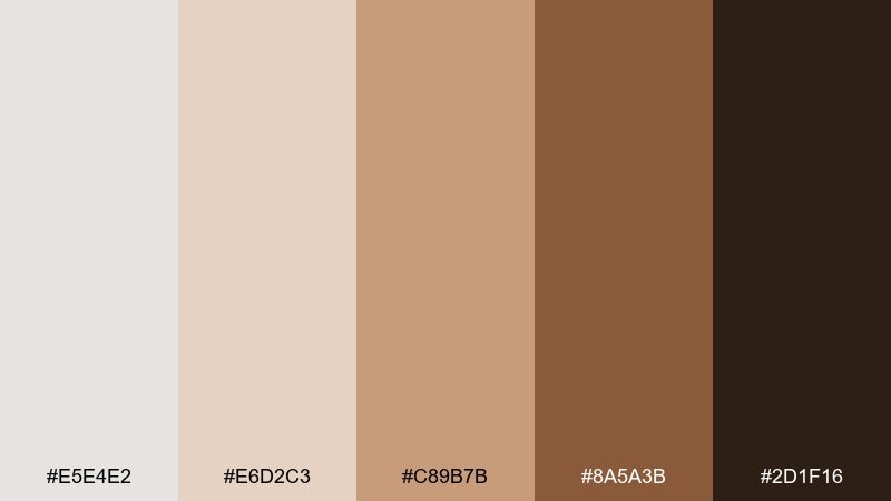
HEX: #e5e4e2 #e6d2c3 #c89b7b #8a5a3b #2d1f16
Mood: luxurious, warm, confident
Best for: jewelry product ads and premium packaging
Warm copper and pale metal tones evoke candlelit displays and polished hardware. These platinum color combinations shine when you need a premium feel without flashy saturation. Pair with high-contrast black type, embossed details, and soft studio shadows. Tip: use copper as a sparing highlight on borders and logos so it reads like metal, not orange.
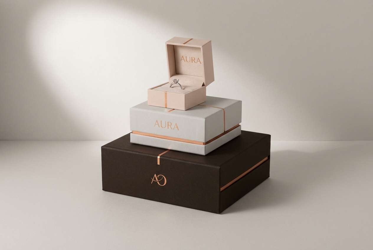
Image example of copper sheen generated using media.io
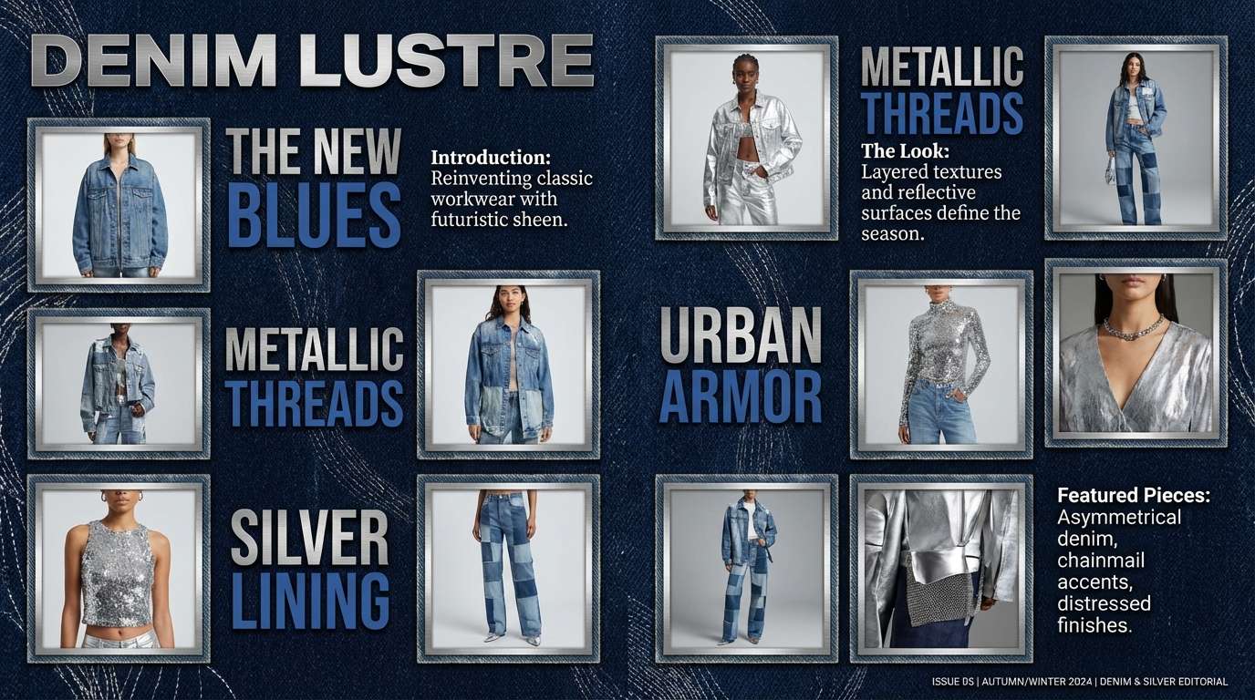
11) Stonewashed Denim
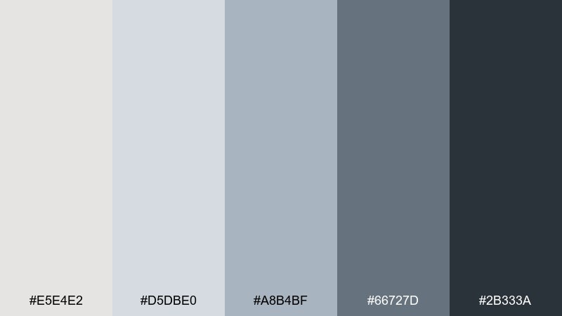
HEX: #e5e4e2 #d5dbe0 #a8b4bf #66727d #2b333a
Mood: relaxed, dependable, contemporary
Best for: casual apparel branding and lookbooks
Muted denim-grays feel like worn-in jackets and cool overcast afternoons. The palette is easy to style with monochrome photography and minimal product shots. Pair with off-white space and simple grid layouts for a catalog feel. Tip: keep the darkest steel for prices and calls to action so the softer tones can breathe.
Image example of stonewashed denim generated using media.io
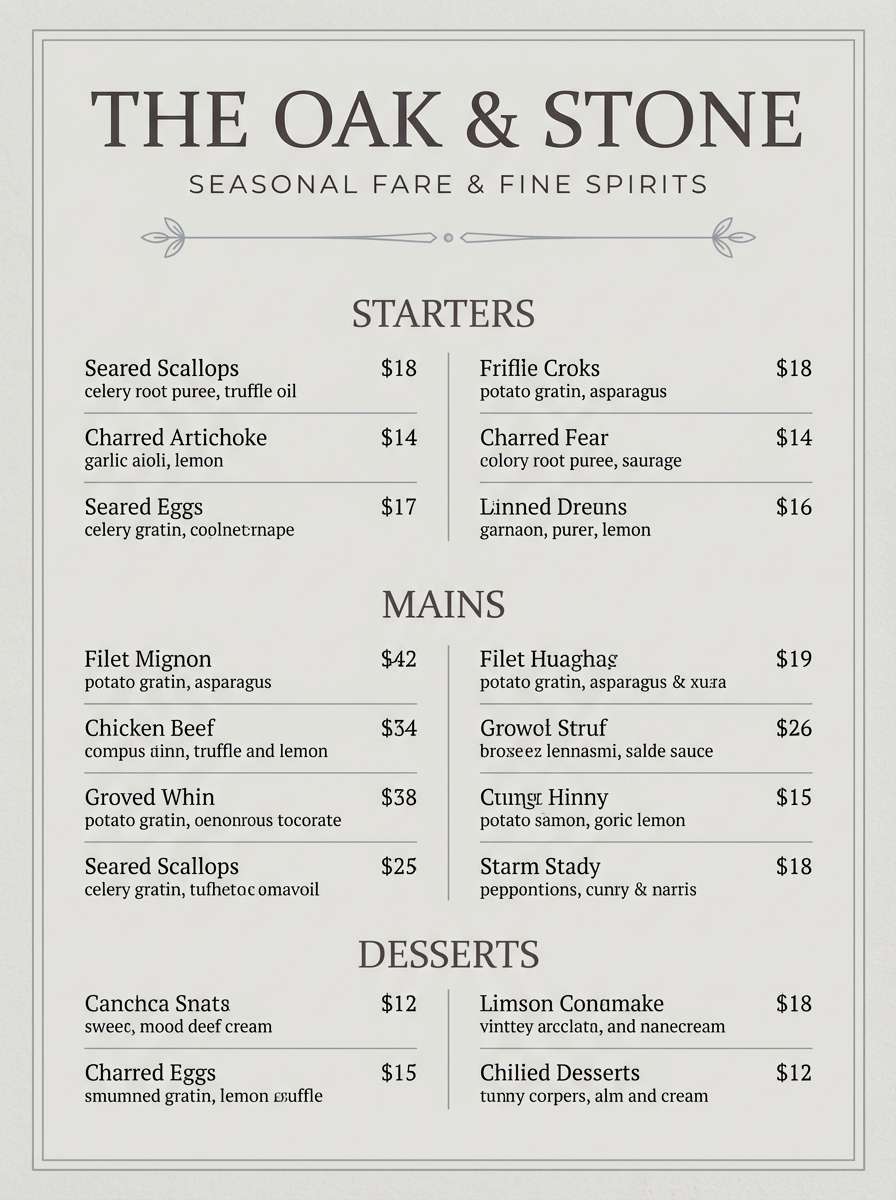
12) Smoked Quartz
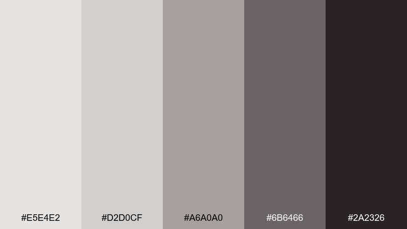
HEX: #e5e4e2 #d2d0cf #a6a0a0 #6b6466 #2a2326
Mood: moody, grounded, elegant
Best for: restaurant menus and upscale stationery
Smoky quartz neutrals bring to mind stone countertops, black tea, and dim evening service. The gentle warmth prevents the grays from feeling sterile on paper. Pair with serif headlines and thin rules for a refined menu layout. Tip: print the light platinum as a warm tint so it looks intentional, not blank.
Image example of smoked quartz generated using media.io
13) Sea Glass Platinum

HEX: #e5e4e2 #d7ece8 #a8d0c9 #5b9a93 #244b49
Mood: fresh, coastal, uplifting
Best for: spa brochures and wellness social posts
Sea-glass greens over a soft metallic base feel like shoreline air and cool mineral water. The minty tones stay sophisticated because the neutrals anchor them. Pair with airy photography, lots of margins, and rounded shapes for a gentle look. Tip: use the deeper teal for buttons and headings to keep contrast accessible.
Image example of sea glass platinum generated using media.io

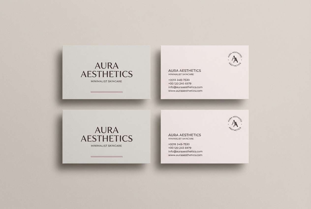
14) Blush Marble
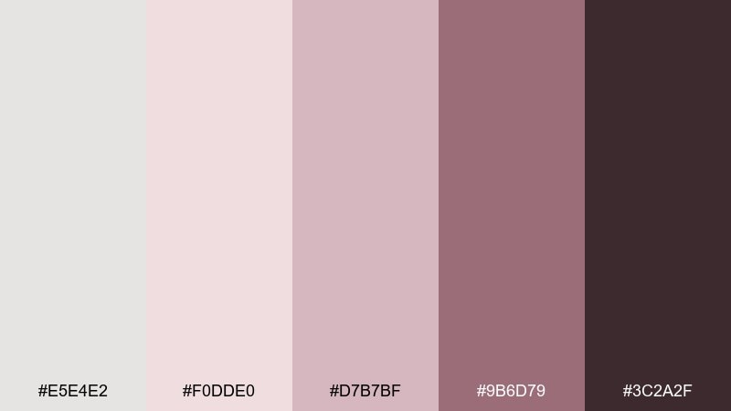
HEX: #e5e4e2 #f0dde0 #d7b7bf #9b6d79 #3c2a2f
Mood: soft, polished, boutique
Best for: beauty brand identity and business cards
Blush marble tones evoke powder compacts, silk robes, and glossy storefronts. The rosy mids add personality while the pale neutral keeps everything light and premium. Pair with minimal logos, thin borders, and subtle foil effects for a boutique finish. Tip: keep backgrounds nearly white and use the mauve for small brand moments like icons and stamps.
Image example of blush marble generated using media.io
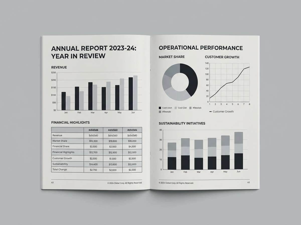
15) Graphite Pearl
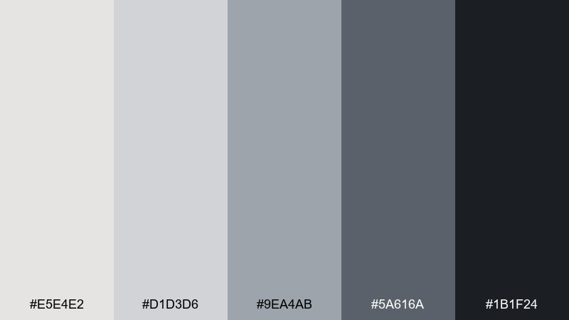
HEX: #e5e4e2 #d1d3d6 #9ea4ab #5a616a #1b1f24
Mood: professional, sharp, timeless
Best for: annual reports and finance slide decks
Pearl whites and graphite grays feel like crisp paper, polished pens, and boardroom clarity. The contrast is strong enough for charts and tables without looking aggressive. Pair with thin grid lines and one accent tint for key metrics. Tip: keep large blocks in the lightest gray and save near-black for numbers and headings.
Image example of graphite pearl generated using media.io
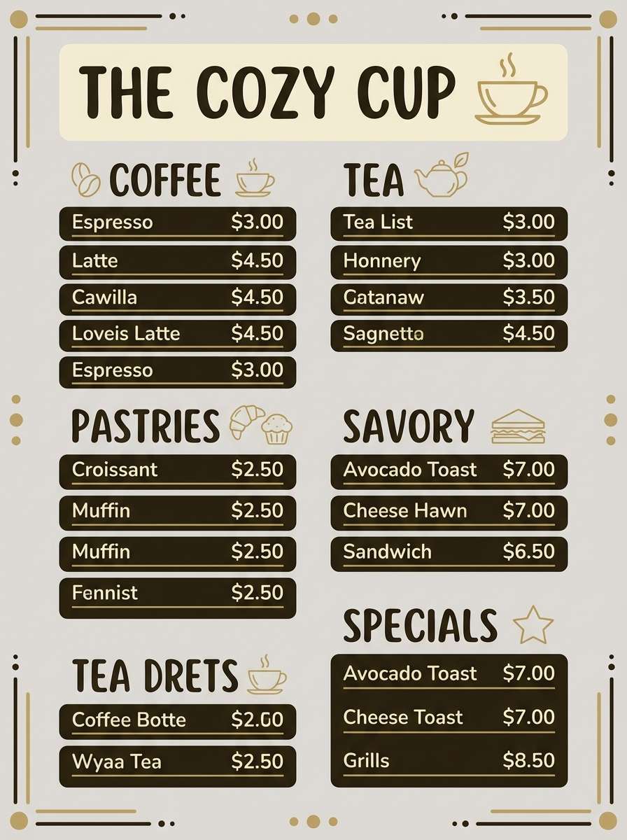
16) Citrine Mist
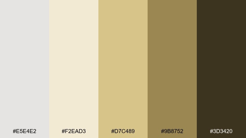
HEX: #e5e4e2 #f2ead3 #d7c489 #9b8752 #3d3420
Mood: optimistic, warm, sunlit
Best for: cafe branding and menu boards
Sunlit citrine and soft metallic neutrals evoke pastries in a glass case and late-afternoon warmth. A little golden accent makes the overall mix feel welcoming rather than sterile. Pair with kraft textures, rounded typography, and simple illustrations. Tip: use the pale butter tone for backgrounds and keep the gold for highlights like prices or tags.
Image example of citrine mist generated using media.io
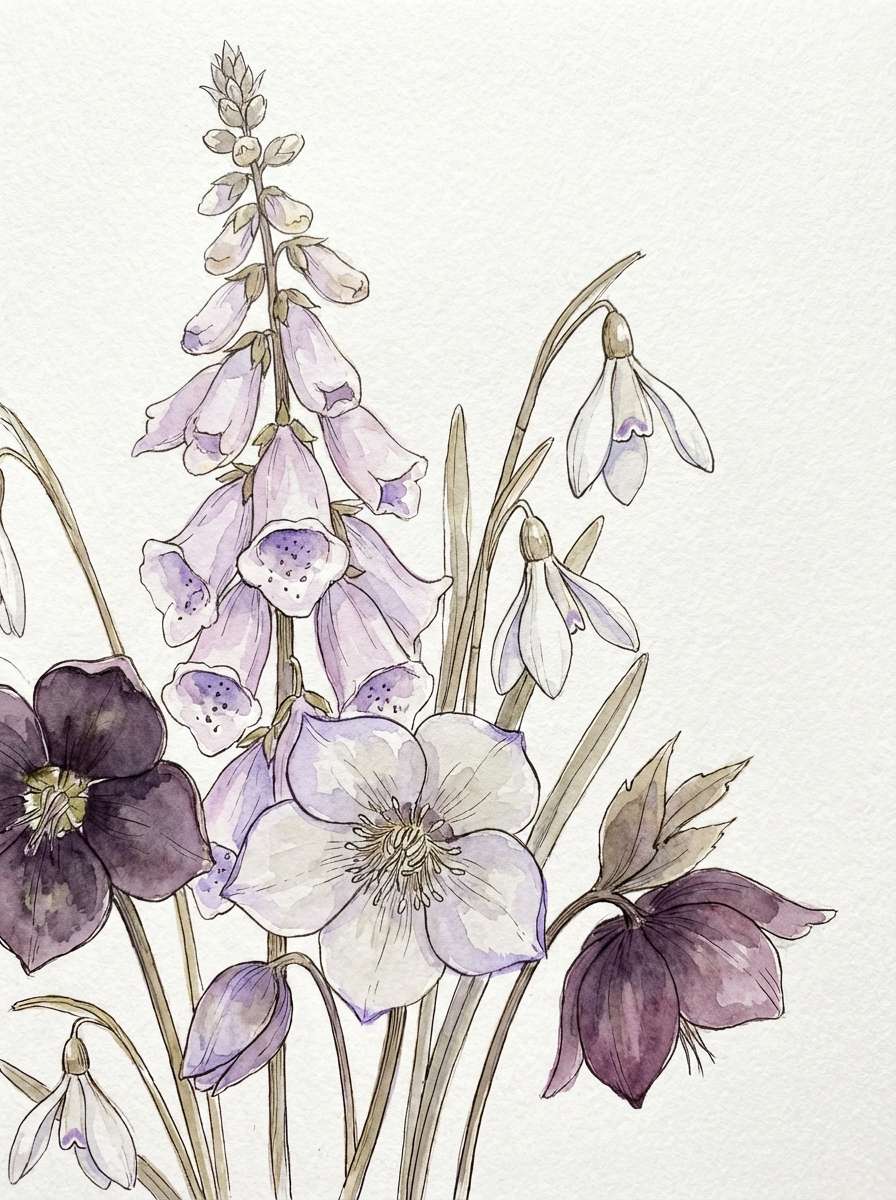
17) Frosted Lilac
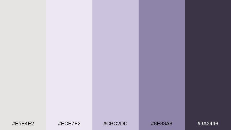
HEX: #e5e4e2 #ece7f2 #cbc2dd #8e83a8 #3a3446
Mood: gentle, airy, whimsical
Best for: spring botanical illustrations and stationery
Frosted lilac hues feel like petals dusted with morning dew. The pale metallic neutral keeps the purples light and usable for stationery without turning sugary. Pair with watercolor florals, soft paper texture, and thin script accents. Tip: let the lightest tones do the heavy lifting and use the deeper violet sparingly for stems and titles.
Image example of frosted lilac generated using media.io
18) Mocha Steel
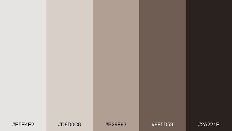
HEX: #e5e4e2 #d8d0c8 #b29f93 #6f5d53 #2a221e
Mood: earthy, sophisticated, grounded
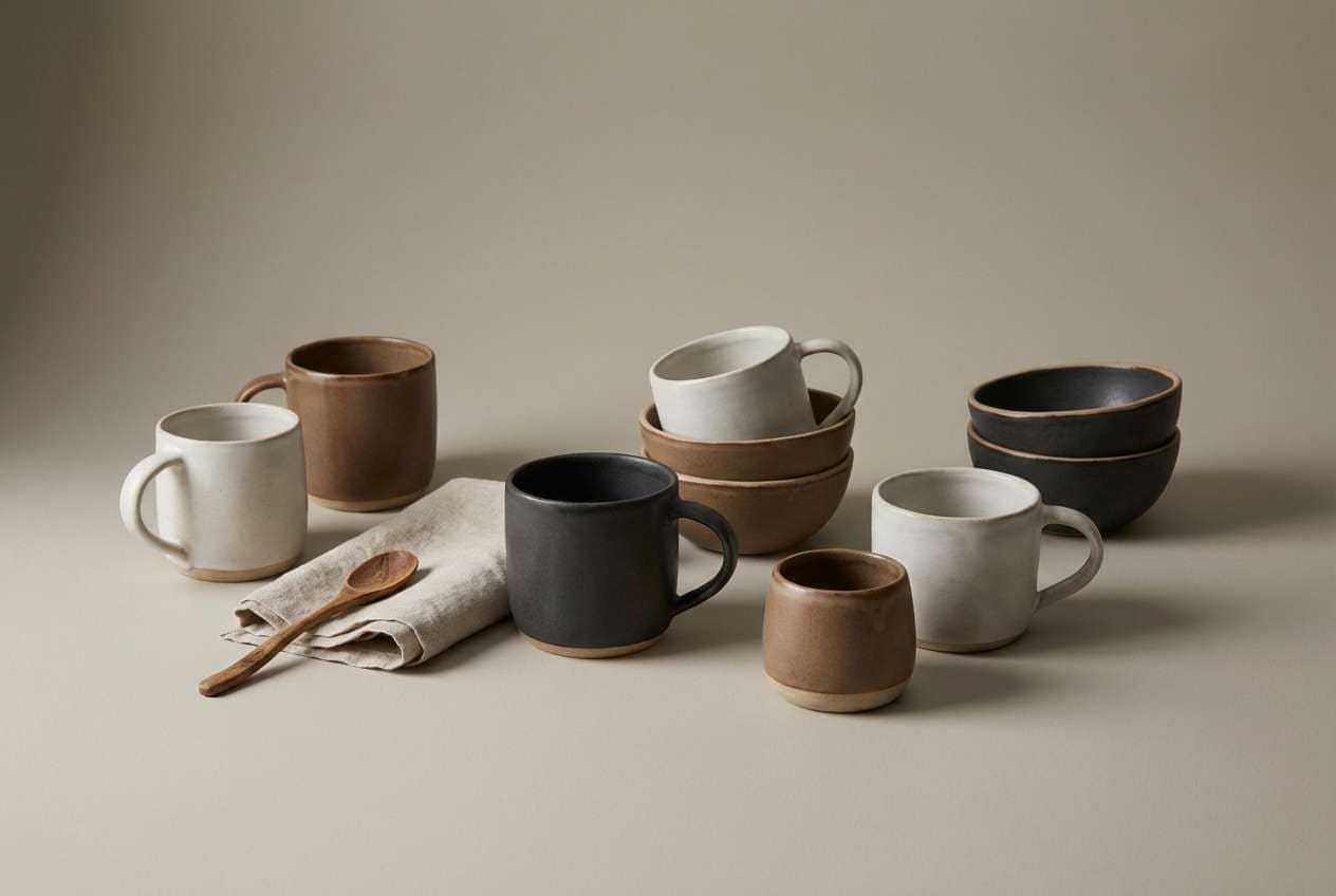
Best for: ceramic product pages and artisan branding
Mocha clays with a cool metal base evoke handmade pottery and studio shelves. These platinum color combinations keep brown tones looking modern instead of heavy. Pair with matte product photography, serif headlines, and generous margins. Tip: use the mid mocha for section backgrounds and the deep espresso for small text and icons.
Image example of mocha steel generated using media.io
19) Arctic Brass

HEX: #e5e4e2 #dde1de #b7bdb7 #b08d3a #2b2d2c
Mood: modern, crisp, premium
Best for: product landing pages with metallic accents
Crisp arctic grays with a flash of brass feel like precision tools and high-end fixtures. The restrained gold adds focus without overpowering the neutral base. Pair with sharp photography, thin rules, and minimal icons for a premium tech feel. Tip: keep brass limited to buttons and micro-highlights so it reads like hardware, not decoration.
Image example of arctic brass generated using media.io
20) Taupe Halo
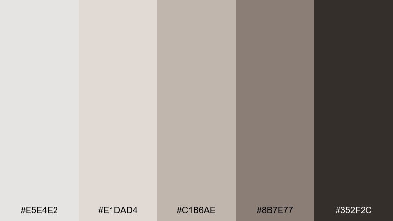
HEX: #e5e4e2 #e1dad4 #c1b6ae #8b7e77 #352f2c
Mood: soft, timeless, welcoming
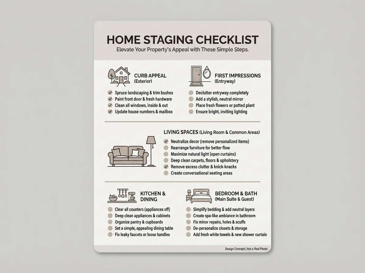
Best for: home staging guides and interior flyers
Soft taupes and pale metallic neutrals evoke sunlit walls and calm, uncluttered rooms. The gentle contrast works well for long reads, checklists, and printed guides. Pair with warm photography, thin dividers, and simple serif titles. Tip: set large text on the lightest warm gray to avoid stark white on paper.
Image example of taupe halo generated using media.io
21) Prism Platinum
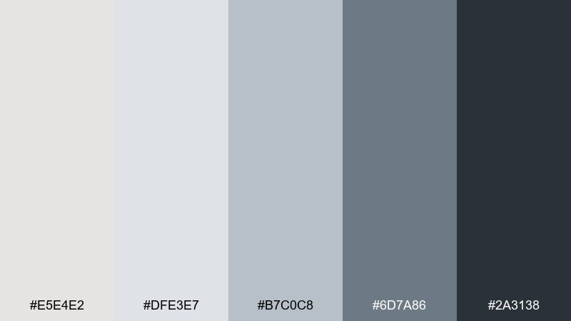
HEX: #e5e4e2 #dfe3e7 #b7c0c8 #6d7a86 #2a3138
Mood: crisp, versatile, modern
Best for: podcast cover art and thumbnail graphics
Crisp neutrals with steel depth feel like studio mics, acoustic panels, and clean editing timelines. A platinum color palette like this keeps cover art readable at small sizes while staying understated. Pair with bold typography and one simple shape or waveform graphic. Tip: boost contrast by placing titles on the darkest block and leaving the rest airy.
Image example of prism platinum generated using media.io

What Colors Go Well with Platinum?
Platinum works best with structured darks (charcoal, near-black, ink navy) because they lock in contrast for typography and UI components. This pairing is especially strong for dashboards, reports, and premium product pages.
For warmth, layer in greige, oat, taupe, copper, or brass—these keep platinum from feeling cold while staying sophisticated. For a fresher direction, pair platinum with sage, teal, or sea-glass mint to add calm color without losing the neutral foundation.
If you want a modern “tinted metal” look, add muted lilac or dusty rose. These soft undertones read elegant and contemporary, particularly in beauty, weddings, and editorial design.
How to Use a Platinum Color Palette in Real Designs
Start by assigning roles: use platinum/light gray for backgrounds, mid-grays for surfaces and borders, and deep charcoal for primary text. This creates a consistent hierarchy and avoids a flat, washed-out look.
Keep accents intentional. A single warm metallic (copper/brass) or a single cool hue (navy/teal/lilac) is usually enough for buttons, badges, and highlights—especially in UI where too many neutrals can blur together.
In print and interiors, lean on texture instead of extra colors: paper grain, linen, concrete, ceramic, and matte finishes help platinum feel rich and dimensional without increasing visual noise.
Create Platinum Palette Visuals with AI
If you already have HEX codes, you can turn them into ready-to-use visuals by generating mockups: landing pages, packaging, posters, menus, and social graphics. Platinum palettes are especially easy to iterate because small shifts in contrast and undertone change the mood quickly.
Use prompts that specify “dominant colors” and the exact HEX values, then refine with lighting and material keywords like matte, brushed metal, foil, linen, or concrete. This keeps the output aligned with your intended finish.
When you find a result you like, reuse the same prompt structure across multiple formats (1:1, 16:9, 9:16) to build a consistent campaign set.
Platinum Color Palette FAQs
-
What is the HEX code for platinum?
A commonly used platinum base is #e5e4e2. In practice, “platinum” palettes also include nearby soft grays, greiges, and charcoals to create contrast. -
Is platinum more warm or cool?
Platinum is typically a cool-leaning neutral, but it can shift warmer depending on surrounding colors (taupe, oat, champagne) or cooler with blues and blue-grays. -
What’s the difference between platinum and silver in design?
Silver often reads cooler and more “chrome-like,” while platinum tends to be softer, slightly warmer/creamier, and easier to use as a background neutral without feeling icy. -
What text color works best on a platinum background?
Deep charcoal or near-black (for example, #2f343a or #111418) usually provides clean readability. For secondary text, use mid-grays, but keep enough contrast for accessibility. -
What accent colors pair well with platinum?
Great accents include navy, teal, sage, dusty rose, lilac, copper, and brass. Choose one primary accent to keep the palette feeling premium and controlled. -
Is platinum a good color for branding?
Yes—platinum signals modernity and quality while staying neutral. It’s especially effective for tech, finance, beauty, wellness, and premium retail when paired with strong typography and one accent. -
How do I keep a platinum palette from looking flat?
Add a full value range (light → mid → dark), use subtle texture (grain, linen, concrete), and reserve one accent color for key moments like buttons, icons, or logos.


