

Pastel brown is a warm neutral that feels soft, human, and inviting—perfect when you want a cozy look without going dark or heavy.
Below are 20 pastel brown color palette ideas with HEX codes, plus practical ways to apply them to branding, UI, print, weddings, and home decor.
In this article
- Why Pastel Brown Color Combinations Work So Well
-
- cafe au lait mist
- oatmilk terracotta
- almond blossom neutral
- cocoa rose dust
- sandstone sage
- biscuit lavender haze
- maple cream studio
- toffee peach glow
- clay linen minimal
- mocha mint quiet
- sepia sky pastel
- cinnamon blush wedding
- caramel sea salt
- driftwood olive home
- latte blue note
- chestnut fog editorial
- nutmeg citrus pop
- soft umber monochrome
- brown sugar bloom
- prairie fawn light
- What Colors Go Well with Pastel Brown?
- How to Use a Pastel Brown Color Palette in Real Designs
- Create Pastel Brown Palette Visuals with AI
Why Pastel Brown Color Combinations Work So Well
Pastel brown sits in the “warm neutral” zone, so it pairs naturally with creams, beiges, soft pinks, and muted greens while staying easy on the eyes. It’s a reliable base color when you want comfort and approachability.
Compared to darker browns, pastel brown keeps interfaces and prints feeling airy and modern. You can still get strong hierarchy by using one deeper cocoa/latte tone for text and CTAs.
Because it resembles natural materials (paper, wood, linen, clay), pastel brown also adds instant “texture” to otherwise minimal designs—great for brands that want calm, premium, and human.
20+ Pastel Brown Color Palette Ideas (with HEX Codes)
1) Cafe Au Lait Mist
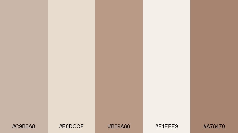
HEX: #c9b6a8 #e8dccf #b89a86 #f4efe9 #a78470
Mood: airy, calm, quietly premium
Best for: minimal website hero and navigation UI
Airy coffeehouse warmth meets clean morning light, giving the layout a calm, quietly premium feel. Use the creamy off-white for backgrounds and keep the deeper latte brown for type and icons. Pair with subtle shadows and soft rounded cards to avoid harsh contrast. Tip: reserve the darkest brown for primary CTAs so the interface stays gentle but readable.
Image example of cafe au lait mist generated using media.io
Media.io is an online AI studio for creating and editing video, image, and audio in your browser.

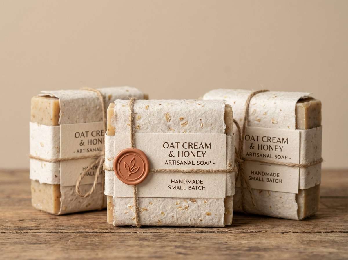
2) Oatmilk Terracotta
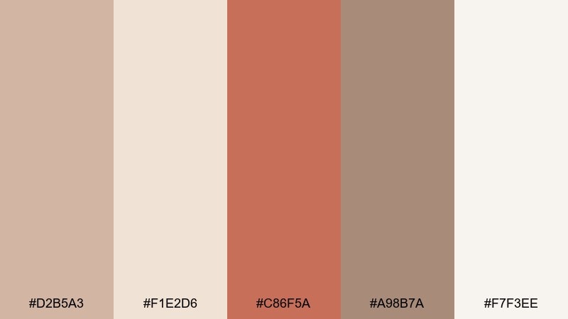
HEX: #d2b5a3 #f1e2d6 #c86f5a #a98b7a #f7f3ee
Mood: sun-warmed, friendly, artisanal
Best for: handmade soap packaging and product labels
Sun-warmed oat tones with a terracotta kick feel friendly and handcrafted, like a small-batch market stall. These pastel brown color combinations shine on kraft paper labels, with terracotta as the stamp, seal, or scent callout. Keep typography dark and simple, and let the creamy shade carry the negative space. Tip: add a thin border in the mid brown to make the label look finished without feeling heavy.
Image example of oatmilk terracotta generated using media.io
3) Almond Blossom Neutral
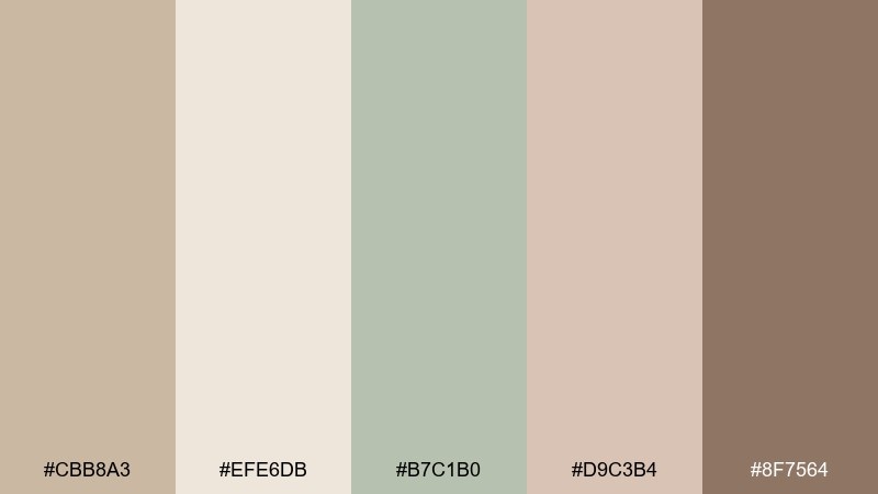
HEX: #cbb8a3 #efe6db #b7c1b0 #d9c3b4 #8f7564
Mood: gentle, botanical, grounded
Best for: spring botanical illustration and stationery
Gentle almond neutrals with a soft sage note evoke pressed leaves and handmade paper. The green works beautifully for stems and linework, while the browns keep the piece grounded and cozy. Pair with uncoated textures and slightly imperfect edges for a natural finish. Tip: limit the darkest shade to small details so the illustration stays light and airy.
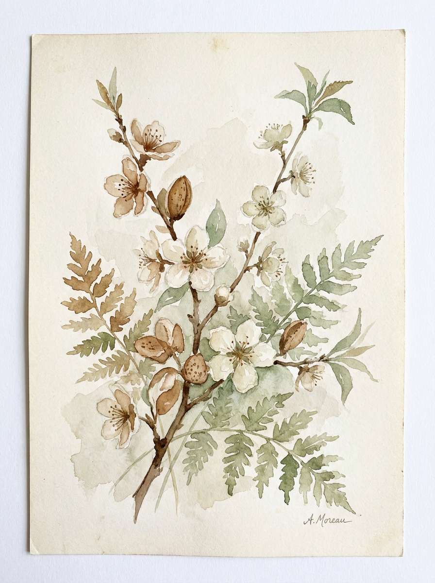
Image example of almond blossom neutral generated using media.io
4) Cocoa Rose Dust
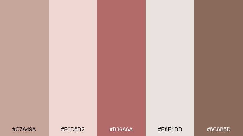
HEX: #c7a49a #f0d8d2 #b36a6a #e8e1dd #8c6b5d
Mood: romantic, vintage, softly dramatic
Best for: wedding invitation and RSVP card design
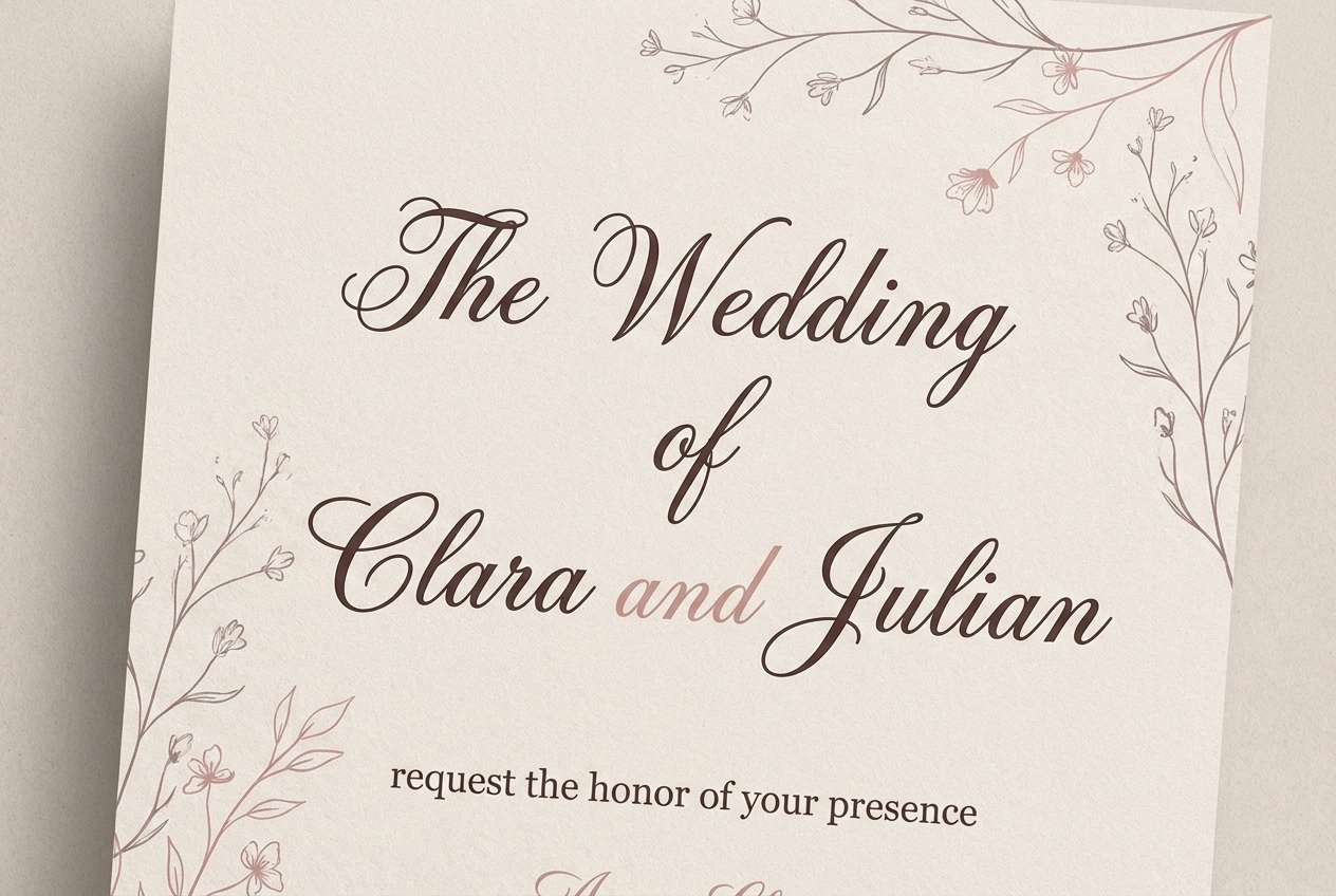
Romantic cocoa and dusty rose feel like vintage silk, candlelight, and handwritten notes. Use the pale blush as the paper base, then bring in cocoa for names and key details. The muted rose makes a lovely wax-seal or monogram accent without turning overly sweet. Tip: choose a serif headline and a clean sans body to keep the design timeless.
Image example of cocoa rose dust generated using media.io
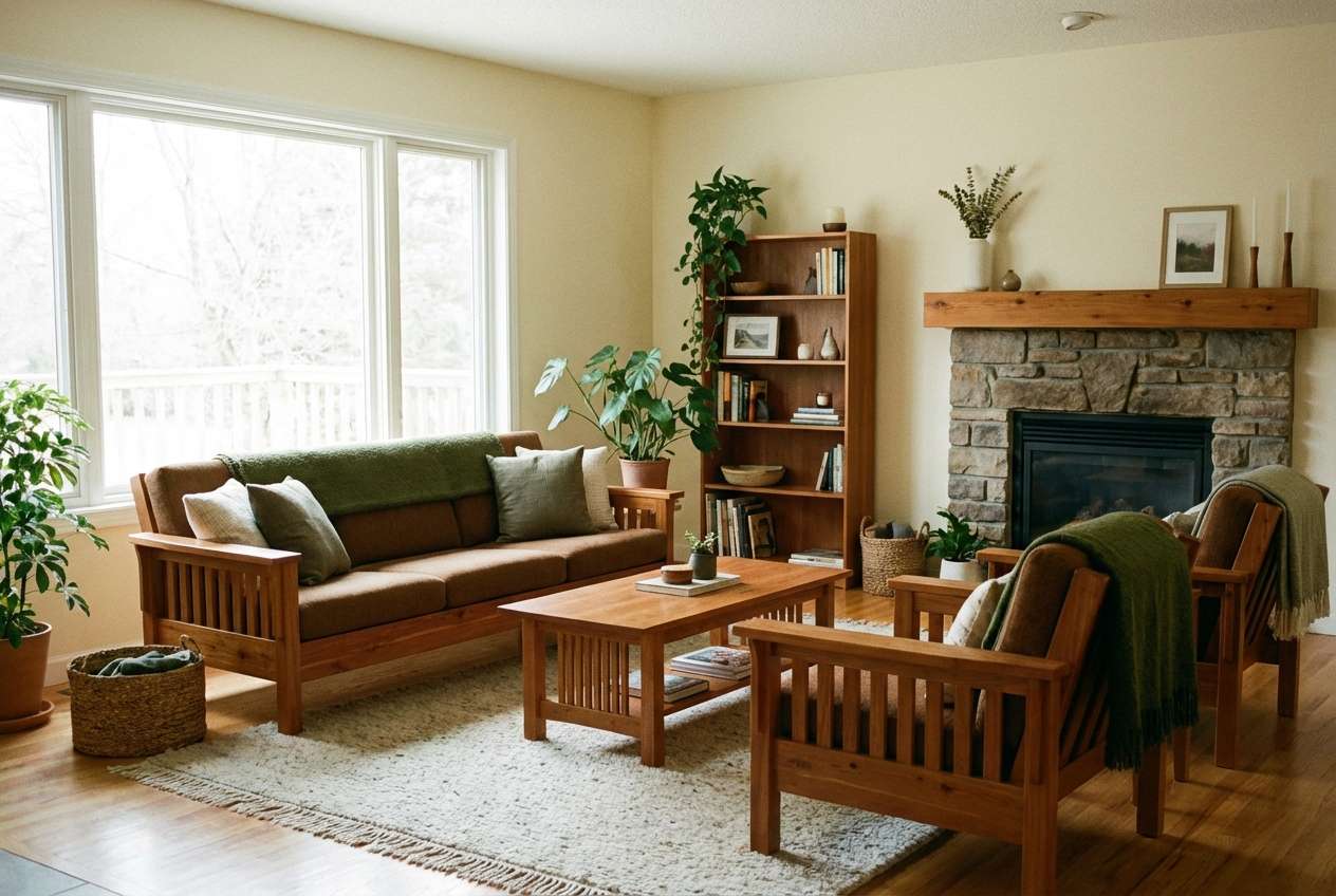
5) Sandstone Sage
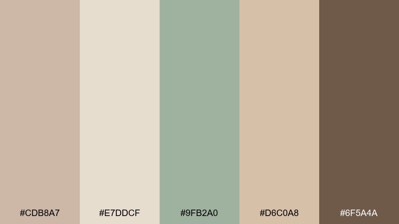
HEX: #cdb8a7 #e7ddcf #9fb2a0 #d6c0a8 #6f5a4a
Mood: earthy, restorative, spa-like
Best for: cozy living room color direction and decor
Earthy sandstone with sage undertones brings a restorative, spa-like calm to a room. Let the light beige and cream handle large surfaces, then layer sage through textiles and plants. Darker brown is best for wood accents, picture frames, or a single statement chair. Tip: keep metals warm, like brushed brass, to preserve the soft warmth.
Image example of sandstone sage generated using media.io
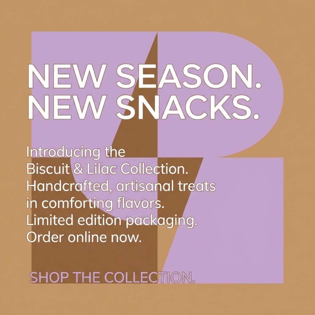
6) Biscuit Lavender Haze
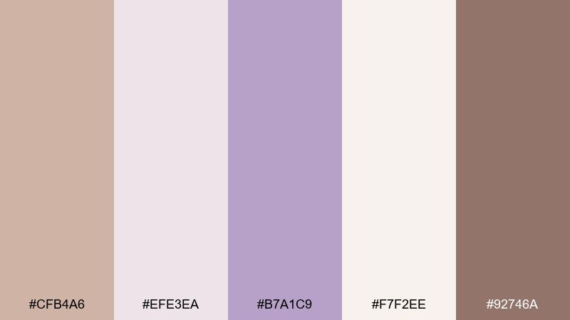
HEX: #cfb4a6 #efe3ea #b7a1c9 #f7f2ee #92746a
Mood: dreamy, soft, boutique
Best for: skincare social post and promo graphic
Dreamy biscuit tones with a lavender haze feel gentle, boutique, and a little whimsical. Use the pale lilac for background gradients and the cocoa-taupe for crisp, readable headlines. The mid lavender works well for icons, badges, or small decorative shapes. Tip: keep imagery minimal and lean on whitespace so the colors do the storytelling.
Image example of biscuit lavender haze generated using media.io
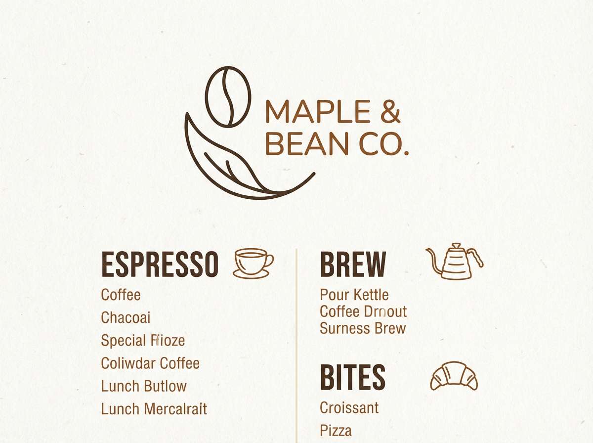
7) Maple Cream Studio
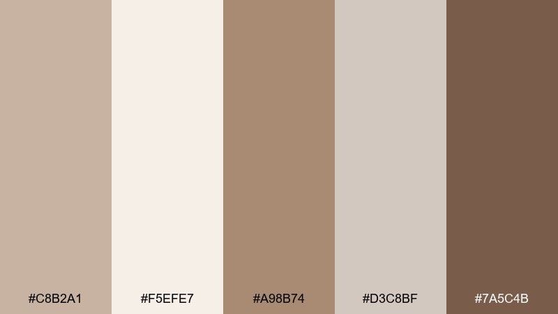
HEX: #c8b2a1 #f5efe7 #a98b74 #d3c8bf #7a5c4b
Mood: cozy, welcoming, handcrafted
Best for: coffee shop logo and menu design
Cozy maple and cream read like frothy cappuccino and warm wood counters. For a pastel brown color palette that still feels sharp, set the menu background in cream and use the darkest brown for prices and section headers. The mid maple shade makes a great divider line or icon fill. Tip: add subtle paper grain to avoid a flat, overly digital look.
Image example of maple cream studio generated using media.io
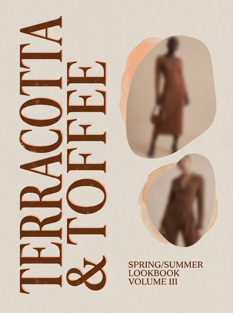
8) Toffee Peach Glow
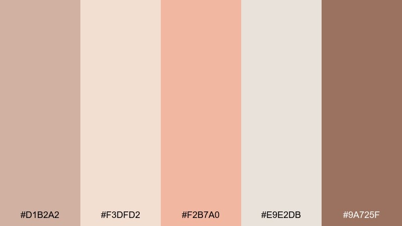
HEX: #d1b2a2 #f3dfd2 #f2b7a0 #e9e2db #9a725f
Mood: playful, luminous, modern
Best for: fashion lookbook cover and editorial teaser
Playful toffee and peach glow like soft sunset lighting on skin and fabric. Use peach as the spotlight color for pull quotes, stickers, or seasonal drops, while the browns keep everything grounded. Pair with clean photography and airy spacing so it stays modern, not retro. Tip: keep black to a minimum and use the darkest brown for text instead.
Image example of toffee peach glow generated using media.io
9) Clay Linen Minimal
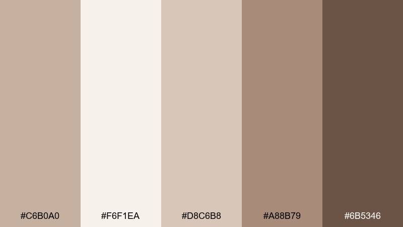
HEX: #c6b0a0 #f6f1ea #d8c6b8 #a88b79 #6b5346
Mood: clean, minimal, quietly warm
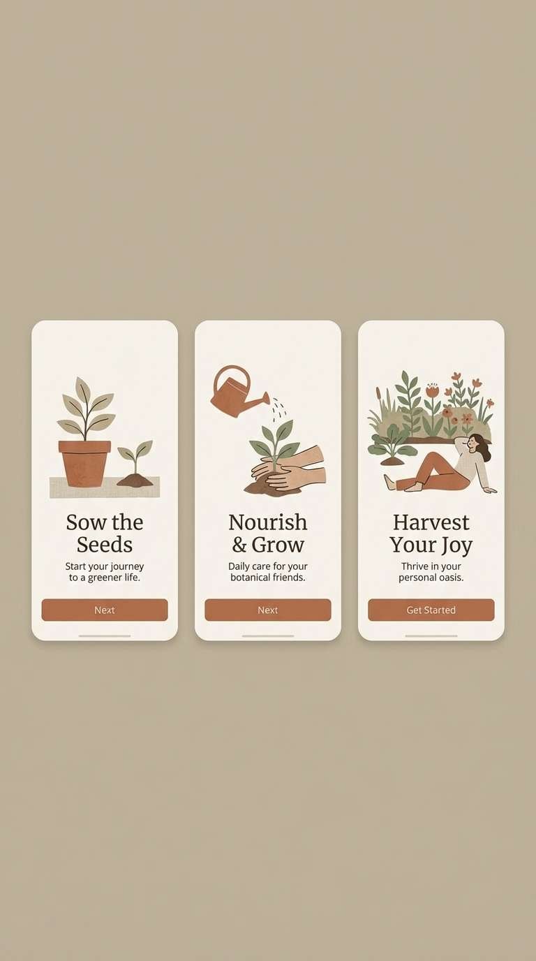
Best for: app onboarding screens and empty states
Clean clay and linen neutrals feel like a calm studio wall and neatly folded textiles. Build onboarding with the light linen as the canvas, then use clay for illustrations and soft panels. The darkest brown should be reserved for key labels and progress indicators. Tip: keep contrast consistent across screens so the flow feels seamless and polished.
Image example of clay linen minimal generated using media.io
10) Mocha Mint Quiet
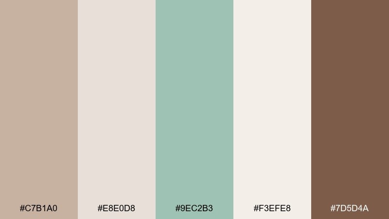
HEX: #c7b1a0 #e8e0d8 #9ec2b3 #f3efe8 #7d5d4a
Mood: fresh, calm, wellness-minded
Best for: wellness blog banner and section headers
Quiet mocha with a minty lift feels fresh, calm, and wellness-minded. Use mint as the navigational highlight for links, tags, or category pills, and keep body areas in warm neutrals. Pair with thin-line icons and plenty of breathing room for a modern feel. Tip: try mint only at 10 to 15 percent coverage so the palette stays soothing.
Image example of mocha mint quiet generated using media.io
11) Sepia Sky Pastel
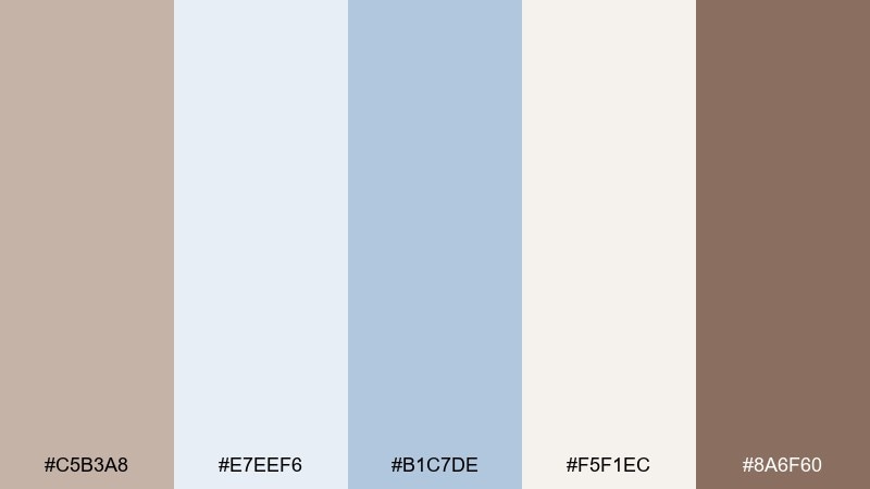
HEX: #c5b3a8 #e7eef6 #b1c7de #f5f1ec #8a6f60
Mood: serene, airy, contemporary
Best for: presentation slides for calm storytelling
Serene sepia and sky blue feel like a quiet morning horizon, soft but contemporary. The cool blues are ideal for charts and callouts, while the browns keep titles warm and approachable. Pair with simple geometric shapes and light dividers for clarity. Tip: use the off-white as the default slide background to prevent the blue from overpowering.
Image example of sepia sky pastel generated using media.io

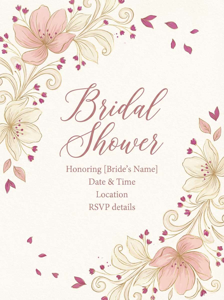
12) Cinnamon Blush Wedding
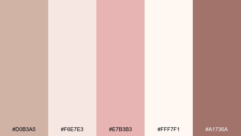
HEX: #d0b3a5 #f6e7e3 #e7b3b3 #fff7f1 #a1736a
Mood: sweet, romantic, celebratory
Best for: bridal shower flyer and signage
Sweet cinnamon blush feels celebratory, like rose macarons and soft ribbons. These pastel brown color combinations work best with lots of light space and delicate typography. Use the deeper cinnamon for headings and dates, and the blush for accents like icons or borders. Tip: print on a warm white stock so the tones stay creamy instead of stark.
Image example of cinnamon blush wedding generated using media.io
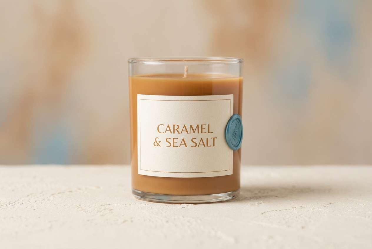
13) Caramel Sea Salt
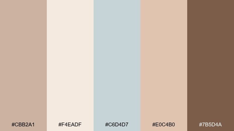
HEX: #cbb2a1 #f4eadf #c6d4d7 #e0c4b0 #7b5d4a
Mood: clean, coastal, softly warm
Best for: candle label and minimal packaging
Caramel warmth with sea-salt blue feels clean and coastal without turning cold. Use the blue as a tiny highlight for scent notes or batch numbers, and keep the label mostly cream and brown. Pair with matte materials and restrained typography for a premium finish. Tip: keep the darkest brown for the brand mark only, so the label stays airy.
Image example of caramel sea salt generated using media.io
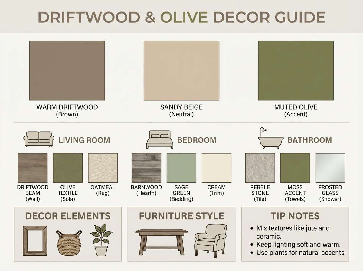
14) Driftwood Olive Home
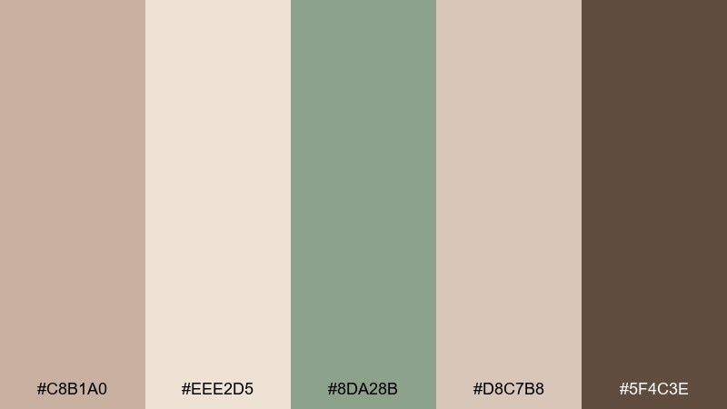
HEX: #c8b1a0 #eee2d5 #8da28b #d8c7b8 #5f4c3e
Mood: natural, grounded, homey
Best for: home decor palette board and paint guide
Driftwood browns and muted olive feel natural and homey, like reclaimed timber and dried herbs. Use the light neutral for walls and the olive for cabinetry, textiles, or a single painted door. The deepest brown is perfect for hardware, frames, or a stair rail detail. Tip: test the olive in different lighting, since it can read warmer next to the browns.
Image example of driftwood olive home generated using media.io
15) Latte Blue Note
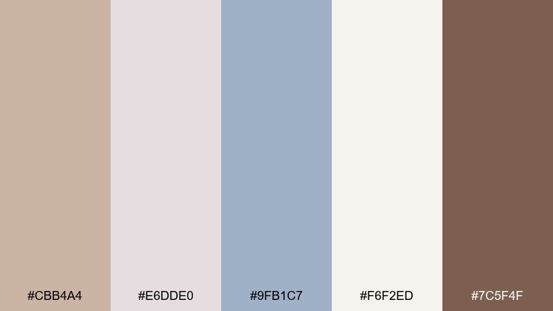
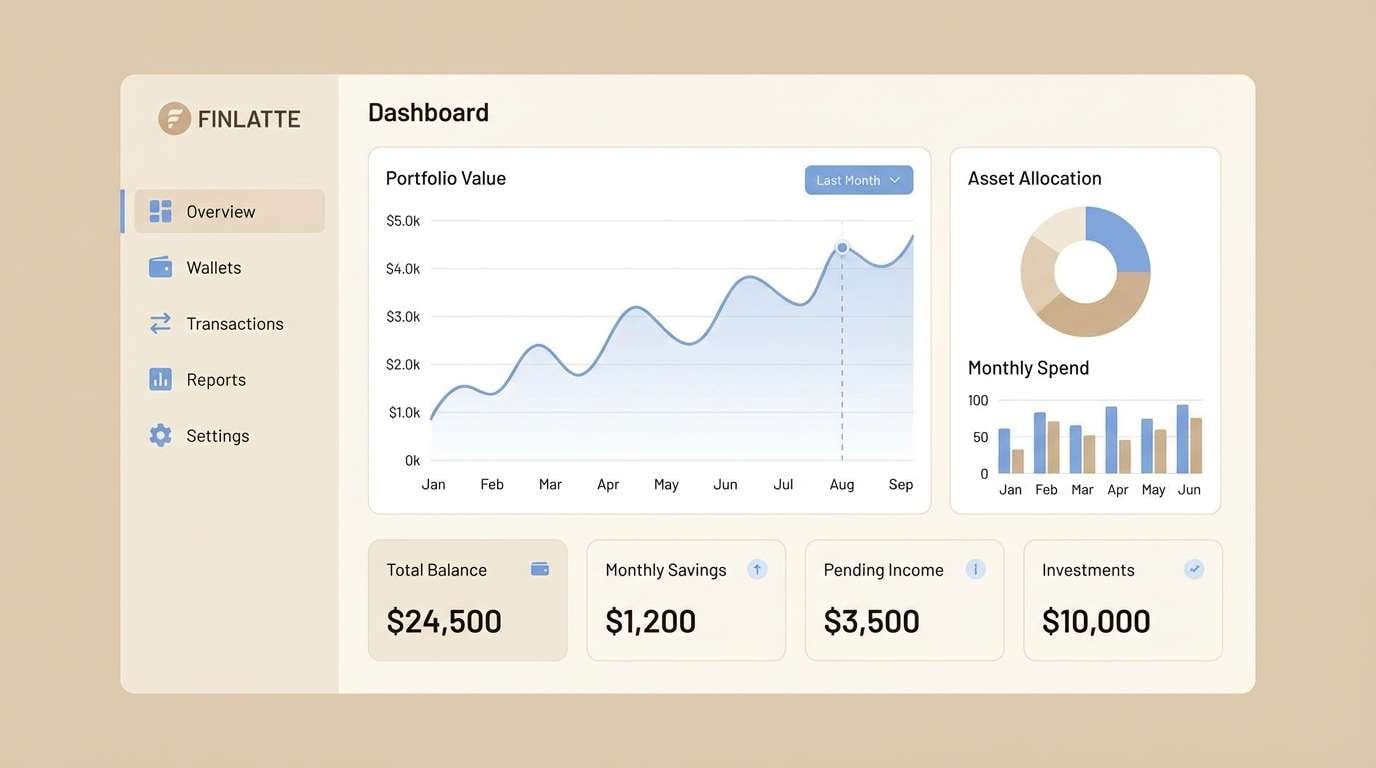
HEX: #cbb4a4 #e6dde0 #9fb1c7 #f6f2ed #7c5f4f
Mood: smart, modern, understated
Best for: fintech dashboard UI and data cards
Understated latte neutrals with a blue note feel smart, modern, and stable. Use the blue for interactive states like active tabs, selected filters, and chart highlights. Keep surfaces in warm off-whites so the data reads clearly without a cold corporate look. Tip: set a consistent blue accent rule so attention always lands on the right numbers.
Image example of latte blue note generated using media.io
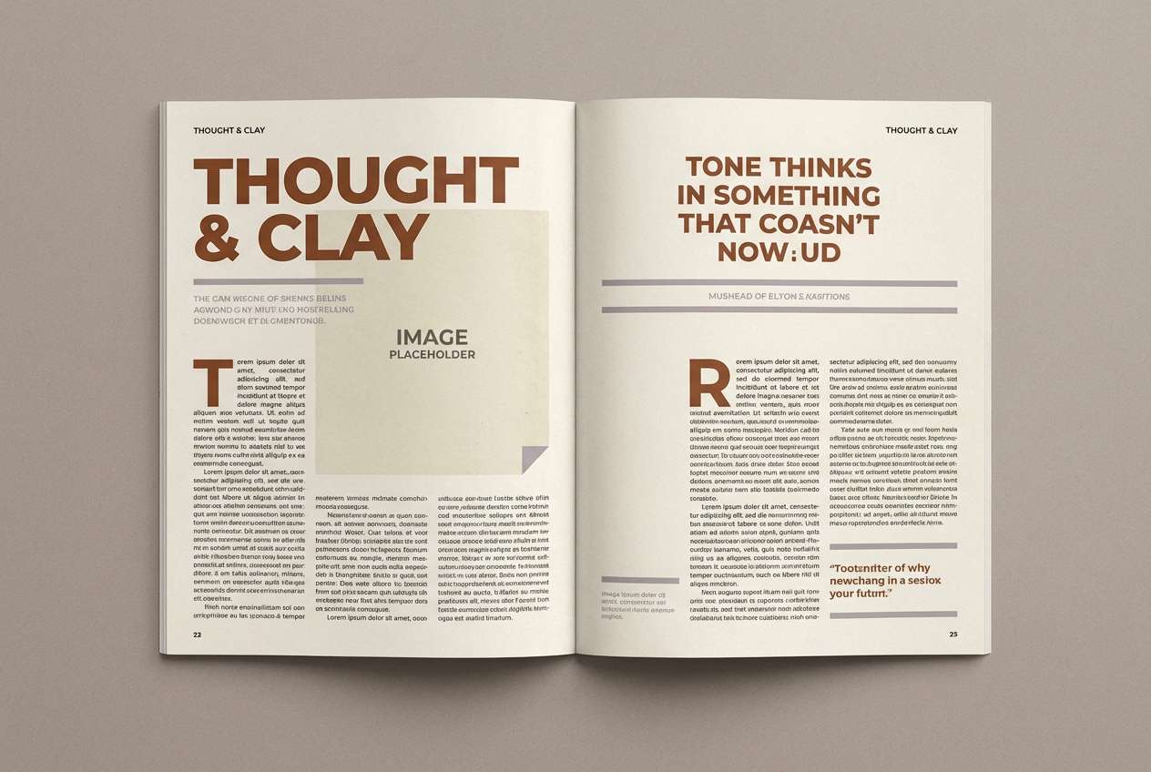
16) Chestnut Fog Editorial
HEX: #c6b1a3 #f0ebe6 #a7a0a6 #d1c8c2 #6e5649
Mood: moody, refined, editorial
Best for: magazine feature spread and typography
Chestnut fog with soft gray-lilac undertones feels refined, like a quiet gallery opening. Use the pale neutral for margins and let chestnut carry headlines and drop caps. The muted gray-lilac is great for pull quotes and section markers without stealing attention. Tip: increase line spacing slightly to keep the darker tones feeling breathable.
Image example of chestnut fog editorial generated using media.io
17) Nutmeg Citrus Pop
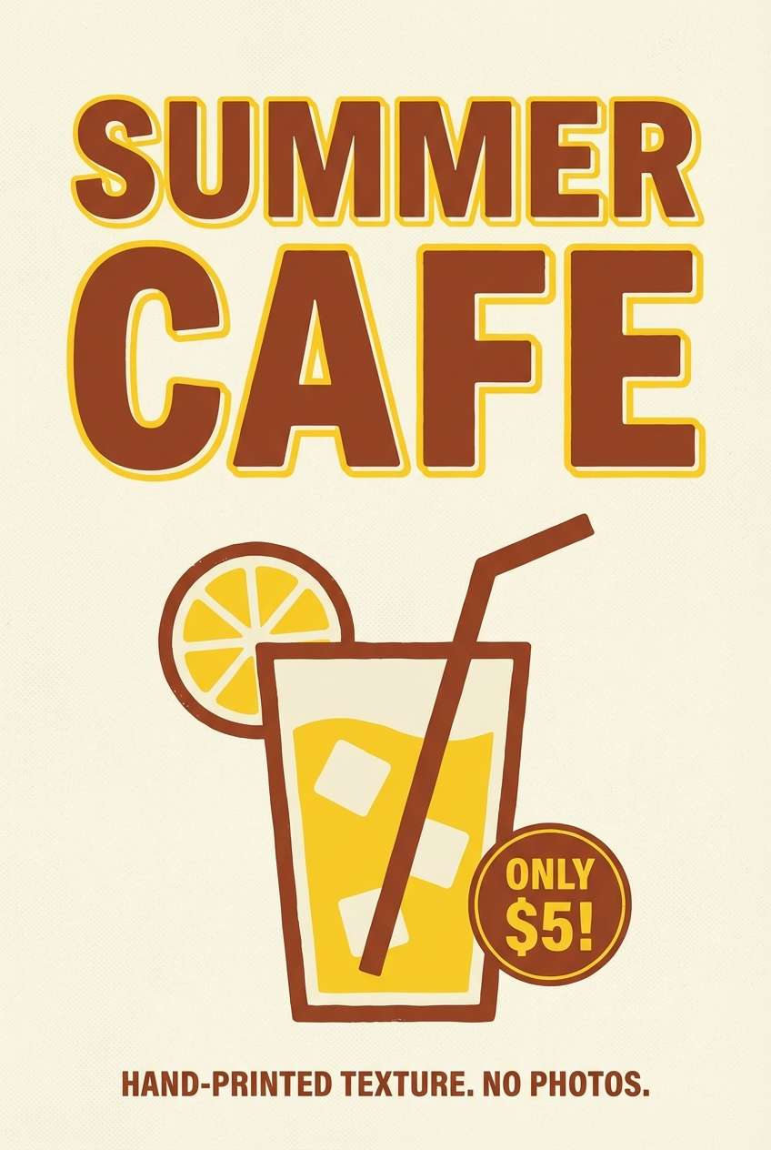
HEX: #cfb5a4 #f6efe8 #f0c06a #d9a48a #8a6a55
Mood: cheerful, zesty, approachable
Best for: summer cafe poster and promo flyer
Nutmeg neutrals with a citrus pop feel cheerful and approachable, like a sunny patio menu. Use the golden accent for price bursts, limited-time offers, or small illustrated fruit shapes. Keep the background light and let the deeper brown handle the headline for legibility. Tip: confine the yellow to one or two elements so it reads intentional, not loud.
Image example of nutmeg citrus pop generated using media.io
18) Soft Umber Monochrome
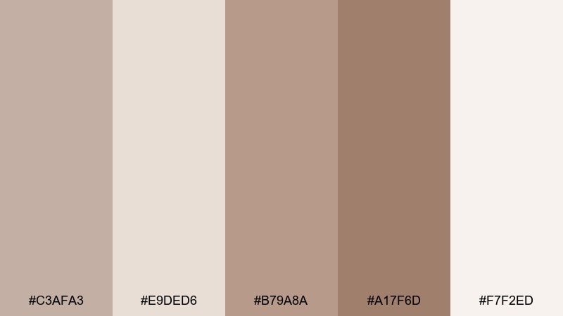
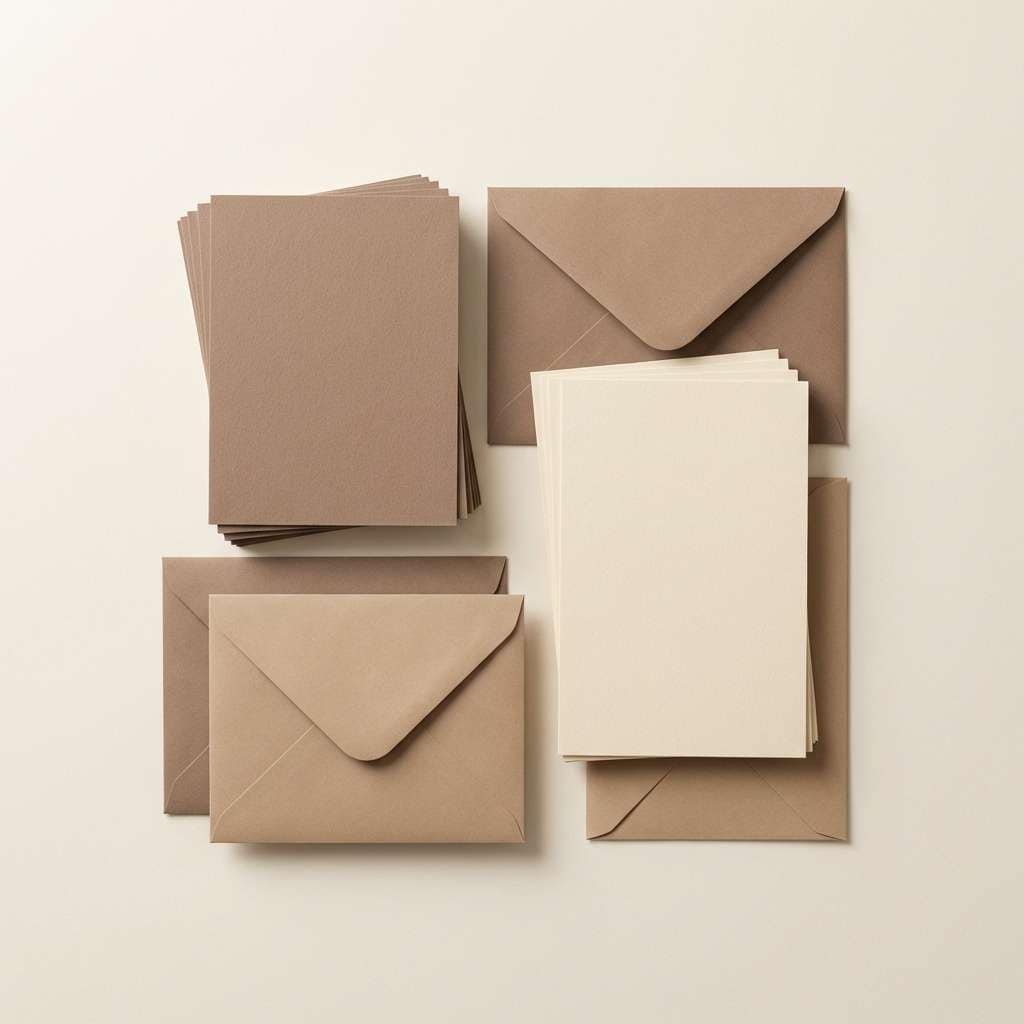
HEX: #c3afa3 #e9ded6 #b79a8a #a17f6d #f7f2ed
Mood: minimal, tonal, soothing
Best for: stationery product shots and brand sets
Soft umber monochrome feels minimal and soothing, like layered paper swatches in a studio. A pastel brown color palette like this is ideal for stationery where texture does the heavy lifting. Use the lightest shade for the base and step up through mid tones for envelopes, cards, and subtle embossing. Tip: photograph with diffused light so the tonal differences stay visible.
Image example of soft umber monochrome generated using media.io
19) Brown Sugar Bloom
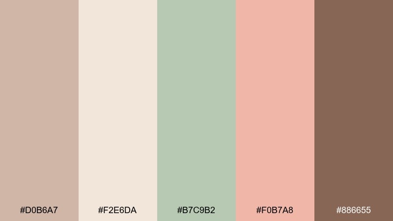
HEX: #d0b6a7 #f2e6da #b7c9b2 #f0b7a8 #886655
Mood: soft, optimistic, springlike
Best for: nursery wall art and gentle prints
Brown sugar warmth with soft bloom tones feels springlike and optimistic, perfect for a calm nursery. Use the cream as the page base, then bring in peach for focal shapes and sage for leafy accents. The deeper brown is best for outlines and small typographic details. Tip: keep shapes rounded and simple so the colors read soothing rather than busy.
Image example of brown sugar bloom generated using media.io
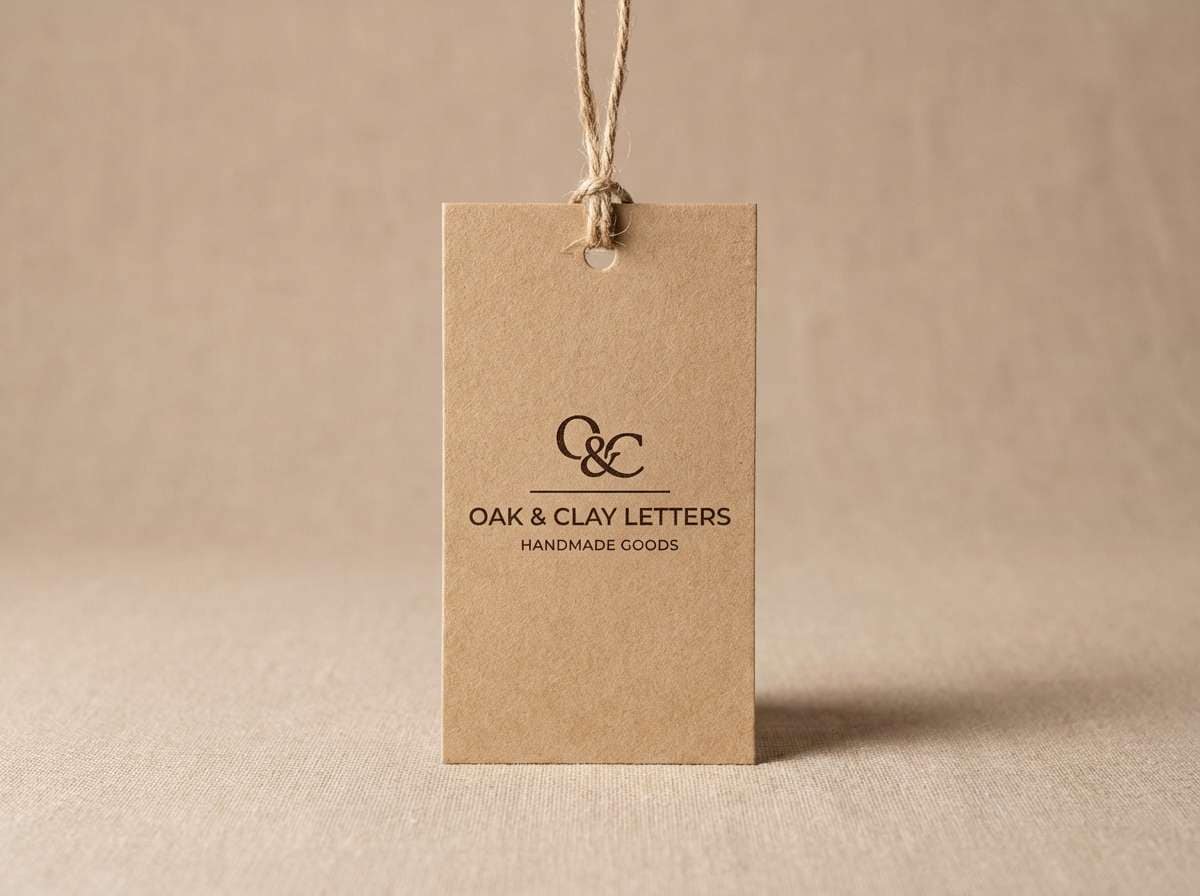
20) Prairie Fawn Light
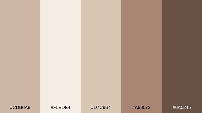
HEX: #cdb6a6 #f5ede4 #d7c6b1 #a98572 #6a5245
Mood: rustic, calm, outdoorsy
Best for: craft paper hang tag and product ad
Prairie fawn tones feel rustic and calm, like sunlit grass and worn leather. Use the light cream for the background and bring in the deeper browns for a bold brand stamp or tag hole reinforcement. Pair with simple icons and minimal copy for an outdoorsy, premium look. Tip: add a subtle shadow under the tag to highlight the warm tonal range.
Image example of prairie fawn light generated using media.io
What Colors Go Well with Pastel Brown?
Pastel brown pairs best with other soft neutrals: cream, off-white, sand, and warm gray. This keeps the palette cohesive and makes typography feel calm but readable.
For a gentle accent, try dusty rose, peach, lilac, or muted terracotta—these add warmth without overpowering the brown base. If you need a fresher vibe, introduce sage, mint, or soft sky blue in small doses.
To avoid a “flat” look, include one darker anchor (cocoa/espresso brown) for headings, icons, or CTAs, and let lighter tones carry the background and spacing.
How to Use a Pastel Brown Color Palette in Real Designs
In UI, treat pastel brown like a friendly alternative to gray: use the lightest shade for surfaces, a mid brown for dividers/cards, and a deeper brown for text and key actions. This creates hierarchy while keeping the interface warm.
For print and packaging, pastel brown shines on uncoated paper, kraft textures, and matte finishes. Use one accent color (like terracotta, blush, or sage) to highlight a scent, flavor, or feature, then keep the rest minimal for a premium feel.
In interiors or decor boards, let cream and beige cover the big areas (walls, rugs, upholstery) and bring pastel brown into wood, trim, or small furniture. Add a muted green or blue through textiles and plants for balance.
Create Pastel Brown Palette Visuals with AI
If you want to preview how a pastel brown color scheme looks on a landing page, label, invitation, or room moodboard, generating quick visuals helps you choose the right balance of contrast and accents.
With Media.io, you can turn a short prompt into clean mockups and style frames, then iterate fast by swapping accents (sage, blush, sky blue) while keeping the same warm neutral base.
Pastel Brown Color Palette FAQs
-
What is a pastel brown color?
Pastel brown is a light, softened brown with added white/brightness, often reading like latte, biscuit, sand, or clay. It keeps the warmth of brown without the heaviness of deep chocolate tones. -
Is pastel brown good for UI design?
Yes—especially for wellness, lifestyle, boutique, and editorial brands. Use a very light cream/off-white for the main background and reserve a deeper brown for body text and CTAs to maintain accessibility and contrast. -
What accent colors go best with pastel brown?
Muted accents work best: sage/mint greens, dusty rose/blush, soft lavender, sky blue, and gentle terracotta. Keep the accent coverage low so the palette stays calm and premium. -
How do I keep a pastel brown palette from looking dull?
Add one darker “anchor” shade for headings and key UI states, and include a small cool counterbalance (sage or soft blue). Also rely on texture—paper grain, shadows, or natural materials—to increase depth. -
What’s a safe text color on pastel brown backgrounds?
Use a deeper cocoa/espresso brown rather than pure black for a softer look, and test contrast for readability. On very light creams, a dark brown typically reads clean and less harsh than black. -
Are pastel brown palettes good for weddings and invitations?
They’re ideal for romantic, vintage, and modern-minimal wedding styles. Pair pastel brown with blush, warm white, and a muted rose accent, then use elegant typography to keep it timeless. -
Can I generate pastel brown palette mockups with AI?
Yes. Use Media.io’s text-to-image tool to create quick UI frames, packaging shots, invitations, or interior moodboards—then refine prompts by specifying materials (matte paper, kraft label, linen texture) and lighting (soft diffused).
Next: Fawn Color Palette


