

Pink maroon is a modern romantic pairing: soft blush and berry tints deliver warmth, while deep maroon adds structure and premium depth. Together, they create palettes that feel expressive without becoming overly sweet.
Below are 20 pink maroon color palette ideas with HEX codes, plus practical tips and AI image prompts you can reuse for branding, UI, invitations, packaging, and social graphics.
In this article
- Why Pink Maroon Palettes Work So Well
-
- rosewood blush
- velvet berry
- dusty petal and merlot
- cocoa rose
- garnet glow
- mauve noir
- peony wine
- antique rose and oxblood
- ballet slipper maroon
- cherry truffle
- plum sangria
- blush clay
- rose gold cabernet
- cranberry cream
- smoky raspberry
- maroon meadow
- orchid mahogany
- pink terracotta
- festival fuchsia wine
- minimal blush and burgundy
- What Colors Go Well with Pink Maroon?
- How to Use a Pink Maroon Color Palette in Real Designs
- Create Pink Maroon Palette Visuals with AI
Why Pink Maroon Palettes Work So Well
Pink maroon palettes balance softness and authority in a single system. Light blushes and rosy mids make layouts feel welcoming, while maroon anchors hierarchy, improves legibility, and adds an upscale finish.
They also travel well across mediums: on screens, maroon can replace harsh black for navigation and headings; in print, it looks rich on textured stocks and pairs naturally with metallic foils and warm neutrals.
Most importantly, pink maroon is flexible in mood. With brighter pinks it becomes energetic and campaign-ready; with dusty mauves and browns, it turns calm, artisanal, and editorial.
20+ Pink Maroon Color Palette Ideas (with HEX Codes)
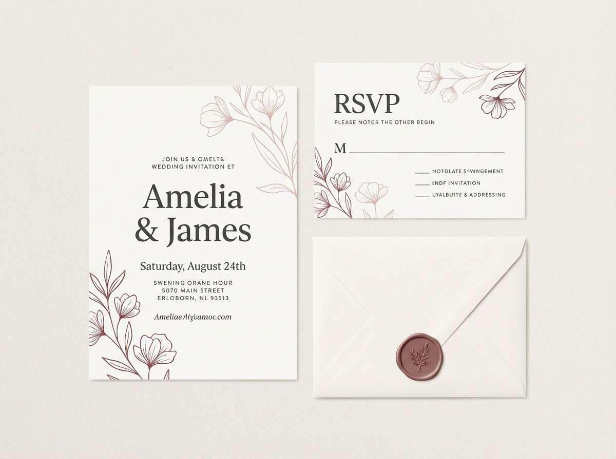
1) Rosewood Blush
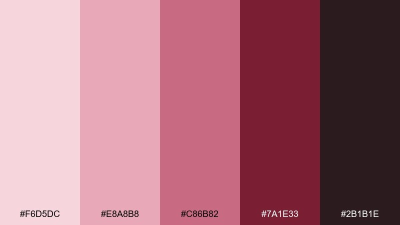
HEX: #F6D5DC #E8A8B8 #C86B82 #7A1E33 #2B1B1E
Mood: romantic, elegant, warm
Best for: wedding invitations and stationery
Romantic and candlelit, these tones feel like roses against dark wood. The blush-to-rosewood range reads premium without turning too loud, making it ideal for invites, menus, and monograms. Pair with ivory paper stock and a touch of matte gold foil for a classic finish. Tip: keep body text in near-black and reserve maroon for headings and borders.
Image example of rosewood blush generated using media.io
Media.io is an online AI studio for creating and editing video, image, and audio in your browser.

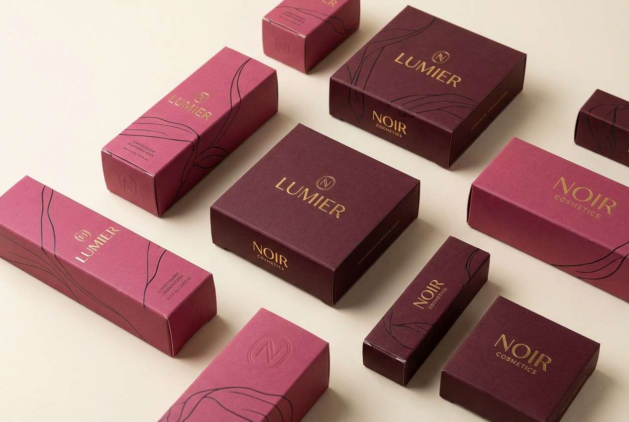
2) Velvet Berry
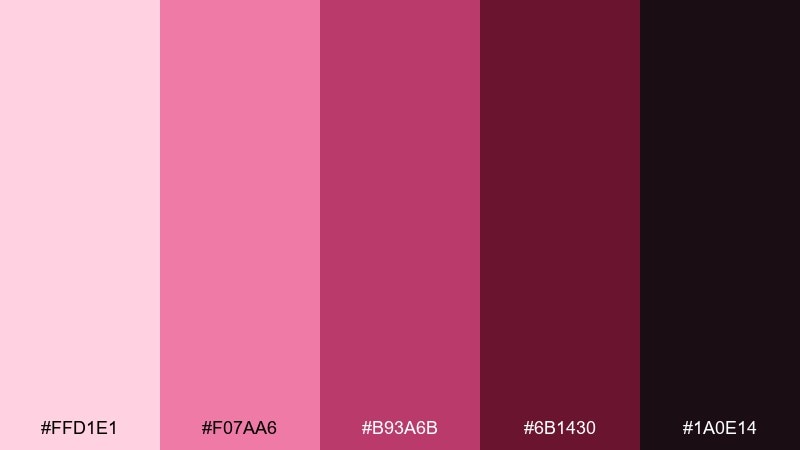
HEX: #FFD1E1 #F07AA6 #B93A6B #6B1430 #1A0E14
Mood: bold, luxe, night-out
Best for: beauty branding and lipstick packaging
Bold and velvety, this mix evokes berry stains and satin fabrics under warm lights. It works beautifully for cosmetics where contrast and richness sell the product story. Pair with black or soft cream backgrounds to keep the berry tones in control. Tip: use the hot pink as a small highlight for calls to action, not as a full background.
Image example of velvet berry generated using media.io
3) Dusty Petal and Merlot
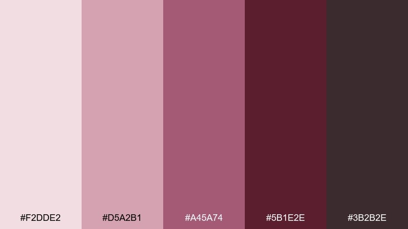
HEX: #F2DDE2 #D5A2B1 #A45A74 #5B1E2E #3B2B2E
Mood: soft, vintage, composed
Best for: editorial layouts and magazine covers
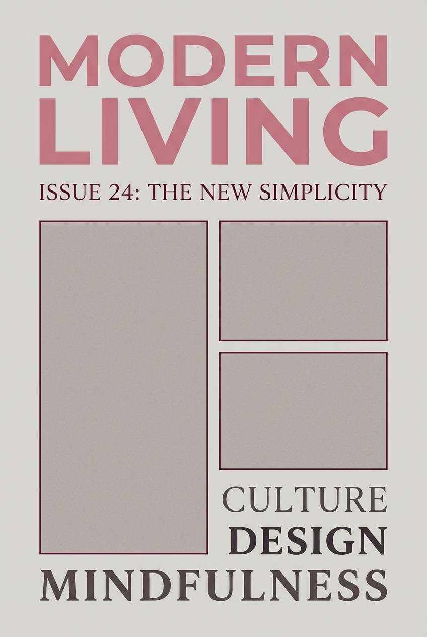
Soft and editorial, the dusty petals feel like vintage film with a merlot shadow. It suits fashion spreads, beauty editorials, and cover lines that need elegance without harsh contrast. Pair with warm gray grids and plenty of white space to keep it airy. Tip: use the merlot tone for section dividers and pull quotes to guide scanning.
Image example of dusty petal and merlot generated using media.io
4) Cocoa Rose
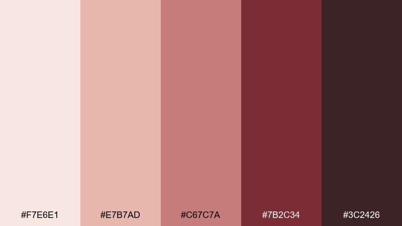
HEX: #F7E6E1 #E7B7AD #C67C7A #7B2C34 #3C2426
Mood: cozy, artisanal, grounded
Best for: coffee shop branding and menu design
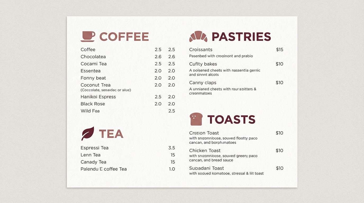
Cozy and handcrafted, it reads like cocoa dusted over rose cream. This pink maroon color palette is a strong fit for cafes, bakeries, and small-batch brands that want warmth over gloss. Pair with kraft textures and off-white backgrounds, then let maroon anchor headings. Tip: keep the mid rose as the primary brand color and use cocoa-brown sparingly for depth.
Image example of cocoa rose generated using media.io
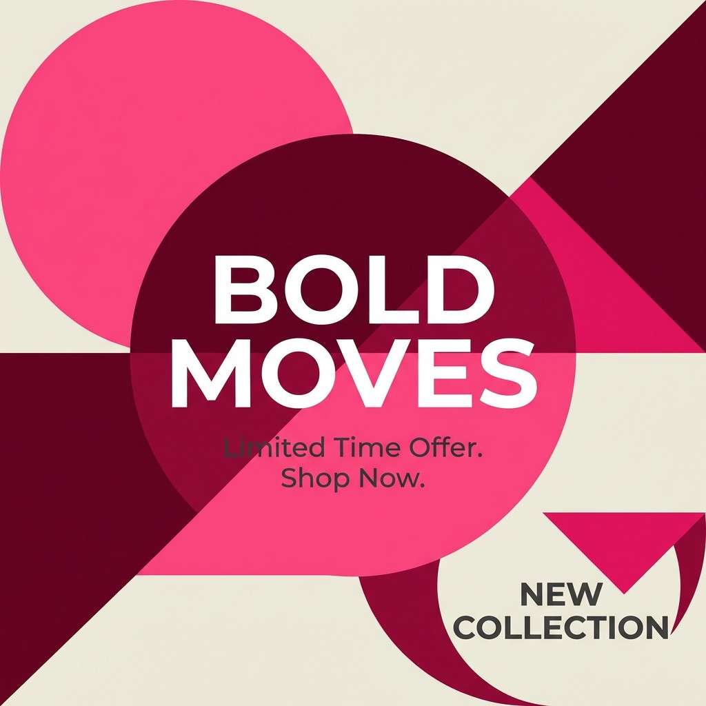
5) Garnet Glow
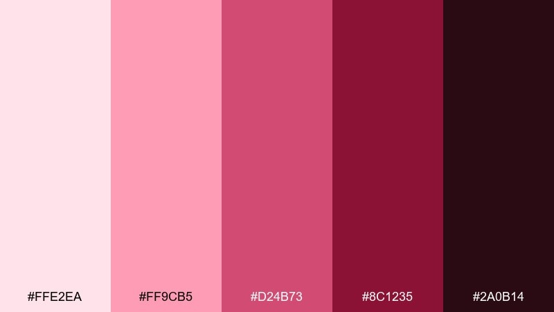
HEX: #FFE2EA #FF9CB5 #D24B73 #8C1235 #2A0B14
Mood: energetic, glossy, confident
Best for: social ads and campaign graphics
Energetic and glossy, these shades feel like garnet highlights on polished makeup. The high contrast makes campaign text pop, especially on short-form social creatives. Pair with white space and minimal shapes so the bright pink does not overwhelm. Tip: reserve the deepest maroon for small type and legal lines to maintain readability.
Image example of garnet glow generated using media.io
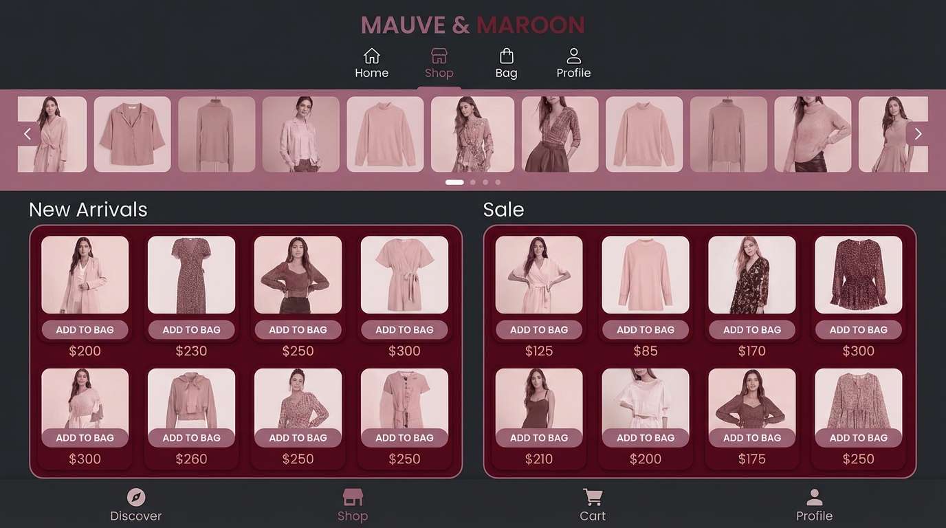
6) Mauve Noir
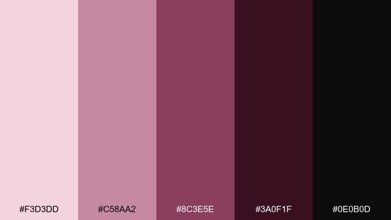
HEX: #F3D3DD #C58AA2 #8C3E5E #3A0F1F #0E0B0D
Mood: moody, modern, dramatic
Best for: app UI for fashion and lifestyle
Moody and modern, this palette feels like mauve velvet against a noir backdrop. It is ideal for fashion or lifestyle UI where depth and drama build a premium vibe. Pair with warm grays for surfaces and use the blush as a highlight state. Tip: keep primary buttons in mauve and use near-black for navigation bars to reduce glare.
Image example of mauve noir generated using media.io
7) Peony Wine
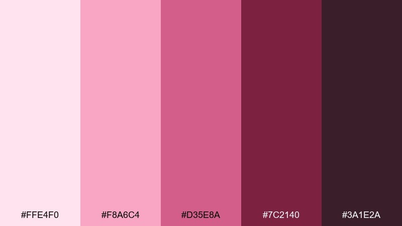
HEX: #FFE4F0 #F8A6C4 #D35E8A #7C2140 #3A1E2A
Mood: playful, romantic, vibrant
Best for: boutique ecommerce hero banners
Playful and romantic, peony pinks melt into a wine-dark base for a lively storefront look. These pink maroon color combinations work best when the lightest tint leads the page and the wine shade frames key messaging. Pair with soft cream and minimal product shadows to keep it fresh. Tip: use the mid pink for badges like new or limited to draw quick attention.
Image example of peony wine generated using media.io
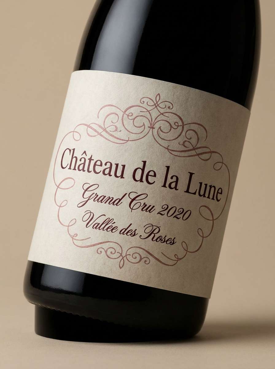
8) Antique Rose and Oxblood
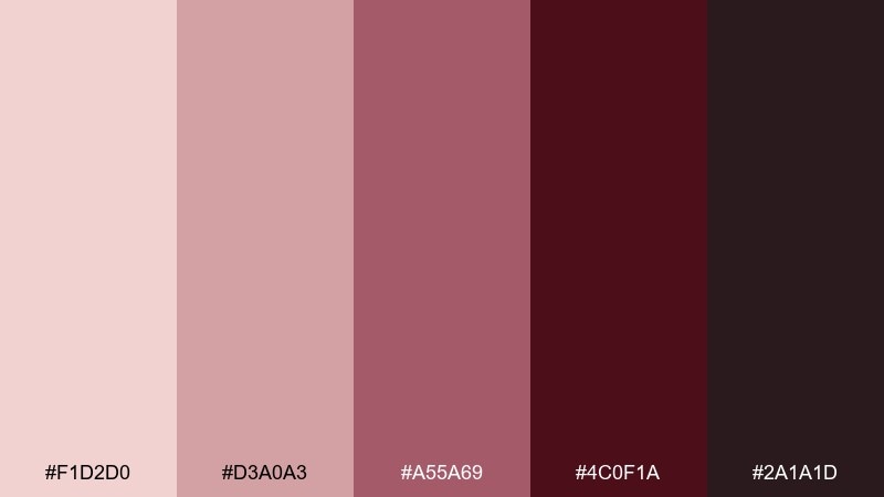
HEX: #F1D2D0 #D3A0A3 #A55A69 #4C0F1A #2A1A1D
Mood: heritage, refined, timeless
Best for: wine labels and premium packaging
Heritage and refined, antique rose tones meet an oxblood base like an old cellar label. It suits premium packaging where you want tradition with a gentle modern lift. Pair with textured paper, embossed details, and a restrained cream background. Tip: keep the darkest shade for the label border and use the antique rose for secondary information blocks.
Image example of antique rose and oxblood generated using media.io
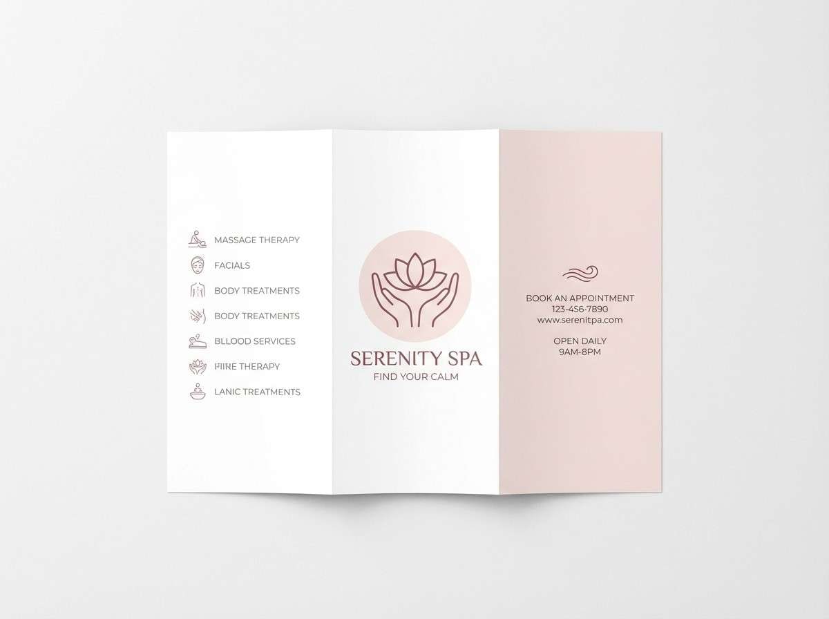
9) Ballet Slipper Maroon
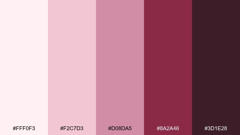
HEX: #FFF0F3 #F2C7D3 #D08DA5 #8A2A46 #3D1E28
Mood: delicate, graceful, calm
Best for: spa brochures and wellness branding
Delicate and calming, these shades evoke ballet satin, soft lighting, and slow mornings. They are a natural fit for wellness brands that need warmth without loud color. Pair with plenty of white space and gentle photography for a serene feel. Tip: use the maroon as a thin rule line and keep large blocks in the pale blush to stay light.
Image example of ballet slipper maroon generated using media.io
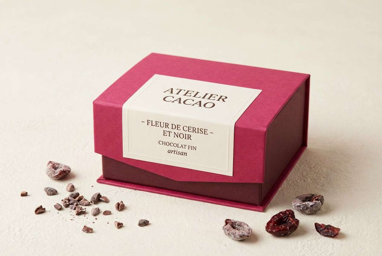
10) Cherry Truffle
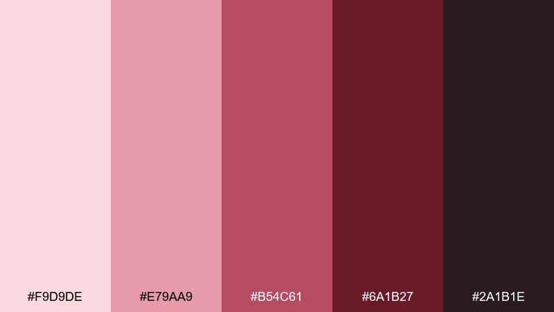
HEX: #F9D9DE #E79AA9 #B54C61 #6A1B27 #2A1B1E
Mood: rich, sweet, intimate
Best for: dessert brand packaging and product ads
Rich and sweet, this set feels like cherry syrup over dark chocolate. The contrast is appetizing and works well for dessert packaging, seasonal promos, and product ads. Pair with cream backdrops and subtle brown textures to reinforce the truffle vibe. Tip: highlight flavor names in the cherry tone and keep the rest of the copy in deep cocoa for clarity.
Image example of cherry truffle generated using media.io
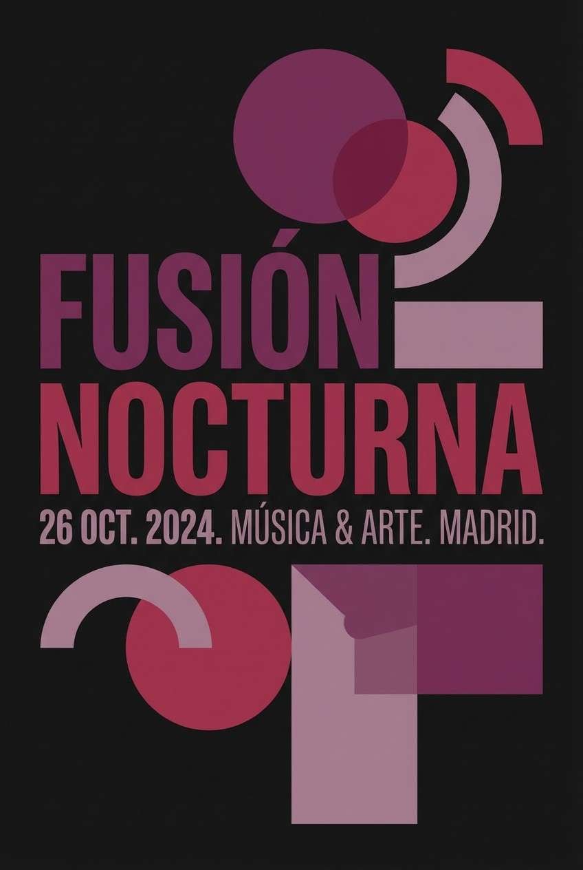
11) Plum Sangria
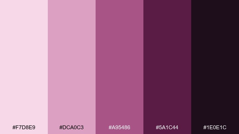
HEX: #F7D8E9 #DCA0C3 #A95486 #5A1C44 #1E0E1C
Mood: mysterious, romantic, upscale
Best for: nightlife event posters
Mysterious and upscale, plum and sangria tones bring a late-night glow to layouts. This pink maroon color scheme works best when you lean into dark backgrounds and let the lighter mauve do the highlighting. Pair with crisp white type and minimal gradients for a modern club feel. Tip: keep the brightest tint for the event date and ticket URL to improve quick scanning.
Image example of plum sangria generated using media.io
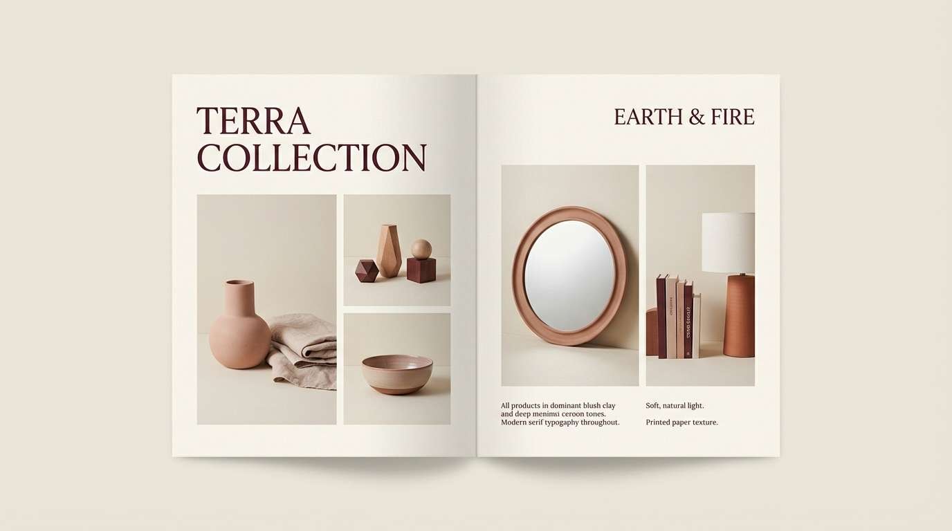
12) Blush Clay
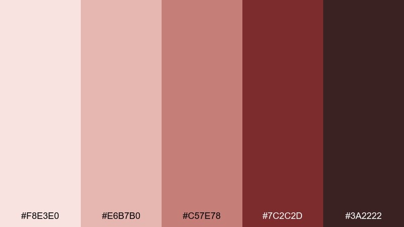
HEX: #F8E3E0 #E6B7B0 #C57E78 #7C2C2D #3A2222
Mood: earthy, warm, rustic
Best for: home decor branding and lookbooks
Earthy and warm, these blush-clay tones feel like sunbaked pottery and linen. They work well for interior brands, ceramics studios, and rustic lookbooks. Pair with natural textures like tan paper, oak, and soft cream to keep it grounded. Tip: use the clay rose as the dominant background and save the maroon for headlines and logos.
Image example of blush clay generated using media.io
13) Rose Gold Cabernet
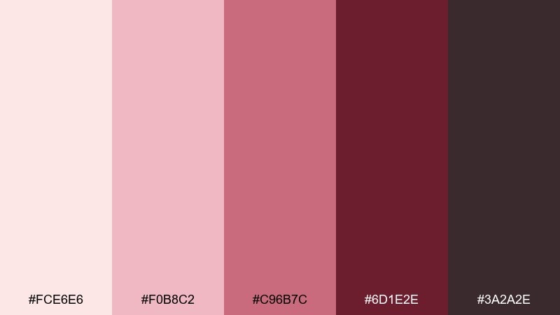
HEX: #FCE6E6 #F0B8C2 #C96B7C #6D1E2E #3A2A2E
Mood: glam, polished, celebratory
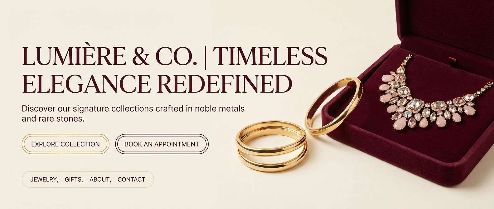
Best for: jewelry ads and luxury landing pages
Glam and polished, rose gold softness meets cabernet depth for a celebratory shine. It is a great fit for jewelry campaigns where you want warmth and a premium edge. Pair with creamy whites, fine line icons, and subtle metallic textures. Tip: let cabernet handle primary CTAs while blush supports cards and secondary sections.
Image example of rose gold cabernet generated using media.io
14) Cranberry Cream
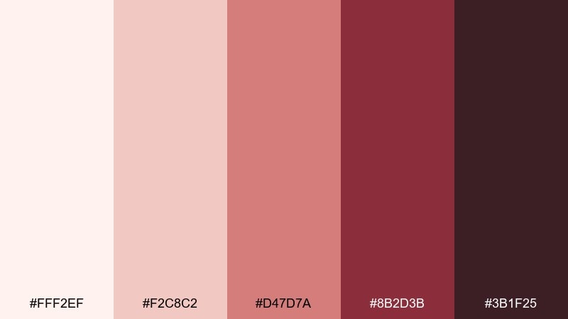
HEX: #FFF2EF #F2C8C2 #D47D7A #8B2D3B #3B1F25
Mood: comforting, festive, friendly
Best for: holiday email headers and promos
Comforting and festive, cranberry and cream feel like winter desserts and warm gatherings. The palette stays friendly while still giving you enough contrast for promotional text. Pair with simple icons and plenty of cream space so the cranberry does not dominate. Tip: use the mid cranberry for buttons and keep body text in a near-black for accessibility.
Image example of cranberry cream generated using media.io

15) Smoky Raspberry
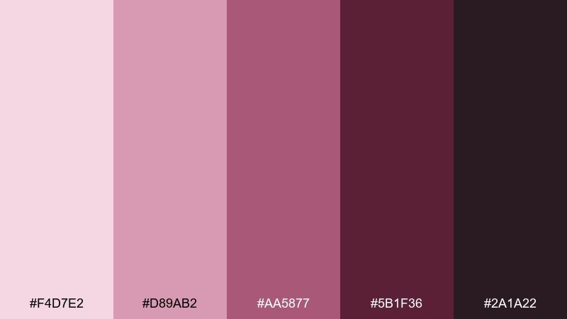
HEX: #F4D7E2 #D89AB2 #AA5877 #5B1F36 #2A1A22
Mood: muted, atmospheric, modern
Best for: podcast cover art and thumbnails
Muted and atmospheric, smoky raspberry tones give a modern, intimate feel. They are strong for podcast covers where you need legibility at small sizes without harsh colors. Pair with high-contrast white type and simple shapes rather than busy photography. Tip: use the deepest maroon behind the title and keep the lighter pink for supporting badges.
Image example of smoky raspberry generated using media.io
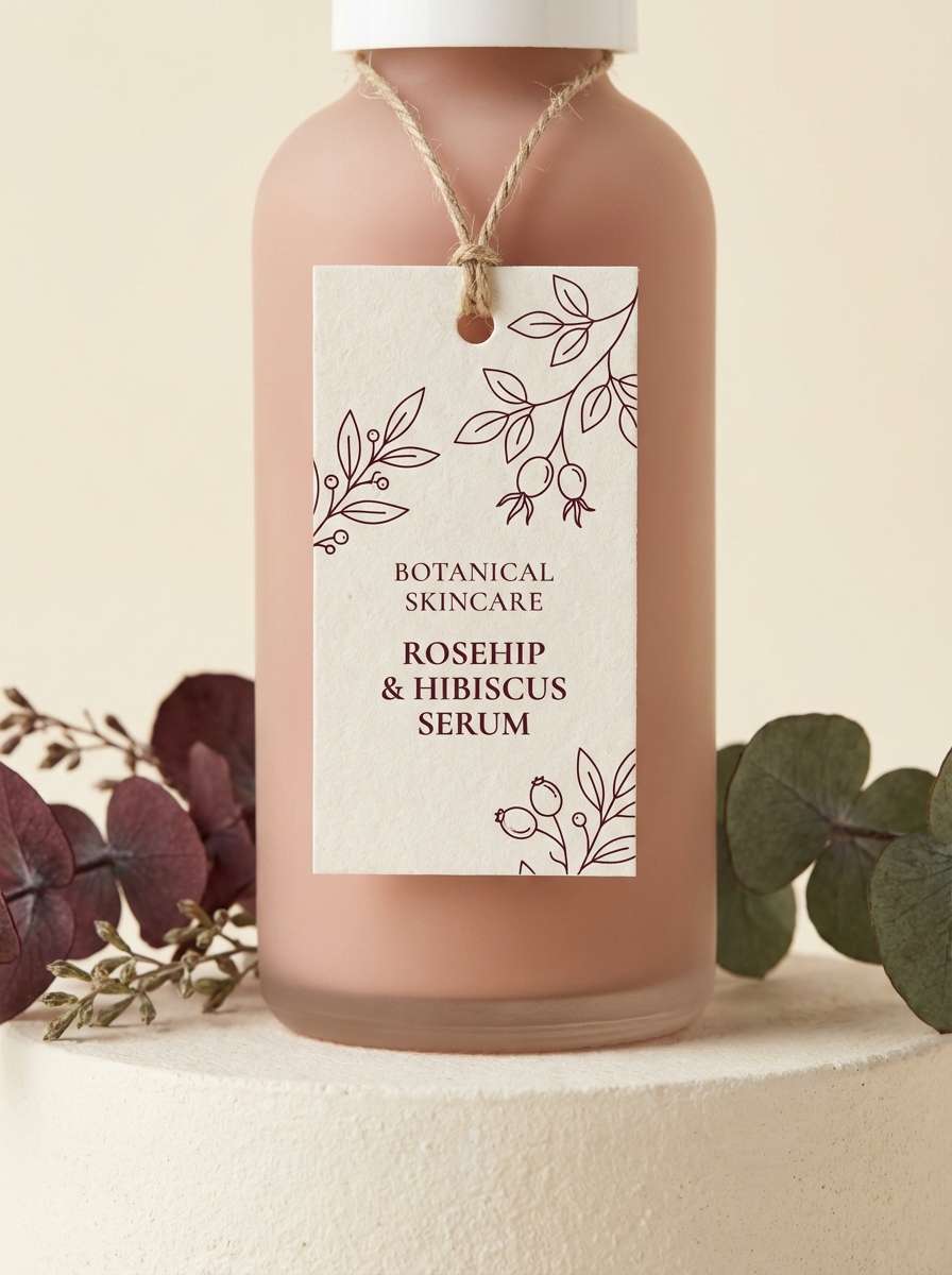
16) Maroon Meadow
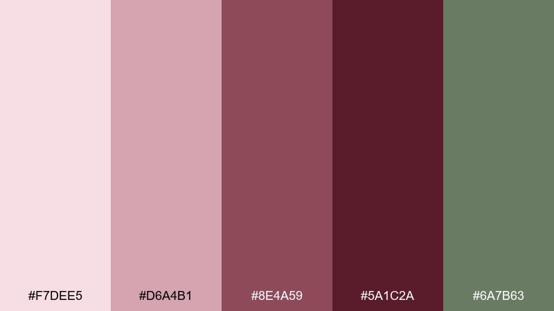
HEX: #F7DEE5 #D6A4B1 #8E4A59 #5A1C2A #6A7B63
Mood: natural, balanced, slightly vintage
Best for: botanical labels and skincare packaging
Natural and balanced, the maroon base feels softened by meadow greens and blush tints. It is a thoughtful choice for botanical skincare where you want romance plus credibility. Pair with off-white labels and simple botanical line drawings to keep it clean. Tip: keep the green as a supporting accent on seals or ingredients, not as the main background.
Image example of maroon meadow generated using media.io
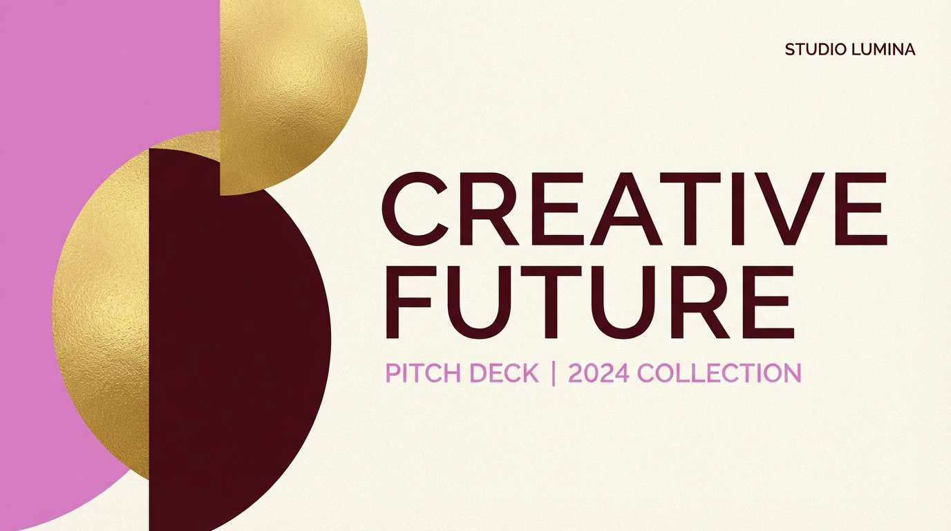
17) Orchid Mahogany
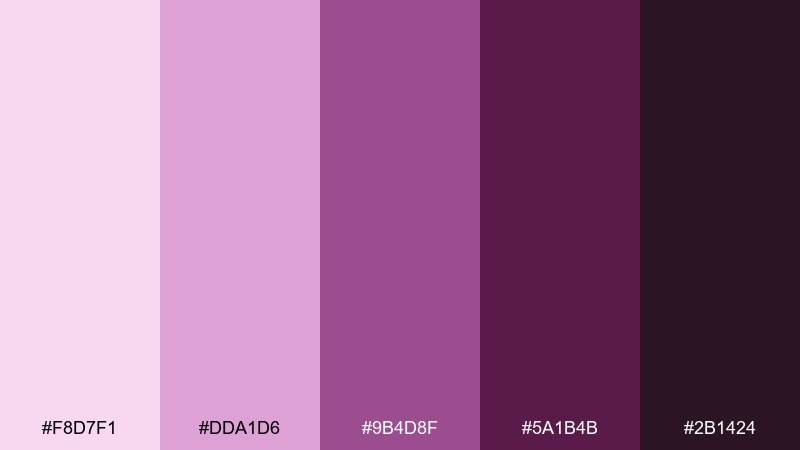
HEX: #F8D7F1 #DDA1D6 #9B4D8F #5A1B4B #2B1424
Mood: creative, expressive, luxe
Best for: creative agency branding and pitch decks
Creative and expressive, orchid highlights sit on a mahogany base like ink on velvet paper. The mix feels premium but not conservative, perfect for agencies and portfolios. Pair with clean grids and monochrome photography to keep the colors in charge. Tip: use orchid for key charts and callouts, then let mahogany ground the cover and section headers.
Image example of orchid mahogany generated using media.io
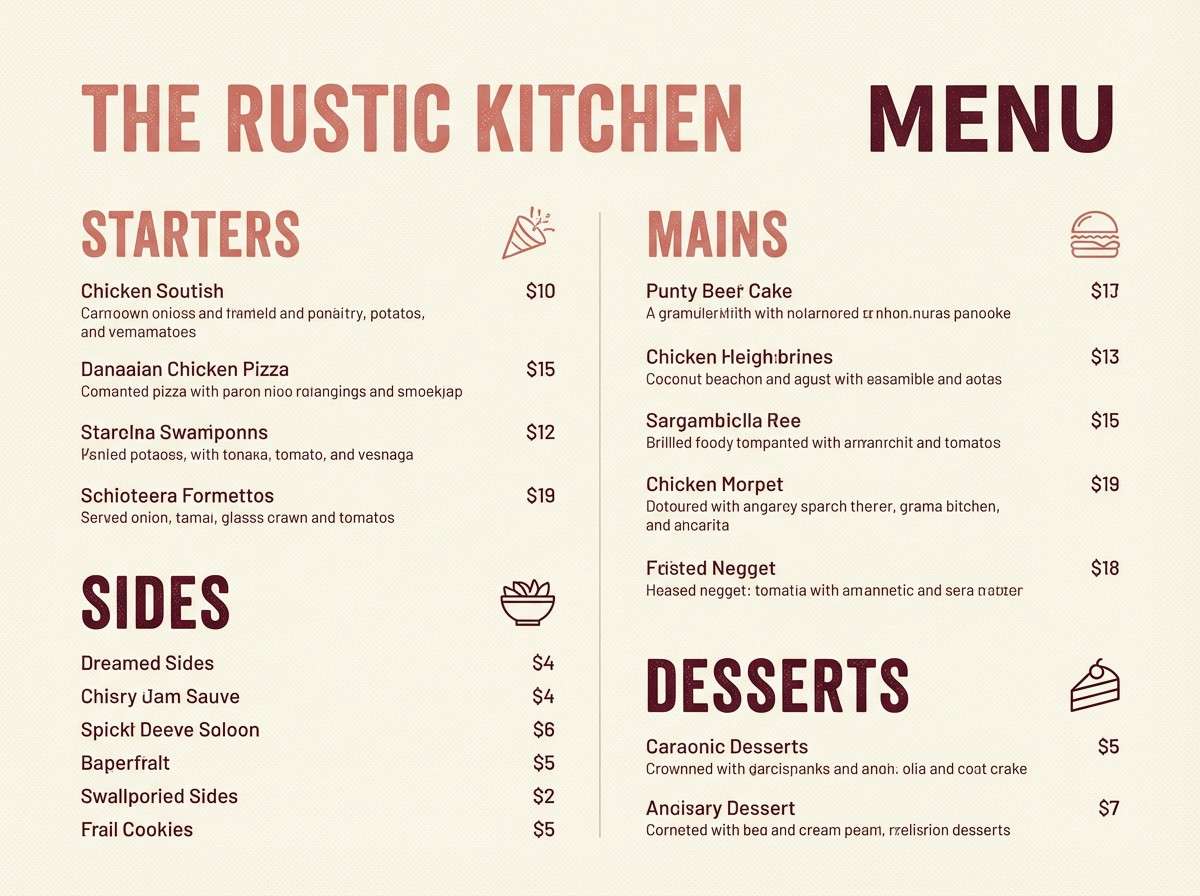
18) Pink Terracotta
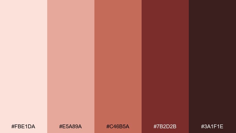
HEX: #FBE1DA #E5A89A #C46B5A #7B2D2B #3A1F1E
Mood: sun-warmed, rustic, inviting
Best for: restaurant menus and Mediterranean branding
Sun-warmed and rustic, pink terracotta feels like clay walls at golden hour. This pink maroon color palette shines on restaurant menus, signage, and food packaging that leans artisanal. Pair with creamy whites and subtle olive accents for a Mediterranean touch. Tip: keep large backgrounds light and use terracotta and maroon for section headers and price highlights.
Image example of pink terracotta generated using media.io
19) Festival Fuchsia Wine
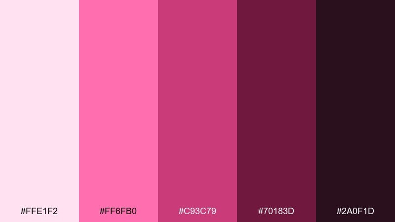
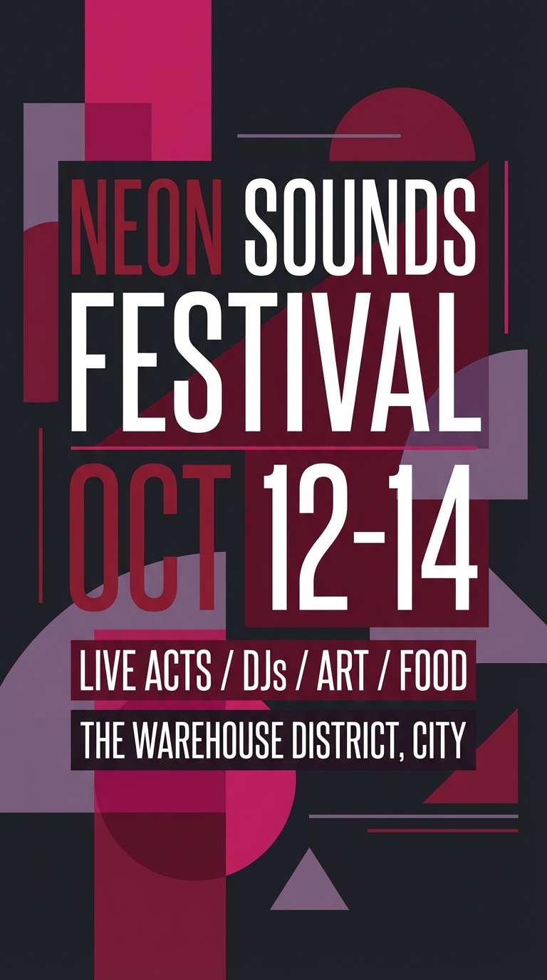
HEX: #FFE1F2 #FF6FB0 #C93C79 #70183D #2A0F1D
Mood: fun, electric, confident
Best for: music festival flyers and ticket graphics
Fun and electric, fuchsia flashes over wine-dark shadows for instant energy. These pink maroon color combinations work best with bold type, simple shapes, and high contrast. Pair with black or off-white backgrounds to keep the fuchsia punchy and readable. Tip: limit fuchsia to headers and badges, then let the wine shade handle large blocks and gradients.
Image example of festival fuchsia wine generated using media.io
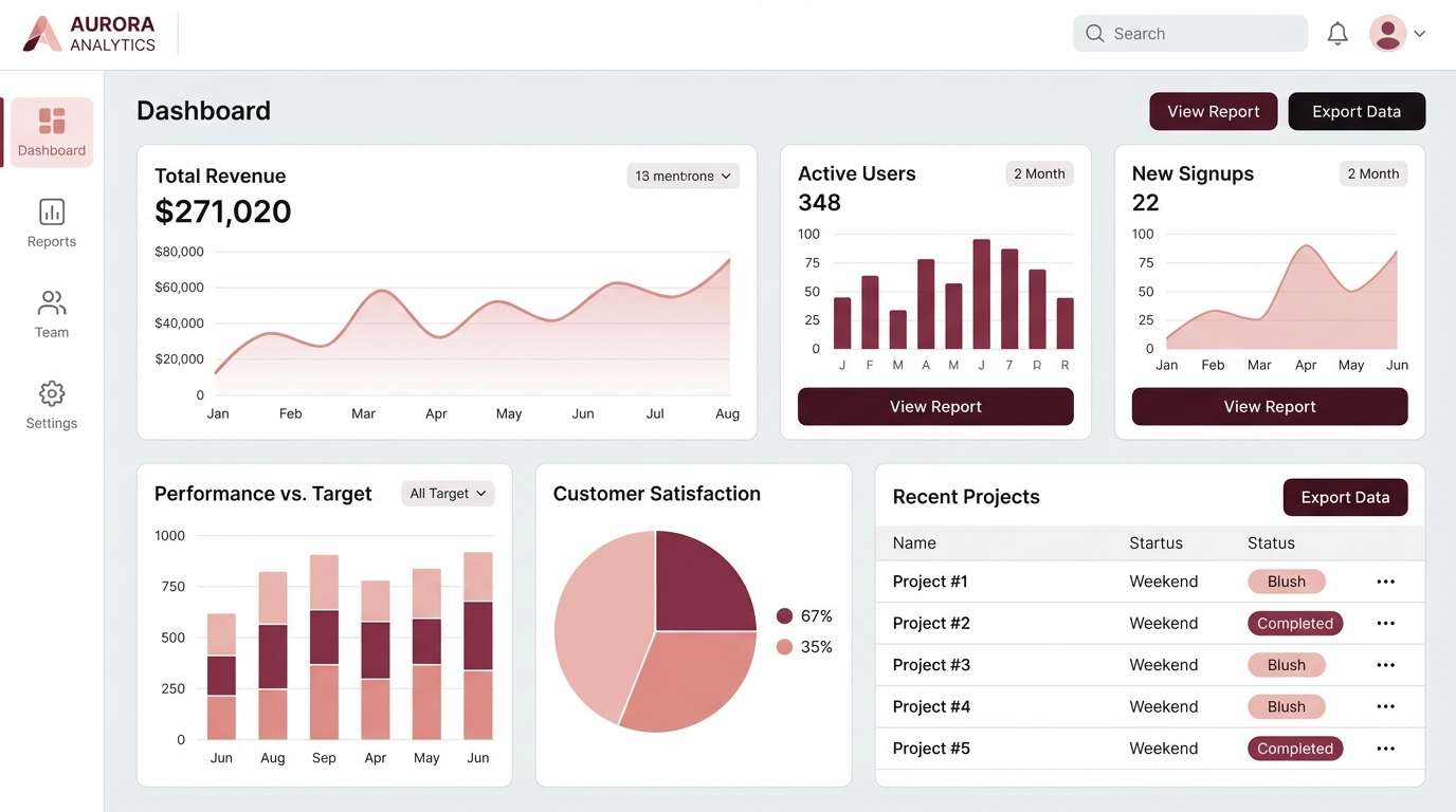
20) Minimal Blush and Burgundy
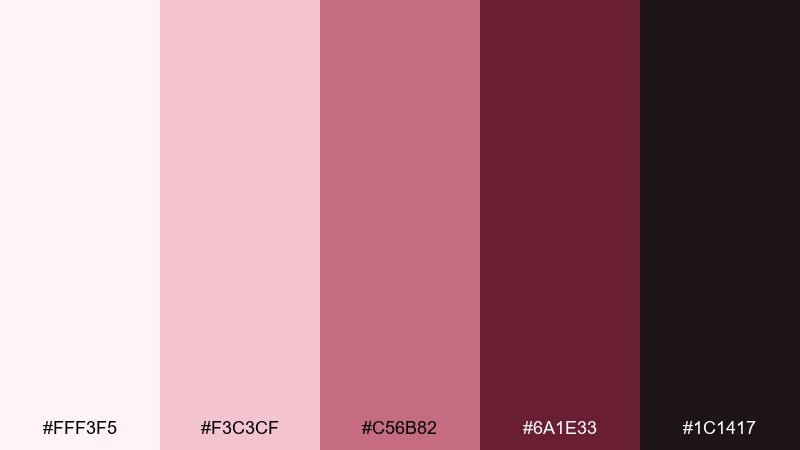
HEX: #FFF3F5 #F3C3CF #C56B82 #6A1E33 #1C1417
Mood: minimal, chic, structured
Best for: clean UI dashboards and SaaS marketing pages
Minimal and chic, blush tints and burgundy anchors create a structured, grown-up look. The contrast is strong enough for data-heavy layouts while staying warm and welcoming. Pair with light gray surfaces and thin dividers to maintain clarity. Tip: use burgundy for primary actions and the soft blush for hover states and subtle notification backgrounds.
Image example of minimal blush and burgundy generated using media.io
What Colors Go Well with Pink Maroon?
Neutrals are the easiest win: ivory, warm white, cream, and soft gray keep pink maroon feeling modern and readable. For typography, near-black or deep charcoal usually outperforms pure black with these warm tones.
For elegant contrast, try muted greens (sage, olive, meadow green) or dusty blues (slate, steel). These cool accents temper the romance and add credibility for skincare, editorial, and UI.
If you want a richer look, layer in warm metals and browns: matte gold, copper, cocoa, and espresso deepen the palette without fighting the maroon base.
How to Use a Pink Maroon Color Palette in Real Designs
Start with role assignment: use the lightest blush as your main background, a mid pink for secondary surfaces or badges, and maroon for headings, CTAs, and key dividers. This keeps pages airy while still feeling premium.
For print (invitations, packaging), let maroon do the anchoring on borders, monograms, or label frames, and keep the rest on warm stock like ivory or cream. Small metallic details (foil or ink) elevate the palette fast.
For UI, watch accessibility: reserve saturated pinks for accents (hover, highlights, small tags) and rely on maroon/near-black for text. That approach protects readability while preserving the romantic brand vibe.
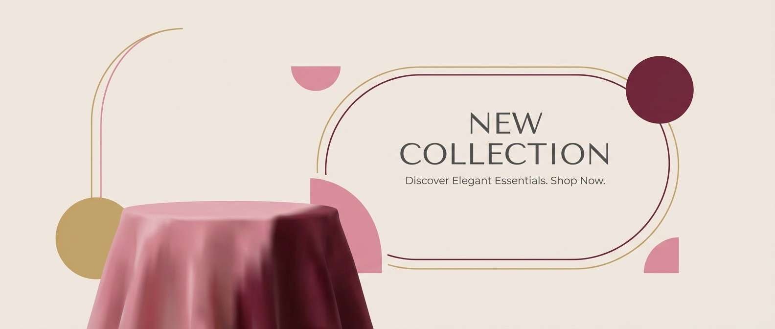
Create Pink Maroon Palette Visuals with AI
When you need fast mockups—invitation suites, packaging concepts, hero banners, or UI screens—AI visuals help you validate a pink maroon direction before production. The prompts in each palette are designed to be copy-paste ready.
In Media.io, you can generate multiple variations, switch aspect ratios, and test backgrounds (cream vs. dark) to see how your maroon anchors and blush highlights behave in real layouts.
Once you find a winning look, reuse the same prompt structure with your brand keywords (materials, product type, typography style) for consistent creatives across campaigns.
Pink Maroon Color Palette FAQs
-
What is a pink maroon color palette?
A pink maroon palette combines light pink/blush tones with deeper maroon, burgundy, or wine shades. The result is a warm scheme that can feel romantic, premium, or modern depending on saturation and contrast. -
Is maroon closer to red or purple?
Maroon is typically a dark red with brown or purple undertones. Burgundy leans more purple, while oxblood often leans browner and deeper. -
What neutral colors pair best with pink maroon?
Ivory, cream, warm white, greige, and warm gray are the most reliable. For text, use near-black/charcoal instead of pure black to keep the overall warmth consistent. -
Can I use pink maroon in a professional brand or SaaS UI?
Yes—keep blush for backgrounds and states, and use burgundy/maroon for primary actions and headings. Limiting bright pink to small accents helps the UI stay clean and readable. -
What accent colors make pink maroon look less “sweet”?
Muted greens (sage/olive), slate blues, and warm grays reduce the candy feel and add balance. Using deeper maroon as the anchor also shifts the palette toward premium and mature. -
How do I avoid readability issues with dark maroon?
Use high-contrast text (warm white on maroon, or near-black on blush), increase font weight for small labels, and avoid placing long paragraphs on saturated pink backgrounds. -
How can I generate pink maroon palette mockups quickly?
Use Media.io text-to-image to create invitation, packaging, poster, or UI mockups from prompts. Start with one of the prompts above, then swap keywords (product type, paper texture, typography style) to match your brand.
Next: Lemon Color Palette


