

Fawn is a warm, flexible neutral that sits between tan and beige, making it easy to build palettes that feel natural without looking flat. It’s especially useful when you want a soft, premium base for typography, product shots, or UI.
Below are fawn color palette ideas with ready-to-use HEX codes, plus practical pairing notes and AI prompts you can reuse to generate matching visuals.
In this article
Why Fawn Palettes Work So Well
Fawn reads as warm and approachable, but it’s neutral enough to support almost any accent color—so your designs feel cohesive without forcing a “theme.” It also tends to flatter photography by adding gentle warmth rather than heavy saturation.
In branding and UI, fawn tones create a quiet hierarchy: light creams for backgrounds, mid tans for surfaces, and deep browns for type and CTAs. That range makes it easy to design for contrast and readability while staying soft.
Because it’s associated with natural materials (linen, leather, wood, paper), fawn palettes instantly communicate craft, calm, and trust—useful for lifestyle, wellness, editorial, and modern retail.
20+ Fawn Color Palette Ideas (with HEX Codes)
1) Desert Linen
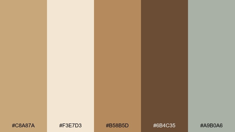
HEX: #c8a87a #f3e7d3 #b58b5d #6b4c35 #a9b0a6
Mood: airy, sun-warmed, calm
Best for: lifestyle brand hero banner
Airy and sun-warmed, it feels like linen curtains in late afternoon light. Use the creamy beige as your background, then let the fawn and caramel tones carry headings and key blocks. The deep walnut shade anchors CTAs without feeling harsh. For a clean finish, keep accents to the soft sage and add generous whitespace.
Image example of desert linen generated using media.io
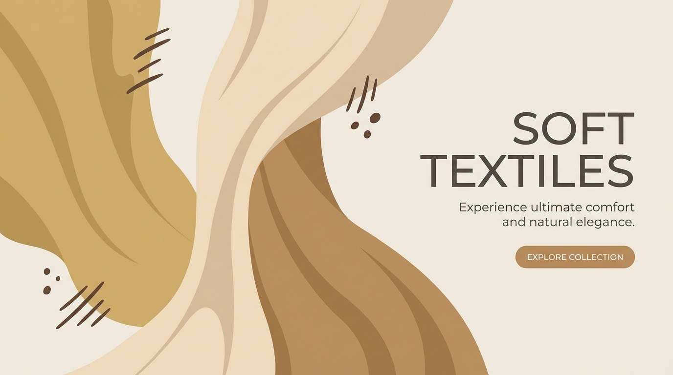
Media.io is an online AI studio for creating and editing video, image, and audio in your browser.

2) Cafe Suede
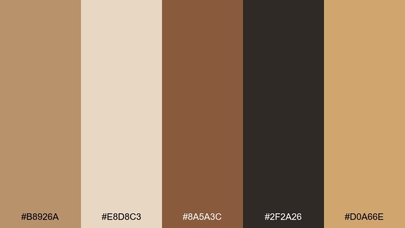
HEX: #b8926a #e8d8c3 #8a5a3c #2f2a26 #d0a66e
Mood: cozy, rich, inviting
Best for: coffee shop menu poster
Cozy and rich, it evokes espresso crema, suede chairs, and warm wood counters. Pair the light oat tone with the inky brown for clear menu hierarchy and readable prices. The golden tan works best as a highlight for specials and seasonal callouts. Keep the layout simple with lots of breathing room so the darker shades do not crowd the page.
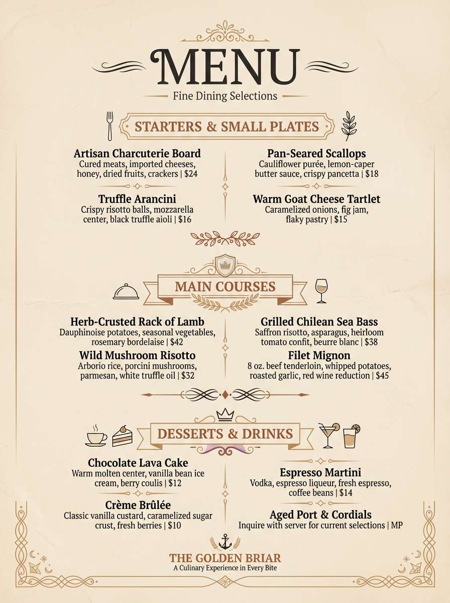
Image example of cafe suede generated using media.io
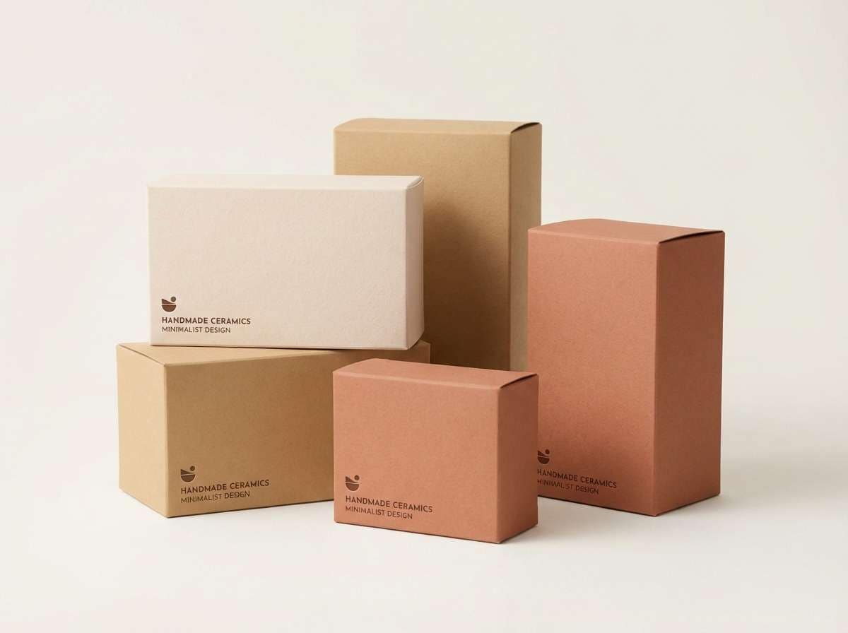
3) Clay Blossom
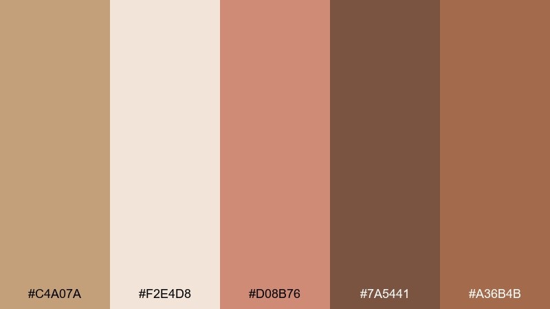
HEX: #c4a07a #f2e4d8 #d08b76 #7a5441 #a36b4b
Mood: soft, artisan, romantic
Best for: ceramic product packaging
Soft and artisan, it brings to mind handmade clay mugs with a blush glaze. These fawn color combinations look especially polished on matte labels and minimal box designs. Let the blush clay tone add warmth to brand marks, while the deep brown keeps ingredients and legal text crisp. Tip: use embossing or spot varnish on the mid tan to create tactile contrast without adding new colors.
Image example of clay blossom generated using media.io
4) Walnut Smoke
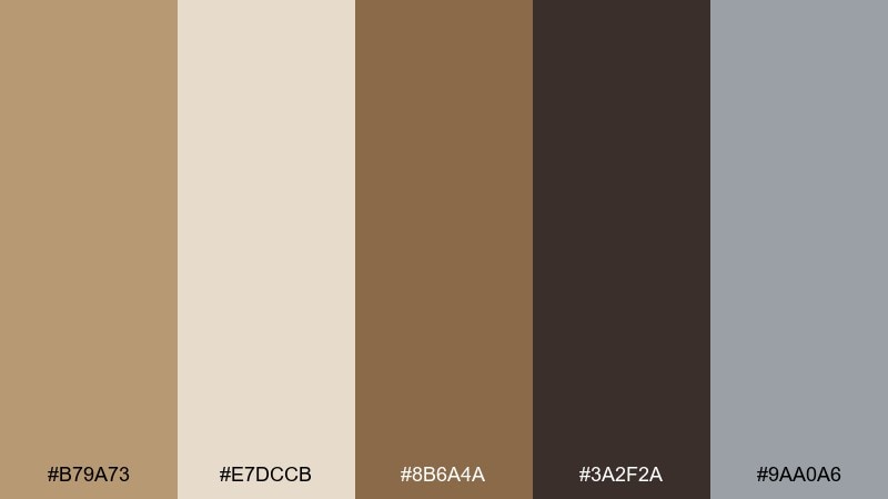
HEX: #b79a73 #e7dccb #8b6a4a #3a2f2a #9aa0a6
Mood: moody, refined, editorial
Best for: menswear lookbook editorial spread
Moody and refined, it feels like a smoky lounge with walnut paneling. Use the pale beige for margins and negative space, then build type hierarchy with the espresso and charcoal tones. The cool gray keeps the spread contemporary and prevents the warms from leaning too rustic. For photography, favor soft contrast and warm highlights to match the palette temperature.
Image example of walnut smoke generated using media.io
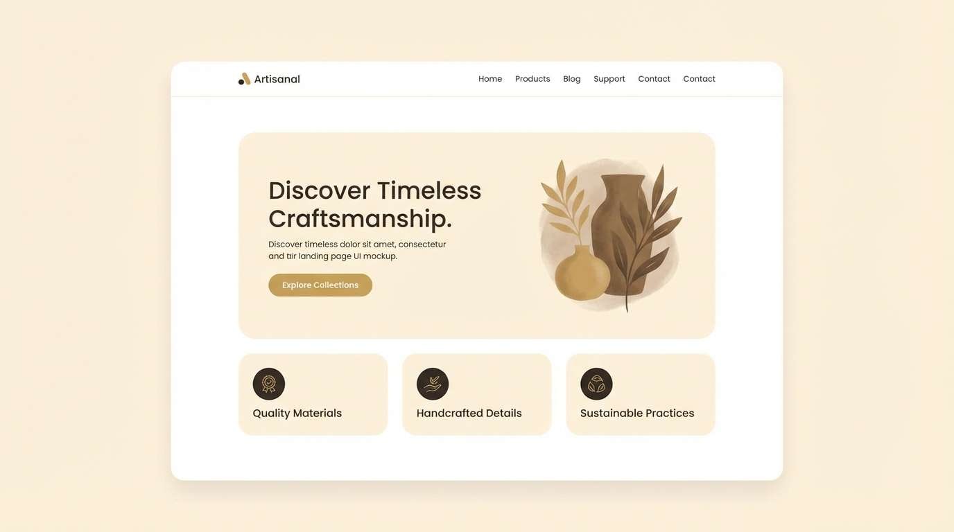
5) Honeyed Minimal
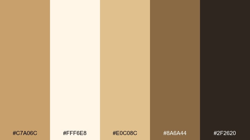
HEX: #c7a06c #fff6e8 #e0c08c #8a6a44 #2f2620
Mood: clean, warm, modern
Best for: minimal website landing UI
Clean and warm, it suggests honey drizzled over toasted oats. A fawn color palette like this shines in modern landing pages where the background stays creamy and the buttons carry the darker roast tone. Use the honey highlight sparingly for badges, pricing emphasis, and small icons. Tip: reserve the near-black only for body text to keep the UI feeling light.
Image example of honeyed minimal generated using media.io
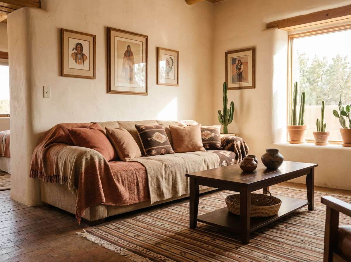
6) Terracotta Dune
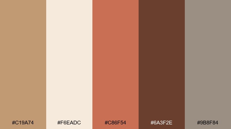
HEX: #c19a74 #f6eadc #c86f54 #6a3f2e #9b8f84
Mood: earthy, sunbaked, rustic
Best for: southwest living room interior styling
Earthy and sunbaked, it reads like dunes, terracotta pots, and woven rugs. Bring in the warm clay as an accent wall or throw pillows, while the sand and fawn tones sit on larger surfaces. The dark cocoa brown works best for frames, hardware, or a single statement piece. Tip: add texture, not extra color, through jute, boucle, and matte ceramics.
Image example of terracotta dune generated using media.io
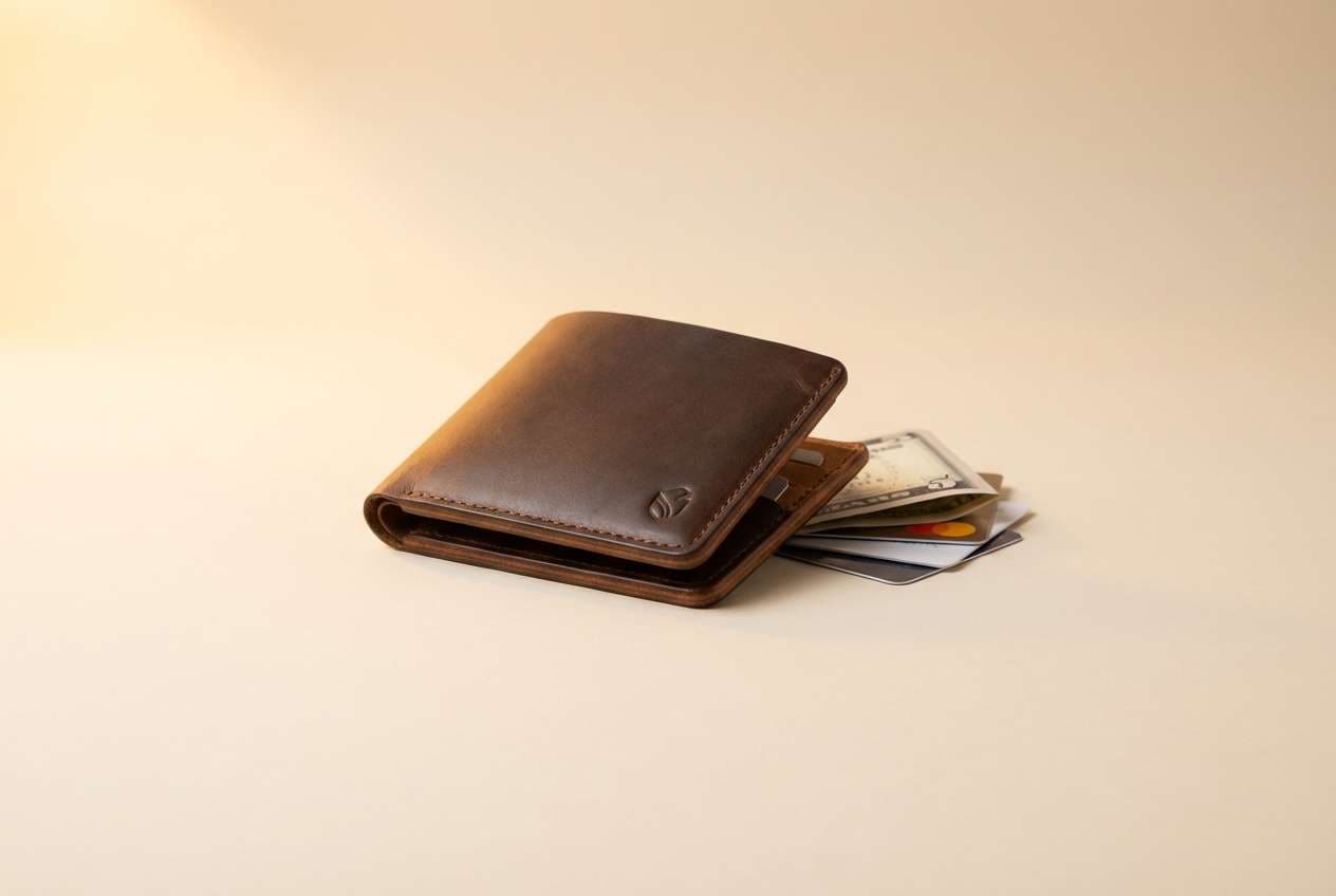
7) Soft Saddle
HEX: #c5a37a #f1e5d6 #a67952 #5a3b28 #d3c2a8
Mood: heritage, grounded, tactile
Best for: leather goods product ad
Heritage and tactile, it recalls a well-worn saddle and brushed canvas. Use the lighter tones to keep the ad premium, then let the mid tan carry product name and price. The deep brown is ideal for subtle shadows and logo marks on packaging. Tip: combine matte paper with a single glossy stamp in the darkest shade for a crafted finish.
Image example of soft saddle generated using media.io
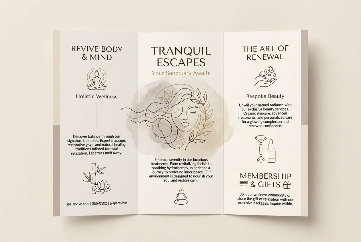
8) Oatmilk Stone
HEX: #c2a37b #f7f0e6 #bdb3a7 #7e6b5a #3d332c
Mood: quiet, balanced, minimalist
Best for: spa brochure
Quiet and balanced, it feels like oatmilk foam against smooth river stone. The palette works best when the off-white leads, with taupe and stone gray building calm sections and dividers. Use the dark espresso only for small headlines and icons to keep the overall tone serene. Tip: pair with thin line art and uncoated paper for an understated luxury look.
Image example of oatmilk stone generated using media.io
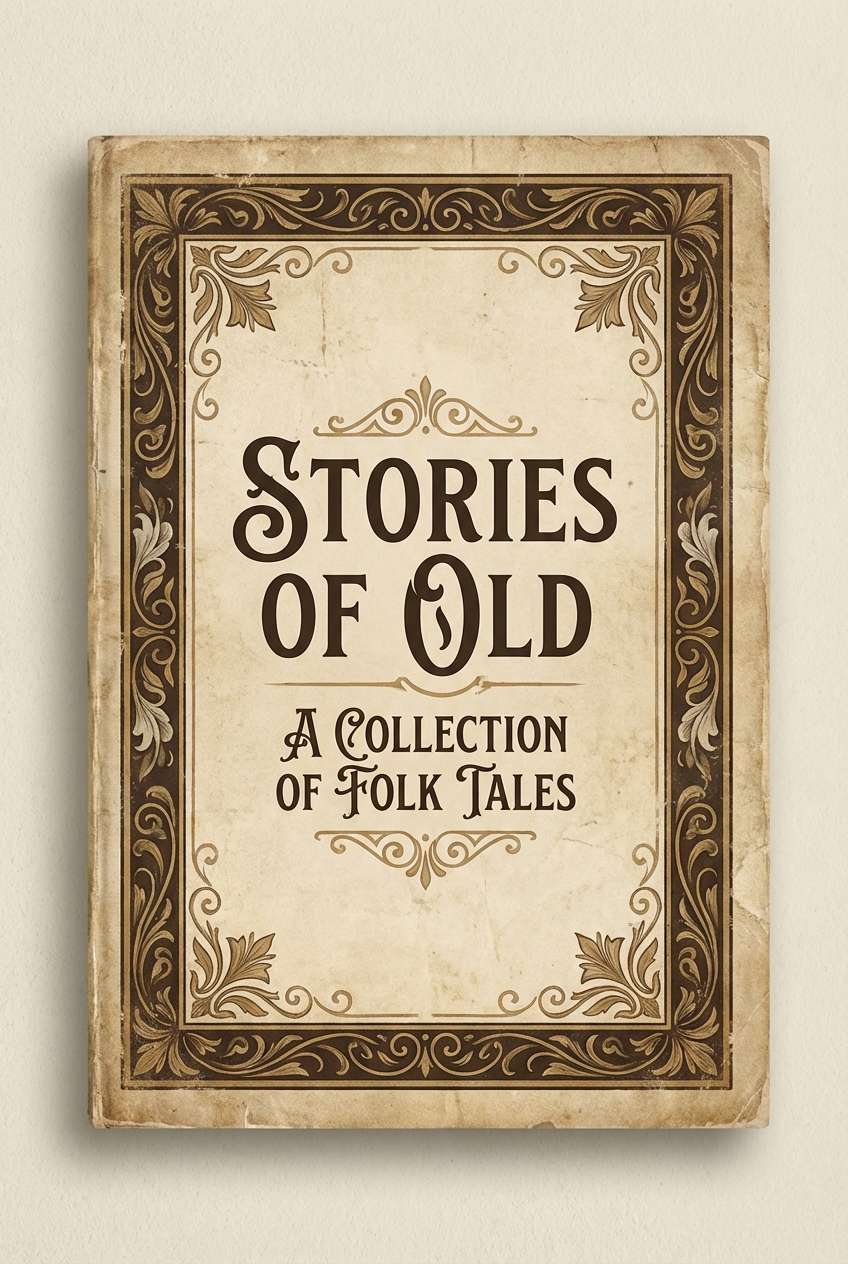
9) Vintage Parchment
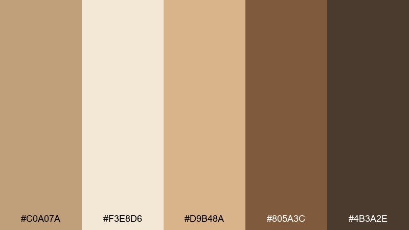
HEX: #c0a07a #f3e8d6 #d9b48a #805a3c #4b3a2e
Mood: nostalgic, warm, literary
Best for: vintage book cover design
Nostalgic and warm, it suggests aged parchment and a well-loved hardcover. Let the parchment cream take over the background, then set the title in the deepest brown for classic contrast. The golden tan is perfect for ornamentation like borders, flourishes, or a small emblem. Tip: add subtle grain and keep typography traditional to preserve the vintage feel.
Image example of vintage parchment generated using media.io
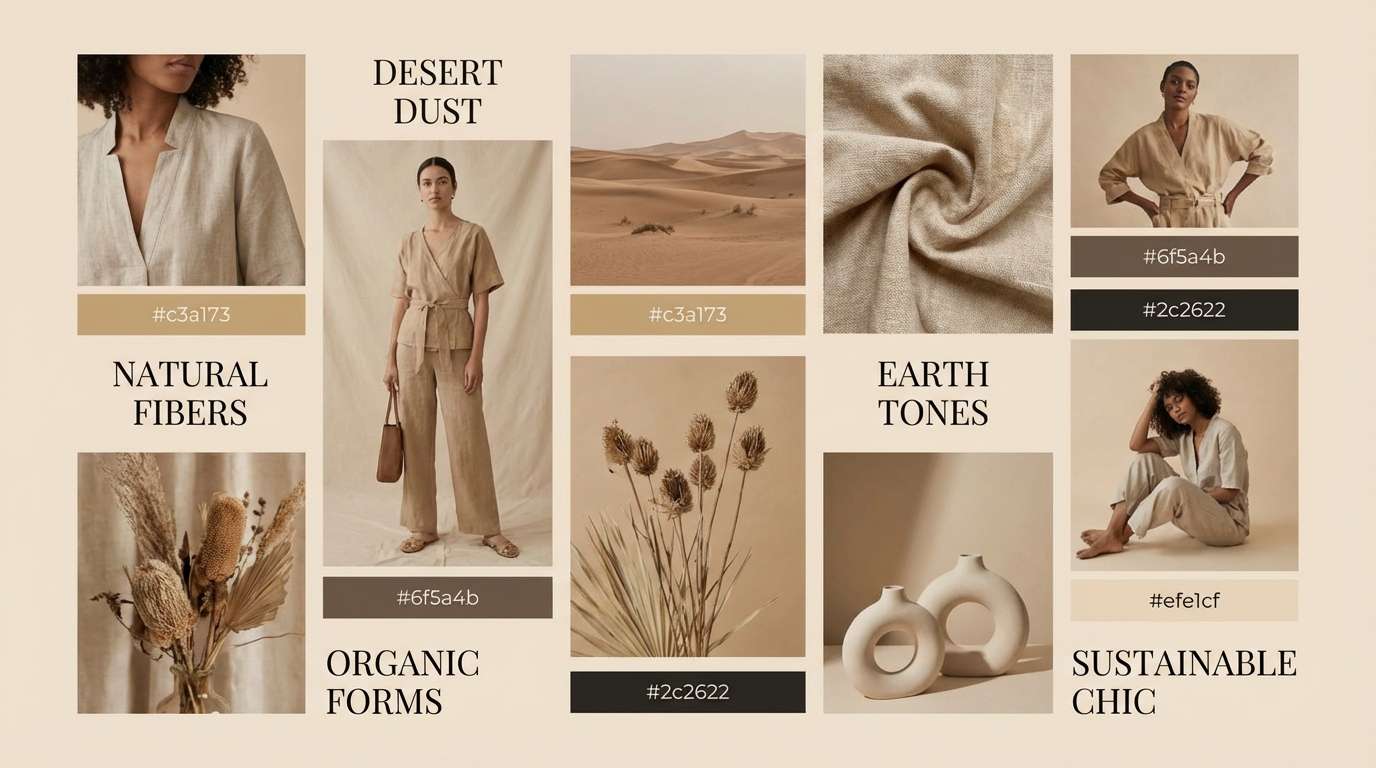
10) Autumn Tweed
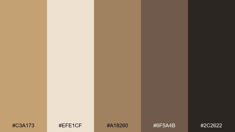
HEX: #c3a173 #efe1cf #a18260 #6f5a4b #2c2622
Mood: cozy, classic, outdoorsy
Best for: fashion moodboard slide
Cozy and classic, it feels like tweed jackets and crisp air. Use the creamy beige as the slide base, then build blocks with the mid tans for fabric swatches and captions. The charcoal-brown adds structure for timelines, prices, or section headers. Tip: keep photo filters warm and slightly desaturated so everything sits naturally together.
Image example of autumn tweed generated using media.io
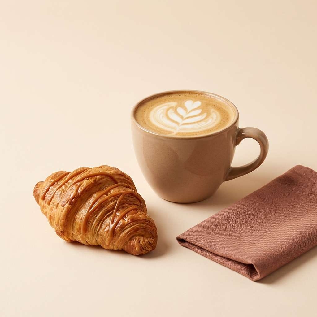
11) Rosewood Latte
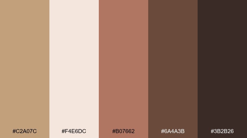
HEX: #c2a07c #f4e6dc #b07662 #6a4a3b #3b2b26
Mood: soft, romantic, cafe-chic
Best for: dessert social media ad
Soft and cafe-chic, it brings to mind a latte beside rosewood furniture. The blush-brown accent gives just enough sweetness for dessert promos without turning pink. Use the deep cocoa for the headline and price tag so the message reads instantly on mobile. Tip: keep props minimal and let one warm highlight color do the work.
Image example of rosewood latte generated using media.io
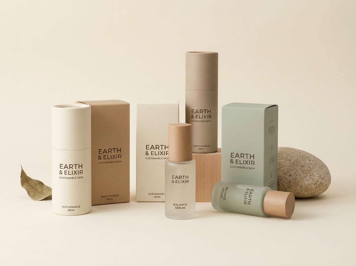
12) Sandstone Sage
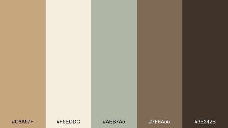
HEX: #c6a57f #f5eddc #aeb7a5 #7f6a55 #3e342b
Mood: fresh, natural, grounded
Best for: sustainable skincare packaging
Fresh and grounded, it feels like sandstone warmed by sun with a hint of herb garden. Use the sage as a soft brand accent for ingredient callouts and iconography. The darker brown gives trustworthy contrast for labels, while the cream keeps everything clean and clinical. Tip: choose kraft or recycled paper to make the earthiness feel intentional.
Image example of sandstone sage generated using media.io
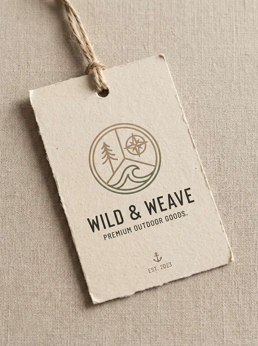
13) Cocoa Moss
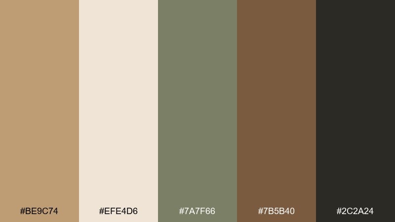
HEX: #be9c74 #efe4d6 #7a7f66 #7b5b40 #2c2a24
Mood: woodsy, muted, organic
Best for: outdoor gear hangtag design
Woodsy and muted, it evokes cocoa nibs, mossy trails, and canvas packs. Let the off-white lead for readability, then use the moss tone for eco notes and sustainability badges. The deep near-black is ideal for small type and barcodes without looking stark. Tip: keep shapes simple and tactile, like stitched borders or stamped icons.
Image example of cocoa moss generated using media.io
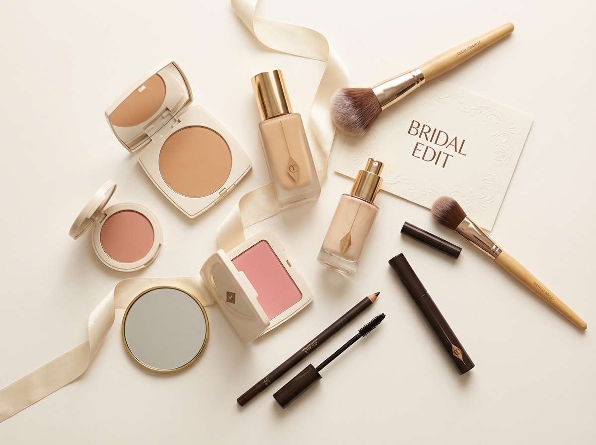
14) Bridal Taupe
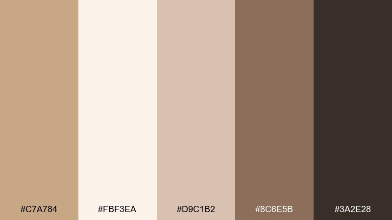
HEX: #c7a784 #fbf3ea #d9c1b2 #8c6e5b #3a2e28
Mood: elegant, soft, timeless
Best for: bridal makeup flat lay
Elegant and soft, it feels like silk veils, champagne toasts, and gentle candlelight. A fawn color palette with rosy taupe undertones works beautifully for bridal content that needs warmth without heavy saturation. Use the cream as the base, then pull the deeper taupe into typography and shadow details. Tip: keep metallics subtle and lean toward brushed champagne rather than bright gold.
Image example of bridal taupe generated using media.io
15) Modern Ranch
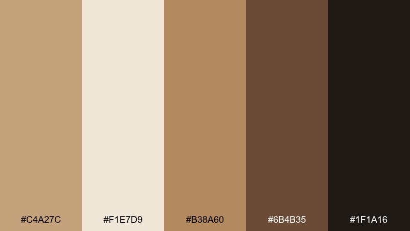
HEX: #c4a27c #f1e7d9 #b38a60 #6b4b35 #1f1a16
Mood: bold, grounded, contemporary rustic
Best for: restaurant logo and signage mockup
Bold and grounded, it recalls sunlit timber with a modern edge. Use the near-black sparingly for a strong logo mark, then let the mid tan handle secondary text and wayfinding. The creamy neutral keeps signage readable from a distance and avoids an overly dark storefront. Tip: pair with condensed type and simple iconography for a clean, updated ranch vibe.
Image example of modern ranch generated using media.io

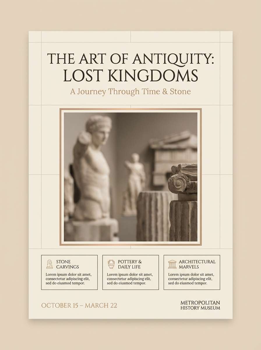
16) Museum Sepia
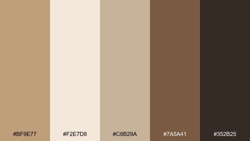
HEX: #bf9e77 #f2e7d8 #c8b29a #7a5a41 #352b25
Mood: historic, cultured, understated
Best for: museum exhibit poster
Historic and cultured, it channels sepia photography and gallery walls. Build a strong type hierarchy by placing titles in dark brown and supporting details in the warm mid tones. The gentle taupe works well for grids, captions, and subtle separators. Tip: keep imagery monochrome or lightly tinted so the poster feels curated, not busy.
Image example of museum sepia generated using media.io
17) Sunlit Adobe
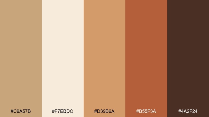
HEX: #c9a57b #f7ebdc #d39b6a #b55f3a #4a2f24
Mood: vibrant, sunlit, adventurous
Best for: travel blog header image
Vibrant and sunlit, it looks like adobe walls glowing at golden hour. These fawn color combinations come alive when you let the warm sand and copper lead, then anchor with a deep cocoa for text overlays. The terracotta accent is ideal for buttons, pins, and small graphic marks. Tip: keep the header simple with one strong photo area and minimal UI elements so the colors read instantly.
Image example of sunlit adobe generated using media.io

18) Cozy Knitwear
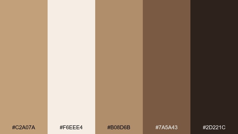
HEX: #c2a07a #f6eee4 #b08d6b #7a5a43 #2d221c
Mood: comfortable, warm, tactile
Best for: knit sweater e-commerce photo
Comfortable and tactile, it feels like a soft sweater and a quiet weekend. Use the cream tone as the backdrop, then let the mid tan and cocoa shades define the knit texture and shadows. The darkest brown is perfect for subtle brand tags and small UI overlays without overpowering the product. Tip: avoid bright props and keep lighting diffused to maintain a cozy mood.
Image example of cozy knitwear generated using media.io
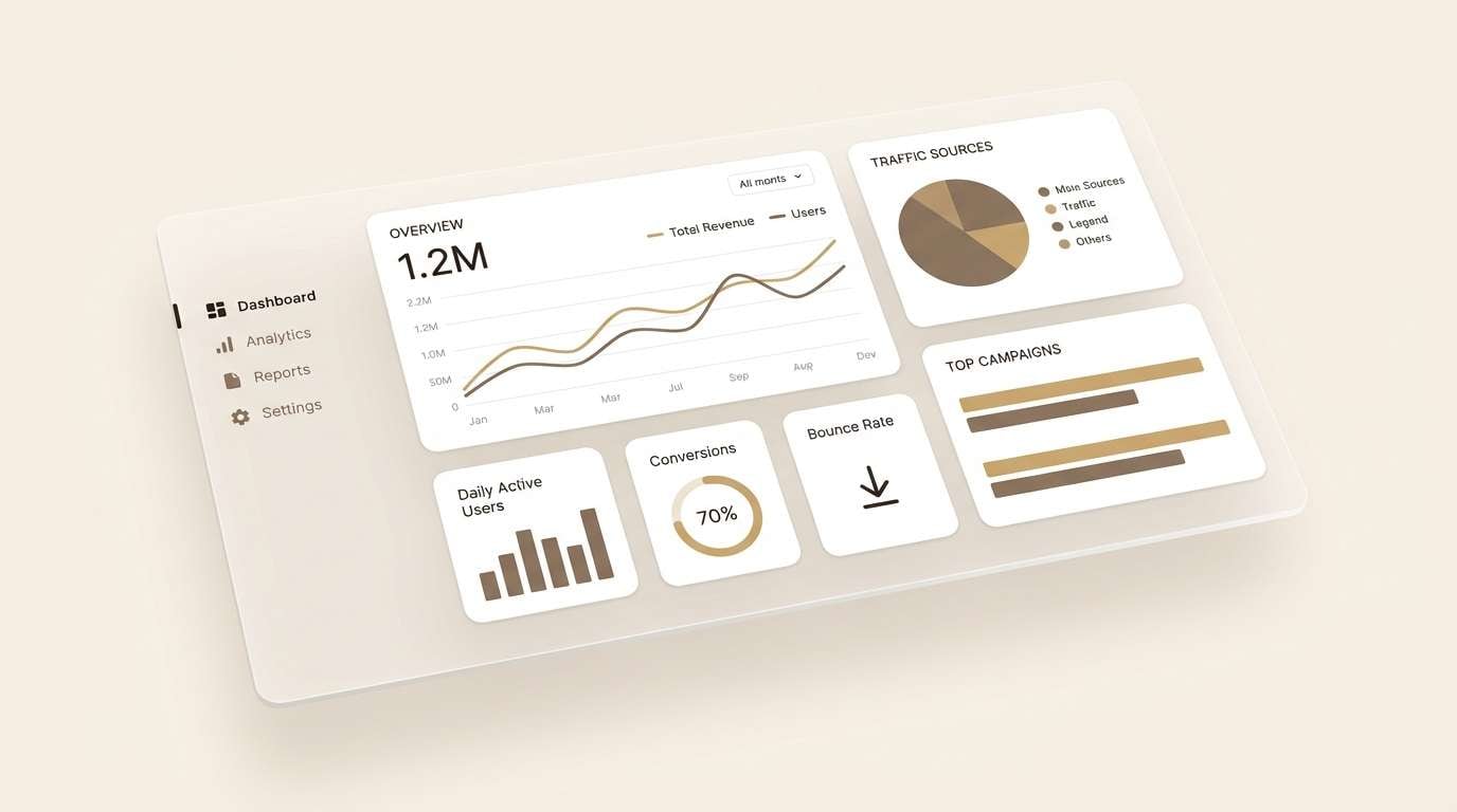
19) Neutral Workbook UI
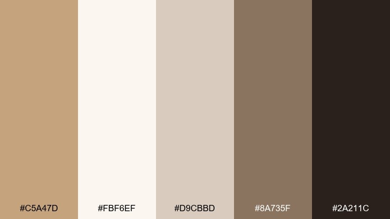
HEX: #c5a47d #fbf6ef #d9cbbd #8a735f #2a211c
Mood: focused, friendly, organized
Best for: analytics dashboard UI
Focused and friendly, it resembles a well-kept workbook with warm paper tones. The fawn color scheme works well for dashboards when you keep charts muted and rely on contrast for hierarchy. Use the deep brown for navigation and key numbers, while the soft taupe supports cards and dividers. Tip: introduce emphasis through weight and spacing before you add more hues.
Image example of neutral workbook ui generated using media.io
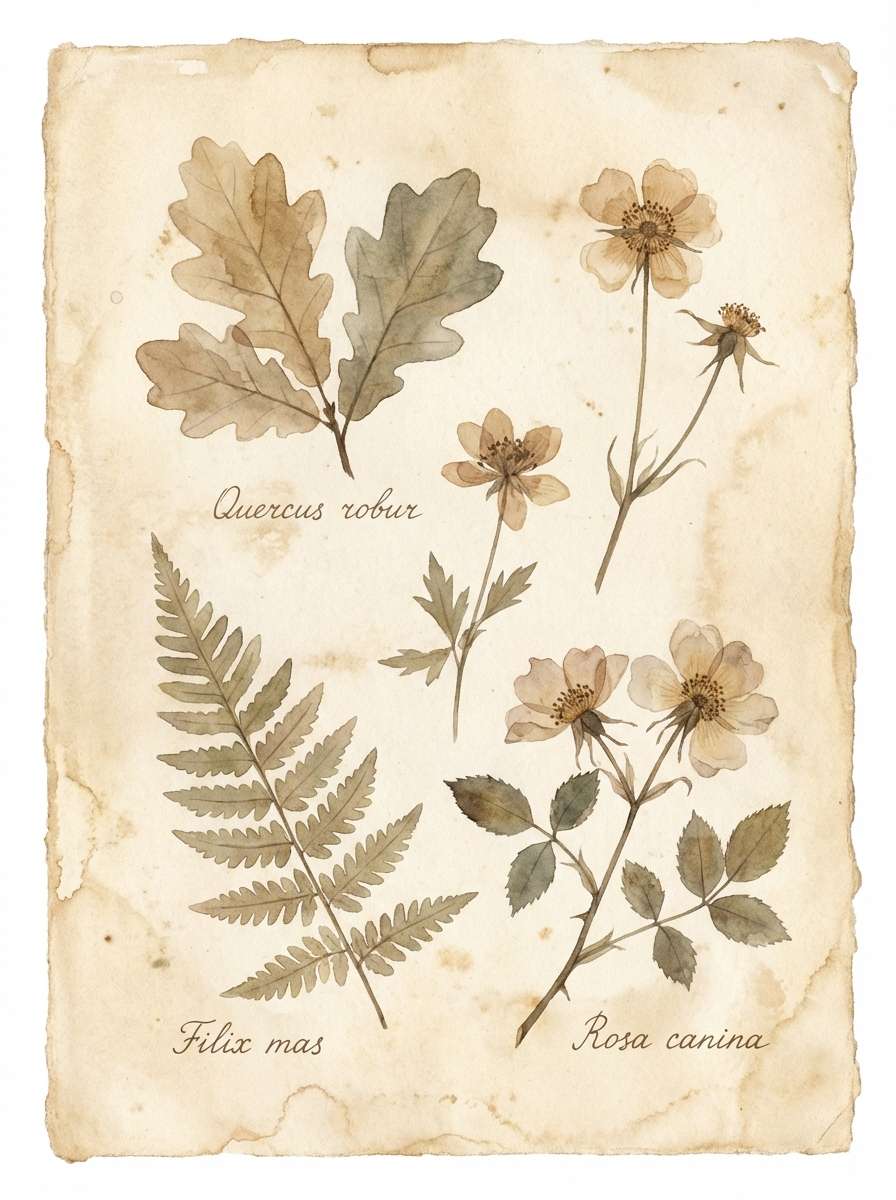
20) Botanical Herbarium
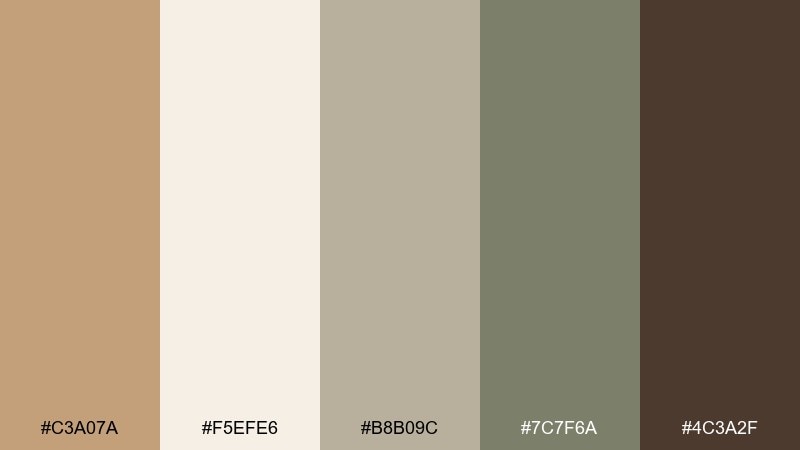
HEX: #c3a07a #f5efe6 #b8b09c #7c7f6a #4c3a2f
Mood: natural, soft, vintage botanical
Best for: botanical watercolor illustration
Natural and softly vintage, it brings to mind pressed leaves in an old herbarium book. Use the warm cream and fawn tones for paper and stems, then layer the muted greens for foliage. The deep brown is best for fine ink lines and subtle labeling. Tip: keep washes translucent and let the background stay warm rather than bright white.
Image example of botanical herbarium generated using media.io
What Colors Go Well with Fawn?
Fawn pairs naturally with other warm neutrals like cream, oat, camel, and chocolate brown, giving you an easy tonal range for backgrounds, surfaces, and typography. This keeps layouts calm while still providing enough contrast for hierarchy.
For accents, muted greens (sage, moss, olive) add an organic feel, while terracotta or clay tones introduce warmth that reads seasonal and handcrafted. If you want a modern edge, mix in cool grays or blue-leaning charcoals to balance fawn’s warmth.
For bolder contrast, use near-black sparingly for key text and CTAs, and keep the rest of the palette soft. This helps fawn look premium rather than overly rustic.
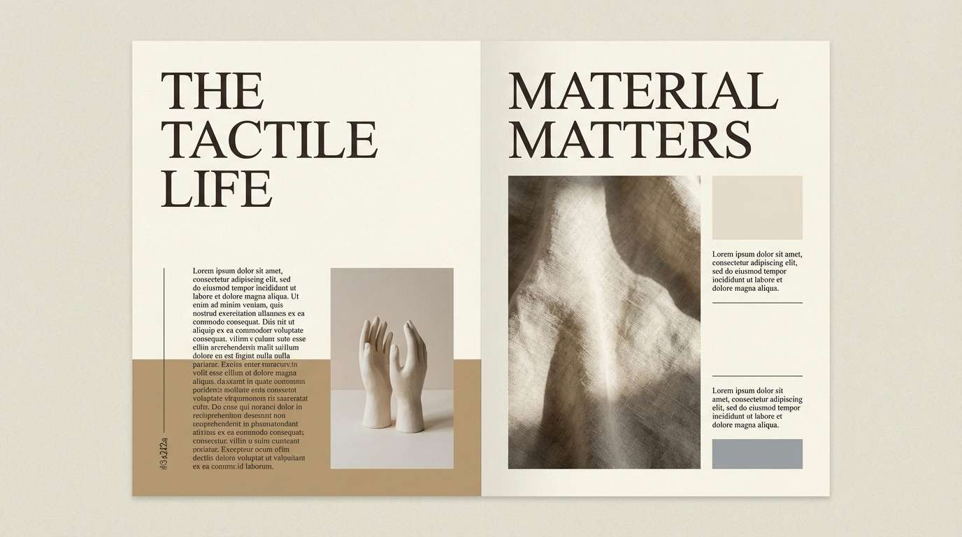
How to Use a Fawn Color Palette in Real Designs
Start by assigning roles: use your lightest cream as the main background, a mid fawn as the primary surface color, and a deep brown as the anchor for text, icons, and buttons. This simple system makes fawn palettes feel intentional and readable.
In interiors, scale matters: put fawn and sand tones on large areas (walls, rugs, upholstery), then use darker walnut/cocoa for small anchors (frames, hardware, lamps). Add interest through texture—linen, jute, matte ceramics—before adding more colors.
For branding and packaging, keep saturation controlled and rely on finish (matte + spot gloss, embossing, foil in champagne tones) to create depth. Fawn is most effective when it stays soft and consistent across print and digital.
Create Fawn Palette Visuals with AI
If you already have HEX codes, you can generate matching visuals by describing your layout (poster, UI, packaging, flat lay) and listing your dominant colors plus a few accents. The key is to keep the same “temperature” across the prompt—warm paper backgrounds and soft lighting work especially well with fawn.
Try reusing the prompts above and swapping only the subject (menu, brochure, landing page) while keeping the palette order consistent. This makes it easy to produce a cohesive set of brand assets quickly.
When you need variations, adjust texture and materials (linen, suede, kraft paper, ceramic) instead of introducing new hues. You’ll get fresh results that still feel like the same brand world.
Fawn Color Palette FAQs
-
What color is fawn?
Fawn is a warm, light brown-beige (often compared to tan or camel) with soft golden undertones. It typically sits between beige and light brown on the spectrum. -
Is fawn closer to beige or tan?
Fawn is usually closer to tan because it carries more warmth and brown depth than classic beige. However, many fawn palettes include creamy beiges to keep the overall look light. -
What colors complement fawn best?
Fawn pairs well with cream and off-white, chocolate/espresso browns, muted greens like sage or moss, terracotta/clay accents, and cool balancing tones like stone gray or charcoal. -
How do I make a fawn palette look modern (not rustic)?
Use lots of negative space, keep backgrounds creamy, introduce a cool gray or blue-leaning charcoal, and reserve the darkest shade for type/CTAs. Clean typography and simple shapes also push it modern. -
Can I use fawn colors for UI and dashboards?
Yes—fawn works well for warm, readable interfaces when you maintain contrast. Use off-white for main backgrounds, mid fawn/taupe for cards and dividers, and deep brown for navigation, key numbers, and primary buttons. -
What’s the best way to choose a fawn background color for text readability?
Pick a very light cream or oat tone for the background, then test body text in deep brown or near-black. Aim for strong contrast and avoid placing small text on mid-tone fawn surfaces. -
How can I generate fawn-themed images that match my brand palette?
Use an AI text-to-image prompt that names your subject and style, then specify your dominant HEX colors and lighting (soft, warm, diffused). Keep the palette consistent across prompts so all images feel like one set.
Next: Indigo Color Palette


