

A blue red orange color palette is a high-energy mix: blue brings trust and structure, while red and orange add urgency, warmth, and motion. It’s a modern choice for brands that want to feel confident, bold, and easy to notice.
Below you’ll find 20 ready-to-use blue red orange color combinations with HEX codes, plus design tips and AI prompts to quickly visualize each palette in real layouts.
In this article
- Why Blue Red Orange Palettes Work So Well
-
- harbor ember
- neon transit
- autumn regatta
- studio pop
- desert signal
- retro arcade
- sunrise workshop
- ceramic market
- arctic flame ui
- mountain relay
- citrus blueprint
- seaside carnival
- midnight aperitif
- craft studio wall
- kids science fair
- signal and sky
- lava coastline
- bold primary mix
- warm data viz
- firework minimal
- What Colors Go Well with Blue Red Orange?
- How to Use a Blue Red Orange Color Palette in Real Designs
- Create Blue Red Orange Palette Visuals with AI
Why Blue Red Orange Palettes Work So Well
Blue red orange palettes work because they balance cool stability with warm intensity. Blue sets a reliable foundation for navigation, backgrounds, and typography, while red and orange naturally pull attention to important actions.
In practical design terms, this means you can build clear hierarchy quickly: blues for structure and readability, red for urgency (errors, “limited time”), and orange for friendly emphasis (highlights, badges, key links).
They also reproduce well across digital and print when you manage saturation. Using neutrals (white, cream, light gray) helps the warm colors stay punchy without overwhelming the layout.
20+ Blue Red Orange Color Palette Ideas (with HEX Codes)
1) Harbor Ember
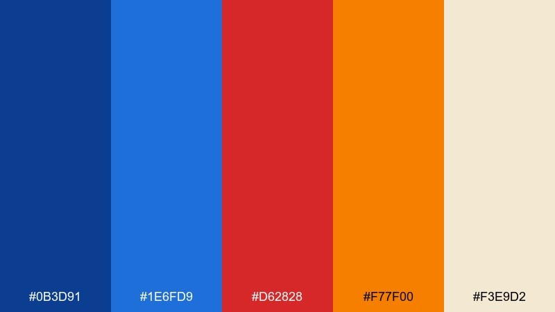
HEX: #0B3D91 #1E6FD9 #D62828 #F77F00 #F3E9D2
Mood: bold, nautical, spirited
Best for: sports branding and hero banners
Bold, nautical energy comes through like deep water against a flare of sunset. This blue red orange color palette works best when you let the navy and azure carry the layout, then use red and orange as high-impact calls to action. Pair it with sand or off-white backgrounds to keep type readable and avoid visual fatigue. Usage tip: reserve the orange for one primary button or highlight per section to keep the hierarchy crisp.
Image example of harbor ember generated using media.io
Media.io is an online AI studio for creating and editing video, image, and audio in your browser.

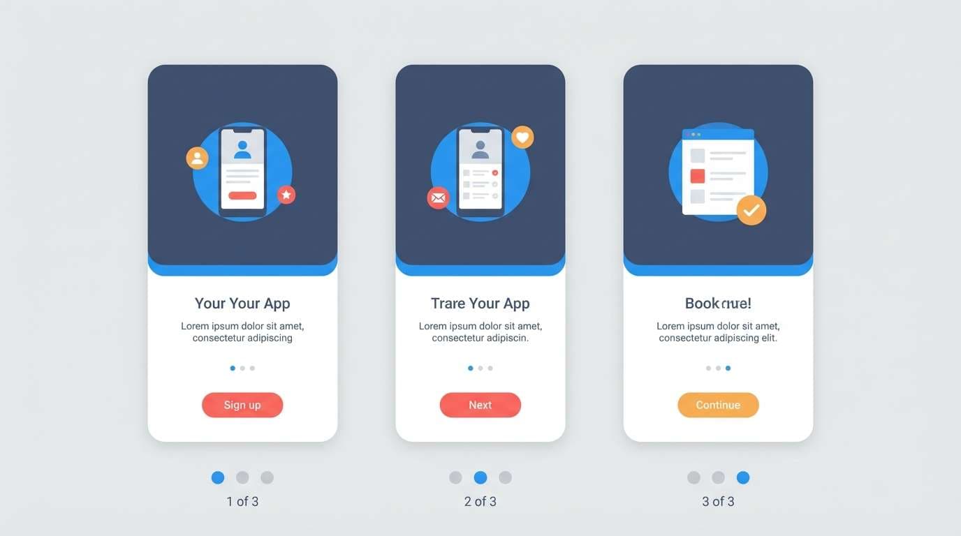
2) Neon Transit
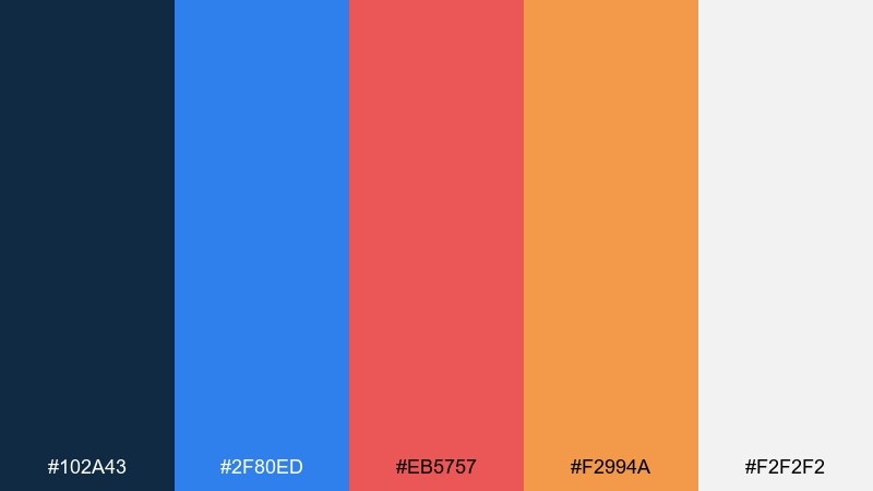
HEX: #102A43 #2F80ED #EB5757 #F2994A #F2F2F2
Mood: urban, punchy, modern
Best for: app onboarding UI screens
Urban and punchy, it feels like city lights flashing past a night train window. The deep slate blue keeps navigation grounded while bright blue leads the eye through steps and progress states. Use the red for warnings and the warm orange for friendly highlights like badges or tips, and keep whitespace generous. Usage tip: limit saturated red to error and destructive actions so the interface stays calm.
Image example of neon transit generated using media.io
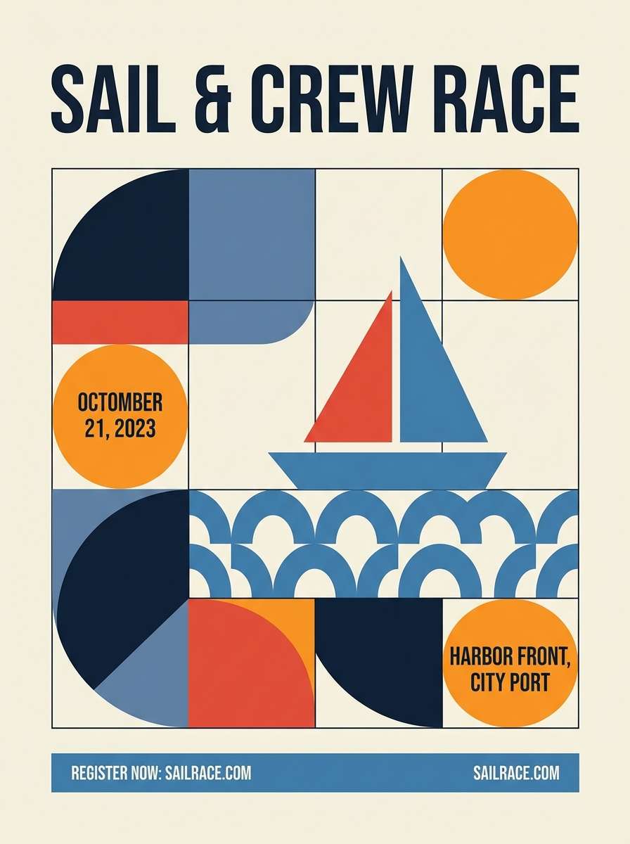
3) Autumn Regatta
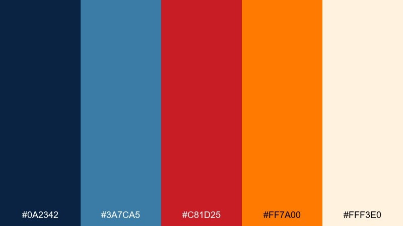
HEX: #0A2342 #3A7CA5 #C81D25 #FF7A00 #FFF3E0
Mood: adventurous, autumnal, confident
Best for: event posters and race promos
Adventurous and autumnal, it evokes sails cutting through cool air with a warm glow on the horizon. Use the dark blue for titles and the softer blue for supporting blocks, then bring in red for urgency and orange for excitement. Creamy off-white keeps the poster breathable and helps fine print stay legible. Usage tip: add a wide blue header bar, then place orange highlights only on dates and key actions.
Image example of autumn regatta generated using media.io
4) Studio Pop
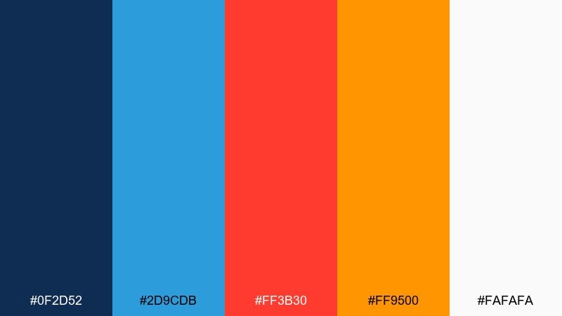
HEX: #0F2D52 #2D9CDB #FF3B30 #FF9500 #FAFAFA
Mood: playful, high-contrast, upbeat
Best for: social ad tiles and promo graphics
Playful, high-contrast color pops feel like sticker art on a clean studio wall. These blue red orange color combinations shine in short-form promos where you need fast readability and a clear focal point. Let blue anchor the background shapes, then use red for the main offer and orange for secondary bursts like icons or price tags. Usage tip: keep text in dark blue or near-black and avoid stacking red and orange behind small type.
Image example of studio pop generated using media.io
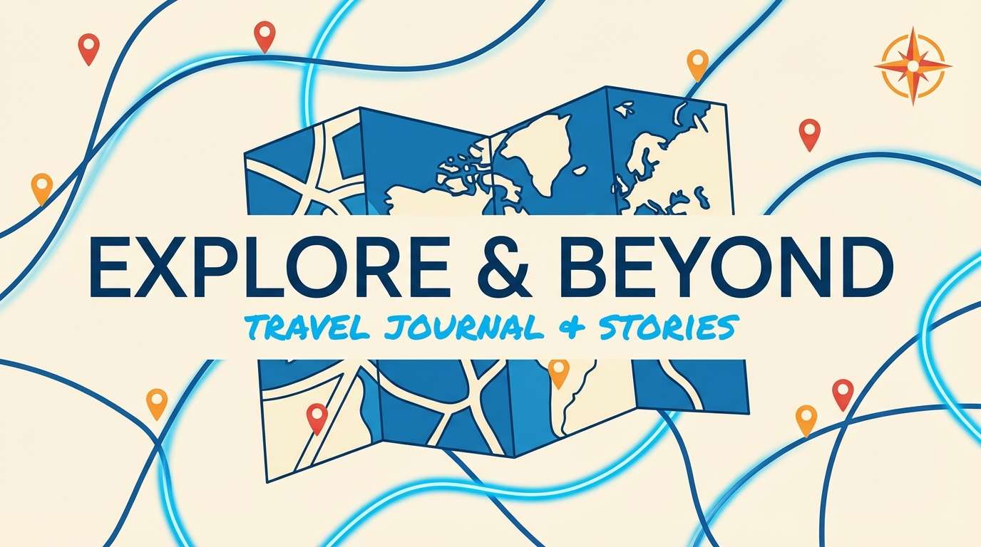
5) Desert Signal
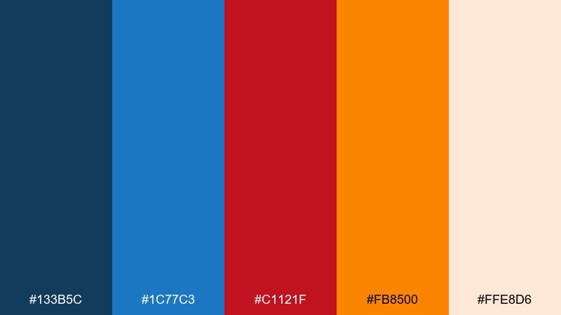
HEX: #133B5C #1C77C3 #C1121F #FB8500 #FFE8D6
Mood: sun-baked, rugged, energetic
Best for: travel blogs and thumbnail covers
Sun-baked and rugged, it suggests open roads, blue skies, and a flash of heat on the horizon. Use the deeper blue for title bars and the brighter blue for links or badges, keeping the page structured and easy to scan. Red and orange are best as accent markers for categories, location pins, or featured posts. Usage tip: apply orange to one recurring element, like the read-more button, for consistent recognition across pages.
Image example of desert signal generated using media.io
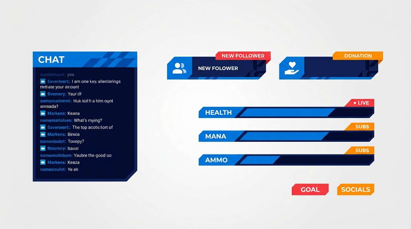
6) Retro Arcade
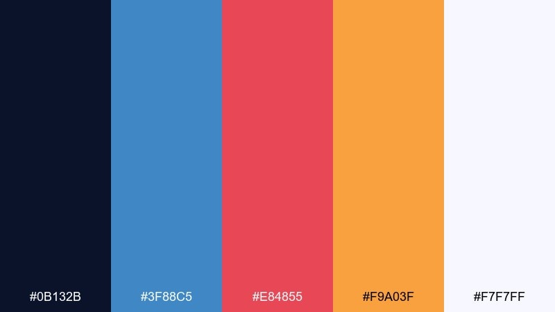
HEX: #0B132B #3F88C5 #E84855 #F9A03F #F7F7FF
Mood: nostalgic, electric, fun
Best for: gaming stream overlay UI
Nostalgic and electric, it feels like glowing cabinets in a dim room. The midnight blue makes overlays look premium while the brighter blue carries tabs, labels, and progress bars. Use red for live status and orange for rewards or highlights, and keep the light neutral for contrast. Usage tip: keep saturation high only on interactive elements so the overlay does not compete with gameplay.
Image example of retro arcade generated using media.io
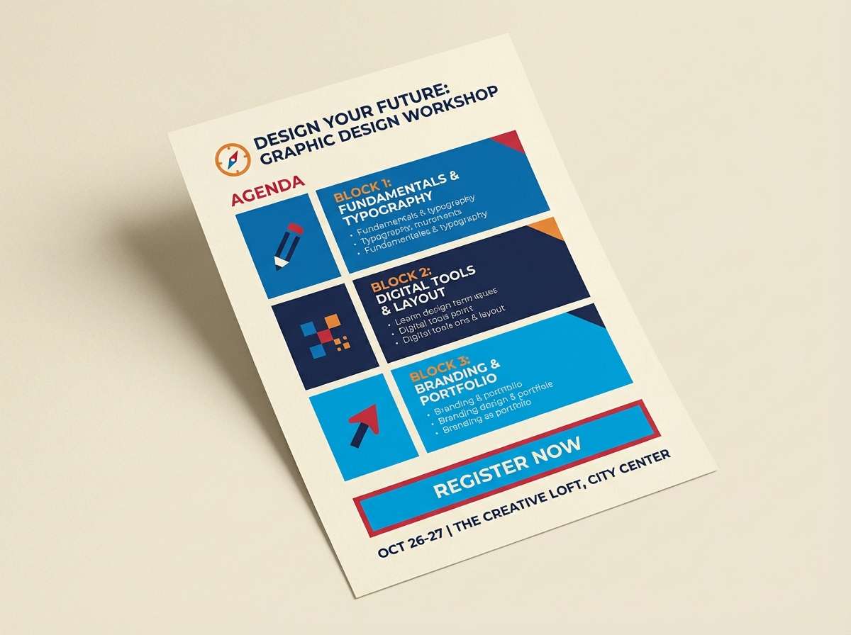
7) Sunrise Workshop
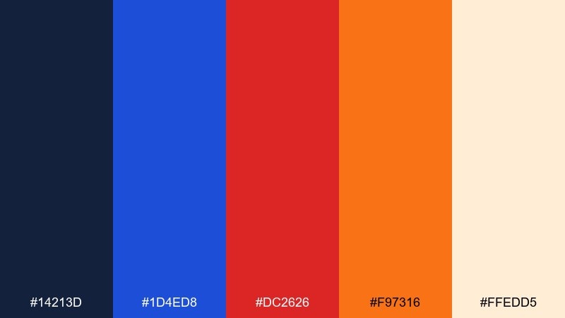
HEX: #14213D #1D4ED8 #DC2626 #F97316 #FFEDD5
Mood: motivating, warm, organized
Best for: workshop flyers and signup one-pagers
Motivating warmth meets clean structure, like a sunrise hitting a tidy studio desk. Keep the navy for headings and body text, then use bright blue for section dividers and links to guide scanning. Red is ideal for deadlines, while orange draws attention to the main signup action without feeling harsh. Usage tip: place orange behind a single key badge, such as limited seats, to boost conversions without clutter.
Image example of sunrise workshop generated using media.io
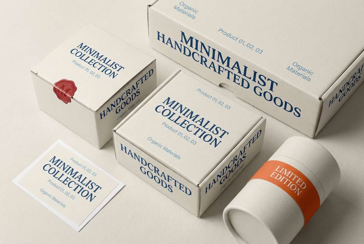
8) Ceramic Market
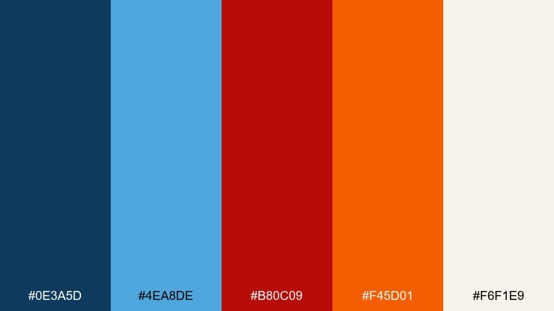
HEX: #0E3A5D #4EA8DE #B80C09 #F45D01 #F6F1E9
Mood: handmade, friendly, artisanal
Best for: product packaging and labels
Handmade and friendly, it brings to mind glazed ceramics with a bright painted motif. Use the softer neutral as the label base, then anchor the brand name in deep blue for a crafted, trustworthy feel. Orange makes a great flavor or variant marker, while red adds a bold stamp-like accent for limited editions. Usage tip: keep red to small seals or icons so the packaging stays premium rather than loud.
Image example of ceramic market generated using media.io
9) Arctic Flame UI
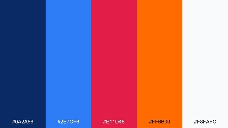
HEX: #0A2A66 #2E7CF6 #E11D48 #FF6B00 #F8FAFC
Mood: crisp, fast, tech-forward
Best for: fintech dashboards and analytics UI
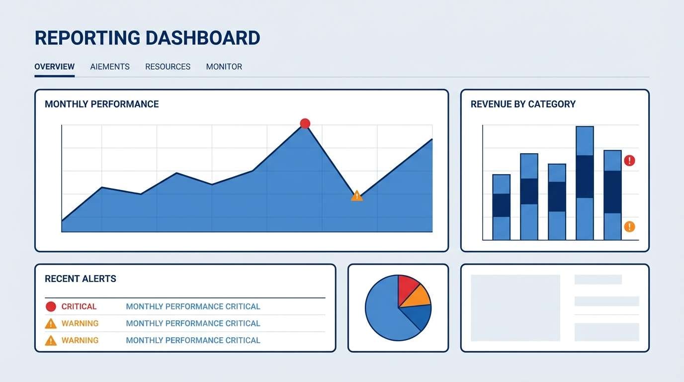
Crisp and fast, it feels like icy air cut by a bright flare of motion. This blue red orange color scheme is strong for dashboards where blue carries trust and structure while warm accents guide attention to key metrics. Use red for risk and negative deltas, and orange for neutral alerts or active filters to avoid over-warning users. Usage tip: keep charts primarily in blues and use the warm tones only for outliers and thresholds.
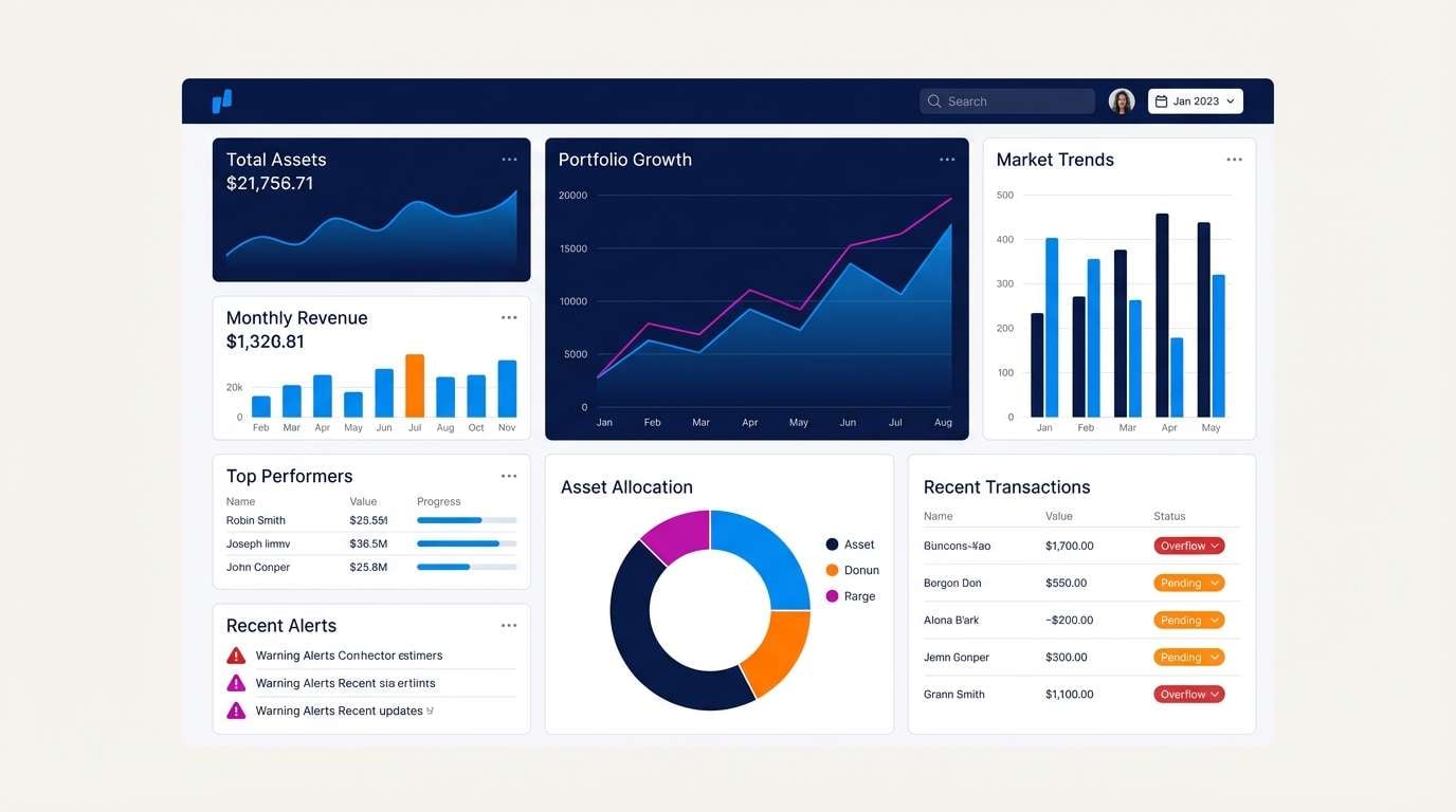
Image example of arctic flame ui generated using media.io
10) Mountain Relay
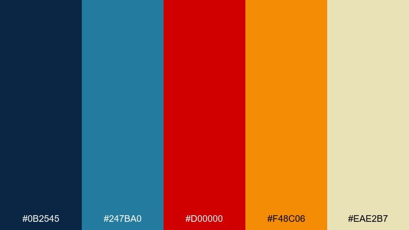
HEX: #0B2545 #247BA0 #D00000 #F48C06 #EAE2B7
Mood: outdoorsy, determined, bold
Best for: outdoor brand logos and patches
Outdoorsy determination comes through like a trail marker against a blue ridge line. Use the darkest blue for the main mark to keep it solid on fabric and signage, then add teal-blue as a secondary fill. Red and orange work best as small hits for energy, like a summit flag or route dot. Usage tip: test the logo in one color first, then add the warm accents only if the silhouette stays recognizable.
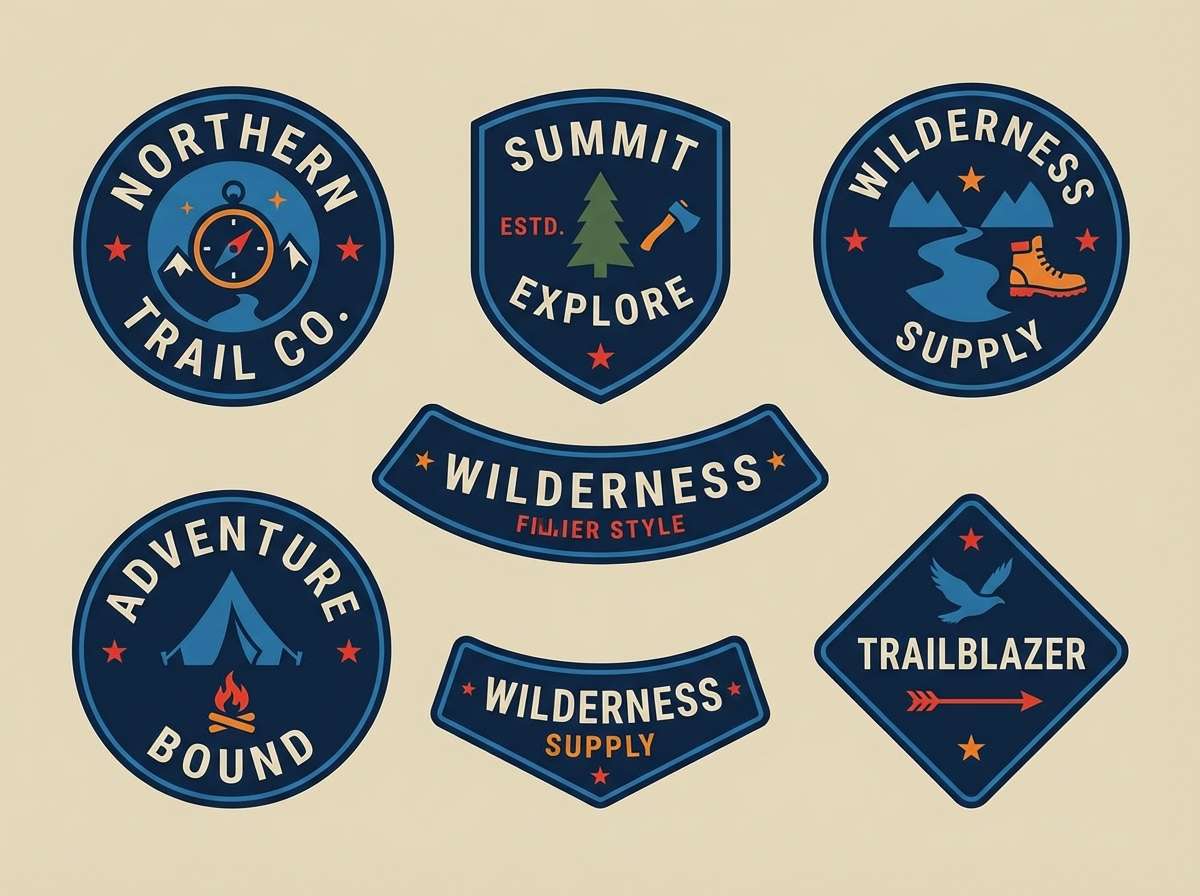
Image example of mountain relay generated using media.io
11) Citrus Blueprint
HEX: #112A46 #1B74E4 #E63946 #FF9F1C #F1FAEE
Mood: smart, lively, structured
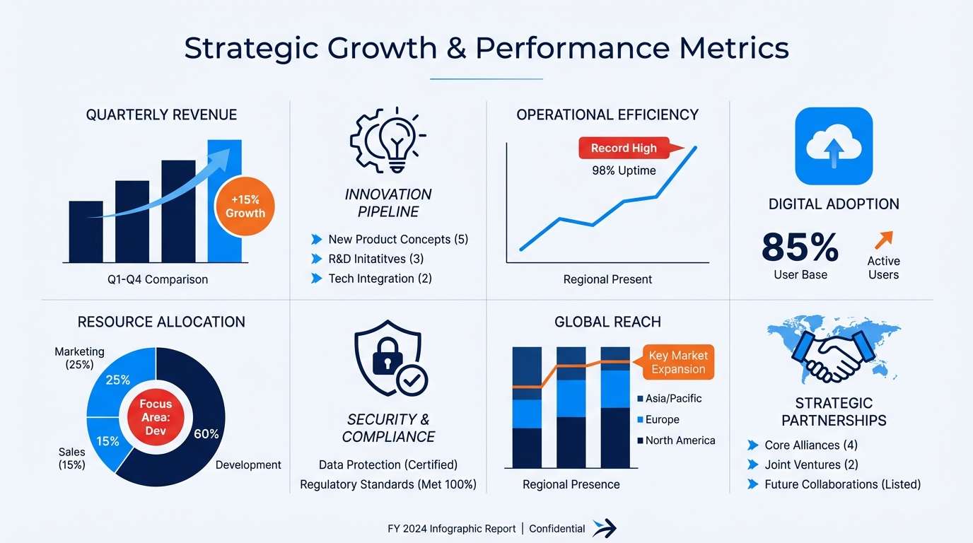
Best for: infographics and presentation slides
Smart structure with a lively kick, like a blueprint lit by bright citrus accents. Use navy for headers and axes, and let the brighter blue carry most data series for clarity. Red and orange are perfect for callouts, annotations, and key takeaways, especially when you need to guide a viewer in seconds. Usage tip: assign warm colors to only one or two categories to avoid confusing comparisons.
Image example of citrus blueprint generated using media.io
12) Seaside Carnival
HEX: #083D77 #2A9DF4 #DA1E37 #FF8800 #FFF7E6
Mood: festive, breezy, inviting
Best for: festival invitations and digital flyers
Festive and breezy, it feels like bunting in sea air with warm lights turning on at dusk. The blues keep the layout clean and readable, while red and orange bring the celebratory punch for dates, tickets, and icons. Use the creamy neutral to soften the contrast and keep the overall look welcoming. Usage tip: turn orange into a repeating motif, like a ticket stub stripe, so the invite feels cohesive.
Image example of seaside carnival generated using media.io

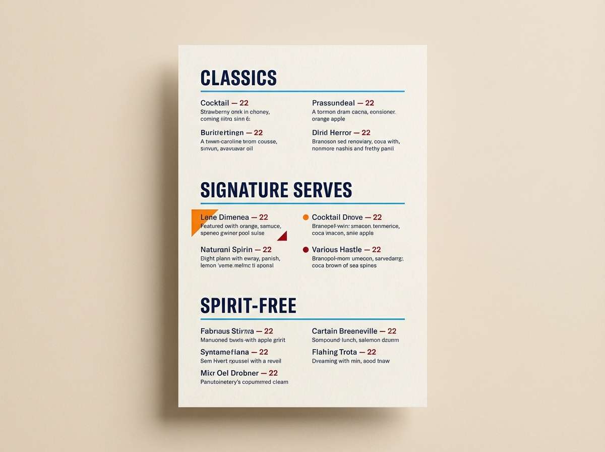
13) Midnight Aperitif
HEX: #081F3A #1F6FEB #B11226 #FF6A00 #F4F1DE
Mood: moody, stylish, upscale
Best for: cocktail bar menus and nightlife posters
Moody and stylish, it recalls a dark bar interior with a neon sign flickering outside. This blue red orange color palette suits menus where navy backgrounds feel premium and bright blue can pick out sections like specials or signatures. Use red sparingly for spicy notes or warnings, and orange for featured cocktails and price highlights. Usage tip: print-test the orange on the chosen paper stock since warm inks can shift under low light.
Image example of midnight aperitif generated using media.io
14) Craft Studio Wall
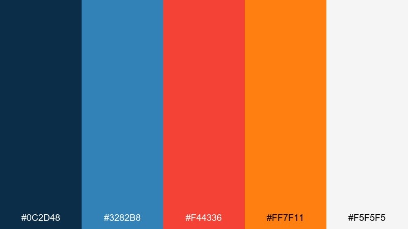
HEX: #0C2D48 #3282B8 #F44336 #FF7F11 #F5F5F5
Mood: creative, hands-on, energetic
Best for: editorial spreads and maker newsletters
Creative, hands-on energy shows up like paint swatches pinned to a studio wall. Use the blues for the grid, captions, and recurring components so the spread feels organized even with many elements. Bring in red for pull quotes and orange for section markers or issue numbers to create an easy rhythm. Usage tip: keep one warm color per page as the lead accent to avoid a chaotic look.
Image example of craft studio wall generated using media.io
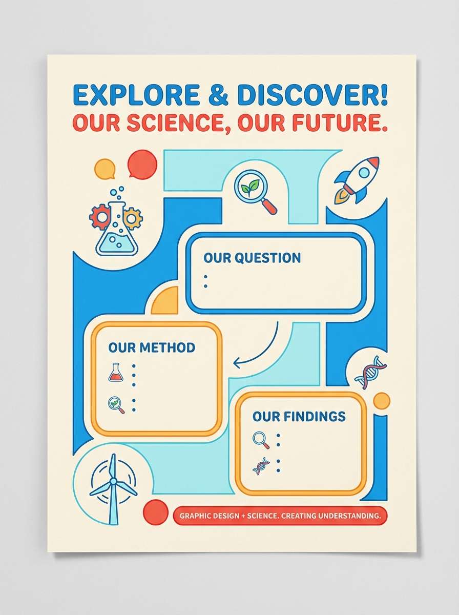
15) Kids Science Fair
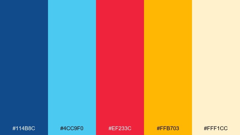
HEX: #114B8C #4CC9F0 #EF233C #FFB703 #FFF1CC
Mood: curious, bright, friendly
Best for: school posters and class handouts
Curious and bright, it feels like a classroom full of posters, stickers, and bold headings. The stronger blue is great for titles and borders, while the lighter cyan-blue keeps subheaders cheerful and readable. Use red for important reminders and warm yellow-orange for fun icons or prize callouts. Usage tip: use large color blocks and simple shapes so the design stays clear from a distance.
Image example of kids science fair generated using media.io
16) Signal and Sky
HEX: #0B1F3B #3B82F6 #E11D48 #F97316 #E5E7EB
Mood: clean, airy, energetic
Best for: website header illustrations
Clean airiness with a sharp signal vibe makes it ideal for modern web headers. Let the bright blue handle the main illustration shapes and keep the darker navy for text and navigation so contrast stays strong. Red and orange are best as tiny motion cues, like arrows, sparks, or dots that lead the eye. Usage tip: build the illustration with two blues first, then add one warm accent pass at the end.
Image example of signal and sky generated using media.io
17) Lava Coastline
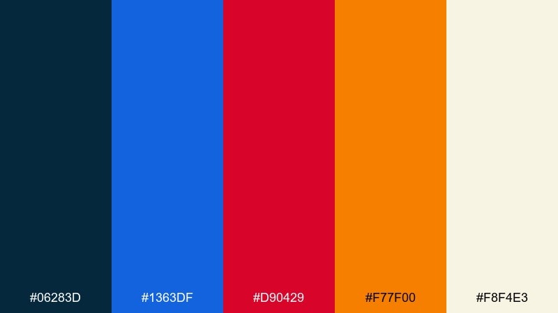
HEX: #06283D #1363DF #D90429 #F77F00 #F8F4E3
Mood: dramatic, cinematic, intense
Best for: album covers and promo posters
Dramatic and cinematic, it reads like ocean depth meeting a streak of lava. Use the darkest blue as the background to create instant mood, then pop the brighter blue into typography or graphic lines. Red and orange add intensity for the artist name, sticker tags, or tour dates, especially on matte stocks. Usage tip: keep gradients subtle and let solid blocks do the heavy lifting for a more modern finish.
Image example of lava coastline generated using media.io
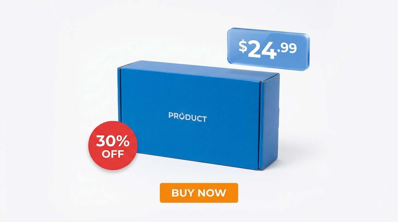
18) Bold Primary Mix
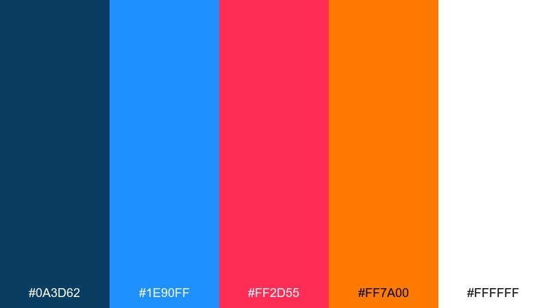
HEX: #0A3D62 #1E90FF #FF2D55 #FF7A00 #FFFFFF
Mood: confident, loud, conversion-focused
Best for: ecommerce product ads
Confident and conversion-focused, it feels like a spotlight on a clean set with a punchy headline. Blue sets trust for the product story, while red and orange deliver urgency without needing extra decoration. These blue red orange color combinations are especially effective for limited-time offers, badge systems, and price emphasis. Usage tip: keep the background white and use warm colors only on two elements, like the discount badge and the buy button.
Image example of bold primary mix generated using media.io
19) Warm Data Viz
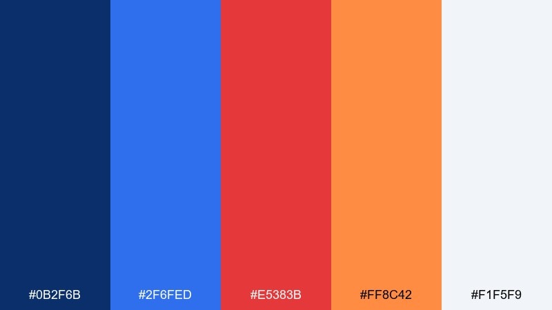
HEX: #0B2F6B #2F6FED #E5383B #FF8C42 #F1F5F9
Mood: analytical, friendly, clear
Best for: reports and data visualization dashboards
Analytical clarity with a friendly warmth makes dense data feel more approachable. Use the two blues for the majority of chart series and UI chrome, which keeps comparisons consistent. Reserve red for critical thresholds and orange for highlights like benchmarks or selected segments. Usage tip: provide a legend that groups warm colors as alerts and cool colors as baseline to reduce cognitive load.
Image example of warm data viz generated using media.io
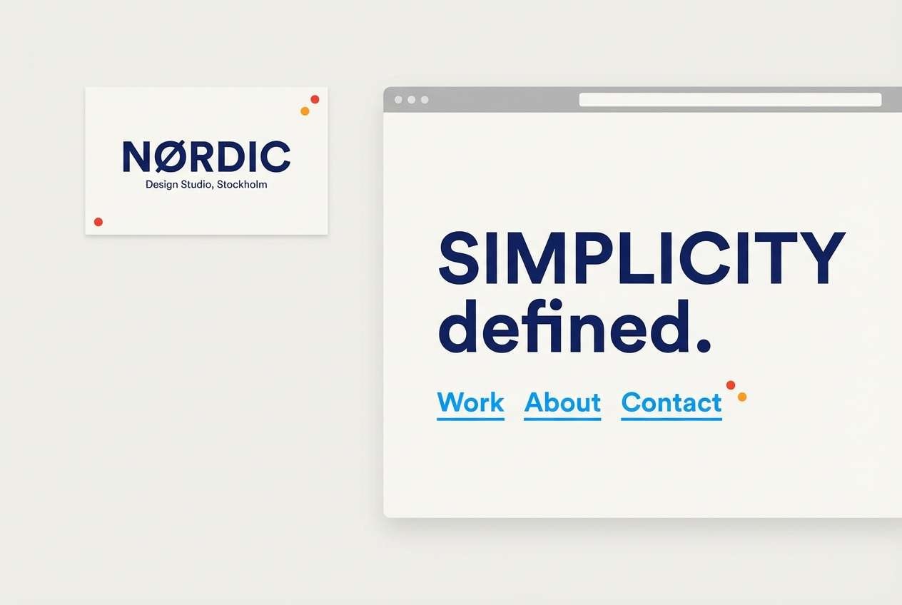
20) Firework Minimal
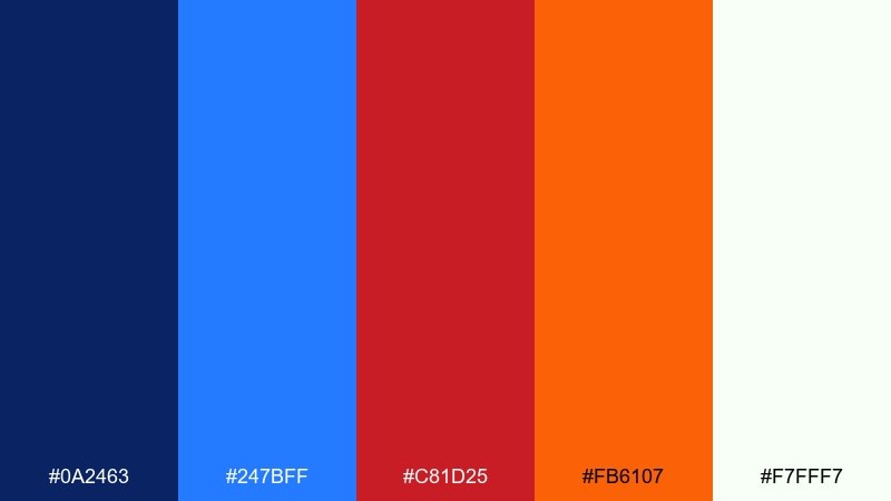
HEX: #0A2463 #247BFF #C81D25 #FB6107 #F7FFF7
Mood: minimal, celebratory, modern
Best for: brand cards and simple landing pages
Minimal and celebratory, it hints at fireworks without needing busy patterns. Use deep blue for the base and typography, then let the brighter blue handle links and small interface cues. Red and orange work best as micro-accents, like a dot, underline, or small icon that adds character. Usage tip: keep your layout mostly monochrome blue, then add one warm accent per component for a clean, premium feel.
Image example of firework minimal generated using media.io
What Colors Go Well with Blue Red Orange?
Neutrals are the easiest win: white, off-white, cream, and light gray help saturated blue red orange hex combinations look clean and readable. If your palette feels too loud, increase neutral space rather than reducing contrast everywhere.
For deeper, more premium looks, pair the trio with charcoal, deep navy, or warm black to calm the warmth and make accents feel intentional. For a softer vibe, add a muted beige or sand tone that bridges blue and orange naturally.
If you need an extra supporting hue, try a gentle teal, pale sky blue, or soft blush—just keep it low-saturation so it doesn’t compete with the warm accents.
How to Use a Blue Red Orange Color Palette in Real Designs
Start by assigning roles: use blue as the base UI color (backgrounds, nav, headings), then reserve red for “stop” moments (errors, critical alerts, deadlines) and orange for “go” moments (primary button, featured badge, highlighted metric).
For posters and promos, make one warm color the hero and the other a supporting accent. For example, orange for dates and CTA, red for small stamps or urgency labels, while blue carries the grid and typography.
In brand systems, test accessibility early: keep text on light neutrals, and ensure warm buttons have enough contrast. Often, a slightly darker blue text color on cream backgrounds makes the whole set feel more modern.
Create Blue Red Orange Palette Visuals with AI
If you want to preview these blue red orange color combinations fast, generate mockups with AI prompts for posters, dashboards, packaging, or hero banners. This makes it easier to validate contrast, mood, and hierarchy before you commit to a full design system.
In Media.io, paste a prompt (like the ones above), then iterate by adjusting the ratio, adding “minimal grid,” or specifying “dominant navy with small orange highlights” to control balance. Save the best outputs as references for your final layout.
Blue Red Orange Color Palette FAQs
-
What does a blue red orange color scheme communicate?
It usually signals trust and clarity (blue) plus energy and urgency (red/orange). That makes it popular for brands and layouts that need both credibility and strong calls to action. -
How do I keep a blue red orange palette from looking too loud?
Use a neutral background (white, cream, light gray) and let blue dominate the layout. Keep red and orange for a few high-impact elements like buttons, badges, or key labels. -
Which accent should I use for CTAs: red or orange?
Orange is typically better for primary CTAs because it feels energetic but friendly. Red is best reserved for destructive actions, errors, or time-sensitive urgency so it doesn’t create stress everywhere. -
What’s a safe ratio for using these colors in UI design?
A common approach is mostly blue and neutrals (around 70–90%), with small warm accents (10–30% total). This keeps interfaces readable while still feeling dynamic. -
Do blue red orange palettes work for print posters?
Yes—especially when you use deep blue for type and structure, and apply red/orange to dates, icons, and key messages. Always print-test orange and red because warm inks can shift depending on paper and lighting. -
What neutral colors pair best with blue red orange HEX codes?
Off-white, cream, sand, and light gray are the most versatile. They reduce visual fatigue and help saturated warm accents stand out without overwhelming the design. -
Can I generate blue red orange palette mockups with AI?
Yes. Use a text-to-image tool, specify the design type (UI, poster, packaging), then mention “dominant navy/blue with small red and orange accents” to control balance and hierarchy.
Next: Cyan Color Palette


