

Pale pink is a soft, flattering base color that can feel romantic, modern, minimal, or playful depending on what you pair it with. It’s especially popular in branding and UI because it’s gentle on the eyes while still feeling distinctive.
Below are pale pink color palette ideas with HEX codes, plus practical usage notes and AI prompts you can reuse to generate matching visuals.
In this article
- Why Pale Pink Palettes Work So Well
-
- blush cloud
- rosewater linen
- petal and sage
- ballet slipper neutrals
- strawberry milk
- dusty rose studio
- peony minimal ui
- vintage vanity
- cotton candy calm
- mauve twilight
- cherry blossom garden
- soft quartz and cocoa
- flamingo accent pop
- nordic blush
- sakura editorial
- powder pink and steel
- pastel confectionery
- warm blush glam
- quiet romance
- modern petal contrast
- What Colors Go Well with Pale Pink?
- How to Use a Pale Pink Color Palette in Real Designs
- Create Pale Pink Palette Visuals with AI
Why Pale Pink Palettes Work So Well
Pale pink sits in a sweet spot: it’s warm and human, but not as loud as saturated reds. That makes it easy to use as a background or “brand tint” without tiring the viewer.
It’s also extremely flexible. With browns and creams it turns cozy and organic; with charcoal it becomes crisp and editorial; with mint or sage it reads fresh and botanical.
Most importantly, pale pink plays nicely with contrast. If you anchor it with a dark neutral (plum, cocoa, or charcoal), you can keep accessibility and legibility while still maintaining a soft overall mood.
20+ Pale Pink Color Palette Ideas (with HEX Codes)
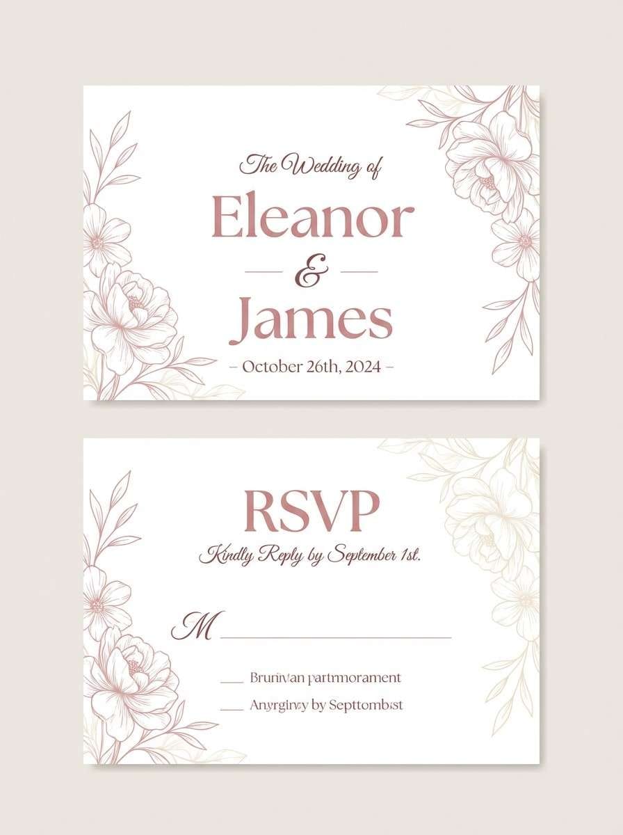
1) Blush Cloud
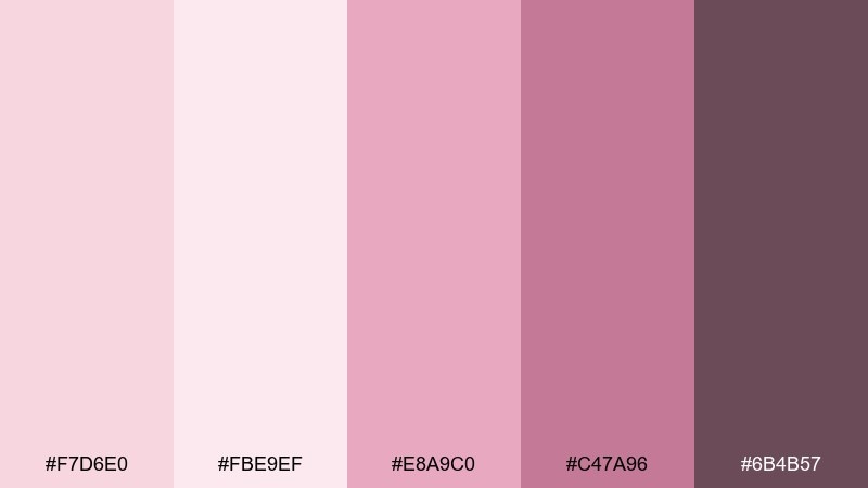
HEX: #F7D6E0 #FBE9EF #E8A9C0 #C47A96 #6B4B57
Mood: airy, romantic, softly polished
Best for: wedding invitation and RSVP sets
Airy blush tones with creamy highlights feel like tulle, petals, and candlelit rooms. Use the lightest pinks as background and reserve the deeper rose and plum for names, dates, and borders. Pair with warm white paper stock and a touch of matte foil for a refined finish. Tip: keep body text in the darkest shade for readability instead of pure black.
Image example of blush cloud generated using media.io
Media.io is an online AI studio for creating and editing video, image, and audio in your browser.

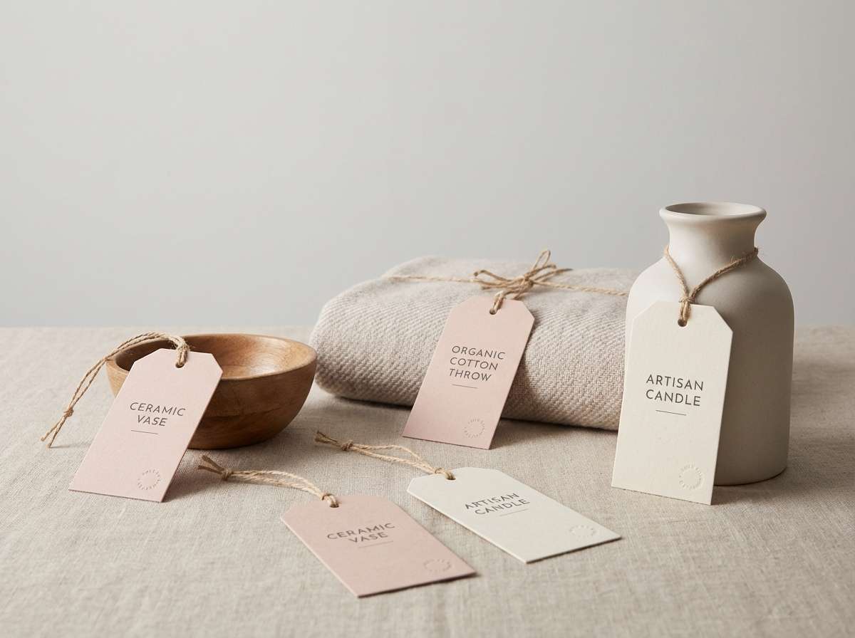
2) Rosewater Linen
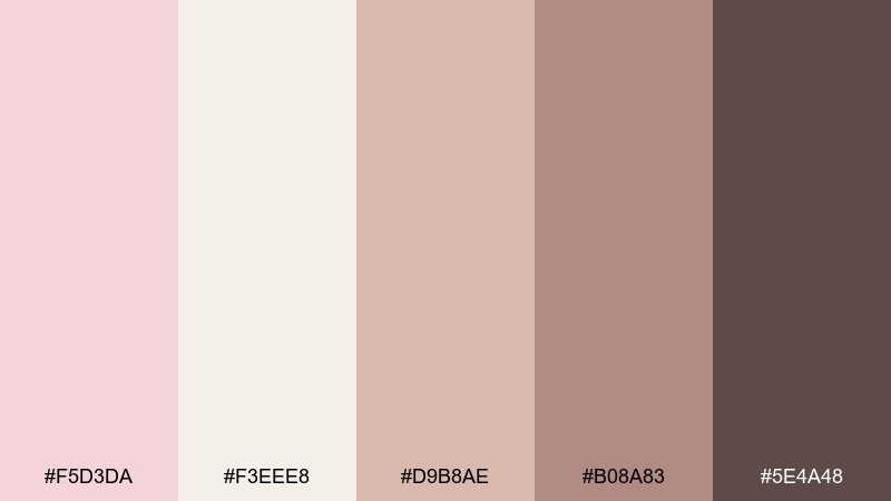
HEX: #F5D3DA #F3EEE8 #D9B8AE #B08A83 #5E4A48
Mood: cozy, organic, understated
Best for: artisan home decor branding
Cozy rosewater and linen neutrals suggest natural fabrics, handmade tags, and sunlit shelves. Lean on the off-white and blush for most surfaces, then add the taupe and cocoa shades for typography and stamp marks. It pairs beautifully with kraft textures, uncoated paper, and soft shadows in product photos. Tip: use the mid-tone beige for secondary text so layouts feel calm, not washed out.
Image example of rosewater linen generated using media.io
3) Petal and Sage
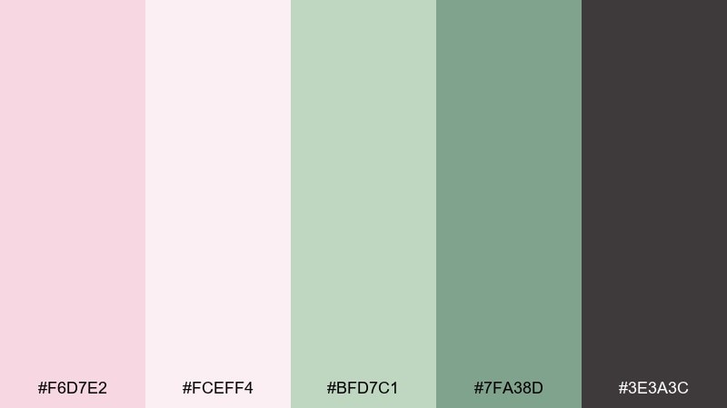
HEX: #F6D7E2 #FCEFF4 #BFD7C1 #7FA38D #3E3A3C
Mood: fresh, botanical, balanced
Best for: spring botanical illustration sets
Fresh petals against soft sage greens feel like a morning garden after light rain. These pale pink color combinations work best when green takes the supporting role and charcoal anchors the details. Pair with delicate linework, minimal shading, and plenty of negative space for a modern botanical look. Tip: keep shadows in the charcoal instead of dark green to avoid a muddy finish.
Image example of petal and sage generated using media.io
4) Ballet Slipper Neutrals
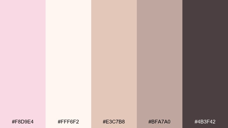
HEX: #F8D9E4 #FFF6F2 #E3C7B8 #BFA7A0 #4B3F42
Mood: elegant, gentle, timeless
Best for: minimal lifestyle blog theme
Ballet slipper pinks and warm neutrals create a graceful, quiet elegance. For a pale pink color palette that reads clean on screens, let the creamy white carry the layout and use the deeper brown for headings and links. Pair with soft gray photography and thin dividers for a modern editorial feel. Tip: keep buttons in the mid beige and reserve the darkest tone for hover states and focus rings.
Image example of ballet slipper neutrals generated using media.io
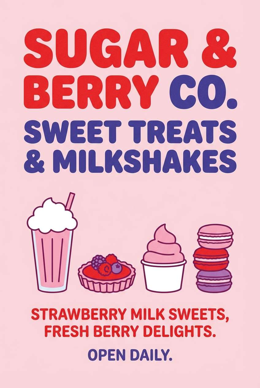
5) Strawberry Milk
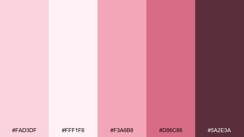
HEX: #FAD3DF #FFF1F6 #F3A6B8 #D86C86 #5A2E3A
Mood: playful, sweet, youthful
Best for: dessert shop poster design
Sweet strawberry milk pinks feel bubbly, nostalgic, and a little flirty. Use the candy blush as the hero color and keep the pale tint for background space so the poster stays legible. Pair with rounded type and simple icons, then add the berry shade for price highlights and callouts. Tip: limit large blocks of the darkest maroon to avoid making the layout feel heavy.
Image example of strawberry milk generated using media.io
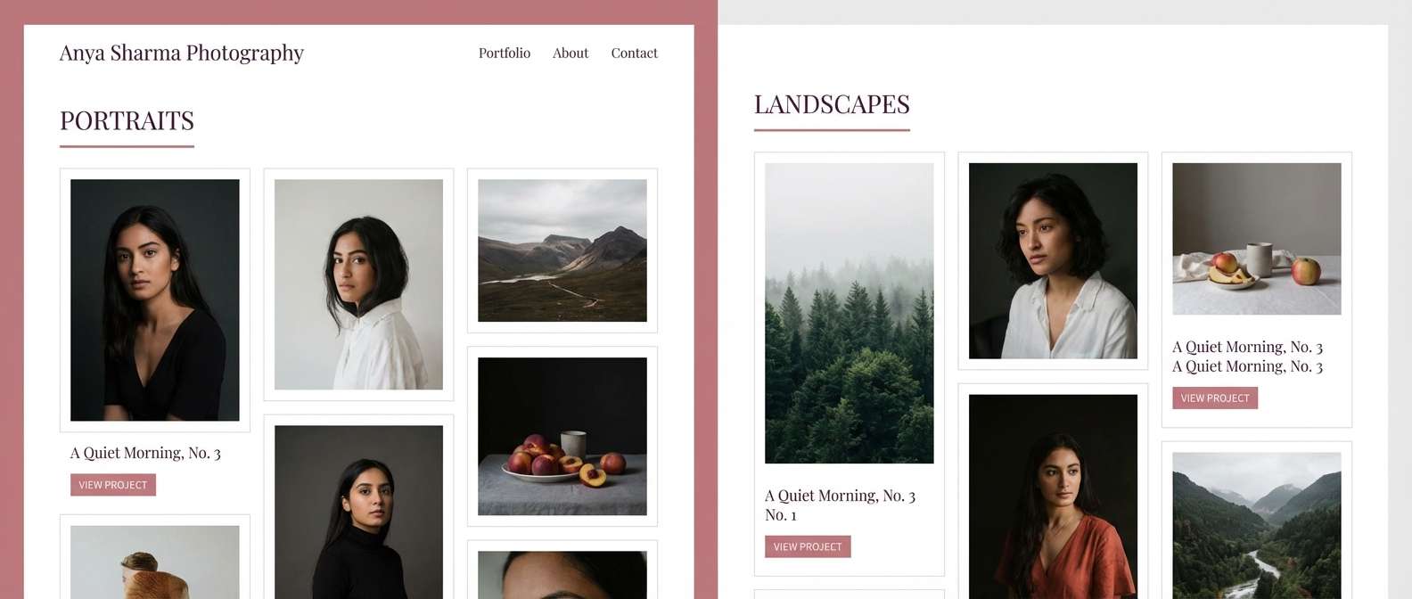
6) Dusty Rose Studio
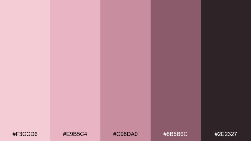
HEX: #F3CCD6 #E9B5C4 #C98DA0 #8B5B6C #2E2327
Mood: moody, artistic, refined
Best for: photography portfolio website
Dusty rose tones with deep wine shadows evoke film grain, velvet backdrops, and studio lighting. Use the light blush for whitespace, the mid rose for section headers, and the near-black plum for navigation and captions. Pair with monochrome portraits or warm-toned photography to keep the mood cohesive. Tip: add generous line spacing and thin rules so the darker shades feel intentional, not cramped.
Image example of dusty rose studio generated using media.io
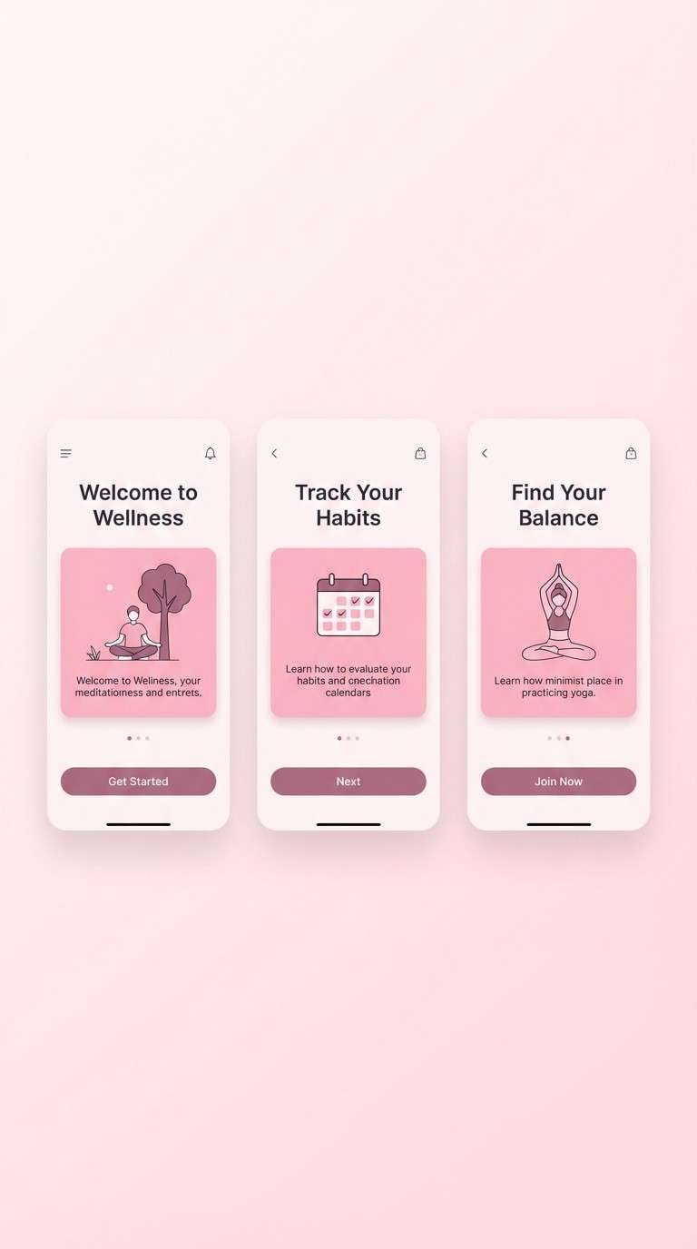
7) Peony Minimal UI
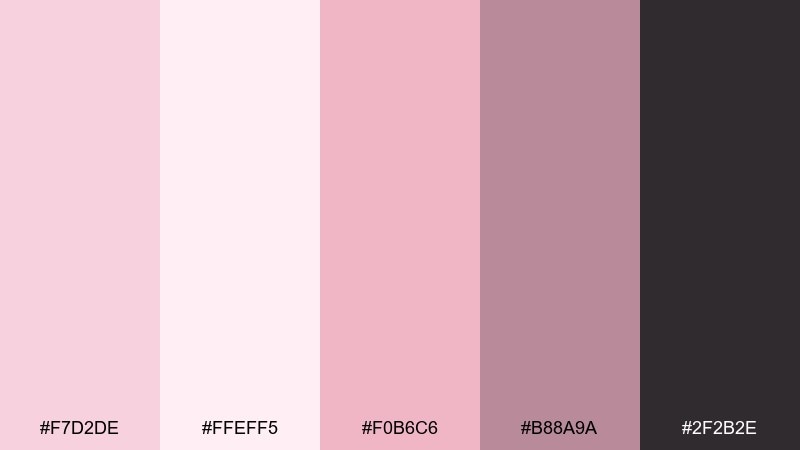
HEX: #F7D2DE #FFEFF5 #F0B6C6 #B88A9A #2F2B2E
Mood: clean, modern, friendly
Best for: health and wellness app onboarding
Soft peony pinks with crisp contrast feel reassuring, modern, and easy to trust. Keep the lightest tint as the main canvas and use the deeper mauve for icons and key CTAs. Pair with simple illustrations and calm microcopy to maintain a supportive tone. Tip: test button contrast on low-brightness screens and shift the CTA to the mid pink if needed.
Image example of peony minimal ui generated using media.io
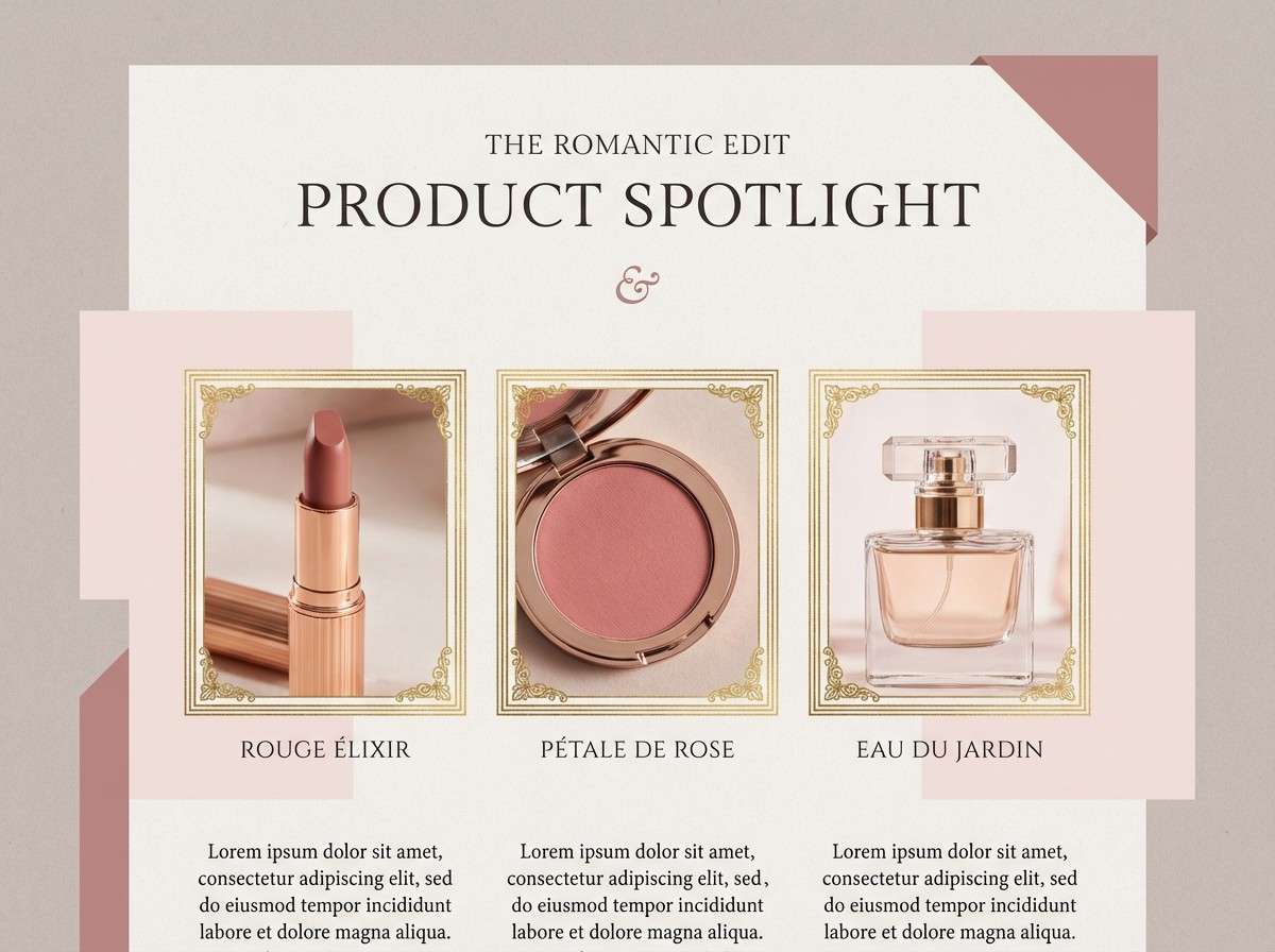
8) Vintage Vanity
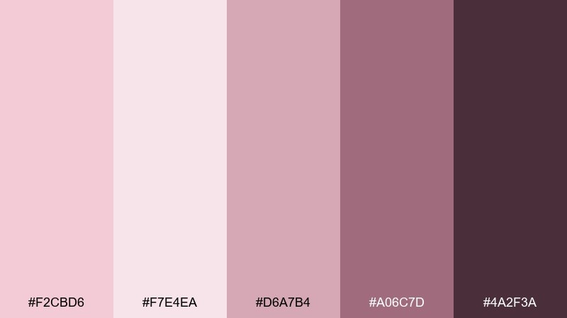
HEX: #F2CBD6 #F7E4EA #D6A7B4 #A06C7D #4A2F3A
Mood: vintage, feminine, intimate
Best for: cosmetics brand lookbook
Vintage vanity pinks feel like powder compacts, satin ribbons, and soft-focus glamour. Let the pale rose carry the page and use the deeper berry tones for captions, prices, and section dividers. Pair with warm lighting and close-up product photography for a cohesive, luxe mood. Tip: keep decorative elements thin so the palette stays elegant instead of ornate.
Image example of vintage vanity generated using media.io
9) Cotton Candy Calm
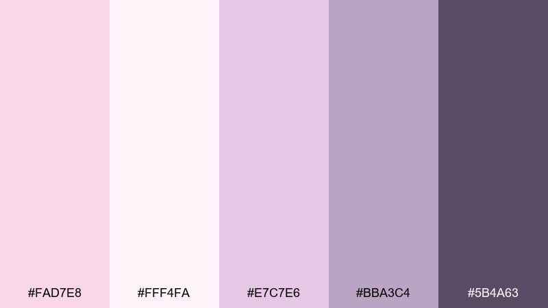
HEX: #FAD7E8 #FFF4FA #E7C7E6 #BBA3C4 #5B4A63
Mood: dreamy, calm, softly whimsical
Best for: sleep podcast cover art
Dreamy cotton-candy pinks with lavender undertones feel like quiet clouds at dusk. Use the pale tint for the background and build hierarchy with the lavender mid-tones for titles and shapes. Pair with gentle gradients and minimal stars or moon motifs to keep it soothing. Tip: avoid pure black text and use the deep violet for a softer, sleep-friendly contrast.
Image example of cotton candy calm generated using media.io

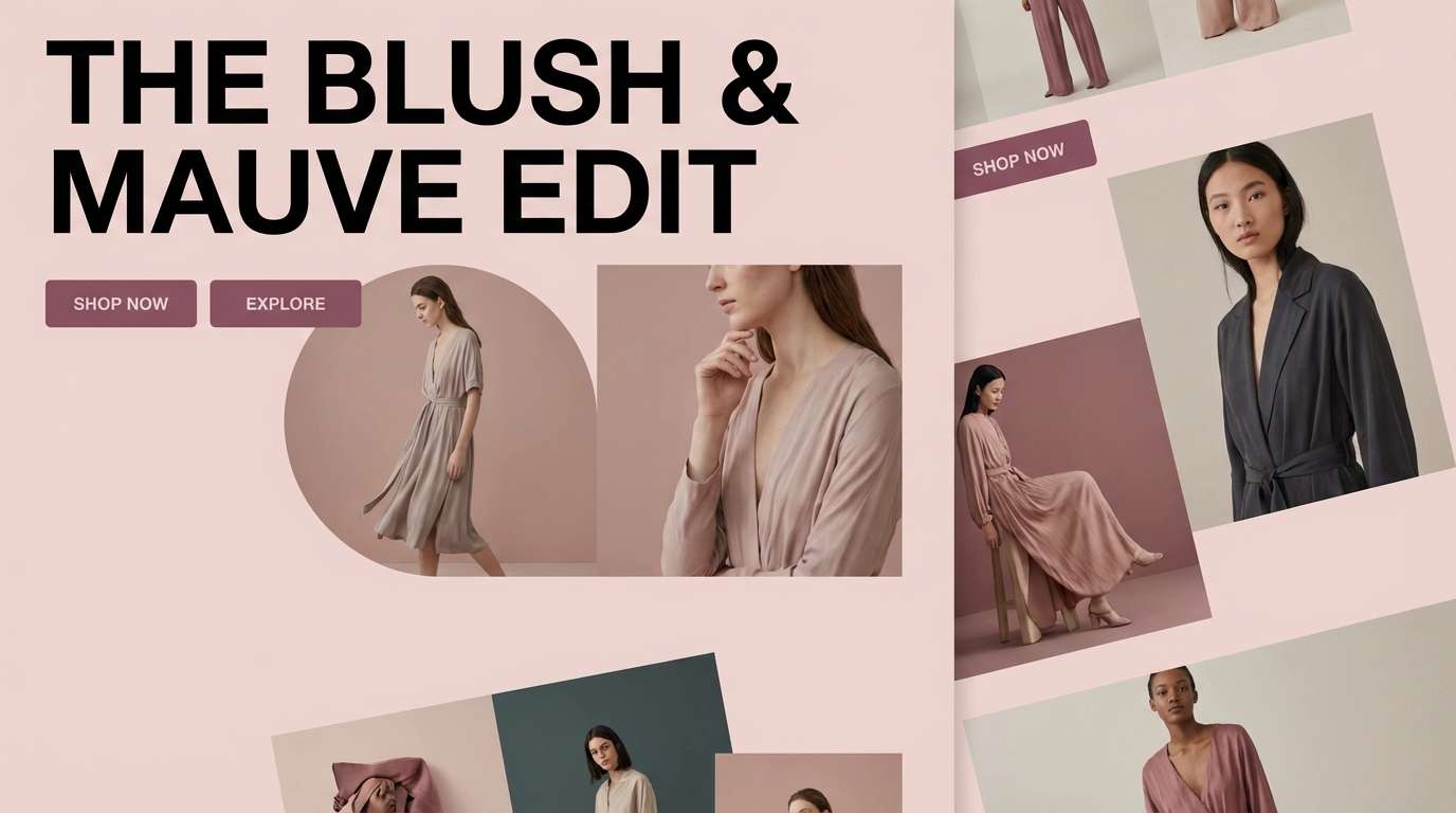
10) Mauve Twilight
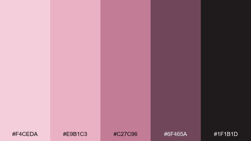
HEX: #F4CEDA #E9B1C3 #C27C96 #6F465A #1F1B1D
Mood: dramatic, cinematic, modern
Best for: fashion campaign landing page
Mauve twilight shades evoke velvet evenings and glossy editorial lighting. This pale pink color scheme shines when the deep near-black is used for large type and the mid mauve becomes the accent for buttons and highlights. Pair with high-contrast photography and minimal grid layouts for a premium look. Tip: use the light blush as a soft overlay behind images to unify the page.
Image example of mauve twilight generated using media.io
11) Cherry Blossom Garden
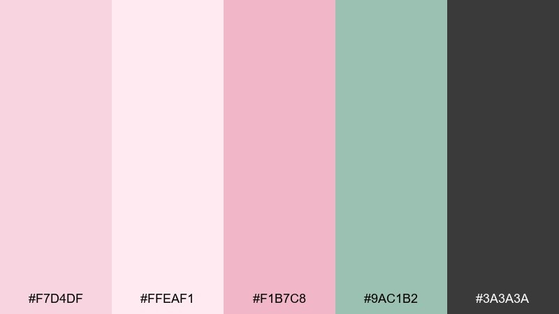
HEX: #F7D4DF #FFEAF1 #F1B7C8 #9AC1B2 #3A3A3A
Mood: bright, springlike, uplifting
Best for: seasonal social media templates
Cherry blossom pinks with a hint of mint feel fresh, optimistic, and instantly seasonal. Use the palest pink as the canvas, mint for secondary blocks, and charcoal for bold text that stays readable in feeds. Pair with simple floral silhouettes and clean sans-serif type for quick, scroll-stopping posts. Tip: keep the strongest pink for small badges and stickers so it pops without overpowering photos.
Image example of cherry blossom garden generated using media.io
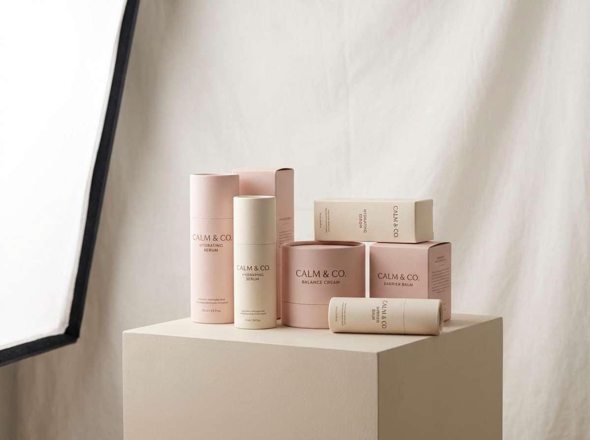
12) Soft Quartz and Cocoa
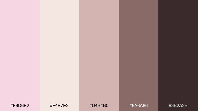
HEX: #F6D6E2 #F4E7E2 #D4B4B0 #8A6A66 #3B2A2B
Mood: warm, grounded, quietly luxurious
Best for: skincare packaging design
Soft quartz pinks with cocoa browns feel warm, comforting, and quietly premium. Use the cream and blush for the box base and let cocoa anchor the logo and ingredient list. Pair with minimal line icons and lots of whitespace to signal clean formulas and gentle routines. Tip: print-test the mid taupe on matte stock so small text stays crisp.
Image example of soft quartz and cocoa generated using media.io
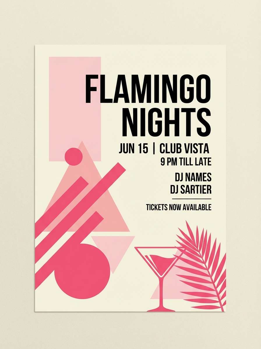
13) Flamingo Accent Pop
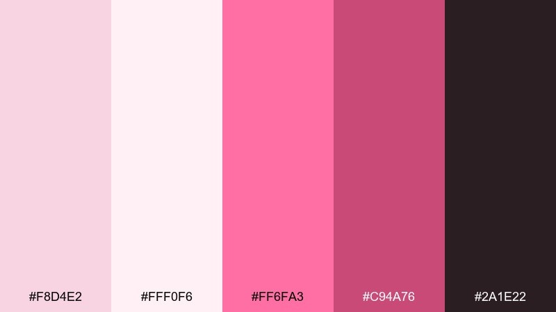
HEX: #F8D4E2 #FFF0F6 #FF6FA3 #C94A76 #2A1E22
Mood: bold, energetic, playful
Best for: event flyer and promo graphics
A playful blush base with a flamingo-hot accent feels energetic and modern. Use the bright pink sparingly for dates, ticket buttons, or a single graphic element, while the soft tints keep the layout breathable. Pair with heavy sans-serif type and simple geometric shapes for maximum clarity. Tip: keep the accent to one or two spots per design so it reads as intentional emphasis.
Image example of flamingo accent pop generated using media.io
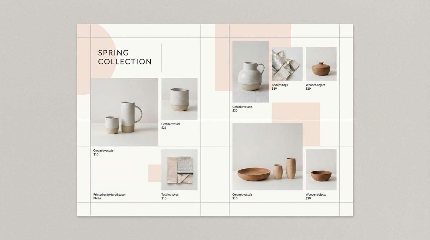
14) Nordic Blush
HEX: #F3D2DB #F7F2EE #D9D6D3 #A9A3A1 #3A3436
Mood: minimal, airy, Scandinavian
Best for: product catalog design
Nordic blush with cool grays feels minimal, spacious, and design-forward. Keep the warm white and blush for page backgrounds, then rely on the gray range for tables, captions, and product specs. Pair with clean product photography and thin dividers to maintain a showroom vibe. Tip: use the charcoal only for headlines so the overall tone stays light.
Image example of nordic blush generated using media.io
15) Sakura Editorial
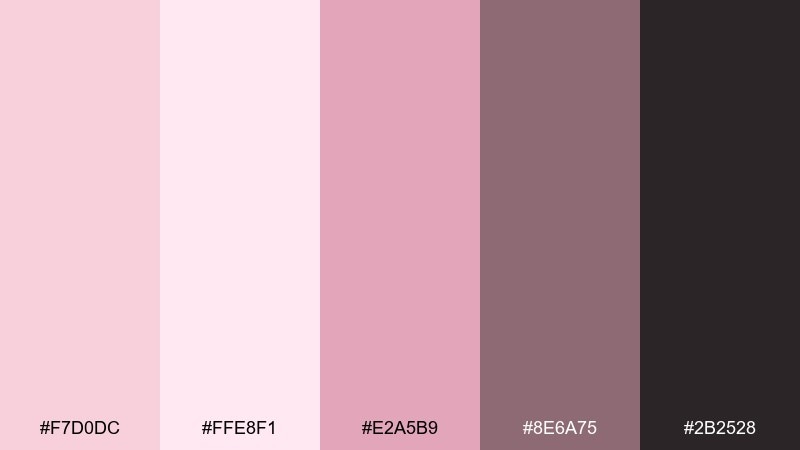
HEX: #F7D0DC #FFE8F1 #E2A5B9 #8E6A75 #2B2528
Mood: editorial, refined, softly dramatic
Best for: magazine feature layout
Sakura-inspired pinks with muted mauve shadows feel like a fashion editorial shot on overcast daylight. Use the pale tint to frame images and the deeper mauve for pull quotes and section markers. Pair with high-contrast black-and-white photos or warm neutrals to keep the spread cohesive. Tip: keep one dominant pink per page and let typography do the heavy lifting.
Image example of sakura editorial generated using media.io
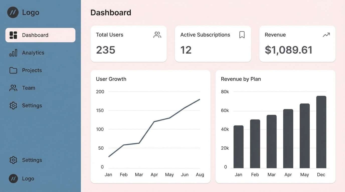
16) Powder Pink and Steel
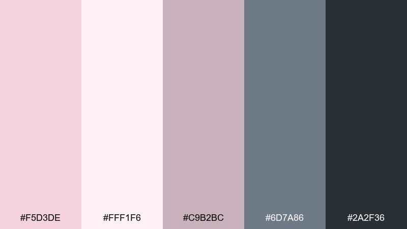
HEX: #F5D3DE #FFF1F6 #C9B2BC #6D7A86 #2A2F36
Mood: modern, cool, professional
Best for: SaaS dashboard UI
Powder pink balanced with steel blues feels modern and surprisingly professional. Use the near-white pink as the background, steel for navigation, and charcoal for dense data text. Pair with simple charts and subtle borders to keep the dashboard clean and scannable. Tip: reserve the pinkest shade for alerts or selected states so it functions like a gentle highlight.
Image example of powder pink and steel generated using media.io
17) Pastel Confectionery
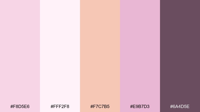
HEX: #F8D5E6 #FFF2F8 #F7C7B5 #E9B7D3 #6A4D5E
Mood: soft, sugary, cheerful
Best for: bakery packaging and labels
Sugary pastels with a hint of peach feel cheerful, giftable, and boutique-ready. Keep the lightest pink for the main label field and use the peach as a secondary accent on icons or flavor names. Pair with simple illustrations and rounded corners to reinforce the sweet theme. Tip: use the deep plum only for barcodes and legal text so it does not compete with the playful tones.
Image example of pastel confectionery generated using media.io
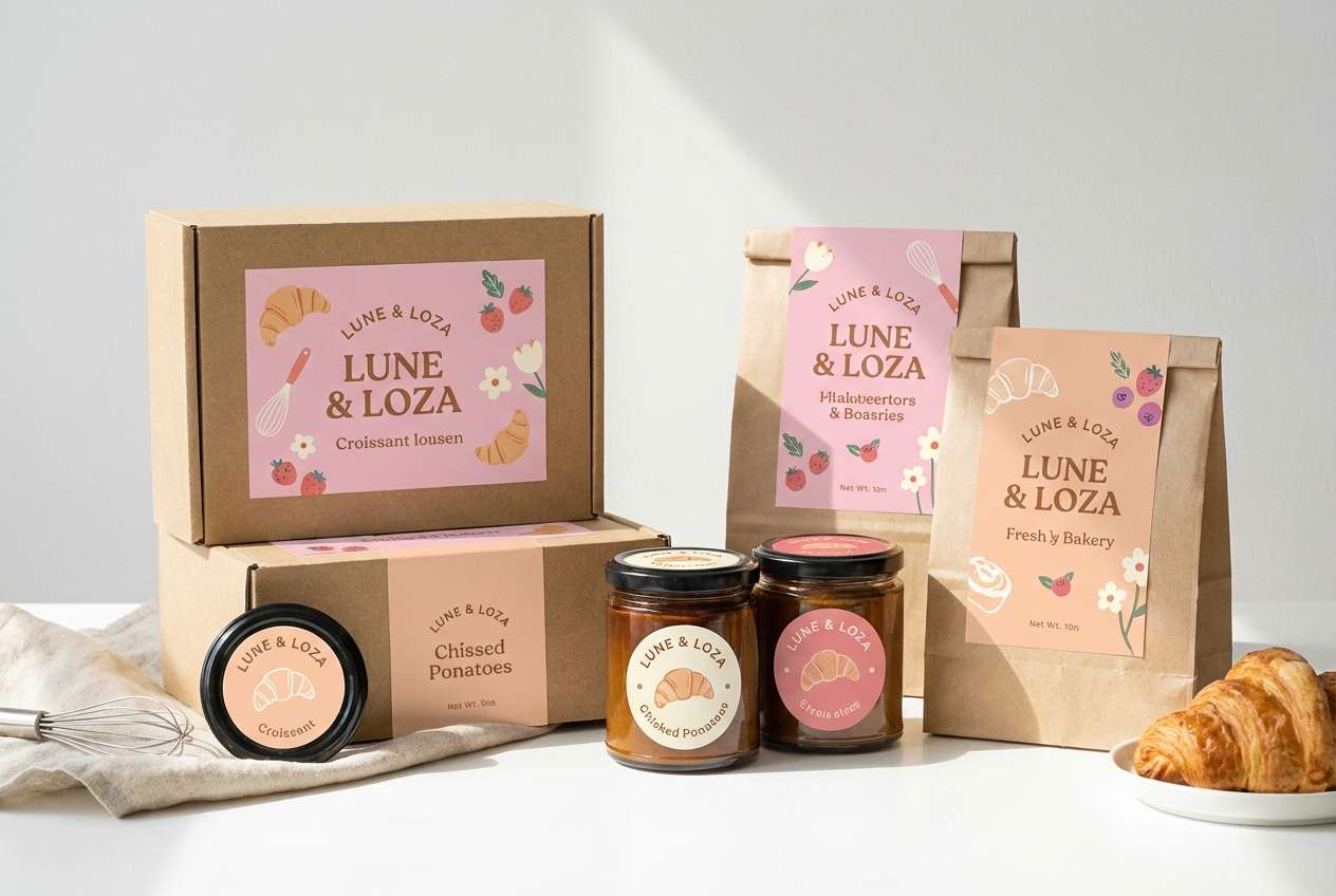
18) Warm Blush Glam
HEX: #F6CEDA #FFE9F2 #F0B79C #C98B7A #3A2A2A
Mood: warm, glamorous, inviting
Best for: beauty product ad creative
Warm blush with a peachy glow feels glamorous, flattering, and camera-ready. Use the light pink as the background and bring in the peach tone on highlights that mimic skin warmth. Pair with soft shadows, glossy product renders, and minimal text for a premium ad look. Tip: keep the darkest shade for the brand name and one key claim so the message stays focused.
Image example of warm blush glam generated using media.io
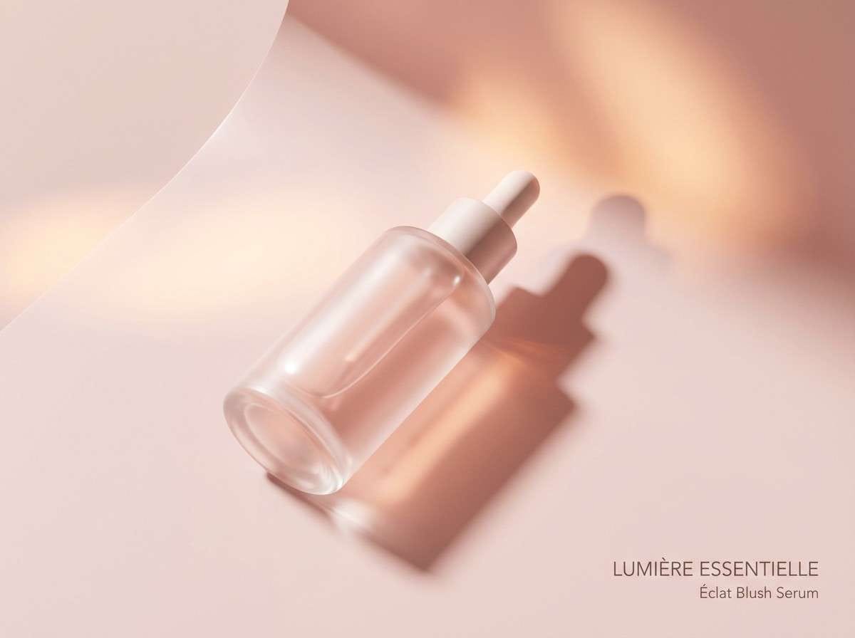
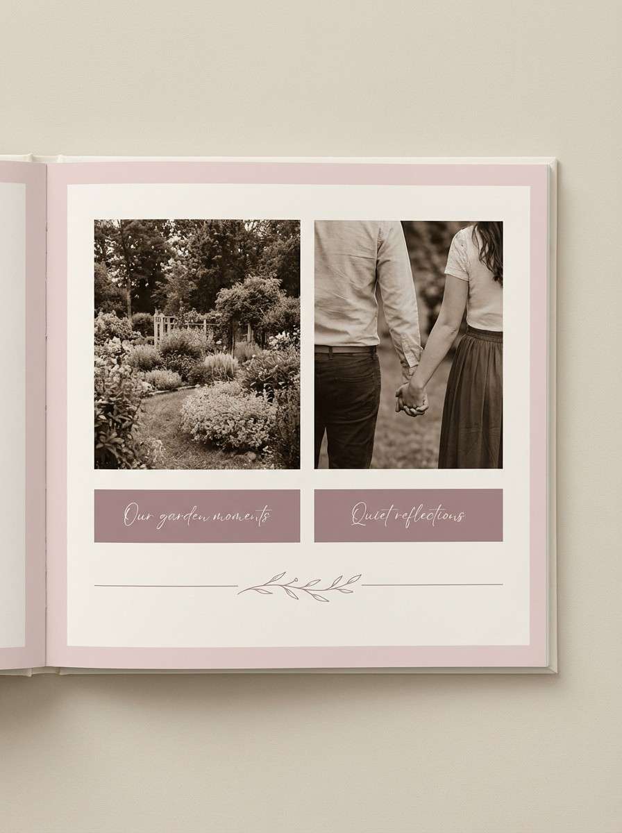
19) Quiet Romance
HEX: #F4D2DE #F9EEF2 #D7B7C3 #9B7D8A #46343C
Mood: tender, calm, intimate
Best for: couples photo book design
Tender pinks with muted mauves feel like handwritten notes and soft afternoon light. Use the palest shade for page backgrounds and keep the mid tones for captions, dates, and small decorative rules. Pair with warm monochrome images and plenty of margins for a timeless photo book. Tip: set text in the deep plum and avoid mid-tone text on blush backgrounds for clarity.
Image example of quiet romance generated using media.io
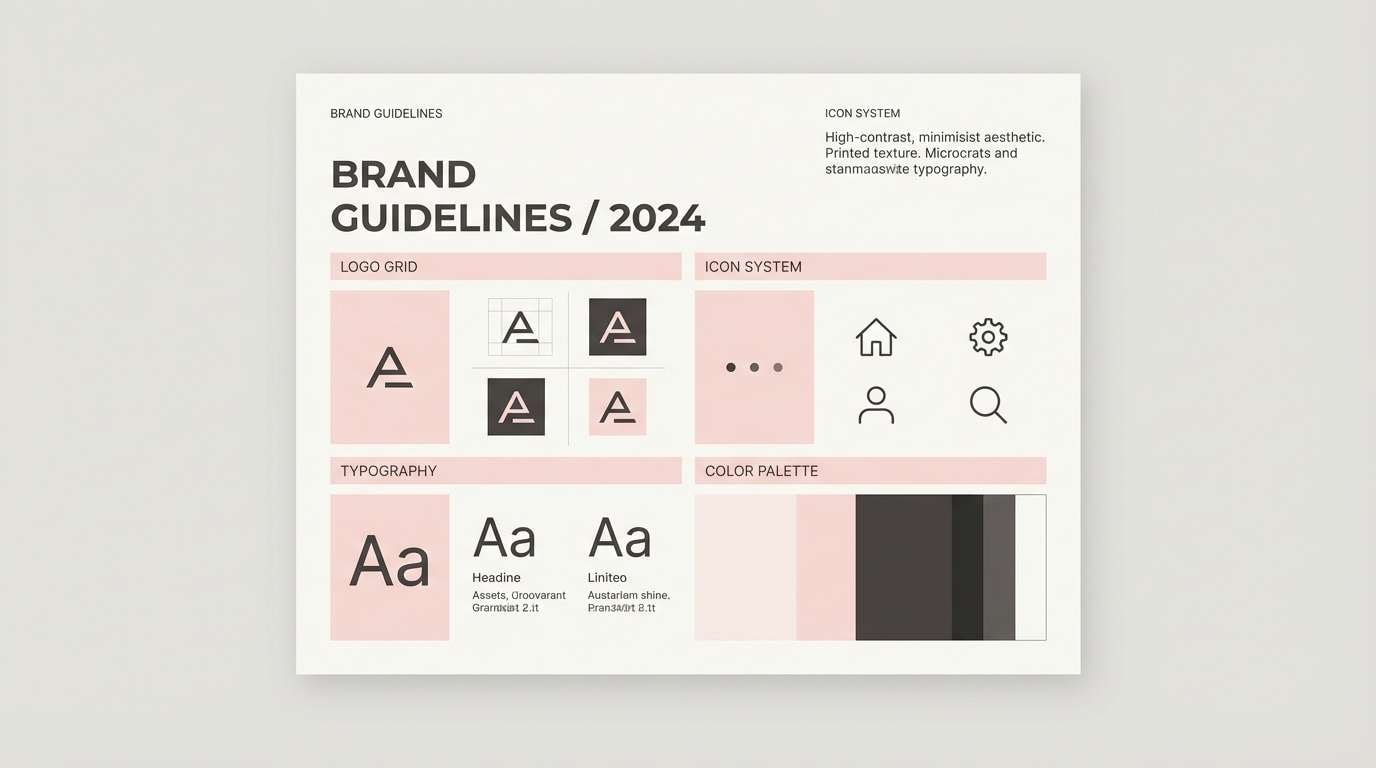
20) Modern Petal Contrast
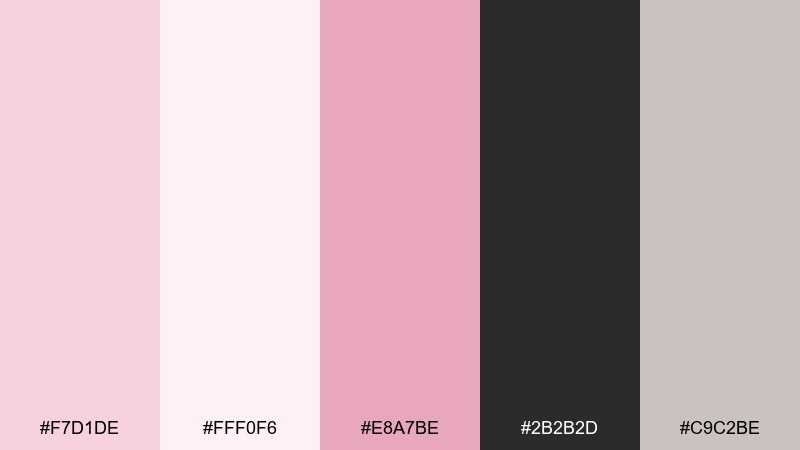
HEX: #F7D1DE #FFF0F6 #E8A7BE #2B2B2D #C9C2BE
Mood: modern, crisp, high-contrast
Best for: brand guidelines and logo system
Crisp petal pink against charcoal feels modern, confident, and brand-ready. These pale pink color combinations work best when the dark neutral is the primary text color and pink is reserved for highlights, badges, and secondary marks. Pair with clean geometric logos and a restrained icon set for a sharp system. Tip: define one signature accent pink and keep the rest of the palette neutral to maintain consistency across touchpoints.
Image example of modern petal contrast generated using media.io
What Colors Go Well with Pale Pink?
Dark neutrals are the easiest match. Charcoal, deep plum, and cocoa brown give pale pink instant structure and readability, which is why they work so well for typography, navigation, and fine print.
For a fresher look, try soft greens like sage or mint. They balance pink’s warmth with a botanical feel and are ideal for spring themes, wellness brands, and lifestyle graphics.
If you want something more modern and “tech-friendly,” add cool grays or steel blue. This shifts pale pink from romantic to professional and helps it fit dashboards, data-heavy screens, and B2B branding.
How to Use a Pale Pink Color Palette in Real Designs
Start by choosing a role for pink: background tint, UI surface color, or small accent. Pale pink works best when you keep large areas light and use one deeper shade (or a dark neutral) to anchor hierarchy.
For UI, prioritize contrast on buttons, links, and form fields. Many pale pinks are too light for white text, so test CTAs with a mid-tone mauve or berry shade and keep body text in charcoal instead of pure black.
For print, paper and finish matter. Uncoated stock makes pink feel soft and organic; matte foil or spot UV can elevate it into something premium without making the palette look overly glossy.
Create Pale Pink Palette Visuals with AI
If you have a palette you love but need matching visuals (posters, mockups, social templates, packaging scenes, or UI screens), AI generation is a fast way to keep the style consistent.
Reuse the prompts above to stay aligned with each palette’s mood, then iterate by swapping only the subject (e.g., “skincare packaging” to “soap packaging”) while keeping lighting, layout, and aspect ratio.
When you generate multiple images, keep one “signature” accent pink consistent across versions so your set looks intentional and brand-ready.
Pale Pink Color Palette FAQs
-
Is pale pink a good brand color?
Yes—pale pink communicates softness, care, and approachability. It works especially well for beauty, wellness, lifestyle, and event brands when balanced with a dark neutral for clarity. -
What’s the best text color on a pale pink background?
Use a dark neutral like charcoal, deep plum, or cocoa rather than pure black. These shades keep contrast strong while staying visually softer and more cohesive with pink. -
How do I keep a pale pink color scheme from looking too “sweet”?
Add cool grays, steel blue, or charcoal, and reduce the number of pink shades used at once. Let pink be an accent or surface tint instead of the only dominant color. -
What accent colors pop against pale pink?
Berry pinks, wine tones, and flamingo/hot pink accents pop strongly. For a fresher contrast, try mint or sage—just keep the accent areas small and intentional. -
Does pale pink print well?
It usually prints well, but very light tints can wash out depending on paper and finish. Always do a print test, and consider using a slightly deeper mid-pink for small text or thin lines. -
Can pale pink work in professional UI design?
Yes. Pair it with steel blue, cool gray, and charcoal for navigation and data text. Use pale pink as a background tint or selected state rather than the main functional color. -
How many colors should I use from a pale pink palette?
A practical rule is 2–3 main colors plus one dark anchor for text. Use the lightest shade for backgrounds, a mid-tone for components, and a deeper tone for emphasis and states.


