

Jade sits between green and teal, so it can feel natural, clean, and modern at the same time. That range makes a jade color palette easy to adapt for branding, UI, and print.
Below are 20 curated jade color scheme ideas with HEX codes, plus quick guidance on what to pair with jade and how to apply it in real layouts.
In this article
- Why Jade Palettes Work So Well
-
- rainforest jade
- porcelain mint
- vintage apothecary
- desert sage
- coastal lagoon
- dark jade noir
- soft spa stones
- citrus jade pop
- botanical ink
- arctic jade glow
- copper patina
- orchid jade twist
- sandstone oasis
- modern office calm
- retro diner jade
- midnight conservatory
- wedding eucalyptus
- tech gradient jade
- ceramic tile jade
- autumn jade and clay
- What Colors Go Well with Jade?
- How to Use a Jade Color Palette in Real Designs
- Create Jade Palette Visuals with AI
Why Jade Palettes Work So Well
Jade is versatile because it balances the calm of green with the freshness of blue. It can read earthy and botanical in muted tones, or sleek and tech-forward when pushed toward brighter teals.
In interfaces, jade works well for states and actions (buttons, toggles, progress) because it’s naturally attention-grabbing without the urgency of red. In print, it pairs beautifully with warm papers and textured neutrals for a premium feel.
Most jade color combinations also scale nicely across tints and shades, giving you a built-in system for backgrounds, accents, and contrast without fighting the palette.
20+ Jade Color Palette Ideas (with HEX Codes)
1) Rainforest Jade
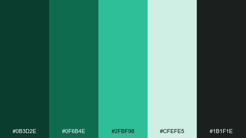
HEX: #0B3D2E #0F6B4E #2FBF98 #CFEFE5 #1B1F1E
Mood: lush, grounded, adventurous
Best for: outdoor brand identity
Lush and shaded like a forest canopy after rain, these tones feel confident and alive. Use the deep green as your anchor, then let the bright jade carry headlines, badges, or calls to action. Pair it with warm neutrals like kraft paper or soft ivory to keep it organic rather than neon. Usage tip: reserve the brightest green for one focal element per layout to maintain hierarchy.
Image example of rainforest jade generated using media.io
Media.io is an online AI studio for creating and editing video, image, and audio in your browser.

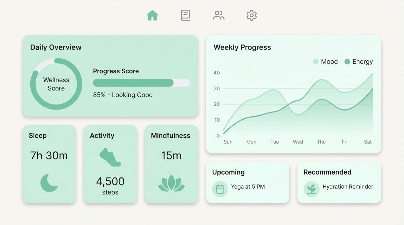
2) Porcelain Mint
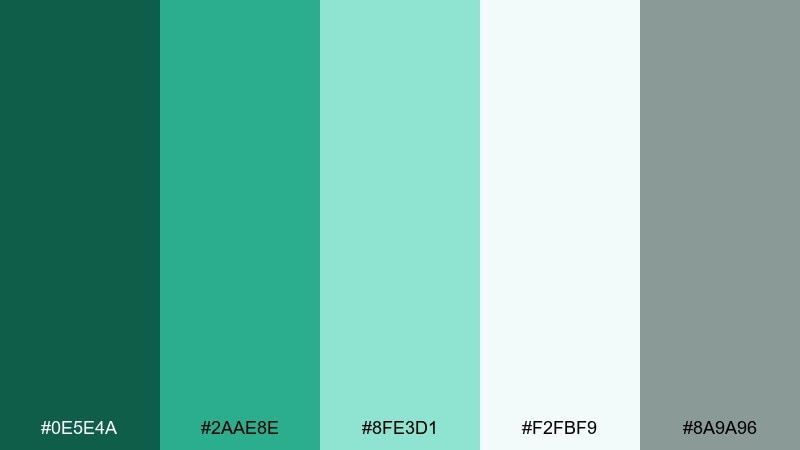
HEX: #0E5E4A #2AAE8E #8FE3D1 #F2FBF9 #8A9A96
Mood: clean, airy, gentle
Best for: wellness UI screens
Clean and airy like mint tea in a porcelain cup, this set reads calm without feeling cold. It works beautifully for health dashboards, meditation apps, and onboarding flows where clarity matters. The softer tints keep large surfaces comfortable, while the mid jade delivers legible buttons and toggles. Usage tip: keep text in dark gray instead of pure black to match the softened vibe.
Image example of porcelain mint generated using media.io
3) Vintage Apothecary
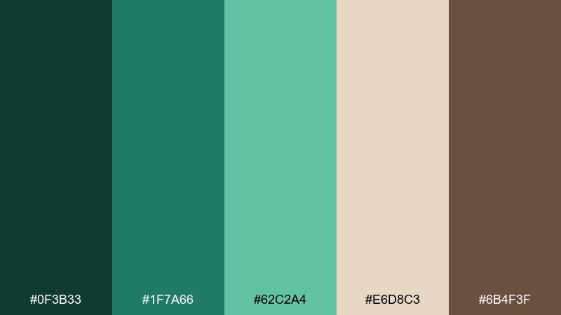
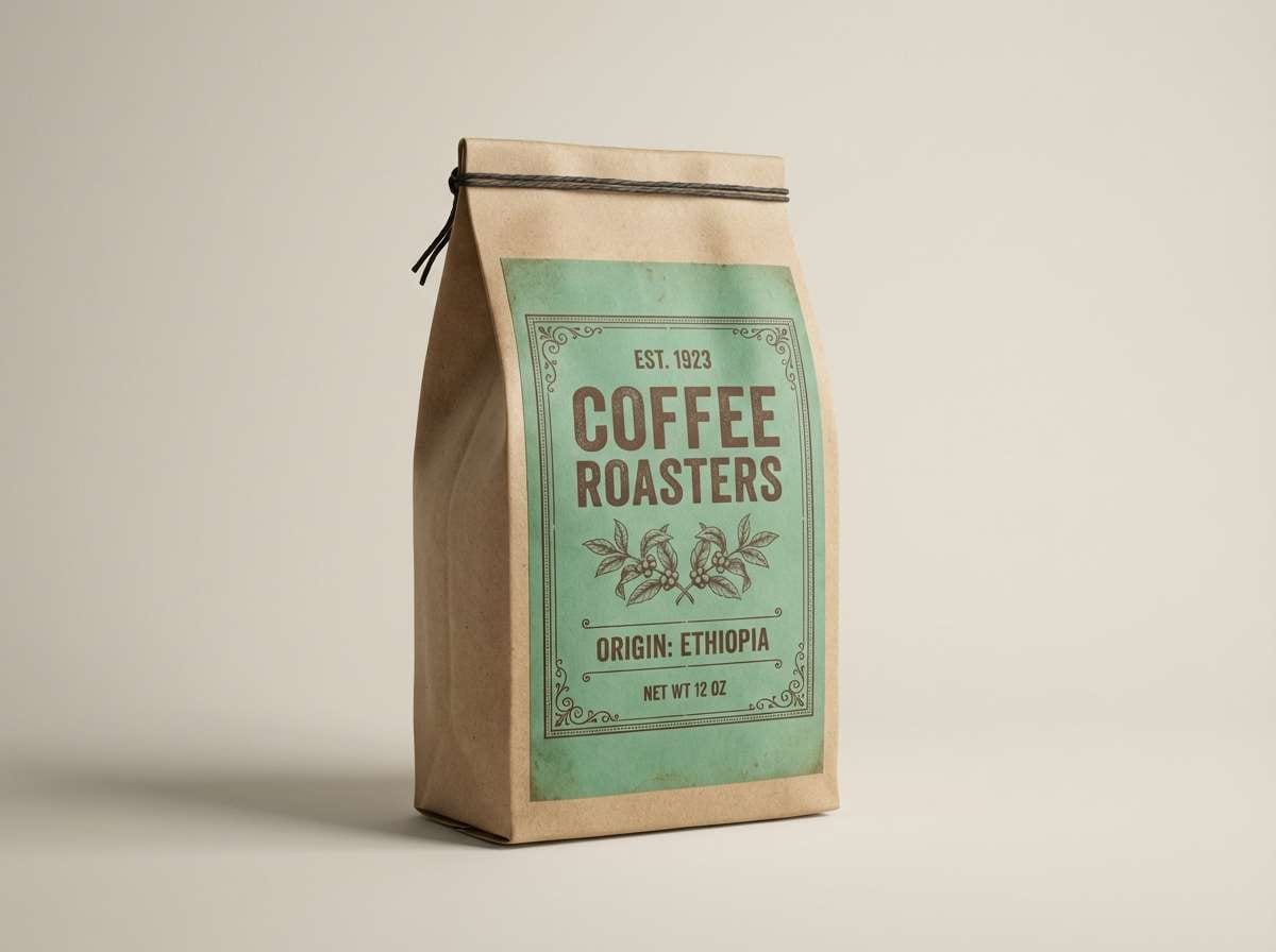
HEX: #0F3B33 #1F7A66 #62C2A4 #E6D8C3 #6B4F3F
Mood: heritage, cozy, crafted
Best for: coffee label and packaging
Heritage and cozy, like glass bottles and paper labels in an old shop, these tones feel handcrafted. The jade color combinations shine when balanced with warm beige and a touch of cocoa brown for typography. Use the darkest green for logo marks and the mid green for borders, seals, or ingredient callouts. Usage tip: add a subtle paper texture behind the beige to amplify the vintage feel.
Image example of vintage apothecary generated using media.io
4) Desert Sage
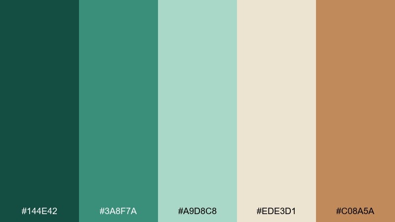
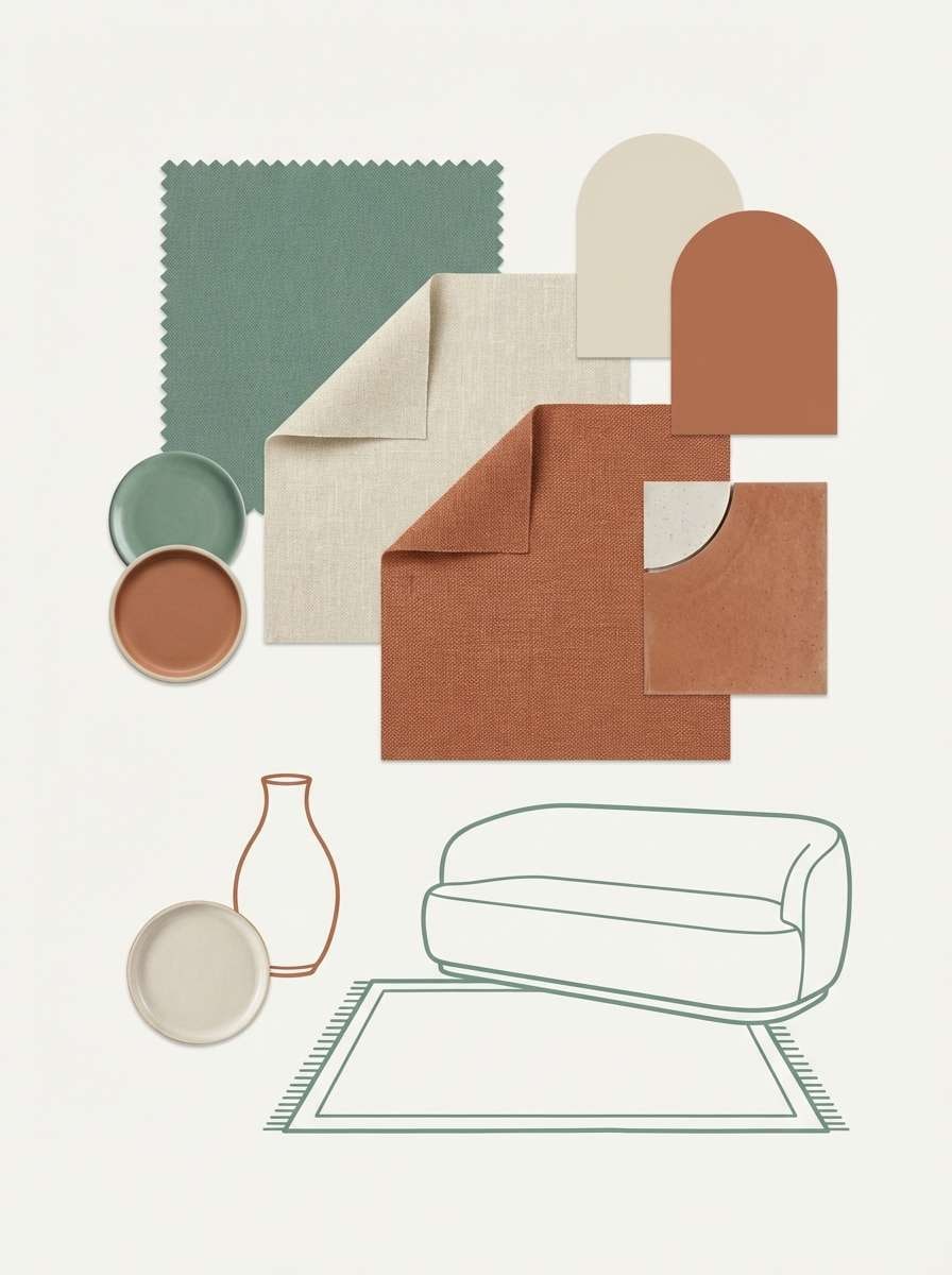
HEX: #144E42 #3A8F7A #A9D8C8 #EDE3D1 #C08A5A
Mood: earthy, warm, relaxed
Best for: boho interior moodboard
Earthy and sun-warmed, this mix feels like sage plants against sand and clay. It works well for interiors, lifestyle blogs, and moodboards that need a calm green with a desert twist. Pair the muted jade with cream backgrounds and bring in terracotta as a small accent for depth. Usage tip: repeat the terracotta only in two or three spots to keep the space feeling restful.
Image example of desert sage generated using media.io
5) Coastal Lagoon
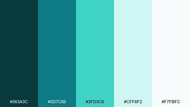
HEX: #063A3C #0D7C86 #3FD3C6 #CFF6F2 #F7FBFC
Mood: refreshing, bright, breezy
Best for: travel landing page hero
Refreshing and breezy, these lagoon tones evoke clear water and sunlit shallows. Use the deeper teal for navigation and footer areas, then let the bright aqua highlight primary actions. White space keeps the palette feeling premium rather than playful. Usage tip: add thin dividers in the palest tint to separate sections without heavy lines.
Image example of coastal lagoon generated using media.io

6) Dark Jade Noir
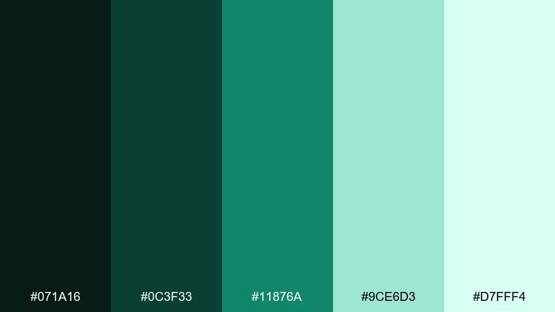
HEX: #071A16 #0C3F33 #11876A #9CE6D3 #D7FFF4
Mood: moody, luxe, dramatic
Best for: premium tech branding
Moody and luxe, it feels like a dim gallery lit by a single emerald glow. A jade color palette like this excels in high-end tech, finance, and product launches where contrast sells confidence. Keep the near-black as the main canvas, then use the vivid green sparingly for logos, hover states, and key metrics. Usage tip: soften gradients between the two lightest tints to avoid banding on dark backgrounds.
Image example of dark jade noir generated using media.io

7) Soft Spa Stones
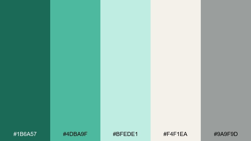
HEX: #1B6A57 #4DBA9F #BFEDE1 #F4F1EA #9A9F9D
Mood: soothing, minimal, balanced
Best for: skincare website sections
Soothing and balanced, it recalls warm towels, stone basins, and quiet steam. The creamy off-white makes product shots feel clean, while the jade tones add gentle vitality to buttons and section headers. Pair with simple sans-serif type and plenty of breathing room for a spa-like rhythm. Usage tip: keep icons in the mid gray so the greens remain the star.
Image example of soft spa stones generated using media.io
8) Citrus Jade Pop
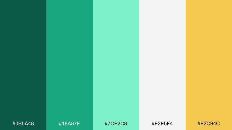
HEX: #0B5A48 #18A87F #7CF2C8 #F2F5F4 #F2C94C
Mood: playful, energetic, modern
Best for: event poster graphics
Playful and energetic, it feels like citrus zest sparked over cool green soda. The yellow accent adds instant optimism, especially on posters and social graphics that need quick stops. Use the bright jade for shapes and highlights, then keep the background near-white for readability. Usage tip: set the yellow as a small badge or underline rather than a large block to avoid glare.
Image example of citrus jade pop generated using media.io
9) Botanical Ink
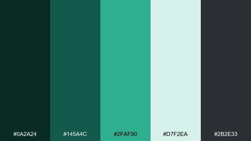
HEX: #0A2A24 #145A4C #2FAF90 #D7F2EA #2B2E33
Mood: artful, editorial, refined
Best for: magazine feature layout
Artful and refined, it suggests pressed leaves sketched in ink. The dark tones support long-form reading while the soft mint tint keeps margins and pull quotes fresh. Pair it with serif headlines and restrained line art for an editorial finish. Usage tip: use the mid jade only for callouts and section labels so it stays special.
Image example of botanical ink generated using media.io
10) Arctic Jade Glow
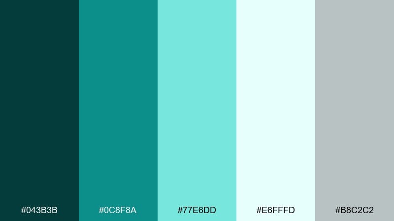
HEX: #043B3B #0C8F8A #77E6DD #E6FFFD #B8C2C2
Mood: crisp, cool, futuristic
Best for: saas onboarding screens
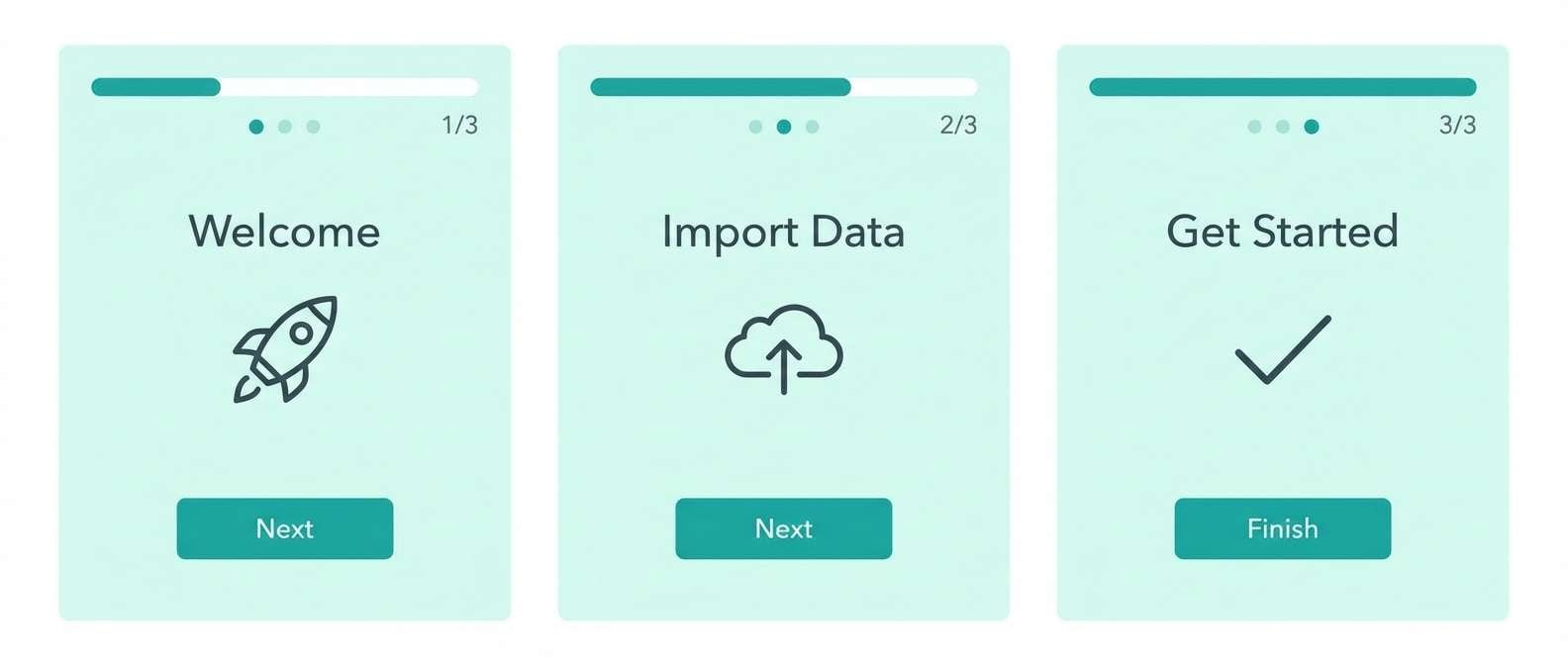
Crisp and futuristic, it feels like ice-lit glass with a subtle glow. These cool teals are great for SaaS onboarding, where you want a modern tone without harsh saturation. Keep most surfaces pale and let the brighter teal guide the eye through steps and progress states. Usage tip: ensure buttons meet contrast by pairing the bright teal with dark text or deeper teal shadows.
Image example of arctic jade glow generated using media.io
11) Copper Patina
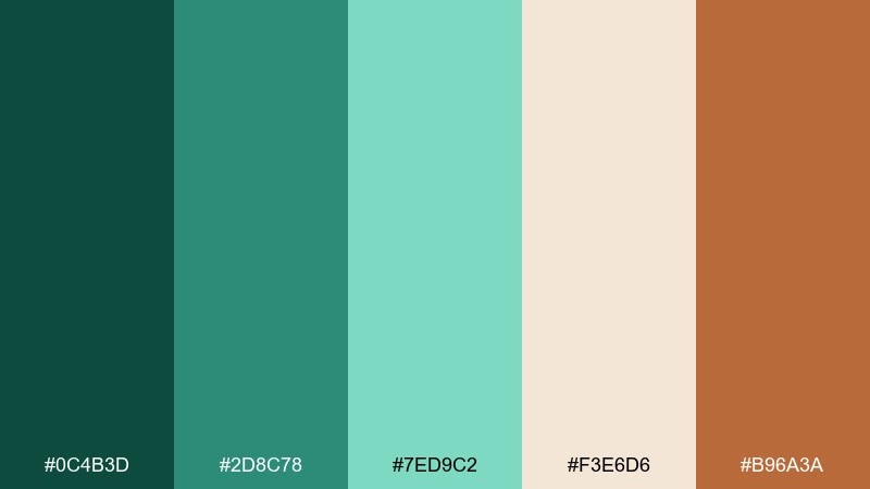
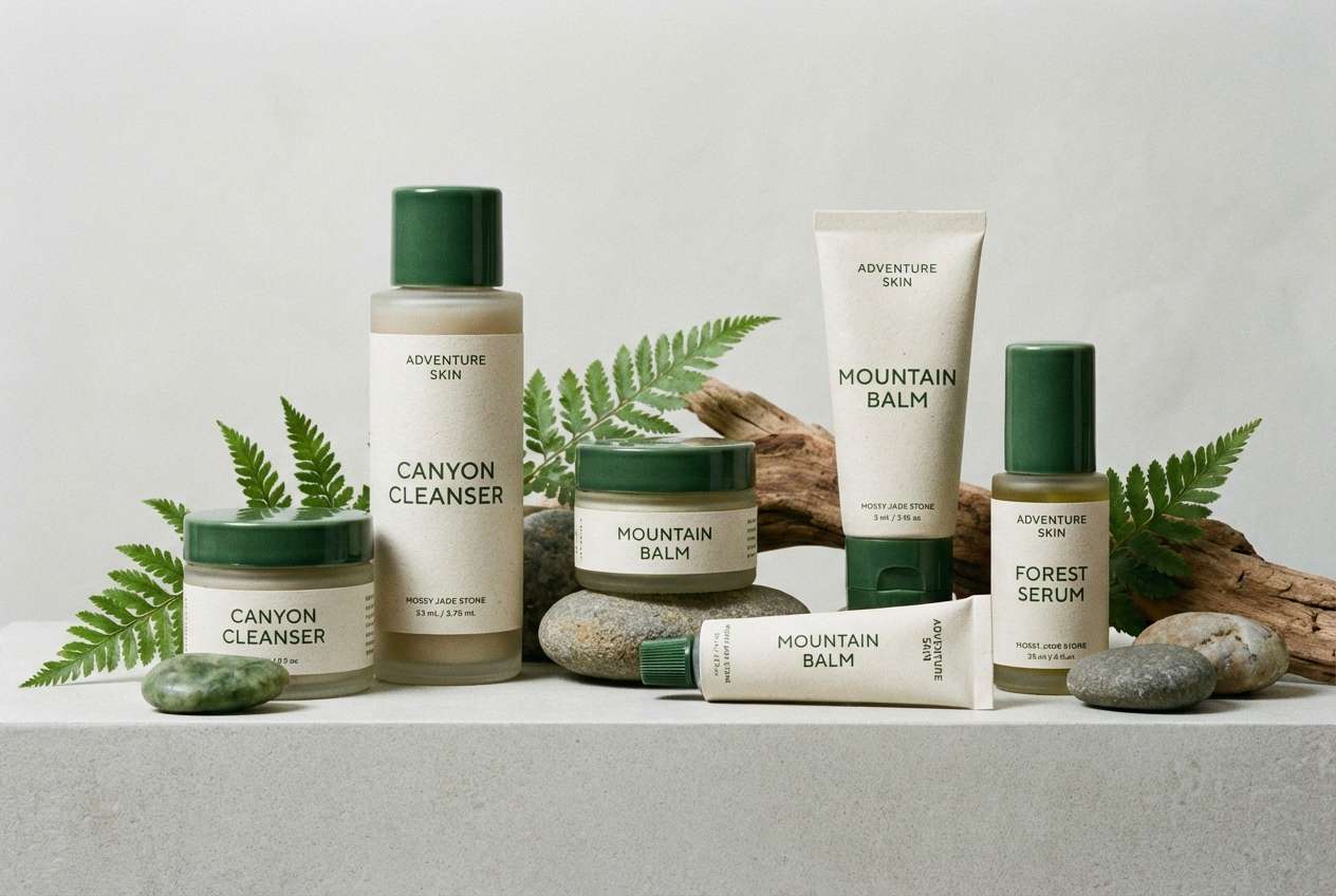
HEX: #0C4B3D #2D8C78 #7ED9C2 #F3E6D6 #B96A3A
Mood: artisanal, warm, sophisticated
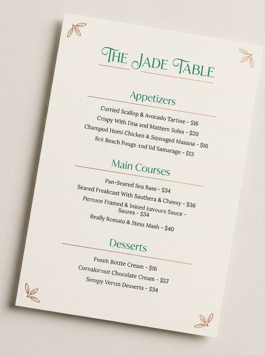
Best for: restaurant menu design
Artisanal and warm, it channels aged copper, patina, and candlelit tables. The jade color combination works best when the copper accent is used like seasoning, not the main dish. Try the cream as a menu base, deep green for headings, and copper for prices or small dividers. Usage tip: print-test the mid green, since inks can shift and dull on uncoated paper.
Image example of copper patina generated using media.io
12) Orchid Jade Twist
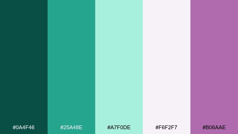
HEX: #0A4F46 #25A48E #A7F0DE #F6F2F7 #B06AAE
Mood: romantic, modern, expressive
Best for: beauty launch social ads
Romantic and expressive, it feels like cool green silk paired with a soft orchid bloom. The purple accent adds personality without overpowering the greens, making it great for beauty drops and creator promos. Use the pale blush-lilac as a backdrop and keep the orchid tone for small stamps, price tags, or stickers. Usage tip: apply the purple to one repeating motif so the feed stays cohesive.
Image example of orchid jade twist generated using media.io
13) Sandstone Oasis
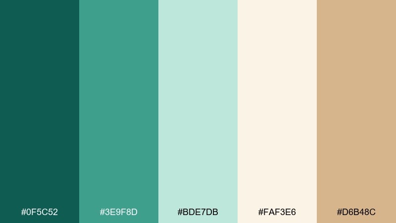
HEX: #0F5C52 #3E9F8D #BDE7DB #FAF3E6 #D6B48C
Mood: welcoming, calm, natural
Best for: home decor catalog page
Welcoming and calm, it brings to mind an oasis garden framed by pale stone. The creamy sand tone makes a friendly base for catalog layouts, while jade adds freshness to headings and product tags. Pair with warm photography and simple grids to keep everything breathable. Usage tip: keep the mid green consistent for all price or CTA elements to build scanning habits.
Image example of sandstone oasis generated using media.io
14) Modern Office Calm
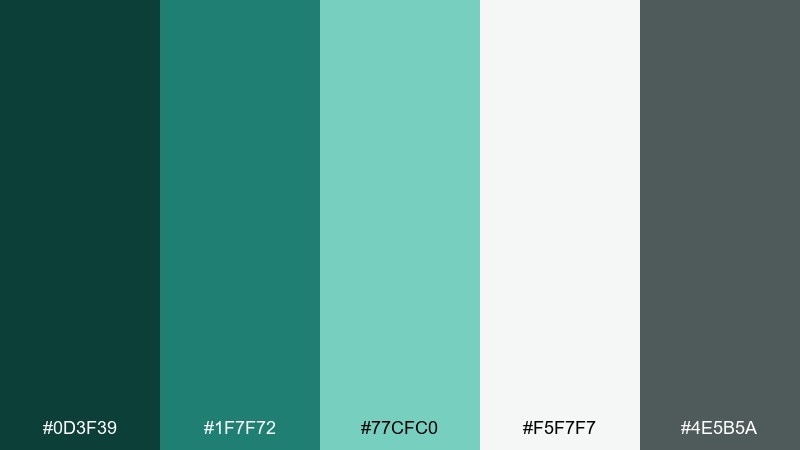
HEX: #0D3F39 #1F7F72 #77CFC0 #F5F7F7 #4E5B5A
Mood: professional, steady, approachable
Best for: b2b presentation template
Professional and steady, it feels like a tidy workspace with a hint of greenery. The deeper greens add authority on title slides, while the light mint keeps charts and tables easy on the eyes. Pair with neutral grays and plenty of whitespace for a modern corporate look. Usage tip: use the bright teal only for key data points so your charts do not get noisy.
Image example of modern office calm generated using media.io

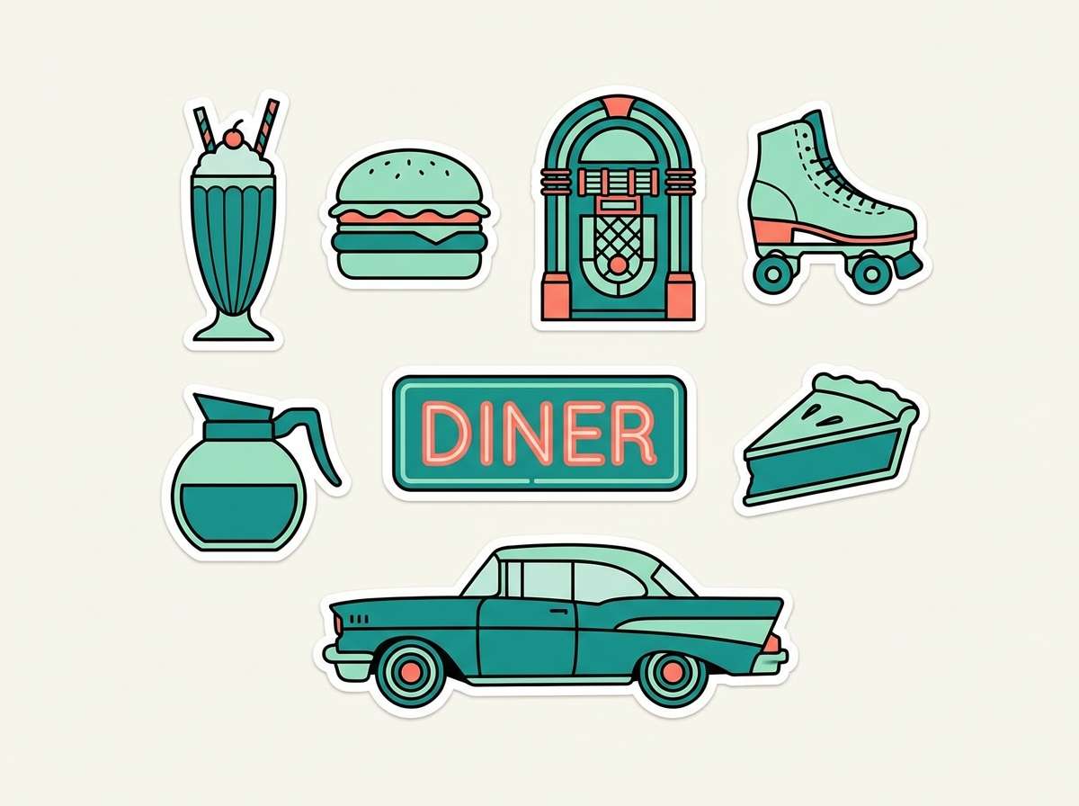
15) Retro Diner Jade
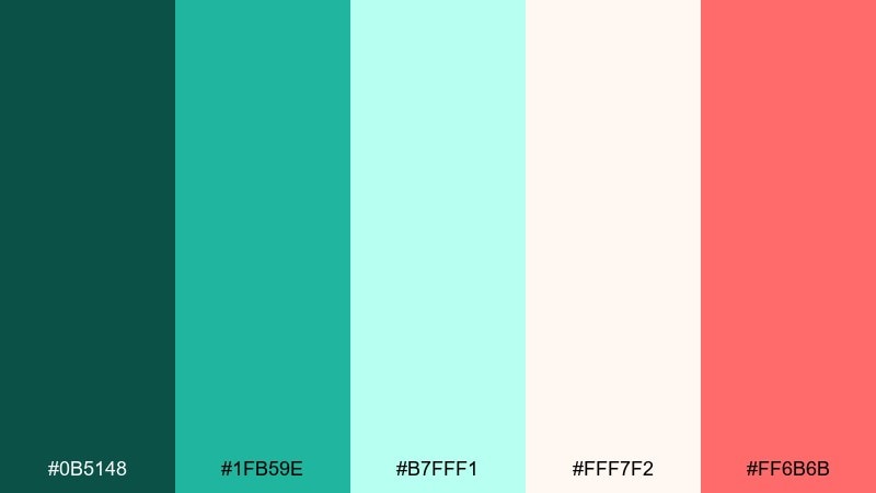
HEX: #0B5148 #1FB59E #B7FFF1 #FFF7F2 #FF6B6B
Mood: nostalgic, fun, bold
Best for: sticker set and merch
Nostalgic and fun, it nods to glossy tiles, neon signs, and vintage soda counters. The soft coral-red brings playful contrast, while the pale mint keeps it light and collectible. Use the bold teal for outlines and type, and let coral pop in small icons or punchy labels. Usage tip: keep outlines consistent in thickness so the set reads as one collection.
Image example of retro diner jade generated using media.io
16) Midnight Conservatory
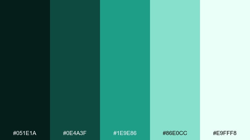
HEX: #051E1A #0E4A3F #1E9E86 #86E0CC #E9FFF8
Mood: mysterious, elegant, immersive
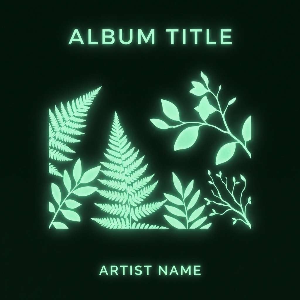
Best for: album cover artwork
Mysterious and elegant, it feels like plants silhouetted in a moonlit greenhouse. The near-black green sets a cinematic base, while the brighter tones add a subtle glow for titles and accents. Pair with minimalist typography and generous negative space for a modern cover look. Usage tip: keep the lightest tint for a single highlight area to preserve the night mood.
Image example of midnight conservatory generated using media.io
17) Wedding Eucalyptus
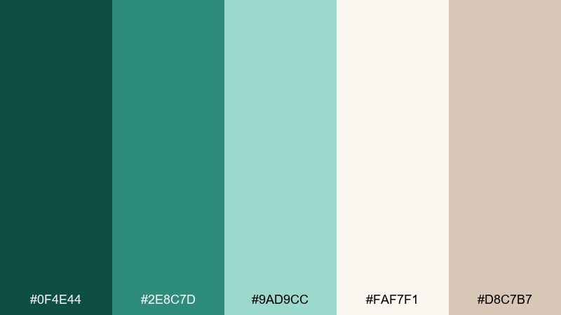
HEX: #0F4E44 #2E8C7D #9AD9CC #FAF7F1 #D8C7B7
Mood: romantic, soft, timeless
Best for: wedding invitation suite
Romantic and soft, it brings eucalyptus leaves and linen paper to mind. These jade color combinations feel especially elegant when paired with warm beige and subtle taupe for type. Use the light cream as the main card stock color, then add greenery in borders, monograms, or small motifs. Usage tip: choose a slightly textured background to make the greens feel more natural and less flat.
Image example of wedding eucalyptus generated using media.io
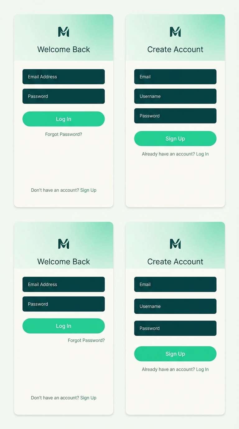
18) Tech Gradient Jade
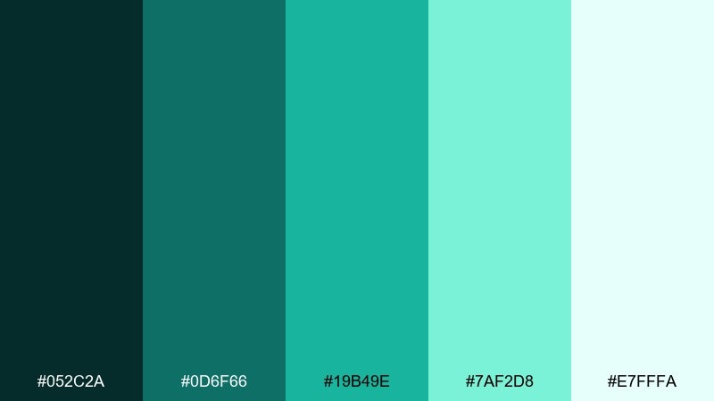
HEX: #052C2A #0D6F66 #19B49E #7AF2D8 #E7FFFA
Mood: sleek, innovative, dynamic
Best for: app login and signup UI
Sleek and dynamic, these tones feel like a smooth gradient on glass. A jade color palette like this is perfect for login screens where you want energy without clutter. Use the darkest teal for form fields and the brighter green for primary buttons, with the pale tint as a forgiving background. Usage tip: apply a subtle diagonal gradient only in the hero area so the rest stays readable.
Image example of tech gradient jade generated using media.io
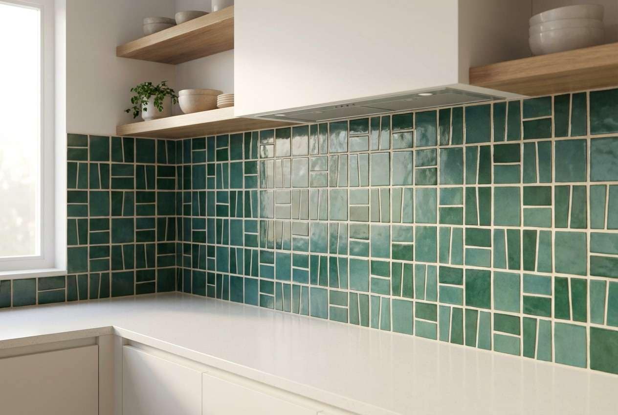
19) Ceramic Tile Jade
HEX: #0B3E3A #177E73 #4BC6B8 #D8F7F3 #F1E7D8
Mood: fresh, tidy, contemporary
Best for: kitchen backsplash mockup
Fresh and tidy, it evokes glossy tiles and clean grout lines. The cool greens look especially sharp with a warm off-white that keeps the overall feel inviting. Use the mid jade for repeating pattern blocks, then step up to the brighter teal for a few statement tiles. Usage tip: limit the brightest shade to about ten percent of the pattern for a balanced rhythm.
Image example of ceramic tile jade generated using media.io
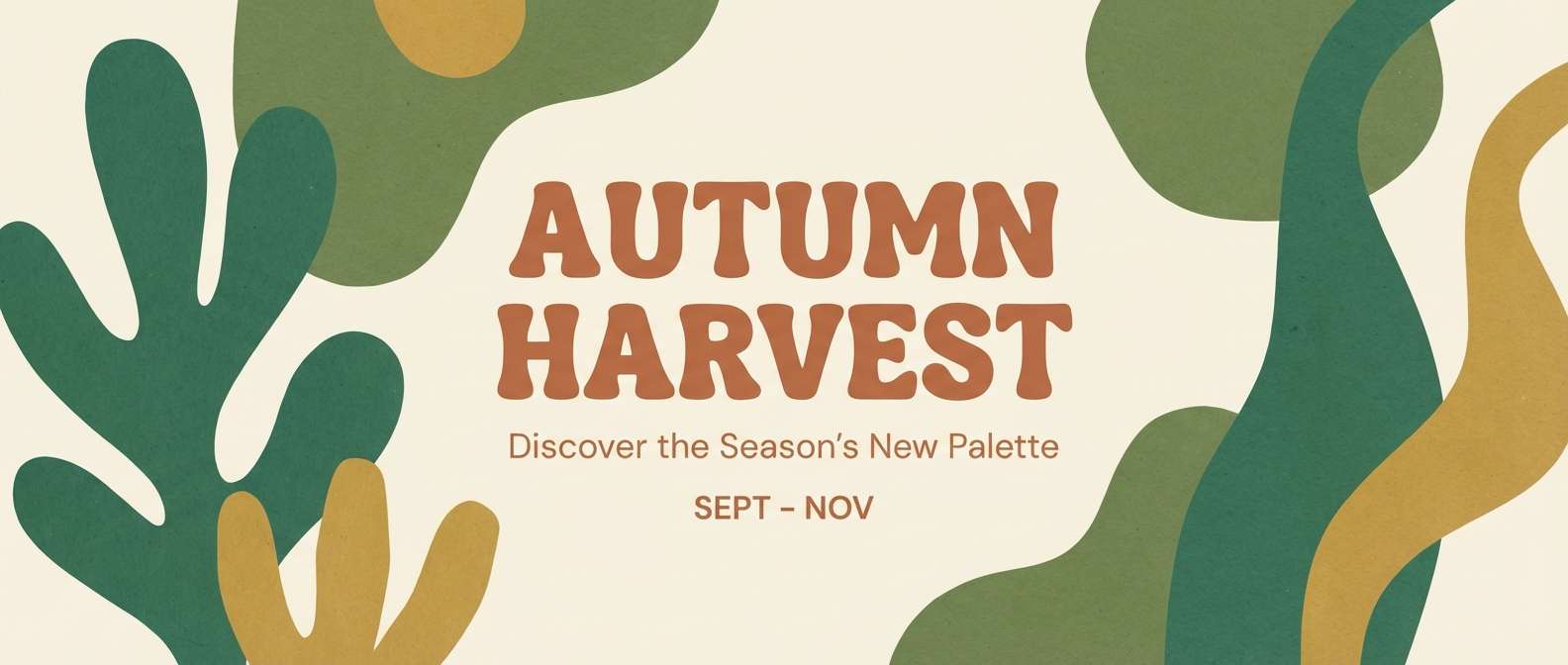
20) Autumn Jade and Clay
HEX: #0D4A3A #2F8B6E #9EE2C9 #F7EFE6 #B45A3C
Mood: cozy, seasonal, inviting
Best for: fall marketing banner
Cozy and seasonal, it feels like green leaves beside clay pots and warm pastries. The clay accent adds appetite and warmth, making it great for campaigns that need a friendly, human touch. Keep the cream background dominant and use jade for structure, with clay reserved for the headline or one key badge. Usage tip: add a thin dark-green border to frame the banner and improve contrast on bright screens.
Image example of autumn jade and clay generated using media.io
What Colors Go Well with Jade?
Jade pairs naturally with warm neutrals like ivory, beige, sand, and taupe, which help it look grounded rather than overly saturated. For typography and structure, charcoal and inky near-blacks keep the palette sophisticated.
If you want contrast, try clay, terracotta, copper, or coral as small accents—these warm tones sit opposite jade’s coolness and create instant focal points. For a softer look, pair jade with pale mint tints, cool grays, and blush-lilacs.
In digital design, keep one “hero” jade for CTAs and a quieter jade tint for backgrounds to preserve hierarchy and readability.
How to Use a Jade Color Palette in Real Designs
Start with roles, not swatches: assign one dark shade for text/nav, one mid jade for interactive elements, one bright accent for emphasis, and one pale tint for backgrounds. This prevents “too much teal” layouts and makes your system easier to scale.
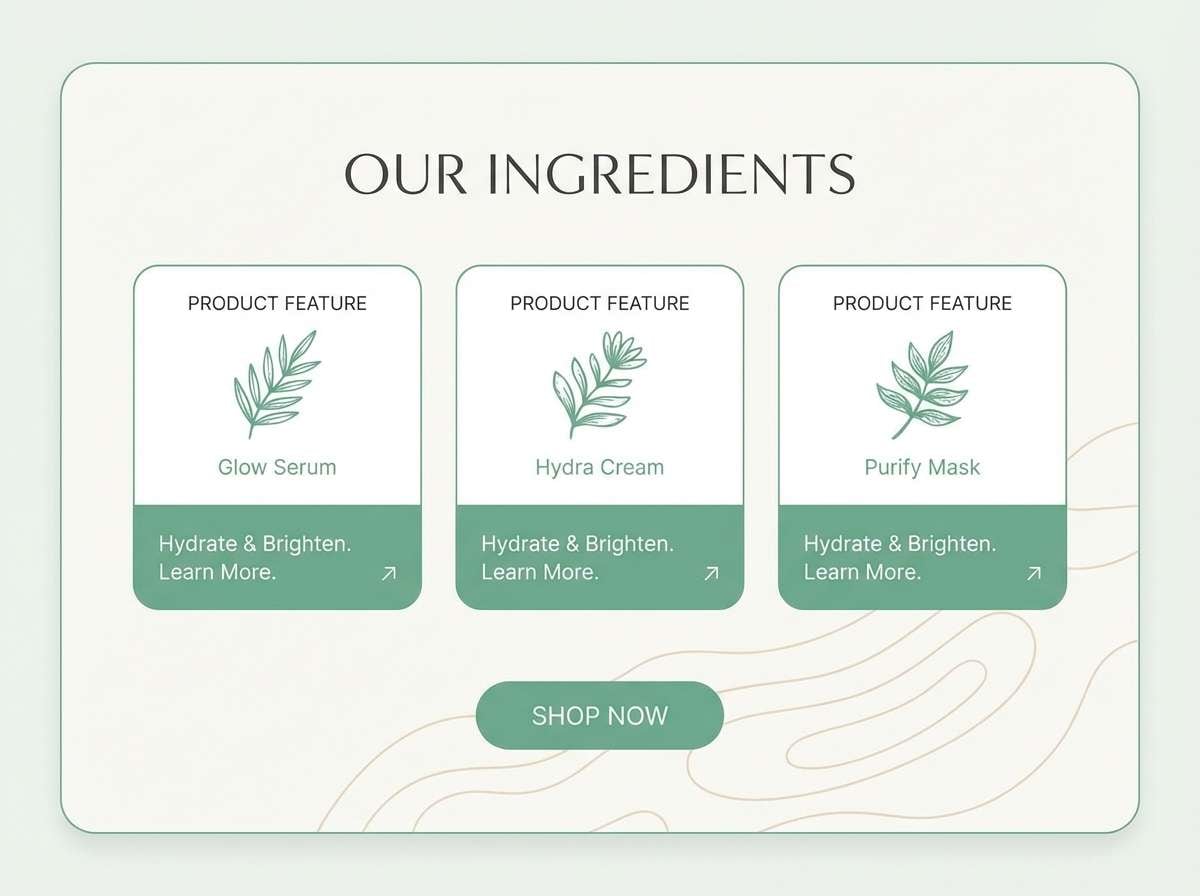
For branding and packaging, jade looks best when balanced with tactile materials—kraft, cream stocks, subtle textures, and warm metallic accents. For UI, check contrast early (especially on pale mint backgrounds) and avoid using the brightest jade on large surfaces.
When in doubt, repeat your accent color intentionally (badges, icons, dividers) instead of introducing new hues—jade palettes feel premium when they’re restrained.
Create Jade Palette Visuals with AI
If you already have HEX codes, you can quickly turn a jade color scheme into mockups for packaging, posters, landing pages, or app screens. Generating a few concept images helps you test mood, contrast, and “brand feel” before committing to production design.
With Media.io, you can paste a clear prompt (style + subject + lighting + aspect ratio) and iterate fast—try swapping one accent color (copper, coral, orchid) to see how the same jade base shifts tone.
Jade Color Palette FAQs
-
What color is jade (green or teal)?
Jade usually sits between green and teal. Some “jade green” leans more botanical and earthy, while modern jade often shifts slightly bluer into teal-green. -
What colors go best with jade green?
Warm neutrals (ivory, beige, sand), dark neutrals (charcoal, near-black), and warm accents (terracotta, copper, coral) pair especially well with jade. -
Is jade a good branding color?
Yes. Jade can signal freshness and trust like green, while still feeling modern like teal—making it a strong choice for wellness, tech, travel, and premium lifestyle brands. -
How do I keep a jade palette from looking too bright?
Use jade as an accent, not a background. Add warm off-whites or beige to soften the overall feel, and reserve the brightest jade for one focal element per section. -
What’s a good text color on jade backgrounds?
On mid-to-dark jade, use white or very light mint for text. On pale jade/mint backgrounds, use charcoal or deep green instead of pure black for a softer, cohesive look. -
Does jade work for UI/UX design?
It works very well for UI, especially for buttons, toggles, and progress states. Just make sure contrast meets accessibility guidelines, particularly with light mint tints. -
How can I generate jade palette mockups quickly?
Use an AI image generator to create concept visuals (packaging, posters, landing page heroes) from a prompt. Media.io makes it easy to iterate styles and keep your jade tones consistent across outputs.


