Moroccan color palettes mix jewel tones with sunbaked neutrals, inspired by zellige tiles, souks, and desert landscapes. The result is a look that feels both timeless and modern, with strong contrast and a handmade warmth.
Below are 20 Moroccan palette combos with HEX codes you can use for branding, interiors, UI, packaging, and social posts—plus AI image prompts to visualize each style fast.
In this article
Why Moroccan Palettes Work So Well
Moroccan tones balance saturation and earthiness in a way that feels rich without being overwhelming. You often get one or two “jewel” anchors (teal, indigo, ruby) supported by soft neutrals (bone, sand, parchment) that keep layouts breathable.
They also create natural hierarchy. Deep blues and charcoals handle typography and structure, while saffron, brass, or terracotta become the attention cues for buttons, highlights, and focal motifs.
Because the inspiration comes from real materials—tile glaze, clay, stone, leather—these schemes tend to look believable in both digital design systems and physical spaces like packaging and interiors.
20+ Moroccan Color Palette Ideas (with HEX Codes)
1) Souk Spice
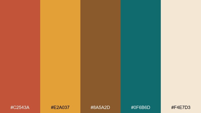
HEX: #C2543A #E2A037 #8A5A2D #0F6B6D #F4E7D3
Mood: warm, bustling, artisanal
Best for: restaurant branding and menu design
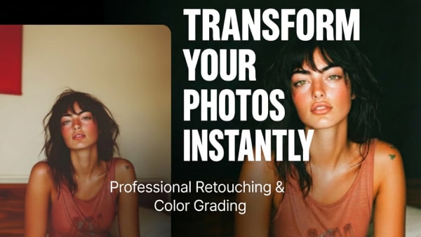
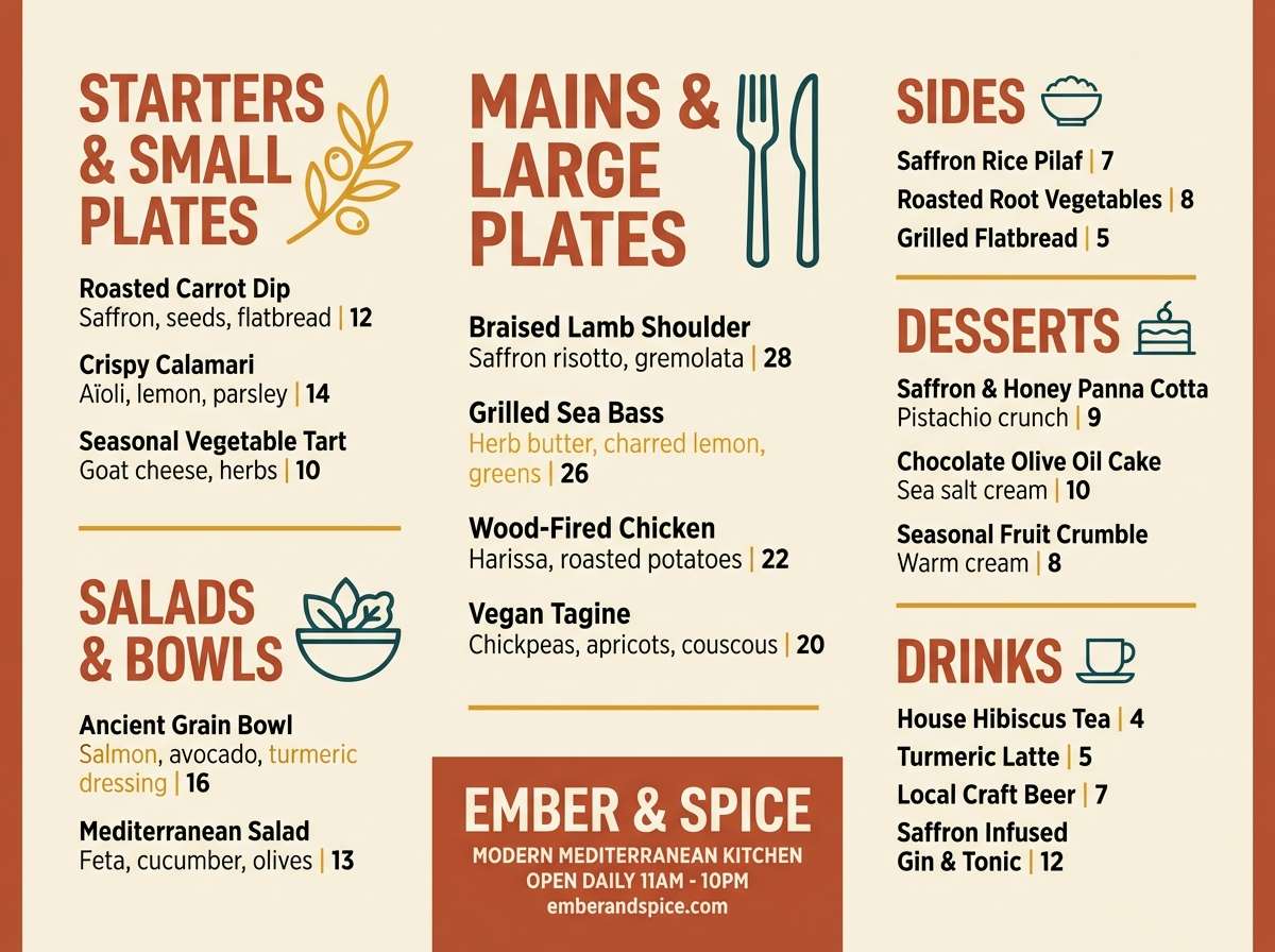
Warm and lively, it brings to mind spice stalls, clay pots, and brass trays catching late-afternoon light. These moroccan color combinations work beautifully on menus, signage, and loyalty cards where you want instant appetite appeal. Pair the teal as an accent with plenty of cream space to keep the layout readable. Tip: reserve the saffron tone for price highlights and callouts so it guides the eye without shouting.
Image example of souk spice generated using media.io
Media.io is an online AI studio for creating and editing video, image, and audio in your browser.

2) Zellige Teal
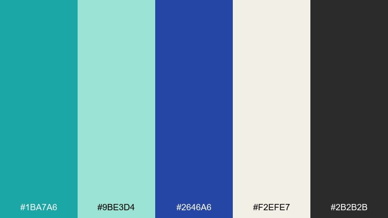
HEX: #1BA7A6 #9BE3D4 #2646A6 #F2EFE7 #2B2B2B
Mood: clean, fresh, coastal
Best for: UI dashboard and data widgets
Crisp and aquatic, it echoes glazed tiles, sea air, and cool stone corridors. The teal and cobalt create strong hierarchy for charts, toggles, and badges without feeling harsh. Balance the brighter tones with off-white panels and charcoal text for accessibility. Tip: use mint for subtle hover states so interactions feel calm and consistent.
Image example of zellige teal generated using media.io

3) Sahara Dunes
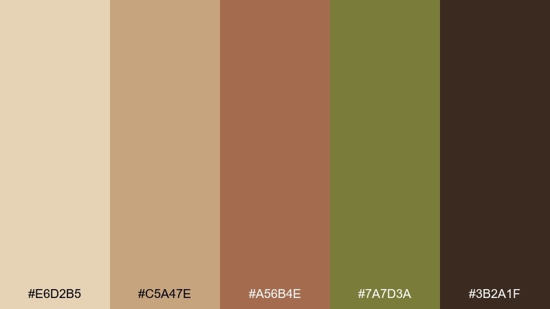
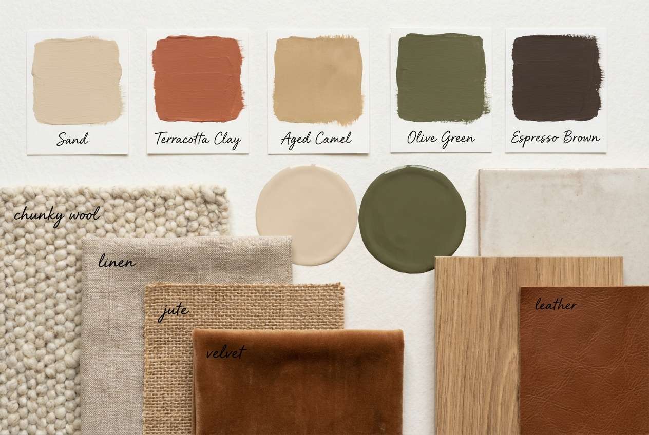
HEX: #E6D2B5 #C5A47E #A56B4E #7A7D3A #3B2A1F
Mood: grounded, sunbaked, natural
Best for: interior wall paint and decor planning
Soft and earthy, it feels like wind-shaped dunes, leather goods, and dusty olive shrubs. These tones shine in living rooms, entryways, and cafes where you want warmth without heavy saturation. Add texture with woven fabrics and matte ceramics to keep the palette from looking flat. Tip: use the darkest brown sparingly on trim or hardware for crisp definition.
Image example of sahara dunes generated using media.io
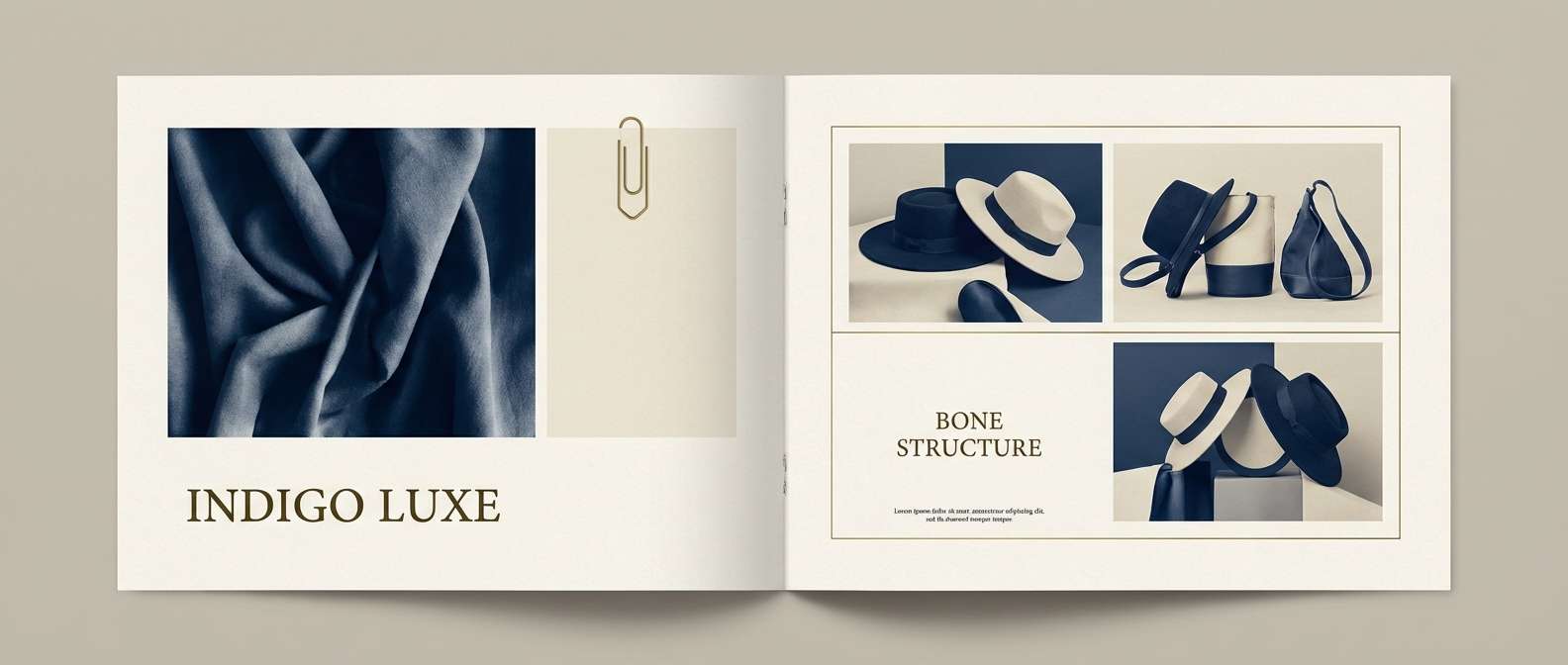
4) Atlas Indigo
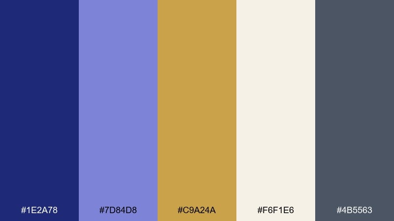
HEX: #1E2A78 #7D84D8 #C9A24A #F6F1E6 #4B5563
Mood: elegant, cool, refined
Best for: fashion lookbook editorial layout
Polished and moody, it recalls indigo dye, twilight streets, and gold accents on woven trims. Indigo and slate make a sophisticated base for typography and product captions. Use lavender for section dividers and brass for small luxury cues like page numbers or pull quotes. Tip: keep photography frames on bone or off-white to avoid muddy shadows.
Image example of atlas indigo generated using media.io
5) Marrakech Rose
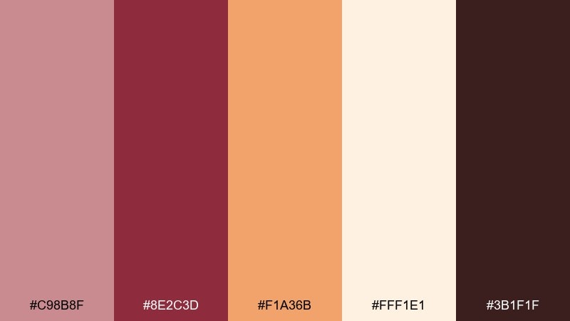
HEX: #C98B8F #8E2C3D #F1A36B #FFF1E1 #3B1F1F
Mood: romantic, sunlit, celebratory
Best for: wedding invitation suite
Romantic and sun-warmed, it evokes rose plaster walls, pomegranate tea, and apricot glow at sunset. This moroccan color palette is ideal for invitations, RSVP cards, and envelope liners where you want softness with a rich focal tone. Pair the deep wine with plenty of cream to keep the typography airy and premium. Tip: use the apricot shade for tiny motifs like arches or florals to add warmth without overpowering the layout.
Image example of marrakech rose generated using media.io
6) Desert Night
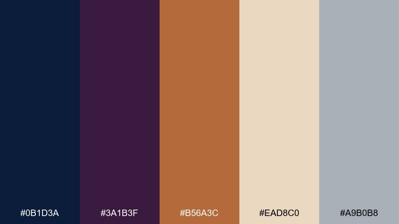
HEX: #0B1D3A #3A1B3F #B56A3C #EAD8C0 #A9B0B8
Mood: mysterious, upscale, cinematic
Best for: luxury product packaging
Dark and cinematic, it suggests lantern-lit alleys and copper glints against midnight fabric. The deep navy and aubergine build instant luxury, while sand and moon gray keep labels readable. Copper works best as a foil-stamp accent for logos or borders rather than a large background. Tip: add generous negative space so the dark tones feel intentional, not heavy.
Image example of desert night generated using media.io
7) Citrus Courtyard
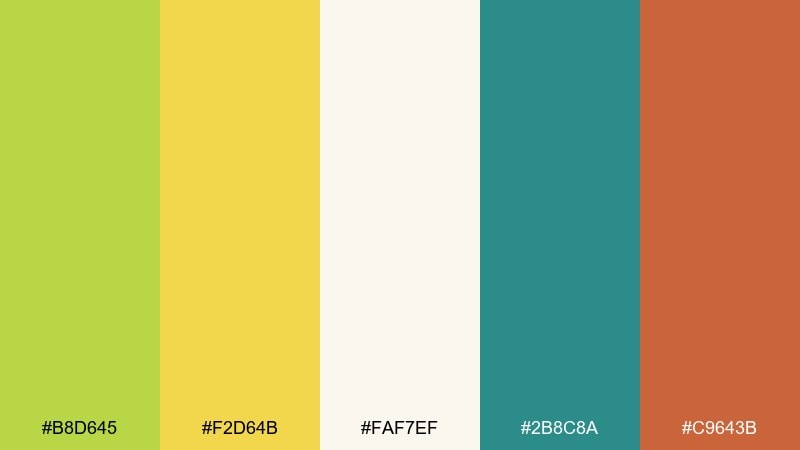
HEX: #B8D645 #F2D64B #FAF7EF #2B8C8A #C9643B
Mood: bright, playful, airy
Best for: spring botanical illustration poster
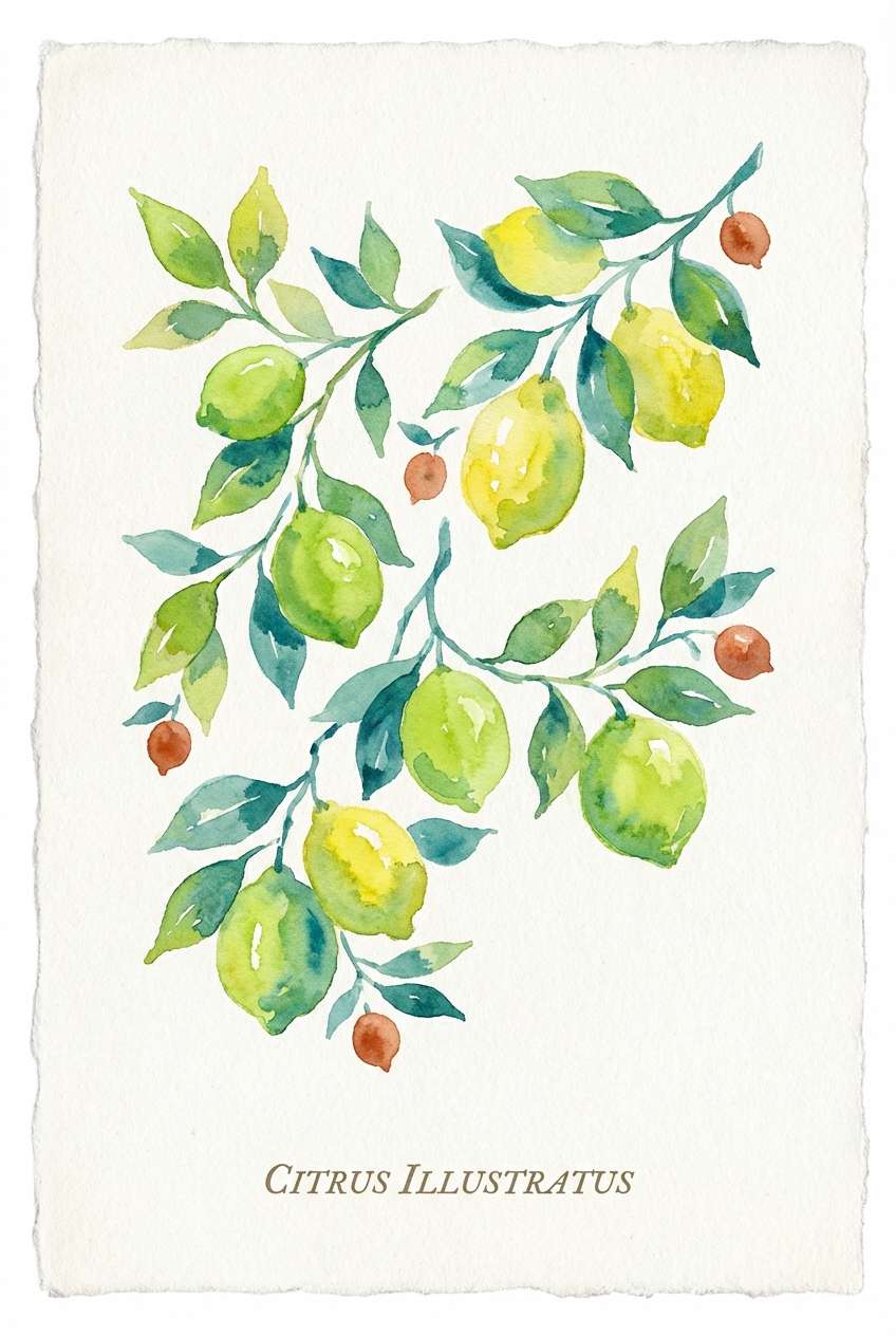
Bright and breezy, it feels like citrus trees in a tiled courtyard with dappled sun. The lime and citron create cheerful focal points, while teal adds cool contrast for leaves and shadows. Keep the cream as the paper tone to preserve a light, watercolor look. Tip: use terracotta only for small fruit accents so the greens stay dominant and fresh.
Image example of citrus courtyard generated using media.io
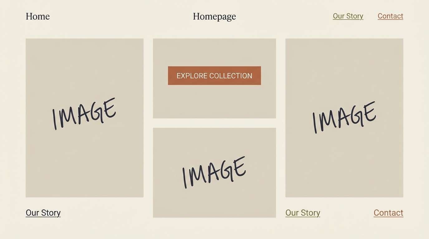
8) Spice Market Neutrals
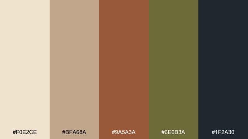
HEX: #F0E2CE #BFA68A #9A5A3A #6E6B3A #1F2A30
Mood: calm, earthy, minimal
Best for: minimalist website theme
Muted and grounded, it recalls burlap sacks, dried herbs, and weathered wood. These tones are perfect for clean websites where imagery should lead and the UI stays quietly supportive. Use ink for headings and buttons, then let cinnamon and olive appear as subtle accent chips. Tip: keep backgrounds in the lightest beige to avoid a dull, muddy feel across long pages.
Image example of spice market neutrals generated using media.io
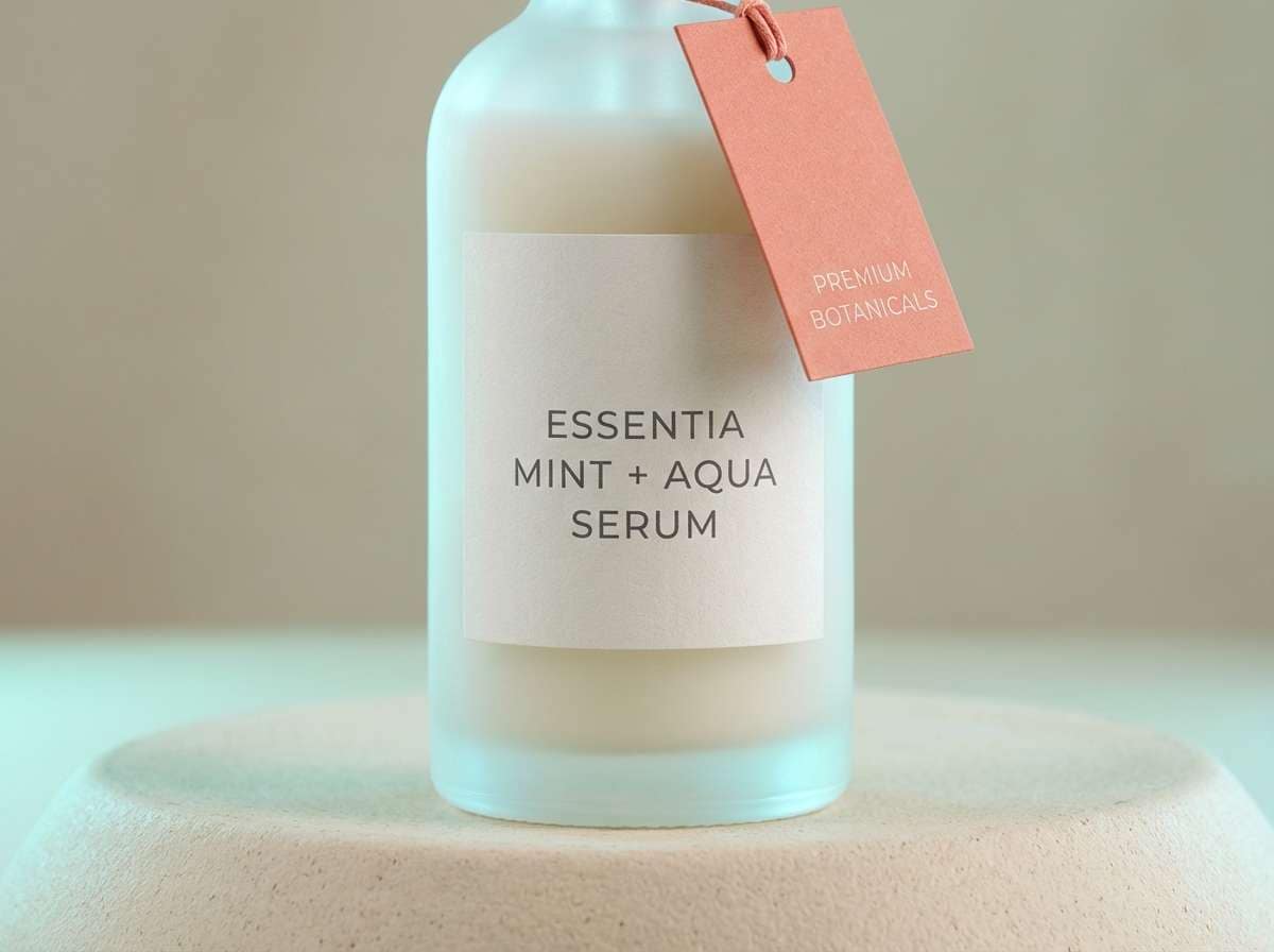
9) Oasis Mint
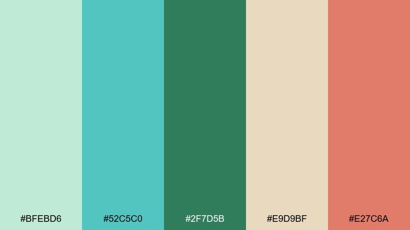
HEX: #BFEBD6 #52C5C0 #2F7D5B #E9D9BF #E27C6A
Mood: refreshing, clean, optimistic
Best for: skincare product ad
Refreshing and clean, it evokes cool water, mint tea, and soft sand underfoot. The mint-to-aqua range reads instantly as wellness, while palm green brings credibility and depth. Use coral as a small CTA or product badge so it pops without turning the ad loud. Tip: keep props minimal and let one dominant green tone lead the composition.
Image example of oasis mint generated using media.io
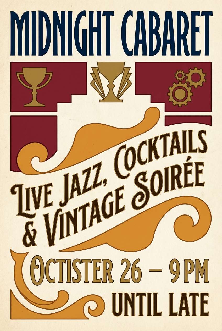
10) Brass Lantern
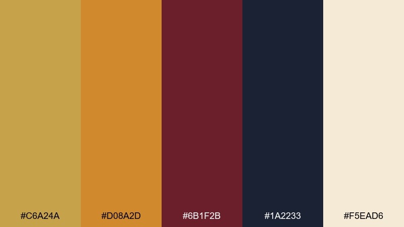
HEX: #C6A24A #D08A2D #6B1F2B #1A2233 #F5EAD6
Mood: glowing, dramatic, vintage
Best for: bar poster and nightlife promo
Glowing and dramatic, it feels like a lantern-lit lounge with velvet shadows and amber highlights. Use midnight and burgundy for big blocks and type contrast, then let brass and amber bring the heat. Parchment keeps the design from becoming too dark and helps fine print stay legible. Tip: apply brass as a thin border or emblem to mimic metallic ink without overwhelming the layout.
Image example of brass lantern generated using media.io
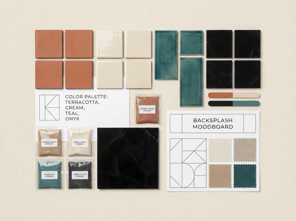
11) Terracotta Tile
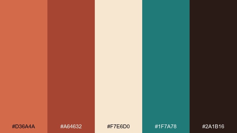
HEX: #D36A4A #A64632 #F7E6D0 #1F7A78 #2A1B16
Mood: rustic, bold, handcrafted
Best for: kitchen backsplash moodboard
Rustic and bold, it channels hand-fired tiles, clay rooftops, and cool teal grout lines. Terracotta and cream are a timeless base for kitchens, while teal adds that crisp pop that reads custom. Bring in the onyx tone through hardware or lighting fixtures to anchor the warmth. Tip: repeat teal in small doses, like pottery or textiles, so it feels intentional rather than random.
Image example of terracotta tile generated using media.io
12) Coastal Essaouira
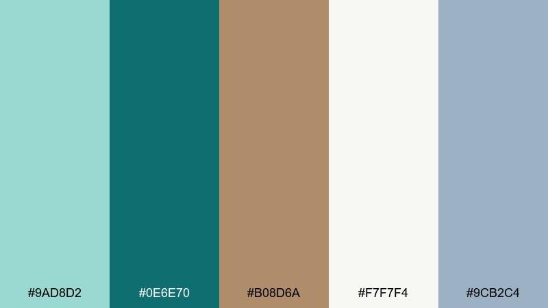
HEX: #9AD8D2 #0E6E70 #B08D6A #F7F7F4 #9CB2C4
Mood: breezy, airy, seaside
Best for: travel blog hero banner
Breezy and light, it brings up seaside medinas, weathered doors, and salt-washed stone. Seafoam and deep teal are strong enough for headlines and buttons, while driftwood keeps the palette natural. Use white as the main canvas so the cool tones feel crisp instead of cold. Tip: add sky gray as a soft overlay for image captions and navigation bars.
Image example of coastal essaouira generated using media.io
13) Royal Fes
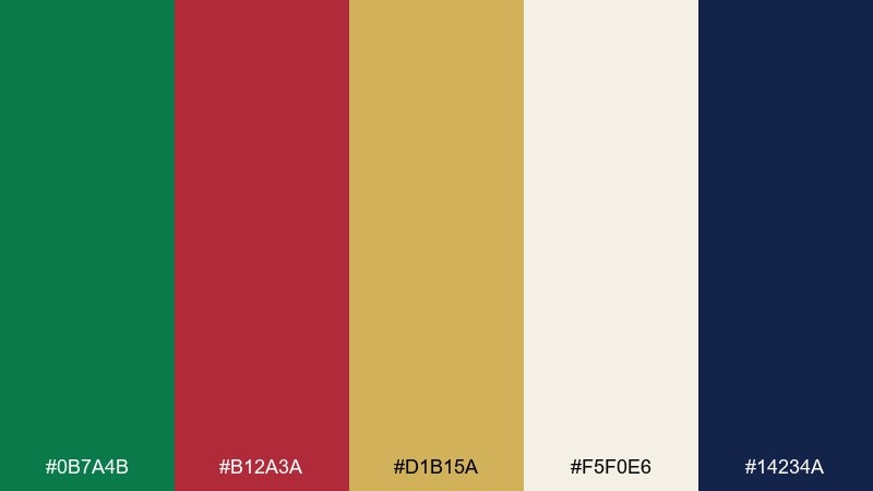
HEX: #0B7A4B #B12A3A #D1B15A #F5F0E6 #14234A
Mood: regal, vibrant, ceremonial
Best for: event flyer design
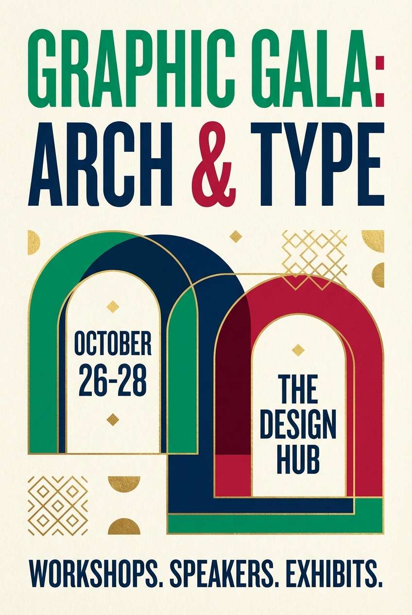
Regal and vibrant, it suggests carved doors, jewel tones, and gold details under soft lantern light. These moroccan color combinations are perfect for concert flyers, cultural events, and gala invitations that need instant energy. Keep ivory as the background to prevent the ruby and emerald from clashing, and let midnight blue hold the typography. Tip: use gold only as a highlight for dates and key names to maintain a premium feel.
Image example of royal fes generated using media.io
14) Date Palm Earth
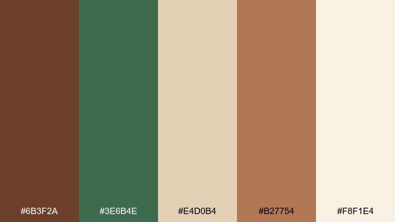
HEX: #6B3F2A #3E6B4E #E4D0B4 #B27754 #F8F1E4
Mood: organic, grounded, artisanal
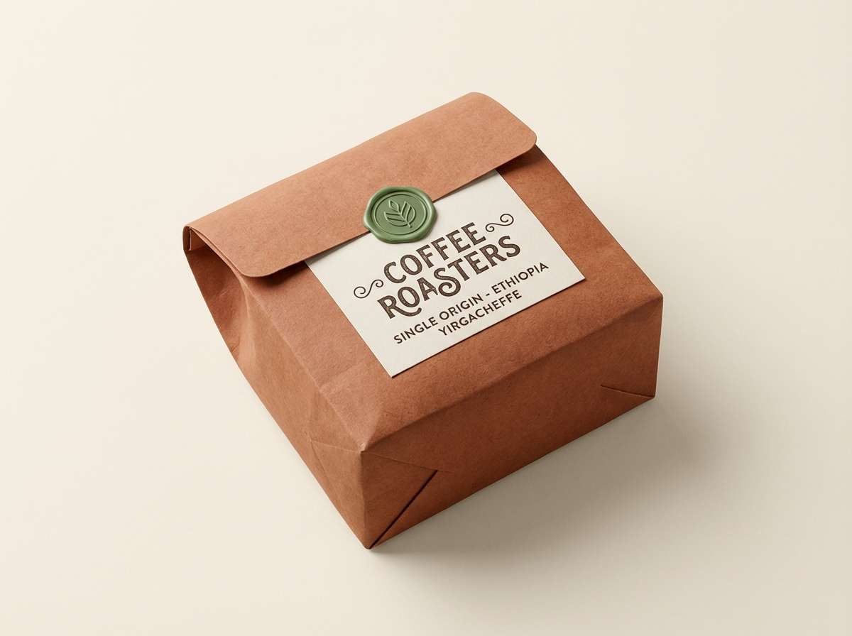
Best for: craft coffee packaging label
Organic and grounded, it brings to mind date palms, roasted beans, and sunlit clay. The brown and clay tones feel deliciously tactile, while palm green adds a fresh twist that reads natural and sustainable. Use the light cream for label backgrounds to keep small type and tasting notes easy to read. Tip: make palm green a single stripe or seal so it looks intentional, not like a leftover accent.
Image example of date palm earth generated using media.io
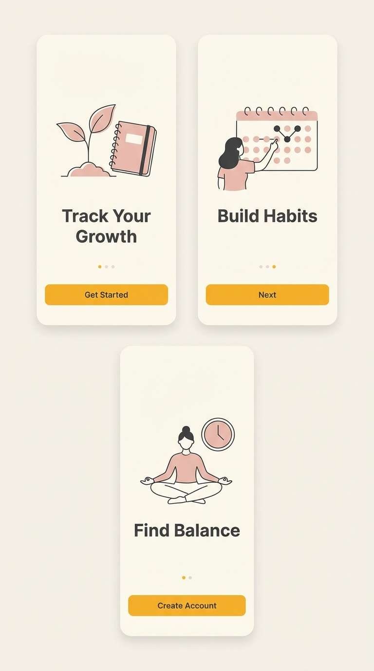
15) Saffron and Smoke
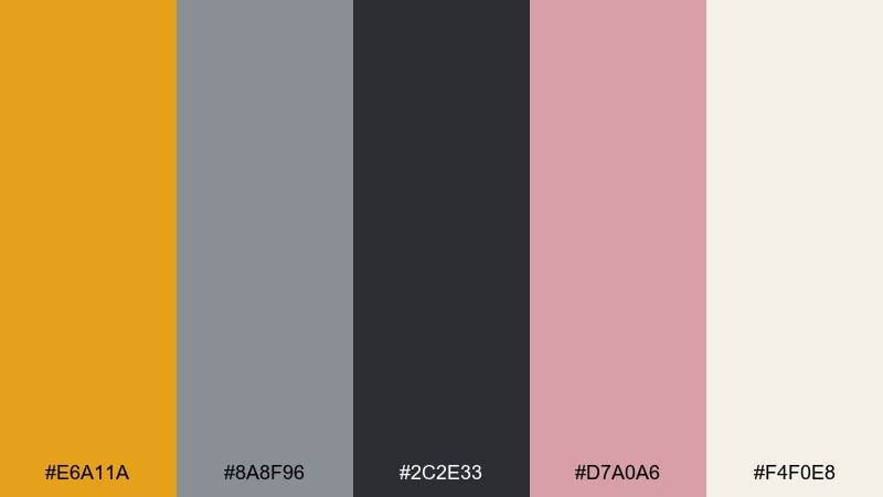
HEX: #E6A11A #8A8F96 #2C2E33 #D7A0A6 #F4F0E8
Mood: modern, edgy, balanced
Best for: app onboarding screens
Modern and slightly edgy, it feels like saffron glow cutting through city smoke. Saffron is strong enough for primary buttons and progress indicators, while charcoal keeps the UI grounded. The blush tone softens illustrations and empty states without turning everything sweet. Tip: limit saffron to one action per screen so onboarding stays clean and confident.
Image example of saffron and smoke generated using media.io
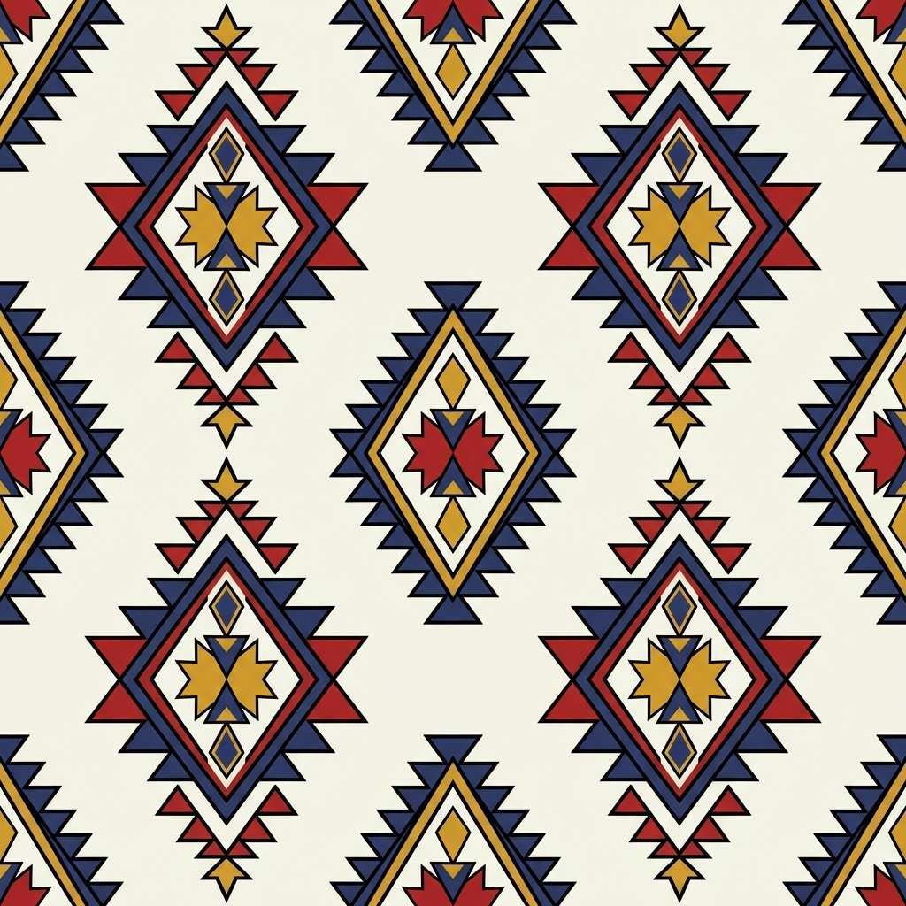
16) Berber Rug
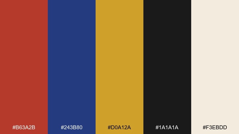
HEX: #B63A2B #243B80 #D0A12A #1A1A1A #F3EBDD
Mood: bold, graphic, folkloric
Best for: textile pattern design
Bold and graphic, it evokes woven rugs, tribal motifs, and inked geometry. This moroccan color palette is a great fit for repeating patterns, labels, and statement accessories where contrast matters. Keep wool white as the main field and use black to sharpen the edges of shapes. Tip: alternate mustard and chili red in small blocks so the pattern feels rhythmic rather than chaotic.
Image example of berber rug generated using media.io
17) Clay and Cactus
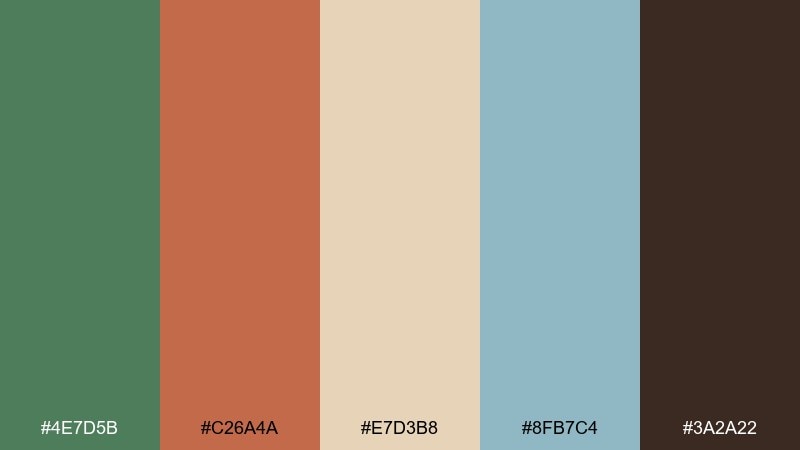
HEX: #4E7D5B #C26A4A #E7D3B8 #8FB7C4 #3A2A22
Mood: eco, friendly, contemporary
Best for: eco brand identity
Fresh yet earthy, it brings up cactus gardens, clay planters, and pale sky haze. The green reads sustainable and trustworthy, while clay adds warmth that keeps the brand approachable. Use sand for backgrounds and deep brown for wordmarks to maintain contrast across print and digital. Tip: reserve the sky tone for secondary graphics like icons and section dividers to keep the system cohesive.
Image example of clay and cactus generated using media.io
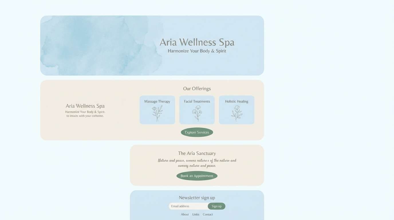
18) Hammam Calm
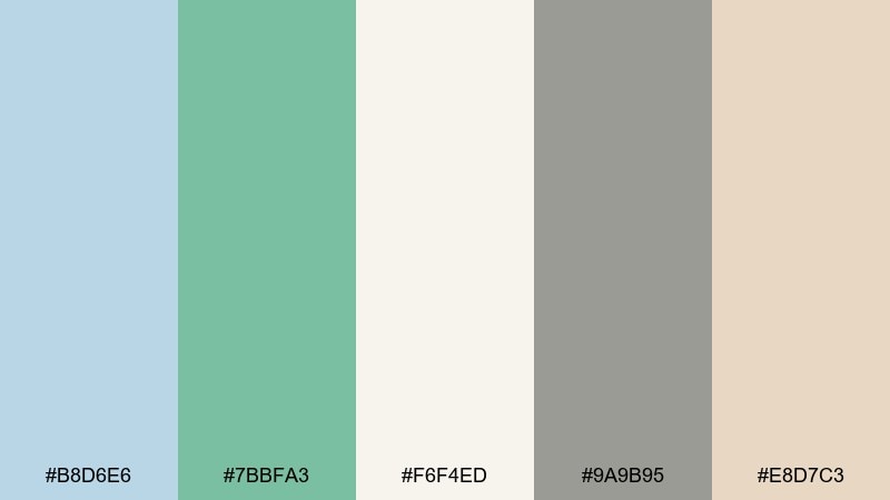
HEX: #B8D6E6 #7BBFA3 #F6F4ED #9A9B95 #E8D7C3
Mood: soothing, airy, spa-like
Best for: spa website landing page
Soothing and airy, it feels like steam, clean tile, and quiet pools. Pale blue and eucalyptus create a gentle wellness signal for hero sections and call-to-action buttons. Keep ivory as the primary background, then use stone gray for navigation and fine print. Tip: add the soap beige as a soft gradient band to separate sections without heavy lines.
Image example of hammam calm generated using media.io
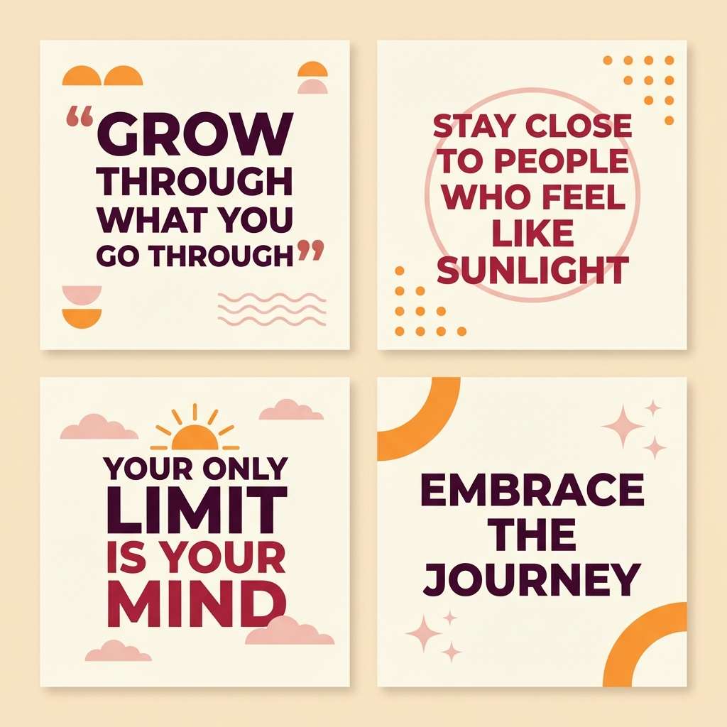
19) Pomegranate Sunset
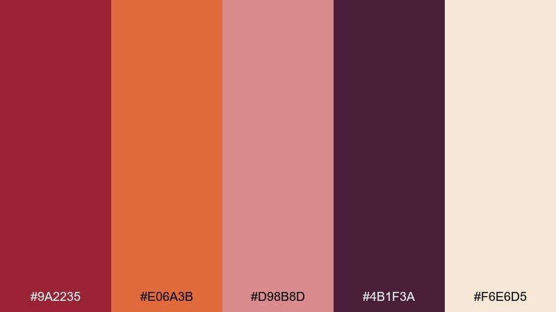
HEX: #9A2235 #E06A3B #D98B8D #4B1F3A #F6E6D5
Mood: expressive, warm, romantic
Best for: social media quote templates
Expressive and warm, it suggests sunset skies over terracotta rooftops and ripe fruit at the market. Use warm cream as the canvas so the pomegranate and plum tones feel rich rather than heavy. Sunset orange makes a great highlight for key words, while blush can soften blocks behind text. Tip: keep backgrounds simple and let one deep tone anchor the typography for better readability on mobile.
Image example of pomegranate sunset generated using media.io
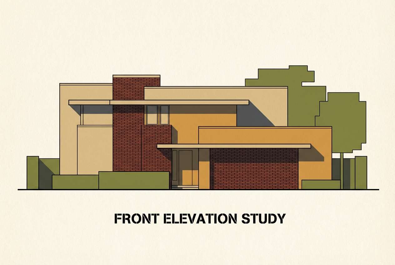
20) Kasbah Shadow
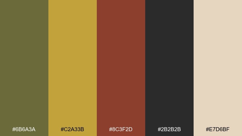
HEX: #6B6A3A #C2A33B #8C3F2D #2B2B2B #E7D6BF
Mood: historic, moody, architectural
Best for: architectural rendering color study
Moody and architectural, it recalls fortress walls, shaded courtyards, and dusty ochre light. Ochre and sand make strong base tones for massing studies, while brick adds warmth for focal volumes. Charcoal is ideal for linework and shadow shapes, keeping the composition crisp. Tip: apply olive to landscape elements so the building tones stay dominant and believable.
Image example of kasbah shadow generated using media.io
What Colors Go Well with Moroccan?
Moroccan palettes pair especially well with warm neutrals like bone, parchment, sand, and cream—these shades keep jewel tones from feeling too intense and help designs stay readable.
For bold contrast, add deep anchors like charcoal, ink black, midnight blue, or aubergine. They make terracotta, saffron, emerald, and teal feel more premium and intentional.
If you want a fresher look, introduce coastal accents like seafoam, mint, or pale sky blue. These keep the scheme bright while still feeling rooted in tile-and-stone inspiration.
How to Use a Moroccan Color Palette in Real Designs
Start with a neutral base (cream, bone, sand) for backgrounds, then choose one jewel tone as your main brand color (teal, indigo, emerald). Use a second saturated tone as a controlled accent for CTAs, highlights, or key motifs.
In interiors, repeat the same accent color in multiple small places—textiles, pottery, art—so it looks curated. In digital UI, keep text mostly charcoal or deep navy and use brighter colors for states (active, hover, badges) rather than full panels.
When in doubt, limit the palette to 60/30/10: 60% neutral, 30% main color, 10% accent. Moroccan color combinations look best when the “spice” is measured.
Create Moroccan Palette Visuals with AI
If you have HEX codes but can’t picture the final vibe, generate quick mockups with AI before you commit. This helps you test how terracotta and teal feel on menus, how indigo reads in editorial layouts, or how saffron performs as a button color.
Use your palette name plus the included prompts to create posters, UI screens, packaging shots, or moodboards. Then iterate by swapping one color at a time (for example, changing cream to bone, or charcoal to deep navy) to refine contrast.
With Media.io, you can turn Moroccan tones into consistent visuals for branding, social templates, and concept boards in minutes.
Moroccan Color Palette FAQs
-
What are the most common Moroccan colors?
Popular Moroccan colors include terracotta, teal, cobalt/indigo, saffron/gold, emerald green, and warm neutrals like sand, bone, and cream. They’re often inspired by zellige tiles, clay walls, brass lanterns, and desert landscapes. -
Is a Moroccan color palette warm or cool?
It can be both. Many Moroccan schemes mix warm earth tones (terracotta, camel, saffron) with cool jewel tones (teal, indigo, seafoam) to create balanced contrast. -
What neutral works best with Moroccan jewel tones?
Bone, parchment, warm cream, and sandy beige are the easiest neutrals to pair with Moroccan jewel tones. They soften saturation and keep designs from looking too heavy. -
How do I use Moroccan colors in a modern brand?
Use a light neutral background, pick one jewel tone as the primary brand color, and keep accents (saffron, copper, terracotta) limited to highlights like buttons, badges, borders, or small motifs. -
What’s a good Moroccan palette for UI design?
Try teal + cobalt with off-white and charcoal (like “Zellige Teal”). It gives clear hierarchy for charts and buttons while keeping readability and accessibility strong. -
What Moroccan colors look good in interiors?
Sand, camel, clay, olive, and deep brown are dependable for walls and decor (like “Sahara Dunes”). Add one crisp accent—teal, brass, or indigo—through tiles, textiles, or hardware. -
How can I preview Moroccan color combinations before designing?
Generate quick concept images (menus, posters, moodboards, UI screens) using an AI text-to-image tool, then iterate by adjusting one color at a time to perfect contrast and mood.