Green yellow palettes blend the steady, natural feel of green with the bright optimism of yellow—making them ideal for designs that need energy without losing clarity.
Below are 20+ curated green yellow color combinations with HEX codes, plus practical tips for UI, branding, and print—so you can pick a set that looks intentional (not overly neon).
In this article
- Why Green Yellow Color Combinations Work So Well
-
- citrus meadow
- lime zest minimal
- matcha lemonade
- spring market
- neon pear pop
- olive sunlit
- avocado citrus
- golden fern
- chartreuse studio
- pineapple sage
- rainy garden glow
- bamboo lemon ui
- tropical patio
- harvest lime
- electric tennis court
- dandelion field notes
- wasabi marble
- lemongrass spa
- greenhouse poster
- citrus circuit
- candlelit citrus
- lime grove editorial
- What Colors Go Well with Green Yellow?
- How to Use a Green Yellow Color Combination in Real Designs
- Create Green Yellow Palette Visuals with AI
Why Green Yellow Color Combinations Work So Well
Green yellow color palettes are naturally attention-grabbing because they mirror common “alive” cues in nature—new leaves, citrus fruit, spring fields, and sunlight. That familiarity helps designs feel fresh, approachable, and easy to understand.
They also create a built-in hierarchy: deeper greens read as stable foundations for navigation, typography, and logos, while yellows act like highlights for CTAs, badges, and key info.
Best of all, you can dial the vibe from calm and earthy (olive + cream) to high-energy and electric (neon lime + near-black) without changing the core color story.
20+ Green Yellow Color Palette Ideas (with HEX Codes)
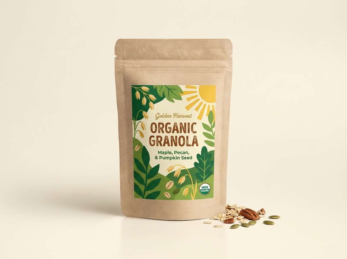
1) Citrus Meadow
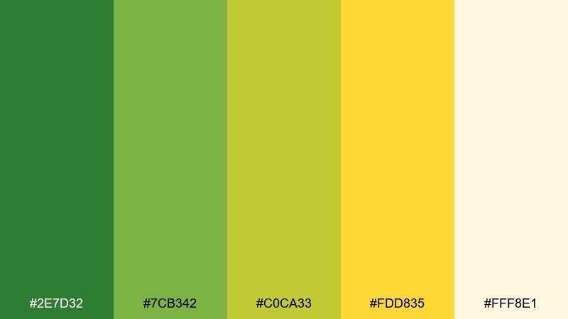
HEX: #2E7D32 #7CB342 #C0CA33 #FDD835 #FFF8E1
Mood: fresh, sunny, outdoorsy
Best for: organic food packaging
Fresh meadow greens and lemon sunlight create an upbeat, farm-to-table feel. Use the darker green for logos and headlines, then let the warm yellow act as a friendly accent. Pair with kraft textures or soft cream backgrounds to keep it natural instead of neon. Tip: reserve the brightest yellow for callouts so it reads like a highlight, not a block of glare.
Image example of citrus meadow generated using media.io
Media.io is an online AI studio for creating and editing video, image, and audio in your browser.

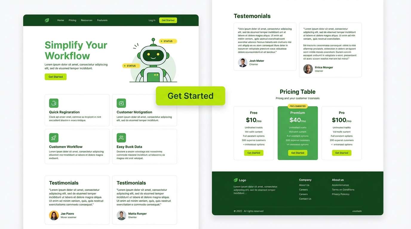
2) Lime Zest Minimal
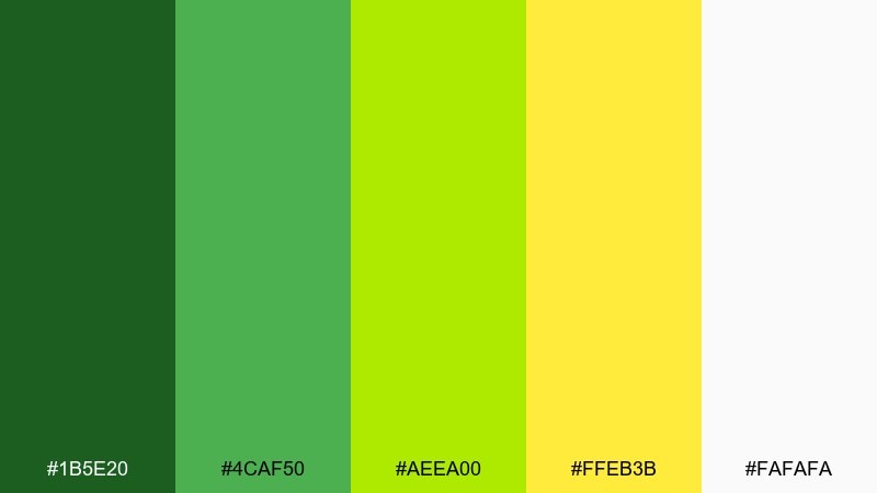
HEX: #1B5E20 #4CAF50 #AEEA00 #FFEB3B #FAFAFA
Mood: clean, energetic, modern
Best for: saas landing page ui
Crisp greens with a zing of lime feel like a clean start and quick momentum. Keep the interface mostly white, using the deep green for navigation and the lime for primary buttons. The sunny yellow works best as a micro-accent for badges, tooltips, or progress states. Tip: test contrast on the lime tones and lean on the darkest green for small text.
Image example of lime zest minimal generated using media.io
3) Matcha Lemonade
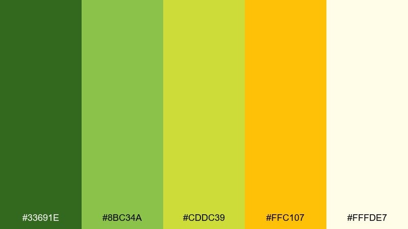
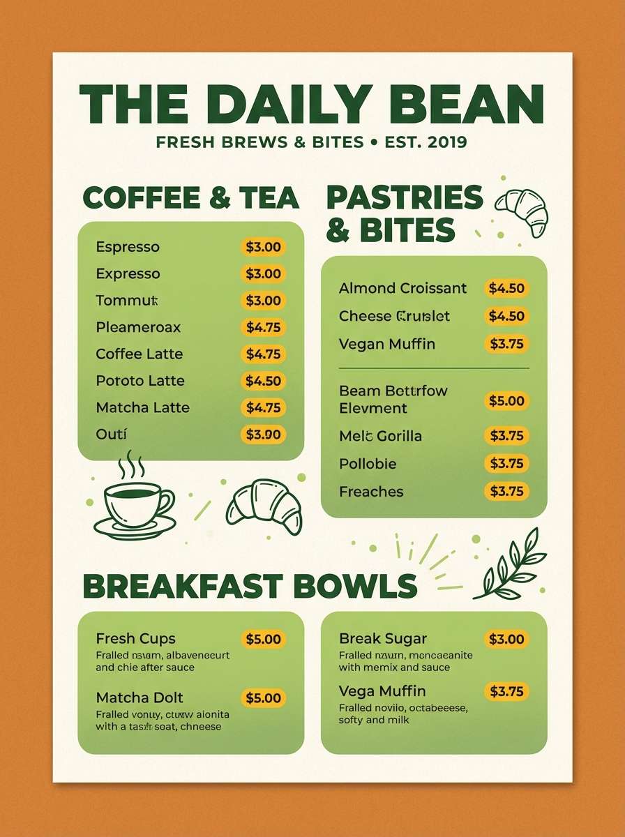
HEX: #33691E #8BC34A #CDDC39 #FFC107 #FFFDE7
Mood: bright, playful, refreshing
Best for: cafe menu design
Bubbly matcha greens and juicy lemonade yellow evoke iced drinks, summer patios, and cheerful chatter. This green yellow color palette works beautifully for menus where sections need clear hierarchy without feeling formal. Pair it with simple black typography and plenty of warm off-white space so the colors stay appetizing. Tip: use the amber tone for prices to subtly guide the eye down the page.
Image example of matcha lemonade generated using media.io
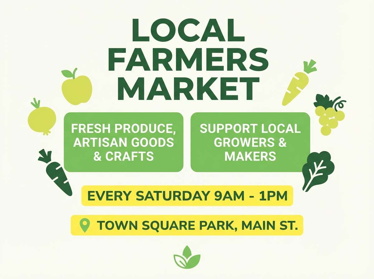
4) Spring Market
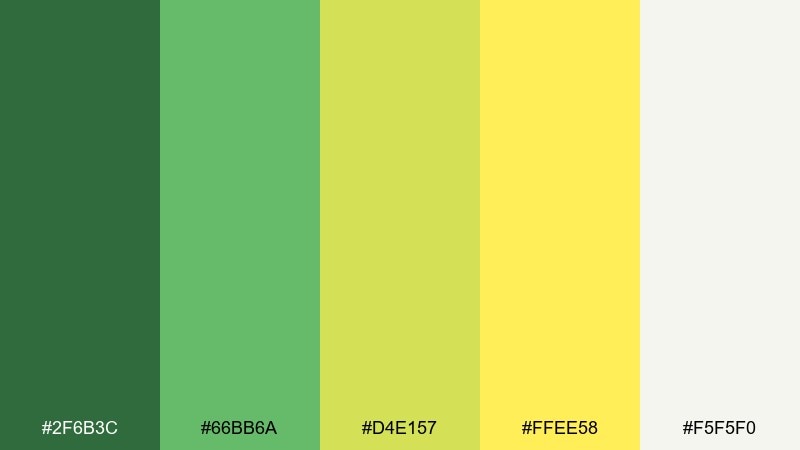
HEX: #2F6B3C #66BB6A #D4E157 #FFEE58 #F5F5F0
Mood: welcoming, light, community-minded
Best for: farmers market flyer
Soft greens and buttery yellow feel like fresh produce stands and handwritten signs. Use the mid-green for the main title, then sprinkle yellow as a highlight behind key details like date and location. Pair with paper-like off-white to keep everything readable from a distance. Tip: add simple icon shapes in the pale lime to create structure without heavy borders.
Image example of spring market generated using media.io
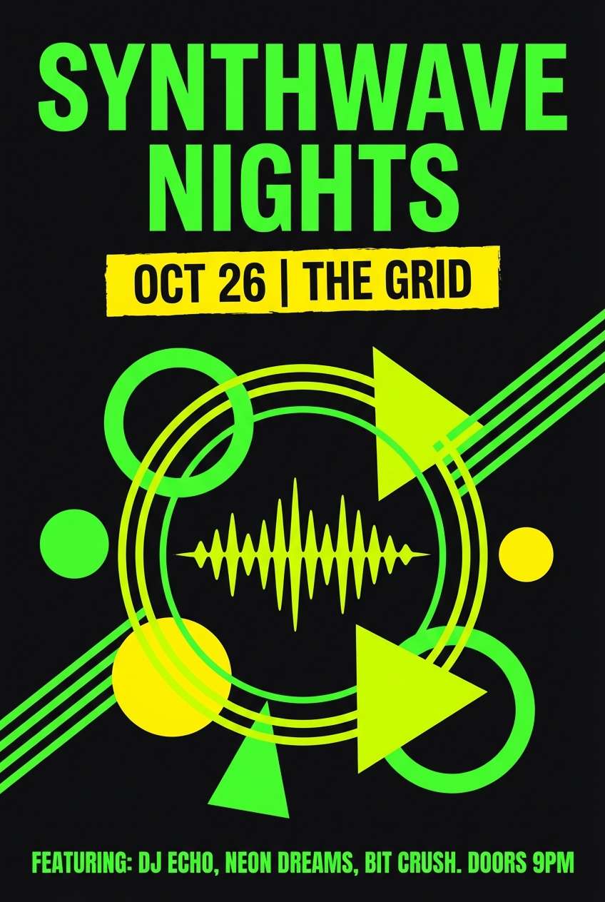
5) Neon Pear Pop
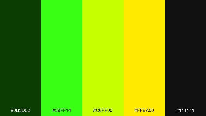
HEX: #0B3D02 #39FF14 #C6FF00 #FFEA00 #111111
Mood: bold, electric, nightlife
Best for: music event poster
Electric lime and pear tones against near-black feel like lasers cutting through a dark room. Use the black as the canvas, then layer neon green for the main typography and the yellow for date or lineup highlights. Keep shapes geometric and minimal so the palette stays sharp, not chaotic. Tip: add a subtle gradient from lime to yellow on one focal element to create motion without adding new colors.
Image example of neon pear pop generated using media.io
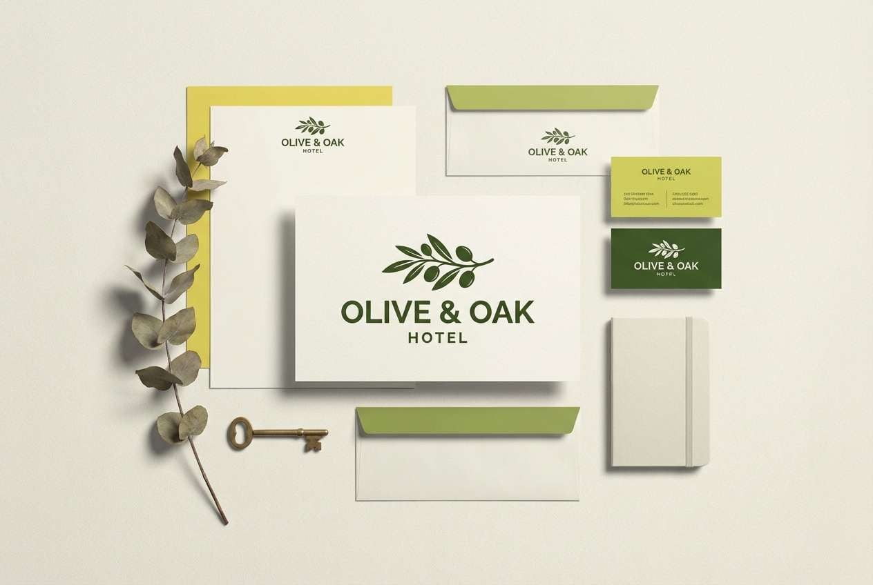
6) Olive Sunlit
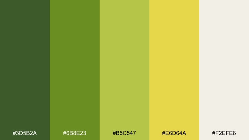
HEX: #3D5B2A #6B8E23 #B5C547 #E6D64A #F2EFE6
Mood: earthy, calm, rustic
Best for: boutique hotel branding
Sunlit olive tones feel grounded, Mediterranean, and quietly premium. These green yellow color combinations shine in logos and stationery when paired with textured cream paper and understated serif type. Use the deepest olive for marks, the soft yellow as a warm highlight, and keep backgrounds light to avoid muddiness. Tip: introduce the pale olive as a secondary brand color for wayfinding and room cards.
Image example of olive sunlit generated using media.io
7) Avocado Citrus
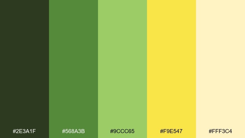
HEX: #2E3A1F #568A3B #9CCC65 #F9E547 #FFF3C4
Mood: cozy, friendly, casual
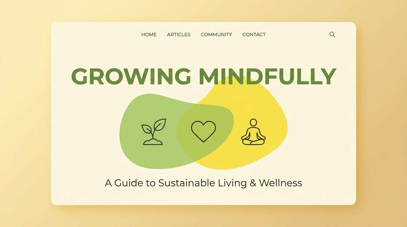
Best for: wellness blog header
Creamy avocado greens with a citrus twist feel comforting and approachable. Use the mid-green for header text and UI chips, while the pale yellow can sit behind quotes or category labels. Pair with warm neutrals and simple line icons to keep it lifestyle-focused. Tip: keep the brightest yellow limited to one element per screen so it reads as intentional emphasis.
Image example of avocado citrus generated using media.io
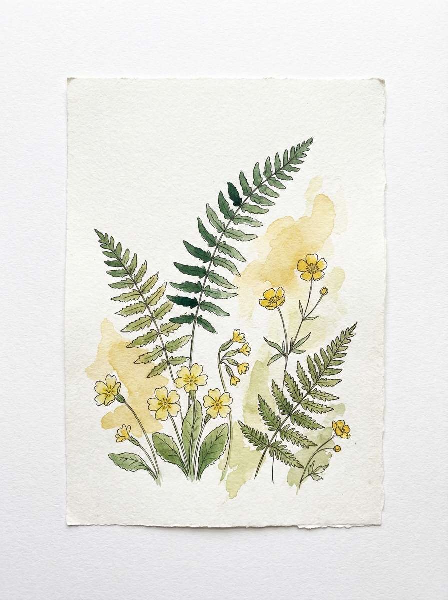
8) Golden Fern
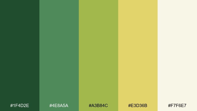
HEX: #1F4D2E #4E8A5A #A3B84C #E3D36B #F7F6E7
Mood: quiet, botanical, refined
Best for: botanical illustration print
Fern greens washed with muted gold evoke shaded trails and pressed leaves. Let the darker tones define stems and shadows, and use the soft golden yellow for petals and light hits. Pair with an eggshell backdrop for a vintage print vibe. Tip: keep saturation low in large areas and add detail through linework instead of more color.
Image example of golden fern generated using media.io
9) Chartreuse Studio

HEX: #0F3D1E #2E7D32 #9ACD32 #E8F04A #E0E0E0
Mood: creative, artsy, contemporary
Best for: design portfolio website
Studio greens with chartreuse highlights feel experimental yet controlled. Use the gray as the main backdrop, letting green anchor navigation and chartreuse punctuate hover states or featured project tags. Pair with lots of whitespace and a single strong typeface to keep the look curated. Tip: keep chartreuse mostly in small components so your work stays the focal point.
Image example of chartreuse studio generated using media.io
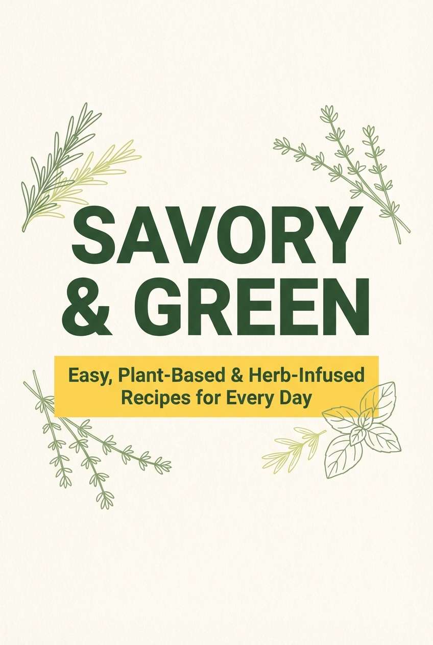
10) Pineapple Sage
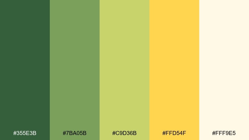
HEX: #355E3B #7BA05B #C9D36B #FFD54F #FFF9E5
Mood: warm, wholesome, uplifting
Best for: recipe ebook cover
Sage greens and pineapple yellow feel like sunny kitchens and fresh herbs. Use the darker green for the title and author name, then bring in yellow for a friendly subtitle banner. Pair with creamy backgrounds and subtle texture to keep it cozy rather than loud. Tip: if you add food photography, keep it warm-toned so it harmonizes with the yellow.
Image example of pineapple sage generated using media.io
11) Rainy Garden Glow
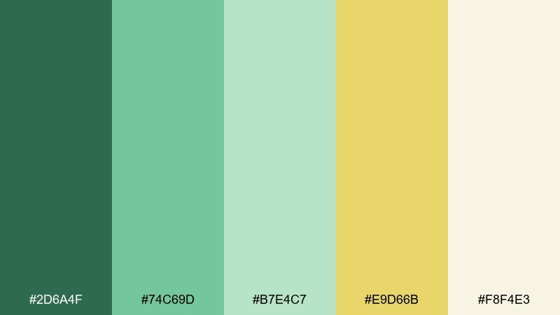
HEX: #2D6A4F #74C69D #B7E4C7 #E9D66B #F8F4E3
Mood: soft, soothing, optimistic
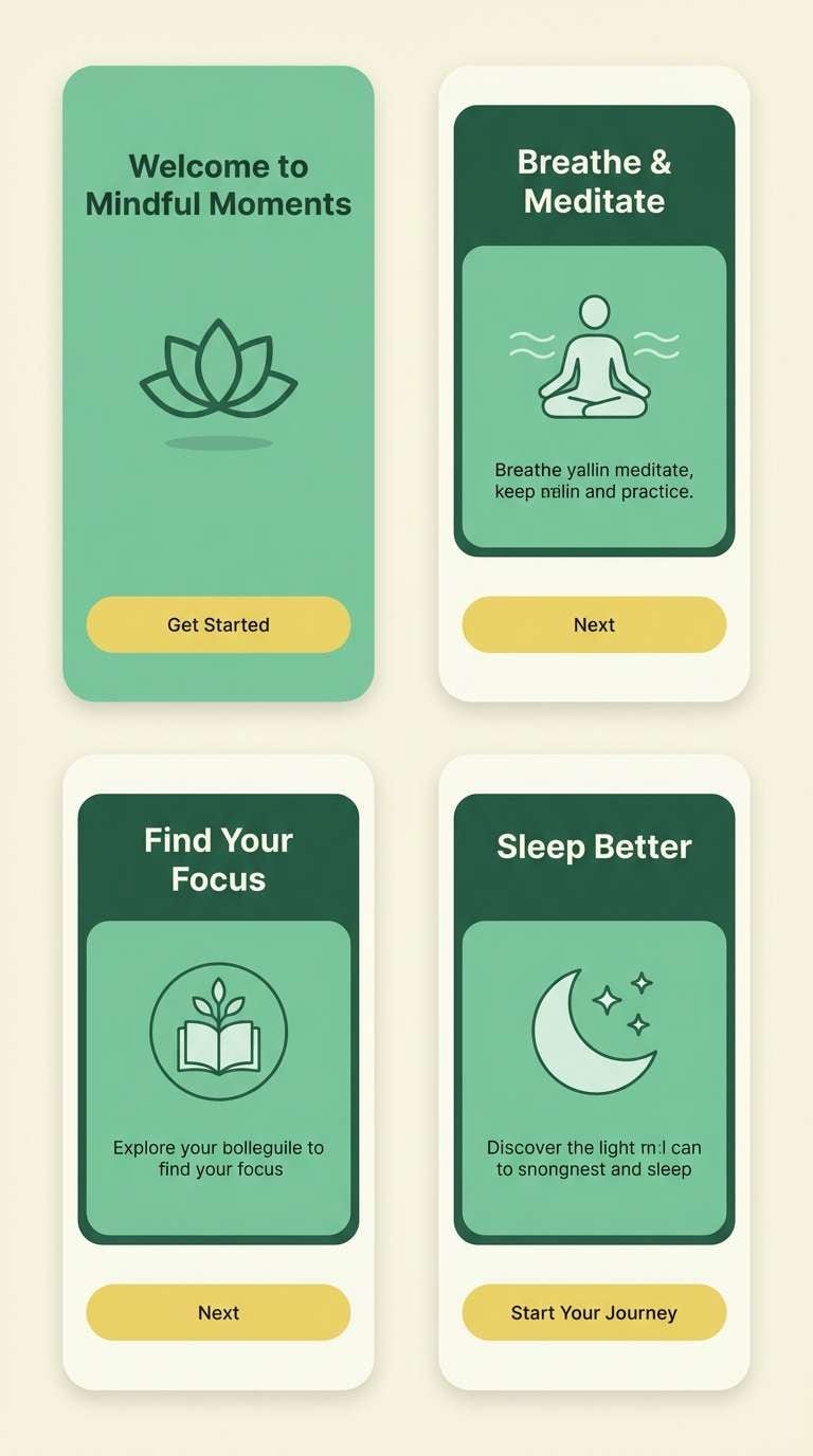
Best for: mindfulness app onboarding
Misty garden greens with a gentle yellow glow feel calm after rain. Use the darkest green for titles and icons, and let the pale mint tones carry large backgrounds without fatigue. The warm yellow is perfect for one reassuring action button per screen. Tip: add generous padding and rounded shapes so the softness reads intentional, not washed out.
Image example of rainy garden glow generated using media.io
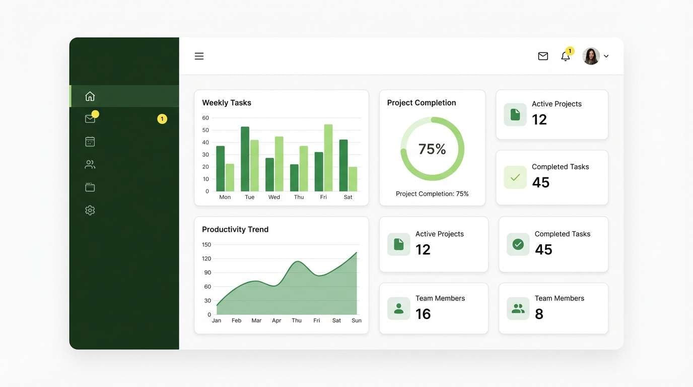
12) Bamboo Lemon UI
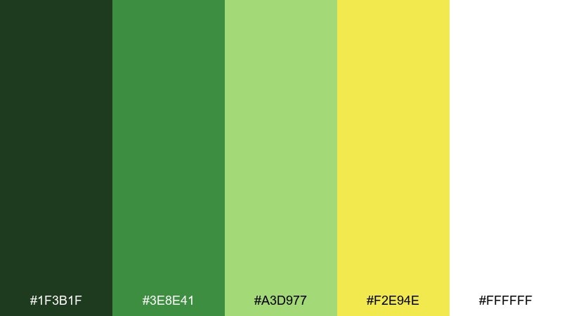
HEX: #1F3B1F #3E8E41 #A3D977 #F2E94E #FFFFFF
Mood: fresh, efficient, friendly
Best for: productivity dashboard ui
Bamboo greens with a clear lemon accent feel organized and motivating. Keep most surfaces white, using the darkest green for text and the brighter greens for status chips and charts. The yellow is ideal for alerts that should feel helpful rather than alarming. Tip: use the same yellow only for one alert level to avoid confusing visual language.
Image example of bamboo lemon ui generated using media.io
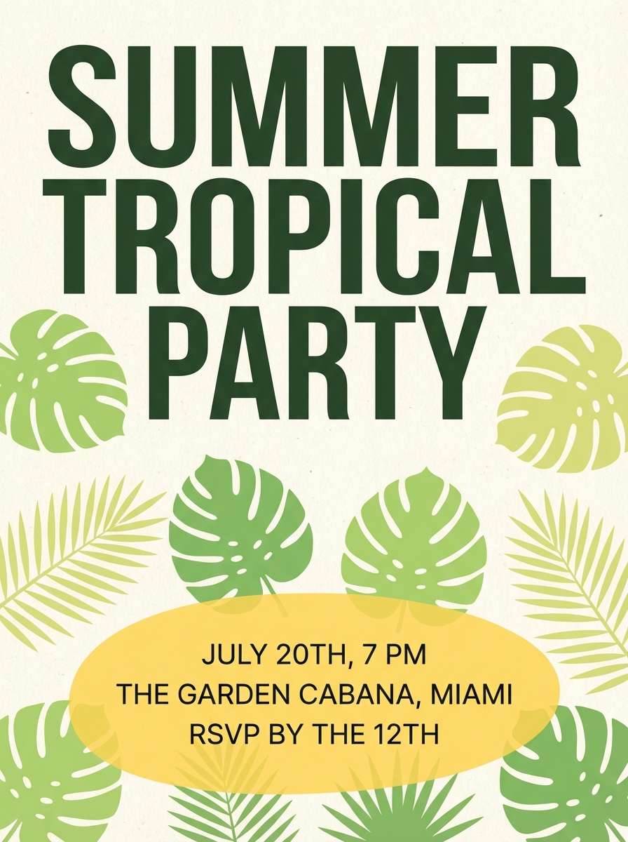
13) Tropical Patio
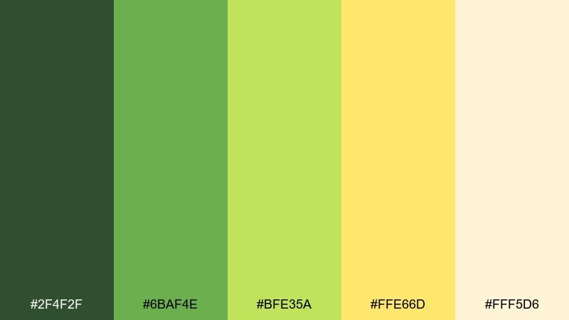
HEX: #2F4F2F #6BAF4E #BFE35A #FFE66D #FFF5D6
Mood: vacation, breezy, cheerful
Best for: summer party invitation
Palm greens and soft sunshine yellow feel like a relaxed patio afternoon. Use the deep green for headings and borders, then bring in the warm yellow for playful shapes or a highlighted RSVP line. Pair with a creamy background to keep the palette airy. Tip: add a simple leaf pattern in the light lime to build energy without clutter.
Image example of tropical patio generated using media.io
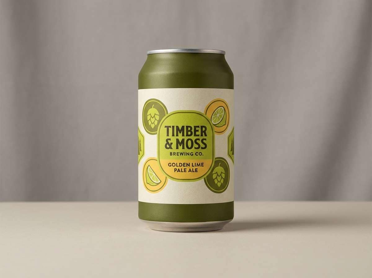
14) Harvest Lime

HEX: #4A5D23 #7C8F2B #B9C23F #F0D54E #F7F1D5
Mood: seasonal, grounded, artisanal
Best for: craft beer can label
Harvest greens with mellow yellow feel earthy, brewed, and a bit nostalgic. Use the darkest olive for the brand mark and thin line illustrations, then let the lime and yellow carry secondary badges like IPA or limited release. Pair with textured cream to suggest paper and craft. Tip: keep small text in the darkest tone so it stays readable on curved cans.
Image example of harvest lime generated using media.io
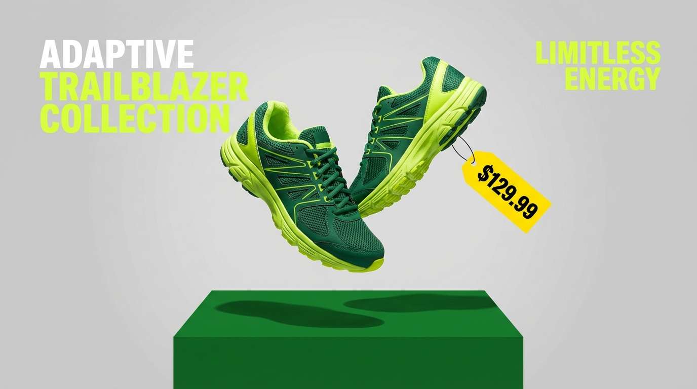
15) Electric Tennis Court
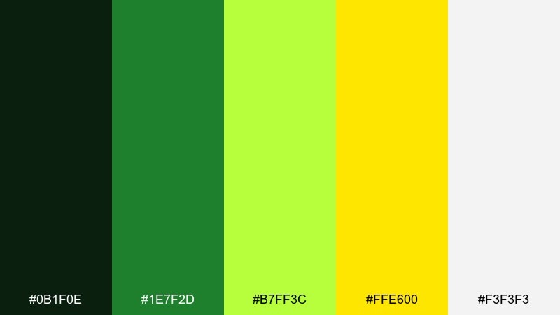
HEX: #0B1F0E #1E7F2D #B7FF3C #FFE600 #F3F3F3
Mood: sporty, high-energy, competitive
Best for: sportswear product ad
Court greens with punchy yellow feel fast, loud, and athletic. Use the deep green for the background or headline blocks, then push the neon-lime for motion graphics and key features. The bright yellow works best for price or drop date tags that need instant attention. Tip: balance the intensity with light gray negative space so the ad still feels premium.
Image example of electric tennis court generated using media.io
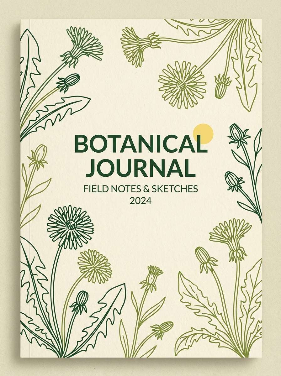
16) Dandelion Field Notes
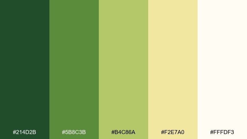
HEX: #214D2B #5B8C3B #B4C86A #F2E7A0 #FFFDF3
Mood: gentle, nostalgic, journal-like
Best for: notebook cover design
Soft field greens and dandelion yellow feel like pressed flowers tucked into a journal. Use the darker greens for title stamping, while the pale yellow can sit as a warm paper tone. Pair with simple illustrations and lots of breathing room to keep it thoughtful. Tip: try a matte finish so the pastel yellow reads creamy instead of glossy.
Image example of dandelion field notes generated using media.io
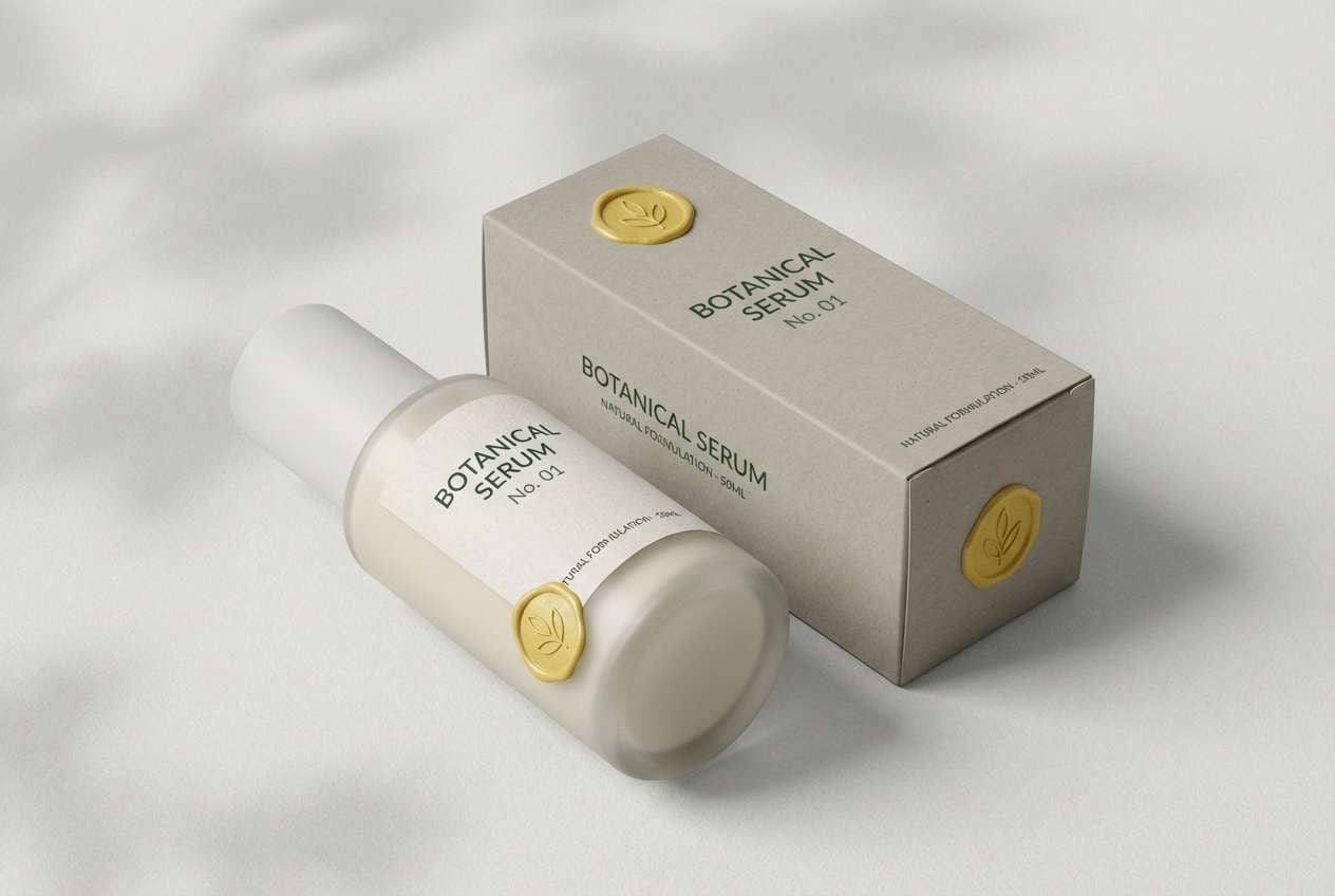
17) Wasabi Marble
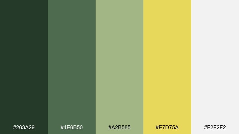
HEX: #263A29 #4E6B50 #A2B585 #E7D75A #F2F2F2
Mood: modern, muted, upscale
Best for: skincare packaging
Muted wasabi greens with a refined yellow accent feel spa-like and editorial. Use the gray-white as the primary package base, then bring in deep green for typography and the golden yellow for a small seal or ingredient callout. Pair with minimalist sans-serif type and subtle embossing to amplify the premium vibe. Tip: keep the yellow strictly as a detail so the line stays calm and sophisticated.
Image example of wasabi marble generated using media.io
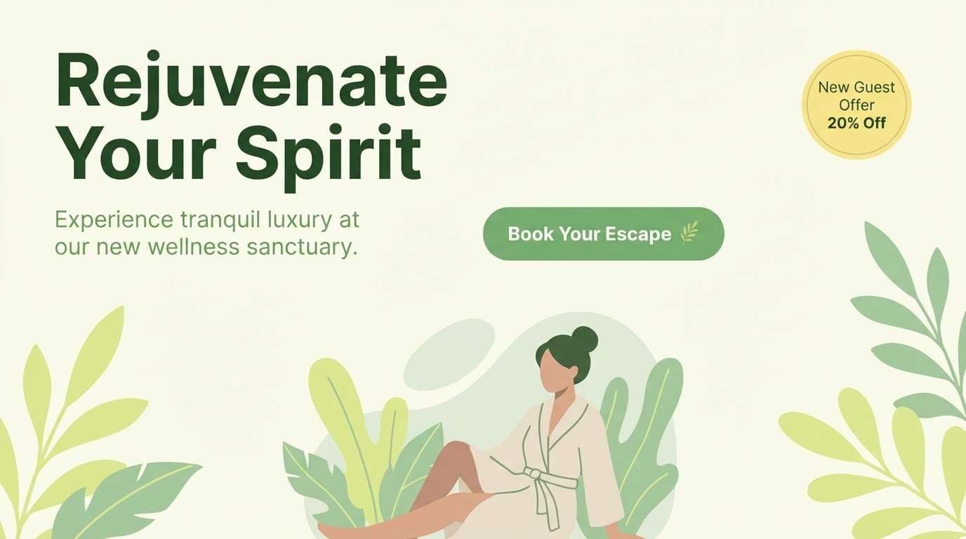
18) Lemongrass Spa
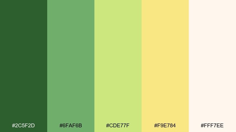
HEX: #2C5F2D #6FAF6B #CDE77F #F9E784 #FFF7EE
Mood: relaxing, clean, airy
Best for: spa website hero
Lemongrass greens and creamy yellow feel like warm towels and herbal steam. Use the palest tone as the background, with mid-green for headings and gentle buttons. The soft yellow can highlight a booking offer without breaking the calm. Tip: choose low-contrast photography and add a translucent green overlay so the UI stays cohesive.
Image example of lemongrass spa generated using media.io
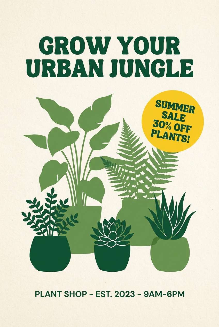
19) Greenhouse Poster
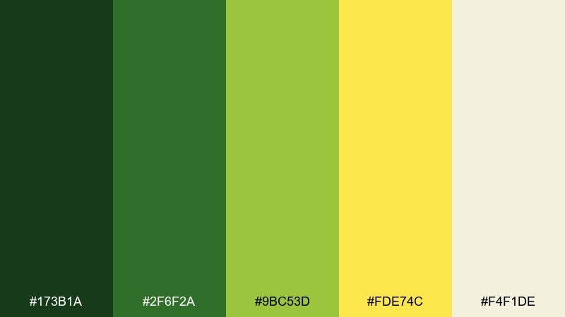
HEX: #173B1A #2F6F2A #9BC53D #FDE74C #F4F1DE
Mood: fresh, optimistic, plant-forward
Best for: plant shop poster
Bright greenhouse greens with sunny yellow feel like new leaves under glass. This green yellow color palette is perfect for bold poster typography, where the yellow can spotlight a sale or new arrivals. Pair with a warm off-white background and simple plant silhouettes for instant readability. Tip: set body text in the darkest green and avoid placing yellow text on light backgrounds.
Image example of greenhouse poster generated using media.io
20) Citrus Circuit
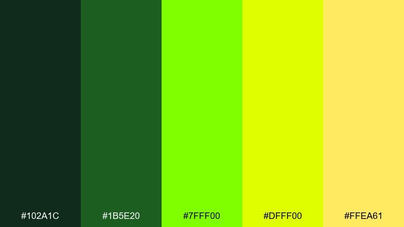
HEX: #102A1C #1B5E20 #7FFF00 #DFFF00 #FFEA61
Mood: techy, sharp, futuristic
Best for: gaming channel banner
Dark evergreen with electric citrus accents feels like a powered-up interface. Use the deepest tones for the base and frames, then let the neon yellow-green run as line details, tags, or small glow effects. Pair with high-contrast typography and crisp shapes for a modern edge. Tip: if you add glow, keep it subtle and only around one accent color so it does not wash out the banner.
Image example of citrus circuit generated using media.io

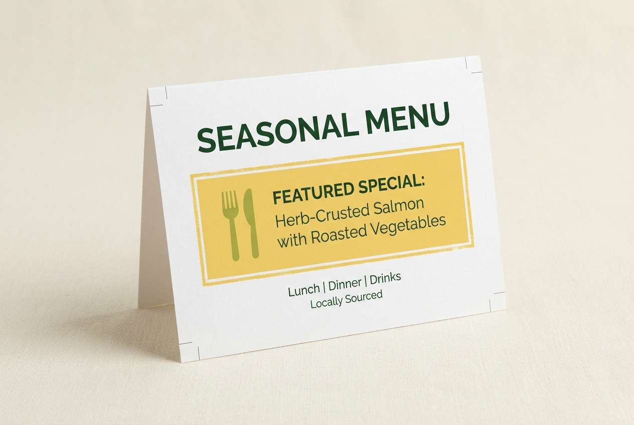
21) Candlelit Citrus
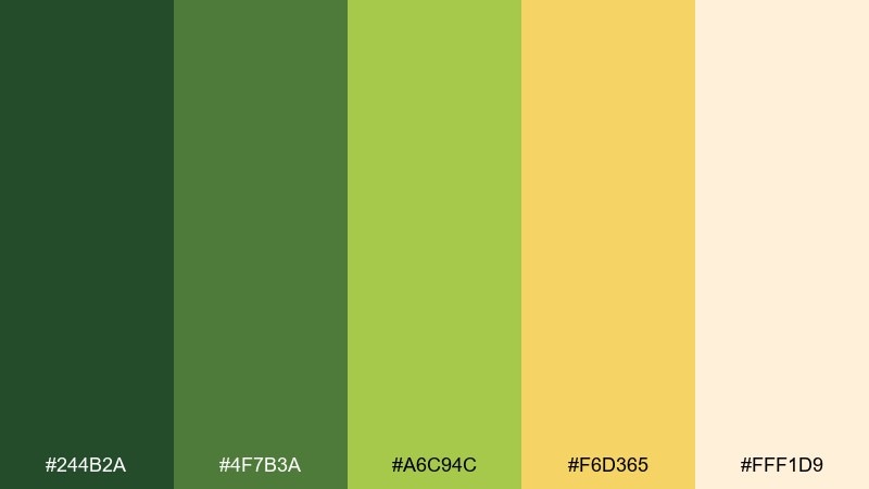
HEX: #244B2A #4F7B3A #A6C94C #F6D365 #FFF1D9
Mood: warm, inviting, softly festive
Best for: restaurant table tent card
Warm greens and candlelit yellow feel like evening specials and cozy conversation. Use the darker green for the header and borders, while the honey yellow can frame a featured dish or happy-hour time. Pair with creamy paper tones and minimal illustrations for a polished look. Tip: keep spacing generous so the color blocks feel like highlights, not heavy panels.
Image example of candlelit citrus generated using media.io
22) Lime Grove Editorial
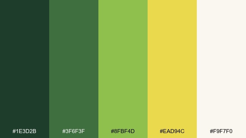
HEX: #1E3D2B #3F6F3F #8FBF4D #EAD94C #F9F7F0
Mood: editorial, confident, nature-inspired
Best for: magazine feature layout
Grove greens with a confident yellow highlight feel like a modern nature magazine. Use the off-white as the page base, deep green for body text and rules, and the yellow for pull quotes or section numbers. Pair with black-and-white photography to make the accents pop without turning loud. Tip: apply the yellow in consistent, repeatable spots so the layout feels intentional across pages.
Image example of lime grove editorial generated using media.io
What Colors Go Well with Green Yellow?
Green yellow pairs especially well with warm neutrals like cream, ivory, kraft, and sand—these tones soften brightness and keep layouts readable. For a cleaner digital look, white and light gray create a crisp base that makes lime accents feel intentional.
For contrast, try deep forest green, charcoal, or near-black to anchor text and UI elements. If you want a more playful direction, small touches of coral, navy, or teal can add personality without fighting the green-yellow energy.
When in doubt, choose one “anchor” dark (for text) and one “accent” yellow (for highlights) to avoid making the design feel busy.
How to Use a Green Yellow Color Combination in Real Designs
In branding, let green do the heavy lifting (logo, typography, primary surfaces) and treat yellow as a selective highlight for premium focus—seals, labels, and key messages. This preserves legibility and prevents yellow from overpowering the system.
In UI, reserve the brightest yellow for a single job: primary CTA, status, or pricing tags. Use softer yellow or off-white for backgrounds, and rely on dark green for text to meet contrast expectations across devices.
For print, test your yellows in real materials—some bright values can shift under different lighting and paper stocks. Cream or textured stocks often make green-yellow combinations feel more natural and less neon.
Create Green Yellow Palette Visuals with AI
If you want to see how a green yellow palette looks on packaging, posters, dashboards, or brand kits, generating a quick mockup can help you decide faster than swatches alone.
With Media.io’s text-to-image tool, you can paste a prompt (like the ones above), include your HEX codes, and produce consistent visuals for presentations, client reviews, or A/B exploration.
Green Yellow Color Palette FAQs
-
What does a green yellow color palette communicate?
Most green yellow color schemes signal freshness, growth, and optimism. Green reads as natural and stable, while yellow acts as an attention cue—great for highlights, calls to action, and “new” messaging. -
How do I stop green and yellow from looking too neon?
Lower saturation in large areas, use cream/off-white backgrounds, and keep the brightest yellow limited to small accents. Adding a dark anchor (forest green or charcoal) also makes neon tones feel controlled. -
Which color should I use for text in a green yellow palette?
Use deep green or near-black for body text and small UI labels. Avoid yellow text on light backgrounds; instead, use yellow as a background highlight behind dark text. -
What are the best neutral colors to pair with green yellow?
Ivory, warm cream, light gray, and kraft-like beige pair exceptionally well. They keep the palette readable and prevent yellow from becoming harsh on screens or in print. -
Is green yellow a good palette for UI and apps?
Yes—green can structure navigation and typography, and yellow can be reserved for CTAs or statuses. Just test contrast carefully, especially with lime shades, to ensure accessibility. -
What’s a safe ratio for using yellow as an accent?
A common approach is to keep yellow under 10–15% of the layout, using it for the most important moments (buttons, badges, price tags). The rest can be greens plus neutrals for balance. -
Can I generate mockups for these palettes quickly?
Yes. Use Media.io’s AI text-to-image tool with prompts that mention your subject (poster, packaging, UI) and include the HEX codes to keep outputs consistent across concepts.