

Mint green mint is a light, airy green that instantly reads as fresh, clean, and modern. It’s an easy way to make designs feel softer without losing clarity or structure.
Below are 20 mint green mint color palette ideas with HEX codes, plus practical pairing tips for branding, UI, weddings, and seasonal visuals.
In this article
- Why Mint Green Mint Palettes Work So Well
-
- seafoam studio
- mint latte neutrals
- garden glass
- fresh clinic ui
- retro soda shop
- coastal fog
- matcha & marble
- spring invitation
- minimal mint poster
- botanical watercolor
- tech dashboard calm
- candy mint pop
- sagey office
- mint copper luxe
- kids room mint
- spa packaging
- editorial mint spread
- sunset mint punch
- wedding mint whisper
- night mint contrast
- What Colors Go Well with Mint Green Mint?
- How to Use a Mint Green Mint Color Palette in Real Designs
- Create Mint Green Mint Palette Visuals with AI
Why Mint Green Mint Palettes Work So Well
Mint green mint sits in a sweet spot: it’s bright enough to feel optimistic, but soft enough to stay calming. That balance makes it versatile across everything from wellness branding to modern UI.
It also pairs beautifully with both warm neutrals (cream, oat, beige) and cool contrasts (slate, navy, charcoal). With the right dark anchor color, mint stays readable and never looks washed out.
Finally, mint green mint naturally creates “breathing room” in layouts. Used as a background wash, it keeps pages feeling light, fresh, and intentionally minimal.
20+ Mint Green Mint Color Palette Ideas (with HEX Codes)
1) Seafoam Studio
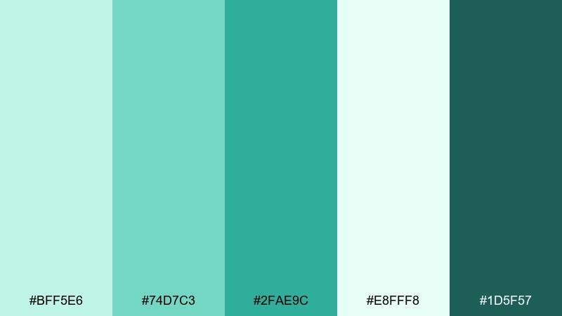
HEX: #bff5e6 #74d7c3 #2fae9c #e8fff8 #1d5f57
Mood: airy, clean, optimistic
Best for: creative studios, wellness branding, homepage hero sections
Airy seafoam tones feel like morning light through glass, crisp and quietly energizing. This mint green mint color palette works best with lots of white space and a single deep green for headlines. Pair it with warm off-white paper textures or soft gray UI lines to keep it modern. Usage tip: reserve the darkest shade for primary buttons so CTAs stay readable.
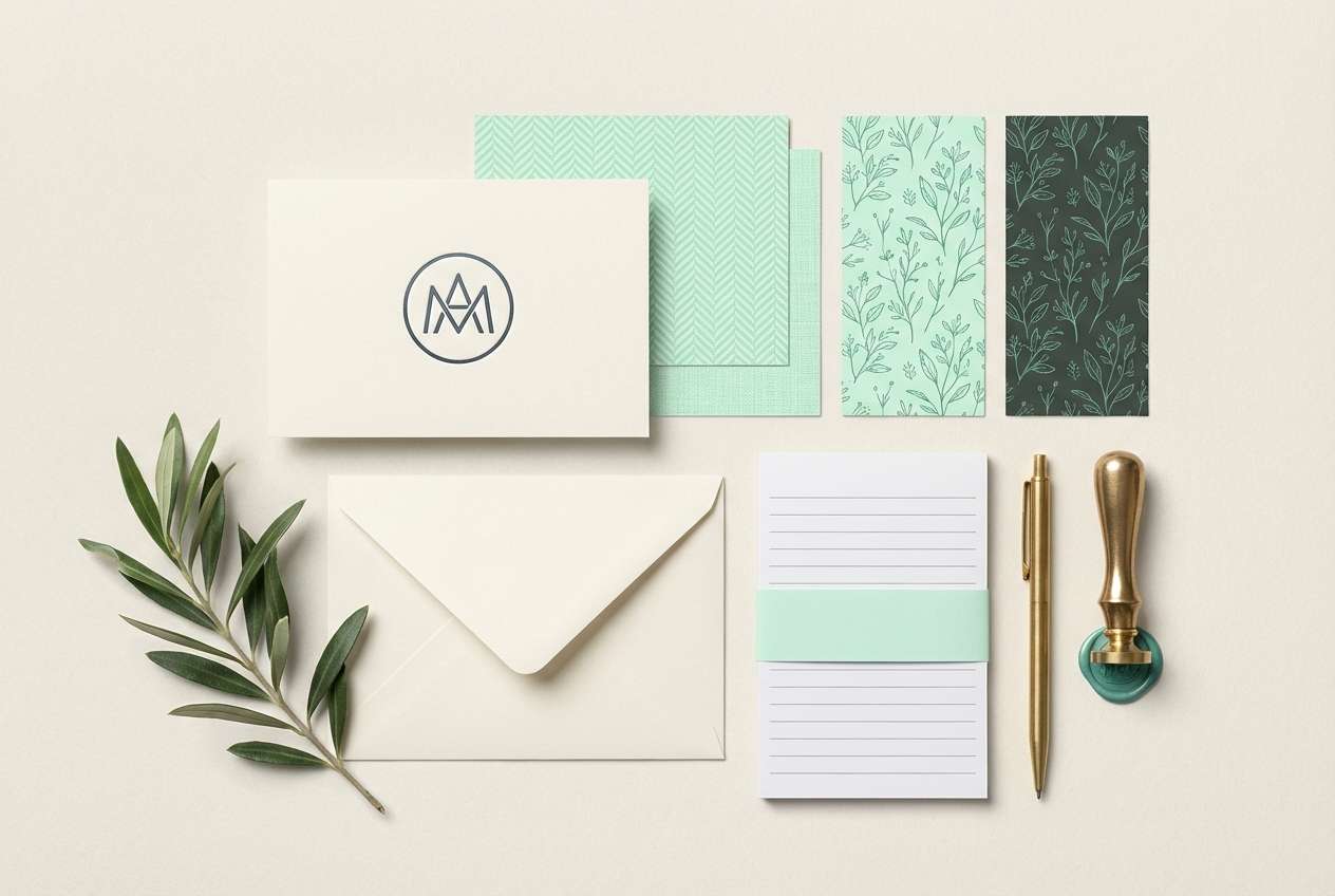
Image example of seafoam studio generated using media.io
Media.io is an online AI studio for creating and editing video, image, and audio in your browser.

2) Mint Latte Neutrals
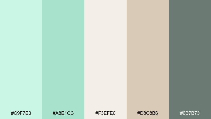
HEX: #c9f7e3 #a8e1cc #f3efe6 #d8c8b6 #6b7b73
Mood: soft, cozy, natural
Best for: cafes, lifestyle packaging, calm Instagram templates
Soft mint over oat and latte neutrals evokes a quiet cafe corner and linen tablecloths. The warm beige keeps the green from feeling sterile, making it great for labels and menu design. Pair with charcoal typography or muted sage icons for an editorial touch. Usage tip: print on uncoated stock to make the neutrals feel richer.
Image example of mint latte neutrals generated using media.io
3) Garden Glass
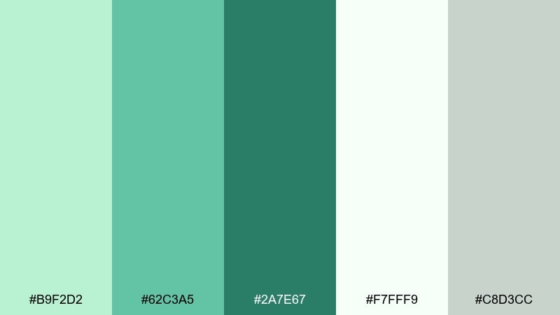
HEX: #b9f2d2 #62c3a5 #2a7e67 #f7fff9 #c8d3cc
Mood: fresh, botanical, crisp
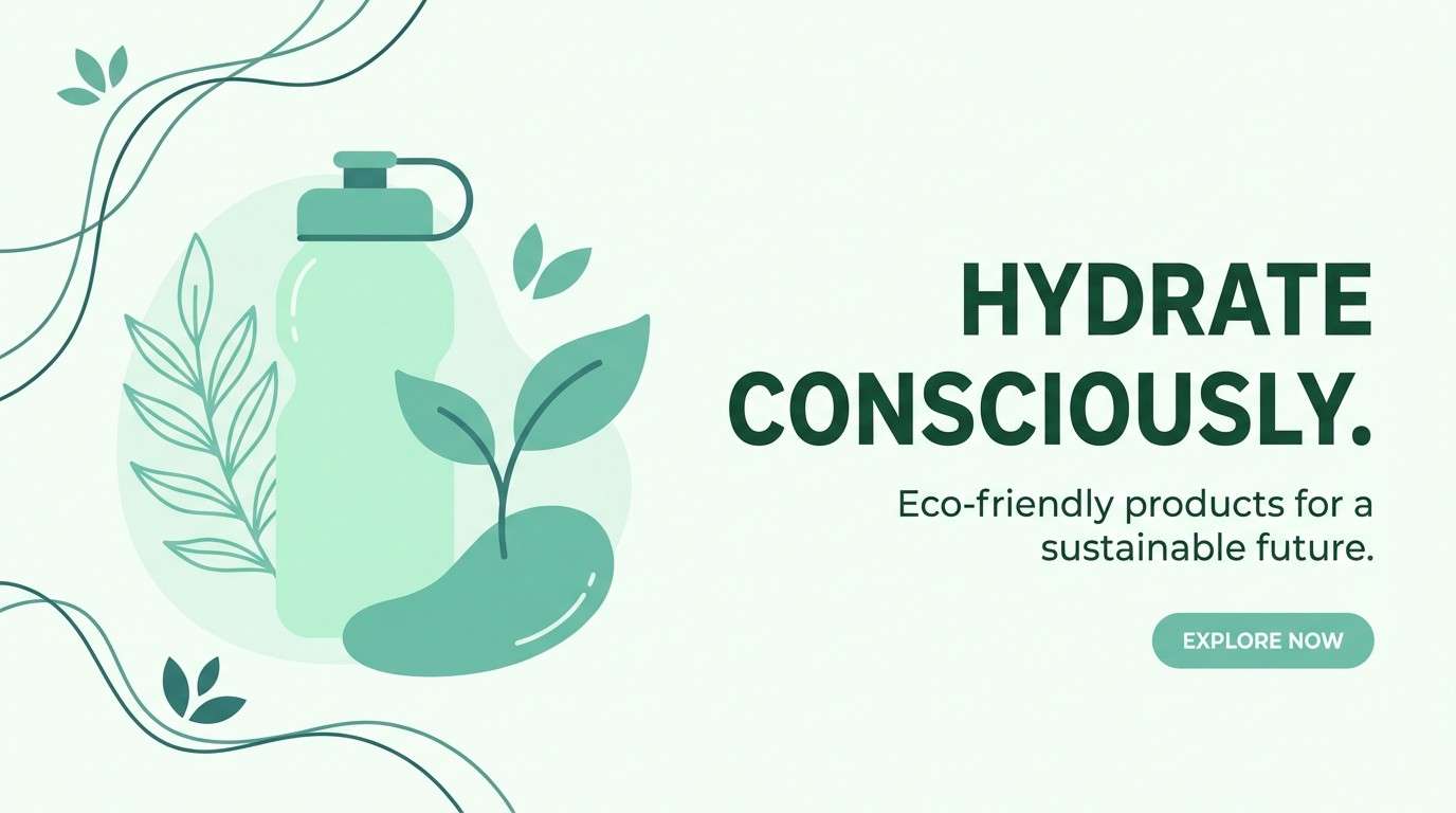
Best for: plant shops, eco product pages, spring campaigns
Fresh greens like dew on leaves give this set a clean botanical lift with a glassy brightness. These mint green mint color combinations shine in layouts that mix natural imagery with simple type. Pair the deep green with pale gray for structure, and keep the lightest tone as breathing room around photos. Usage tip: use the mid green for secondary buttons to create a friendly hierarchy.
Image example of garden glass generated using media.io
4) Fresh Clinic UI
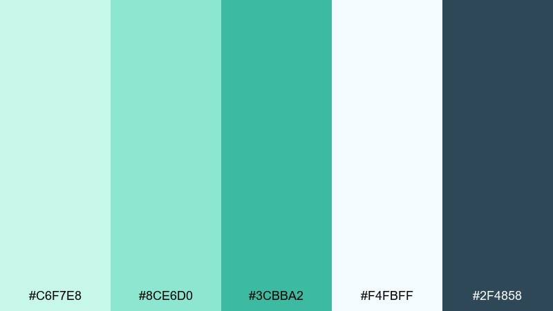
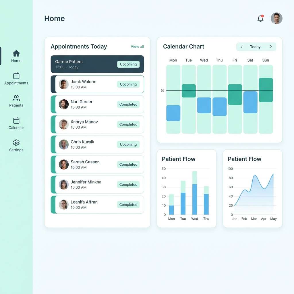
HEX: #c6f7e8 #8ce6d0 #3cbba2 #f4fbff #2f4858
Mood: clinical, reassuring, modern
Best for: health apps, appointment booking flows, dashboards
Cool mint with blue-gray contrast feels hygienic, calm, and professional. It supports high readability for forms, tables, and alerts without looking harsh. Pair the deep slate with the lightest mint for cards and separators, then use the saturated teal only for key actions. Usage tip: keep error states neutral and let mint own the success states.
Image example of fresh clinic ui generated using media.io
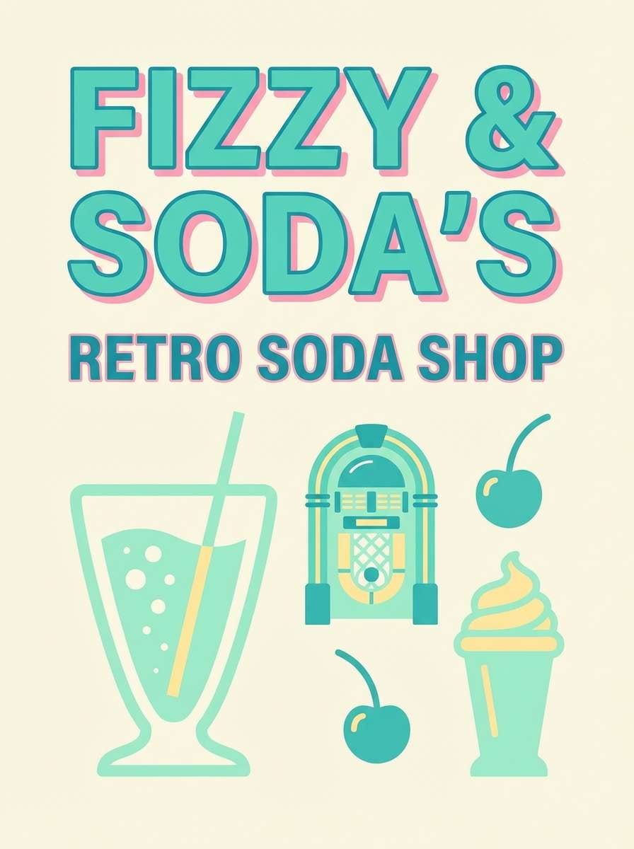
5) Retro Soda Shop
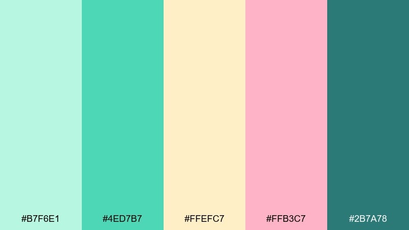
HEX: #b7f6e1 #4ed7b7 #ffefc7 #ffb3c7 #2b7a78
Mood: playful, nostalgic, bright
Best for: pop-up events, dessert branding, cheerful posters
Bubblegum pink and creamy yellow turn mint into a fun, retro treat. The mix feels perfect for bold headlines, sticker-style icons, and playful patterns. Pair with simple sans-serif type and keep the darkest teal for outlines to stop the pastels from blending. Usage tip: use the pink sparingly as a highlight so mint stays the star.
Image example of retro soda shop generated using media.io
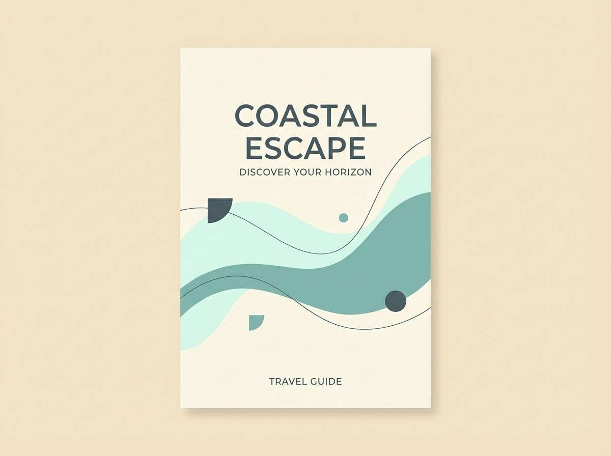
6) Coastal Fog
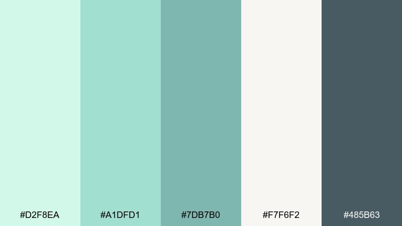
HEX: #d2f8ea #a1dfd1 #7db7b0 #f7f6f2 #485b63
Mood: misty, relaxed, coastal
Best for: travel blogs, spa brochures, calming presentations
Misty mint and muted blue-gray evoke a quiet shoreline and soft sea air. The tones stay gentle even in large blocks, making them great for slide backgrounds and long-form reading. Pair with warm cream and simple line icons for an easy, breezy look. Usage tip: keep text in the dark slate to avoid low-contrast fatigue.
Image example of coastal fog generated using media.io
7) Matcha & Marble
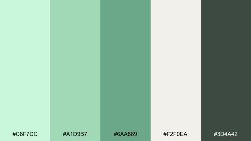
HEX: #c8f7dc #a1d9b7 #6aa889 #f2f0ea #3d4a42
Mood: earthy, refined, grounded
Best for: interior mood boards, artisan brands, premium stationery
Earthy matcha greens against marble cream feel grounded and quietly luxurious. The darker charcoal-green adds structure for type, borders, and monograms. Pair with subtle texture like paper grain or stone patterns to deepen the premium vibe. Usage tip: let the cream dominate and use mint as a soft wash behind content.
Image example of matcha & marble generated using media.io
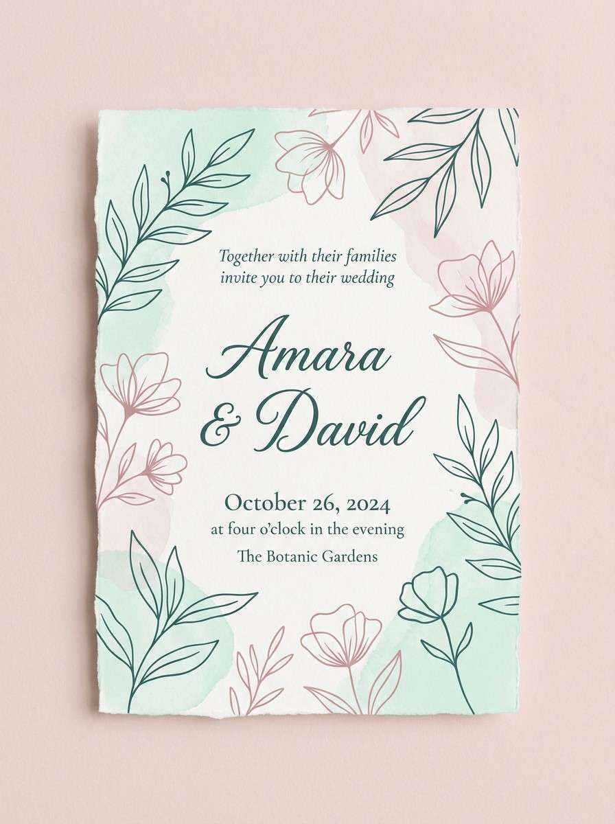
8) Spring Invitation
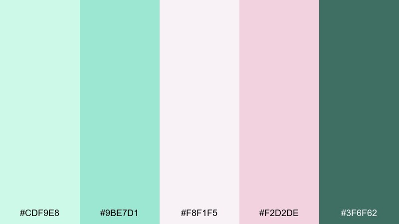
HEX: #cdf9e8 #9be7d1 #f8f1f5 #f2d2de #3f6f62
Mood: romantic, airy, floral
Best for: wedding invitations, baby showers, spring event flyers
Airy mint with blushy pink reads like petals, chiffon, and fresh-cut stems. As a mint green mint color scheme, it stays delicate while still offering strong contrast with the deep green for names and dates. Pair with thin serif type, floral line art, and plenty of margin to keep it elegant. Usage tip: print the blush tones slightly lighter to avoid overpowering the mint.
Image example of spring invitation generated using media.io
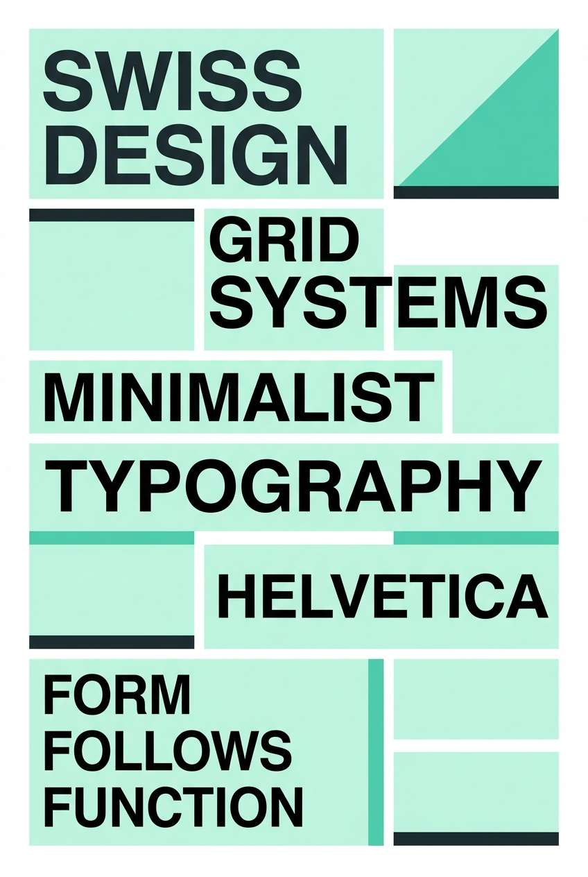
9) Minimal Mint Poster
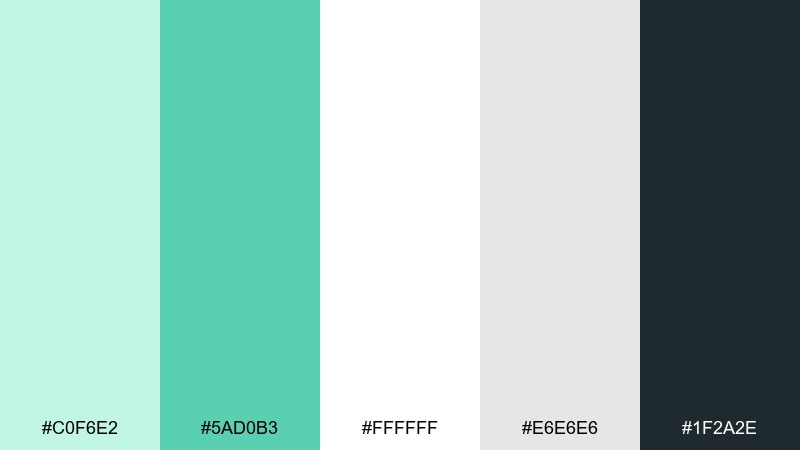
HEX: #c0f6e2 #5ad0b3 #ffffff #e6e6e6 #1f2a2e
Mood: minimal, sharp, contemporary
Best for: typography posters, gallery promos, clean social ads
Crisp mint against white and graphite feels modern, clean, and editorial. The palette is perfect for big type, geometric grids, and negative space-led layouts. Pair with monochrome photography or simple line graphics to keep the message front and center. Usage tip: use the bright mint only for one focal block per layout.
Image example of minimal mint poster generated using media.io
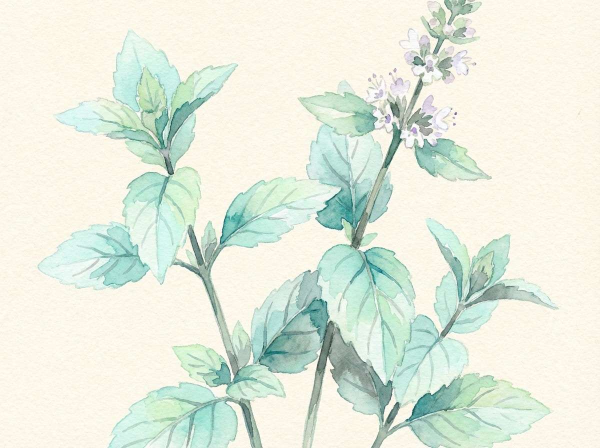
10) Botanical Watercolor
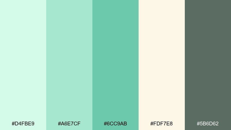
HEX: #d4fbe9 #a6e7cf #6cc9ab #fdf7e8 #5b6d62
Mood: gentle, organic, artistic
Best for: illustrations, nursery prints, nature blog headers
Gentle mint washes feel like watercolor leaves and soft sunlight. The warm cream keeps the greens looking hand-painted rather than digital. Pair with muted olive-gray outlines and loose brush textures to emphasize the natural vibe. Usage tip: let the lightest mint blend into the background for a dreamy gradient.
Image example of botanical watercolor generated using media.io
11) Tech Dashboard Calm
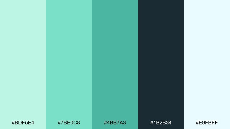
HEX: #bdf5e4 #7be0c8 #4bb7a3 #1b2b34 #e9fbff
Mood: focused, cool, confident
Best for: analytics dashboards, fintech apps, data-heavy UI
Cool mint highlights over deep navy-charcoal create a focused, high-contrast tech feel. The light ice tone is ideal for cards and panels while the saturated teal adds crisp emphasis. Pair with thin dividers and restrained icon sets to keep complex data readable. Usage tip: reserve the darkest background for charts so mint lines pop clearly.
Image example of tech dashboard calm generated using media.io

12) Candy Mint Pop
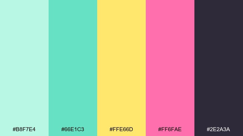
HEX: #b8f7e4 #66e1c3 #ffe66d #ff6fae #2e2a3a
Mood: bold, fun, energetic
Best for: youth brands, merch drops, punchy social graphics
Bright mint with candy yellow and hot pink feels loud in the best way, like neon signage softened by pastel air. The deep purple-black anchors the whole set so it still reads clean in type-heavy designs. Pair with chunky sans-serif fonts and simple shapes rather than detailed illustrations. Usage tip: keep backgrounds dark to make the mint glow without washing out.
Image example of candy mint pop generated using media.io

13) Sagey Office
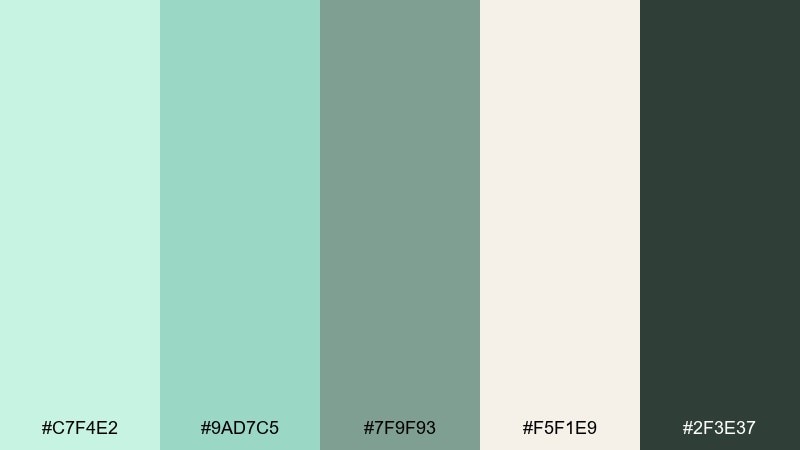
HEX: #c7f4e2 #9ad7c5 #7f9f93 #f5f1e9 #2f3e37
Mood: professional, calm, understated
Best for: corporate decks, reports, modern office branding
Muted mint and sage feel steady and responsible, like a well-lit workspace and clean notebooks. The warm paper tone prevents the greens from looking too cold in long documents. Pair with simple charts, thin rules, and plenty of spacing for a premium corporate look. Usage tip: use the mid sage for secondary headings to reduce visual noise.
Image example of sagey office generated using media.io
14) Mint Copper Luxe
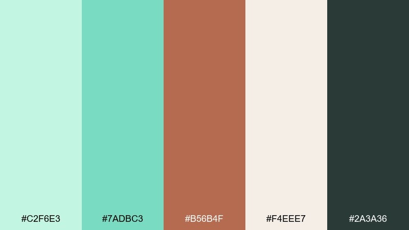
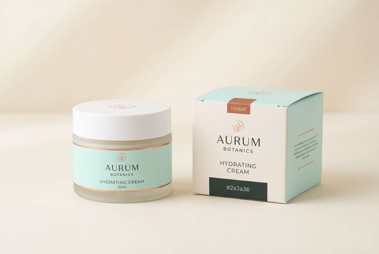
HEX: #c2f6e3 #7adbc3 #b56b4f #f4eee7 #2a3a36
Mood: luxurious, warm, contemporary
Best for: beauty branding, premium packaging, boutique logos
Cool mint with copper warmth feels like polished metal against sea glass. This mint green mint color combination is perfect for upscale packaging where you want freshness without losing sophistication. Pair with cream backgrounds and minimal typography, then add copper only as a foil accent or thin border. Usage tip: keep copper on small elements so it reads intentional, not rustic.
Image example of mint copper luxe generated using media.io
15) Kids Room Mint
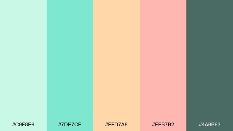
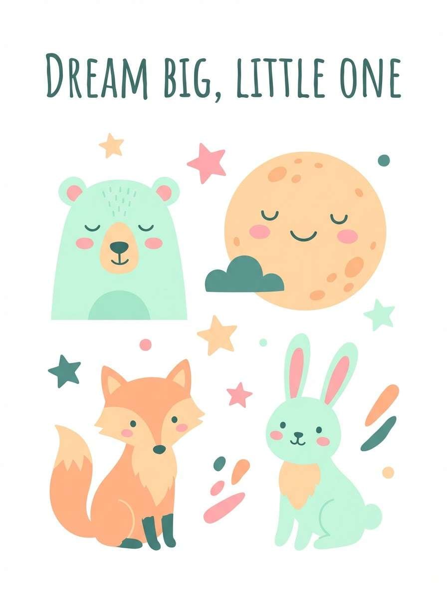
HEX: #c9f8e6 #7de7cf #ffd7a8 #ffb7b2 #4a6b63
Mood: sweet, friendly, playful
Best for: nursery decor, kids brands, cheerful illustrations
Mint with peach and soft coral feels like storybooks, plush toys, and sunny mornings. The warm accents keep the green lively and approachable for kid-focused designs. Pair with rounded type, simple doodles, and lots of white to keep it airy. Usage tip: use the darker green for outlines so characters stay readable on pastel fills.
Image example of kids room mint generated using media.io
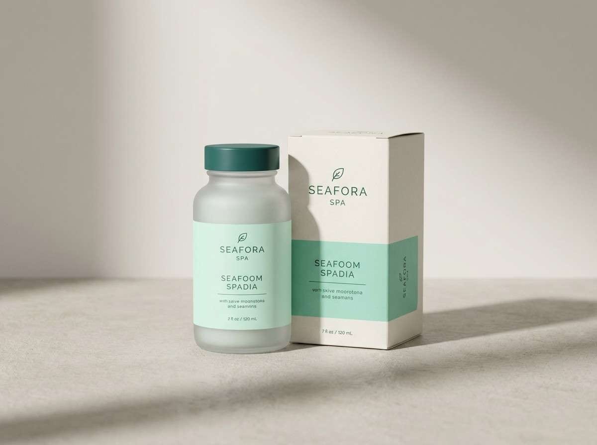
16) Spa Packaging
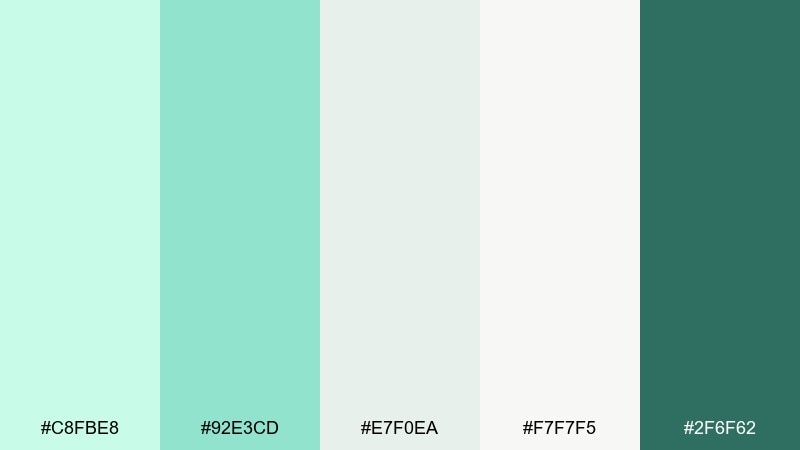
HEX: #c8fbe8 #92e3cd #e7f0ea #f7f7f5 #2f6f62
Mood: soothing, clean, serene
Best for: spa products, self-care ads, minimal packaging systems
Soft mint and misty neutrals feel like steam, towels, and a quiet treatment room. The palette is subtle enough for full-bleed packaging while still giving you a strong accent for logos. Pair with matte finishes and gentle typography to keep it calm and premium. Usage tip: use the deep green only for the brand mark and key claims.
Image example of spa packaging generated using media.io
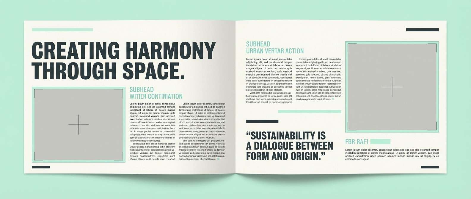
17) Editorial Mint Spread
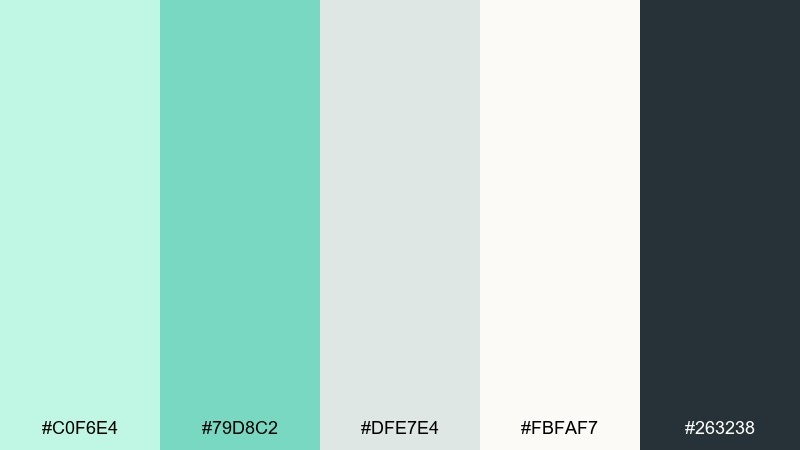
HEX: #c0f6e4 #79d8c2 #dfe7e4 #fbfaf7 #263238
Mood: editorial, airy, polished
Best for: magazine layouts, lookbooks, portfolio pages
Airy mint with ink-black type feels like a modern magazine spread with plenty of breathing room. The soft grays keep everything refined for long reads and image captions. Pair with high-contrast photography and let mint appear in section headers or pull quotes. Usage tip: keep body text in near-black for consistent accessibility.
Image example of editorial mint spread generated using media.io
18) Sunset Mint Punch
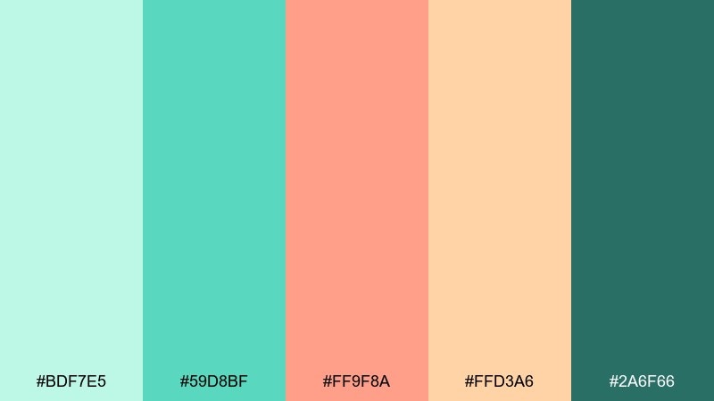
HEX: #bdf7e5 #59d8bf #ff9f8a #ffd3a6 #2a6f66
Mood: fresh, summery, vibrant
Best for: seasonal promos, beverage ads, event banners
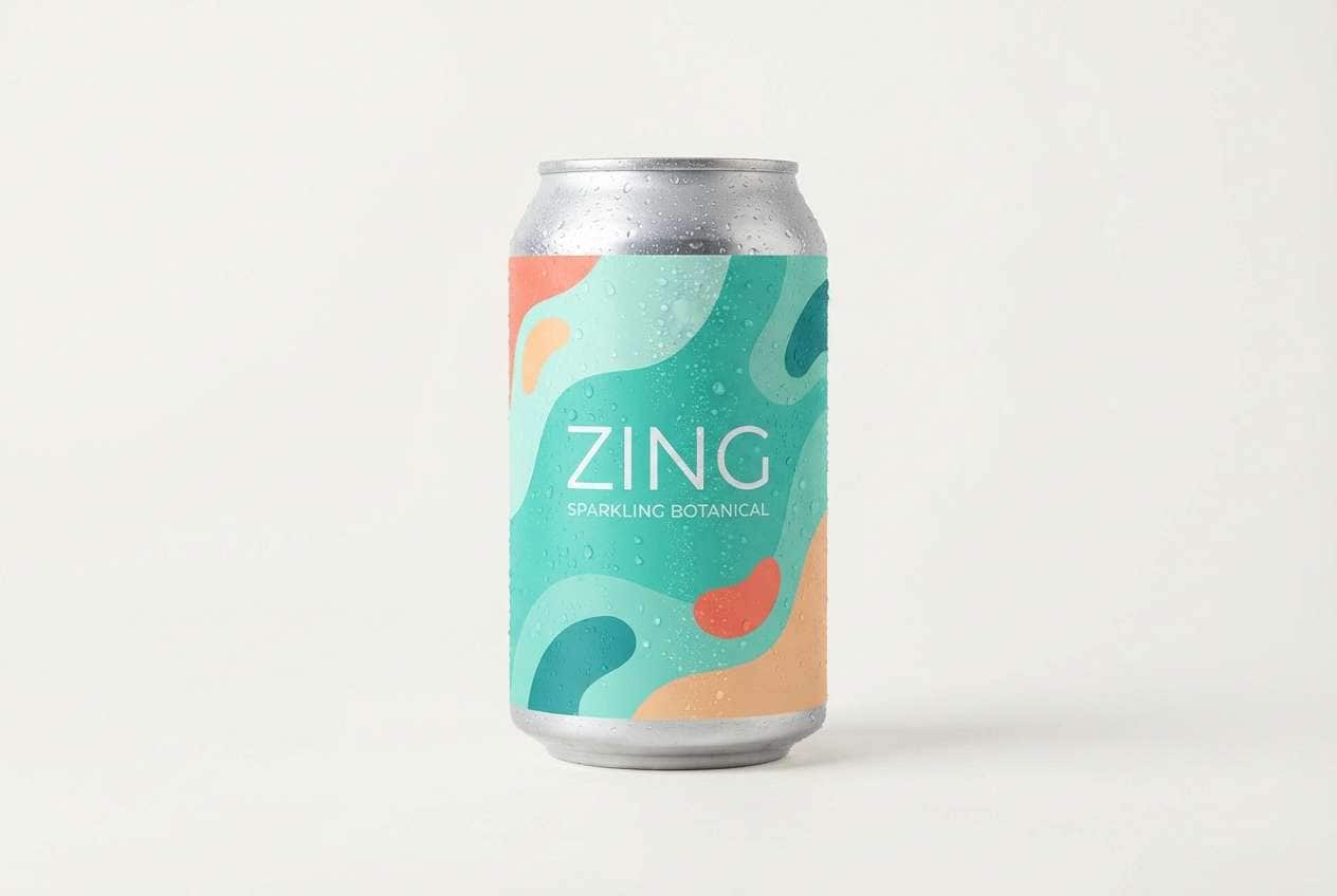
Mint with sunset coral and apricot feels like poolside shade and late-day glow. These mint green mint color combinations work especially well for summer promotions when you want energy without harsh contrast. Pair with bold shapes and keep the darkest teal for type to maintain clarity. Usage tip: let coral be a small burst, like a badge or price tag, to avoid visual overload.
Image example of sunset mint punch generated using media.io
19) Wedding Mint Whisper
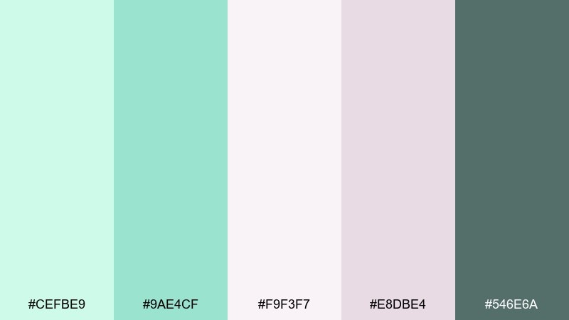
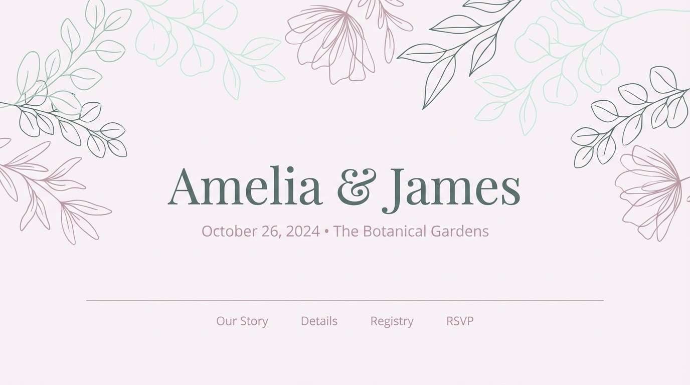
HEX: #cefbe9 #9ae4cf #f9f3f7 #e8dbe4 #546e6a
Mood: romantic, soft, timeless
Best for: wedding websites, save-the-dates, table cards
Soft mint and dusty lilac neutrals feel like silk ribbons and pale florals. The darker gray-green gives you readable type without breaking the gentle mood. Pair with delicate serif fonts and minimal botanical motifs for a refined look. Usage tip: use the light blush as the main background and mint as the accent for section dividers.
Image example of wedding mint whisper generated using media.io
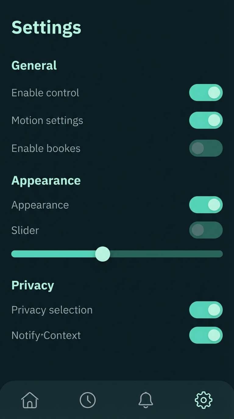
20) Night Mint Contrast
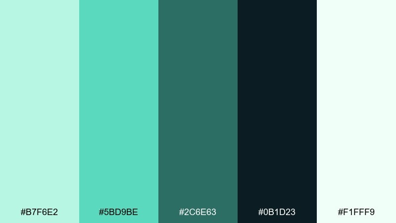
HEX: #b7f6e2 #5bd9be #2c6e63 #0b1d23 #f1fff9
Mood: sleek, moody, high-contrast
Best for: night mode UI, gaming overlays, bold branding
Bright mint on inky blue-black feels futuristic and sharp, like LEDs in a dark studio. The high contrast is perfect for dark mode interfaces, navigation bars, and punchy hero headers. Pair with minimal iconography and keep gradients subtle to avoid visual noise. Usage tip: use the pale near-white only for text and never as a large block on dark screens.
Image example of night mint contrast generated using media.io
What Colors Go Well with Mint Green Mint?
Mint green mint looks especially polished with creamy neutrals like warm white, ivory, oat, and soft beige. These keep the palette light while avoiding an overly “medical” feel.
For contrast and readability, pair mint with deep anchors like slate, blue-gray, charcoal, or near-black. This is the easiest way to make mint work for UI text, buttons, and headers without sacrificing accessibility.
If you want a playful twist, add small accents of pale pink, coral, or butter yellow. Used sparingly, these warm notes make mint feel friendly and trend-forward.
How to Use a Mint Green Mint Color Palette in Real Designs
In branding, let mint be the “air” in the system: backgrounds, packaging fields, and secondary panels. Then keep one dark green/charcoal shade for logos, headlines, and high-contrast typography.
In UI, mint is great for success states, positive metrics, and calm surfaces like cards or filters. Reserve the most saturated teal for primary actions so the interface still has a clear hierarchy.
For events (weddings, showers, spring flyers), mint pairs best with blush or cream plus a deep green for names and dates. This keeps the overall look delicate while ensuring key info stays legible.
Create Mint Green Mint Palette Visuals with AI
If you already have HEX codes, you can quickly turn them into mood boards, packaging mockups, posters, or UI concepts using AI. This is a fast way to preview how mint behaves in different lighting styles and layouts.
Start by choosing a dominant mint tone, then tell the generator what type of design you need (brand board, landing page hero, invitation, or product shot). Add your accent colors and specify a clean background to keep the mint looking fresh.
Mint Green Mint Color Palette FAQs
-
What is the difference between mint green and seafoam?
Mint green is usually cleaner and slightly brighter, while seafoam often leans a bit more blue/gray and muted. Both work well together, but seafoam tends to feel more coastal and subdued. -
Is mint green mint a good color for branding?
Yes—mint green mint communicates freshness, calm, and approachability, which suits wellness, skincare, eco brands, and modern lifestyle products. For a professional look, pair it with a dark slate/charcoal for type and a warm neutral background. -
What text color is most readable on mint backgrounds?
Deep charcoal, slate, or very dark green usually provides the best contrast on mint. Avoid pure white text on light mint backgrounds because it often fails contrast checks and looks washed out. -
What colors go well with mint green mint for weddings?
Blush, pale pink, soft lilac neutrals, and warm cream are classic wedding pairings for mint. Add a dark gray-green for typography so invitations and menus stay readable. -
Can mint green mint work in dark mode UI?
Yes—mint works great as an accent color on deep navy/blue-black backgrounds, especially for toggles, active states, and highlights. Keep large dark surfaces neutral and use mint in focused areas to avoid glare. -
How do I keep mint palettes from looking too “clinical”?
Add warmth with oat, beige, cream, or copper accents, and use softer textures (paper grain, matte finishes). Also limit highly saturated teal to small UI actions or highlights. -
How can I generate mint green mint palette images quickly?
Use Media.io’s text-to-image tool and describe the design (e.g., “brand identity mood board” or “minimal packaging”) while including your HEX colors as dominant and accent tones. You can iterate fast by changing lighting, style (vector vs realistic), and aspect ratio.
Next: Pale Pink Color Palette


