Mediterranean color palettes blend sun-washed blues, salty seafoam, warm terracotta, and creamy neutrals to create an instantly coastal look that still feels modern.
Whether you’re designing an interior, building a UI theme, or creating travel branding, these Mediterranean colors make it easy to balance calm freshness with inviting warmth.
In this article
- Why Mediterranean Palettes Work So Well
-
- santorini shutters
- amalfi lemon wash
- terracotta harbor
- olive grove courtyard
- sea glass mosaic
- blue dome nightfall
- coral reef aperitivo
- whitewashed linen
- aegean tilework
- cypress and stone
- sunlit portico
- marine and marble
- pomegranate market
- sandstone steps
- lavender coast
- capri mint and clay
- stormy coastline
- fisherman net neutral
- cobalt and saffron
- seaside chalk pastels
- What Colors Go Well with Mediterranean?
- How to Use a Mediterranean Color Palette in Real Designs
- Create Mediterranean Palette Visuals with AI
Why Mediterranean Palettes Work So Well
Mediterranean color palettes are naturally balanced: cool ocean blues and teals bring clarity and calm, while sun-baked terracotta, sand, and cream add warmth and comfort. That contrast feels both refreshing and grounded.
They also read “authentic” because the hues mirror real coastal materials—white plaster, clay tiles, sea glass, limestone, olive leaves, and deep water shadows. Even in digital design, those references make the palette feel familiar.
Most Mediterranean color schemes are easy to scale across projects because they include strong anchors (navy/cobalt) plus soft neutrals for space and readability, so the overall look stays clean instead of noisy.
20+ Mediterranean Color Palette Ideas (with HEX Codes)
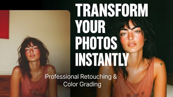
1) Santorini Shutters
HEX: #0B3C5D #1D6FA3 #7FC8D6 #F2E9D8 #E28B67
Mood: breezy, crisp, sunlit
Best for: travel branding hero banner
Breezy and crisp like whitewashed walls against deep blue sea. The navy and azure set a confident base, while seafoam and sand keep the look airy and welcoming. Use terracotta as a warm accent for buttons, icons, or a logo mark. Pair with clean sans-serif type and plenty of negative space for that postcard feel.
Image example of santorini shutters generated using media.io

Media.io is an online AI studio for creating and editing video, image, and audio in your browser.

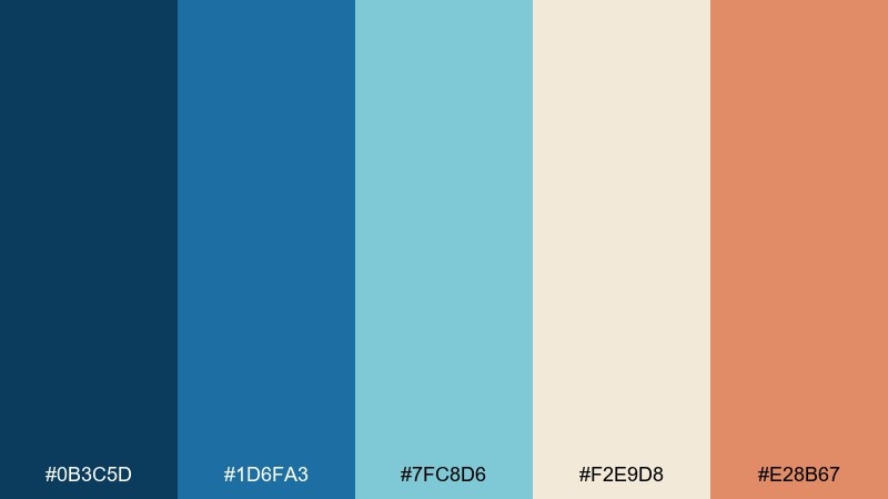
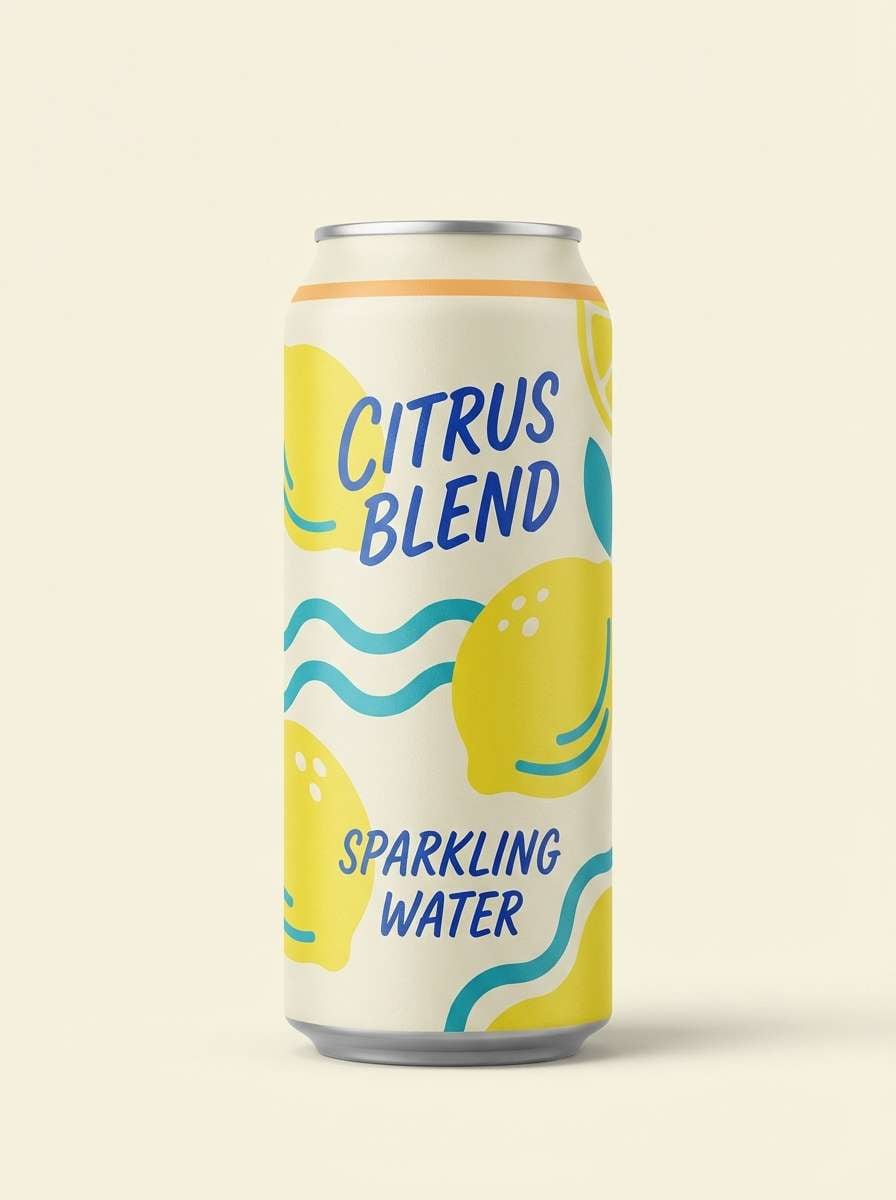
2) Amalfi Lemon Wash
HEX: #FFEB7A #2AA9A1 #FDF7E3 #1F4E79 #F4A261
Mood: sunny, playful, fresh
Best for: beverage packaging
Sunny and playful, like lemon groves above a turquoise bay. The buttery yellow pops instantly, balanced by teal and a grounded cobalt for contrast. Keep the cream as the label background so the type stays readable and premium. A small apricot highlight on the cap or badge adds a friendly, appetizing warmth.
Image example of amalfi lemon wash generated using media.io
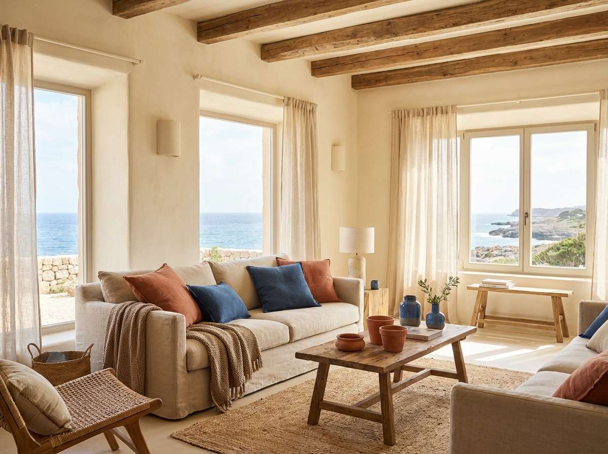
3) Terracotta Harbor
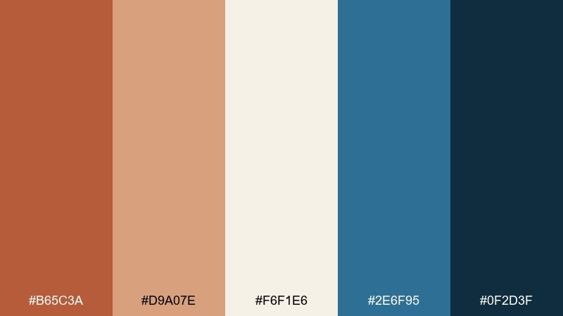
HEX: #B65C3A #D9A07E #F6F1E6 #2E6F95 #0F2D3F
Mood: grounded, coastal, inviting
Best for: living room interior plan
Grounded and inviting, like clay roofs meeting a shaded marina. Terracotta and warm tan handle the cozy surfaces, while layered blues bring in the waterline and depth. Use the cream as your wall or large-textile neutral to keep the room from feeling heavy. A good tip is to repeat the darkest blue in small doses, like frame trim or hardware, for a pulled-together finish.
Image example of terracotta harbor generated using media.io
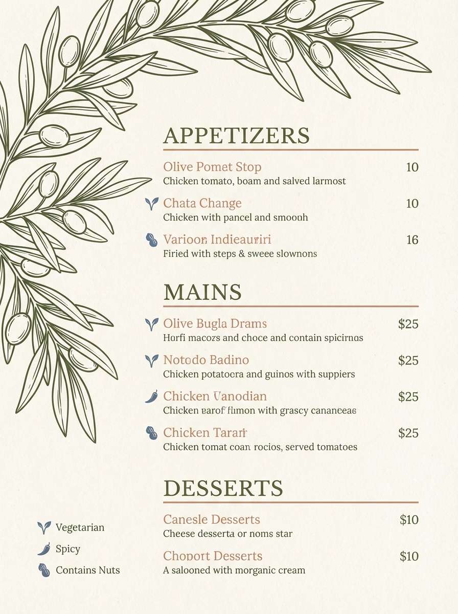
4) Olive Grove Courtyard
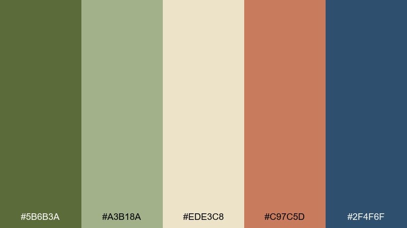
HEX: #5B6B3A #A3B18A #EDE3C8 #C97C5D #2F4F6F
Mood: rustic, relaxed, refined
Best for: restaurant menu design
Rustic and relaxed, like dappled shade under olive trees and stone arches. This mediterranean color scheme works best when the cream carries the layout and the greens handle section headers and dividers. Bring in the clay tone for highlights like specials or callouts, and use the slate blue for price alignment and small icons. Tip: keep paper texture subtle so the greens stay clean and readable.
Image example of olive grove courtyard generated using media.io
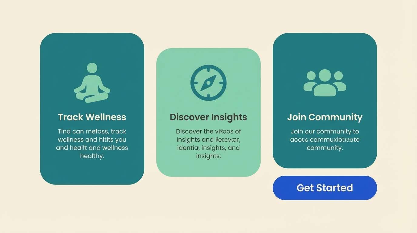
5) Sea Glass Mosaic
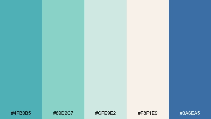
HEX: #4FB0B5 #89D2C7 #CFE9E2 #F8F1E9 #3A6EA5
Mood: clean, calming, modern
Best for: app onboarding screens
Clean and calming, like sea glass scattered on pale sand. The teal family creates a gentle progression for backgrounds, cards, and progress steps. Use the cobalt as your primary CTA so it stands out without shouting. For a smooth look, keep gradients subtle and reserve the cream for typography zones.
Image example of sea glass mosaic generated using media.io
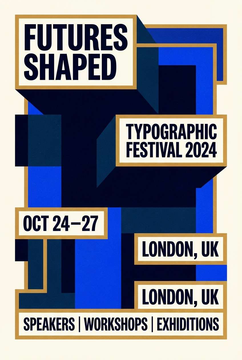
6) Blue Dome Nightfall
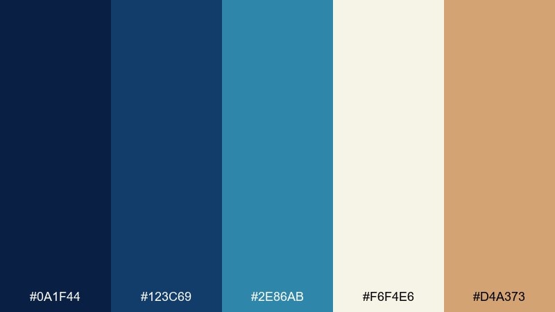
HEX: #0A1F44 #123C69 #2E86AB #F6F4E6 #D4A373
Mood: dramatic, elegant, twilight
Best for: event poster design
Dramatic and elegant, like twilight settling over cobalt domes and lantern light. Stack the deep blues for bold typography blocks, then let the pale cream open up breathing room. The warm gold works beautifully for date highlights, badges, or a thin border. One practical move is to keep the background dark and use cream for the main text to maximize legibility at distance.
Image example of blue dome nightfall generated using media.io
7) Coral Reef Aperitivo
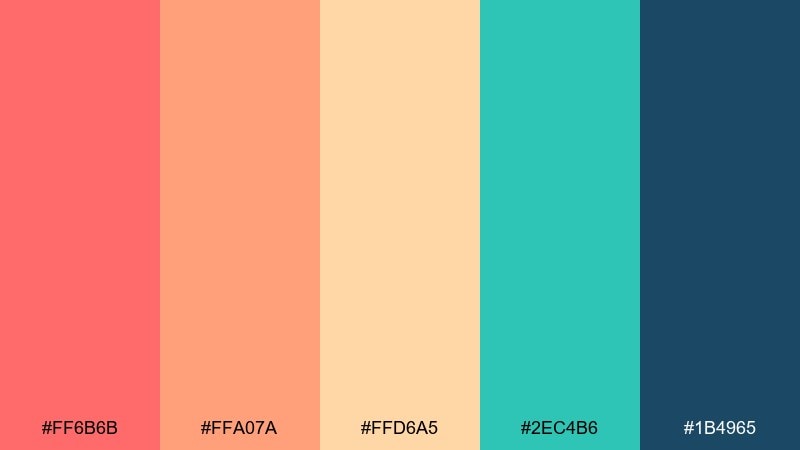
HEX: #FF6B6B #FFA07A #FFD6A5 #2EC4B6 #1B4965
Mood: energetic, social, summery
Best for: summer social media post
Energetic and social, like a seaside aperitivo with coral umbrellas and sparkling water. Coral and apricot bring the punch, while teal cools everything down for balance. Use the deep blue for headline text so it stays sharp over the warm tones. A simple tip: limit the layout to two dominant warm blocks and one teal accent so the design feels intentional, not busy.
Image example of coral reef aperitivo generated using media.io
8) Whitewashed Linen
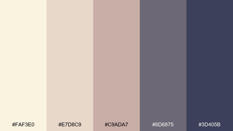
HEX: #FAF3E0 #E7D8C9 #C9ADA7 #6D6875 #3D405B
Mood: soft, airy, understated
Best for: minimalist brand identity
Soft and airy, like sun-bleached linen and quiet stone streets. The warm creams and blushy taupes make a gentle foundation for stationery and web sections. Bring in the smoky violet for hierarchy and the deep indigo for logos or headings. For consistency, keep your imagery desaturated so the neutrals stay the star.
Image example of whitewashed linen generated using media.io
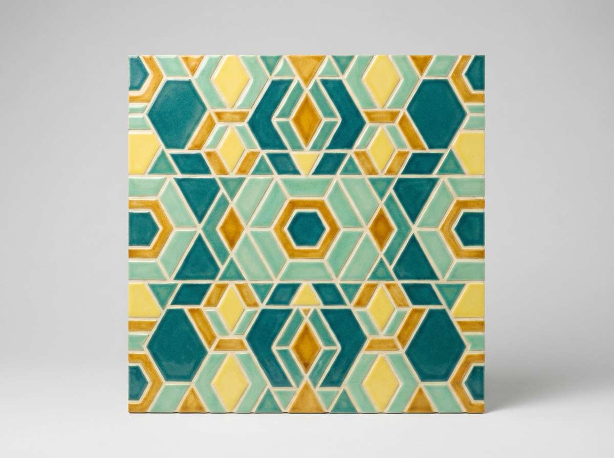
9) Aegean Tilework
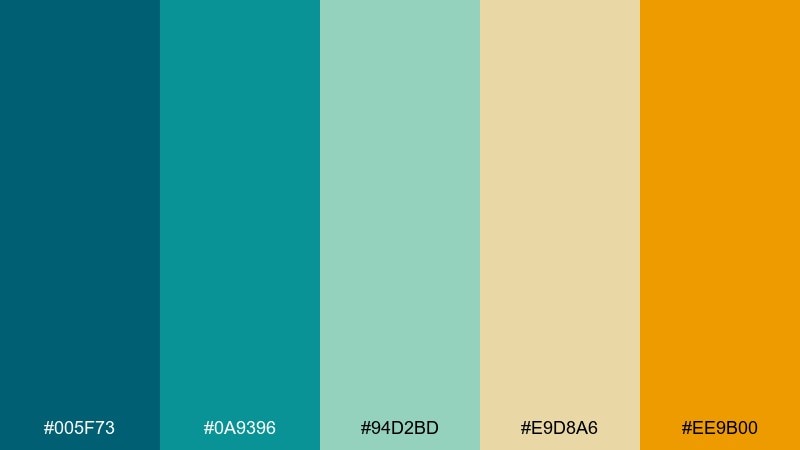
HEX: #005F73 #0A9396 #94D2BD #E9D8A6 #EE9B00
Mood: artisan, vibrant, coastal
Best for: kitchen backsplash mockup
Artisan and vibrant, like hand-painted tiles in a small seaside kitchen. The teal-to-mint range is perfect for pattern repetition, while buttery yellow and amber add that sunlit glow. Use the darkest teal for grout lines or framing so the pattern feels crisp. If the room is small, keep the rest of the surfaces neutral to let the backsplash shine.
Image example of aegean tilework generated using media.io
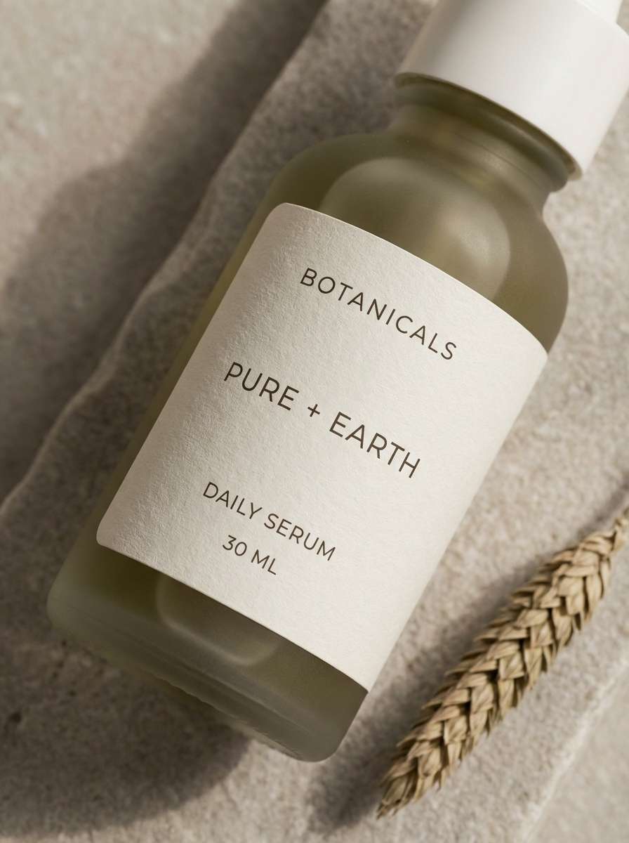
10) Cypress and Stone
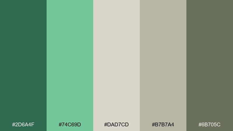
HEX: #2D6A4F #74C69D #DAD7CD #B7B7A4 #6B705C
Mood: natural, muted, trustworthy
Best for: eco skincare label
Natural and muted, like cypress branches against pale limestone. The greens read clean and botanical, while the stone neutrals keep the label feeling premium and calm. Use the darker olive for ingredient lists and the lighter green for seals or icons. Tip: choose matte packaging finishes so the soft neutrals don't glare under retail lighting.
Image example of cypress and stone generated using media.io
11) Sunlit Portico

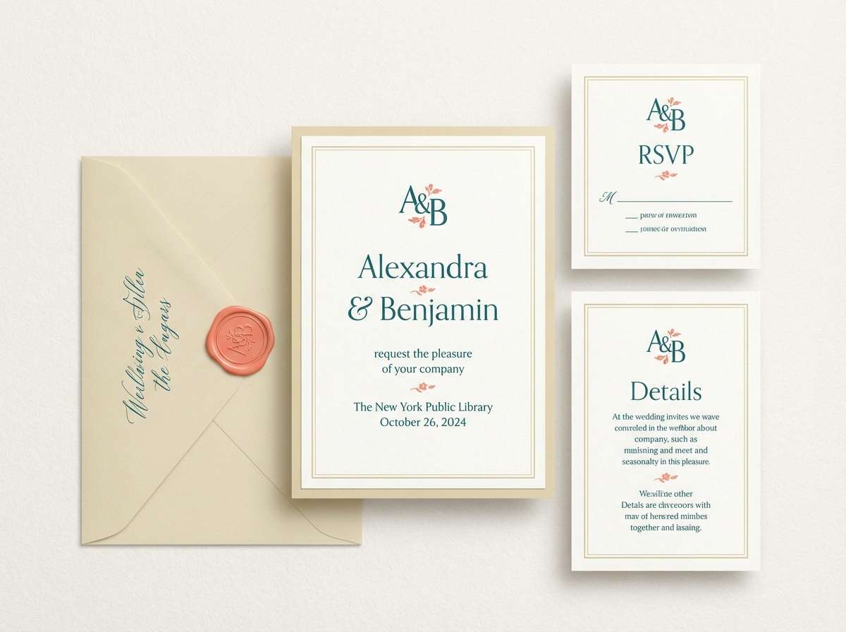
HEX: #F9E2AE #F4A261 #E76F51 #2A9D8F #264653
Mood: warm, romantic, festive
Best for: wedding invitation suite
Warm and romantic, like sunlight pouring through an archway onto painted tiles. This mediterranean color palette shines when you let the pale gold handle the paper base and keep the deeper teal for typography. Coral and terracotta make beautiful accents for monograms, RSVP details, or envelope liners. A smart usage tip is to reserve the deepest blue-green for small text so it stays crisp without feeling harsh.
Image example of sunlit portico generated using media.io
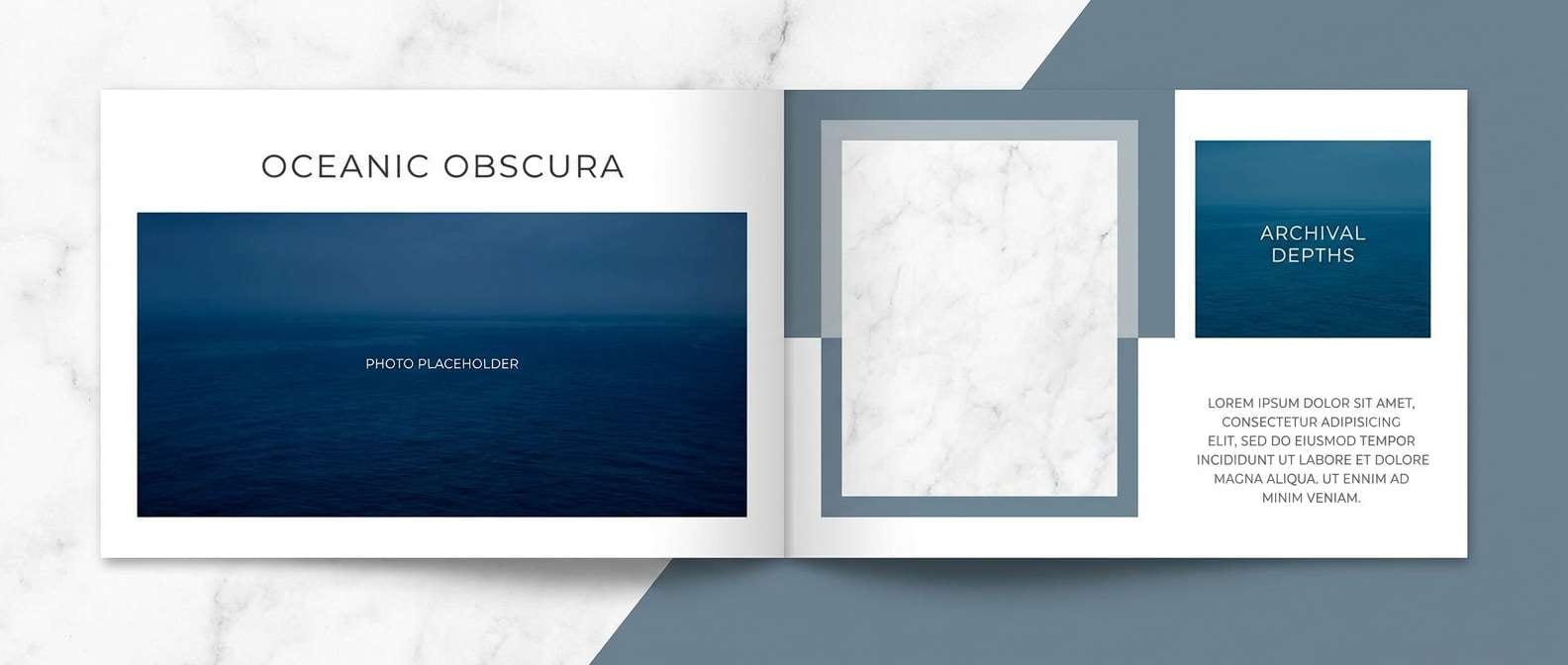
12) Marine and Marble
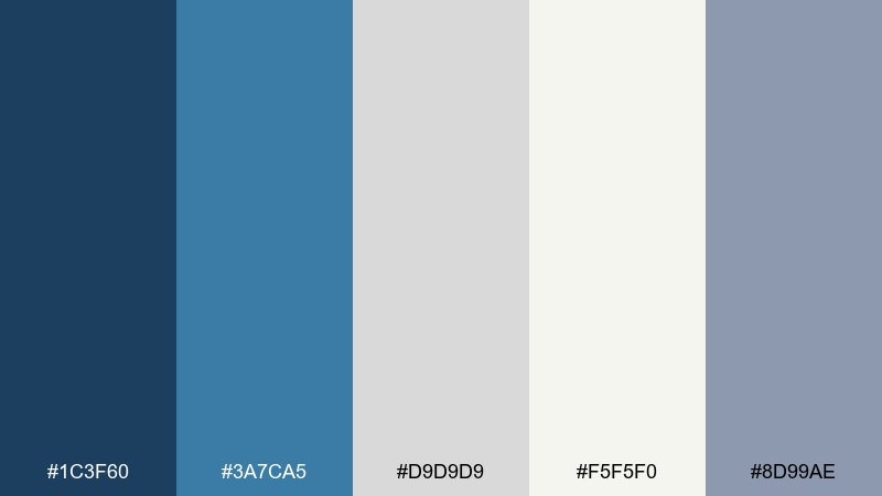
HEX: #1C3F60 #3A7CA5 #D9D9D9 #F5F5F0 #8D99AE
Mood: polished, editorial, cool
Best for: editorial magazine spread
Polished and editorial, like cool marble with a hint of open water. Use the marine blues for headers, pull quotes, and section tabs, then let the soft off-white carry body text areas. The grays create subtle structure for grids, rules, and caption boxes. For a premium finish, keep accent colors minimal and rely on whitespace and typography for drama.
Image example of marine and marble generated using media.io
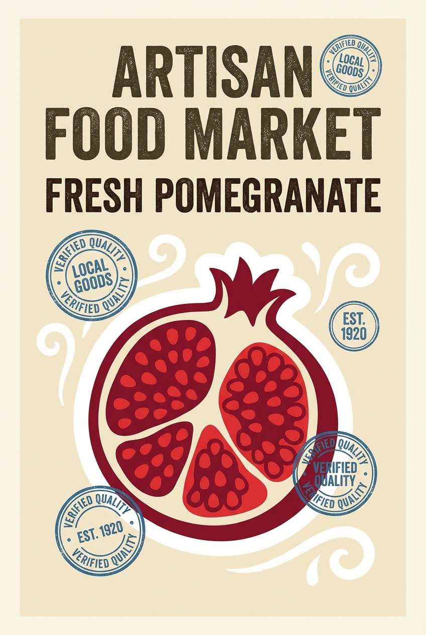
13) Pomegranate Market
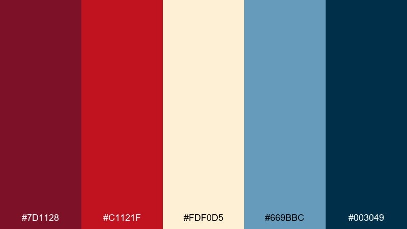
HEX: #7D1128 #C1121F #FDF0D5 #669BBC #003049
Mood: bold, flavorful, lively
Best for: artisan food poster
Bold and flavorful, like a market stall stacked with fruit and patterned fabric. The reds bring instant appetite appeal, while the creamy base keeps the composition from getting too loud. Use the soft blue for secondary panels or stamps, and reserve the deep navy for type and outlines. Tip: add a simple illustrated motif so the strong colors feel curated, not chaotic.
Image example of pomegranate market generated using media.io
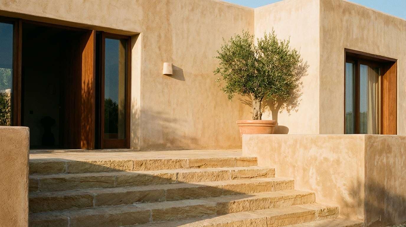
14) Sandstone Steps
HEX: #E6CCB2 #DDB892 #B08968 #7F5539 #3C2F2F
Mood: earthy, warm, timeless
Best for: exterior paint guide
Earthy and timeless, like sun-warmed steps carved from sandstone. The gradient from pale beige to deep brown makes it easy to map main walls, trim, doors, and accents. Use the lightest tone broadly, then step down in value for architectural details and contrast. A practical tip is to test the mid-tone in shade as well as sun, since it will shift warmer outdoors.
Image example of sandstone steps generated using media.io
15) Lavender Coast
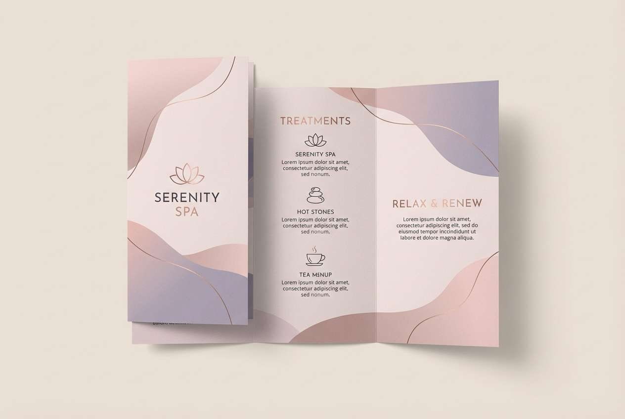
HEX: #6D597A #B56576 #E56B6F #EAAC8B #F8EDEB
Mood: soft, romantic, coastal
Best for: spa brochure
Soft and romantic, like lavender in warm air near the shore. The muted purples and rosy tones create a soothing flow for headings, section cards, and subtle gradients. Keep the pale blush as the primary background to maintain a light, wellness feel. Tip: pair with thin line icons and generous margins so the colors read calm, not sugary.
Image example of lavender coast generated using media.io
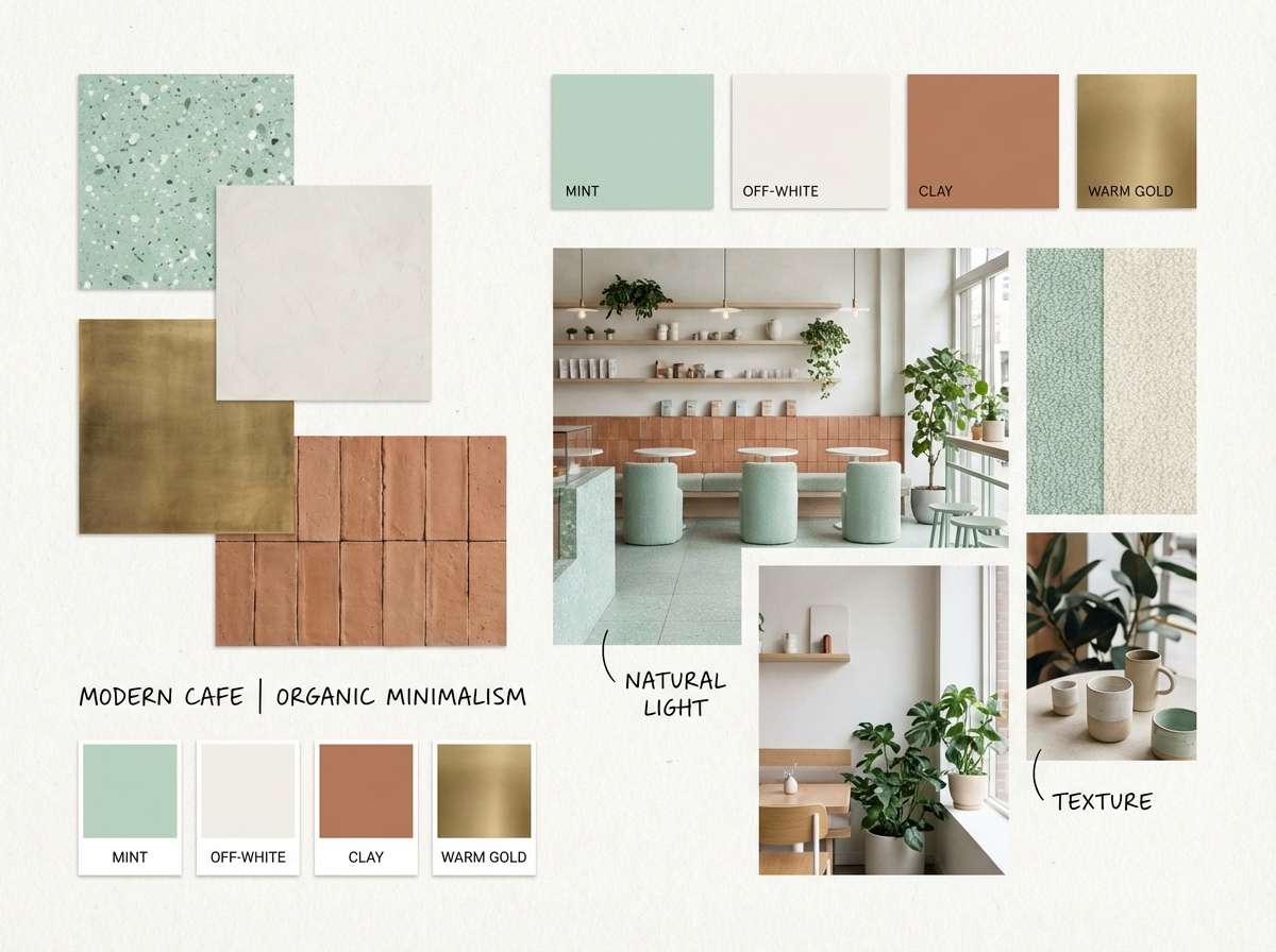
16) Capri Mint and Clay
HEX: #2A9D8F #8FE3CF #F1FAEE #E9C46A #C8553D
Mood: fresh, sunny, balanced
Best for: cafe interior mood board
Fresh and sunny, like minty gelato with terracotta cups on a bright table. These mediterranean color combinations feel best when mint and off-white cover most surfaces, leaving clay for stools, signage, or a feature wall. The soft gold is a great bridge tone for lighting, wood finishes, or menu highlights. Tip: repeat the clay accent at least three times in the room so it feels intentional rather than random.
Image example of capri mint and clay generated using media.io
17) Stormy Coastline
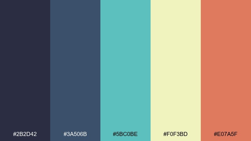
HEX: #2B2D42 #3A506B #5BC0BE #F0F3BD #E07A5F
Mood: moody, modern, confident
Best for: tech landing page
Moody and modern, like a storm rolling in over a bright shoreline. The deep blues build trust for hero sections and navigation, while teal adds a sleek interactive feel. Use the pale lime as a subtle background panel and save the warm coral for key CTAs. One useful tip is to keep gradients low-contrast so the interface stays sharp and accessible.
Image example of stormy coastline generated using media.io

18) Fisherman Net Neutral
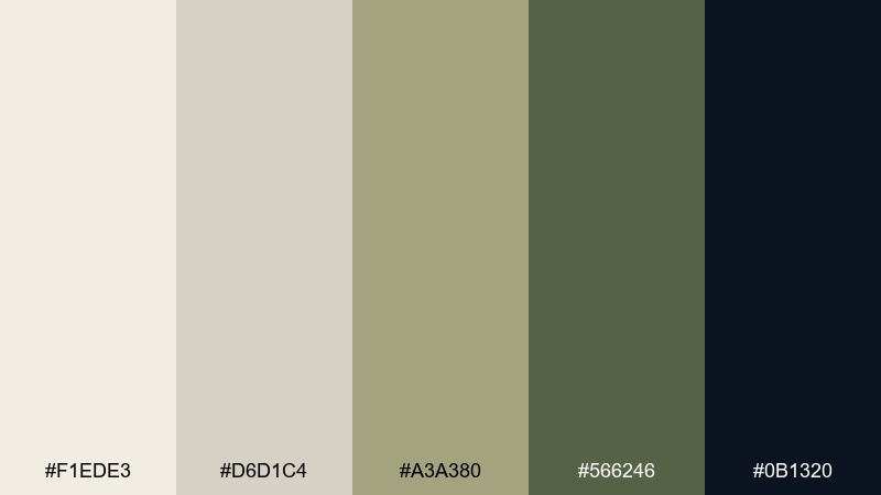
HEX: #F1EDE3 #D6D1C4 #A3A380 #566246 #0B1320
Mood: quiet, coastal, tactile
Best for: product photography backdrop
Quiet and tactile, like rope, canvas, and weathered docks. The creamy neutrals make products look premium, while the mossy greens bring a natural, grounded edge. Use the near-black sparingly for props or label text to keep contrast clean. Tip: choose soft side lighting so the texture shows without turning the scene too harsh.
Image example of fisherman net neutral generated using media.io
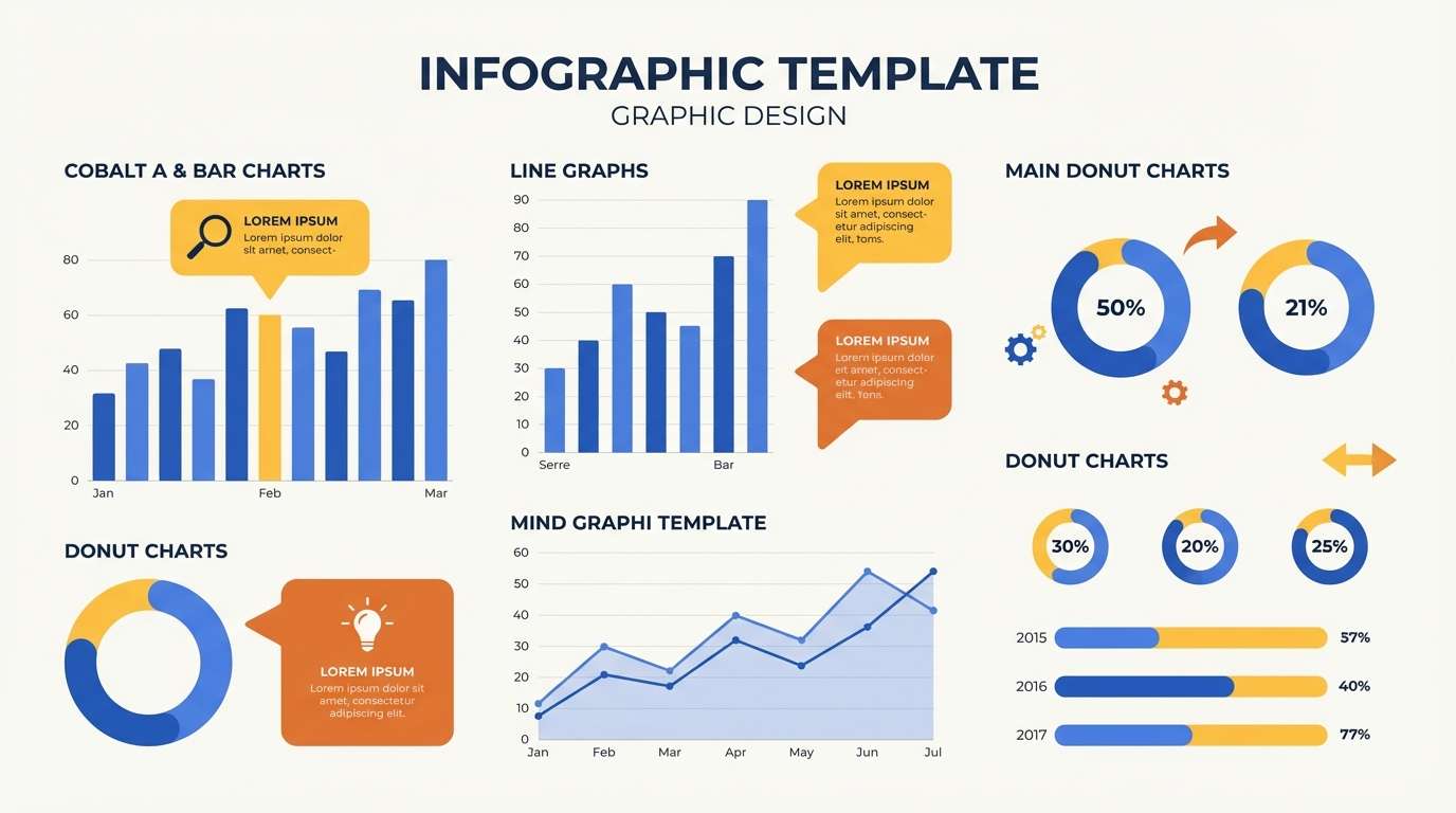
19) Cobalt and Saffron
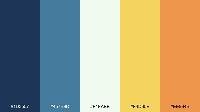
HEX: #1D3557 #457B9D #F1FAEE #F4D35E #EE964B
Mood: bright, confident, informative
Best for: infographic template
Bright and confident, like cobalt ceramic next to saffron spice. Use the off-white for the canvas, then build charts with layered blues for clarity. The yellows and oranges are perfect for callouts, legend keys, and emphasis numbers. A simple tip is to assign one warm color per data category to keep the story easy to scan.
Image example of cobalt and saffron generated using media.io
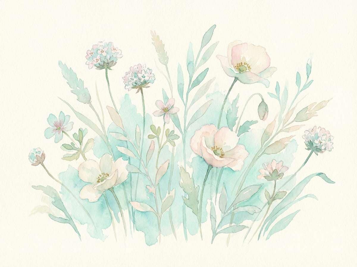
20) Seaside Chalk Pastels
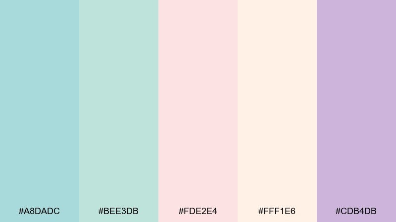
HEX: #A8DADC #BEE3DB #FDE2E4 #FFF1E6 #CDB4DB
Mood: gentle, airy, springlike
Best for: spring botanical illustration
Gentle and airy, like chalky pastels drifting in a sea breeze. These soft tones work beautifully for watercolor petals, leaves, and background washes. Keep one cool shade dominant and let the blush and cream float in as highlights for a balanced composition. Tip: avoid heavy outlines and use layered transparency so the palette stays light and natural.
Image example of seaside chalk pastels generated using media.io
What Colors Go Well with Mediterranean?
Mediterranean colors pair best with warm neutrals (cream, sand, stone) because they recreate white plaster walls and sunlit textures that keep bold blues from feeling too intense.
For accents, terracotta, clay, saffron, and coral add the “sun-baked” warmth that makes coastal blues feel lived-in rather than cold. If you want a more natural direction, olive and cypress greens fit effortlessly.
For a modern finish, add deep anchors like navy, indigo, or near-black in small doses for typography, UI elements, or hardware—this improves contrast and makes the palette feel more premium.
How to Use a Mediterranean Color Palette in Real Designs
Start with a simple hierarchy: choose one deep blue for structure (headers/navigation), one light neutral for breathing room (background/walls), and one warm accent (CTA/buttons/feature decor). This keeps the design coastal without becoming busy.
In interiors, apply the 60–30–10 idea: 60% cream/sand, 30% ocean tones, 10% terracotta or saffron. In branding and UI, keep neutrals behind text and reserve saturated colors for emphasis and clear actions.
Texture matters: matte finishes, paper grain, limestone-like backgrounds, and subtle gradients help Mediterranean palettes look authentic rather than flat. Pair with clean type and generous spacing for a fresh, sunlit feel.
Create Mediterranean Palette Visuals with AI
If you already have HEX codes, you can quickly turn them into travel banners, product mockups, posters, and UI screens by describing the layout and mood—then letting AI generate variations you can refine.
With Media.io, you can prompt for specific design formats (like “onboarding screens” or “wedding invitation suite”), control aspect ratios, and iterate fast until the Mediterranean look matches your brand.
Try generating a few options per palette, then keep the best composition and swap only one accent color at a time to stay consistent across a full design system.
Mediterranean Color Palette FAQs
-
What is a Mediterranean color palette?
A Mediterranean color palette is a coastal-inspired set of hues—typically ocean blues, seafoam/teal, sunlit creams, sandy beiges, and warm terracotta accents—designed to feel airy, relaxed, and sun-washed. -
Which Mediterranean colors are best for interiors?
For interiors, start with cream or warm white for walls, add muted blues/teals for furniture or tiles, and use terracotta or clay as an accent in textiles, pottery, or a feature wall. -
How do I keep Mediterranean colors from looking too bright?
Balance saturated blues and corals with plenty of soft neutrals (cream, sand, stone) and choose slightly muted versions of teal/blue. Matte textures and natural materials also reduce “neon” vibes. -
What are good Mediterranean color combinations for branding?
Popular choices include navy + azure + cream + terracotta for travel brands, teal + lemon + cream for food/beverage, and olive + clay + cream for rustic hospitality or eco-focused brands. -
What’s a good CTA color in a Mediterranean UI palette?
Deep cobalt or marine blue often works best for CTAs because it contrasts well against cream and seafoam backgrounds. If your UI is already dark, a warm coral or saffron accent can stand out clearly. -
Can I use Mediterranean colors for modern, minimalist designs?
Yes. Use a large neutral base (off-white/linen), keep blues as structured blocks, and limit warm accents to small, intentional highlights. Minimal typography and whitespace make the palette feel contemporary. -
How can I generate Mediterranean palette images with AI?
Describe the design type (poster, packaging, UI, interior mood board), specify the dominant colors and accents, and include a clear style direction (minimal, editorial, watercolor, etc.). Media.io can generate multiple variations quickly for iteration.
Next: Moroccan Color Palette