

Light coral (#F08080) sits right between blush and peach, giving you warmth without the heaviness of red. It’s a go-to accent for modern branding, friendly UI, and cozy home palettes because it feels inviting and human.
Below are 20 light coral color palette ideas with HEX codes, plus image prompts you can use to generate matching visuals in Media.io for mockups, moodboards, and campaign concepts.
In this article
- Why Light Coral Palettes Work So Well
-
- seashell sunrise
- clay blush studio
- peach sorbet ui
- coral and sage garden
- sunset linen living room
- retro soda pop
- minimal ink and coral
- coastal coral drift
- rose gold espresso
- soft coral nursery
- coral citrus punch
- terracotta ballet
- coral on charcoal ui
- coral and lavender dream
- desert coral roadtrip
- coral mint cleanse
- coral copper kitchen
- coral monochrome gradient
- coral and navy classic
- coral bloom watercolor
- What Colors Go Well with Light Coral?
- How to Use a Light Coral Color Palette in Real Designs
- Create Light Coral Palette Visuals with AI
Why Light Coral Palettes Work So Well
Light coral brings warmth and approachability, which makes designs feel more personal than pure pinks and less aggressive than true reds. It’s an easy way to add “friendly energy” without overpowering a layout.
It also pairs naturally with both neutrals (cream, oatmeal, charcoal) and contrasting cool tones (sage, teal, navy). That flexibility helps you build clear hierarchy: coral for emphasis, deeper tones for structure, and soft tints for breathing room.
Finally, light coral photographs well across print and digital when balanced with a dark anchor color. With the right contrast choices, it can look romantic, modern, playful, or premium—depending on what you pair it with.
20+ Light Coral Color Palette Ideas (with HEX Codes)
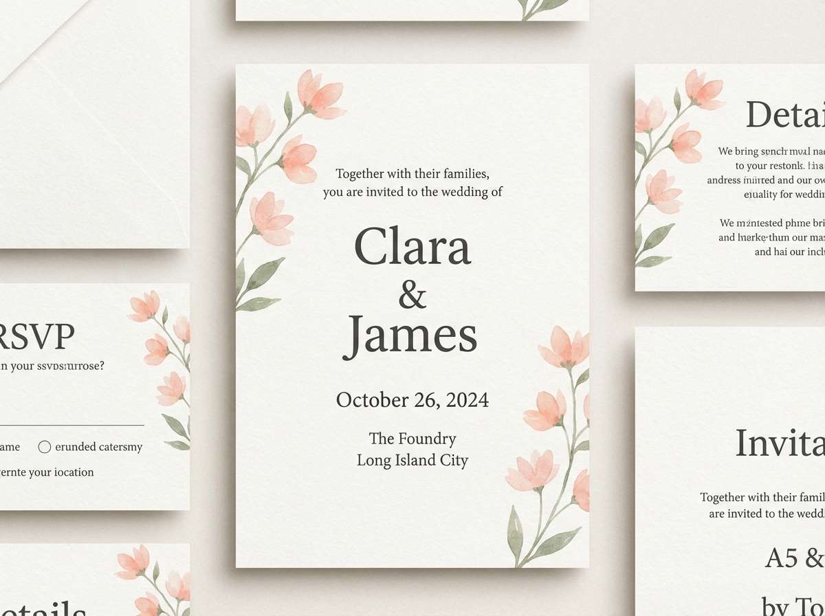
1) Seashell Sunrise
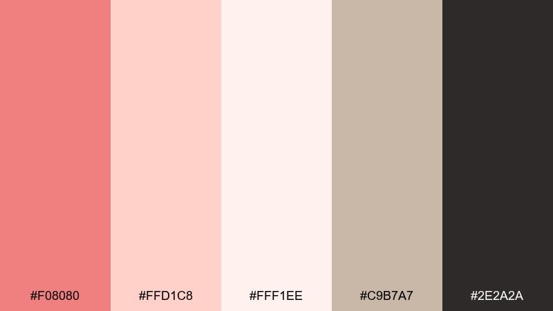
HEX: #F08080 #FFD1C8 #FFF1EE #C9B7A7 #2E2A2A
Mood: soft, romantic, airy
Best for: wedding invitation suite
Soft and romantic, this mix feels like sunrise over seashell sand with a gentle blush glow. It shines on wedding stationery, menus, and day-of signage where you want warmth without being loud. Pair the coral with creamy whites and a little charcoal for crisp typography. Tip: keep the darkest tone for names and headings so the delicate pastels stay readable.
Image example of seashell sunrise generated using media.io
Media.io is an online AI studio for creating and editing video, image, and audio in your browser.

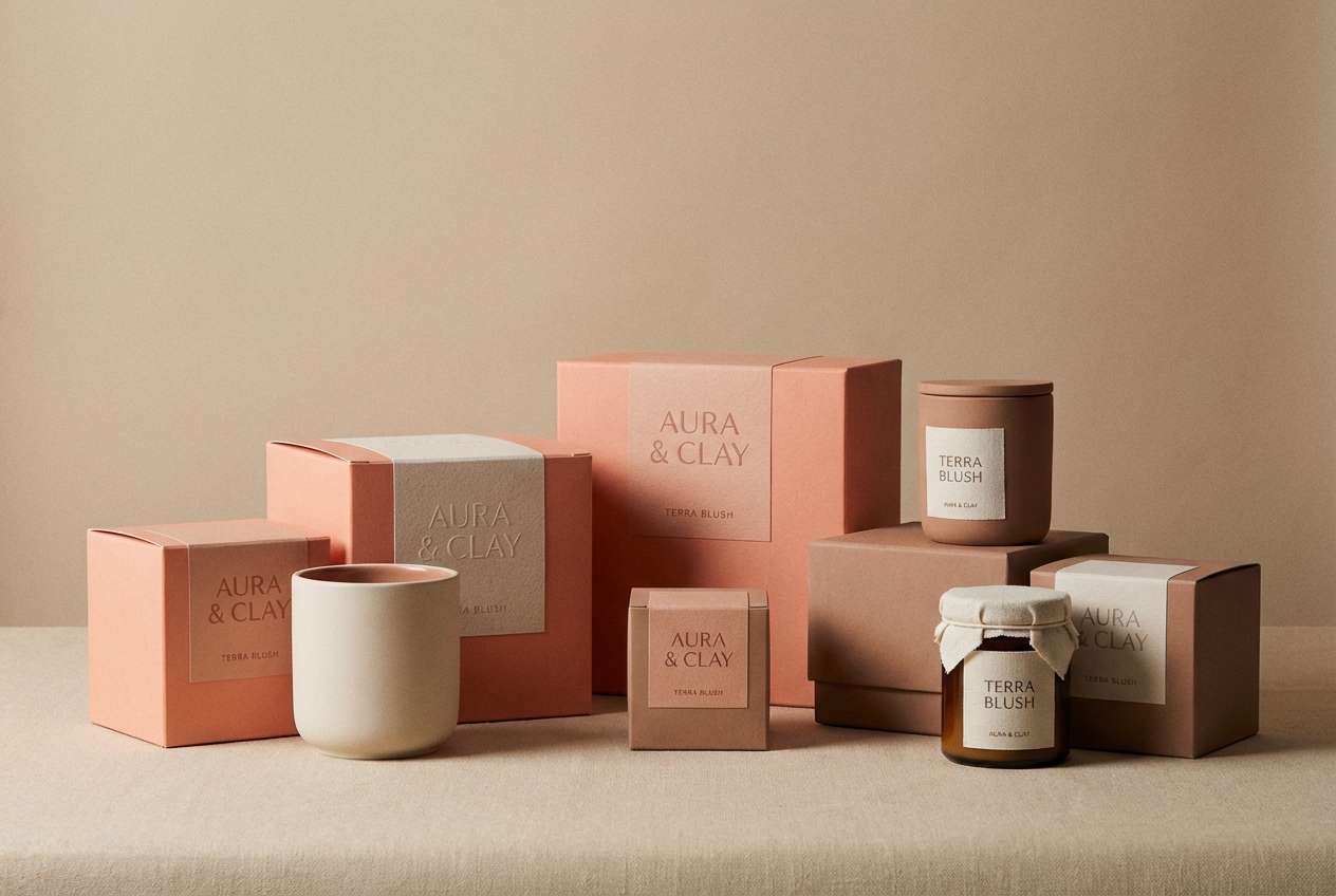
2) Clay Blush Studio
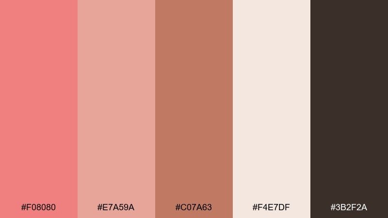
HEX: #F08080 #E7A59A #C07A63 #F4E7DF #3B2F2A
Mood: earthy, warm, modern
Best for: product packaging mockup
Earthy blush and clay tones create a grounded, boutique feel, like sun-warmed ceramics on a studio shelf. It works beautifully for skincare, candles, and artisanal food labels where texture and craft matter. Balance the coral with creamy beige and use the deep brown for premium contrast. Tip: add a matte paper finish and keep accent elements minimal to let the color story feel elevated.
Image example of clay blush studio generated using media.io
3) Peach Sorbet UI
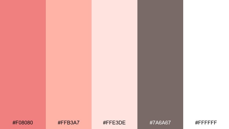
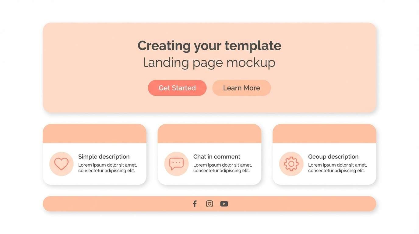
HEX: #F08080 #FFB3A7 #FFE3DE #7A6A67 #FFFFFF
Mood: friendly, clean, upbeat
Best for: 2D UI landing page mockup
Fresh and upbeat like a scoop of sorbet, these tones feel approachable and bright. They are a great fit for wellness apps, lifestyle newsletters, and ecommerce banners that need a soft hook. Use the coral for buttons and highlights, then anchor sections with warm gray text for clarity. Tip: reserve the most saturated coral for one primary action to keep the UI calm.
Image example of peach sorbet ui generated using media.io
4) Coral and Sage Garden
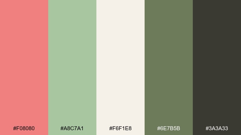
HEX: #F08080 #A8C7A1 #F6F1E8 #6E7B5B #3A3A33
Mood: fresh, botanical, calming
Best for: watercolor botanical illustration
Fresh and botanical, the coral bloom against sage greens evokes a quiet garden after rain. It is ideal for spring collection graphics, eco-friendly brands, and nature-forward blog headers. Let sage handle larger areas while coral pops in petals, badges, or small icons. Tip: add gentle paper grain to reinforce the organic mood without muddying the colors.
Image example of coral and sage garden generated using media.io
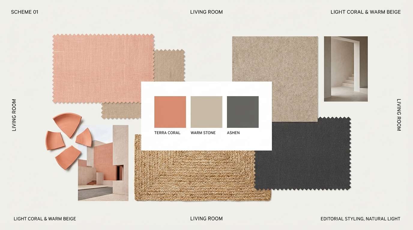
5) Sunset Linen Living Room
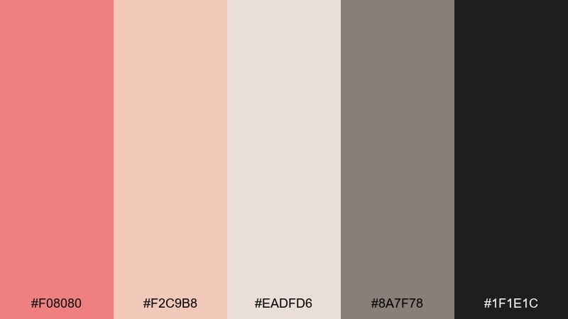
HEX: #F08080 #F2C9B8 #EADFD6 #8A7F78 #1F1E1C
Mood: cozy, refined, homey
Best for: interior design moodboard
Cozy and refined, these tones feel like linen curtains catching a mellow sunset glow. Use them for interior moodboards, furniture lookbooks, or home decor posts where warmth sells comfort. Pair coral accents with oatmeal neutrals and keep black just for small details like frames or headings. Tip: in room styling, repeat coral twice in smaller items rather than one big statement piece.
Image example of sunset linen living room generated using media.io
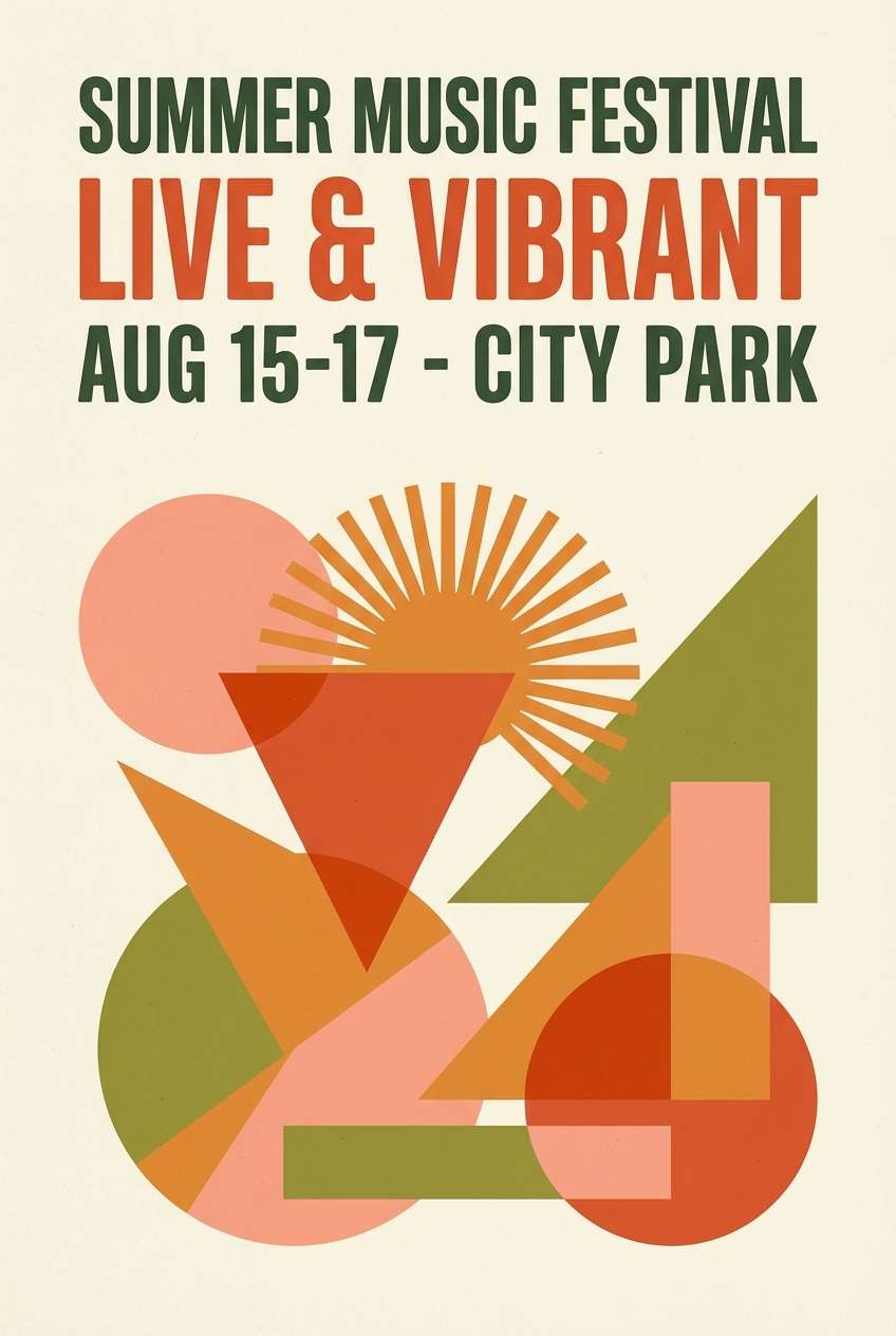
6) Retro Soda Pop
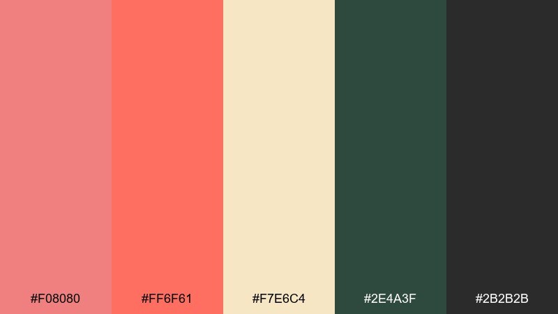
HEX: #F08080 #FF6F61 #F7E6C4 #2E4A3F #2B2B2B
Mood: playful, bold, vintage
Best for: promotional poster design
Playful and punchy, this set channels retro diners, fizzy drinks, and bold signage. It works great for event posters, seasonal promos, and merch graphics where you want instant energy. Let the warm cream soften the reds, then use the deep green as a grounding counterpoint. Tip: try chunky type and simple shapes so the high-contrast colors stay readable from a distance.
Image example of retro soda pop generated using media.io
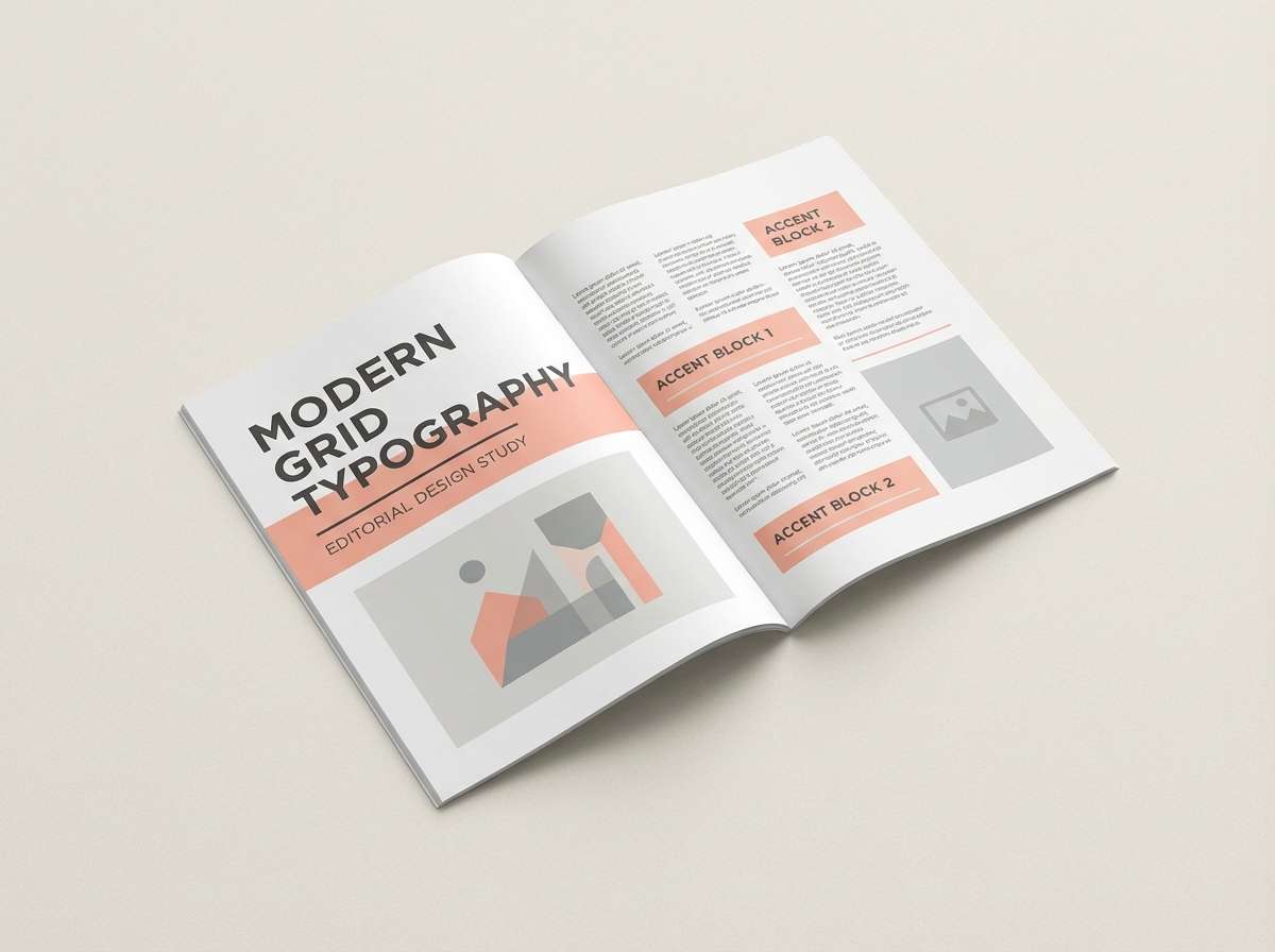
7) Minimal Ink and Coral
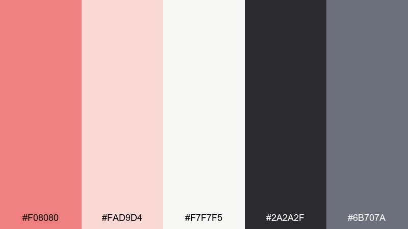
HEX: #F08080 #FAD9D4 #F7F7F5 #2A2A2F #6B707A
Mood: sleek, modern, editorial
Best for: magazine layout design
Sleek and editorial, the inky darks make coral highlights feel intentional and modern. This light coral color scheme fits portfolios, magazines, and minimalist brand guides that rely on strong hierarchy. Use the charcoal for headlines and body text, then bring coral in for pull quotes and key stats. Tip: keep plenty of white space so the accent color reads as premium rather than cute.
Image example of minimal ink and coral generated using media.io
8) Coastal Coral Drift
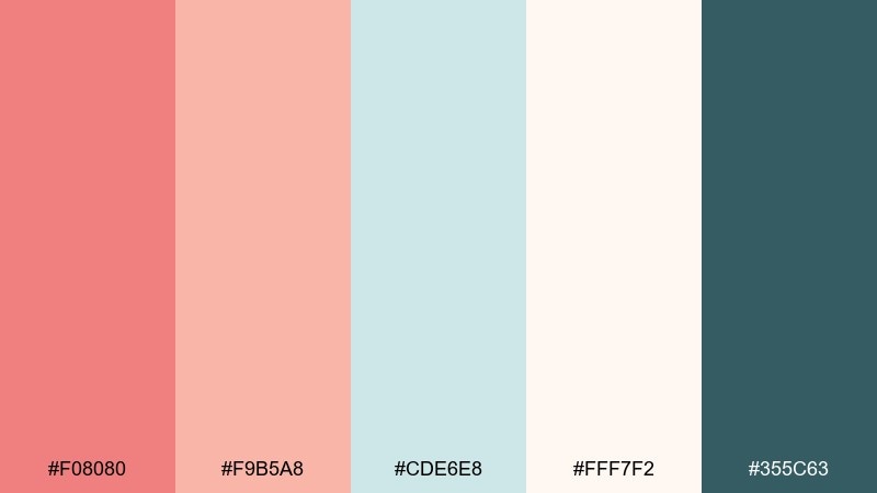
HEX: #F08080 #F9B5A8 #CDE6E8 #FFF7F2 #355C63
Mood: breezy, coastal, relaxed
Best for: social media post template
Breezy and coastal, these shades evoke driftwood, seafoam, and a soft coral horizon. They are perfect for travel creators, beachwear drops, or relaxed lifestyle content. Use teal for calm backgrounds and coral for badges, prices, or key phrases. Tip: add subtle grain and keep the palette to two dominant colors per post to avoid a busy look.
Image example of coastal coral drift generated using media.io
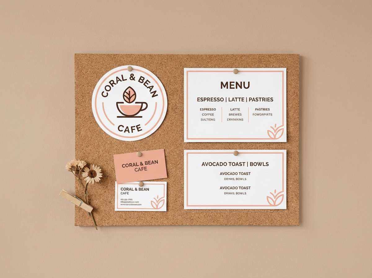
9) Rose Gold Espresso
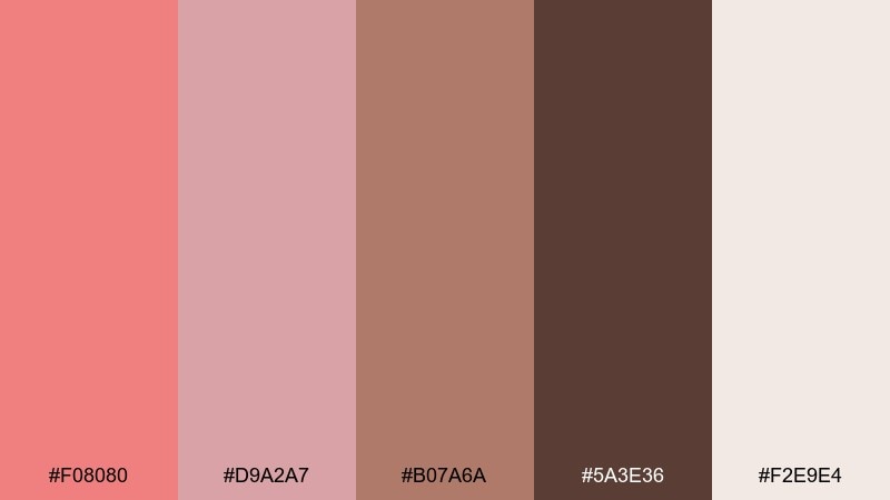
HEX: #F08080 #D9A2A7 #B07A6A #5A3E36 #F2E9E4
Mood: luxurious, cozy, boutique
Best for: cafe brand identity
Luxurious and cozy, this blend feels like rose gold light over a cappuccino bar. These light coral color combinations are strong for cafe logos, menu designs, and loyalty cards that need warmth and sophistication. Keep the creamy beige as your base and use espresso brown for legibility and structure. Tip: foil-stamp the soft coral on dark brown for a premium, tactile finish.
Image example of rose gold espresso generated using media.io
10) Soft Coral Nursery
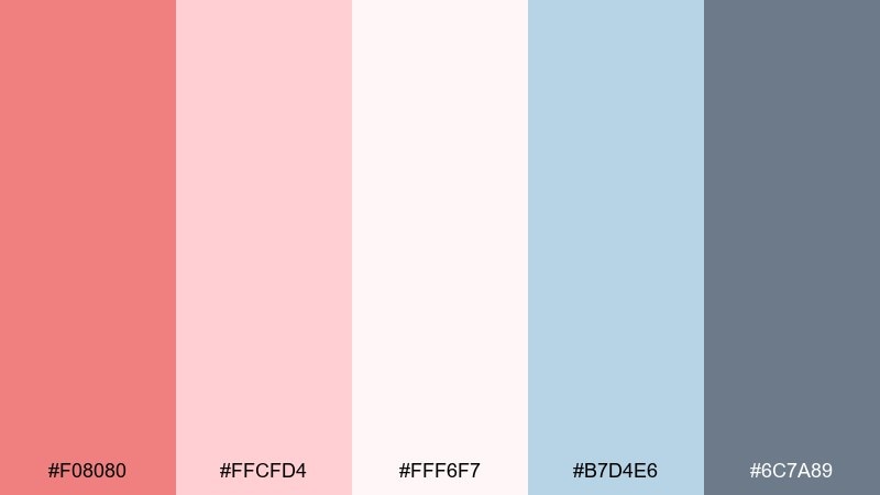
HEX: #F08080 #FFCFD4 #FFF6F7 #B7D4E6 #6C7A89
Mood: gentle, sweet, comforting
Best for: nursery wall art illustration
Gentle and comforting, these pastels feel like a lullaby in color form. They suit nursery prints, baby shower decor, and soft educational flashcards. Let the blush tones carry the warmth, while the dusty blue adds a calming counterbalance. Tip: use the deeper gray-blue for outlines and small text so everything stays soft but still clear.
Image example of soft coral nursery generated using media.io

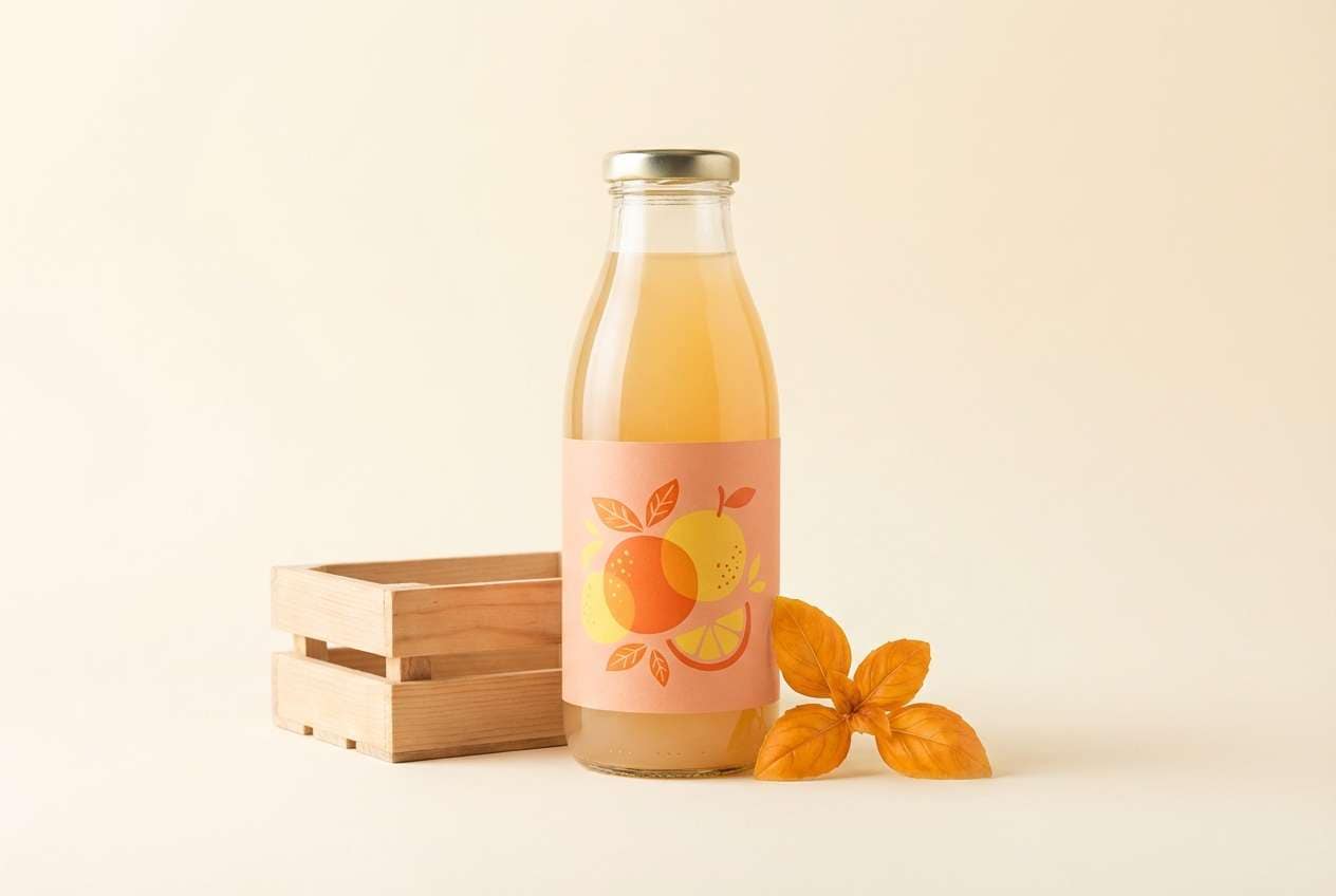
11) Coral Citrus Punch
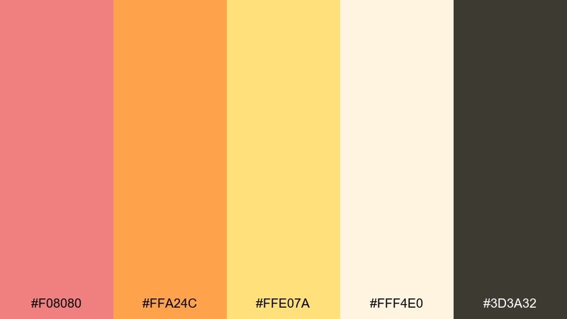
HEX: #F08080 #FFA24C #FFE07A #FFF4E0 #3D3A32
Mood: sunny, energetic, appetizing
Best for: beverage product ad
Sunny and energetic, this palette feels like citrus slices on a bright summer table. A light coral color combination with orange and lemon works especially well for beverage ads, food packaging, and summer campaign graphics. Use the buttery yellow as a highlight and keep dark brown for ingredient lists and small copy. Tip: photograph or render the product on a warm cream background to preserve that fresh, appetizing glow.
Image example of coral citrus punch generated using media.io
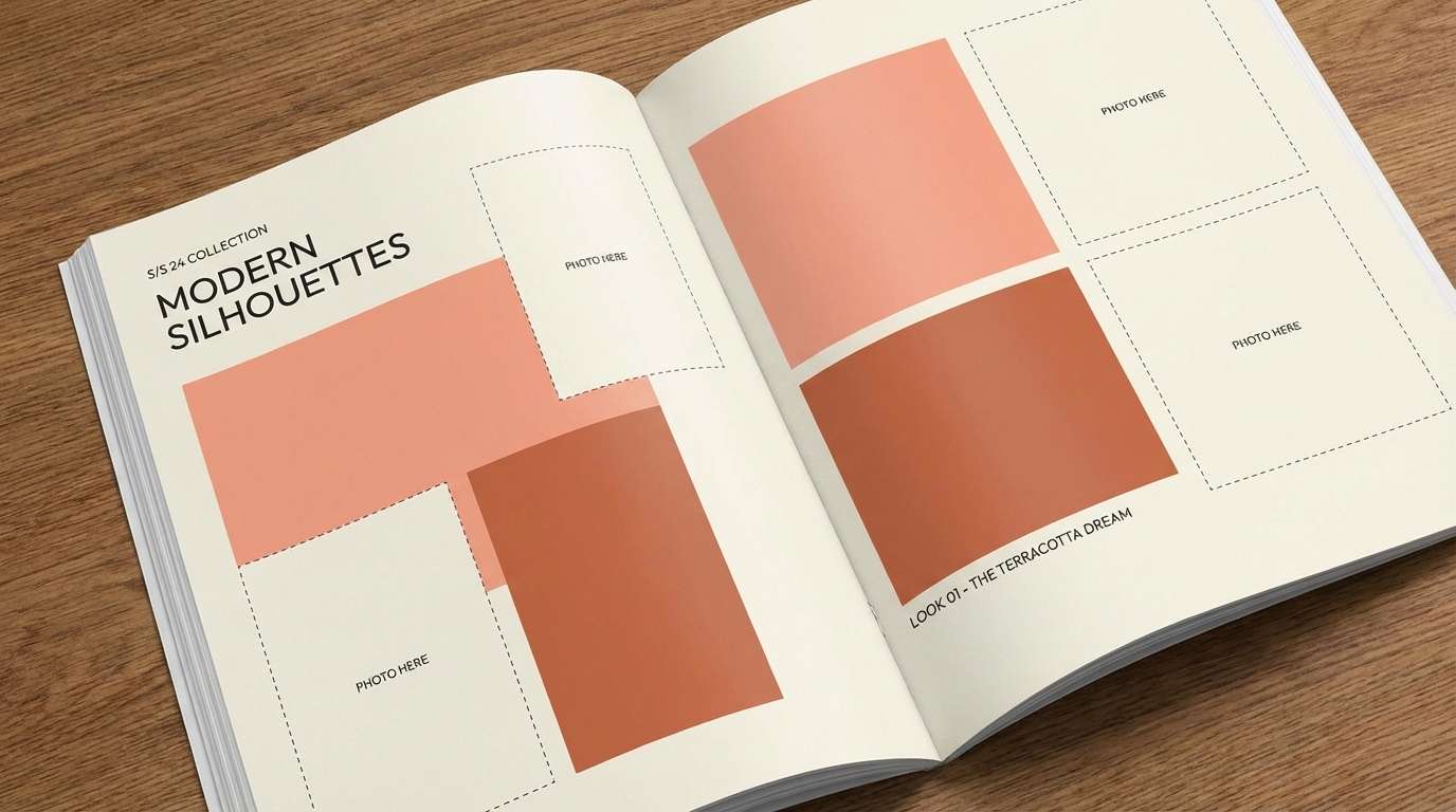
12) Terracotta Ballet
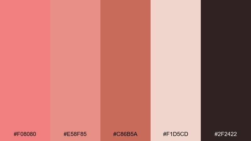
HEX: #F08080 #E58F85 #C86B5A #F1D5CD #2F2422
Mood: graceful, warm, sophisticated
Best for: fashion lookbook spread
Graceful and sophisticated, these warm corals read like ballet slippers, stage curtains, and soft studio light. They are ideal for fashion lookbooks, beauty editorials, and artisan collections. Let terracotta carry larger shapes and keep the light blush for negative space. Tip: stick to monochrome styling and vary texture, not hue, to keep the spread polished.
Image example of terracotta ballet generated using media.io
13) Coral on Charcoal UI
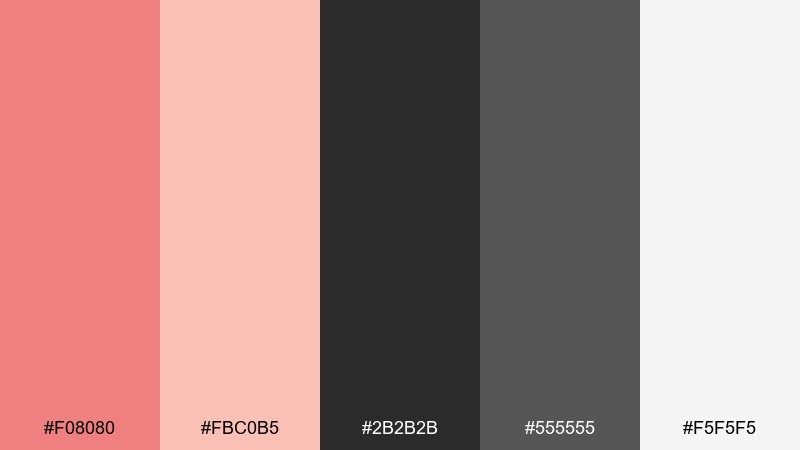
HEX: #F08080 #FBC0B5 #2B2B2B #555555 #F5F5F5
Mood: confident, modern, high-contrast
Best for: 2D UI dashboard mockup
Confident and modern, the charcoal base makes coral highlights feel sharp and purposeful. This light coral color palette is a great choice for dashboards, analytics views, and SaaS marketing pages that need strong contrast. Use coral for active states and key metrics, while off-white keeps cards and tables readable. Tip: avoid using the coral for long text blocks, and reserve it for status, charts, and primary actions.
Image example of coral on charcoal ui generated using media.io
14) Coral and Lavender Dream
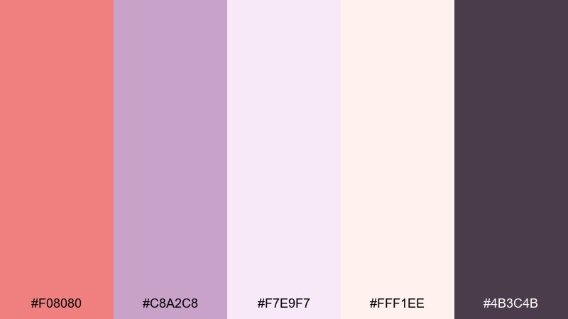
HEX: #F08080 #C8A2C8 #F7E9F7 #FFF1EE #4B3C4B
Mood: dreamy, sweet, whimsical
Best for: spa flyer design
Dreamy and whimsical, coral and lavender together feel like cotton candy clouds at dusk. These light coral color combinations suit spa flyers, self-care promos, and gentle product launches where softness is the message. Keep lavender as a supportive block color and use coral for headlines and offer stickers. Tip: use rounded shapes and airy spacing to match the soothing, floaty vibe.
Image example of coral and lavender dream generated using media.io

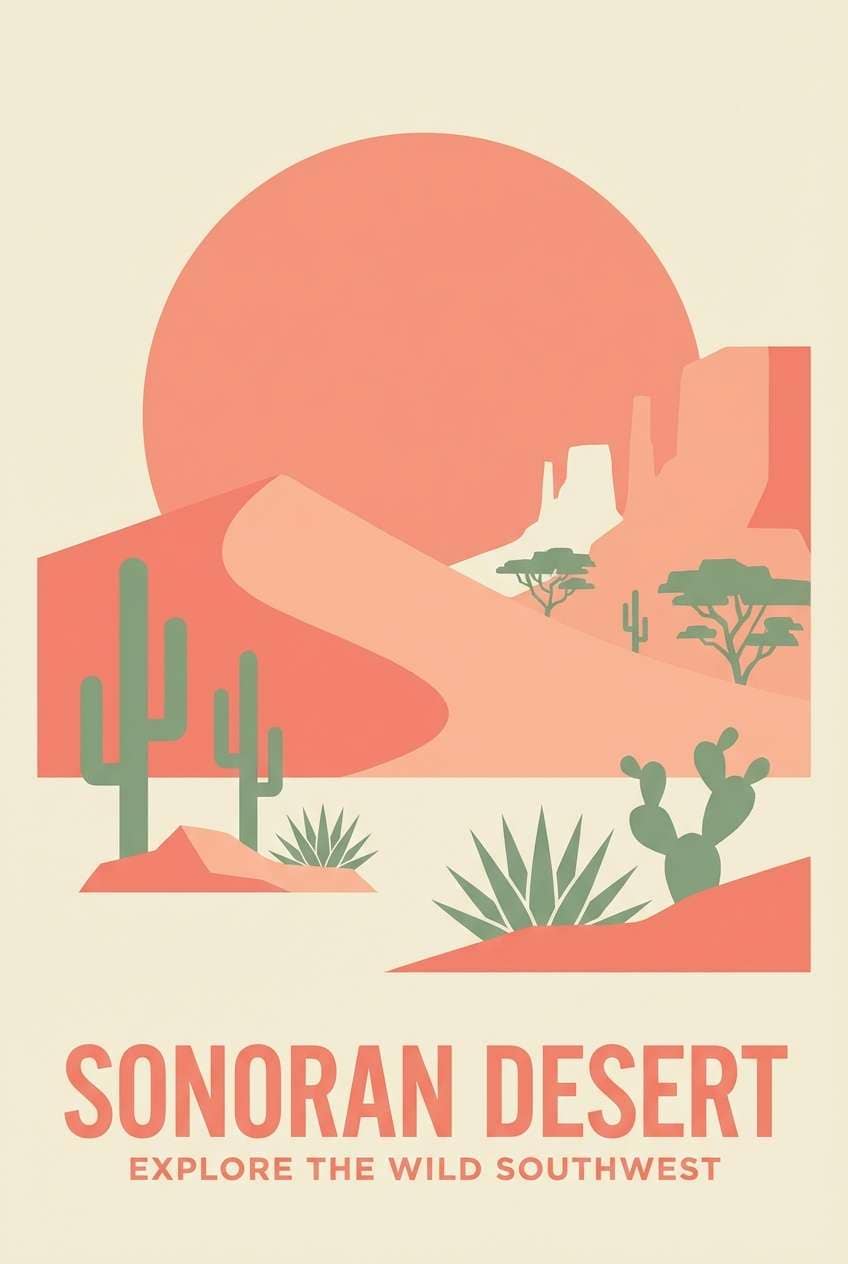
15) Desert Coral Roadtrip
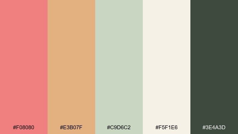
HEX: #F08080 #E3B07F #C9D6C2 #F5F1E6 #3E4A3D
Mood: adventurous, sunbaked, relaxed
Best for: travel poster illustration
Adventurous and sunbaked, these tones feel like a roadtrip through desert towns at golden hour. They work well for travel posters, outdoor brand drops, and weekend itinerary graphics. Use sand and cream as broad backgrounds, then pull coral into badges and route markers. Tip: keep greens muted so the warm hues remain the main story.
Image example of desert coral roadtrip generated using media.io
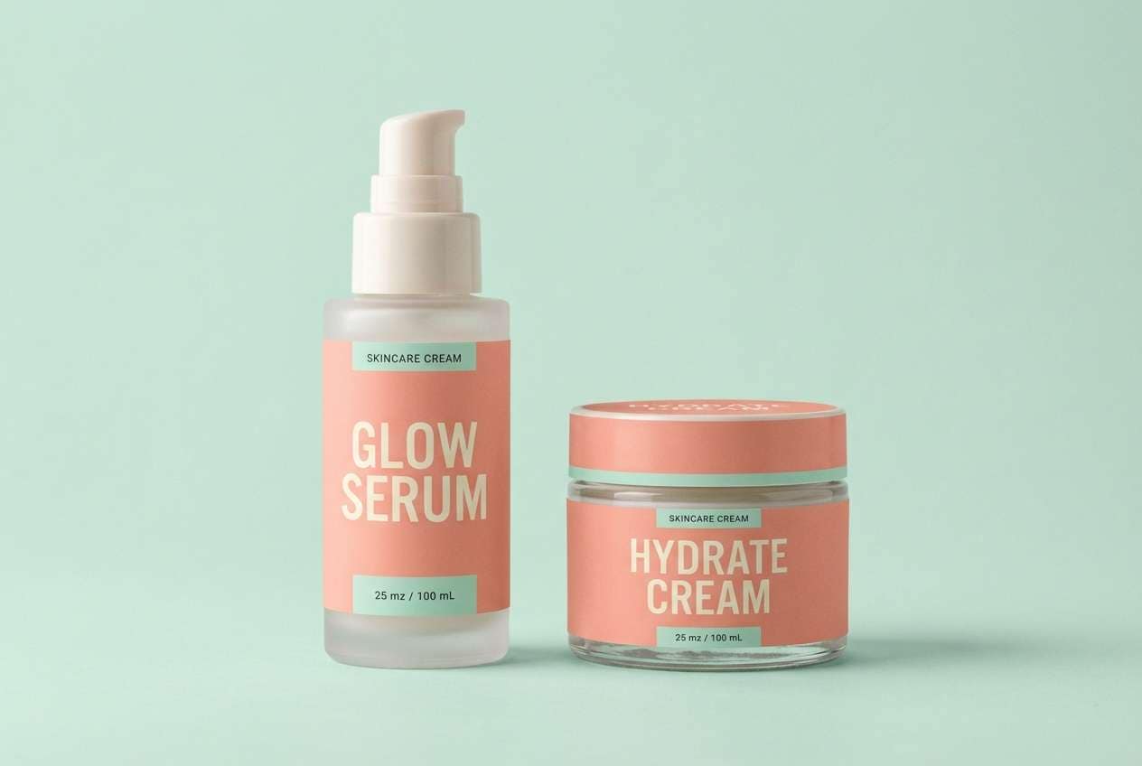
16) Coral Mint Cleanse
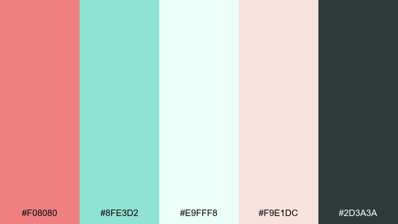
HEX: #F08080 #8FE3D2 #E9FFF8 #F9E1DC #2D3A3A
Mood: fresh, clean, modern
Best for: skincare product ad
Fresh and clean, mint and coral together feel like a cool rinse with a warm glow. This light coral color palette is excellent for skincare ads, clean beauty packaging, and wellness landing pages. Let mint own the background while coral highlights claims and CTAs, then use deep teal for ingredient text. Tip: keep reflections soft and avoid heavy shadows to maintain that just-washed clarity.
Image example of coral mint cleanse generated using media.io
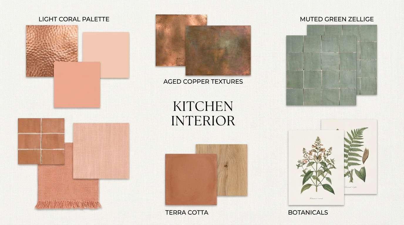
17) Coral Copper Kitchen
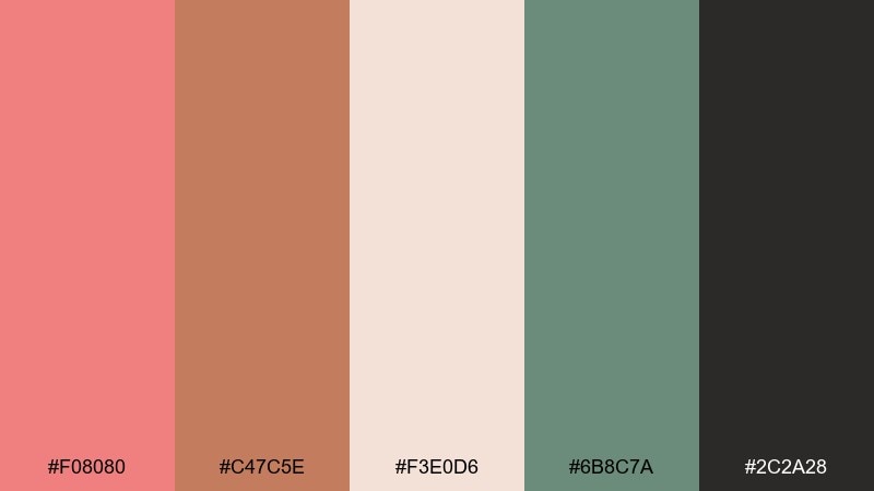
HEX: #F08080 #C47C5E #F3E0D6 #6B8C7A #2C2A28
Mood: rustic, inviting, grounded
Best for: kitchen interior moodboard
Rustic and inviting, this mix recalls copper cookware, warm tiles, and herb pots on a sunny counter. It is a strong fit for kitchen moodboards, home renovation content, and cookware branding. Use coral in small decor touches and let the copper-brown handle larger surfaces for a more timeless look. Tip: add muted green as the only cool note to keep the warmth from feeling flat.
Image example of coral copper kitchen generated using media.io
18) Coral Monochrome Gradient
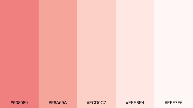
HEX: #F08080 #F6A59A #FCD0C7 #FFE8E4 #FFF7F6
Mood: soft, minimal, modern
Best for: abstract background for app
Soft and minimal, these tonal steps feel like a gentle sunrise gradient across satin. They are perfect for app backgrounds, hero headers, and subtle presentation templates where you want warmth without distraction. Use the mid coral for key highlights and let the palest tints do the heavy lifting in large areas. Tip: add a slight blur and grain so the gradient looks smooth on different screens.
Image example of coral monochrome gradient generated using media.io
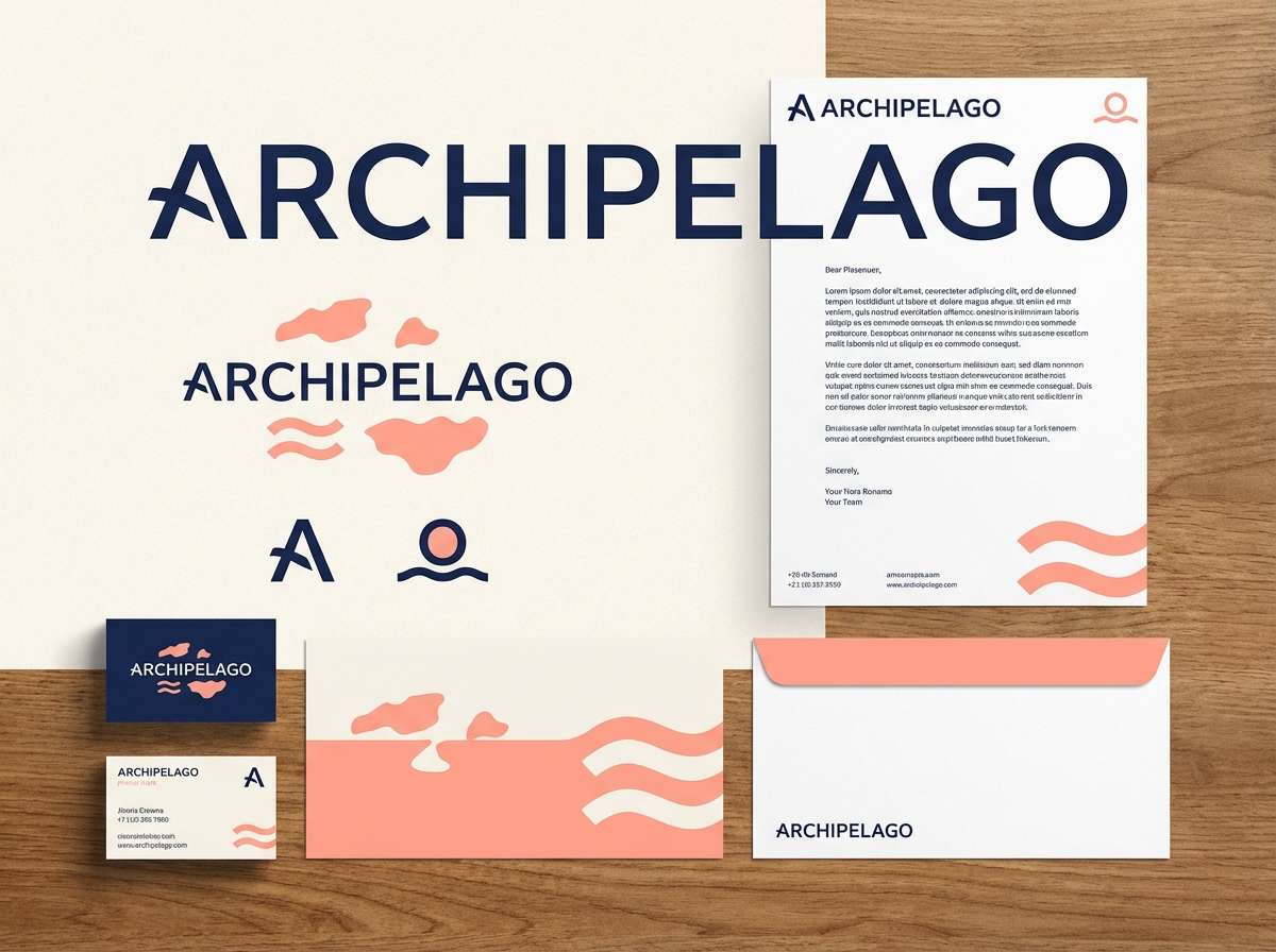
19) Coral and Navy Classic
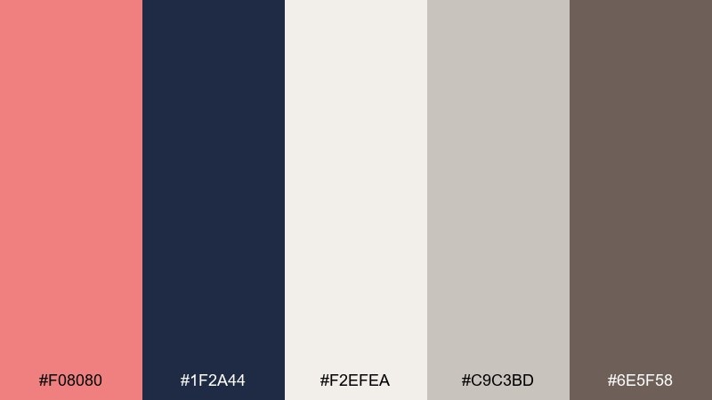
HEX: #F08080 #1F2A44 #F2EFEA #C9C3BD #6E5F58
Mood: classic, confident, polished
Best for: brand identity kit
Classic and polished, coral against navy feels like a tailored blazer with a playful pocket square. This light coral color scheme works for consulting brands, premium newsletters, and event identities that need confidence with warmth. Use navy for structure and long-form text, then let coral highlight key offers and buttons. Tip: keep neutrals creamy rather than stark white to maintain a refined, print-friendly finish.
Image example of coral and navy classic generated using media.io
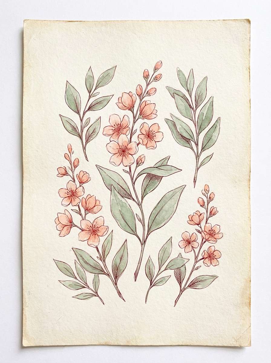
20) Coral Bloom Watercolor
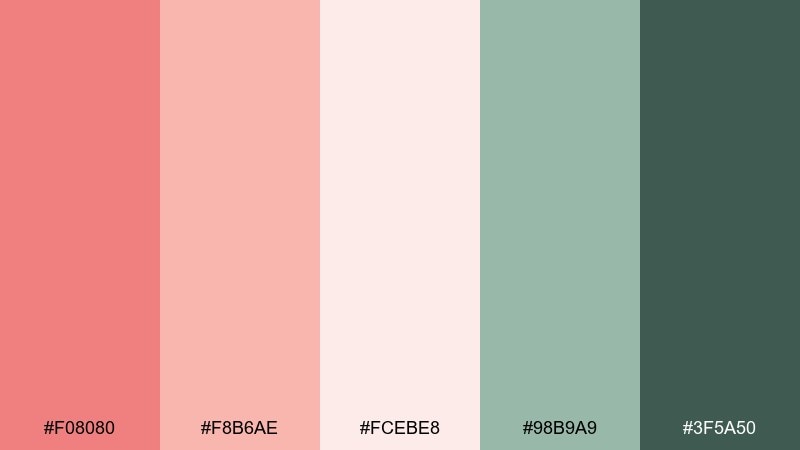
HEX: #F08080 #F8B6AE #FCEBE8 #98B9A9 #3F5A50
Mood: delicate, artistic, springlike
Best for: watercolor floral print
Delicate and springlike, these hues evoke watercolor petals layered over soft paper. They are ideal for art prints, journal covers, and seasonal packaging inserts. Use coral and blush for the blooms, then bring in muted green for leaves and small framing details. Tip: keep outlines sparse and let the washes overlap for a natural, handmade look.
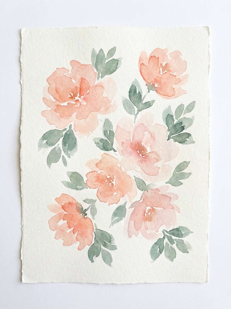
Image example of coral bloom watercolor generated using media.io
What Colors Go Well with Light Coral?
Light coral looks best when it has a “support team”: soft creams and off-whites for space, plus a dark anchor (charcoal, espresso, or navy) for legibility. This makes coral feel intentional rather than overly sweet.
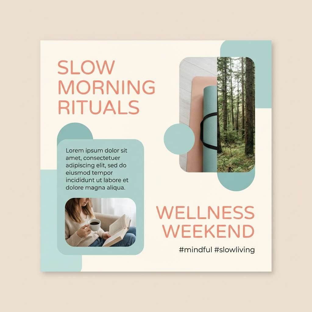
For contrast, try cool greens and blue-greens like sage, teal, and mint—these balance coral’s warmth and create a fresh, modern vibe. Lavender also works beautifully when you want something dreamy and gentle.
If you want a more energetic palette, pair light coral with warm oranges and buttery yellows. Keep the background warm-cream instead of pure white to maintain a cohesive, appetizing glow.
How to Use a Light Coral Color Palette in Real Designs
In branding, treat light coral as an accent for emotional warmth: icons, highlight bars, packaging accents, or social badges. Let darker neutrals handle logos, headlines, and long-form copy to keep everything readable.
In UI, reserve coral for primary actions (CTA buttons), active states, and key metrics—then use warm grays for text and very light tints for section backgrounds. This keeps the interface calm while still guiding attention.
For interiors and lifestyle visuals, repeat coral in smaller touches (pillows, art, ceramics) instead of one oversized statement. Pair it with linen-like neutrals and a single grounding dark for a refined, cozy look.
Create Light Coral Palette Visuals with AI
If you already have HEX codes, the fastest way to test a light coral color scheme is to generate mock visuals: invitation suites, packaging, UI layouts, posters, and moodboards. Seeing the palette “in context” helps you choose the right contrast and saturation.
With Media.io Text-to-Image, you can paste a prompt like the examples above and iterate quickly—swapping typography, textures, backgrounds, and lighting until the coral feels soft, bold, or neutral to match your project.
Once you find a direction you like, reuse the prompt structure to produce a consistent set of assets for campaigns, pitch decks, or brand guidelines.
Light Coral Color Palette FAQs
-
What is the HEX code for light coral?
The most common light coral HEX is #F08080. It’s a warm coral-pink that works well as an accent with creams, warm grays, and deep neutrals. -
Is light coral more pink or more orange?
Light coral sits between pink and orange, but it typically reads slightly pink on screens. Pairing it with mint/teal will make it look warmer, while pairing it with beige/rose tones will make it look softer and pinker. -
What are the best neutral colors to pair with light coral?
Warm off-white, cream, oatmeal beige, and charcoal are the easiest neutrals to pair with light coral. They keep the palette balanced and improve readability in text-heavy designs. -
What colors complement light coral for strong contrast?
Deep navy, charcoal, and espresso brown create strong, polished contrast. For color contrast (not just dark/light), muted greens like sage or deep teal also complement coral nicely. -
Can I use light coral for website buttons and CTAs?
Yes—light coral works great for buttons, but use it selectively. Pair it with dark text or place it on a clean, light background, and reserve it for primary actions so the UI doesn’t feel noisy. -
Does light coral work for wedding invitations?
Absolutely. Light coral is popular for wedding stationery because it feels romantic and warm without being overly saturated. Combine it with creamy whites and a dark ink/charcoal for elegant typography. -
How do I generate matching light coral palette images?
Use Media.io’s text-to-image tool with a clear prompt (style + subject + background + “dominant light coral” notes). Then iterate by adjusting textures (matte paper, watercolor, grain) and adding a dark anchor color for definition.
Next: Blue Coral Color Palette


