

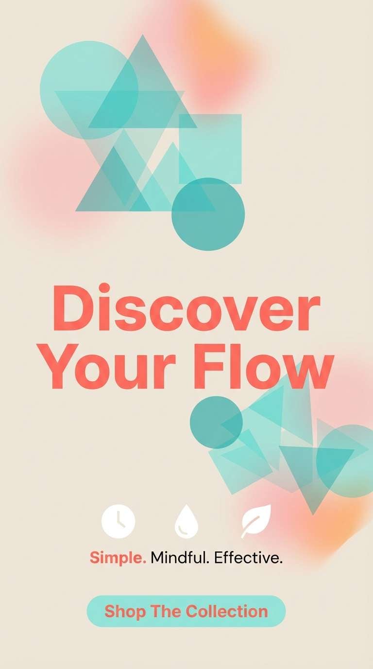
Blue coral color palettes pair oceanic teals and aquas with warm coral accents, creating a look that feels both refreshing and human. It’s a coastal-meets-modern mix that works across digital UI, print, and packaging.
Below are 20 ready-to-use blue coral color schemes with HEX codes, plus AI image prompts you can copy to generate on-brand visuals fast.
In this article
Why Blue Coral Color Schemes Work So Well
Blue coral palettes balance cool and warm temperature in a way that naturally creates contrast. Teal and aqua feel clean and calming, while coral adds energy that draws attention without the harshness of pure red.
They also support clear hierarchy: cool blues can hold large areas like backgrounds, headers, and panels, and coral becomes the “signal” color for buttons, highlights, or key labels. That makes the scheme especially useful for branding and UI where clarity matters.
Because the palette leans coastal, it’s easy to pair with soft neutrals for a premium, airy finish. With the right whites, creams, and charcoals, blue coral can look playful, editorial, or high-end depending on how much saturation you use.
20+ Blue Coral Color Palette Ideas (with HEX Codes)
1) Coastal Reef
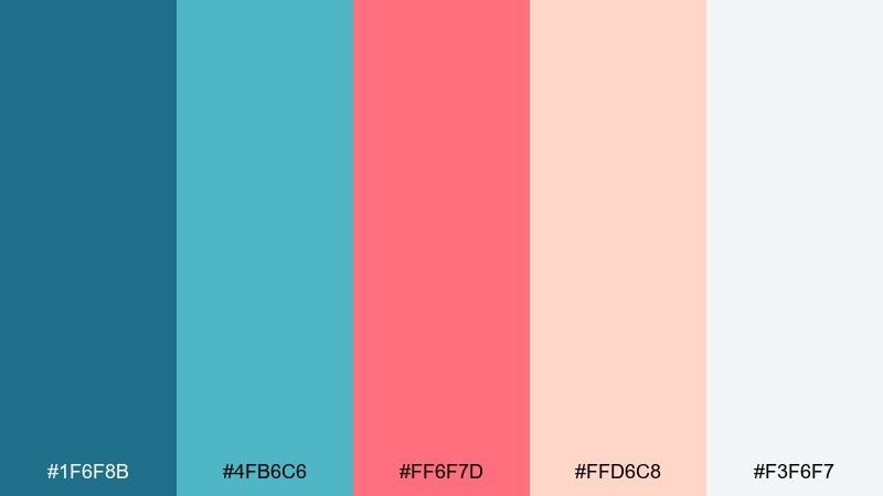
HEX: #1f6f8b #4fb6c6 #ff6f7d #ffd6c8 #f3f6f7
Mood: fresh, breezy, optimistic
Best for: website hero and landing pages
Fresh and breezy like ocean air over a bright reef, these tones feel clean without turning cold. Use the teal and aqua for large sections, then drop in coral as a focused call to action. Pair with soft off-white backgrounds and plenty of spacing to keep the layout airy. Tip: reserve the warm pink for one primary button style to improve visual hierarchy.
Image example of coastal reef generated using media.io
Media.io is an online AI studio for creating and editing video, image, and audio in your browser.

2) Coral Harbor
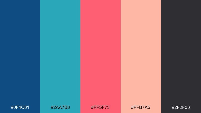
HEX: #0f4c81 #2aa7b8 #ff5f73 #ffb7a5 #2f2f33
Mood: bold, modern, confident
Best for: brand identity moodboards
Bold and modern like a harbor at golden hour, it balances deep navy with lively coral. A blue and coral color palette like this works best when the darkest tone anchors logos and typography. Add the bright coral for badges, highlights, and social covers, while peach keeps transitions smooth. Tip: use the charcoal as your default text color instead of pure black for a softer finish.
Image example of coral harbor generated using media.io
3) Minty Lagoon
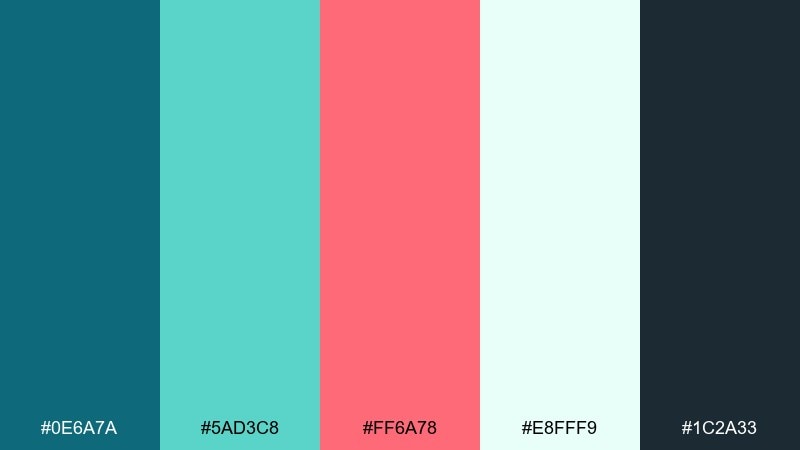
HEX: #0e6a7a #5ad3c8 #ff6a78 #e8fff9 #1c2a33
Mood: clean, techy, calming
Best for: app UI dashboards
Clean and calming like sunlit water in a lagoon, this coral and blue color palette feels friendly for data-heavy screens. Use the mint as the main surface color for cards and panels, and keep the deep teal for headers and navigation. Coral is strongest as a status color for alerts or key metrics, not as a background. Tip: keep charts to two dominant series colors to avoid visual noise.
Image example of minty lagoon generated using media.io
4) Sea Glass Coral
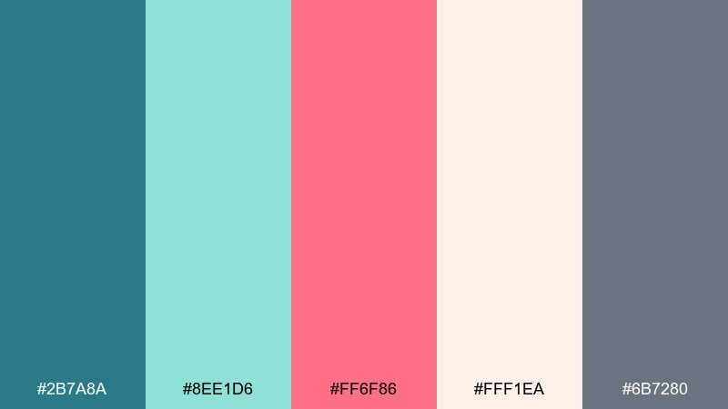
HEX: #2b7a8a #8ee1d6 #ff6f86 #fff1ea #6b7280
Mood: soft, airy, spa-like
Best for: skincare packaging
Soft and spa-like, it reads as sea glass with a gentle coral flush. The pale blush and warm white create a premium backdrop for labels and ingredient callouts. Use teal for brand marks and the brighter pink for a single hero detail like a seal or stripe. Tip: matte finishes look especially good with these muted aquas and creamy neutrals.
Image example of sea glass coral generated using media.io
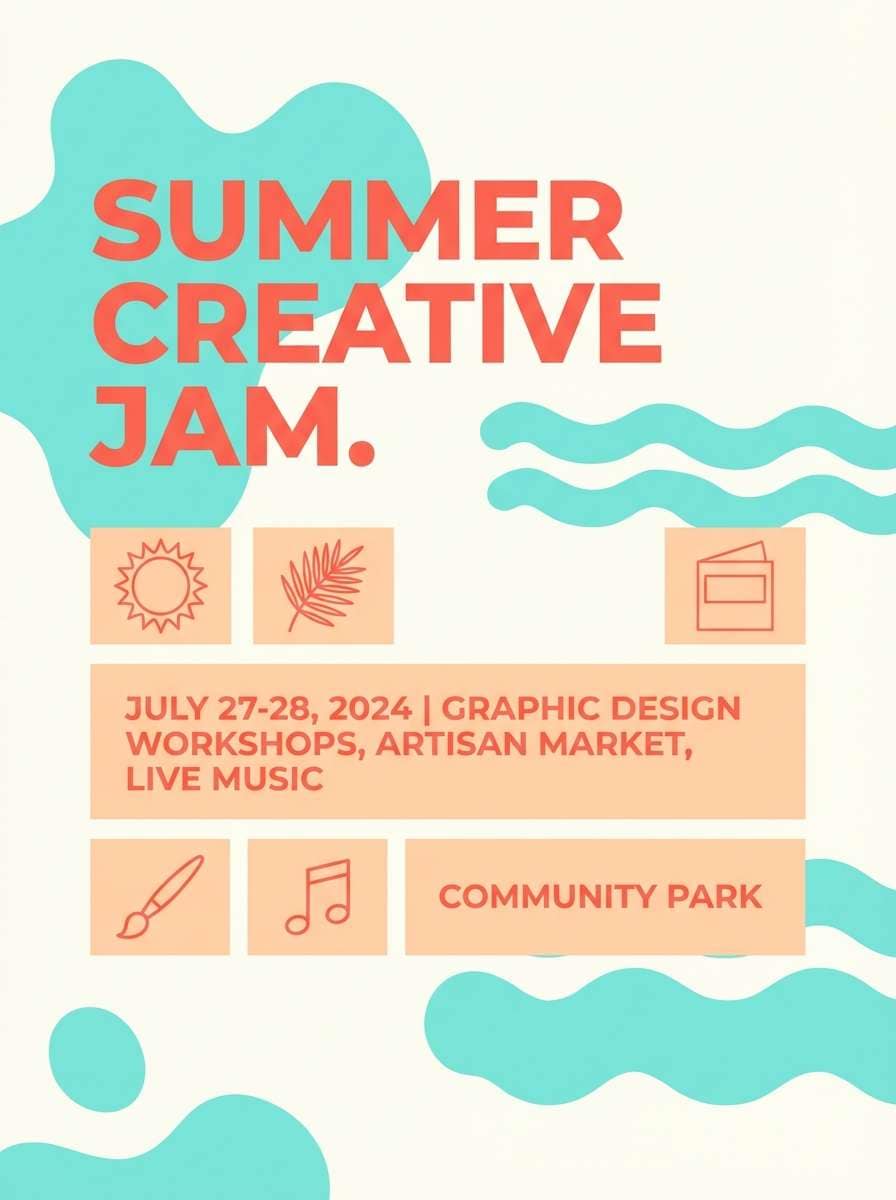
5) Tropic Postcard
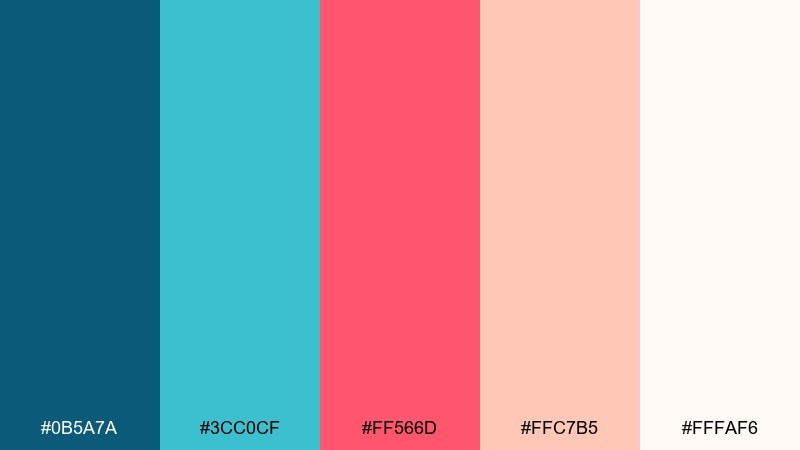
HEX: #0b5a7a #3cc0cf #ff566d #ffc7b5 #fffaf6
Mood: playful, sunny, energetic
Best for: summer event posters
Playful and sunny like a vintage beach postcard, this set pops without feeling neon. These coral and blue color combinations shine on posters where aqua fills big shapes and coral drives the headline. Pair with a warm white base and keep peach for supporting blocks or secondary text areas. Tip: use bold sans typography and limit outlines so the colors do the work.
Image example of tropic postcard generated using media.io
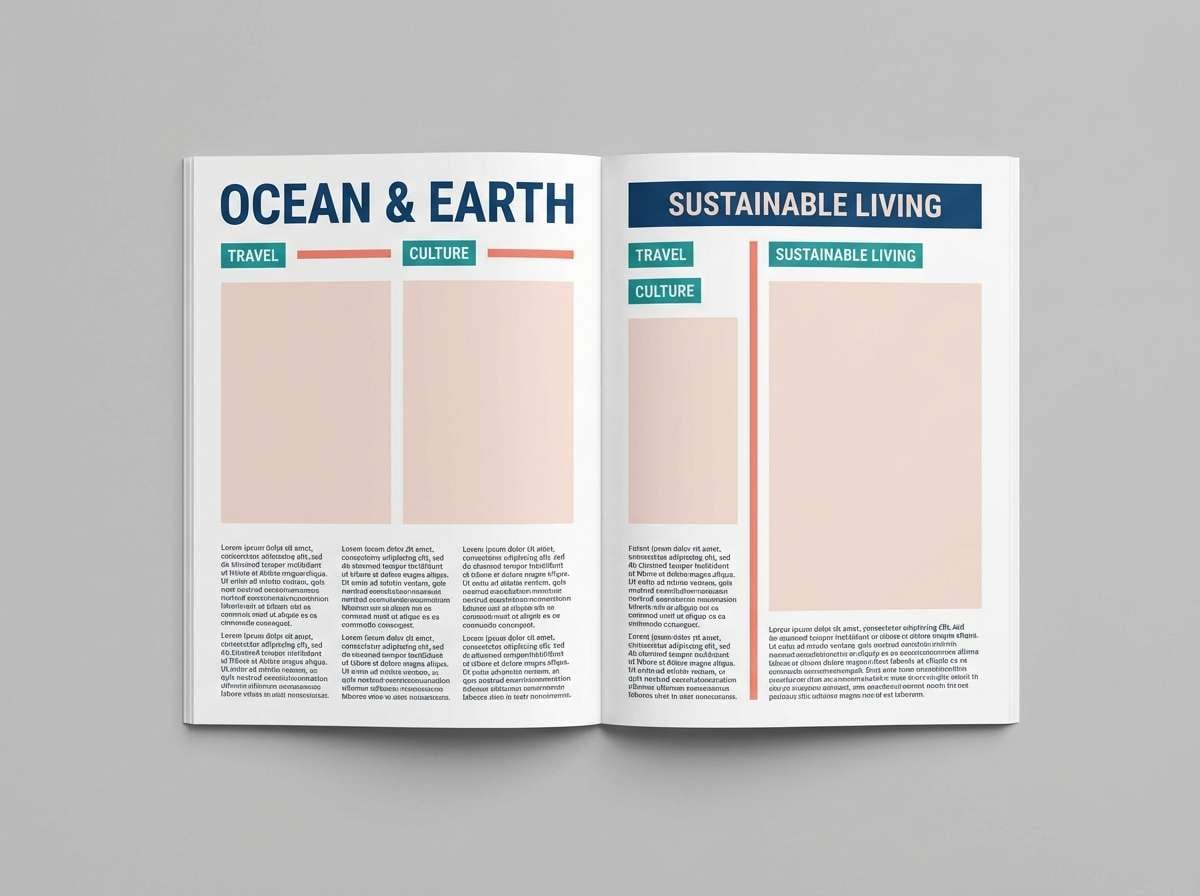
6) Reefline Editorial
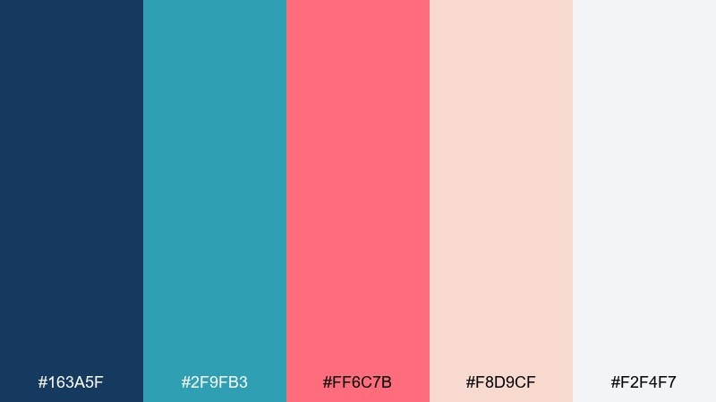
HEX: #163a5f #2f9fb3 #ff6c7b #f8d9cf #f2f4f7
Mood: polished, coastal, editorial
Best for: magazine layouts
Polished and coastal, this coral blue color scheme feels like glossy pages featuring seaside architecture and clean type. The deep blue supports long-form text, while teal works for section labels and pull quotes. Coral is best saved for a single standout element per spread, like a rule line or drop cap. Tip: keep body text on the light gray to reduce glare and improve readability.
Image example of reefline editorial generated using media.io
7) Calm Aquarium
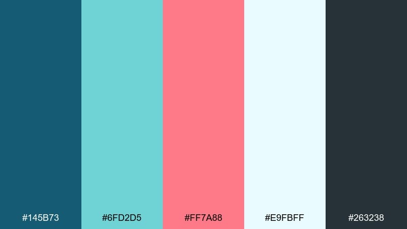
HEX: #145b73 #6fd2d5 #ff7a88 #e9fbff #263238
Mood: calm, clear, approachable
Best for: presentation slide decks
Calm and clear like watching fish glide past glass, this palette stays readable in long decks. Use the light aqua for slide backgrounds, deep teal for titles, and charcoal for body text. Coral works well as a single emphasis color for numbers, icons, or key takeaways. Tip: maintain consistent color roles across slides so the audience learns your visual language.
Image example of calm aquarium generated using media.io
8) Coral Cloud
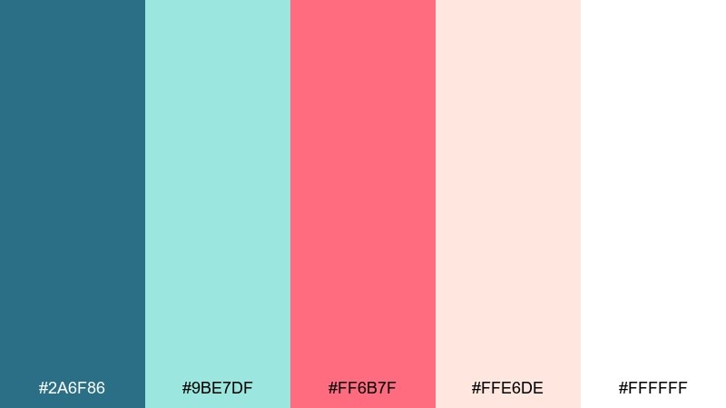
HEX: #2a6f86 #9be7df #ff6b7f #ffe6de #ffffff
Mood: gentle, dreamy, light
Best for: nursery wall art prints
Gentle and dreamy like coral-tinted clouds over calm water, these coral blue hues feel soothing for kids spaces. Keep the mint and blush as the main fields, then add teal for outlines and simple shapes. The brighter coral is great for small focal points like stars, hearts, or a name banner. Tip: print on warm white paper to keep the blush tones soft.
Image example of coral cloud generated using media.io
9) Nautical Pop
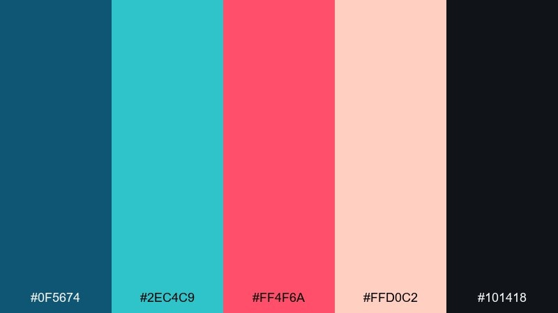
HEX: #0f5674 #2ec4c9 #ff4f6a #ffd0c2 #101418
Mood: graphic, punchy, youthful
Best for: merch and sticker graphics
Graphic and punchy, it feels like nautical signage reimagined for modern street style. Use the dark tones for bold outlines and type, then let aqua carry the biggest fills. Coral becomes the pop that makes stickers and patches instantly readable from a distance. Tip: test designs at small sizes so the coral accents do not disappear.
Image example of nautical pop generated using media.io
10) Sandbar UI
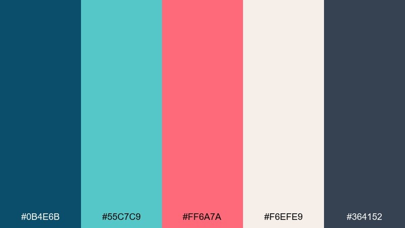
HEX: #0b4e6b #55c7c9 #ff6a7a #f6efe9 #364152
Mood: balanced, professional, friendly
Best for: fintech dashboards
Balanced and professional with a friendly edge, it evokes a sandbar where water meets warm shoreline. Use the beige as your main canvas and keep teal for navigation and data modules. Coral is ideal for a single primary action and for positive trend markers when used sparingly. Tip: pair with rounded UI components to soften the contrast between navy and coral.
Image example of sandbar ui generated using media.io
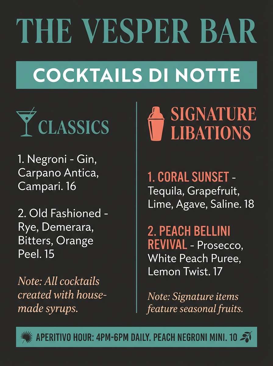
11) Blue Coral Night
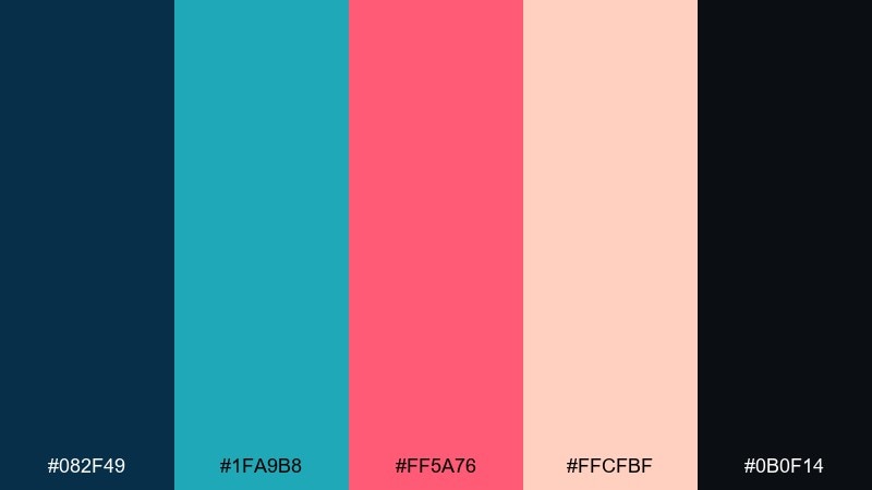
HEX: #082f49 #1fa9b8 #ff5a76 #ffcfbf #0b0f14
Mood: moody, chic, high-contrast
Best for: cocktail bar menus
Moody and chic like a late-night ocean view, this coral and blue set thrives on contrast. Use near-black for the menu background, then bring in teal for section headers and dividers. Coral works beautifully for signature drinks or price callouts, while peach can soften secondary notes. Tip: keep spacing generous so the bright accents feel intentional, not busy.
Image example of blue coral night generated using media.io
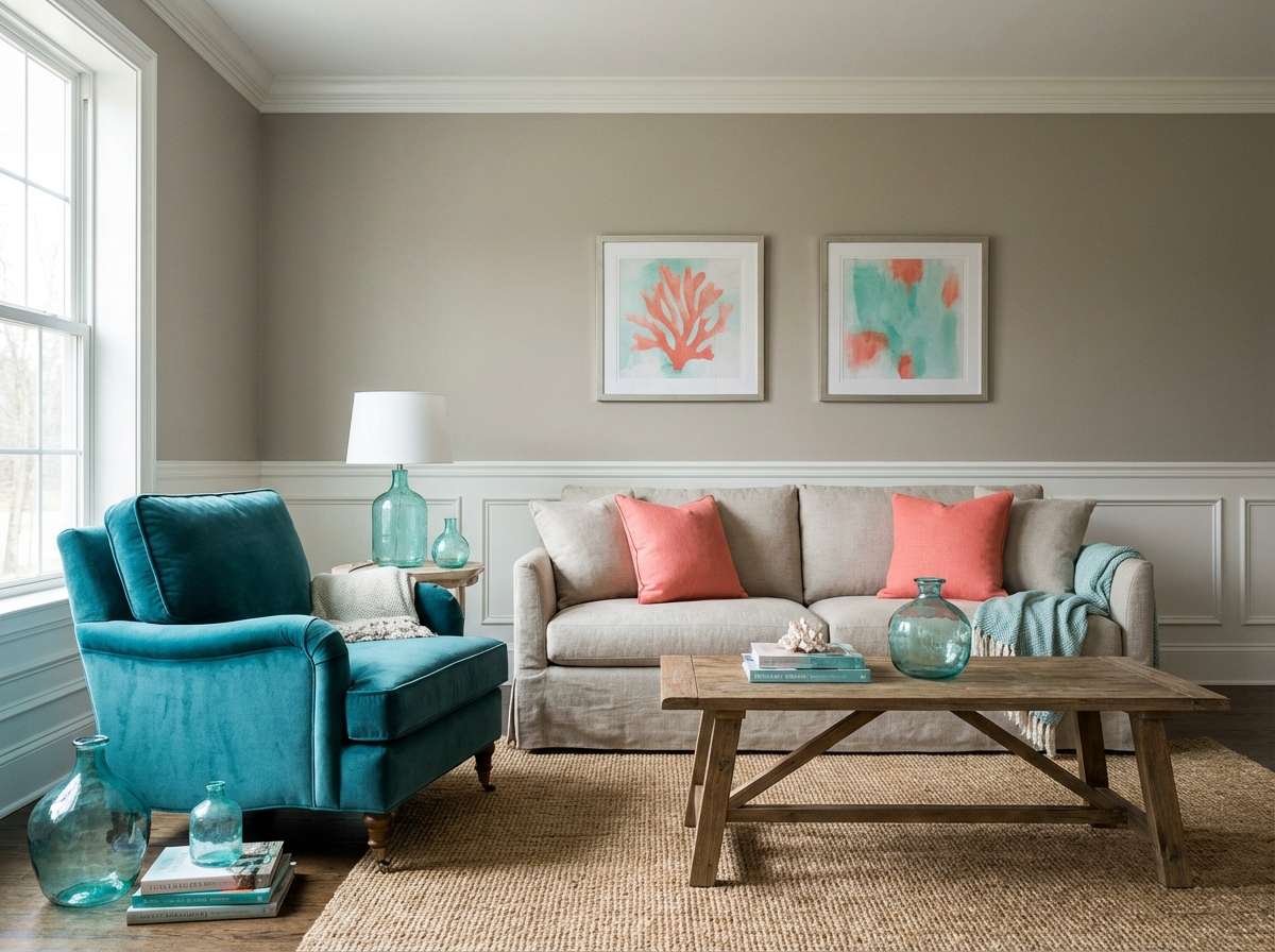
12) Pebble Shore
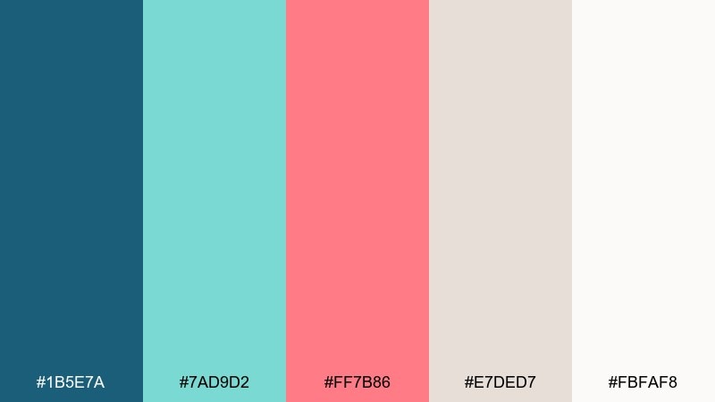
HEX: #1b5e7a #7ad9d2 #ff7b86 #e7ded7 #fbfaf8
Mood: relaxed, natural, airy
Best for: living room paint planning
Relaxed and natural like pebbles washed clean by tide, these colors feel easy to live with. Keep the warm greige and soft white as your large surfaces, then introduce teal on cabinetry or a feature wall. Coral works best in textiles like cushions and art, where it can be swapped seasonally. Tip: add natural wood and linen to keep the space grounded.
Image example of pebble shore generated using media.io
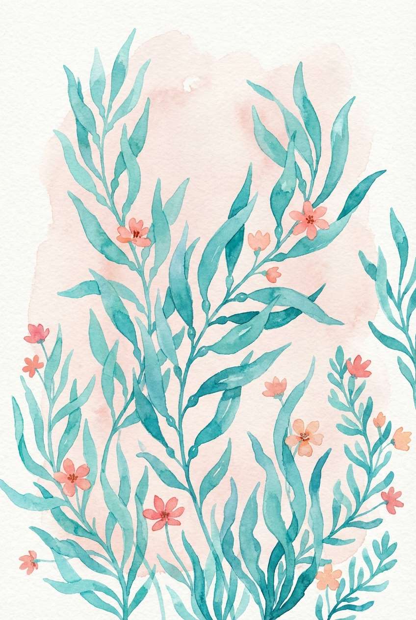
13) Coral Kelp
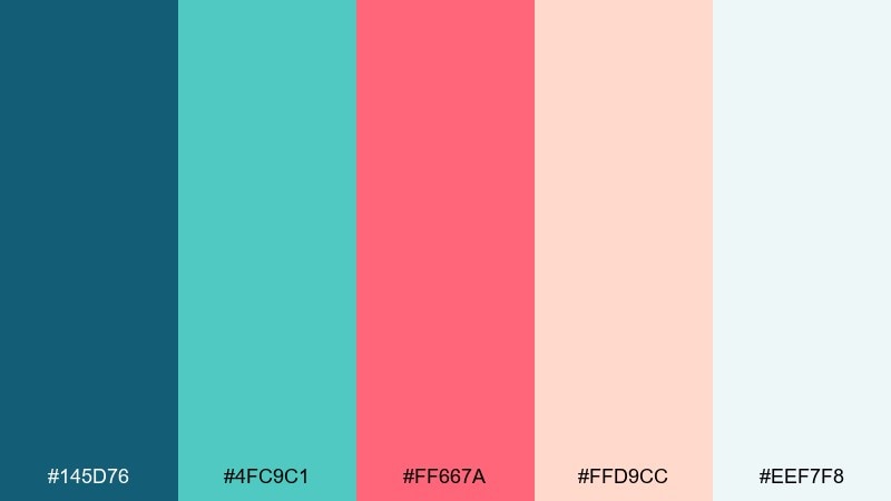
HEX: #145d76 #4fc9c1 #ff667a #ffd9cc #eef7f8
Mood: organic, coastal, lively
Best for: botanical illustrations
Organic and lively like kelp forests swaying underwater, this blue and coral mix feels fresh and handcrafted. Use teal and aqua for the main foliage shapes and keep the blush background light and open. Coral becomes perfect for small sea blooms or accent berries to guide the eye. Tip: limit linework to one dark tone so the watercolor fills stay the star.
Image example of coral kelp generated using media.io
14) Icy Reef
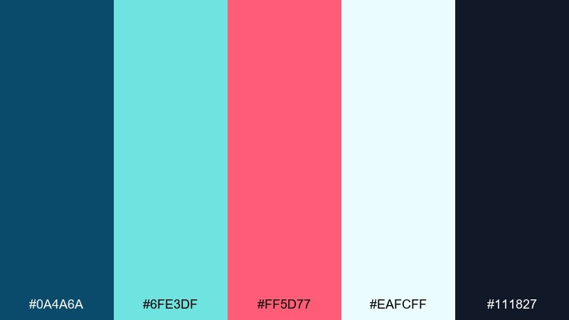
HEX: #0a4a6a #6fe3df #ff5d77 #eafcff #111827
Mood: crisp, futuristic, energetic
Best for: tech product ads
Crisp and futuristic like ice over clear water, it feels sharp and energetic. This blue and coral color scheme works well when the icy aqua carries the background glow and the coral provides a single bold highlight. Pair with dark ink typography and minimal gradients to keep it premium. Tip: place coral only on the most important element, like the price badge or buy button.
Image example of icy reef generated using media.io

15) Coral Spritz
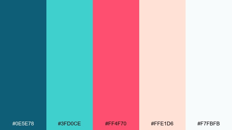
HEX: #0e5e78 #3fd0ce #ff4f70 #ffe1d6 #f7fbfb
Mood: bright, bubbly, social
Best for: instagram story ads
Bright and bubbly like a sparkling spritz by the sea, this coral and blue palette is made for quick attention. Let coral lead the headline and stickers, while aqua handles shapes and highlights behind text. Keep blush as a soft buffer so the layout does not feel crowded. Tip: add a generous margin around text to improve readability on small screens.
Image example of coral spritz generated using media.io
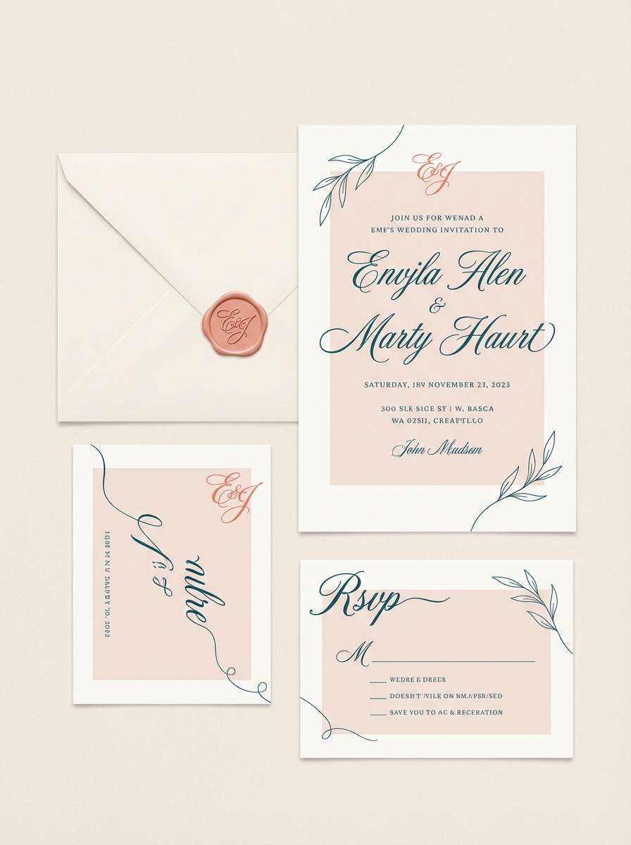
16) Harbor Lights
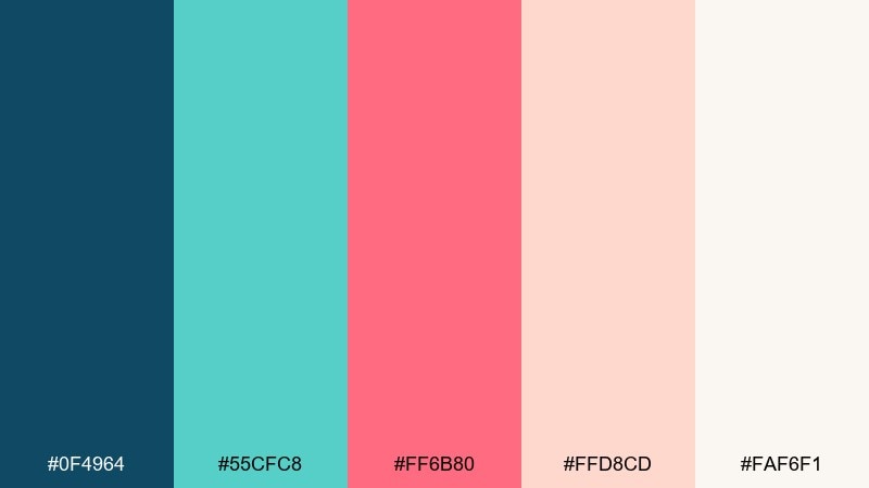
HEX: #0f4964 #55cfc8 #ff6b80 #ffd8cd #faf6f1
Mood: romantic, refined, coastal
Best for: wedding invitations
Romantic and refined like harbor lights reflecting on water, these tones feel elegant without being fussy. A blue coral color palette suits invitations when teal is used for names and headings, while blush and cream keep the paper look soft. Coral works best as a tiny detail, like a monogram mark or RSVP underline. Tip: choose textured cardstock so the muted aquas look richer in print.
Image example of harbor lights generated using media.io
17) Oceanic Clay
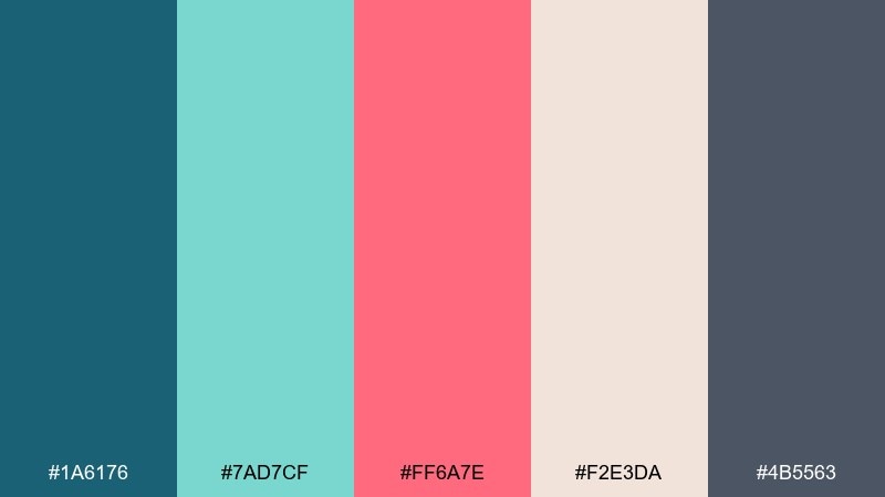
HEX: #1a6176 #7ad7cf #ff6a7e #f2e3da #4b5563
Mood: earthy, artisanal, warm-cool
Best for: ceramic glaze inspiration
Earthy and artisanal, it feels like glazed clay cooled by sea air. The warm sand tone makes the aquas look more natural, while coral adds a hand-painted charm. Use teal for the base glaze and keep coral for rim details or small motifs. Tip: photograph pieces on neutral backdrops so the subtle sand shade reads true.
Image example of oceanic clay generated using media.io
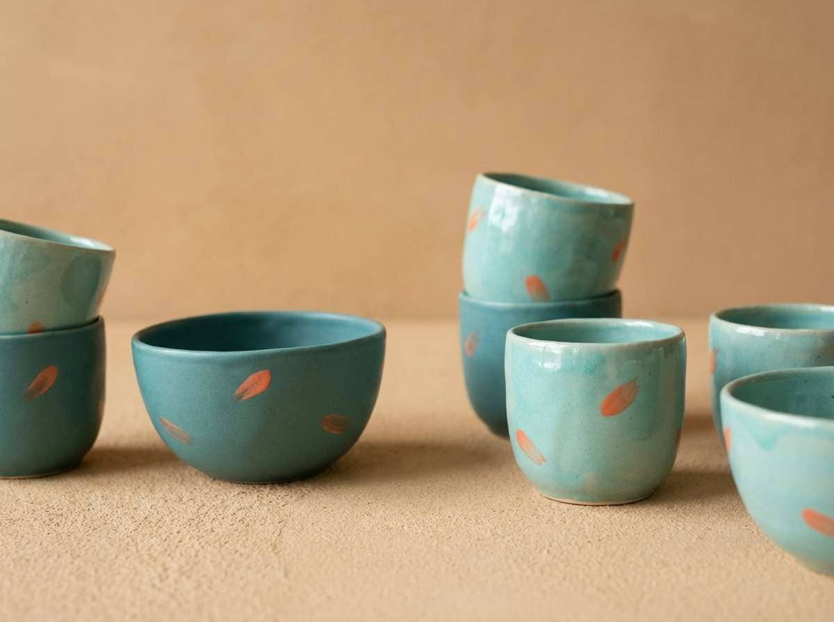
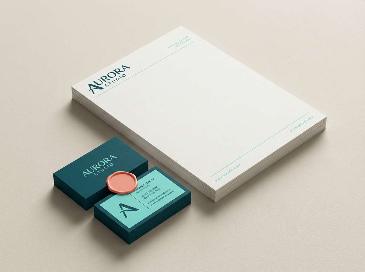
18) Driftwood Coral
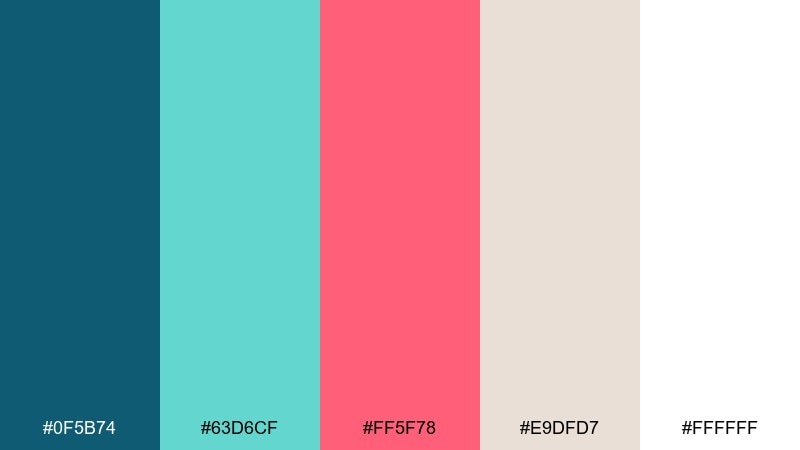
HEX: #0f5b74 #63d6cf #ff5f78 #e9dfd7 #ffffff
Mood: clean, coastal, timeless
Best for: logo and stationery sets
Clean and timeless like driftwood on a bright shoreline, this blue and coral mix works across print and digital. Use the warm neutral as the main paper tone, then apply teal for the mark and letterheads. Coral adds a confident accent for seals, social avatars, or small highlights on business cards. Tip: keep the logo in one color for most uses and save coral for special moments.
Image example of driftwood coral generated using media.io
19) Reef Breeze
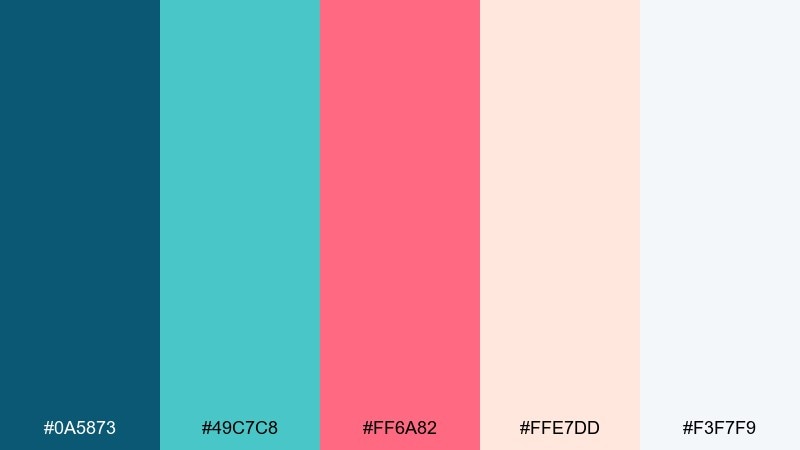
HEX: #0a5873 #49c7c8 #ff6a82 #ffe7dd #f3f7f9
Mood: light, friendly, clear
Best for: email newsletter headers
Light and friendly like a morning breeze off the water, it keeps email designs approachable. Use aqua for header blocks and section dividers, and set text in the deeper blue for clarity. Coral works best for a single button style or key promotional tags. Tip: keep images slightly desaturated so they do not fight the coral accent.
Image example of reef breeze generated using media.io

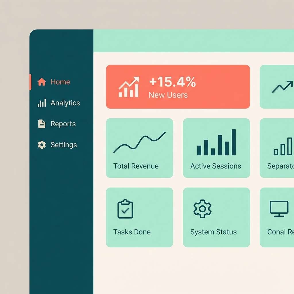
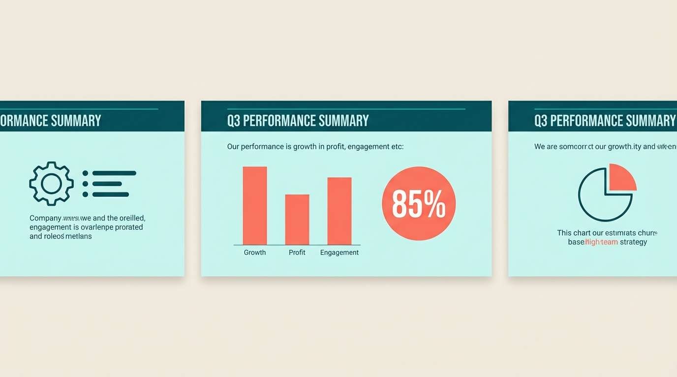
20) Coral Tide
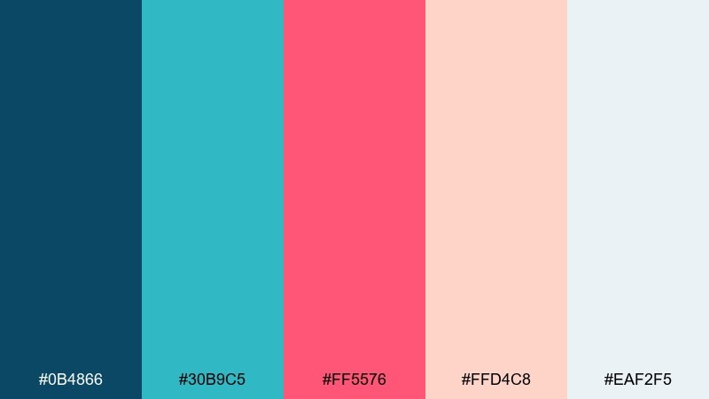
HEX: #0b4866 #30b9c5 #ff5576 #ffd4c8 #eaf2f5
Mood: dynamic, modern, data-ready
Best for: analytics dashboards and charts
Dynamic and modern like a fast-moving tide, these coral blue tones make metrics feel more engaging. Use teal and aqua as your primary series colors, then reserve coral for anomalies or the most important KPI. Blue coral color combinations like this stay clear when you keep backgrounds pale and gridlines subtle. Tip: ensure coral meets contrast guidelines on light panels by using it in thicker strokes or labels.
Image example of coral tide generated using media.io

What Colors Go Well with Blue Coral?
Blue coral palettes look best with soft neutrals that keep the overall feel airy: warm white, cream, light gray, and sand-beige help the teal tones stay calm and the coral accents feel intentional.
For stronger contrast, pair blue coral with ink navy or charcoal instead of pure black. This makes typography feel more premium while keeping enough separation for accessibility in UI.
If you want a more coastal or natural direction, add driftwood browns, linen textures, and muted sage. For a modern direction, use cool light grays and crisp whites with minimal gradients.
How to Use a Blue Coral Color Palette in Real Designs
Assign clear roles: use teal/aqua as your base surfaces (backgrounds, cards, sections), then keep coral as the highlight color for one primary action (CTA button) and a small set of emphasis elements (badges, key numbers, active states).
In print and packaging, let warm whites and blush tones carry large areas while teal supports logos and headings. Coral works best as a stripe, seal, or small icon that guides the eye and adds personality without overwhelming the layout.
For data visuals, use two cool series colors (teal and aqua) and reserve coral for alerts, anomalies, or the top KPI. This keeps charts readable and prevents coral from turning into visual noise.
Create Blue Coral Palette Visuals with AI
If you already have HEX codes, you can turn them into real mockups quickly by generating hero headers, posters, packaging, and UI scenes in a consistent blue coral style. The key is to describe the layout, materials, and lighting, then keep your palette as the dominant colors.
Start with one palette, generate 3–5 variations, and keep the best prompt as your “brand recipe.” From there, you can iterate on composition (e.g., poster vs. landing page) without losing the same coastal color identity.
Use Media.io to generate blue coral visuals from text prompts in your browser, then refine outputs for campaigns, presentations, and social content.
Blue Coral Color Palette FAQs
-
What is a blue coral color palette?
A blue coral color palette is a balanced scheme that combines cool ocean tones (teal, aqua, navy) with warm coral accents (pink-red or salmon). It’s popular for coastal, modern, and friendly design styles. -
Which HEX codes are typical for blue coral themes?
Common blue coral HEX families include deep teals (e.g., #0b4e6b), bright aquas (e.g., #55c7c9), and coral accents (e.g., #ff6a7a), usually supported by warm whites or blush neutrals. -
How do I keep coral from overpowering the design?
Use coral as an accent, not a background: limit it to CTAs, highlights, or key metrics while letting teal/aqua and neutrals cover most of the page. Keeping coral to one button style often improves hierarchy. -
Do blue coral palettes work for professional brands?
Yes. Choose a deeper navy/teal as the anchor, use charcoal for text, and keep coral minimal. This creates a confident, modern look that still feels approachable. -
What neutrals pair best with blue coral?
Warm white, cream, light gray, blush, and sand-beige pair especially well. They soften the cool blues and make coral accents look more premium and less harsh. -
Is blue coral good for UI and accessibility?
It can be, as long as you check contrast—especially for coral text on light backgrounds. Use coral in thicker strokes, icons, or filled buttons, and rely on deep teal/charcoal for body text. -
Can I generate blue coral mockups with AI using prompts?
Yes. Include the scene type (UI, poster, packaging), mention teal/aqua surfaces, specify coral as the CTA/highlight, and keep neutrals for negative space. Then iterate variations to find the most on-brand composition.


