Lemon yellow is a high-energy shade that instantly signals sunshine, freshness, and optimism. When it’s paired with the right neutrals or contrasting hues, it becomes a versatile accent for UI, branding, and print.
Below are 20 lemon yellow color combinations with HEX codes, plus practical guidance on what to pair with lemon yellow and how to apply it cleanly in real layouts.
In this article
- Why Lemon Yellow Color Combinations Work So Well
-
- sunlit citrus studio
- lemon and linen
- modern zest ui
- botanical lemon grove
- retro lemon soda
- lemon meringue dessert
- sunny minimal poster
- lemon meets lavender
- festival lemon pop
- coastal lemon breeze
- lemon and terracotta home
- luxe lemon gold
- kids lemon crayon
- lemon night market
- soft lemon blush
- artisan lemon paper
- lemon tech gradient
- vintage lemon postcard
- lemon espresso contrast
- lemon slate office
- What Colors Go Well with Lemon Yellow?
- How to Use Lemon Yellow Color Combinations in Real Designs
- Create Lemon Yellow Palette Visuals with AI
Why Lemon Yellow Color Combinations Work So Well
Lemon yellow sits in a “notice me” zone of the spectrum: it’s bright, warm, and easy to spot, which makes it perfect for highlights, CTAs, tags, and key information in a layout.
It also adapts well to different styles. With cool slates and near-black, lemon yellow feels modern and technical; with creams, tans, and muted greens, it becomes natural and lifestyle-friendly.
The key is control. Use lemon yellow as an accent rather than a full-page background, and balance it with neutrals or deeper anchors so the design stays readable and premium.
20 Lemon Yellow Color Combination Ideas (with HEX Codes)
1) Sunlit Citrus Studio

HEX: #FFF44F #FFE08A #FFB703 #F77F00 #2A9D8F
Mood: bright, upbeat, energetic
Best for: product ad hero banner
Bright citrus light and a playful punch of teal make this lemon yellow color palette feel like a summer studio set. Use it for splashy hero sections, promo banners, and seasonal launches where you want instant warmth. Pair the deeper orange with teal for strong contrast, and reserve the lemon tone for highlights and callouts. Usage tip: keep body text on white or a very pale tint to avoid eye strain.
Image example of sunlit citrus studio generated using media.io

Media.io is an online AI studio for creating and editing video, image, and audio in your browser.

2) Lemon and Linen

HEX: #FFF44F #F7F3E9 #E6D5B8 #C8B6A6 #5A5A5A
Mood: airy, calm, natural
Best for: lifestyle brand identity
Soft sunlight on linen and sand gives this set a relaxed, lived-in feel. The lemon yellow color scheme works beautifully in wellness, home goods, and boutique food brands where warmth matters more than volume. Let cream and oatmeal carry large surfaces, then use the yellow as a signature stamp color. Usage tip: choose the charcoal gray for typography to keep everything crisp and premium.
Image example of lemon and linen generated using media.io

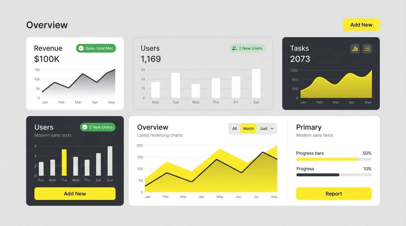
3) Modern Zest UI
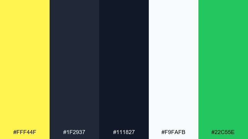
HEX: #FFF44F #1F2937 #111827 #F9FAFB #22C55E
Mood: clean, modern, high-contrast
Best for: 2D UI dashboard mockup
Crisp dark grays with a neon-fresh yellow read like a sharp, modern workspace. This color combination with lemon yellow shines in dashboards, fintech tools, and analytics screens where hierarchy must be obvious. Keep yellow for primary CTAs and status highlights, while green supports success states without competing. Usage tip: avoid large yellow backgrounds in UI and instead use it as a controlled accent for focus.
Image example of modern zest ui generated using media.io
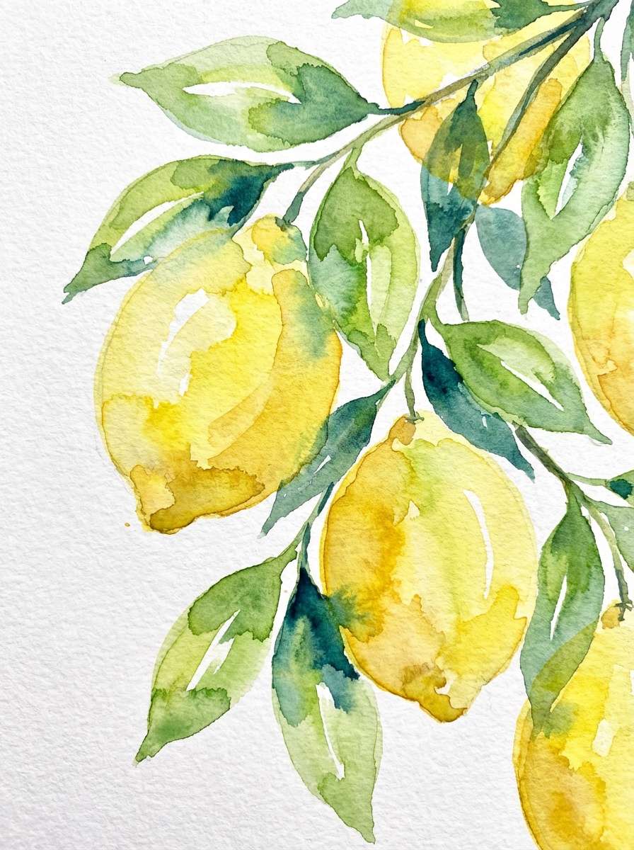
4) Botanical Lemon Grove

HEX: #FFF44F #D9ED92 #99D98C #52B69A #168AAD
Mood: fresh, botanical, optimistic
Best for: spring botanical illustration
Dewy greens and sunny yellow evoke a lemon grove after rainfall. It is ideal for eco packaging, garden events, and nature-first social posts where freshness is the story. Combine the soft greens for gradients and save the deeper teal-blue for outlines and headings. Usage tip: add plenty of white space so the greens feel breathable, not busy.
Image example of botanical lemon grove generated using media.io
5) Retro Lemon Soda

HEX: #FFF44F #FF7AA2 #FFB4A2 #8E9AAF #2EC4B6
Mood: retro, playful, pop
Best for: event flyer design
Bubblegum pink and fizzy yellow create a nostalgic soda-shop vibe with a modern twist. These lemon yellow color combinations are made for party flyers, music nights, and playful DTC drops. Use the pink for big headers, let yellow handle stickers and badges, and bring in teal for small accents that feel refreshing. Usage tip: keep the slate tone behind text blocks to improve readability without dulling the fun.
Image example of retro lemon soda generated using media.io

6) Lemon Meringue Dessert

HEX: #FFF44F #FFF7D6 #FDE2A7 #D4A373 #6B4F4F
Mood: cozy, sweet, inviting
Best for: bakery packaging
Creamy custard tones and baked caramel browns feel like a warm slice of pie on a cafe table. This lemon yellow mix works especially well for pastry branding, menu accents, and comfort-food packaging. Let the pale cream do the heavy lifting, then layer yellow for highlights and seals. Usage tip: use the cocoa brown for logos and small type so it reads clearly on light backgrounds.
Image example of lemon meringue dessert generated using media.io

7) Sunny Minimal Poster

HEX: #FFF44F #FFFFFF #E5E7EB #374151 #0F172A
Mood: minimal, crisp, confident
Best for: typographic poster
Clean white space with a sharp yellow hit feels like sunlight cutting through a modern gallery. Use this color combination with lemon yellow for typographic posters, announcement graphics, or landing sections that need a bold focal point without clutter. Keep the darkest navy for headlines and let yellow underline key words or dates. Usage tip: add only one large yellow shape per layout to maintain the minimalist punch.
Image example of sunny minimal poster generated using media.io

8) Lemon Meets Lavender
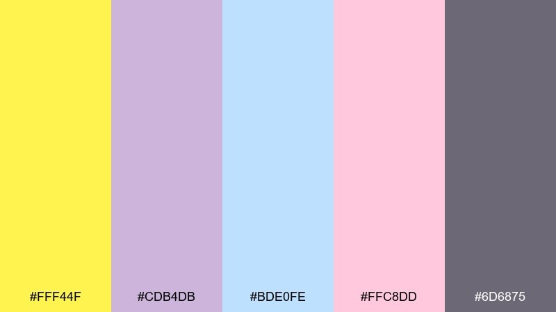
HEX: #FFF44F #CDB4DB #BDE0FE #FFC8DD #6D6875
Mood: soft, dreamy, friendly
Best for: beauty social post templates
Pastel lavender and blush give the yellow a gentle, dreamy glow like spring mornings. The combination fits beauty, self-care, and creator content where you want warmth without shouting. Let lavender take backgrounds and use yellow for icons, highlights, and small decorative motifs. Usage tip: keep contrast high for text by using the muted plum as your primary type color.
Image example of lemon meets lavender generated using media.io

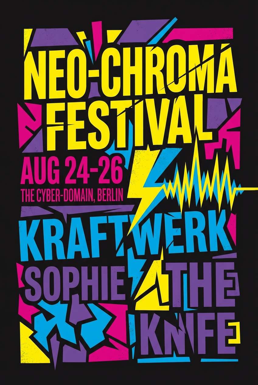
9) Festival Lemon Pop

HEX: #FFF44F #FF006E #8338EC #3A86FF #000000
Mood: bold, electric, high-energy
Best for: concert poster
Neon brights against black feel like stage lights and midnight crowds. These lemon yellow color combinations are perfect for posters, merch drops, and social teasers that need instant impact. Use yellow as the spotlight color, and keep the magenta and violet for secondary shapes or artist names. Usage tip: limit gradients and rely on clean blocks of color so the palette stays punchy in print.
Image example of festival lemon pop generated using media.io
10) Coastal Lemon Breeze
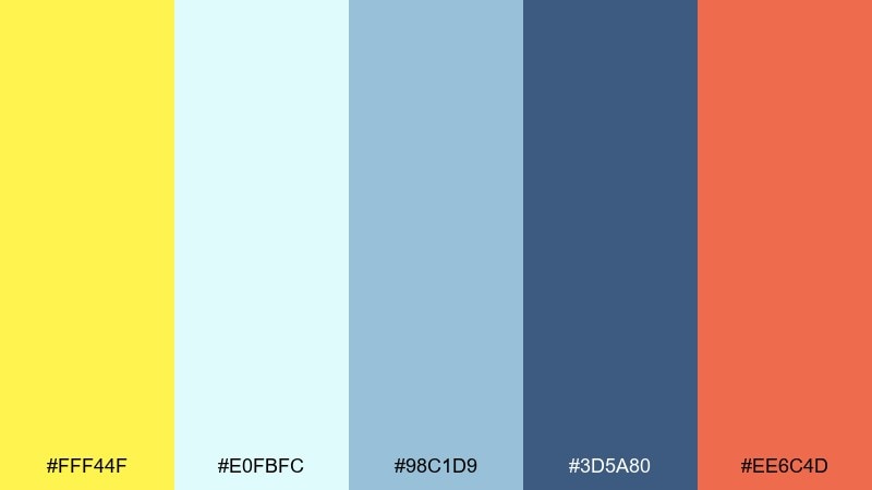
HEX: #FFF44F #E0FBFC #98C1D9 #3D5A80 #EE6C4D
Mood: breezy, coastal, cheerful
Best for: travel blog header
Sea-glass blues with a warm citrus accent feel like a beach town at golden hour. The lemon yellow color palette works well for travel headers, resort promos, and summer editorial graphics. Use the pale aqua for backgrounds and keep lemon for buttons or location tags, while coral adds a small warm counterpoint. Usage tip: balance the warm tones by leaning on navy for navigation and titles.
Image example of coastal lemon breeze generated using media.io

11) Lemon and Terracotta Home
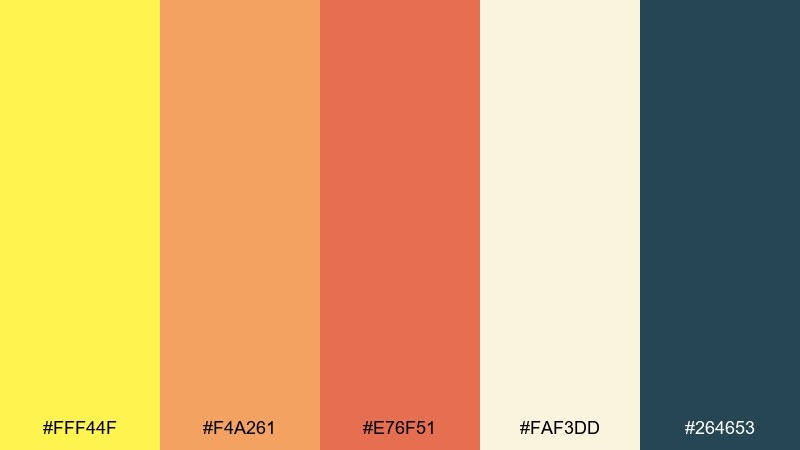
HEX: #FFF44F #F4A261 #E76F51 #FAF3DD #264653
Mood: warm, earthy, welcoming
Best for: interior design mood board
Sun-warmed terracotta and deep teal bring a grounded, Mediterranean comfort to the yellow. This lemon yellow color palette is great for home decor brands, maker shops, and lifestyle editorial where warmth should feel intentional. Use cream as the base, then layer terracotta for blocks and patterns while yellow becomes a bright accessory note. Usage tip: keep teal for anchors like headings or frames so the palette does not drift too pastel.
Image example of lemon and terracotta home generated using media.io

12) Luxe Lemon Gold

HEX: #FFF44F #D4AF37 #0B1320 #1D3557 #F1FAEE
Mood: luxury, dramatic, refined
Best for: premium product packaging
Golden highlights on deep midnight tones feel cinematic and upscale. Use this set for premium packaging, high-end landing pages, or membership branding that needs a confident contrast. Let navy and near-black handle most surfaces, then apply gold and lemon as foil-like accents for logos or seals. Usage tip: keep the pale off-white for breathing room on labels and legal copy.
Image example of luxe lemon gold generated using media.io
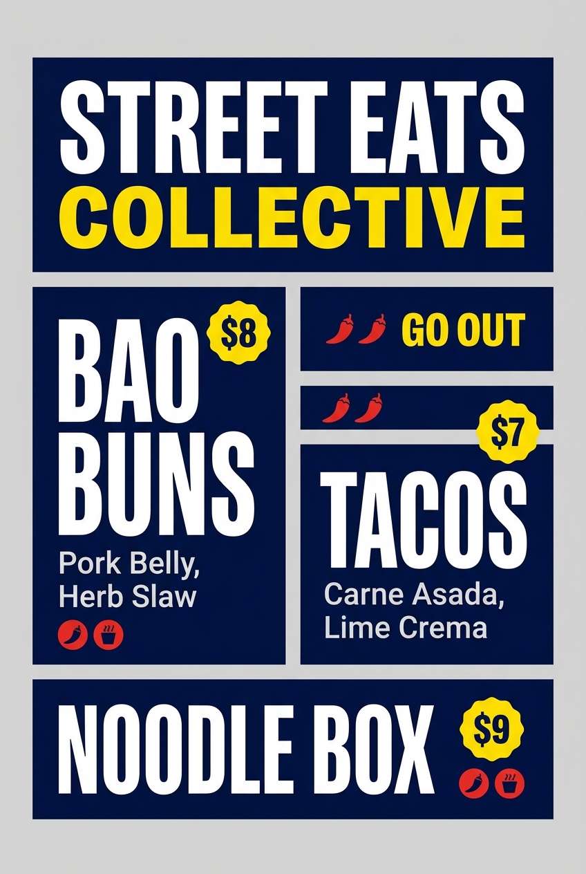
13) Kids Lemon Crayon
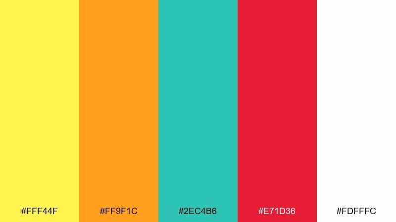
HEX: #FFF44F #FF9F1C #2EC4B6 #E71D36 #FDFFFC
Mood: playful, kid-friendly, bright
Best for: kids learning app UI
Crayon-bright primaries with a sunny yellow feel like classroom posters and sticker sheets. Use it for kids apps, playful onboarding screens, or educational cards where color helps guide attention. Keep white as the main canvas, then use yellow and teal for navigation elements while orange and red highlight rewards. Usage tip: apply one bright color per component so screens stay readable and not chaotic.
Image example of kids lemon crayon generated using media.io

14) Lemon Night Market

HEX: #FFF44F #2B2D42 #8D99AE #EF233C #EDF2F4
Mood: urban, edgy, vibrant
Best for: street food poster
A bright yellow accent against inky blue-grays feels like neon signage in a night market. It is ideal for street food branding, pop-up posters, and social ads that need a gritty modern edge. Use yellow for pricing and callouts, while red adds heat for spicy items or urgent CTAs. Usage tip: keep the light gray for background panels so the dark tones do not swallow details.
Image example of lemon night market generated using media.io
15) Soft Lemon Blush

HEX: #FFF44F #FFE5EC #FFC2D1 #D8E2DC #6C757D
Mood: gentle, romantic, modern
Best for: wedding invitation suite
Blush pinks and muted sage make the yellow feel tender, like petals in warm daylight. The mix works beautifully for wedding stationery, bridal showers, and delicate packaging where you want softness with a cheerful lift. Use blush for large areas, bring lemon in for monograms or small flourishes, and rely on gray for typography. Usage tip: choose an uncoated paper look to keep the palette feeling airy and refined.
Image example of soft lemon blush generated using media.io

16) Artisan Lemon Paper
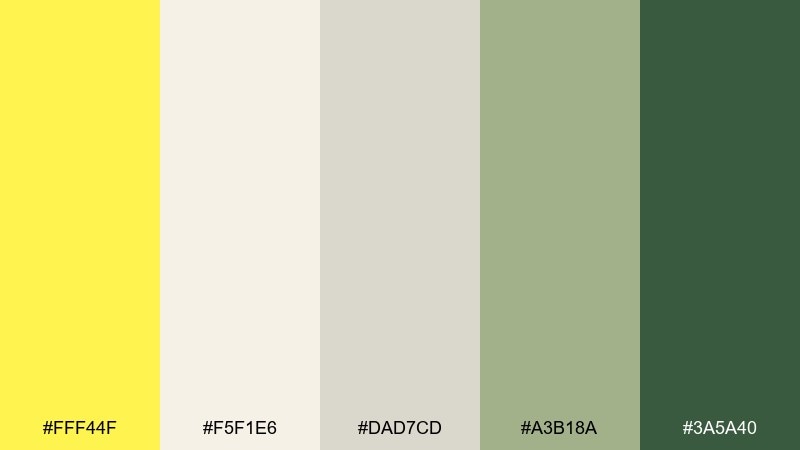
HEX: #FFF44F #F5F1E6 #DAD7CD #A3B18A #3A5A40
Mood: handmade, rustic, grounded
Best for: craft label design
Recycled paper neutrals with herb greens feel like a weekend market and handwritten tags. Use this lemon yellow color palette for artisan goods, candles, small-batch foods, and sustainable packaging that needs warmth without gloss. Keep the paper tones as the base, then use lemon for small stamps, icons, or batch numbers. Usage tip: use the darkest green for logos so it looks inked and authentic.
Image example of artisan lemon paper generated using media.io

17) Lemon Tech Gradient

HEX: #FFF44F #A7F3D0 #38BDF8 #6366F1 #0B1020
Mood: futuristic, fresh, digital
Best for: SaaS landing page hero
Cool gradients and a bright yellow spark feel like modern software with a human touch. A lemon yellow color combination like this works well for SaaS heroes, feature cards, and onboarding illustrations. Use the deep near-black for structure, then let cyan-to-indigo gradients carry big shapes while yellow becomes the attention magnet. Usage tip: keep yellow limited to one primary CTA and a few icons to avoid competing with the gradients.
Image example of lemon tech gradient generated using media.io

18) Vintage Lemon Postcard
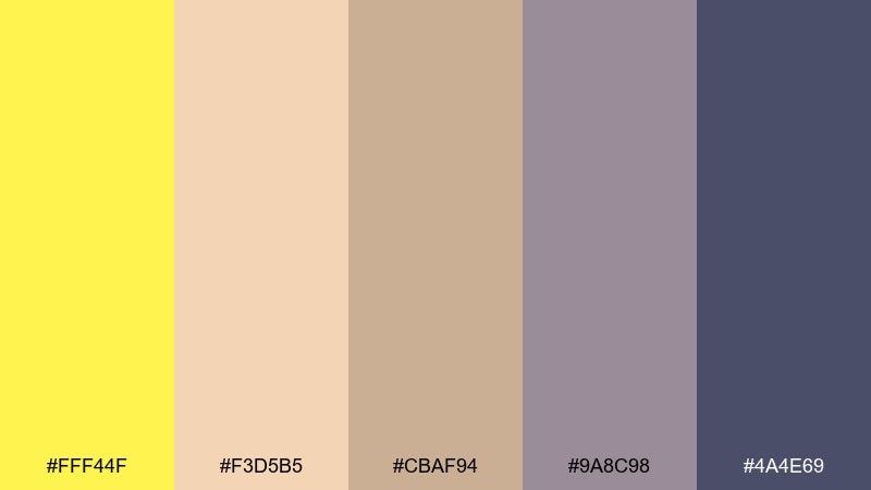
HEX: #FFF44F #F3D5B5 #CBAF94 #9A8C98 #4A4E69
Mood: vintage, muted, nostalgic
Best for: travel postcard design
Faded paper tones and dusty plum feel like a postcard found in a drawer. Use it for vintage travel prints, cafe menus, and editorial graphics that want warmth without high saturation. Let the parchment shades dominate, then add lemon as a sun motif, border, or stamp-like badge. Usage tip: choose the deep indigo-plum for headings to preserve that old-print contrast.
Image example of vintage lemon postcard generated using media.io

19) Lemon Espresso Contrast

HEX: #FFF44F #2D1E16 #6F4E37 #C7B299 #F8F4E3
Mood: cozy, bold, cafe-ready
Best for: coffee shop menu
Deep espresso browns with a lemon highlight feel like morning energy with a zesty twist. It is great for cafe menus, food photography overlays, and packaging where you want strong readability and warmth. Use the dark brown for the main text, the cream for background, and add yellow to flag specials or seasonal drinks. Usage tip: keep yellow on small elements like icons and price tags for a clean, premium look.
Image example of lemon espresso contrast generated using media.io

20) Lemon Slate Office

HEX: #FFF44F #CBD5E1 #94A3B8 #334155 #0F172A
Mood: professional, modern, focused
Best for: corporate presentation deck
Cool slates with a bright yellow accent feel like a sharp office moment with personality. This lemon yellow color palette fits pitch decks, annual reports, and B2B landing pages where clarity matters. Use slate blues for charts and sections, then apply yellow to spotlight key metrics or slide titles. Usage tip: keep backgrounds light and reserve the deepest navy for headers and footers to maintain contrast.
Image example of lemon slate office generated using media.io

What Colors Go Well with Lemon Yellow?
Lemon yellow pairs best with strong anchors and calm bases. Charcoal, deep navy, and near-black make it feel clean and modern, while cream, parchment, and soft gray keep the palette bright without turning harsh.
For a fresh, natural look, add greens (mint, sage, or botanical tones). For a playful contrast, lean into pinks, corals, and magenta; for a coastal vibe, combine lemon yellow with aqua and ocean blues.
If you’re designing for readability, treat lemon yellow like a highlighter: great for accents and badges, but use darker hues for body text and critical UI labels.
How to Use Lemon Yellow Color Combinations in Real Designs
In UI, a lemon yellow color combination works best for primary actions (CTA buttons), focus states, and small status highlights. Avoid large lemon-yellow panels behind text; instead, place it on buttons, icons, and short callouts where contrast is easy to control.
In branding and packaging, build the base with neutrals (white, cream, linen, parchment), then use lemon yellow as a signature stamp color—seals, borders, labels, or a single hero element that’s instantly recognizable.
For print, test saturation and paper choice. Uncoated stocks soften lemon yellow nicely, while glossy finishes can push it into neon territory; balance with darker inks for headings and fine type.
Create Lemon Yellow Palette Visuals with AI
Once you’ve chosen your HEX set, you can quickly mock up posters, hero banners, packaging, or UI scenes to see how lemon yellow behaves at real scale. This helps you spot contrast issues early and refine where the yellow should (and shouldn’t) dominate.
Start with one palette, generate a few variations, then keep the layout consistent while swapping accents (teal vs coral vs navy). You’ll end up with a cohesive system of visuals that still feels flexible across campaigns.
Use your palette HEX codes as “dominant colors” in the prompt and specify the design type (UI dashboard, poster, label, hero banner) to guide the composition.
Lemon Yellow Color Palette FAQs
-
What HEX code is lemon yellow?
A common lemon yellow used in these palettes is #FFF44F. It’s bright, clean, and works well as an accent color for highlights and CTAs. -
What colors complement lemon yellow?
Deep navy, charcoal, and black create strong contrast; teal and aqua add a fresh modern twist; and lavender or blush can soften lemon yellow into a pastel, friendly look. -
Can I use lemon yellow as a background color?
You can, but it’s usually better in small doses. For large backgrounds, use pale cream or off-white and reserve lemon yellow for shapes, badges, and key UI elements to reduce eye strain. -
What text color works best on lemon yellow?
Use near-black, deep navy, or charcoal for readable text on lemon yellow. Avoid white text on lemon yellow, since contrast is typically too low for accessibility. -
Is lemon yellow good for professional or corporate design?
Yes—when paired with slate blues and dark navies. Use lemon yellow to highlight key metrics, slide titles, or CTAs while keeping the core layout neutral and structured. -
How do I keep a lemon yellow palette from looking childish?
Anchor it with sophisticated neutrals (cream, parchment, warm gray) and darker tones (navy, espresso brown). Limit bright secondary colors and use lemon yellow as a controlled signature accent. -
How can I quickly visualize a lemon yellow color scheme?
Generate mockups with an AI image tool using your palette HEX codes and a clear layout description (poster, packaging, UI, brand kit). Create a few variants to compare balance and contrast before final design work.