

Light color palettes are a reliable way to make designs feel clean, modern, and approachable. They’re especially useful when you want visuals to breathe and content to feel easy to scan.
Below are 20 light color combinations with HEX codes, plus practical tips for pairing, contrast, and real-world use in UI, branding, and print layouts.
In this article
Why Light Color Combinations Work So Well
Light color combinations create an instant sense of clarity because they reduce visual weight. That makes layouts feel more open, and it helps key elements like headlines, product photos, and calls to action stand out without heavy framing.
They also communicate softness and trust—useful for wellness, lifestyle, SaaS, education, and premium product categories. When paired with a dark anchor color for text, light schemes can look both minimal and high-end.
Another advantage is flexibility: pastels and soft neutrals adapt easily to different seasons and brand moods. A tiny accent shift (mint to lavender, peach to blush) can refresh an entire interface while keeping the structure consistent.
20+ Light Color Palette Ideas (with HEX Codes)
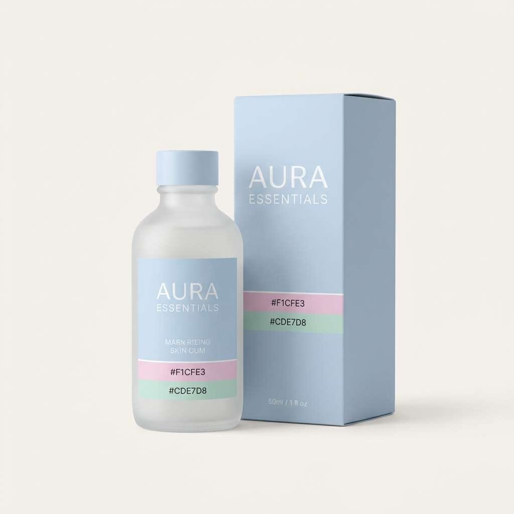
1) Cloud Milkshake
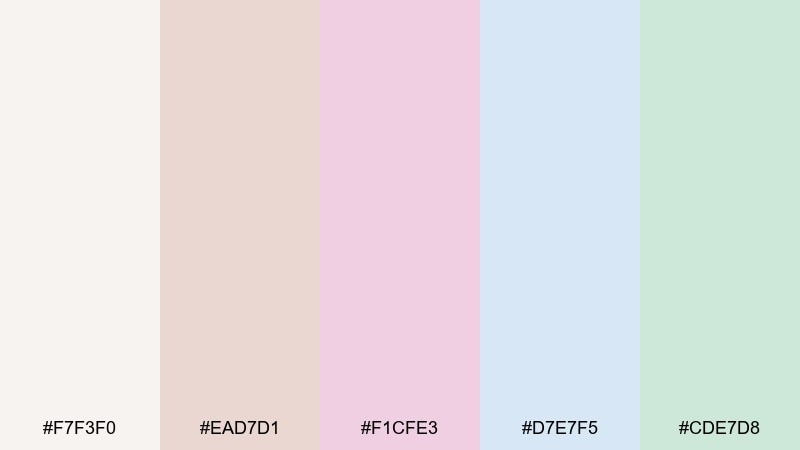
HEX: #F7F3F0 #EAD7D1 #F1CFE3 #D7E7F5 #CDE7D8
Mood: airy, sweet, calming
Best for: skincare packaging and product ads
Airy and sweet like whipped cream with a blush of fruit, these tones feel soothing and clean. They shine on skincare labels, wellness ads, and gentle product photography where clarity matters. Pair with warm gray type and plenty of negative space to keep it premium. Usage tip: let the pale blue or mint carry the background, then reserve pink as a small highlight for calls to action.
Image example of cloud milkshake generated using media.io
Media.io is an online AI studio for creating and editing video, image, and audio in your browser.

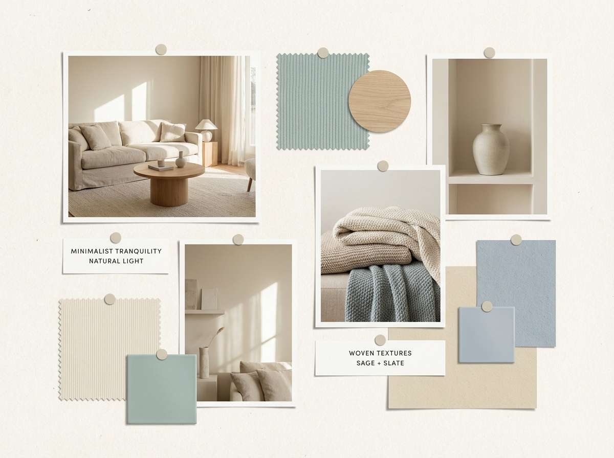
2) Morning Linen
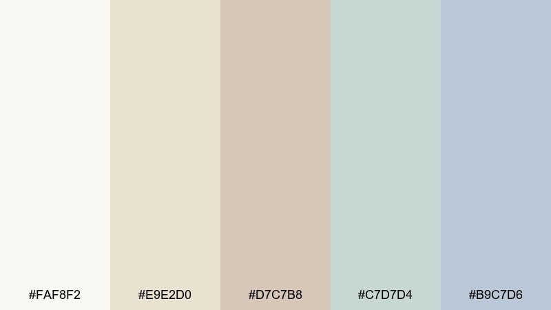
HEX: #FAF8F2 #E9E2D0 #D7C7B8 #C7D7D4 #B9C7D6
Mood: warm, natural, understated
Best for: interior mood boards and lifestyle branding
Warm and natural, it evokes sunlit linen, pale wood, and a quiet, tidy room. Use it for lifestyle brands, home decor mood boards, or calm blog headers where you want a soft first impression. It pairs well with charcoal text and simple line icons for a modern, editorial feel. Usage tip: keep contrast by choosing one deeper tone for headings, then keep everything else airy.
Image example of morning linen generated using media.io
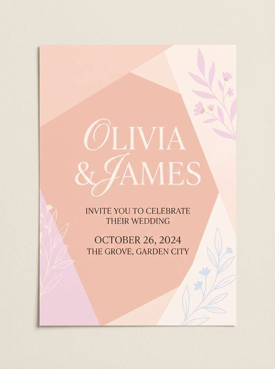
3) Peach Breeze
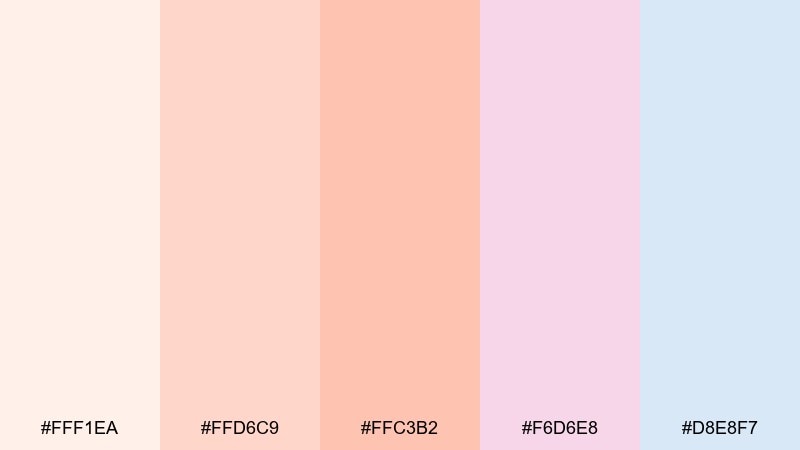
HEX: #FFF1EA #FFD6C9 #FFC3B2 #F6D6E8 #D8E8F7
Mood: fresh, friendly, romantic
Best for: wedding invitations and bridal stationery
Fresh and romantic, it feels like a spring breeze drifting through peach blossoms. These shades work beautifully on invitations, RSVP cards, and ceremony signage where softness is the goal. Pair with elegant serif typography and a touch of gold foil or warm beige for polish. Usage tip: keep the background nearly cream and use the deeper peach for names and key details.
Image example of peach breeze generated using media.io
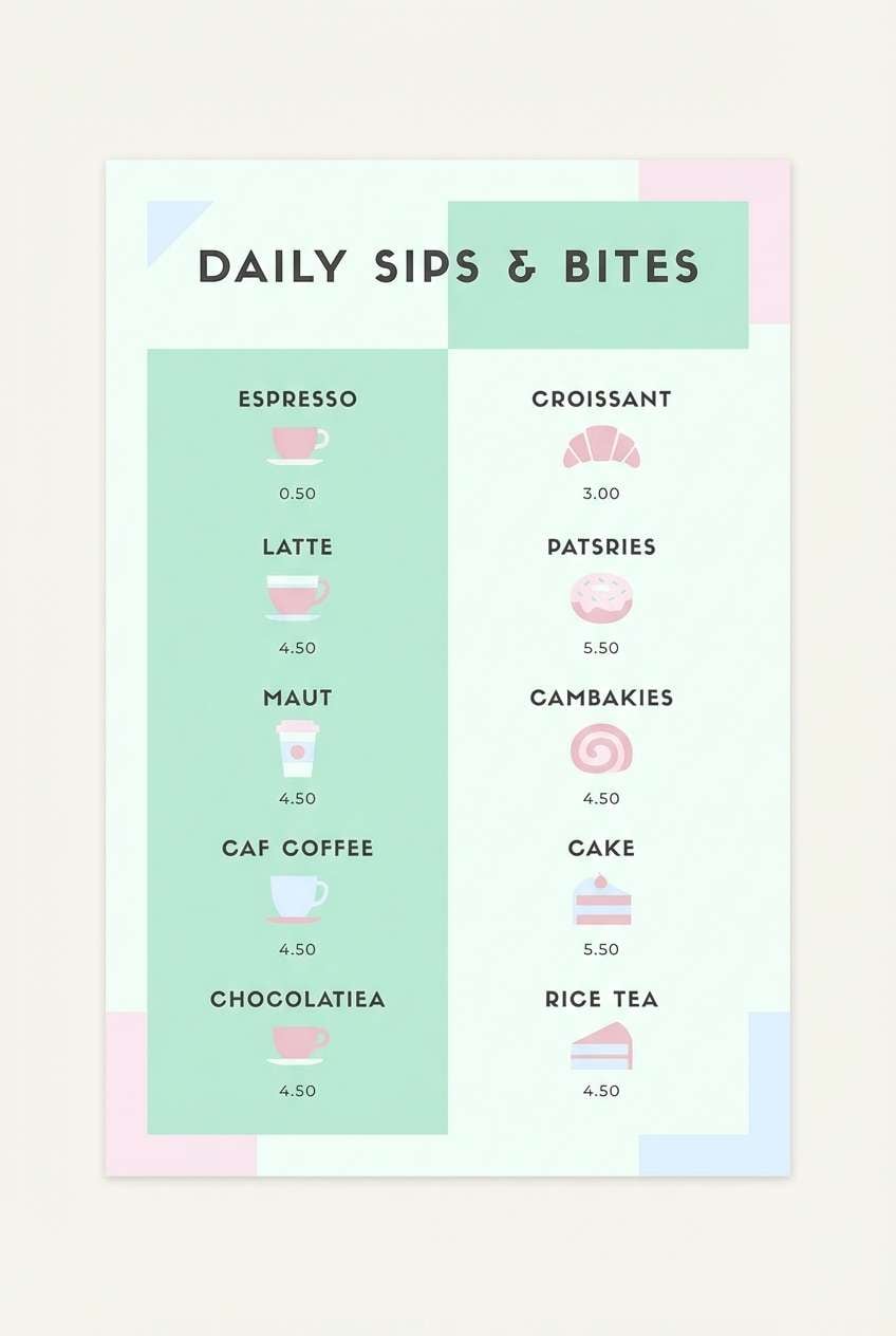
4) Mint Gelato
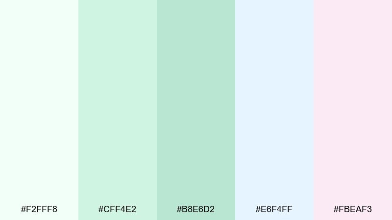
HEX: #F2FFF8 #CFF4E2 #B8E6D2 #E6F4FF #FBEAF3
Mood: cool, playful, refreshing
Best for: cafe menus and dessert posters
Cool and playful, this light color combination brings to mind mint gelato, frosted glass, and pastel sprinkles. Use it on cafe menus, dessert posters, or seasonal specials where you want a refreshing vibe without going loud. Pair with a deep forest or graphite for legible pricing and headings. Usage tip: set the menu background in the icy mint, then use blush sparingly to spotlight featured items.
Image example of mint gelato generated using media.io
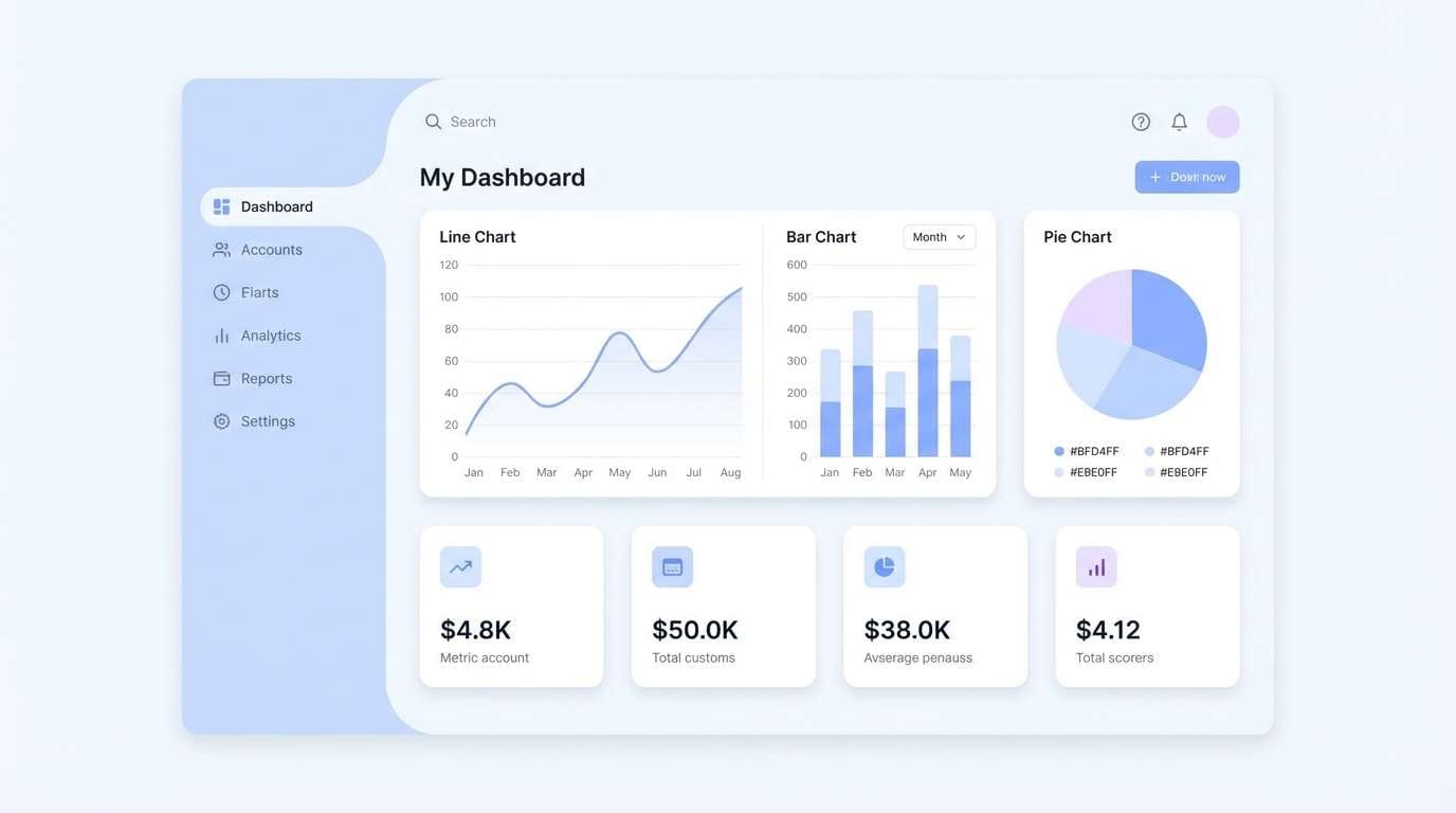
5) Powder Blue Studio
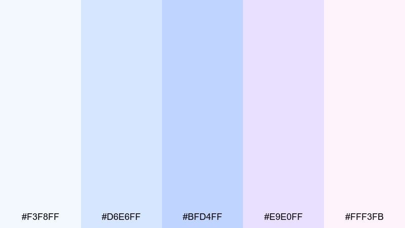
HEX: #F3F8FF #D6E6FF #BFD4FF #E9E0FF #FFF3FB
Mood: clean, modern, tech-soft
Best for: saas landing pages and dashboard UI
Clean and modern, these hues feel like a bright studio with soft daylight bouncing off white walls. They are ideal for SaaS landing pages and dashboards that need a calm, trustworthy tone. Add a dark navy for navigation and use the lavender as a gentle secondary accent for tabs or badges. Usage tip: keep cards white and tint section backgrounds with the pale blue to create structure without heavy borders.
Image example of powder blue studio generated using media.io
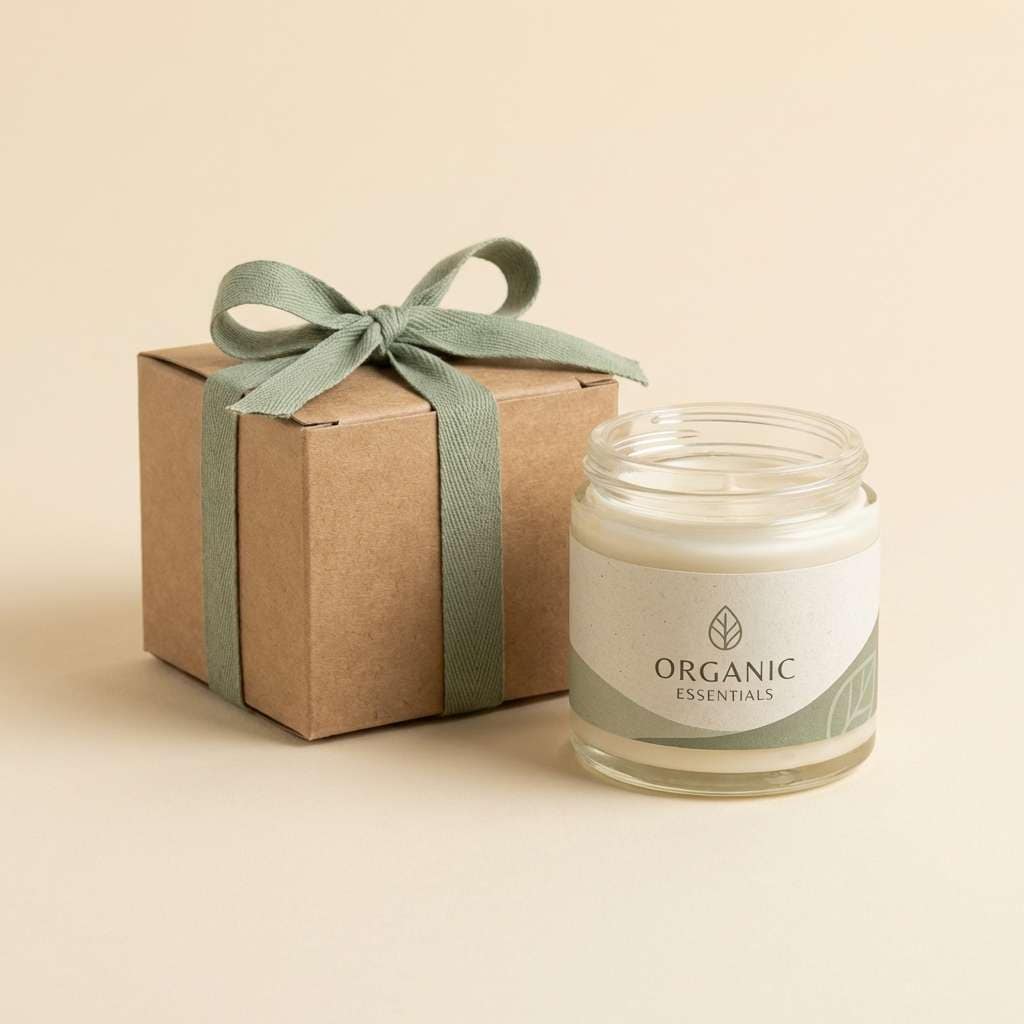
6) Soft Sand and Sage
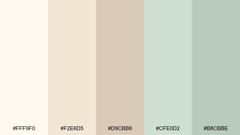
HEX: #FFF9F0 #F2E6D5 #D9CBB8 #CFE0D2 #B8CBBE
Mood: grounded, cozy, organic
Best for: eco brand packaging and labels
Grounded and cozy, it looks like sun-warmed sand with sage leaves laid on top. This set fits eco packaging, artisanal labels, and mindful brand identities that lean natural. Pair with a deep olive or espresso brown for typography to keep it readable and earthy. Usage tip: use the cream as your base and let sage drive icons, seals, and secondary panels.
Image example of soft sand and sage generated using media.io
7) Lavender Haze
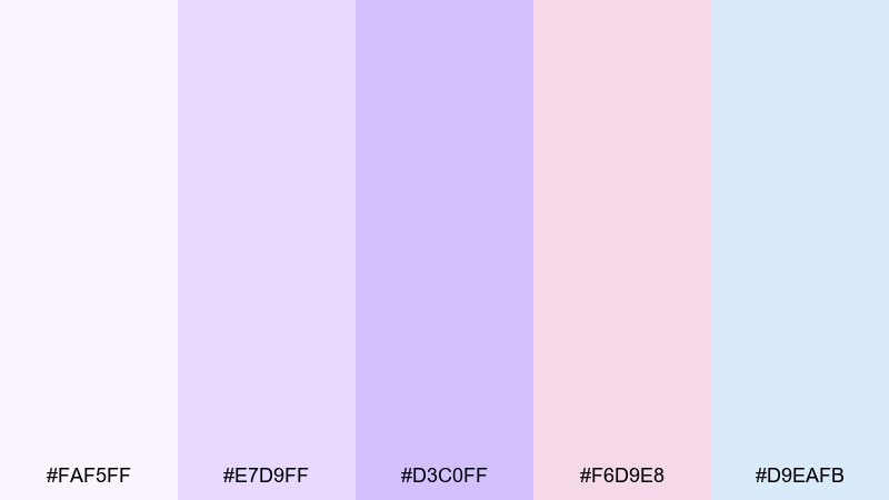
HEX: #FAF5FF #E7D9FF #D3C0FF #F6D9E8 #D9EAFB
Mood: dreamy, gentle, creative
Best for: beauty brand social posts and banners
Dreamy and gentle, this light color scheme evokes lavender fields fading into a pastel sky. Use it for beauty banners, boutique promos, or creator branding where you want softness with a hint of fantasy. Pair with deep plum or charcoal for text and keep gradients subtle to avoid a sugary look. Usage tip: build a two-color gradient from lavender to pale blue and use blush for small stickers or price tags.
Image example of lavender haze generated using media.io
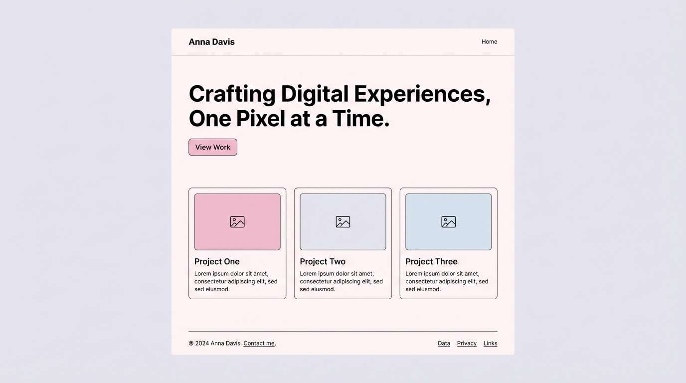
8) Blush Minimal
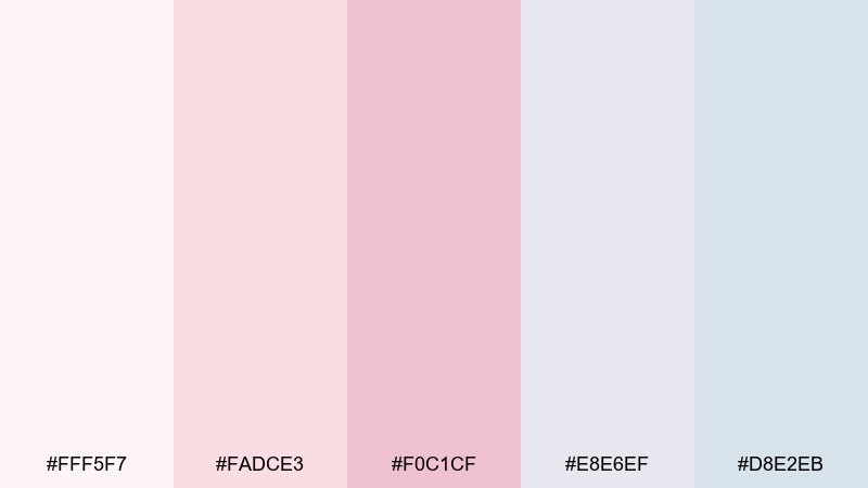
HEX: #FFF5F7 #FADCE3 #F0C1CF #E8E6EF #D8E2EB
Mood: polished, soft, minimalist
Best for: portfolio sites and personal branding
Polished and soft, it feels like a clean studio desk with a blush notebook and cool gray shadows. It works well for portfolios, personal brands, and service sites that need warmth without losing clarity. Pair with a near-black for headlines and keep imagery bright to match the airy tone. Usage tip: let the pale gray-blue support sections, then use the richer blush only for buttons and hover states.
Image example of blush minimal generated using media.io
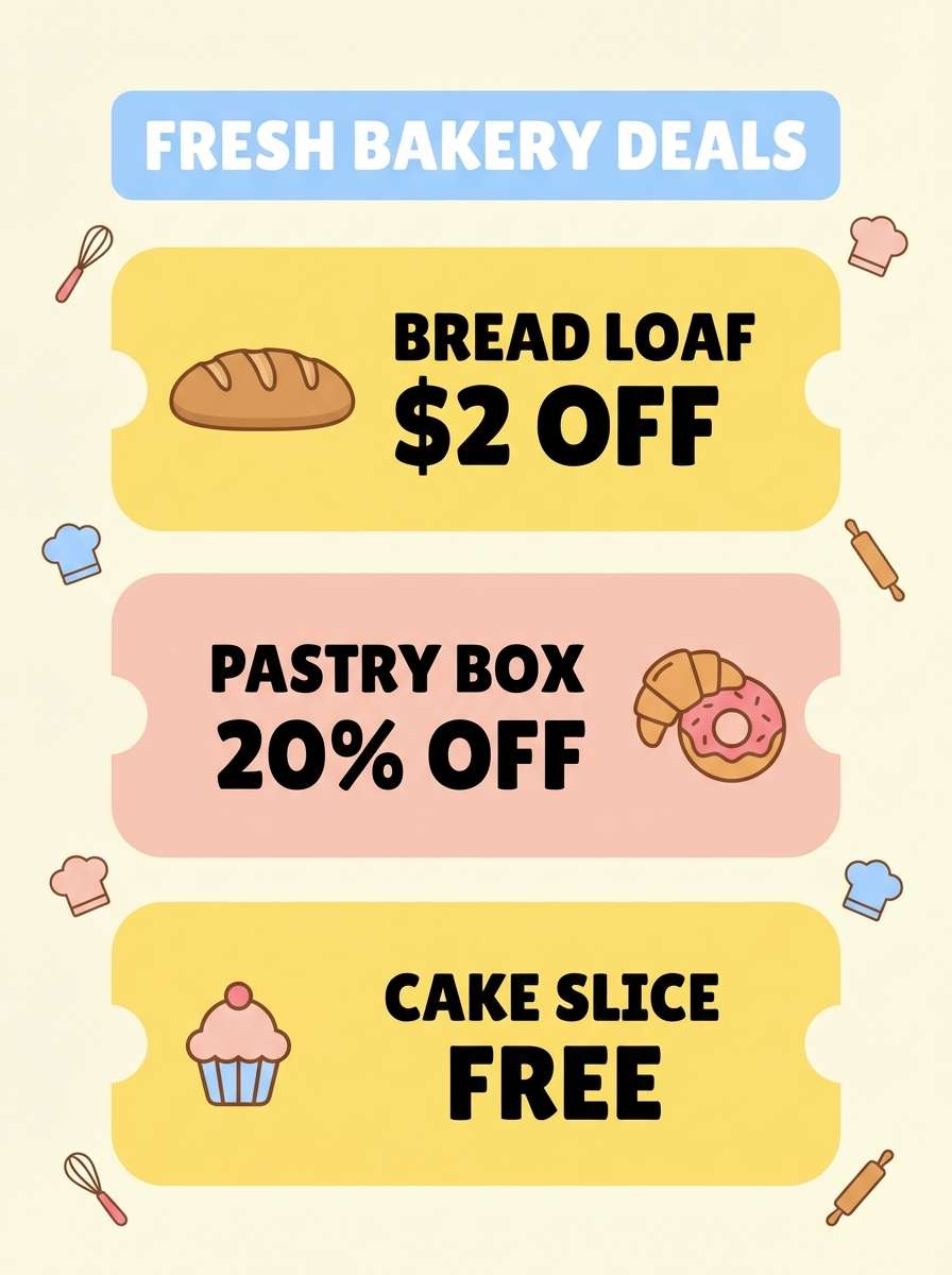
9) Lemon Chiffon
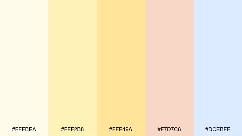
HEX: #FFFBEA #FFF2B8 #FFE49A #F7D7C6 #DCEBFF
Mood: sunny, upbeat, welcoming
Best for: bakery branding and coupon flyers
Sunny and welcoming, this light color palette resembles lemon chiffon cake with a soft glaze and a cool blue napkin. Use it for bakery branding, coupon flyers, or cheerful announcements that should feel friendly and accessible. Pair with cocoa brown for text and a touch of the pale blue to keep the yellows from feeling flat. Usage tip: keep the strongest yellow for badges and prices so the layout stays readable.
Image example of lemon chiffon generated using media.io
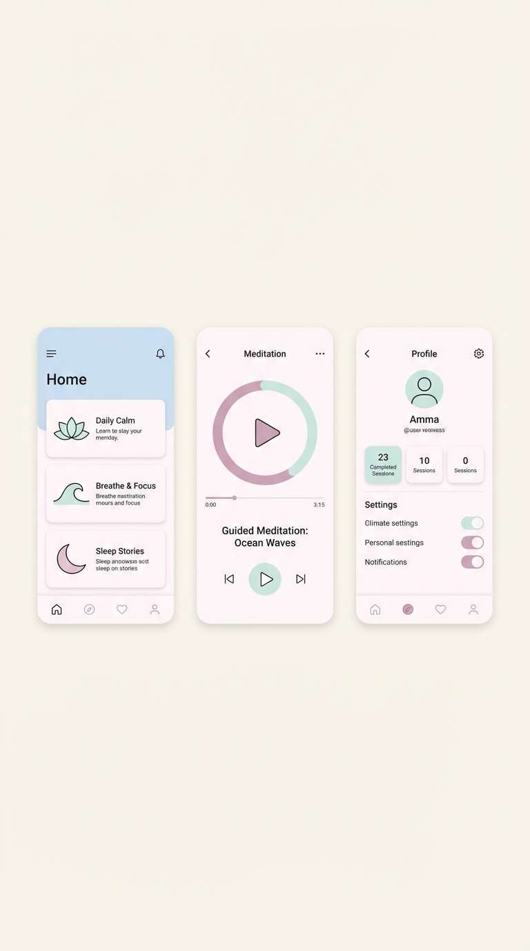
10) Icy Rose Quartz
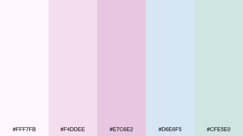
HEX: #FFF7FB #F4DDEE #E7C6E2 #D6E6F5 #CFE5E0
Mood: serene, spa-like, delicate
Best for: wellness apps and meditation UI
Serene and spa-like, this light color combination feels like rose quartz under cool morning light. These hues suit wellness apps, meditation screens, and gentle onboarding flows where calm matters more than contrast. Pair with deep slate text and keep icons thin for an elegant finish. Usage tip: use the icy blue for primary surfaces and reserve the mauve for progress states and friendly micro-interactions.
Image example of icy rose quartz generated using media.io
11) Sea Glass Morning
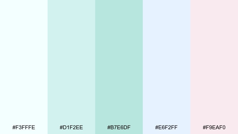
HEX: #F3FFFE #D1F2EE #B7E6DF #E6F2FF #F9EAF0
Mood: breezy, coastal, clean
Best for: travel newsletters and hotel brochures
Breezy and coastal, it brings up sea glass, salty air, and a pale sunrise over water. It is a great fit for travel emails, boutique hotel brochures, and resort landing pages that need a clean, relaxed tone. Pair with deep teal or navy for headings and keep photography bright and airy. Usage tip: use seafoam blocks to separate sections instead of heavy lines.
Image example of sea glass morning generated using media.io

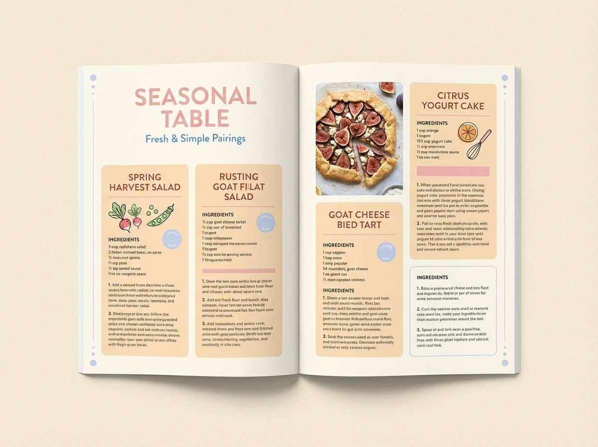
12) Apricot Cream
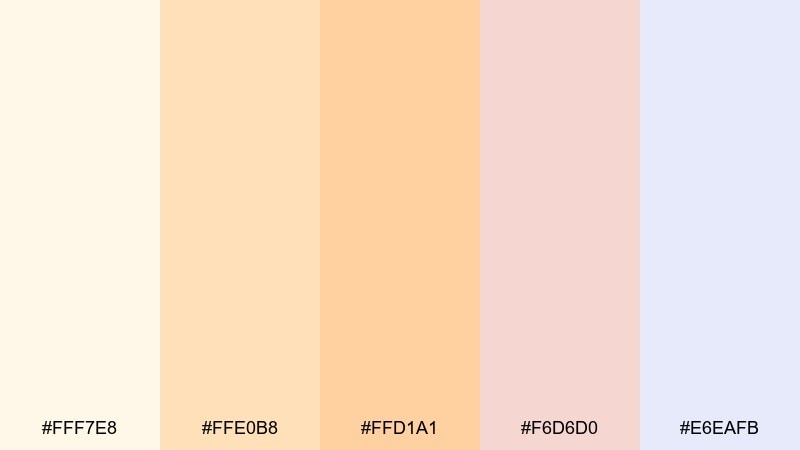
HEX: #FFF7E8 #FFE0B8 #FFD1A1 #F6D6D0 #E6EAFB
Mood: comforting, friendly, soft
Best for: recipe blogs and food editorial layouts
Comforting and friendly, it looks like apricot jam swirled into fresh cream. Use these tones for recipe blogs, food editorials, and cooking guides that should feel warm and approachable. Pair with a dark cocoa for type and keep the blue as a cool counterbalance in sidebars or ingredient cards. Usage tip: make cards white, then tint section headers with the apricot to guide the eye.
Image example of apricot cream generated using media.io
13) Cotton Candy UI
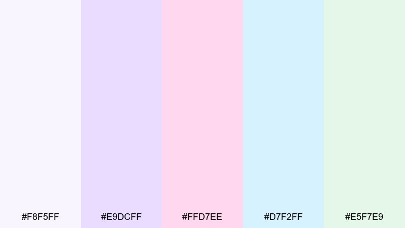
HEX: #F8F5FF #E9DCFF #FFD7EE #D7F2FF #E5F7E9
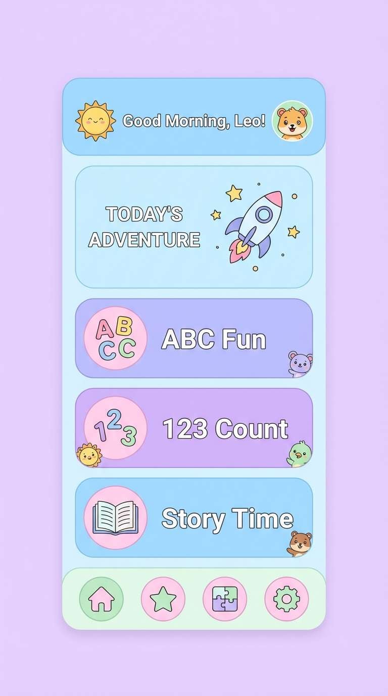
Mood: cheerful, soft, playful
Best for: kids learning app UI and onboarding
Cheerful and soft, it feels like cotton candy clouds over a clear pool. As a light color scheme, it keeps kids learning screens upbeat without relying on harsh primaries. Pair with a deep indigo for labels and use rounded components to match the friendly tone. Usage tip: choose one accent (pink or mint) per screen so the interface stays focused.
Image example of cotton candy ui generated using media.io
14) Fresh Paper
HEX: #FFFFFF #F4F6F8 #E6EBF1 #D7DEE8 #C7D0DB
Mood: crisp, professional, minimalist
Best for: business presentations and reports
Crisp and professional, it looks like freshly printed pages with subtle shadows. Use it for presentations, reports, and document-style websites where content should lead. Pair with a single bold accent color for charts, while keeping these neutrals as the backbone. Usage tip: avoid pure black for large areas and use a deep charcoal instead for softer contrast.
Image example of fresh paper generated using media.io
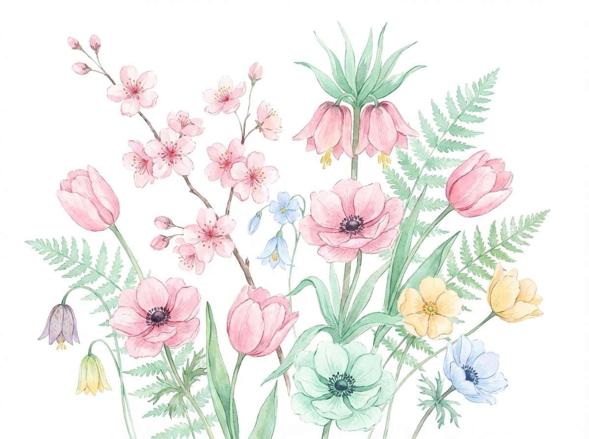
15) Spring Petals
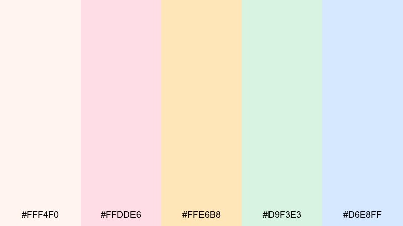
HEX: #FFF4F0 #FFDDE6 #FFE6B8 #D9F3E3 #D6E8FF
Mood: floral, bright, optimistic
Best for: watercolor botanical illustrations
Floral and optimistic, it evokes petals, fresh buds, and the first warm weekend of the year. These colors are perfect for botanical illustrations, seasonal wallpapers, and gentle craft prints. Pair with soft ink outlines in gray-brown to keep the watercolor look believable. Usage tip: let the blue act as open sky space so the pinks and yellows do not crowd the page.
Image example of spring petals generated using media.io
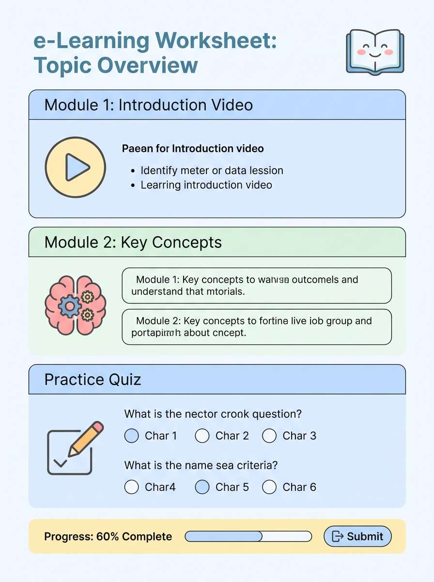
16) Calm Classroom
HEX: #F8FAFF #E6F0FF #E8F7E8 #FFF5D6 #FCE3E8
Mood: gentle, encouraging, organized
Best for: school worksheets and e-learning pages
Gentle and encouraging, this light color combination feels like a tidy classroom with soft posters on the wall. Use it for worksheets, e-learning pages, and teacher resources where readability and warmth need to coexist. Pair with dark graphite text and simple icons so the page stays accessible. Usage tip: assign one color to each content type (notes, tasks, examples) and keep it consistent across pages.
Image example of calm classroom generated using media.io
17) Nordic Frost
HEX: #F6FAFB #DDECEF #C7DADD #E6E2F7 #F2E9E4
Mood: cool, quiet, modern
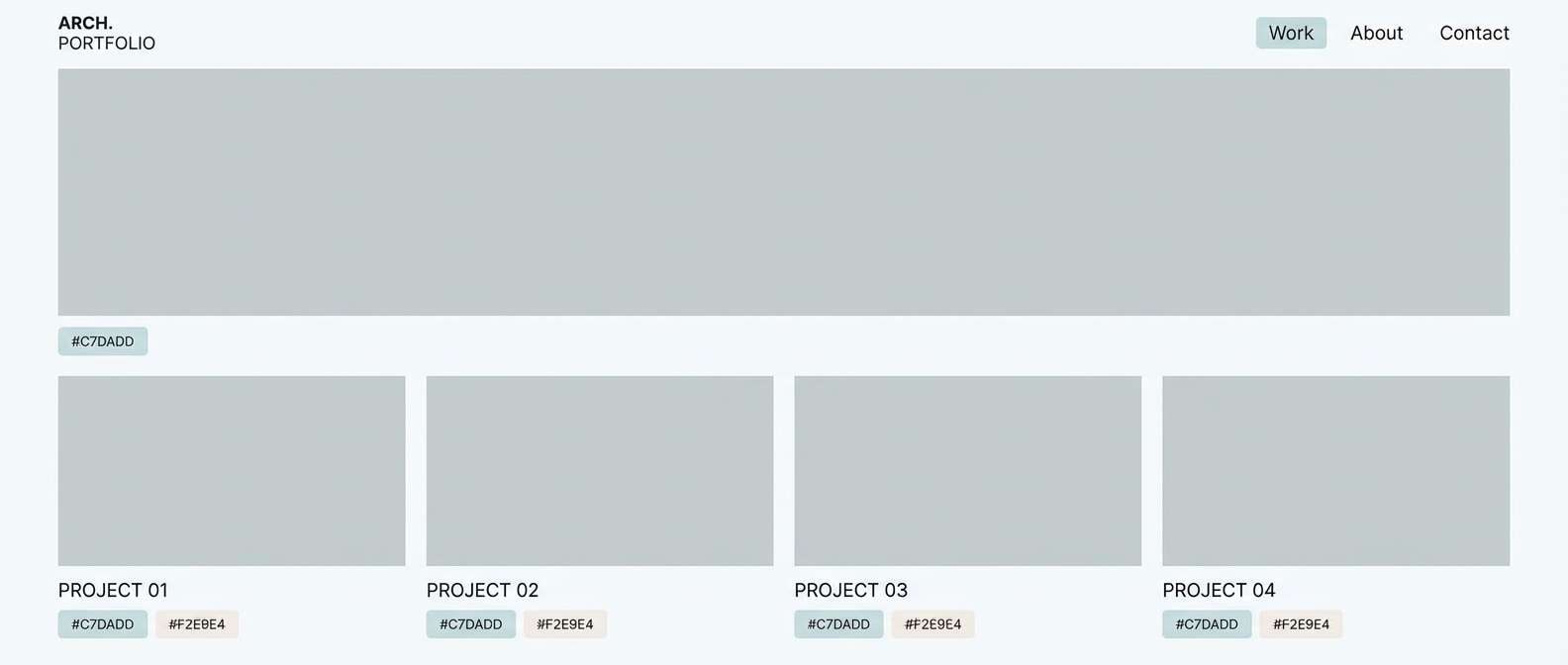
Best for: architect portfolios and gallery sites
Cool and quiet, it suggests frosted windows, pale stone, and a minimalist Scandinavian room. It works beautifully for architecture portfolios and gallery sites that need restraint and clarity. Pair with black or deep navy typography and use subtle shadows instead of borders. Usage tip: lean on the icy blues for structure, then add the warm beige only where you want emphasis.
Image example of nordic frost generated using media.io
18) Vanilla Sky
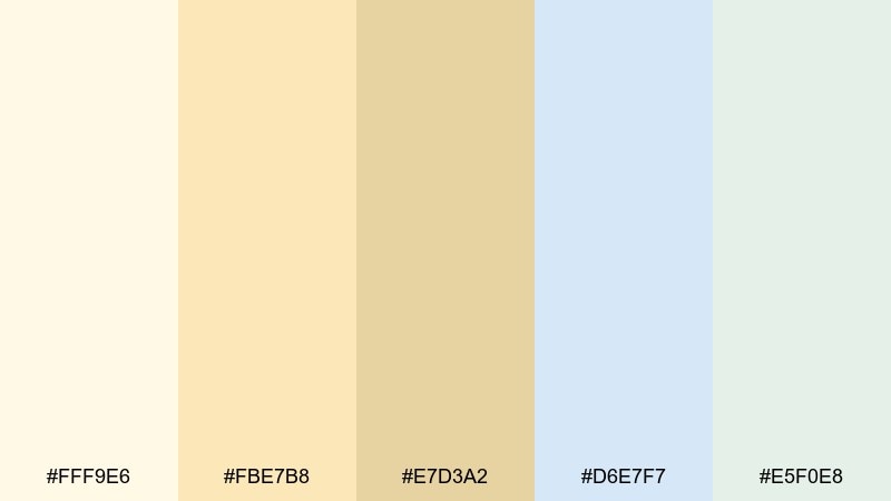
HEX: #FFF9E6 #FBE7B8 #E7D3A2 #D6E7F7 #E5F0E8
Mood: soft, sunny, calming
Best for: travel posters and summer promos
Soft and sunny, it feels like vanilla clouds against a pale blue horizon. Use it for summer promos, travel posters, or event graphics that should feel bright but still gentle. Pair with a muted navy for titles and keep the green as a supporting tint for secondary details. Usage tip: keep the background creamy and place text on the blue blocks for clearer contrast.
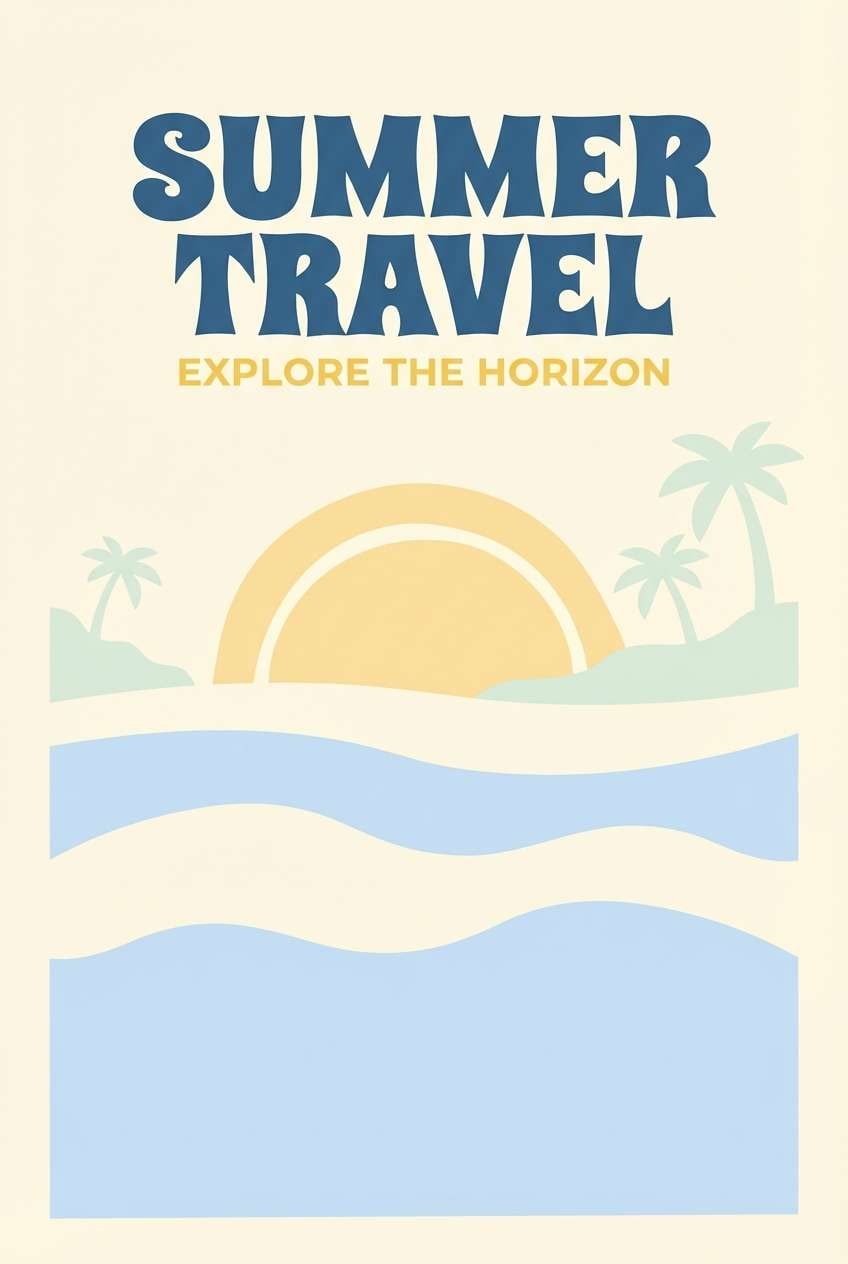
Image example of vanilla sky generated using media.io
19) Studio Pastels
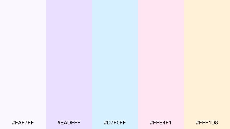
HEX: #FAF7FF #EADFFF #D7F0FF #FFE4F1 #FFF1D8
Mood: creative, modern, optimistic
Best for: brand kits and social templates
Creative and optimistic, it resembles a bright design studio with pastel sticky notes and clean paper. These light color combinations work well for brand kits, social templates, and creator resources where you want variety without noise. Pair with a single dark anchor (ink or midnight) to keep typography sharp. Usage tip: pick two dominant tones per template and let the remaining colors act as small tags or icons.
Image example of studio pastels generated using media.io
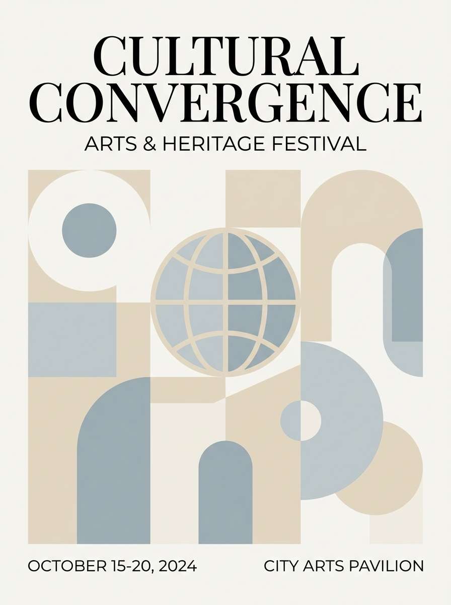
20) Quiet Museum
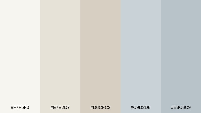
HEX: #F7F5F0 #E7E2D7 #D6CFC2 #C9D2D6 #B8C3C9
Mood: elegant, muted, timeless
Best for: museum flyers and cultural event posters
Elegant and muted, it recalls stone walls, archival paper, and soft gallery lighting. Use it for museum flyers, cultural event posters, and high-end editorial graphics that should feel timeless. Pair with black typography and a single metallic accent if you need more hierarchy. Usage tip: keep imagery monochrome or low-saturation so the palette stays cohesive and refined.
Image example of quiet museum generated using media.io
What Colors Go Well with Light?
Light palettes pair best with a dark anchor that restores contrast: charcoal, slate, deep navy, espresso brown, or deep forest green. This keeps body text readable and gives your design a clear hierarchy without making it feel harsh.
For accents, choose one or two mid-tone colors (not pure neon) so buttons, badges, and icons are visible. In many light schemes, a muted coral, dusty blue, or soft teal performs better than bright primary red or electric blue.
If you want a premium look, add a warm neutral (beige, ivory, greige) alongside a cool tint (pale blue or gray-blue). The warm/cool balance prevents the palette from looking washed out or overly sugary.
How to Use a Light Color Combination in Real Designs
Start with a background and surface system: use the lightest tone for the page background, then pick one slightly deeper tint for cards, panels, or section blocks. This creates structure without heavy borders.
Reserve your strongest color for interactive states (buttons, links, highlights) and keep it consistent. Light palettes feel cohesive when the accent is used sparingly but predictably across screens and pages.
Always test contrast with real content: long paragraphs, small UI labels, form fields, and disabled states. Light UIs often need darker typography than you expect, plus subtle shadows or dividers to separate components.
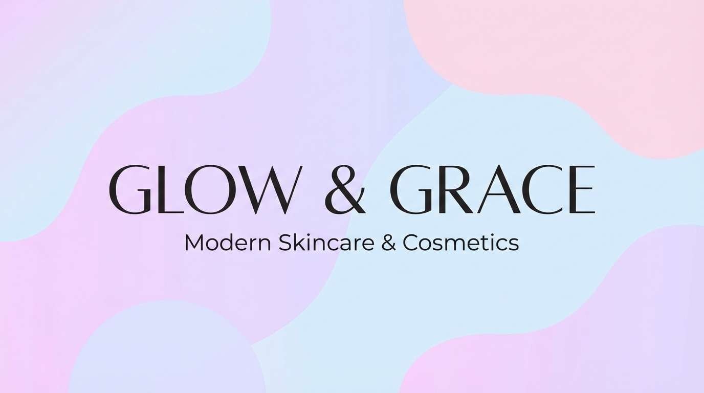
Create Light Palette Visuals with AI
If you already have HEX codes but need mockups, posters, or UI-style examples, AI image generation is a fast way to visualize how a light color palette behaves in real compositions. You can also iterate quickly by swapping one accent color and keeping everything else consistent.
With Media.io, you can paste a prompt, define your dominant tones, and generate clean, on-brand visuals for social graphics, packaging concepts, landing pages, and more—without complex design setup.
Light Color Palette FAQs
-
What is a light color palette?
A light color palette is a set of high-value (bright) colors—often pastels and soft neutrals—designed to create an airy, minimal look for UI, branding, or print layouts. -
Are light color palettes good for websites and apps?
Yes. Light palettes can improve perceived cleanliness and readability, especially when paired with a dark text color and clear spacing. The key is maintaining accessible contrast for small UI labels and buttons. -
How do I keep a light palette from looking washed out?
Add a dark anchor (navy/charcoal/espresso) and one mid-tone accent for emphasis. Also use subtle elevation (shadows) or gentle dividers to separate sections. -
What text color works best on light backgrounds?
Deep charcoal or slate is usually better than pure black for large text areas, because it feels softer while still providing strong contrast on pastel or off-white backgrounds. -
How many colors should I use in a light scheme?
For most projects, 3–5 colors is enough: 1 background, 1 surface tint, 1–2 supporting tints, and 1 accent. Too many pastels at once can reduce clarity. -
What industries benefit most from light color palettes?
Wellness, skincare, lifestyle, weddings, education, and SaaS brands often use light palettes to communicate calmness, trust, and modern simplicity. -
Can I generate light palette design examples with AI?
Yes. Use a text-to-image tool and specify your HEX colors in the prompt (dominant + accents), along with the design type (UI mockup, invitation, poster) and aspect ratio.
Next: Gaming Color Palette


