Lavender and pink sit right between romantic blush and gentle violet, making it one of the easiest hues to style across modern branding, UI, and event design.
Below are 20 curated lavender and pink combinations with HEX codes, plus practical ways to pair them with neutrals, dark anchors, and complementary accents.
In this article
- Why Lavender and Pink Combinations Work So Well
-
- blush lilac mist
- rose quartz latte
- orchid dusk
- cotton candy wedding
- peony and sage
- soft ballet core
- berry macarons
- mauve minimalism
- spring ribbon
- plum velvet
- frosted lilac
- antique bouquet
- neon lilac pop
- dusty rose clay
- grape sorbet
- heather sunrise
- champagne mauve
- lilac ink
- sakura twilight
- porcelain blush
- What Colors Go Well with Lavender Pink?
- How to Use a Lavender Pink Color Combination in Real Designs
- Create Lavender Pink Palette Visuals with AI
Why Lavender and Pink Combinations Work So Well
Lavender pink blends warmth (pink) with a cool, calming undertone (lavender), so it feels soft without being childish and romantic without being overly sweet. That balance makes it versatile for everything from wedding stationery to product UI.
It also pairs naturally with both light and dark supports. Creamy whites and pale blushes create airy layouts, while plum, aubergine, and inky purples add contrast for legible typography and premium depth.
Finally, lavender and pink photograph well and flatters materials like satin, glass, cosmetics packaging, and paper—ideal for brands that rely on lifestyle visuals and polished marketing assets.
20 Lavender Pink Color Combinations (with HEX Codes)
1) Blush Lilac Mist
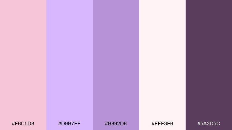
HEX: #F6C5D8 #D9B7FF #B892D6 #FFF3F6 #5A3D5C
Mood: dreamy and weightless
Best for: UI onboarding screens
Dreamy and weightless, these lavender and pink tones feel like soft fog at sunrise with a hint of berry. Use the pale blush and airy lilac for large surfaces, then anchor buttons and headlines with the deep plum. It works beautifully for gentle, welcoming onboarding flows in wellness, beauty, or lifestyle apps. Tip: keep contrast accessible by pairing the darkest shade with the lightest background for primary CTAs.
Image example of blush lilac mist generated using media.io

Media.io is an online AI studio for creating and editing video, image, and audio in your browser.

2) Rose Quartz Latte
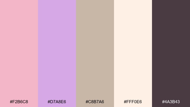
HEX: #F2B6C8 #D7A8E6 #C8B7A6 #FFF0E6 #4A3B43
Mood: cozy and romantic
Best for: cafe branding logo and menu
Cozy and romantic, this lavender pink color palette evokes steamed milk, sugared petals, and a warm afternoon glow. For cafe branding, set the creamy tone as your base, then use rose and lavender for highlights and section headers. The espresso-like shade keeps type crisp on menus and signage. If you want lavender pink color combinations that still feel grounded, keep the beige as the bridge between sweet pastels and dark text.
Image example of rose quartz latte generated using media.io

3) Orchid Dusk
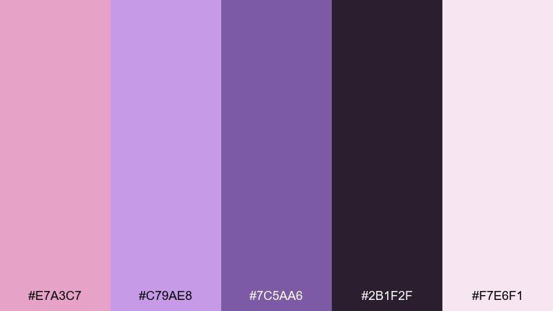
HEX: #E7A3C7 #C79AE8 #7C5AA6 #2B1F2F #F7E6F1
Mood: moody and electric
Best for: night event poster
Moody and electric, it feels like city lights reflecting off satin fabric at dusk. Let the near-black base handle the background, then layer orchid and lilac for typography that pops without turning neon. This set shines on posters, club flyers, and announcement graphics where you need drama with polish. Tip: add a soft glow effect around the light pink to boost readability on the dark field.
Image example of orchid dusk generated using media.io

4) Cotton Candy Wedding

HEX: #F9C6D8 #E8C2FF #C6A6D9 #FFF7FB #8A6B85
Mood: soft and celebratory
Best for: wedding invitation suite
Soft and celebratory, these lavender and pink combinations bring to mind tulle, floating ribbons, and confetti in gentle pastels. Use the airy off-white for paper or background, then print names in the muted plum for elegance. The blush and lilac work best as borders, monograms, or floral line art details. For a lavender pink color palette that stays refined, keep saturation low and rely on texture like embossing or foil for extra depth.
Image example of cotton candy wedding generated using media.io

5) Peony and Sage

HEX: #F3B5C9 #D9B8FF #A6C7B3 #FFF4F8 #3E3A44
Mood: fresh and garden-like
Best for: botanical watercolor art print
Fresh and garden-like, it feels like peony petals against cool green leaves after rain. Let the blush and lilac paint the blooms, then use sage to balance the sweetness and keep it natural. It works especially well for spring art prints, packaging illustrations, and gentle brand patterns. Tip: keep outlines in charcoal instead of pure black for a softer, handcrafted finish.
Image example of peony and sage generated using media.io

6) Soft Ballet Core
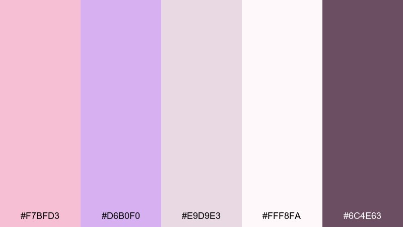
HEX: #F7BFD3 #D6B0F0 #E9D9E3 #FFF8FA #6C4E63
Mood: graceful and powdery
Best for: fashion lookbook editorial spread
Graceful and powdery, this pink and lavender color scheme recalls ballet slippers, satin ribbons, and softly lit dressing rooms. Use the warm gray-mauve as the supporting neutral, then reserve the deeper plum for headings and page numbers. The pale blush and off-white keep product photography feeling high-end without fighting skin tones. Tip: maintain plenty of whitespace so the pastel accents read intentional rather than overly sweet.
Image example of soft ballet core generated using media.io

7) Berry Macarons
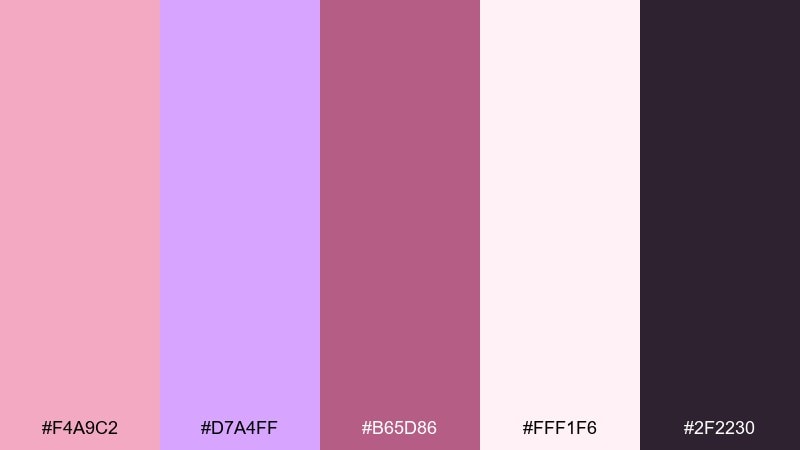
HEX: #F4A9C2 #D7A4FF #B65D86 #FFF1F6 #2F2230
Mood: playful and sweet
Best for: bakery packaging
Playful and sweet, it instantly suggests berry filling, glossy icing, and a pastel pastry box. Use the pale cream as the carton base, then bring in punchy magenta for flavor labels and seals. The dark plum gives you clean legibility for ingredients and barcodes without feeling harsh. For lavender pink color combinations in food branding, keep the bold shade limited to small areas so the overall look stays deliciously light.
Image example of berry macarons generated using media.io

8) Mauve Minimalism

HEX: #EFB7CC #CDB2E9 #B9A0B3 #F7F2F6 #2E2431
Mood: calm and modern
Best for: app dashboard UI
Calm and modern, these muted tones feel like brushed fabric and quiet focus. Use the near-white for the canvas, then apply mauve and lilac as subtle chart fills, tags, and selected states. The deep aubergine works well for navigation and key metrics to maintain clarity. Tip: keep borders very light and rely on spacing and typography to preserve the minimalist vibe.
Image example of mauve minimalism generated using media.io

9) Spring Ribbon

HEX: #F8B9D0 #E3C0FF #FFD6E7 #FFF9FC #6E5A72
Mood: cheerful and airy
Best for: baby shower flyer
Cheerful and airy, the pink and lavender combination feels like curled ribbons and tissue paper in a sunlit room. Use the clean off-white to keep the flyer readable, then bring in blush and lilac for headers and decorative shapes. The soft rose tint is perfect for background blocks behind details like date and location. Tip: pair it with rounded sans-serif type to reinforce the friendly, welcoming tone.
Image example of spring ribbon generated using media.io

10) Plum Velvet
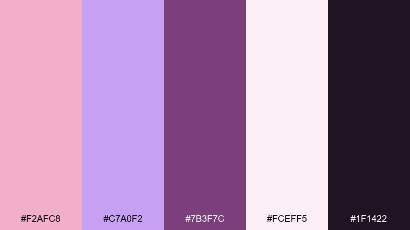
HEX: #F2AFC8 #C7A0F2 #7B3F7C #FCEFF5 #1F1422
Mood: luxurious and dramatic
Best for: luxury skincare product ad
Luxurious and dramatic, it evokes velvet curtains, glossy glass, and rich evening light. Set the background in deep near-black, then let the plum and lavender carry the premium feel in gradients and highlights. The pale blush is ideal for soft reflections and copy blocks without losing the moody atmosphere. For a lavender pink color palette in high-end ads, use the darkest shade for negative space and keep the pinks concentrated on the product glow.
Image example of plum velvet generated using media.io

11) Frosted Lilac

HEX: #F6B8D3 #DABEFF #BFA7D6 #FFFFFF #60425E
Mood: clean and uplifting
Best for: instagram story templates
Clean and uplifting, it looks like frosting swirls and translucent crystals. Build templates with white as the base, then use lilac panels for polls, links, and highlights. The muted purple keeps text and icons readable while still feeling soft. Tip: limit overlays to one or two per slide so stories stay crisp and easy to scan.
Image example of frosted lilac generated using media.io

12) Antique Bouquet

HEX: #EFB3C6 #CFAFE3 #D8C6BF #FDF4F1 #4D3C46
Mood: vintage and tender
Best for: vintage stationery set
Vintage and tender, these shades resemble pressed flowers and timeworn paper. Use the warm cream for stationery stock, then print details in the deep brown-plum for a classic look. The dusty blush and lilac are perfect for borders, seals, or subtle patterning. Tip: add a light grain texture so the palette feels authentically antique rather than overly polished.
Image example of antique bouquet generated using media.io

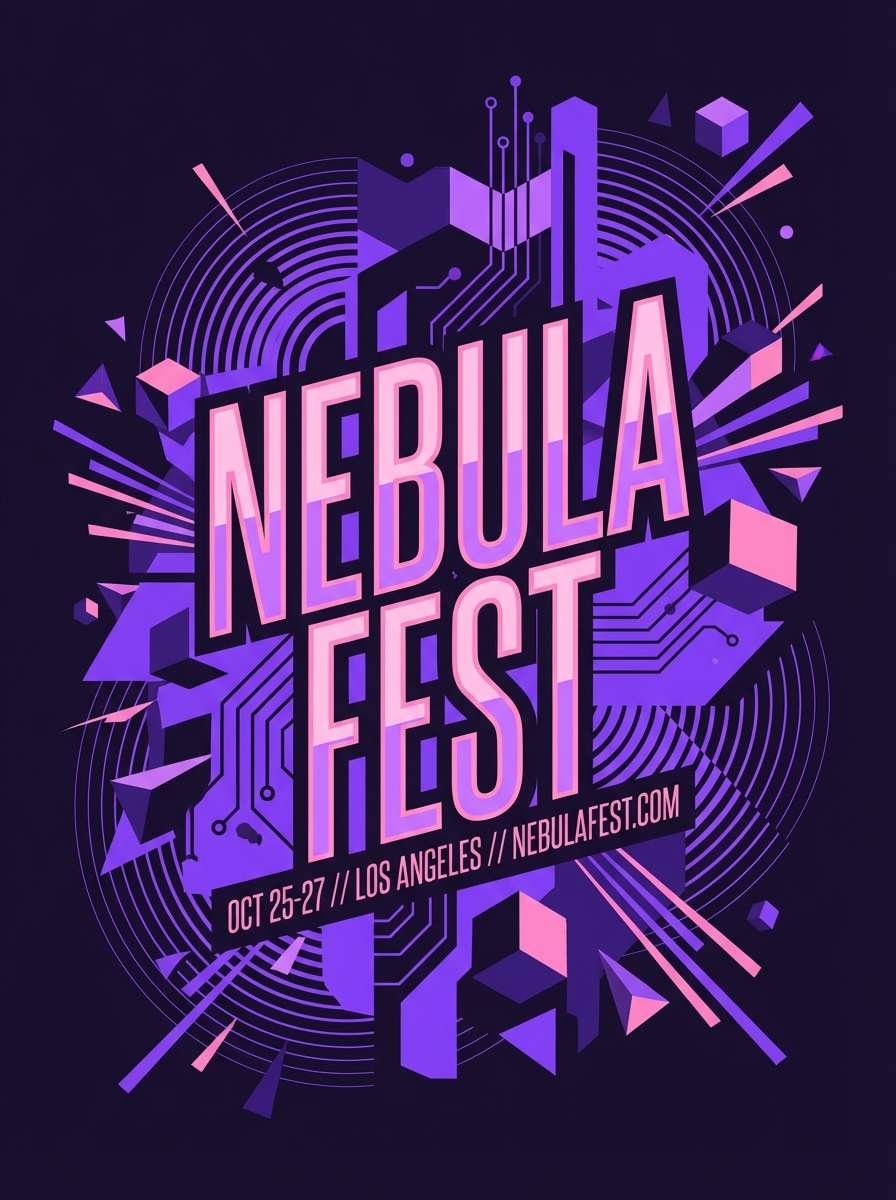
13) Neon Lilac Pop

HEX: #FF9EC9 #D38BFF #8F4DFF #FFF0F8 #1A0F2B
Mood: bold and energetic
Best for: music festival poster
Bold and energetic, it feels like stage lights cutting through haze with a sweet punch. Let the midnight shade dominate the background so the bright pink and violet can do the shouting. This pink lavender mix works best for festival posters, DJ promos, and merch graphics that need instant attention. Tip: use the light blush only as breathing room around key text so the neon accents stay powerful.
Image example of neon lilac pop generated using media.io
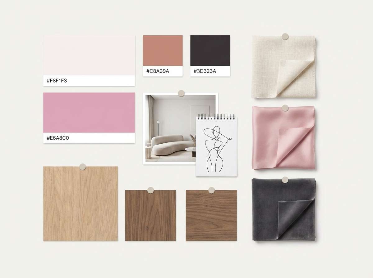
14) Dusty Rose Clay
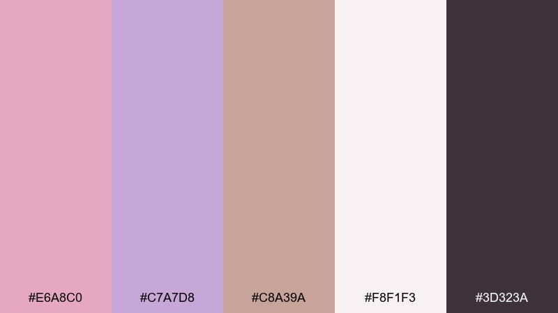
HEX: #E6A8C0 #C7A7D8 #C8A39A #F8F1F3 #3D323A
Mood: earthy and calm
Best for: interior paint mood board
Earthy and calm, it suggests clay walls, dried petals, and linen in soft daylight. Use the warm off-white for walls and broad surfaces, then bring dusty rose and lilac into textiles like cushions or curtains. The clay tone bridges pink and neutral, making it easy to pair with wood and brass. Tip: test the deeper charcoal on trim or metal fixtures to keep the room feeling defined.
Image example of dusty rose clay generated using media.io
15) Grape Sorbet
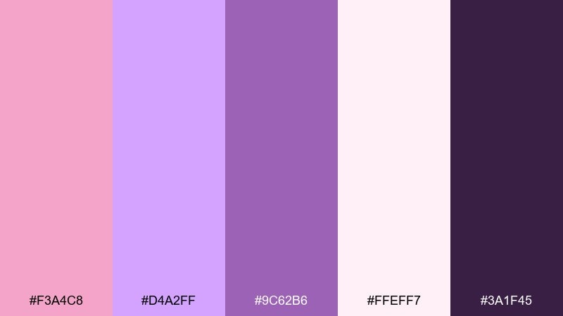
HEX: #F3A4C8 #D4A2FF #9C62B6 #FFEFF7 #3A1F45
Mood: juicy and fun
Best for: gelato brand identity
Juicy and fun, this lavender and pink combination looks like a scoop of sorbet melting into a swirl of berry syrup. Use the light blush as the base for cups and labels, then push the brand personality with the saturated purple. The deeper grape shade is perfect for logos and flavor names when you want strong shelf readability. Tip: keep gradients subtle so the identity stays clean and printable across packaging.
Image example of grape sorbet generated using media.io

16) Heather Sunrise

HEX: #F7B3CC #E0B8FF #BFD0E6 #FFF6FA #4B3A57
Mood: gentle and hopeful
Best for: wellness app splash screen
Gentle and hopeful, it evokes early morning skies with a soft heather haze. Use the near-white as the background, then blend blush and lilac in a subtle gradient behind your logo. The cool blue-gray adds a modern, calming counterbalance that fits wellness and meditation products. Tip: keep your primary button in the darkest shade to stay readable over the pastel gradient.
Image example of heather sunrise generated using media.io

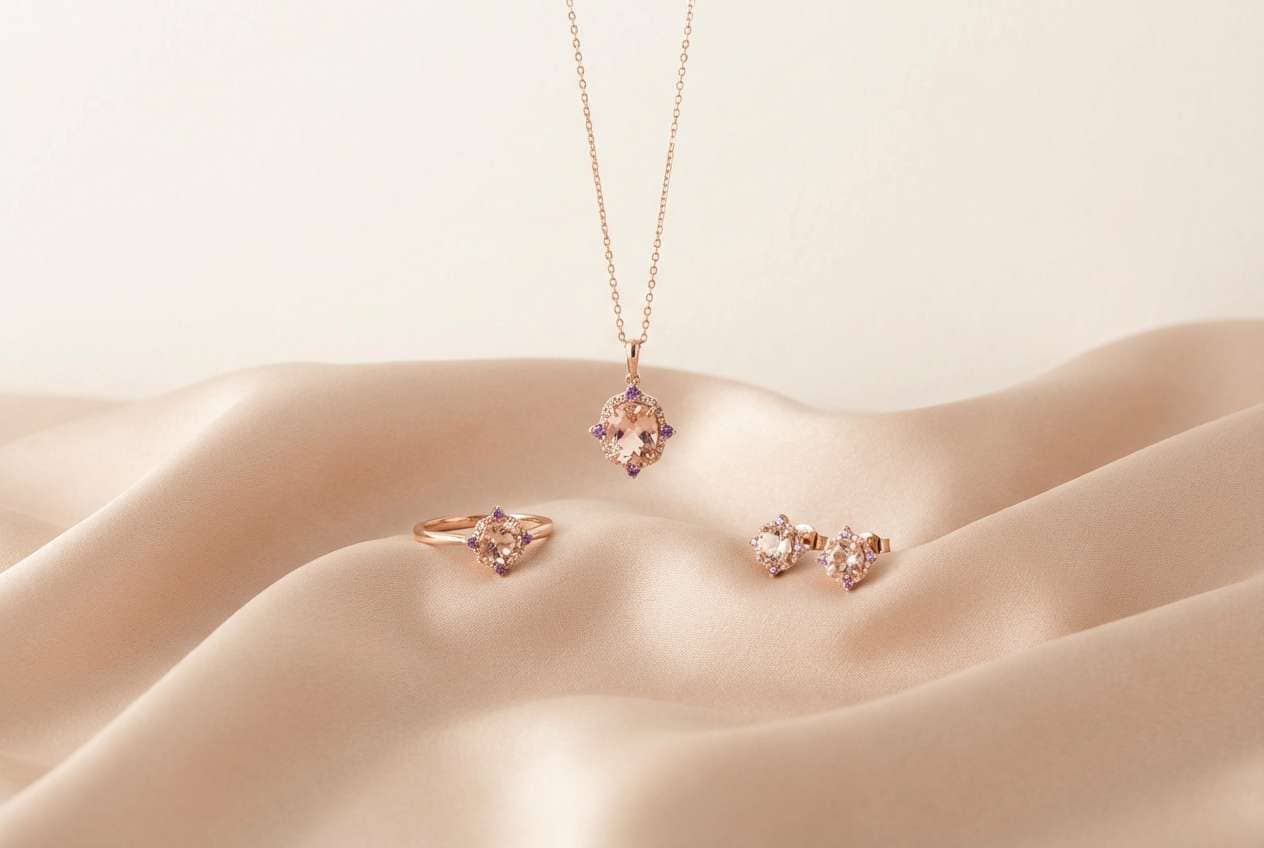
17) Champagne Mauve
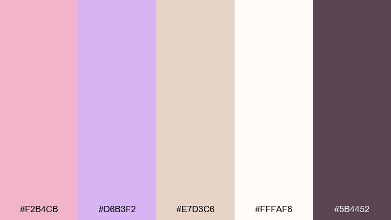
HEX: #F2B4CB #D6B3F2 #E7D3C6 #FFFAF8 #5B4452
Mood: elegant and luminous
Best for: jewelry product photography
Elegant and luminous, this lavender pink color palette feels like champagne shimmer against satin and soft candlelight. Use the creamy highlight as the background to flatter metals, then bring mauve into props or subtle gradients behind the product. The deeper plum is ideal for price tags and small type that must remain crisp. Tip: keep reflections warm and controlled so the palette reads premium rather than sugary.
Image example of champagne mauve generated using media.io
18) Lilac Ink

HEX: #F0B2CD #C9B0FF #9C7BC9 #F6F0F8 #251A2E
Mood: poetic and refined
Best for: book cover design
Poetic and refined, these lavender and pink combinations suggest violet ink on creamy pages with a romantic undertone. Use the off-white for the main cover field, then set the title in the deep inky shade for strong contrast. Lilac and mauve are great for illustrated motifs, gradients, or genre cues like romance or contemporary fiction. Tip: keep the mid-purple for secondary text so the hierarchy remains clear.
Image example of lilac ink generated using media.io

19) Sakura Twilight
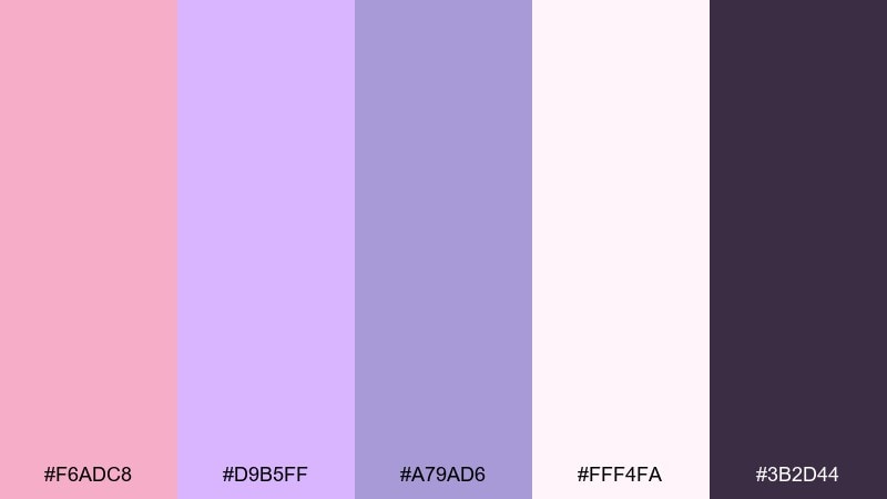
HEX: #F6ADC8 #D9B5FF #A79AD6 #FFF4FA #3B2D44
Mood: romantic and serene
Best for: spring social banner
Romantic and serene, it feels like cherry blossoms fading into a cool evening sky. Use the pale base to keep the banner fresh, then layer lavender and blush in soft shapes behind key messaging. The mid-tone purple supports icons and dividers without stealing attention. Tip: choose one dominant pastel per banner and keep the other as a supporting accent for a cleaner scroll-stopping look.
Image example of sakura twilight generated using media.io

20) Porcelain Blush
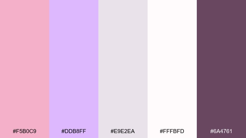
HEX: #F5B0C9 #DDB8FF #E9E2EA #FFFBFD #6A4761
Mood: delicate and polished
Best for: bridal makeup palette ad
Delicate and polished, it brings to mind porcelain powder, soft blush, and elegant vanity lighting. Use the near-white as your backdrop for a clean cosmetics feel, then add lavender and rose as shadow washes behind product shots. The deep mauve is perfect for shade names and fine print that needs to stay readable. Tip: keep product textures matte or satin so the pastel tones remain true and not overly reflective.
Image example of porcelain blush generated using media.io

What Colors Go Well with Lavender Pink?
Lavender pink pairs effortlessly with soft neutrals like warm white, cream, and blush-beige when you want a light, airy look. These combinations are popular for weddings, skincare branding, and gentle editorial layouts.
For contrast and readability, add deep anchors like plum, aubergine, charcoal, or inky violet. This keeps UI and print typography crisp while still staying within a romantic, cohesive palette.
If you want a fresher twist, introduce a balancing accent such as sage green, blue-gray, or muted periwinkle. These cooler notes reduce sweetness and help lavender pink feel more modern.
How to Use a Lavender Pink Color Combination in Real Designs
Start with a clear role for each shade: a light base (backgrounds), a mid-tone (sections, cards, fills), and a dark anchor (text, icons, CTAs). Lavender pink works best when it’s supported by structure and hierarchy.
In branding and packaging, keep the boldest pinks for small focal points like seals, flavor tags, or callouts, and let off-whites carry most of the surface area. This reads premium instead of overpowering.
For UI, prioritize accessibility by testing contrast between your darkest shade and your lightest background. If needed, reserve plum/ink tones for primary buttons and key navigation elements.
Create Lavender Pink Palette Visuals with AI
If you’re building a mood board, poster, or UI concept, turning a palette into realistic visuals is often the fastest way to validate the vibe. With AI image generation, you can prototype multiple directions without a full photoshoot or long design sprint.
Use your chosen HEX colors as “dominant” and “accent” notes in prompts, then specify layout type (poster, packaging, UI), lighting style, and aspect ratio. Small prompt tweaks can quickly move the result from soft bridal to bold nightlife.
Lavender Pink Color Palette FAQs
-
What is the HEX code for lavender pink?
Lavender pink isn’t a single fixed HEX value, but common lavender-pink tones in this guide include #F6C5D8, #F2B6C8, and #F5B0C9. Choose a lighter blush-lavender for backgrounds and a deeper plum for contrast. -
Is lavender pink better as a primary brand color or an accent?
It can be either. For wellness, beauty, and lifestyle brands, lavender pink works well as a primary color when paired with off-white and a dark plum for typography. For more corporate products, it often performs best as an accent color in UI states, highlights, or packaging details. -
What colors go with lavender pink for a modern look?
Try pairing lavender pink with charcoal, deep aubergine, blue-gray, and soft warm whites. These anchors keep the palette clean and contemporary while letting the pink feel intentional rather than sugary. -
What colors go with lavender pink for weddings?
Off-white or ivory, muted plum/mauve for text, and soft lilac are classic wedding pairings. Add subtle metallics (champagne tones) through paper texture, foil, or decor to elevate the look. -
How do I keep lavender pink UI accessible?
Use the darkest shade in your palette (plum/ink) for primary text and CTAs on the lightest background, and avoid setting light pink text on white. Always check contrast ratios, especially for buttons and small labels. -
What’s a good contrasting accent for lavender pink?
Sage green is a popular contrasting accent because it balances the warmth of pink with a natural, calming feel. Blue-gray also works well when you want a cooler, more minimal aesthetic. -
Can I generate palette-based images for marketing quickly?
Yes. Use Media.io text-to-image and include your lavender pink HEX colors as dominant and accent tones in the prompt, plus details like “studio lighting,” “minimal layout,” or “poster typography” to match your use case.