

Lake colors sit in that sweet spot between blue and green, so they feel calm, fresh, and modern across digital and print designs.
Below are 20 lake color palette combinations with HEX codes, plus practical tips for UI, branding, packaging, and more.
In this article
Why Lake Palettes Work So Well
Lake-inspired palettes feel naturally balanced because they combine cool blues (trust, clarity) with green-leaning teals (health, calm). That mix reads clean without feeling sterile, making it easy to use in modern UI and branding.
They also scale well across light and dark design systems. Many lake palettes include soft misty tints for backgrounds and deep blue-greens for contrast, so you can build hierarchy without harsh black.
Finally, lake tones pair beautifully with neutrals and warm accents. A touch of sand, copper, or gold can add personality while the water tones keep the overall look steady and professional.
20+ Lake Color Palette Ideas (with HEX Codes)
1) Misty Morning
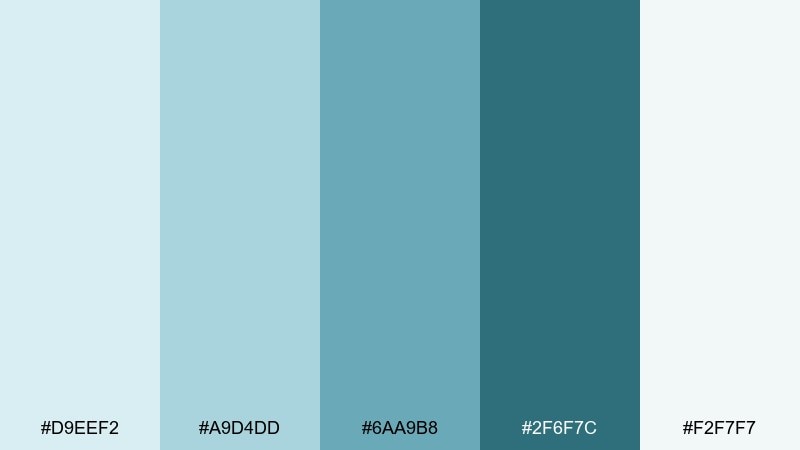
HEX: #d9eef2 #a9d4dd #6aa9b8 #2f6f7c #f2f7f7
Mood: airy and calm
Best for: minimal saas dashboard ui
Airy mist and early light come through in these cool aquas and softened teals. It works beautifully for SaaS dashboards, wellness apps, and clean data views where clarity matters. Pair it with crisp white space and a single dark teal for emphasis. Usage tip: reserve the deepest tone for primary CTAs to keep contrast accessible.
Image example of misty morning generated using media.io

Media.io is an online AI studio for creating and editing video, image, and audio in your browser.

2) Deep Cove

HEX: #0b1f2a #0f3a4a #145e6f #1c8a9a #d4e9ea
Mood: moody and cinematic
Best for: premium branding and hero banners
Dark water at dusk sets a confident, cinematic tone with inky blues and saturated teal. Use it for premium branding, landing page heroes, or tech products that need depth and authority. Balance the heavy base with the pale blue-green as breathing room for headlines. Usage tip: add subtle gradients between the mid teals to create a polished, modern glow.
Image example of deep cove generated using media.io

3) Pebble Shore
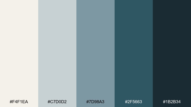
HEX: #f4f1ea #c7d0d2 #7d98a3 #2f5663 #1b2b34
Mood: grounded and quiet
Best for: editorial layouts and blogs
Worn stones and cool shoreline air give this mix a grounded, understated feel. For editorial layouts, it reads sophisticated without looking cold, especially when the cream tone leads. As a lake color palette, it shines in long-form pages where you want calm hierarchy and readable contrast. Usage tip: keep body text in the near-black and use the blue-gray for section dividers and pull quotes.
Image example of pebble shore generated using media.io
4) Pine Reflection
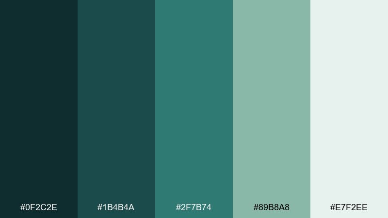
HEX: #0f2c2e #1b4b4a #2f7b74 #89b8a8 #e7f2ee
Mood: fresh and outdoorsy
Best for: eco packaging and natural brands
Evergreen reflections and cool shade bring a crisp, outdoorsy energy. It is ideal for eco packaging, outdoor gear, and sustainable skincare where greens must feel clean, not loud. Pair the deep forest tones with warm uncoated paper textures for a premium natural look. Usage tip: print the darkest shades as small blocks or icons to avoid over-inking on kraft stock.
Image example of pine reflection generated using media.io
5) Sunset Dock

HEX: #1d2b44 #2a5c73 #4aa3a2 #f0c28f #f6f3ea
Mood: welcoming and nostalgic
Best for: travel ads and social graphics
Warm evening light over cool water creates a welcoming, nostalgic mood. The sand accent keeps the blues from feeling too corporate, making it great for travel ads and lifestyle social posts. Pair it with airy photography and simple sans-serif type to keep the mood effortless. Usage tip: let the peachy highlight appear sparingly on buttons or price tags for instant focus.
Image example of sunset dock generated using media.io
6) Waterlily Pastel

HEX: #f7f5fb #cfe8f5 #9dc7dd #6aa2b8 #3d6a7a
Mood: soft and romantic
Best for: baby shower invitations and stationery
Powdery blues and gentle slate feel like petals floating on still water. These lake color combinations suit baby shower invitations, bridal stationery, and delicate packaging where you want calm elegance. Pair with a light serif and plenty of margin so the pastels do not crowd the page. Usage tip: use the darkest blue for names and key details to keep printing crisp.
Image example of waterlily pastel generated using media.io

7) Stormy Basin

HEX: #1b2a33 #2f4b57 #4e7583 #7fa7b1 #e3ecee
Mood: cool and serious
Best for: reports, presentations, and infographics
Overcast skies and rippled water give these blues a serious, steady presence. It is a strong fit for reports, slide decks, and infographics where you need structure without harsh contrast. Pair the medium blue-grays with thin line icons for a professional finish. Usage tip: keep charts readable by using the lightest tone as the canvas and the darkest as labels.
Image example of stormy basin generated using media.io
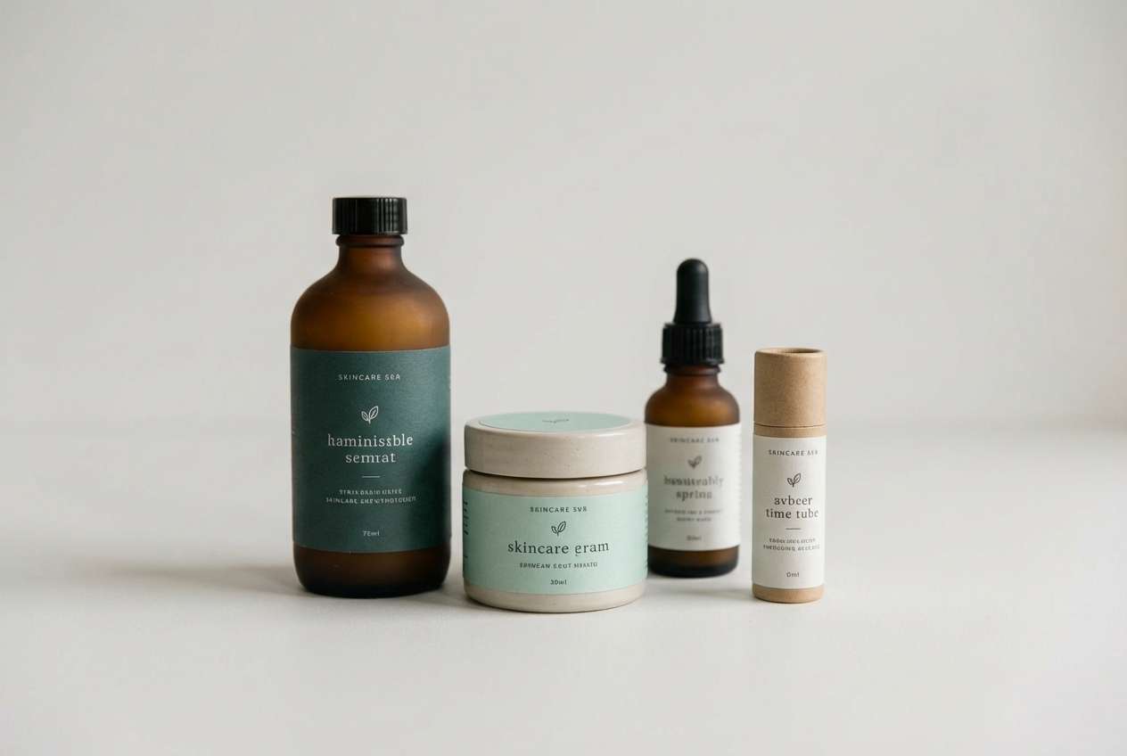
8) Clear Spring

HEX: #e8fbff #bfeaf2 #77c6d5 #2a8fa4 #0f5162
Mood: bright and refreshing
Best for: fitness apps and splash screens
Cold, clear water and sunlit shallows make this set feel bright and energizing. It works especially well for fitness apps, onboarding flows, and splash screens that should feel clean and active. Pair it with bold geometric shapes and a deep teal navigation bar for stability. Usage tip: use the lightest aqua as the main background to keep the interface feeling weightless.
Image example of clear spring generated using media.io
9) Marina Night

HEX: #08131d #0f2a3b #1c4c66 #2d7aa0 #9fd2e3
Mood: sleek and modern
Best for: dark mode ui and analytics
Late-night marina lights bring a sleek, high-contrast vibe without going full black. It is perfect for dark mode analytics, finance tools, and developer dashboards where focus matters. Pair the bright blue as a highlight color for active states and links. Usage tip: keep large surfaces in the two darkest tones to reduce glare and make data pops feel intentional.
Image example of marina night generated using media.io
10) Alpine Lake

HEX: #f2f9ff #b4d8ef #5aa7d6 #246a96 #123c58
Mood: crisp and adventurous
Best for: outdoor brands and web headers
High-altitude air and glacial blues make this palette feel crisp and adventurous. Use it for outdoor brands, web headers, and event graphics where you want clarity and momentum. Pair it with sharp photography and minimal iconography for a modern explorer look. Usage tip: set gradients from sky blue to deep blue for large banners so the transition feels natural.
Image example of alpine lake generated using media.io

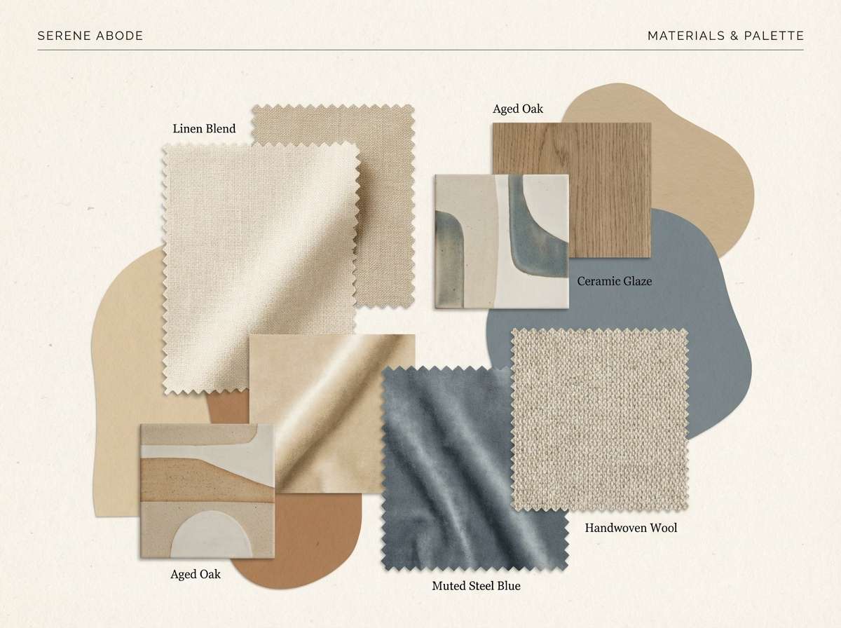
11) Driftwood Neutral
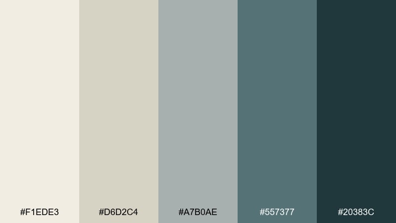
HEX: #f1ede3 #d6d2c4 #a7b0ae #557377 #20383c
Mood: warm and balanced
Best for: interior mood boards and blogs
Sun-bleached wood and soft water tones create a warm, balanced mix. It is ideal for interior mood boards, lifestyle blogs, and calm ecommerce pages that need a neutral base. Pair it with natural materials like linen textures and muted photography. Usage tip: treat the blue-gray as the anchor color for headings so the warm neutrals stay airy.
Image example of driftwood neutral generated using media.io
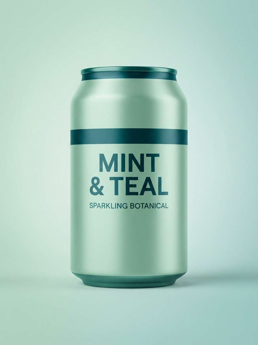
12) Glassy Teal

HEX: #e9fffb #b7f0e7 #5fd1c3 #1aa59a #0a5b5a
Mood: clean and playful
Best for: beauty promos and modern packaging
Glassy surface water and bright minty teal make this mix feel clean, playful, and modern. As a lake color palette, it works for beauty promos, drink labels, and startup branding that needs freshness without neon. Pair it with simple black or deep teal typography for a sharp, editorial contrast. Usage tip: keep the light mint as the background and use the saturated teal for stickers or seals.
Image example of glassy teal generated using media.io
13) Sailcloth Blue

HEX: #f7fafc #d0e4f3 #86b6d8 #3a78a6 #1f3d5a
Mood: nautical and tidy
Best for: corporate websites and navigation
Crisp sailcloth whites and dependable blues create a tidy, trustworthy impression. It fits corporate websites, navigation-heavy apps, and service brands that need clarity and calm. Pair it with thin strokes, clear spacing, and simple icons for a polished UI. Usage tip: use the mid blue for links and the deep navy for headers to keep hierarchy obvious.
Image example of sailcloth blue generated using media.io

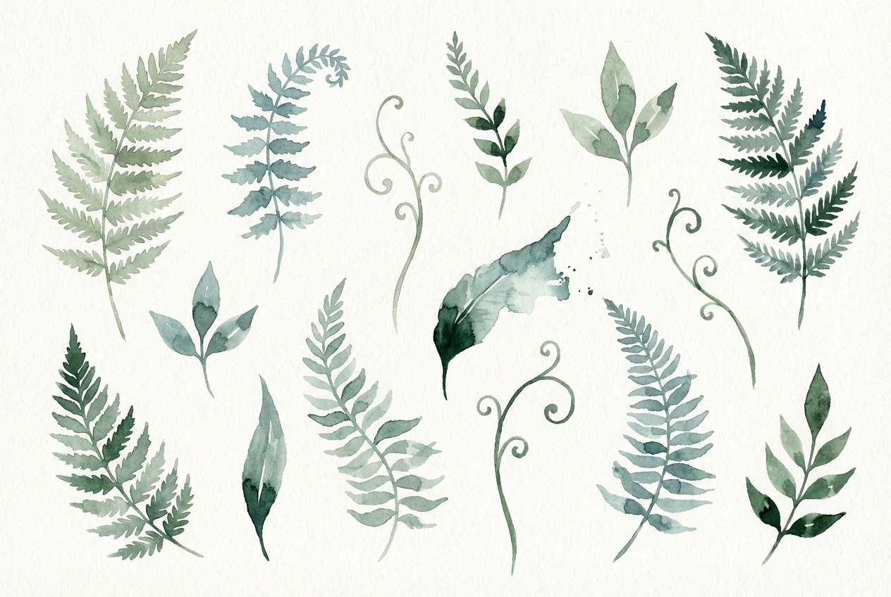
14) Ferny Banks

HEX: #eaf4ee #bcd7c8 #6fa893 #2f6b5c #163a33
Mood: earthy and restorative
Best for: botanical illustrations and labels
Shaded ferns along the waterline give these greens a restorative, natural calm. It is a great fit for botanical illustrations, garden labels, and slow-living brands. Pair it with off-white paper tones and delicate line drawings for an artisan feel. Usage tip: keep the darkest green for outlines so the mid greens can stay soft and organic.
Image example of ferny banks generated using media.io
15) Copper Buoy

HEX: #102a3a #1b5a6c #2ea3a9 #d08a5a #f1e2d2
Mood: bold and contemporary
Best for: event posters and music flyers
Cool blue-green water with a copper pop feels bold, contemporary, and a bit industrial. It is strong for event posters, music flyers, and creative studio branding where you want contrast that still looks refined. Pair it with condensed typography and large color blocks to lean into the graphic energy. Usage tip: use the copper as a single accent shape or date badge so it stays punchy.
Image example of copper buoy generated using media.io

16) Snowmelt

HEX: #fbfeff #dff3ff #a5d7f5 #4f9ecb #205b7a
Mood: light and optimistic
Best for: healthcare sites and onboarding
Fresh snowmelt and bright daylight make these blues feel light, optimistic, and hygienic. They are a natural match for healthcare sites, onboarding flows, and service apps that must feel reassuring. Pair with soft rounded shapes and clear iconography for a friendly tone. Usage tip: keep the medium blue for interactive states and avoid using it as body text on light backgrounds.
Image example of snowmelt generated using media.io

17) Indigo Depths

HEX: #0b1020 #1a2340 #2c3f6d #4a6bb0 #c9d3f2
Mood: thoughtful and dramatic
Best for: creative portfolios and case studies
Deep indigo layers feel thoughtful, dramatic, and slightly mysterious. It works well for creative portfolios, case study pages, and product storytelling where you want spotlight-like contrast. Pair it with plenty of whitespace and a single periwinkle accent for links. Usage tip: apply the light lavender as section backgrounds to keep the dark tones from feeling heavy.
Image example of indigo depths generated using media.io

18) Golden Reeds
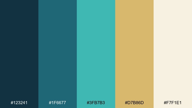
HEX: #123241 #1f6677 #3fb7b3 #d7b86d #f7f1e1
Mood: sunlit and natural
Best for: restaurant menus and hospitality
Sunlit reeds and clear water bring a natural warmth to cool teal tones. These lake color combinations are great for hospitality branding, restaurant menus, and boutique hotels that want relaxed polish. Pair the gold with textured paper or subtle grain to amplify the organic feel. Usage tip: use teal for headings and the gold for highlights like icons, specials, or section markers.
Image example of golden reeds generated using media.io

19) Urban Lakeside
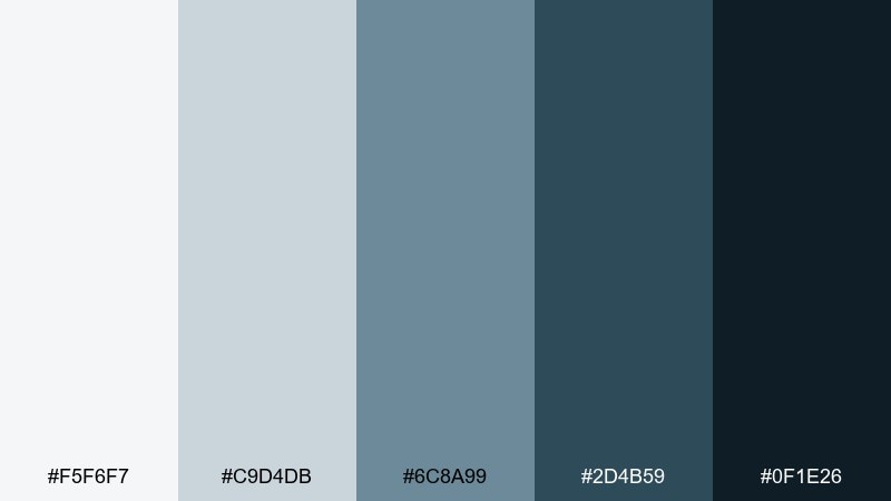
HEX: #f5f6f7 #c9d4db #6c8a99 #2d4b59 #0f1e26
Mood: modern and pragmatic
Best for: app ui kits and design systems
Concrete paths and cool water tones give this set a modern, pragmatic edge. It is ideal for UI kits and design systems where neutral blues must stay flexible across components. Pair it with strict spacing and a single brighter accent from your brand to avoid a flat look. Usage tip: build states by stepping through the gray-blue ramp for hover, active, and disabled elements.
Image example of urban lakeside generated using media.io

20) Quiet Lagoon
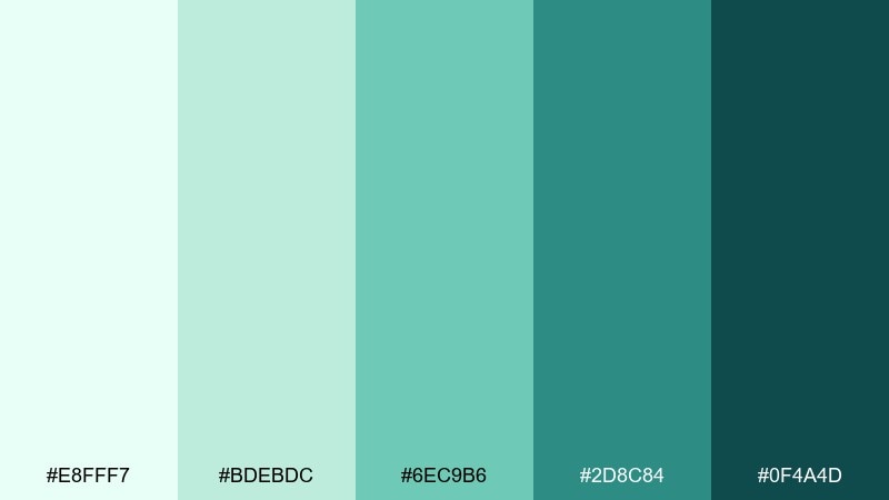
HEX: #e8fff7 #bdebdc #6ec9b6 #2d8c84 #0f4a4d
Mood: peaceful and spa-like
Best for: wellness branding and landing pages
A quiet lagoon mood comes through as peaceful, spa-like, and gently uplifting. It is perfect for wellness branding, meditation landing pages, and clean ecommerce sections. Pair it with soft photography, rounded corners, and light serif headings for a calming premium feel. Usage tip: keep contrast high by using the deep teal for text on the mint background.
Image example of quiet lagoon generated using media.io

What Colors Go Well with Lake?
Lake tones (teal, aqua, blue-green, and deep blue) pair especially well with clean neutrals like white, cream, soft gray, and charcoal. Neutrals help the water shades feel airy and readable, particularly in UI and editorial layouts.
If you want more personality, add a warm contrast: sand, peach, copper, or soft gold. A single warm accent can make a lake palette feel more human and less “corporate,” while still staying polished.
For a nature-forward direction, combine lake blues with muted greens (sage, fern, pine) and paper-like off-whites. This keeps the palette organic and works well for packaging and eco branding.
How to Use a Lake Color Palette in Real Designs
Start with roles, not just colors: use the lightest tint as background, a mid-tone for secondary surfaces, and the darkest tone for text and strong UI elements. This makes the palette usable across components without guessing.
For branding, keep one “signature” lake color (often a saturated teal) and let the rest support it with softer tints and deep anchors. This improves consistency across social posts, landing pages, and print pieces.
In print, watch contrast and ink density: deep teals can print heavy on uncoated stock. Use dark tones for small elements (icons, rules, headings) and keep large areas in lighter aquas or neutrals for a cleaner finish.
Create Lake Palette Visuals with AI
If you already have HEX codes, you can turn them into on-brand visuals fast by generating mockups: dashboards, posters, packaging, menus, and landing pages. The key is describing the layout plus the dominant palette mood (misty, deep, minty, or stormy).
Try reusing the prompts above and swapping the use case (for example, “mobile onboarding screens” to “website hero banner”) while keeping the same lake tones. This helps you explore multiple styles without losing color consistency.
When you like a result, generate a few variations with different lighting, typography, or composition. You will quickly land on a cohesive set of assets for your design system or campaign.
Lake Color Palette FAQs
-
What is a lake color palette?
A lake color palette is a set of colors inspired by water and shoreline tones—typically aqua, teal, blue-green, navy, and soft neutrals—chosen to create a calm, fresh, modern look. -
Are lake colors more blue or green?
They sit between both. Many lake palettes lean teal (blue-green), with lighter aqua tints for backgrounds and deeper blue/navy shades for contrast and readability. -
What accent colors work best with teal and lake blue?
Warm accents like sand, peach, copper, and muted gold work especially well. They add focal points (buttons, badges, prices) without overpowering the calm water tones. -
Do lake palettes work for dark mode UI?
Yes. Choose two deep tones for surfaces, one brighter blue for active states/links, and one pale aqua for subtle highlights. This keeps contrast high while avoiding pure black. -
How do I keep lake palettes accessible?
Use the darkest shade for text on light backgrounds, and check contrast for buttons and links. Avoid using mid teals as body text on very light aqua backgrounds because it can reduce readability. -
What’s the easiest way to apply a lake palette to a brand?
Pick one primary teal/blue-green, a deep anchor (navy or deep teal), and a light neutral for backgrounds. Then use one warm accent sparingly for standout moments like CTAs or highlights. -
Can I generate lake-themed design mockups with AI?
Yes. Use a prompt that specifies the design format (dashboard, poster, packaging) and the mood (misty, cinematic, spa-like), then iterate with small changes to typography, spacing, and lighting.


