

Harvest gold sits right between mustard yellow and warm ochre, which makes it easy to push either retro or modern depending on what you pair it with. It’s a standout for branding, interiors, and UI when you want warmth without going neon.
Below are 20 harvest gold color palette ideas with HEX codes, plus practical tips for using neutrals, greens, browns, and contrast-friendly darks.
In this article
- Why Harvest Gold Palettes Work So Well
-
- retro kitchen glow
- desert mustard sage
- autumn orchard
- brass and charcoal minimal
- honeyed linen
- midcentury poster pop
- golden olive workspace ui
- harvest sunset gradient
- warm walnut branding
- ceramic tile teal accent
- vintage book cover
- botanical ochre watercolor
- cozy cabin interior
- festival flyer warmth
- craft beer label
- soft nursery neutral
- elegant wedding invitation
- artisan soap packaging
- editorial fashion spread
- modern cafe menu ui
- What Colors Go Well with Harvest Gold?
- How to Use a Harvest Gold Color Palette in Real Designs
- Create Harvest Gold Palette Visuals with AI
Why Harvest Gold Palettes Work So Well
Harvest gold reads as warm, familiar, and optimistic—so it instantly adds “sunlight” to a layout without needing bright saturation. It’s especially good at making minimal designs feel more human and inviting.
Because it lives in the yellow-to-ochre range, it pairs naturally with earthy neutrals (cream, tan, walnut) and foliage greens (sage, olive). Those combinations feel grounded and timeless, not trendy for one season.
It also performs well as an accent: a small harvest gold badge, rule line, or button can guide attention without overpowering photography or typography.
20+ Harvest Gold Color Palette Ideas (with HEX Codes)
1) Retro Kitchen Glow

HEX: #D6A117 #F2E3C6 #C97C2B #5B4A3A #A9B086
Mood: cozy, nostalgic, sunny
Best for: kitchen decor mood board and home goods branding
Cozy and nostalgic, this mix feels like morning light on ceramic tiles and warm wood cabinets. Use the gold and cream as your base, then bring in burnt orange for small pops on labels or patterns. Sage keeps it grounded and stops the warmth from feeling too heavy. Tip: reserve the deep brown for typography and outlines to keep layouts crisp.
Image example of retro kitchen glow generated using media.io

Media.io is an online AI studio for creating and editing video, image, and audio in your browser.

2) Desert Mustard Sage

HEX: #CFA11A #8C9A5B #E8D8B0 #B86B2D #3F4A2F
Mood: earthy, calm, natural
Best for: landscape poster and outdoor lifestyle branding
Earthy and calm, the tones read like sun-baked sand, dry grass, and shaded canyon walls. Let the mustard lead on headlines while sage and deep olive handle secondary blocks and icons. The tan keeps negative space warm without turning yellow. Tip: keep contrast high by pairing the deep olive with the light tan for body text areas.
Image example of desert mustard sage generated using media.io

3) Autumn Orchard

HEX: #D1A11D #B34A2A #6E7F3A #F5E9D3 #3A2A20
Mood: rustic, rich, seasonal
Best for: farmers market flyer and seasonal promotions
Rustic and rich, it brings to mind apple crates, fallen leaves, and late-afternoon warmth. These harvest gold color combination notes shine when you anchor layouts with cream and use rust as the attention grabber for dates and calls to action. Olive is great for foliage motifs, borders, and small stamps. Tip: keep the dark brown for key text only so the palette stays light and inviting.
Image example of autumn orchard generated using media.io

4) Brass and Charcoal Minimal

HEX: #C79A1B #2B2B2B #6A5B4B #EFE7D7 #9C8F84
Mood: modern, restrained, premium
Best for: luxury brand identity and stationery
Modern and restrained, it feels like brushed brass on matte charcoal with soft paper neutrals. Use the gold sparingly as a highlight color for logos, rules, and small UI indicators. The off-white keeps layouts airy while warm gray supports subtle sections and secondary text. Tip: avoid large gold backgrounds here, and treat gold like metallic ink for maximum impact.
Image example of brass and charcoal minimal generated using media.io

5) Honeyed Linen

HEX: #D9A11A #F7F0E2 #E1C27A #B8A39A #7A5A3A
Mood: soft, airy, comforting
Best for: wellness brand palette and lifestyle blog design
Soft and airy, the colors feel like honey drizzled over linen and warm oat milk. Build your background with the light cream, then layer gold and wheat for gentle sections and badges. The taupe and cocoa keep it mature and readable for long-form content. Tip: use cocoa for body text and save gold for buttons and key highlights.
Image example of honeyed linen generated using media.io
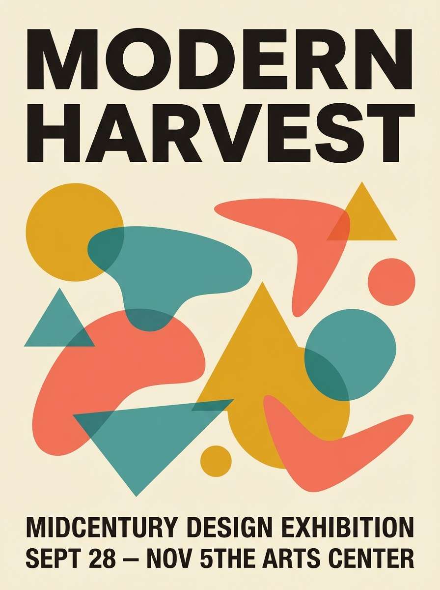
6) Midcentury Poster Pop
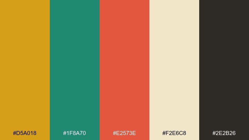
HEX: #D5A018 #1F8A70 #E2573E #F2E6C8 #2E2B26
Mood: playful, bold, retro
Best for: event poster series and social graphics
Playful and bold, it channels midcentury prints, punchy shapes, and optimistic color blocking. Let gold and cream carry the background, then use teal and coral for geometry and emphasis. The near-black is ideal for strong type that still feels warm. Tip: keep teal or coral to one main accent per layout so the design stays graphic, not chaotic.
Image example of midcentury poster pop generated using media.io
7) Golden Olive Workspace UI

HEX: #CFA21C #5F6B2B #F2F0E8 #2E3A2E #B7C0A0
Mood: focused, grounded, fresh
Best for: dashboard UI and productivity app theme
Focused and grounded, the palette suggests tidy desks, olive leaves, and sunlit notes. Use the warm off-white for surfaces, then rely on deep green for navigation and strong contrast. Gold works best as a status color for highlights, tags, and progress indicators. Tip: pair gold with off-white, not the darkest green, to prevent vibration in small UI elements.
Image example of golden olive workspace ui generated using media.io

8) Harvest Sunset Gradient
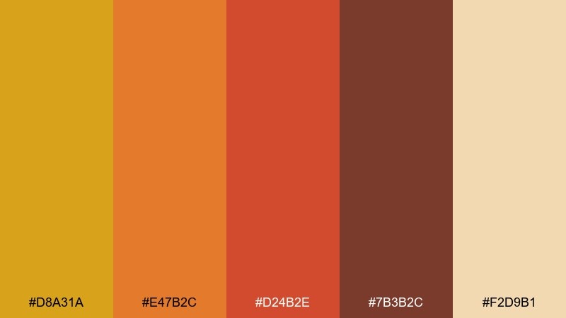
HEX: #D8A31A #E47B2C #D24B2E #7B3B2C #F2D9B1
Mood: energetic, warm, dramatic
Best for: app onboarding screens and promo banners
Energetic and warm, it reads like a sunset gradient melting from gold to ember. Use the light sand as breathing room, then let orange and red-orange carry calls to action. The deep sienna is perfect for bold headings and shadowed overlays. Tip: apply a gold-to-orange gradient only on large areas, and keep smaller UI elements solid for clarity.
Image example of harvest sunset gradient generated using media.io
9) Warm Walnut Branding

HEX: #CDA01B #7A4E2D #3E2A1F #EFE1C6 #B7A06B
Mood: heritage, trustworthy, artisanal
Best for: coffee brand identity and packaging system
Heritage and trustworthy, the tones feel like polished walnut, kraft paper, and golden crema. These harvest gold color combinations work well when gold and cream lead the label while walnut and espresso shades support typography and seals. Add the muted khaki as a secondary panel color for variety across SKUs. Tip: keep one consistent dark text color across the system to maintain that artisanal, premium feel.
Image example of warm walnut branding generated using media.io

10) Ceramic Tile Teal Accent

HEX: #D3A11C #0F6D6A #E8D9B8 #9E6A2B #1D2D2C
Mood: crafted, cool-accented, balanced
Best for: restaurant menu and boutique signage
Crafted and balanced, it combines warm clay and gold with a cool teal that feels like glazed tile. Use gold and sand for background fields, then bring teal in for section headers, icons, or borders. The dark teal-black is strong for type while still harmonizing with the warmth. Tip: limit teal to 10 to 20 percent of the layout for a refined accent instead of a takeover.
Image example of ceramic tile teal accent generated using media.io

11) Vintage Book Cover

HEX: #C89B1A #4F3B2A #7C6B55 #EDE2C9 #2E2020
Mood: academic, classic, quiet
Best for: book cover design and editorial headers
Academic and quiet, it evokes worn leather spines, aged paper, and library shadows. Put the paper tone up front, then layer gold for titles, rules, and small ornaments. The browns create depth for frames and subtitle text without turning muddy. Tip: add texture through grain or subtle patterning in the light tones, not by darkening the whole page.
Image example of vintage book cover generated using media.io

12) Botanical Ochre Watercolor
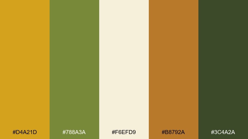
HEX: #D4A21D #788A3A #F6EFD9 #B8792A #3C4A2A
Mood: organic, gentle, artistic
Best for: botanical illustration set and spring stationery
Organic and gentle, it looks like watercolor washes over handmade paper with leafy shadows. The gold and cream make a warm base, while olive tones add believable foliage without going overly bright. Terracotta is great for petals, berries, or small stamps. Tip: keep plenty of cream negative space so the paints feel airy rather than dense.
Image example of botanical ochre watercolor generated using media.io

13) Cozy Cabin Interior

HEX: #CF9F1A #6B4B2A #A46E3A #F1E4CC #3E3A32
Mood: cozy, rustic, grounded
Best for: interior design concept board and cabin rental branding
Cozy and grounded, it feels like lamplight on pine walls and worn leather chairs. Use the cream as wall color or background, then add gold in textiles, throw pillows, or small brand accents. Mid-brown and tan bring natural wood warmth, while the deep charcoal-brown keeps signage and headings readable. Tip: choose one hero surface in gold, like a feature wall or logo mark, and let the woods do the rest.
Image example of cozy cabin interior generated using media.io

14) Festival Flyer Warmth
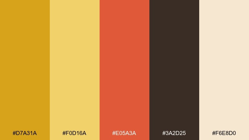
HEX: #D7A31A #F0D16A #E05A3A #3A2D25 #F6E8D0
Mood: cheerful, loud, welcoming
Best for: music festival flyer and ticket graphics
Cheerful and welcoming, it captures string lights, paper banners, and golden-hour crowds. Use the pale cream as the base so the bright yellow and coral can pop without overwhelming the page. Dark brown keeps type legible and adds a handmade, poster-like feel. Tip: combine the two yellows in big blocks, then use coral only for the most important info like dates and lineup.
Image example of festival flyer warmth generated using media.io
15) Craft Beer Label

HEX: #CFA11B #1E1A16 #8A5B2C #F3E2B9 #4B5A2A
Mood: bold, hoppy, handcrafted
Best for: craft beer can label and taproom signage
Bold and handcrafted, it feels like toasted malt, hops, and inked stamps. Let the dark near-black handle the logo and key type, then use gold and cream for the main label field. Brown and hop-green are strong supporting accents for variants or ingredient callouts. Tip: keep fine details in cream against the dark base to avoid muddy printing.
Image example of craft beer label generated using media.io

16) Soft Nursery Neutral

HEX: #D0A11A #F8F3E6 #E7D2B2 #C8B9A6 #8B6A45
Mood: gentle, warm, soothing
Best for: baby shower invitation and nursery product branding
Gentle and soothing, it suggests warm milk, soft blankets, and sunlit curtains. Use the light cream as the main background and keep gold as a tiny accent for icons, stars, or borders. The sand and taupe tones are perfect for secondary panels and subtle patterns. Tip: choose the cocoa shade for text so everything stays readable without feeling stark.
Image example of soft nursery neutral generated using media.io

17) Elegant Wedding Invitation

HEX: #CDA01C #FFF7EA #C7B2A0 #5C4A3F #A88A5A
Mood: romantic, refined, timeless
Best for: wedding invitation suite and event stationery
Romantic and refined, it feels like candlelight on ivory paper with a hint of antique gold. Use ivory as the main canvas, then bring in gold for monograms, dividers, and small flourishes. The warm taupes and brown keep the suite elegant and readable for long details sections. Tip: keep gold elements thin and minimal so the design reads timeless rather than flashy.
Image example of elegant wedding invitation generated using media.io

18) Artisan Soap Packaging
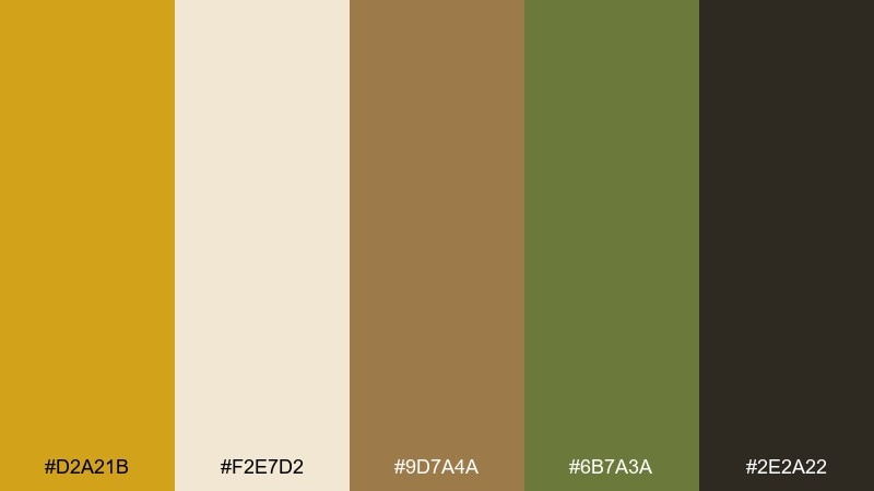
HEX: #D2A21B #F2E7D2 #9D7A4A #6B7A3A #2E2A22
Mood: natural, boutique, earthy
Best for: soap box packaging and skincare product ads
Natural and boutique, it recalls dried herbs, warm wax, and hand-cut paper wraps. A harvest gold color palette like this looks best when the cream stays dominant and the darker tones are used for ingredient text and brand marks. Olive works nicely for botanical line art, while tan adds warmth to secondary panels. Tip: keep the near-black limited to small type and barcodes so the package stays soft and handmade.
Image example of artisan soap packaging generated using media.io

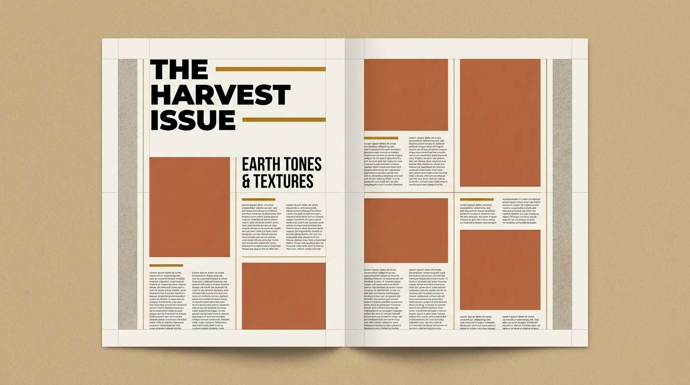
19) Editorial Fashion Spread
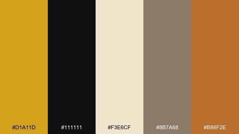
HEX: #D1A11D #111111 #F3E6CF #8B7A68 #B86F2E
Mood: editorial, confident, warm-modern
Best for: magazine layout and lookbook design
Editorial and confident, it feels like warm studio lighting against crisp black type. Use the creamy beige for margins and columns, then bring gold into section headers, pull quotes, or small graphic rules. The muted stone and terracotta add depth for sidebars and captions without stealing focus. Tip: keep black for typography and use gold as the signature highlight to guide the eye through the spread.
Image example of editorial fashion spread generated using media.io
20) Modern Cafe Menu UI

HEX: #D5A11A #2F2A23 #F6F0E5 #6C7A3A #B57A2D
Mood: modern, warm, appetizing
Best for: cafe ordering UI and digital menu board
Modern and appetizing, it suggests espresso crema, toasted pastry, and green herbs. Build the interface on the soft cream, then use dark brown for navigation and pricing to keep everything readable from a distance. Gold and caramel work as buttons and badges, while olive is ideal for dietary tags and category chips. Tip: use gold for the primary action only so the ordering flow stays obvious.
Image example of modern cafe menu ui generated using media.io

What Colors Go Well with Harvest Gold?
Harvest gold pairs beautifully with warm neutrals like cream, ivory, beige, and taupe—these keep the palette soft and usable for backgrounds. For richer depth, add walnut, cocoa, espresso, or charcoal-brown instead of pure black.
For contrast and freshness, lean into greens: sage for calm, olive for earthiness, and deep forest for strong UI contrast. If you want a bolder complementary accent, teal and blue-green add a crafted, midcentury feel without clashing.
Warm supporting accents like terracotta, rust, and burnt orange amplify the “autumn” vibe and work well for CTAs, badges, and highlights.
How to Use a Harvest Gold Color Palette in Real Designs
Use harvest gold as a highlight color first: buttons, icons, dividers, and key labels. This keeps readability high while still giving your design a recognizable warm signature.
For branding and packaging, choose one consistent dark text tone (espresso, deep olive, or warm black) and reuse it everywhere. Then rotate secondary accents (sage, terracotta, tan) across layouts or SKUs for variety without losing cohesion.
In UI, avoid placing bright gold directly on very dark green or black for tiny elements; pair gold with off-white or sand for small tags, chips, and indicators to prevent visual vibration.
Create Harvest Gold Palette Visuals with AI
If you’re building a brand board, poster series, menu, or UI theme, generating mock visuals helps you validate contrast and “mood” fast. With Media.io, you can turn a simple prompt into consistent palette-driven imagery in minutes.
Start with one palette above, then describe the design type (menu, landing page hero, product packaging) and specify which HEX should dominate vs. act as an accent. Iterate by swapping only one color at a time to keep results controlled.
Harvest Gold Color Palette FAQs
-
What is harvest gold (as a color)?
Harvest gold is a warm yellow-ochre shade commonly associated with retro 60s–70s interiors and appliances. In modern design, it’s used as a cozy accent that feels sunny and earthy rather than neon. -
Is harvest gold the same as mustard yellow?
They’re close, but harvest gold is often slightly more golden/ochre and less green-leaning than classic mustard. Many palettes treat “mustard,” “ochre,” and “harvest gold” as neighboring tones with small differences in warmth and saturation. -
What neutral colors match harvest gold best?
Cream, ivory, warm beige, sand, and taupe are the easiest pairings for backgrounds. For text and structure, choose warm dark browns or charcoal instead of stark black for a softer, more cohesive look. -
What accent colors make harvest gold look modern?
Deep charcoal, forest green, and teal are reliable “modernizers” because they add contrast and cool balance. Used sparingly, coral or terracotta can also make the palette feel current while staying warm. -
How do I keep harvest gold from feeling too vintage?
Limit gold to small highlights, increase negative space with off-white backgrounds, and pair it with clean typography and dark neutrals (charcoal or deep green). Avoid using gold as a full-page background unless you mute it with plenty of cream and gray-brown support tones. -
Can I use harvest gold in UI design without hurting accessibility?
Yes—use harvest gold for accents (badges, progress, highlights) and keep primary text on light neutrals with dark brown/green/charcoal for contrast. For buttons, test contrast ratios and consider darker golds or dark text on gold for better readability. -
What industries work well with a harvest gold palette?
Food and beverage (coffee, cafes, craft beer), home goods, wellness, editorial, outdoor lifestyle, and boutique packaging all benefit from harvest gold’s warm, trustworthy feel.


