

A mid century modern color palette is all about warm woods, confident contrast, and playful accents that still feel timeless. Think teak, olive, mustard, and seafoam—balanced with creamy neutrals and charcoal lines.
Below are 20 retro-inspired mid century modern colors you can use for interiors, branding, posters, and UI—each with HEX codes and an AI image prompt you can recreate in minutes.
In this article
- Why Mid Century Modern Palettes Work So Well
-
- teak and teal
- avocado lounge
- mustard vinyl
- sunset terracotta
- atomic mint
- palm springs pink
- walnut cream
- ceramic blue
- olive circuit
- desert postcard
- saffron and stone
- retro office
- cactus and clay
- mocha mushroom
- coral formica
- turquoise stereo
- brass and berry
- pebble and persimmon
- graphite and oat
- seafoam diner
- What Colors Go Well with Mid Century Modern?
- How to Use a Mid Century Modern Color Palette in Real Designs
- Create Mid Century Modern Palette Visuals with AI
Why Mid Century Modern Palettes Work So Well
Mid century modern palettes work because they balance warm, human materials (wood, clay, leather) with cool, structured contrast (teal, slate, charcoal). That push-pull creates a look that feels both inviting and designed.
These retro color schemes also rely on clear hierarchy: one or two “hero” colors, supportive neutrals, and a small accent that adds energy. The result is bold enough for posters and branding, but calm enough for interiors and UI.
Finally, many atomic-age palettes are naturally print-friendly: creamy backgrounds, dark type colors, and a warm highlight (mustard or brass) that reads well in both digital and physical formats.
20+ Mid Century Modern Color Palette Ideas (with HEX Codes)
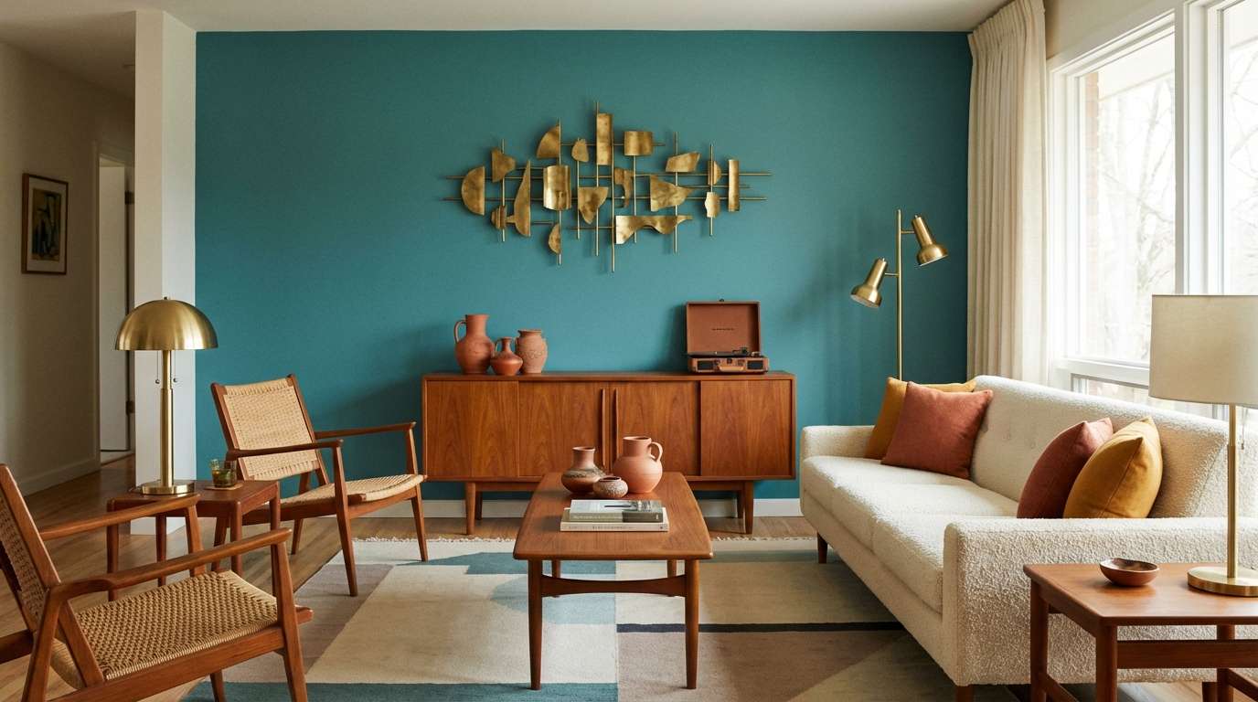
1) Teak and Teal
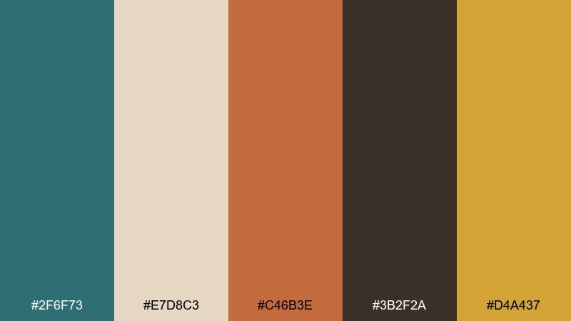
HEX: #2F6F73 #E7D8C3 #C46B3E #3B2F2A #D4A437
Mood: warm, confident, architectural
Best for: living room accent wall and decor styling
Warm teak vibes meet cool teal for a look that feels tailored and timeless. Use the teal for a statement wall or upholstered chair, then ground it with walnut-brown and creamy beige. Terracotta and brass-gold add that iconic retro punch without getting loud. Tip: repeat the gold in small hardware pieces to make the palette feel intentional.
Image example of teak and teal generated using media.io
Media.io is an online AI studio for creating and editing video, image, and audio in your browser.

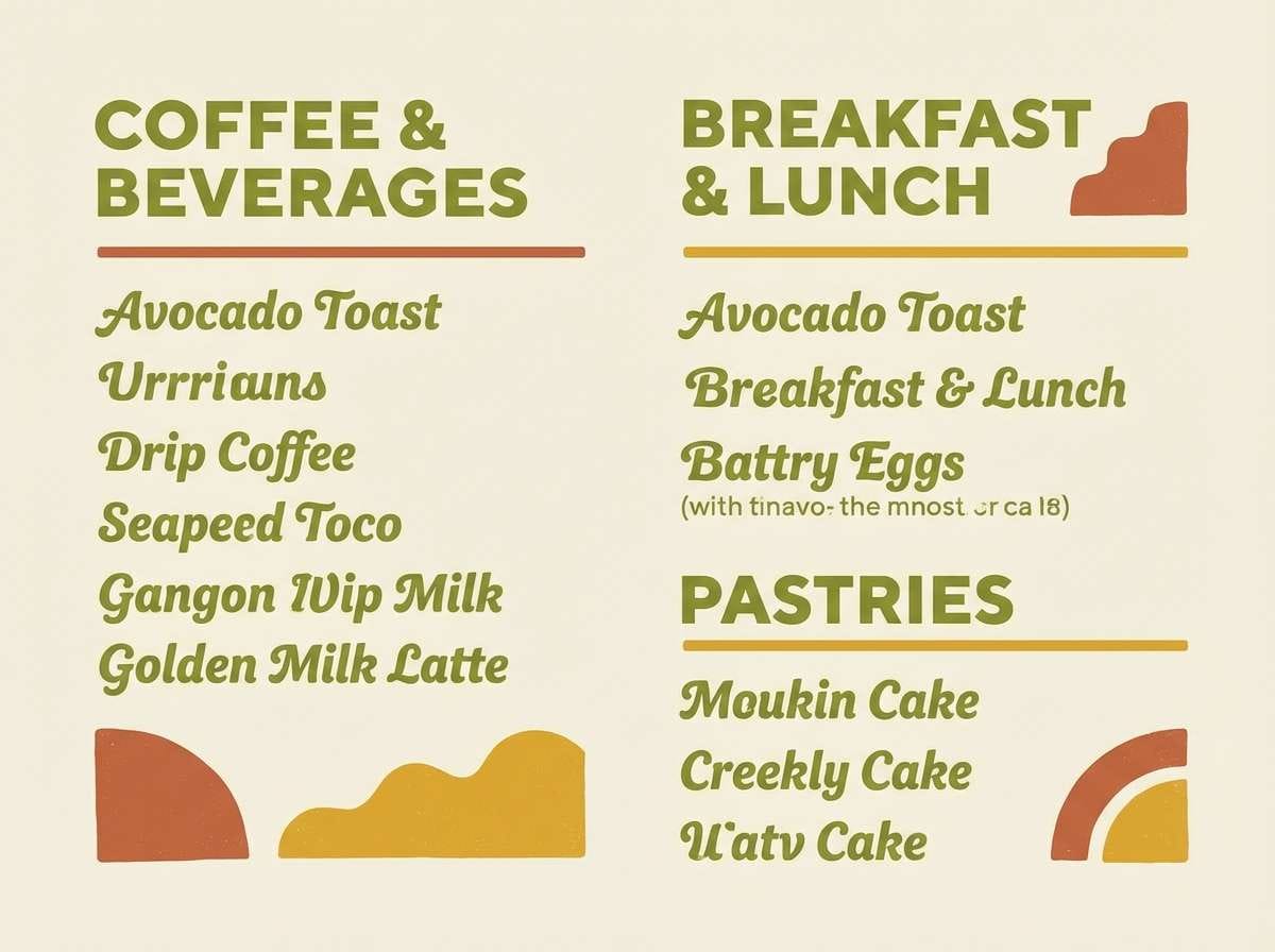
2) Avocado Lounge
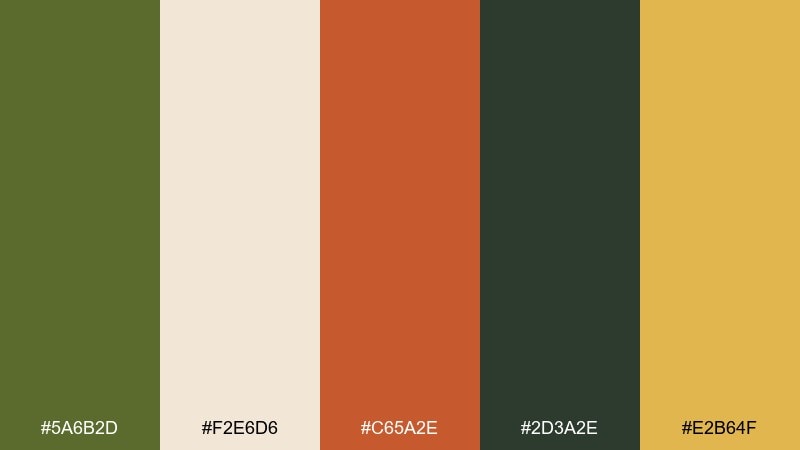
HEX: #5A6B2D #F2E6D6 #C65A2E #2D3A2E #E2B64F
Mood: earthy, relaxed, nostalgic
Best for: cafe menu branding and signage
Earthy avocado green and toasted terracotta feel like a cozy corner booth and a vinyl record spinning. Pair the creamy neutral with deep pine to keep text readable and layouts clean. Use the mustard-gold as a highlight color for prices, icons, and calls to action. Tip: limit avocado to large blocks and let cream dominate for a fresher finish.
Image example of avocado lounge generated using media.io
3) Mustard Vinyl
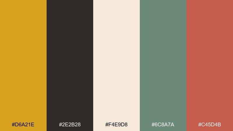
HEX: #D6A21E #2E2B28 #F4E9D8 #6C8A7A #C45D4B
Mood: bold, rhythmic, playful
Best for: album cover artwork or playlist thumbnail
Mustard and charcoal create a punchy, graphic feel like classic record labels and geometric posters. Keep the cream as breathing room so the darker tones do not feel heavy. Sage brings a soft counterpoint, while coral-red adds an energetic focal pop. Tip: use charcoal for typography and outlines to maintain crisp contrast.
Image example of mustard vinyl generated using media.io

4) Sunset Terracotta
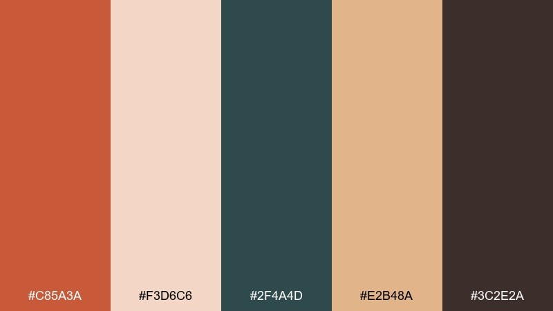
HEX: #C85A3A #F3D6C6 #2F4A4D #E2B48A #3C2E2A
Mood: sun-warmed, grounded, inviting
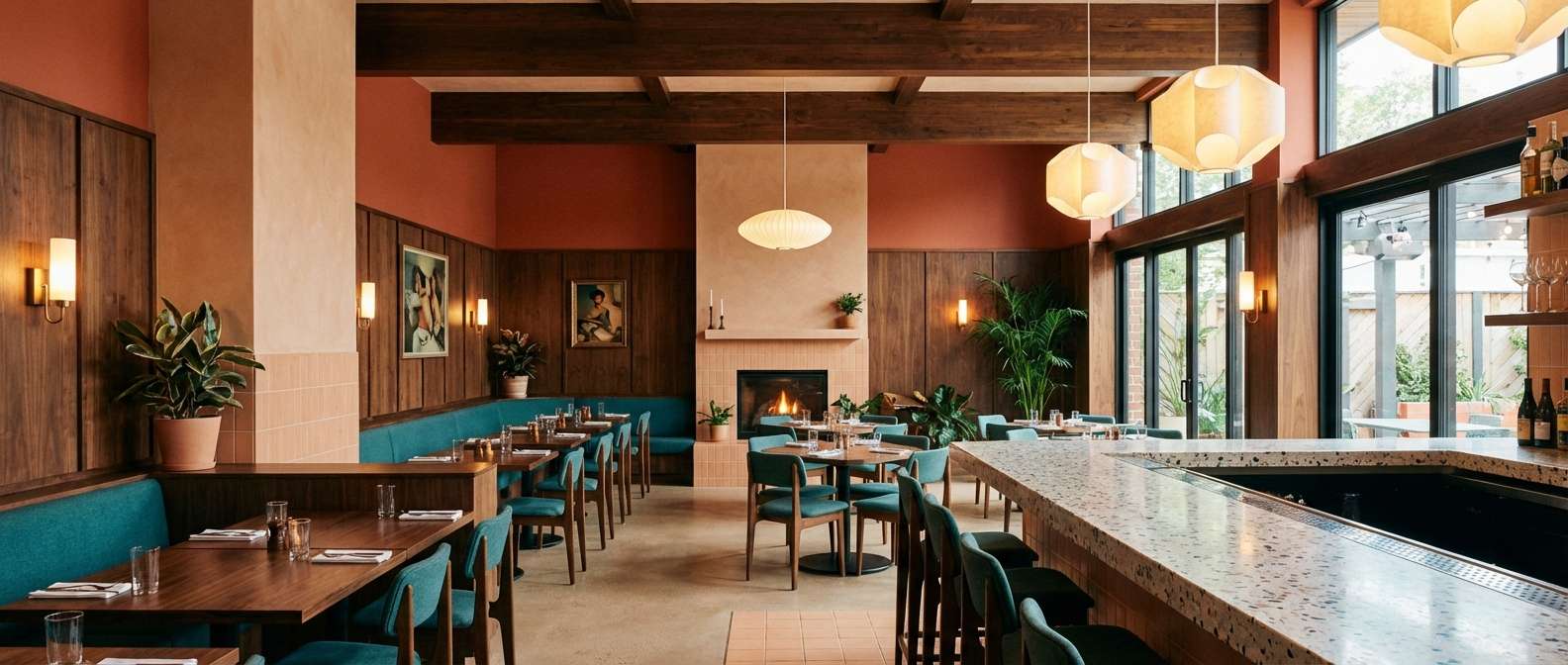
Best for: restaurant interior palette and wall art
Sunset terracotta and blushy peach feel like warm plaster walls at golden hour. Bring in the deep teal for contrast on upholstery or artwork frames, then use cocoa brown to anchor floors and wood tones. This mid century modern color scheme works best when peach and sand stay dominant and teal is used as a deliberate accent. Tip: add texture, like linen and matte ceramics, to keep the warmth sophisticated.
Image example of sunset terracotta generated using media.io
5) Atomic Mint
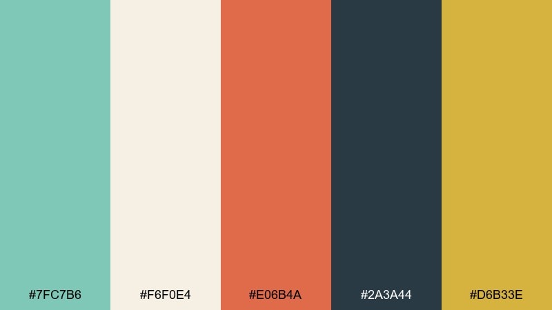
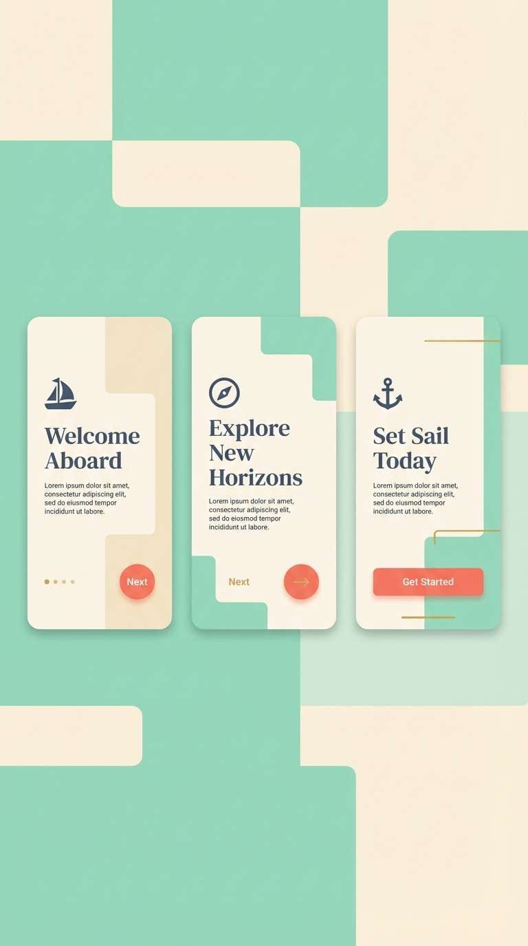
HEX: #7FC7B6 #F6F0E4 #E06B4A #2A3A44 #D6B33E
Mood: fresh, optimistic, retro-futurist
Best for: mobile app onboarding screens (2D UI)
Minty seafoam and creamy white evoke a clean, optimistic, atomic-era look. Use the navy-slate for headings and icons to keep accessibility strong, then add coral for friendly emphasis. A touch of warm gold works well for progress indicators or badges. Tip: keep coral to one primary button style so the interface stays calm.
Image example of atomic mint generated using media.io
6) Palm Springs Pink
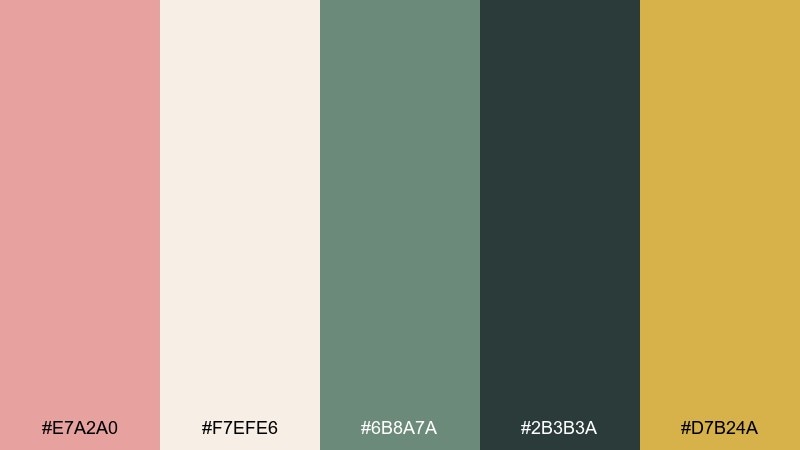
HEX: #E7A2A0 #F7EFE6 #6B8A7A #2B3B3A #D7B24A
Mood: sunny, breezy, confident
Best for: wedding invitation suite
Dusty pink and soft cream feel like desert resorts, poolside umbrellas, and polished stone. Use sage green for foliage illustrations and a dark evergreen for elegant text contrast. A hint of warm gold elevates the whole set with a vintage-luxe touch. Tip: print cream as the main paper tone and keep pink to borders and headings for a refined look.
Image example of palm springs pink generated using media.io
7) Walnut Cream
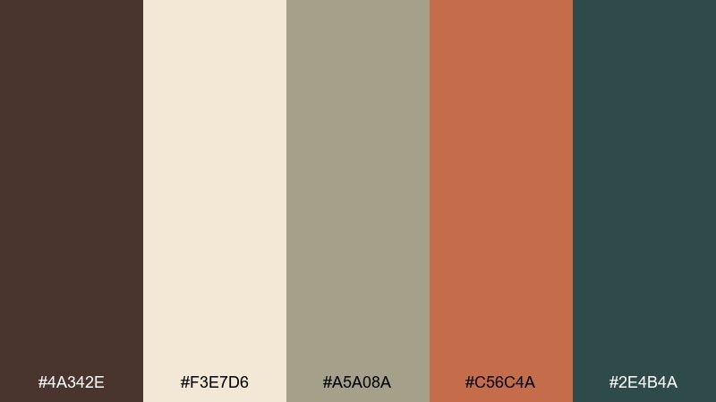
HEX: #4A342E #F3E7D6 #A5A08A #C56C4A #2E4B4A
Mood: quiet, cozy, curated
Best for: book cover design for literary fiction
Walnut brown and oat-cream read like worn leather, paperbacks, and a calm reading nook. Use the soft stone-khaki as a secondary background to add depth without adding noise. Terracotta brings warmth for titles or illustration accents, while deep teal keeps the typography crisp. Tip: choose one bold terracotta element and let the neutrals carry the rest.
Image example of walnut cream generated using media.io
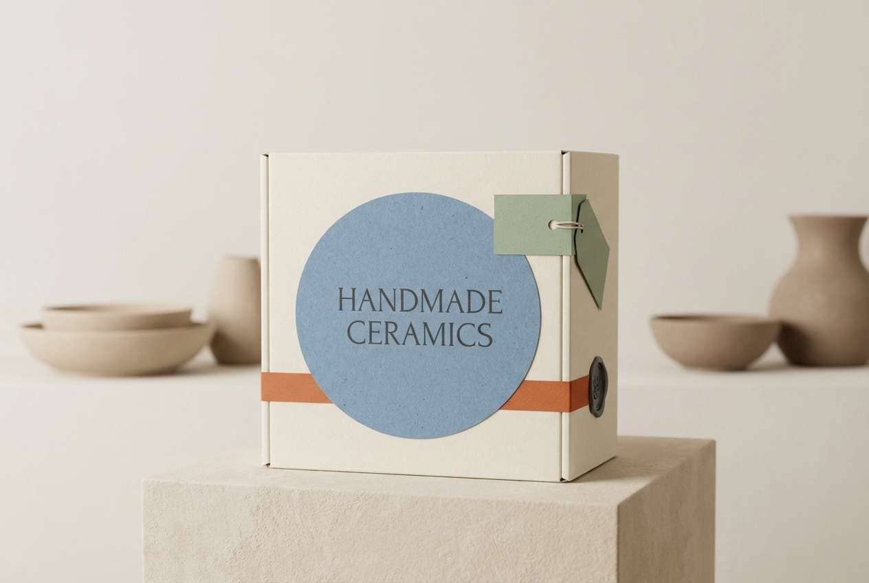
8) Ceramic Blue
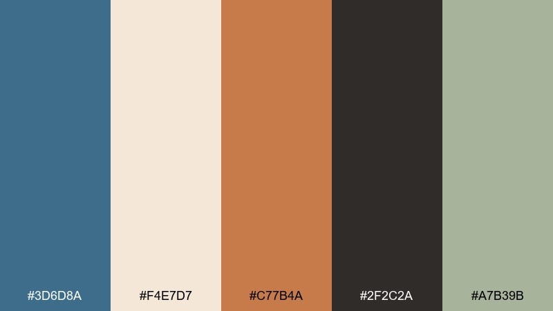
HEX: #3D6D8A #F4E7D7 #C77B4A #2F2C2A #A7B39B
Mood: clean, coastal, collectible
Best for: product packaging for handmade ceramics
Ceramic blue and creamy ivory feel like glossy glaze against raw clay. Use charcoal for labels and fine linework to keep the packaging readable and premium. Terracotta adds warmth that ties back to the handmade story, while muted sage softens the overall contrast. Tip: keep the blue as the hero color and repeat it on seals or stickers for cohesion.
Image example of ceramic blue generated using media.io
9) Olive Circuit
HEX: #6A7A33 #F1E7D9 #2E4A4F #C05A3D #D9B55A
Mood: smart, retro-tech, grounded
Best for: brand kit for a vintage electronics shop
Olive and deep teal evoke old circuit boards and tidy workshop drawers. Let the cream do most of the heavy lifting in backgrounds so the darker tones stay sharp. Used thoughtfully, this mid century modern color palette looks especially good with simple geometric logos and minimal icon sets. Tip: reserve terracotta for badges and promotions so it feels special, not constant.
Image example of olive circuit generated using media.io
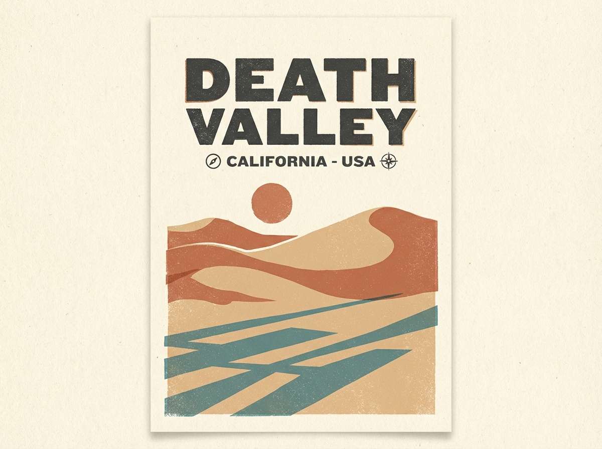
10) Desert Postcard
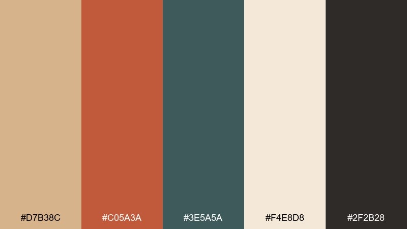
HEX: #D7B38C #C05A3A #3E5A5A #F4E8D8 #2F2B28
Mood: travel-ready, sun-faded, nostalgic
Best for: retro travel poster for a desert city
Sandy beige and sun-baked terracotta feel like a faded postcard pulled from a drawer. Add the dusty teal for skies or shadows, then use charcoal for crisp type and outlines. Cream keeps the whole poster airy and print-friendly. Tip: use large, simple shapes and minimal gradients to capture that classic poster vibe.
Image example of desert postcard generated using media.io
11) Saffron and Stone
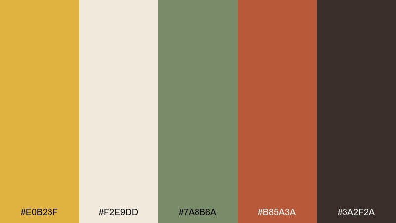
HEX: #E0B23F #F2E9DD #7A8B6A #B85A3A #3A2F2A
Mood: confident, warm, editorial
Best for: magazine spread for home decor
Saffron and stone feel like woven textiles, brass lamps, and sunlit pages. Use the creamy neutral as the paper base, then build hierarchy with cocoa-brown headings. Sage supports lifestyle photography and captions without stealing attention. Tip: keep saffron to highlights and pull quotes so it reads as intentional, not noisy.
Image example of saffron and stone generated using media.io
12) Retro Office
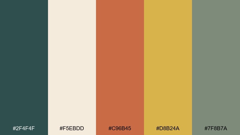
HEX: #2F4F4F #F5EBDD #C96B45 #D8B24A #7F8B7A
Mood: professional, composed, vintage-cool
Best for: website UI for a design studio (2D UI)
Deep teal and warm neutrals set a calm, credible tone like a classic office with modern polish. Keep the cream as the main canvas, then use teal for navigation and headings to maintain structure. For a mid century modern color scheme, terracotta buttons and muted-gold accents add personality without hurting readability. Tip: use the gray-green for dividers and cards to avoid harsh pure-gray lines.
Image example of retro office generated using media.io
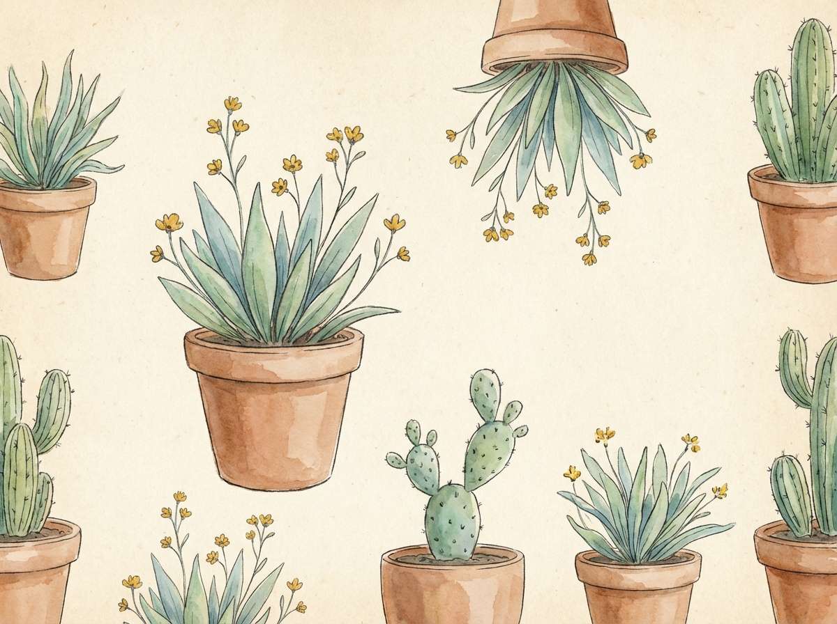
13) Cactus and Clay
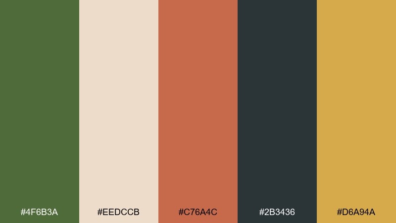
HEX: #4F6B3A #EEDCCB #C76A4C #2B3436 #D6A94A
Mood: desert-botanical, natural, friendly
Best for: watercolor botanical illustration set
Cactus green and clay terracotta bring a desert garden to life, soft and sunlit. Use the creamy sand as your paper tone, then deepen shadows with graphite-charcoal for definition. A mustard accent works beautifully for tiny blossoms or label stamps. Tip: keep the charcoal subtle in watercolor work so the greens stay fresh.
Image example of cactus and clay generated using media.io
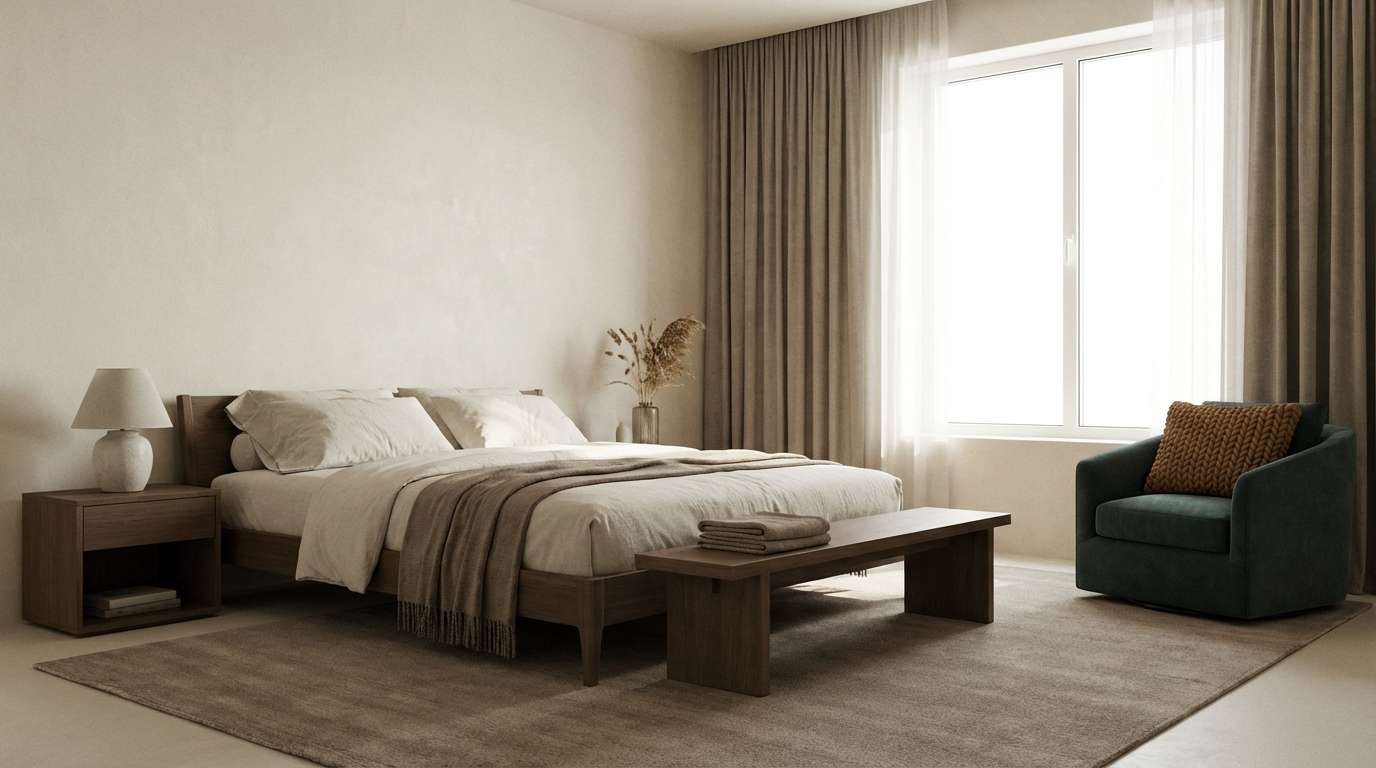
14) Mocha Mushroom
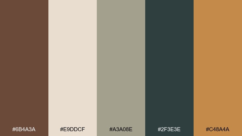
HEX: #6B4A3A #E9DDCF #A3A08E #2F3E3E #C48A4A
Mood: soft, earthy, understated
Best for: minimalist interior styling for a bedroom
Mocha and mushroom neutrals feel calm and tactile, like wool throws and matte pottery. Use the cream as the main wall or bedding tone, then layer stone-taupe in rugs and textiles. A deep green-teal keeps the palette from drifting too beige, while warm caramel adds a cozy accent. Tip: mix finishes like wood, linen, and ceramic to create depth without adding new colors.
Image example of mocha mushroom generated using media.io
15) Coral Formica
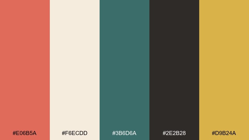
HEX: #E06B5A #F6ECDD #3B6D6A #2E2B28 #D9B24A
Mood: cheerful, crisp, diner-inspired
Best for: social media promo template set
Coral and cream feel upbeat and clean, like glossy countertops and retro signage. Use the teal for structure in headers and frames, then rely on charcoal for strong type contrast. The warm gold works as a subtle highlight for icons, stickers, or sale tags. Tip: keep coral as your main block color and use teal in thin lines to avoid visual clutter.
Image example of coral formica generated using media.io
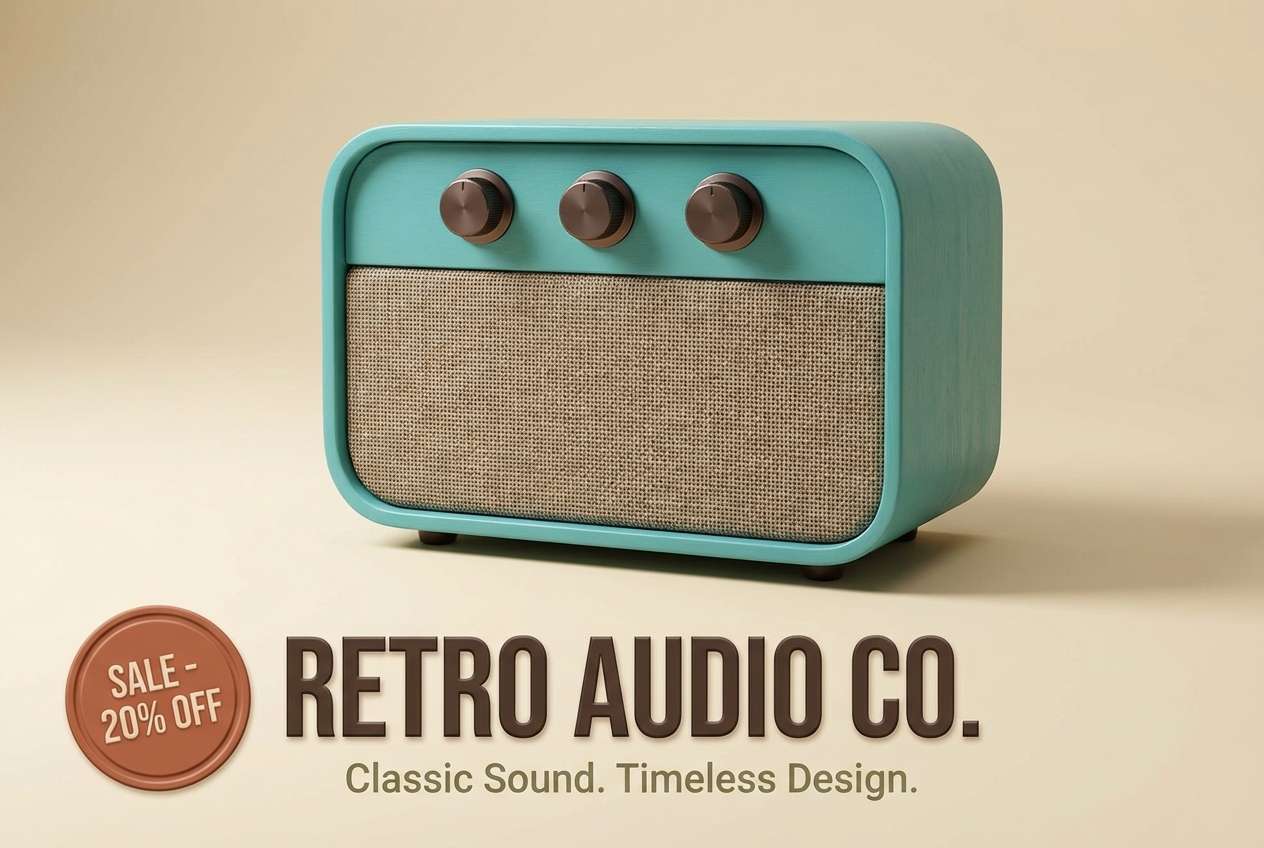
16) Turquoise Stereo
HEX: #2F8C8A #F4EADB #C65B3E #3A2F2A #A7B18F
Mood: bright, confident, nostalgic
Best for: product ad for a retro speaker
Turquoise and warm cream feel energetic, like a classic stereo dial lighting up. Ground the look with deep espresso-brown for typography and product details. Terracotta adds warmth for callouts, while muted olive keeps secondary elements calm. Tip: keep the background mostly cream so the turquoise product color steals the spotlight.
Image example of turquoise stereo generated using media.io
17) Brass and Berry
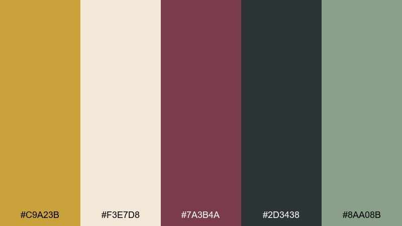
HEX: #C9A23B #F3E7D8 #7A3B4A #2D3438 #8AA08B
Mood: moody, luxe, artistic
Best for: cocktail bar flyer
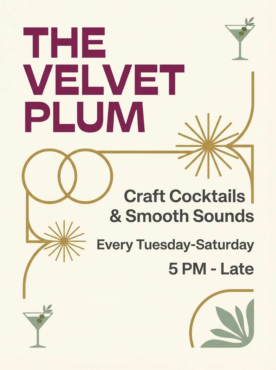
Brass-gold and berry plum create a glamorous, late-night vibe with a vintage twist. Use cream as the background to keep it readable, then set key typography in charcoal for crisp contrast. These mid century modern color combinations shine with simple geometric dividers and plenty of negative space. Tip: keep berry to one or two hero elements like the event title and a single shape.
Image example of brass and berry generated using media.io
18) Pebble and Persimmon
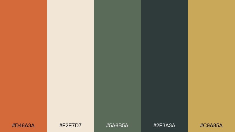
HEX: #D46A3A #F2E7D7 #5A6B5A #2F3A3A #C9A85A
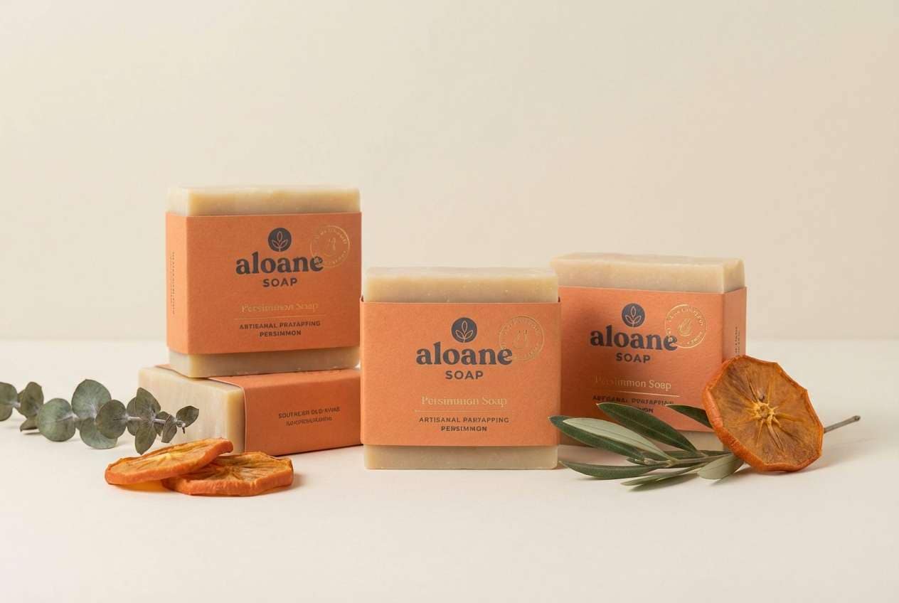
Mood: natural, balanced, handcrafted
Best for: artisan soap packaging
Persimmon orange and pebble-cream feel handmade, warm, and a little rustic. Use the leafy green for ingredient callouts and the deep slate for brand marks to keep everything grounded. The soft gold works nicely for subtle borders or stamps that suggest quality. Tip: print the slate sparingly so the packaging stays light and approachable.
Image example of pebble and persimmon generated using media.io
19) Graphite and Oat
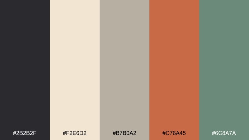
HEX: #2B2B2F #F2E6D2 #B7B0A2 #C76A45 #6C8A7A
Mood: modern, grounded, quietly bold
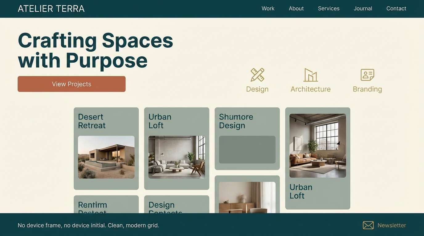
Best for: portfolio website landing page (2D UI)
Graphite and oat feel clean and modern while still nodding to vintage materials. Use oat as the primary background, then lean on graphite for type and navigation for strong contrast. Terracotta adds a warm highlight for buttons, while sage is perfect for secondary sections or tags. Tip: keep the interface mostly neutral and let terracotta signal actions consistently.
Image example of graphite and oat generated using media.io
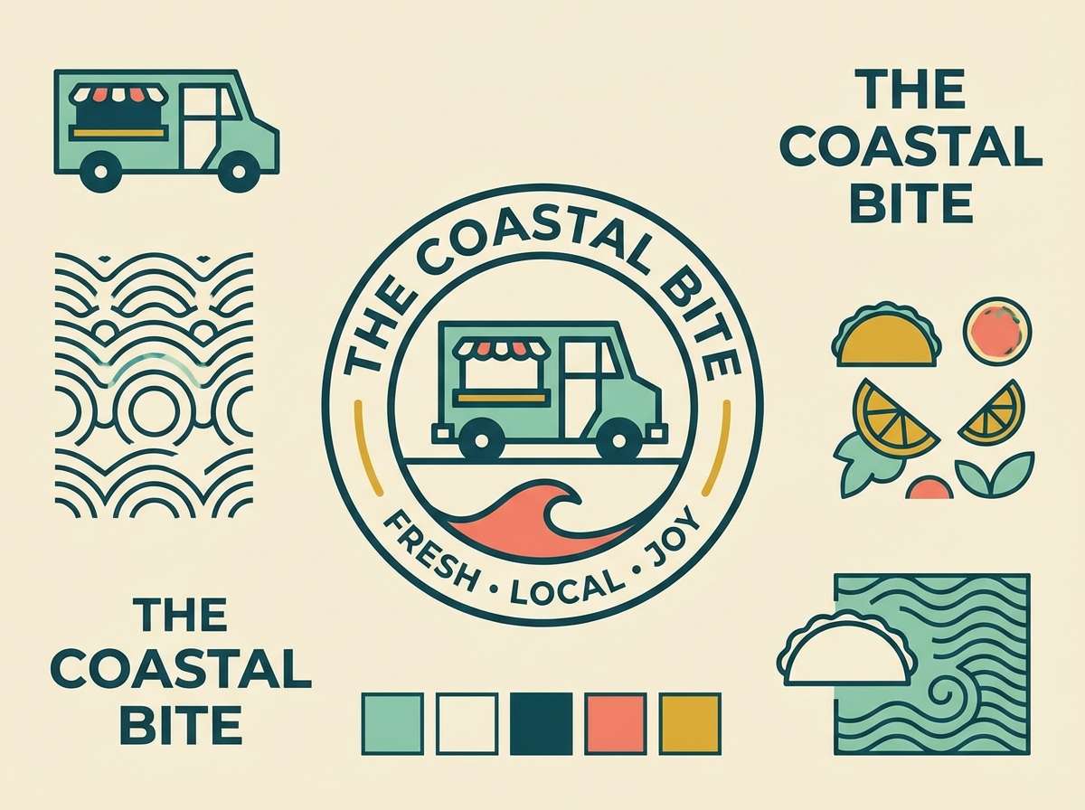
20) Seafoam Diner

HEX: #86C5B4 #F7EEDD #D97B4A #2F4A4D #D6B23E
Mood: bright, friendly, retro-playful
Best for: food truck logo and mini brand set
Seafoam and cream feel light and nostalgic, like a sunny diner sign on a quiet street. Use deep teal for outlines and typography so the logo stays readable at small sizes. Coral adds appetite-friendly warmth, and a touch of mustard brings that classic vintage accent. Tip: test the logo in one-color teal first, then layer seafoam and coral for the full look.
Image example of seafoam diner generated using media.io
What Colors Go Well with Mid Century Modern?
Mid century modern colors pair best when you combine a warm base (cream, oat, sand, walnut) with a cool anchor (teal, slate, deep green) and one bright accent (mustard, coral, brass). This keeps the look retro without becoming chaotic.
For interiors, warm woods naturally bridge between cooler wall colors and warmer textiles, making teal/terracotta or olive/cream especially easy to live with. In branding and posters, charcoal or deep teal is often the most reliable choice for typography contrast.
If you want a lighter, more contemporary twist, lean into seafoam, blush, and cream—then keep outlines and text in a dark evergreen or graphite to preserve that mid-century structure.
How to Use a Mid Century Modern Color Palette in Real Designs
Start by choosing your “hero” color (like teal, olive, or coral), then give it space by using a creamy neutral as the primary background. This is the easiest way to get that clean, architectural mid-century feel.
Next, assign roles: dark color for text and outlines, warm color for emphasis (buttons, price tags, badges), and one soft supporting color for secondary sections. Keeping those roles consistent makes the whole design feel intentional.
For print-style layouts, mid-century modern palettes look best with simple geometric shapes, generous margins, and limited gradients—more screenprint than photoreal glow.
Create Mid Century Modern Palette Visuals with AI
If you have HEX codes but need real-looking mockups, Media.io lets you generate mid-century interiors, posters, packaging, and UI visuals directly from a text prompt. It’s a fast way to test whether a palette feels balanced before you commit.
Reuse the prompts above, then swap in your product, room type, or layout format (square post, 16:9 hero banner, 3:4 flyer). Keep the palette consistent by repeating the same hero and neutral across multiple generations.
Once you have an image you like, you can iterate: adjust lighting (daylight vs ambient), materials (linen, walnut, ceramic), or composition (more negative space) while keeping the same mid century modern color scheme.
Mid Century Modern Color Palette FAQs
-
What defines a mid century modern color palette?
Most mid century modern palettes combine warm neutrals (cream, oat, beige), rich earthy tones (walnut, terracotta, olive), and one optimistic accent (mustard, coral, seafoam) anchored by a dark outline color like charcoal or deep teal. -
What are the best mid century modern colors for living rooms?
Teal, walnut brown, warm cream, terracotta, and brass-gold are classic choices. Use cream on large surfaces, teal for an accent wall or chair, and terracotta/brass as smaller decor accents for a balanced look. -
How do I keep a retro color scheme from looking dated?
Limit the loudest color to small areas, keep backgrounds neutral, and use a single dark color for clean typography and outlines. Modern lighting, minimal clutter, and consistent spacing also help the palette feel current. -
What mid century modern color combinations work well for branding?
Olive + cream + deep teal is great for “heritage” brands, while graphite + oat + terracotta feels modern but still retro-inspired. Add mustard or brass as a highlight for icons, dividers, or calls to action. -
Are mid century palettes good for UI design and accessibility?
Yes—if you use a dark anchor (graphite, deep teal) for text and reserve bright accents (coral, mustard) for buttons or badges. Always check contrast ratios when placing text over colored blocks. -
What colors should I avoid with mid century modern?
Very cool neon tones and icy grays can clash with the warm, tactile mid-century feel. If you use bright colors, choose warmer versions (coral instead of hot pink, mustard instead of neon yellow). -
How can I visualize a mid century modern color palette quickly?
Generate a few mockups with the same prompt style (interior, poster, packaging, or UI) and iterate on one variable at a time—like lighting or materials—so you can judge the palette consistently across outputs.


