

A jungle color palette blends deep greens, earthy browns, and soft botanical neutrals to create designs that feel alive, grounded, and modern. It’s a go-to choice when you want “nature” without looking overly rustic.
Below are 20+ jungle palette ideas with HEX codes plus real-use tips for branding, interiors, and UI—along with AI prompts you can use to generate matching visuals fast.
In this article
Why Jungle Color Schemes Work So Well
Jungle color schemes feel instantly familiar because they echo real-world contrast: deep canopy shadows, mid-tone leaves, and lighter sand or mist highlights. That natural hierarchy makes layouts feel structured without forcing harsh blacks or stark whites.
They’re also flexible across styles. Desaturated greens and stone neutrals can look premium and minimalist, while bright leaf greens and warm gold accents add playful energy for posters, campaigns, and social ads.
Most importantly, jungle tones signal “healthy,” “eco,” and “outdoors” at a glance—helpful for branding, packaging, and UI where you want trust and calm alongside modern polish.
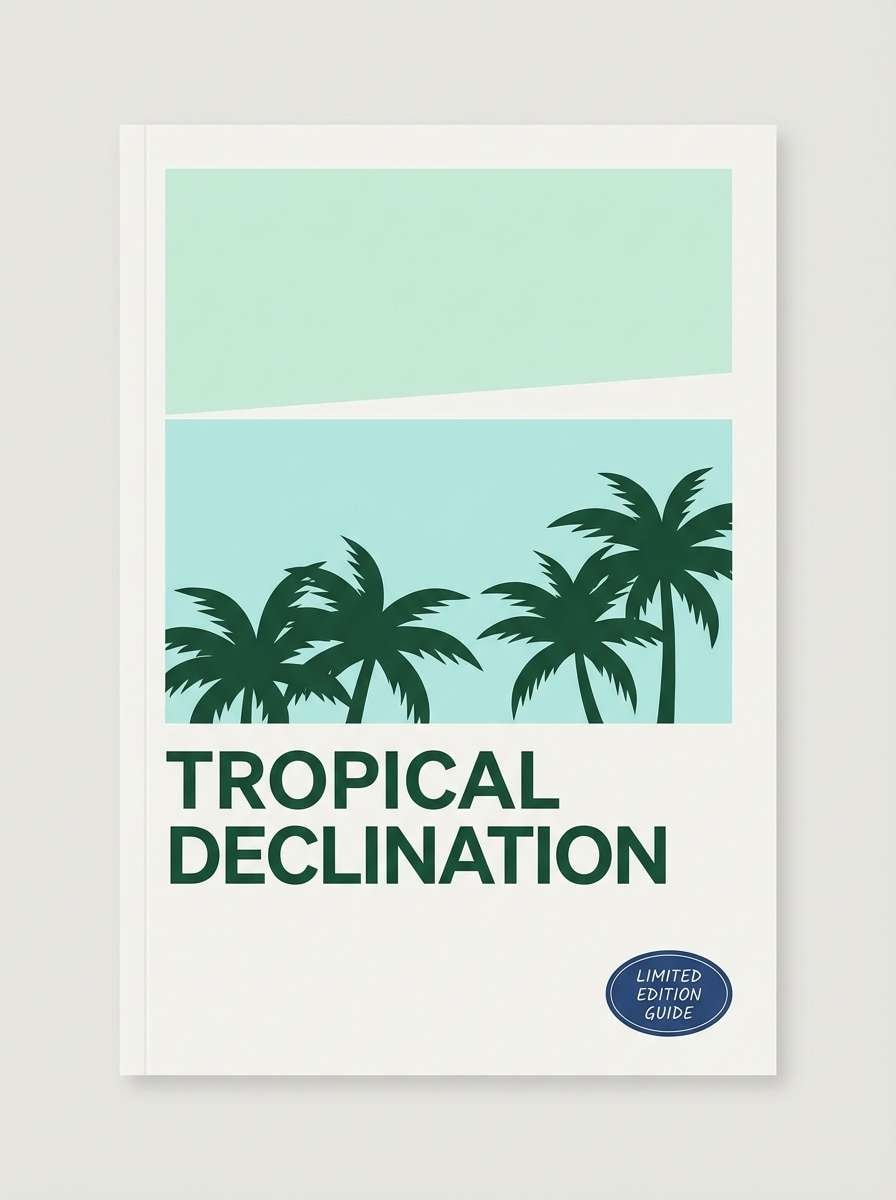
20+ Jungle Color Palette Ideas (with HEX Codes)
1) Canopy Dusk
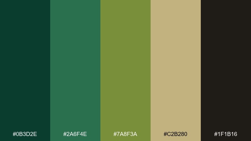
HEX: #0B3D2E #2A6F4E #7A8F3A #C2B280 #1F1B16
Mood: moody, grounded, premium
Best for: eco product packaging and outdoor brand marks
Moody dusk greens and bark-dark shadows evoke a quiet trail right before nightfall. Use it on kraft textures, matte labels, and minimalist logos where depth matters more than brightness. Pair the deep green with the sand tone for readable type and clean hierarchy. Tip: reserve the near-black as a thin outline or small typography to keep it refined, not heavy.
Image example of canopy dusk generated using media.io

Media.io is an online AI studio for creating and editing video, image, and audio in your browser.

2) Fern Fronds
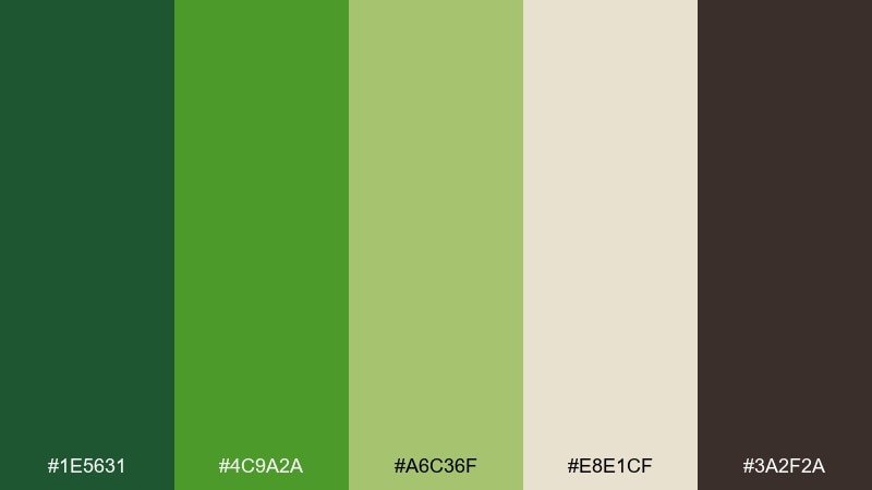
HEX: #1E5631 #4C9A2A #A6C36F #E8E1CF #3A2F2A
Mood: fresh, botanical, calm
Best for: watercolor prints and botanical wall art
Fresh frond greens and soft paper neutrals feel like a sunlit greenhouse sketchbook. These tones work beautifully for illustration-led posters, stationery, and gentle brand motifs. Balance the bright leaf green with the warm off-white so the artwork stays airy. Tip: keep the brown as a fine line color for stems and captions instead of large fills.
Image example of fern fronds generated using media.io

3) Monsoon Leaf

HEX: #0F2E2B #1F6F64 #6FB98F #D5E7D4 #243B53
Mood: cool, rainy, focused
Best for: analytics dashboards and fintech UI
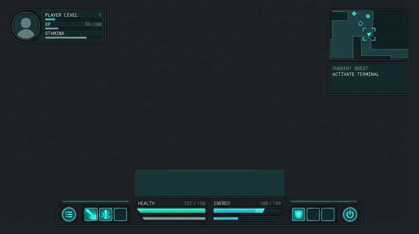
Cool rain-washed teals and slate shadows suggest monsoon air and glossy leaves. The contrast supports data-heavy screens while still feeling organic. Use the pale mint as a background and keep the dark teal for navigation and headings. Tip: apply the mid teal for charts and active states, then limit the slate to dividers for clarity.
Image example of monsoon leaf generated using media.io

4) Orchid Shadow
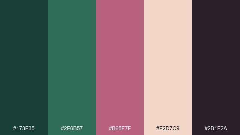
HEX: #173F35 #2F6B57 #B65F7F #F2D7C9 #2B1F2A
Mood: lush, romantic, editorial
Best for: magazine layouts and beauty editorials
Lush greens with a muted orchid pop feel like hidden blooms under broad leaves. These jungle color combinations shine in editorial spreads where you want elegance with an edge. Let the blush act as the page base, then bring in green blocks for pull quotes and section headers. Tip: use the near-black plum for body text to keep it soft but still highly readable.
Image example of orchid shadow generated using media.io
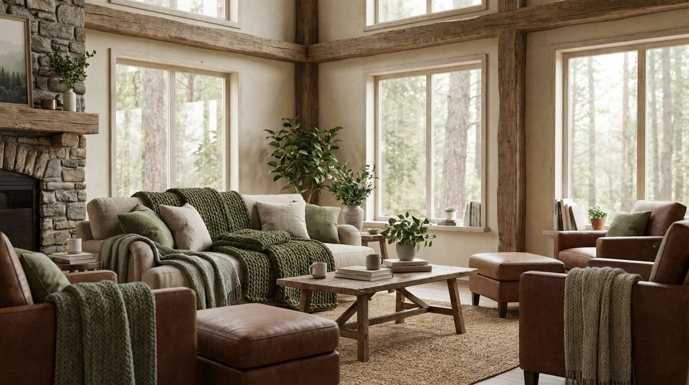
5) Mossy Trail
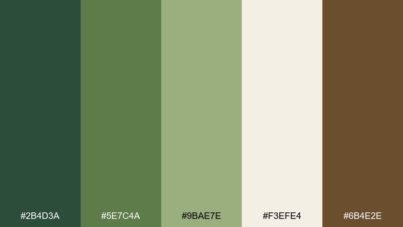
HEX: #2B4D3A #5E7C4A #9BAE7E #F3EFE4 #6B4E2E
Mood: cozy, earthy, rustic
Best for: cabin interiors and lifestyle lookbooks
Earthy moss and trail-brown tones evoke wool blankets, wood grain, and damp forest floors. Use this mix for interior mood boards, rustic branding, or a warm lifestyle spread. Pair the cream with the deepest green for strong contrast and a timeless feel. Tip: keep the mid greens on larger surfaces like walls or banners, then bring in brown through small decor or icons.
Image example of mossy trail generated using media.io
6) Bamboo Breeze
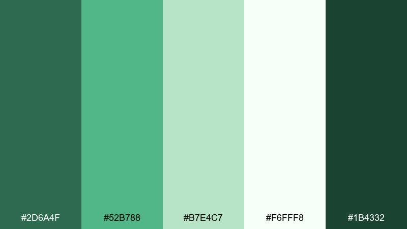
HEX: #2D6A4F #52B788 #B7E4C7 #F6FFF8 #1B4332
Mood: clean, airy, restorative
Best for: spa flyers and wellness promos
Airy bamboo greens and clean whites feel like a quiet morning stretch by an open window. The light-to-dark range makes it easy to build calm layouts with clear calls to action. Use the pale mint and white for background space, then keep the darkest green for headings. Tip: apply the bright green sparingly as a single highlight color for buttons or discount tags.
Image example of bamboo breeze generated using media.io

7) Riverbank Clay
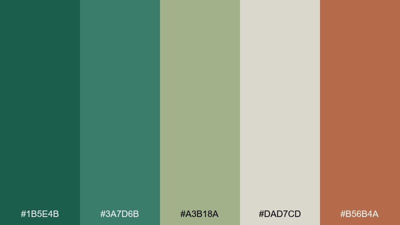
HEX: #1B5E4B #3A7D6B #A3B18A #DAD7CD #B56B4A
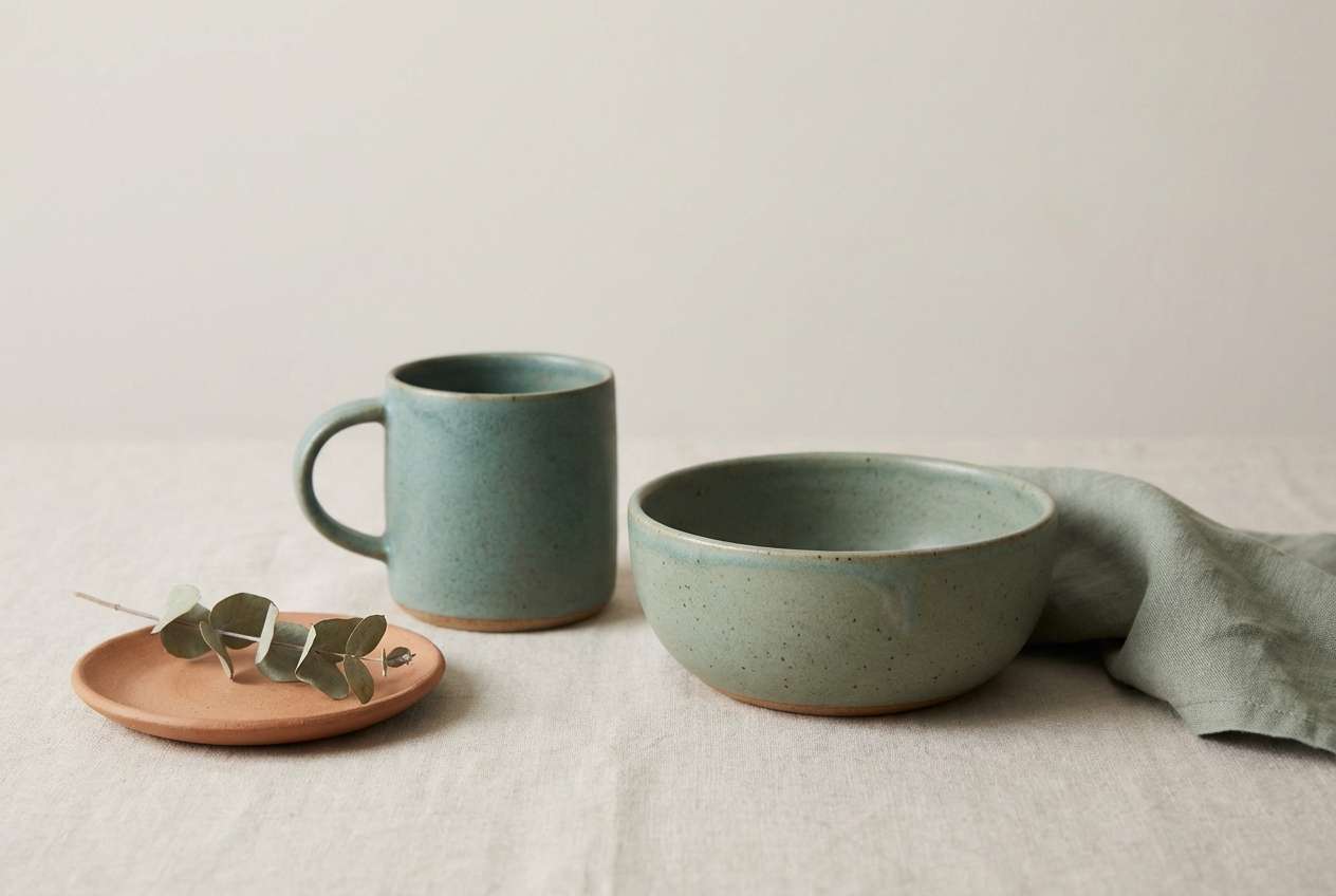
Mood: natural, artisanal, warm
Best for: ceramics branding and product ads
Riverbank teals with clay warmth bring to mind wet stones, terracotta, and reed-lined water. It works well for handmade goods where you want nature without looking overly rustic. Pair the clay accent with the pale neutral for pricing and small labels. Tip: keep teal as the hero color on the product, then use clay only in props or a small badge to avoid visual noise.
Image example of riverbank clay generated using media.io
8) Tropical Understory
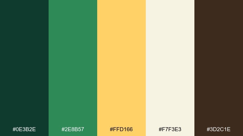
HEX: #0E3B2E #2E8B57 #FFD166 #F7F3E3 #3D2C1E
Mood: bright, adventurous, playful
Best for: illustrated kids posters and activity sheets
Bright sun-gold against deep leaf greens feels like light breaking through a dense understory. The contrast is energetic, great for playful illustrations and educational prints. Use the cream as the main canvas so the yellow stays cheerful rather than loud. Tip: outline characters in the dark brown to keep shapes crisp without harsh black.
Image example of tropical understory generated using media.io

9) Jungle Nightfall
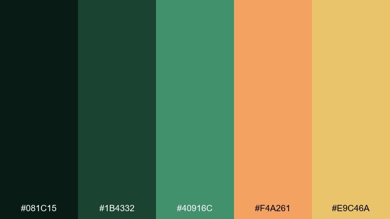
HEX: #081C15 #1B4332 #40916C #F4A261 #E9C46A
Mood: dramatic, nocturnal, electric
Best for: music posters and event branding
Nocturnal greens with warm amber sparks feel like fireflies over dark foliage. This set is perfect for posters where you need high impact without neon overload. Let the darkest green carry the background, then place amber type for instant readability. Tip: keep the brighter green for supporting graphics like waves, grids, or small icons to guide the eye.
Image example of jungle nightfall generated using media.io

10) Sunlit Canopy

HEX: #2D6A4F #74C69D #F2E8CF #BC6C25 #283618
Mood: optimistic, natural, modern
Best for: ecommerce hero banners for sustainable fashion
Sunlit greens and warm clay browns bring the feeling of an open canopy and golden afternoon. This jungle color palette works well for web hero sections, lookbooks, and clean product storytelling. Pair the cream with the darkest green for headlines and accessibility-friendly contrast. Tip: use the clay tone only for one primary button or price tag so the page stays calm and premium.
Image example of sunlit canopy generated using media.io
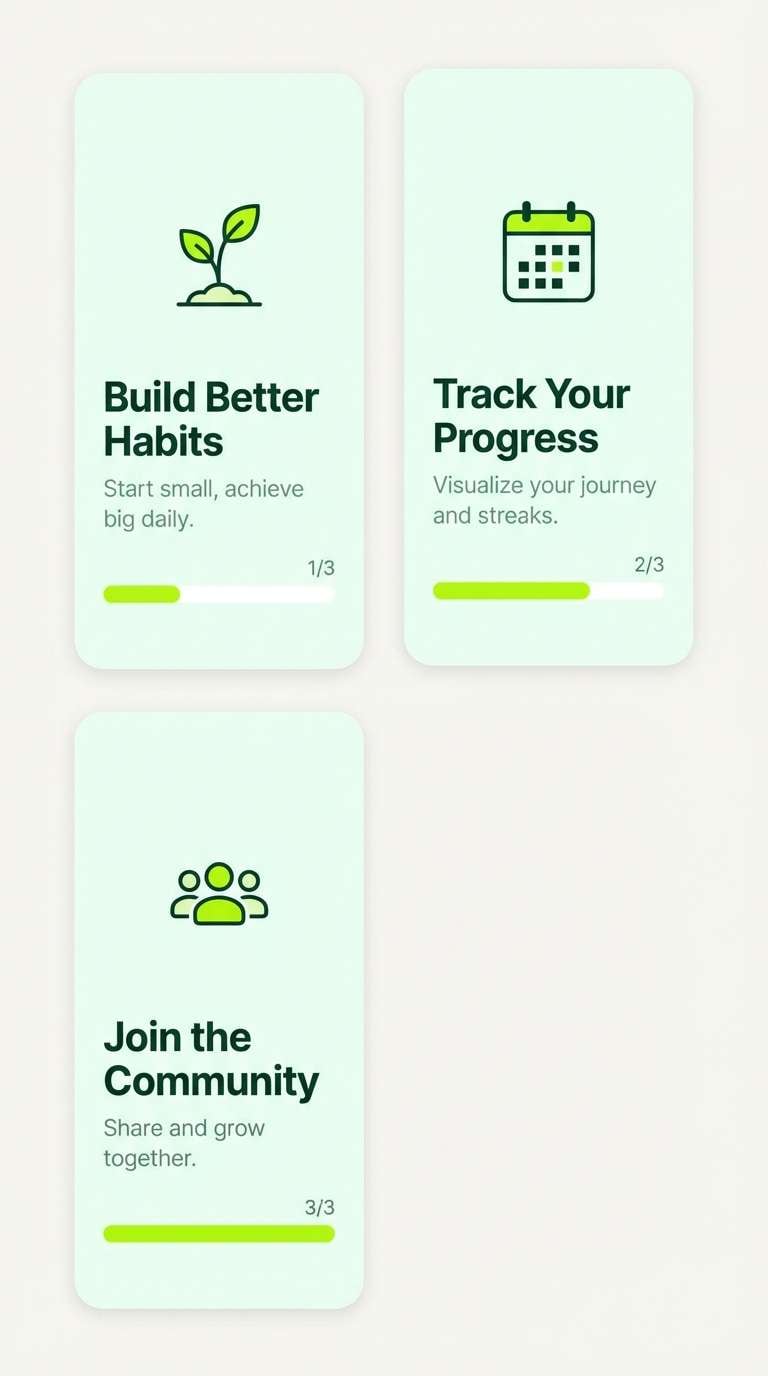
11) Liana Lime
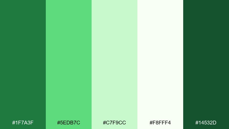
HEX: #1F7A3F #5EDB7C #C7F9CC #F8FFF4 #14532D
Mood: fresh, friendly, energizing
Best for: app onboarding and habit tracker UI
Lively lime greens feel like new growth climbing upward, optimistic and motivating. The soft tints help interfaces stay approachable while still feeling vibrant. Use the near-white for screens and cards, then push the darkest green for key labels and icons. Tip: keep the brightest lime for progress states and success moments so it reads as a reward.
Image example of liana lime generated using media.io
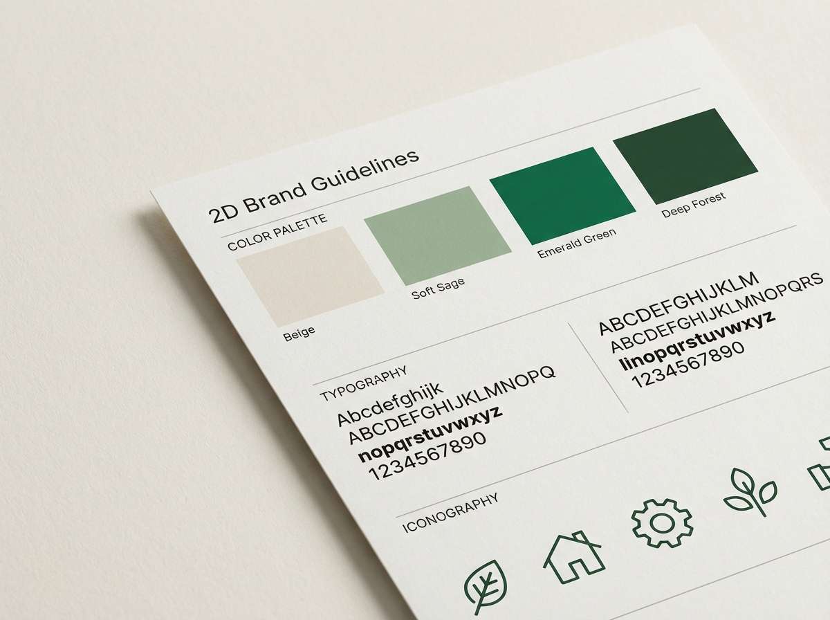
12) Earth and Emerald
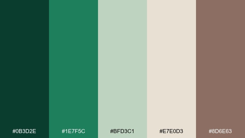
HEX: #0B3D2E #1E7F5C #BFD3C1 #E7E0D3 #8D6E63
Mood: balanced, trustworthy, organic
Best for: brand guidelines and identity systems
Emerald depth and soft earth neutrals create a grounded, professional feel with a natural twist. This jungle color scheme is strong for brand guidelines where you need versatile backgrounds, legible text, and a consistent accent. Pair the warm beige with emerald for section dividers and icon sets. Tip: assign one green as primary and the other as secondary to avoid muddy overlaps in layouts.
Image example of earth and emerald generated using media.io
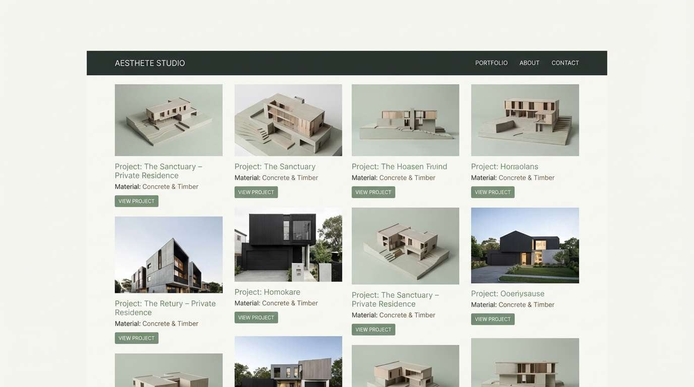
13) Wet Stone Green
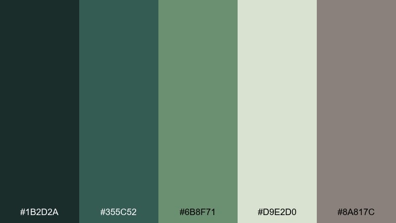
HEX: #1B2D2A #355C52 #6B8F71 #D9E2D0 #8A817C
Mood: quiet, architectural, refined
Best for: architecture portfolios and studio sites
Muted greens and stone grays feel like mist on concrete and wet leaves along a path. The low-saturation mix supports sleek typography and photography-heavy layouts. Use the pale green-gray for negative space and the darkest tone for navigation. Tip: keep the warm gray only for captions and secondary UI to prevent the page from turning too cool.
Image example of wet stone green generated using media.io
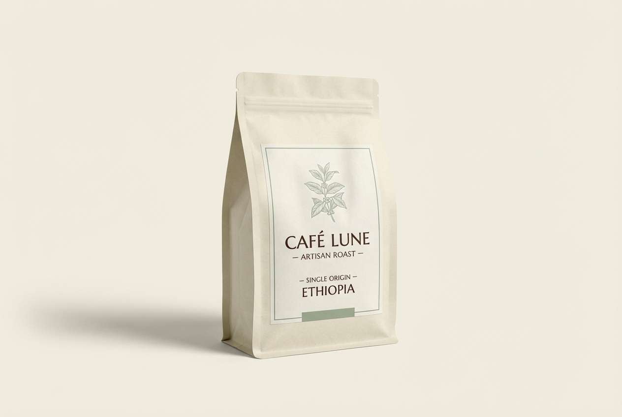
14) Cacao Grove
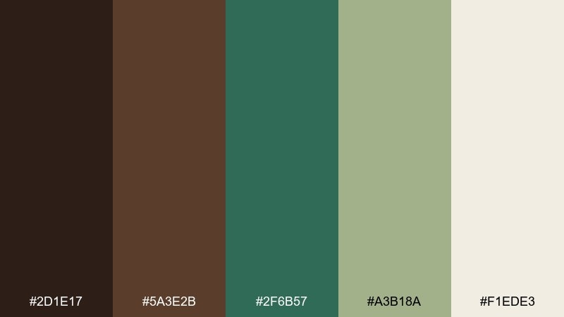
HEX: #2D1E17 #5A3E2B #2F6B57 #A3B18A #F1EDE3
Mood: rich, cozy, artisan
Best for: coffee packaging and cafe branding
Rich cacao browns with softened greens evoke shaded groves, roasted beans, and leafy stems. The mix feels handcrafted and premium, ideal for labels, menus, and gift sets. Pair the cream with the darkest brown for a classic type treatment. Tip: use the green as a small seal, origin marker, or leaf icon so the packaging stays warm and appetizing.
Image example of cacao grove generated using media.io
15) Misty Palm

HEX: #1D3C34 #3C6E71 #A8DADC #F1FAEE #457B9D
Mood: breezy, coastal-jungle, serene
Best for: travel brochure covers and resort promos
Misty aquas and deep palms feel like humid air meeting ocean wind. These tones are great for travel pieces that need calm energy and clean readability. Use the pale mint as the main background, then place the deeper teal for titles and wayfinding. Tip: keep the blue accent for one focal element like a badge or a route line to avoid looking overly nautical.
Image example of misty palm generated using media.io
16) Parrot Accent
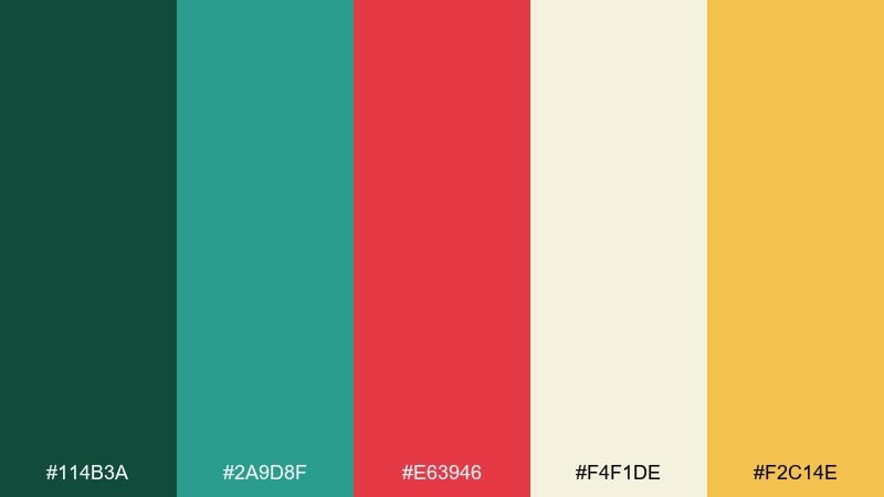
HEX: #114B3A #2A9D8F #E63946 #F4F1DE #F2C14E
Mood: bold, energetic, adventurous
Best for: social ads for tours and outdoor events
Vivid parrot red and sun-gold bring instant energy to deep tropical greens. These jungle color combinations are ideal when a campaign needs a strong hook without losing that nature-first vibe. Let cream carry the layout, then use red only for the main call to action or price. Tip: keep teal as the supporting accent so the warm colors stay punchy rather than chaotic.
Image example of parrot accent generated using media.io

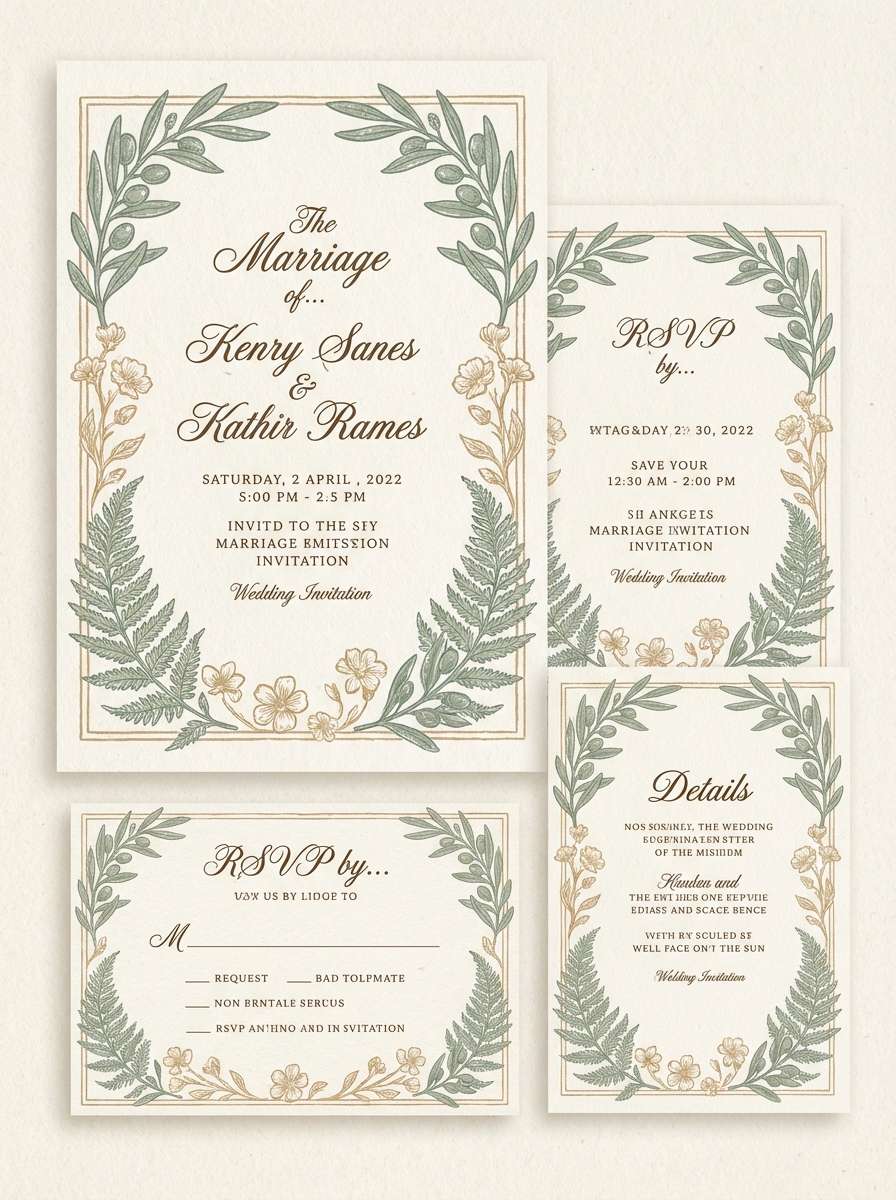
17) Vintage Safari
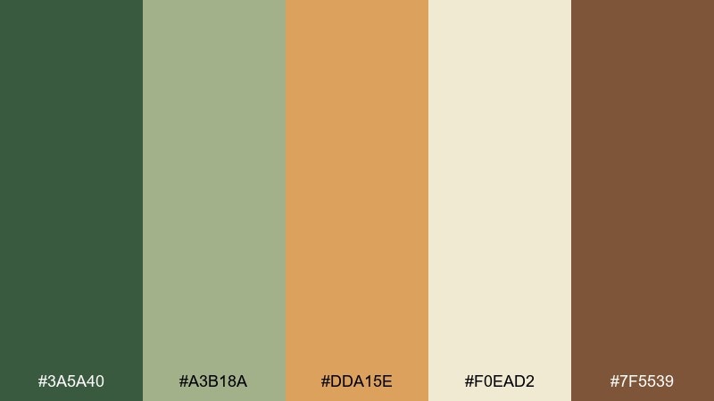
HEX: #3A5A40 #A3B18A #DDA15E #F0EAD2 #7F5539
Mood: vintage, warm, nostalgic
Best for: wedding invitations and classic stationery
Dusty greens with sun-baked tan feel like old field journals and pressed leaves. The warmth makes it a strong choice for invitations, menus, and heritage-inspired stationery. Pair the cream base with the brown for elegant typography, then bring in tan for borders or monograms. Tip: print the greens slightly lighter on textured paper to keep the look airy and timeless.
Image example of vintage safari generated using media.io
18) Deep Vine

HEX: #052E2B #0F5E4B #2DD4BF #F3F4F6 #111827
Mood: sleek, techy, high-contrast
Best for: gaming HUD and dark mode UI
Deep vine tones with a sharp aqua glow feel like bioluminescence in the dark. The palette supports fast readability and a modern, game-ready edge. Use the near-black as the base, then place the aqua for interactive states and highlights. Tip: keep the light gray for text and panels so the interface stays clean without flattening the contrast.
Image example of deep vine generated using media.io
19) Highland Fern
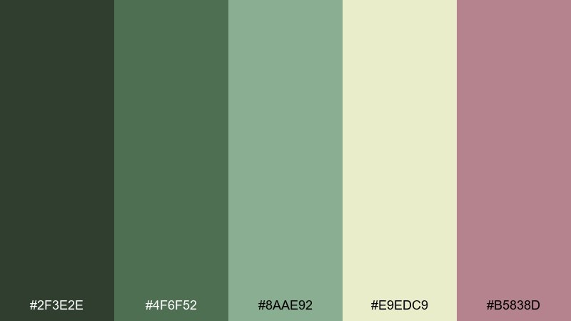
HEX: #2F3E2E #4F6F52 #8AAE92 #E9EDC9 #B5838D
Mood: soft, modern, earthy-floral
Best for: skincare labels and apothecary branding
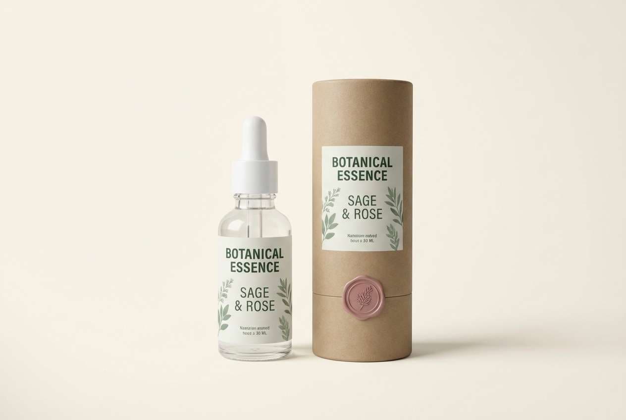
Soft fern greens with a dusty rose accent feel like herbs drying on linen. This mix is great for skincare where you want calm, clean, and slightly elevated. Pair the pale yellow-cream with the darkest green for label text and ingredient lists. Tip: use the rose as a tiny seal or scent indicator to differentiate variants without changing the whole label.
Image example of highland fern generated using media.io
20) Silt and Sage
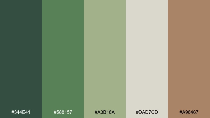
HEX: #344E41 #588157 #A3B18A #DAD7CD #A98467
Mood: welcoming, organic, down-to-earth
Best for: restaurant menus and farm-to-table branding
Sage greens and silt browns feel like herbs, clay plates, and a well-loved wooden table. The tones are versatile for menus, signage, and simple web ordering pages. Use the light neutral as the background so food photos or illustrations remain the focus. Tip: set headings in the darkest green and use the warm brown only for section dividers or small icons.
Image example of silt and sage generated using media.io
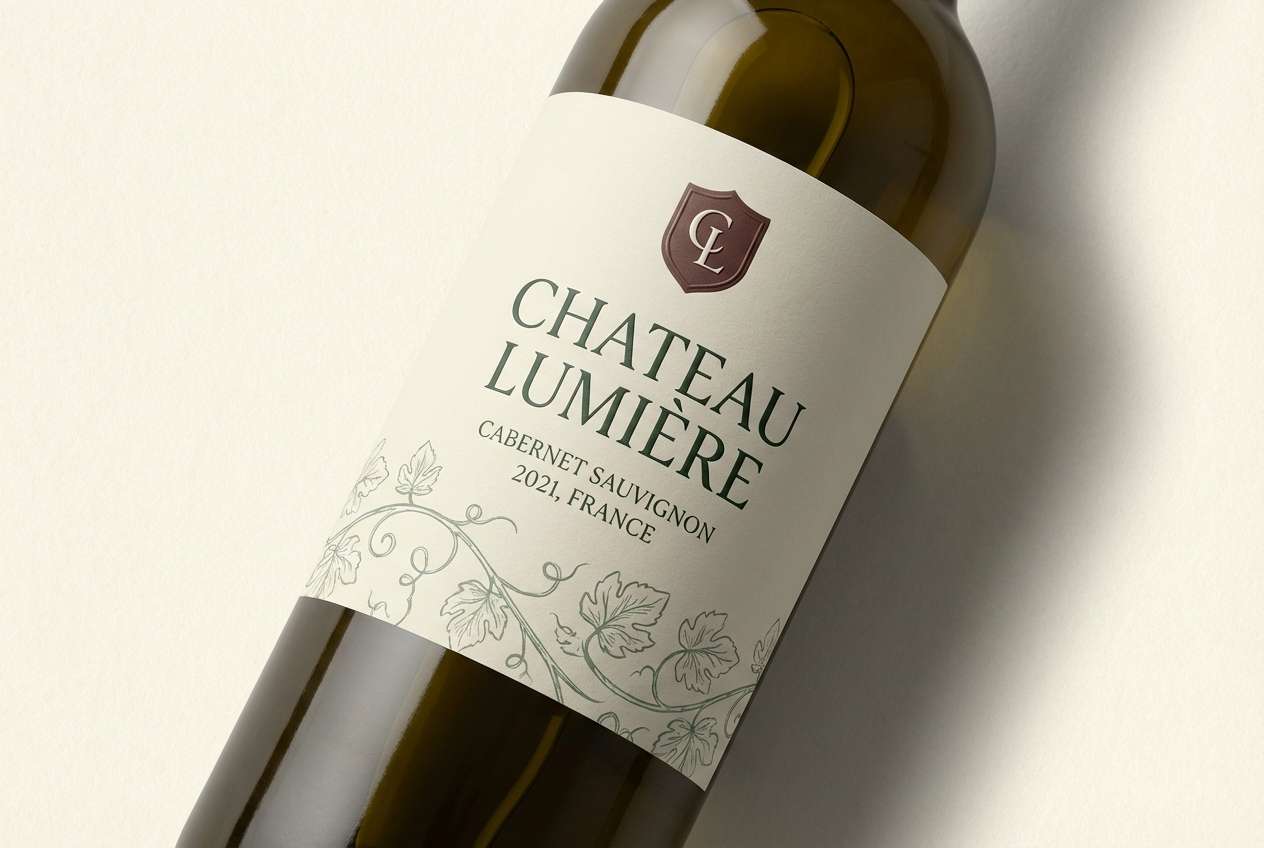
21) Vineyard Shade
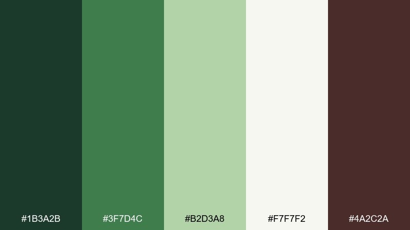
HEX: #1B3A2B #3F7D4C #B2D3A8 #F7F7F2 #4A2C2A
Mood: classic, calm, heritage
Best for: wine labels and artisan food tags
Shaded greens and deep burgundy-brown feel like vines in late afternoon light. It suits heritage branding where you want restraint, not loud color. Pair the near-white with the darkest green for high-end typography and clean spacing. Tip: keep the burgundy-brown for small crests or foil-like details to add depth without overpowering the label.
Image example of vineyard shade generated using media.io
What Colors Go Well with Jungle?
Jungle greens pair naturally with warm neutrals like sand, cream, and kraft-beige to keep layouts breathable and readable. These lighter tones also help you avoid an overly dark, heavy look when you’re using deep greens as a base.
For accents, try sun-gold, clay/terracotta, or muted coral—warm highlights that mimic flowers, sunlight, and soil. If you want a cooler feel, add misty mint, slate blue, or stone gray to sharpen the palette for modern UI and editorial grids.
How to Use a Jungle Color Palette in Real Designs
Start with one “canopy” dark green for headers/navigation and one light neutral for backgrounds. Then choose a mid green for cards, sections, and illustrations—this three-step structure keeps the palette clear instead of muddy.
Use warm accent colors (gold, clay, blush) sparingly for calls to action, labels, and key data points. In interiors or print, apply the deepest tone in smaller areas (trim, frames, typography) and let mid greens and creams carry the largest surfaces.
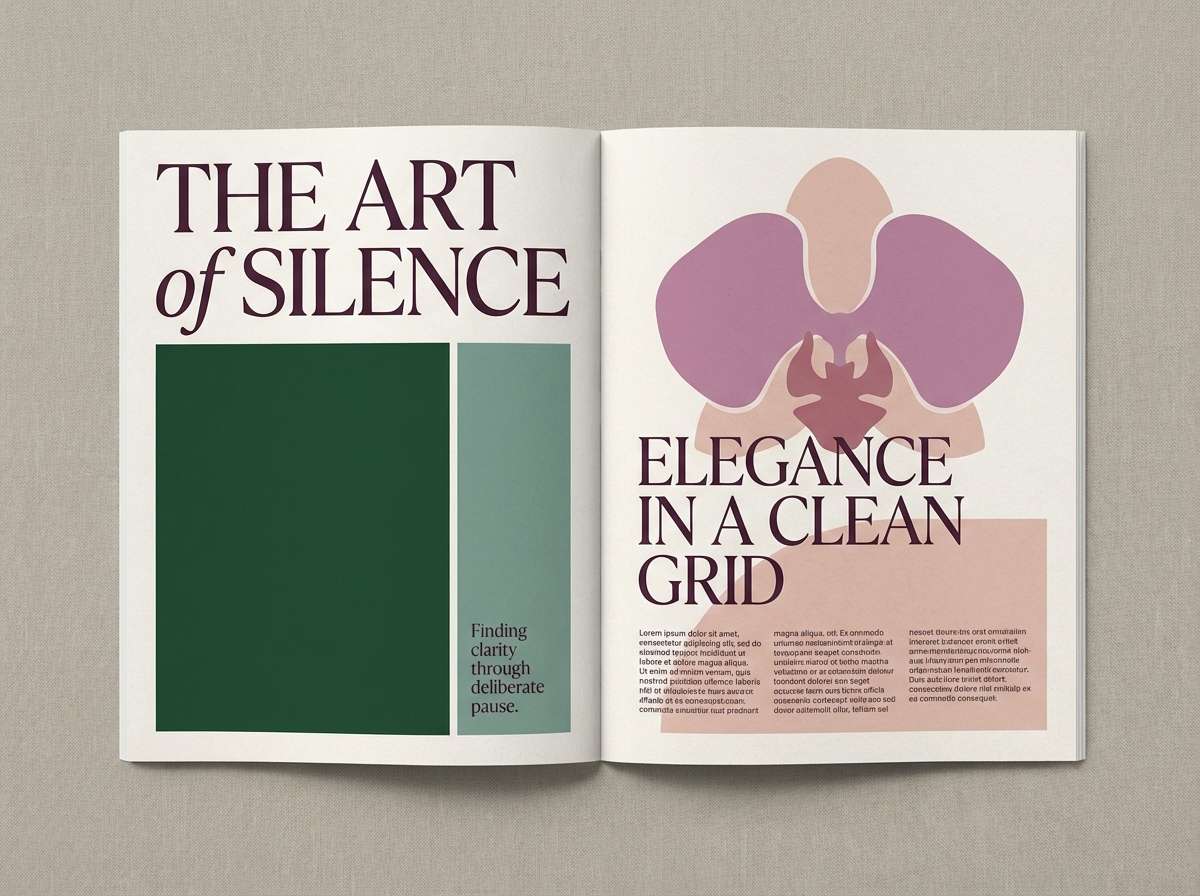
Create Jungle Palette Visuals with AI
If you’re building mood boards, posters, packaging mocks, or UI concepts, generating a few consistent visuals can help you validate the vibe before you commit. The prompts above are designed to match each jungle palette’s mood and best-use case.
In Media.io, you can tweak the subject, composition, and lighting while keeping the same color direction—great for producing a cohesive set of brand or campaign assets.
Jungle Color Palette FAQs
-
What is a jungle color palette?
A jungle color palette is a nature-inspired set built around layered greens (forest, leaf, moss) supported by earthy neutrals (sand, bark, stone) and occasional bright accents (sun-gold, clay, tropical red). -
Which HEX codes are commonly used for jungle greens?
Popular jungle greens include deep canopy tones like #081C15 and #0B3D2E, mid greens like #2D6A4F and #2E8B57, and softer sage/mint like #A3B18A and #D5E7D4. -
How do I keep a jungle palette from looking too dark?
Use a light neutral (cream, off-white, pale mint) as the primary background, and reserve near-black greens for navigation, headings, and small details. Add one warm accent (gold or clay) for lift and contrast. -
What accent colors work best with jungle palettes?
Warm accents like sun-gold (#FFD166, #E9C46A) and terracotta/clay (#BC6C25, #B56B4A) feel natural with greens. For a bolder look, use restrained coral/red (#E63946) in small CTA elements. -
Are jungle palettes good for UI and app design?
Yes—especially when you separate roles: a dark green for navigation, a light neutral for surfaces, and one saturated highlight for interactive states. This keeps the UI readable while still feeling organic. -
What’s the best jungle palette for branding?
For versatile brand systems, look for a balanced mix like “Earth and Emerald” with two greens plus warm neutrals. It supports logos, guidelines, packaging, and web layouts without color conflicts. -
How can I generate jungle-themed visuals that match my HEX colors?
Use an AI text-to-image tool and describe the subject plus lighting and materials (kraft paper, matte labels, misty mint backgrounds). Reuse a consistent prompt style across assets to keep the palette cohesive.


