

A blue green red color palette is one of the easiest ways to get instant contrast: blue adds trust, green signals “go,” and red creates attention-grabbing focal points.
The key is hierarchy—use blue/green as the system colors and keep red as the accent so your design feels energetic, not chaotic.
In this article
- Why Blue Green Red Palettes Work So Well
-
- coastal signal
- retro regatta
- forest carnival
- city transit
- garden kiosk
- alpine picnic
- neon harbor
- vintage atlas
- minimal badge
- festival poster
- tea house modern
- winter market
- studio primary
- coral reef route
- artisan label
- kids museum
- sport banner
- data dashboard
- holiday sprig
- street mural
- clinic calm
- market metrics
- What Colors Go Well with Blue Green Red?
- How to Use a Blue Green Red Color Palette in Real Designs
- Create Blue Green Red Palette Visuals with AI
Why Blue Green Red Palettes Work So Well
Blue and green sit close enough on the color wheel to feel cohesive, while red cuts through as a high-visibility accent. That balance makes this triad feel both stable and exciting.
In practice, blue often becomes your “structure” color (navigation, headers, large panels) and green becomes your “status” color (success, active states, confirmations). Red then reads immediately as urgency, warning, or a single standout CTA.
Because the palette naturally has strong contrast, it’s ideal for UI, posters, packaging, and dashboards—anywhere you need clear hierarchy and fast scanning.
20+ Blue Green Red Color Palette Ideas (with HEX Codes)
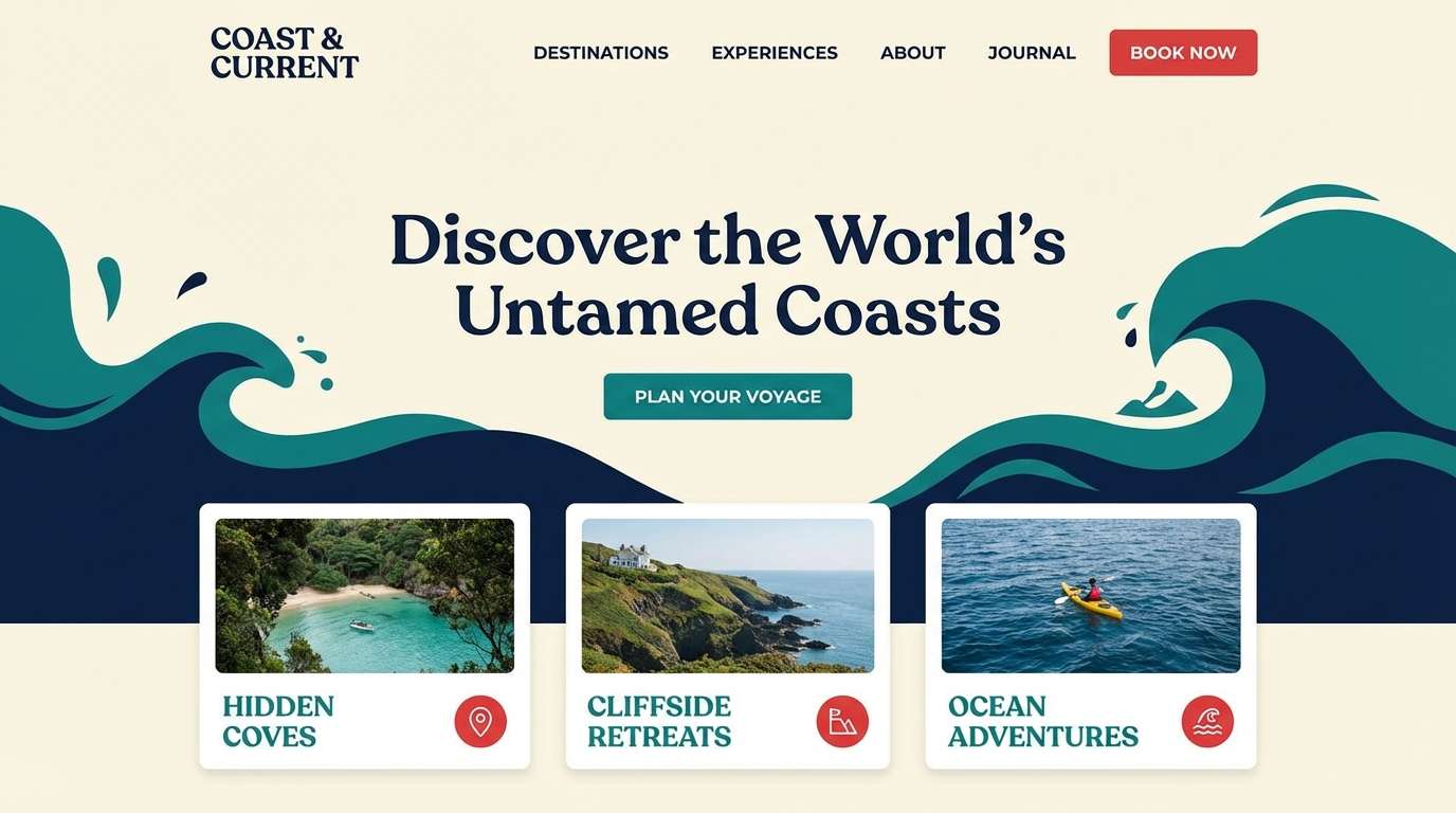
1) Coastal Signal
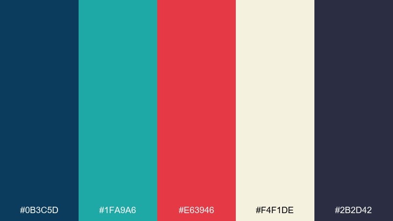
HEX: #0B3C5D #1FA9A6 #E63946 #F4F1DE #2B2D42
Mood: crisp, nautical, confident
Best for: travel brand landing page hero UI
Crisp nautical energy comes through like a harbor flag set against deep water. Use the navy and teal as your main canvas, then drop in the red as a clear call to action. Cream keeps text areas breathable, while charcoal supports body copy and icons. Usage tip: reserve red for one primary button per section to maintain a clean hierarchy.
Image example of coastal signal generated using media.io
Media.io is an online AI studio for creating and editing video, image, and audio in your browser.

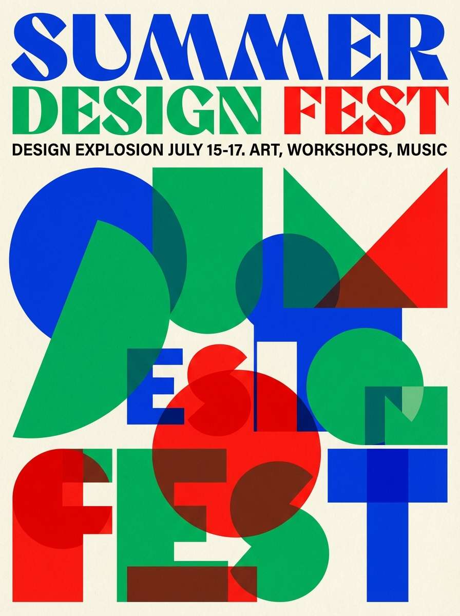
2) Retro Regatta
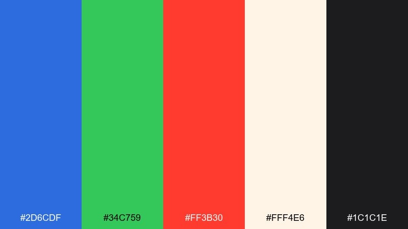
HEX: #2D6CDF #34C759 #FF3B30 #FFF4E6 #1C1C1E
Mood: retro, sporty, upbeat
Best for: summer event poster design
Upbeat retro sport vibes feel like sail numbers, loud whistles, and sunlit water. Let the bright blue and green carry the main shapes, then use the red for headlines or date blocks. The warm ivory background keeps it friendly, while near-black anchors small text and sponsor lines. Usage tip: keep type bold and geometric so the palette reads instantly from a distance.
Image example of retro regatta generated using media.io
3) Forest Carnival

HEX: #145A32 #1E88E5 #C62828 #F1F8E9 #4E342E
Mood: earthy, playful, storybook
Best for: botanical illustration set for social posts
Earthy playfulness lands like a storybook fair tucked into a forest clearing. The deep green and sky blue handle foliage and shadows, while the red brings charming berries and tiny focal points. Soft mint lightens the page, and brown adds hand-drawn warmth for outlines. Usage tip: use red sparingly as a visual breadcrumb that guides the eye across a carousel.
Image example of forest carnival generated using media.io

4) City Transit
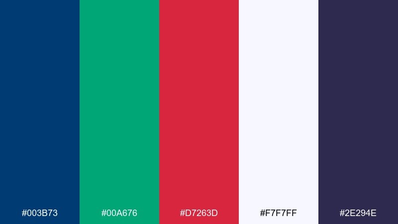
HEX: #003B73 #00A676 #D7263D #F7F7FF #2E294E
Mood: urban, efficient, high-contrast
Best for: wayfinding signage system concept
Urban efficiency shows up like clean station tiles, sharp arrows, and clear platform numbers. This blue green red color scheme works best when blue is the primary information color, green supports confirmation states, and red is reserved for warnings. Off-white keeps signs readable, and indigo adds depth for secondary panels. Usage tip: standardize icon strokes in indigo so the system looks consistent across materials.
Image example of city transit generated using media.io

5) Garden Kiosk
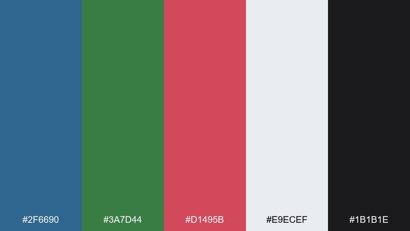
HEX: #2F6690 #3A7D44 #D1495B #E9ECEF #1B1B1E
Mood: fresh, friendly, local-market
Best for: farmers market vendor logo and labels
Fresh local-market charm feels like chalkboard menus and bunches of herbs on display. Use the blue for the logo base, green for natural cues, and dusty red for seasonal highlights like strawberries or tomatoes. Light gray keeps labels clean, while black helps small typography stay legible on jars and bags. Usage tip: print the red as a spot accent on one sticker element to control costs and boost consistency.
Image example of garden kiosk generated using media.io

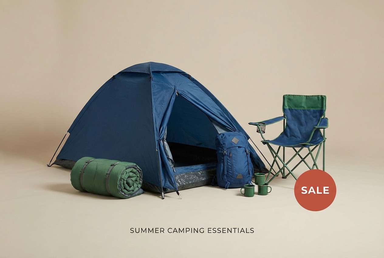
6) Alpine Picnic

HEX: #1B4965 #5FAF4E #E84855 #F0EBD8 #3D3D3D
Mood: outdoorsy, cozy, optimistic
Best for: camping gear product ad
Outdoorsy optimism reads like a picnic blanket laid out beside a cool lake breeze. Let the blue and beige build the calm foundation, then bring in the green for eco cues and trail details. The warm red is perfect for a price badge or limited offer tag without feeling harsh. Usage tip: keep the background beige and add red only to one focal element to avoid visual noise.
Image example of alpine picnic generated using media.io
7) Neon Harbor

HEX: #0A84FF #00D084 #FF2D55 #0B0B0F #F2F2F7
Mood: nightlife, neon, techy
Best for: music app playlist UI screens
Nightlife neon pops like club signage reflecting on dark water. Use the near-black as the main stage, then let electric blue and neon green drive active states and progress elements. Hot red works best as a micro-accent for likes, alerts, or live badges. Usage tip: soften large text blocks in the light gray so the bright colors stay punchy without eye fatigue.
Image example of neon harbor generated using media.io

8) Vintage Atlas
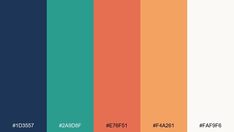
HEX: #1D3557 #2A9D8F #E76F51 #F4A261 #FAF9F6
Mood: heritage, warm, exploratory
Best for: editorial magazine spread layout
Heritage warmth feels like worn map paper, stamped routes, and travel notes in the margins. The deep blue sets strong headlines, teal supports section labels, and the red-orange highlights pull quotes or location pins. Sandy tones soften large blocks and keep the spread inviting. Usage tip: pair with a serif headline font and keep accent shapes thin so the layout stays editorial, not cartoony.
Image example of vintage atlas generated using media.io

9) Minimal Badge
HEX: #114B5F #1A936F #D00000 #F3E9D2 #2D2A32
Mood: minimal, premium, focused
Best for: coffee bag packaging label
Minimal premium focus comes across like a single wax seal on textured paper. Use teal-blue for the main label field, mint green for subtle icons, and red for one standout badge such as roast level. The warm tan background adds craft character, while dark charcoal keeps details crisp. Usage tip: leave generous margins around the red badge so it reads as intentional, not noisy.
Image example of minimal badge generated using media.io

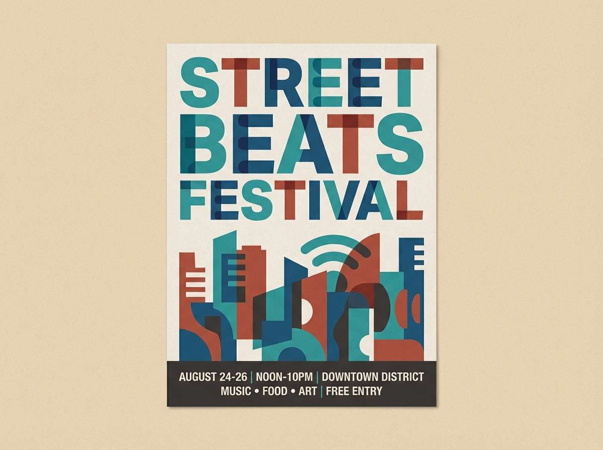
10) Festival Poster

HEX: #005F73 #0A9396 #AE2012 #E9D8A6 #001219
Mood: bold, artsy, sun-baked
Best for: street festival flyer design
Bold artsy energy lands like painted banners and loud music under a hot afternoon sun. Blue and teal carry the big shapes, while brick red makes dates and ticket info feel urgent. The sandy yellow supports textures and background blocks without washing out contrast. Usage tip: use the dark tone for a single footer strip so sponsors and QR codes stay readable.
Image example of festival poster generated using media.io
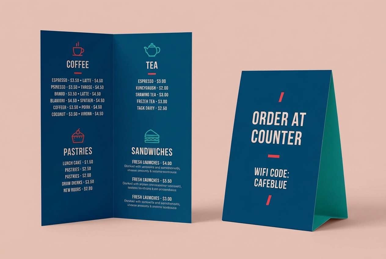
11) Tea House Modern

HEX: #15616D #2EC4B6 #E71D36 #FFDDD2 #0B1320
Mood: modern, calm, boutique
Best for: cafe menu and table tent set
Modern calm feels like steamed glass, clean ceramic, and a quiet counter at opening time. Use the deep blue for headings, teal for section dividers, and red for one or two signature items. Blush keeps the menu soft and welcoming, while the near-black ensures fine print stays sharp. Usage tip: keep red to small dots or price markers so the set looks boutique, not fast-food.
Image example of tea house modern generated using media.io
12) Winter Market
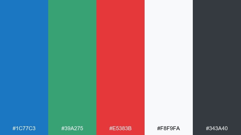
HEX: #1C77C3 #39A275 #E5383B #F8F9FA #343A40
Mood: clean, festive, structured
Best for: holiday email newsletter template
Clean festive structure reads like twinkle lights against fresh snow. Use blue for headers and links, green for positive callouts, and red for giftable highlights or limited-time banners. The near-white background keeps the email lightweight, while dark gray improves accessibility for long reads. Usage tip: make the primary CTA green and keep red for secondary urgency labels so clicks feel guided, not pressured.
Image example of winter market generated using media.io

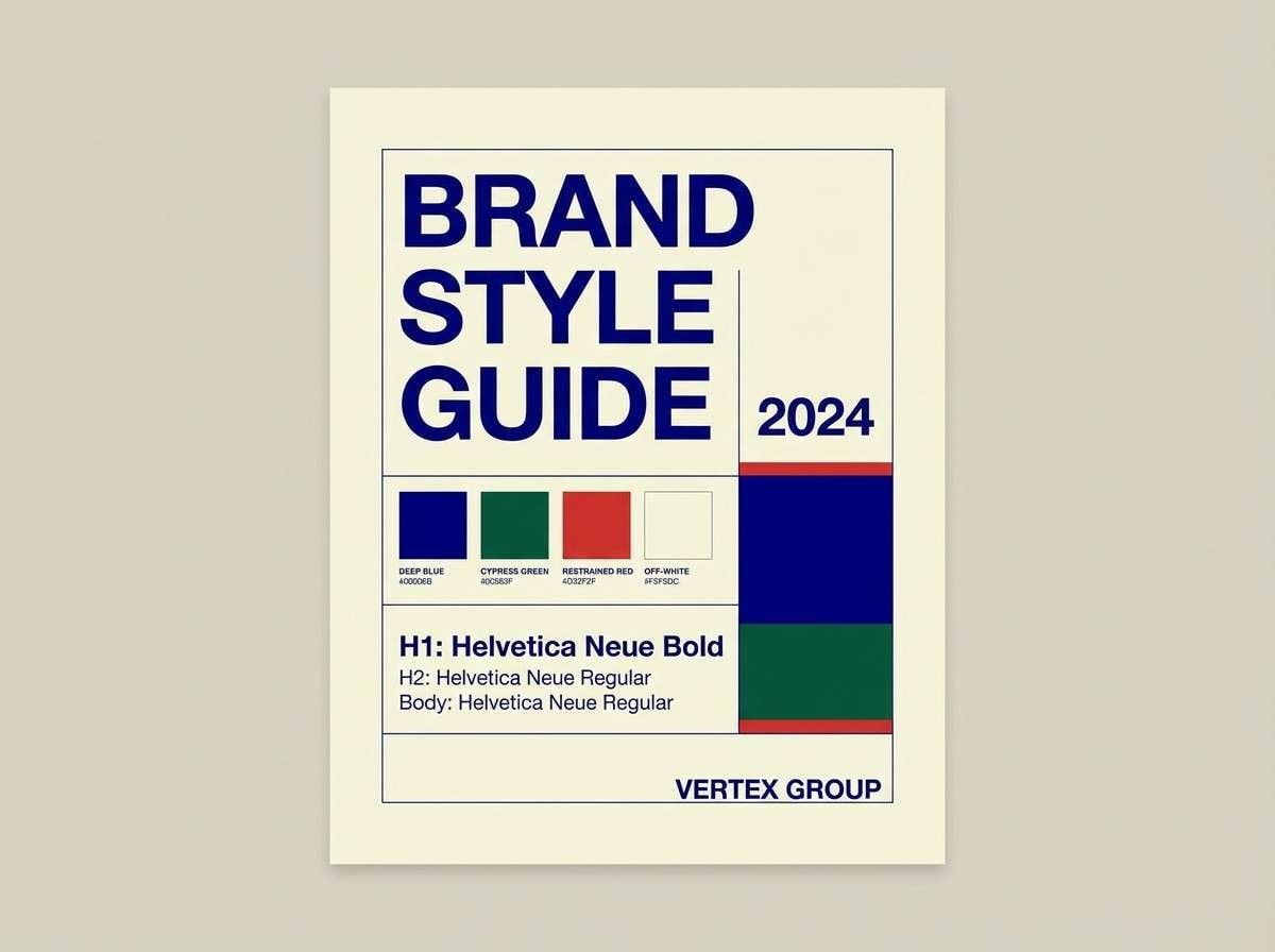
13) Studio Primary

HEX: #1E3A8A #16A34A #DC2626 #F5F5F4 #0F172A
Mood: classic, studio-clean, professional
Best for: brand style guide cover
Classic studio-clean confidence feels like crisp paper, sharp grids, and well-lit mockups. A blue foundation plus green support tones keep it professional, and the red is perfect for section tabs or key rules. Off-white helps the page breathe, while deep slate gives typography a premium edge. Usage tip: use red only for headings or dividers so the guide stays disciplined and easy to scan.
Image example of studio primary generated using media.io
14) Coral Reef Route
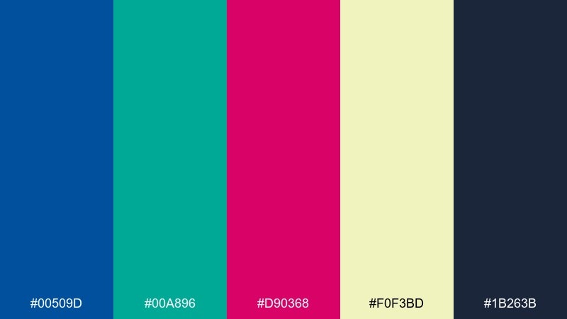
HEX: #00509D #00A896 #D90368 #F0F3BD #1B263B
Mood: tropical, vivid, energetic
Best for: swimwear product packaging
Tropical vivid energy hits like reef colors flashing under clear water. Let blue and aqua dominate the packaging base, then use the pink-red for a bold pattern hit or logo stamp. The pale lime background tone keeps the vibe sunny without going neon. Usage tip: pair the accent with simple sans-serif type and avoid extra colors so the shelf impact stays strong.
Image example of coral reef route generated using media.io

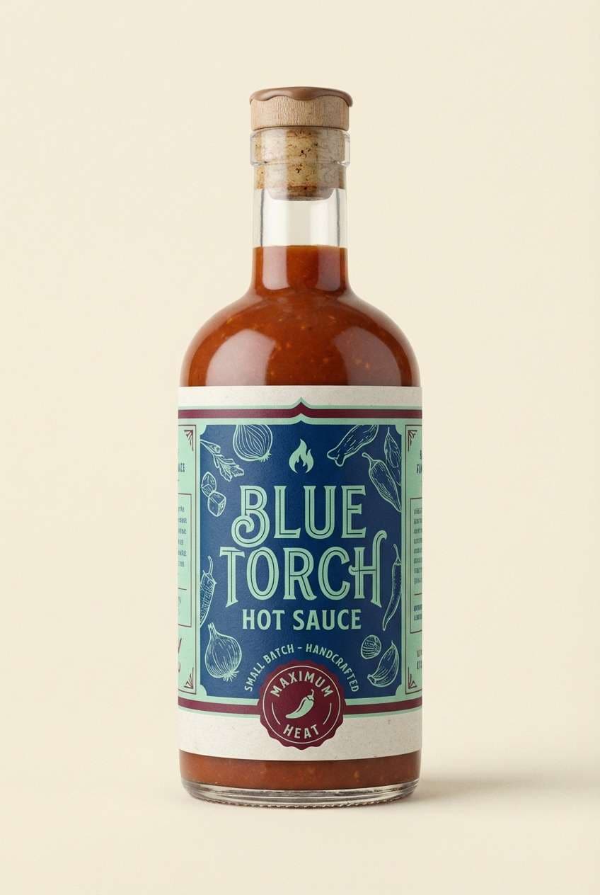
15) Artisan Label
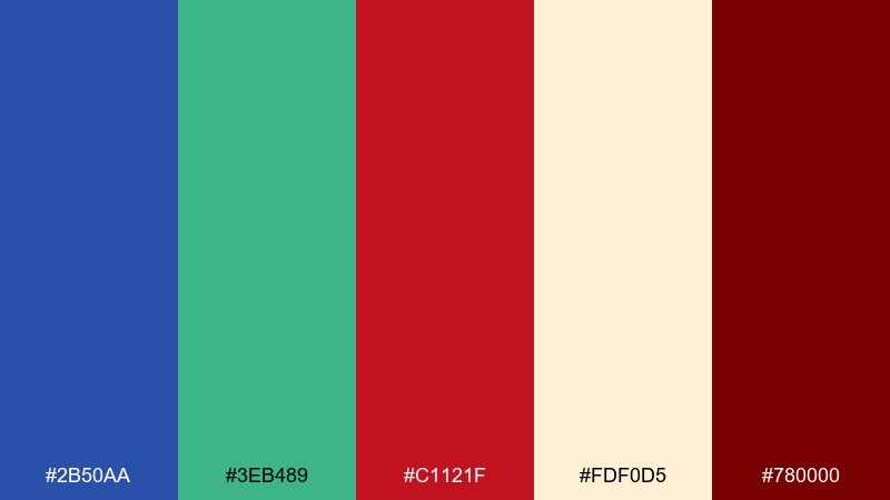
HEX: #2B50AA #3EB489 #C1121F #FDF0D5 #780000
Mood: craft, rich, nostalgic
Best for: hot sauce bottle label
Craft richness feels like small-batch kitchens and hand-stamped paper. Use the strong blue for the brand block, mint for freshness cues, and deep red for heat level and icon badges. Cream keeps the label readable, and the dark maroon adds an aged, premium finish. Usage tip: keep the main red in one area, then echo it with tiny pepper icons for cohesion.
Image example of artisan label generated using media.io
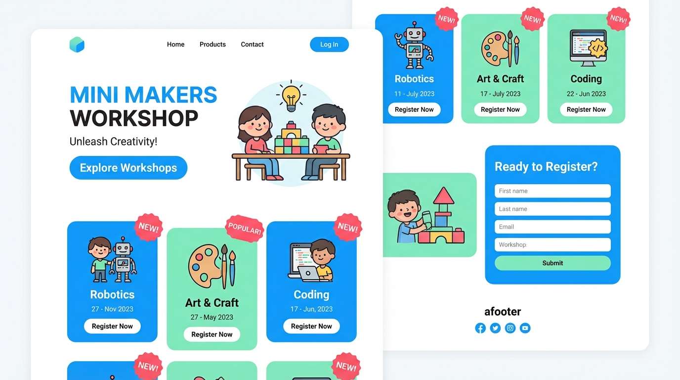
16) Kids Museum
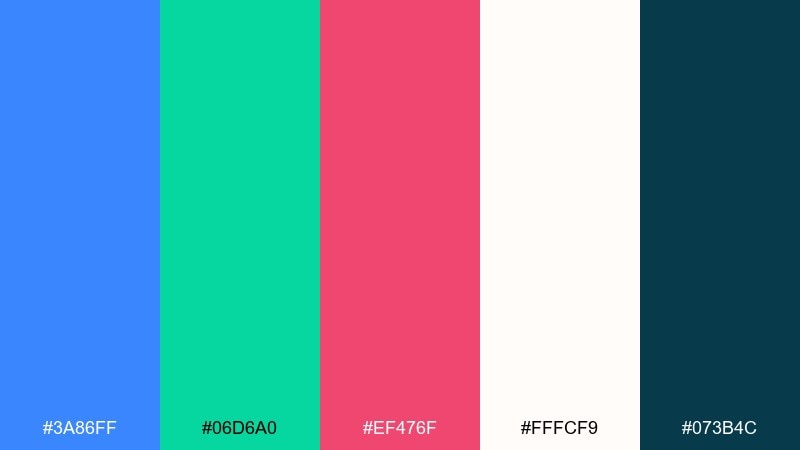
HEX: #3A86FF #06D6A0 #EF476F #FFFCF9 #073B4C
Mood: playful, bright, welcoming
Best for: kids workshop registration landing page UI
Playful brightness feels like hands-on exhibits and colorful learning stations. Use blue for structure and navigation, green for progress states, and pink-red for friendly highlights such as badges and event tags. Off-white keeps the interface airy, while deep teal helps headings stay readable. Usage tip: round your UI components so the colors feel inviting rather than aggressive.
Image example of kids museum generated using media.io
17) Sport Banner
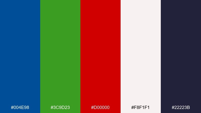
HEX: #004E98 #3C9D23 #D00000 #F8F1F1 #22223B
Mood: competitive, bold, high-energy
Best for: team announcement social banner
Competitive energy reads like stadium lights and a last-minute comeback. Blue works well for the base banding, green adds motion accents, and red nails the headline moment for names and scores. The pale background keeps it shareable on feeds, while dark indigo helps type stay sharp. Usage tip: push the red behind the player name only, so the message lands instantly when scrolled.
Image example of sport banner generated using media.io

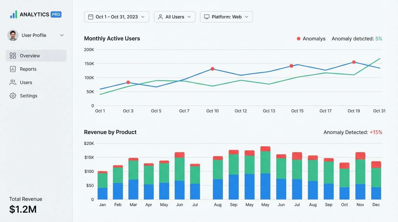
18) Data Dashboard
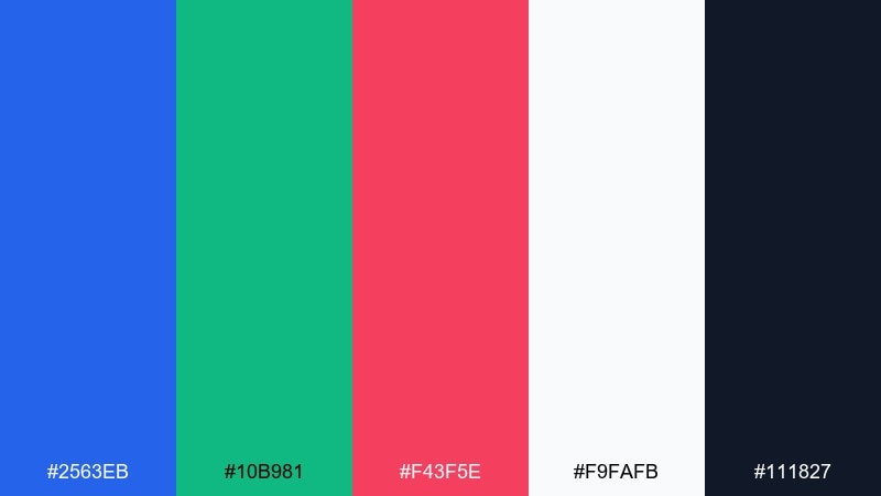
HEX: #2563EB #10B981 #F43F5E #F9FAFB #111827
Mood: modern, analytical, crisp
Best for: SaaS analytics dashboard UI
Modern analytical clarity feels like tidy charts, crisp labels, and calm decision-making. For a blue green red color palette like this, treat blue as the main series, green as success metrics, and red as anomalies only. The light background keeps data readable, and the deep slate supports dense navigation. Usage tip: keep red points under five percent of the chart area so alerts stay meaningful.
Image example of data dashboard generated using media.io
19) Holiday Sprig
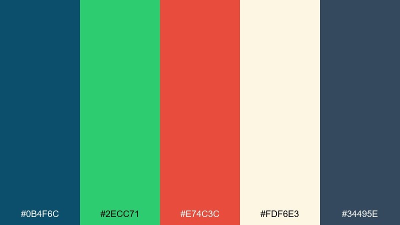
HEX: #0B4F6C #2ECC71 #E74C3C #FDF6E3 #34495E
Mood: cheerful, seasonal, cozy
Best for: holiday invitation card
Cheerful seasonal coziness feels like evergreen sprigs on a warm cream card. Use the deep blue for the main text and borders, green for foliage illustration, and red for berries or a small RSVP stamp. Slate keeps secondary details grounded without turning harsh. Usage tip: pick either red or green as the main illustration focus, and let the other stay as a supporting accent for balance.
Image example of holiday sprig generated using media.io

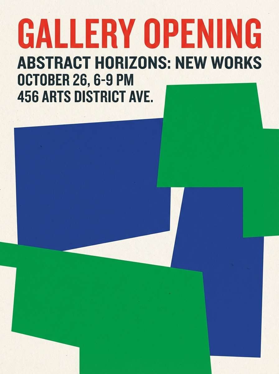
20) Street Mural

HEX: #22356F #00B06B #F94144 #F6F7EB #2B2D42
Mood: bold, creative, contemporary
Best for: gallery opening poster
Bold contemporary creativity feels like fresh paint, big shapes, and confident typographic rhythm. Blue and green build large blocks, and the punchy red drives the focal headline for maximum street-read. For designers exploring blue green red color combinations, this mix stays modern when you keep the background off-white and the shadows dark. Usage tip: limit gradients and lean on solid fills so the poster prints cleanly at large sizes.
Image example of street mural generated using media.io
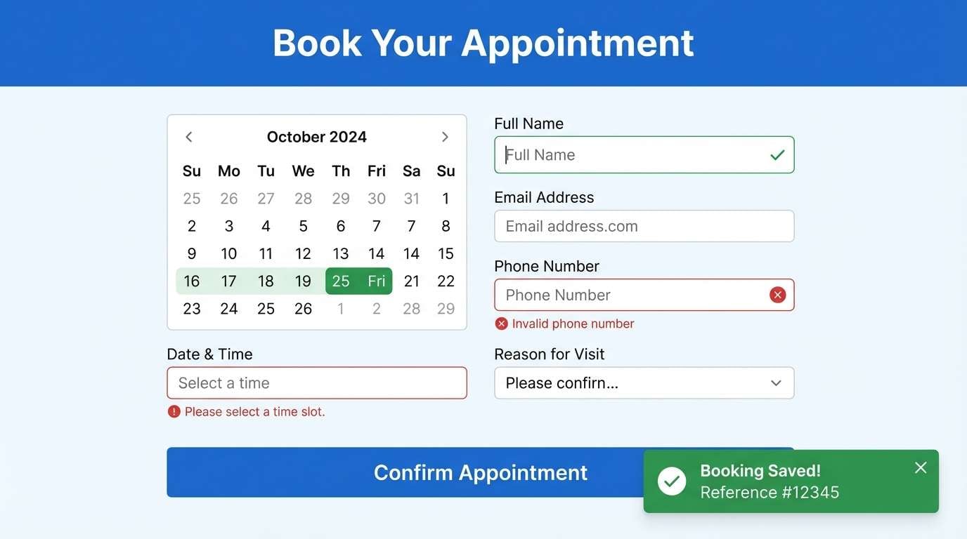
21) Clinic Calm
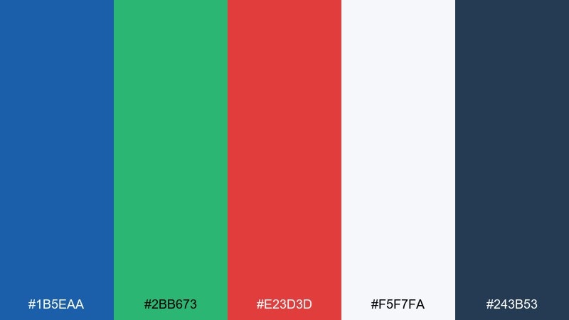
HEX: #1B5EAA #2BB673 #E23D3D #F5F7FA #243B53
Mood: calm, trustworthy, clinical-clean
Best for: healthcare appointment booking UI
Calm trustworthy tones feel like a bright waiting room and clear signage that reduces stress. Use blue for navigation and headings, green for confirmations and availability, and red only for critical validation messages. The soft gray-white background keeps everything readable, while deep blue-gray supports form labels and icons. Usage tip: keep error states subtle by pairing red with small icons and plain language instead of large blocks.
Image example of clinic calm generated using media.io
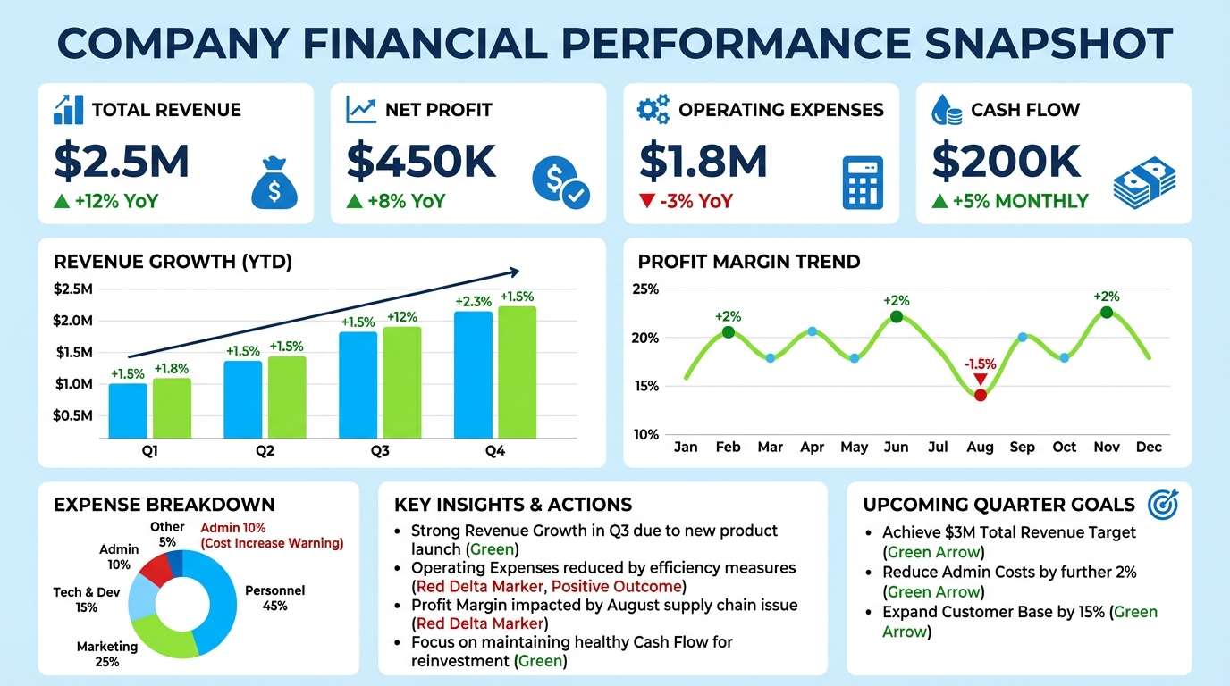
22) Market Metrics
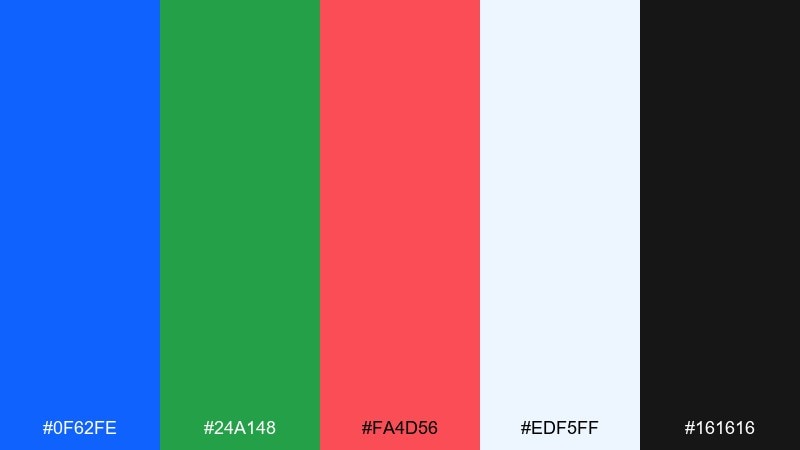
HEX: #0F62FE #24A148 #FA4D56 #EDF5FF #161616
Mood: sharp, data-driven, corporate
Best for: financial report infographic
Sharp corporate clarity feels like a clean report deck and decisive charts. Blue should carry primary bars and titles, green can signal growth, and red is best kept for negative deltas and risk callouts. The pale blue background adds polish without stealing contrast, while near-black keeps annotations legible. Usage tip: standardize chart legends so the same colors always mean the same outcomes across pages.
Image example of market metrics generated using media.io
What Colors Go Well with Blue Green Red?
Neutrals make this palette easier to control: off-white, warm cream, cool light gray, and charcoal help the colors feel intentional and readable. If you’re designing UI, choose one light background and one dark text color first, then layer the trio on top.
For extra depth, add a “bridge” tone like teal (between blue and green) or coral (between red and orange). These supporting hues keep transitions smooth, especially in gradients, illustrations, and large poster shapes.
Metallics also pair well—silver for a tech feel, or a muted gold for premium packaging—without competing with the core blue/green/red contrast.
How to Use a Blue Green Red Color Palette in Real Designs
Start with roles, not equal percentages. A common split is 60–30–10: blue as the primary base, green as the supporting system color, and red as the smallest accent for CTAs, alerts, or key labels.
To avoid clashing, keep saturation consistent across the trio and use red in fewer places than you think—one main button per section, one “warning” style, or one headline block on a poster often works best.
For accessibility, check contrast on text and icons. Red and green can be tricky together for color-blind users, so pair them with icons, patterns, or labels to reinforce meaning.
Create Blue Green Red Palette Visuals with AI
If you want to see your palette before committing it to a brand guide, generate quick mockups: landing pages, posters, packaging labels, and app screens. It’s a fast way to test hierarchy and find where red should (and shouldn’t) appear.
With Media.io’s text-to-image tools, you can paste a prompt, specify the aspect ratio, and iterate on layout styles—flat, realistic, editorial, or bold geometric—while keeping your blue/green/red direction consistent.
Blue Green Red Color Palette FAQs
-
What does a blue green red color palette communicate?
It combines trust and structure (blue), freshness and progress (green), and urgency or emphasis (red). Together, it creates strong hierarchy that’s great for interfaces, posters, and brand systems. -
How do I keep blue, green, and red from clashing?
Pick a dominant color (usually blue), use green for supporting UI states or secondary blocks, and limit red to a few high-priority accents. Neutrals like off-white and charcoal help everything feel balanced. -
What’s the best background color for a blue green red palette?
Light neutrals (cream, off-white, pale gray) are the safest for readability and print. Dark mode works too—use near-black with softened light text so the bright colors stay punchy without eye strain. -
Is red and green a problem for accessibility?
It can be for some users with color vision differences. Don’t rely on red vs. green alone—add icons, labels, patterns, or position cues, and verify contrast ratios for text and critical UI elements. -
How much red should I use in a blue green red color scheme?
Usually the least—around 5–10% of the design. Treat red as a “signal” color for one primary CTA, key headline blocks, or error states, so it stays meaningful. -
Which industries commonly use blue green red palettes?
Tech and SaaS dashboards, healthcare and booking UIs, finance reporting, sports promotions, and event posters. The trio supports clarity, speed of scanning, and strong attention control. -
Can I use this palette for branding without looking too “primary”?
Yes—choose slightly muted or deeper versions (navy, teal, brick red), add a warm neutral, and keep your typography refined. This makes the palette feel modern and premium rather than basic.
Next: Lake Color Palette


