

Blue and burgundy is a modern pairing that feels both confident and refined—cool blues bring structure, while burgundy adds warmth and premium depth.
Below are 20 curated blue burgundy color palette ideas with HEX codes, plus practical tips for using them in branding, weddings, and UI.
In this article
- Why Blue Burgundy Palettes Work So Well
-
- midnight merlot
- harbor wine
- velvet dock
- cabernet coastline
- ink and rosewood
- stormy sangria
- sapphire cellar
- classic claret navy
- museum evening
- winter vineyard
- urban bistro
- royal library
- sunset tasting room
- granite and garnet
- denim and mulberry
- night opera
- vintage letterpress
- modern art gala
- cocoa noir
- blossom nightfall
- What Colors Go Well with Blue Burgundy?
- How to Use a Blue Burgundy Color Palette in Real Designs
- Create Blue Burgundy Palette Visuals with AI
Why Blue Burgundy Palettes Work So Well
Blue burgundy palettes balance temperature and emotion: blue communicates clarity and trust, while burgundy adds richness and human warmth. Together, they feel “designed” without looking loud.
This combo also creates natural hierarchy. Navy and deep blues work as stable backgrounds and text colors, while burgundy becomes an intentional accent for CTAs, headlines, seals, or highlights.
Most blue-and-burgundy schemes pair easily with soft neutrals (ivory, blush-gray, warm white), which helps you keep contrast readable across web, print, and photography overlays.
20+ Blue Burgundy Color Palette Ideas (with HEX Codes)
1) Midnight Merlot
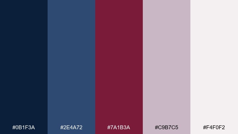
HEX: #0b1f3a #2e4a72 #7a1b3a #c9b7c5 #f4f0f2
Mood: moody, luxe, cinematic
Best for: premium brand identity and hero banners
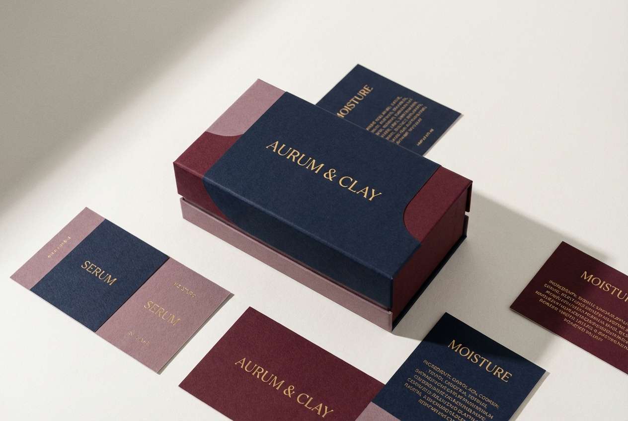
Moody and cinematic like a late-night lounge with velvet shadows and a glass of merlot. This blue burgundy color palette feels instantly premium on logos, landing pages, and packaging sleeves. Pair it with warm ivory typography and keep accents minimal so the burgundy reads as intentional, not busy. Usage tip: reserve the darkest navy for backgrounds and use the wine tone for only one high-contrast focal element.
Image example of midnight merlot generated using media.io
Media.io is an online AI studio for creating and editing video, image, and audio in your browser.

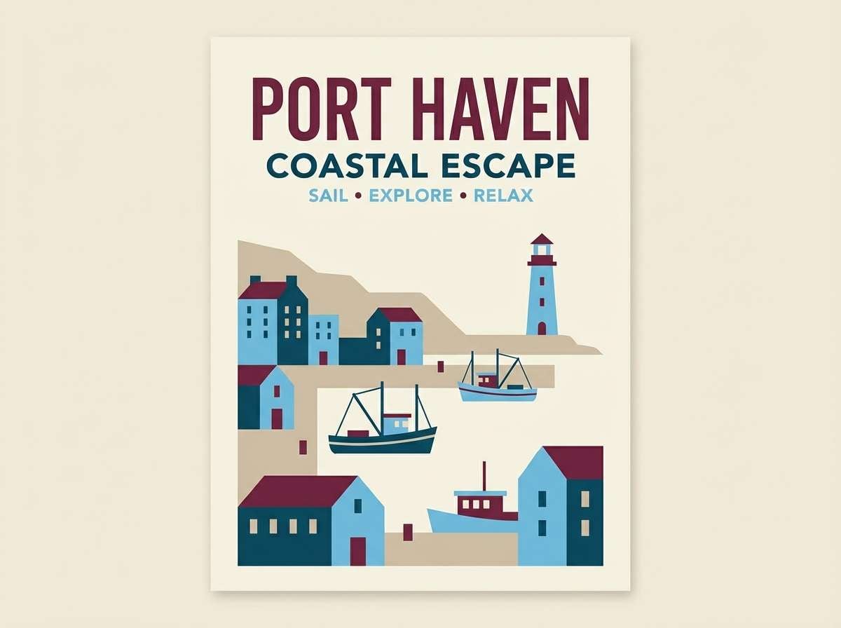
2) Harbor Wine
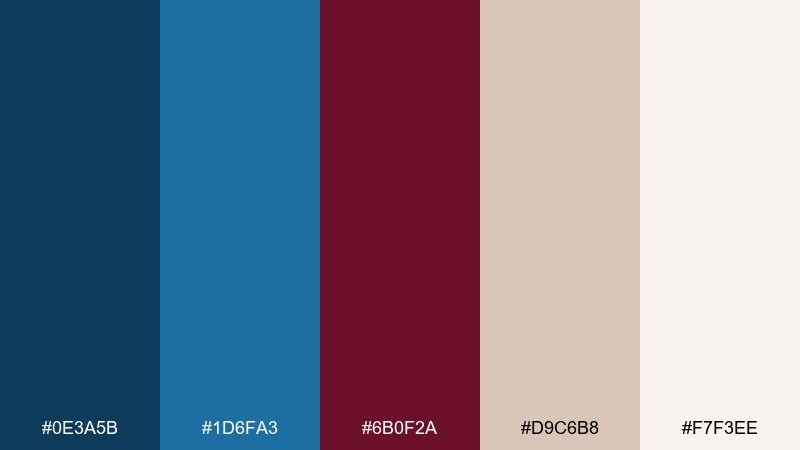
HEX: #0e3a5b #1d6fa3 #6b0f2a #d9c6b8 #f7f3ee
Mood: coastal, polished, confident
Best for: travel posters and hotel branding
Polished and coastal, like harbor water under a crisp sky with a deep wine accent. The brighter blue brings clarity while burgundy adds a grounded, boutique feel. It works beautifully on travel posters, hospitality logos, and wayfinding where contrast matters. Usage tip: let the light sand tone carry large areas, then use burgundy sparingly for stamps, icons, or callouts.
Image example of harbor wine generated using media.io
3) Velvet Dock
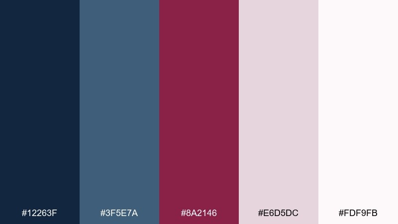
HEX: #12263f #3f5e7a #8a2146 #e6d5dc #fdf9fb
Mood: romantic, refined, soft-contrast
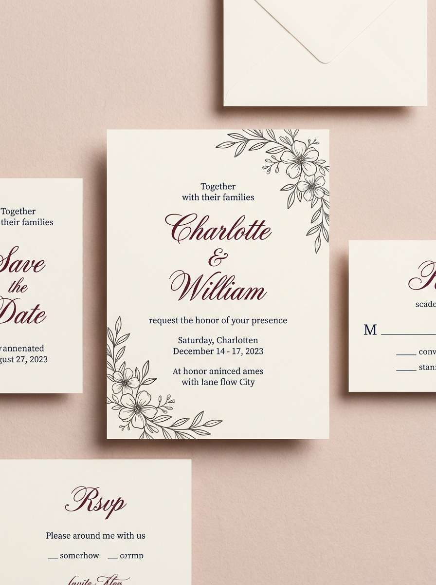
Best for: wedding invitations and stationery
Romantic and refined, like velvet ribbon tied around a classic dockside bouquet. The soft blush-lilac neutral keeps the darker tones from feeling heavy on paper. It shines on invitations, menus, and save-the-dates with delicate serif type and simple line art. Usage tip: print burgundy for names and headlines, and keep body text in the deeper blue for readability.
Image example of velvet dock generated using media.io
4) Cabernet Coastline
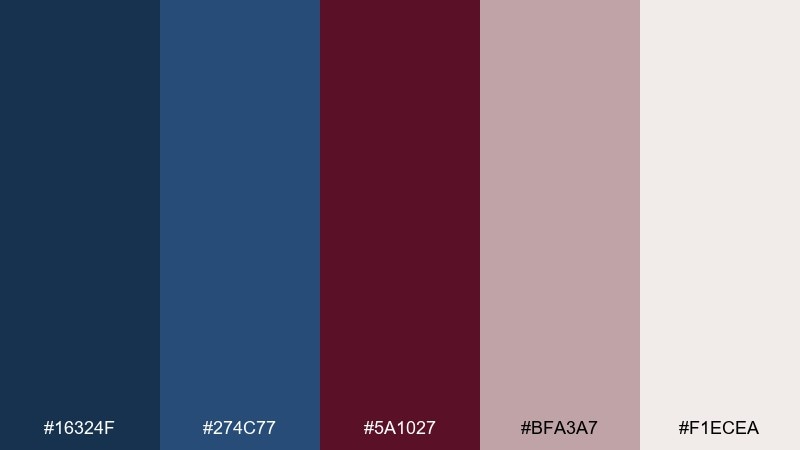
HEX: #16324f #274c77 #5a1027 #bfa3a7 #f1ecea
Mood: classic, editorial, understated
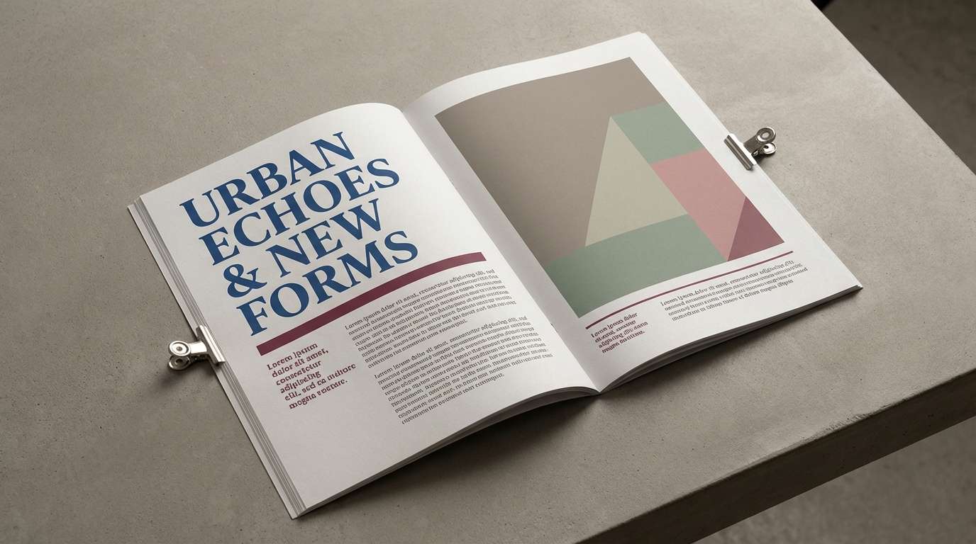
Best for: magazine spreads and lookbooks
Classic and editorial, like a coastline at dusk with a cabernet undertone. The muted mauve-gray acts as a stylish bridge between cool blues and warm wine. Use it for lookbooks, magazine spreads, and portfolio layouts where you want a high-end calm. Usage tip: keep margins generous and let the mid-blue handle subheads so burgundy remains a strong accent.
Image example of cabernet coastline generated using media.io
5) Ink and Rosewood
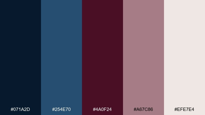
HEX: #071a2d #254e70 #4a0f24 #a67c86 #efe7e4
Mood: dramatic, vintage, intimate
Best for: book covers and podcast artwork
Dramatic and intimate, like ink on textured paper with rosewood warmth. The inky navy creates depth while the softened mauve keeps the palette from feeling harsh. It fits book covers, podcast artwork, and event posters that need a story-forward mood. Usage tip: add subtle grain and keep one bold title line in burgundy for instant hierarchy.
Image example of ink and rosewood generated using media.io
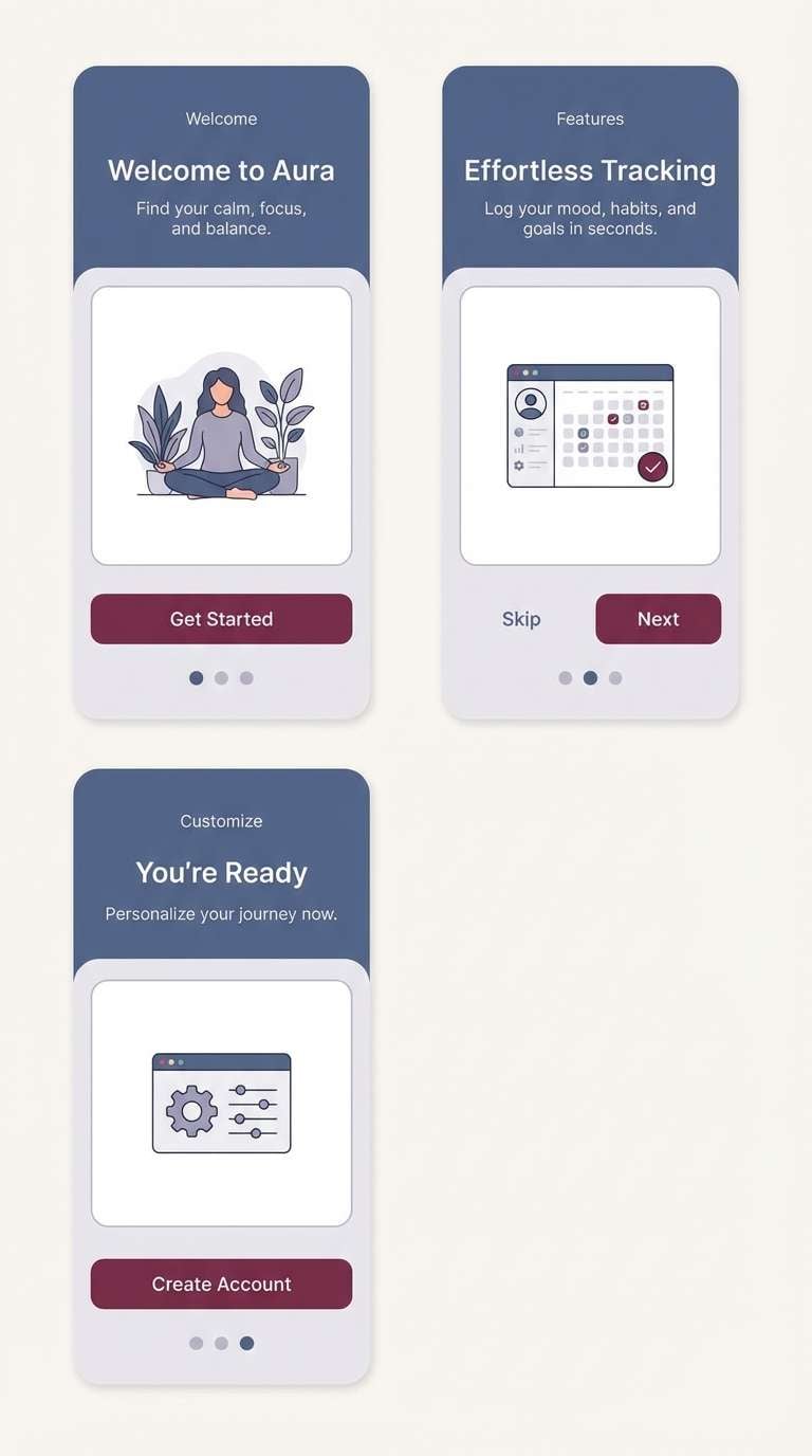
6) Stormy Sangria
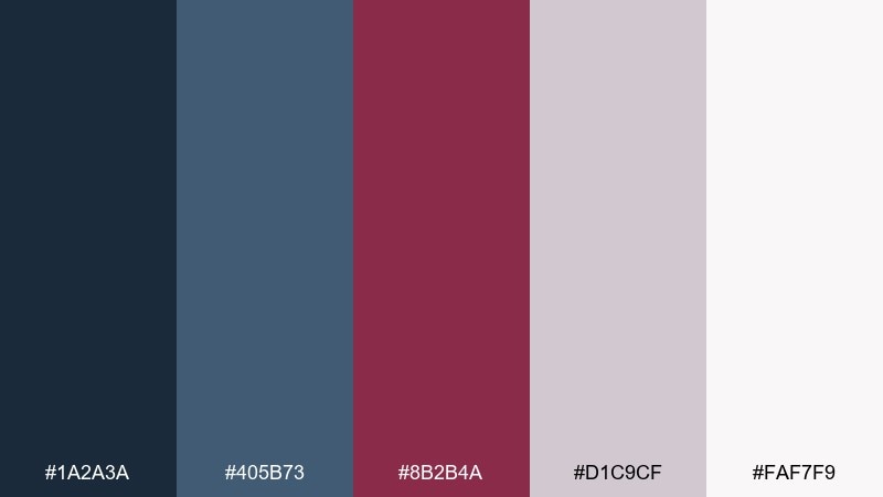
HEX: #1a2a3a #405b73 #8b2b4a #d1c9cf #faf7f9
Mood: stormy, modern, calming
Best for: app onboarding screens
Stormy yet calming, like rain clouds breaking over city lights with a sangria glow. The cool slate blues support long reading sessions, while the berry tone adds just enough energy for buttons. Use it for onboarding screens, dashboards, and settings pages where you need clarity without stark contrast. Usage tip: set primary buttons in burgundy and secondary actions in the mid-slate blue to avoid visual competition.
Image example of stormy sangria generated using media.io
7) Sapphire Cellar
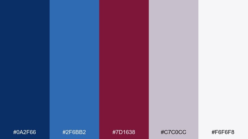
HEX: #0a2f66 #2f6bb2 #7d1638 #c7c0cc #f6f6f8
Mood: bold, energetic, tech-forward
Best for: startup landing pages and CTAs
Bold and tech-forward, like sapphire neon reflected on cellar stone. The brighter blue gives you instant clarity for links and UI states, while the wine tone keeps it mature. It works well for startup landing pages, SaaS pricing sections, and strong CTA moments. Usage tip: use the vivid blue for active states and reserve burgundy for one standout conversion action.
Image example of sapphire cellar generated using media.io

8) Classic Claret Navy
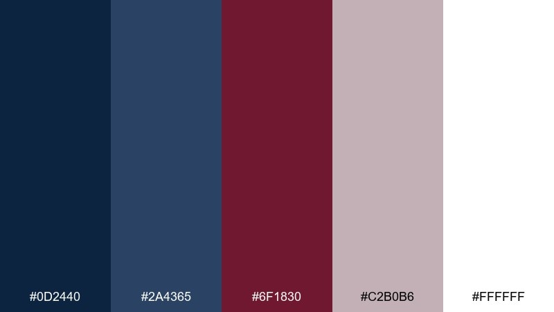
HEX: #0d2440 #2a4365 #6f1830 #c2b0b6 #ffffff
Mood: timeless, formal, high-contrast
Best for: corporate presentations and reports
Timeless and formal, like a tailored suit with a claret pocket square. This blue burgundy color scheme is ideal for decks and reports because it stays crisp on white while still feeling distinctive. Pair it with light gray charts and keep the burgundy for section headers or key metrics. Usage tip: avoid using both dark tones in the same paragraph area to maintain clean readability.
Image example of classic claret navy generated using media.io
9) Museum Evening
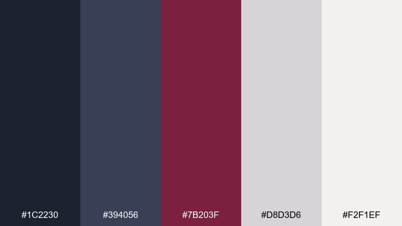
HEX: #1c2230 #394056 #7b203f #d8d3d6 #f2f1ef
Mood: quiet, curated, sophisticated
Best for: gallery event flyers
Quiet and curated, like a museum wing right before closing. The near-black navy supports dramatic typography, and the dusty gray keeps everything elegant instead of heavy. Use it for gallery flyers, cultural events, or minimalist posters with strong negative space. Usage tip: let burgundy appear as a thin rule, stamp, or date marker for a subtle premium cue.
Image example of museum evening generated using media.io
10) Winter Vineyard
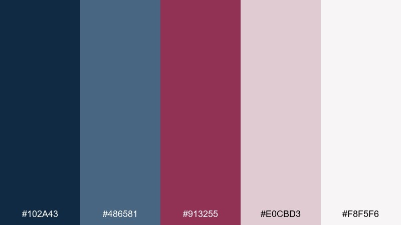
HEX: #102a43 #486581 #913255 #e0cbd3 #f8f5f6
Mood: cozy, seasonal, elegant
Best for: holiday cards and email headers
Cozy and seasonal, like winter air over vineyard rows with a warm berry scarf. The pale blush neutral softens the palette and keeps it friendly for greetings and seasonal promos. It works nicely on holiday cards, email headers, and social graphics where you want elegance without glittery clichés. Usage tip: use the blush as the main canvas and layer navy text for a clean, readable finish.
Image example of winter vineyard generated using media.io

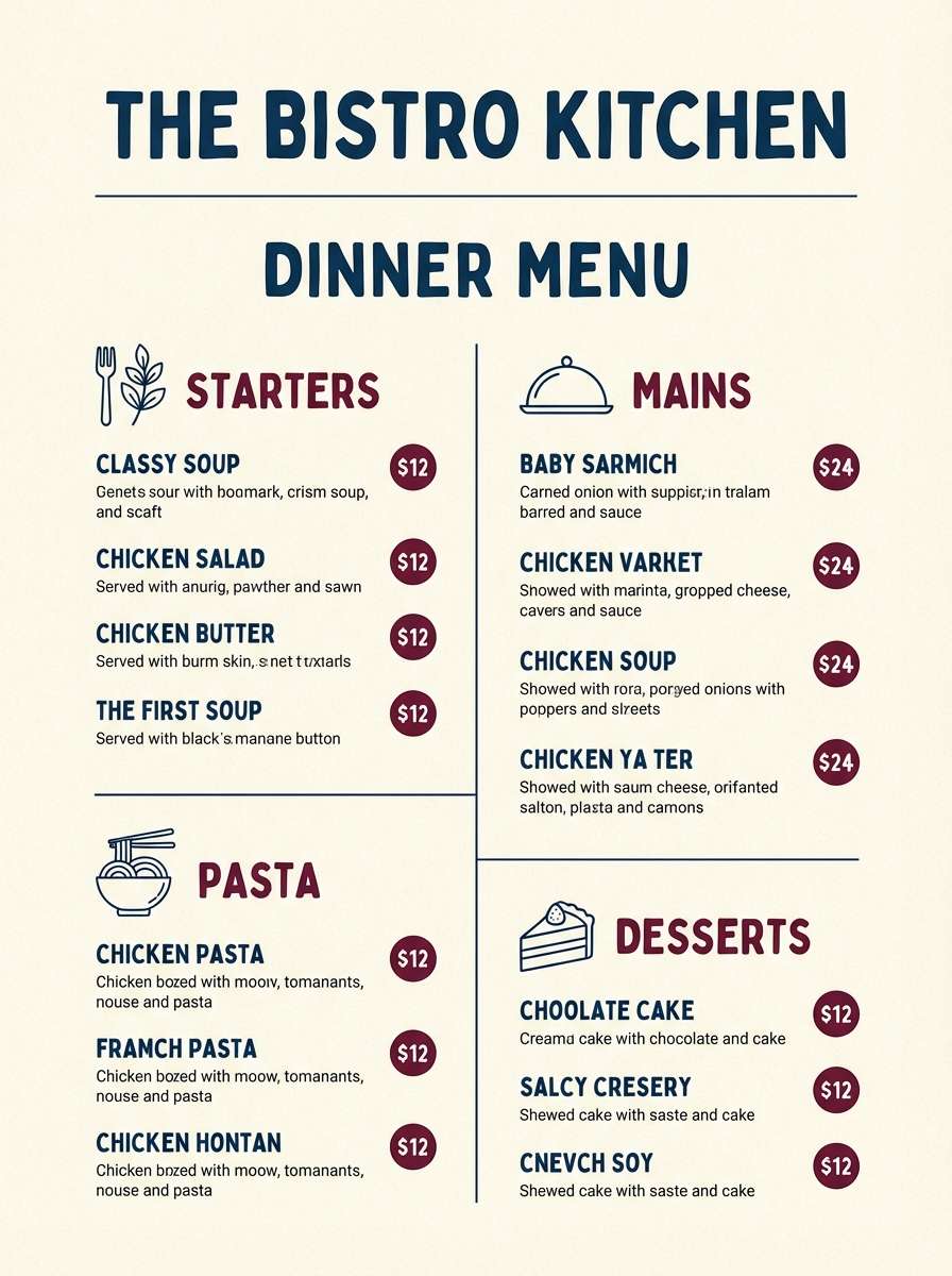
11) Urban Bistro
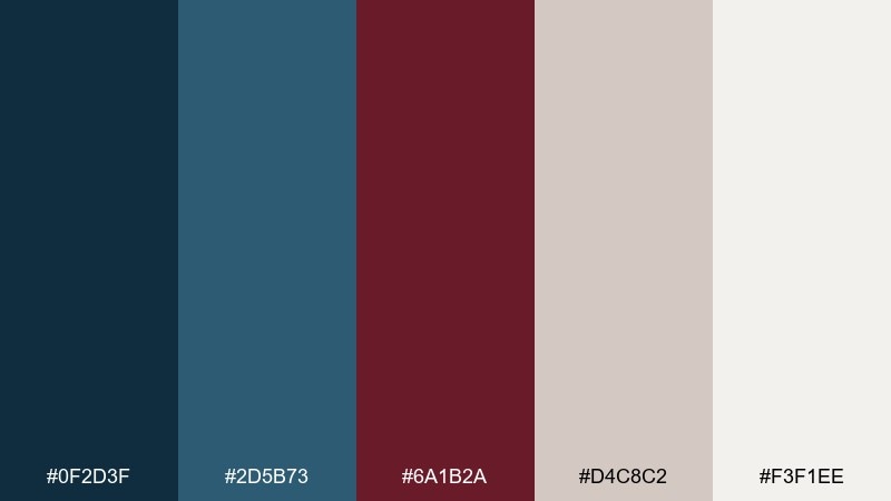
HEX: #0f2d3f #2d5b73 #6a1b2a #d4c8c2 #f3f1ee
Mood: warm, urban, inviting
Best for: restaurant menus and signage
Warm and urban, like a bistro awning on a rainy street. The teal-leaning blue feels approachable, while burgundy brings appetite-friendly richness. Use it for menus, signage, loyalty cards, and simple food packaging where legibility matters. Usage tip: keep menu body text in the dark blue and use burgundy only for category headers and specials.
Image example of urban bistro generated using media.io
12) Royal Library
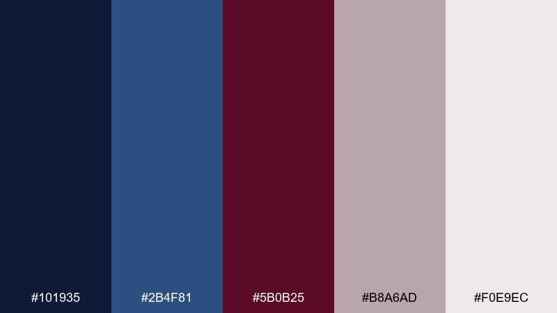
HEX: #101935 #2b4f81 #5b0b25 #b8a6ad #f0e9ec
Mood: heritage, academic, luxurious
Best for: university branding and certificates
Heritage and academic, like leather spines and quiet reading lamps. The rich navy anchors the page, while burgundy adds a ceremonial note that fits seals and crests. It is a strong choice for certificates, alumni campaigns, and institutional branding that needs gravitas. Usage tip: pair with subtle emboss textures and keep the mid-blue for secondary elements like borders and icons.
Image example of royal library generated using media.io
13) Sunset Tasting Room
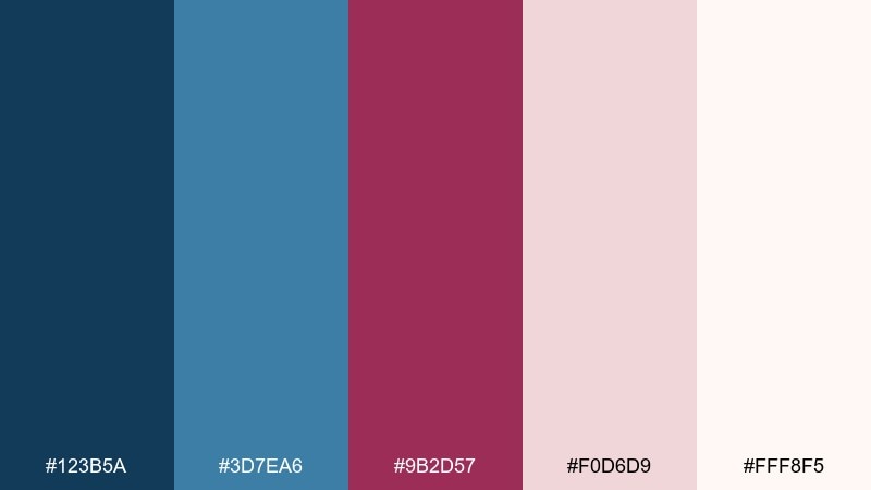
HEX: #123b5a #3d7ea6 #9b2d57 #f0d6d9 #fff8f5
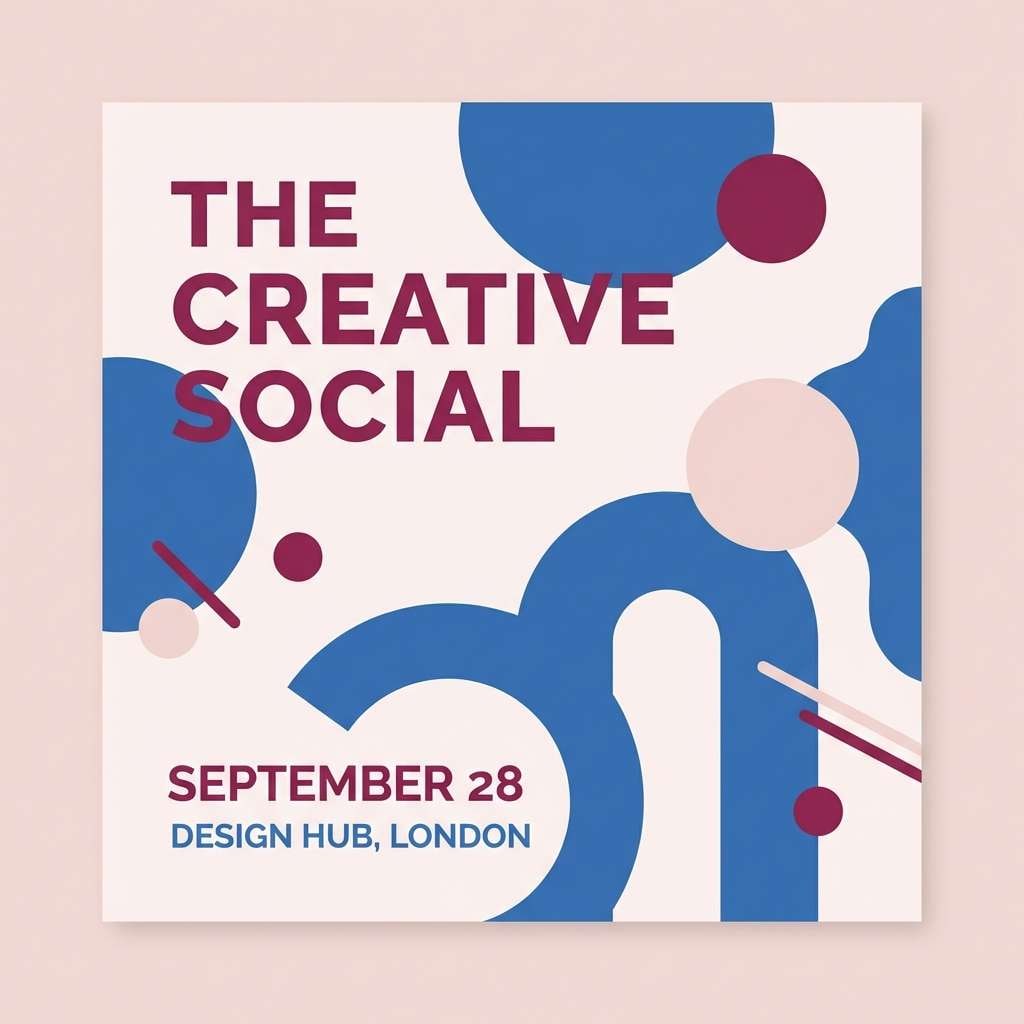
Mood: bright, celebratory, romantic
Best for: event invitations and social posts
Bright and celebratory, like sunset light spilling into a tasting room. The airy blush makes the palette feel fresh, while the berry tone pops for headlines and RSVP details. Use it for event invitations, social templates, and announcement graphics that need to feel upbeat but polished. Usage tip: keep backgrounds light and let the berry tone do the work for emphasis.
Image example of sunset tasting room generated using media.io
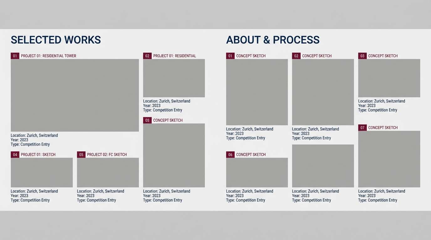
14) Granite and Garnet
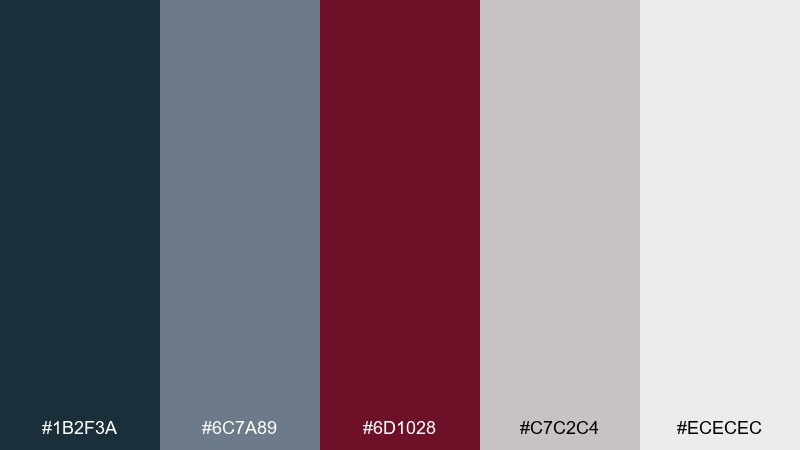
HEX: #1b2f3a #6c7a89 #6d1028 #c7c2c4 #ececec
Mood: industrial, balanced, grounded
Best for: architecture portfolios
Industrial and grounded, like granite steps with a garnet detail. The cool grays do most of the heavy lifting, making the deeper hues feel measured and professional. It is a great match for architecture portfolios, proposal PDFs, and case-study pages. Usage tip: lean on the grays for diagrams and let garnet mark key labels or section breaks.
Image example of granite and garnet generated using media.io
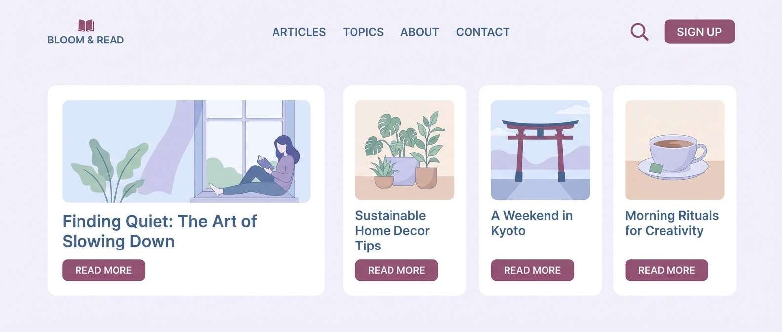
15) Denim and Mulberry
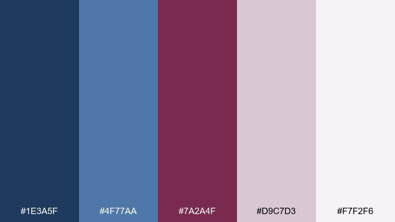
HEX: #1e3a5f #4f77aa #7a2a4f #d9c7d3 #f7f2f6
Mood: casual, creative, friendly
Best for: lifestyle blog themes
Casual and creative, like worn denim with a mulberry lip tint. The lighter blue keeps things readable and friendly, while the purple-leaning burgundy adds personality. Use it for blog themes, creator media kits, and carousel posts that need a soft, modern vibe. Usage tip: apply the pale lavender as a background block behind quotes or tips to create instant structure.
Image example of denim and mulberry generated using media.io
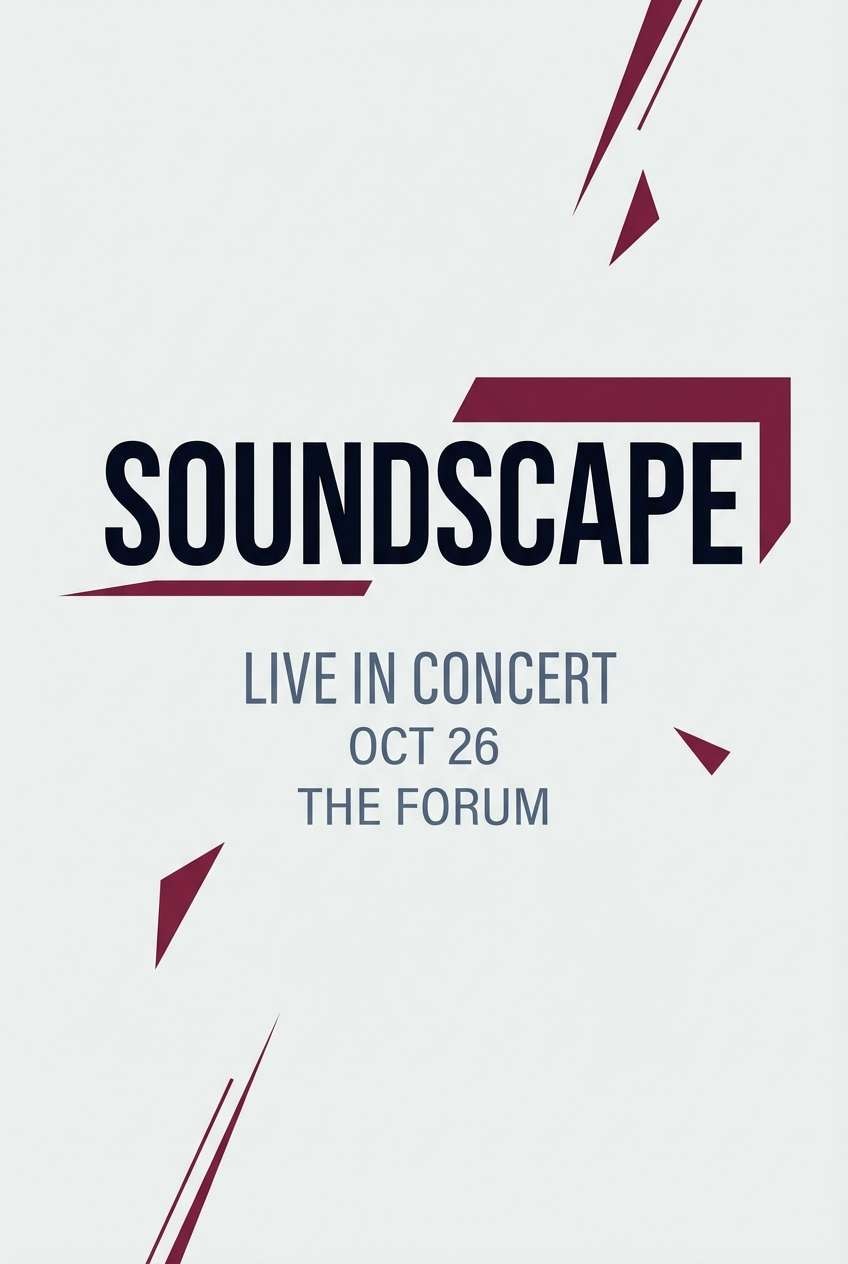
16) Night Opera
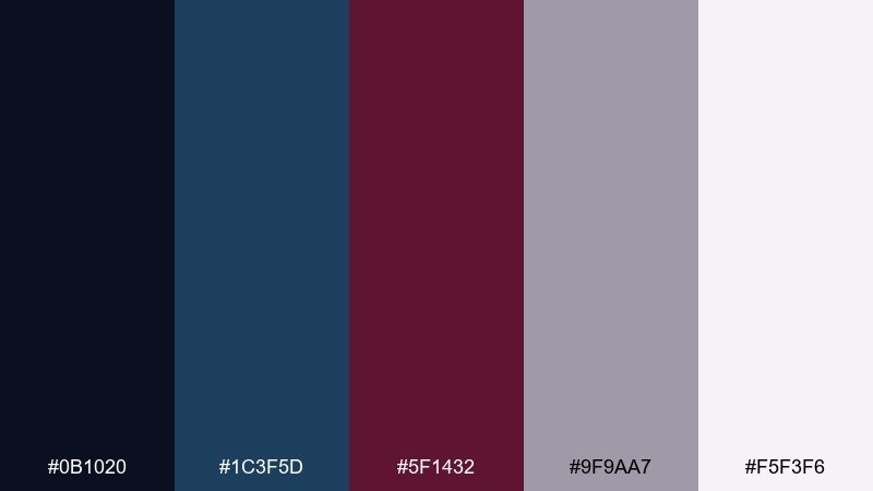
HEX: #0b1020 #1c3f5d #5f1432 #9f9aa7 #f5f3f6
Mood: theatrical, dark, dramatic
Best for: music posters and album covers
Theatrical and dark, like an opera house before the curtain rises. The near-black base lets the burgundy feel rich rather than bright, perfect for strong type and minimal imagery. It suits music posters, album covers, and nighttime event promos with a serious edge. Usage tip: keep backgrounds deep and use the light gray-lilac for small credits to avoid harsh white glare.
Image example of night opera generated using media.io
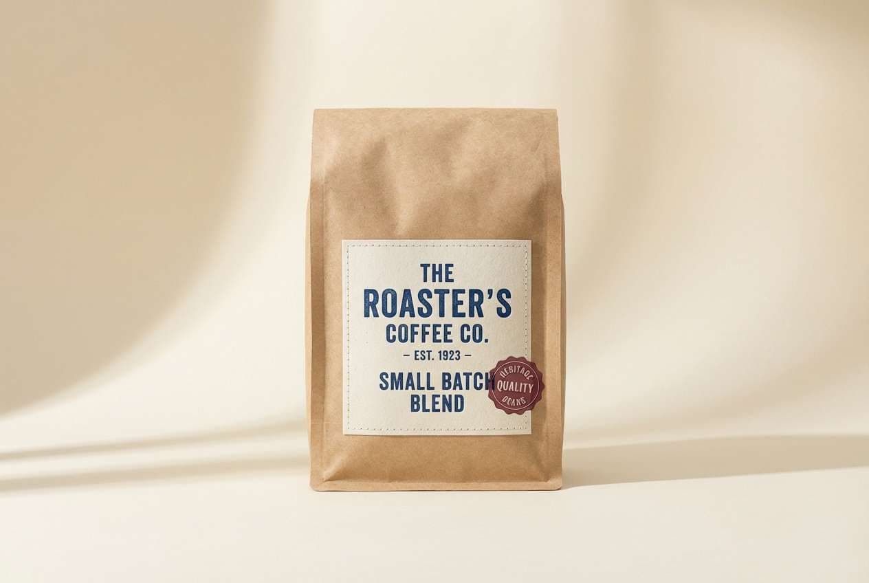
17) Vintage Letterpress
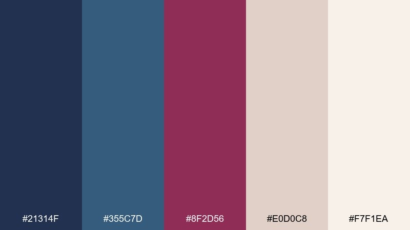
HEX: #21314f #355c7d #8f2d56 #e0d0c8 #f7f1ea
Mood: artisanal, nostalgic, warm
Best for: coffee packaging and labels
Artisanal and nostalgic, like letterpress ink on creamy stock. The warm paper tones make the blues and burgundy feel handmade rather than corporate. It is a natural fit for coffee labels, candle boxes, and small-batch packaging where you want craft energy. Usage tip: use one ink color per panel and let the cream tone provide the vintage softness.
Image example of vintage letterpress generated using media.io
18) Modern Art Gala
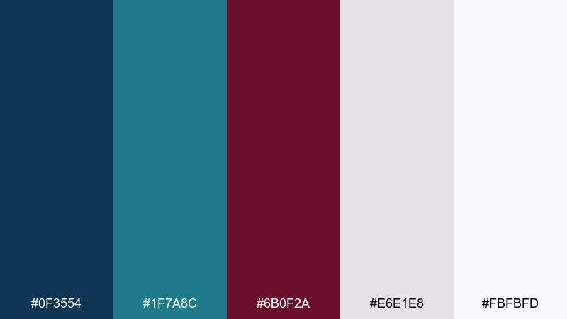
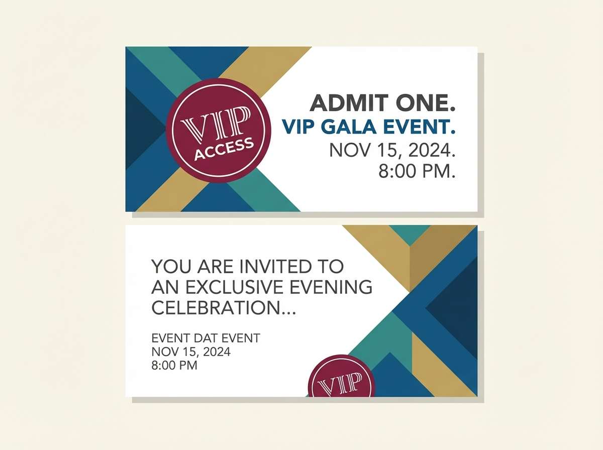
HEX: #0f3554 #1f7a8c #6b0f2a #e6e1e8 #fbfbfd
Mood: modern, gallery-chic, striking
Best for: gala invitations and ticket designs
Modern and gallery-chic, like spotlights on a sculptural piece with a bold wine detail. The teal adds unexpected freshness without pulling the palette out of the sophisticated zone. Use it for gala invitations, ticket designs, and contemporary event branding. Usage tip: keep shapes geometric and let burgundy mark VIP or premium tiers for instant differentiation.
Image example of modern art gala generated using media.io
19) Cocoa Noir
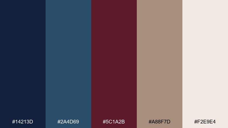
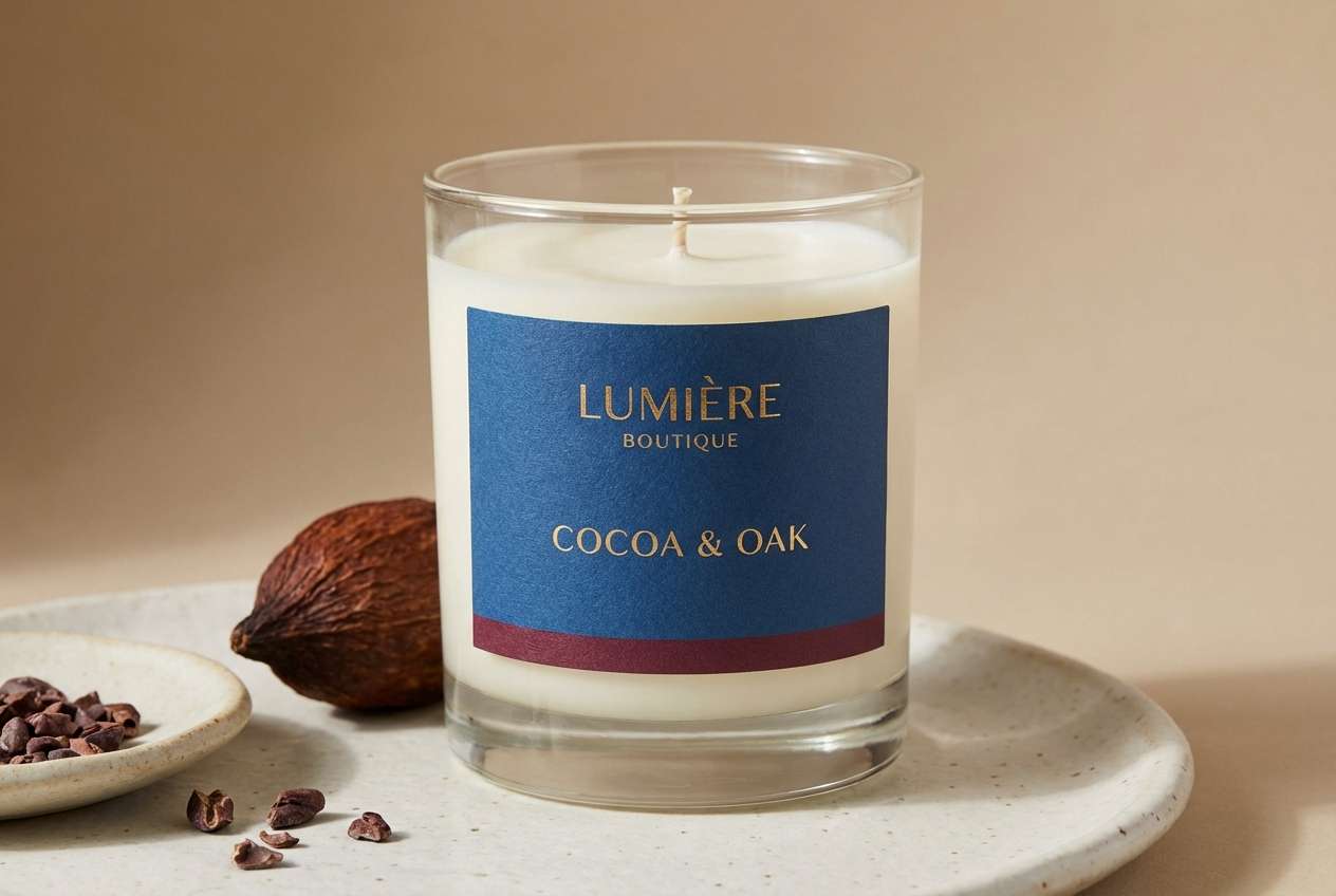
HEX: #14213d #2a4d69 #5c1a2b #a88f7d #f2e9e4
Mood: earthy, cozy, upscale
Best for: boutique product ads
Earthy and upscale, like cocoa powder on a dark countertop with a burgundy ribbon. The warm brown adds comfort, making the cooler blues feel less icy and more lifestyle-ready. It works well for boutique product ads, artisan goods, and warm-toned photography overlays. Usage tip: pick two dominant tones only, then use the cocoa as a quiet supporting neutral to keep the layout clean.
Image example of cocoa noir generated using media.io
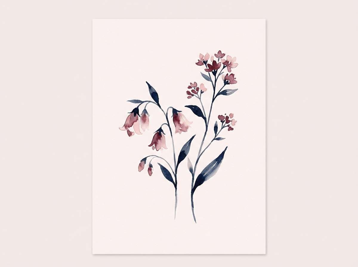
20) Blossom Nightfall
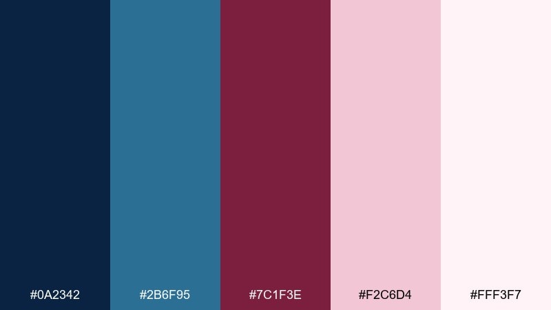
HEX: #0a2342 #2b6f95 #7c1f3e #f2c6d4 #fff3f7
Mood: fresh, floral, elegant
Best for: spring campaigns and botanical art
Fresh and floral, like pink petals against a night sky after rain. These blue burgundy color combinations feel lively for spring campaigns without losing sophistication. Pair it with delicate botanical linework and let the blush tones carry backgrounds for a lighter touch. Usage tip: use burgundy for small blossoms or focal petals, and keep the deep navy reserved for text and outlines.
Image example of blossom nightfall generated using media.io
What Colors Go Well with Blue Burgundy?
Soft neutrals are the easiest match: warm ivory, off-white, sand, and blush-gray keep the palette airy and help the burgundy feel intentional rather than heavy. They also improve readability for UI and print.
For extra depth, add charcoal, slate, or cool gray—these work especially well for diagrams, tables, and secondary text. If you want a fresher twist, try teal or dusty pink as a supporting accent.
Metallics can work too: muted gold or champagne reads premium on invitations and packaging, while silver pairs nicely with blue-forward, tech-oriented layouts.
How to Use a Blue Burgundy Color Palette in Real Designs
Start with role assignment: pick one blue as the primary (backgrounds, navigation, headings), keep a light neutral for negative space, and reserve burgundy for emphasis (CTAs, badges, key stats, RSVP details).
Maintain contrast discipline. If you use a very dark navy background, switch body text to warm white/ivory and keep burgundy for a single focal element. On white backgrounds, use burgundy for short headlines—not long paragraphs.
In branding systems, repeat burgundy consistently in the same UI or print locations (buttons, labels, stamps). This builds recognition and prevents the palette from feeling randomly “colorful.”
Create Blue Burgundy Palette Visuals with AI
If you have HEX codes but need fast visuals (posters, invitations, hero banners, product mockups), AI image generation can help you test the look before production.
Use prompts that describe the format (poster, UI, packaging), lighting/style (studio, minimal, editorial), and your key colors (navy background + burgundy accent + neutral paper tone). Then iterate by changing only one variable at a time.
Media.io makes it simple to generate on-brand images in your browser—ideal for quick mood boards, campaign concepts, and client previews.
Blue Burgundy Color Palette FAQs
-
What does the blue burgundy color combination communicate?
Blue signals trust, calm, and structure, while burgundy adds warmth, sophistication, and a premium feel. Together, they create a balanced look that works across corporate, editorial, and event designs. -
Is burgundy a good accent color with navy or deep blue?
Yes. Burgundy is strong enough to stand out against navy, but it feels more mature than bright red. Use it for CTAs, stamps, headings, and key highlights rather than large background blocks. -
Which neutral backgrounds work best with blue and burgundy?
Warm white, ivory, sand, blush-gray, and soft greige are the most reliable. They keep the palette readable and help bridge the cool blue and warm burgundy. -
How do I keep blue burgundy palettes readable in UI design?
Assign roles: blue for primary surfaces and text, neutrals for space, burgundy for one main action. Check contrast ratios, avoid placing burgundy text on mid-blue, and keep long body copy in a dark blue/charcoal on a light background. -
Can I use blue burgundy palettes for weddings?
Absolutely. Pair navy and burgundy with blush, mauve-gray, or warm ivory for stationery, florals, and attire details. Burgundy works well for names and monograms, while blue keeps body text crisp. -
What is a good “signature” burgundy HEX to start with?
#7a1b3a is a versatile wine burgundy that feels modern and luxe. It pairs especially well with deep navy backgrounds and soft mauve/ivory neutrals. -
How can I quickly preview blue burgundy branding visuals?
Generate mockups with AI using prompts that specify the design type (logo on packaging, landing page hero, invitation suite) and include your HEX colors as guidance. This helps you compare multiple directions before final design work.
Next: Beach Color Palette


