

Indigo blue sits between navy and purple, giving designs a rare mix of authority and imagination. It can feel corporate, cinematic, calming, or electric depending on the accents you pair with it.
Below are 20 indigo blue color palette ideas with HEX codes, plus real-use tips and AI prompts you can reuse in Media.io.
In this article
Why Indigo Blue Palettes Work So Well
Indigo blue is naturally high-contrast: it’s dark enough to ground layouts and create hierarchy, but it still carries a subtle purple bias that feels more premium than basic navy.
It’s also incredibly flexible across mediums. In UI, indigo supports legible white typography and clean data visualization; in print, it reads as rich ink and pairs beautifully with warm paper tones.
Most importantly, indigo plays well with both cool and warm accents—mint, cyan, coral, gold, blush, and ivory—so you can dial the mood from serene to bold without changing your core brand color.
20+ Indigo Blue Color Palette Ideas (with HEX Codes)
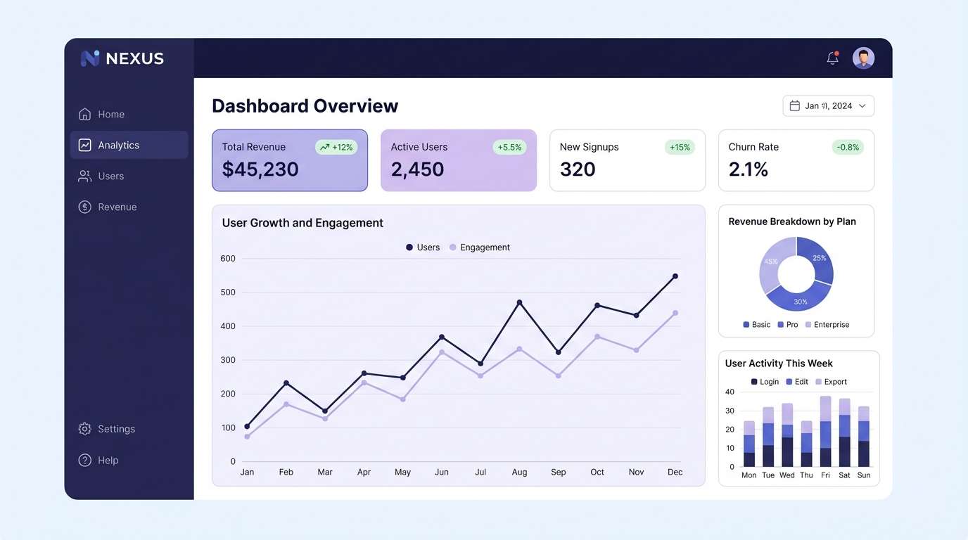
1) Midnight Iris
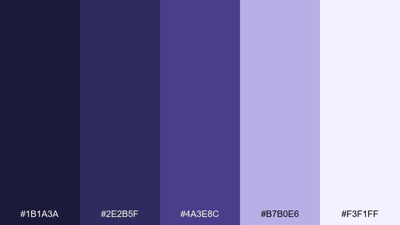
HEX: #1B1A3A #2E2B5F #4A3E8C #B7B0E6 #F3F1FF
Mood: mysterious, luxe, calm
Best for: SaaS dashboard UI
Mysterious and velvety, it feels like city lights reflected on a midnight sky. Use the deep indigo as your base, then let the soft lavender and near-white carry readability in cards and tables. Pair it with subtle shadows and rounded components to keep it modern rather than gothic. Tip: reserve the brightest tint for key CTAs and active states so the interface stays focused.
Image example of midnight iris generated using media.io
Media.io is an online AI studio for creating and editing video, image, and audio in your browser.

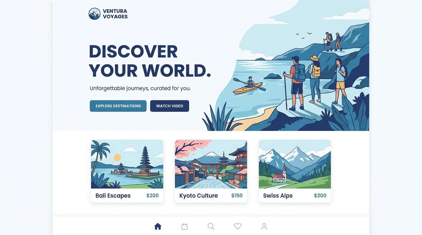
2) Coastal Ink
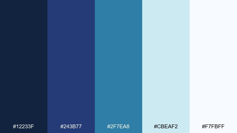
HEX: #12233F #243B77 #2F7EA8 #CBEAF2 #F7FBFF
Mood: fresh, modern, airy
Best for: travel brand landing page
Fresh and breezy, it evokes ink-blue waves and clear morning air. These indigo blue color combinations work well when you want depth without heaviness, especially with a pale aqua for open space. Pair the teal with simple line icons and keep the darkest tone for headers and navigation. Tip: use the lightest tint as section breaks to maintain a calm scroll rhythm.
Image example of coastal ink generated using media.io
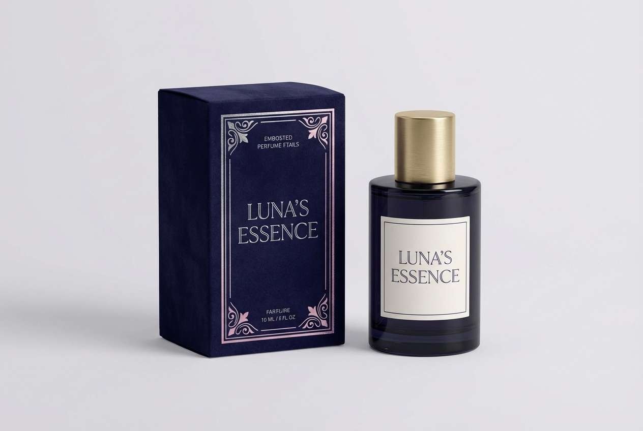
3) Velvet Nightfall
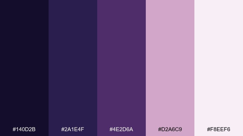
HEX: #140D2B #2A1E4F #4E2D6A #D2A6C9 #F8EEF6
Mood: dramatic, romantic, upscale
Best for: luxury fragrance packaging
Dramatic and romantic, it feels like velvet curtains and a dimly lit lounge. The near-black indigo builds premium contrast, while mauve and blush soften the mood for beauty products. Pair with metallic foil (silver or rose gold) and keep typography minimal for a couture finish. Tip: use the blush tint on side panels to add depth in studio lighting.
Image example of velvet nightfall generated using media.io
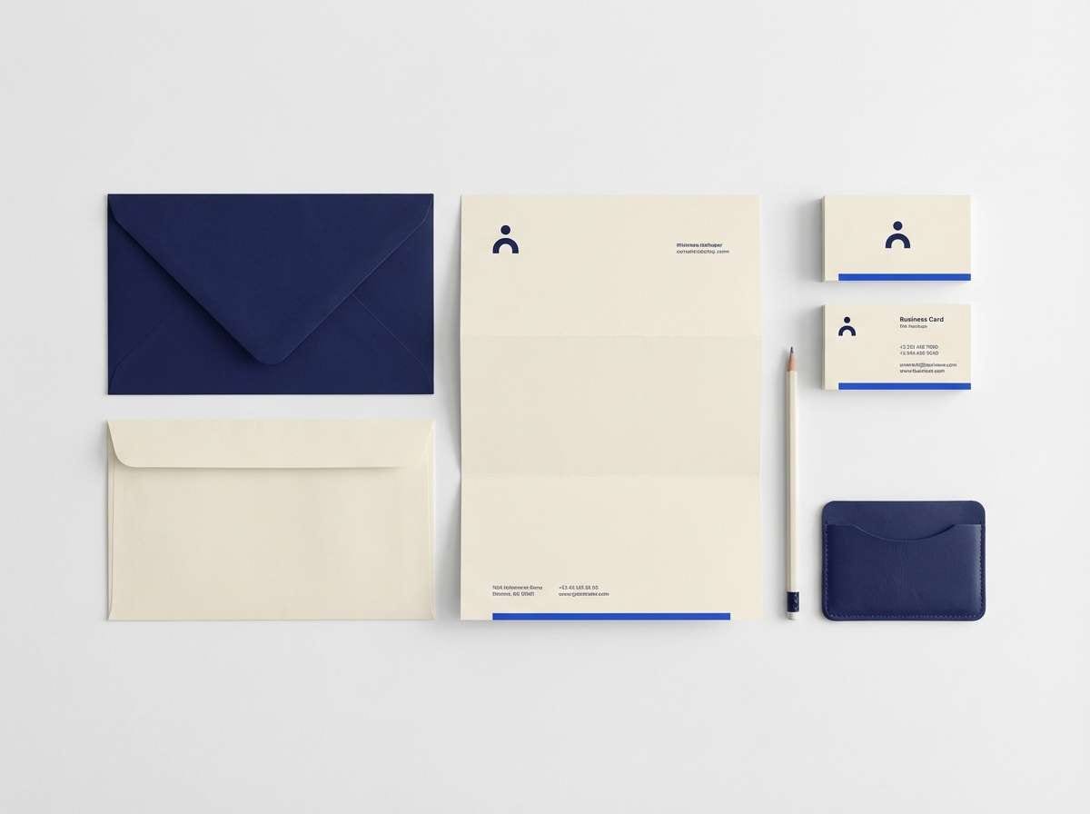
4) Indigo and Ivory
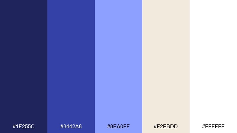
HEX: #1F255C #3442A8 #8EA0FF #F2EBDD #FFFFFF
Mood: clean, classic, confident
Best for: corporate branding kit
Clean and confident, it reads like crisp stationery on an executive desk. Indigo carries authority, while ivory and white keep layouts open and approachable. Pair with a single bold weight for headlines and plenty of margins for a polished, global feel. Tip: keep the periwinkle as a secondary accent for charts and highlights to avoid visual noise.
Image example of indigo and ivory generated using media.io
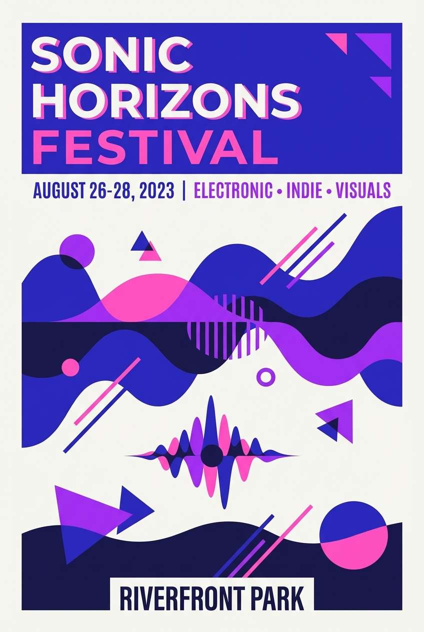
5) Electric Orchid
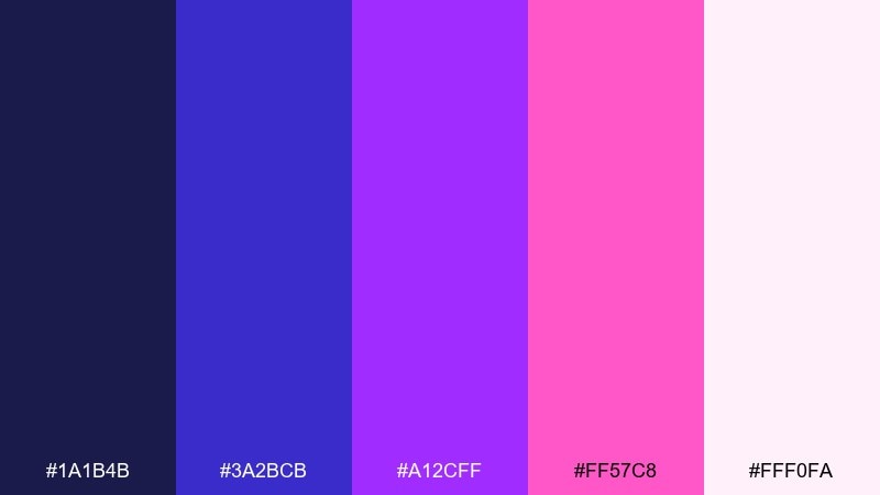
HEX: #1A1B4B #3A2BCB #A12CFF #FF57C8 #FFF0FA
Mood: bold, energetic, futuristic
Best for: music festival poster
Bold and electric, it feels like neon signage and late-night basslines. The deep indigo anchors the brights so the purple and magenta can pop without turning chaotic. Pair with geometric shapes and high-contrast type for instant impact at a distance. Tip: keep the light pink as negative space for schedules and small-print details.
Image example of electric orchid generated using media.io
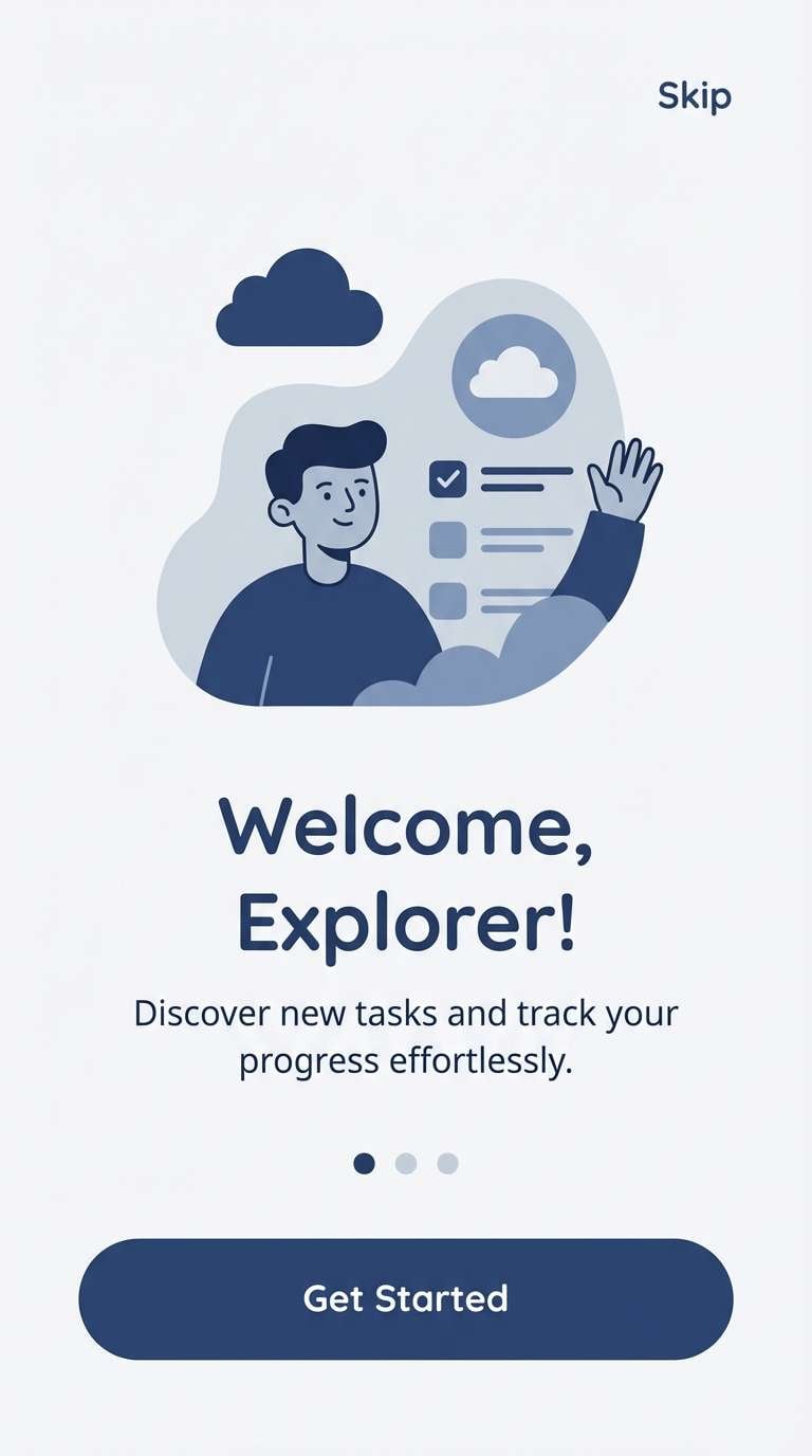
6) Denim Dusk
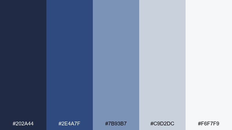
HEX: #202A44 #2E4A7F #7B93B7 #C9D2DC #F6F7F9
Mood: casual, trustworthy, relaxed
Best for: app onboarding screens
Relaxed and familiar, it brings to mind worn denim and a soft dusk sky. Mid indigo and slate blues build trust, while pale grays keep onboarding screens airy and readable. Pair with rounded illustrations and simple progress indicators to reduce friction. Tip: use the medium blue for primary buttons and save the darkest tone for headers only.
Image example of denim dusk generated using media.io
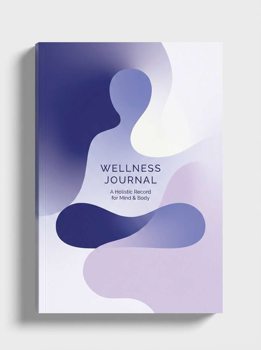
7) Lunar Lavender
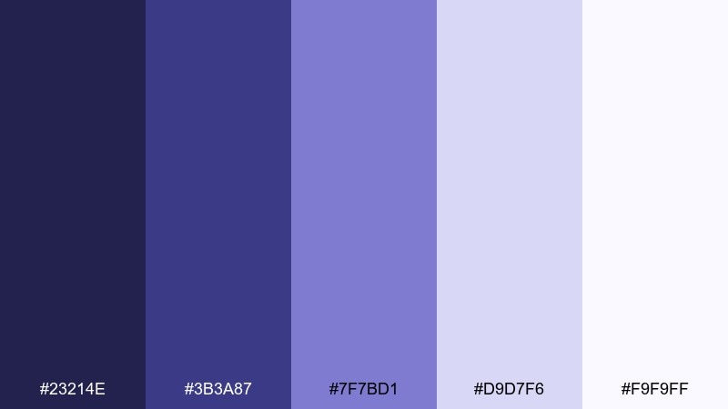
HEX: #23214E #3B3A87 #7F7BD1 #D9D7F6 #F9F9FF
Mood: dreamy, soft, serene
Best for: wellness journal cover
Dreamy and serene, it resembles moonlight washing over pale lavender petals. This indigo blue color palette is especially calming for wellness and self-care designs where you want softness without losing structure. Pair with thin serif headings and gentle gradients that move from indigo into lilac. Tip: keep the deepest shade in small doses for titles and spine text to avoid a heavy cover.
Image example of lunar lavender generated using media.io
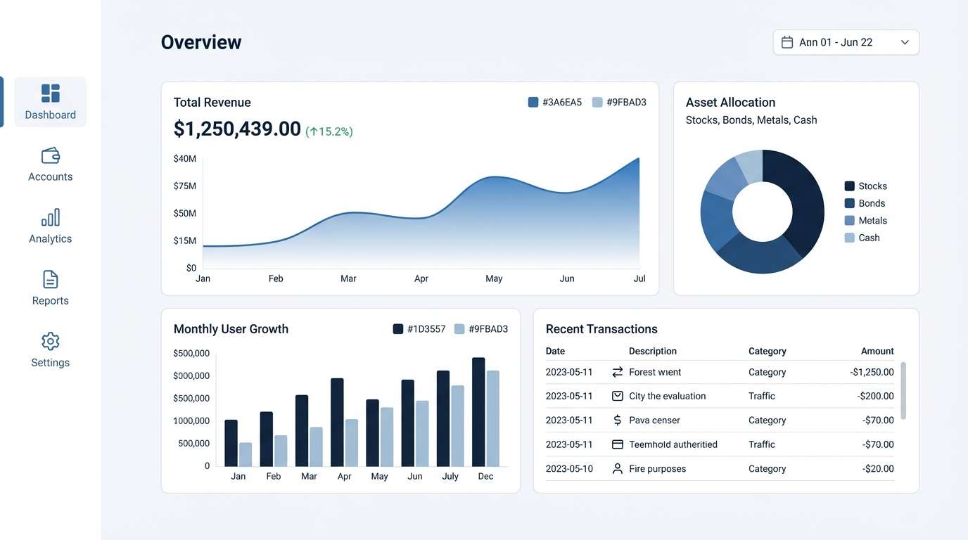
8) Sapphire Smoke
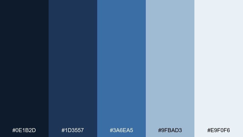
HEX: #0E1B2D #1D3557 #3A6EA5 #9FBAD3 #E9F0F6
Mood: cool, professional, composed
Best for: fintech analytics UI
Cool and composed, it suggests sapphire glass and soft smoke drifting across a skyline. The dark navy-indigo tones make data feel serious, while muted blues keep charts legible and calm. Pair with thin gridlines, clear number formatting, and restrained iconography. Tip: use the lightest blue-gray as card backgrounds so the data stays the hero.
Image example of sapphire smoke generated using media.io
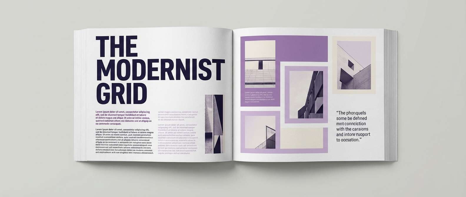
9) Stormy Plum
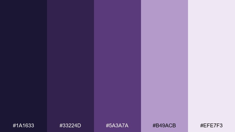
HEX: #1A1633 #33224D #5A3A7A #B49ACB #EFE7F3
Mood: moody, artistic, refined
Best for: editorial magazine spread
Moody and refined, it feels like storm clouds tinted with plum. Deep indigo and eggplant are strong for headlines, while the pale lilac gives room for long-form reading. Pair with black-and-white photography and a strict grid to amplify the editorial vibe. Tip: keep body text dark and use the plum tint only for pull quotes and section labels.
Image example of stormy plum generated using media.io
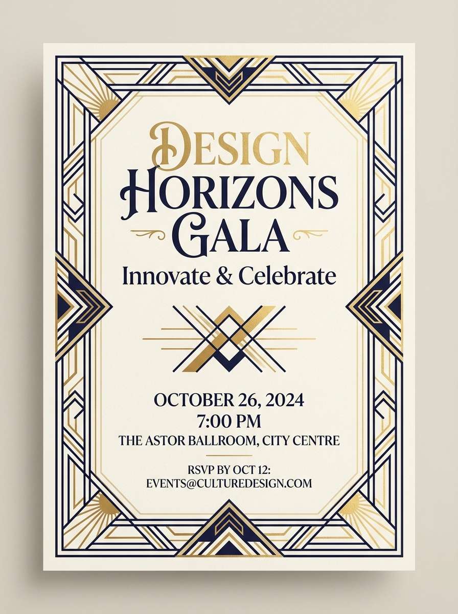
10) Art Deco Indigo
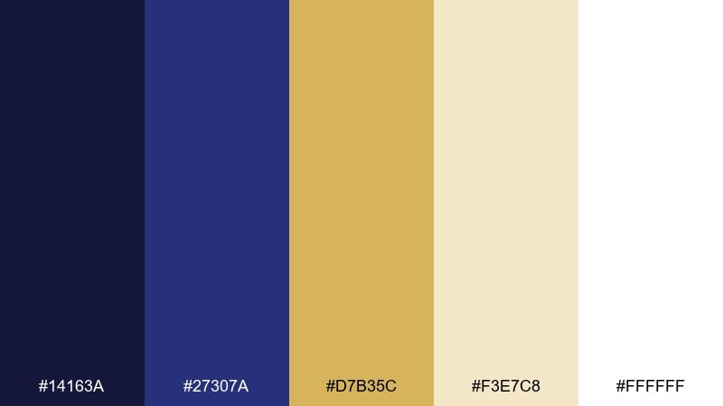
HEX: #14163A #27307A #D7B35C #F3E7C8 #FFFFFF
Mood: glamorous, vintage, high-contrast
Best for: event invitation card
Glamorous and vintage, it channels art deco halls and warm champagne lights. Indigo paired with antique gold instantly feels celebratory, while cream tones keep the layout elegant. Pair with geometric borders and a condensed typeface for a period-correct look. Tip: keep gold elements thin and strategic so the design prints cleanly on textured paper.
Image example of art deco indigo generated using media.io
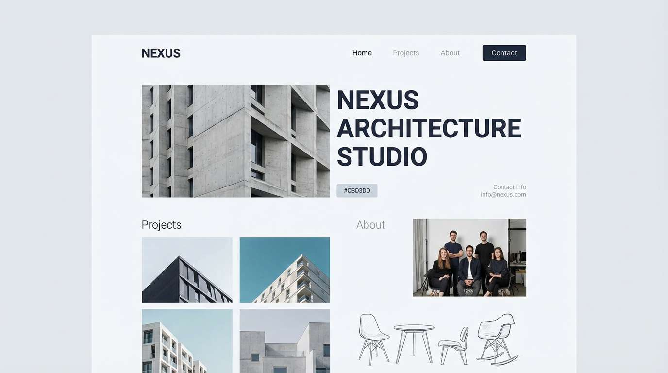
11) Zen Slate
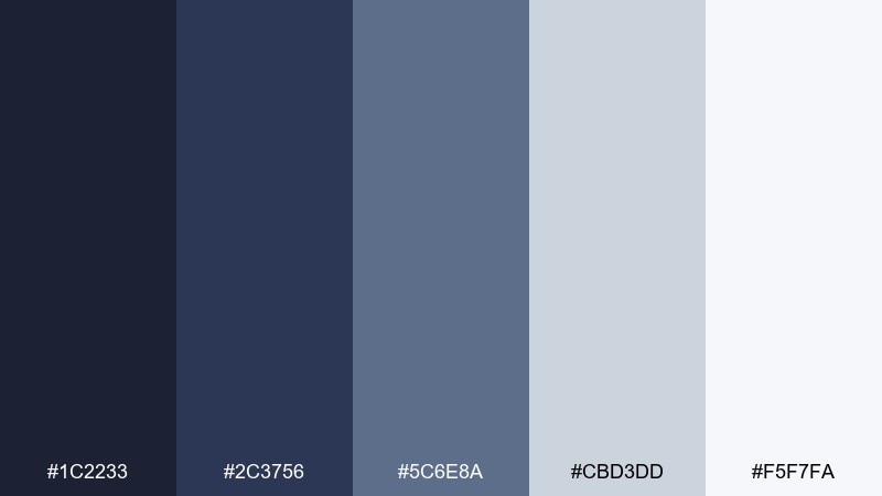
HEX: #1C2233 #2C3756 #5C6E8A #CBD3DD #F5F7FA
Mood: minimal, grounded, quiet
Best for: architecture studio website
Quiet and grounded, it reads like slate stone, steel, and clean daylight. The indigo-leaning darks feel serious for navigation and case studies, while the soft grays keep portfolios crisp. Pair with large photography, thin rules, and generous spacing to emphasize craft. Tip: use the mid slate tone for hover states so interactions stay subtle.
Image example of zen slate generated using media.io
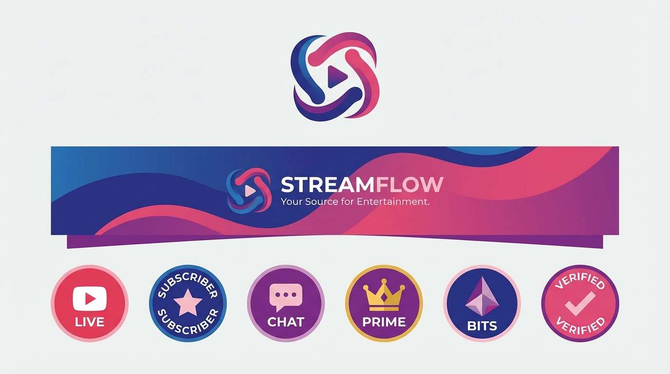
12) Berry Observatory
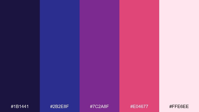
HEX: #1B1441 #2B2E8F #7C2A8F #E04677 #FFE6EE
Mood: playful, cosmic, expressive
Best for: streaming channel branding
Playful and cosmic, it feels like a night observatory with berry-colored signals. The contrast between indigo, violet, and raspberry makes thumbnails and badges stand out in busy feeds. Pair with bold sans-serif type and simple star or orbit motifs for instant recognition. Tip: use the blush tint as a background for text-heavy banners to maintain clarity.
Image example of berry observatory generated using media.io
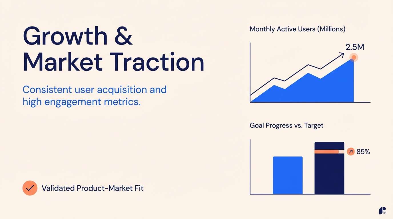
13) Indigo Sunrise
HEX: #1A2057 #3845C6 #FF8A5B #FFD3A6 #FFF6EE
Mood: optimistic, warm, high-contrast
Best for: startup pitch deck slides
Optimistic and punchy, it looks like sunrise warmth breaking through a deep indigo horizon. This indigo blue color scheme is great for storytelling slides where you need confident structure plus a memorable accent. Pair the coral with simple charts and highlight callouts, keeping the background mostly cream for readability. Tip: limit the coral to one element per slide to preserve its impact.
Image example of indigo sunrise generated using media.io
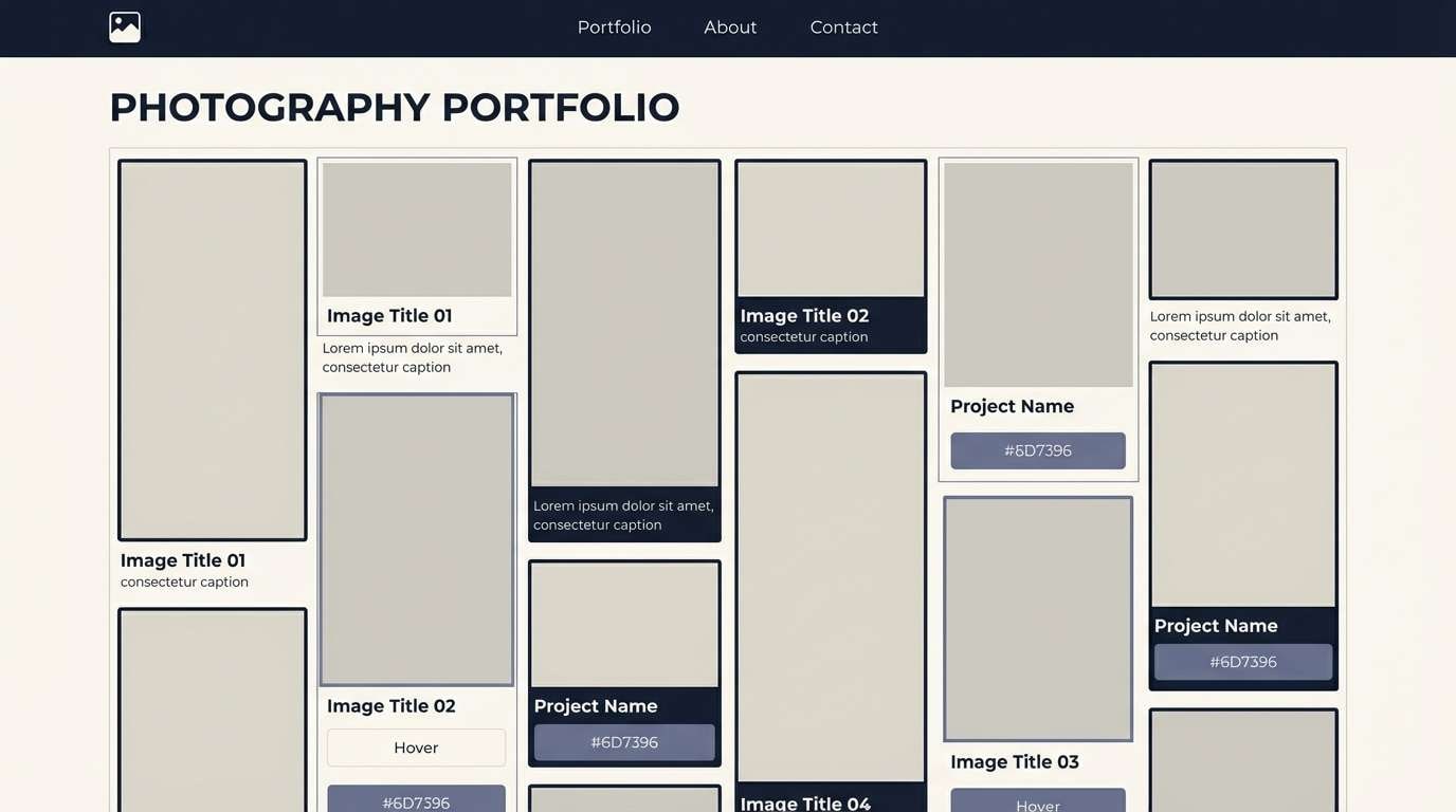
14) Museum Quiet
HEX: #121A2B #2A3153 #6D7396 #D7D5CF #FAF8F2
Mood: timeless, restrained, curated
Best for: portfolio site for photographers
Timeless and curated, it feels like a museum gallery with soft wall paint and framed prints. The indigo-dark tones give navigation a refined edge, while warm grays keep images true to color. Pair with minimal UI chrome and let photography dominate the page. Tip: use the warm off-white for backgrounds to avoid the harshness of pure white.
Image example of museum quiet generated using media.io
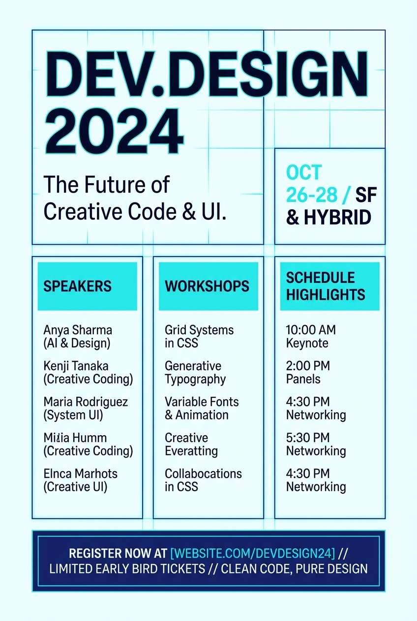
15) Neon Blueprint
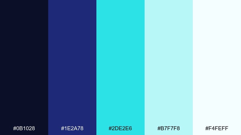
HEX: #0B1028 #1E2A78 #2DE2E6 #B7F7F8 #F4FEFF
Mood: techy, crisp, futuristic
Best for: developer conference flyer
Techy and crisp, it evokes blueprint lines lit by neon cyan. These indigo blue color combinations shine in event materials where you want a dark foundation with a single high-energy highlight. Pair with monospaced accents, grid patterns, and clear hierarchy for schedules and speakers. Tip: keep cyan for key details like dates and venue so scanning is effortless.
Image example of neon blueprint generated using media.io
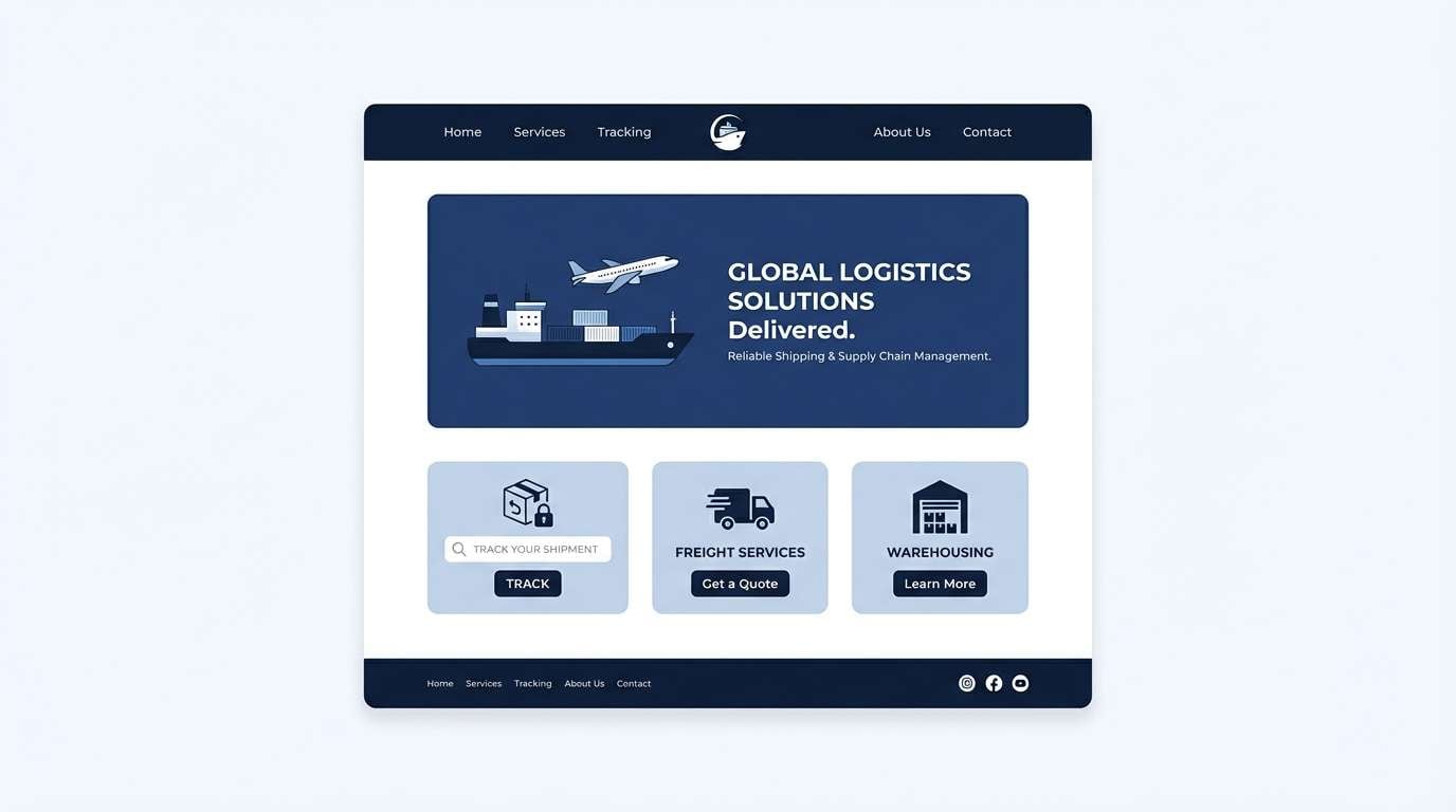
16) Winter Harbor
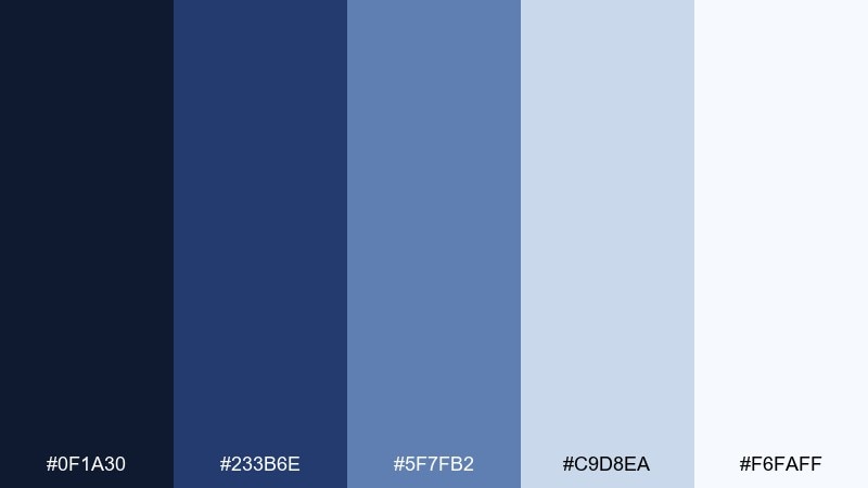
HEX: #0F1A30 #233B6E #5F7FB2 #C9D8EA #F6FAFF
Mood: cool, steady, spacious
Best for: shipping and logistics website
Cool and steady, it brings to mind a winter harbor with calm water and steel cranes. The layered blues feel reliable for operations and tracking pages, and the pale tints keep forms easy on the eyes. Pair with clear icon sets and plenty of whitespace for a practical, no-drama look. Tip: use the medium blue for status tags to create quick visual scanning.
Image example of winter harbor generated using media.io
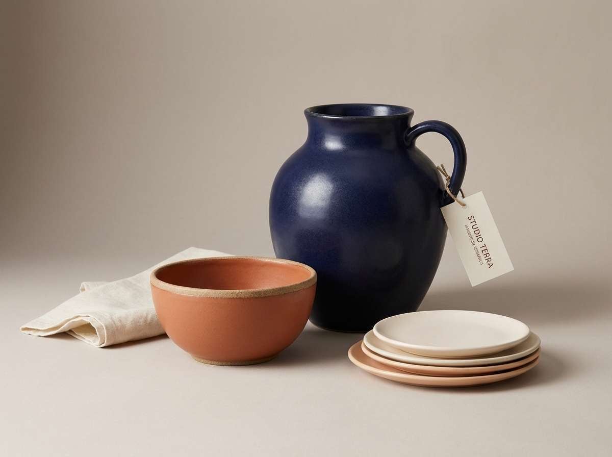
17) Indigo Clay
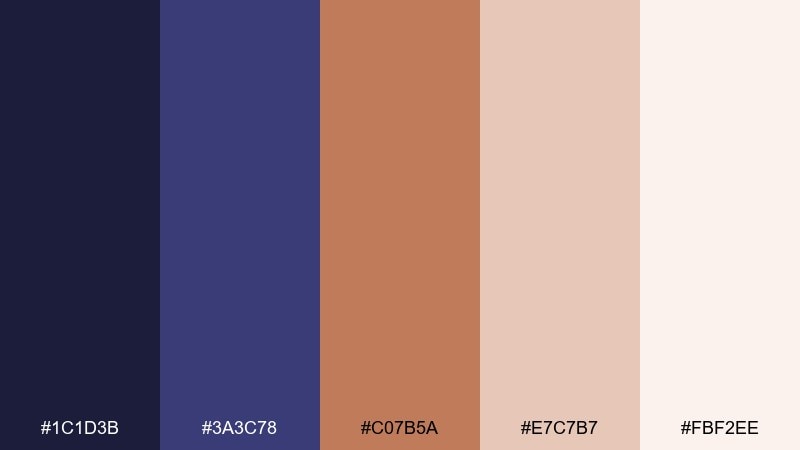
HEX: #1C1D3B #3A3C78 #C07B5A #E7C7B7 #FBF2EE
Mood: earthy, creative, handmade
Best for: ceramics shop product ad
Earthy and handmade, it feels like indigo dye beside warm clay on a workbench. This indigo blue color combination balances craft and sophistication, perfect for small-batch product storytelling. Pair with natural textures, soft shadows, and warm neutrals so the terracotta accent looks intentional. Tip: keep the clay tone for price tags or callouts to guide the eye without shouting.
Image example of indigo clay generated using media.io
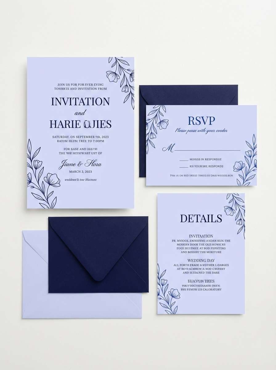
18) Royal Stationery
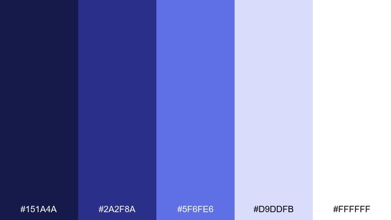
HEX: #151A4A #2A2F8A #5F6FE6 #D9DDFB #FFFFFF
Mood: formal, polished, bright
Best for: wedding invitation suite
Formal and polished, it resembles classic ink on bright paper with a regal twist. Strong indigo delivers tradition, while the lighter periwinkles add softness for modern couples. Pair with delicate borders, script accents, and plenty of whitespace for a clean print finish. Tip: use the mid blue for section dividers so the suite stays cohesive across inserts.
Image example of royal stationery generated using media.io
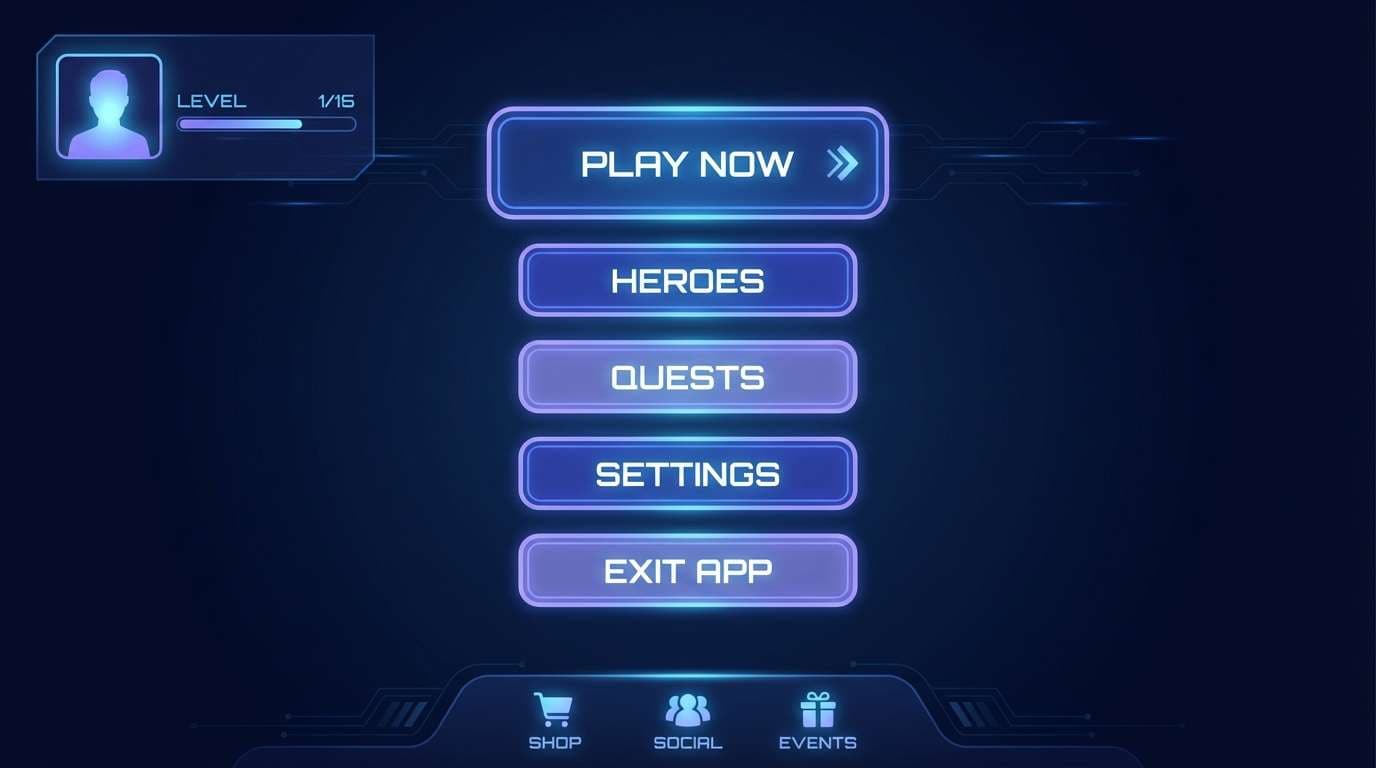
19) Cosmic Navy
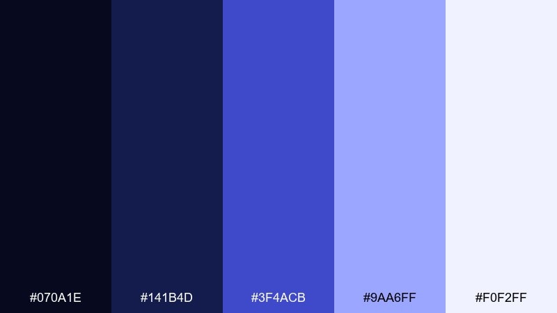
HEX: #070A1E #141B4D #3F4ACB #9AA6FF #F0F2FF
Mood: cinematic, bold, sleek
Best for: gaming app UI
Cinematic and sleek, it looks like deep space cut with sharp blue highlights. The near-black navy creates focus for game menus, and the brighter indigo tones add motion and energy. Pair with glowing buttons, subtle gradients, and high-contrast typography for instant legibility. Tip: keep the light lavender for tooltips and microcopy to reduce glare on dark screens.
Image example of cosmic navy generated using media.io
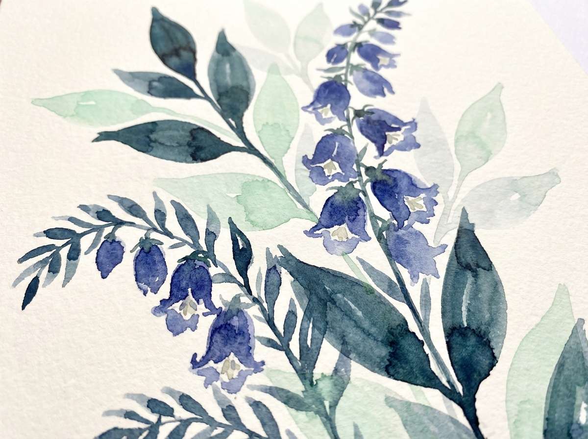
20) Indigo Garden
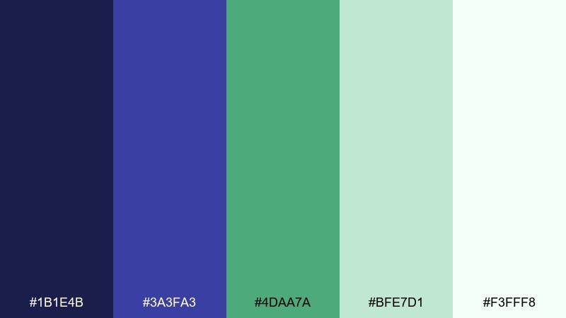
HEX: #1B1E4B #3A3FA3 #4DAA7A #BFE7D1 #F3FFF8
Mood: fresh, botanical, balanced
Best for: watercolor botanical illustration
Fresh and botanical, it suggests indigo petals against new green leaves after rain. These indigo blue color combinations feel especially lively when the green is used as a sparing accent rather than a competing base. Pair with soft textures and plenty of white space so the illustration stays airy. Tip: keep the deepest indigo for outlines and shadows to make the greens glow.
Image example of indigo garden generated using media.io
What Colors Go Well with Indigo Blue?
Indigo blue pairs effortlessly with crisp neutrals like white, ivory, and cool grays—these keep layouts breathable while letting indigo carry structure for headers, nav, and hero sections.
For accents, choose either warm contrast (coral, terracotta, antique gold, blush) or cool energy (mint, cyan, aqua). Warm accents make indigo feel friendlier and more editorial; cool accents make it feel techy and modern.
If you want a tonal look, build a blue-purple palette with lilac, periwinkle, or violet. This keeps everything harmonious while still giving you enough separation for buttons, charts, and highlights.
How to Use a Indigo Blue Color Palette in Real Designs
Start with indigo as your “anchor” color: use it for top navigation, hero headlines, or dark sections. Then use light tints (near-white, pale lavender, or blue-gray) for backgrounds and cards so text remains readable.
Limit high-saturation accents to one job. For example: coral only for CTAs, mint only for success states, or gold only for dividers and premium badges. This keeps indigo from feeling muddy and prevents the palette from turning busy.
In print, indigo looks richest when you avoid pure black. Use a very deep indigo for body text, and reserve true black only when you need maximum contrast (like barcodes or micro text).
Create Indigo Blue Palette Visuals with AI
If you already have HEX codes, you can turn them into real design mockups fast by describing the layout (dashboard, poster, packaging) and explicitly listing the colors you want the AI to prioritize.
To get consistent results, keep your prompts specific: mention “dominant colors” for the base indigos, “accents” for the bright pops, and add constraints like “no device frame” or “plain background” for clean outputs.
Generate multiple variations, then reuse the best image style as a template for future brand assets—this is especially helpful for social posts, landing pages, and pitch decks.
Indigo Blue Color Palette FAQs
-
Is indigo blue closer to navy or purple?
Indigo blue sits between navy and purple. Compared with navy, it usually has a more violet undertone; compared with purple, it stays more “blue-ink” and grounded, which is why it works well for both professional and creative brands. -
What is a good complementary accent for indigo blue?
Warm accents like coral, terracotta, and antique gold create strong contrast against indigo blue and help it feel more approachable. If you want a modern tech look instead, cyan or mint can be a clean, high-energy counterpoint. -
Can I use indigo blue as a background color for websites?
Yes—indigo is excellent for dark headers, hero sections, or full dark-mode UIs. Use off-whites or very light blue-grays for text areas, and keep bright accents limited to key actions (CTAs, active states) to maintain readability. -
Which neutrals work best with indigo blue palettes?
Ivory, warm off-white, and soft cool grays are the most versatile. They reduce the heaviness of deep indigo and make spacing feel intentional, especially in editorial layouts and branding systems. -
How do I keep an indigo blue color scheme from looking too dark?
Balance deep indigo with at least two lighter tones: a light background (near-white) and a mid tint (periwinkle, slate blue, or lilac). Use the darkest shade mainly for navigation, headings, or outlines rather than large body areas. -
What industries commonly use indigo blue branding?
Indigo blue is popular in SaaS, fintech, gaming, luxury beauty, and corporate identity systems because it communicates trust while still feeling modern and premium. -
How can I generate indigo blue palette images with consistent colors?
In your prompt, list the HEX codes and label them as “dominant” and “accents,” then specify the design type (UI, packaging, poster) and constraints (plain background, no hands, no device frame). This improves color adherence and repeatability across outputs.


