

Green, blue, and yellow is one of the most versatile triads in modern design: it can feel coastal and fresh, sporty and bold, or clean and tech-forward depending on saturation and contrast.
Below are 20+ ready-to-use green blue yellow color palette ideas with HEX codes, plus practical pairing tips for branding, UI, posters, and packaging.
In this article
- Why Green Blue Yellow Palettes Work So Well
-
- lagoon citrus
- sunlit surf
- rainforest pop
- nordic marina
- garden kite
- aquarium meadow
- retro primary play
- coastal market
- minty mosaic
- schoolyard bright
- tropical atlas
- urban transit
- leafy lagoon
- summer regatta
- picnic pattern
- eco tech dashboard
- museum modern
- spring botanic wash
- bright lab notes
- city park picnic
- ocean orchard
- What Colors Go Well with Green Blue Yellow?
- How to Use a Green Blue Yellow Color Palette in Real Designs
- Create Green Blue Yellow Palette Visuals with AI
Why Green Blue Yellow Palettes Work So Well
Green and blue naturally communicate stability and clarity, while yellow adds instant energy. Together, they create a balanced spectrum that feels both trustworthy and optimistic.
From a usability standpoint, the trio is easy to build hierarchy with: blue can carry primary UI surfaces, green can reinforce success or eco cues, and yellow can highlight the single action or detail you want noticed first.
This combination also adapts across styles—muted tones feel modern and premium, while saturated versions feel playful and high-impact for posters, packaging, and social campaigns.
20+ Green Blue Yellow Color Palette Ideas (with HEX Codes)
1) Lagoon Citrus
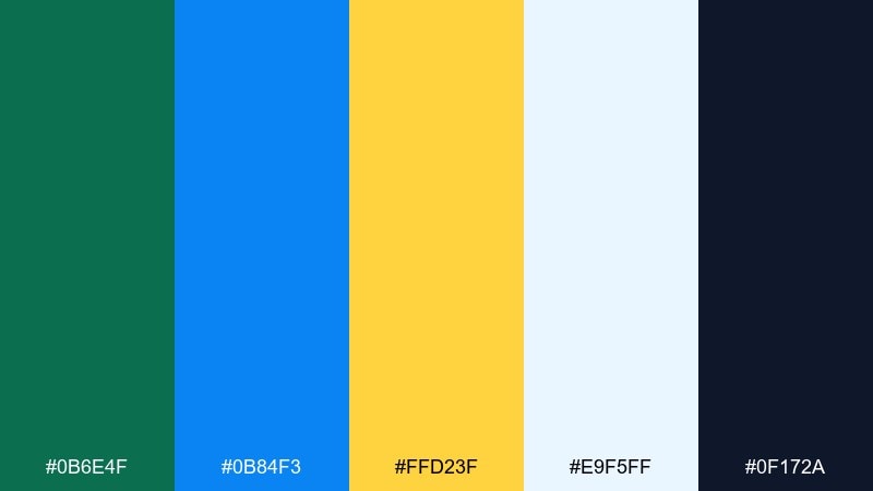
HEX: #0b6e4f #0b84f3 #ffd23f #e9f5ff #0f172a
Mood: fresh, bright, coastal
Best for: travel landing page UI
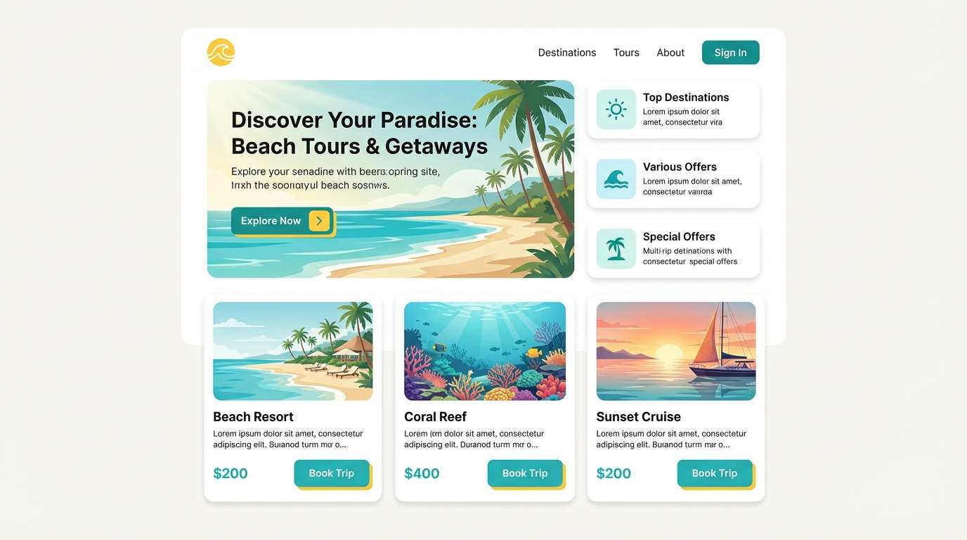
Fresh lagoon blues and zesty yellow feel like sunlight hitting clear water. This green blue yellow color palette is ideal for travel and hospitality UI where clarity and optimism matter. Pair it with lots of white space and a deep ink tone for type to keep contrast sharp. Usage tip: reserve the yellow for one primary CTA so it reads instantly.
Image example of lagoon citrus generated using media.io
Media.io is an online AI studio for creating and editing video, image, and audio in your browser.

2) Sunlit Surf
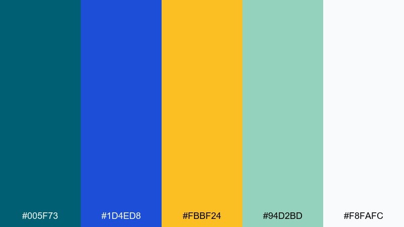
HEX: #005f73 #1d4ed8 #fbbf24 #94d2bd #f8fafc
Mood: uplifting, airy, sporty
Best for: summer event poster
Uplifting surf blues with a warm sunburst accent bring instant summer energy. These tones work well for bold headlines, date blocks, and simple iconography on posters. Pair with an off-white base so the greens and blues stay breezy rather than heavy. Usage tip: set the headline in deep blue and use yellow only for the key detail you want remembered.
Image example of sunlit surf generated using media.io
3) Rainforest Pop
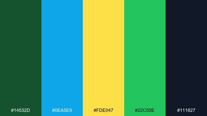
HEX: #14532d #0ea5e9 #fde047 #22c55e #111827
Mood: bold, playful, energetic
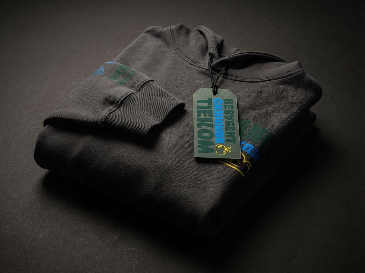
Best for: streetwear product ad
Bold rainforest greens with electric sky blue and punchy yellow feel lively and urban. Use it for streetwear ads where you want high contrast and quick readability. Pair with near-black for type and let the blue carry secondary blocks or tags. Usage tip: keep backgrounds dark so the yellow pops without looking neon-heavy.
Image example of rainforest pop generated using media.io
4) Nordic Marina
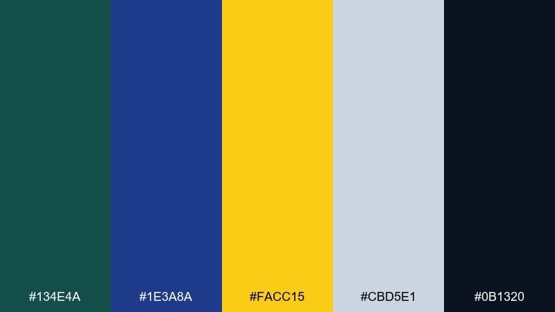
HEX: #134e4a #1e3a8a #facc15 #cbd5e1 #0b1320
Mood: cool, clean, contemporary
Best for: SaaS dashboard UI
Cool marina tones feel crisp, structured, and confident like a modern harbor. This green blue yellow color scheme suits SaaS dashboards that need hierarchy without visual noise. Pair with soft slate grays for panels and let yellow highlight alerts or active states. Usage tip: keep the yellow at under 10 percent coverage to maintain a premium look.
Image example of nordic marina generated using media.io
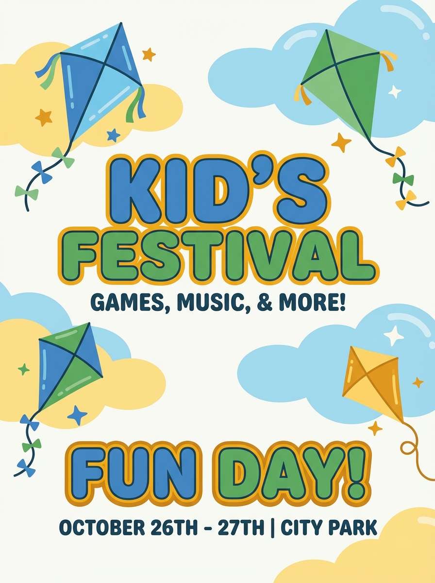
5) Garden Kite
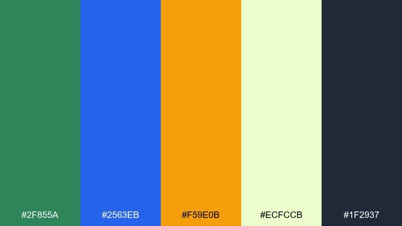
HEX: #2f855a #2563eb #f59e0b #ecfccb #1f2937
Mood: cheerful, outdoorsy, friendly
Best for: kids festival flyer
Cheerful garden greens and a bright sky blue feel like kites over a park. The mix is perfect for kid-friendly flyers with simple shapes, mascots, and big type. Pair with a pale leafy tint to soften large background areas. Usage tip: outline key text in dark charcoal so it stays readable over the brighter blocks.
Image example of garden kite generated using media.io
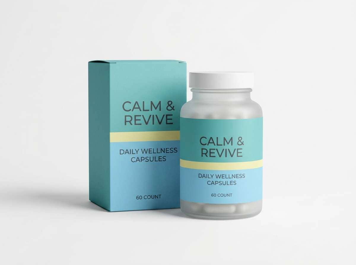
6) Aquarium Meadow
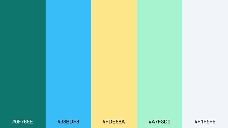
HEX: #0f766e #38bdf8 #fde68a #a7f3d0 #f1f5f9
Mood: soft, calming, optimistic
Best for: wellness brand packaging
Soft aquatic tones with a mellow yellow feel calming, clean, and friendly. It works beautifully for wellness packaging where you want gentle trust rather than high drama. Pair with white and a light mint tint for spacious labels and subtle patterns. Usage tip: use the blue for the brand mark and keep yellow for small seal details.
Image example of aquarium meadow generated using media.io
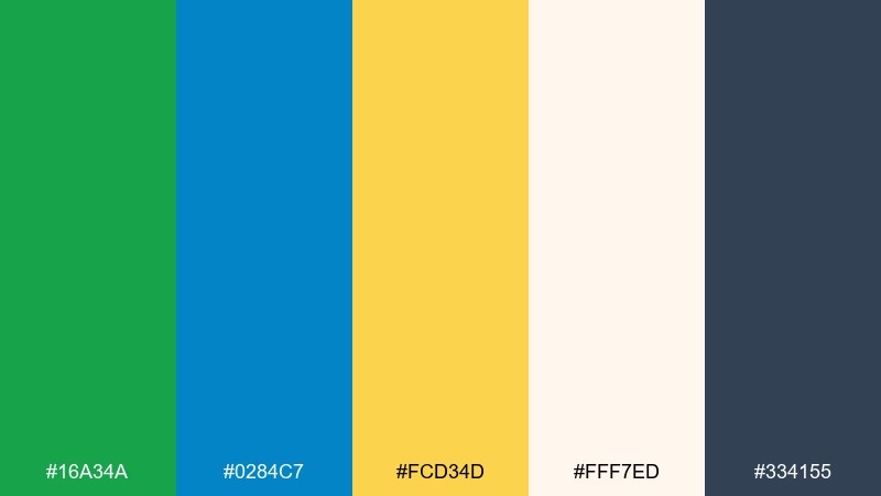
7) Retro Primary Play
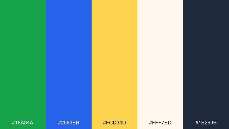
HEX: #16a34a #2563eb #fcd34d #fff7ed #1e293b
Mood: nostalgic, punchy, fun
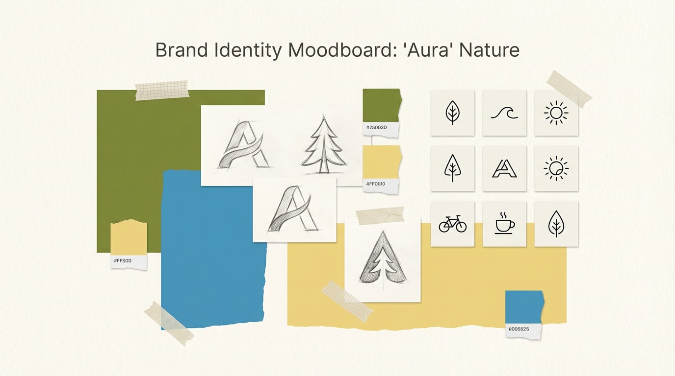
Best for: brand identity moodboard
Nostalgic primaries with a creamy base evoke vintage toys and bold print graphics. These green blue yellow color combinations shine in branding when you want playful confidence and clear recognition. Pair with a warm off-white so the trio feels curated rather than harsh. Usage tip: apply the colors in flat blocks first, then add texture sparingly for retro character.
Image example of retro primary play generated using media.io
8) Coastal Market
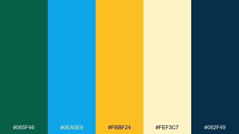
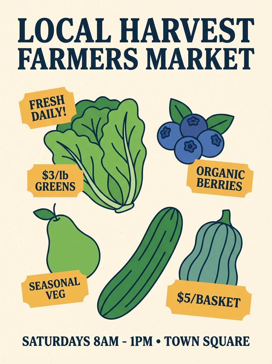
HEX: #065f46 #0ea5e9 #fbbf24 #fef3c7 #082f49
Mood: warm, welcoming, artisanal
Best for: farmers market poster
Welcoming coastal greens and blues with honeyed yellow feel like fresh produce stands by the sea. Use it for market posters that balance friendliness with clear wayfinding. Pair with a buttery cream background and a deep navy for body copy. Usage tip: keep illustrations in two tones and let yellow serve as the price tag highlight.
Image example of coastal market generated using media.io
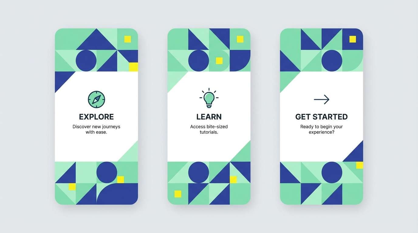
9) Minty Mosaic
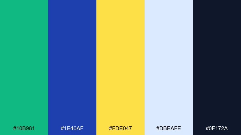
HEX: #10b981 #1e40af #fde047 #dbeafe #0f172a
Mood: crisp, geometric, modern
Best for: app onboarding screens
Crisp mint and deep blue with a sunny accent feel modern and neatly structured. These tones work great for onboarding where you need clear steps and friendly nudges. Pair with a pale blue background for calm breathing room between sections. Usage tip: color-code steps with mint and blue, then use yellow only for the final success state.
Image example of minty mosaic generated using media.io
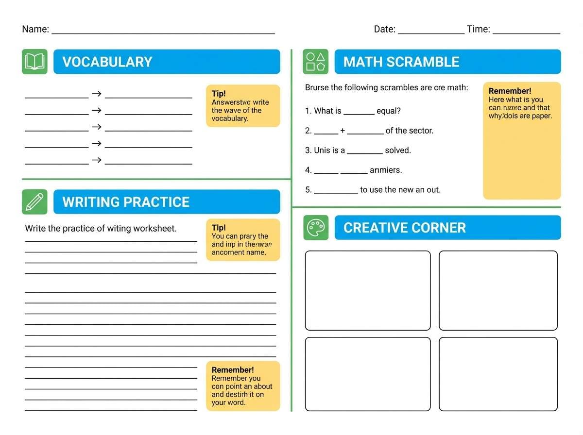
10) Schoolyard Bright
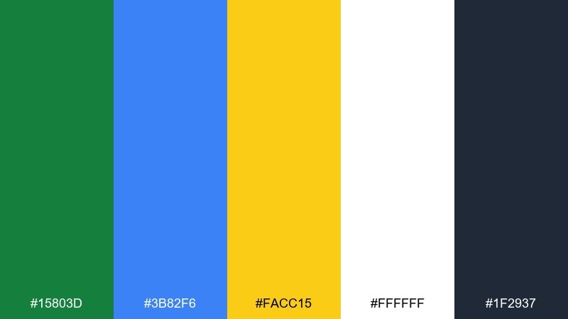
HEX: #15803d #3b82f6 #facc15 #ffffff #1f2937
Mood: clear, upbeat, educational
Best for: classroom worksheet template
Upbeat schoolyard hues feel clear, friendly, and easy to scan. Use them on worksheets and classroom materials to create structure without clutter. Pair with plenty of white and a dark neutral for instructions and answer lines. Usage tip: keep yellow for headings and callouts so students can find sections fast.
Image example of schoolyard bright generated using media.io
11) Tropical Atlas
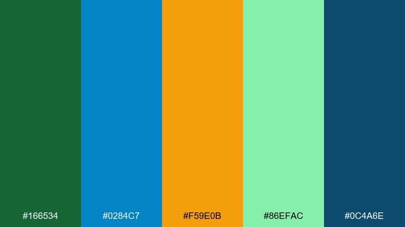
HEX: #166534 #0284c7 #f59e0b #86efac #0c4a6e
Mood: adventurous, sunny, lively
Best for: travel magazine spread
Adventurous tropical greens with ocean blue and mango yellow feel like a map of island hopping. It fits editorial layouts where photography needs strong but tasteful supporting color. Pair with restrained typography and let the blue frame pull quotes or section titles. Usage tip: use green for small navigation markers so the spread stays readable over images.
Image example of tropical atlas generated using media.io
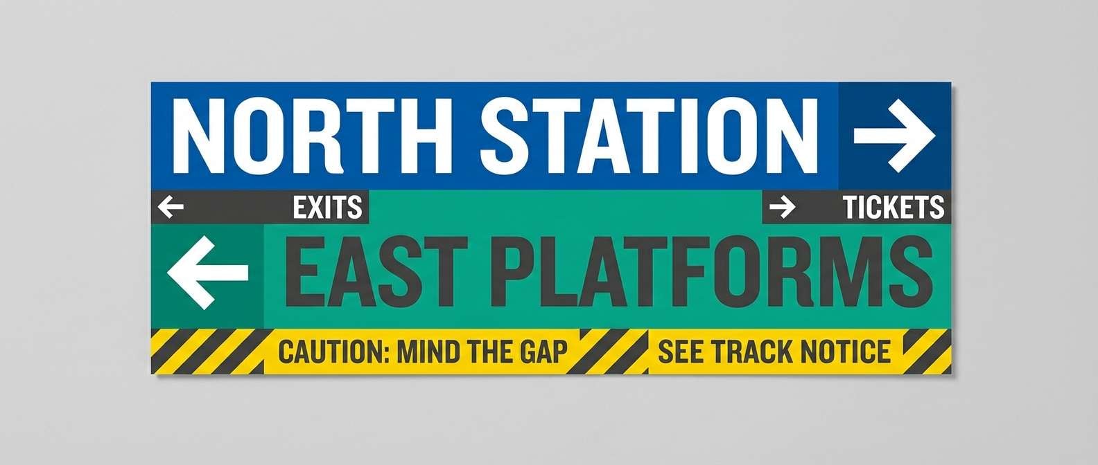
12) Urban Transit
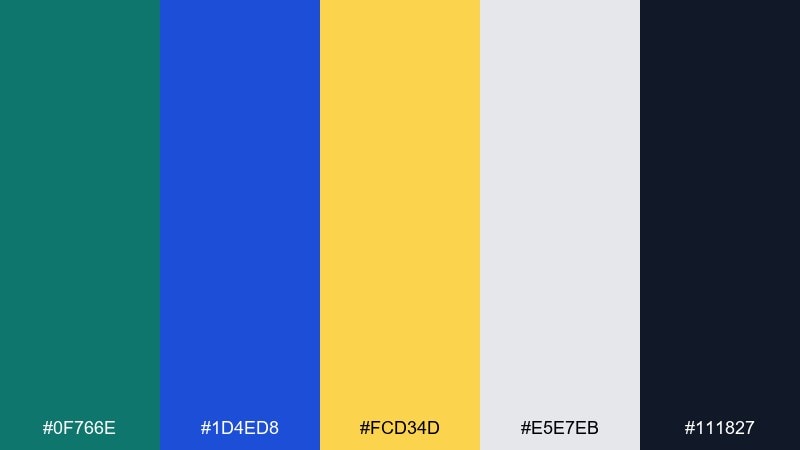
HEX: #0f766e #1d4ed8 #fcd34d #e5e7eb #111827
Mood: confident, practical, city-smart
Best for: wayfinding signage system
Confident city tones feel like clean transit maps and reliable navigation. This green blue yellow color palette works for wayfinding because the contrast stays strong at a distance. Pair with cool gray for background panels and rely on near-black for type and arrows. Usage tip: assign one color per route and keep yellow for warnings and service updates.
Image example of urban transit generated using media.io
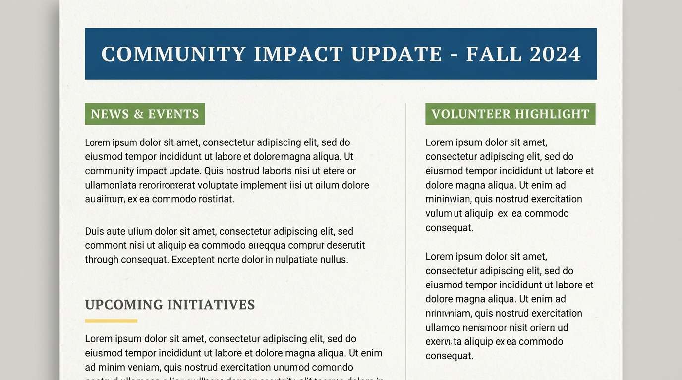
13) Leafy Lagoon
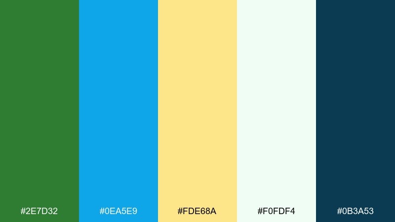
HEX: #2e7d32 #0ea5e9 #fde68a #f0fdf4 #0b3a53
Mood: natural, light, refreshing
Best for: eco nonprofit newsletter
Natural leafy greens with airy blue and soft yellow feel hopeful and community-focused. They are well suited to newsletters where you want a friendly, readable rhythm across sections. Pair with a very light green tint for backgrounds and a deep blue for headlines. Usage tip: keep charts in two colors and use the yellow only as a highlight for key numbers.
Image example of leafy lagoon generated using media.io
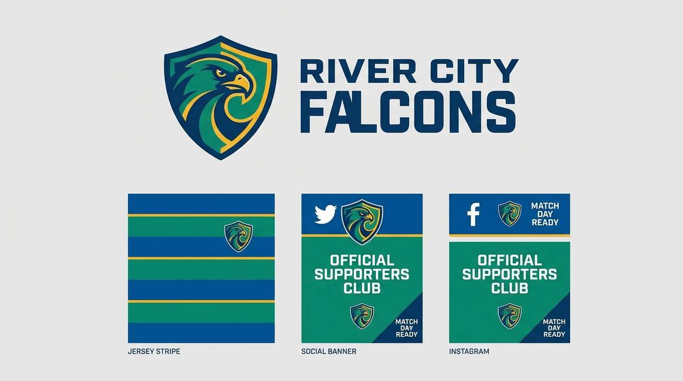
14) Summer Regatta

HEX: #047857 #2563eb #fbbf24 #e0f2fe #0f172a
Mood: sporty, breezy, competitive
Best for: sports club branding
Breezy regatta colors feel sporty and confident, like sails against a bright sky. Use them for club branding where you need strong identity across jerseys, social posts, and banners. Pair with a pale sky tint for backgrounds and keep the darkest tone for typography. Usage tip: place yellow on small badges and stripes so it reads as energy, not noise.
Image example of summer regatta generated using media.io
15) Picnic Pattern
HEX: #16a34a #0284c7 #fcd34d #fff7ed #334155
Mood: cozy, friendly, handmade
Best for: packaging label design
Cozy picnic vibes come through in the warm cream base and sunny accents. The green blue yellow color combination works well on labels where pattern and type need to stay legible. Pair with a soft off-white background and keep outlines in slate to avoid harsh edges. Usage tip: use the blue for the product name and green for supporting details, saving yellow for a small quality seal.
Image example of picnic pattern generated using media.io
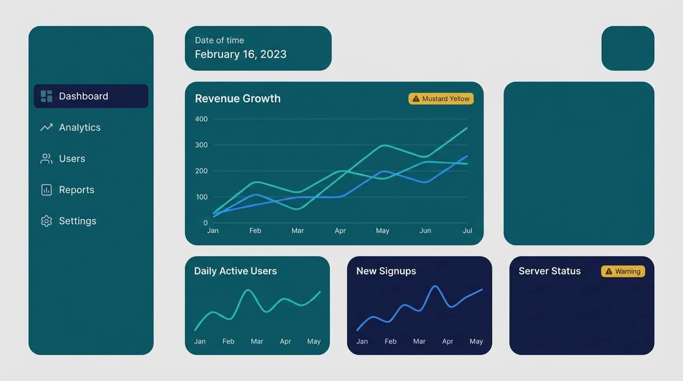
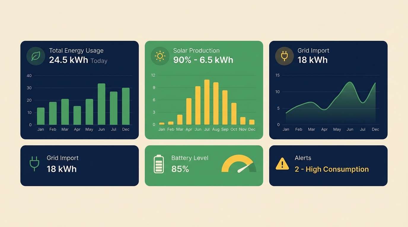
16) Eco Tech Dashboard
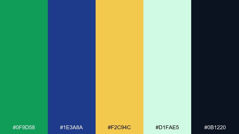
HEX: #0f9d58 #1e3a8a #f2c94c #d1fae5 #0b1220
Mood: smart, sustainable, professional
Best for: energy monitoring UI
Smart eco-tech tones feel efficient and trustworthy, like clean energy data visualized clearly. Use them in monitoring dashboards to separate metrics, states, and alerts without overwhelming the user. Pair with a pale mint panel color and a very dark base for text and chart axes. Usage tip: make yellow the alert and threshold color so it signals attention consistently.
Image example of eco tech dashboard generated using media.io
17) Museum Modern
HEX: #115e59 #1e40af #eab308 #f3f4f6 #111827
Mood: refined, curated, contemporary
Best for: exhibition invitation card
Refined jewel tones with a golden note feel curated and contemporary, like a modern museum poster wall. This green blue yellow color scheme works well for invitations where typography leads and color supports. Pair with a soft gray paper tone and plenty of negative space for an upscale finish. Usage tip: emboss or spot-color the yellow element to create a premium focal point.
Image example of museum modern generated using media.io

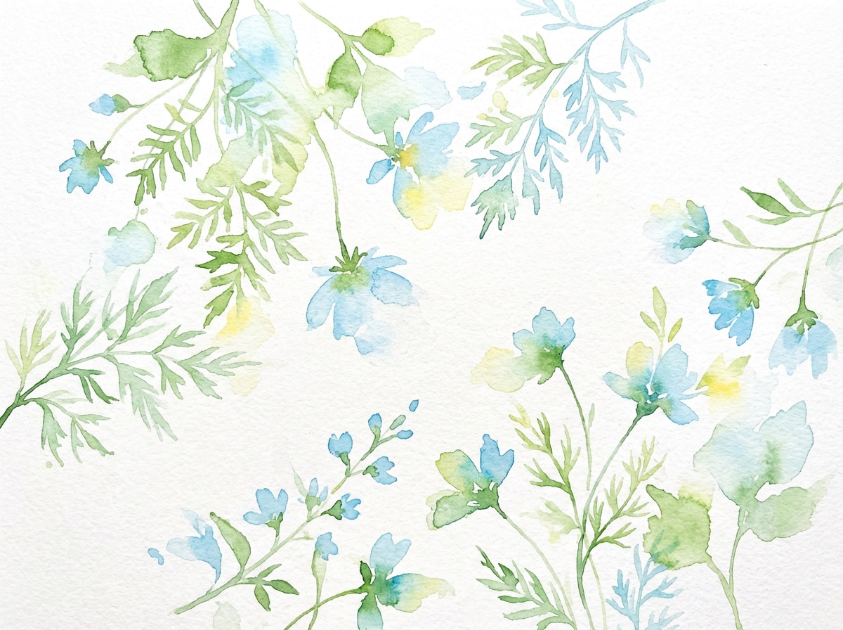
18) Spring Botanic Wash
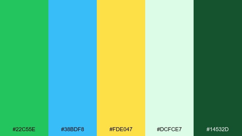
HEX: #22c55e #38bdf8 #fde047 #dcfce7 #14532d
Mood: light, floral, optimistic
Best for: botanical watercolor illustration
Light botanical washes feel like new leaves, open skies, and soft morning sun. The mix is great for spring illustrations, greeting cards, or gentle background art behind copy. Pair with pale green washes to keep the page airy and avoid heavy outlines. Usage tip: let yellow appear as small pollen-like dots so it stays delicate.
Image example of spring botanic wash generated using media.io
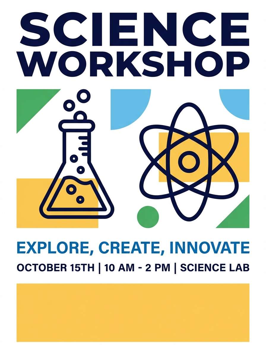
19) Bright Lab Notes
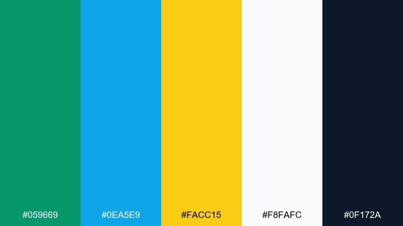
HEX: #059669 #0ea5e9 #facc15 #f8fafc #0f172a
Mood: curious, clear, upbeat
Best for: science workshop poster
Curious lab-note energy comes through in the crisp blue and bright yellow hits. It is a strong choice for workshop posters where icons, steps, and key times must read fast. Pair with white space and a dark ink tone for clean contrast. Usage tip: keep illustrations in line style and fill only the most important shapes with color.
Image example of bright lab notes generated using media.io
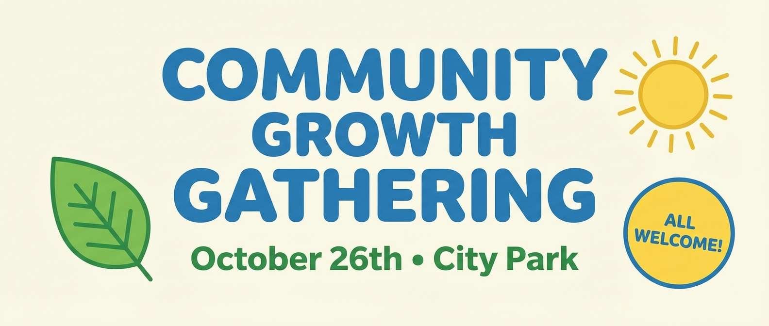
20) City Park Picnic
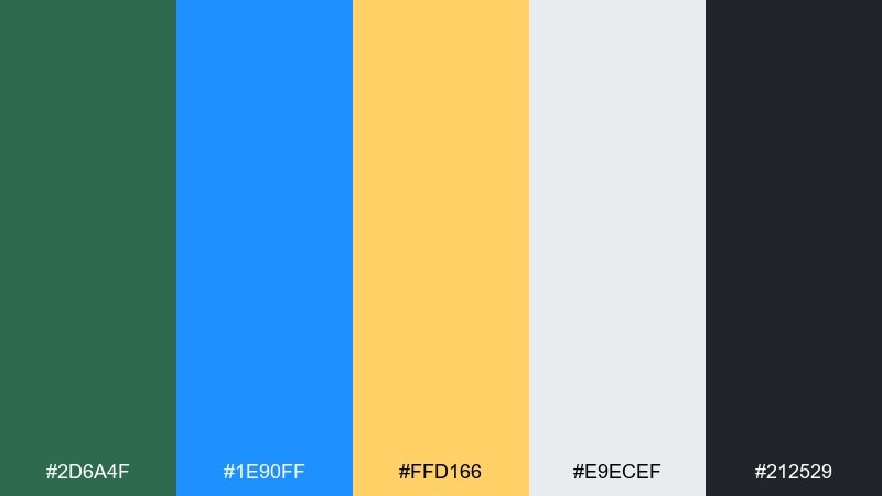
HEX: #2d6a4f #1e90ff #ffd166 #e9ecef #212529
Mood: relaxed, social, sunny
Best for: community event banner
Relaxed park tones feel social and sunny, like a weekend meetup on the grass. Use them on banners where you need friendly visibility from a distance. Pair with a light gray base to keep the look clean and modern. Usage tip: make the headline blue for clarity and use yellow for the date badge.
Image example of city park picnic generated using media.io
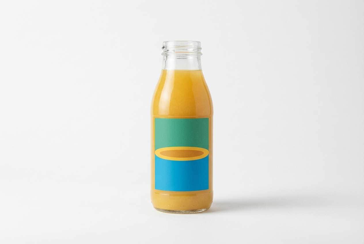
21) Ocean Orchard
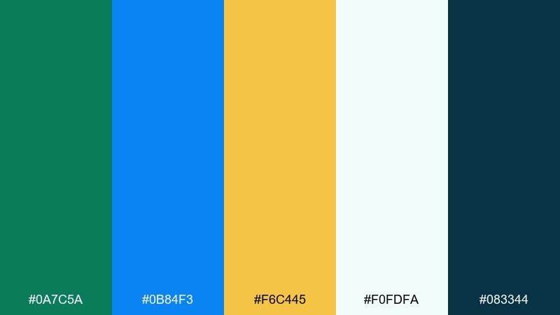
HEX: #0a7c5a #0b84f3 #f6c445 #f0fdfa #083344
Mood: fresh, juicy, modern
Best for: juice bottle packaging
Fresh ocean-meets-orchard tones feel juicy, modern, and clean. They suit beverage packaging where you want both natural cues and a crisp, refreshing finish. Pair with a very light aqua background and a deep teal for ingredient lists. Usage tip: use yellow as a flavor ring or cap accent to create shelf recognition.
Image example of ocean orchard generated using media.io
What Colors Go Well with Green Blue Yellow?
Neutrals are the easiest way to control intensity: crisp white and off-white keep the palette airy, while charcoal and near-black help typography stay sharp against brighter blues and yellows.
For a more premium or editorial feel, add cool grays (slate, stone) to create structured UI panels and calm negative space. If you want warmth, creamy beige can soften the overall look without dulling the blue.
Accents that pair well include coral or orange for extra pop, and deep navy for anchoring headlines. In most layouts, keep yellow as the smallest share so it remains a clear highlight.
How to Use a Green Blue Yellow Color Palette in Real Designs
Start with roles instead of equal coverage: use blue as the primary brand/UI color, green for supportive states (success, eco cues, secondary blocks), and yellow for one key focal point such as a CTA, badge, or alert.
Prioritize contrast and legibility—especially for UI and signage. Put body text on white/off-white or very dark backgrounds, and avoid placing yellow text on light backgrounds unless you outline it or darken the yellow significantly.
To keep things modern, use flat color blocks and consistent spacing. Then add depth with subtle tints (pale aqua, light mint, soft gray) rather than introducing too many new saturated colors.
Create Green Blue Yellow Palette Visuals with AI
If you want to see these colors in context, generate quick mockups: posters, packaging, dashboards, onboarding screens, or brand moodboards. Visual testing helps you confirm whether your yellow reads as “sunny” or “warning,” and whether your green leans natural or tech.
With Media.io, you can turn a short prompt into multiple style variations, then iterate by swapping which color is dominant and keeping yellow as the accent for consistent hierarchy.
Try generating two versions of the same design: one with a light background for an airy feel, and one with a dark background to make the yellow pop more dramatically.
Green Blue Yellow Color Palette FAQs
-
What does a green blue yellow color palette communicate?
It typically signals a mix of trust (blue), growth or freshness (green), and optimism/attention (yellow). Depending on saturation, it can feel coastal and friendly, sporty and energetic, or clean and tech-forward. -
How do I keep yellow from overpowering the design?
Use yellow as an accent (often under 10–15% coverage) for CTAs, badges, or highlights. Keep larger surfaces in blue/green or light neutrals, and reserve yellow for the one element you want noticed first. -
What background works best with green blue yellow tones?
For a light, modern look, use white, off-white, pale aqua, or soft gray. For a bold look (especially posters/ads), use deep navy or near-black so yellow and bright blue stay high-contrast. -
Is this palette good for UI and dashboards?
Yes—blue can define primary navigation and components, green can represent positive states, and yellow can flag warnings or key updates. Just ensure accessible contrast ratios for text and icons. -
What are good neutral pairings for green blue yellow palettes?
Charcoal, ink navy, slate gray, warm cream, and clean white are the most reliable. They reduce visual noise and let the three main colors establish hierarchy. -
Can I use green and blue equally, or should one be dominant?
You can, but most designs read cleaner with one dominant color (often blue), one supporting color (green), and yellow as a highlight. Equal dominance can work in playful branding, but needs careful spacing and typography. -
What’s a fast way to preview these palettes on real designs?
Generate a few mockups with the same layout (poster, landing page, label) and swap dominance: blue-first vs green-first vs dark-background. Media.io’s text-to-image workflow makes it quick to iterate and compare.
Next: Gold Beige Color Palette


