

Fantasy color palettes help you tell a story fast: a single glance can suggest moonlight, ancient magic, or dragon-fire intensity. That makes them perfect for UI, branding, illustration, and any design that needs mood as much as clarity.
Below are 20 fantasy color scheme ideas with HEX codes, mood notes, and real-use tips—plus AI prompts you can reuse to generate visuals that match each palette’s vibe.
In this article
- Why Fantasy Palettes Work So Well
-
- enchanted forest glow
- dragon ember dusk
- moonlit sapphire mist
- fairy lantern pastels
- arcane library sepia
- crystal cavern aura
- mermaid lagoon dream
- celestial nebula bloom
- ancient rune stone
- unicorn meadow shine
- witching hour plum
- griffin gold crest
- frosted kingdom haze
- sunken temple jade
- phoenix ash and flame
- starlight court ivory
- shadow realm noir
- elven silk rose
- storm mage teal
- titan copper relic
- What Colors Go Well with Fantasy?
- How to Use a Fantasy Color Palette in Real Designs
- Create Fantasy Palette Visuals with AI
Why Fantasy Palettes Work So Well
Fantasy palettes work because they rely on instantly recognizable visual cues—glow highlights, deep shadows, jewel tones, and “otherworldly” contrasts. Even without characters or lore, the colors can imply a world with rules and magic.
They also balance emotion and readability. A great fantasy color scheme often pairs a dark base (night, stone, smoke) with a controlled accent (rune violet, ember orange, starlight gold) so interfaces and layouts stay functional.
Most importantly, fantasy colors are flexible: you can push them toward regal luxury, playful whimsy, or cinematic danger just by changing saturation, contrast, and where you place the brightest hue.
20+ Fantasy Color Palette Ideas (with HEX Codes)
1) Enchanted Forest Glow
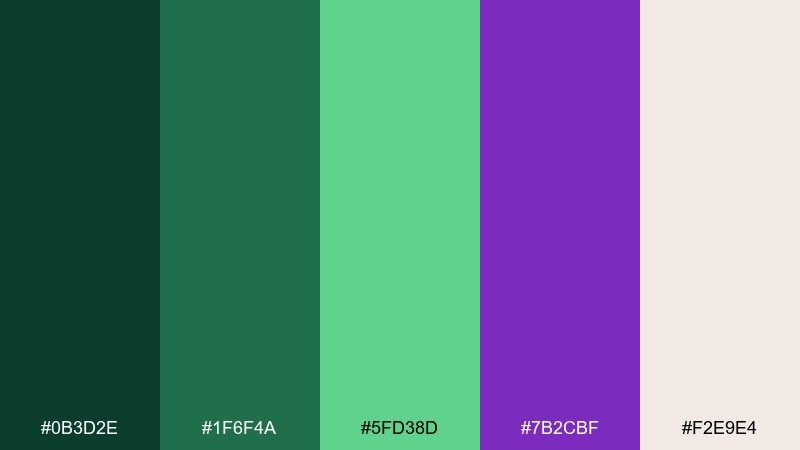
HEX: #0b3d2e #1f6f4a #5fd38d #7b2cbf #f2e9e4
Mood: mystical, lush, glowing
Best for: watercolor forest illustration for a game loading screen
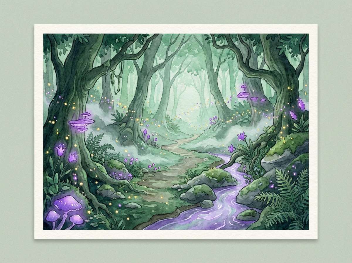
Mossy greens and violet sparks feel like moonlit paths, fireflies, and hidden portals under ancient trees. Use it for fantasy landscapes, nature-first UI accents, or serene brand backdrops. Pair the purple with cream for readable headlines, and keep mint as a glowing highlight. Tip: reserve the brightest green for interactive cues so the scene stays calm, not neon.
Image example of enchanted forest glow generated using media.io
Media.io is an online AI studio for creating and editing video, image, and audio in your browser.

2) Dragon Ember Dusk
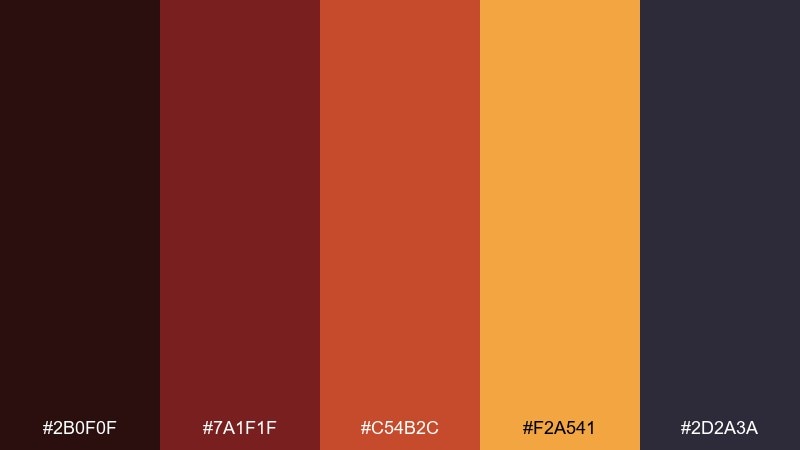
HEX: #2b0f0f #7a1f1f #c54b2c #f2a541 #2d2a3a
Mood: fiery, bold, cinematic
Best for: cinematic book cover artwork for a dragon tale
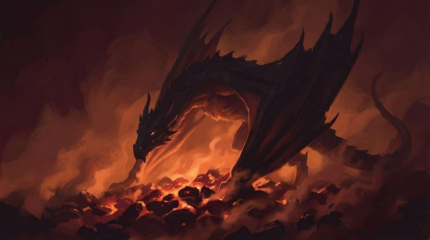
Smoky maroon and ember orange evoke cracked lava, scorched armor, and torchlit skies. It shines on covers, posters, and high-impact hero sections where you want instant drama. Balance the heat with the deep charcoal-violet to keep gradients rich rather than loud. Tip: use the gold-orange sparingly on titles and insignias to mimic real flame highlights.
Image example of dragon ember dusk generated using media.io
3) Moonlit Sapphire Mist
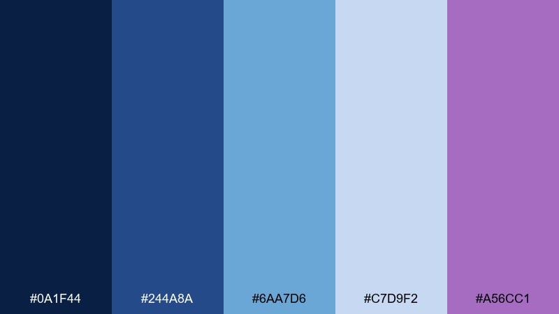
HEX: #0a1f44 #244a8a #6aa7d6 #c7d9f2 #a56cc1
Mood: calm, nocturnal, ethereal
Best for: 2D night-mode UI for a lore wiki app
Cool blues and a soft lilac glow feel like fog rolling over a lake under a bright moon. This fantasy color scheme works beautifully for night mode interfaces, reading apps, and peaceful dashboards. Pair the palest blue with dark navy for crisp contrast, and keep lilac for badges or links. Tip: set large surfaces in navy and save mid-blue for cards to avoid a flat, all-blue screen.
Image example of moonlit sapphire mist generated using media.io

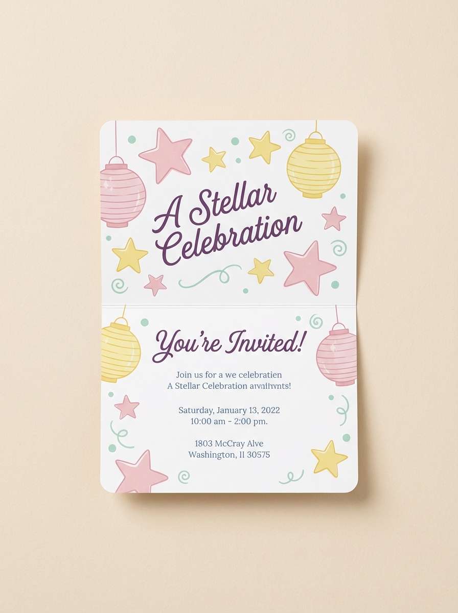
4) Fairy Lantern Pastels
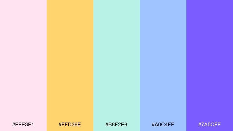
HEX: #ffe3f1 #ffd36e #b8f2e6 #a0c4ff #7a5cff
Mood: whimsical, playful, airy
Best for: children's party invitation design on a plain background
Cotton-candy pinks with buttery yellow and mint feel like lanterns floating through a twilight garden. These tones suit invitations, sticker sets, and cheerful social graphics without turning childish. Pair the periwinkle and purple for headings, and let the pastels do the heavy lifting in shapes and borders. Tip: keep one strong purple element as an anchor so the layout does not look washed out.
Image example of fairy lantern pastels generated using media.io
5) Arcane Library Sepia
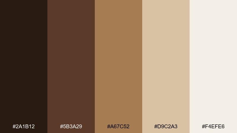
HEX: #2a1b12 #5b3a29 #a67c52 #d9c2a3 #f4efe6
Mood: antique, scholarly, warm
Best for: editorial magazine layout for a history feature
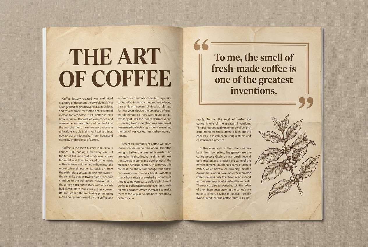
Worn leather browns and parchment creams evoke stacked spellbooks, candlewax, and ink-stained margins. It works best for editorial design, long-form reading, and brands that want heritage without feeling dusty. Pair the darkest brown with cream for body text contrast, and use tan for dividers and pull quotes. Tip: add texture lightly in the background so the palette stays premium, not muddy.
Image example of arcane library sepia generated using media.io
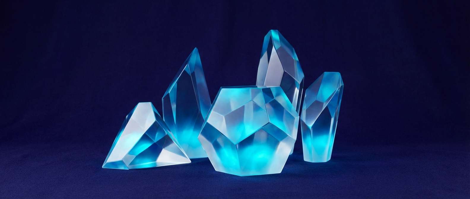
6) Crystal Cavern Aura
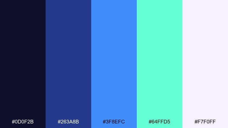
HEX: #0d0f2b #263a8b #3f8efc #64ffd5 #f7f0ff
Mood: electric, luminous, futuristic-mystic
Best for: SaaS landing hero with abstract crystal shapes
Inky indigo and neon-cool cyan feel like light refracting through quartz in a hidden cave. Use it for tech-meets-magic brands, streaming overlays, or sci-fi interfaces that still feel dreamy. Pair the bright cyan with the pale lavender-white for clean highlights and icons. Tip: keep indigo as the primary background so the glow colors look intentional, not accidental.
Image example of crystal cavern aura generated using media.io
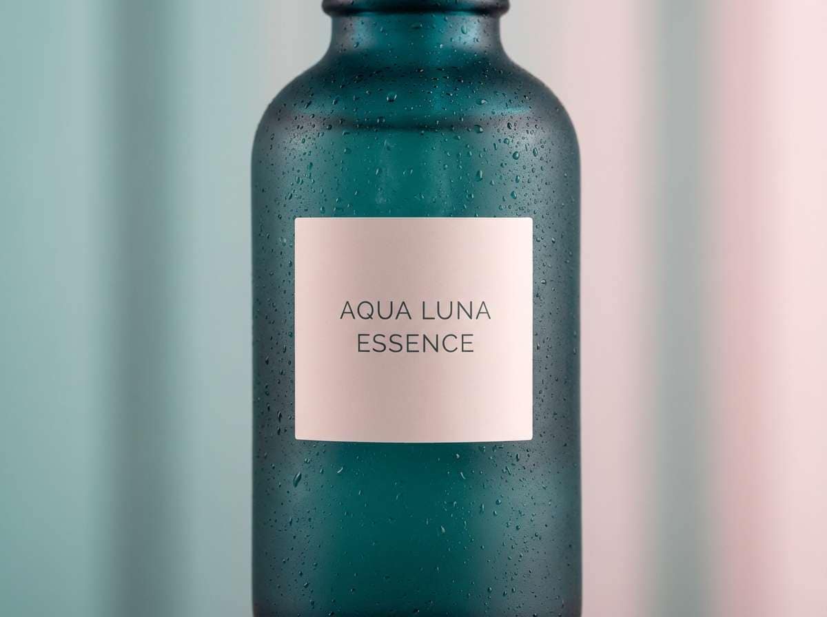
7) Mermaid Lagoon Dream
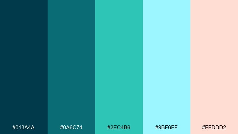
HEX: #013a4a #0a6c74 #2ec4b6 #9bf6ff #ffddd2
Mood: fresh, oceanic, dreamy
Best for: realistic skincare product ad in a studio setup
Teal waters and airy aqua highlights suggest sunlit waves, sea glass, and a calm shoreline. It fits wellness branding, bath products, and lifestyle ads that need a clean, hydrated feel. Pair the blush-peach with deep teal for a modern contrast that still feels soft. Tip: use the light aqua as negative space so the design breathes like open water.
Image example of mermaid lagoon dream generated using media.io
8) Celestial Nebula Bloom
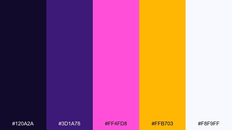
HEX: #120a2a #3d1a78 #ff4fd8 #ffb703 #f8f9ff
Mood: cosmic, vibrant, otherworldly
Best for: music festival poster design on a plain background
Deep space violet with hot magenta and golden bursts feels like a nebula blooming behind distant stars. These fantasy color combinations are perfect for posters, album art, and bold campaign graphics that need instant energy. Pair magenta with off-white for legibility, then use gold as a spotlight accent on key dates or calls to action. Tip: limit gradients to one focal area so the palette stays striking instead of chaotic.
Image example of celestial nebula bloom generated using media.io
9) Ancient Rune Stone
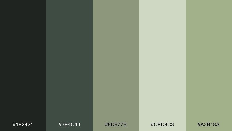
HEX: #1f2421 #3e4c43 #8d977b #cfd8c3 #a3b18a
Mood: earthy, grounded, mysterious
Best for: tabletop RPG character sheet and UI panels
Mossy stone neutrals feel like carved runes, weathered temples, and foggy hills at dawn. It works well for tabletop layouts, tool UIs, and products that need a natural, understated tone. Pair the light sage with charcoal for readable tables and forms, and use olive as a subtle highlight. Tip: keep line work in the darkest green-black so the page looks carved, not printed.
Image example of ancient rune stone generated using media.io
10) Unicorn Meadow Shine
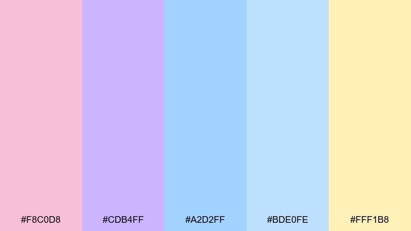
HEX: #f8c0d8 #cdb4ff #a2d2ff #bde0fe #fff1b8
Mood: sweet, optimistic, soft-glowing
Best for: kids stationery branding and sticker pack
Pastel pinks, lilac, and sky blue feel like dew on meadow flowers and a gentle sunrise. It is ideal for kid-friendly branding, playful merch, and lighthearted packaging. Pair the buttery yellow with lilac for a cheerful logo lockup, then use sky blue as the main background. Tip: add plenty of white space so the colors stay airy instead of sugary.
Image example of unicorn meadow shine generated using media.io
11) Witching Hour Plum
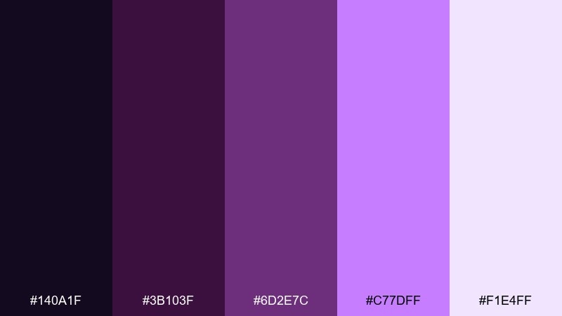
HEX: #140a1f #3b103f #6d2e7c #c77dff #f1e4ff
Mood: dark, elegant, spellbound
Best for: cosmetics branding and product label system
Velvet plums and luminous lavender feel like midnight rituals, smoky incense, and a soft amethyst glow. Use it for cosmetics, boutique packaging, or moody social templates where elegance matters. Pair the darkest purple with pale lavender for premium contrast, and reserve the bright lilac for seals or shimmer highlights. Tip: keep typography simple and spaced out so the palette reads luxurious, not gothic cluttered.
Image example of witching hour plum generated using media.io
12) Griffin Gold Crest
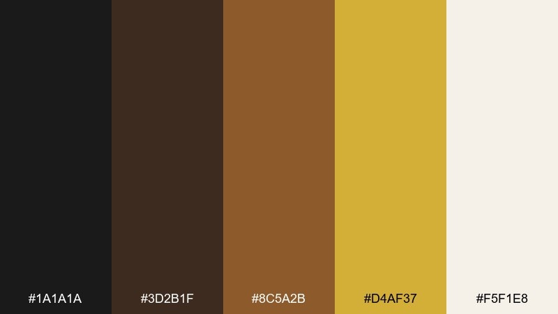
HEX: #1a1a1a #3d2b1f #8c5a2b #d4af37 #f5f1e8
Mood: regal, confident, old-world
Best for: premium spirits label and packaging mockup
Blackened bronze and antique gold evoke heraldic crests, polished armor, and candlelit halls. It is a strong fit for premium labels, luxury branding, and award-style certificates. Pair gold with warm ivory to keep details readable, and use near-black for backgrounds and borders. Tip: use gold as a foil-like accent on emblems only, not large blocks, for a more believable premium feel.
Image example of griffin gold crest generated using media.io
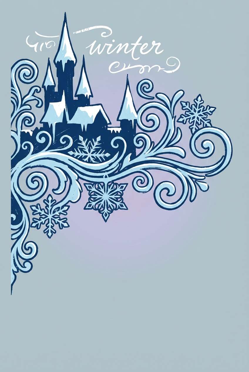
13) Frosted Kingdom Haze
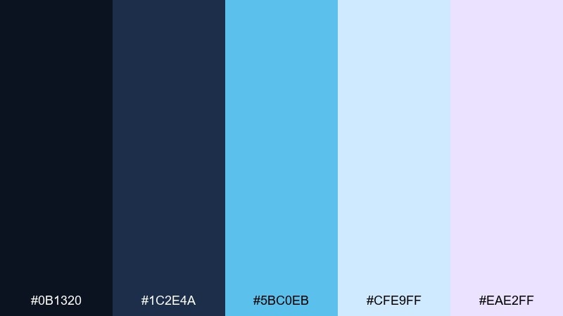
HEX: #0b1320 #1c2e4a #5bc0eb #cfe9ff #eae2ff
Mood: icy, clean, adventurous
Best for: winter event poster illustration on a plain background
Deep arctic navy and frosted blues feel like snowdrifts, cold air, and distant castle towers. It works for winter campaigns, adventure banners, and crisp UI themes that need clarity. Pair the pale icy blue with navy for strong readability, and keep the lavender tint for soft shadows. Tip: use the bright cyan-blue as a single focal glow, like ice magic, to avoid overcooling the whole design.
Image example of frosted kingdom haze generated using media.io
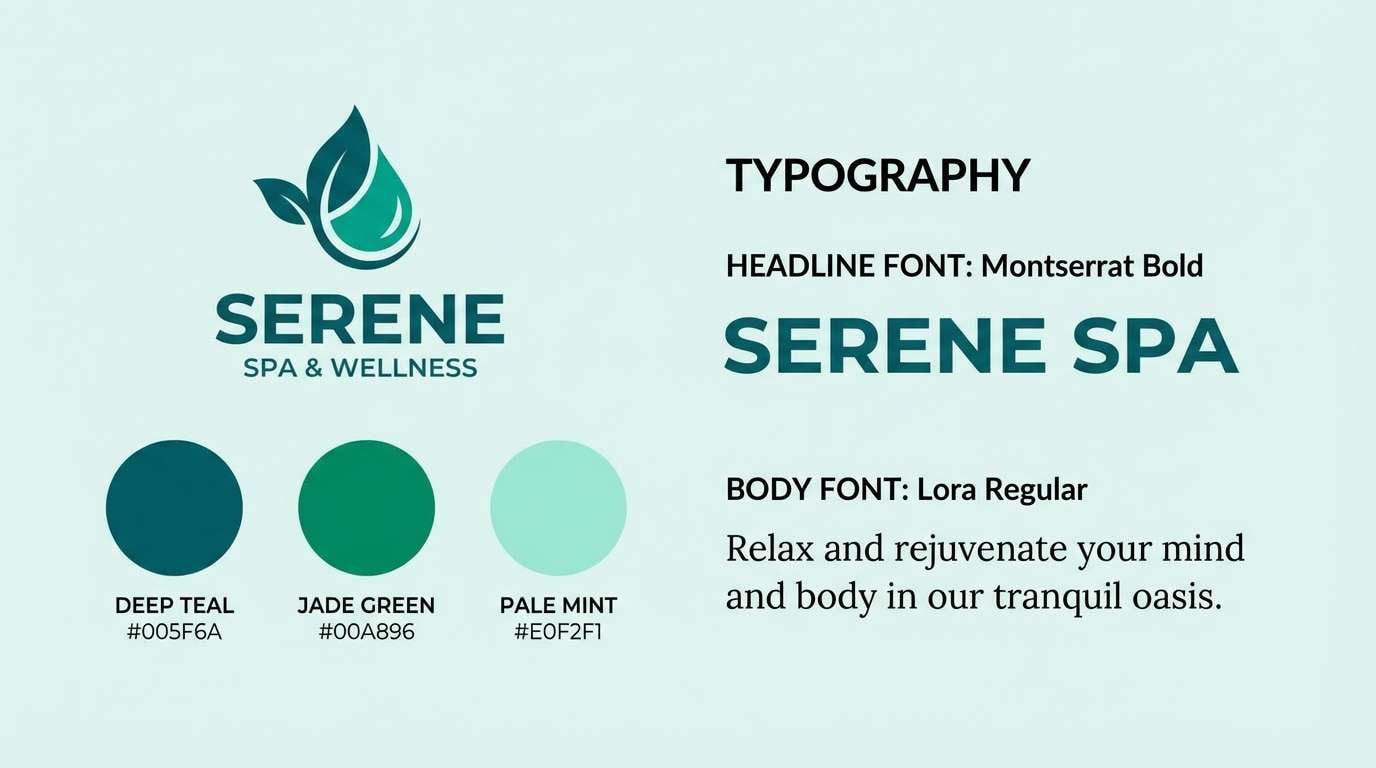
14) Sunken Temple Jade
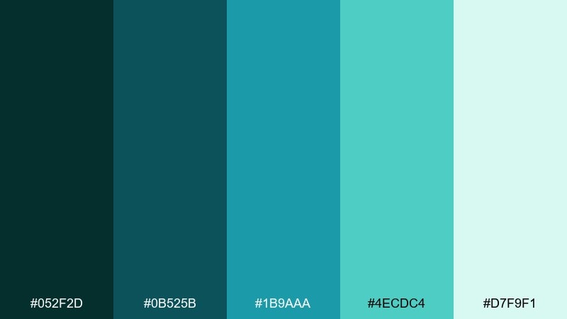
HEX: #052f2d #0b525b #1b9aaa #4ecdc4 #d7f9f1
Mood: ancient, aquatic, refreshing
Best for: spa logo and brand kit presentation slide
Deep sea greens and bright jade feel like submerged stonework covered in coral and light beams. Use it for spa branding, eco products, or calm presentation decks that need a confident teal core. Pair the darkest teal with the pale mint for logos and headings, and use aqua for icon fills. Tip: keep gradients subtle so the palette stays clean and modern, not tropical.
Image example of sunken temple jade generated using media.io
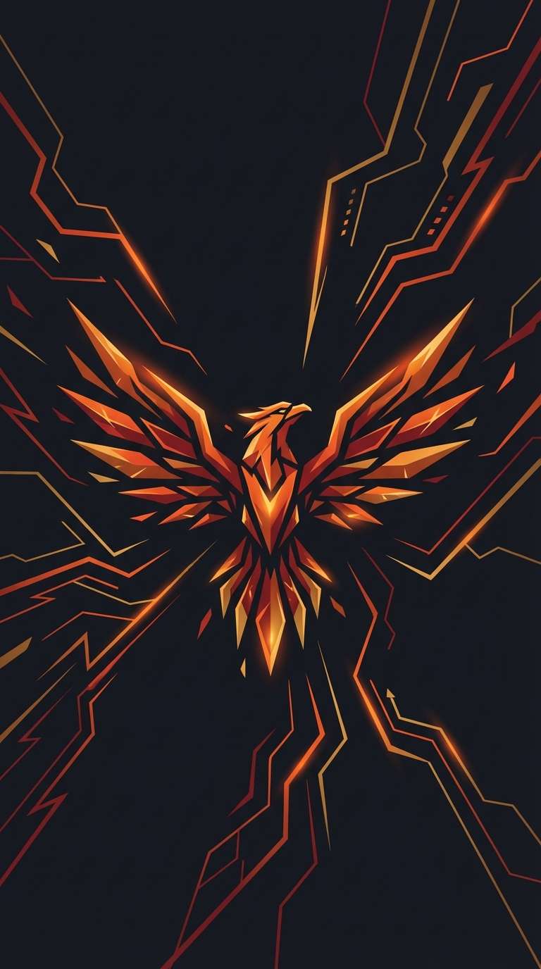
15) Phoenix Ash and Flame
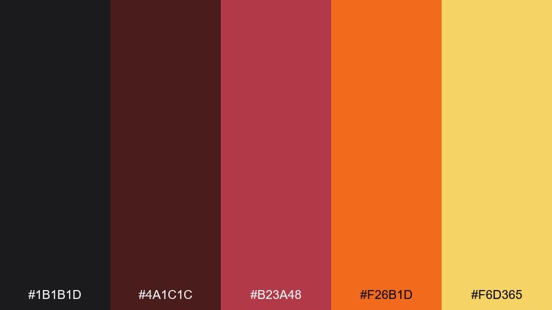
HEX: #1b1b1d #4a1c1c #b23a48 #f26b1d #f6d365
Mood: reborn, intense, heroic
Best for: esports team poster and logo background treatment
Charcoal ash with hot orange and ember red feels like wings rising from smoke after a battle. This fantasy color palette is built for bold identities, team graphics, and punchy thumbnails. Pair the gold with charcoal for high-contrast type, then let ember orange lead in gradients and flares. Tip: keep the deepest gray as the main field so the warm colors read like heat, not flat paint.
Image example of phoenix ash and flame generated using media.io
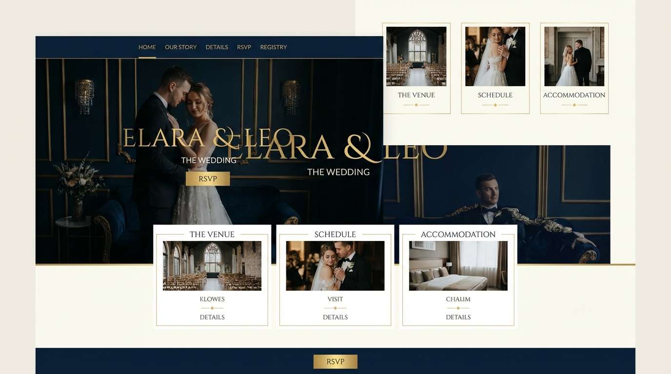
16) Starlight Court Ivory
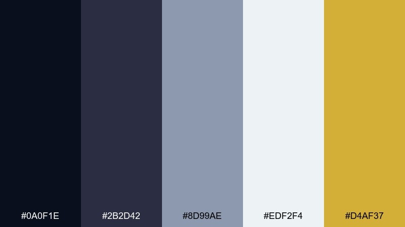
HEX: #0a0f1e #2b2d42 #8d99ae #edf2f4 #d4af37
Mood: refined, celestial, balanced
Best for: luxury wedding website UI mockup in 2D
Midnight blue-black, soft silver, and ivory feel like a quiet palace balcony under starlight. It is ideal for luxury wedding sites, editorial layouts, and premium service brands. Pair ivory with near-black for timeless readability, and use gold only for rules, icons, or monograms. Tip: keep buttons in dark navy with gold outlines to stay elegant without flashing.
Image example of starlight court ivory generated using media.io
17) Shadow Realm Noir
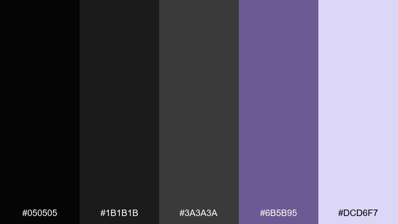
HEX: #050505 #1b1b1b #3a3a3a #6b5b95 #dcd6f7
Mood: ominous, sleek, mysterious
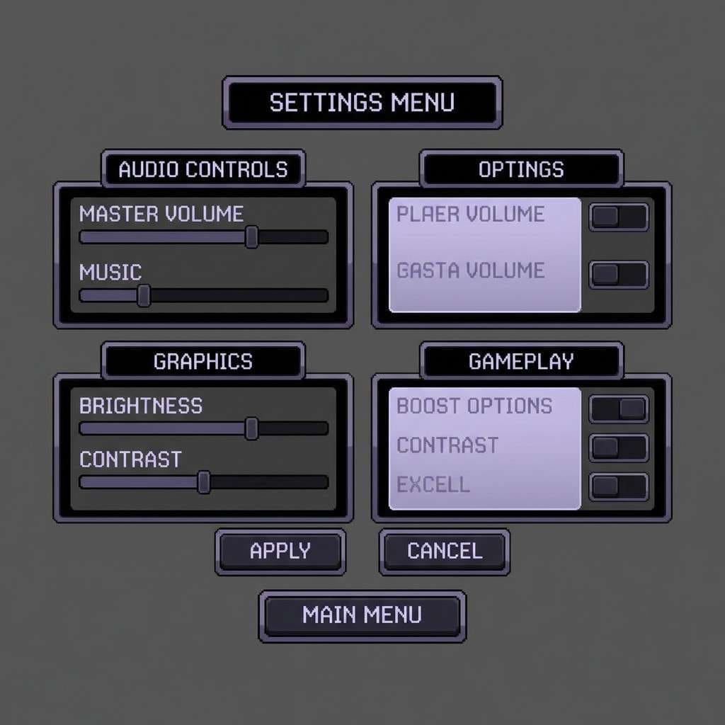
Best for: dark game UI panels and menu screens in 2D
Layered blacks with a muted violet glow feel like corridors lit by distant runes. Use it for dark mode interfaces, stealth game menus, or tech branding with a moody edge. Pair the pale lavender with black for icons and status text, and keep mid-gray for panel separation. Tip: limit violet to hover states and key rewards so the UI stays readable in near-black.
Image example of shadow realm noir generated using media.io
18) Elven Silk Rose
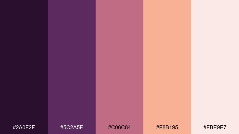
HEX: #2a0f2f #5c2a5f #c06c84 #f8b195 #fbe9e7
Mood: romantic, graceful, enchanted
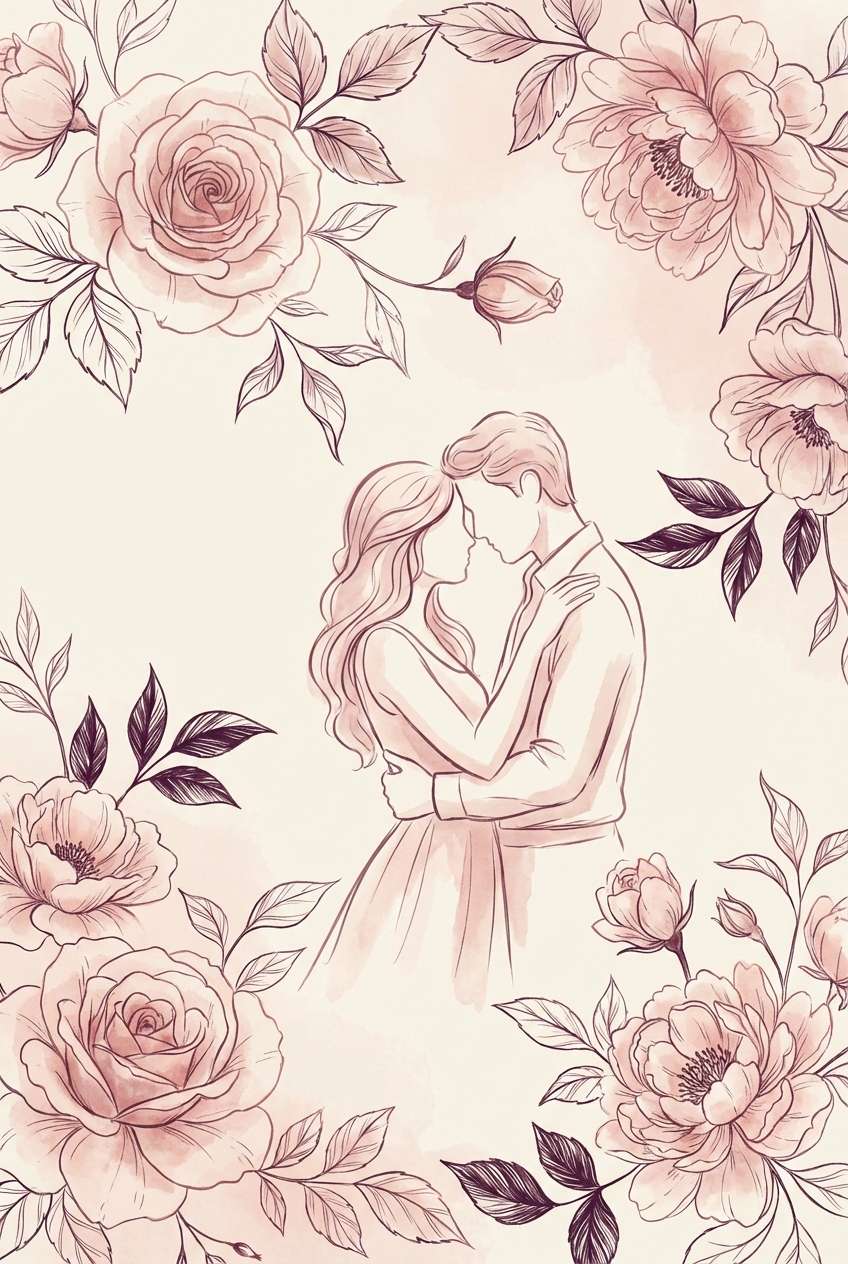
Best for: romance novel cover design with illustrated florals
Rose and plum tones feel like velvet gowns, candlelit vows, and petals drifting through a hidden garden. It suits romance covers, boutique gifting, and soft personal branding. Pair blush with deep plum for elegant titles, and use the light peach as a gentle background wash. Tip: add a thin plum border to keep the lighter tones from feeling too airy on screen.
Image example of elven silk rose generated using media.io
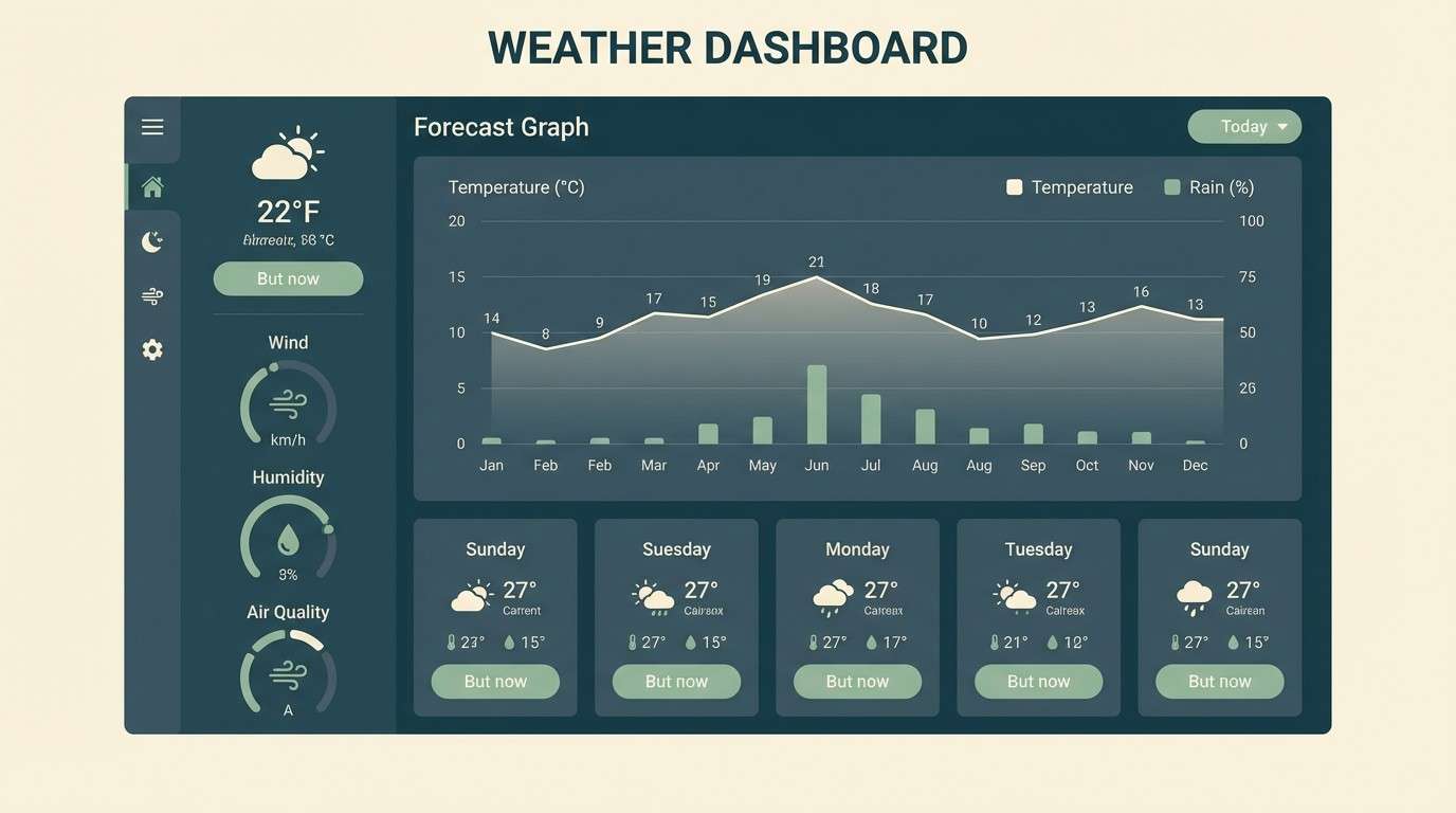
19) Storm Mage Teal
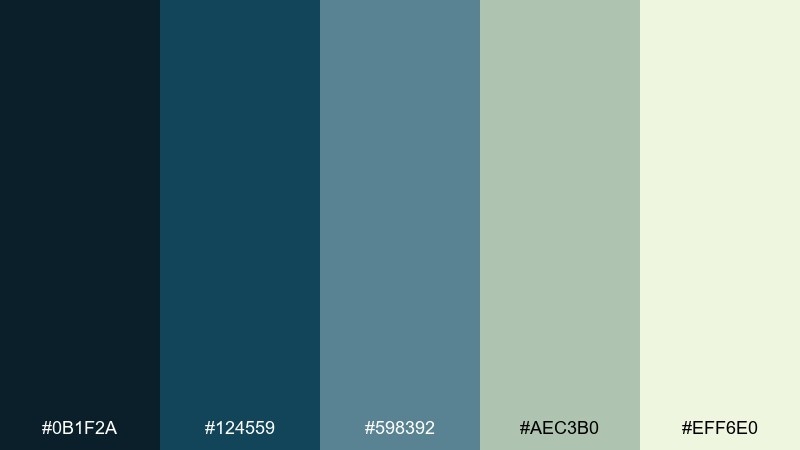
HEX: #0b1f2a #124559 #598392 #aec3b0 #eff6e0
Mood: cool, focused, stormy
Best for: weather dashboard UI mockup in 2D
Steel-teal shadows and soft sage lights feel like rolling clouds, rain-slick stone, and charged air before a spell. These fantasy color combinations fit dashboards, data-heavy screens, and productivity tools that want calm authority. Pair the pale cream-green with the deepest teal for charts and readable labels, then use slate for secondary panels. Tip: keep one accent color for alerts and reuse it consistently to avoid noisy data visuals.
Image example of storm mage teal generated using media.io
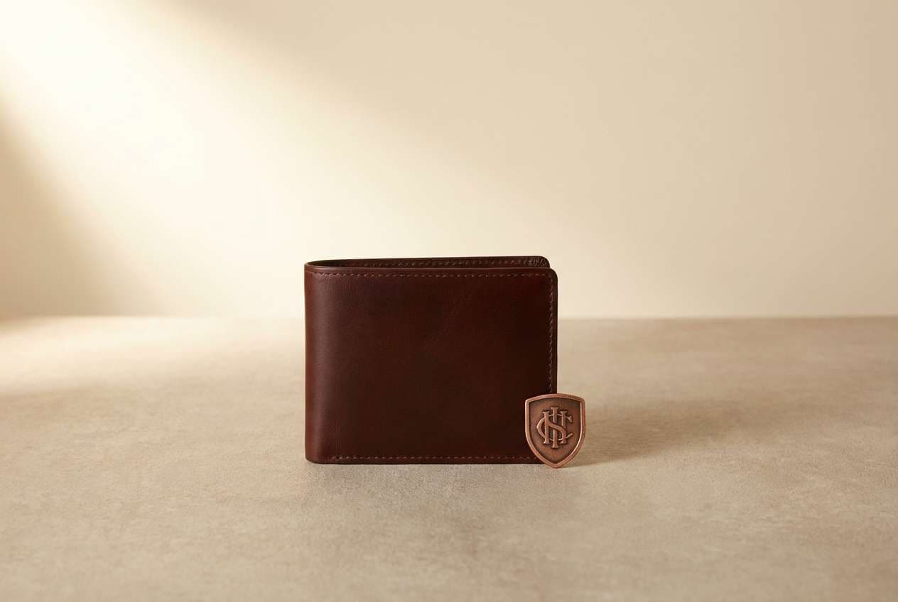
20) Titan Copper Relic
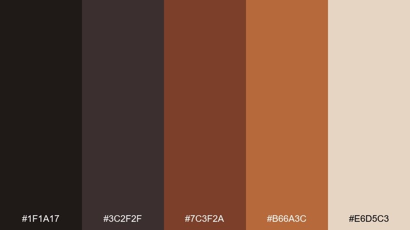
HEX: #1f1a17 #3c2f2f #7c3f2a #b66a3c #e6d5c3
Mood: mythic, rugged, artisanal
Best for: realistic leather goods product ad in a studio
Copper browns and worn neutrals evoke relics pulled from ruins, hammered metal, and well-loved leather. Use it for artisanal product ads, heritage logos, and packaging that wants grit with warmth. Pair the light beige with deep espresso for clean typography, then bring copper forward in stitching, seals, or accents. Tip: keep backgrounds simple and matte so the copper tones feel like real material, not orange paint.
Image example of titan copper relic generated using media.io
What Colors Go Well with Fantasy?
Fantasy palettes pair especially well with deep bases (near-black, midnight navy, charcoal) because they create a stage for glow colors like cyan, magenta, violet, and gold. This “dark + luminous” structure instantly reads as magical, celestial, or cinematic.
Earthy neutrals—parchment cream, leather brown, stone gray, moss green—also work beautifully when you want ancient, grounded fantasy. They make decorative details (runes, borders, crests) feel tactile and believable.
For whimsical fantasy, lean into airy pastels (pink, lilac, butter yellow, mint) and keep one darker anchor color so the design doesn’t become washed out.
How to Use a Fantasy Color Palette in Real Designs
Start by assigning roles: choose one primary background color, one surface color (cards/panels), one text color, and one accent for interactive states. Fantasy schemes often fail when every hue competes for attention instead of supporting a clear hierarchy.
Control saturation and “glow.” Use the brightest color for small, intentional moments—CTA buttons, icons, badges, magical effects—so it feels like power or light, not a random highlight.
Finally, test contrast early, especially in UI. Even the most enchanted color combinations must remain readable on mobile screens and in dark mode.
Create Fantasy Palette Visuals with AI
If you already have HEX codes, the fastest way to validate the mood is to generate a few quick scenes: a UI mockup, a poster, and a product-style studio shot. Seeing the palette applied will reveal whether it feels “mystical,” “regal,” or “playful” in practice.
Reuse the prompts above as templates—swap subjects (dragon, castle, crystal, menu screen) while keeping the palette’s dominant colors and lighting notes. This helps you stay consistent across brand assets and campaign visuals.
With Media.io, you can create fantasy-inspired images in your browser and iterate quickly until the look matches your worldbuilding.
Fantasy Color Palette FAQs
-
What is a fantasy color palette?
A fantasy color palette is a curated set of colors designed to evoke magical, mythical, or otherworldly moods—often using deep shadows, jewel tones, and glowing accents to suggest atmosphere and lore. -
Which fantasy colors are best for dark mode UI?
Use a near-black or midnight base (navy/charcoal), a soft light text color (ivory/pale blue), and one restrained accent (violet, cyan, or gold) for links and hover states. Palettes like Moonlit Sapphire Mist or Shadow Realm Noir are strong starting points. -
How do I keep a magical color scheme readable?
Assign clear roles (background, surface, text, accent) and check contrast for body text. Save your brightest “spell glow” color for small UI moments so readability doesn’t collapse into neon. -
Are fantasy palettes good for branding, not just art?
Yes. Many fantasy palettes translate well to premium branding (gold + near-black), wellness (teal + mint), or cosmetics (plum + lavender). The key is using the most intense hues as accents instead of full-page fills. -
What are common fantasy palette combinations?
Popular fantasy color combinations include navy + silver + gold (celestial luxury), charcoal + ember orange (heroic fire), forest green + violet (enchanted nature), and parchment + sepia (ancient library/heritage). -
How many colors should a fantasy palette include?
Five colors is a practical sweet spot: one dark base, one mid-tone for surfaces, one light for text/space, and 1–2 accents for magic effects or interactive UI states. -
Can I generate fantasy palette visuals with AI prompts?
Yes—describe the subject (UI, poster, book cover), specify dominant colors and lighting (glow, mist, ember), and keep the composition clean. Then iterate by adjusting only one variable at a time (accent color intensity, background darkness, or texture).
Next: Red Rust Color Palette


