

Candy pink is bright, youthful, and instantly attention-grabbing—perfect when you want designs to feel sweet, optimistic, and modern.
Below are candy pink color palette ideas with HEX codes, plus quick pairing tips for UI, branding, packaging, and social content.
In this article
- Why Candy Pink Palettes Work So Well
-
- cotton candy pop
- sakura milk tea
- neon bubblegum night
- rose quartz minimal
- peony and pistachio
- flamingo sunset gradient
- strawberry shortcake cream
- ballet slipper neutrals
- carnation and copper
- raspberry lemon zest
- dusty rose studio
- pink clay and sage
- candy heart pastels
- magenta punch and ink
- cherry blossom tech
- pink champagne gold
- retro diner pink
- orchid mist serenity
- coral pink streetwear
- midnight rose contrast
- blush apricot glow
- frosted berry lavender
- What Colors Go Well with Candy Pink?
- How to Use a Candy Pink Color Palette in Real Designs
- Create Candy Pink Palette Visuals with AI
Why Candy Pink Palettes Work So Well
Candy pink sits in a high-energy zone of the spectrum, so it naturally draws the eye and creates a strong “hero color” for buttons, headlines, packaging highlights, and key visuals.
It also adapts well: in pastel mixes it feels cute and friendly; paired with deep navy or near-black it becomes dramatic and premium; with creams and warm neutrals it turns cozy and approachable.
Because candy pink can overpower other hues, good palettes build in breathing room (whites/creams) and anchoring tones (charcoal, deep plum, slate) to keep layouts readable and brand-safe.
20+ Candy Pink Color Palette Ideas (with HEX Codes)
1) Cotton Candy Pop
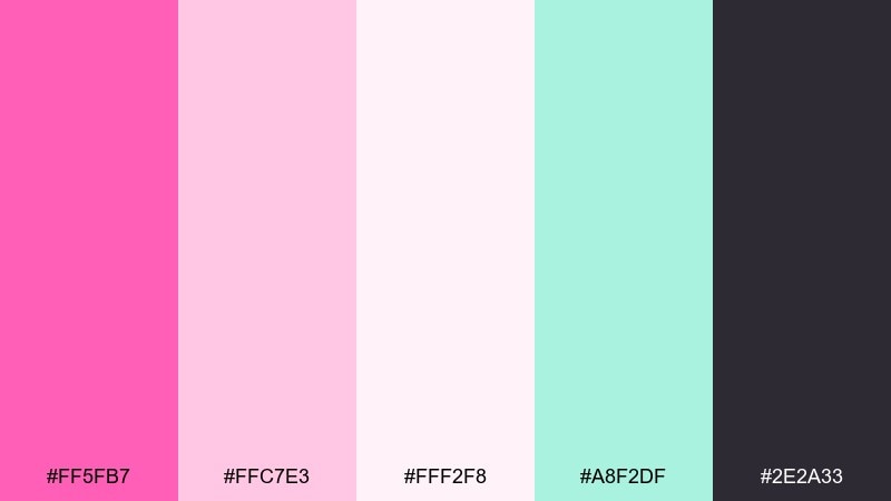
HEX: #ff5fb7 #ffc7e3 #fff2f8 #a8f2df #2e2a33
Mood: playful, sugary, high-contrast
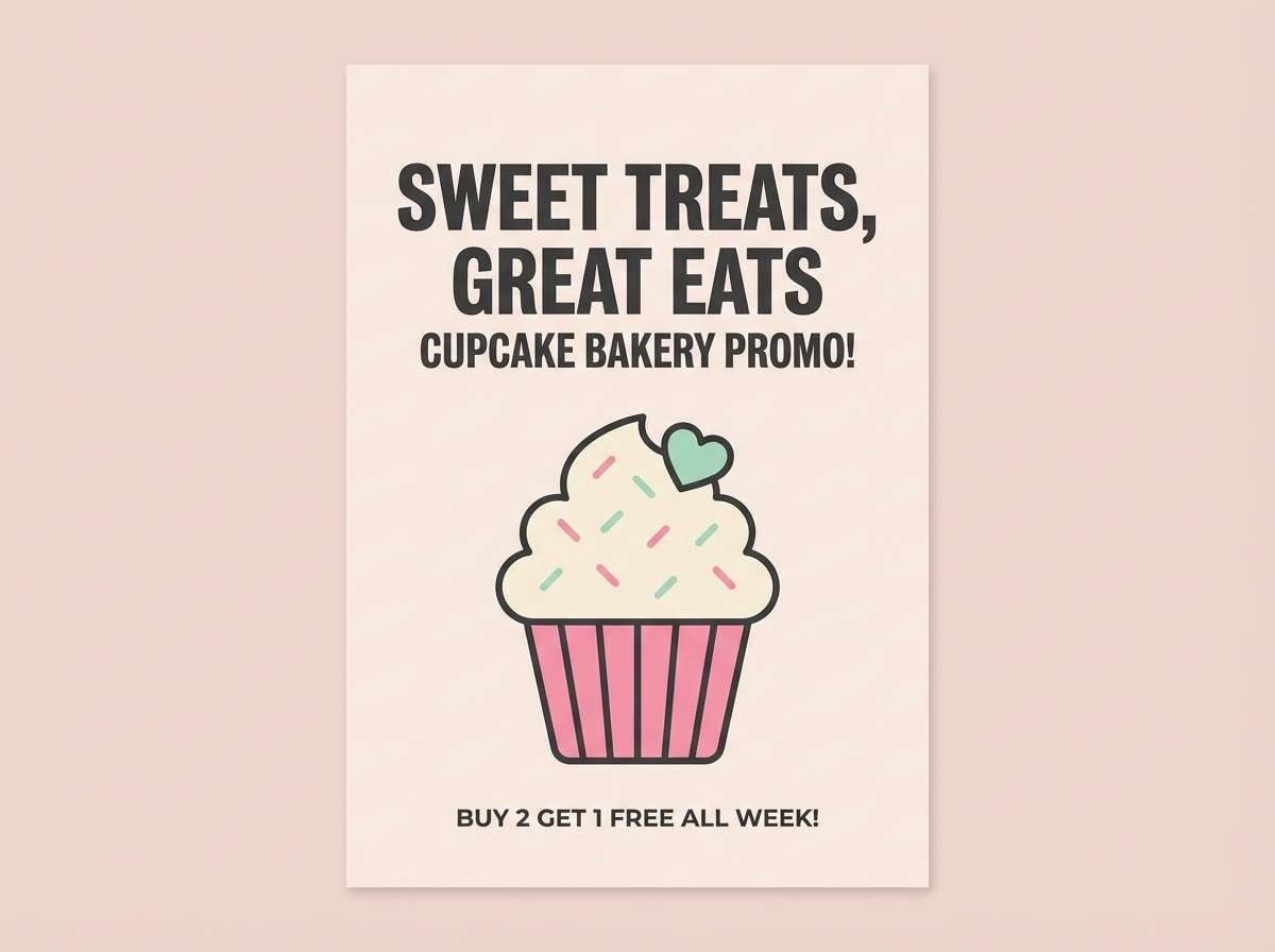
Best for: bakery social promo posters
Playful and sugary, this mix feels like fluffy frosting and a neon sign glow. The bright pink stays lively against airy blush and cream, while mint cools the sweetness. Use the charcoal tone for headlines and prices so your layout stays readable. Tip: keep the mint to small badges or stickers so the pink remains the hero.
Image example of cotton candy pop generated using media.io
Media.io is an online AI studio for creating and editing video, image, and audio in your browser.

2) Sakura Milk Tea
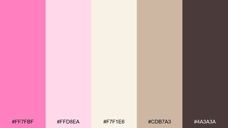
HEX: #ff7fbf #ffd8ea #f7f1e6 #cdb7a3 #4a3a3a
Mood: cozy, delicate, cafe-friendly
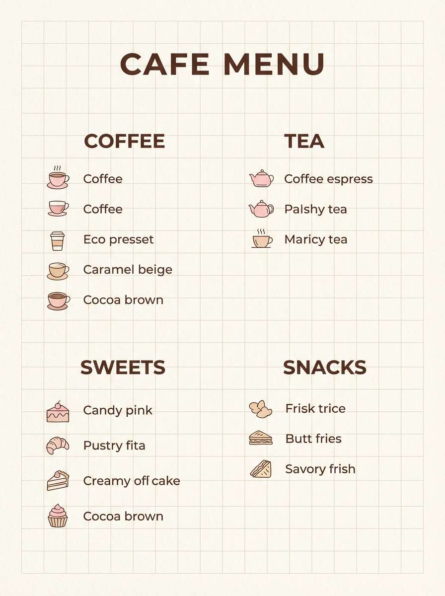
Best for: cafe menu design
Cozy and delicate, these tones evoke cherry blossoms drifting into warm milk tea. The creamy off-white and caramel beige soften the pink so the menu feels inviting, not loud. Pair with dark cocoa text for legibility and a premium touch. Tip: use the deepest brown only for section titles and key prices to keep the page airy.
Image example of sakura milk tea generated using media.io
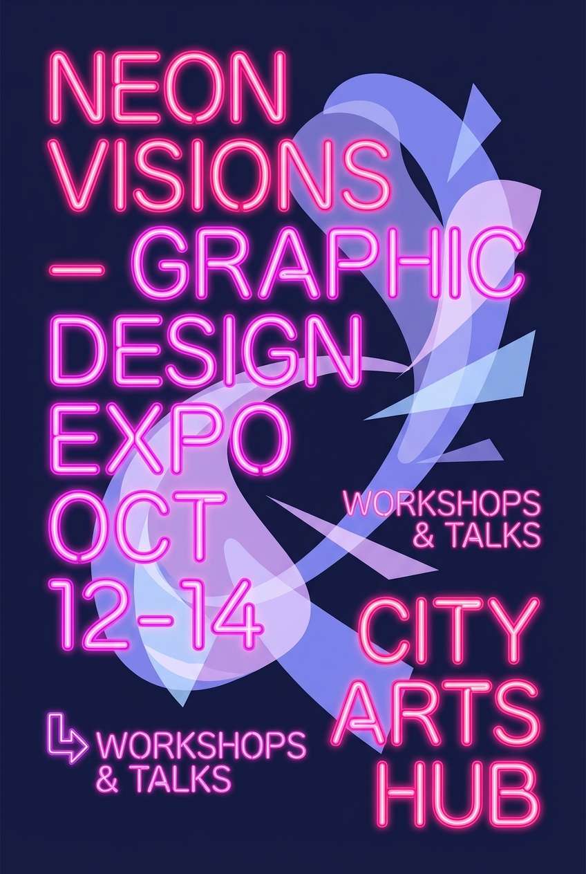
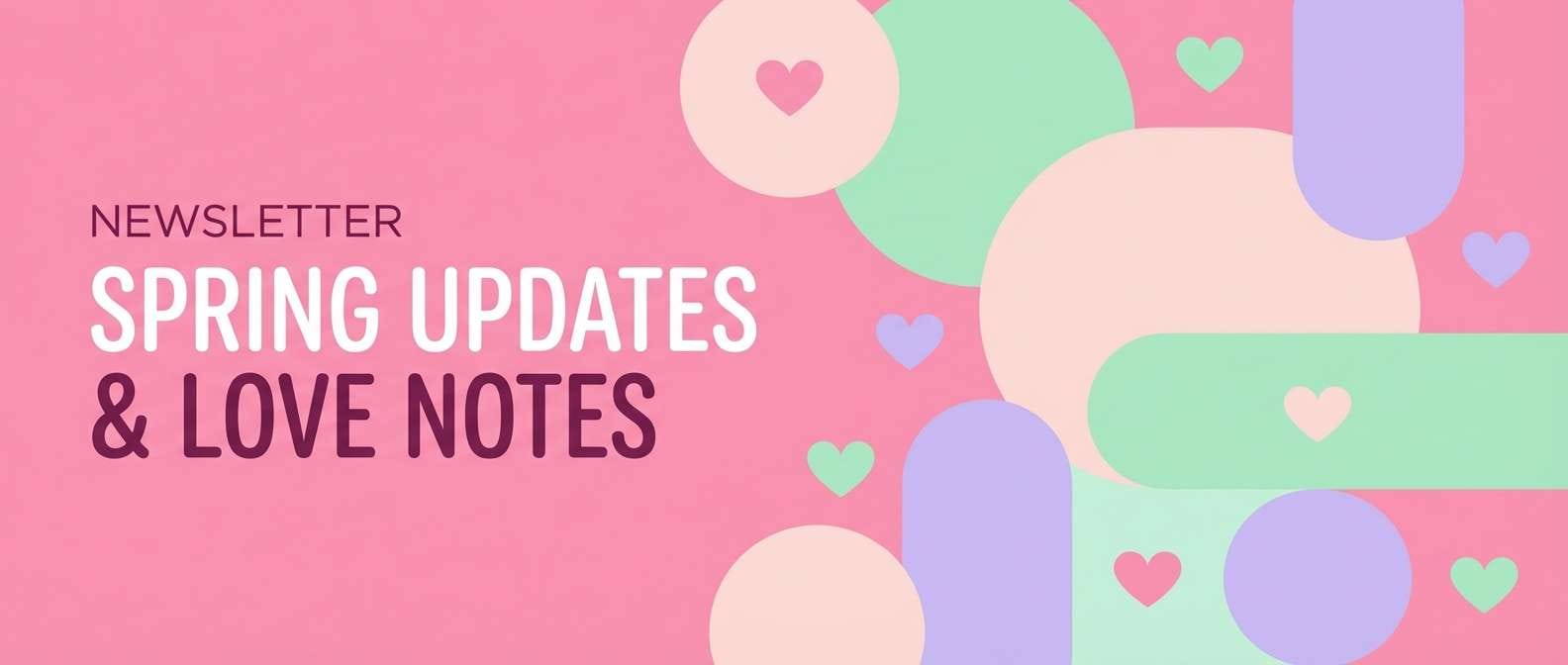
3) Neon Bubblegum Night
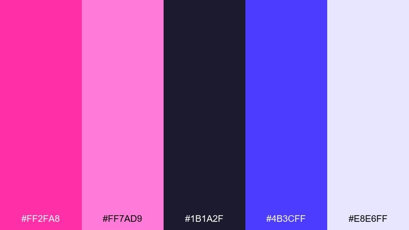
HEX: #ff2fa8 #ff7ad9 #1b1a2f #4b3cff #e8e6ff
Mood: electric, nightlife, energetic
Best for: music event flyer design
Electric and nightlife-ready, this palette looks like bubblegum neon against a midnight sky. The vivid pinks hit hardest when the deep navy is used as the background, with periwinkle adding a futuristic edge. These candy pink color combinations work best with bold type, simple shapes, and plenty of negative space. Tip: keep the light lavender for small glow effects and date blocks so the flyer stays punchy.
Image example of neon bubblegum night generated using media.io
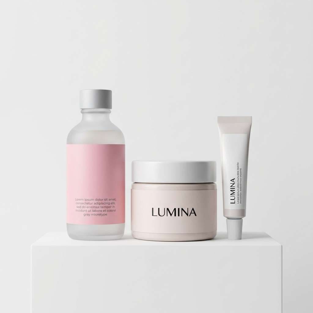
4) Rose Quartz Minimal
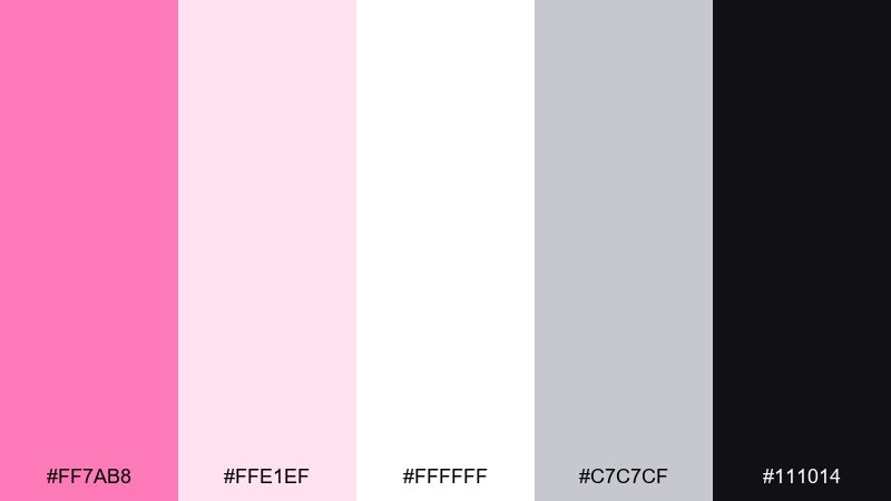
HEX: #ff7ab8 #ffe1ef #ffffff #c7c7cf #111014
Mood: clean, modern, airy
Best for: skincare packaging and labels
Clean and modern, these tones feel like polished glass and soft rose quartz. The white space and pale blush keep the look clinical in a good way, while the pink adds warmth and approachability. Pair with crisp black typography and a touch of cool gray for regulatory text and ingredient panels. Tip: print the main pink as a spot color to keep it consistent across boxes, tubes, and stickers.
Image example of rose quartz minimal generated using media.io
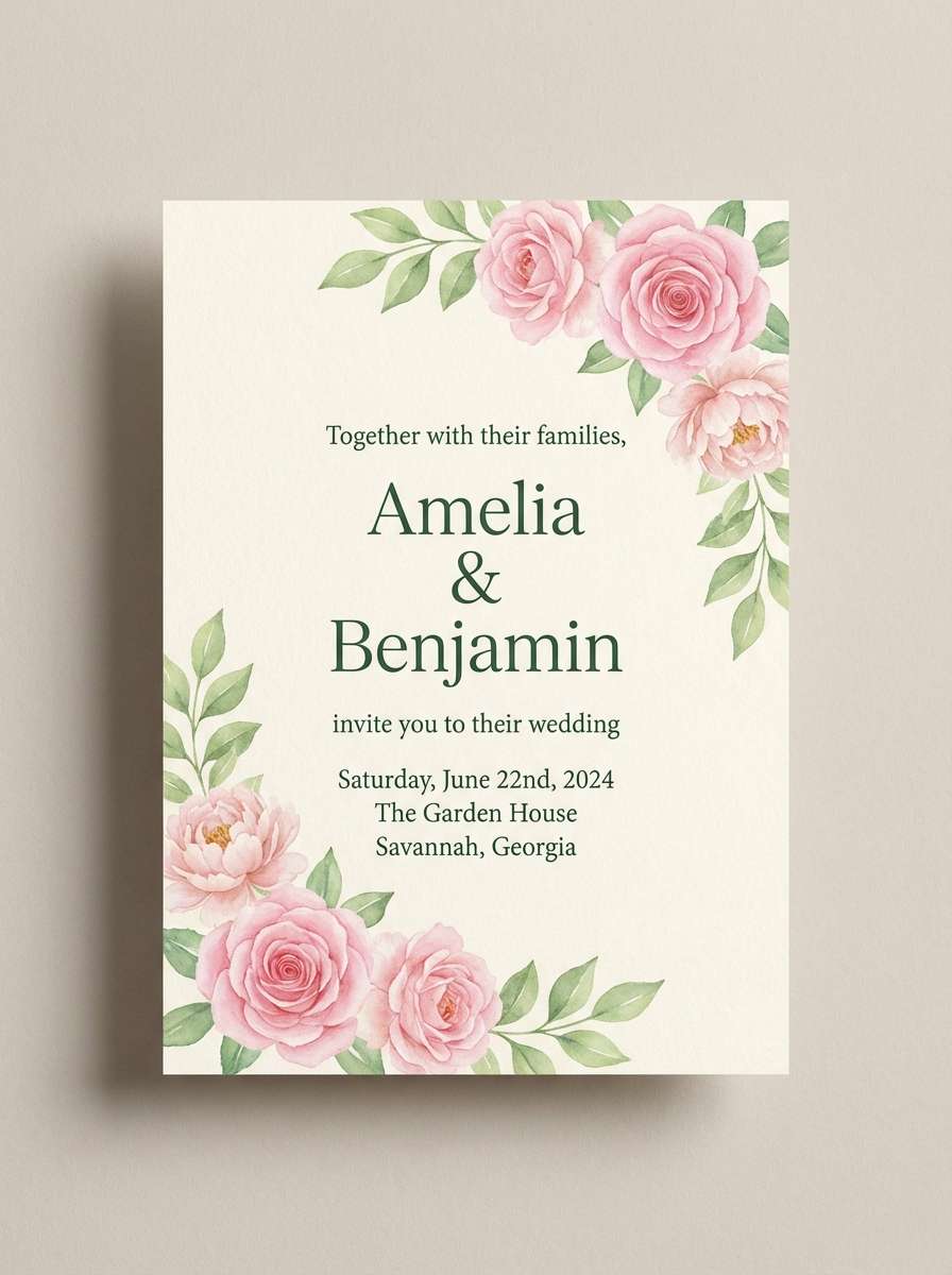
5) Peony and Pistachio
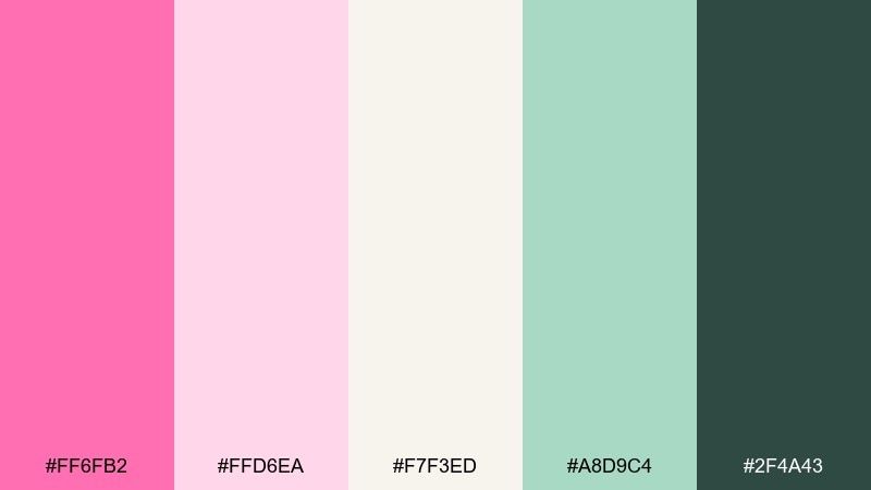
HEX: #ff6fb2 #ffd6ea #f7f3ed #a8d9c4 #2f4a43
Mood: romantic, fresh, garden-like
Best for: spring wedding invitation set
Romantic and fresh, this mix feels like peonies in a sunlit greenhouse. The pistachio green adds a crisp botanical counterpoint to the pinks without turning the look too pastel. Use the deep green for names and key details so the invitation reads beautifully in print. Tip: add a thin cream border to keep the layout from feeling overly sweet.
Image example of peony and pistachio generated using media.io
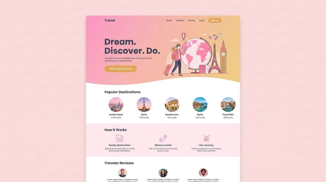
6) Flamingo Sunset Gradient
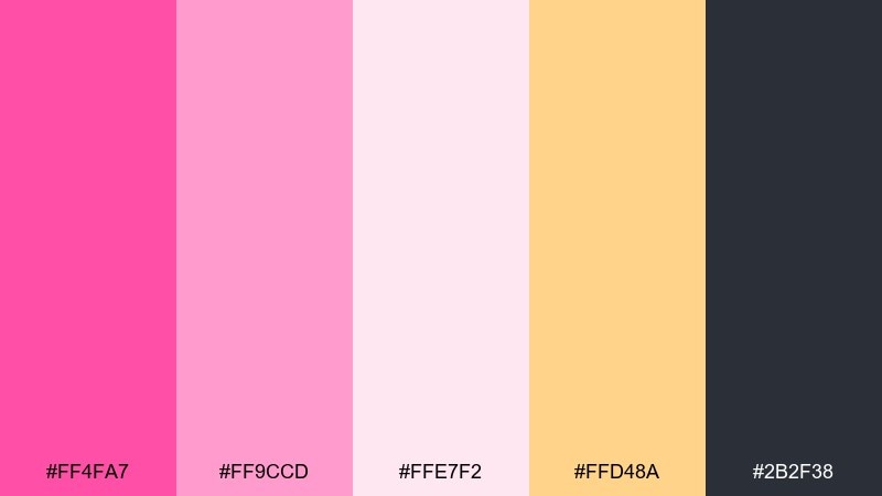
HEX: #ff4fa7 #ff9ccd #ffe7f2 #ffd48a #2b2f38
Mood: sunny, optimistic, bold
Best for: travel app landing page UI
Sunny and optimistic, these hues bring to mind a flamingo sunset over warm sand. The peachy gold keeps the pink from feeling flat and helps buttons pop without relying on harsh contrast. Use the deep slate for navigation and body text to keep the interface accessible. Tip: apply the two pinks as a subtle hero gradient and reserve the gold for primary calls to action.
Image example of flamingo sunset gradient generated using media.io
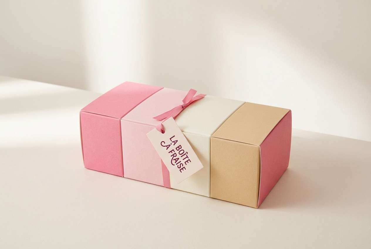
7) Strawberry Shortcake Cream
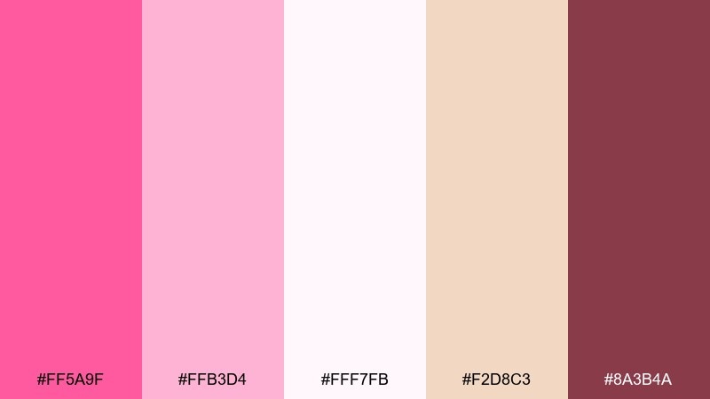
HEX: #ff5a9f #ffb3d4 #fff7fb #f2d8c3 #8a3b4a
Mood: sweet, nostalgic, dessert-like
Best for: dessert box packaging
Sweet and nostalgic, this set feels like strawberry syrup swirled into whipped cream. The warm biscuit beige adds a baked-goods vibe that makes the pink read more appetizing than cosmetic. Pair with a berry text color for flavor labels and a premium, handmade look. Tip: use the pale near-white for background panels so product photos stay clean.
Image example of strawberry shortcake cream generated using media.io
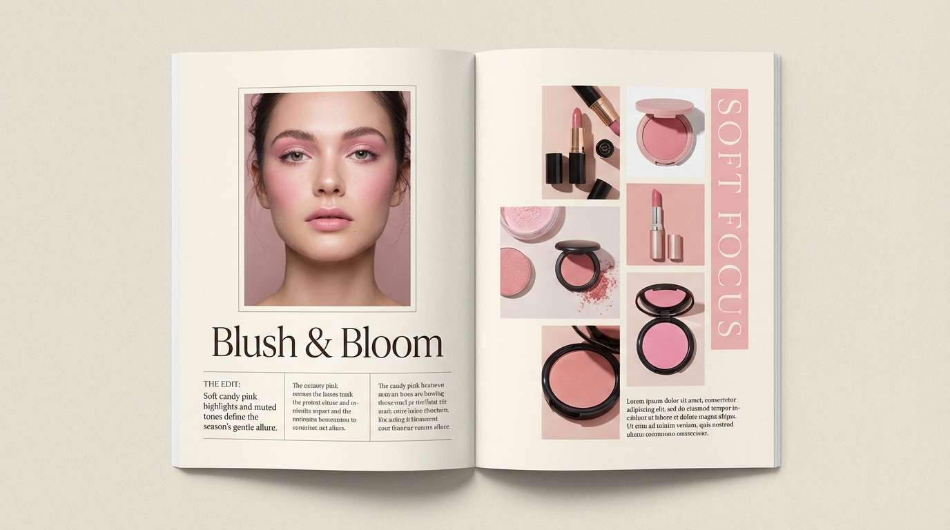
8) Ballet Slipper Neutrals
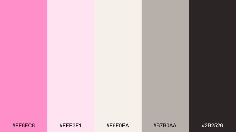
HEX: #ff8fc8 #ffe3f1 #f6f0ea #b7b0aa #2b2526
Mood: soft, editorial, refined
Best for: beauty magazine layout
Soft and refined, these tones evoke ballet slippers, powder, and warm studio light. The gentle neutrals keep the pink sophisticated, especially when paired with dark espresso typography. Use the mid greige for captions, lines, and column dividers to maintain an editorial rhythm. Tip: keep images slightly desaturated so the pink accents feel intentional, not accidental.
Image example of ballet slipper neutrals generated using media.io
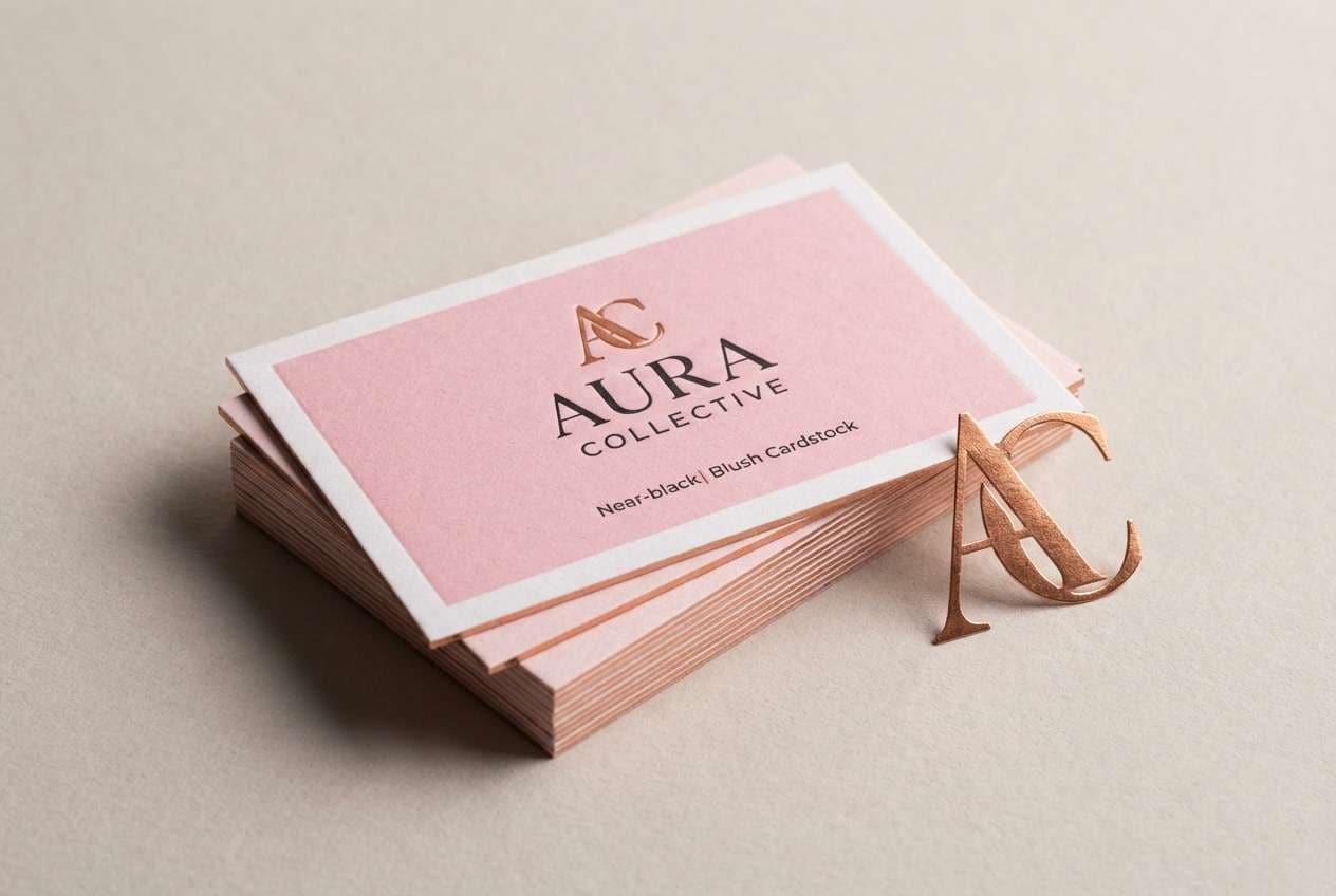
9) Carnation and Copper
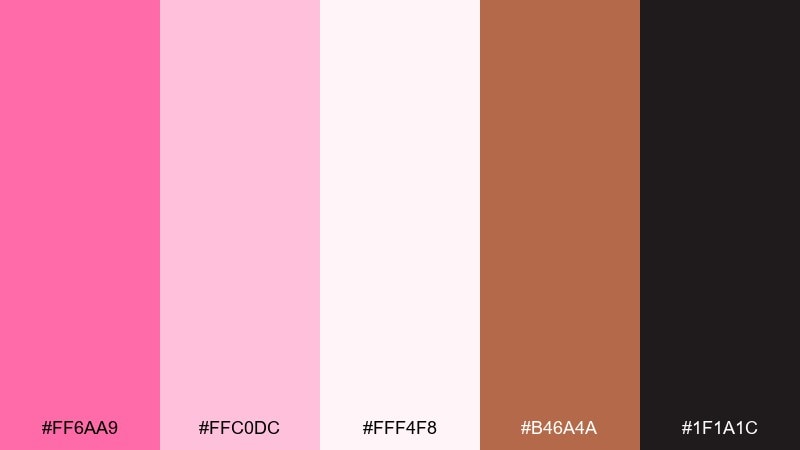
HEX: #ff6aa9 #ffc0dc #fff4f8 #b46a4a #1f1a1c
Mood: boutique, warm, slightly vintage
Best for: boutique logo and business card
Warm and boutique-ready, this pairing brings carnations to mind with a hint of copper jewelry shine. The copper tone adds depth and maturity, making the pink feel more premium than playful. Use near-black for logo marks and contact details to keep everything crisp in print. Tip: foil the copper on a matte blush card stock for a small luxury upgrade.
Image example of carnation and copper generated using media.io
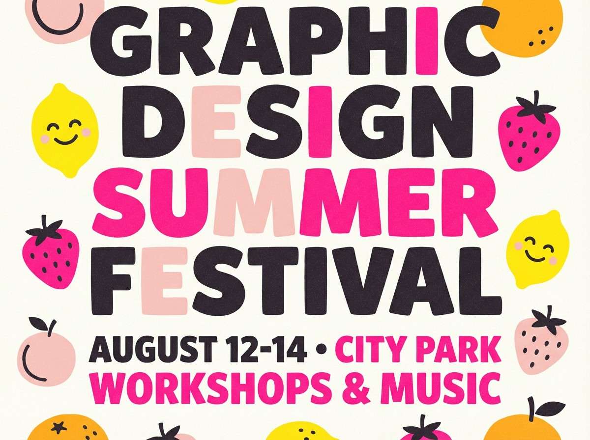
10) Raspberry Lemon Zest

HEX: #ff3d9a #ff86c5 #fff0f7 #ffe45c #2a2a2a
Mood: bright, upbeat, summery
Best for: summer festival poster
Bright and upbeat, these colors feel like raspberry soda with a squeeze of lemon. The yellow is the perfect counterweight to the pinks, creating lively contrast without turning neon. For candy pink color combinations in posters, use charcoal type and limit the yellow to highlights like dates, tickets, or sponsor tags. Tip: set the background to the pale blush so the hot pink elements look sharper and cleaner.
Image example of raspberry lemon zest generated using media.io
11) Dusty Rose Studio
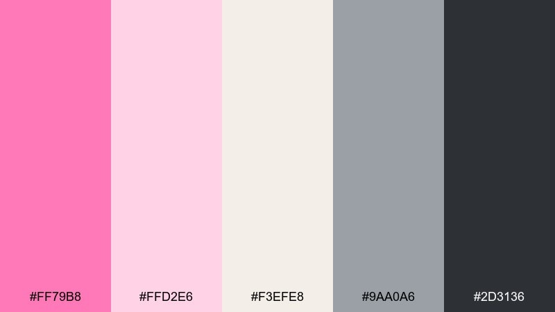
HEX: #ff79b8 #ffd2e6 #f3efe8 #9aa0a6 #2d3136
Mood: calm, professional, modern
Best for: brand style guide one-pager
Calm and modern, this mix looks like dusty rose paint beside cool studio concrete. The grays keep the pink grounded, making it easy to use for serious brands that still want warmth. Pair the darkest gray with the soft cream for body copy and accessibility-friendly contrast. Tip: present the palette as large color blocks with short usage rules to keep the guide skimmable.
Image example of dusty rose studio generated using media.io
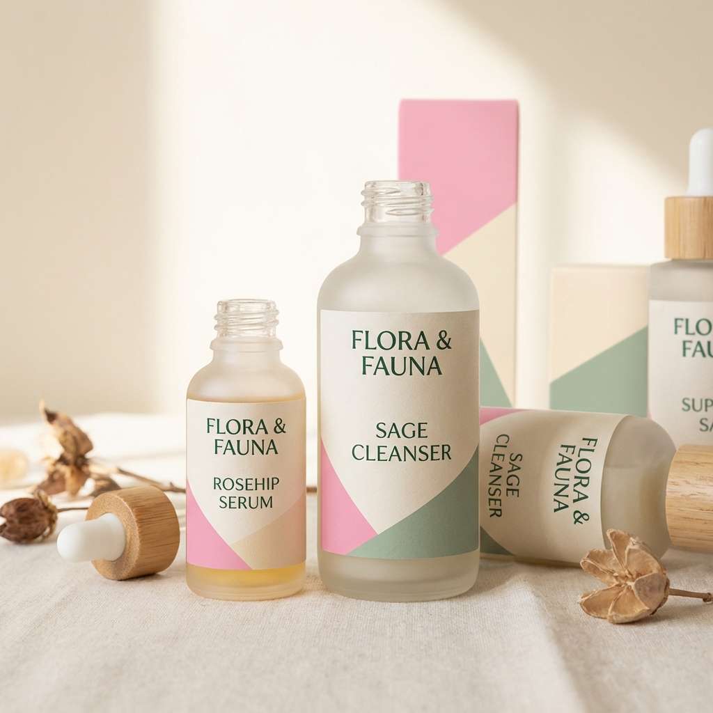
12) Pink Clay and Sage
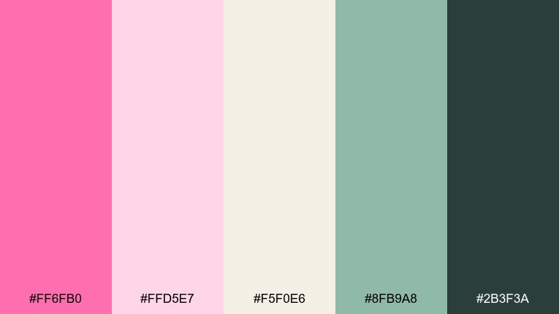
HEX: #ff6fb0 #ffd5e7 #f5f0e6 #8fb9a8 #2b3f3a
Mood: earthy, gentle, wellness-focused
Best for: eco cosmetics label design
Earthy and gentle, these tones evoke pink clay masks and fresh sage leaves. The muted green reduces the sweetness and makes the overall look feel cleaner and more natural. Use the deep green for ingredient lists and certification badges to keep labels readable. Tip: choose uncoated paper stock so the soft colors feel tactile and authentic.
Image example of pink clay and sage generated using media.io
13) Candy Heart Pastels
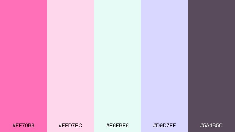
HEX: #ff70b8 #ffd7ec #e6fbf6 #d9d7ff #5a4b5c
Mood: cute, soft, friendly
Best for: email header graphics for campaigns
Cute and friendly, these pastels feel like candy hearts and soft confetti. Mint and lavender cool the pink nicely, so the design stays approachable for wide audiences. Use the plum tone for text and icons so you do not lose contrast on light backgrounds. Tip: keep button fills solid and avoid gradients to maintain clarity at small sizes.
Image example of candy heart pastels generated using media.io
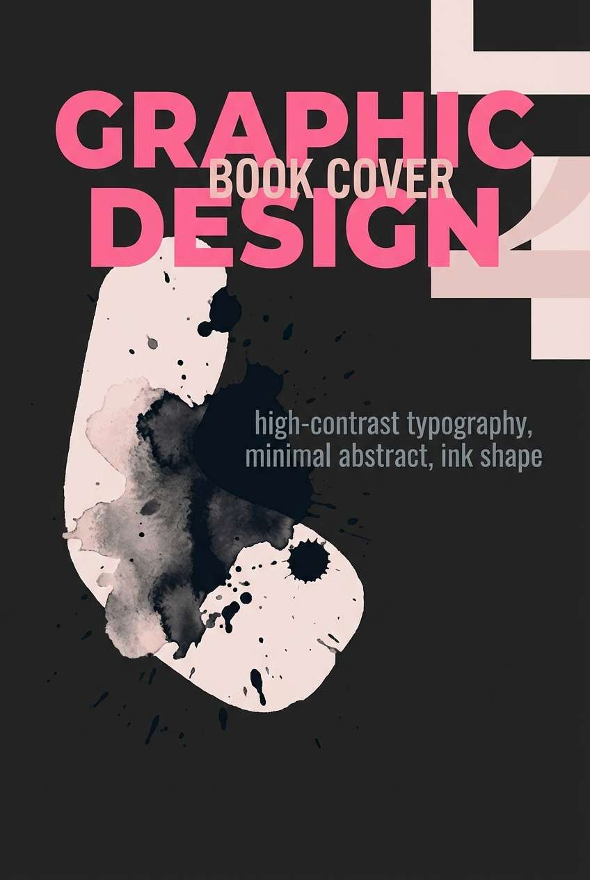
14) Magenta Punch and Ink
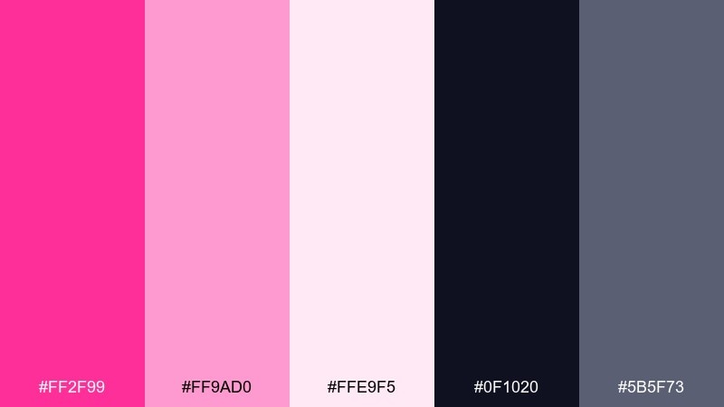
HEX: #ff2f99 #ff9ad0 #ffe9f5 #0f1020 #5b5f73
Mood: bold, dramatic, high-contrast
Best for: book cover design
Bold and dramatic, this set looks like magenta ink splashed on glossy paper. The near-black background makes the pinks glow, while the steel gray keeps secondary text calm. Pair with condensed type and a single graphic element to avoid visual noise. Tip: reserve the brightest pink for the title only, and let blush handle subtitles and author names.
Image example of magenta punch and ink generated using media.io
15) Cherry Blossom Tech
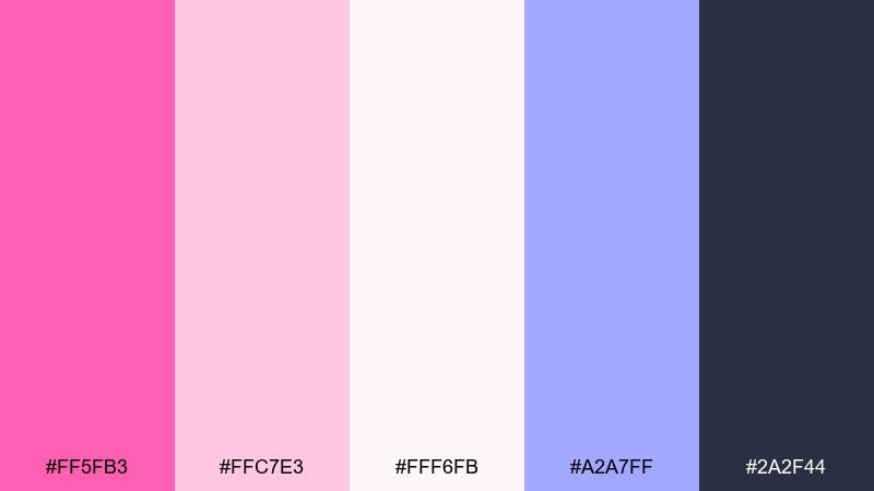
HEX: #ff5fb3 #ffc7e3 #fff6fb #a2a7ff #2a2f44
Mood: soft, modern, tech-friendly
Best for: app onboarding screen UI
Soft and modern, these colors feel like cherry blossoms meeting sleek interface chrome. The periwinkle accent adds a subtle tech vibe without overpowering the pink. Use the deep slate for navigation labels and accessibility-friendly text contrast. Tip: limit periwinkle to one component type, like links or progress indicators, for a consistent system.
Image example of cherry blossom tech generated using media.io
16) Pink Champagne Gold
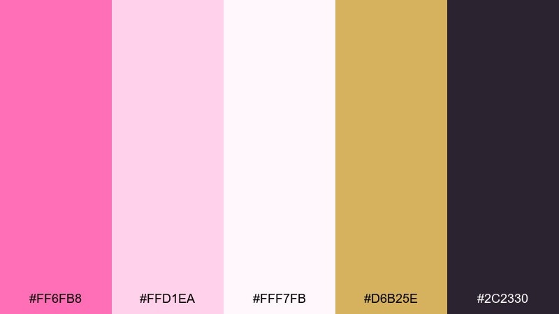
HEX: #ff6fb8 #ffd1ea #fff7fb #d6b25e #2c2330
Mood: luxurious, celebratory, polished
Best for: gala invitation and RSVP card
Luxurious and celebratory, these tones evoke pink champagne with a soft gold shimmer. The warm metallic note keeps the look upscale, especially when the background stays clean and pale. A candy pink color palette like this shines with elegant serif type and restrained ornamentation. Tip: use the gold only on borders or monograms so the invitation feels refined, not flashy.
Image example of pink champagne gold generated using media.io
17) Retro Diner Pink
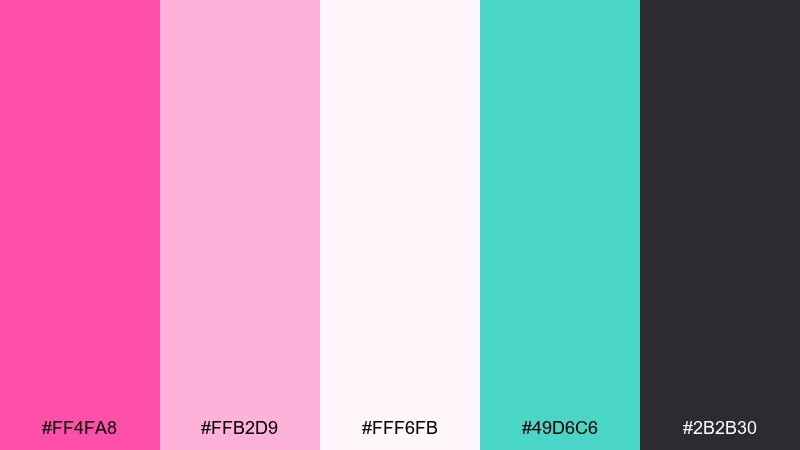
HEX: #ff4fa8 #ffb2d9 #fff6fb #49d6c6 #2b2b30
Mood: retro, fun, punchy
Best for: soda can packaging concept
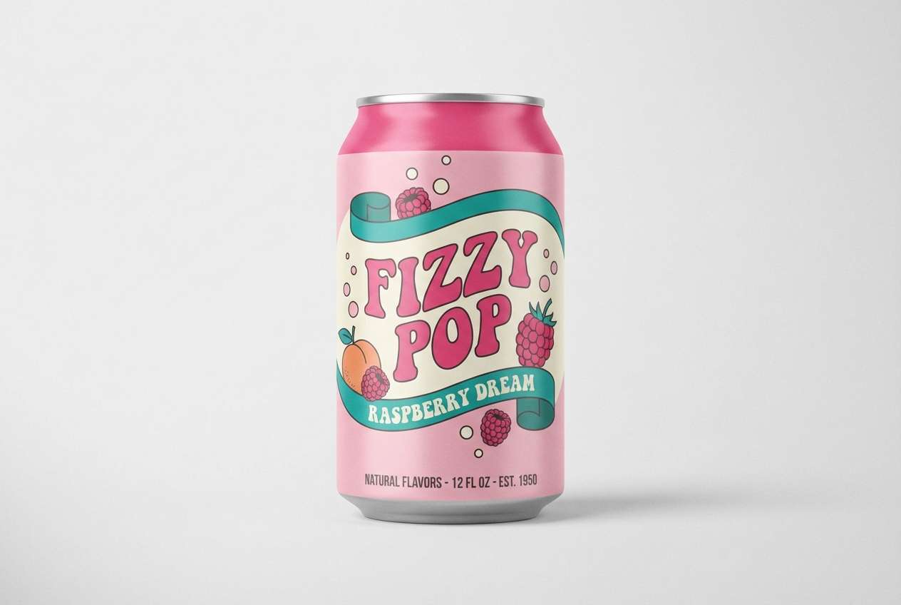
Retro and punchy, this mix recalls diner booths, chrome edges, and fizzy soda. Teal brings a classic vintage counterbalance, making the pink feel energetic instead of syrupy. Use the dark gray for nutrition text and barcode areas to keep packaging practical. Tip: set big curved type in pink and let teal handle stripes or small badges for instant shelf pop.
Image example of retro diner pink generated using media.io
18) Orchid Mist Serenity
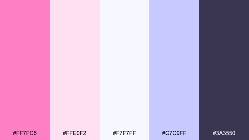
HEX: #ff7fc5 #ffe0f2 #f7f7ff #c7c9ff #3a3550
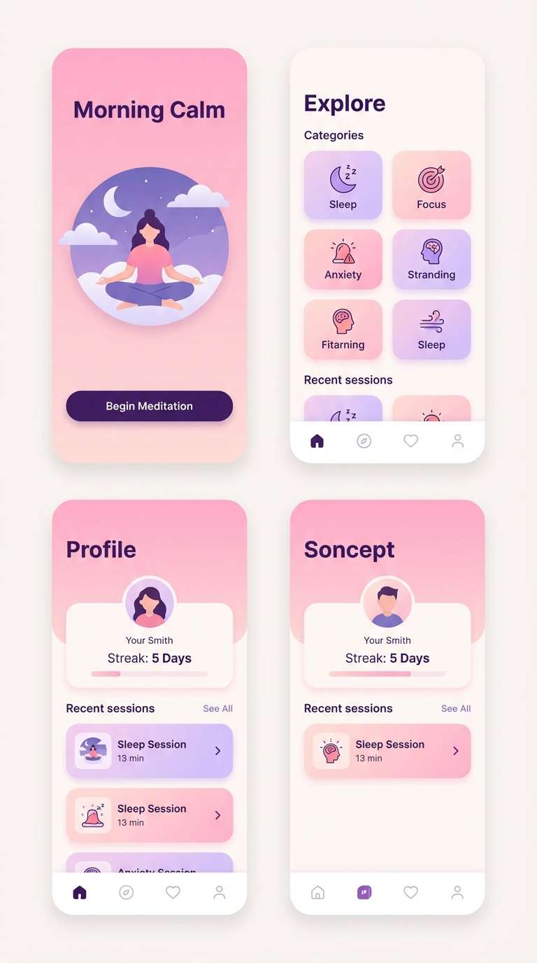
Mood: calming, dreamy, gentle
Best for: meditation app UI screens
Calming and dreamy, these shades feel like orchid mist drifting through a quiet room. The cool lavender tones prevent the pink from becoming too warm, ideal for wellness visuals. Use the deep violet for text and icons so buttons remain clear on pale surfaces. Tip: keep animations subtle and let the near-white serve as breathing space around content.
Image example of orchid mist serenity generated using media.io
19) Coral Pink Streetwear
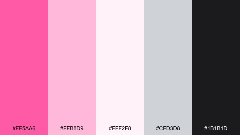
HEX: #ff5aa6 #ffb8d9 #fff2f8 #cfd3d8 #1b1b1d
Mood: urban, confident, minimal
Best for: streetwear hoodie product ad
Urban and confident, this palette feels like a clean streetwear drop with a pink statement piece. The cool grays and near-black give the look structure, letting the coral-leaning pink read bold rather than cute. Pair with simple sans-serif type and plenty of whitespace for a modern ad layout. Tip: light pink works best as a soft backdrop, while the darkest tone anchors the logo and pricing.
Image example of coral pink streetwear generated using media.io
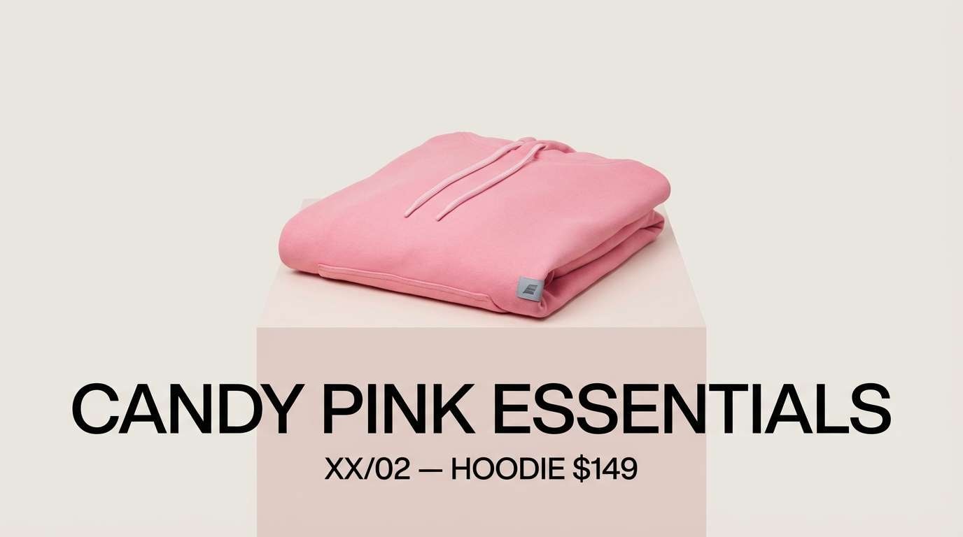
20) Midnight Rose Contrast
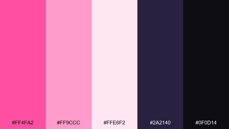
HEX: #ff4fa2 #ff9ccc #ffe6f2 #2a2140 #0f0d14
Mood: moody, luxe, high-contrast
Best for: cosmetics website hero banner
Moody and luxe, this set looks like roses under midnight lighting. Deep violet and near-black make the pink feel richer, ideal for beauty brands that want drama without going gothic. For candy pink color combinations on web banners, keep the background dark and use blush for supporting UI chips or trust badges. Tip: test contrast on small text and keep bright pink reserved for one primary button to avoid visual fatigue.
Image example of midnight rose contrast generated using media.io
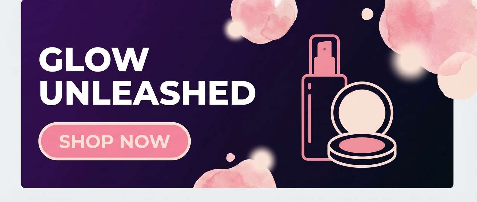
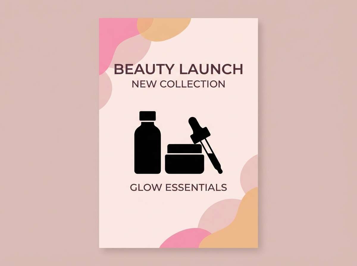
21) Blush Apricot Glow
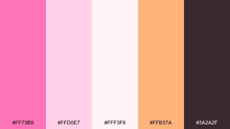
HEX: #ff73b9 #ffd0e7 #fff3f6 #ffb37a #3a2a2f
Mood: warm, friendly, radiant
Best for: beauty launch poster
Warm and radiant, these shades feel like a blush highlight with an apricot glow. The orange-leaning accent adds warmth and makes the pink look more skin-friendly across diverse imagery. Pair with a deep plum-brown for headings to keep the composition grounded. Tip: use apricot sparingly on icons or callouts so the overall look stays soft.
Image example of blush apricot glow generated using media.io
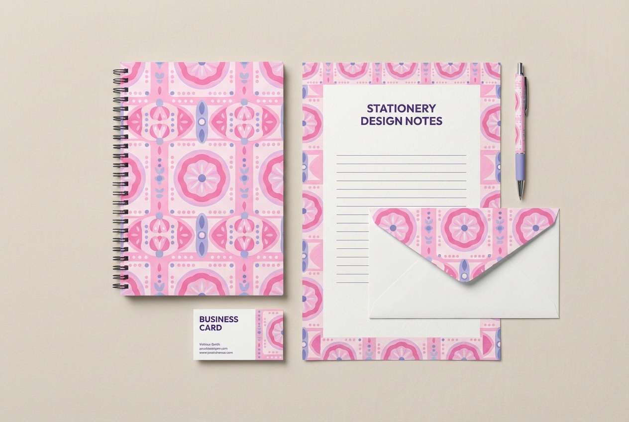
22) Frosted Berry Lavender

HEX: #ff63b1 #ffbfe1 #f7f2ff #b9a7ff #3b2c5a
Mood: whimsical, soft, slightly magical
Best for: stationery set design
Whimsical and soft, this palette feels like frosted berries dusted with lavender sugar. The cool purple notes add a dreamy twist that pairs well with illustrations and playful patterns. Use the deep violet for lines and small text so notebooks and cards stay readable. Tip: apply the light lavender as a subtle background tint to avoid stark white pages.
Image example of frosted berry lavender generated using media.io
What Colors Go Well with Candy Pink?
Soft creams, warm off-whites, and blush tints make candy pink feel airy and usable for backgrounds, packaging panels, and UI surfaces. They also reduce “visual sugar overload” in dense layouts.
For contrast, deep neutrals like charcoal, near-black, deep plum, or slate keep typography crisp and accessible. This is especially important for buttons, price labels, and long-form text.
To add freshness, try cool greens (mint, sage, pistachio) or periwinkle/lavender accents. These hues balance the warmth of pink and help designs feel more modern and less monochrome.
How to Use a Candy Pink Color Palette in Real Designs
Start with a clear role system: pick one candy pink as the primary accent, one pale tint for backgrounds, and one dark anchor for text. This keeps the palette consistent across pages, posts, and packaging.
Use candy pink strategically on the highest-priority elements—CTA buttons, key badges, product highlights, or headlines—then let creams and blush handle the larger surfaces so the design can breathe.
If printing, test swatches early: vivid pinks can shift between screens and paper. Consider a spot color or tight CMYK proofing when brand consistency matters.
Create Candy Pink Palette Visuals with AI
Want to preview how a candy pink color palette looks in a flyer, UI mockup, or product label before you design? Generate quick concept visuals and iterate faster with consistent prompts.
With Media.io Text to Image, you can describe the layout, subject, and style, then reuse the same palette direction across multiple assets for a cohesive brand look.
Candy Pink Color Palette FAQs
-
What is a candy pink color palette?
A candy pink color palette is a set of coordinated colors built around a bright, saturated pink (often bubblegum-like), supported by light tints (blush/cream) and grounding shades (charcoal, plum, navy) for contrast and readability. -
Is candy pink the same as hot pink?
They’re close, but not always identical. Hot pink typically leans more neon and intense, while candy pink can include slightly softer bubblegum tones. In practice, many palettes use both as primary + highlight. -
What neutral colors work best with candy pink?
Warm creams and off-whites keep it soft, while charcoal, near-black, deep plum, or slate create strong contrast for text and UI elements. -
What accent colors pair well with candy pink for a modern look?
Mint/sage greens and periwinkle/lavender accents are great modern pairings. They cool down the warmth of pink and create a balanced, contemporary feel in UI and branding. -
How do I keep candy pink designs from looking too “sweet”?
Use candy pink as an accent (not the background), add a dark anchor color for typography, and include cooler tones (gray, violet, sage) to mature the overall palette. -
Is candy pink suitable for UI and app design?
Yes—especially for onboarding, lifestyle, beauty, or event apps. Just ensure accessible contrast for text and controls, and reserve the brightest pink for one primary action to avoid visual fatigue. -
How can I generate candy pink palette images quickly?
Use Media.io’s text-to-image tool: describe the design (e.g., “landing page UI,” “poster,” “packaging”), specify your candy pink tone and supporting colors, and iterate prompts to explore different compositions.


