

Gold and burgundy is a classic pairing: one brings warmth and shine, the other adds depth and drama. Together, they create a premium look that feels romantic, confident, and timeless.
Below are 20 refined gold burgundy color combinations with HEX codes, plus practical tips for weddings, branding, packaging, UI, and editorial layouts.
In this article
- Why Gold Burgundy Palettes Work So Well
-
- gilded merlot
- velvet vineyard
- regal library
- brass bordeaux ui
- autumn opera
- candlelit bistro
- heritage crest
- rosy antique
- satin ribbon
- mocha garnet
- festive garnet gold
- art deco gala
- copper rosewood
- minimal maroon luxe
- orchard dusk
- velvet stage ui
- old world map
- ruby truffle
- champagne noir
- sunlit baroque
- What Colors Go Well with Gold Burgundy?
- How to Use a Gold Burgundy Color Palette in Real Designs
- Create Gold Burgundy Palette Visuals with AI
Why Gold Burgundy Palettes Work So Well
Burgundy carries the emotional weight of deep reds—heritage, romance, and seriousness—without the loudness of bright crimson. Gold adds a controlled glow that reads as celebratory and upscale.
This contrast (dark wine vs. luminous metallic) naturally creates hierarchy in layouts: burgundy for anchors like headlines and hero shapes, gold for accents like rules, badges, and highlights.
When you add a soft cream and a near-black, the palette becomes highly usable across print and digital—rich enough for luxury, but still readable for long-form content and UI.
20+ Gold Burgundy Color Palette Ideas (with HEX Codes)
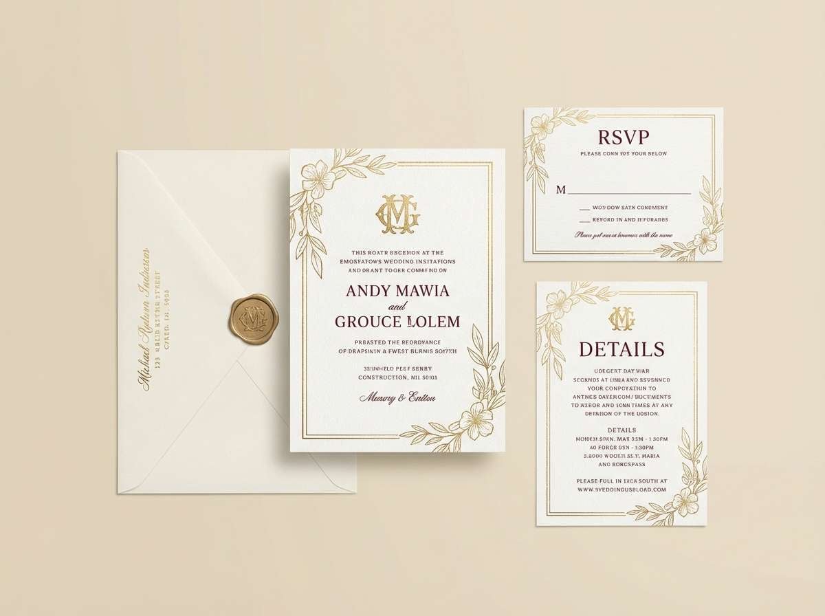
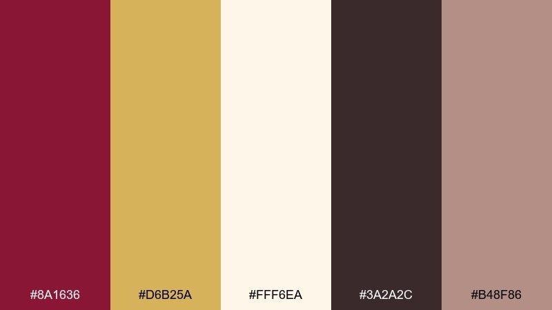
1) Gilded Merlot
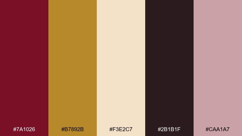
HEX: #7a1026 #b7892b #f3e2c7 #2b1b1f #caa1a7
Mood: opulent and romantic
Best for: wedding invitation suite
Opulent and romantic, it feels like candlelight on velvet and champagne silk. Use the deep wine tone for headers, then bring in metallic gold for borders or monograms. Cream keeps the layout airy while the near-black adds contrast for fine print. Tip: reserve the gold for one focal element per card so it reads premium, not busy.
Image example of gilded merlot generated using media.io
Media.io is an online AI studio for creating and editing video, image, and audio in your browser.

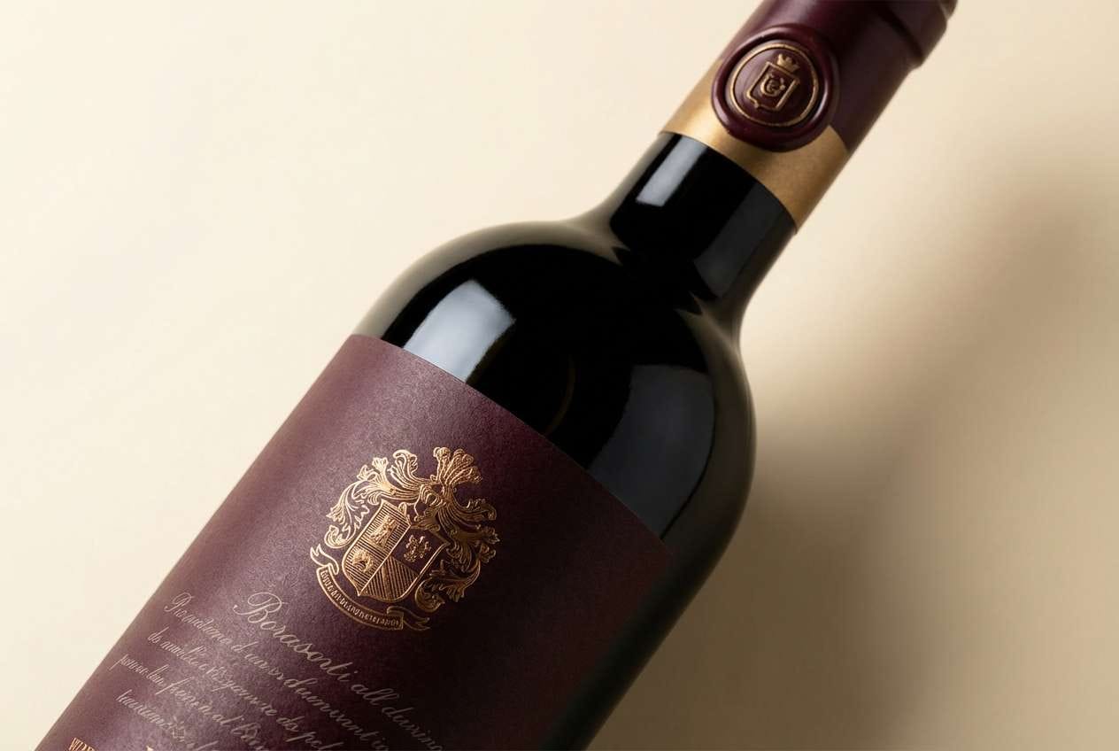
2) Velvet Vineyard
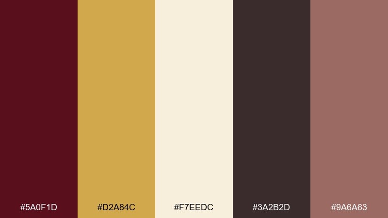
HEX: #5a0f1d #d2a84c #f7eedc #3a2b2d #9a6a63
Mood: rich and vintage
Best for: wine label packaging
Rich and vintage, it brings to mind oak barrels, ripe fruit, and a dim cellar glow. These gold burgundy color combinations work beautifully on labels, seals, and premium gift boxes. Keep cream as negative space so the burgundy feels deeper and the gold stays crisp. Tip: print the gold as a foil stamp on textured paper for an instant boutique feel.
Image example of velvet vineyard generated using media.io
3) Regal Library
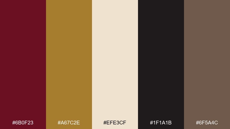
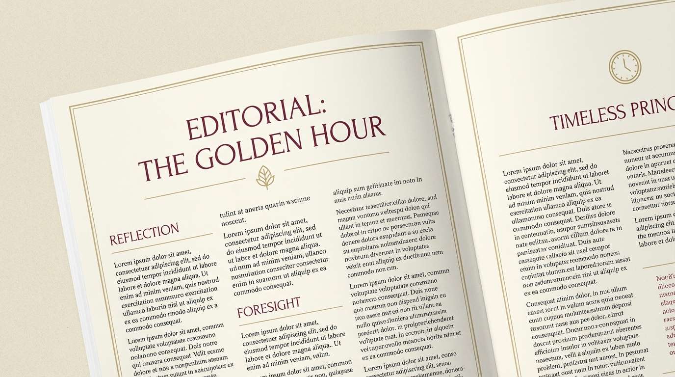
HEX: #6b0f23 #a67c2e #efe3cf #1f1a1b #6f5a4c
Mood: scholarly and grand
Best for: editorial magazine layout
Scholarly and grand, it reads like leather bindings, gilt titles, and aged paper. Use the cream for wide margins and the dark ink tone for body text to maintain long-read comfort. Add burgundy for pull quotes and section dividers, then accent with muted gold for rules and icons. Tip: pair with classic serif headlines to amplify the library feel.
Image example of regal library generated using media.io
4) Brass Bordeaux UI
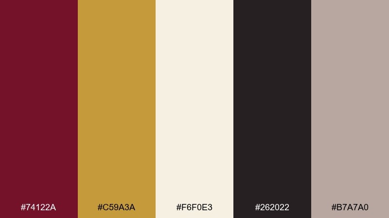
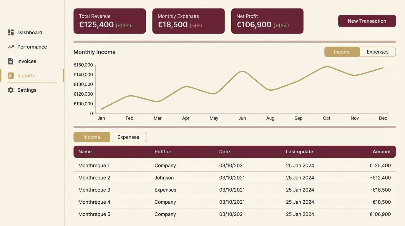
HEX: #74122a #c59a3a #f6f0e3 #262022 #b7a7a0
Mood: confident and polished
Best for: finance dashboard UI
Confident and polished, it feels like brass details against a tailored suit. The gold burgundy color scheme shines in dashboards where you want a premium tone without sacrificing clarity. Use cream for panels, charcoal for text, and keep burgundy for key metrics or alerts while gold highlights active states. Tip: use the taupe-gray for borders and separators to reduce visual noise.
Image example of brass bordeaux ui generated using media.io
5) Autumn Opera
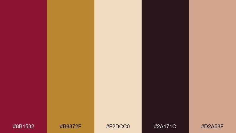
HEX: #8b1532 #b8872f #f2dcc0 #2a171c #d2a58f
Mood: dramatic and warm
Best for: theater poster design
Dramatic and warm, it evokes velvet curtains, spotlight haze, and a packed balcony. Let burgundy dominate the title area, then use gold for cast names or a subtle frame. Cream helps smaller details stay readable while the deep near-black adds stage-like depth. Tip: limit gradients and rely on solid blocks for a bold, print-friendly look.
Image example of autumn opera generated using media.io
6) Candlelit Bistro
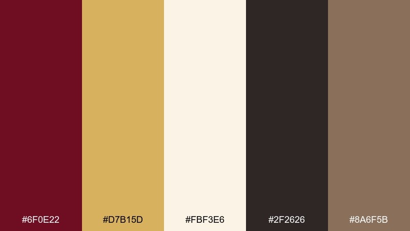
HEX: #6f0e22 #d7b15d #fbf3e6 #2f2626 #8a6f5b
Mood: cozy and upscale
Best for: restaurant menu design
Cozy and upscale, it suggests a small bistro with brass lamps and red wine at the table. Use cream as the menu base, set body text in charcoal, and reserve burgundy for section headers. Gold works best for tiny icons, rules, or a signature dish callout. Tip: keep the burgundy ink slightly matte to avoid glare under warm lighting.
Image example of candlelit bistro generated using media.io
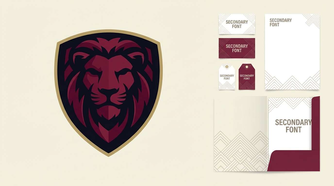
7) Heritage Crest
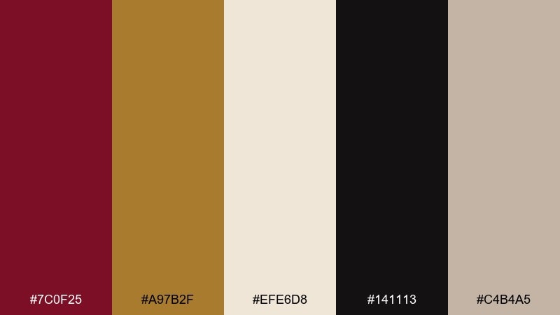
HEX: #7c0f25 #a97b2f #efe6d8 #141113 #c4b4a5
Mood: traditional and bold
Best for: sports team branding
Traditional and bold, it feels like a stitched crest and vintage varsity pride. Build the mark in burgundy and near-black, then add gold as an outline for high visibility on merch. Cream and warm gray help secondary graphics and typography stay neutral. Tip: test the crest at small sizes and simplify gold details so they do not blur in embroidery.
Image example of heritage crest generated using media.io
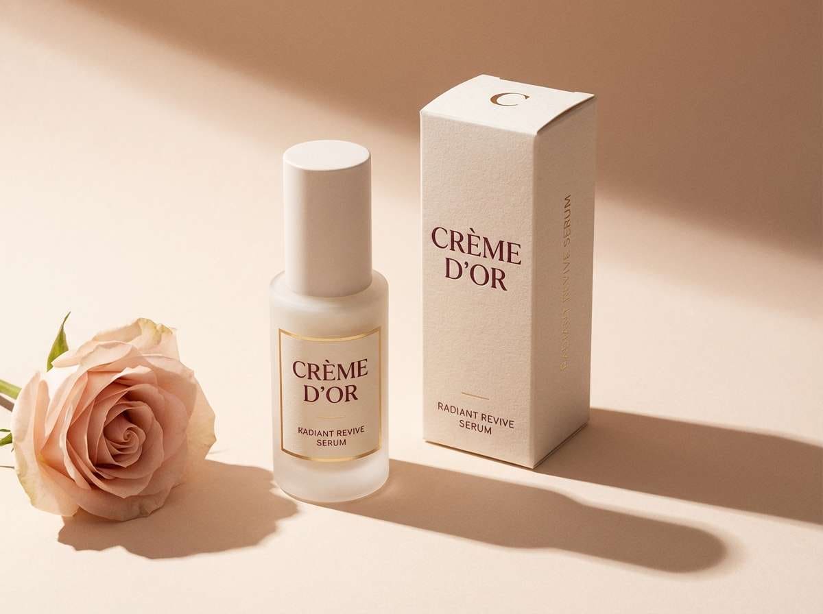
8) Rosy Antique
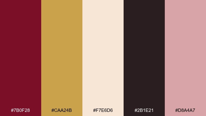
HEX: #7b0f28 #caa24b #f7e6d6 #2b1e21 #d8a4a7
Mood: softly glamorous
Best for: beauty product ad
Softly glamorous, it reads like antique jewelry beside a blush compact. Use the rosy nude as a background tint, then anchor the composition with burgundy for product names. Gold is ideal for tiny claims and highlights, especially in a foil-like finish. Tip: keep shadows warm and subtle so the palette stays romantic rather than harsh.
Image example of rosy antique generated using media.io
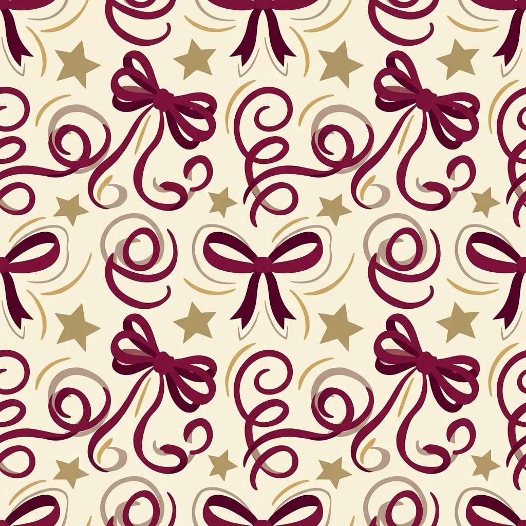
9) Satin Ribbon
HEX: #8a1636 #d6b25a #fff6ea #3a2a2c #b48f86
Mood: festive and refined
Best for: gift wrap pattern
Festive and refined, it resembles satin bows, wrapped boxes, and soft candle glow. Use burgundy for the main pattern shapes and keep cream as the paper base. Add gold as small stars, thin lines, or ribbon highlights for a luxe finish. Tip: scale the repeat slightly larger so the pattern reads clearly from a distance on bags and tissue.
Image example of satin ribbon generated using media.io
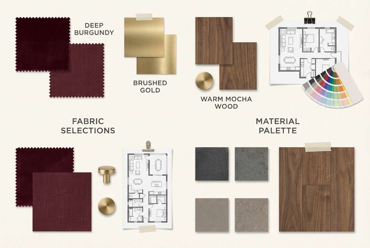
10) Mocha Garnet
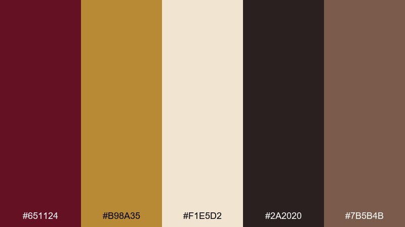
HEX: #651124 #b98a35 #f1e5d2 #2a2020 #7b5b4b
Mood: grounded and luxurious
Best for: interior mood board
Grounded and luxurious, it feels like garnet velvet against walnut wood and warm plaster. These gold burgundy color combinations work well for lounge spaces, boutique hotels, and statement dining rooms. Keep cream and mocha as the large surfaces, then bring burgundy into textiles and art. Tip: choose brushed gold hardware instead of high-shine to keep the room feeling modern.
Image example of mocha garnet generated using media.io
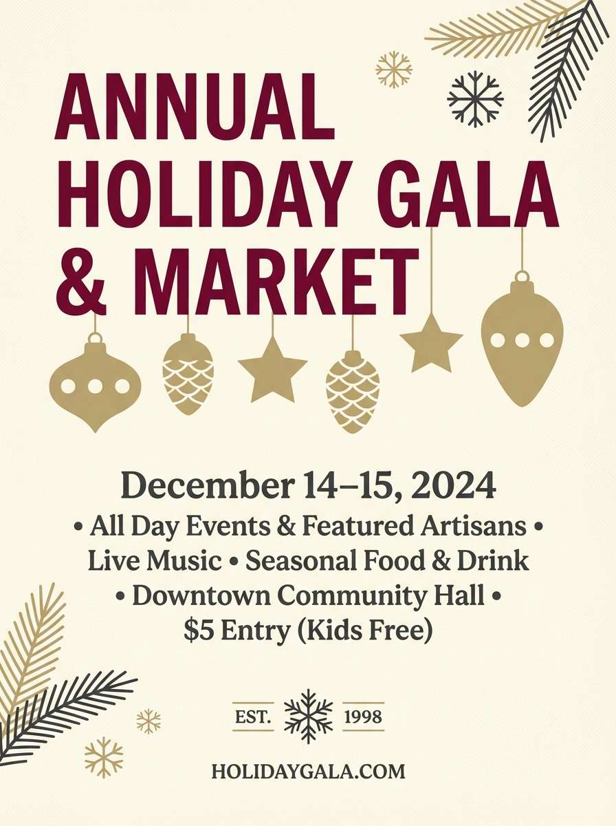
11) Festive Garnet Gold
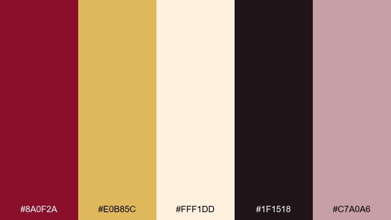
HEX: #8a0f2a #e0b85c #fff1dd #1f1518 #c7a0a6
Mood: joyful and elegant
Best for: holiday flyer
Joyful and elegant, it brings holiday warmth without going cartoonish. Use burgundy for the headline and hero shapes, and let gold do the sparkling accents and small ornaments. Cream keeps the flyer bright, while the deep ink tone helps with legibility for dates and locations. Tip: if printing, set gold elements slightly thicker so fine lines do not disappear.
Image example of festive garnet gold generated using media.io
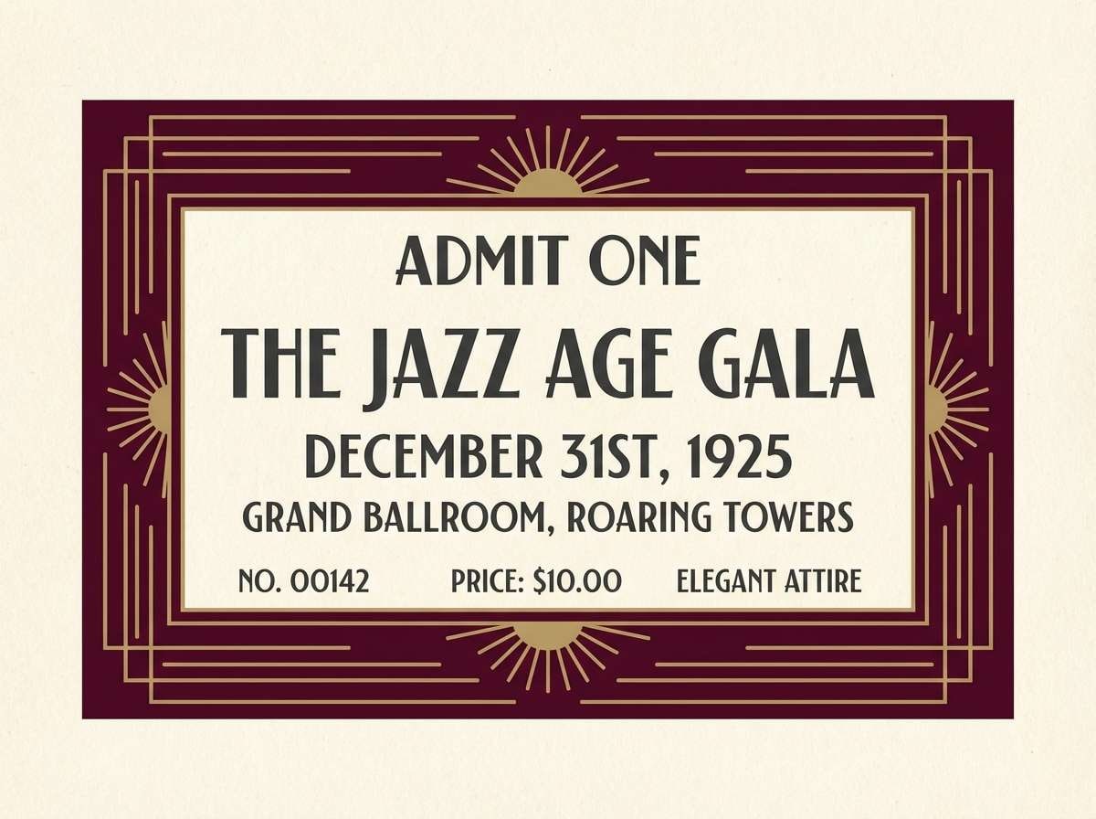
12) Art Deco Gala
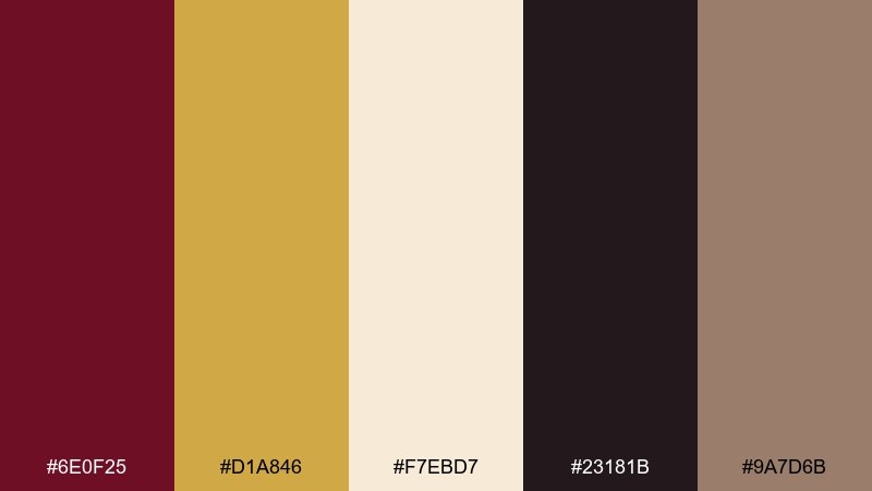
HEX: #6e0f25 #d1a846 #f7ebd7 #23181b #9a7d6b
Mood: glitzy and architectural
Best for: gala ticket design
Glitzy and architectural, it nods to deco arches, sharp lines, and late-night glamour. A gold burgundy color palette like this loves symmetry, so use geometric frames and centered typography. Cream keeps the ticket readable while charcoal anchors small text like seating and entry details. Tip: add a subtle gold line pattern behind the title to create depth without clutter.
Image example of art deco gala generated using media.io
13) Copper Rosewood

HEX: #731126 #c28b3a #f6e7d6 #2b1c1f #a87463
Mood: warm and artisanal
Best for: skincare packaging
Warm and artisanal, it suggests copper tools, rosewood shelves, and handmade apothecary bottles. Use cream for the label base, burgundy for the brand name, and keep gold for a small seal or cap accent. The terracotta note bridges the two and prevents the look from feeling too formal. Tip: choose uncoated paper and a single metallic stamp for a tactile, elevated finish.
Image example of copper rosewood generated using media.io
14) Minimal Maroon Luxe
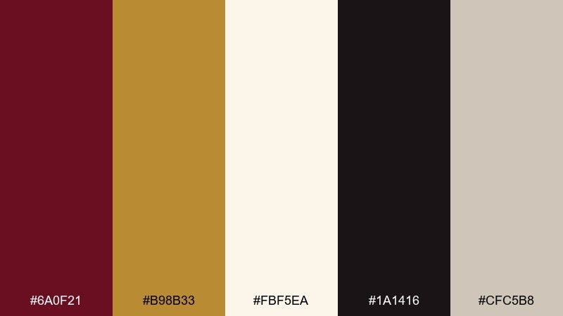
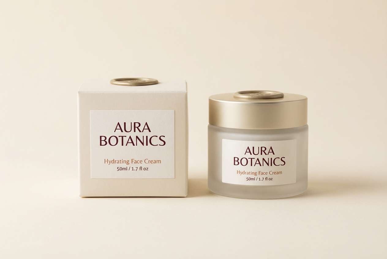
HEX: #6a0f21 #b98b33 #fbf5ea #1a1416 #cfc5b8
Mood: sleek and premium
Best for: logo and business card
Sleek and premium, it feels like a tailored card case and a quiet handshake. Let the near-black and cream handle most of the typography for clarity and restraint. Add burgundy as a signature mark color, then bring in muted gold for a thin edge or embossed detail. Tip: use plenty of whitespace so the palette reads modern, not ornate.
Image example of minimal maroon luxe generated using media.io
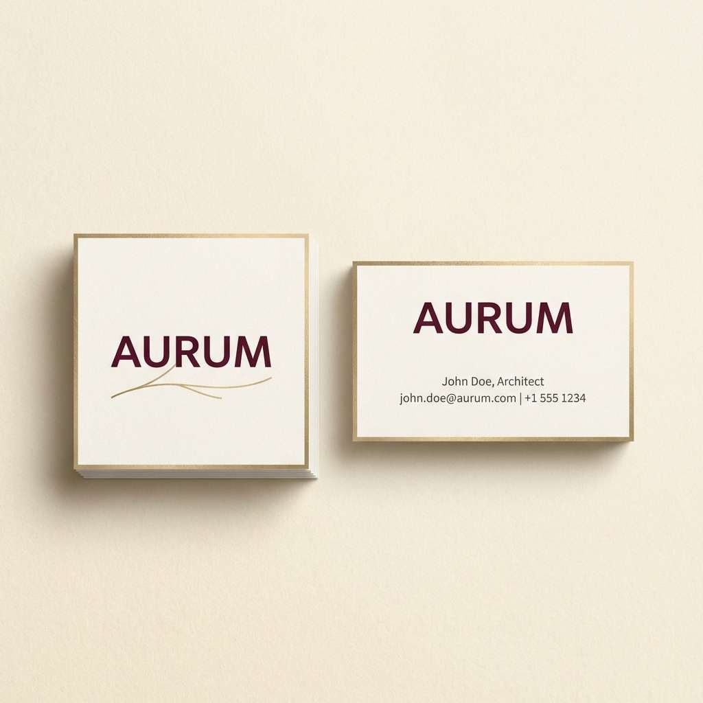
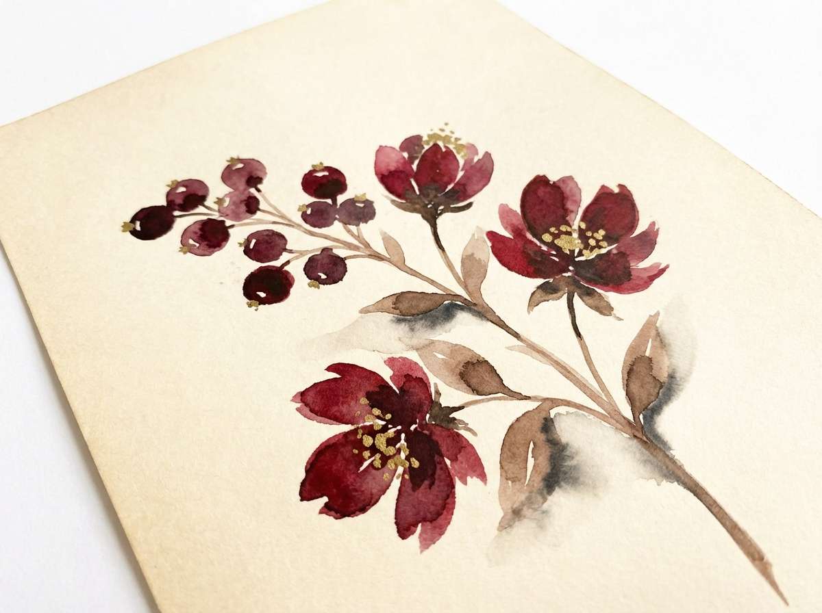
15) Orchard Dusk
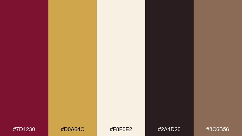
HEX: #7d1230 #d0a64c #f8f0e2 #2a1d20 #8c6b56
Mood: moody and natural
Best for: botanical watercolor print
Moody and natural, it recalls late harvest fruit, dry leaves, and twilight air. Use cream as the paper tone, then layer burgundy petals or berries with soft, transparent washes. Add gold as delicate pollen dots or thin highlights to keep the illustration luminous. Tip: keep the darkest ink limited to stems and outlines so the watercolor stays airy.
Image example of orchard dusk generated using media.io
16) Velvet Stage UI
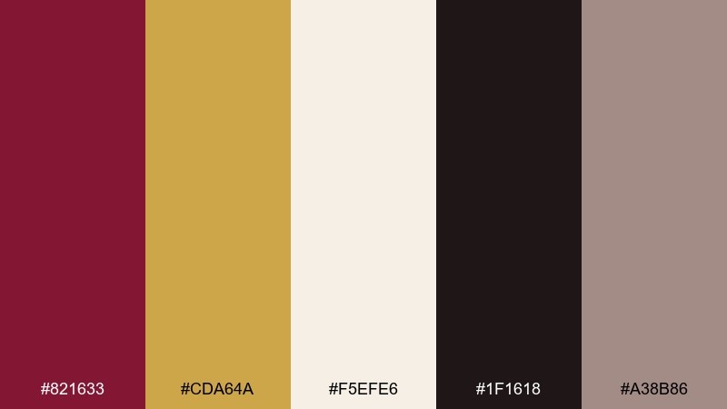
HEX: #821633 #cda64a #f5efe6 #1f1618 #a38b86
Mood: dramatic and modern
Best for: music app UI
Dramatic and modern, it feels like house lights dimming before the first note. Use burgundy for primary actions and album highlights, while cream keeps lists and lyrics readable. Gold makes a perfect accent for progress bars, toggles, and featured badges. Tip: avoid using gold for long text and keep it to micro-interactions for better accessibility.
Image example of velvet stage ui generated using media.io
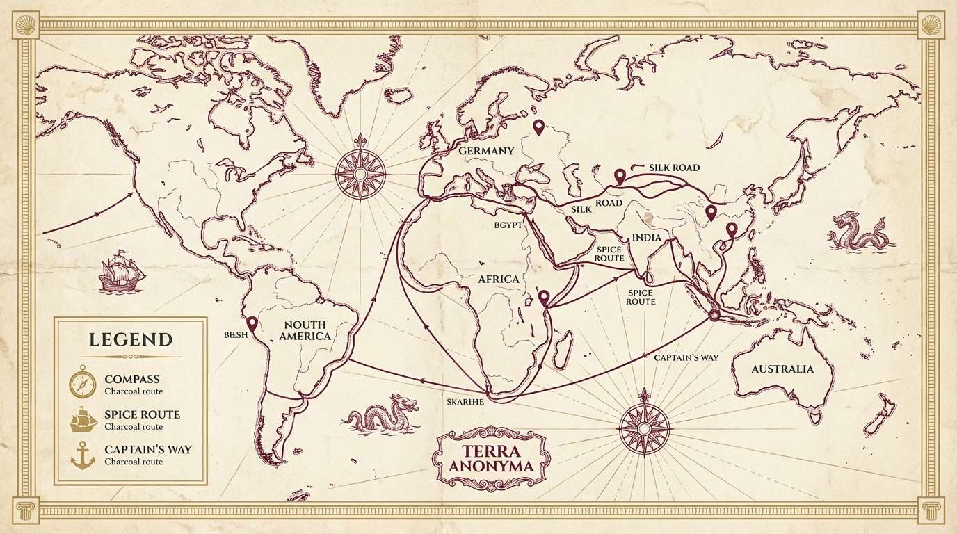
17) Old World Map
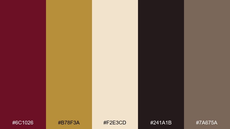
HEX: #6c1026 #b78f3a #f2e3cd #241a1b #7a675a
Mood: historic and adventurous
Best for: vintage infographic poster
Historic and adventurous, it evokes aged parchment, compass roses, and inked routes. Use cream as the map base, then draw key shapes in burgundy with charcoal labels for clarity. Add muted gold for borders, pins, or legend markers to guide the eye. Tip: keep the gold elements consistent in size so the poster stays cohesive from afar.
Image example of old world map generated using media.io
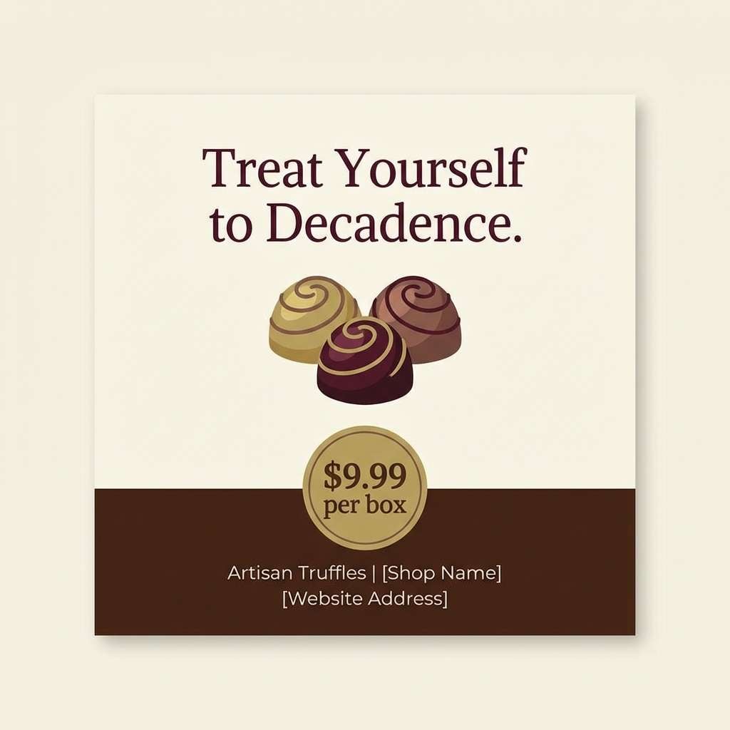
18) Ruby Truffle
HEX: #7a0f25 #d2a64d #f9efe1 #2a1a1c #9b6a5a
Mood: decadent and cozy
Best for: dessert shop social post
Decadent and cozy, it feels like chocolate ganache and a glass of red after dinner. These gold burgundy color combinations are perfect for menus, promos, and limited-time treats that need a premium vibe. Use cream for the backdrop, burgundy for the product name, and gold for price tags or tiny sparkle accents. Tip: add a dark cocoa block behind the hero text to make it pop on small screens.
Image example of ruby truffle generated using media.io
19) Champagne Noir
HEX: #6a0c1f #c8a24a #f6f1e7 #0f0d0e #b3a7a0
Mood: sleek and cinematic
Best for: portfolio website styling
Sleek and cinematic, it feels like a night premiere with a champagne shimmer. Use near-black for large backgrounds, then bring in cream for readable typography and generous spacing. Burgundy works well for hover states and featured project tags, while gold highlights awards or calls to action. Tip: keep animations subtle so the palette carries the drama, not the motion.
Image example of champagne noir generated using media.io

20) Sunlit Baroque
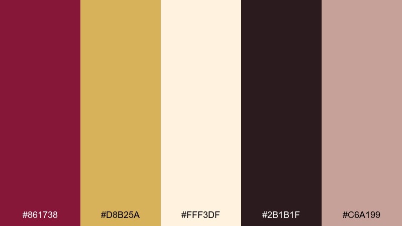
HEX: #861738 #d8b25a #fff3df #2b1b1f #c6a199
Mood: ornate yet bright
Best for: presentation slide deck
Ornate yet bright, it brings gilded frames into daylight rather than a dark hall. A gold burgundy color palette like this works best when you pick one hero hue per slide and let cream do the breathing room. Use burgundy for section dividers and titles, with gold for icons and key numbers. Tip: keep charts mostly cream and charcoal, then use burgundy as the single emphasis color for the takeaway.
Image example of sunlit baroque generated using media.io

What Colors Go Well with Gold Burgundy?
Cream, ivory, and warm white are the easiest partners—they keep burgundy from feeling too heavy and make gold look more luminous. Charcoal and near-black add crisp legibility, especially for typography and small UI labels.
For a softer mood, try dusty rose, nude, or warm taupe to bridge burgundy and gold without adding harsh contrast. For a more natural direction, mocha browns and muted wood tones make the palette feel grounded.
If you want a fresher twist, introduce cool accents sparingly (like sage/seafoam or a muted teal) so the gold still reads as the highlight rather than competing with strong saturation.
How to Use a Gold Burgundy Color Palette in Real Designs
Start by assigning roles: burgundy for primary brand moments (logo, headers, hero blocks), cream for backgrounds, and near-black for readable text. Treat gold as an accent, not a base color—use it for dividers, badges, icons, and one key focal detail.
In print (invites, menus, packaging), gold looks most premium as foil or metallic ink, while burgundy works best as a matte. In digital UI, consider using “gold” more like a warm mustard for states and highlights to keep contrast accessible.
Keep the composition simple: larger blocks of cream and burgundy with small gold touches generally look more expensive than trying to make everything metallic.
Create Gold Burgundy Palette Visuals with AI
If you want to preview how a gold burgundy color scheme looks on real designs—like invitations, labels, posters, or UI screens—generate mockups in seconds with AI. It’s a fast way to test mood, balance, and contrast before production.
Use a clear prompt that names the format (menu, ticket, dashboard), sets a background color (cream or near-black), and specifies where gold should appear (foil border, badge, icons). Then iterate by adjusting lighting, texture, and typography style.
With Media.io, you can create multiple variations quickly and pick the one that best matches your brand or event aesthetic.
Gold Burgundy Color Palette FAQs
-
What does a gold and burgundy color palette communicate?
It typically signals luxury, tradition, romance, and confidence. Burgundy brings depth and seriousness, while gold adds celebration and a premium finish. -
Is burgundy and gold a good combination for weddings?
Yes—especially for fall/winter weddings or formal themes. Use burgundy for key stationery elements and keep gold as a restrained accent (foil border, monogram, small icons) for an elegant look. -
How do I keep gold from looking “too yellow” on screens?
Use a muted, slightly brown-leaning gold (like antique brass) and pair it with cream and charcoal. Avoid using bright gold for large text; reserve it for buttons, badges, and highlights. -
What neutrals work best with a gold burgundy color scheme?
Warm cream/ivory, taupe, and charcoal are the most reliable. They stabilize the palette and improve readability without dulling the richness of burgundy. -
What’s the best way to use gold in print designs?
Foil stamping or metallic ink delivers the most premium result. Keep gold details slightly thicker (not hairline-thin) so they reproduce cleanly on textured paper. -
Can I use gold and burgundy for a modern brand?
Yes—make it modern by using lots of whitespace, clean typography, and minimal ornamentation. Let burgundy act as a signature color and apply gold sparingly as an accent. -
Which color should dominate: burgundy or gold?
Burgundy should usually dominate, with gold as an accent. This keeps the design grounded and prevents the gold from overwhelming the layout or reducing contrast.
Next: Sea Green Color Palette


