

Boho color palettes blend earthy neutrals with sunbaked clays, muted greens, and soft creams to create a relaxed, handcrafted feel. They’re a go-to choice for brands and visuals that want warmth without looking loud.
Below are 20 boho palette ideas with HEX codes, plus ready-to-copy AI prompts so you can generate matching visuals fast for social posts, packaging, interiors, and more.
In this article
Why Boho Palettes Work So Well
Boho colors feel naturally cohesive because they’re inspired by materials you already associate with comfort and craft: clay, sand, linen, wood, stone, and faded botanicals. That gives designs a grounded mood without needing heavy contrast or bright saturation.
They’re also flexible across mediums. The same terracotta-and-cream base can look premium on packaging, calm on a wellness landing page, or warm and welcoming in an interior mood board.
Most boho schemes include a clear “canvas” color (cream, beige, off-white) that makes layouts breathable. That background space helps typography stay readable and keeps the overall vibe curated rather than cluttered.
20+ Boho Color Palette Ideas (with HEX Codes)
1) Desert Clay
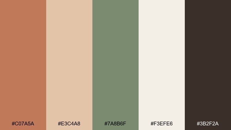
HEX: #c07a5a #e3c4a8 #7a8b6f #f3efe6 #3b2f2a
Mood: sunbaked, grounded, artisanal
Best for: brand identity and packaging
Sunbaked clay and linen neutrals feel handmade and quietly confident, like a pottery studio at golden hour. Use it for logos, labels, and earthy packaging where warmth matters more than contrast. Pair the terracotta with the cream as your base, then add sage for calm balance and deep espresso for text. Tip: keep the darkest tone for small details so the label stays airy and premium.
Image example of desert clay generated using media.io
Media.io is an online AI studio for creating and editing video, image, and audio in your browser.

2) Sage Linen
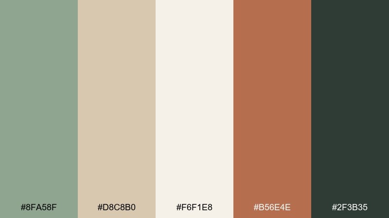
HEX: #8fa58f #d8c8b0 #f6f1e8 #b56e4e #2f3b35
Mood: calm, airy, organic
Best for: wellness websites and landing pages
Soft sage and washed linen read calm and breathable, like a quiet retreat with sunlight on canvas. These tones work beautifully for wellness sites, slow living blogs, and service brands that need trust and softness. Let the off-white carry most of the page, then use terracotta for buttons and the deep green for headings. Tip: keep the accent color to one primary action to avoid muddy warmth.
Image example of sage linen generated using media.io
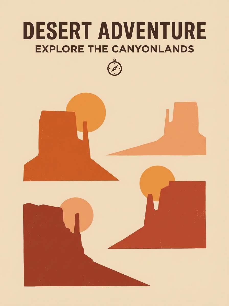
3) Sunset Canyon
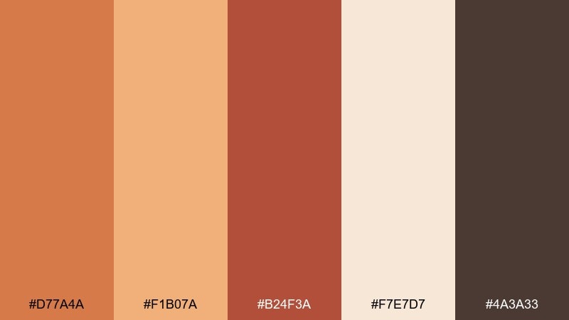
HEX: #d77a4a #f1b07a #b24f3a #f7e7d7 #4a3a33
Mood: radiant, rustic, adventurous
Best for: travel posters and event promos
Glowing canyon oranges and toasted clay set a bold, road-trip vibe with dusty warmth. For posters and promos, these boho color combinations shine when you use the pale sand as negative space and stack the deeper reds for depth. Pair with simple serif type or hand-drawn accents to keep the look artisanal. Tip: add a thin dark-brown border to anchor the brightest orange.
Image example of sunset canyon generated using media.io
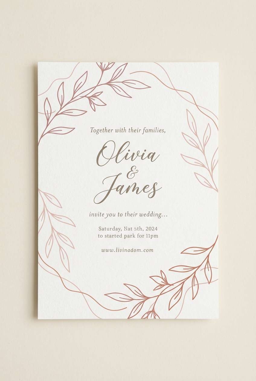
4) Dusty Rose Adobe
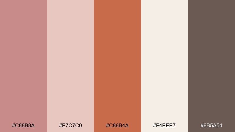
HEX: #c88b8a #e7c7c0 #c86b4a #f4eee7 #6b5a54
Mood: romantic, soft, earthy
Best for: wedding invitations and stationery
Dusty rose and adobe warmth feel romantic without turning sugary, like dried florals against plaster walls. Use it for invitations, menus, and save-the-dates where you want a modern rustic mood. Let the cream hold the background, then alternate rose and terracotta for headers and separators. Tip: print the deep taupe for text so the softer tones stay delicate.
Image example of dusty rose adobe generated using media.io
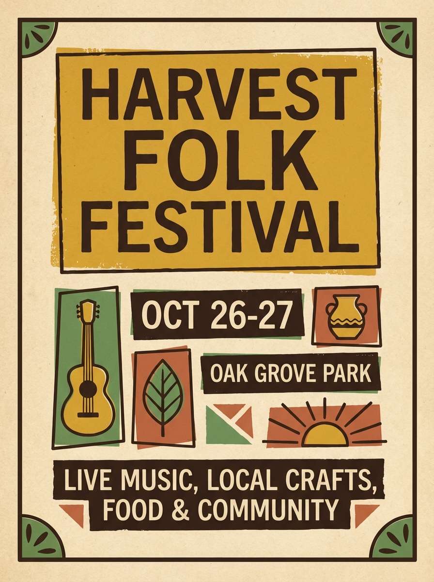
5) Mustard Fern
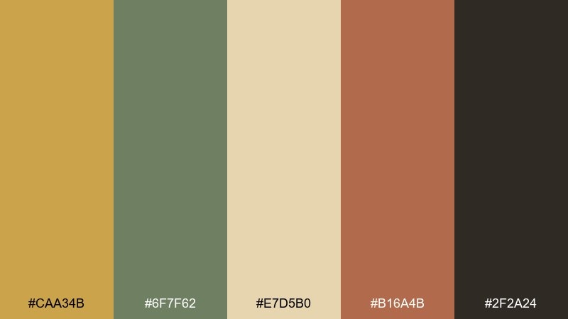
HEX: #caa34b #6f7f62 #e7d5b0 #b16a4b #2f2a24
Mood: vintage, earthy, lively
Best for: artisan market flyers
Mustard and fern green evoke vintage textiles and sun-faded market stalls. These tones work well for flyers and social posts that need a cheerful pop without neon brightness. Balance the mustard with plenty of warm beige, then use the deep brown for legible type. Tip: keep green for icons or small motifs so it feels fresh, not heavy.
Image example of mustard fern generated using media.io
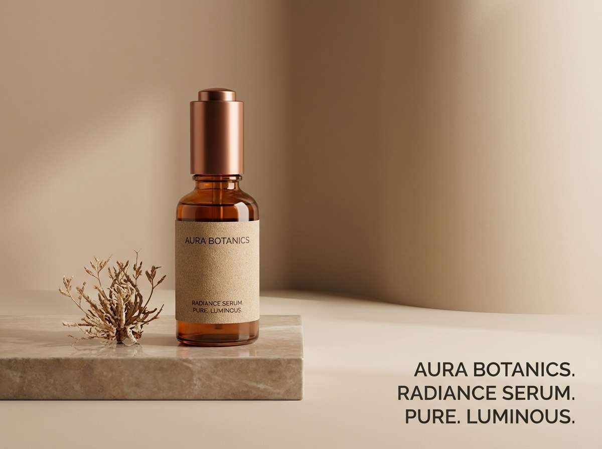
6) Copper Sand
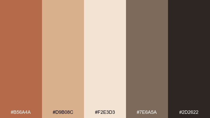
HEX: #b56a4a #d9b08c #f2e3d3 #7e6a5a #2d2622
Mood: warm, minimal, grounded
Best for: skincare product ads
Copper warmth against sandy neutrals feels clean and tactile, like brushed metal and raw paper. Use this for skincare ads where you want warmth but still need a minimal, high-end look. Pair the light sand with copper as the hero tone, and reserve charcoal for product names and prices. Tip: a soft gradient in the beige range adds depth without introducing new colors.
Image example of copper sand generated using media.io
7) Indigo Nomad
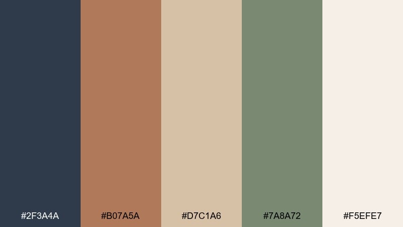
HEX: #2f3a4a #b07a5a #d7c1a6 #7a8a72 #f5efe7
Mood: moody, worldly, balanced
Best for: editorial layouts and lookbooks
Inky indigo with clay and canvas neutrals feels like a well-worn travel journal and woven rugs. It suits lookbooks and editorial spreads where you want depth without going fully dark. Use indigo for headlines and section blocks, then keep body copy on the light cream for readability. Tip: repeat the sage tone as a small rule line or caption highlight to unify pages.
Image example of indigo nomad generated using media.io
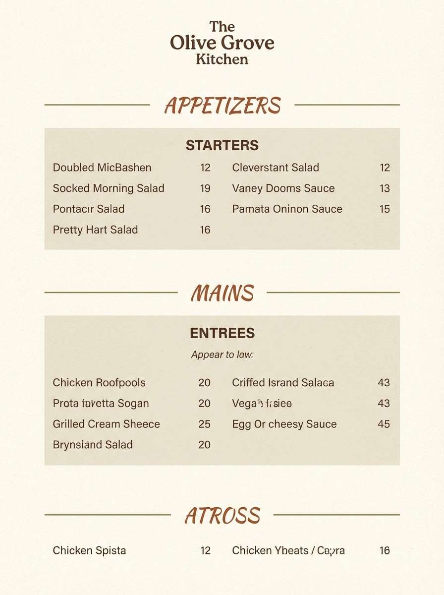
8) Olive Terracotta
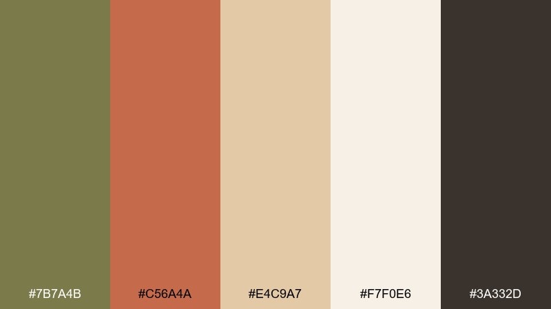
HEX: #7b7a4b #c56a4a #e4c9a7 #f7f0e6 #3a332d
Mood: earthy, confident, rustic
Best for: restaurant menus and signage
Olive and terracotta feel rustic and welcoming, like herbs drying beside a brick oven. This boho color palette works especially well for menus, café signage, and food brands that lean handmade and seasonal. Keep the background creamy, then use terracotta for section headers and olive for icons or dividers. Tip: test legibility by setting body text in the deep brown, not the olive.
Image example of olive terracotta generated using media.io
9) Cocoa Cream
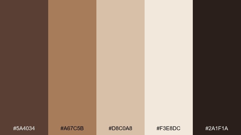
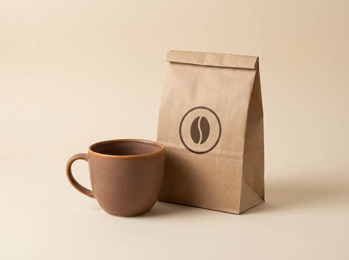
HEX: #5a4034 #a67c5b #d8c0a8 #f3e8dc #2a1f1a
Mood: cozy, rich, comforting
Best for: coffee shop branding
Cocoa browns and whipped-cream neutrals feel cozy, rich, and familiar. Use these tones for café branding, loyalty cards, and packaging where warmth and appetite appeal matter. Pair the light cream as the base with caramel as the main brand color, then bring in the darkest brown for stamps and type. Tip: keep gradients subtle so the palette stays sophisticated rather than sugary.
Image example of cocoa cream generated using media.io
10) Rustic Bloom
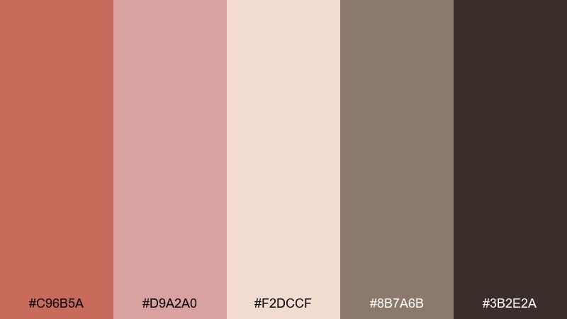
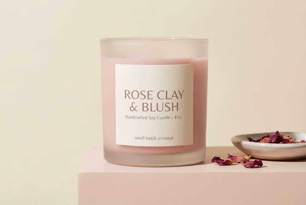
HEX: #c96b5a #d9a2a0 #f2dccf #8b7a6b #3b2e2a
Mood: warm, floral, nostalgic
Best for: handmade product labels
Warm rose clay with soft blush feels like dried blooms pressed into a notebook. It works well for handmade labels, candle wraps, and boutique tags that need a gentle romantic tone. Use blush and cream for the main label field, then add the deeper clay for brand marks and seals. Tip: keep the gray-taupe for small secondary text to avoid heavy contrast.
Image example of rustic bloom generated using media.io
11) Amber Dune
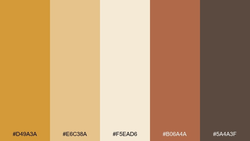
HEX: #d49a3a #e6c38a #f5ead6 #b06a4a #5a4a3f
Mood: sunny, golden, inviting
Best for: social media templates
Golden amber and dune beige bring a cheerful, sunlit warmth that still feels natural. Use it for social templates, highlight covers, and promo carousels where you need energy without harsh saturation. Let the pale sand dominate, then reserve amber for stickers and headings and use terracotta sparingly for emphasis. Tip: pair with simple rounded shapes to echo the softness of the tones.
Image example of amber dune generated using media.io
12) Pebble Macrame
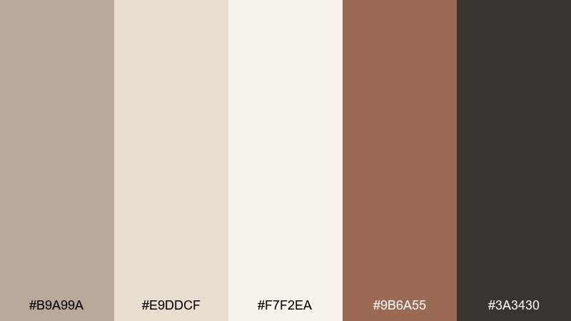
HEX: #b9a99a #e9ddcf #f7f2ea #9b6a55 #3a3430
Mood: soft, textured, neutral
Best for: portfolio websites and case studies
Pebble neutrals and macrame warmth feel quiet and tactile, like woven cotton and raw stone. These boho color combinations are ideal for portfolio sites where projects need breathing room and typography must stay crisp. Keep the background near-ivory, then use the warm clay for links and hover states. Tip: add gentle section panels in the mid pebble tone to guide scanning.
Image example of pebble macrame generated using media.io
13) Ochre Sienna
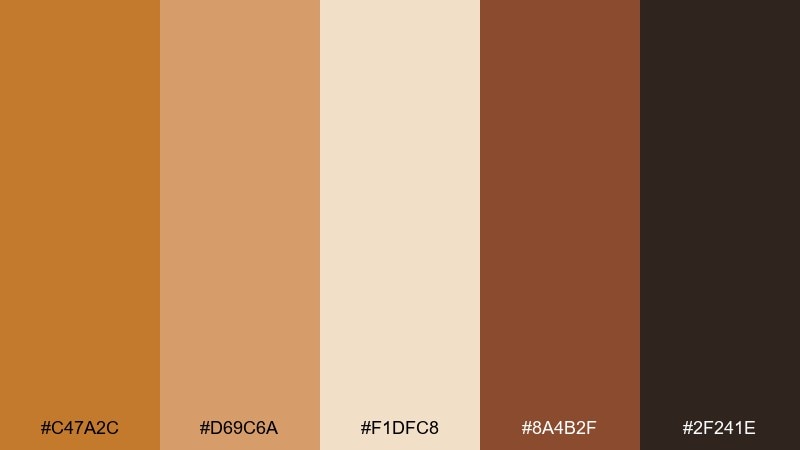
HEX: #c47a2c #d69c6a #f1dfc8 #8a4b2f #2f241e
Mood: bold, earthy, craft-forward
Best for: craft fair posters
Ochre and sienna create a bold, handmade energy that feels like dyed fabric and sunlit clay. Use it for craft fair posters and workshop promos that need to stand out on a noticeboard. Pair the light tan with large ochre blocks, then ground the layout with deep brown text. Tip: keep the darkest tone for titles only to avoid overwhelming the warm midtones.
Image example of ochre sienna generated using media.io
14) Poppy Kilim
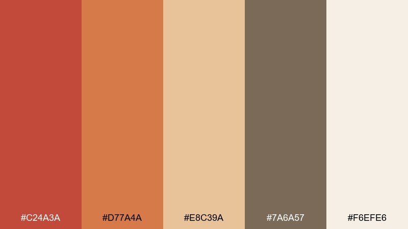
HEX: #c24a3a #d77a4a #e8c39a #7a6a57 #f6efe6
Mood: vibrant, folk, expressive
Best for: album covers and creative posters
Poppy red and warm orange feel like a kilim rug in a sunlit room, lively but still earthy. These tones suit album covers and creative posters where pattern and rhythm matter. Use the cream as your breathing space, then stack red and orange for the focal graphic and keep the taupe for supporting type. Tip: limit the red to one main shape so the orange can glow instead of competing.
Image example of poppy kilim generated using media.io
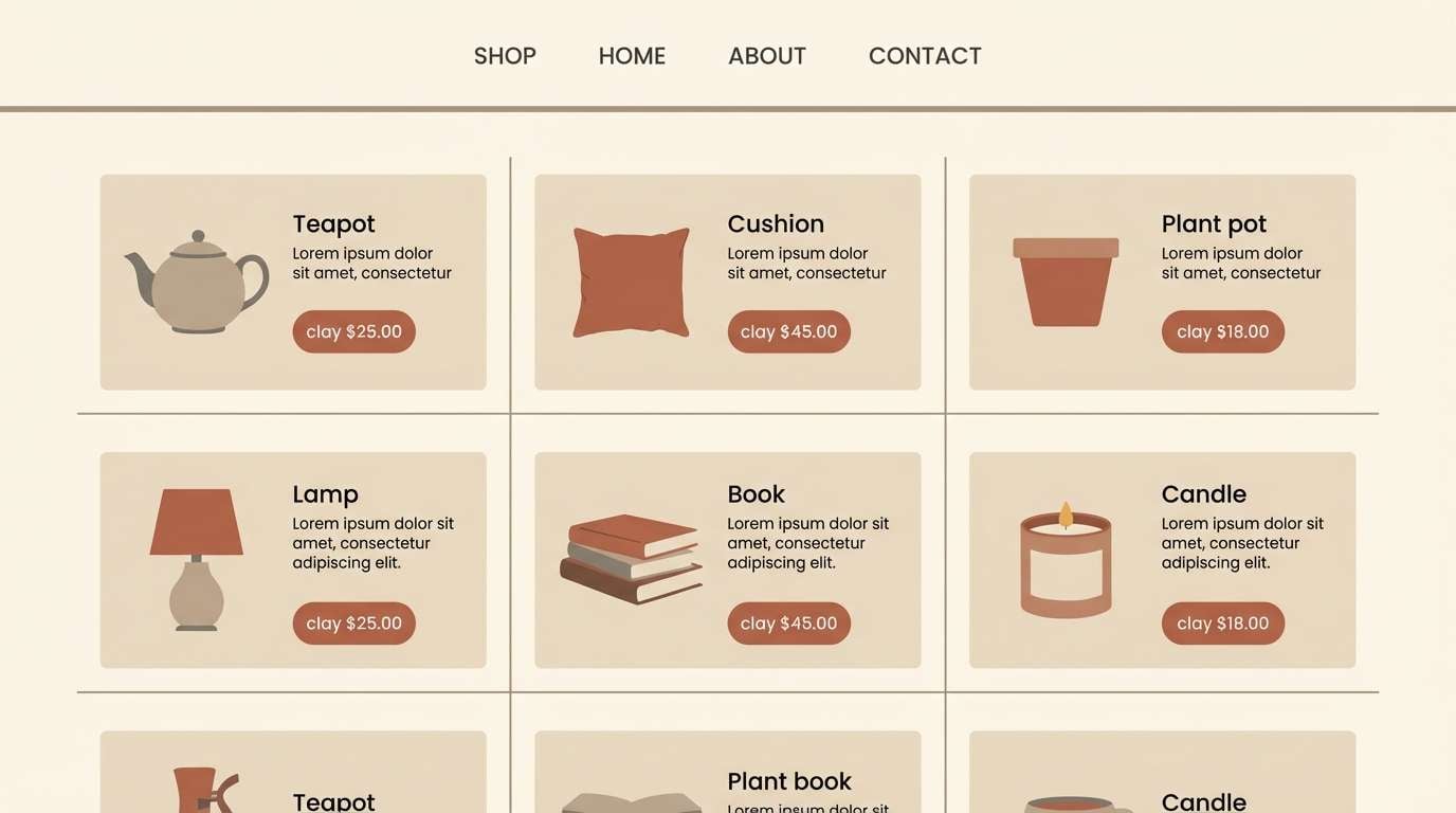
15) Clay Pottery
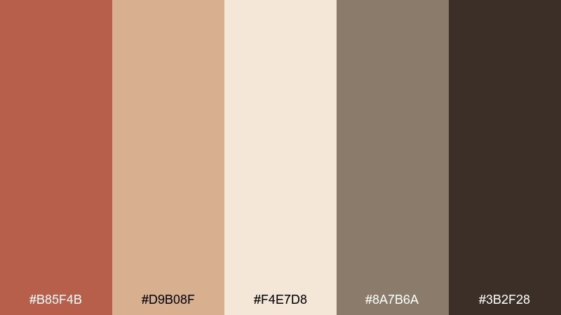
HEX: #b85f4b #d9b08f #f4e7d8 #8a7b6a #3b2f28
Mood: handmade, warm, balanced
Best for: ceramics shop ecommerce
Clay and kiln-warm neutrals feel handmade and steady, like glazed pottery on open shelves. Use these tones for ecommerce pages where product photos need a warm, consistent backdrop. Keep the light beige for pages and cards, then use clay for price tags and callouts with charcoal for text. Tip: match photo backgrounds to the cream tone to make the catalog feel cohesive.
Image example of clay pottery generated using media.io
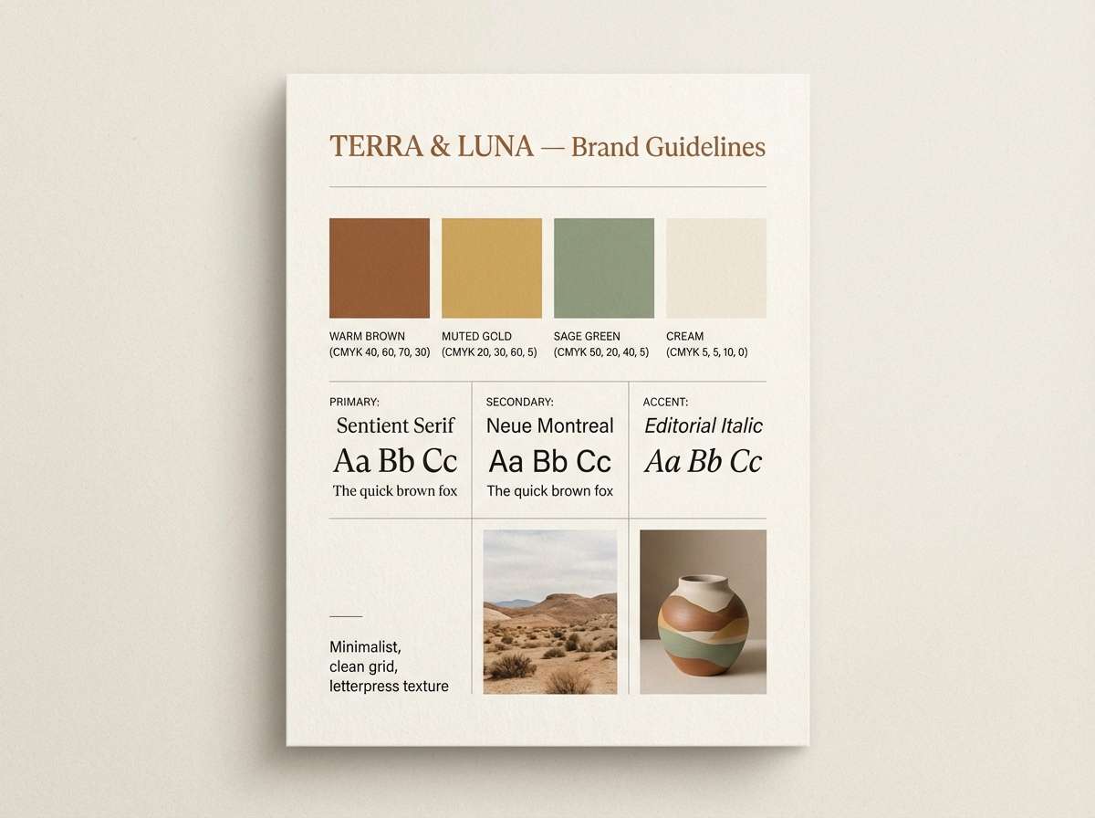
16) Vintage Tapestry
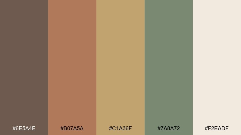
HEX: #6e5a4e #b07a5a #c1a36f #7a8a72 #f2eadf
Mood: heritage, earthy, curated
Best for: brand guidelines and moodboards
Heritage browns, muted gold, and soft sage feel like a vintage tapestry collected over time. This boho color palette is great for brand guidelines where you need a cohesive story across print and digital. Use cream as the canvas, then set brown for typography and gold for highlights like icons and separators. Tip: keep sage as a secondary accent so it reads intentional, not accidental.
Image example of vintage tapestry generated using media.io
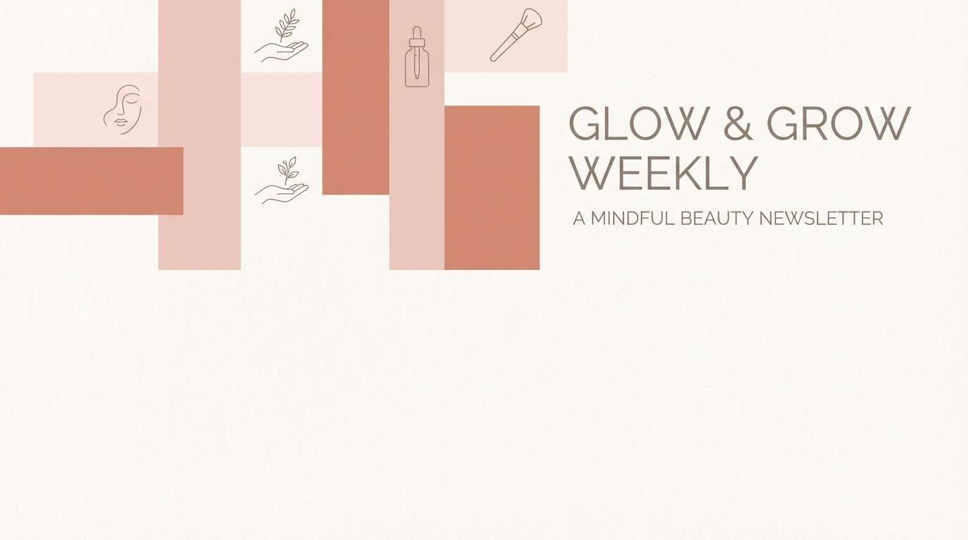
17) Sandstone Blush
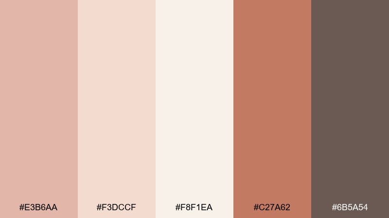
HEX: #e3b6aa #f3dccf #f8f1ea #c27a62 #6b5a54
Mood: soft, gentle, modern
Best for: beauty blogs and newsletters
Sandstone blush feels gentle and modern, like warm sunlight through sheer curtains. Use it for beauty newsletters and blog headers where you want softness but still need structure. Pair blush with near-ivory backgrounds, then use the deeper coral-clay for buttons and section titles. Tip: keep the taupe for body text to avoid low-contrast readability issues.
Image example of sandstone blush generated using media.io
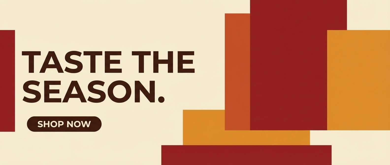
18) Campfire Spice
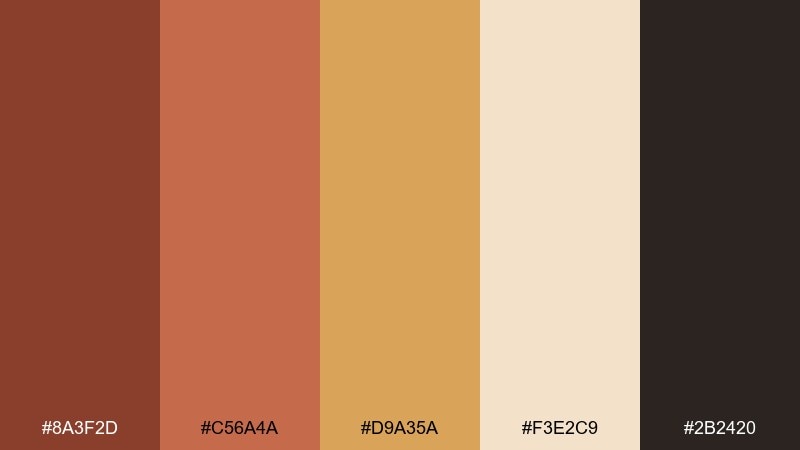
HEX: #8a3f2d #c56a4a #d9a35a #f3e2c9 #2b2420
Mood: bold, cozy, spirited
Best for: seasonal promos and banners
Campfire spice tones feel bold and cozy, like toasted cinnamon and ember glow at night. This boho color scheme is perfect for seasonal promos where you want warmth, contrast, and a hint of drama. Use the pale cream for the banner field, then layer spice and amber for the message and call-to-action. Tip: keep the darkest brown for outlines and small type so the layout stays sharp.
Image example of campfire spice generated using media.io
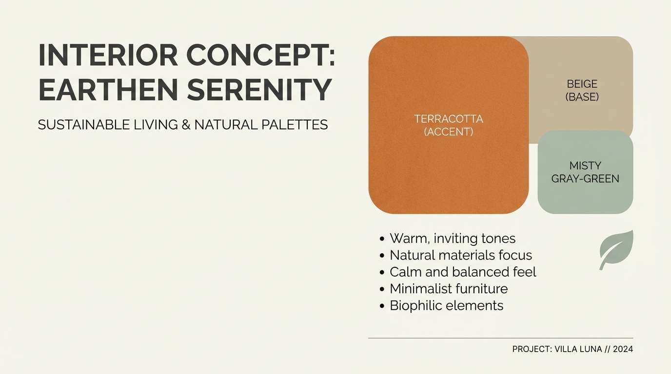
19) Terra Mist
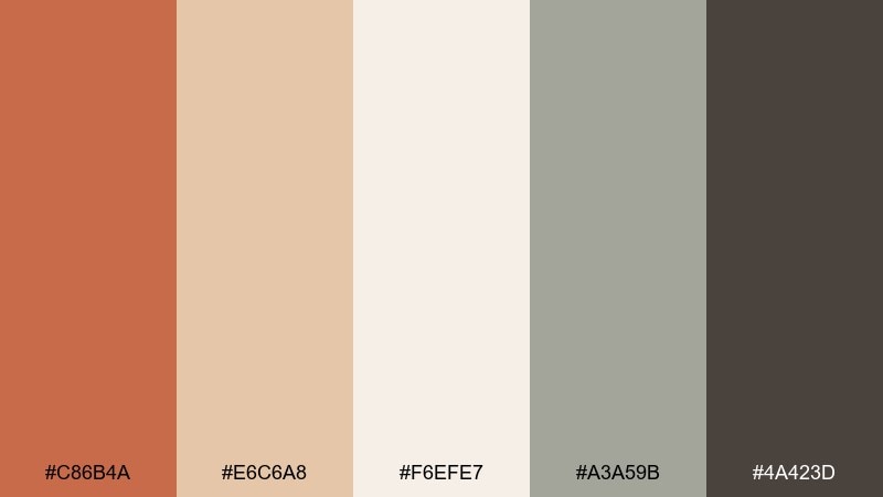
HEX: #c86b4a #e6c6a8 #f6efe7 #a3a59b #4a423d
Mood: dusty, calm, contemporary
Best for: interior mood boards and presentations
Dusty terracotta with misty gray-green feels calm and contemporary, like plaster walls and soft linen throws. Use it for interior presentations and mood boards where you want warmth without going overly rustic. Pair the cream as a slide background and use terracotta for key callouts, while the muted gray-green keeps the palette modern. Tip: add charcoal only for headings to maintain an airy, curated feel.
Image example of terra mist generated using media.io
20) Woven Market

HEX: #a25b3d #caa34b #7a8b6f #e7d5b0 #3a2f28
Mood: earthy, playful, artisanal
Best for: handcrafted goods shop banners
Woven market tones feel playful and artisanal, like baskets, spice jars, and painted signs. Use these colors for shop banners, category headers, and campaign graphics where you want a handcrafted vibe with clear hierarchy. Pair mustard with beige for large shapes, then bring in sage for supporting elements and keep brown for text. Tip: repeat one accent color in small badges to make the layout feel intentional.
Image example of woven market generated using media.io
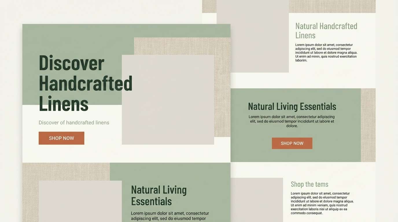
What Colors Go Well with Boho?
Boho pairs best with warm earth tones: terracotta, clay, rust, caramel, and cocoa brown. These shades create the signature sunbaked base that feels organic and inviting.
To keep the palette from feeling too heavy, add light neutrals like cream, linen, sand, or off-white as your main background. Then bring in muted greens (sage, olive, fern) or dusty blues (indigo) for balance.
If you want a brighter accent, choose a softened golden amber or muted mustard rather than a neon yellow. The goal is warmth with a slightly faded, natural finish.
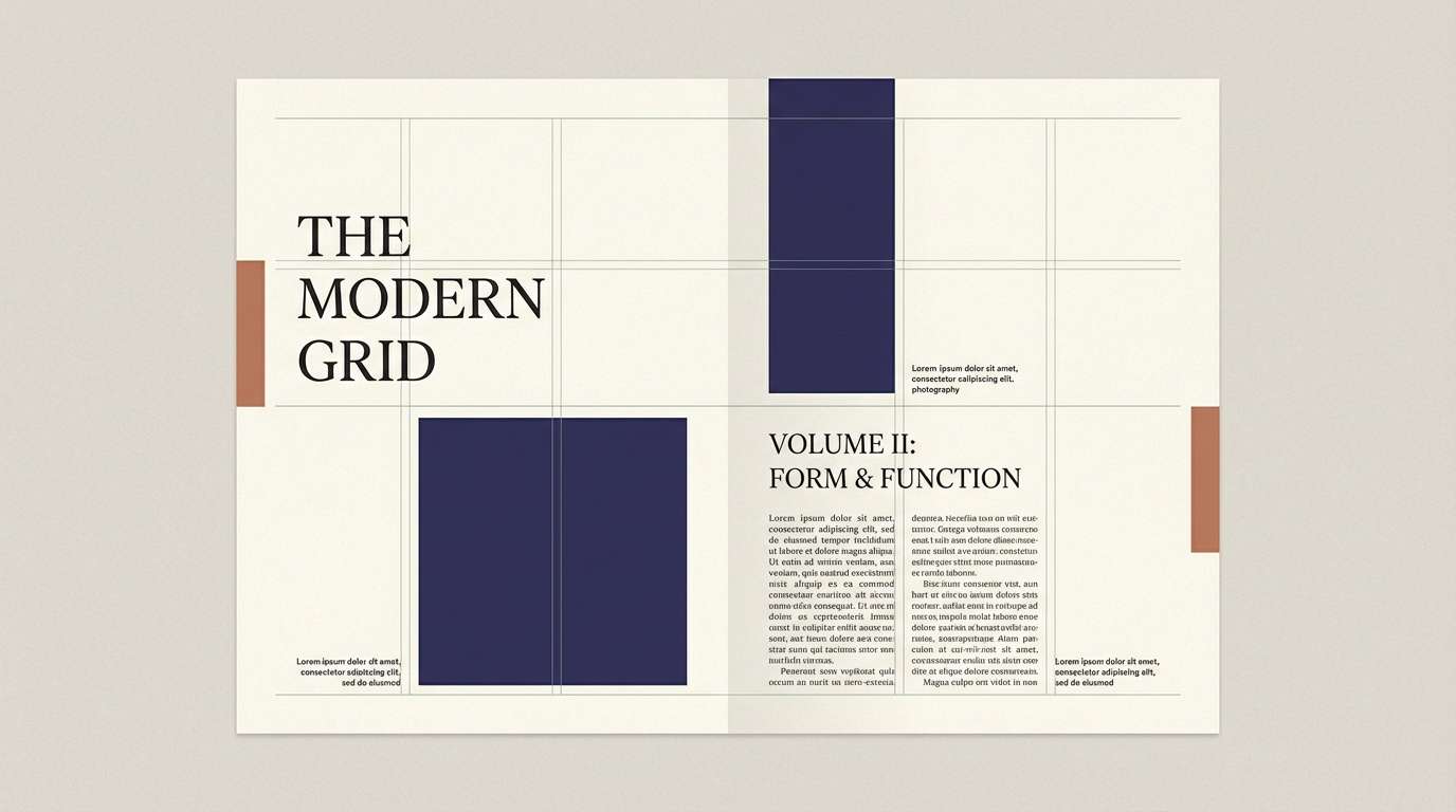
How to Use a Boho Color Palette in Real Designs
Start with one dominant neutral (often cream) and one hero tone (terracotta, clay, caramel). This creates a clear hierarchy for layouts like landing pages, menus, or packaging where readability matters.
Use darker browns or charcoal-leaning tones for text and small UI elements to avoid low contrast. In boho palettes, midtones can look beautiful but may reduce legibility when used for body copy.
Keep accents intentional: repeat one secondary color (like sage) in small dividers, icons, or badges. That repetition is what makes boho feel curated rather than random.
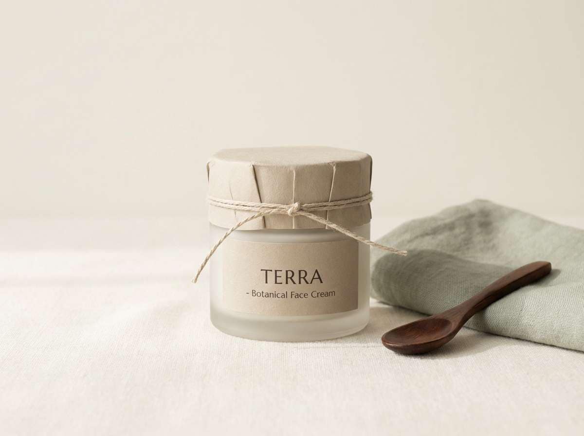
Create Boho Palette Visuals with AI
If you already have HEX codes, you can generate matching mockups (labels, posters, social templates, mood boards) by describing the scene and calling out the palette’s materials and lighting—linen, clay, paper, warm sun, soft shadows.
Media.io helps you turn these boho palette prompts into consistent visuals for branding and content, without needing complex design tools. Paste a prompt, keep your style consistent, and iterate quickly across formats.
Boho Color Palette FAQs
-
What is a boho color palette?
A boho color palette is a mix of earthy neutrals and sun-warmed tones (like terracotta, sand, cocoa, and muted greens) designed to feel relaxed, organic, and handcrafted. -
What are the best boho colors for a brand?
Start with a cream or linen base, pick one hero color like terracotta or caramel, then add a muted green (sage/olive) and a deep brown for text. This keeps the brand warm and readable. -
Is boho the same as earthy color palettes?
They overlap, but boho often includes softer, slightly dusty tones and curated contrasts (like indigo with clay) that feel inspired by textiles, travel, and artisan materials. -
How do I keep boho palettes from looking muddy?
Use one light neutral as the main background, limit the number of mid-browns used together, and reserve the darkest color for type and small details. Strong hierarchy prevents “all-midtones” blending. -
What’s a good boho palette for interiors?
Try warm cream + terracotta + a misty gray-green/sage + a grounded charcoal-brown. It reads cozy and modern, especially with natural textures like linen, wood, and plaster. -
Can I use boho colors for modern web design?
Yes. Keep layouts minimal, let off-white dominate, use terracotta as a controlled CTA color, and choose a deep green or indigo for headings to add structure without harsh contrast. -
How can I generate boho palette images with AI?
Describe the scene (packaging, poster, UI, mood board), specify materials (paper, canvas, clay, wood), lighting (soft diffused, golden hour), and include your palette direction. Then iterate by refining one detail at a time.


