A formal color palette is built to communicate credibility, hierarchy, and restraint. It’s the fastest way to make branding, UI, and print feel intentional—without relying on loud hues or trendy gradients.
Below are curated formal color palette ideas with HEX codes, plus AI image prompts you can use to generate matching visuals in seconds.
In this article
- Why Formal Palettes Work So Well
-
- midnight tuxedo
- ivory ledger
- executive navy
- charcoal silk
- oxford slate
- velvet merlot
- pearl pewter
- gallery greige
- crisp monochrome
- bronze briefcase
- forest formality
- sapphire letterhead
- mauve signature
- stoneboard
- ink linen
- cedar conference
- platinum accent
- burgundy protocol
- deep teal etiquette
- classic cafe
- What Colors Go Well with Formal?
- How to Use a Formal Color Palette in Real Designs
- Create Formal Palette Visuals with AI
Why Formal Palettes Work So Well
Formal color schemes succeed because they prioritize clarity: high contrast for readability, controlled saturation for focus, and predictable hierarchy for navigation. This makes them ideal for brands and interfaces where trust matters.
Most formal palettes lean on dark neutrals (navy, charcoal, espresso) paired with light bases (ivory, mist gray) to keep layouts spacious. A single metallic or muted accent then adds distinction without disrupting the tone.
They also translate well across mediums. What looks polished on a website typically prints cleanly on stationery, certificates, and signage—especially when you keep accents restrained and typography disciplined.
20+ Formal Color Palette Ideas (with HEX Codes)
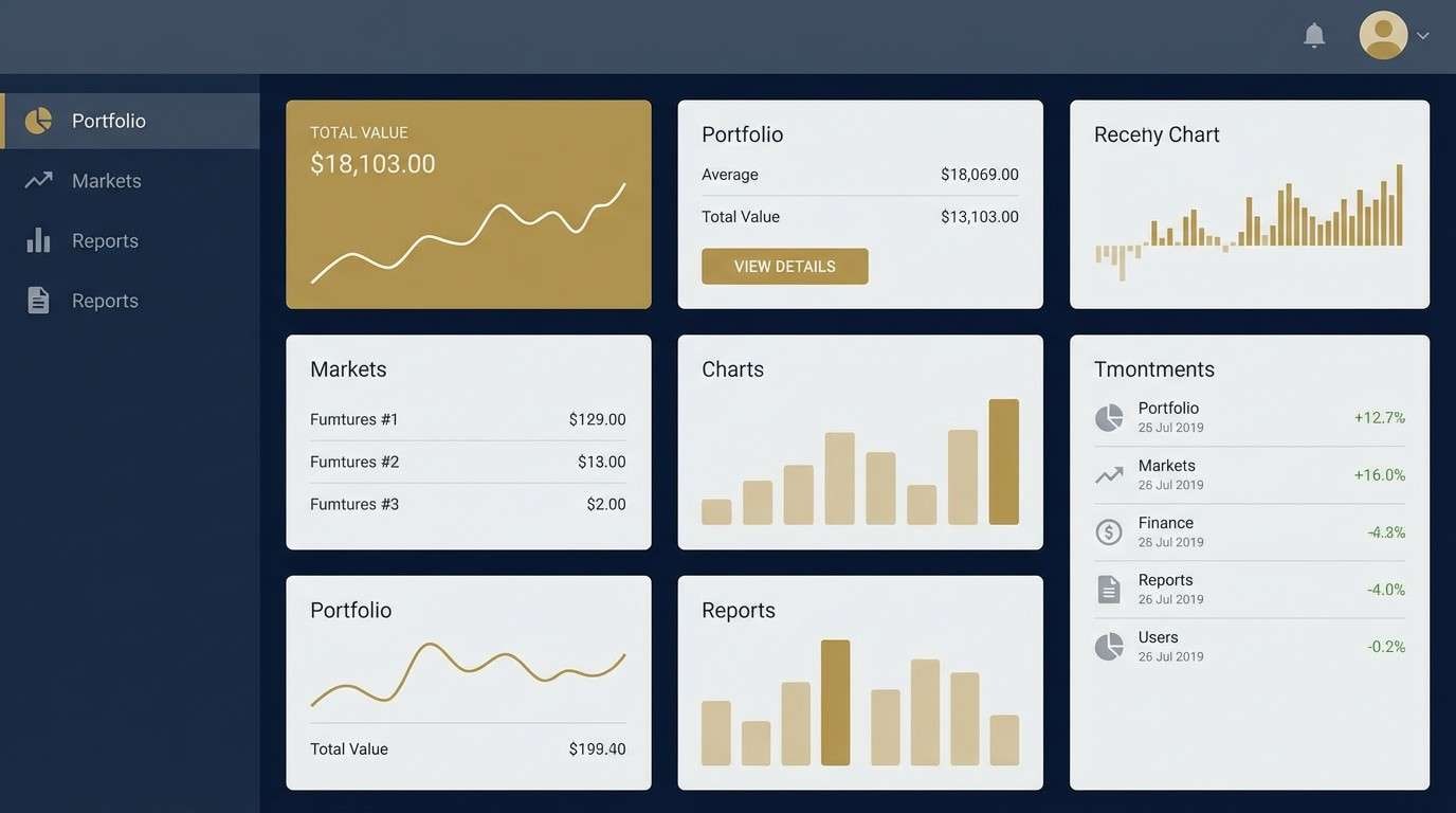
1) Midnight Tuxedo
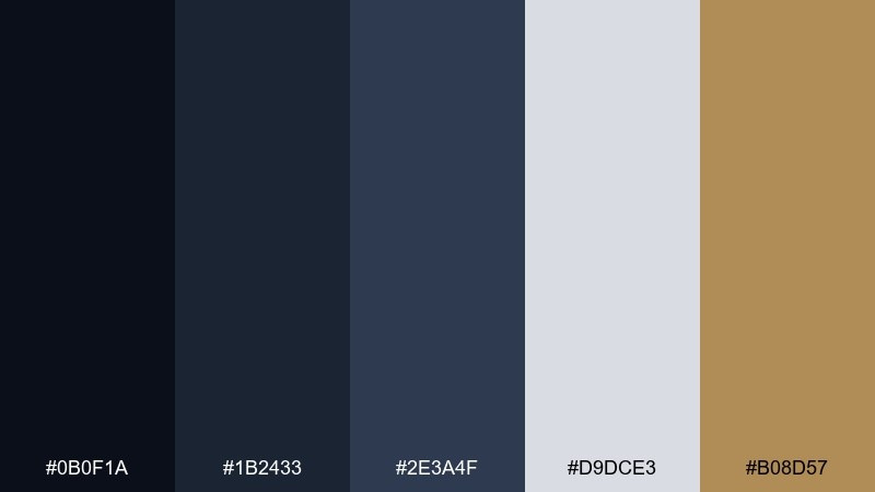
HEX: #0B0F1A #1B2433 #2E3A4F #D9DCE3 #B08D57
Mood: polished and authoritative
Best for: finance dashboard UI
Polished and authoritative like a midnight suit under gallery lighting, these tones feel crisp and controlled. Use the dark navy and ink shades for navigation and headers, then lift content with the pale gray. The warm brass accent adds premium contrast without turning flashy. For a formal color palette that reads executive, keep the gold to buttons and key metrics only.
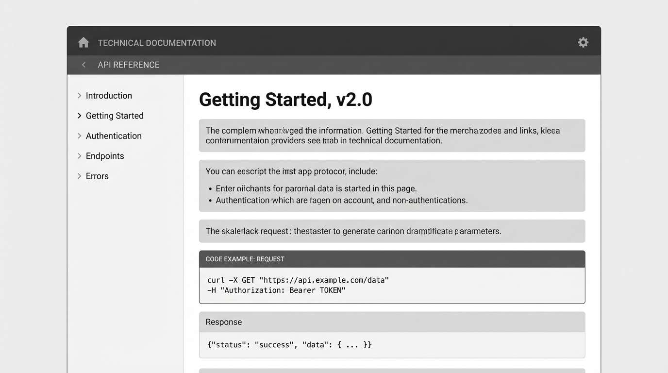
Image example of midnight tuxedo generated using media.io
Media.io is an online AI studio for creating and editing video, image, and audio in your browser.

2) Ivory Ledger
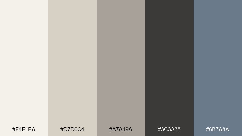
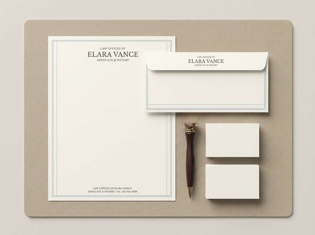
HEX: #F4F1EA #D7D0C4 #A7A19A #3C3A38 #6B7A8A
Mood: calm and trustworthy
Best for: legal stationery set
Calm and trustworthy like archival paper and sharpened graphite, this mix feels precise and traditional. Let ivory dominate the page for breathing room, with charcoal for typography and signatures. The muted steel blue works well for lines, seals, and subtle section dividers. For print, choose an uncoated stock to keep the tones soft and credible.
Image example of ivory ledger generated using media.io
3) Executive Navy
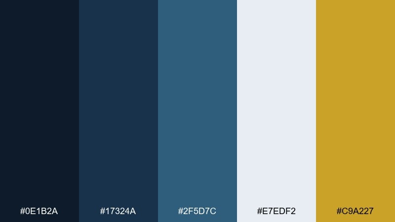
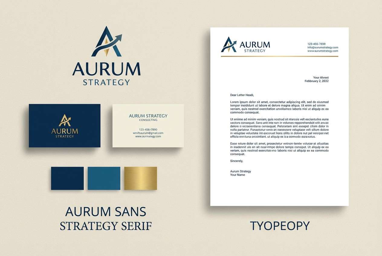
HEX: #0E1B2A #17324A #2F5D7C #E7EDF2 #C9A227
Mood: confident and modern
Best for: consulting firm branding
Confident and modern like a tailored blazer with a sharp lapel, the blues here feel steady and current. Use the darkest navy for your logo and primary headings, then layer the mid blues for supporting graphics. The pale blue-white keeps layouts airy, while the gold can highlight awards, CTAs, or trust badges. This set supports clean typography and a disciplined grid.
Image example of executive navy generated using media.io
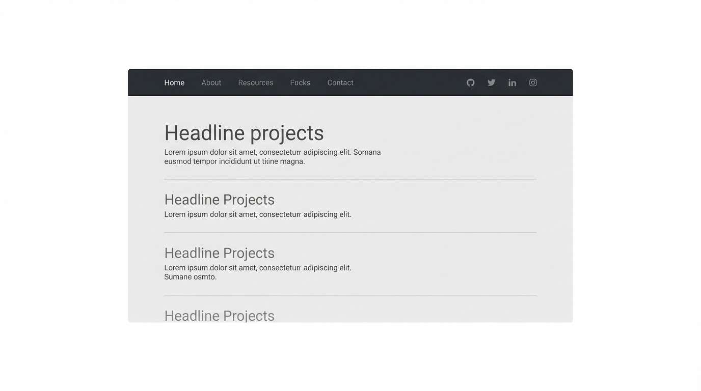
4) Charcoal Silk
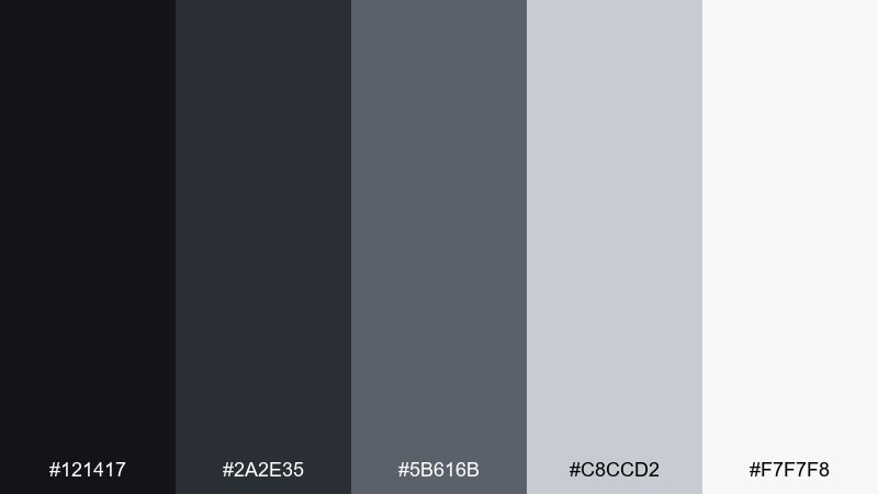
HEX: #121417 #2A2E35 #5B616B #C8CCD2 #F7F7F8
Mood: sleek and understated
Best for: portfolio website UI
Sleek and understated like charcoal silk in soft light, this monochrome range puts content first. Build contrast with the near-black for headers and the light gray-white for canvas space. The mid grays work best for borders, icons, and secondary text to maintain a premium feel. Keep imagery in full color or black-and-white and let the interface stay quiet.
Image example of charcoal silk generated using media.io
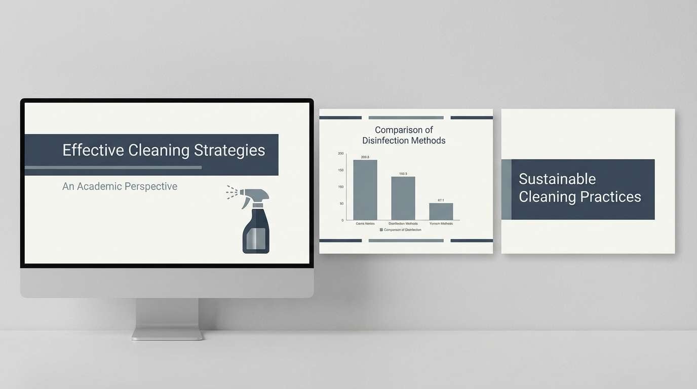
5) Oxford Slate
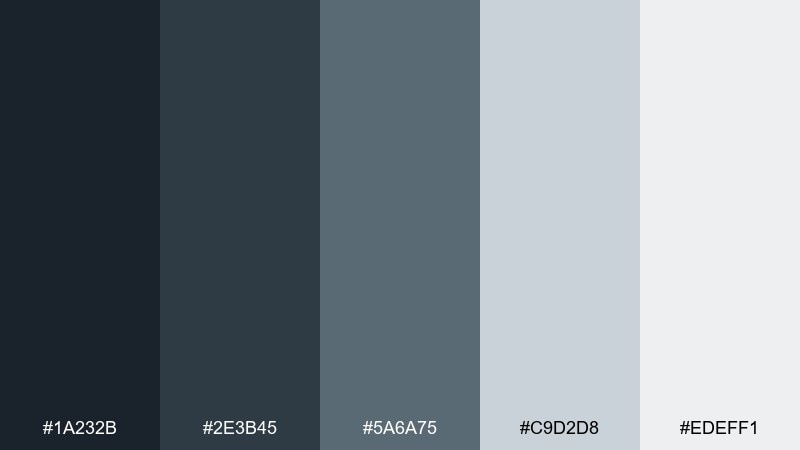
HEX: #1A232B #2E3B45 #5A6A75 #C9D2D8 #EDEFF1
Mood: academic and composed
Best for: conference slide deck
Academic and composed like slate boards and crisp lecture notes, these cool neutrals feel organized. Use the darkest tones for title slides and section breaks, then switch to light backgrounds for readability. The steel and slate shades are ideal for charts and callout boxes without visual noise. For long decks, keep contrast high and reserve the mid tones for data, not body text.
Image example of oxford slate generated using media.io
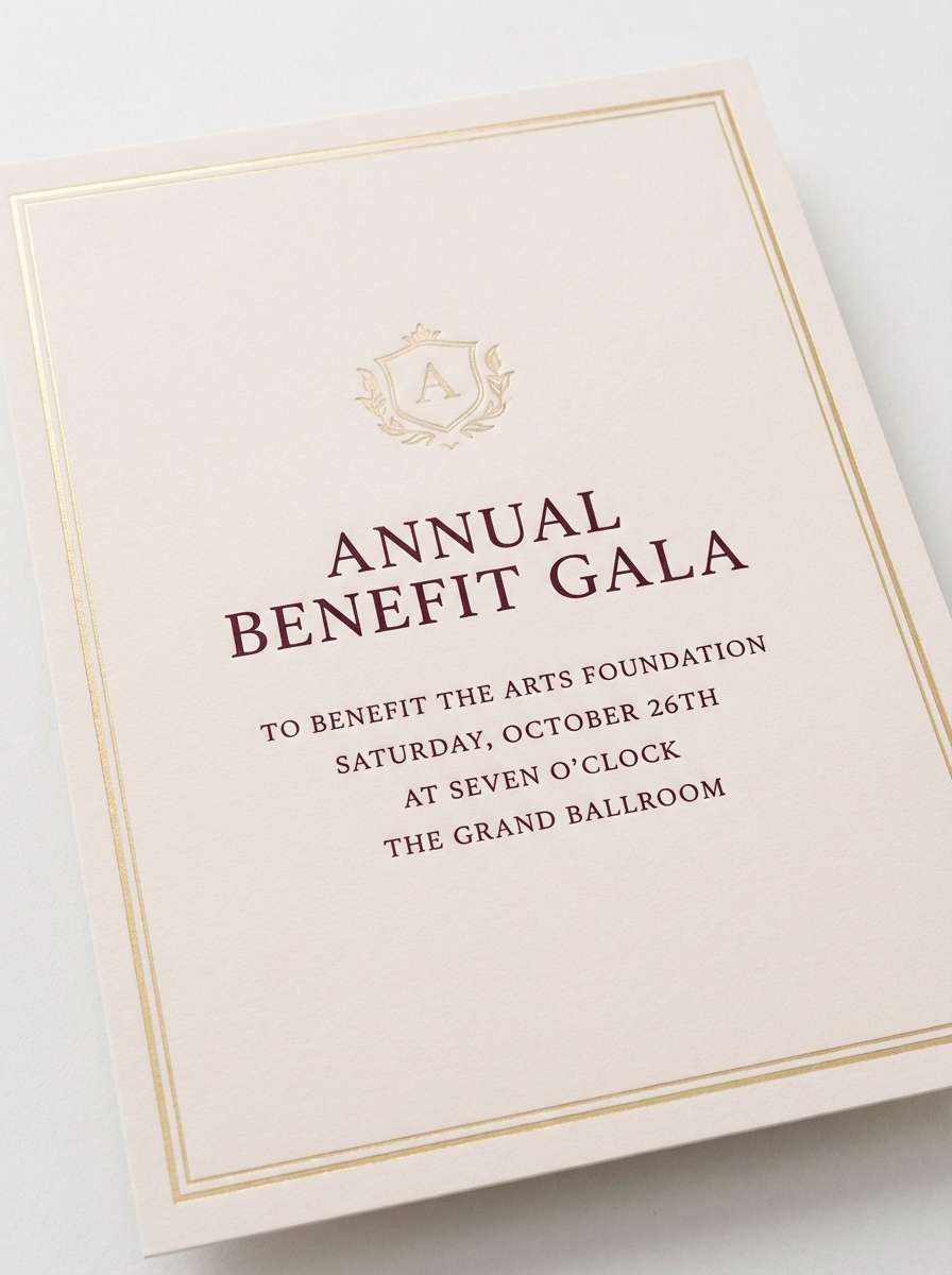
6) Velvet Merlot
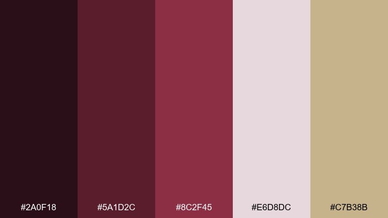
HEX: #2A0F18 #5A1D2C #8C2F45 #E6D8DC #C7B38B
Mood: luxurious and intimate
Best for: gala invitation design
Luxurious and intimate like velvet drapery and candlelit glassware, this palette leans rich without feeling loud. Pair the deep merlot with warm champagne for a refined headline and border treatment. Use the blush-tinted off-white for the main card background to keep typography readable. A subtle foil effect on the champagne accent elevates the whole layout for formal events.
Image example of velvet merlot generated using media.io
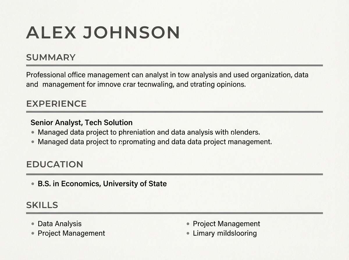
7) Pearl Pewter
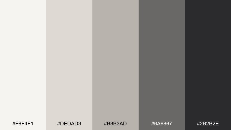
HEX: #F6F4F1 #DEDAD3 #B8B3AD #6A6867 #2B2B2E
Mood: clean and dignified
Best for: resume template
Clean and dignified like pearl paper with a pewter clip, these neutrals feel professional and timeless. Use the near-black for name and headings, then soften secondary sections with mid-gray. Light neutrals keep the page bright and ATS-friendly while still looking designed. For a crisp result, use one sans-serif family and rely on spacing, not color, for hierarchy.
Image example of pearl pewter generated using media.io
8) Gallery Greige
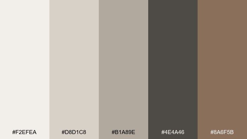
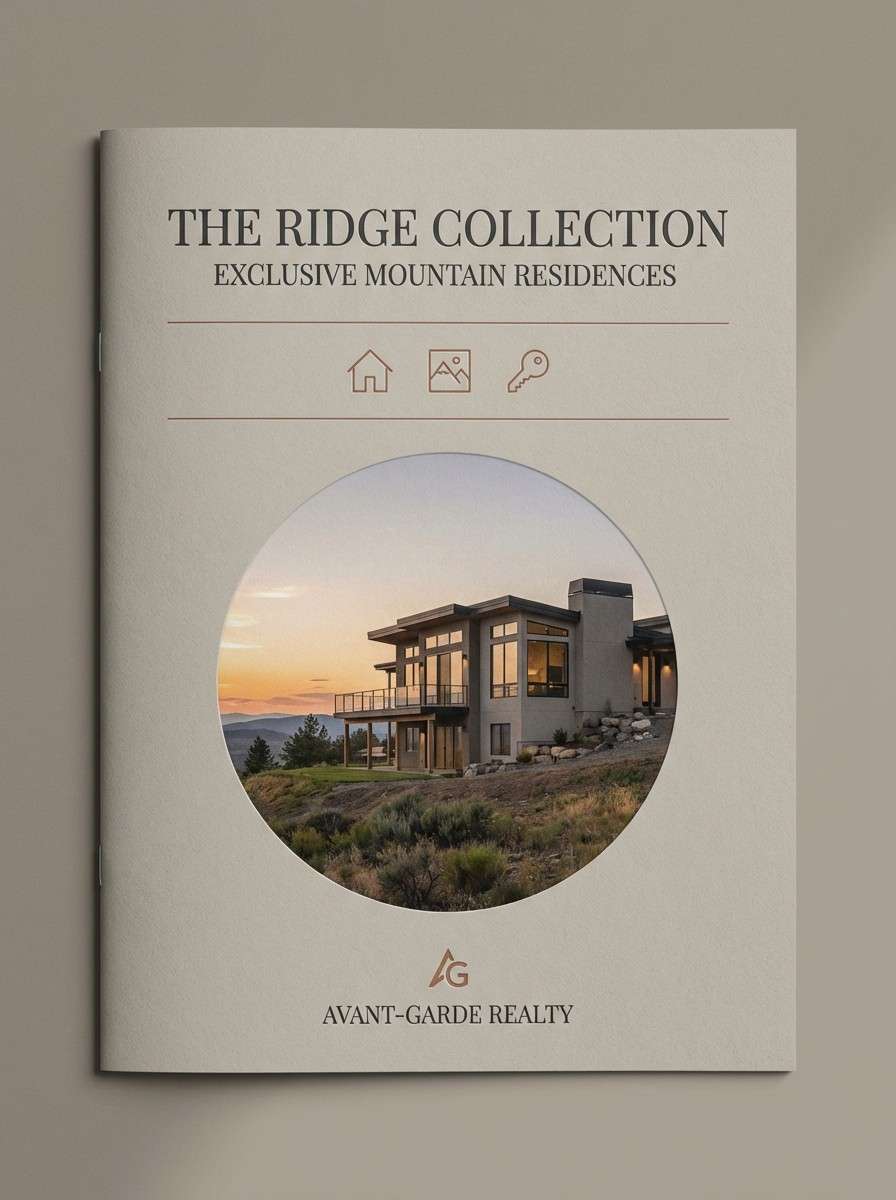
HEX: #F2EFEA #D8D1C8 #B1A89E #4E4A46 #8A6F5B
Mood: warm and curated
Best for: luxury real estate brochure
Warm and curated like a quiet gallery wall, these tones bring polish without feeling cold. The greige base keeps photography looking natural, while charcoal anchors headlines and captions. The clay-brown accent supports tasteful highlights like prices, neighborhood tags, and small icons. These formal color combinations work best with lots of whitespace and a restrained serif for headings.
Image example of gallery greige generated using media.io
9) Crisp Monochrome
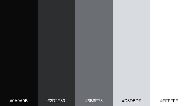
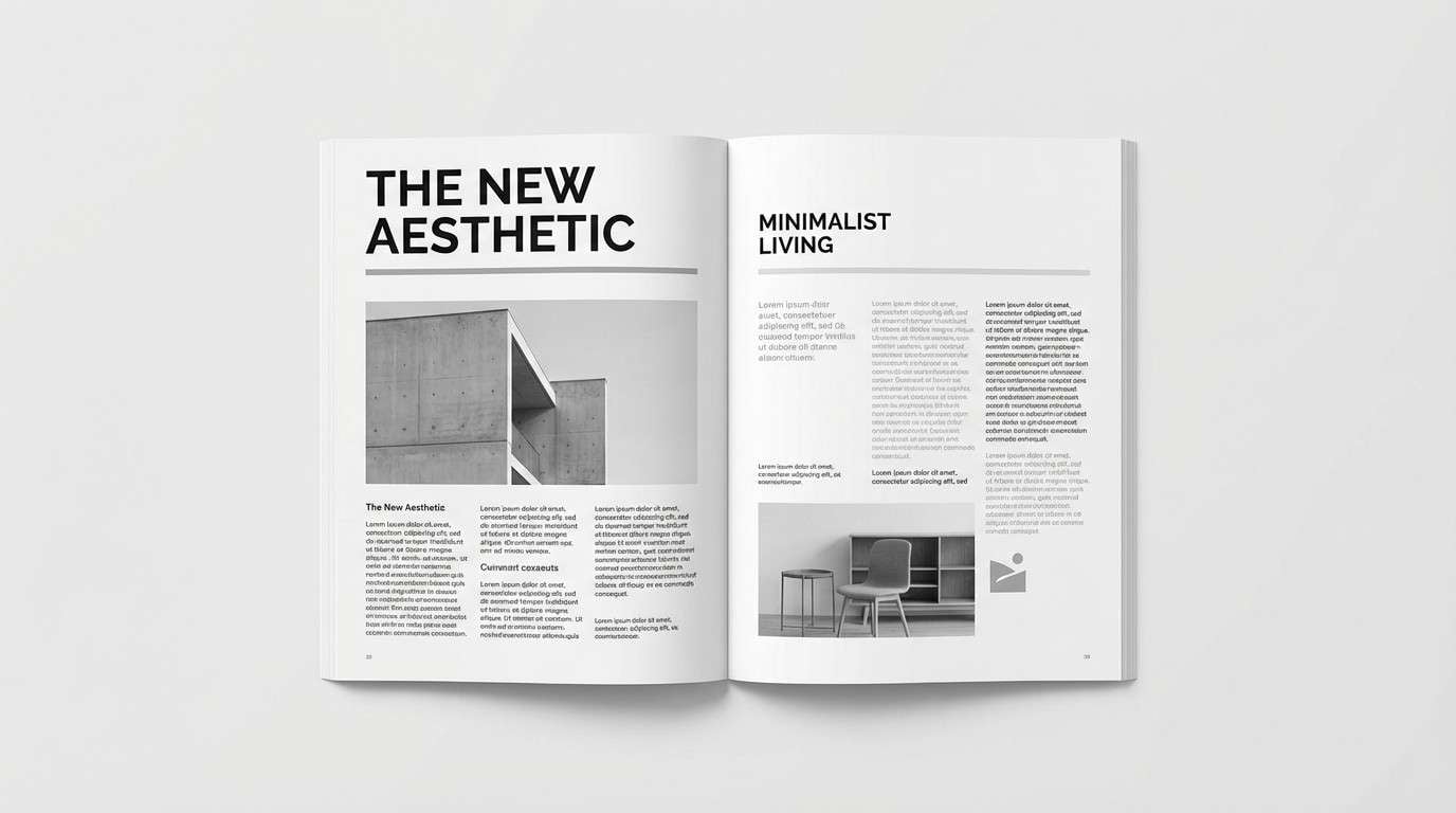
HEX: #0A0A0B #2D2E30 #6B6E73 #D8DBDF #FFFFFF
Mood: sharp and editorial
Best for: magazine layout
Sharp and editorial like fresh ink on bright paper, this set is built for typography and contrast. Use black and white to frame images, then deploy the grays for captions, rules, and pull quotes. It is especially strong when your photos are high-contrast or black-and-white. For formal color combination needs in publishing, keep body text near-black and avoid mid-gray at small sizes.
Image example of crisp monochrome generated using media.io
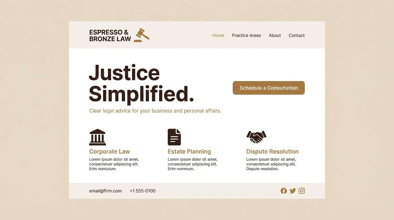
10) Bronze Briefcase
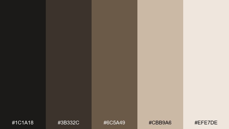
HEX: #1C1A18 #3B332C #6C5A49 #CBB9A6 #EFE7DE
Mood: grounded and premium
Best for: law firm website
Grounded and premium like worn leather and polished metal, these browns feel established and credible. Use the deep espresso for headers and navigation, with tan and sand for backgrounds and cards. The mid bronze supports icons and subtle separators without stealing attention from content. Add one strong accent style, like underlines or thin borders, and keep everything else minimal.
Image example of bronze briefcase generated using media.io
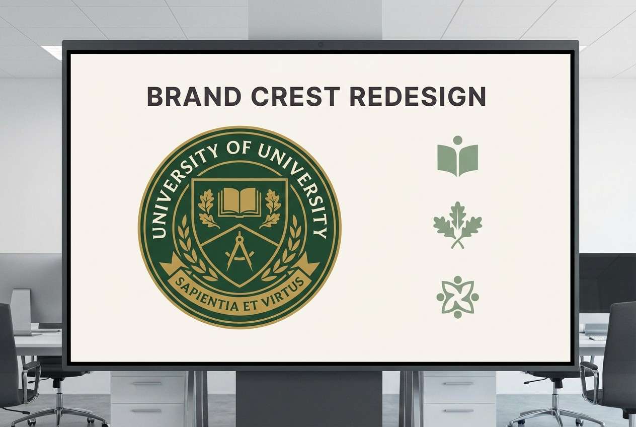
11) Forest Formality
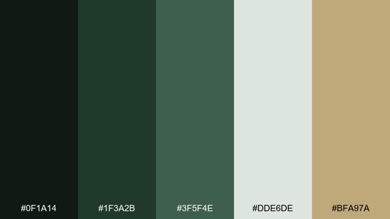
HEX: #0F1A14 #1F3A2B #3F5F4E #DDE6DE #BFA97A
Mood: heritage and steady
Best for: university crest redesign
Heritage and steady like evergreen hedges around stone buildings, this mix feels institutional in a good way. Use deep forest for the crest and primary marks, then support with muted greens for secondary graphics. The soft mint-gray background keeps layouts legible, while the antique gold adds tradition. As a formal color scheme, it pairs best with classic serif lettering and simple shapes.
Image example of forest formality generated using media.io
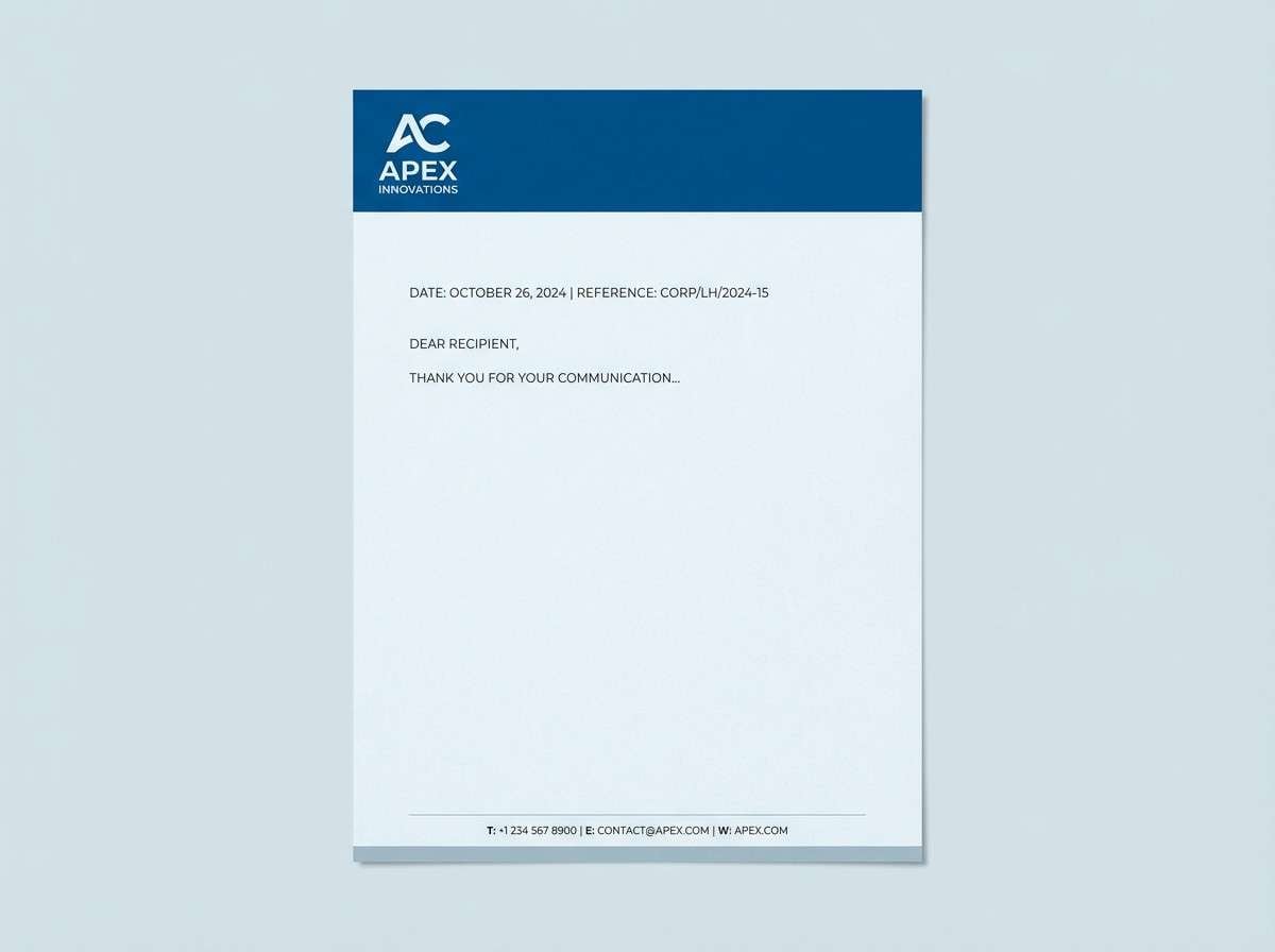
12) Sapphire Letterhead
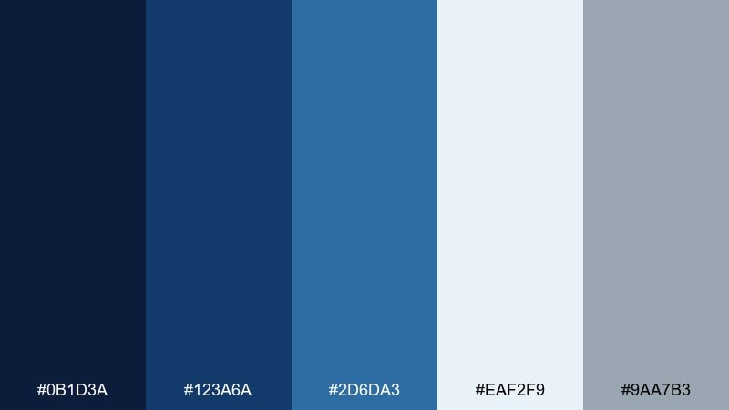
HEX: #0B1D3A #123A6A #2D6DA3 #EAF2F9 #9AA7B3
Mood: clear and reliable
Best for: corporate letterhead
Clear and reliable like a well-pressed shirt and a clean signature, these blues feel straightforward and professional. Use sapphire for the header band and logo, then keep most of the page in pale blue-white. The soft gray-blue works well for footer details and fine lines. For print, avoid heavy fills and let the blues appear as confident accents.
Image example of sapphire letterhead generated using media.io
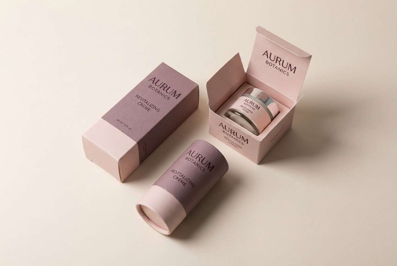
13) Mauve Signature
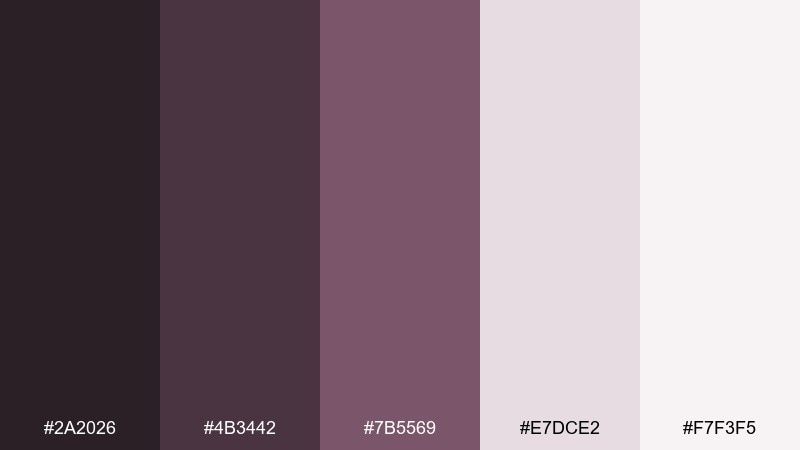
HEX: #2A2026 #4B3442 #7B5569 #E7DCE2 #F7F3F5
Mood: soft and poised
Best for: boutique brand packaging
Soft and poised like a handwritten note on blush stationery, these mauves feel refined and personal. Use the deep plum-brown for the wordmark and product names, while the dusty mauve supports patterns or side panels. Pale blush and near-white keep the packaging clean and upscale. A matte finish works beautifully here, with one small spot gloss detail for contrast.
Image example of mauve signature generated using media.io
14) Stoneboard
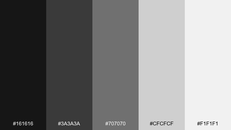
HEX: #161616 #3A3A3A #707070 #CFCFCF #F1F1F1
Mood: disciplined and neutral
Best for: internal product documentation
Disciplined and neutral like polished concrete and clean signage, this range keeps focus on structure. Use near-black for headings and code labels, then assign light grays to content panels and callouts. Mid-gray is best reserved for icons and secondary notes so nothing competes with the main text. For readability, ensure links or highlights use weight and underline rather than color alone.
Image example of stoneboard generated using media.io
15) Ink Linen
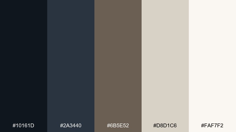
HEX: #10161D #2A3440 #6B5E52 #D8D1C6 #FAF7F2
Mood: classic and tactile
Best for: editorial blog theme
Classic and tactile like fountain pen ink on linen paper, these tones feel readable and warm. Keep the background in soft linen, then use ink for primary text and navigation for a bookish look. The muted walnut shade makes a great accent for tags, quotes, and small buttons. If you add imagery, choose warm photography so the neutrals stay cohesive.
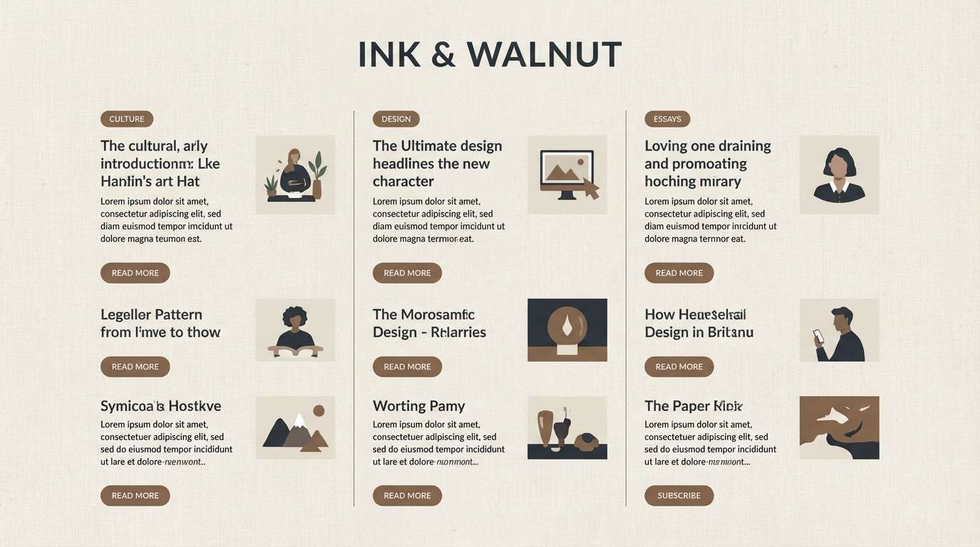
Image example of ink linen generated using media.io
16) Cedar Conference
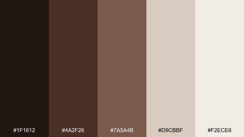
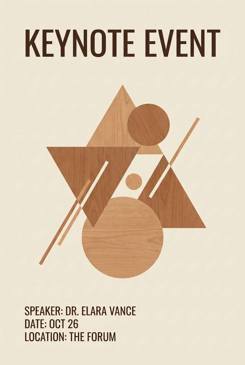
HEX: #1F1612 #4A2F26 #7A5A4B #D9CBBF #F2ECE6
Mood: warm and dependable
Best for: event poster for keynote
Warm and dependable like cedar wood and espresso crema, these browns add gravitas without feeling heavy. Use the darkest brown for the keynote title, then bring in the lighter neutrals for the background and speaker details. The mid cedar tones work nicely for geometric shapes or subtle texture blocks. For formal color combinations on posters, keep the layout typographic and avoid busy imagery.
Image example of cedar conference generated using media.io
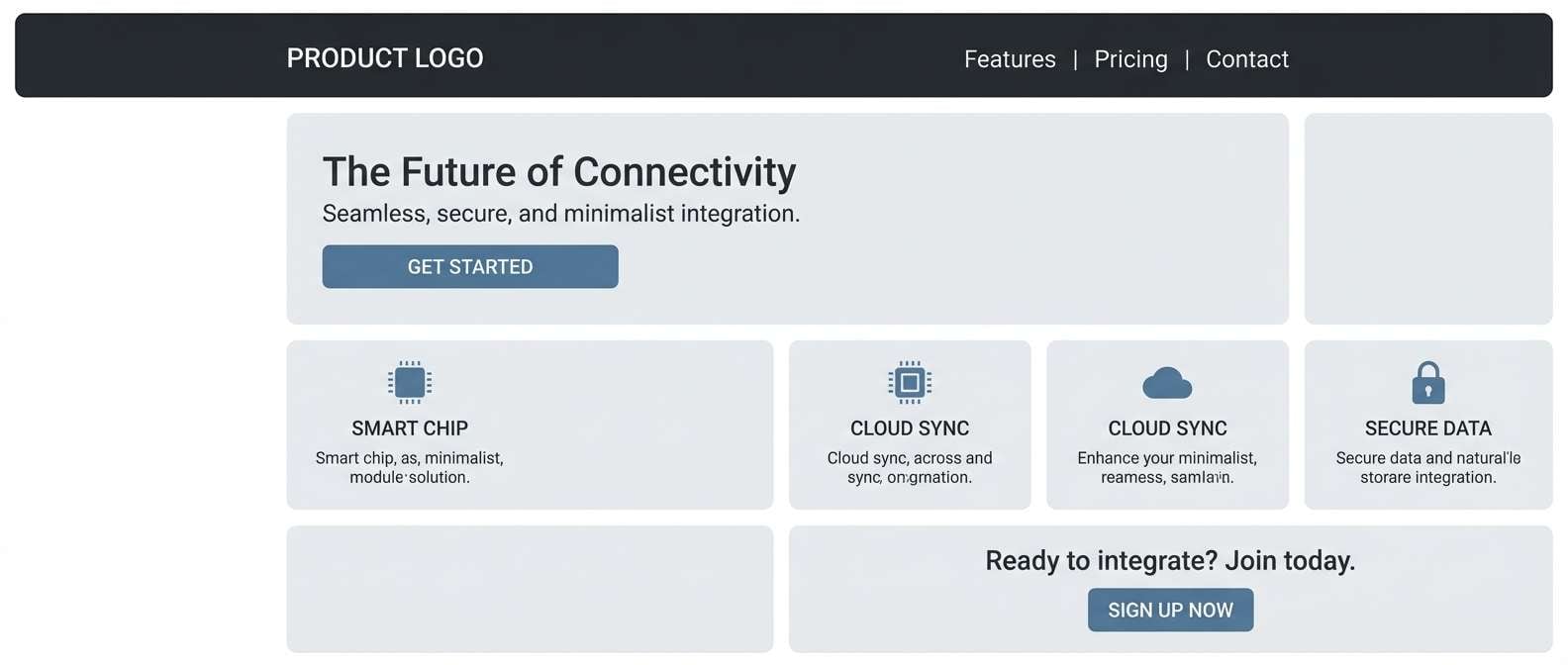
17) Platinum Accent
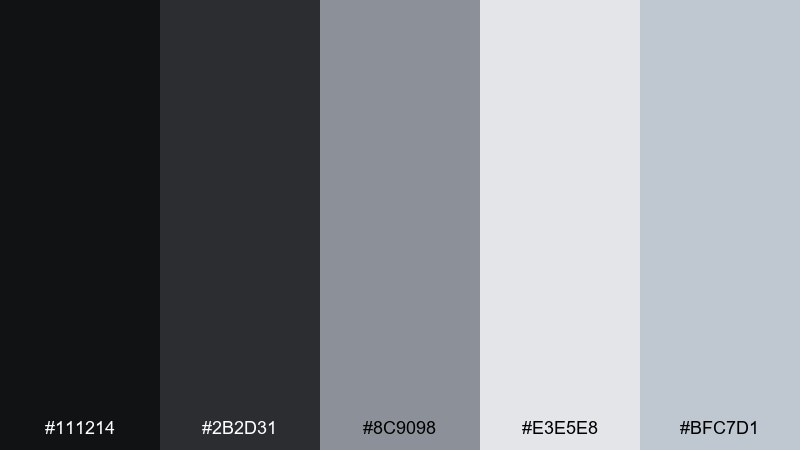
HEX: #111214 #2B2D31 #8C9098 #E3E5E8 #BFC7D1
Mood: cool and high-end
Best for: tech product landing page
Cool and high-end like brushed metal under soft studio lights, these grays feel premium and precise. Use near-black for the hero headline and navigation, with platinum panels to separate sections. The blue-gray accent supports CTA buttons and feature badges without introducing loud color. For impact, pair it with crisp product renders and generous spacing.
Image example of platinum accent generated using media.io
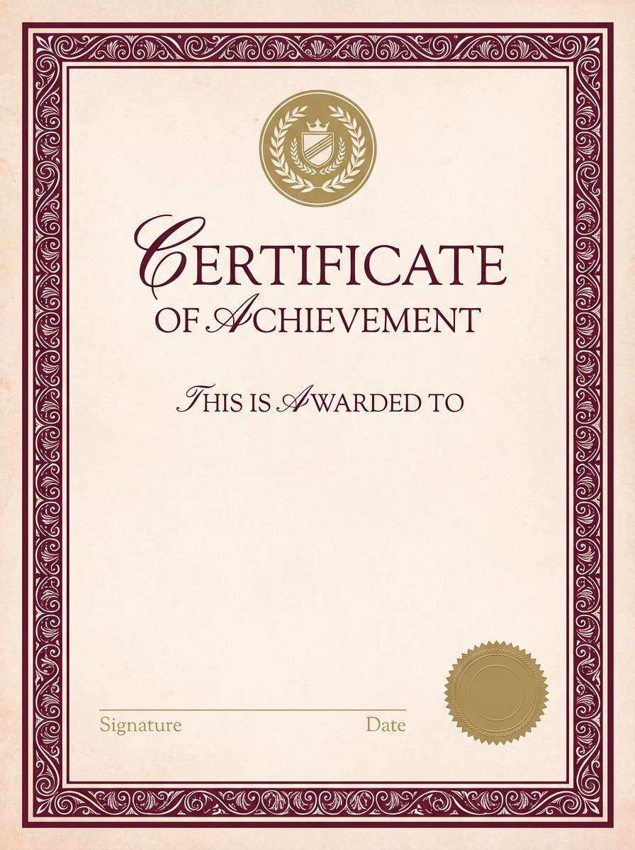
18) Burgundy Protocol
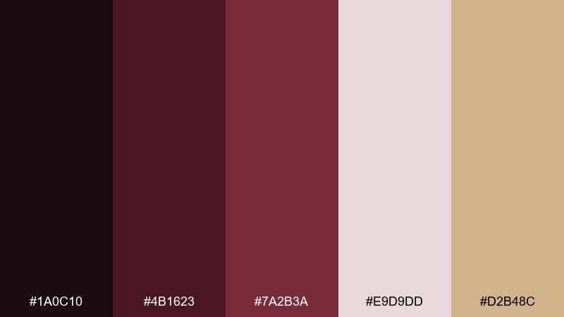
HEX: #1A0C10 #4B1623 #7A2B3A #E9D9DD #D2B48C
Mood: ceremonial and refined
Best for: award certificate design
Ceremonial and refined like a wax seal on thick paper, this burgundy set feels official. Use the deep wine for borders and headings, then keep the center area light for legibility. The muted gold works best as a thin frame, emblem, or signature line highlight. When you want a formal color palette for certificates, stick to one decorative element and let typography do the rest.
Image example of burgundy protocol generated using media.io
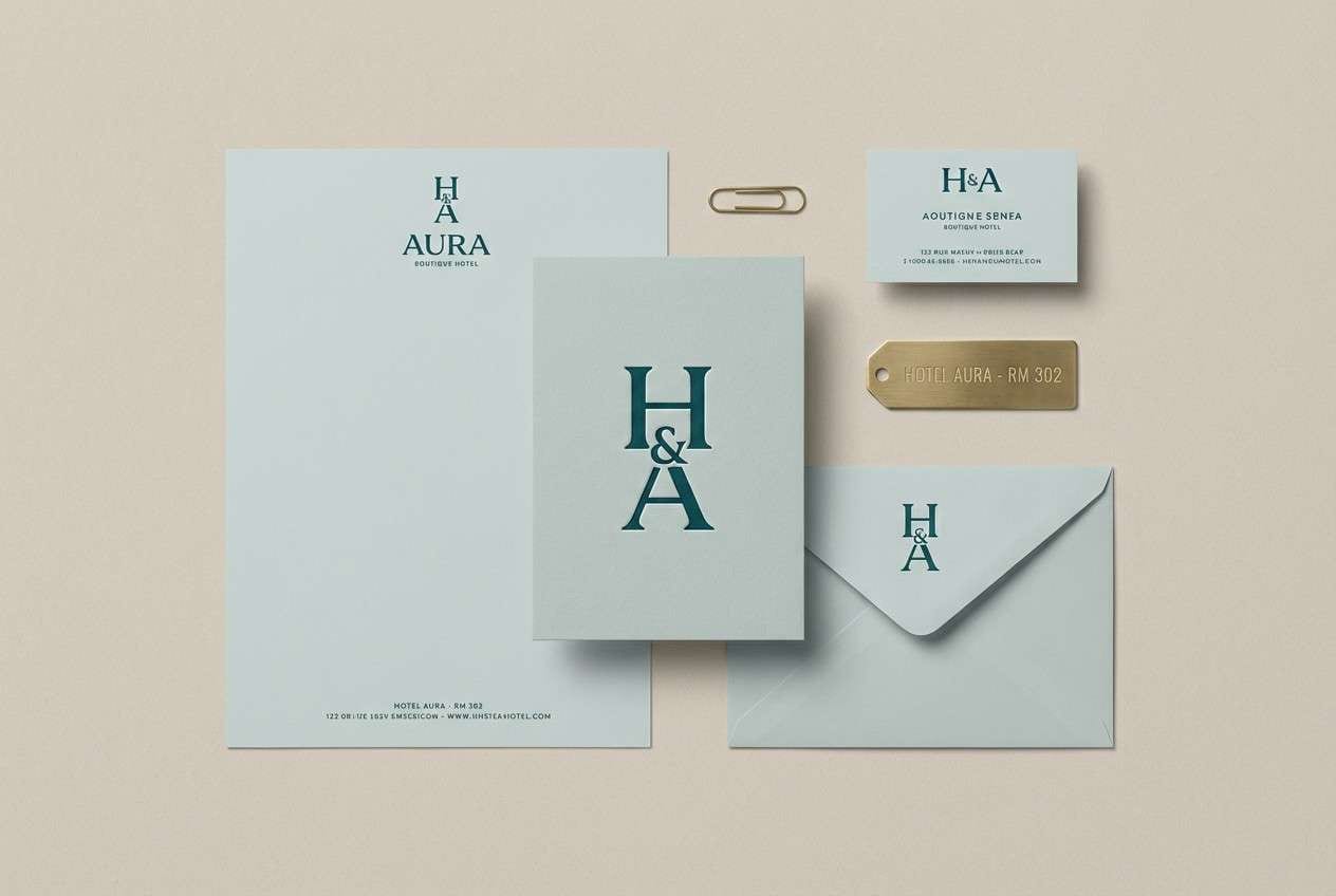
19) Deep Teal Etiquette
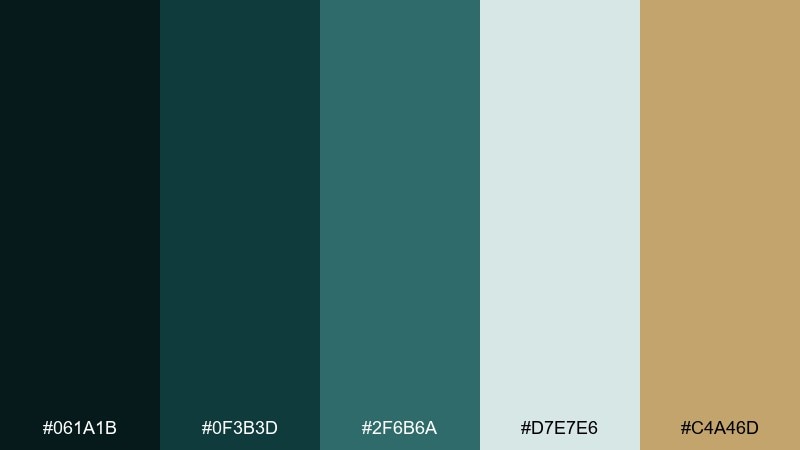
HEX: #061A1B #0F3B3D #2F6B6A #D7E7E6 #C4A46D
Mood: confident and distinctive
Best for: hotel brand identity
Confident and distinctive like deep teal glass and warm brass fixtures, these tones feel upscale and memorable. Use the darkest teal for the monogram, with mid teal for patterns or wayfinding elements. The pale aqua-gray supports menus and stationery without looking sterile. For formal color combination options in hospitality, keep the brass accent small and repeat it consistently across touchpoints.
Image example of deep teal etiquette generated using media.io
20) Classic Cafe
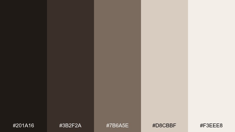
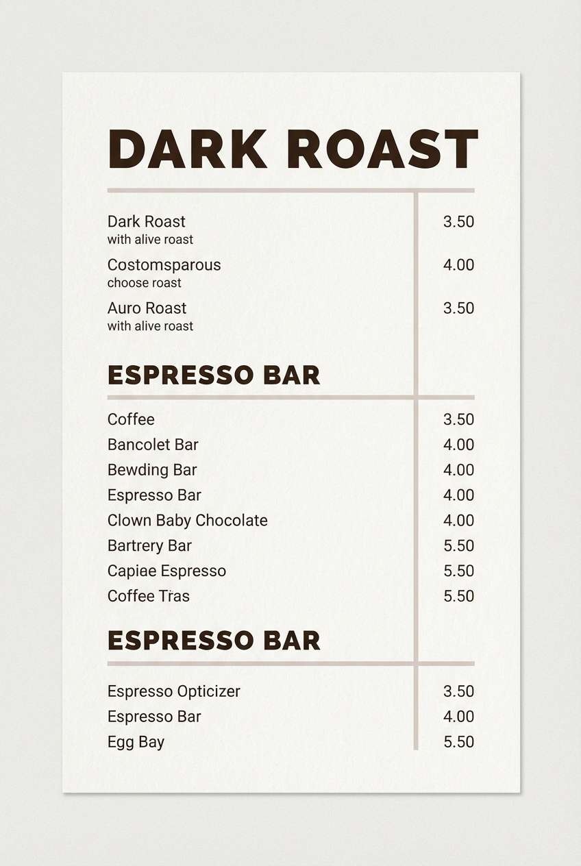
HEX: #201A16 #3B2F2A #7B6A5E #D8CBBF #F3EEE8
Mood: inviting and traditional
Best for: coffee shop menu
Inviting and traditional like café woodwork and crema foam, these browns feel grounded and readable. Use the darkest roast tone for menu categories, then let the cream background carry most of the layout. Mid taupe is perfect for prices and dividers, keeping the design calm even with lots of items. For a tidy finish, set one accent weight for specials instead of adding new colors.
Image example of classic cafe generated using media.io
What Colors Go Well with Formal?
Formal palettes pair best with neutrals and low-saturation hues: navy with ivory, charcoal with cool grays, espresso with sand, and forest green with soft mint-gray. These combinations keep visual noise low while preserving strong legibility.
If you need an accent, choose one “premium” highlight such as muted gold, brass, pewter, or a restrained blue-gray. Small, consistent use of accent color reads more formal than multiple competing highlights.
For typography-heavy designs, black/white with a single gray scale is the safest foundation. You can then add a signature accent for CTAs, seals, or key metrics without breaking the formal tone.
How to Use a Formal Color Palette in Real Designs
Start with a strict hierarchy: one dark for headings/navigation, one light base for backgrounds, and one mid-tone for dividers and secondary text. This simple structure keeps layouts disciplined and easy to scan.
Limit accents to the moments that matter—primary buttons, badges, key numbers, or a thin frame line on print. In formal branding, restraint is the design language that signals confidence.
Finally, test your palette in context: long-form text, charts, and real photography. If contrast drops in small text or on paper stock, adjust the mid-tones before adding new colors.
Create Formal Palette Visuals with AI
Want to see how a formal color scheme looks on a dashboard, letterhead, certificate, or packaging? Generate quick mockups by reusing the prompts above and swapping in your brand name or layout type.
Media.io makes it easy to turn palette ideas into consistent visuals you can present to stakeholders, iterate on, and export for real workflows. Keep your prompt minimal, specify “flat design” or “print-ready,” and include your aspect ratio once.
When you find a direction you like, generate a few variations (different layouts, lighting, or paper textures) while keeping the same HEX family. That’s a fast way to build a formal system that feels cohesive.
Formal Color Palette FAQs
-
What makes a color palette look “formal”?
Formal palettes typically use dark neutrals (navy, charcoal, espresso) with light bases (ivory, pale gray) and one restrained accent. The overall effect is controlled contrast, low saturation, and clear hierarchy. -
Are formal color schemes only black, white, and gray?
No. Many formal color combinations include deep blues, forest greens, burgundy, and muted metallic accents. The key is keeping saturation low and using accents sparingly. -
What is the best formal color palette for corporate branding?
Deep navy + light neutral + a small gold or blue-gray accent is a classic choice. Palettes like Executive Navy or Sapphire Letterhead are reliable for corporate identity, web, and print. -
How many colors should a formal brand palette include?
Most formal branding systems work best with 3–5 colors: a primary dark, a light background, one or two supporting neutrals, and one accent for highlights and CTAs. -
Can I use gold accents without making the design look flashy?
Yes—keep gold as a minor accent (thin borders, icons, badges, or primary buttons) and avoid large fills. Muted gold/brass tones tend to read more premium and less decorative. -
What’s the safest formal palette for readability in UI?
Charcoal-on-light (or near-black on off-white) with mid-gray for dividers is the safest. Palettes like Charcoal Silk, Stoneboard, or Crisp Monochrome are built for typography and clarity. -
How do I generate formal palette mockups quickly?
Use Media.io’s text-to-image tool with a simple prompt describing your layout (dashboard, letterhead, certificate) and specify your palette vibe (navy, charcoal, ivory, gold accent) plus one aspect ratio.
Next: Food Color Palette
