

Food visuals don’t start and end with photography—color does a huge amount of appetite-building work on its own. The right food color palette can make menus easier to scan, packaging feel more premium, and social posts look instantly “delicious.”
Below are 20 curated, appetizing color palettes (with HEX codes), plus practical tips for pairing warm neutrals, fresh greens, and bold accents across real design layouts.
In this article
Why Food Palettes Work So Well
Food branding relies on fast emotional cues: warmth suggests comfort, bright accents suggest freshness, and deep tones imply richness or premium quality. A well-built palette triggers those cues before someone reads a single word.
Good food color combinations also improve usability. High-contrast text colors help menu scanning, clear accent colors guide attention to best sellers, and consistent neutrals keep layouts from feeling chaotic.
Most importantly, food palettes are versatile: the same set can translate across packaging, menu boards, app UI, and social templates—so your brand stays recognizable everywhere.
20+ Food Color Palette Ideas (with HEX Codes)
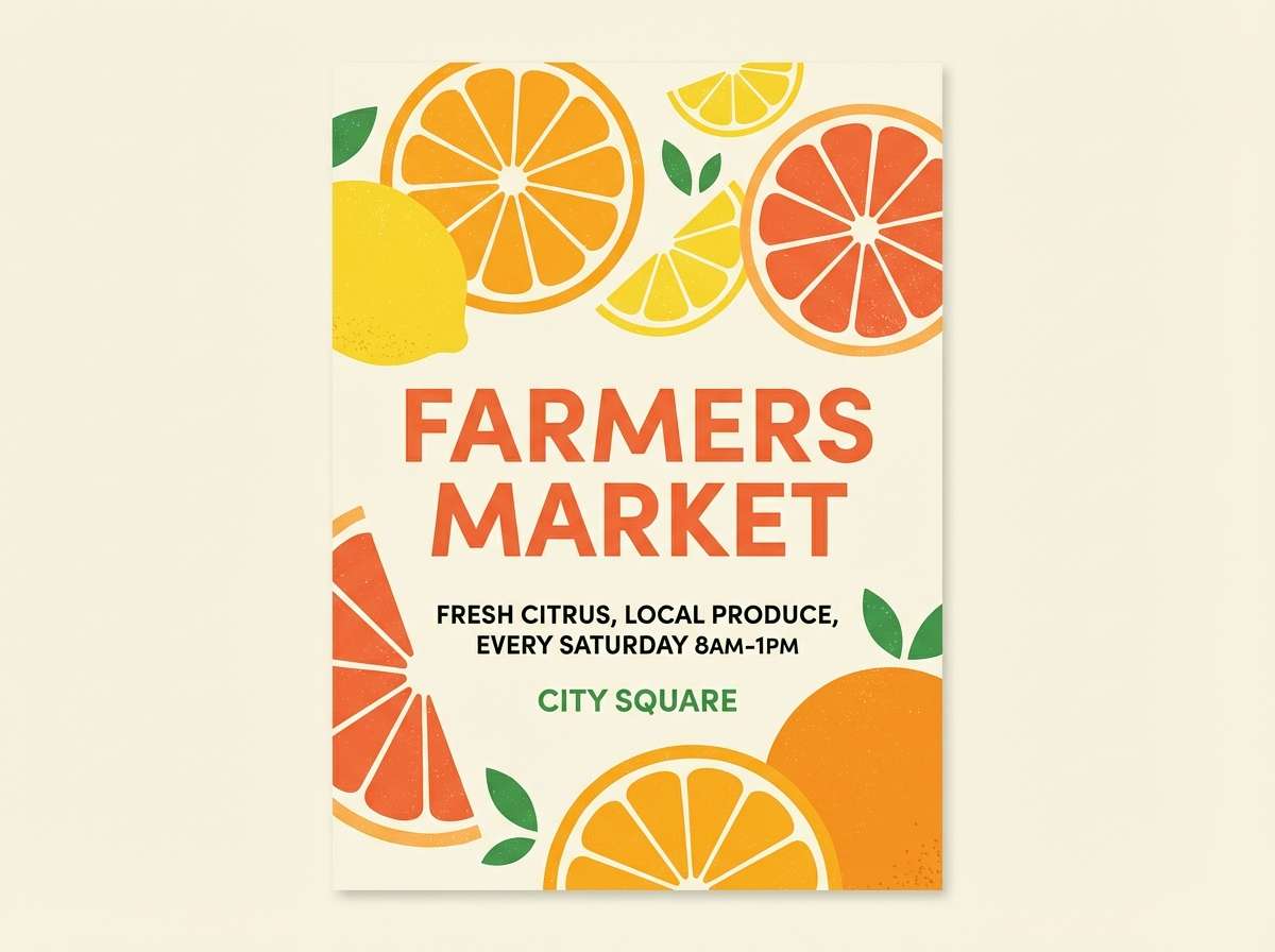
1) Citrus Market
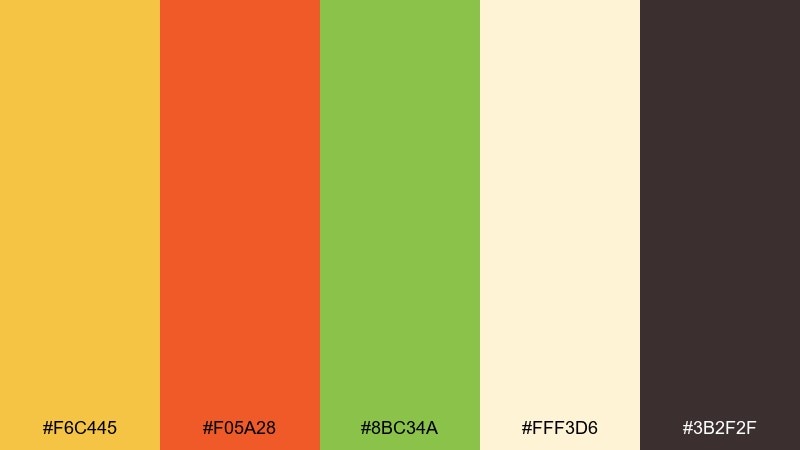
HEX: #F6C445 #F05A28 #8BC34A #FFF3D6 #3B2F2F
Mood: zesty, sunny, welcoming
Best for: farmers market posters and cafe menu headers
Zesty and sunlit, this mix feels like citrus slices on a wooden stall and a breeze of fresh herbs. It shines on headlines, price tags, and punchy callouts where clarity matters. Pair the bright yellow and orange with the cream base to keep layouts breathable, then ground it with the cocoa brown for text. Usage tip: reserve the lime green for small icons or highlights so it stays crisp rather than loud.
Image example of citrus market generated using media.io
Media.io is an online AI studio for creating and editing video, image, and audio in your browser.

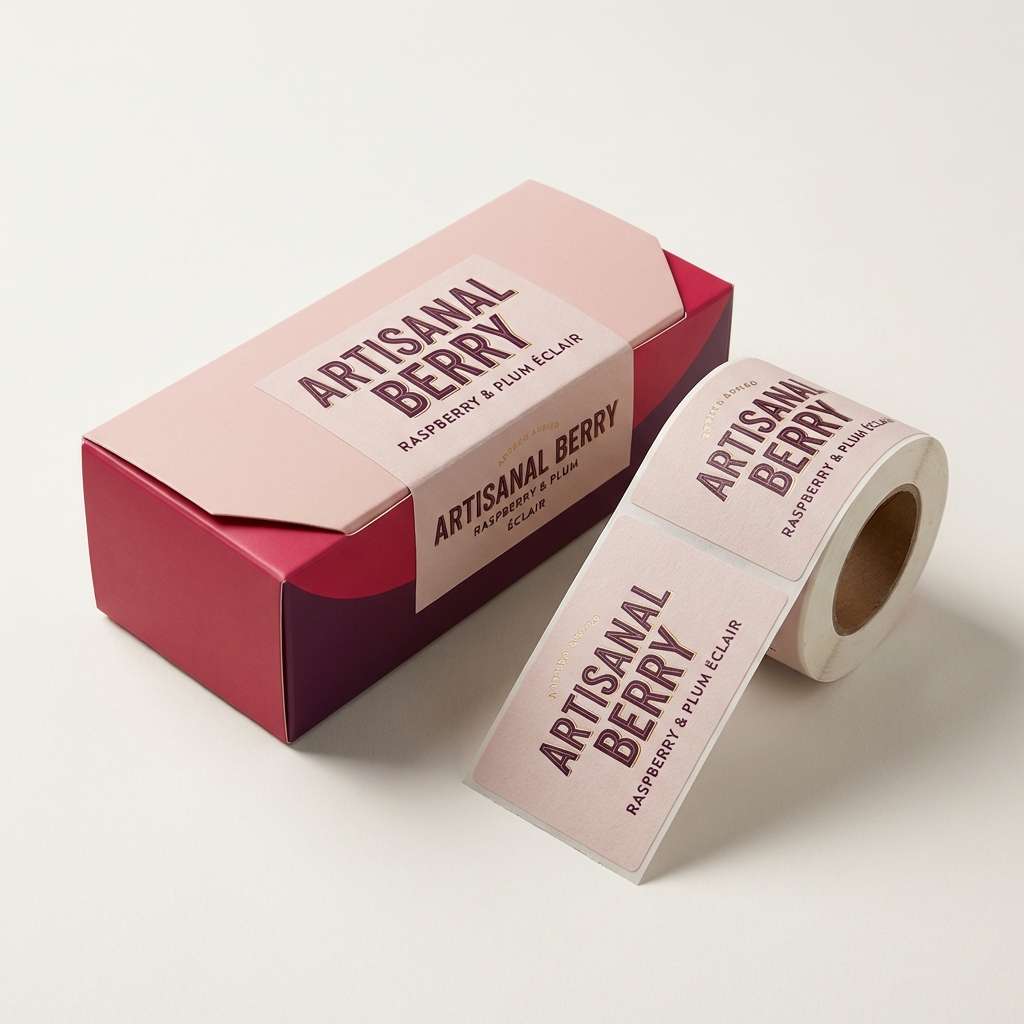
2) Berry Parfait
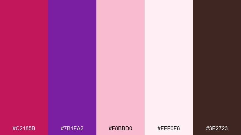
HEX: #C2185B #7B1FA2 #F8BBD0 #FFF0F6 #3E2723
Mood: playful, fruity, romantic
Best for: dessert packaging and instagram promos
Playful and creamy, it evokes berry compote swirled into yogurt with a dark chocolate finish. This food color palette works beautifully for sweet treats, boutique labels, and limited-edition drops where you want a premium feel without going heavy. Let blush and off-white carry the background, then use raspberry and plum for brand marks and buttons. Usage tip: keep the chocolate brown for small type and borders to avoid dulling the lively fruit tones.
Image example of berry parfait generated using media.io
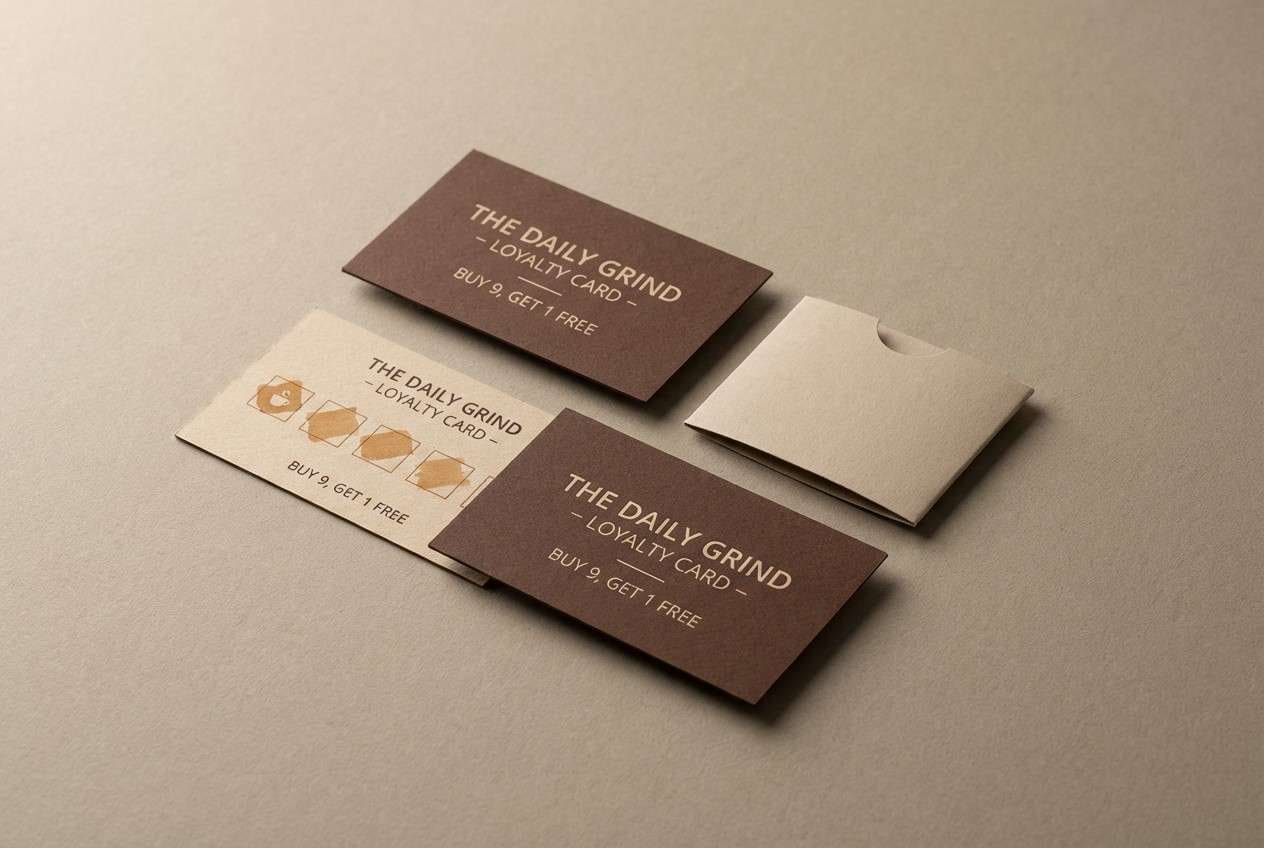
3) Cocoa Roast
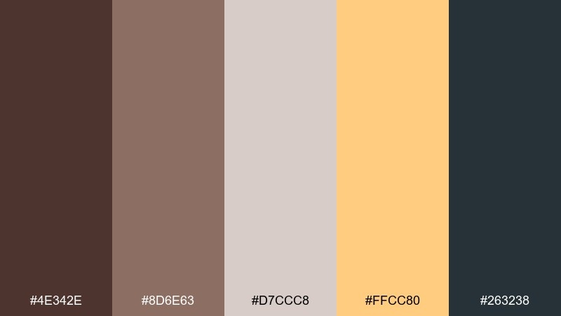
HEX: #4E342E #8D6E63 #D7CCC8 #FFCC80 #263238
Mood: cozy, grounded, artisan
Best for: coffee shop branding and loyalty cards
Cozy and grounded, it recalls roasted beans, warm mugs, and a hint of caramel foam. These tones suit artisan logos, stamp marks, and tactile print pieces like loyalty cards. Pair the cocoa and charcoal for strong typography, then soften with the latte and oat neutrals in backgrounds. Usage tip: use the light caramel as a spotlight color for badges or limited offers.
Image example of cocoa roast generated using media.io
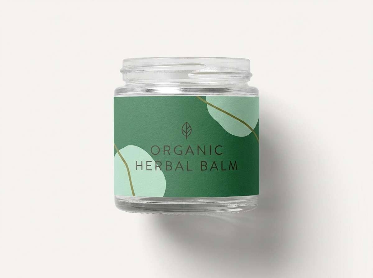
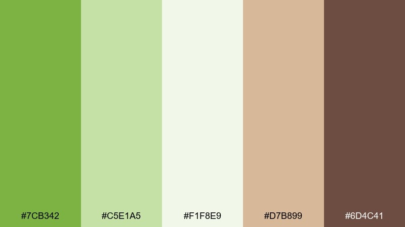
4) Herb Garden
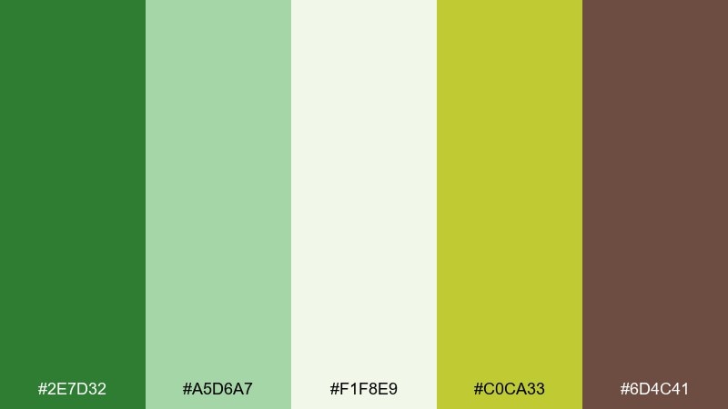
HEX: #2E7D32 #A5D6A7 #F1F8E9 #C0CA33 #6D4C41
Mood: fresh, wholesome, botanical
Best for: organic product labels and farmers co-op branding
Fresh and leafy, it brings to mind basil, citrus zest, and sunlit kitchen counters. It fits organic labels, sustainable branding, and wellness content where you want clean energy without neon. Balance the darker green for titles with the pale mint and off-white for airy spacing, and use the olive-yellow sparingly as a natural pop. Usage tip: add the warm brown only for small seals or ingredient notes to keep the overall look light.
Image example of herb garden generated using media.io
5) Caramel Drizzle
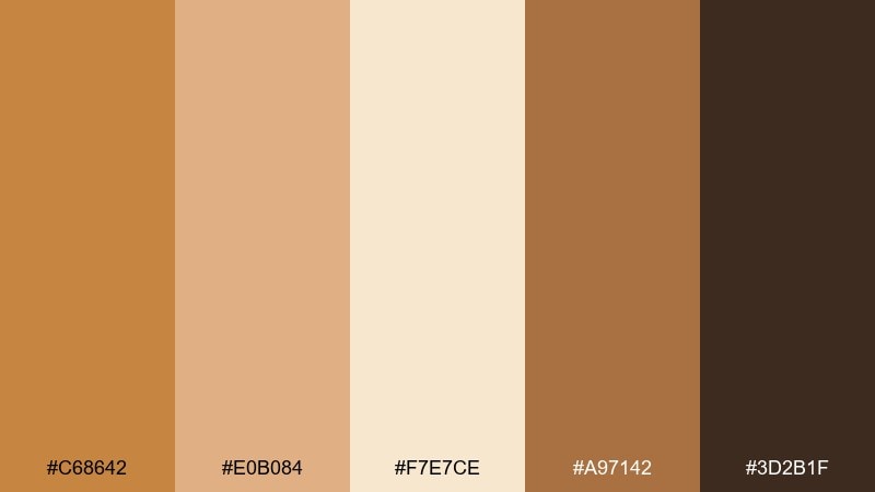
HEX: #C68642 #E0B084 #F7E7CE #A97142 #3D2B1F
Mood: warm, indulgent, elegant
Best for: bakery branding and premium gift tags
Warm and indulgent, it feels like caramel ribboning over pastry with toasted sugar edges. It is ideal for premium bakery marks, gift tags, and seasonal promotions that lean cozy. Use the creamy beige as the main canvas, then layer the caramel and tan for depth in patterns and borders. Usage tip: keep the darkest brown for tiny type or thin lines so the design stays airy and luxurious.
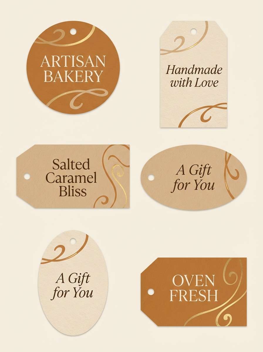
Image example of caramel drizzle generated using media.io
6) Ocean Sushi
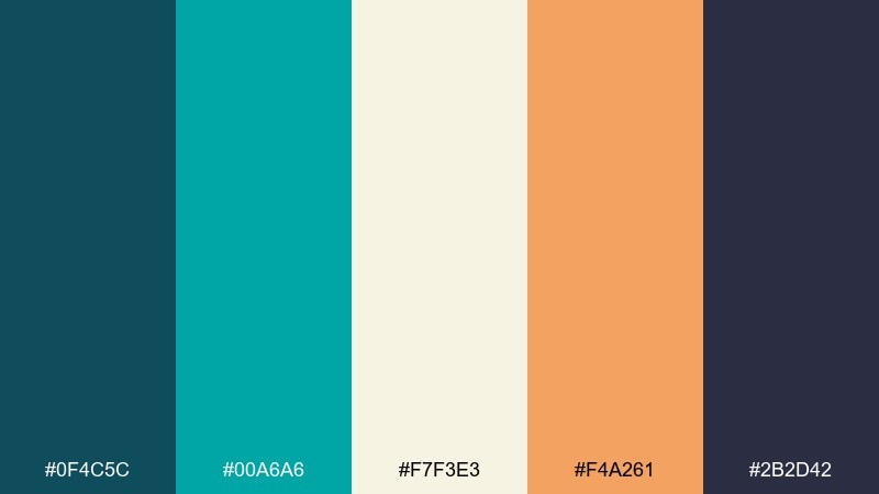
HEX: #0F4C5C #00A6A6 #F7F3E3 #F4A261 #2B2D42
Mood: clean, coastal, modern
Best for: seafood restaurant menus and signage
Clean and coastal, it suggests sea glass, nori shadows, and a salmon highlight. These colors work well for menus, wayfinding, and modern restaurant signage where contrast matters. Let rice-cream backgrounds carry readability, then use teal for sections and salmon for featured items. Usage tip: keep the deep slate for body text and thin dividers to maintain a sharp, upscale feel.
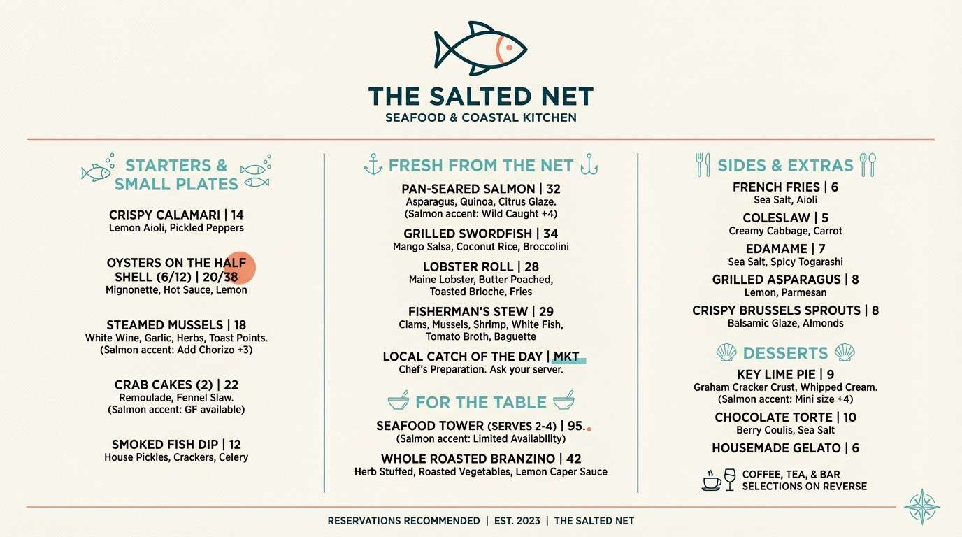
Image example of ocean sushi generated using media.io
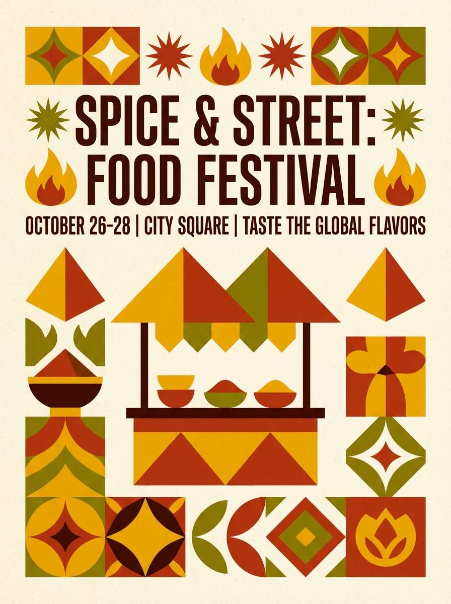
7) Spice Route
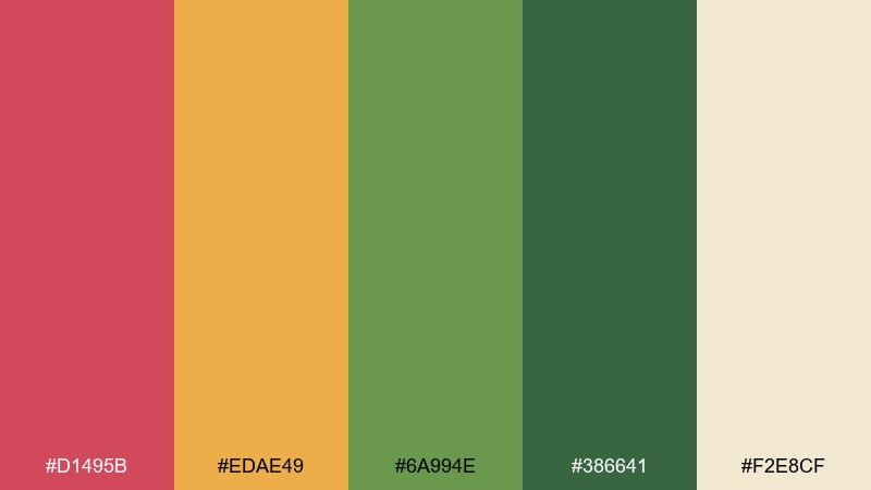
HEX: #D1495B #EDAE49 #6A994E #386641 #F2E8CF
Mood: vibrant, worldly, energetic
Best for: street food festival posters and flyers
Vibrant and worldly, it evokes paprika heat, turmeric glow, and fresh coriander. These food color combinations are made for festival posters, food truck branding, and bold social tiles. Use the warm cream as negative space, then let saffron and paprika take the spotlight while greens support secondary info. Usage tip: limit heavy green blocks and instead use green as icon fills or section headers for better balance.
Image example of spice route generated using media.io
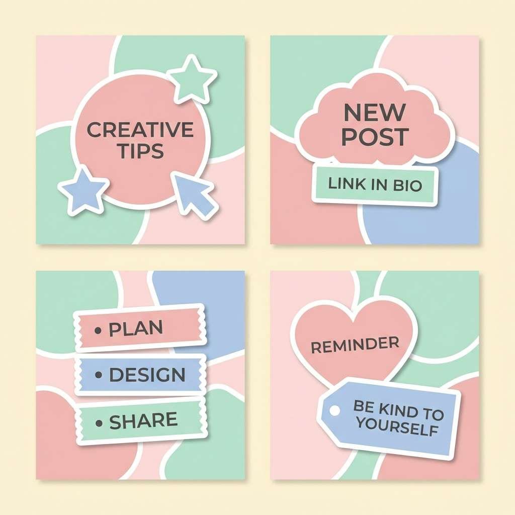
8) Bakery Pastels
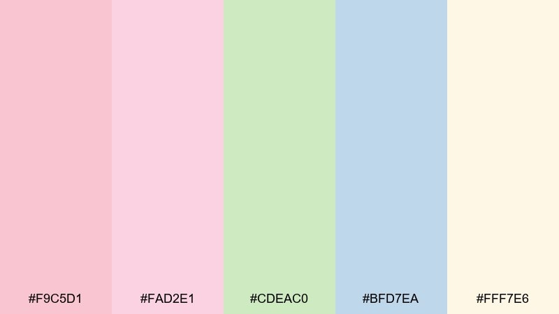
HEX: #F9C5D1 #FAD2E1 #CDEAC0 #BFD7EA #FFF7E6
Mood: soft, sweet, airy
Best for: cupcake shop instagram templates and stickers
Soft and airy, it feels like frosting, sprinkles, and bright morning light. Great for social templates, sticker packs, and playful promo graphics that need gentle charm. Use the butter-cream tone as the base, then rotate blush, mint, and powder blue across sections to keep variety without noise. Usage tip: add thin outlines or darker text to keep pastel blocks accessible and readable.
Image example of bakery pastels generated using media.io
9) Avocado Toast
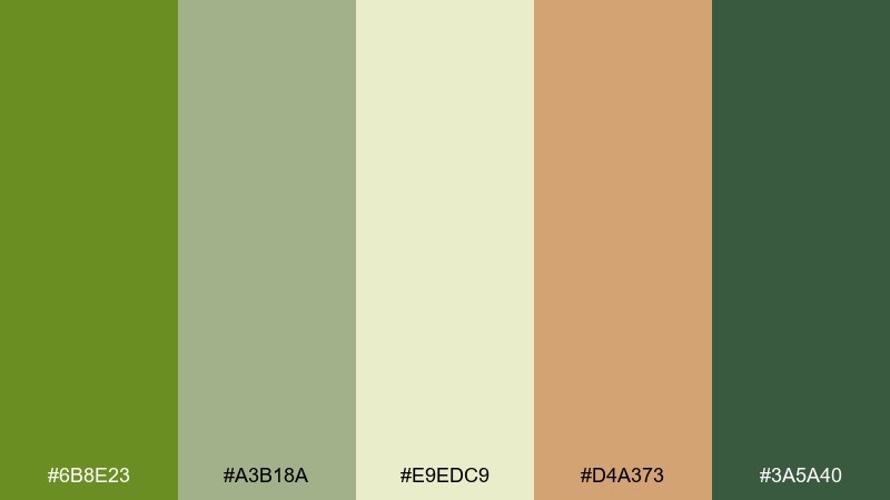
HEX: #6B8E23 #A3B18A #E9EDC9 #D4A373 #3A5A40
Mood: natural, trendy, calm
Best for: brunch cafe branding and menu boards
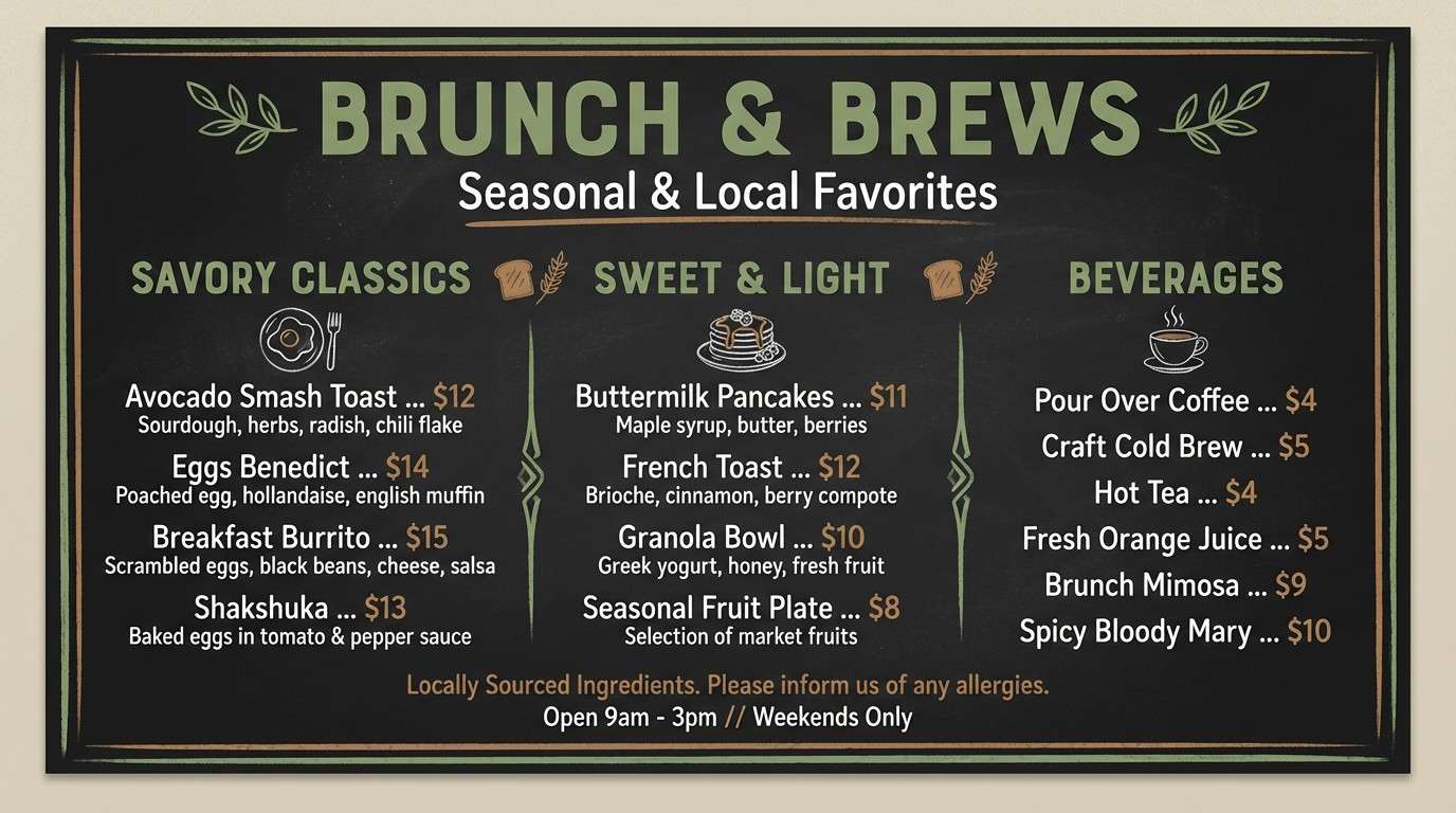
Natural and trendy, it brings up ripe avocado, toasted crust, and leafy greens. The muted greens keep the look modern and calm for brunch cafes, menu boards, and simple merch. Pair the pale oat tone with deep green for crisp legibility, then use the toast-brown as a warm accent for featured items. Usage tip: keep saturation low across backgrounds to let food photography stand out if you add it later.
Image example of avocado toast generated using media.io
10) Pomegranate Spritz
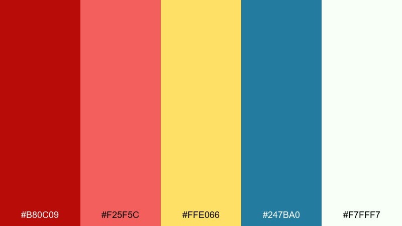
HEX: #B80C09 #F25F5C #FFE066 #247BA0 #F7FFF7
Mood: sparkling, bold, celebratory
Best for: beverage launch ads and bar menus
Sparkling and bold, it suggests a tart red spritz with a bright citrus twist. Use it for beverage launches, bar menus, and energetic promo banners where you want instant appetite appeal. Let the near-white carry breathing room, then drive attention with the deep red and coral while the teal adds modern contrast. Usage tip: keep yellow for small bursts like price tags, badges, or garnish icons to avoid overpowering the reds.
Image example of pomegranate spritz generated using media.io
11) Vanilla Cream
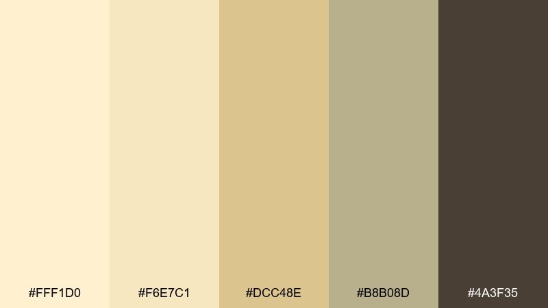
HEX: #FFF1D0 #F6E7C1 #DCC48E #B8B08D #4A3F35
Mood: minimal, warm, comforting
Best for: recipe blog themes and editorial layouts
Minimal and comforting, it feels like vanilla custard, oat milk, and soft bakery paper. These warm neutrals are perfect for recipe blogs, editorial spreads, and long-form content where readability is king. Use the light creams for backgrounds and cards, then step down into wheat and taupe for structure. Usage tip: reserve the dark cocoa for headings and links to keep the page calm but navigable.
Image example of vanilla cream generated using media.io
12) Midnight Espresso
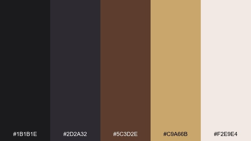
HEX: #1B1B1E #2D2A32 #5C3D2E #C9A66B #F2E9E4
Mood: moody, sophisticated, high-contrast
Best for: premium coffee packaging and nighttime promos
Moody and sophisticated, it recalls a late espresso bar with brass details and soft paper napkins. This food color palette is strong for premium packaging, black-background promos, and bold hero banners. Let the near-black lead, then add the gold-tan as a luxe accent for seals, pricing, or key features. Usage tip: keep the warm off-white for small text blocks and negative space so the dark tones do not feel heavy.
Image example of midnight espresso generated using media.io
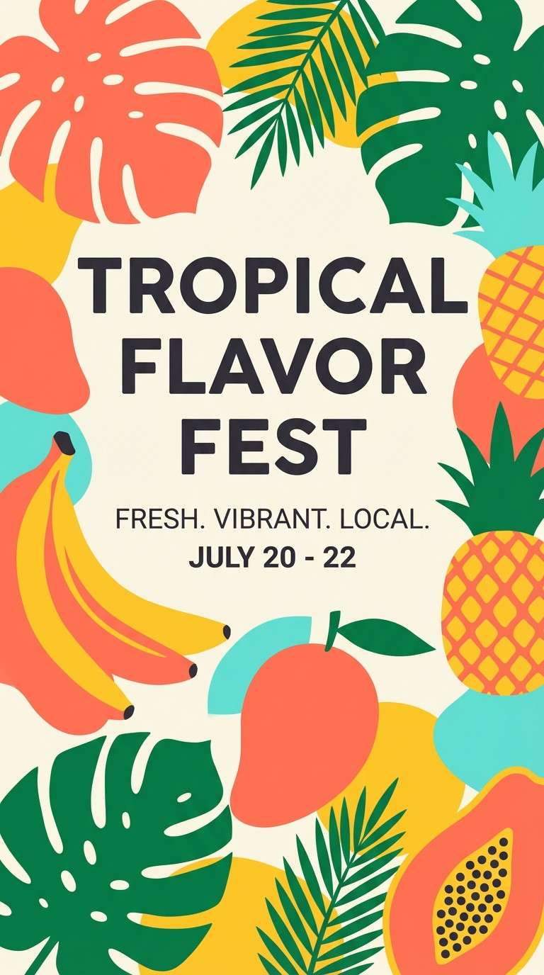
13) Tropical Smoothie
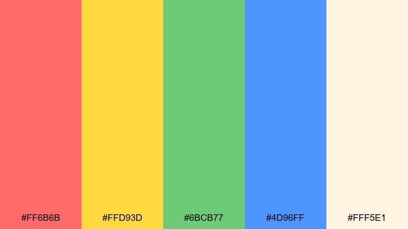
HEX: #FF6B6B #FFD93D #6BCB77 #4D96FF #FFF5E1
Mood: bright, fun, summery
Best for: juice bar social ads and promo posters
Bright and summery, it feels like fruit ice, tropical leaves, and a clear sky overhead. These food color combinations are perfect for juice bars, summer promos, and playful posters that need instant energy. Use the creamy base to keep the palette from looking too primary, then pick two dominant colors per design to stay focused. Usage tip: treat the blue as a small contrast accent for buttons or badges rather than a full background.
Image example of tropical smoothie generated using media.io
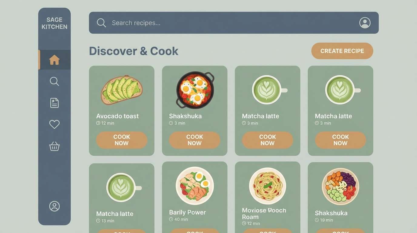
14) Umami Slate
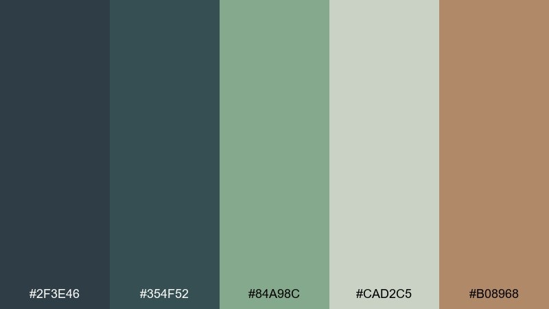
HEX: #2F3E46 #354F52 #84A98C #CAD2C5 #B08968
Mood: modern, earthy, understated
Best for: recipe app UI and meal planner dashboards
Modern and understated, it evokes slate plates, steamed greens, and warm wood utensils. It suits interfaces where you need calm structure, like meal planners, recipe apps, and nutrition dashboards. Use the slates for navigation and headers, then bring in sage and pale gray-green for cards and secondary panels. Usage tip: keep the wood-tan as the single warm accent for primary buttons or selected states.
Image example of umami slate generated using media.io
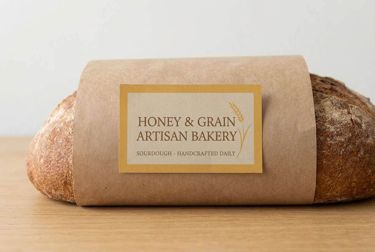
15) Honeyed Wheat
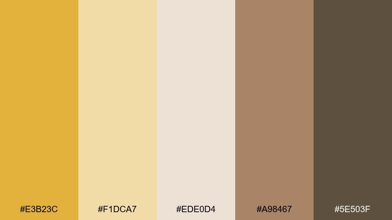
HEX: #E3B23C #F1DCA7 #EDE0D4 #A98467 #5E503F
Mood: rustic, sunny, homey
Best for: artisan bread packaging and bakery signage
Rustic and sunny, it brings to mind honey, wheat fields, and paper-wrapped loaves. It is a natural fit for artisan bread packaging, bakery signage, and handcrafted labels. Let the light flour tones take most of the surface, then use honey gold for focal elements like stamps and icons. Usage tip: rely on the deeper brown-gray for text to keep contrast strong on warm backgrounds.
Image example of honeyed wheat generated using media.io
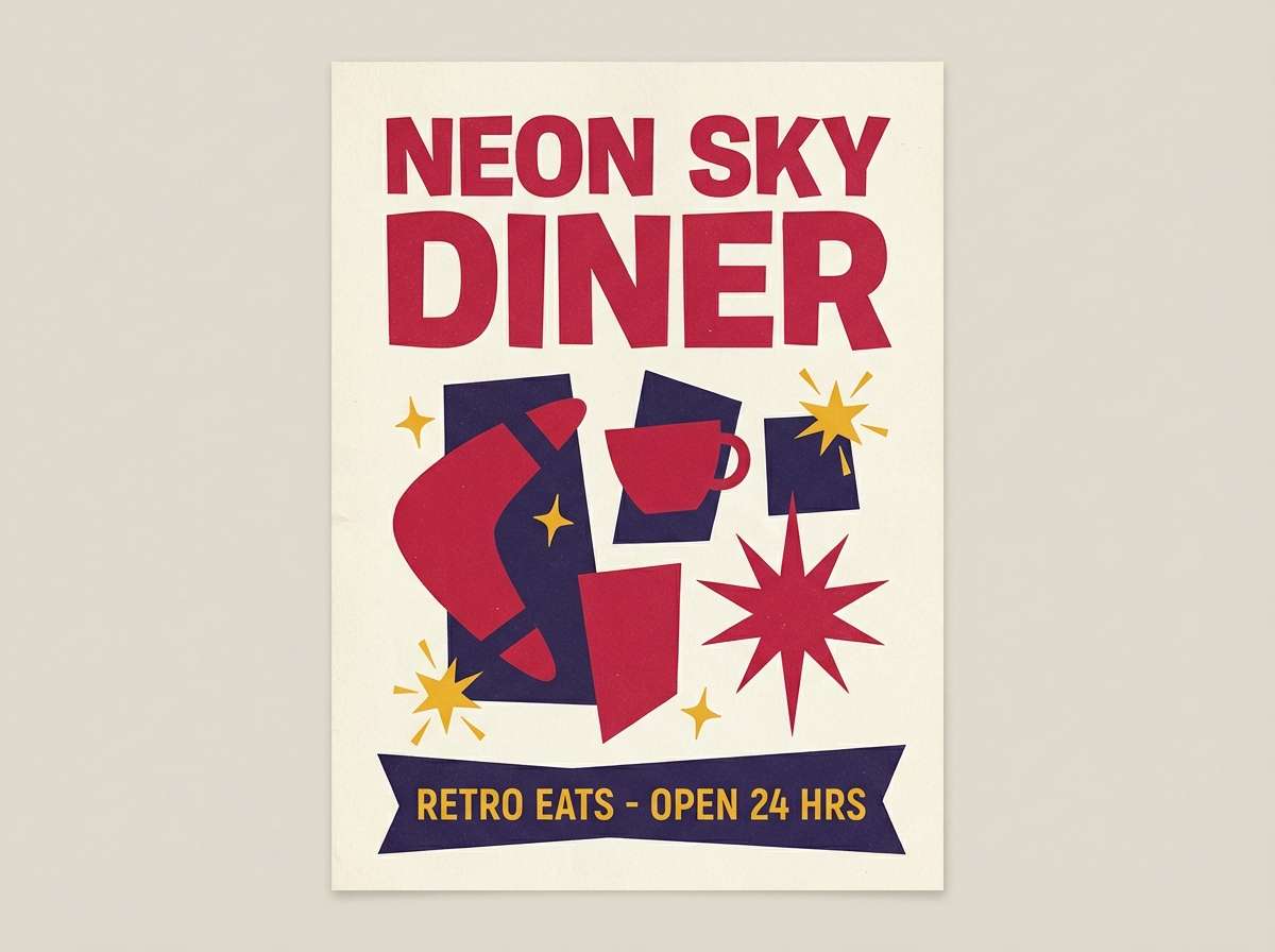
16) Cherry Cola
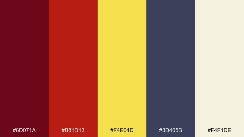
HEX: #6D071A #B81D13 #F4E04D #3D405B #F4F1DE
Mood: retro, punchy, high-energy
Best for: diner posters and soda brand campaigns
Retro and punchy, it feels like cherry syrup, cola fizz, and neon-lit diner signs. This food color combination is great for vintage-inspired posters, soda campaigns, and bold typographic layouts. Use the off-white for the base, then let cherry reds drive the main message while the deep indigo steadies the composition. Usage tip: keep the yellow for highlights like limited-time badges, stars, or price bursts.
Image example of cherry cola generated using media.io
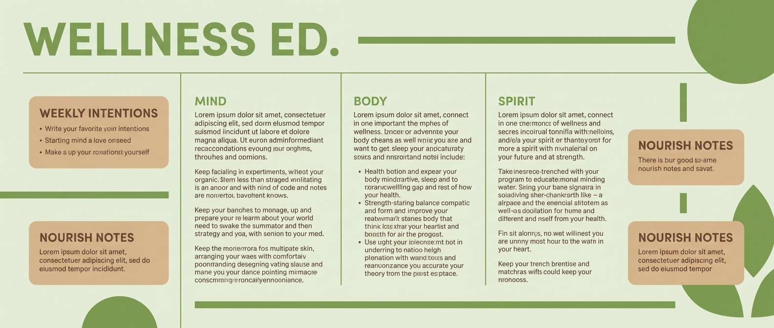
17) Matcha Latte
HEX: #7CB342 #C5E1A5 #F1F8E9 #D7B899 #6D4C41
Mood: calm, fresh, wellness
Best for: tea shop branding and wellness newsletters
Calm and fresh, it suggests matcha foam, steamed milk, and a warm pastry edge. It works for tea shop identities, wellness newsletters, and gentle landing pages. Use the pale off-white green for backgrounds, then choose matcha green for CTAs and section headers. Usage tip: add the latte tan and cocoa brown only where you need warmth, like footer areas or small badges.
Image example of matcha latte generated using media.io
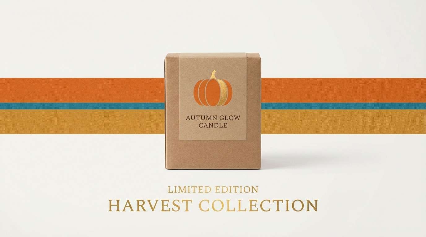
18) Pumpkin Harvest
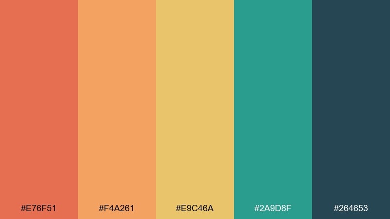
HEX: #E76F51 #F4A261 #E9C46A #2A9D8F #264653
Mood: seasonal, cozy, adventurous
Best for: fall menu promos and seasonal product ads
Seasonal and cozy, it evokes roasted pumpkin, toasted spices, and cool teal pottery. It is perfect for fall menu promos, seasonal banners, and product ads that need warmth with a modern edge. Let the oranges and golds dominate, then use teal as a contrasting stripe or button color. Usage tip: keep the deep blue-green for text and small shapes so the warm hues stay the hero.
Image example of pumpkin harvest generated using media.io
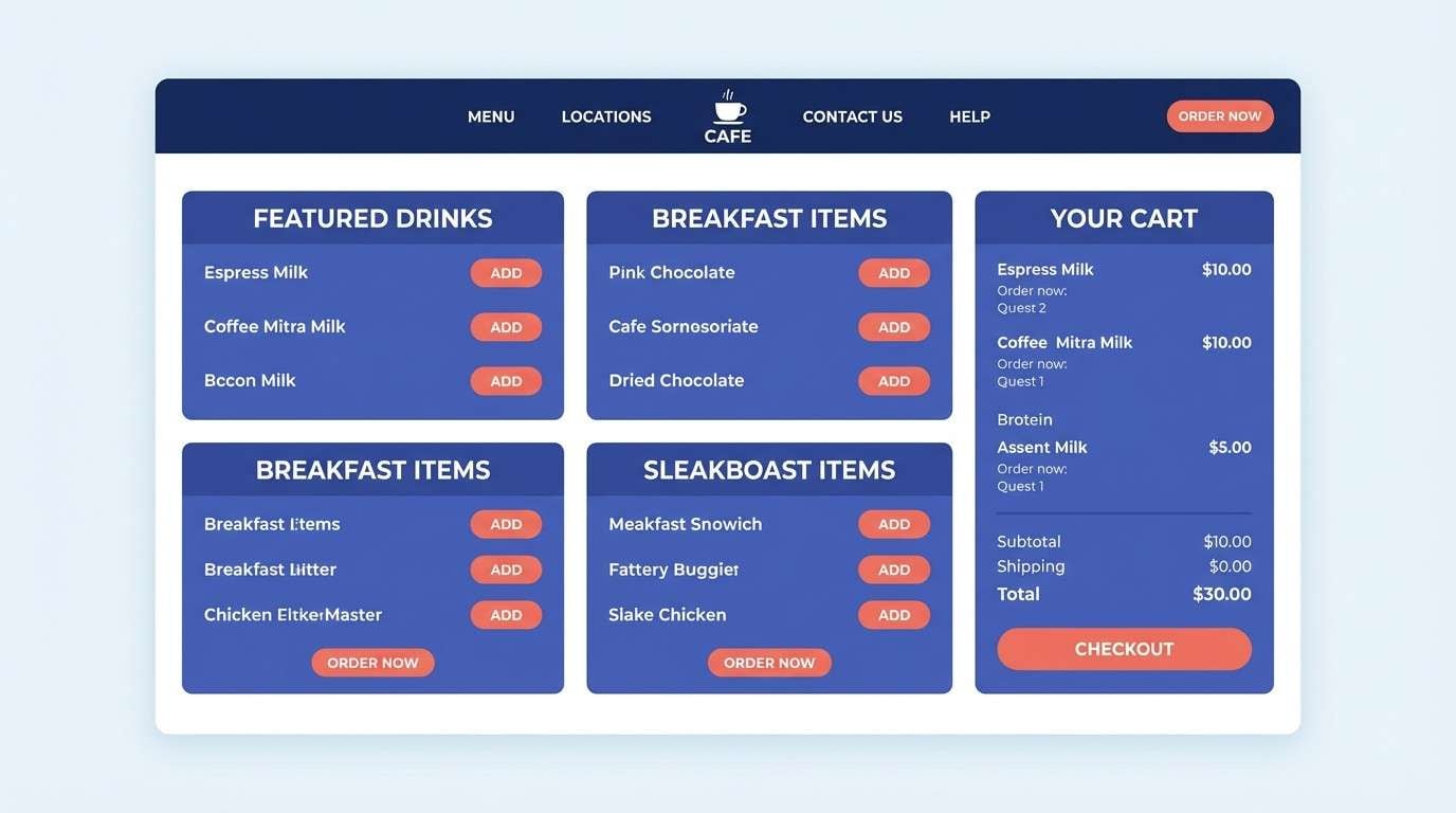
19) Blueberry Muffin
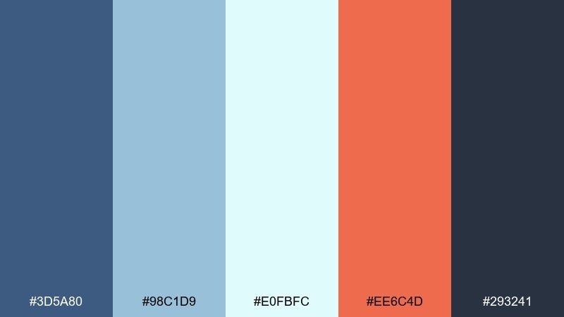
HEX: #3D5A80 #98C1D9 #E0FBFC #EE6C4D #293241
Mood: cool, friendly, contemporary
Best for: breakfast cafe websites and order pages
Cool and friendly, it feels like blueberry skins, morning light, and a warm baked finish. It is great for cafe websites and order pages where you want trust, clarity, and a bit of playful contrast. Use the icy light tones for backgrounds and cards, then anchor navigation with navy. Usage tip: apply the orange-coral for primary actions only so it reads as a clear click target.
Image example of blueberry muffin generated using media.io
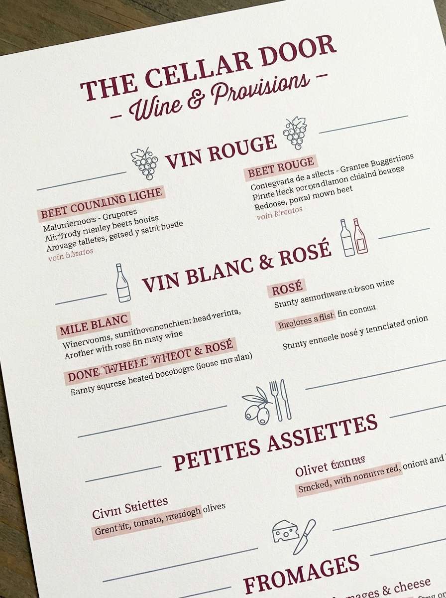
20) Beetroot Bistro
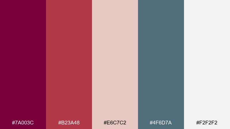
HEX: #7A003C #B23A48 #E6C7C2 #4F6D7A #F2F2F2
Mood: earthy, chic, slightly dramatic
Best for: bistro branding and wine bar menus
Earthy and chic, it brings up roasted beet slices, dusty rose linens, and cool steel accents. It works beautifully for bistro branding, wine bar menus, and elegant table cards. Let the soft blush-gray and near-white create space, then use beet tones for headings and key sections. Usage tip: use the blue-gray as a neutral divider and icon color to keep the reds from feeling too romantic.
Image example of beetroot bistro generated using media.io
What Colors Go Well with Food?
Warm hues (reds, oranges, yellows) tend to feel appetizing and energetic, which makes them popular for calls-to-action, price tags, and “featured” labels. Pair them with creamy off-whites or paper-like beiges to keep the design breathable.
Greens and teals work well as “freshness” and “clean” signals—great for organic, plant-forward, and seafood concepts. Use a deeper slate or cocoa tone for typography so your palette stays readable across menus and packaging.
To avoid a noisy look, choose one hero color, one supporting color, and keep the rest as neutrals. That simple hierarchy is what makes many modern food palettes feel premium.
How to Use a Food Color Palette in Real Designs
Start with function: pick a light background for readability, a dark text color for contrast, and one accent for buttons or “order now” highlights. Then add a second accent only if you need categorization (e.g., vegan, spicy, new).
For packaging, keep brand marks and key claims in high-contrast pairs, while using softer tones for patterns or secondary panels. This helps shelves read quickly without sacrificing detail up close.
On social posts, limit each tile to two loud colors at most and let neutrals do the heavy lifting. Consistent color placement (same button color, same headline color) builds recognition fast.
Create Food Palette Visuals with AI
If you want to preview how a food color scheme looks on menus, labels, or app UI, generate quick mock visuals before committing to a full design system. It’s a fast way to test contrast, mood, and hierarchy.
With Media.io Text to Image, you can paste a prompt, iterate styles (minimal, realistic, retro), and explore multiple compositions using your chosen HEX direction. This makes it easier to align palette and layout early.
Once you have a direction you like, keep your neutrals consistent and only swap accent colors for seasonal promos or limited-edition drops.
Food Color Palette FAQs
-
What is a food color palette?
A food color palette is a curated set of colors (often with HEX codes) used to create an appetizing, consistent look across menus, packaging, websites, and social posts. -
Which colors are most appetizing for branding?
Warm tones like red, orange, and yellow are commonly associated with appetite and energy. They work best when balanced with light neutrals and a strong dark text color for readability. -
How do I keep food palettes from looking too bright?
Use a cream or off-white as the main background, reserve saturated colors for highlights, and anchor the design with a deep neutral (cocoa, charcoal, or navy) for text and dividers. -
What are good food color combinations for organic or healthy brands?
Muted greens (sage, herb, matcha) paired with warm beiges or off-whites feel fresh and trustworthy. Add a single warm accent (honey or wood-tan) for buttons or badges. -
How many colors should I use on a menu design?
For most menus, 3–5 colors is ideal: a background neutral, a text neutral, and 1–2 accents for categories, featured items, and calls-to-action. -
Can I use these HEX palettes for app UI and web design?
Yes. Apply light tones to surfaces (backgrounds/cards), darker tones to navigation and text, and keep one accent color for primary actions to maintain clarity and consistency. -
How can I preview a palette on packaging or posters quickly?
Generate mockups with an AI tool like Media.io Text to Image using prompts similar to real layouts (menu grid, label on jar, promo poster). This helps you validate mood and contrast before designing.
Next: Beaver Color Palette


