

Beaver is a warm, earthy brown family that feels natural, reliable, and easy to live with. It’s the kind of neutral that adds character without overpowering a layout.
Below are 20 beaver color palette ideas with HEX codes, plus practical use tips for branding, UI, and print—so you can build a cohesive look fast.
In this article
- Why Beaver Color Combinations Work So Well
-
- riverbank warmth
- cedar and cream editorial
- clay studio neutrals
- mossy dam earthtones
- walnut ui focus
- sandstone poster mix
- cocoa and copper glow
- autumn ledger
- linen and leather
- hearthside kitchen
- driftwood minimal
- umber night
- maple latte
- stone path outdoors
- birch bark wedding
- terracotta ink
- espresso contrast
- prairie dusk
- sienna workshop
- quiet sepia portfolio
- What Colors Go Well with Beaver?
- How to Use a Beaver Color Palette in Real Designs
- Create Beaver Palette Visuals with AI
Why Beaver Color Combinations Work So Well
Beaver tones sit in that sweet spot between classic brown and soft taupe, which makes them feel grounded but still modern. They’re naturally “material” colors—wood, leather, clay, coffee—so designs feel tactile and trustworthy.
They also play nicely with light neutrals, giving you instant contrast for typography and UI components. When you add one deep near-black, the palette becomes versatile enough for both cozy lifestyle branding and clean product interfaces.
Most importantly, beaver palettes are forgiving in real-world production. They tend to print well, photograph well, and hide small inconsistencies across screens better than icy grays or highly saturated colors.
20+ Beaver Color Palette Ideas (with HEX Codes)
1) Riverbank Warmth
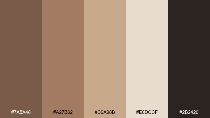
HEX: #7A5A48 #A27B62 #C9A98B #E8DCCF #2B2420
Mood: cozy, rustic, grounded
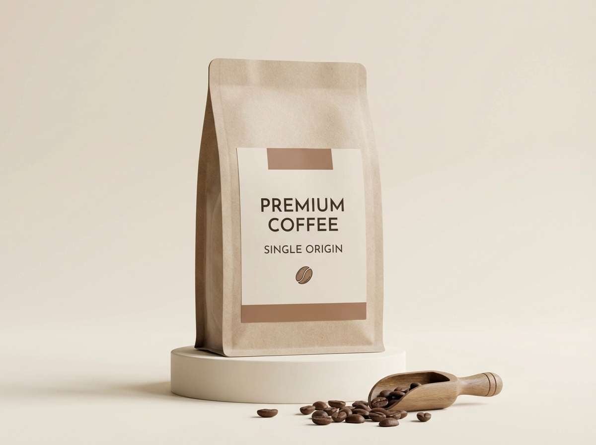
Best for: outdoor brand identity and coffee packaging
Cozy and grounded like sunlit driftwood and warm river stones. This beaver color palette works beautifully for outdoorsy branding, roastery labels, and heritage-style packaging. Pair the creamy tone with the deep brown for high legibility, then use the mid tans for texture and background fields. Tip: reserve the near-black shade for small type and icons to keep the look premium, not heavy.
Image example of riverbank warmth generated using media.io
Media.io is an online AI studio for creating and editing video, image, and audio in your browser.

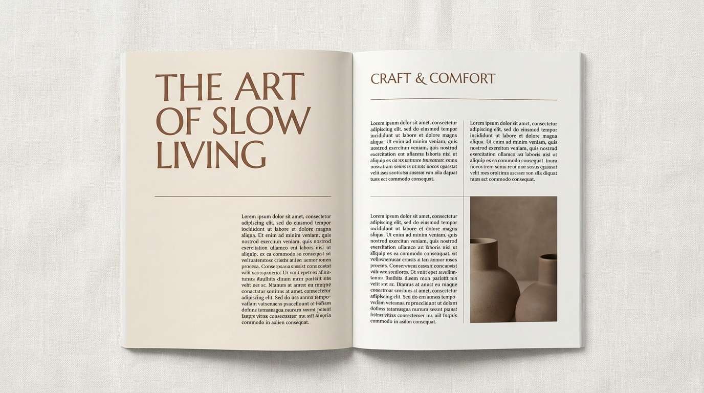
2) Cedar and Cream Editorial
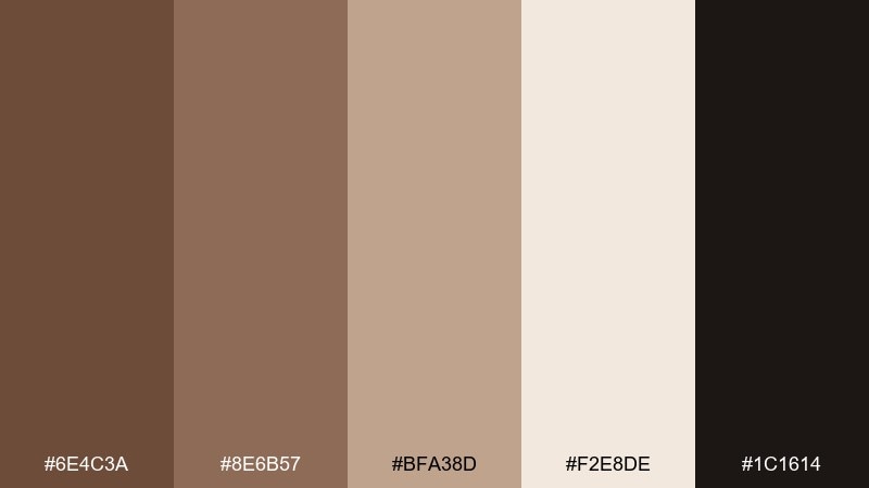
HEX: #6E4C3A #8E6B57 #BFA38D #F2E8DE #1C1614
Mood: refined, editorial, warm
Best for: magazine layouts and lifestyle blogs
Refined and warm, like cedar shelves against soft cream paper. Use it for magazine spreads, blog hero sections, and long-form reads where comfort matters. Keep body text in the near-black, then bring in the mid browns for pull quotes and section dividers. Tip: use the light cream as a generous margin color to make layouts feel airy.
Image example of cedar and cream editorial generated using media.io
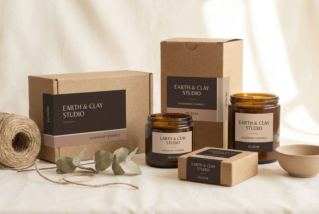
3) Clay Studio Neutrals
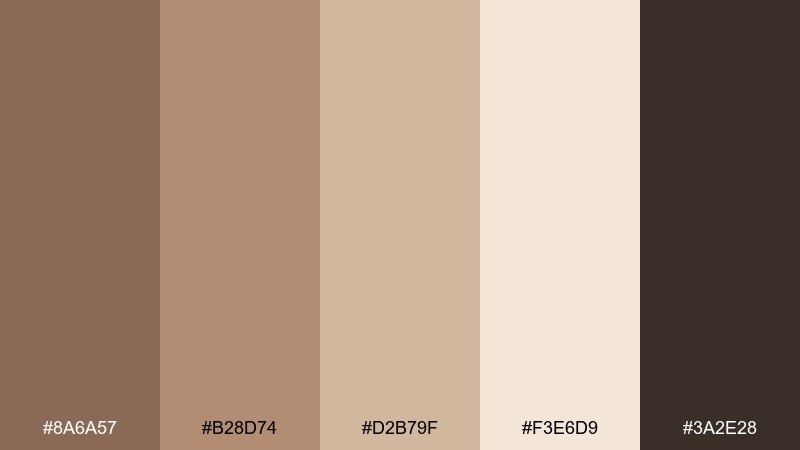
HEX: #8A6A57 #B28D74 #D2B79F #F3E6D9 #3A2E28
Mood: handmade, calm, artisanal
Best for: ceramics product ads and craft stores
Handmade and calm, like fresh clay drying on a studio shelf. These beaver tones suit craft store promos, ceramics ads, and maker-market branding where texture is part of the story. Use the pale shade for negative space, then layer the mid browns for product labels and badges. Tip: add subtle grain or paper texture so the palette feels tactile rather than flat.
Image example of clay studio neutrals generated using media.io
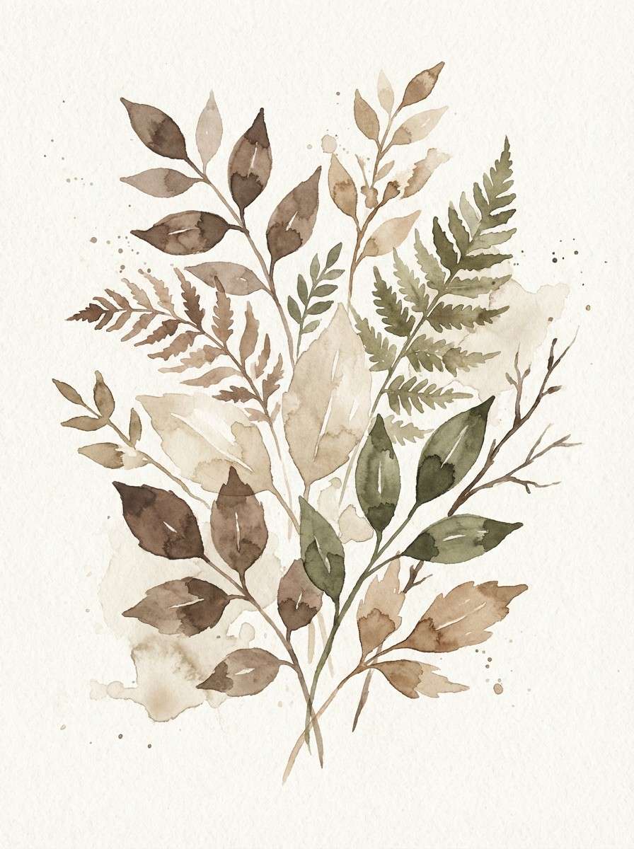
4) Mossy Dam Earthtones
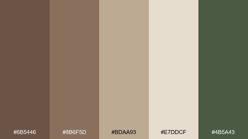
HEX: #6B5446 #8B6F5D #BDAA93 #E7DDCF #4B5A43
Mood: earthy, natural, quietly fresh
Best for: botanical illustrations and eco infographics
Earthy and quietly fresh, like moss on weathered timber. It works well for eco infographics, plant-themed prints, and nature-forward social posts. Let the green be a restrained accent against the warmer browns to keep the look balanced. Tip: use the light neutral as the paper base so illustrations feel like a field journal page.
Image example of mossy dam earthtones generated using media.io
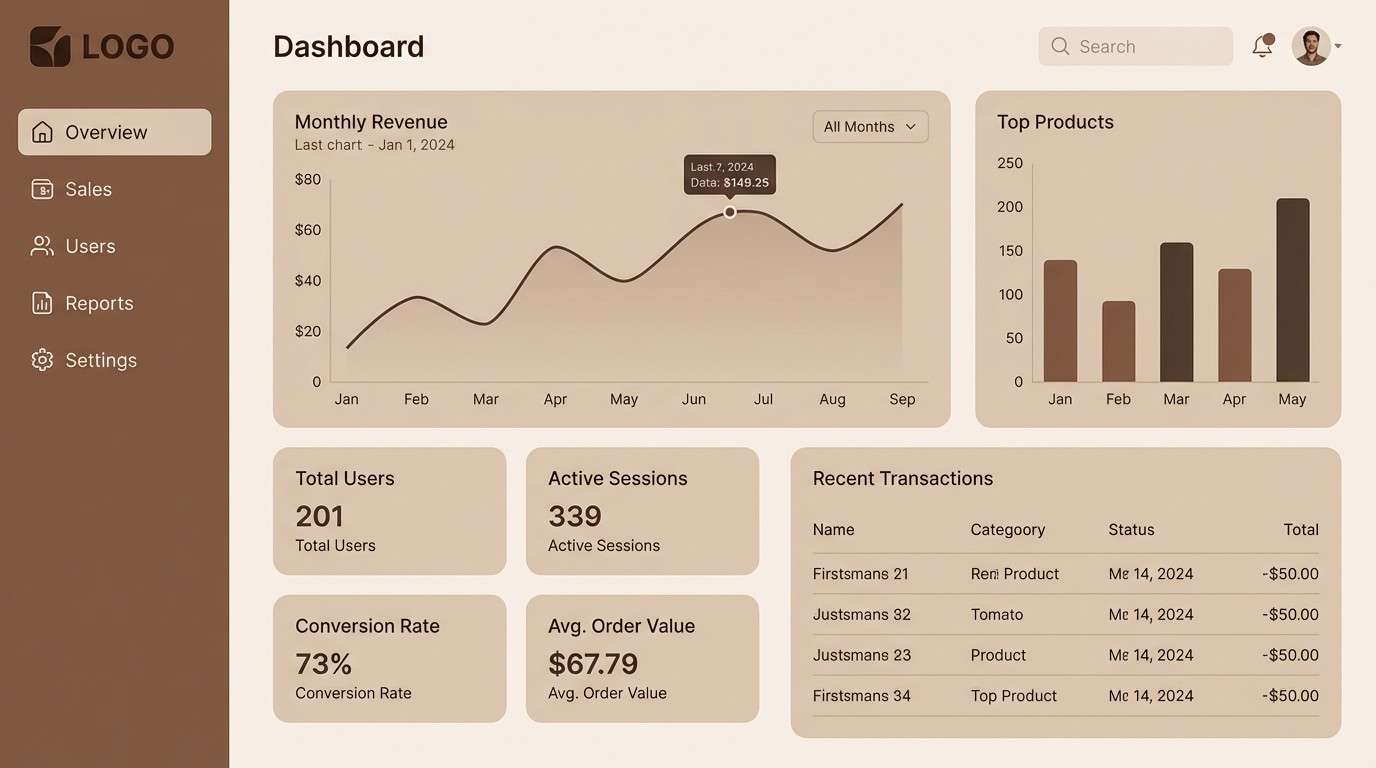
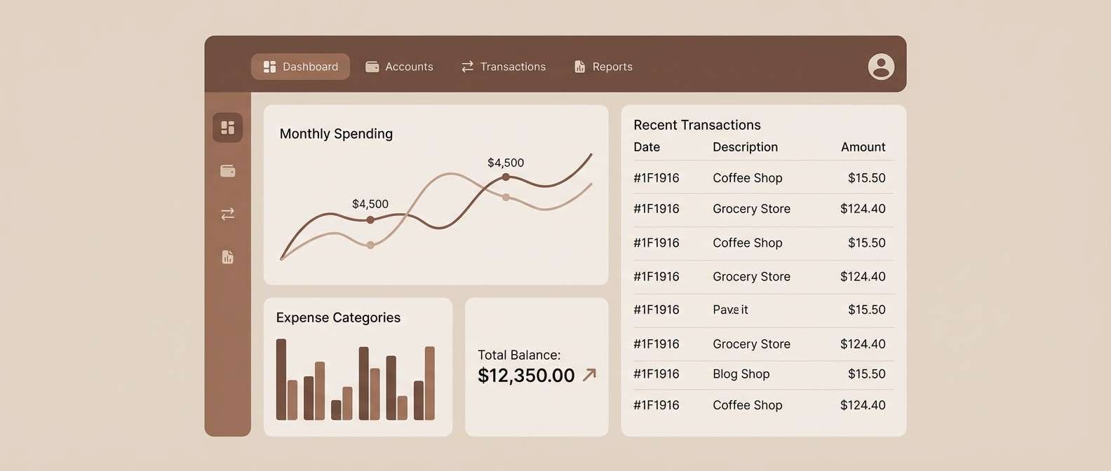
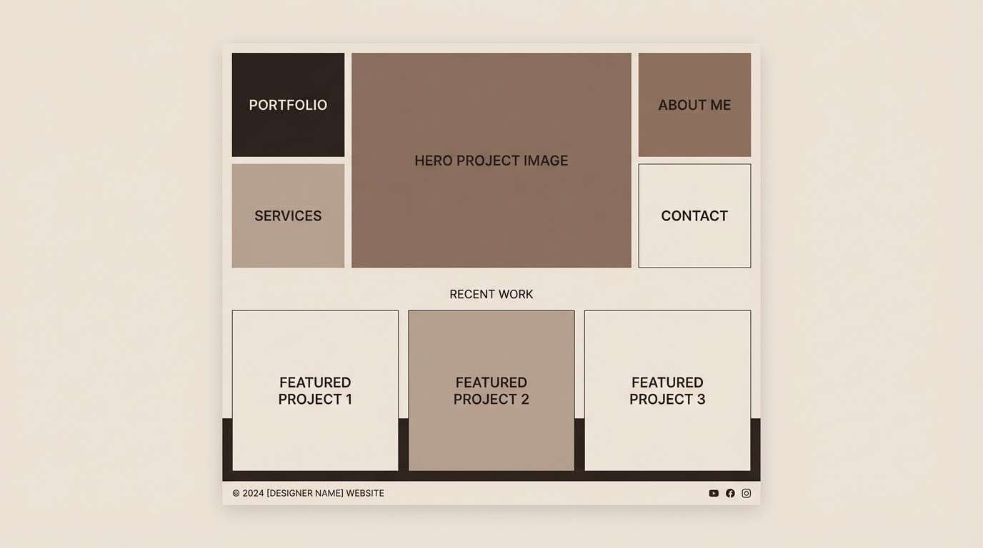
5) Walnut UI Focus
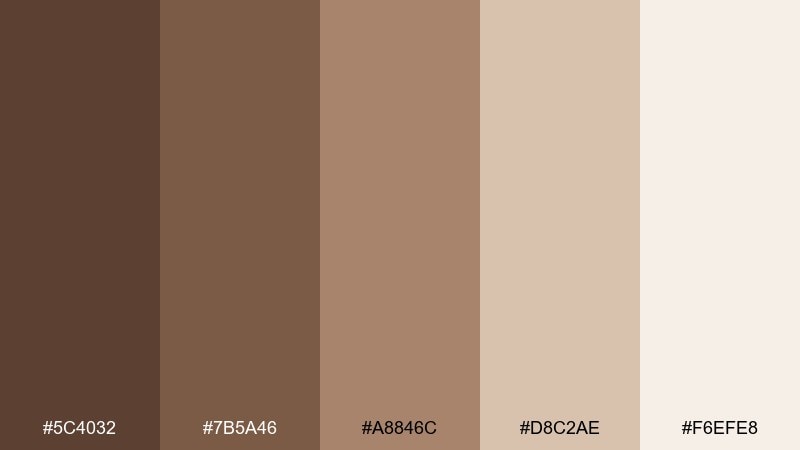
HEX: #5C4032 #7B5A46 #A8846C #D8C2AE #F6EFE8
Mood: modern, warm, approachable
Best for: dashboard UI and settings screens
Modern and approachable, like walnut wood with a soft matte finish. Use these beaver color combinations for dashboards, account pages, and settings screens that should feel trustworthy instead of sterile. Put the deepest shade on navigation and primary buttons, then lean on the lighter neutrals for cards and surfaces. Tip: keep contrast high by using the palest tone behind text-heavy modules.
Image example of walnut ui focus generated using media.io
6) Sandstone Poster Mix
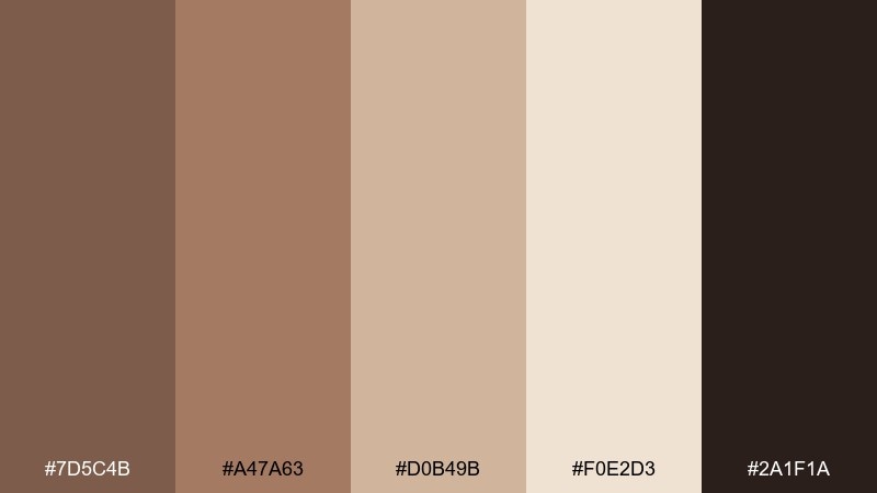
HEX: #7D5C4B #A47A63 #D0B49B #F0E2D3 #2A1F1A
Mood: bold, vintage, high-contrast
Best for: event posters and workshop flyers
Bold and a little vintage, like sandstone lit by late afternoon sun. It fits workshop flyers, pop-up event posters, and bold typography layouts. Use the near-black for headlines, then let the mid browns carry secondary type and shapes. Tip: add a single large cream block behind text to keep everything readable from a distance.
Image example of sandstone poster mix generated using media.io

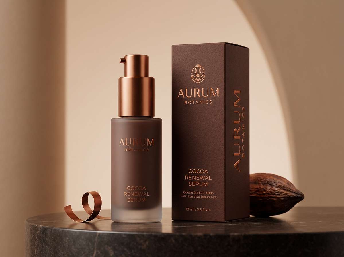
7) Cocoa and Copper Glow
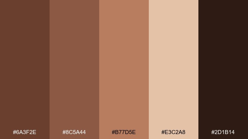
HEX: #6A3F2E #8C5A44 #B77D5E #E3C2A8 #2D1B14
Mood: luxurious, warm, glowing
Best for: beauty packaging and product ads
Luxurious and glowing, like cocoa with a copper sheen. These beaver color combinations are ideal for beauty packaging, skincare ads, and premium product storytelling. Keep the coppery mid tone for highlights and foils, then ground the layout with the darkest brown on type and borders. Tip: use soft gradients between the middle shades to mimic metallic warmth without looking flashy.
Image example of cocoa and copper glow generated using media.io
8) Autumn Ledger
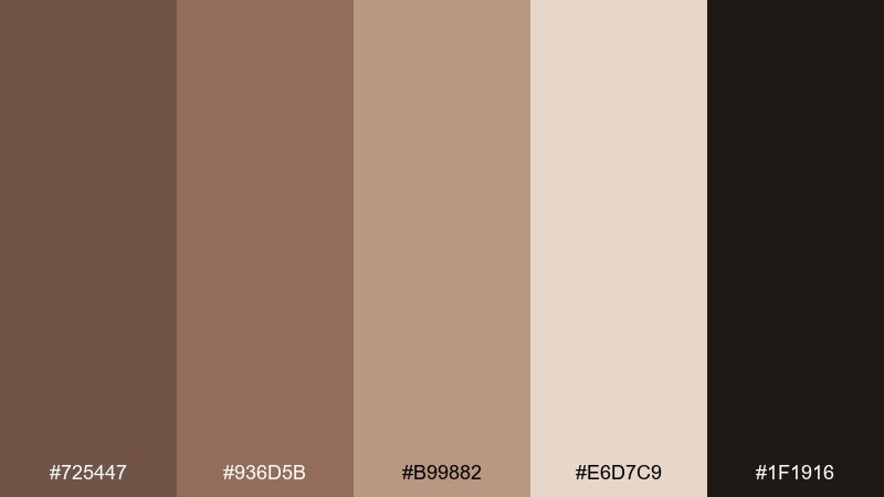
HEX: #725447 #936D5B #B99882 #E6D7C9 #1F1916
Mood: trustworthy, steady, mature
Best for: finance dashboards and reports
Trustworthy and steady, like an old ledger bound in worn leather. Use this beaver color palette in finance UI, invoice templates, or annual report graphics to project stability. The light neutral keeps charts readable, while the richer browns work well for tabs and data highlights. Tip: limit the darkest shade to key numbers and headings so the interface stays calm.
Image example of autumn ledger generated using media.io
9) Linen and Leather
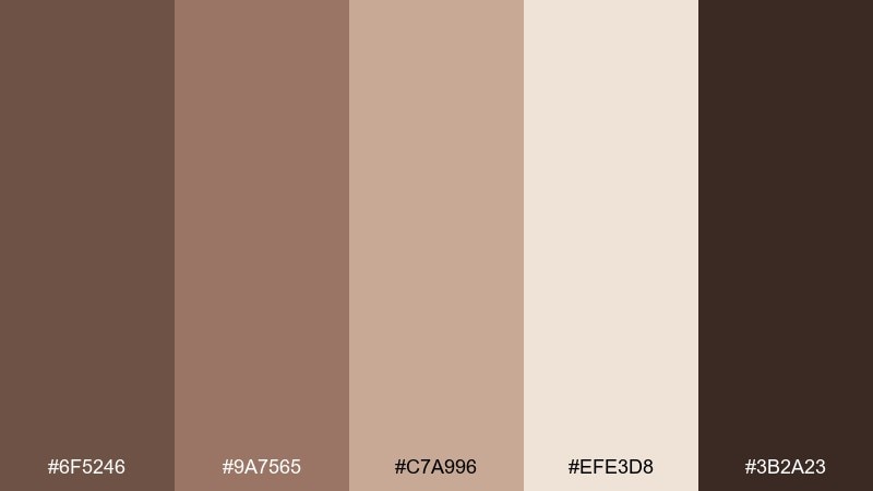
HEX: #6F5246 #9A7565 #C7A996 #EFE3D8 #3B2A23
Mood: soft, upscale, understated
Best for: fashion lookbooks and ecommerce banners
Soft and upscale, like linen fabric paired with a classic leather belt. It suits lookbooks, ecommerce banners, and brand photography overlays where subtlety sells. Use the lightest tone for background blocks and the deeper brown for price tags and key CTAs. Tip: keep typography thin and spaced out to match the understated vibe.
Image example of linen and leather generated using media.io
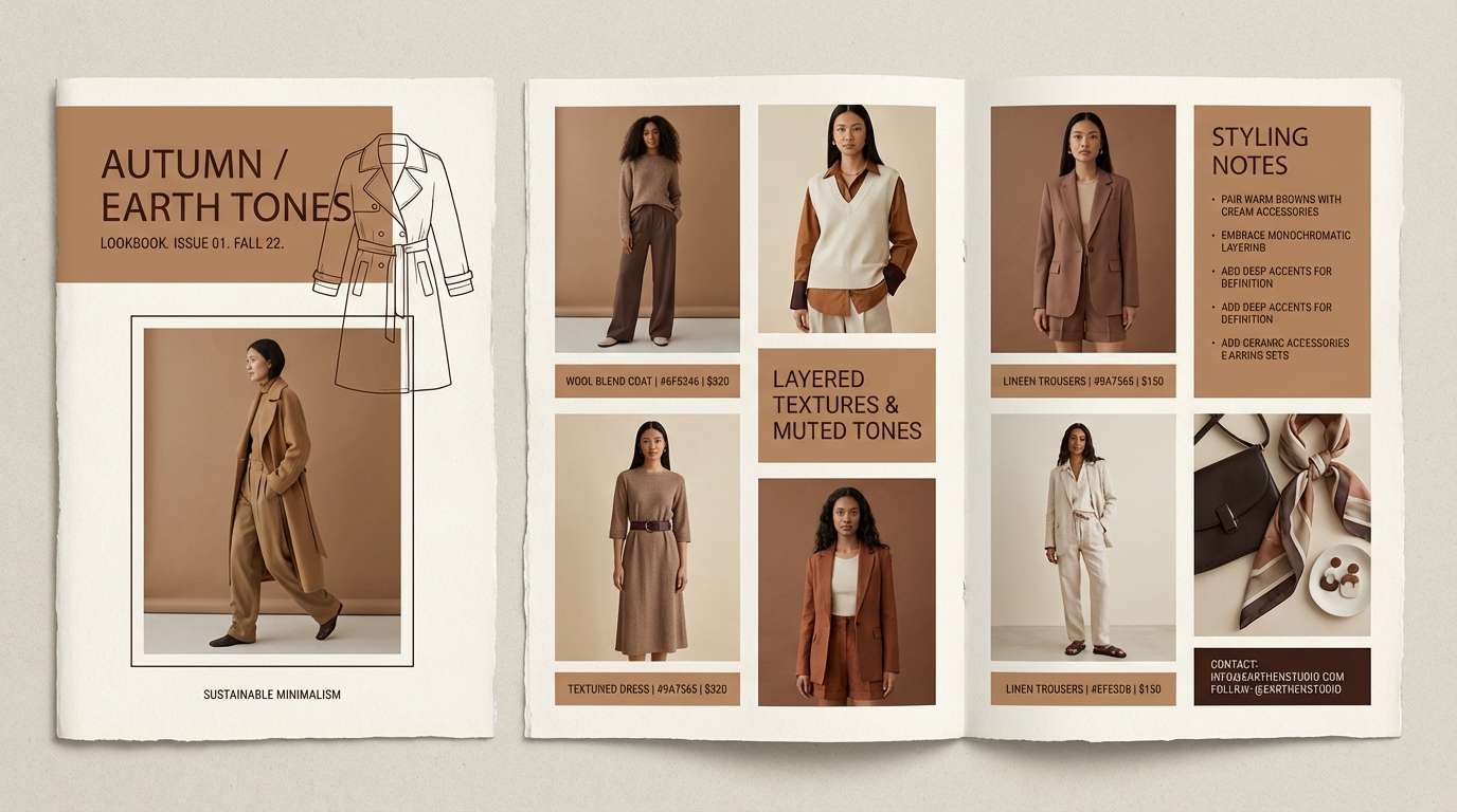
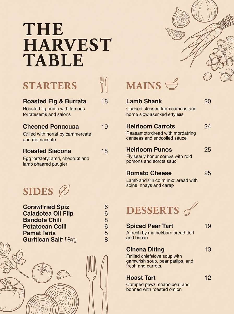
10) Hearthside Kitchen
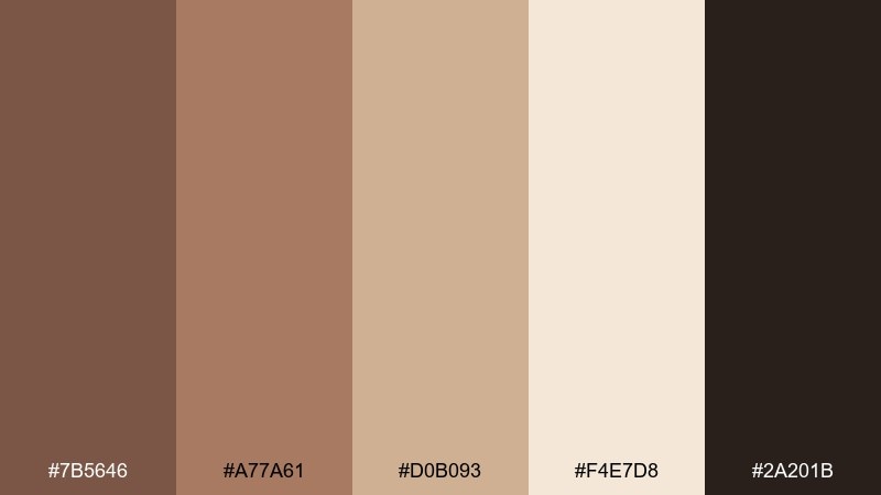
HEX: #7B5646 #A77A61 #D0B093 #F4E7D8 #2A201B
Mood: welcoming, homey, hearty
Best for: restaurant menus and recipe cards
Welcoming and homey, like a warm kitchen with wood cabinets and fresh bread. Use it for menus, recipe cards, and food blog graphics that should feel hearty and real. Pair the cream base with the dark brown for crisp text, and use the tan shades for section headers and icons. Tip: a subtle border in the mid tone can make menu panels feel crafted, not boxed in.
Image example of hearthside kitchen generated using media.io
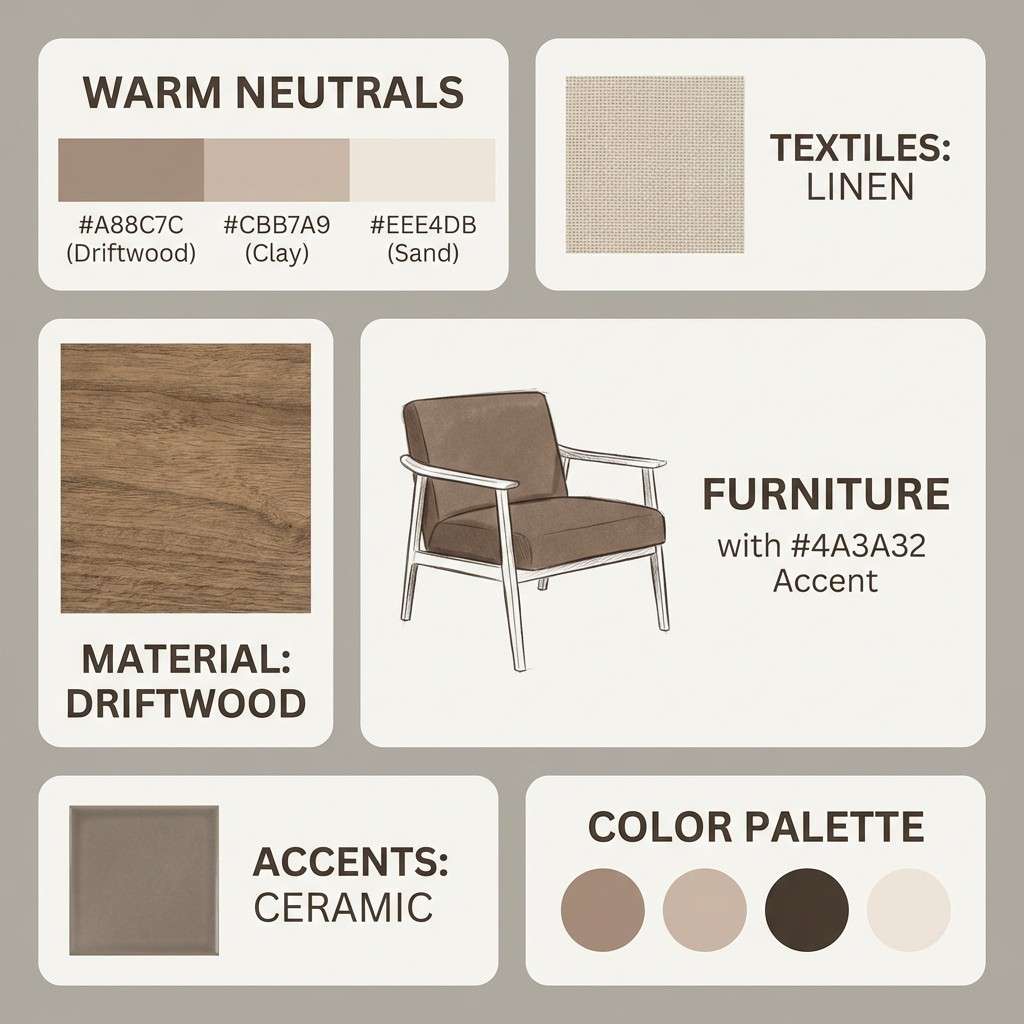
11) Driftwood Minimal
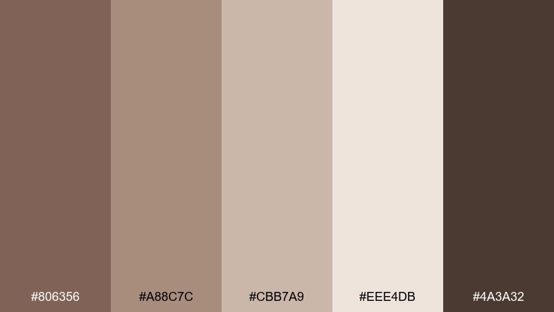
HEX: #806356 #A88C7C #CBB7A9 #EEE4DB #4A3A32
Mood: minimal, airy, serene
Best for: interior moodboards and portfolio sites
Minimal and serene, like driftwood and sand in a quiet coastal cabin. This beaver color palette works nicely for interior design moodboards, portfolio sites, and understated presentations. Use the pale neutral as the main canvas, then add structure with the gray-brown for grids and captions. Tip: keep accent usage low so the palette stays calm and spacious.
Image example of driftwood minimal generated using media.io
12) Umber Night
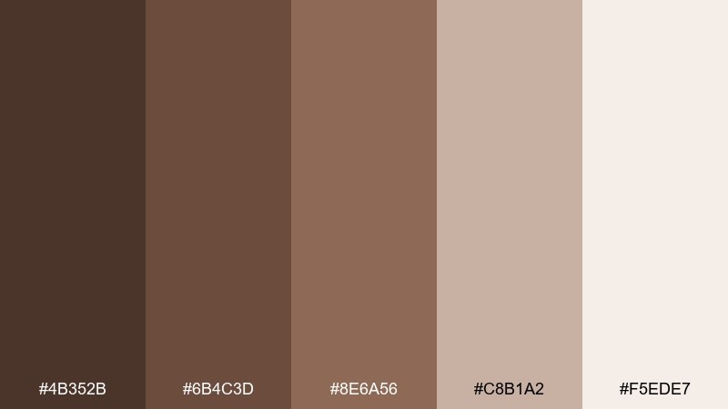
HEX: #4B352B #6B4C3D #8E6A56 #C8B1A2 #F5EDE7
Mood: moody, intimate, cinematic
Best for: album covers and book launches
Moody and intimate, like lamplight on dark wood at night. Use it for album art, book launch graphics, and dramatic hero banners where depth matters. Let the darkest shades dominate, then bring in the pale neutral as a spotlight for titles and dates. Tip: add a subtle vignette using the deepest brown to increase the cinematic feel.
Image example of umber night generated using media.io

13) Maple Latte
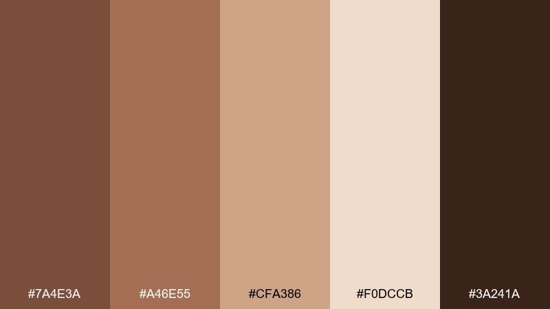
HEX: #7A4E3A #A46E55 #CFA386 #F0DCCB #3A241A
Mood: sweet, friendly, inviting
Best for: cafe promos and social templates
Sweet and inviting, like a maple latte with foamy crema. These beaver color combinations are great for cafe promos, Instagram carousels, and seasonal offers that need warmth without looking heavy. Use the light caramel tone for big background shapes and the deep brown for headings and prices. Tip: keep product photos warm-toned so they blend naturally with the palette.
Image example of maple latte generated using media.io

14) Stone Path Outdoors
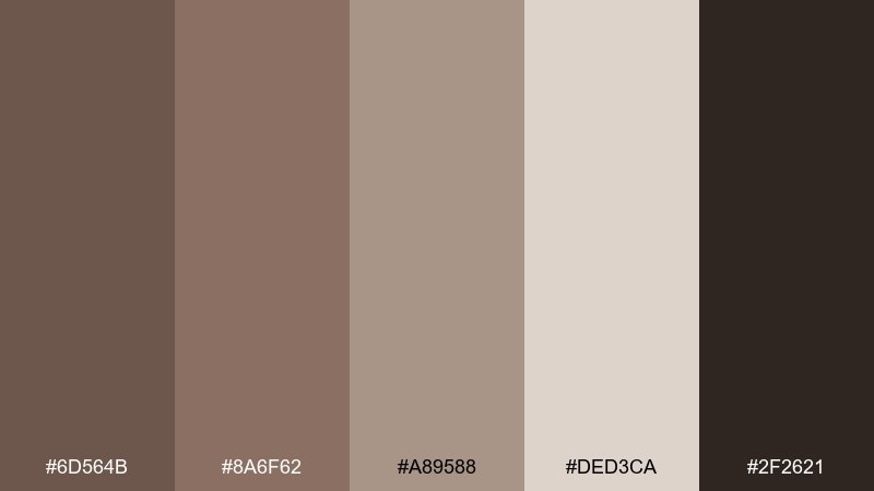
HEX: #6D564B #8A6F62 #A89588 #DED3CA #2F2621
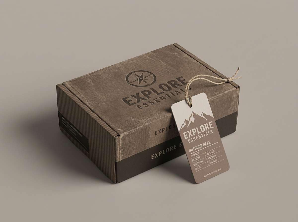
Mood: rugged, dependable, neutral
Best for: outdoor gear ads and product pages
Rugged and dependable, like a stone path through dry woods. Use it for outdoor gear ads, product landing pages, and spec sheets where clarity is key. Pair the medium taupe with the dark shade for buttons and labels, then let the light neutral support product images. Tip: keep one accent tone consistent for all CTAs to avoid a muddy interface.
Image example of stone path outdoors generated using media.io
15) Birch Bark Wedding
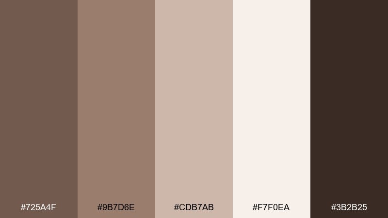
HEX: #725A4F #9B7D6E #CDB7AB #F7F0EA #3B2B25
Mood: romantic, natural, elegant
Best for: wedding invitations and stationery
Romantic and natural, like birch bark and soft linen ribbons. This beaver color palette fits wedding invitations, save-the-dates, and elegant stationery suites with a grounded feel. Use the cream as the paper base, then set typography in the deep brown for a classic look. Tip: add a thin border or monogram in the mid taupe to keep details delicate.
Image example of birch bark wedding generated using media.io
16) Terracotta Ink
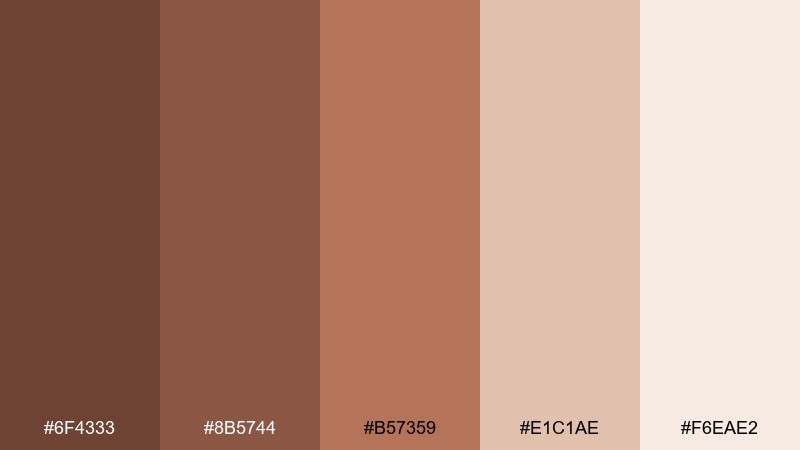
HEX: #6F4333 #8B5744 #B57359 #E1C1AE #F6EAE2
Mood: creative, warm, artistic
Best for: book covers and author branding
Creative and warm, like terracotta pots beside dark ink sketches. Use these beaver color combinations for book covers, author branding, and workshop materials where a handcrafted tone helps. Let the terracotta shade be the hero, and use the deep brown sparingly to frame titles and subtitles. Tip: a slightly off-white background keeps the palette from feeling too heavy in print.
Image example of terracotta ink generated using media.io
17) Espresso Contrast
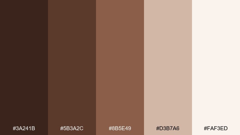
HEX: #3A241B #5B3A2C #8B5E49 #D3B7A6 #FAF3ED
Mood: sharp, premium, confident
Best for: tech branding and landing pages
Sharp and premium, like espresso crema against porcelain. These beaver color combinations shine in tech branding, landing pages, and product UI that needs warmth plus clarity. Use the darkest shade for navigation and key CTAs, then balance it with the pale background for crisp readability. Tip: keep accent usage consistent by choosing one mid tone for highlights and progress states.
Image example of espresso contrast generated using media.io
18) Prairie Dusk
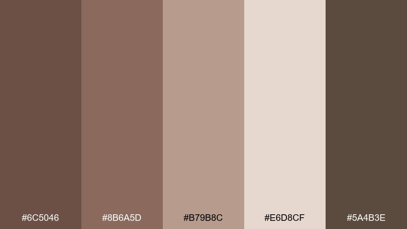
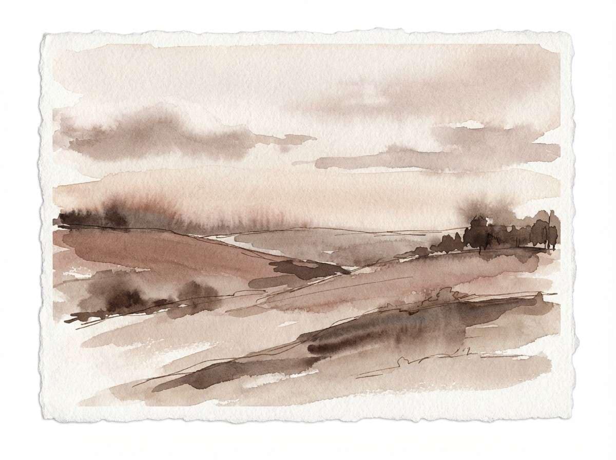
HEX: #6C5046 #8B6A5D #B79B8C #E6D8CF #5A4B3E
Mood: soft, dusty, peaceful
Best for: landscape illustrations and posters
Soft and dusty, like prairie grass fading into dusk. Use it for landscape posters, calming header art, and gentle storytelling illustrations. Keep the lighter neutral as the sky or paper base, then layer the mid tones for hills and textures. Tip: avoid pure black outlines and use the deepest brown instead for a more natural finish.
Image example of prairie dusk generated using media.io
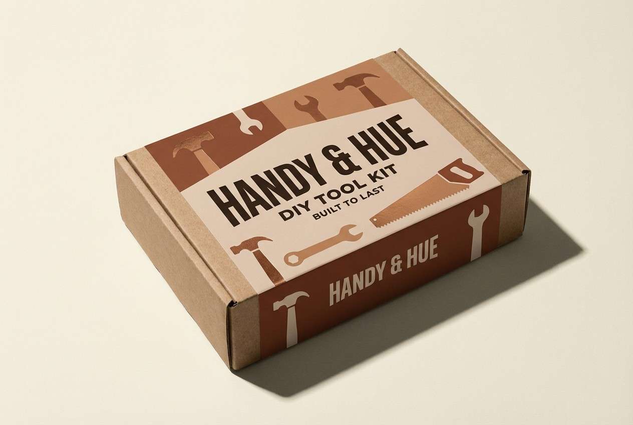
19) Sienna Workshop
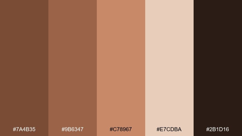
HEX: #7A4B35 #9B6347 #C78967 #E7CDBA #2B1D16
Mood: energetic, crafty, robust
Best for: tool packaging and DIY tutorials
Energetic and robust, like a workbench stained with sienna sawdust. This beaver color palette is a strong fit for DIY tutorial thumbnails, maker brand assets, and tool packaging. Use the bright sienna mid tone for callouts and badges, then anchor everything with the near-black for clear hierarchy. Tip: keep backgrounds light so the bolder brown feels like an accent, not a flood.
Image example of sienna workshop generated using media.io
20) Quiet Sepia Portfolio
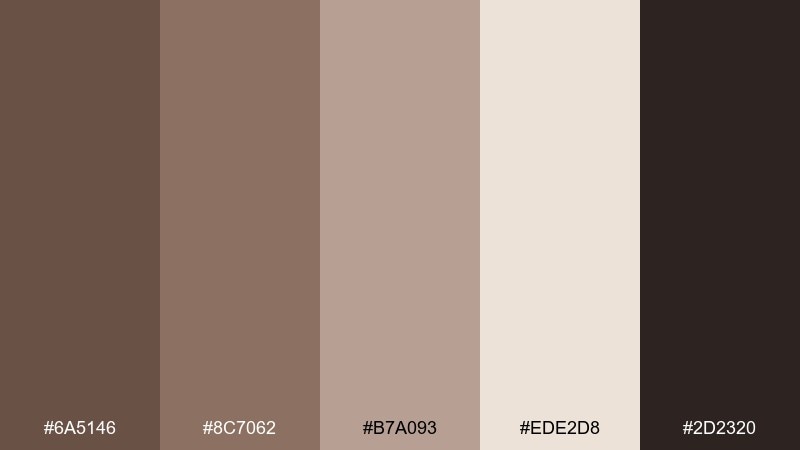
HEX: #6A5146 #8C7062 #B7A093 #EDE2D8 #2D2320
Mood: quiet, nostalgic, minimal
Best for: photography portfolios and case studies
Quiet and nostalgic, like sepia prints in a matte album. Use it for photography portfolios, case studies, and calm slide decks where images should lead. Keep UI elements subtle in the mid tones, then use the dark shade only for navigation and captions. Tip: add generous spacing and thin dividers so the palette feels modern rather than retro.
Image example of quiet sepia portfolio generated using media.io
What Colors Go Well with Beaver?
Beaver pairs naturally with creamy off-whites, linen tones, and warm grays, which keep designs light and readable. For deeper contrast, add espresso or near-black browns instead of pure black to preserve the organic feel.
Muted greens (moss, olive, eucalyptus) are a classic accent because they echo outdoor materials and balance the warmth. If you want a more premium edge, copper/bronze highlights and dusty terracotta bring glow without turning the palette loud.
For modern UI, combine beaver with a very pale neutral surface and one consistent mid-brown accent. This keeps buttons, states, and charts clear—without the interface turning muddy.
How to Use a Beaver Color Palette in Real Designs
Start with roles, not just colors: pick one dark beaver for text/CTA, one mid tone for UI structure (borders, tabs, dividers), and one light neutral for the main background. This creates predictable hierarchy across pages and screens.
In branding and packaging, treat beaver as a “material base” and layer texture (paper grain, wood, matte finishes) to make the palette feel intentional. Small doses of a near-black shade help logos and labels stay sharp and premium.
For print, test your lightest neutral and mid browns together—those are the shades most likely to compress. Keeping type either very dark or very light usually prevents low-contrast surprises.
Create Beaver Palette Visuals with AI
If you want to preview how a beaver palette will look on real assets (menus, landing pages, product boxes, posters), generate quick concept visuals before committing to production. It’s a fast way to validate contrast, mood, and material cues.
Use your chosen HEX set as the base, then describe the format (UI mockup, label design, invitation suite) and lighting (studio, natural, cinematic). A consistent prompt style helps you compare palette options fairly.
Once you like a direction, iterate by changing only one variable at a time—like swapping the accent shade or brightening the background—so improvements are measurable.
Beaver Color Palette FAQs
-
What is a “beaver” color in design?
Beaver is a warm, earthy brown that often sits between taupe and medium-dark wood tones. It’s commonly used as a grounded neutral for branding, interiors, and UI palettes. -
Is beaver more brown or more gray?
Most beaver shades lean brown with a muted, slightly gray (taupe) undertone. That subtle desaturation is what makes it pair well with creams, stone neutrals, and muted greens. -
What accent colors work best with beaver?
Muted greens (moss/olive), coppery oranges, and soft terracotta accents are dependable choices. For cleaner, modern contrast, use an off-white base plus a deep espresso near-black for text and buttons. -
How do I keep a beaver palette from looking “muddy”?
Increase value separation: use a very light neutral background, reserve the darkest brown for type/CTAs, and keep only one mid-tone as your main accent. Avoid stacking several similar mid browns in the same area. -
Do beaver tones work for websites and apps?
Yes—beaver palettes are popular for dashboards, settings screens, and landing pages because they feel warm and trustworthy. Just ensure WCAG-friendly contrast by pairing dark text with very light surfaces. -
Are beaver palettes good for print materials?
They’re generally print-friendly because they resemble real materials like wood, leather, and paper. Always proof light neutrals and mid browns together to make sure subtle differences don’t compress on your chosen stock. -
Can I generate beaver palette mockups with AI?
Yes—use an AI text-to-image tool, include your HEX codes in the prompt, and specify the asset type (packaging, UI, invitation, poster). This helps you preview mood and contrast before final design.
Next: Contrast Color Palette


