

Red rust is a warm, earthy hue that sits between brick red and burnt orange—rich enough to feel bold, yet grounded enough to act like a neutral in many designs.
Below are red rust palette ideas with HEX codes you can copy for branding, interiors, UI, and social graphics, plus AI prompts to generate matching visuals fast.
In this article
- Why Red Rust Palettes Work So Well
-
- foundry ember
- desert kiln
- autumn brick cream
- copper canyon
- rustic minimal
- spiced clay ui
- terracotta sunset
- vintage workshop
- warm lodge
- sienna sage
- canyon dusk
- brick charcoal
- clay rose
- ochre hearth
- rusty denim
- paprika pop
- earthy editorial
- claystone kitchen
- desert bloom watercolor
- industrial signage
- museum clay
- spice market mix
- What Colors Go Well with Red Rust?
- How to Use a Red Rust Color Palette in Real Designs
- Create Red Rust Palette Visuals with AI
Why Red Rust Palettes Work So Well
Red rust feels familiar and tactile—like clay, brick, leather, and oxidized metal—so it instantly adds warmth and authenticity. That makes it a strong choice for brands and spaces that want to feel crafted, grounded, or outdoorsy.
It also pairs beautifully with both light neutrals (cream, sand, blush) and deep anchors (charcoal, navy, forest green). This flexibility helps you build contrast for readability while keeping the overall look cohesive.
Because rust is naturally muted compared to bright reds, it reads as sophisticated rather than loud. With the right neutrals, you can push it industrial, rustic, modern, or romantic without changing the hero hue.
20+ Red Rust Color Palette Ideas (with HEX Codes)
1) Foundry Ember
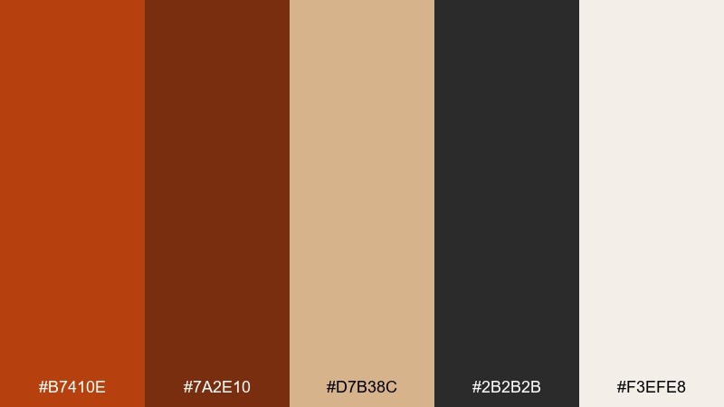
HEX: #B7410E #7A2E10 #D7B38C #2B2B2B #F3EFE8
Mood: bold, industrial, grounded
Best for: brand identity for a craft coffee roaster
Bold and industrial, it feels like glowing embers in a steel workshop with a soft dusting of ash. Use the deep rust and charcoal for logos and headlines, then bring in warm sand for packaging textures. Pair it with uncoated paper, matte black finishes, and simple sans-serif type. Tip: keep the rust as the hero color and reserve the light cream for breathing room.
Image example of foundry ember generated using media.io
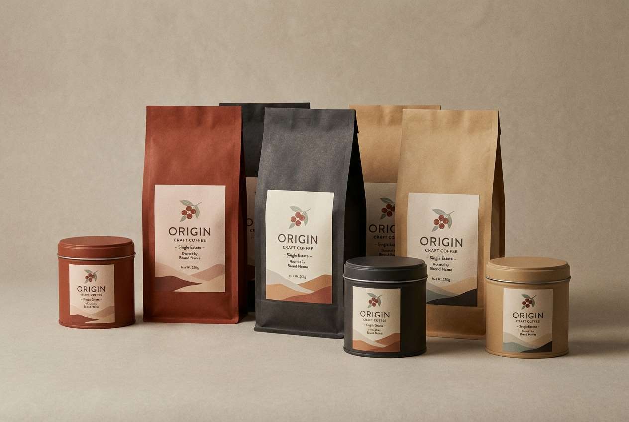
Media.io is an online AI studio for creating and editing video, image, and audio in your browser.

2) Desert Kiln
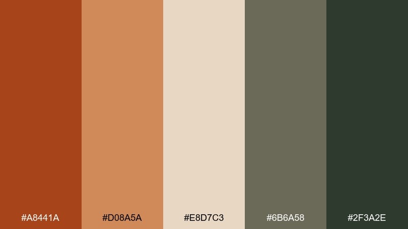
HEX: #A8441A #D08A5A #E8D7C3 #6B6A58 #2F3A2E
Mood: sunbaked, earthy, calm
Best for: southwest-inspired living room interior styling
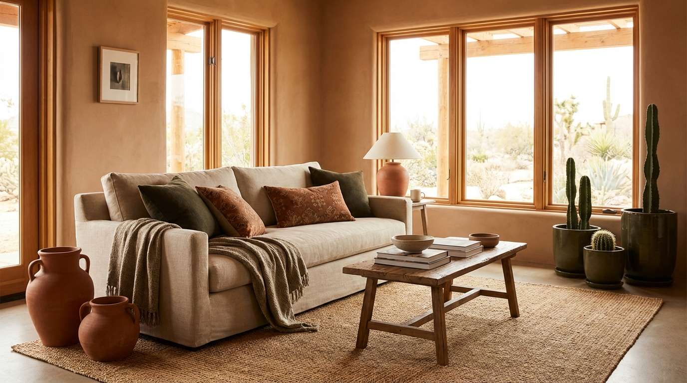
Sunbaked and calm, it evokes clay walls, desert wind, and weathered stone. Lean on the muted rust and tan for textiles, then anchor the room with olive-charcoal accents. Natural materials like linen, leather, and raw wood make these tones feel authentic. Tip: repeat the dark green sparingly in three small touchpoints to keep the space cohesive.
Image example of desert kiln generated using media.io
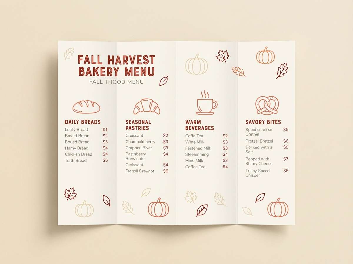
3) Autumn Brick Cream
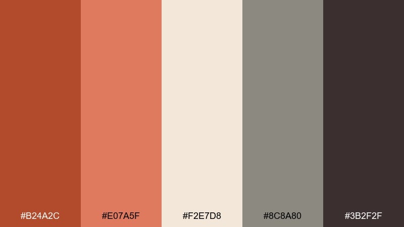
HEX: #B24A2C #E07A5F #F2E7D8 #8C8A80 #3B2F2F
Mood: cozy, seasonal, inviting
Best for: fall bakery menu design
Cozy and inviting, it brings to mind brick ovens, cinnamon warmth, and fresh paper bags. Use the rich brick tone for section headers, then balance it with creamy backgrounds for readability. A hint of warm gray keeps the layout modern instead of overly rustic. Tip: limit the darker brown to icons and dividers so the menu stays light and appetizing.
Image example of autumn brick cream generated using media.io
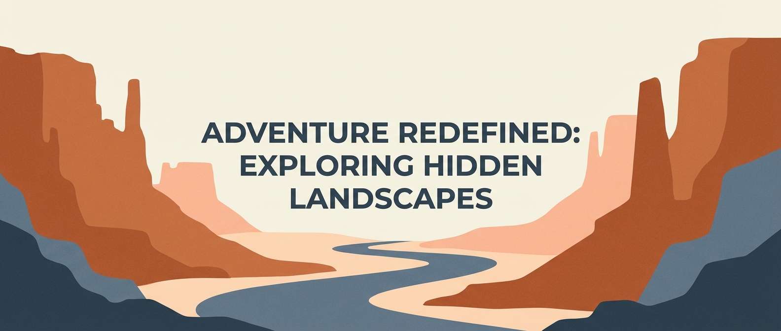
4) Copper Canyon
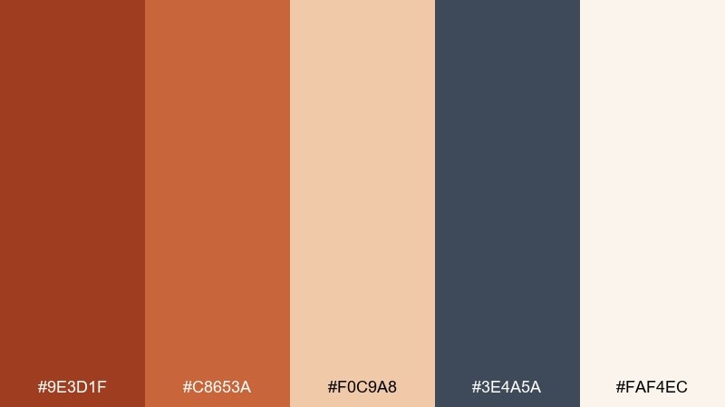
HEX: #9E3D1F #C8653A #F0C9A8 #3E4A5A #FAF4EC
Mood: adventurous, warm, contemporary
Best for: travel blog hero banner
Adventurous and warm, it reads like canyon rock against a cool evening sky. Let the copper tones lead in large shapes, then use slate blue for contrast in buttons and links. Cream keeps the composition airy and makes photos feel brighter. Tip: add a subtle grain overlay to unify the warm and cool tones.
Image example of copper canyon generated using media.io
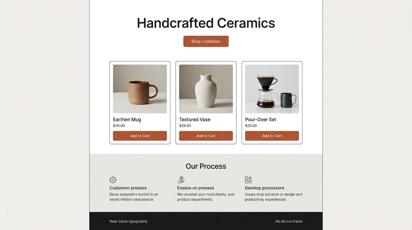
5) Rustic Minimal
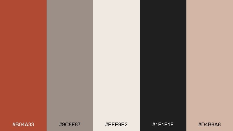
HEX: #B04A33 #9C8F87 #EFE9E2 #1F1F1F #D4B6A6
Mood: minimal, warm, refined
Best for: modern product landing page UI mockup
Minimal and refined, it feels like warm clay against clean stone and ink. Use the near-black for text and navigation, then bring in rust as the single high-impact accent. The soft grays and creams keep interfaces calm and premium. Tip: apply rust only to primary CTAs and active states to avoid visual noise.
Image example of rustic minimal generated using media.io
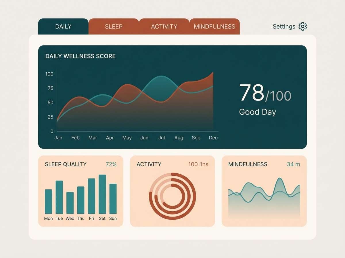
6) Spiced Clay UI
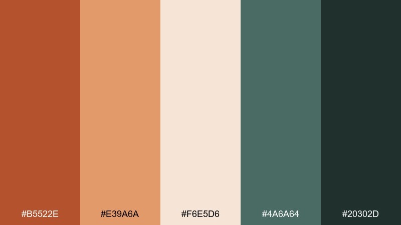
HEX: #B5522E #E39A6A #F6E5D6 #4A6A64 #20302D
Mood: fresh, warm, modern
Best for: dashboard UI for a wellness app
Fresh and warm, it suggests spiced clay, dried herbs, and a cool ceramic glaze. In a red rust color palette like this, the dark teal makes an excellent contrast for charts and navigation. Keep cards on the pale peach-cream so the interface stays soft and welcoming. Tip: use the mid-spice tone for highlights while reserving the darkest shade for text and key metrics.
Image example of spiced clay ui generated using media.io
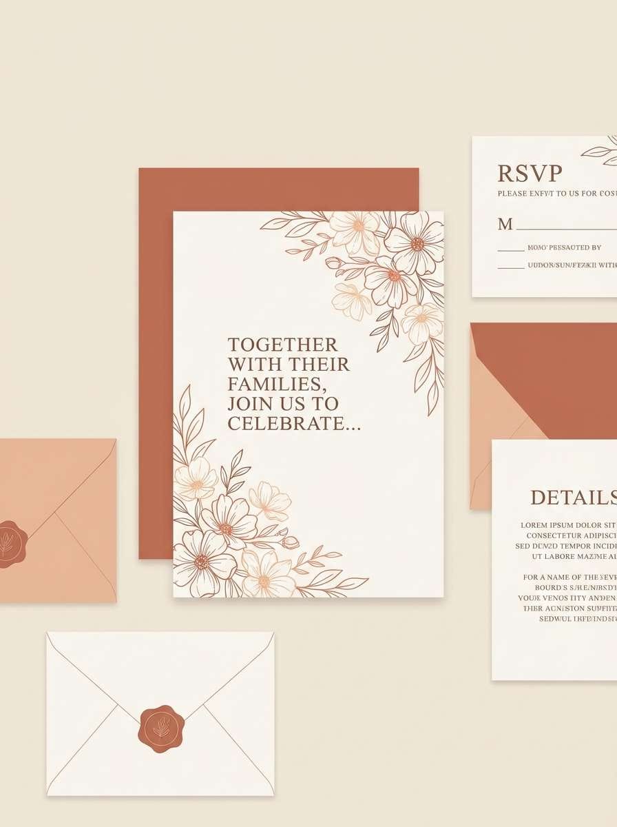
7) Terracotta Sunset
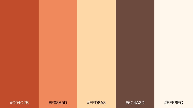
HEX: #C04C2B #F08A5D #FFD8A8 #6C4A3D #FFF6EC
Mood: romantic, glowing, optimistic
Best for: wedding invitation suite
Romantic and glowing, it feels like a terracotta sky at golden hour with soft candlelight. Use the palest cream as the paper base, then add warm coral for names and headings. Deep cocoa works beautifully for fine lines, monograms, and RSVP details. Tip: emboss or letterpress the darker tone to add tactile contrast without adding more colors.
Image example of terracotta sunset generated using media.io
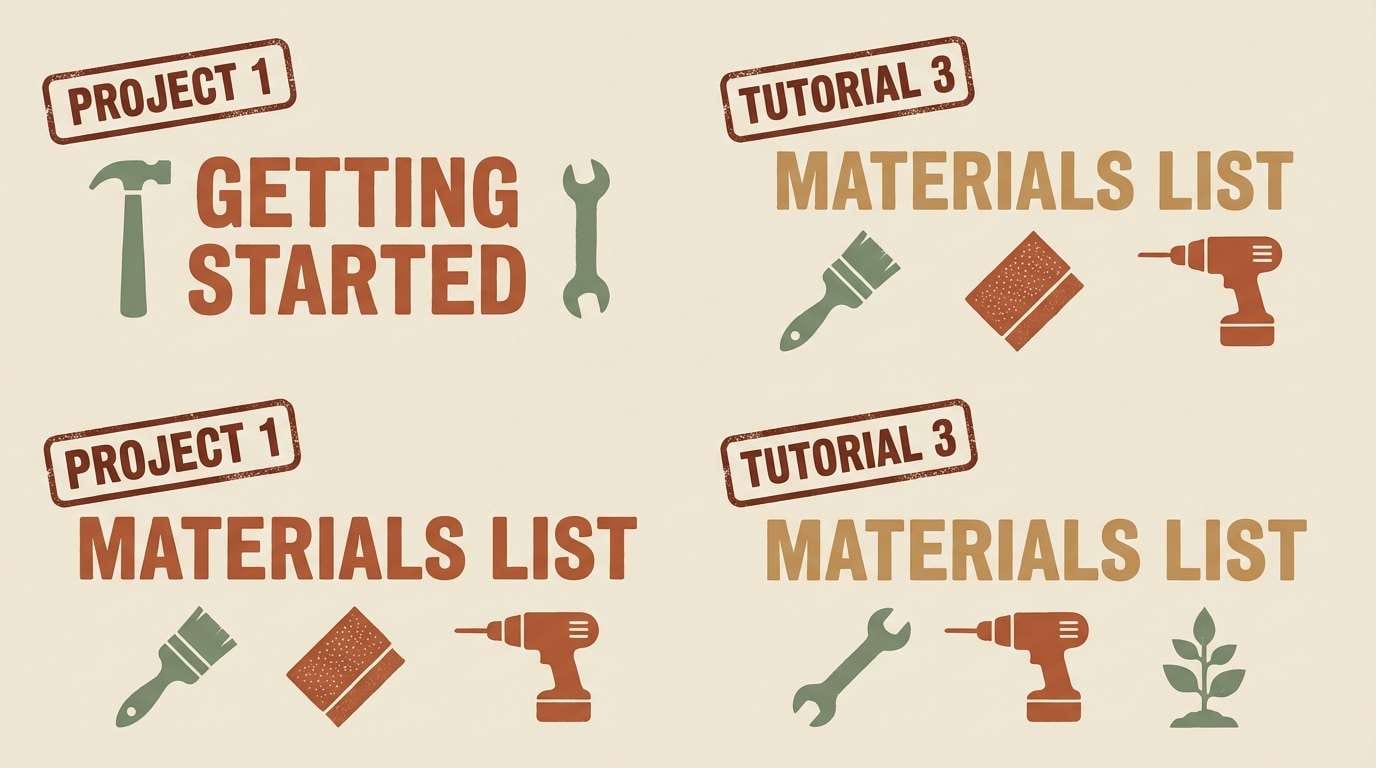
8) Vintage Workshop
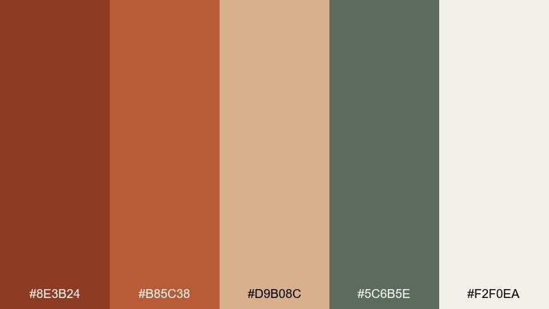
HEX: #8E3B24 #B85C38 #D9B08C #5C6B5E #F2F0EA
Mood: nostalgic, handmade, sturdy
Best for: DIY tutorial blog graphics
Nostalgic and handmade, it recalls worn tool handles, sawdust, and aged canvas. Use the darker rust for titles and stamps, while tan and linen tones keep tutorials friendly and readable. A muted green adds a practical, workshop feel without turning the palette muddy. Tip: apply the green only to callout boxes so the warm tones remain the main story.
Image example of vintage workshop generated using media.io
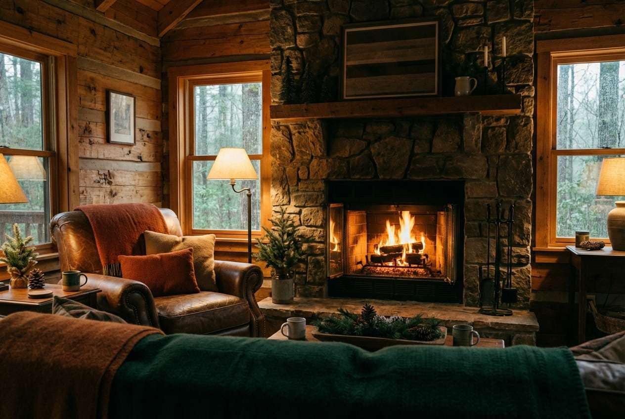
9) Warm Lodge
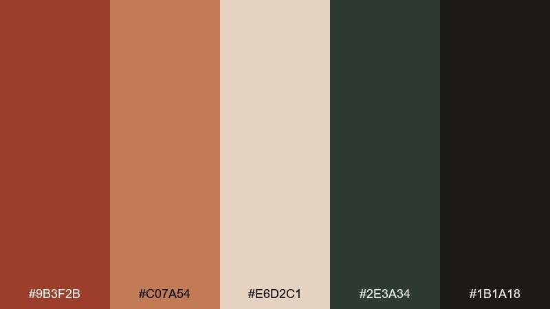
HEX: #9B3F2B #C07A54 #E6D2C1 #2E3A34 #1B1A18
Mood: cozy, rustic, intimate
Best for: cabin rental listing photos color grading
Cozy and intimate, it feels like a lodge fire, leather chairs, and pine shadows outside the window. Use the warm midtone for wood and textiles, then deepen the mood with near-black and forest accents. Creamy highlights keep interiors from looking too heavy in low light. Tip: push rust into the midtones during grading and keep shadows neutral to preserve detail.
Image example of warm lodge generated using media.io
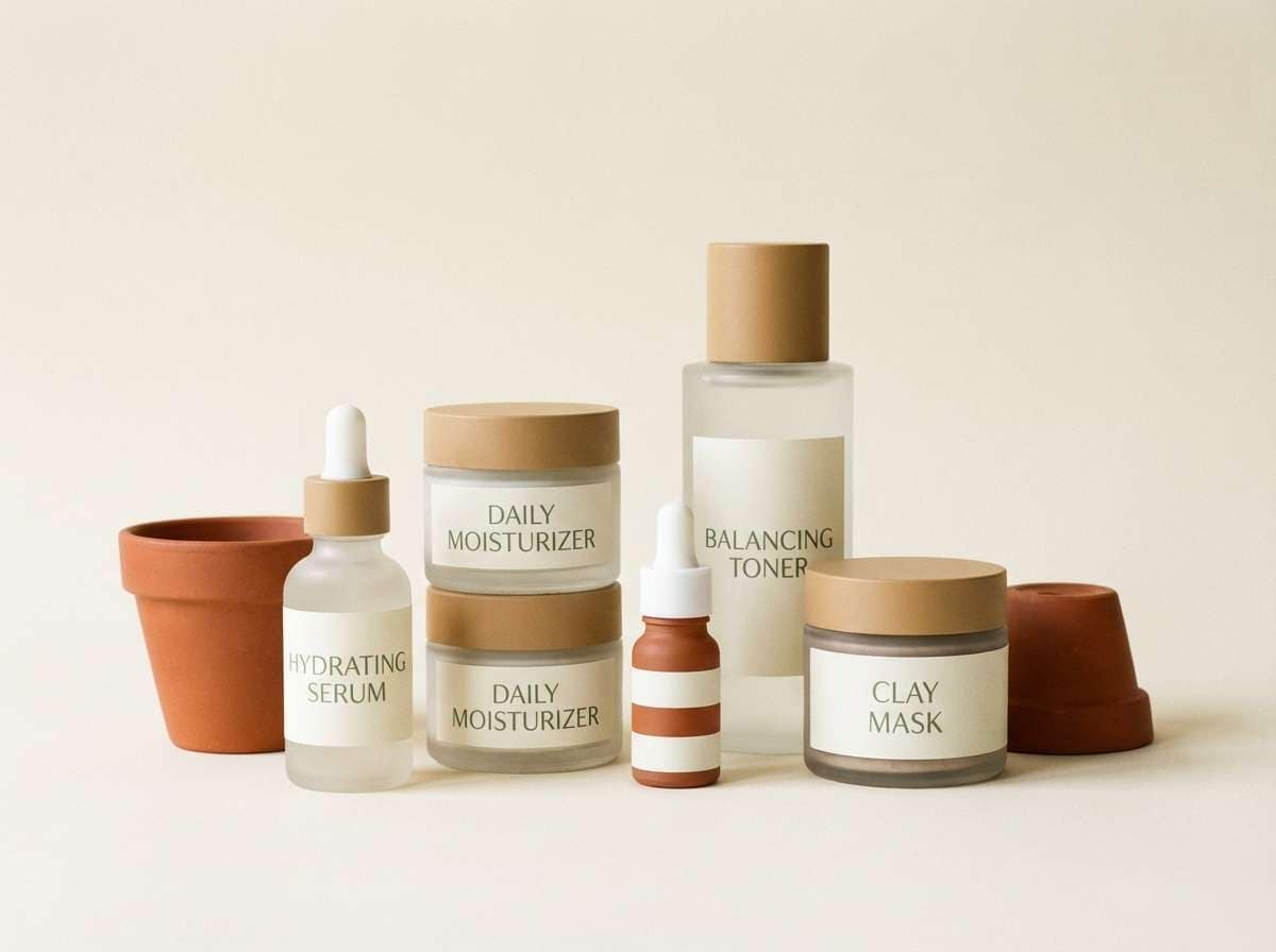
10) Sienna Sage
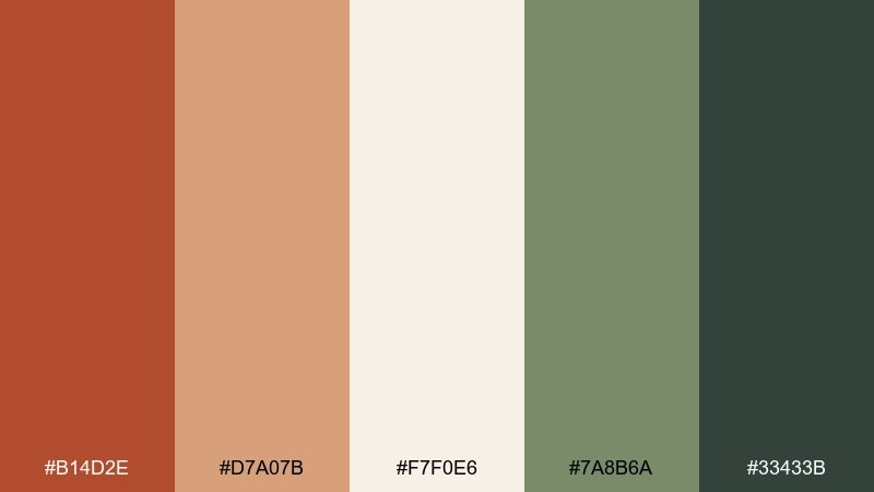
HEX: #B14D2E #D7A07B #F7F0E6 #7A8B6A #33433B
Mood: natural, balanced, calming
Best for: skincare product labels
Natural and balanced, it suggests sun-warmed earth paired with fresh garden herbs. Use the light cream for label backgrounds and keep the typography in the deep green for a clean, botanical feel. Sienna and soft tan work well for ingredient highlights and seals. Tip: choose matte materials so the warm tones stay soft instead of glossy.
Image example of sienna sage generated using media.io
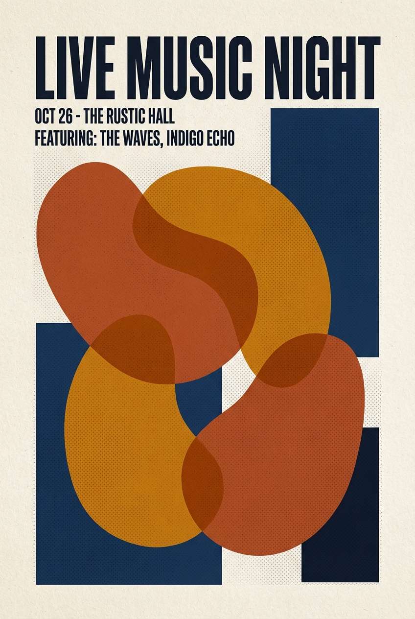
11) Canyon Dusk
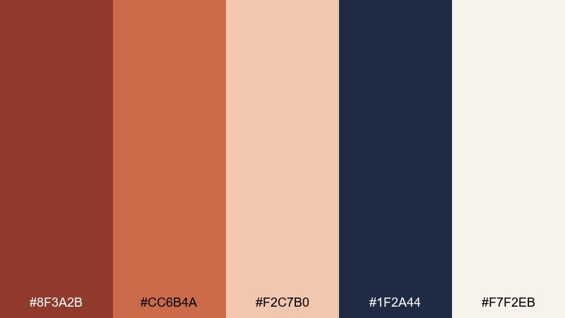
HEX: #8F3A2B #CC6B4A #F2C7B0 #1F2A44 #F7F2EB
Mood: dramatic, cinematic, modern
Best for: event poster for a live music night
Dramatic and cinematic, it feels like warm canyon light fading into a deep navy evening. These red rust color combinations shine on posters when you set bold type in navy and use rust as the main shape color. Pale peach helps with legibility for dates and venue details. Tip: add a subtle halftone texture to the rust blocks for a vintage gig-poster edge.
Image example of canyon dusk generated using media.io
12) Brick Charcoal

HEX: #A73F2A #D16D57 #E9D8CF #3A3A3A #111111
Mood: urban, strong, confident
Best for: streetwear lookbook layout
Urban and confident, it reads like brick walls, charcoal ink, and warm skin tones. Use near-black for typography and grid lines, then let brick and salmon carry the accents. The dusty blush neutral smooths transitions between blocks of color. Tip: keep backgrounds mostly light neutral to make product photos feel crisp.
Image example of brick charcoal generated using media.io
13) Clay Rose
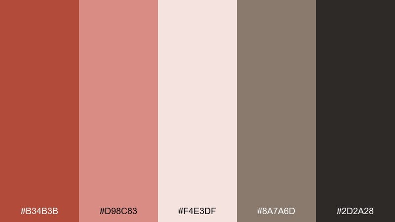
HEX: #B34B3B #D98C83 #F4E3DF #8A7A6D #2D2A28
Mood: soft, romantic, vintage
Best for: beauty social media templates
Soft and romantic, it feels like clay blush, dried roses, and vintage paper. Use the pale pink-cream for backgrounds and reserve the darker clay for titles and key claims. Warm taupe keeps the layout elegant and less sugary than pure pink. Tip: add thin separators in taupe to structure carousel slides without heavy borders.
Image example of clay rose generated using media.io
14) Ochre Hearth
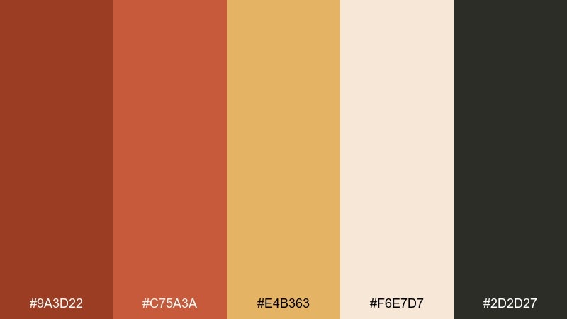
HEX: #9A3D22 #C75A3A #E4B363 #F6E7D7 #2D2D27
Mood: homey, warm, cheerful
Best for: kitchen backsplash and decor planning
Homey and cheerful, it brings to mind a busy hearth with toasted bread and golden spice jars. Use ochre as a bright pop in tiles or accessories, while rust tones keep the space grounded. Creamy neutrals help these warm colors feel clean rather than heavy. Tip: repeat ochre in small, high-visibility spots like handles, canisters, or a narrow border tile.
Image example of ochre hearth generated using media.io
15) Rusty Denim
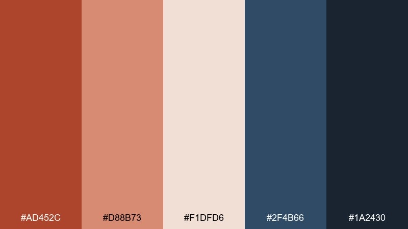
HEX: #AD452C #D88B73 #F1DFD6 #2F4B66 #1A2430
Mood: casual, modern, balanced
Best for: apparel e-commerce homepage
Casual and modern, it feels like worn denim paired with a warm rust scarf. Use the blues for navigation and trust cues, then pull rust into promotional tags and seasonal banners. The pale blush neutral keeps product grids clean and reduces contrast fatigue. Tip: use the darkest navy only for body text to keep the page feeling airy.
Image example of rusty denim generated using media.io
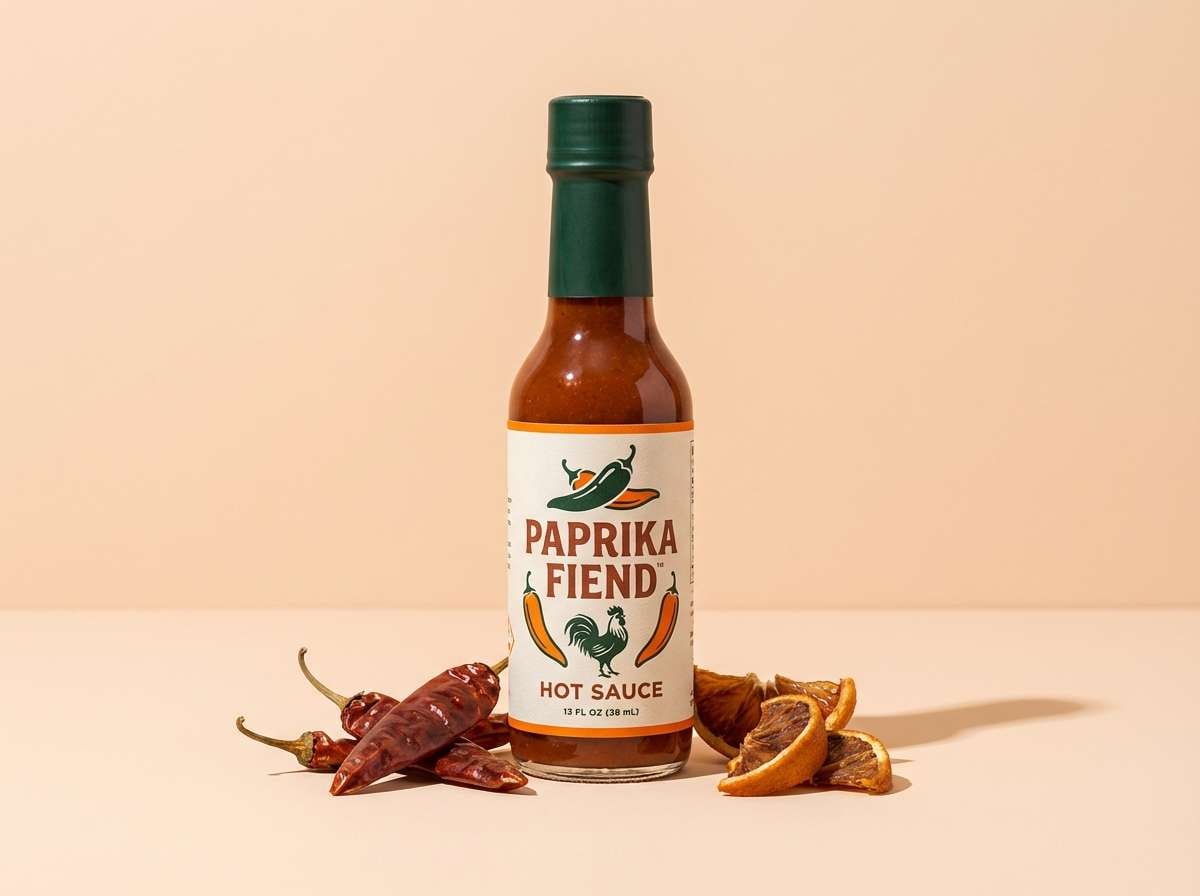
16) Paprika Pop
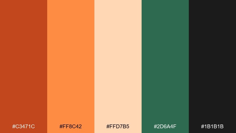
HEX: #C3471C #FF8C42 #FFD7B5 #2D6A4F #1B1B1B
Mood: energetic, spicy, playful
Best for: hot sauce product ad
Energetic and spicy, it evokes paprika heat with a fresh green bite. These tones work great for bold ads where orange-rust carries the appetite appeal and deep green adds contrast. Keep text mostly in near-black for sharp readability on the light peach. Tip: use the bright orange sparingly as a highlight so it feels punchy, not loud.
Image example of paprika pop generated using media.io
17) Earthy Editorial
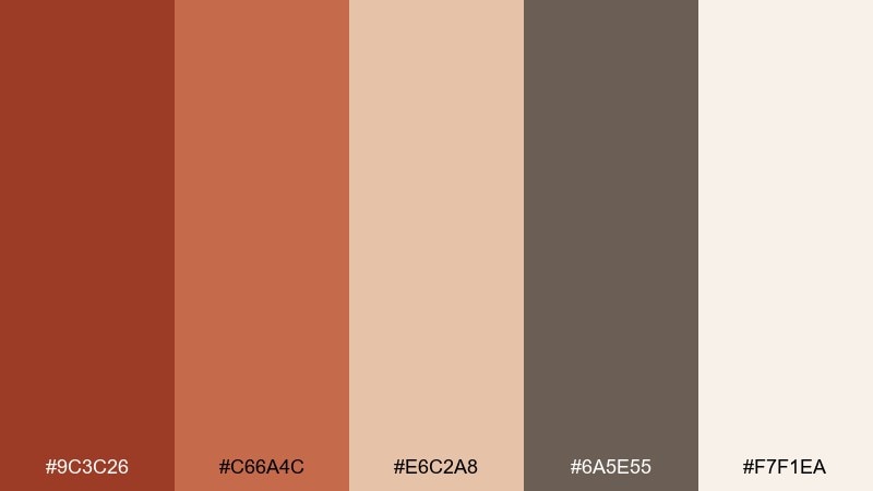
HEX: #9C3C26 #C66A4C #E6C2A8 #6A5E55 #F7F1EA
Mood: editorial, artistic, warm
Best for: magazine feature layout
Editorial and artistic, it feels like print ink on textured paper with warm clay highlights. Use rust for pull quotes and section tabs, while taupe and cream handle long-form readability. The soft peach is ideal for background panels behind captions. Tip: pair with a serif headline font and a restrained grid to keep the warmth looking premium.
Image example of earthy editorial generated using media.io
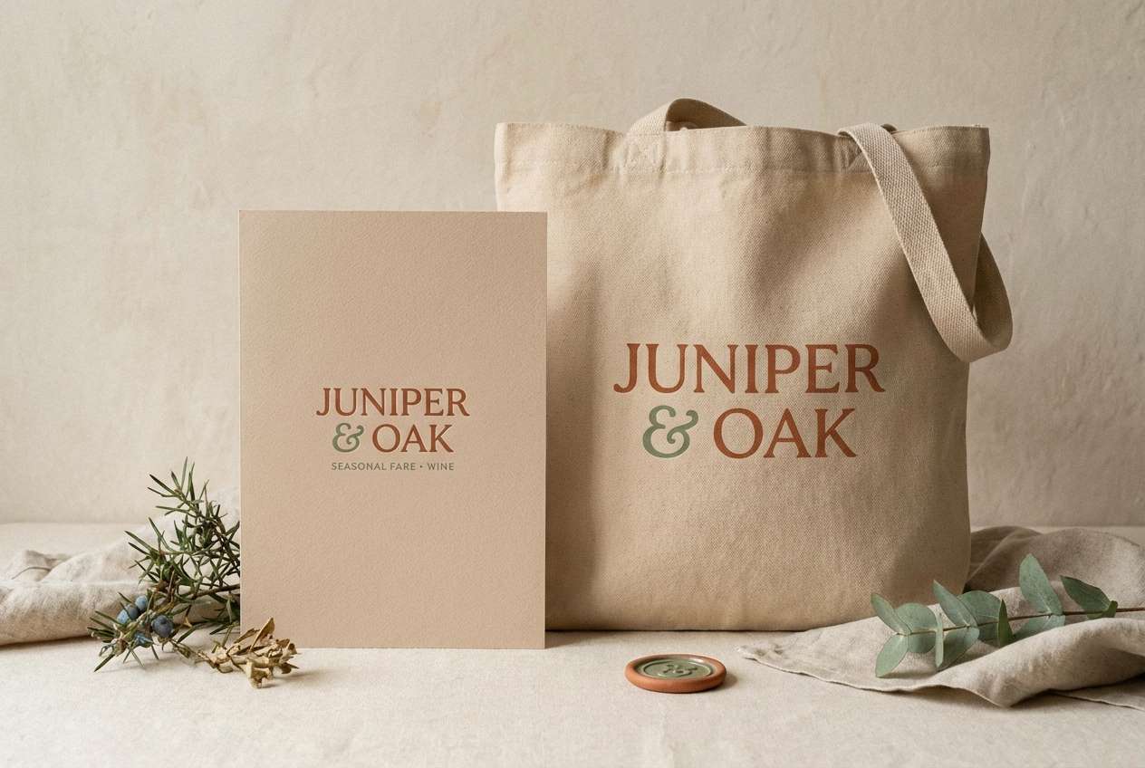
18) Claystone Kitchen
HEX: #B14A2B #D9A07B #EFE1D6 #A3B18A #3A4A3F
Mood: fresh, wholesome, welcoming
Best for: farm-to-table restaurant branding
Fresh and wholesome, it suggests clay bowls, toasted grains, and leafy greens from the garden. Red rust color combinations like these feel especially appetizing on menus, signage, and tote bags when you balance warmth with herbaceous greens. Use the pale neutral as your main canvas and keep the darkest green for small, crisp details. Tip: choose one green as the signature accent and stick to it across all touchpoints.
Image example of claystone kitchen generated using media.io
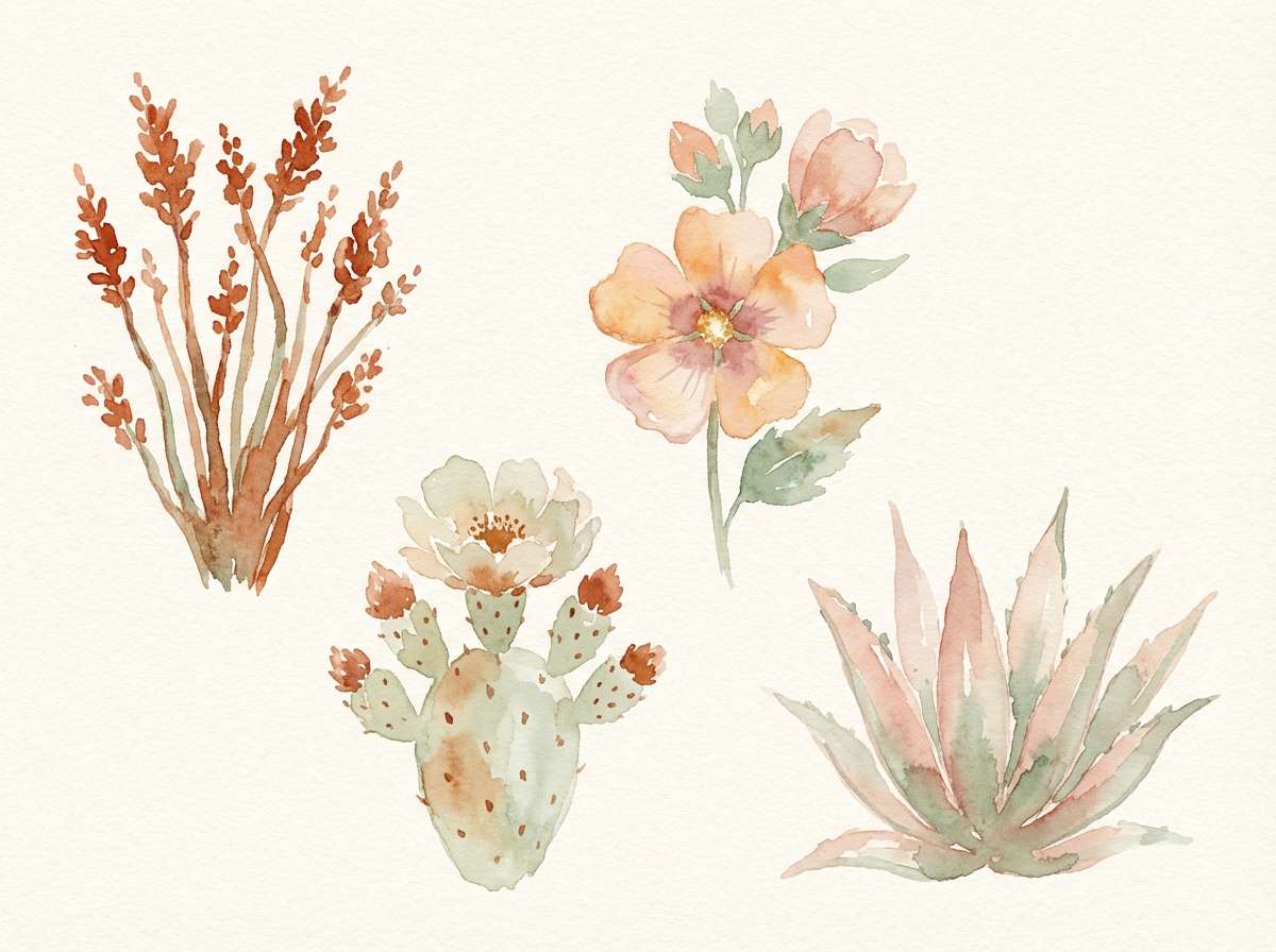
19) Desert Bloom Watercolor
HEX: #B24A30 #E28F6B #F6D7C3 #8FAE8B #F9F2EA
Mood: soft, airy, botanical
Best for: spring botanical illustration set
Soft and airy, it looks like watercolor washes over desert blooms and sunlit petals. Use the warm rust as the deepest pigment for flower centers and stems, then fade into peach and cream for highlights. The gentle green keeps the botanicals lively without overpowering the warm base. Tip: keep edges slightly feathered so the palette feels painted, not flat.
Image example of desert bloom watercolor generated using media.io
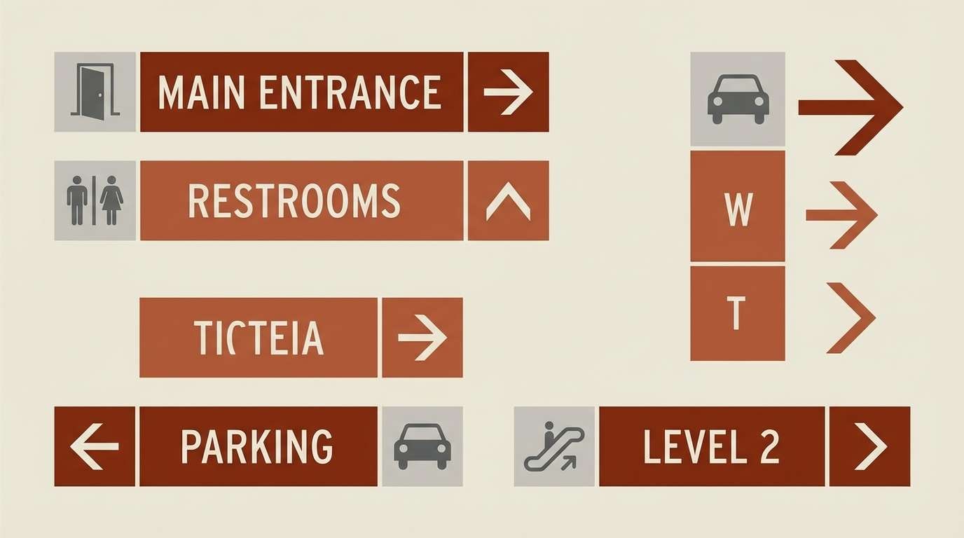
20) Industrial Signage
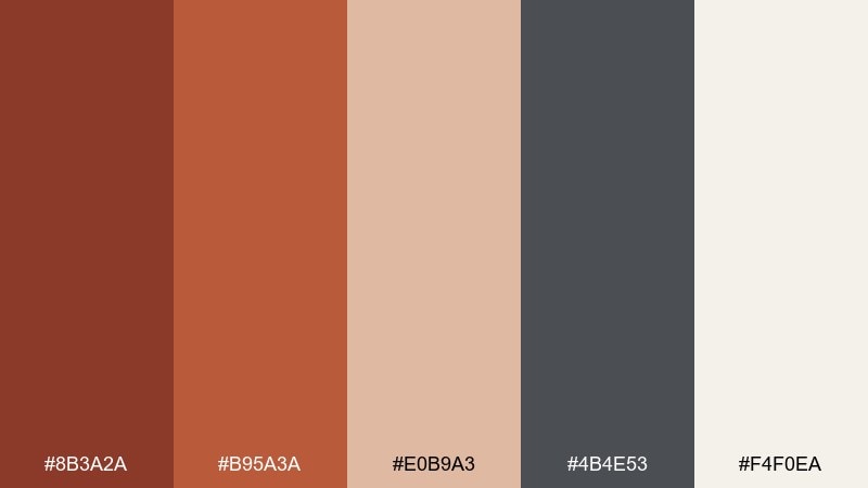
HEX: #8B3A2A #B95A3A #E0B9A3 #4B4E53 #F4F0EA
Mood: tough, clear, utilitarian
Best for: wayfinding signage system
Tough and utilitarian, it feels like painted metal, concrete dust, and clear directional marks. Use the darker rust for headers and arrows, then rely on gray for structure and accessibility. The pale neutral supports high contrast without looking stark white. Tip: test contrast pairs early and keep icon fills in gray for consistency across sign types.
Image example of industrial signage generated using media.io
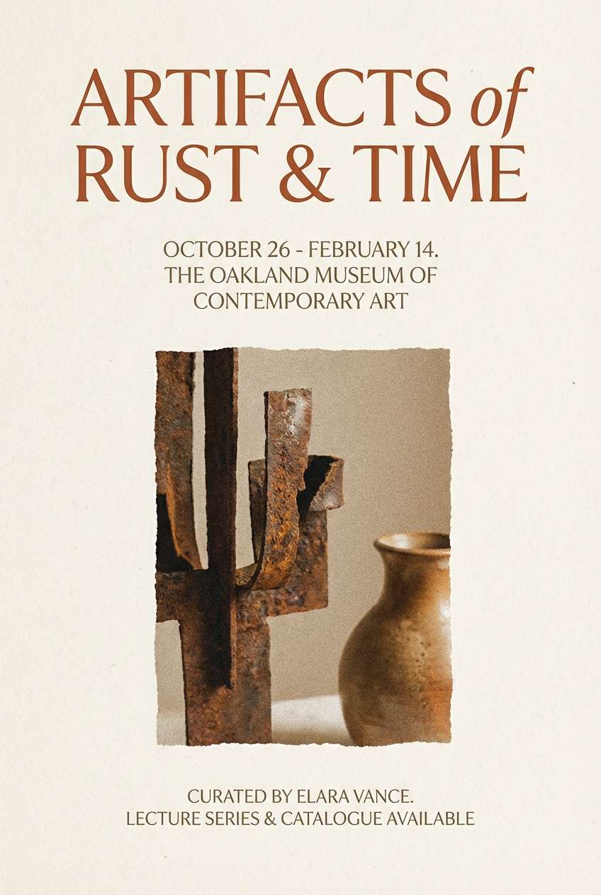
21) Museum Clay
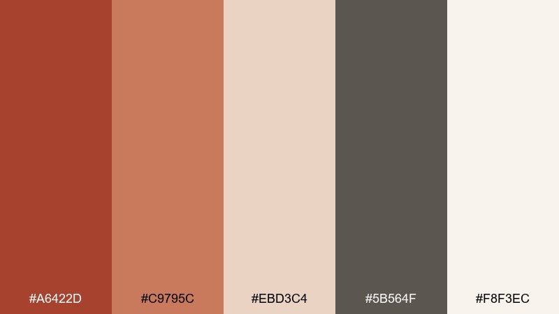
HEX: #A6422D #C9795C #EBD3C4 #5B564F #F8F3EC
Mood: quiet, cultured, timeless
Best for: museum exhibition flyer
Quiet and cultured, it evokes gallery walls, sculpted clay, and soft spotlight warmth. Use rust for exhibition titles and key dates, while warm gray supports body copy without feeling cold. The peach neutral works well for subtle panels behind images or quotes. Tip: keep margins generous so the warm tones feel curated, not crowded.
Image example of museum clay generated using media.io
22) Spice Market Mix
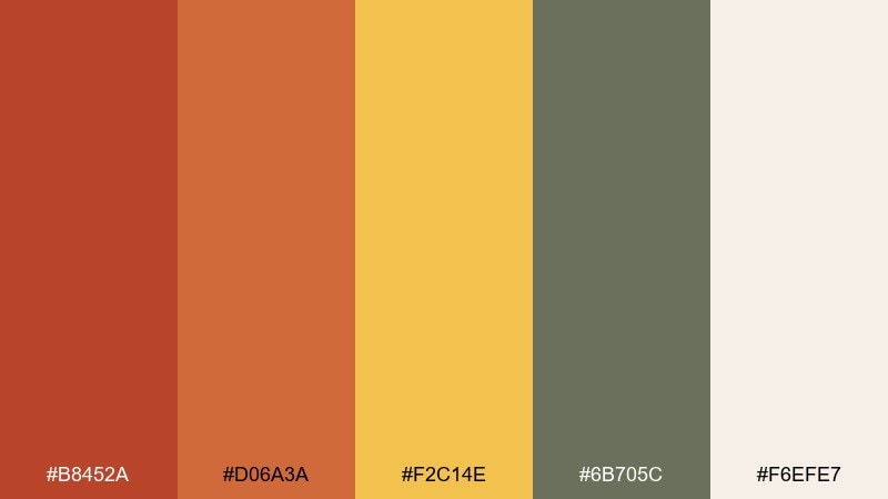
HEX: #B8452A #D06A3A #F2C14E #6B705C #F6EFE7
Mood: lively, earthy, aromatic
Best for: recipe blog header graphics
Lively and aromatic, it brings up images of heaped spices, paper sacks, and warm sunlight. A red rust color combination with golden mustard makes headers feel energetic without going neon. Keep the background creamy and use the muted olive for small UI labels or tags. Tip: set large type in the darker rust and let mustard appear only as a highlight line or badge.
Image example of spice market mix generated using media.io
What Colors Go Well with Red Rust?
Red rust pairs best with warm neutrals (cream, sand, oatmeal, blush) that soften the heat and keep layouts readable. These light tones also make rust feel more premium and less heavy.
For contrast, lean into cool counterpoints like slate blue, navy, or deep teal—great for buttons, links, and headers. Botanical greens (sage, olive, forest) also complement rust naturally and add freshness without stealing attention.
To modernize the palette, add charcoal or near-black for typography and structure. This makes red rust look crisp, confident, and intentionally designed.
How to Use a Red Rust Color Palette in Real Designs
Use red rust as a hero accent rather than a full background: try it on CTAs, headings, badges, or key shapes. Then support it with a light neutral canvas so the warmth feels controlled and professional.
Balance temperature by pairing rust with one cool anchor (navy/teal/slate) and one deep neutral (charcoal/brown) to create hierarchy. This approach works especially well in UI, posters, and brand systems where contrast matters.
For print and packaging, choose tactile finishes—uncoated stock, matte lamination, or subtle grain—so rust reads earthy and crafted. In interiors, repeat rust in a few touchpoints (textiles, art, ceramics) to keep it intentional.
Create Red Rust Palette Visuals with AI
If you already have HEX codes, the fastest way to test a red rust color palette is to generate sample visuals—packaging, posters, UI mockups, or room scenes—and compare which direction fits your project.
With Media.io’s text-to-image, you can paste a prompt, describe the vibe (industrial, romantic, modern), and iterate quickly. It’s a practical way to validate contrast and mood before you commit to final design files.
Start with one palette above, reuse its prompt, then swap the subject (menu, label, landing page) to create a consistent set of references.
Red Rust Color Palette FAQs
-
What is the HEX code for red rust?
A common red rust HEX code is #B7410E. It’s a warm, earthy red-orange often used for industrial, autumn, and handcrafted design styles. -
Is red rust closer to red, orange, or brown?
Red rust typically sits between red and orange with a brown/earth undertone. Depending on lighting and surrounding colors, it can read more brick-red (with charcoal) or more terracotta/orange (with creams and peaches). -
What neutral colors match a red rust palette best?
Warm neutrals like cream, sand, oatmeal, and soft blush pair especially well because they keep the palette cozy while improving readability. Off-whites often look better than pure white next to rust. -
What accent colors create strong contrast with red rust?
Deep teal, slate blue, and navy create clean, modern contrast against red rust. Charcoal and near-black are also reliable for typography and UI structure. -
Can I use red rust in modern UI design?
Yes—use rust as a controlled accent (primary buttons, active states, highlights) and keep most surfaces in light warm neutrals. Pair with dark text (charcoal/near-black) for accessibility and a premium feel. -
Does red rust work for branding?
Red rust is great for brands that want to feel crafted, warm, and trustworthy—coffee, food, outdoors, ceramics, and heritage-inspired products. Add a cool counter-color (navy/teal) to make it feel more contemporary. -
How do I keep a red rust color scheme from feeling too heavy?
Increase the proportion of light neutrals, reduce dark accents, and reserve the deepest rust shades for small, high-impact moments. Texture (grain, uncoated paper, soft shadows) can also add depth without adding darkness.
Next: Bright Color Palette


