Cream ivory sits in the sweet spot between bright white and warm beige—clean enough for modern layouts, but soft enough to feel welcoming. That balance makes it a reliable base for branding, interiors, and UI.
Below are 20 cream ivory color palette ideas with HEX codes, plus practical tips and AI prompts you can use to generate matching visuals in minutes.
In this article
Why Cream Ivory Palettes Work So Well
Cream ivory works as a “soft white” that keeps designs bright without feeling sterile. It reduces harsh contrast, which helps layouts feel calmer and more premium.
Because it’s neutral with warm undertones, cream ivory pairs easily with wood tones, muted greens, cocoa browns, charcoal, and blush accents. That flexibility makes it a strong base color for systems like brand kits, packaging families, and UI themes.
It also prints beautifully on uncoated and textured stocks, where pure white can look too stark. With the right dark anchor, cream ivory stays legible while still looking cozy.
20+ Cream Ivory Color Palette Ideas (with HEX Codes)
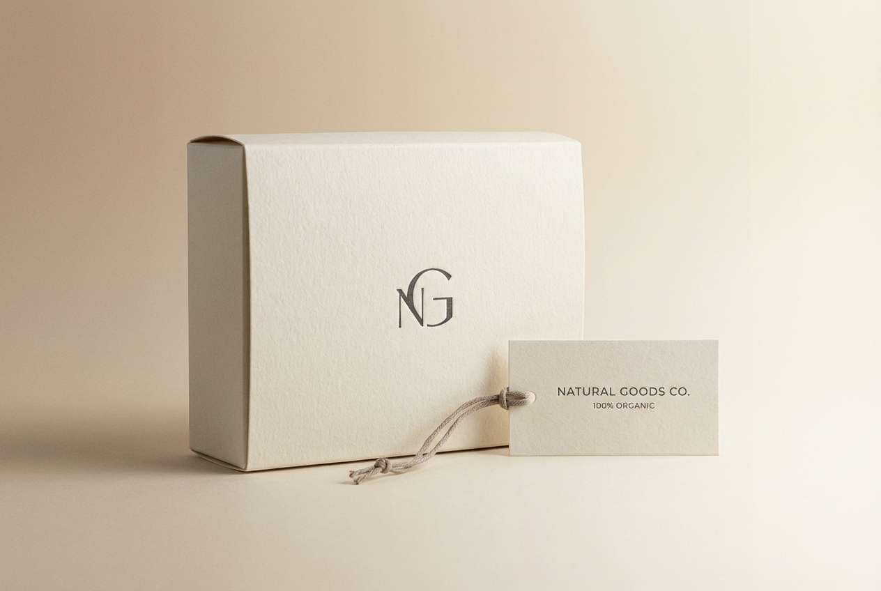
1) Porcelain Morning
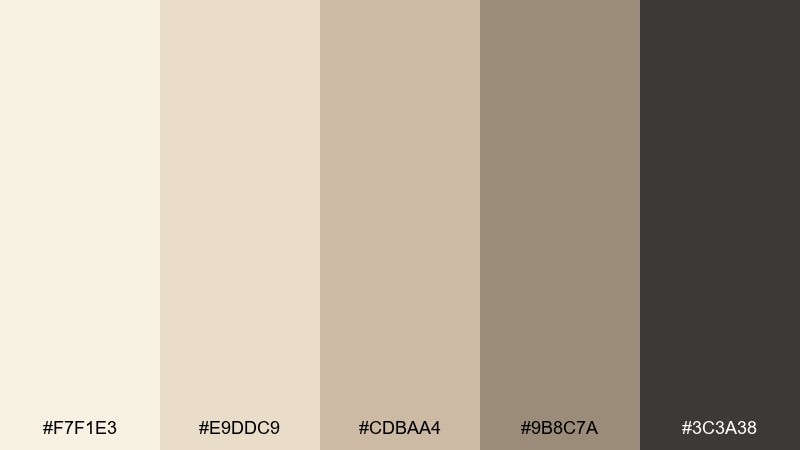
HEX: #F7F1E3 #E9DDC9 #CDBAA4 #9B8C7A #3C3A38
Mood: airy, calm, refined
Best for: minimal product packaging for home goods
Airy porcelain tones and warm stone neutrals evoke a quiet, well-lit studio shelf. Use it for labels, cartons, and hang tags where legibility matters and the material texture can shine. Pair with matte black typography and subtle embossing for a premium feel. Tip: keep the darkest tone for only one focal element, like the brand mark, to preserve the clean vibe.
Image example of porcelain morning generated using media.io
Media.io is an online AI studio for creating and editing video, image, and audio in your browser.

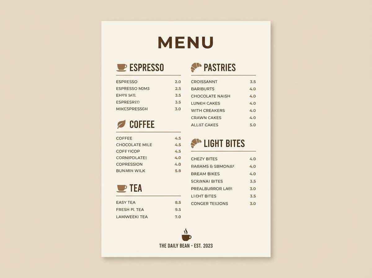
2) Oatmilk Latte
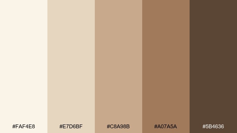
HEX: #FAF4E8 #E7D6BF #C8A98B #A07A5A #5B4636
Mood: cozy, inviting, warm
Best for: cafe branding and menu design
Creamy oat tones and roasted browns feel like a slow morning espresso with steamed milk. It works beautifully for menus, loyalty cards, and signage where warmth should lead the brand voice. Pair with hand-drawn line icons or serif type to add craft without looking rustic. Tip: print the lightest shade on uncoated stock to keep the palette soft and appetizing.
Image example of oatmilk latte generated using media.io
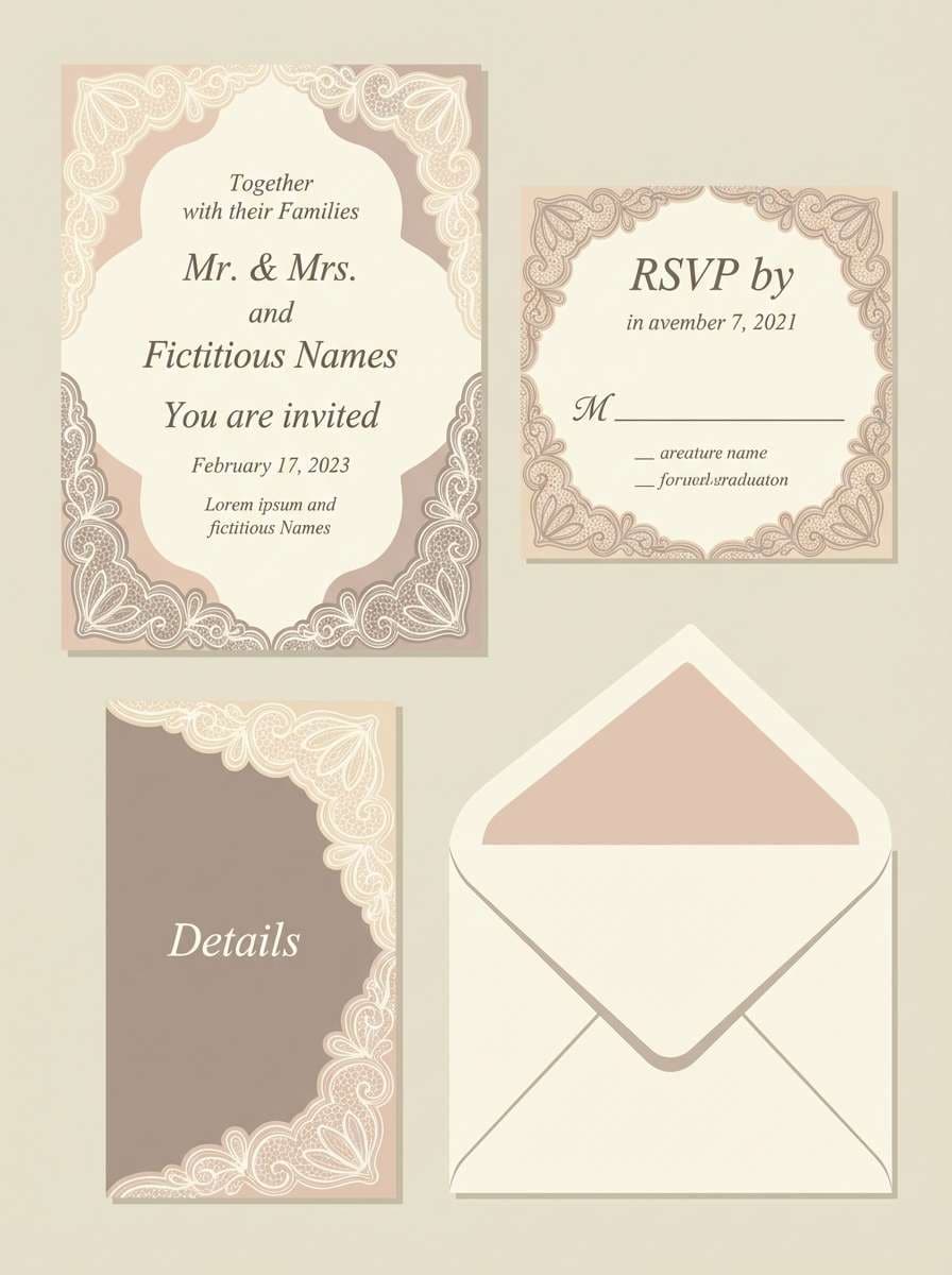
3) Vintage Lace

HEX: #FFF7EE #F1E2D7 #D7C2B5 #B59A8C #6E5B52
Mood: romantic, soft, nostalgic
Best for: wedding invitation suite
Delicate lace-like neutrals create a romantic, heirloom glow with gentle contrast. This cream ivory color palette suits invitations, RSVP cards, and envelope liners where softness should feel intentional, not washed out. Pair with blush florals, copper foil, or a thin brown ink for calligraphy. Tip: keep background fields slightly off-white to avoid stark printer whites.
Image example of vintage lace generated using media.io
4) Sandstone Sage
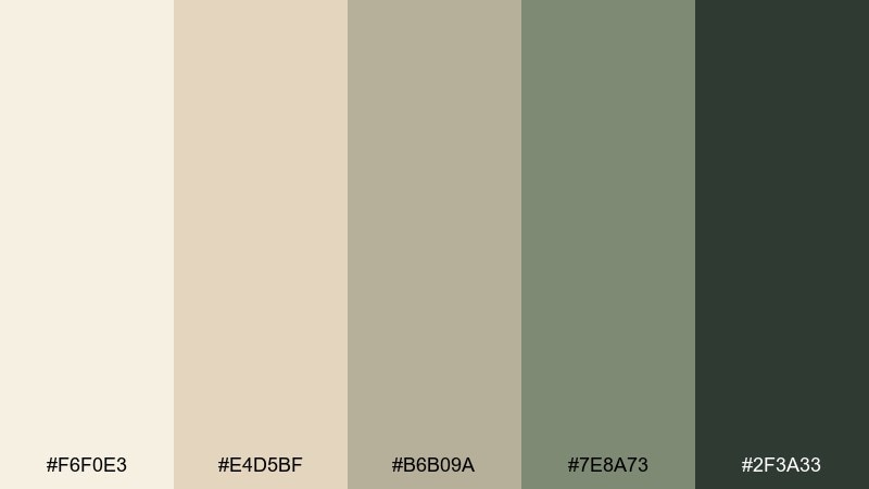
HEX: #F6F0E3 #E4D5BF #B6B09A #7E8A73 #2F3A33
Mood: grounded, natural, balanced
Best for: eco lifestyle brand identity
Sun-warmed sandstone and muted sage feel like a calm hike through dry grasses and shaded leaves. Use it for sustainable branding, stationery, and simple icon systems where nature needs to feel modern. Pair with recycled paper textures and dark green-gray text for clarity. Tip: reserve the sage tone for highlights and navigation to guide the eye without overpowering the neutrals.
Image example of sandstone sage generated using media.io
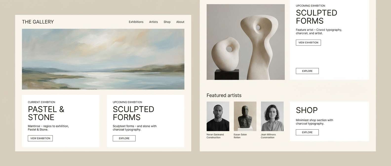
5) Minimal Gallery
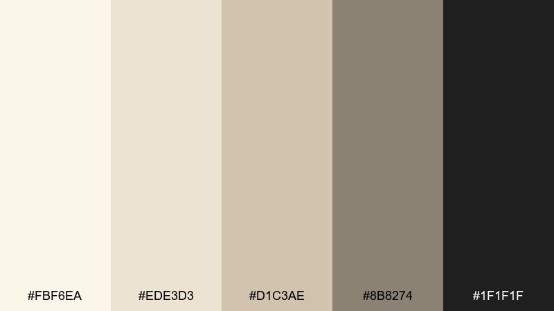
HEX: #FBF6EA #EDE3D3 #D1C3AE #8B8274 #1F1F1F
Mood: modern, crisp, curated
Best for: art gallery website UI
Clean ivory neutrals and deep ink contrast evoke a quiet gallery wall and a focused spotlight. Use it for website layouts, exhibition pages, and ticketing flows where content should breathe. Pair with generous whitespace and a single strong accent button in charcoal for a sharp hierarchy. Tip: keep borders and dividers in the mid beige to avoid a heavy, boxed-in feel.
Image example of minimal gallery generated using media.io
6) Blush Champagne
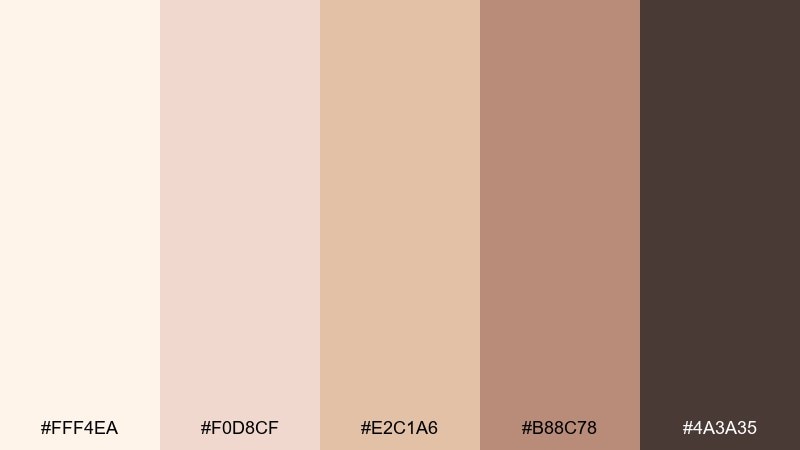
HEX: #FFF4EA #F0D8CF #E2C1A6 #B88C78 #4A3A35
Mood: celebratory, elegant, warm
Best for: beauty launch social campaign
Champagne cream and blush undertones feel festive, polished, and softly luminous. It shines in social templates, product teasers, and highlight covers where a gentle glam mood is the goal. Pair with thin metallic accents or warm brown type for a refined finish. Tip: use blush for overlays at low opacity to keep imagery cohesive across posts.
Image example of blush champagne generated using media.io
7) Coastal Dune
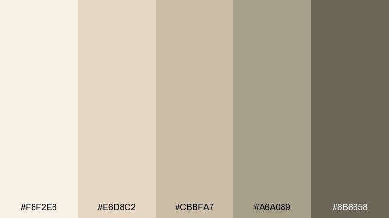
HEX: #F8F2E6 #E6D8C2 #CBBFA7 #A6A089 #6B6658
Mood: sunlit, relaxed, breezy
Best for: travel blog header and editorial visuals
Soft dune neutrals bring to mind sun-bleached sand, driftwood, and hazy late afternoons. These cream ivory color combinations work well for blog headers, featured image frames, and calm editorial sections. Pair with warm photography and minimal line art to keep the layout airy. Tip: add depth by stacking two adjacent neutrals in gradients rather than reaching for a bold accent.
Image example of coastal dune generated using media.io

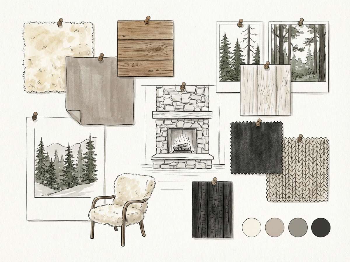
8) Nordic Cabin

HEX: #F5EFE2 #DDD2C0 #B8A895 #7E7266 #2B2A28
Mood: snug, rustic-modern, quiet
Best for: interior mood board for a living room
Warm ivory and toasted wood tones evoke a cozy cabin with clean Nordic lines. Use it for interior mood boards, furniture lookbooks, or renovation presentations that need warmth without clutter. Pair with natural textures like wool, oak, and linen, then anchor with near-black hardware. Tip: let the mid taupe dominate large surfaces and keep the darkest tone for small details.
Image example of nordic cabin generated using media.io
9) Warm Paper Editorial
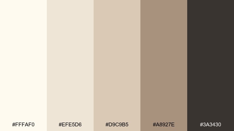
HEX: #FFFAF0 #EFE5D6 #D9C9B5 #A8927E #3A3430
Mood: literary, thoughtful, timeless
Best for: magazine spread layout
Cream paper neutrals and ink-like darks feel like a well-worn novel and a quiet reading nook. It fits long-form editorial layouts, pull quotes, and feature openers where typography should lead. Pair with sepia photography and thin rules in the mid beige to keep the grid gentle. Tip: keep body text on the lightest shade for accessibility and a true print feel.
Image example of warm paper editorial generated using media.io
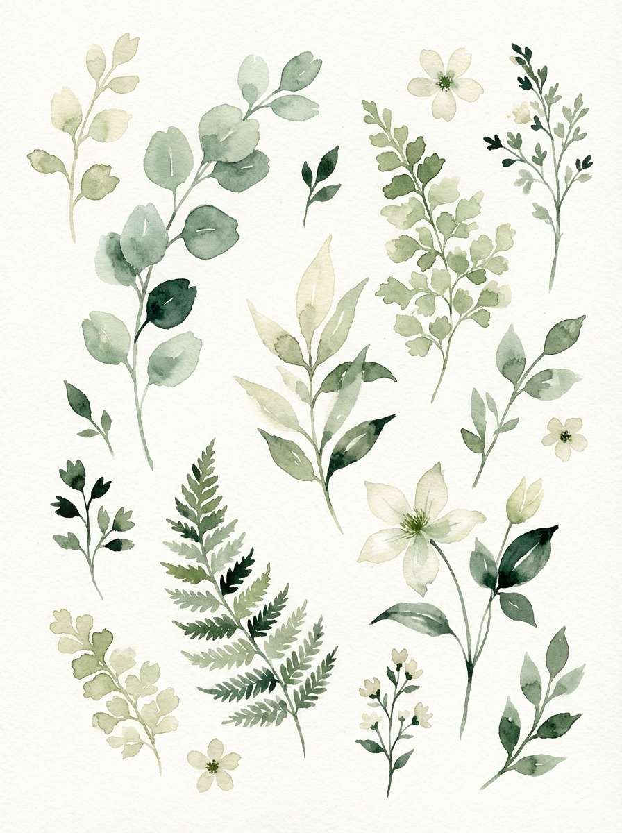
10) Botanical Ivory
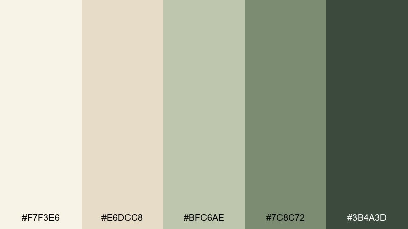
HEX: #F7F3E6 #E6DCC8 #BFC6AE #7C8C72 #3B4A3D
Mood: fresh, botanical, gentle
Best for: spring botanical illustration set
Light ivory and soft greens evoke pressed leaves, herbarium pages, and early spring air. As a cream ivory color scheme, it suits illustrated sticker packs, planners, and brand motifs that lean natural and calm. Pair with watercolor textures and minimal outlines in deep forest green for definition. Tip: keep the palest tone as the paper base so the greens stay crisp and readable.
Image example of botanical ivory generated using media.io
11) Honey Wheat
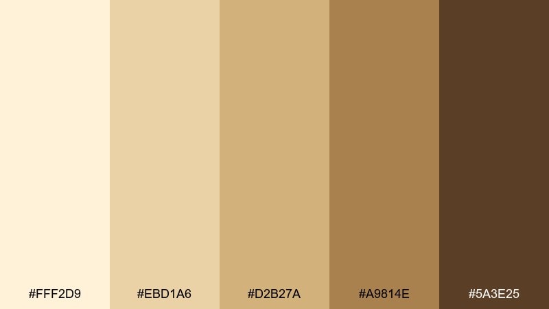
HEX: #FFF2D9 #EBD1A6 #D2B27A #A9814E #5A3E25
Mood: golden, sunny, wholesome
Best for: bakery packaging and labels
Golden wheat and honeyed neutrals bring instant warmth, like fresh bread cooling on a counter. Use it for bakery labels, pastry boxes, and shelf tags where appetite appeal matters. Pair with simple illustrations and a deep cocoa type color to stay legible. Tip: apply the warm gold as a stamp-like accent for a handcrafted, small-batch feel.
Image example of honey wheat generated using media.io
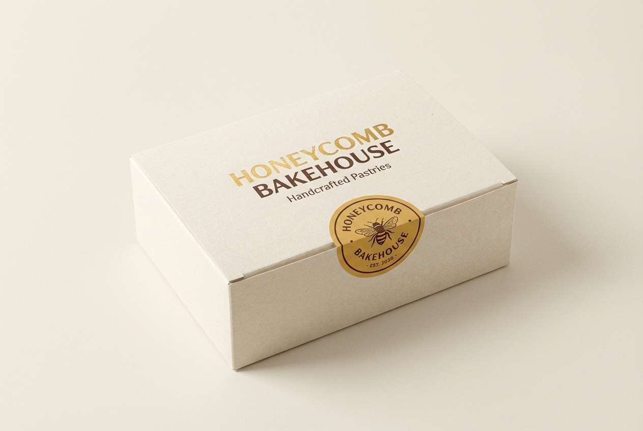
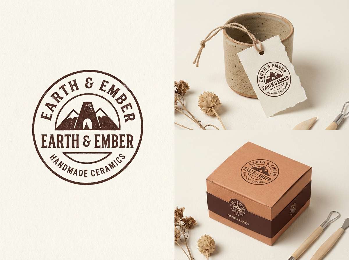
12) Clay Pottery
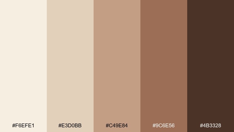
HEX: #F6EFE1 #E3D0BB #C49E84 #9C6E56 #4B3328
Mood: earthy, artisanal, comforting
Best for: handmade ceramics shop branding
Soft ivory and clay browns feel like hand-thrown pottery drying in a sunlit studio. This cream ivory color palette is a strong fit for maker brands, craft fairs, and packaging that wants an honest, tactile tone. Pair with rough paper textures and minimal marks to keep it authentic. Tip: use the mid terracotta as your hero color, and let the deep brown act as an accent for logos and stamps.
Image example of clay pottery generated using media.io
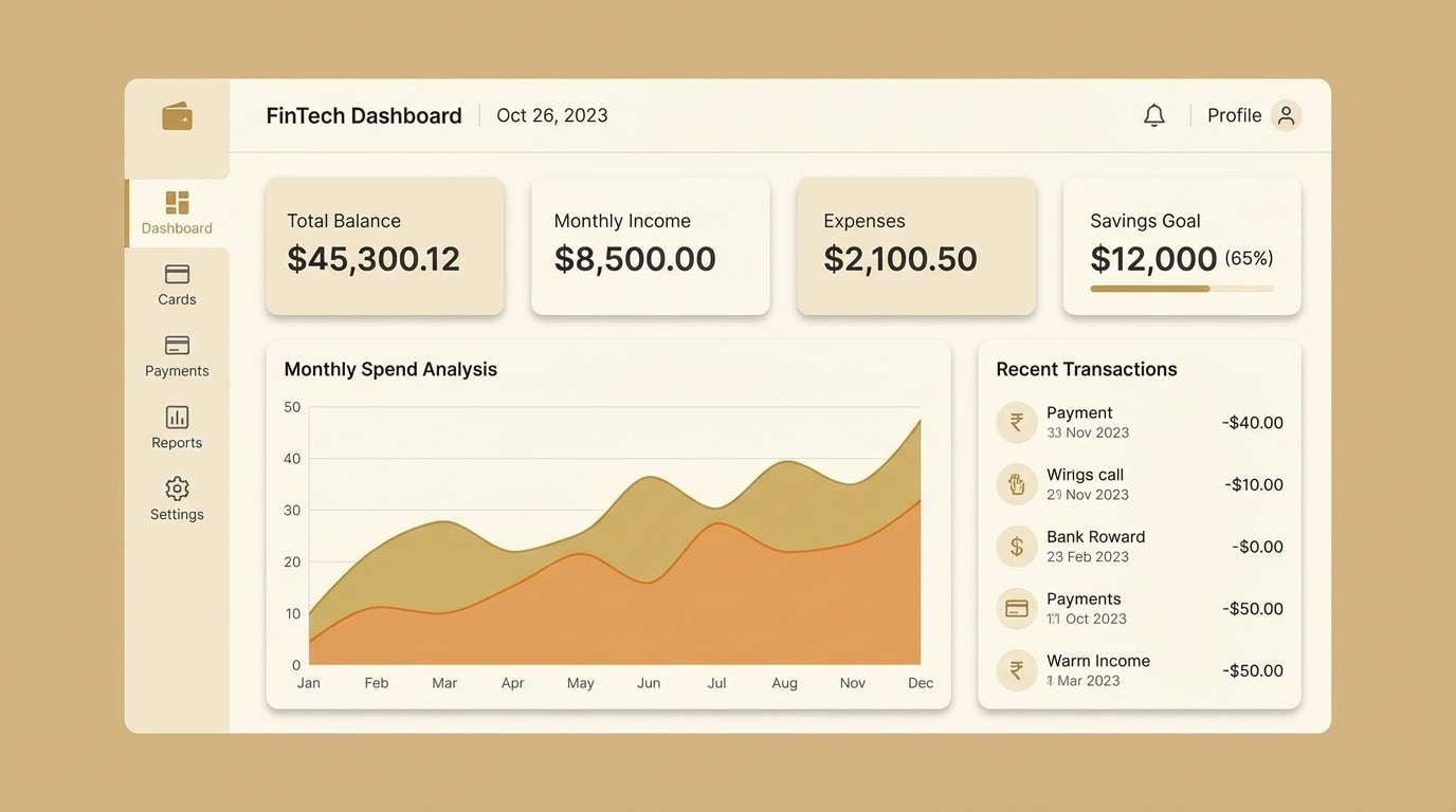
13) Soft Shadow UI
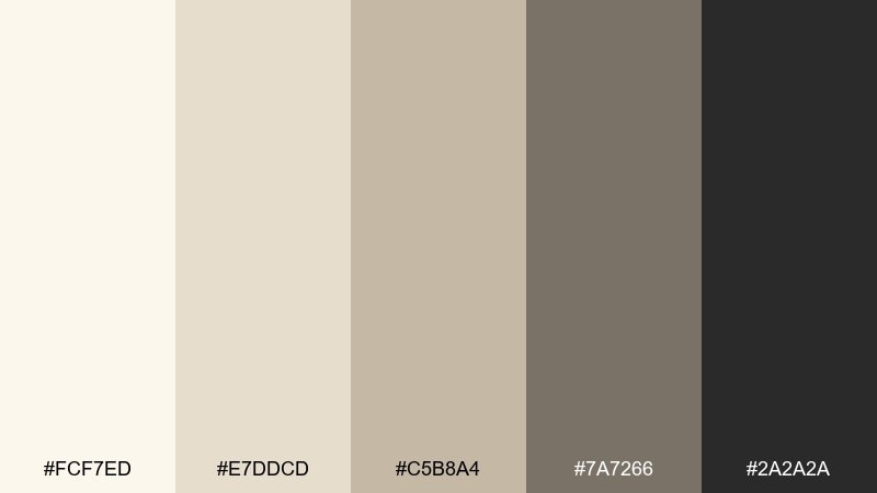
HEX: #FCF7ED #E7DDCD #C5B8A4 #7A7266 #2A2A2A
Mood: sleek, understated, professional
Best for: dashboard UI for a finance app
Muted ivory layers with soft shadow neutrals create a calm, trustworthy interface mood. Use it for dashboards, tables, and settings screens where contrast should be clear but not harsh. Pair with subtle dividers and restrained icon fills for a refined system. Tip: keep primary buttons in the darkest tone and rely on spacing to build hierarchy across cards.
Image example of soft shadow ui generated using media.io
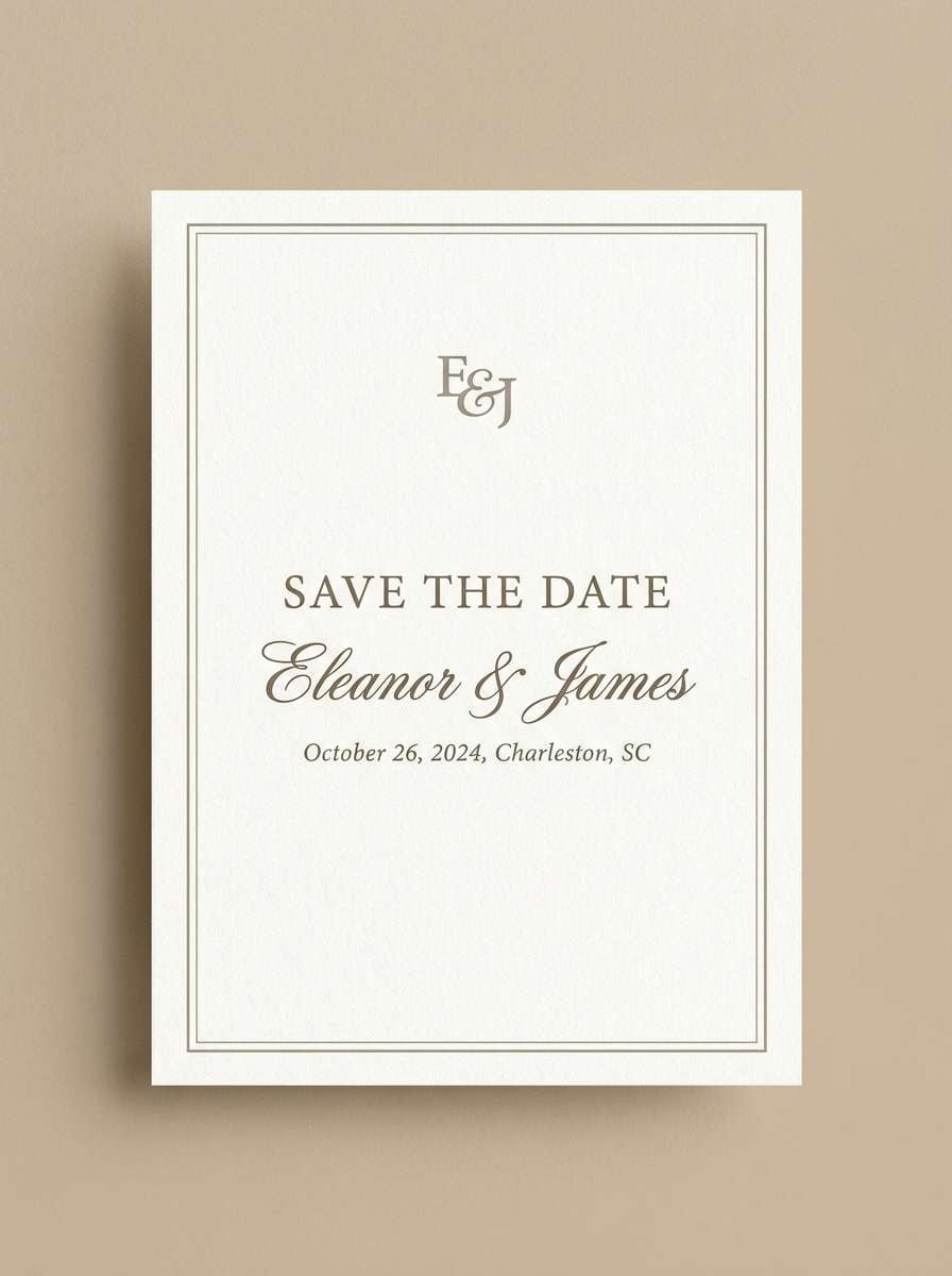
14) Heirloom Wedding
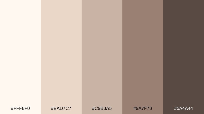
HEX: #FFF8F0 #EAD7C7 #C9B3A5 #9A7F73 #5A4A44
Mood: classic, tender, refined
Best for: save the date card design
Soft heirloom neutrals and warm cocoa undertones feel timeless, like an old family photo album. Use it for save the dates, monograms, and elegant timeline cards where warmth should remain subtle. Pair with a script accent and clean serif body type to balance tradition and clarity. Tip: add a thin border in the mid taupe to frame the design without making it feel heavy.
Image example of heirloom wedding generated using media.io
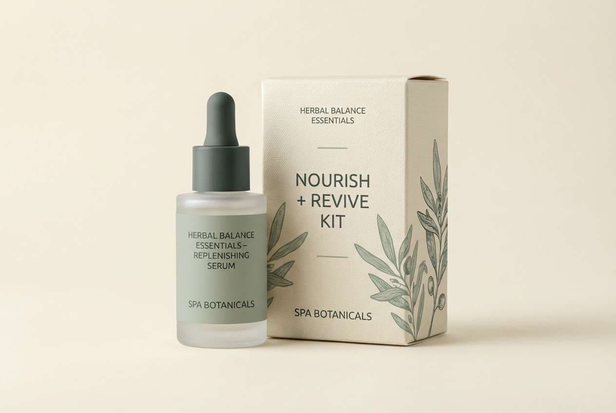
15) Modern Spa
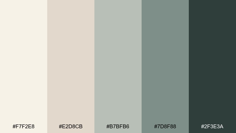
HEX: #F7F2E8 #E2D8CB #B7BFB6 #7D8F88 #2F3E3A
Mood: clean, soothing, restorative
Best for: skincare product ad and packaging
Clean ivory neutrals with cool herbal greens evoke steamed towels, stone basins, and a quiet spa room. These cream ivory color combinations fit skincare ads, product boxes, and ingredient callouts that should feel clinical yet gentle. Pair with minimalist sans-serif type and plenty of negative space for a modern finish. Tip: keep green accents limited to key benefits and seals so the overall look stays calm.
Image example of modern spa generated using media.io
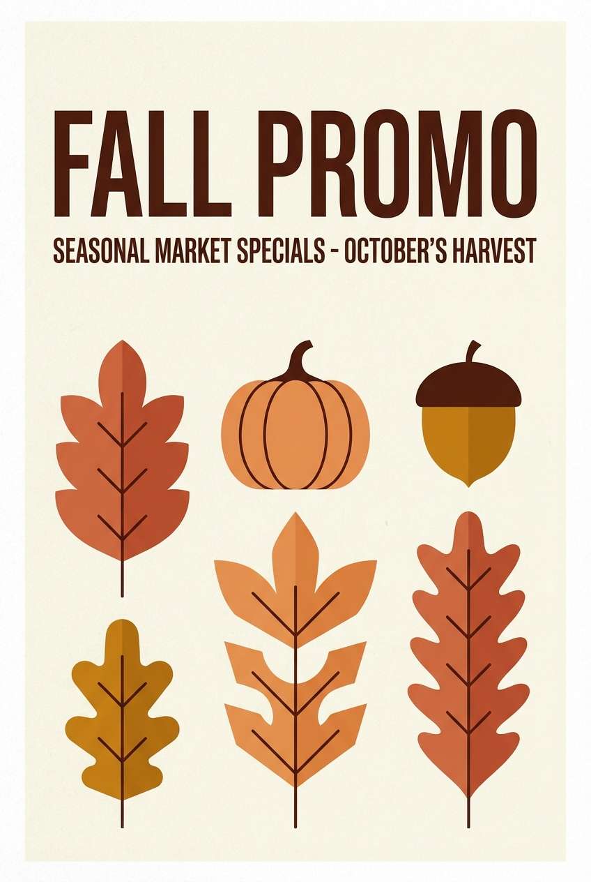
16) Autumn Cream
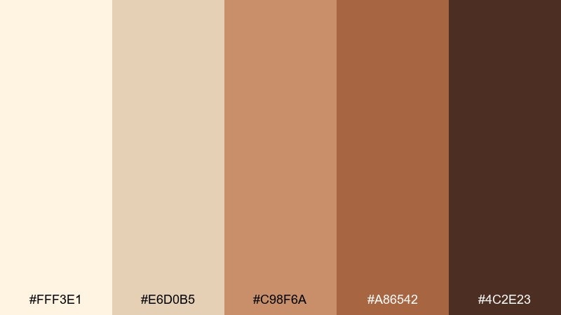
HEX: #FFF3E1 #E6D0B5 #C98F6A #A86542 #4C2E23
Mood: toasty, seasonal, welcoming
Best for: fall promo poster for a local market
Toasty cream and spiced terracotta feel like crisp air and warm cider. Use it for seasonal posters, event banners, and price cards that need to pop without going neon. Pair with kraft-style textures and bold headlines in deep cocoa to keep it readable from a distance. Tip: let the terracotta be the main block color and keep cream for margins and text panels.
Image example of autumn cream generated using media.io
17) Cocoa Linen
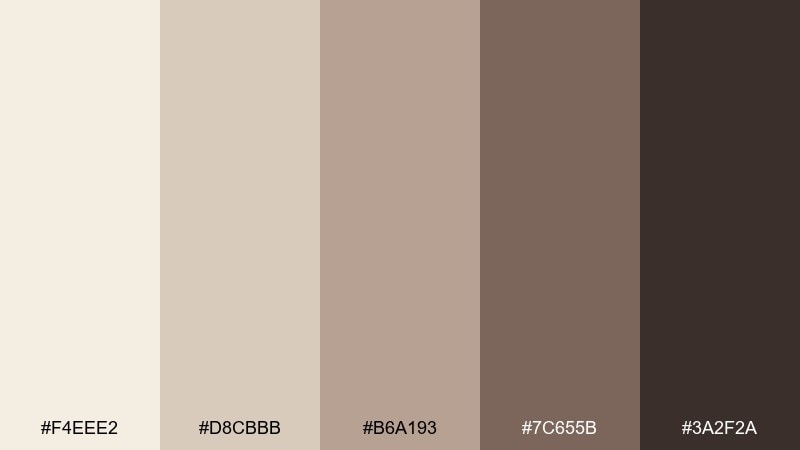
HEX: #F4EEE2 #D8CBBB #B6A193 #7C655B #3A2F2A
Mood: cozy, grounded, sophisticated
Best for: book cover design for literary fiction
Linen-like neutrals and cocoa browns evoke quiet evenings, soft textiles, and a warm reading lamp. It works well for book covers, chapter headers, and author branding that aims for understated depth. Pair with serif typography and subtle grain to make the design feel tactile. Tip: increase contrast by placing text only on the lightest two shades for crisp readability.
Image example of cocoa linen generated using media.io
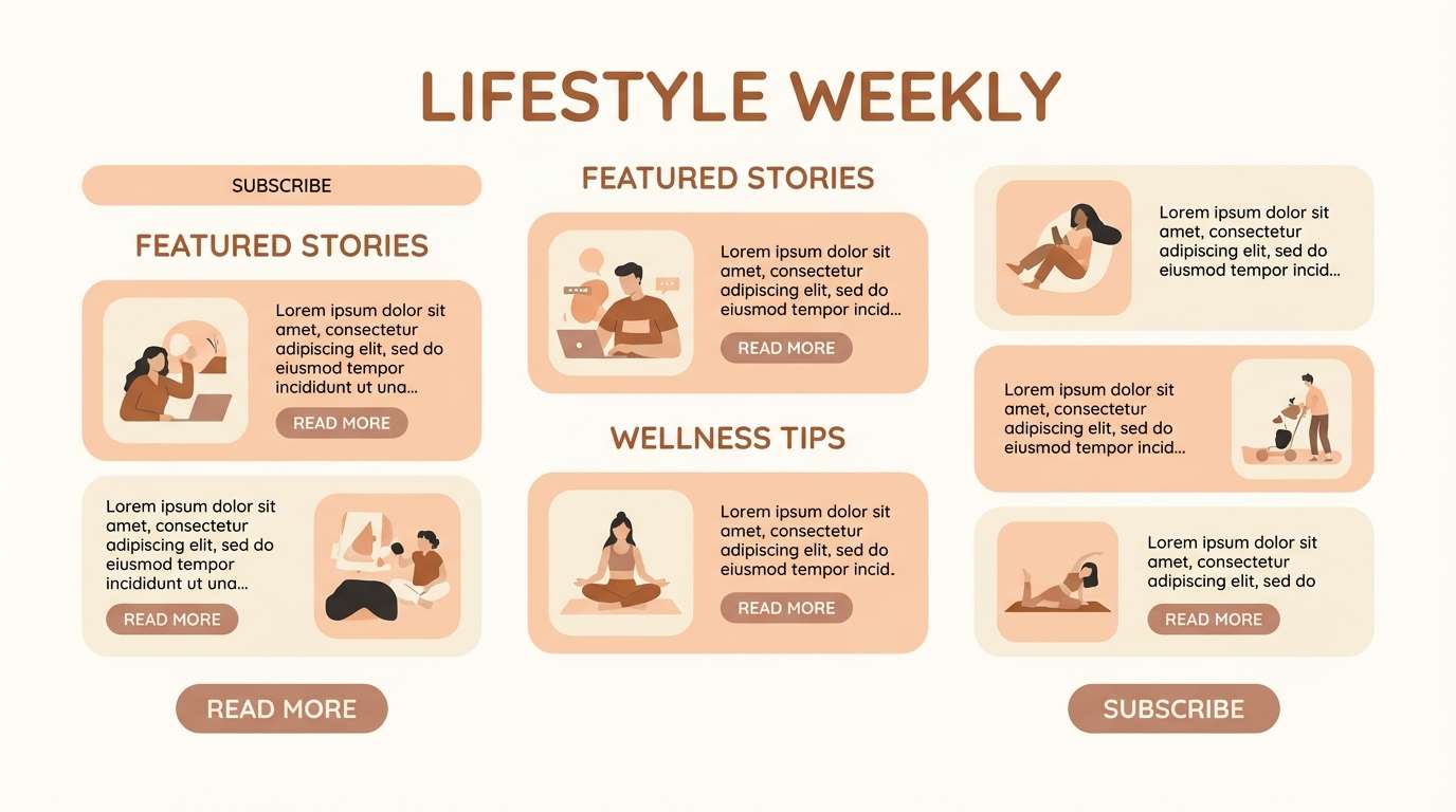
18) Peachy Neutral

HEX: #FFF5EA #F2DECF #E7BFA8 #C48D74 #6A4B3F
Mood: friendly, bright, approachable
Best for: lifestyle newsletter template
Soft peach neutrals and warm browns feel upbeat, like morning light on a cream wall. Use it for newsletters, blog sidebars, and content cards where you want a friendly tone without loud color. Pair with rounded UI elements and light dividers to keep everything easy to scan. Tip: use the peach as a highlight chip for tags and categories to guide attention gently.
Image example of peachy neutral generated using media.io
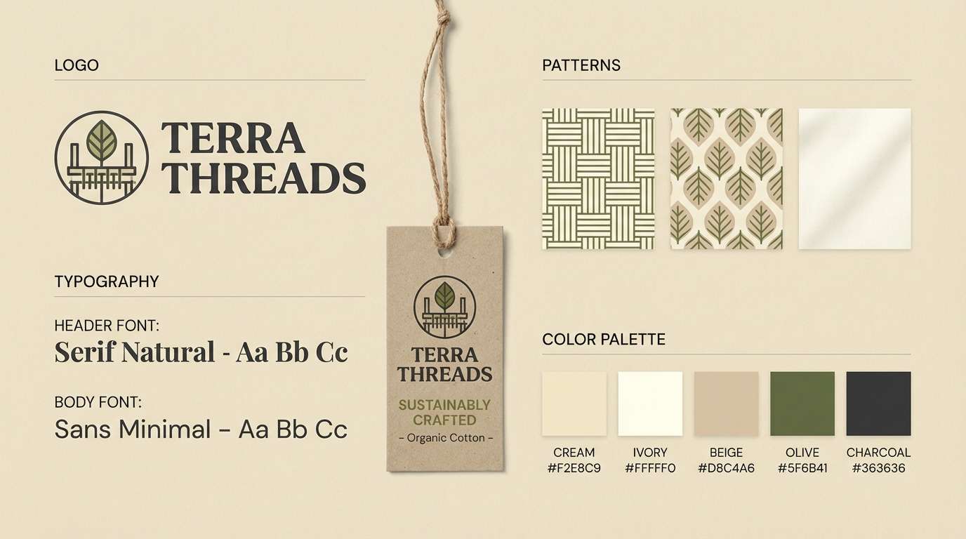
19) Olive Canvas
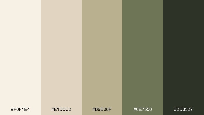
HEX: #F6F1E4 #E1D5C2 #B9B08F #6E7556 #2D3327
Mood: earthy, artistic, confident
Best for: brand kit for a sustainable apparel label
Canvas-like creams with olive depth evoke field jackets, natural dyes, and well-made basics. These cream ivory color combinations are ideal for apparel brand kits, lookbooks, and hang tag systems that need a grounded edge. Pair with bold type and simple photography backdrops in the lightest neutral for consistency. Tip: let olive act as the signature color, but keep backgrounds bright to avoid a heavy feel.
Image example of olive canvas generated using media.io
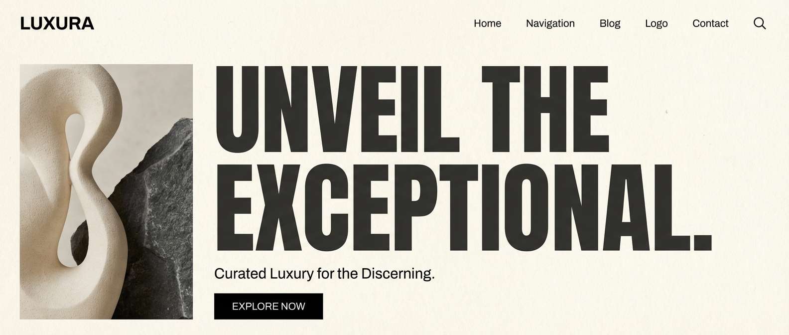
20) Midnight Cream Contrast
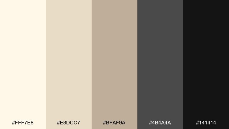
HEX: #FFF7E8 #E8DCC7 #BFAF9A #4B4A4A #141414
Mood: dramatic, modern, high-contrast
Best for: luxury landing page hero section
Soft cream highlights against midnight grays feel cinematic, like a spotlight in a dark room. Use it for luxury landing pages, hero banners, and premium service websites where contrast should signal confidence. Pair with large type, minimal imagery, and a single beige accent button for conversion. Tip: keep black reserved for headings and key CTAs to maintain an upscale, intentional rhythm.
Image example of midnight cream contrast generated using media.io
What Colors Go Well with Cream Ivory?
Cream ivory pairs especially well with deep neutrals like charcoal, espresso brown, and near-black because the contrast feels crisp without the “icy” look of pure white. These pairings are ideal for typography, logos, and CTA buttons.
For a natural direction, add muted greens (sage, olive, forest) and warm earth tones (terracotta, clay, wheat). This keeps the palette grounded while still feeling clean and modern.
If you want a softer, romantic look, layer in blush, champagne, or peach-tinted neutrals. Keep saturation low so the overall effect stays airy and cohesive.
How to Use a Cream Ivory Color Palette in Real Designs
Start by choosing cream ivory as your background and reserve your darkest shade for headings, primary navigation, and key UI actions. This creates hierarchy without needing loud color.
Use mid-tone beiges and taupes for borders, cards, and secondary surfaces so the layout doesn’t feel “boxed.” In print, these mid neutrals also help avoid harsh edges around blocks of text.
For branding systems, pick one accent (olive, sage, terracotta, or blush) and apply it consistently to highlights like tags, icons, seals, or promo stickers. Consistency is what makes neutral palettes look intentional.
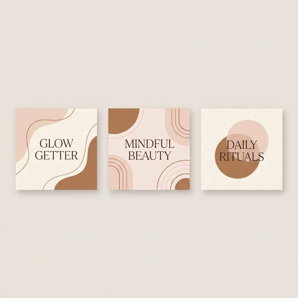
Create Cream Ivory Palette Visuals with AI
If you have HEX codes but need matching visuals (mockups, UI sections, posters, or packaging scenes), AI image generation helps you explore directions fast. You can keep the same palette while testing different styles, layouts, and lighting.
Use the prompts above as a starting point, then swap keywords like “minimal,” “editorial,” or “luxury” to match your brand vibe. Add your target aspect ratio once (for example, 3:2 or 16:9) so outputs stay consistent across a campaign.
When you find a look you like, generate variations with small changes—type style, texture, or one accent color—so the palette remains cohesive across every asset.
Cream Ivory Color Palette FAQs
-
What is the difference between cream and ivory?
Cream usually leans warmer and more yellow, while ivory is often slightly more neutral (sometimes with a faint beige or peach undertone). In design, both act like soft whites, but cream reads cozier and ivory reads a bit cleaner. -
Is cream ivory a good background color for websites?
Yes—cream ivory reduces glare compared with pure white and can make pages feel more premium. Just ensure strong text contrast (charcoal/near-black) and test accessibility for body copy. -
What accent colors look best with cream ivory?
Muted greens (sage/olive), warm browns (cocoa/espresso), terracotta, and blush work especially well. For a modern edge, pair cream ivory with charcoal or black and keep accents minimal. -
How do I keep a cream ivory palette from looking “washed out”?
Add a true dark anchor (charcoal, deep brown, or near-black) and include at least one mid-tone for structure (taupe or warm gray). Limit very pale shades to backgrounds and spacing-heavy areas. -
Does cream ivory print well on packaging and invitations?
It prints beautifully, especially on uncoated or textured paper where pure white can feel too stark. Use slightly off-white backgrounds and avoid ultra-light text colors to maintain readability. -
What’s a safe text color on cream ivory?
Deep charcoal, espresso brown, or near-black are safest for readability. For secondary text, use a darker taupe rather than a light gray so it stays legible on warm backgrounds. -
Can I generate matching palette visuals from HEX codes with AI?
Yes—use an AI text-to-image tool and describe the scene (packaging, UI, invitation, poster) plus the palette vibe (minimal, cozy, luxury). Then iterate by keeping the same neutral base and changing only one accent or texture at a time.
Next: Army Color Palette