Army color palettes blend olive, khaki, and rugged neutrals to create designs that feel grounded, reliable, and modern.
Below are curated army color combinations (with HEX codes) you can use for branding, UI, and print—plus AI prompts to generate matching visuals fast.
In this article
- Why Army Palettes Work So Well
-
- field camo
- desert drill
- olive night
- ranger khaki
- barracks concrete
- vintage fatigues
- moss and sand
- patrol sunrise
- urban tactical
- woodland mist
- bronze insignia
- canvas tent
- iron badge
- muddy boots
- sage field notes
- pine barricade
- dusty parachute
- campfire rations
- stormwatch
- quiet command
- supply crate
- medic pouch
- canteen clay
- What Colors Go Well with Army?
- How to Use a Army Color Palette in Real Designs
- Create Army Palette Visuals with AI
Why Army Palettes Work So Well
Army tones sit in the sweet spot between neutral and expressive: they carry personality, but stay practical and easy to pair with typography, photography, and UI components.
Because many shades are desaturated (olive, sage, khaki, greige), they reduce visual noise and make layouts feel disciplined—ideal for dashboards, portfolios, packaging, and editorial grids.
They also translate well across materials: coated screens, uncoated paper, fabric textures, and product shots. With the right contrast, an army green palette can feel premium, outdoorsy, or minimal.
20+ Army Color Palette Ideas (with HEX Codes)
1) Field Camo
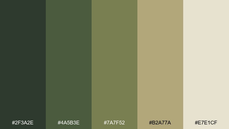
HEX: #2f3a2e #4a5b3e #7a7f52 #b2a77a #e7e1cf
Mood: rugged, grounded, outdoorsy
Best for: outdoor gear brand identity
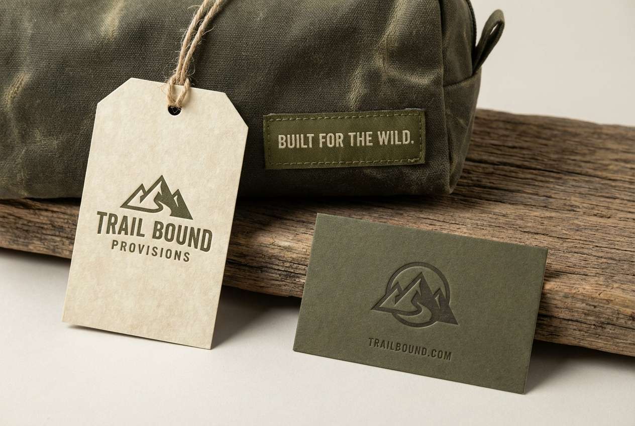
Rugged and grounded like a well-worn jacket on a forest trail, these tones feel dependable and practical. Use the deep greens for logos and headers, then let the warm khaki and parchment lighten layouts. Pair nicely with matte black hardware details or off-white typography for clarity. Tip: keep the darkest shade for small accents so the design stays readable.
Image example of field camo generated using media.io
Media.io is an online AI studio for creating and editing video, image, and audio in your browser.

2) Desert Drill
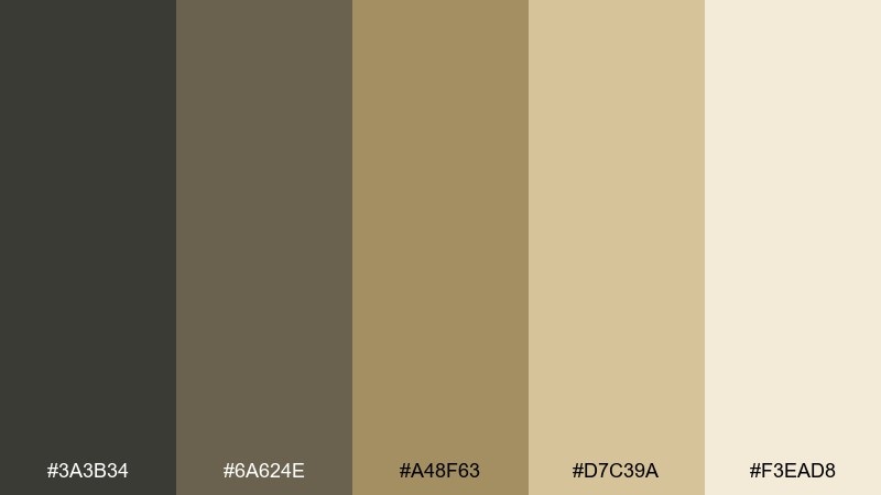
HEX: #3a3b34 #6a624e #a48f63 #d7c39a #f3ead8
Mood: dusty, warm, utilitarian
Best for: tactical apparel product ad
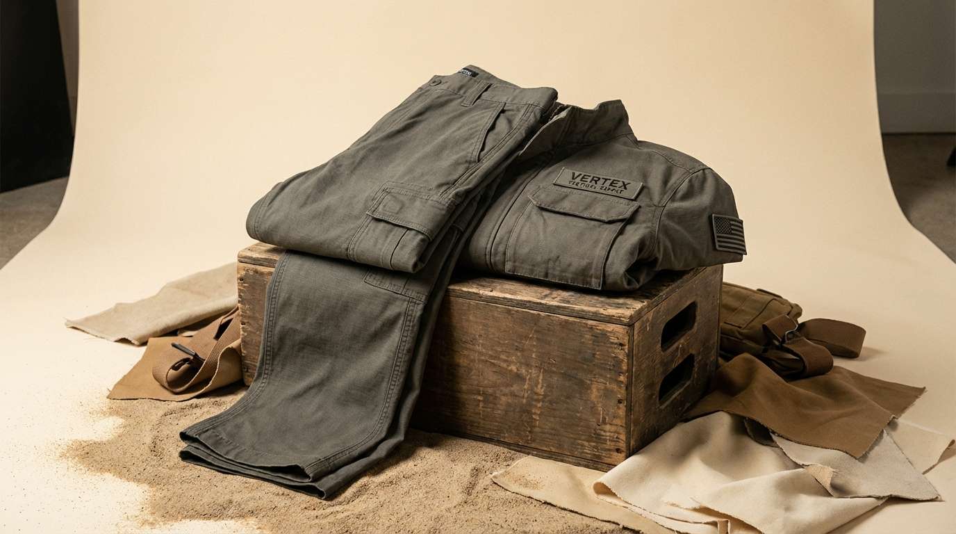
Dusty warmth and sunbaked grit bring to mind desert training grounds and canvas packs. Use the mid sand and tan shades as the main surfaces, with charcoal-olive for type and trims. It works especially well for product ads where texture matters, like cotton twill or ripstop. Tip: add subtle grain to backgrounds so the palette feels tactile, not flat.
Image example of desert drill generated using media.io
3) Olive Night
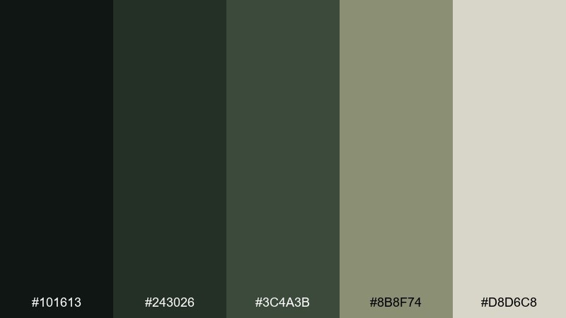
HEX: #101613 #243026 #3c4a3b #8b8f74 #d8d6c8
Mood: stealthy, calm, premium
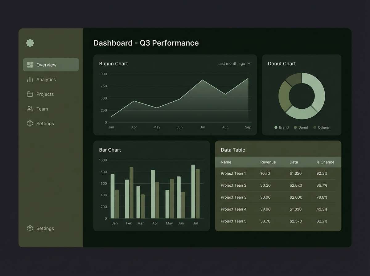
Best for: dark mode dashboard UI
Stealthy and calm, like night vision tones fading into mist, this mix feels premium without being loud. For an army color palette in dark mode, use near-black green for backgrounds and the muted sage for cards and dividers. Keep text in the pale stone shade for contrast, then reserve the mid olive for active states. Tip: avoid pure black; the green-black reads softer and more modern.
Image example of olive night generated using media.io
4) Ranger Khaki
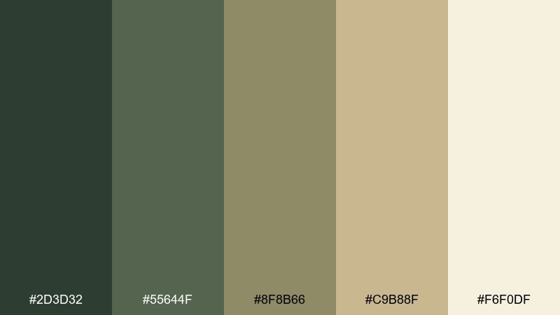
HEX: #2d3d32 #55644f #8f8b66 #c9b88f #f6f0df
Mood: classic, steady, approachable
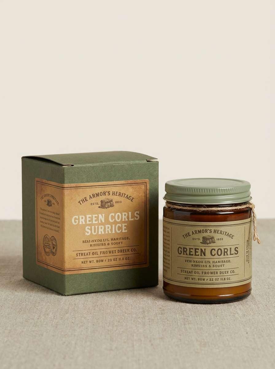
Best for: heritage brand packaging
Classic and steady, these hues evoke field journals, brass buckles, and khaki uniforms. Use the creamy off-white as breathing room, then build structure with khaki and sage for panels and labels. It pairs well with kraft paper textures and understated serif type. Tip: print the darkest green as a spot color for a crisp, heritage finish.
Image example of ranger khaki generated using media.io
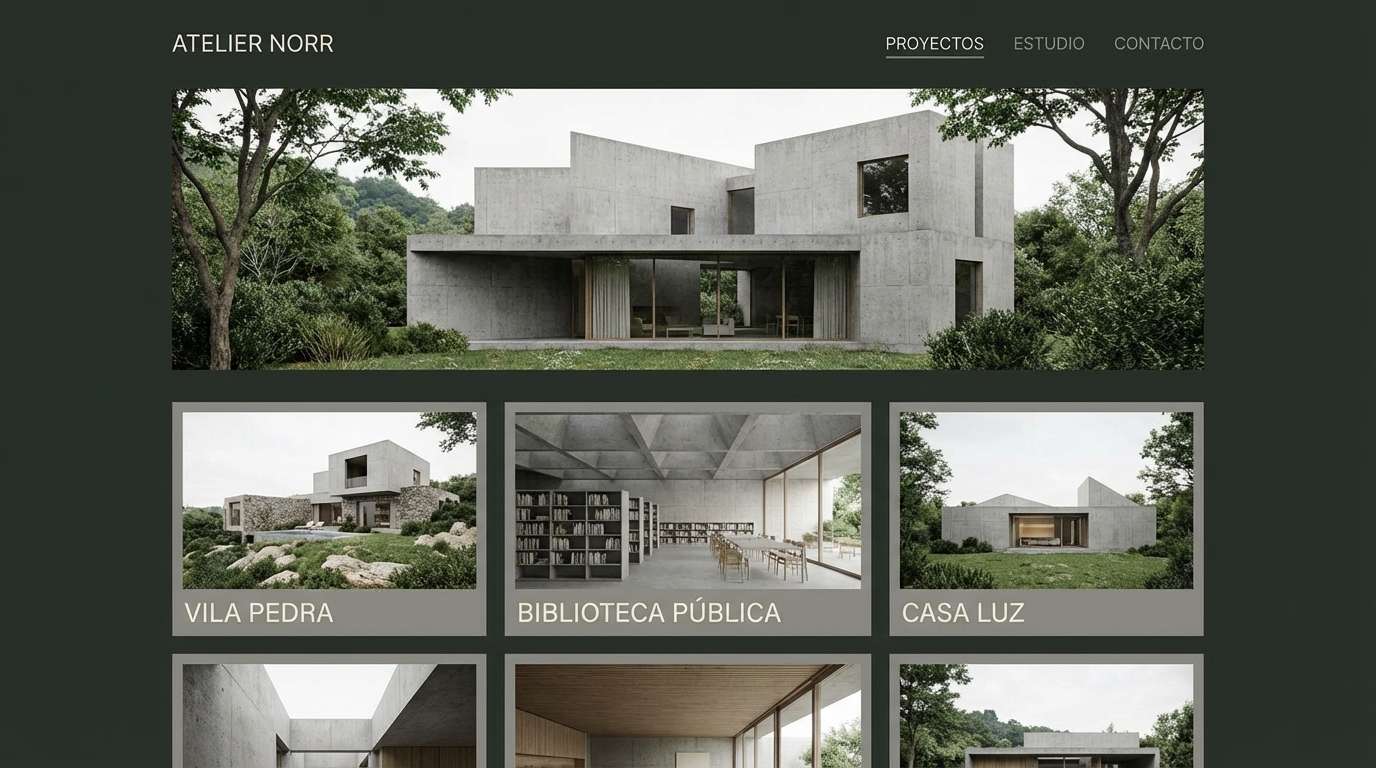
5) Barracks Concrete
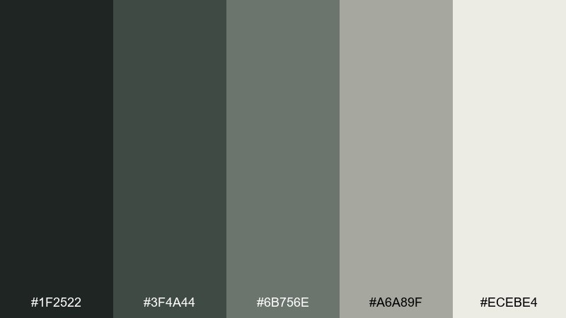
HEX: #1f2522 #3f4a44 #6b756e #a6a89f #ecebe4
Mood: industrial, disciplined, minimal
Best for: architecture portfolio website
Industrial and disciplined, this set feels like concrete corridors softened by muted green-gray light. Use the near-black for navigation and titles, then let the mid grays carry grids and layout lines. It works beautifully for architectural portfolios where restraint and hierarchy matter. Tip: keep imagery in neutral or desaturated tones so the palette stays cohesive.
Image example of barracks concrete generated using media.io
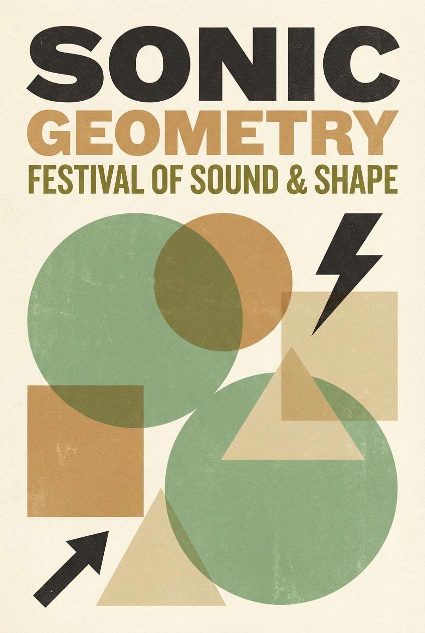
6) Vintage Fatigues
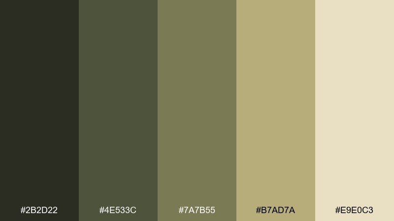
HEX: #2b2d22 #4e533c #7a7b55 #b7ad7a #e9e0c3
Mood: nostalgic, worn-in, earthy
Best for: retro poster design
Nostalgic and worn-in, these colors feel like faded patches and sun-bleached fabric. Use the pale sand as the poster base, then layer olive and moss for typography and simple graphic shapes. A touch of dark soot keeps the design grounded and legible from a distance. Tip: add halftone texture for an authentic retro print vibe.
Image example of vintage fatigues generated using media.io
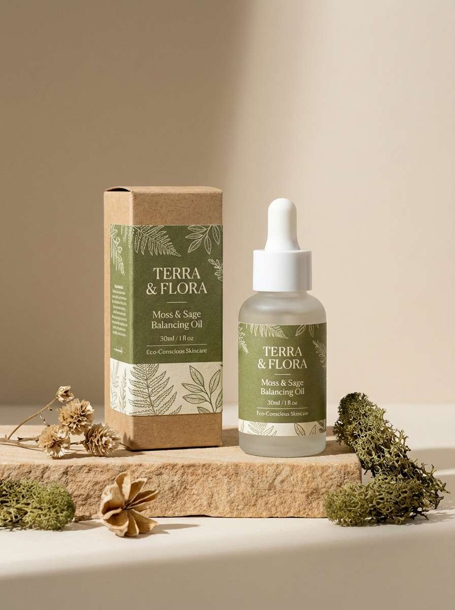
7) Moss and Sand
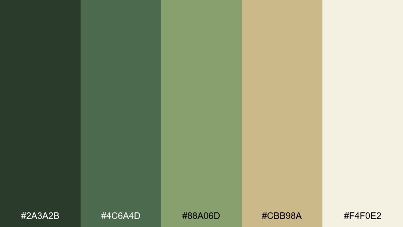
HEX: #2a3a2b #4c6a4d #88a06d #cbb98a #f4f0e2
Mood: fresh, natural, balanced
Best for: eco-friendly skincare label
Fresh and natural, like mossy stones beside a sandy creek, this mix feels clean but grounded. Let the soft cream and sand carry the label background, then use moss and sage for type and botanical marks. It pairs well with minimal line illustrations and uncoated paper stock. Tip: keep saturation modest so the brand stays calm and eco-forward.
Image example of moss and sand generated using media.io
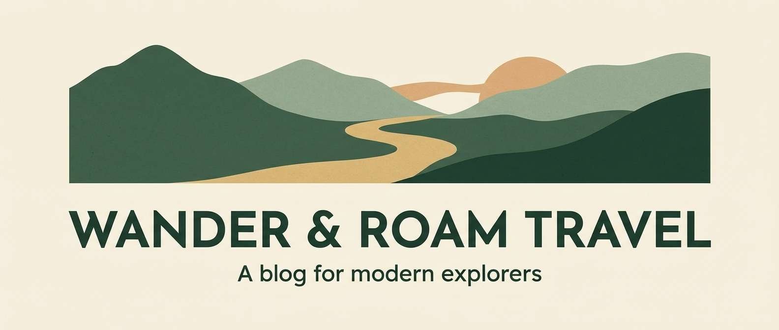
8) Patrol Sunrise
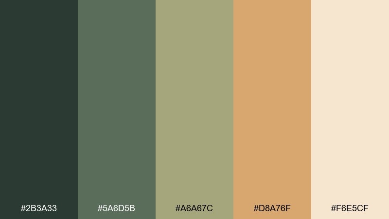
HEX: #2b3a33 #5a6d5b #a6a67c #d8a76f #f6e5cf
Mood: hopeful, warm, adventurous
Best for: travel blog header graphics
Hopeful and warm, this palette looks like sunrise light cutting through dusty green hills. Use the soft peach-tan as a highlight color for buttons or badges, while the greens handle headings and navigation. It works great for travel headers where you want adventure without loud saturation. Tip: use the light cream as negative space so the warm accent feels intentional.
Image example of patrol sunrise generated using media.io
9) Urban Tactical
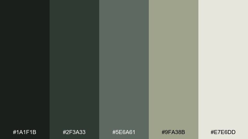
HEX: #1a1f1b #2f3a33 #5e6a61 #9fa38b #e7e6dd
Mood: modern, tactical, understated
Best for: streetwear lookbook editorial
Modern and understated, these shades feel like city shadows, brushed metal, and muted utility fabric. For clean army color combinations in an editorial layout, use the near-black for headlines and the soft stone for margins and captions. The olive-grays keep product photos cohesive, especially with monochrome styling. Tip: limit accent elements to one mid-tone so spreads stay sleek.
Image example of urban tactical generated using media.io
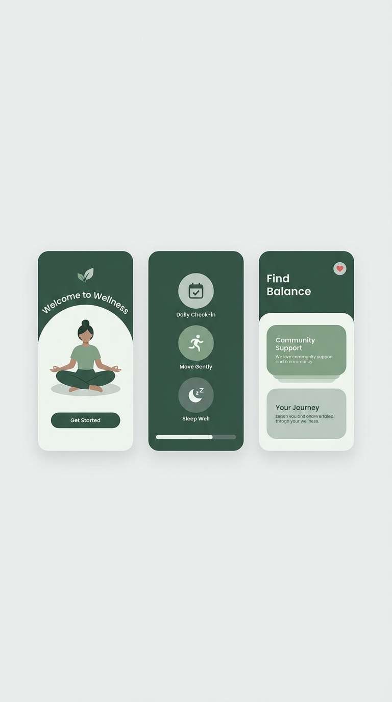
10) Woodland Mist
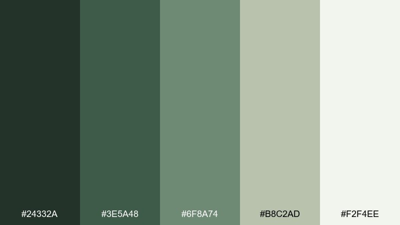
HEX: #24332a #3e5a48 #6f8a74 #b8c2ad #f2f4ee
Mood: airy, quiet, restorative
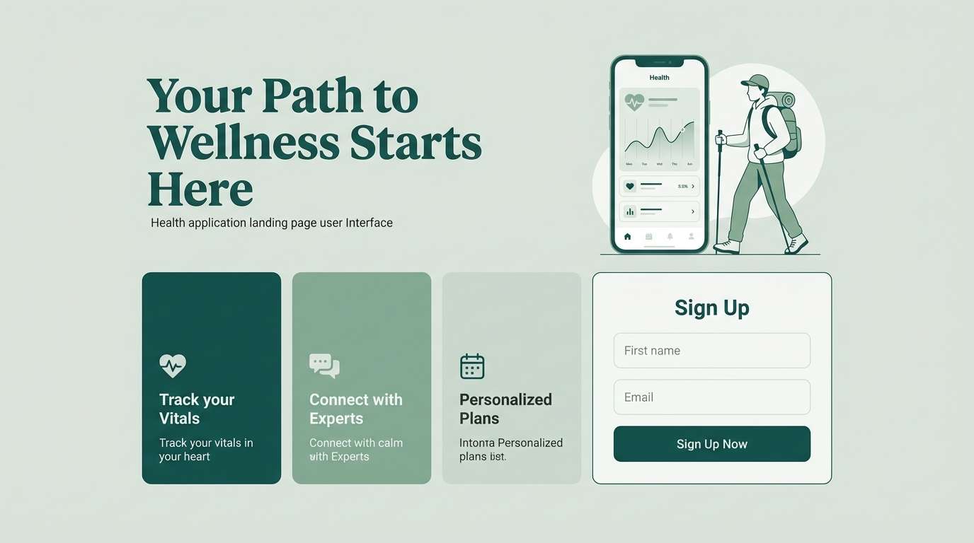
Best for: wellness app onboarding UI
Airy and quiet, like morning mist moving through pines, these greens feel restorative. Use the pale fog tone for screens and modals, then build gentle hierarchy with sage and spruce for icons and headings. It pairs beautifully with rounded typography and soft gradients. Tip: keep contrast accessible by using the darkest green for key text only.
Image example of woodland mist generated using media.io
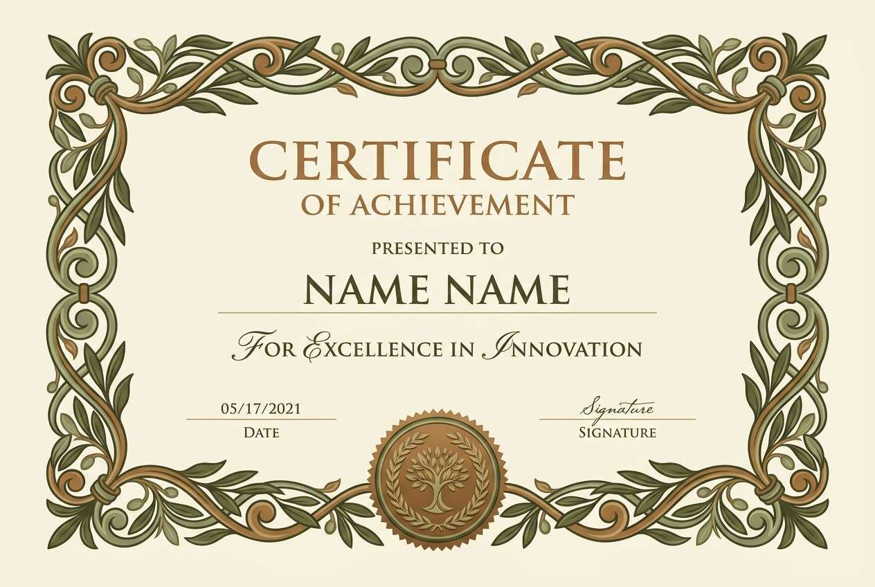
11) Bronze Insignia
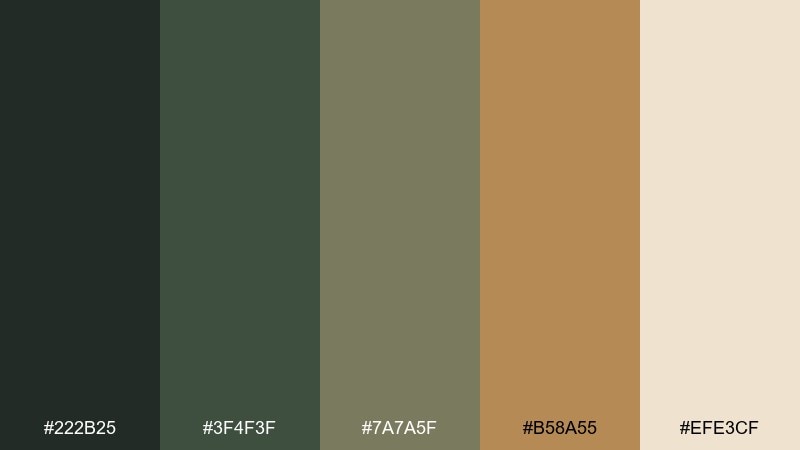
HEX: #222b25 #3f4f3f #7a7a5f #b58a55 #efe3cf
Mood: honorable, warm, ceremonial
Best for: award certificate template
Honorable and warm, these tones suggest polished bronze, stitched badges, and aged paper. Use the bronze as a seal or border detail, while the olive and sage carry headings and subheads. It works best on cream stock with subtle texture and plenty of whitespace. Tip: keep the bronze limited to 5–10% of the layout for a refined, ceremonial feel.
Image example of bronze insignia generated using media.io
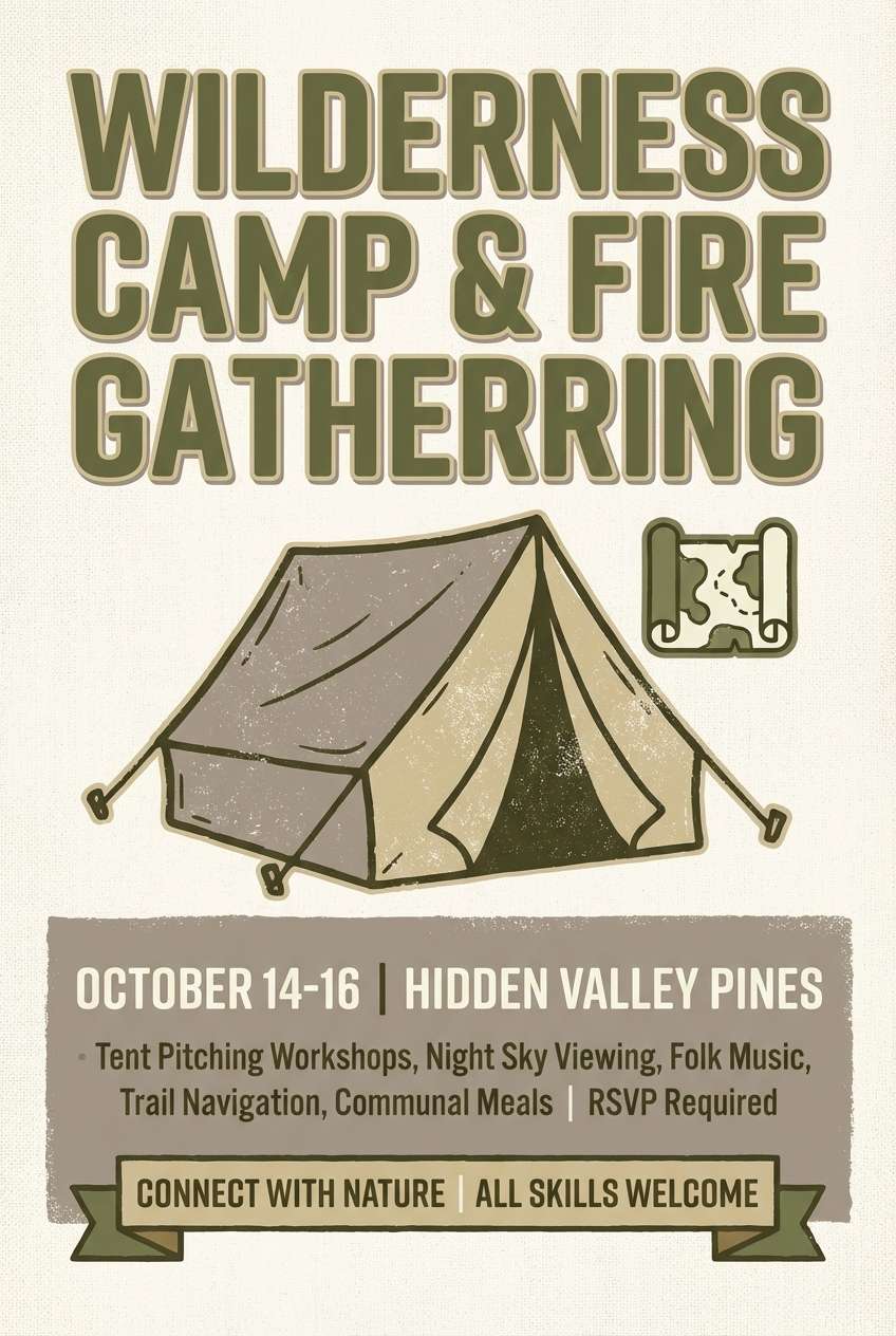
12) Canvas Tent
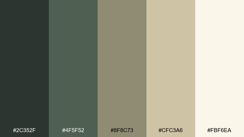
HEX: #2c352f #4f5f52 #8f8c73 #cfc3a6 #fbf6ea
Mood: cozy, practical, camp-inspired
Best for: camping event flyer
Cozy and practical, this set feels like canvas tents, rope knots, and warm lantern light. Use the cream for the flyer background, then layer muted greens for headings and route details. The soft greige keeps everything friendly without turning pastel. Tip: combine with simple pictograms and thick strokes for easy readability outdoors.
Image example of canvas tent generated using media.io
13) Iron Badge
HEX: #141916 #2a2f2a #4a4f48 #7d7f73 #dcd9cf
Mood: stern, metallic, authoritative
Best for: security service website UI
Stern and metallic, like iron hardware and pressed uniforms, these neutrals feel authoritative. Use the darkest shades for nav and footers, with mid gray-greens for cards and form fields. It pairs well with sharp sans-serif fonts and simple icon sets. Tip: add one subtle light-gray border system to keep sections distinct.
Image example of iron badge generated using media.io
14) Muddy Boots

HEX: #2a241c #4a3f2d #6f6a4b #a39a6d #e7dcc5
Mood: gritty, earthy, hardworking
Best for: workwear e-commerce product page
Gritty and earthy, these tones bring up wet soil, scuffed leather, and long days on the job. Use the dark brown for strong CTA text and price emphasis, while the olive-khaki shades support backgrounds and tabs. It fits workwear product pages where you want toughness without high contrast fatigue. Tip: keep product photos warm-toned so the browns look intentional, not dull.
Image example of muddy boots generated using media.io
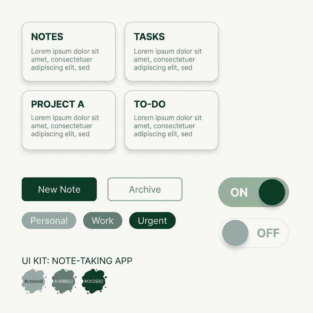
15) Sage Field Notes

HEX: #2a332d #4b5a50 #7f8f82 #b9c0b6 #f5f7f3
Mood: calm, organized, thoughtful
Best for: note-taking app UI kit
Calm and organized, these sage-leaning greens feel like lined notebooks and quiet focus. Use the pale background for long-form reading, then apply the mid sage for buttons, tags, and toggles. It pairs well with soft shadows and plenty of spacing for a distraction-free UI kit. Tip: use the darkest green sparingly for primary actions and key labels.
Image example of sage field notes generated using media.io
16) Pine Barricade
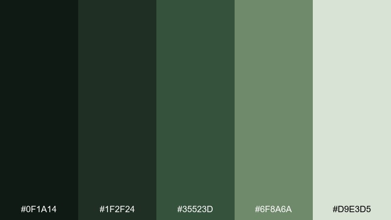
HEX: #0f1a14 #1f2f24 #35523d #6f8a6a #d9e3d5
Mood: defensive, deep, forested
Best for: survival course landing page
Deep and forested, these greens feel like pine shade and sturdy barricades. Use the darkest tones to frame sections and create confidence, then bring in the soft green for highlights and trust signals. It works best for rugged landing pages with bold headings and clear modules. Tip: keep the lightest tint for badges and callouts so it pops without turning bright.
Image example of pine barricade generated using media.io
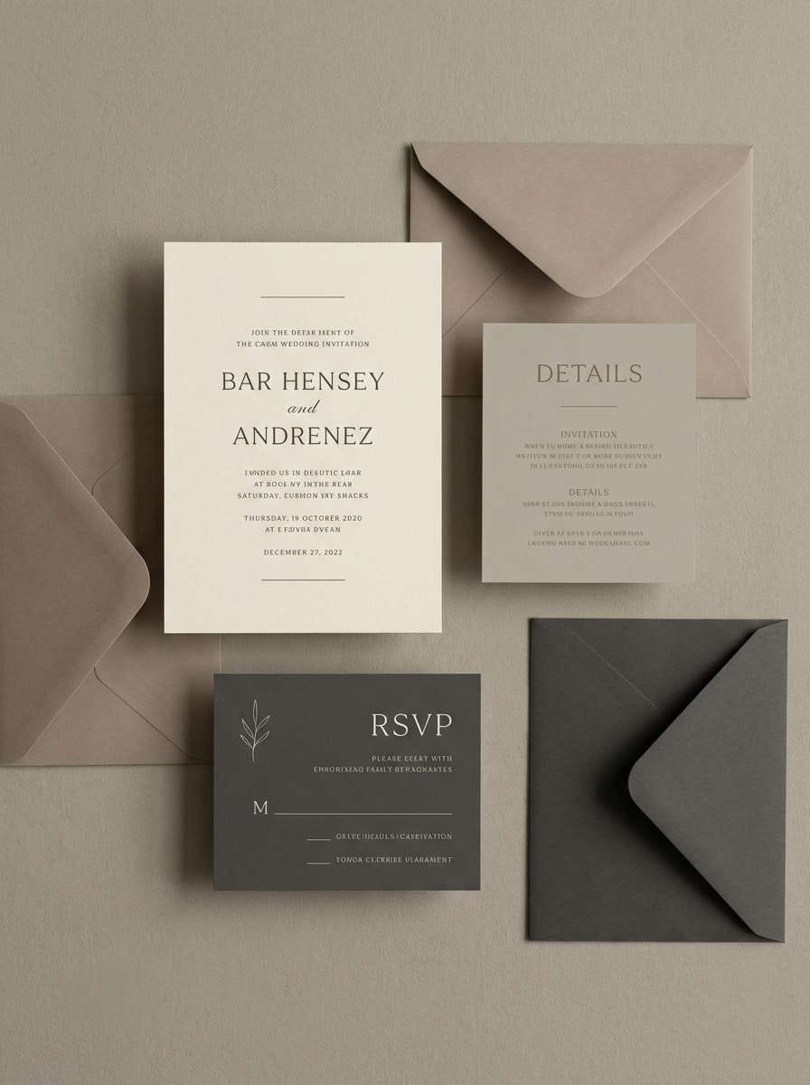
17) Dusty Parachute
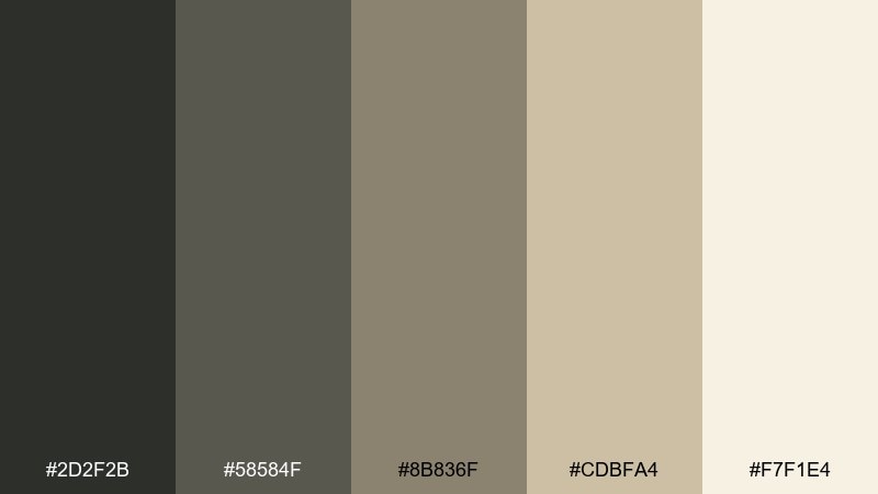
HEX: #2d2f2b #58584f #8b836f #cdbfa4 #f7f1e4
Mood: soft, muted, reliable
Best for: minimal wedding invitation suite
Soft and muted, this mix looks like folded fabric and sun-faded canvas drifting in quiet air. Use the warm cream as the base, then set typography in the charcoal and taupe for a refined look. It pairs beautifully with minimal line art and blind-emboss details. Tip: keep contrast gentle by choosing the darkest tone only for names and dates.
Image example of dusty parachute generated using media.io
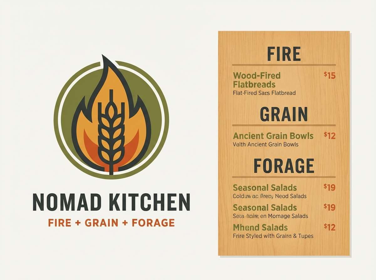
18) Campfire Rations

HEX: #2a2f2a #4c5a46 #8a7c53 #c07a4a #f2e2c8
Mood: warm, hearty, adventurous
Best for: food truck logo and menu
Warm and hearty, these colors evoke smoky campfires, toasted grains, and simple comfort food. Use the ember orange as a punchy highlight for the logo mark, while the olive greens keep the menu grounded. It works best on cream paper or light boards with bold, friendly type. Tip: limit the orange to key items and pricing so it reads like heat, not noise.
Image example of campfire rations generated using media.io
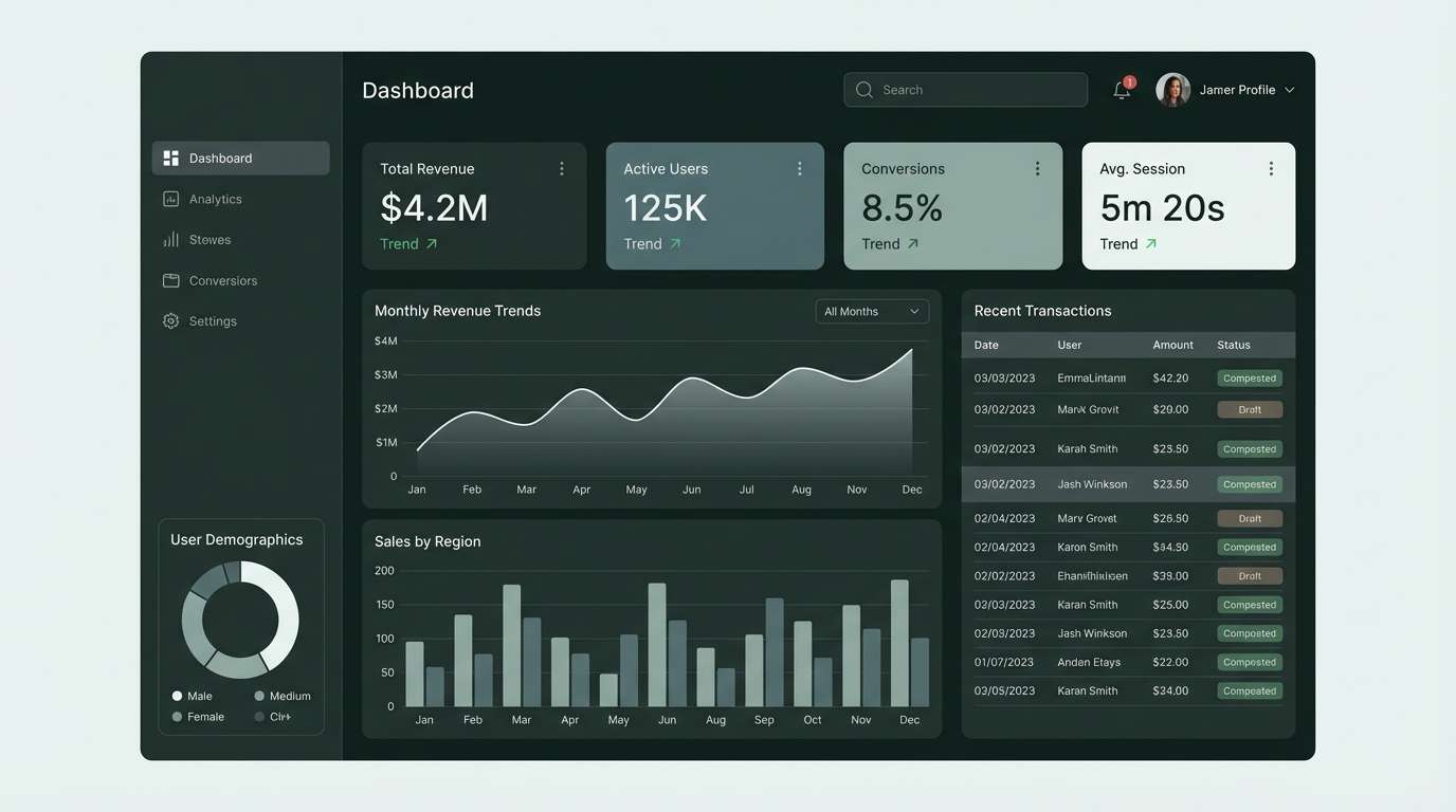
19) Stormwatch
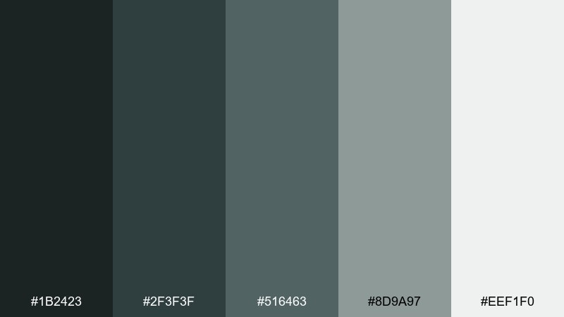
HEX: #1b2423 #2f3f3f #516463 #8d9a97 #eef1f0
Mood: cool, alert, composed
Best for: analytics dashboard UI
Cool and composed, these blue-green grays feel like storm clouds rolling over steel. Use the darker tones for sidebars and chart frames, then keep the light gray-green for background and tables. It pairs well with crisp data visualizations and restrained accent indicators. Tip: reserve the mid teal-gray for active states so the dashboard stays calm under heavy information.
Image example of stormwatch generated using media.io
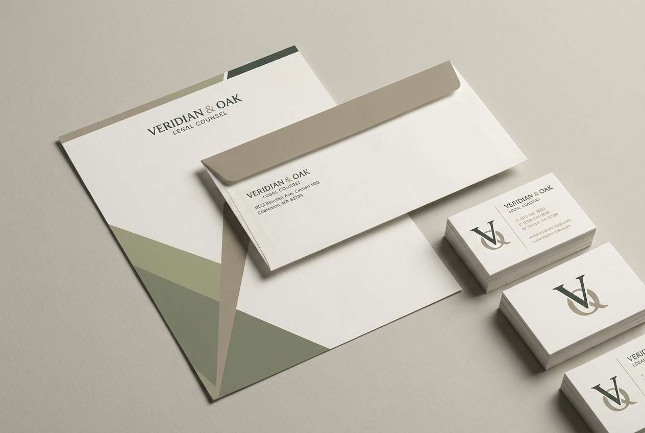
20) Quiet Command
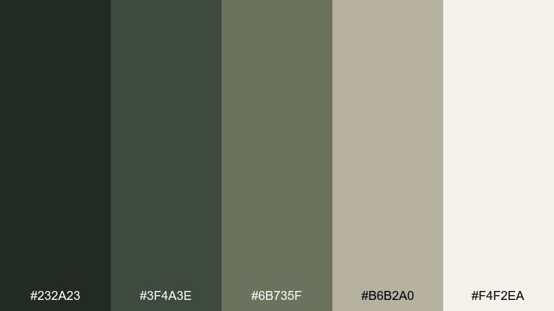
HEX: #232a23 #3f4a3e #6b735f #b6b2a0 #f4f2ea
Mood: confident, quiet, refined
Best for: law firm brand stationery
Confident and quiet, these refined greens and warm neutrals feel like authority without flash. For a polished army color palette on stationery, use the charcoal-green for the wordmark and the warm light tone for paper and envelopes. The mid olive works well for subtle rules, embossing, or a secondary monogram. Tip: keep layouts minimalist so the color contrast communicates trust.
Image example of quiet command generated using media.io
21) Supply Crate

HEX: #1f2a1f #3c4a33 #6a6b44 #a8925a #f0e5cc
Mood: sturdy, vintage, practical
Best for: craft beer can label
Sturdy and vintage, this mix suggests stamped crates, rough paper, and utilitarian charm. Use the tan and cream for the main label fields, then layer olive and mustard-khaki for badges and illustrations. These army color combinations look great with blocky typography and woodcut-style graphics. Tip: keep the darkest green for outlines so small label details stay sharp.
Image example of supply crate generated using media.io

22) Medic Pouch

HEX: #22312b #3e5a4f #6f8f84 #a9c2b6 #f3f7f5
Mood: clean, reassuring, clinical
Best for: health app landing page
Clean and reassuring, these cool greens feel like sterile kits and calm, competent care. Use the pale minty-white for page backgrounds, with deeper teal-green for headings and primary buttons. It pairs well with rounded cards, simple icons, and generous line spacing. Tip: keep CTAs in the darkest shade and use lighter tints for supportive info blocks.
Image example of medic pouch generated using media.io
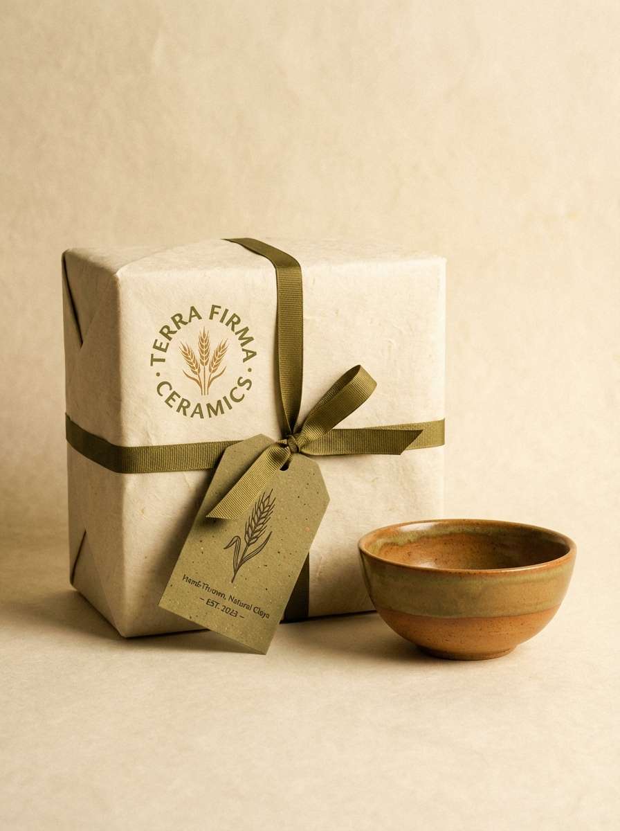
23) Canteen Clay

HEX: #2b312b #4f5a4a #7d7a61 #b07c5a #efe1cf
Mood: earthy, handcrafted, warm
Best for: ceramics brand product packaging
Earthy and handcrafted, these tones recall clay rims, olive leaves, and sun-warmed studio shelves. Use the warm clay accent for stamps or seals, while the greens and wheat set a natural foundation. It works best on textured paper wraps and minimal packaging layouts. Tip: keep typography dark and simple so the artisanal colors stay in control.
Image example of canteen clay generated using media.io
What Colors Go Well with Army?
Army green pairs naturally with warm neutrals like khaki, tan, beige, and cream—these keep the palette outdoorsy and approachable while preserving a grounded look.
For a sharper, modern contrast, add charcoal, iron gray, or near-black green. This is especially effective for UI typography, navigation, and icon systems.
If you want a controlled pop, use muted warm accents like bronze, clay, or ember orange. Keeping accents under 10% helps the army palette stay calm and premium.
How to Use a Army Color Palette in Real Designs
Start with roles, not just colors: assign one dark tone for headings/navigation, one mid tone for surfaces (cards, panels), one light tone for backgrounds, and one accent for highlights and CTAs.
For print and packaging, lean on texture—kraft paper, uncoated stock, grain, and embossing make olive and khaki feel intentional instead of flat. Keep the darkest ink for small details and type clarity.
For digital products, watch contrast: olive can reduce readability if everything sits in the same mid range. Use the lightest tint for spacing and the darkest shade for key text to stay accessible.
Create Army Palette Visuals with AI
If you want mockups that match your army color scheme (branding sets, UI screens, labels, posters), generating visuals with consistent tones can save hours of iteration.
Use the included prompts as a starting point, then tweak materials (paper, fabric, metal), lighting, and aspect ratio to fit your exact use case.
With Media.io, you can turn your army palette idea into on-brand image examples in minutes—ready for presentations, moodboards, and creative direction.
Army Color Palette FAQs
-
What is an army color palette?
An army color palette is a set of grounded greens (olive, sage, forest) paired with khaki, tan, and rugged neutrals like charcoal or stone—often inspired by military and outdoor utility tones. -
Is army green the same as olive green?
They overlap, but army green is often darker, grayer, and more muted than classic olive. Olive can skew warmer/yellower, while army green commonly feels more neutral and tactical. -
What HEX code is closest to “army green”?
There isn’t one universal HEX value, but deep muted greens like #2f3a2e or #2d3d32 read as modern army green in many digital designs. -
What colors pair best with army green for branding?
Khaki, parchment, cream, and warm greige create a reliable heritage look. For a more modern brand, pair army green with charcoal, concrete gray, and one warm accent like bronze or clay. -
How do I make an army palette work in dark mode UI?
Use a green-black background instead of pure black, then layer muted sage/olive for cards and dividers. Keep text in a pale stone tone to maintain contrast and reduce eye strain. -
Can army palettes look premium (not camouflage)?
Yes—limit saturation, keep layouts minimal, and use a restrained accent (5–10%) like bronze. Premium results usually come from clean typography, whitespace, and consistent materials. -
How do I choose an accent color for an army palette?
Pick a warm, muted accent (ember orange, clay, bronze) if you want energy, or a cool gray-green/teal-gray if you want a composed, analytical feel. Use it sparingly for highlights and states.
Next: Saffron Color Palette