

Burgundy maroon is a deep, elegant red family that instantly adds richness, intimacy, and a premium feel to modern design work. It’s a favorite for branding, packaging, invitations, and UI because it reads as confident without being loud.
Below are 20+ burgundy maroon color palette ideas with HEX codes, plus practical ways to pair and apply them across real projects.
In this article
- Why Burgundy Maroon Palettes Work So Well
-
- velvet winery
- smoked rosewood
- gilded merlot
- crimson espresso
- dusty plum linen
- autumn cabernet
- minimal oxblood ui
- rose gold night
- berry cocoa cream
- vintage wine poster
- forest and merlot
- coastal garnet
- candlelit bistro
- winter berry snow
- stone and sangria
- orchid noir
- royal maroon silk
- terracotta merlot table
- burgundy indigo ink
- spiced cherry cola
- museum merlot
- What Colors Go Well with Burgundy Maroon?
- How to Use a Burgundy Maroon Color Palette in Real Designs
- Create Burgundy Maroon Palette Visuals with AI
Why Burgundy Maroon Palettes Work So Well
Burgundy maroon sits in that “luxury neutral” zone: it’s saturated enough to feel intentional, but dark enough to behave like a grounding base color. That’s why it works equally well as a hero background, a logo color, or a small accent in modern interfaces.
It also pairs beautifully with both warm and cool companions—think ivory, tan, gold, sage, teal, and indigo—so it’s easy to build balanced systems with clear hierarchy. Add a near-black for typography and you get a polished, editorial finish.
Most importantly, burgundy maroon carries emotion: romance, heritage, confidence, and warmth. When used with enough whitespace and high-contrast text, it looks modern instead of heavy.
20+ Burgundy Maroon Color Palette Ideas (with HEX Codes)
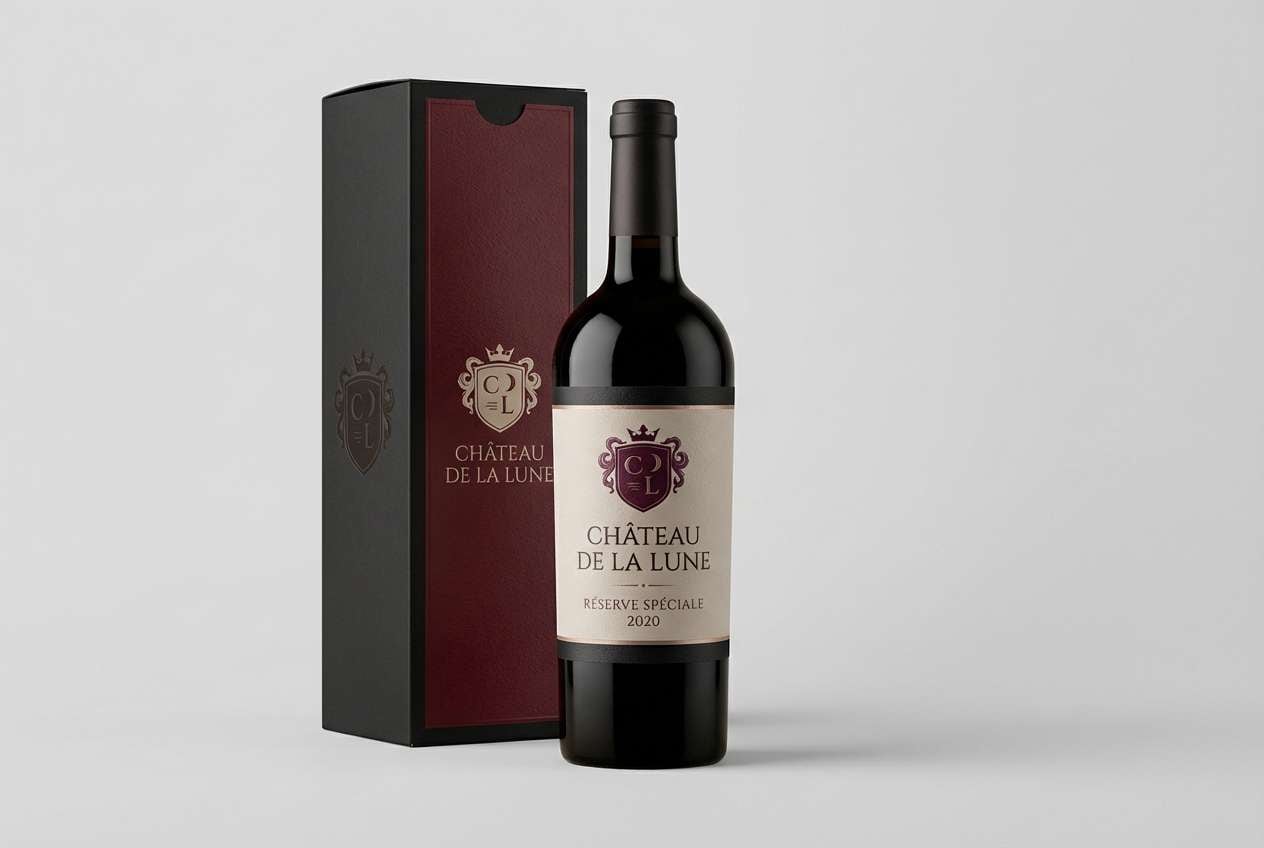
1) Velvet Winery
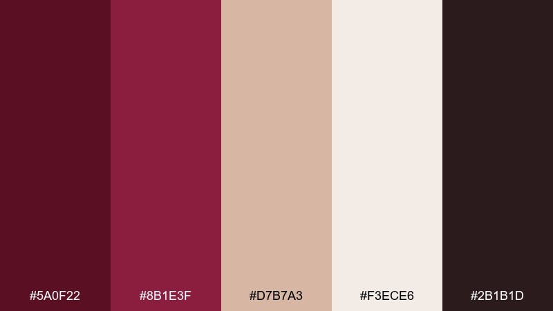
HEX: #5a0f22 #8b1e3f #d7b7a3 #f3ece6 #2b1b1d
Mood: luxurious, intimate, classic
Best for: wine label and premium packaging
Velvety merlot tones feel like a candlelit tasting room and dark oak barrels. Use the deep reds for the main brand blocks, then soften with warm beige for whitespace and readability. Pair with matte black details and subtle foil accents for a premium finish. Tip: keep typography minimal and let the burgundy lead the hierarchy.
Image example of velvet winery generated using media.io
Media.io is an online AI studio for creating and editing video, image, and audio in your browser.

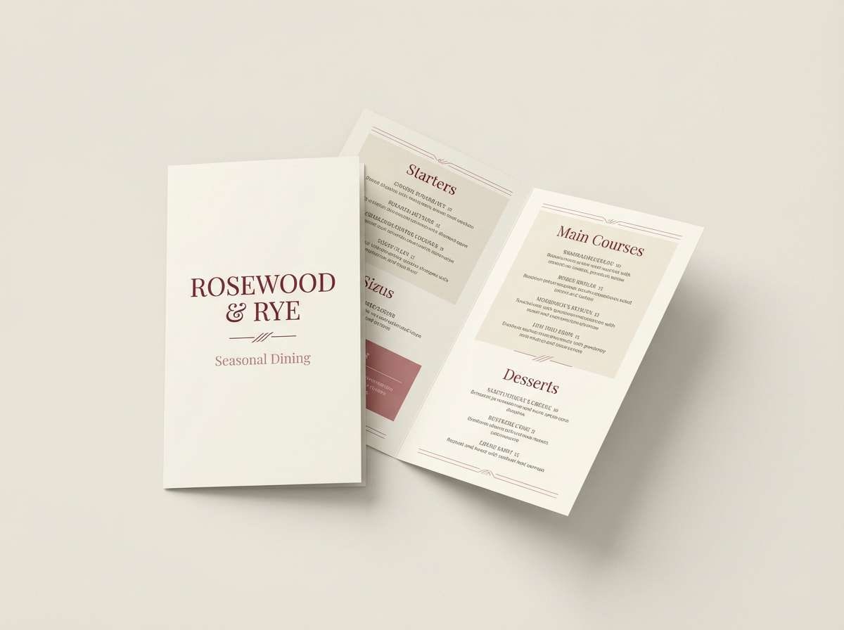
2) Smoked Rosewood
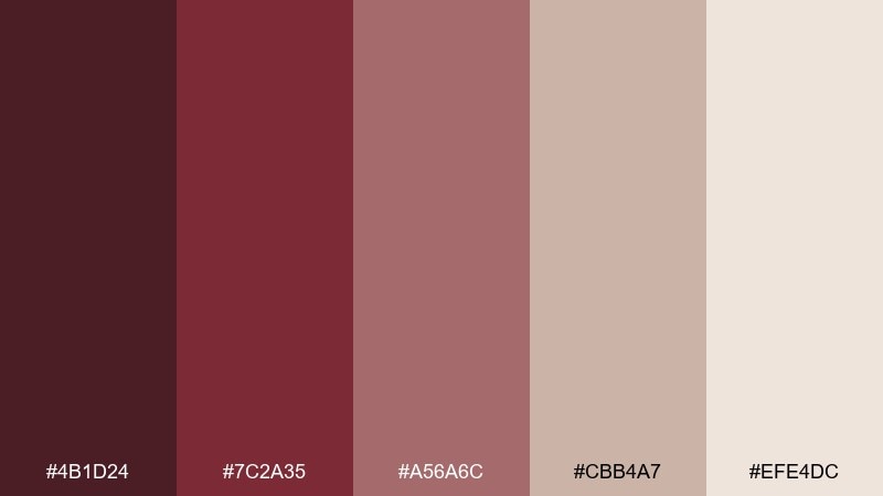
HEX: #4b1d24 #7c2a35 #a56a6c #cbb4a7 #efe4dc
Mood: moody, warm, understated
Best for: restaurant menu design
Smoky rosewood reds create a cozy, late-night dining vibe. Use the darker tones for section headers and the dusty rose for supporting highlights like icons or dividers. Creamy neutrals keep long menu lists easy to scan. Tip: print on uncoated stock to make the muted reds feel tactile and sophisticated.
Image example of smoked rosewood generated using media.io
3) Gilded Merlot
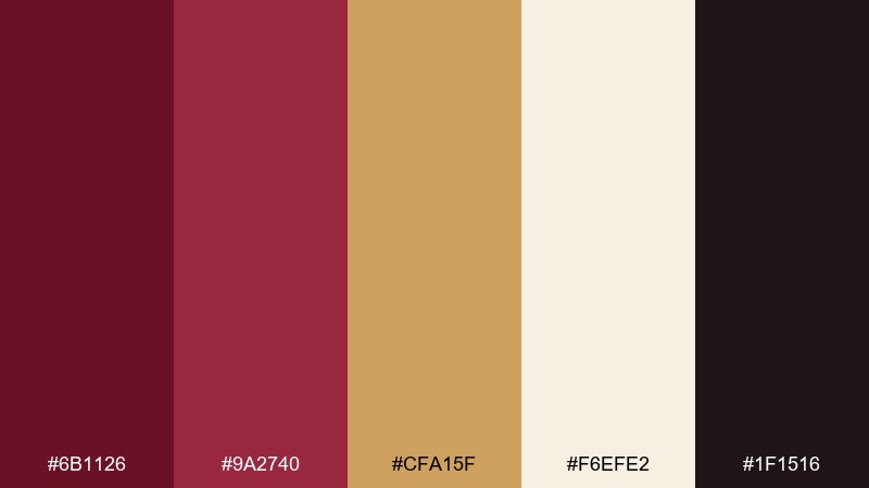
HEX: #6b1126 #9a2740 #cfa15f #f6efe2 #1f1516
Mood: opulent, celebratory, elegant
Best for: luxury brand identity
Opulent merlot with a gold glow brings to mind velvet curtains and champagne toasts. This burgundy maroon color palette shines in monograms, seals, and premium stationery where contrast matters. Pair the metallic tone with warm ivory backgrounds and use the near-black for crisp type. Tip: reserve the gold shade for small highlights so it feels intentional, not flashy.
Image example of gilded merlot generated using media.io
4) Crimson Espresso
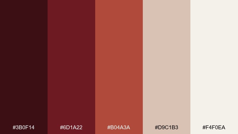
HEX: #3b0f14 #6d1a22 #b04a3a #d9c1b3 #f4f0ea
Mood: bold, grounded, cozy
Best for: coffee shop poster
Dark espresso reds feel bold and grounded, like roasted beans and brick walls. Use the deepest shade for the headline and the warm clay tone for secondary callouts or price badges. Blush-beige and soft off-white keep the layout from feeling heavy. Tip: add subtle grain to backgrounds so the palette feels more artisanal.
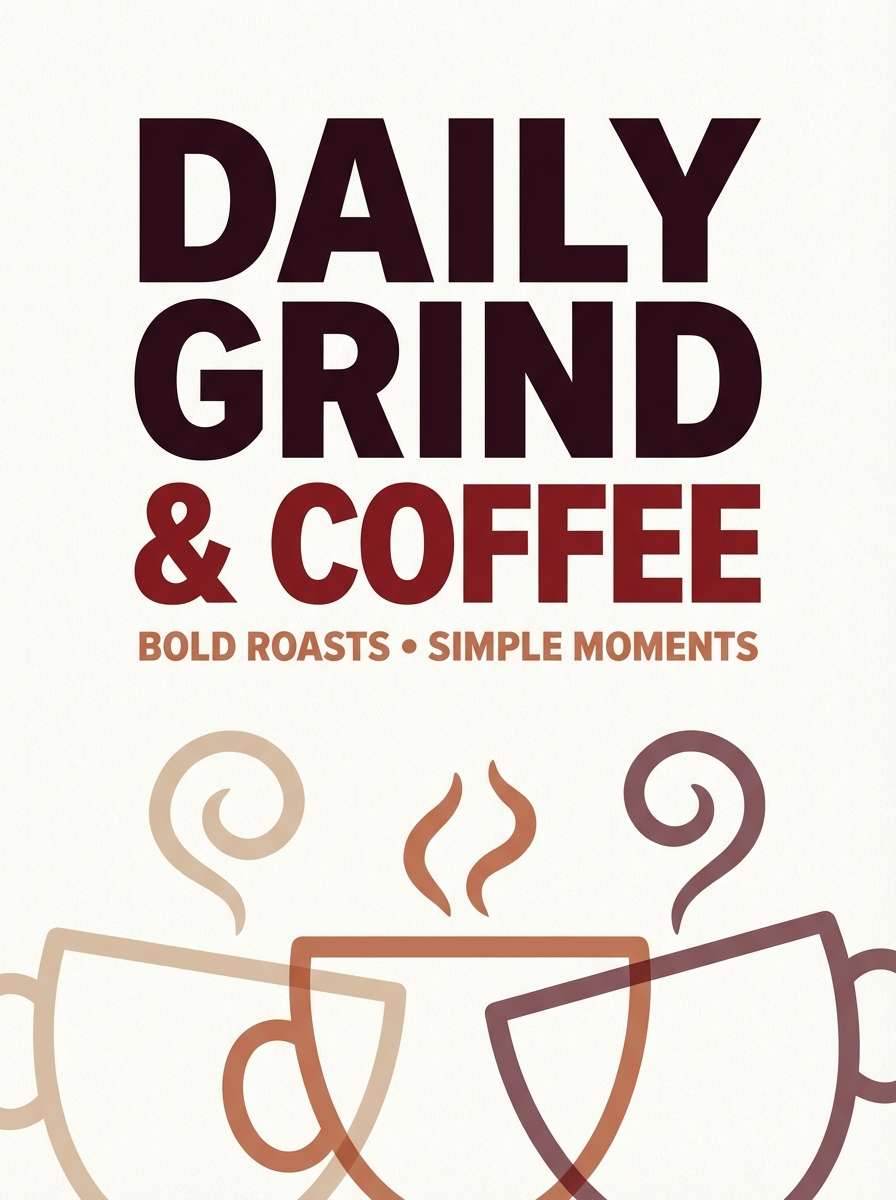
Image example of crimson espresso generated using media.io
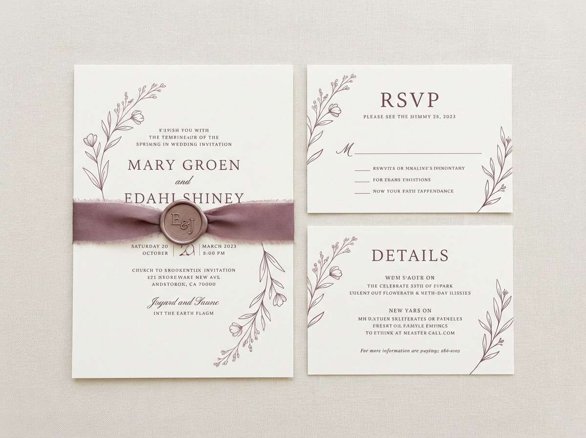
5) Dusty Plum Linen
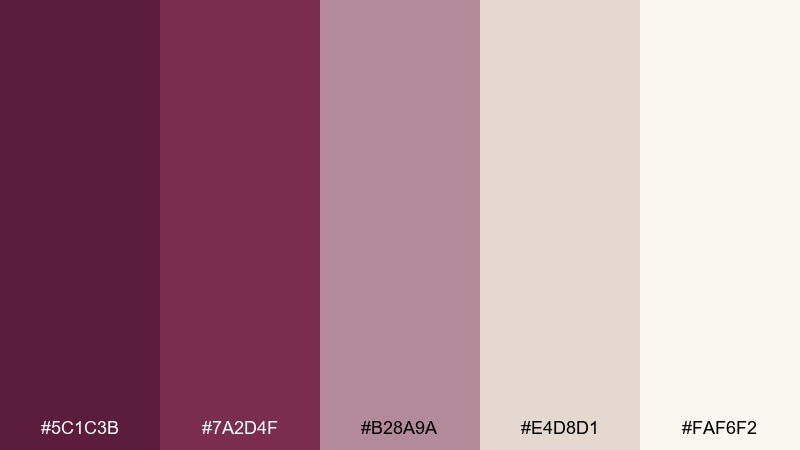
HEX: #5c1c3b #7a2d4f #b28a9a #e4d8d1 #faf6f2
Mood: soft, romantic, airy
Best for: wedding invitation suite
Dusty plum and linen neutrals feel like pressed flowers and soft fabric. Use plum for names and key details, then lean on the pale tones for generous margins and calm breathing room. This pairing works beautifully with delicate line art and serif type. Tip: keep the mid pink-lilac shade to small motifs so the suite stays refined.
Image example of dusty plum linen generated using media.io
6) Autumn Cabernet
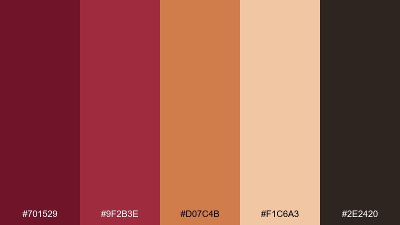
HEX: #701529 #9f2b3e #d07c4b #f1c6a3 #2e2420
Mood: seasonal, spicy, inviting
Best for: fall sale landing page
Spiced cabernet reds and toasted orange feel like falling leaves and warm cider. These burgundy maroon color combinations work best when you let the red anchor the hero area and use the orange as a confident CTA accent. Add the light peach for background panels to keep text readable. Tip: stick to one accent button color for consistency across sections.
Image example of autumn cabernet generated using media.io

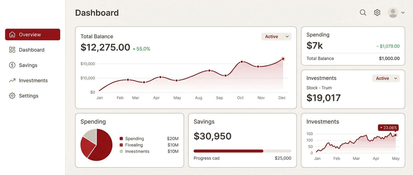
7) Minimal Oxblood UI
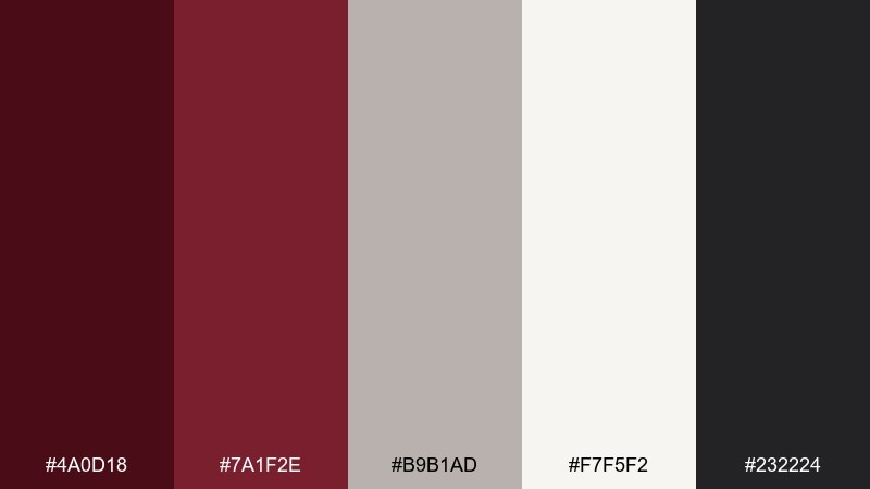
HEX: #4a0d18 #7a1f2e #b9b1ad #f7f5f2 #232224
Mood: modern, sharp, confident
Best for: finance dashboard UI
Minimal oxblood tones feel confident and precise, like a tailored suit. Use the deep red sparingly for key states such as active navigation, highlights, or warning badges. Let the warm gray and off-white carry most surfaces to maintain clarity. Tip: ensure accessible contrast by pairing the darkest shade with the lightest background for small text.
Image example of minimal oxblood ui generated using media.io
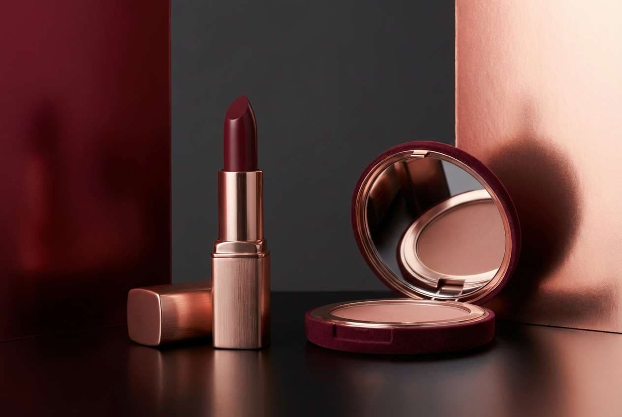
8) Rose Gold Night
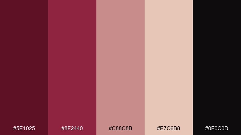
HEX: #5e1025 #8f2440 #c88c8b #e7c6b8 #0f0c0d
Mood: glam, nocturnal, romantic
Best for: beauty product ad
Rose-gold warmth against near-black feels like a night out under city lights. Make the deep wine shade the hero backdrop, then use the blush metals for glow effects and subtle gradients. This set pairs well with minimalist sans-serif type and high-contrast product photography. Tip: keep highlights soft to avoid turning the pinks overly sweet.
Image example of rose gold night generated using media.io
9) Berry Cocoa Cream
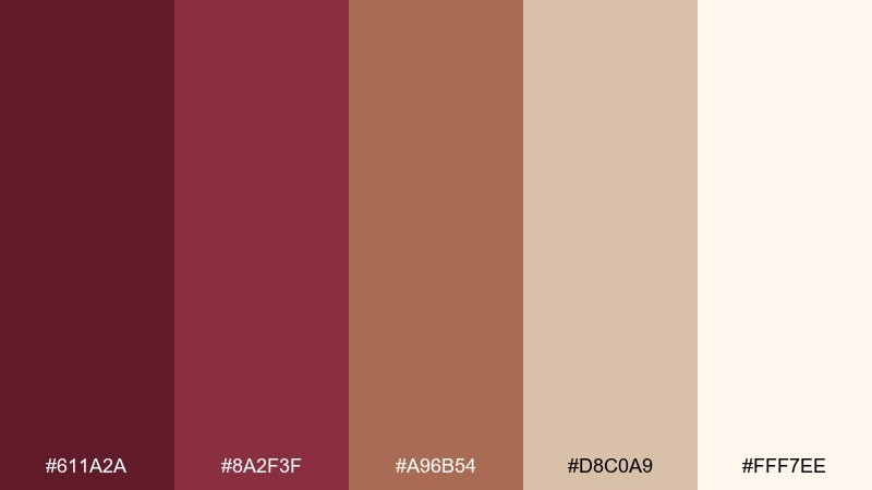
HEX: #611a2a #8a2f3f #a96b54 #d8c0a9 #fff7ee
Mood: comforting, sweet, sophisticated
Best for: bakery branding
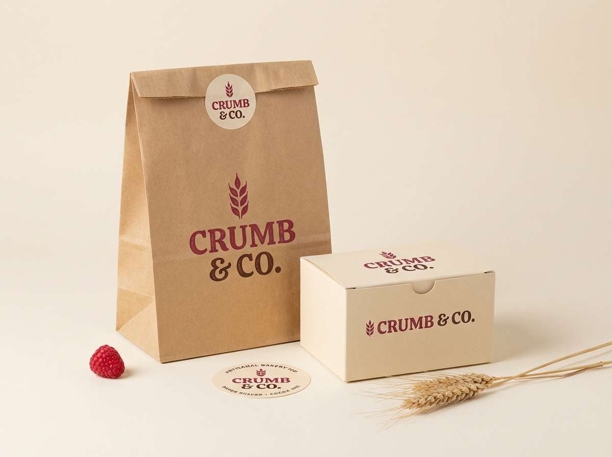
Berry reds and cocoa browns feel like jam tarts and warm pastries. Use the berry shades for the logo and key labels, while cream and caramel tones keep packaging friendly and approachable. This mix looks especially good with hand-drawn illustrations or stamped textures. Tip: choose one primary red and let the second red act as a supporting highlight.
Image example of berry cocoa cream generated using media.io
10) Vintage Wine Poster
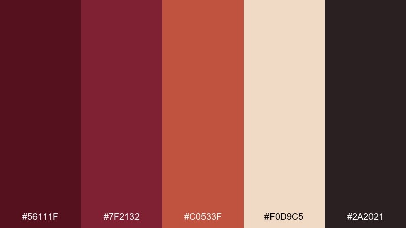
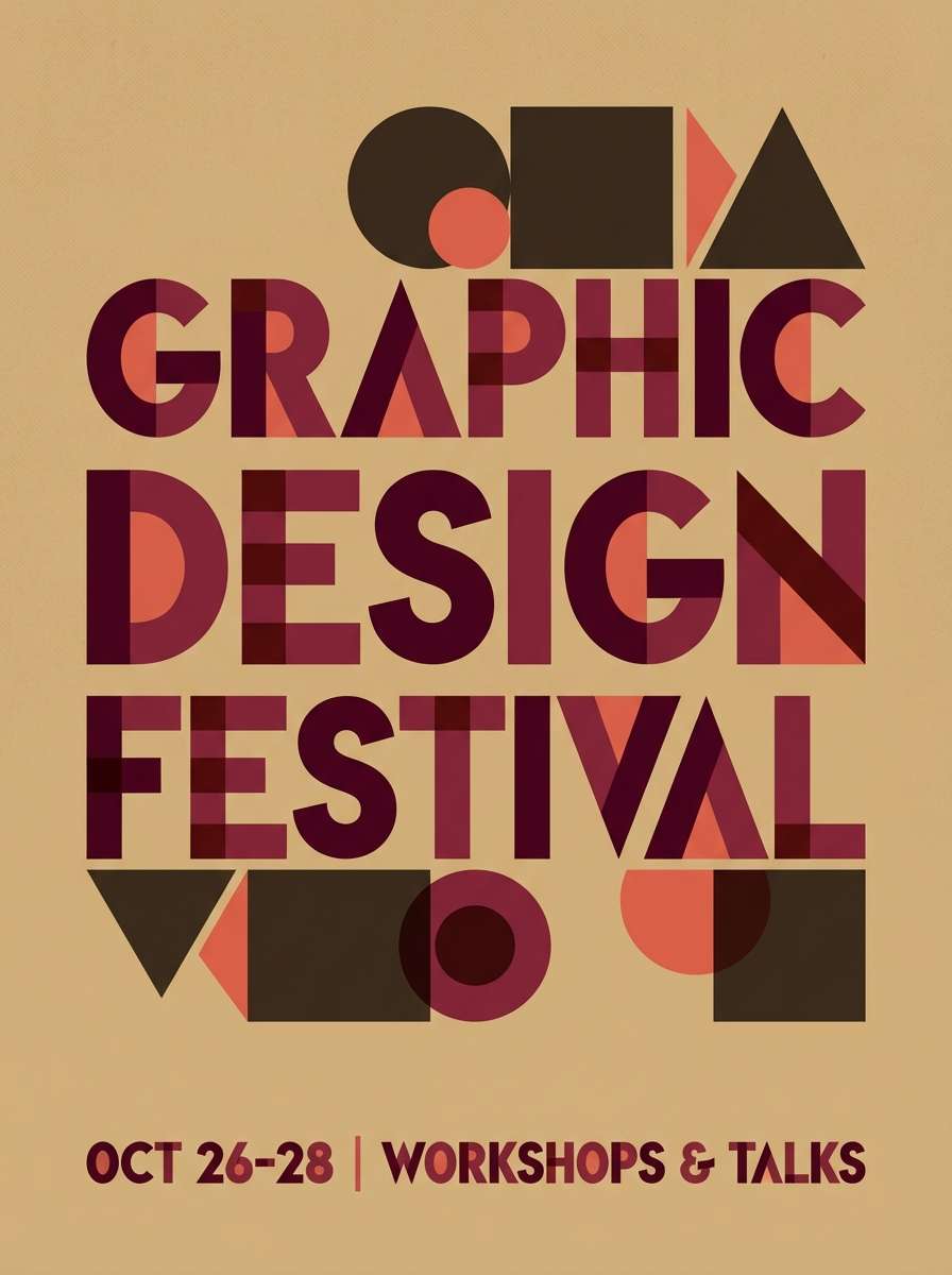
HEX: #56111f #7f2132 #c0533f #f0d9c5 #2a2021
Mood: retro, artsy, expressive
Best for: event poster design
Retro wine reds with warm coral feel like screen-printed gig posters and old cinema signage. A burgundy maroon color combination like this works best with chunky type, bold blocks, and a limited set of shapes. Use the pale tan as the base to keep the reds vibrant without overwhelming the layout. Tip: repeat the coral accent in two or three small places to unify the composition.
Image example of vintage wine poster generated using media.io
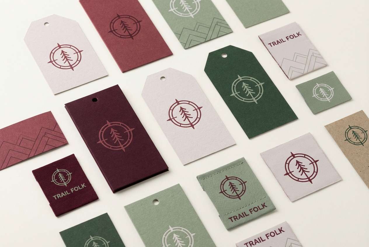
11) Forest and Merlot
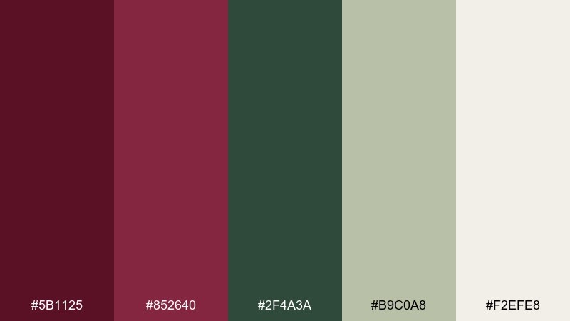
HEX: #5b1125 #852640 #2f4a3a #b9c0a8 #f2efe8
Mood: earthy, refined, natural
Best for: outdoor brand logo and tags
Merlot paired with forest green feels like a hike that ends at a cozy lodge. Use the green for secondary elements like tags or patterns, while the red stays reserved for the primary mark. The soft sage and off-white keep it grounded and approachable. Tip: test the logo in one-color versions so it stays strong on kraft paper and fabric.
Image example of forest and merlot generated using media.io
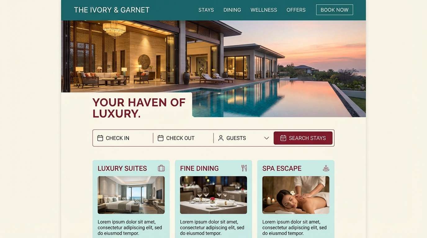
12) Coastal Garnet
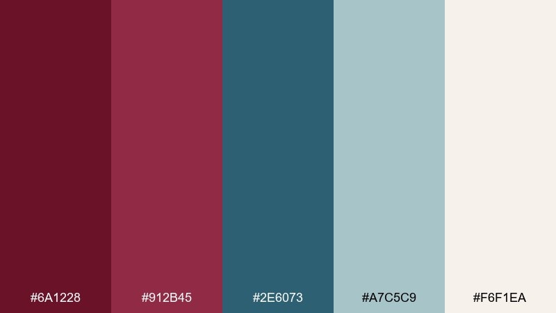
HEX: #6a1228 #912b45 #2e6073 #a7c5c9 #f6f1ea
Mood: fresh, balanced, modern
Best for: hotel website UI
Garnet reds with cool coastal teal feel crisp, like seaside air with a sophisticated twist. Use garnet for CTAs and highlights, while teal supports navigation, icons, or link states. The pale aqua and warm ivory keep the layout bright and welcoming. Tip: limit gradients and lean on solid color blocks for a clean, modern experience.
Image example of coastal garnet generated using media.io
13) Candlelit Bistro
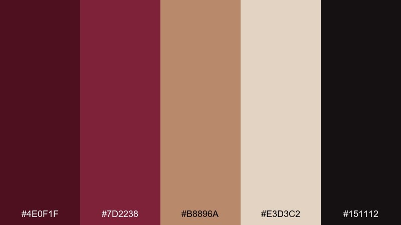
HEX: #4e0f1f #7d2238 #b8896a #e3d3c2 #151112
Mood: intimate, warm, upscale
Best for: fine dining flyer
Candlelit reds and toasted bronze feel intimate and upscale, like a small bistro after dark. Use the deepest shades for dramatic headers and the bronze for subtle separators or icon accents. The light beige keeps body text comfortable and prevents the design from becoming too heavy. Tip: add generous line spacing so dark palettes still feel airy.
Image example of candlelit bistro generated using media.io
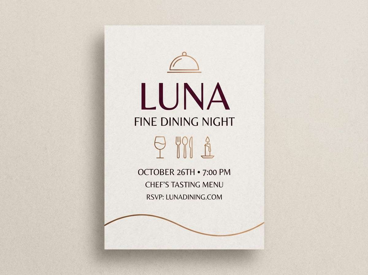
14) Winter Berry Snow
HEX: #6d1530 #a12f4b #d9a5b3 #f8f7f5 #3a2b2d
Mood: festive, soft, wintry
Best for: holiday greeting card
Winter berry tones against snowy white feel festive without going overboard. Use the bright berry shade for the main greeting and let the blush pink support small illustrations or borders. Charcoal-plum keeps typography sharp for details like dates and addresses. Tip: keep backgrounds mostly white so the reds feel crisp and seasonal.
Image example of winter berry snow generated using media.io
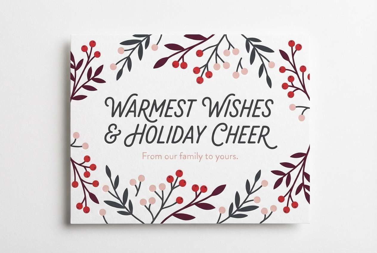
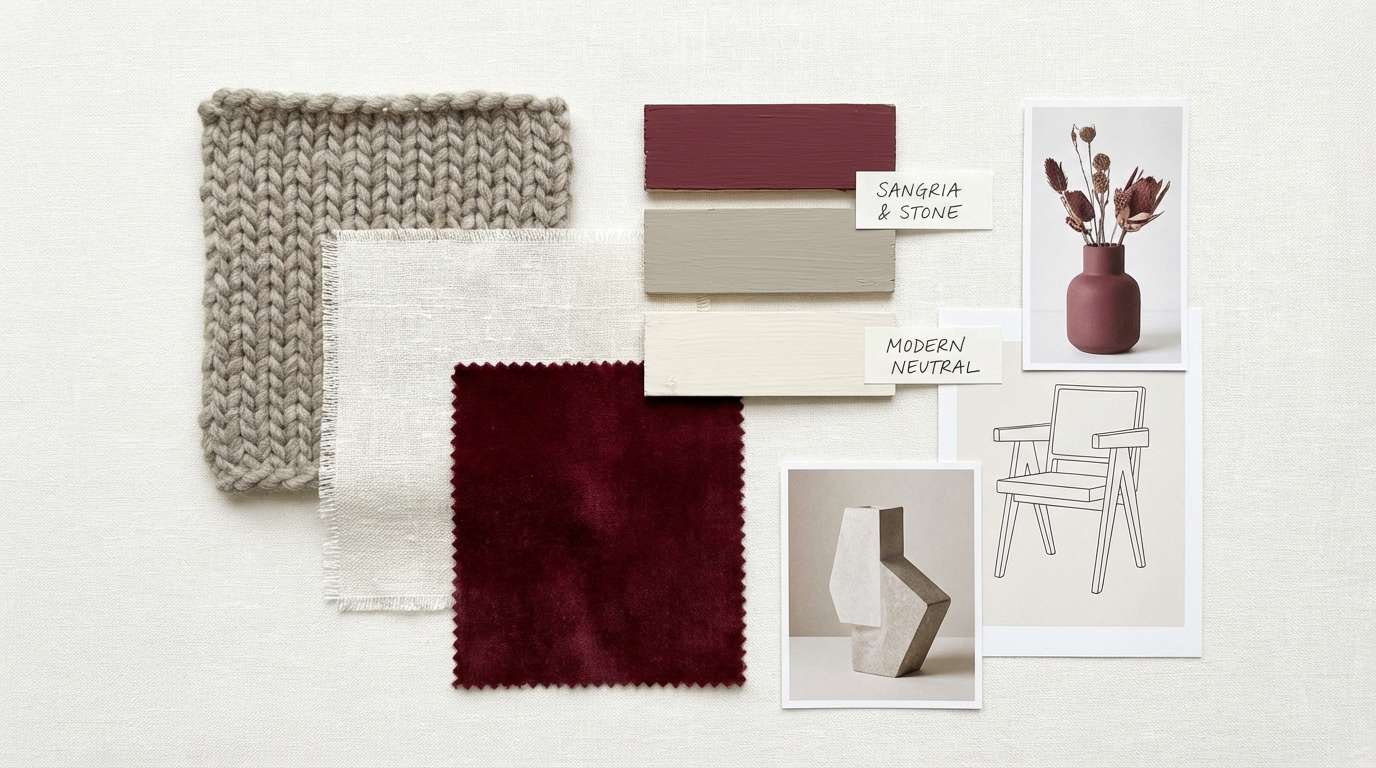
15) Stone and Sangria
HEX: #5f1427 #862b3f #9a8c83 #cfc6c1 #f4f2f0
Mood: calm, mature, contemporary
Best for: interior design mood board
Sangria reds with stone neutrals feel calm and mature, like a modern apartment with warm lighting. Use the reds as accent swatches for textiles, art, or a feature chair, while the grays and off-whites carry the main surfaces. This mix pairs beautifully with walnut wood and brushed brass hardware. Tip: keep the darkest red to small, repeated accents for a curated look.
Image example of stone and sangria generated using media.io
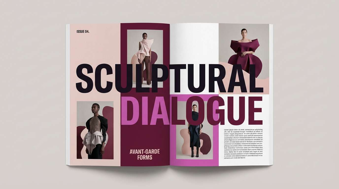
16) Orchid Noir
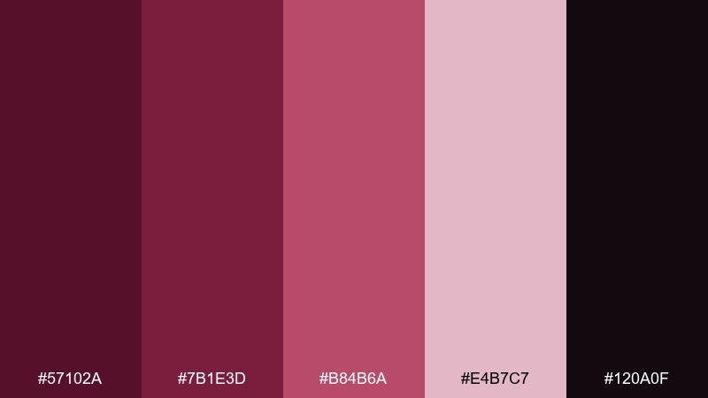
HEX: #57102a #7b1e3d #b84b6a #e4b7c7 #120a0f
Mood: dramatic, chic, fashion-forward
Best for: editorial magazine layout
Orchid reds on noir feel dramatic and fashion-forward, like a backstage runway moment. Use the near-black for type and grids, then let the orchid and blush tones color pull quotes or section openers. Keep imagery high-contrast so the palette stays bold rather than busy. Tip: limit accent colors to one per spread to maintain a premium editorial rhythm.
Image example of orchid noir generated using media.io
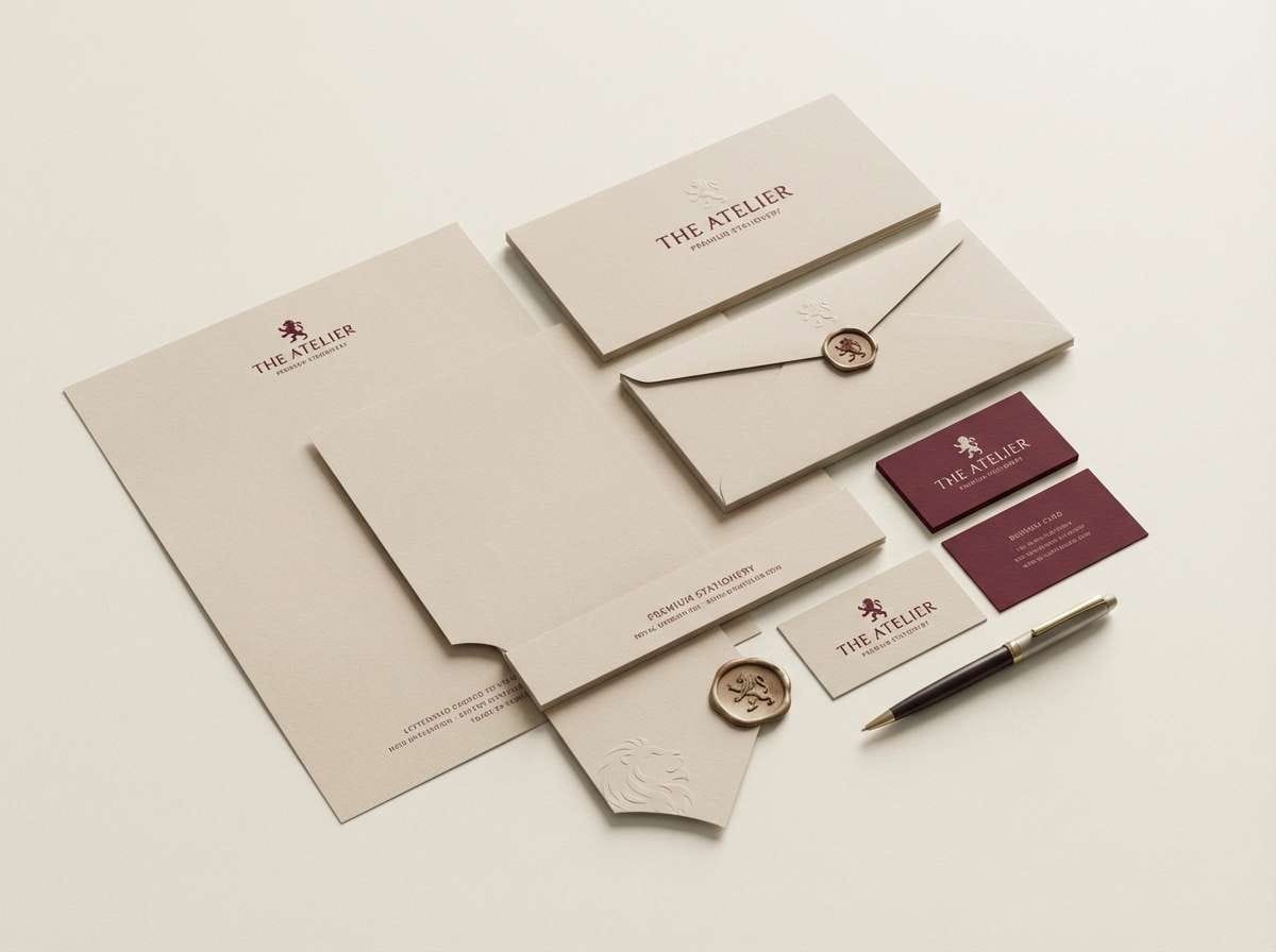
17) Royal Maroon Silk
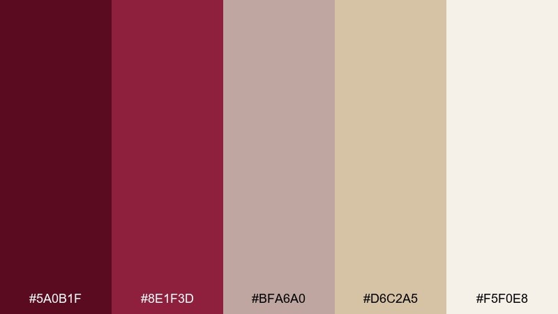
HEX: #5a0b1f #8e1f3d #bfa6a0 #d6c2a5 #f5f0e8
Mood: regal, smooth, timeless
Best for: premium stationery set
Regal maroon with silky neutrals feels timeless, like heirloom stationery and wax seals. This burgundy maroon color palette is perfect for letterheads, envelopes, and certificates where elegance matters more than loud contrast. Pair it with embossed textures, cream paper, and classic serif fonts. Tip: print the darkest shade with slightly reduced ink coverage to avoid heavy, muddy solids.
Image example of royal maroon silk generated using media.io
18) Terracotta Merlot Table
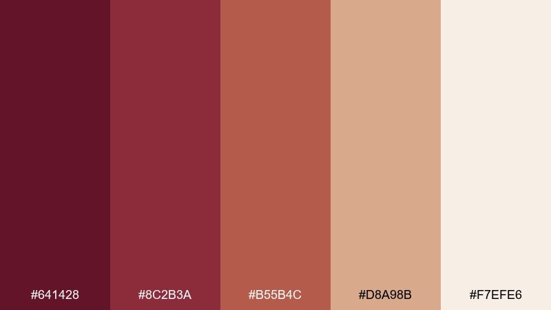
HEX: #641428 #8c2b3a #b55b4c #d8a98b #f7efe6
Mood: welcoming, rustic, sun-warmed
Best for: food product packaging
Sun-warmed terracotta with merlot red feels rustic and welcoming, like a shared table at golden hour. Use merlot for the logo and key claims, then let terracotta and sand tones carry backgrounds and patterns. This set pairs well with hand-lettering and simple ingredient illustrations. Tip: keep the darkest tone for small text to improve legibility on warm mid-tone boxes.
Image example of terracotta merlot table generated using media.io
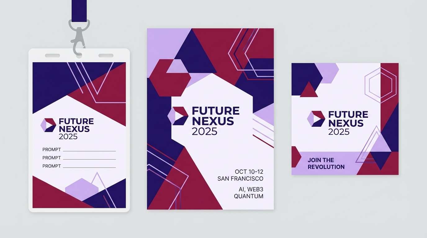
19) Burgundy Indigo Ink
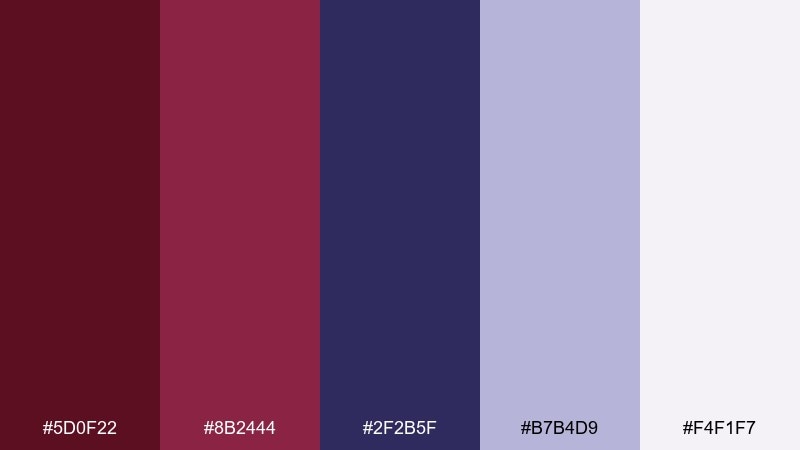
HEX: #5d0f22 #8b2444 #2f2b5f #b7b4d9 #f4f1f7
Mood: creative, intelligent, bold
Best for: tech conference branding
Burgundy with indigo feels smart and creative, like late-night ideas on ink-stained paper. Use indigo for backgrounds and stage signage, while burgundy highlights key announcements and dates. Lavender and soft white help charts, schedules, and sponsor grids stay readable. Tip: keep gradients subtle so the palette stays crisp across print and screens.
Image example of burgundy indigo ink generated using media.io
20) Spiced Cherry Cola
HEX: #6a1026 #9a2340 #c85b3c #f0b07a #2b1a15
Mood: playful, bold, energetic
Best for: retro soda can design
Spiced cherry reds with caramel warmth feel playful, like a retro diner soundtrack. These burgundy maroon color combinations pop when you use the brighter red for the logo shape and the orange-caramel tones for stripes or bursts. Add the dark cola brown to anchor outlines and small text. Tip: keep the background mostly one solid tone so the retro graphics read fast at a distance.
Image example of spiced cherry cola generated using media.io
21) Museum Merlot
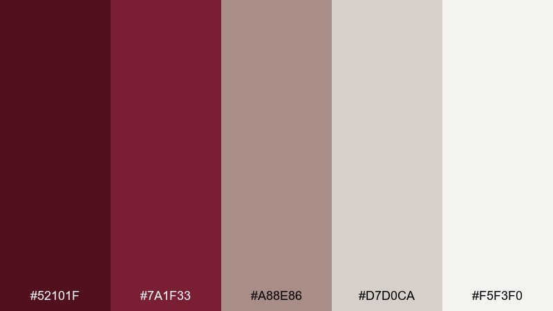
HEX: #52101f #7a1f33 #a88e86 #d7d0ca #f5f3f0
Mood: cultured, quiet, refined
Best for: museum exhibit brochure
Quiet merlot tones feel cultured and refined, like a gallery with soft spotlights. Use the darkest shade for section titles and wayfinding, then rely on warm grays for body copy and captions. This mix pairs beautifully with monochrome photography and generous margins. Tip: keep accent color use consistent across spreads to reinforce navigation.
Image example of museum merlot generated using media.io
What Colors Go Well with Burgundy Maroon?
Soft neutrals are the easiest match: ivory, warm white, beige, sand, and greige keep burgundy maroon looking modern and readable. These also make great background colors for packaging and UI surfaces.
For richer contrast, pair it with near-black/charcoal for typography and structure, then add one warm highlight like gold, bronze, terracotta, or caramel. This approach is reliable for premium branding systems.
If you want a fresher, more contemporary twist, bring in cool counterpoints like teal, sage green, or indigo. Cool accents help burgundy feel balanced rather than overly romantic.
How to Use a Burgundy Maroon Color Palette in Real Designs
Use burgundy maroon as your anchor color, not your everywhere color. In most layouts, it works best as a hero block, a header/footer, or a brand mark—then let light neutrals handle the majority of the canvas.
Plan hierarchy with contrast: pair the darkest burgundy or near-black with the lightest background for small text, and reserve mid-tones for dividers, icons, chips, and secondary UI states. This keeps the palette feeling intentional instead of muddy.
In print, test ink coverage and paper stock. Burgundy maroon can look deeper on uncoated paper and more vibrant on coated finishes—so it’s worth printing a small proof before committing to large runs.
Create Burgundy Maroon Palette Visuals with AI
If you’re building a mood board, mockup, or ad concept, generating palette-matched visuals can help you validate the vibe quickly. Create a few variations (luxury, minimal UI, rustic, editorial) and compare them side-by-side.
With Media.io’s text-to-image tool, you can paste a prompt, describe your composition, and guide the look with burgundy maroon tones—ideal for early-stage branding exploration, pitch decks, and content planning.
Burgundy Maroon Color Palette FAQs
-
What’s the difference between burgundy and maroon?
Burgundy usually leans more wine-like (often with cooler or purple undertones), while maroon tends to be more brown-red. In practice, many “burgundy maroon” palettes combine both to create depth and flexibility. -
What are popular burgundy maroon HEX codes?
Common anchors include deep wine reds like #5a0f22, #6b1126, and #7a1f33, paired with warm neutrals like #f6efe2 or #f4f2f0 for contrast and readability. -
Which colors pair best with burgundy maroon for a modern look?
Warm white/ivory, greige, and charcoal are the cleanest modern pairings. For a contemporary accent, add teal, sage, indigo, or a muted gold/bronze used sparingly. -
How do I keep burgundy maroon from feeling too dark?
Give it plenty of whitespace (off-white or warm ivory), limit burgundy to key blocks, and use lighter neutrals for large surfaces. Also ensure strong text contrast by using near-black on light backgrounds (or white on the darkest burgundy). -
Is burgundy maroon good for UI and app design?
Yes—especially as an accent for active states, highlights, badges, or key CTAs. For accessibility, keep most UI surfaces light and test contrast ratios when placing small text on burgundy backgrounds. -
What’s a good accent color for burgundy maroon CTAs?
Toasted orange/terracotta creates warm energy, while teal provides crisp contrast. If you want a premium feel, use muted gold or bronze for small highlights rather than large button fills. -
Can I generate burgundy maroon themed images for branding mockups?
Yes. Use Media.io text-to-image prompts describing your subject (logo, packaging, UI, poster) and specify burgundy/merlot/oxblood with matching neutrals (ivory, beige, charcoal) to keep results consistent.


