

Brown, yellow, and orange sit close together on the warm side of the color wheel, so they naturally feel cohesive, earthy, and inviting. This makes them a go-to trio for seasonal campaigns, food branding, and rustic-modern UI themes.
Below are 20+ brown yellow orange color palette ideas with HEX codes, plus practical ways to keep contrast crisp and layouts readable.
In this article
- Why Brown Yellow Orange Palettes Work So Well
-
- harvest market
- desert sunset
- honeyed terracotta
- spiced latte
- marigold grove
- canyon clay
- golden maple
- toasted saffron
- pumpkin patch
- amber dusk
- caramel orchard
- bronze sunbeam
- autumn plaid
- sunbaked adobe
- butterscotch brick
- copper lantern
- rustic citrus
- wheat and walnut
- campfire glow
- vintage bistro
- gilded ember
- What Colors Go Well with Brown Yellow Orange?
- How to Use a Brown Yellow Orange Color Palette in Real Designs
- Create Brown Yellow Orange Palette Visuals with AI
Why Brown Yellow Orange Palettes Work So Well
Brown brings stability and “real-world” material cues (wood, leather, soil), while orange adds energy and approachability. Yellow rounds it out with optimism and visibility, so the overall scheme feels warm without being overly saturated.
Because these hues share undertones, gradients and transitions look smooth and intentional. That makes them especially effective for packaging, seasonal graphics, and branding systems that need warmth across many touchpoints.
To keep the palette from turning muddy, anchor layouts with a light cream background or a deep espresso text color. This creates a clear value range (light-to-dark) that protects readability.
20+ Brown Yellow Orange Color Palette Ideas (with HEX Codes)
1) Harvest Market
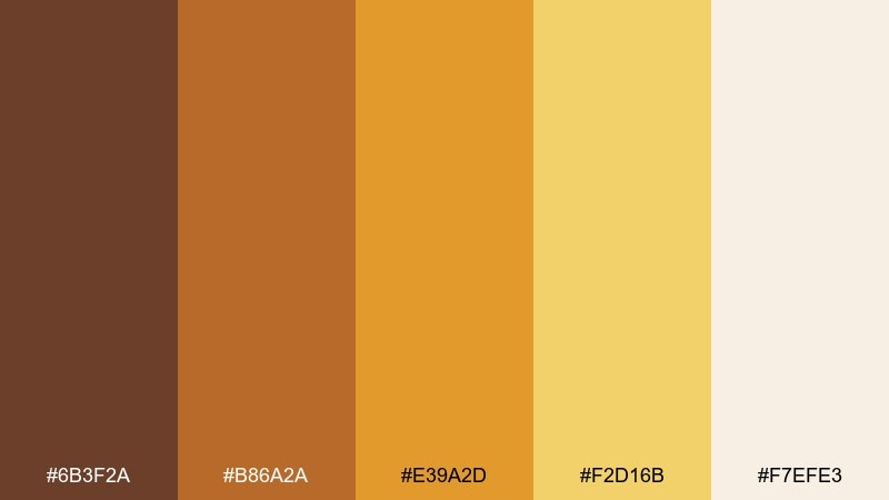
HEX: #6B3F2A #B86A2A #E39A2D #F2D16B #F7EFE3
Mood: cozy, abundant, welcoming
Best for: farm-to-table restaurant menu design
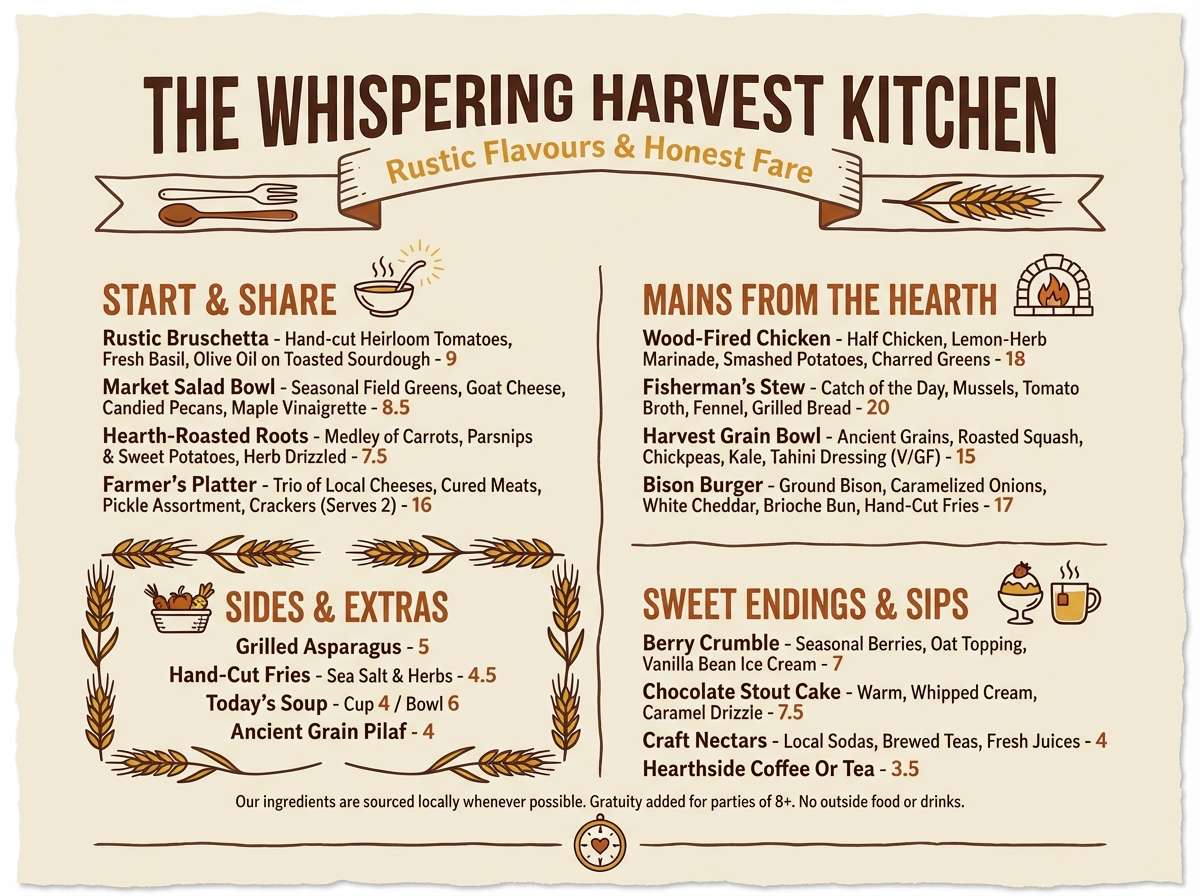
Cozy and abundant, it feels like wooden crates, fresh pumpkins, and late-afternoon sun. Use this brown yellow orange color palette for menus, table tents, and loyalty cards where warmth sells comfort. Pair it with off-white space and a deep brown for legible type. Tip: reserve the pale cream for backgrounds and let the golden tones highlight prices and calls to action.
Image example of harvest market generated using media.io
Media.io is an online AI studio for creating and editing video, image, and audio in your browser.

2) Desert Sunset
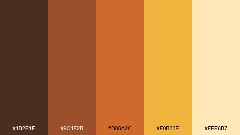
HEX: #4B2E1F #9C4F2B #D06A2C #F0B33E #FFE6B7
Mood: dramatic, sunlit, adventurous
Best for: travel poster for a desert destination
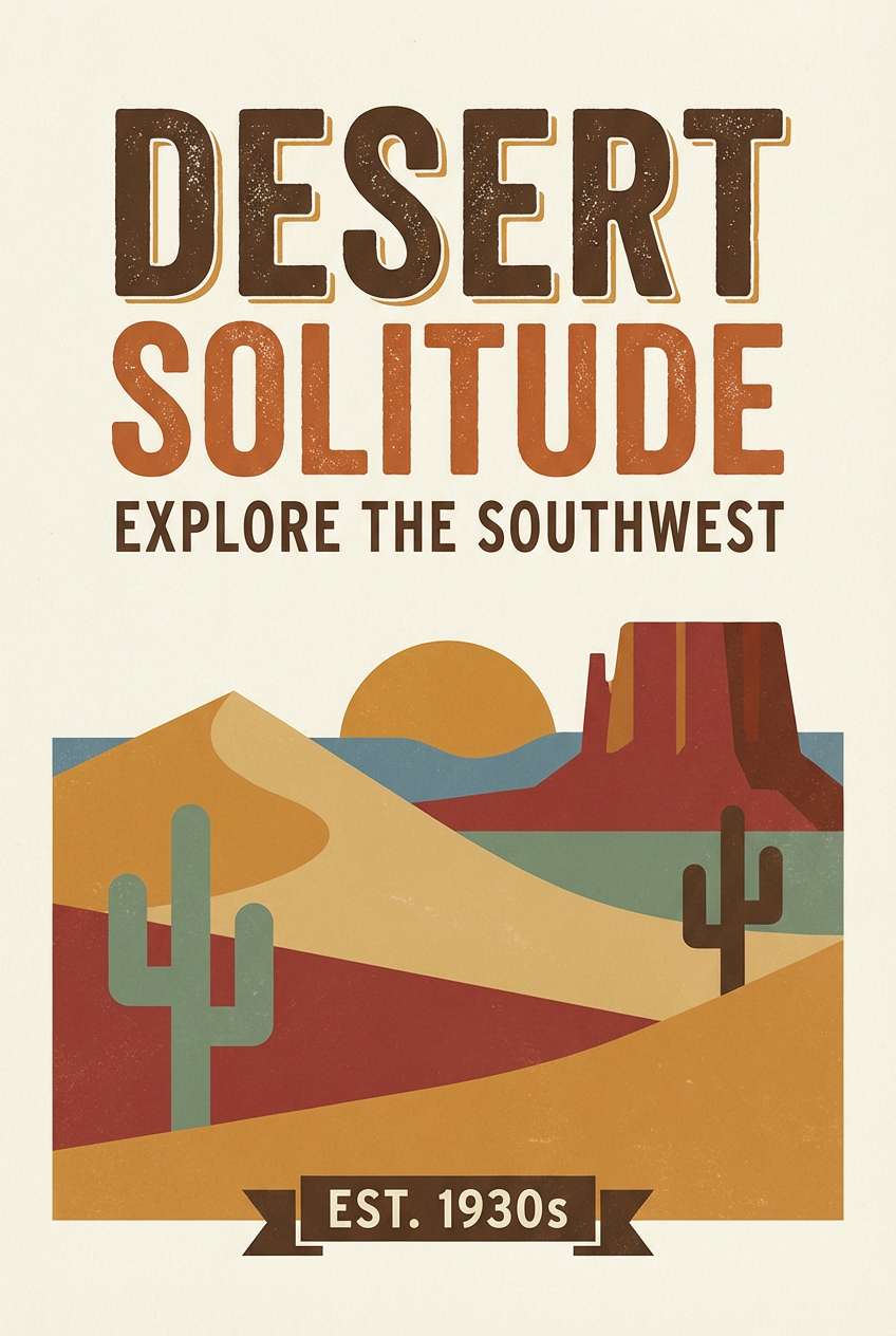
Dramatic and sunlit, it evokes dunes, canyon shadows, and a horizon that glows. It works beautifully on travel posters, event flyers, and hero banners where you want instant heat and motion. Balance the orange with the deep brown for headlines, and keep the pale sand as breathing room. Tip: add a subtle grain texture to the light background for a vintage print feel.
Image example of desert sunset generated using media.io
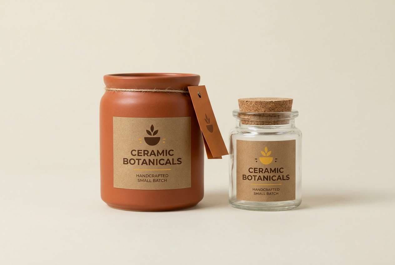
3) Honeyed Terracotta
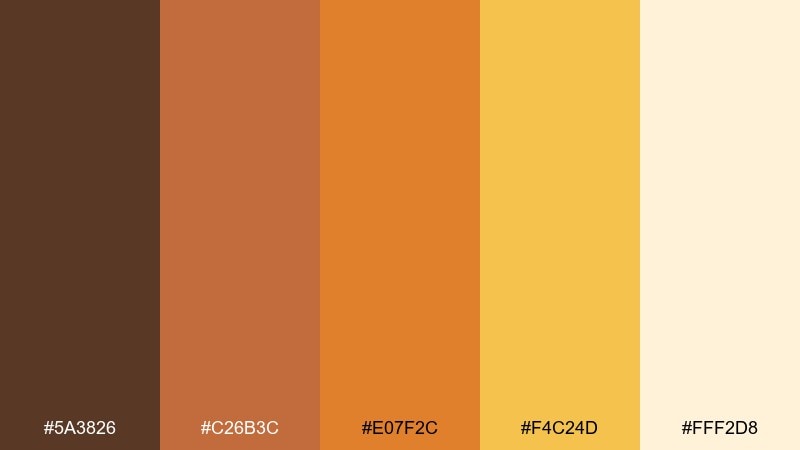
HEX: #5A3826 #C26B3C #E07F2C #F4C24D #FFF2D8
Mood: handmade, sunny, artisanal
Best for: ceramic brand packaging and labels
Handmade and sunny, it brings to mind glazed clay, honey drizzle, and a warm studio light. These brown yellow orange color combinations shine on labels, kraft boxes, and hang tags, especially with simple line art. Pair with uncoated paper textures and minimal black ink for ingredients and barcode areas. Tip: keep the brightest yellow as a small seal or sticker so it feels premium, not loud.
Image example of honeyed terracotta generated using media.io
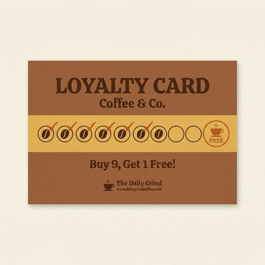
4) Spiced Latte
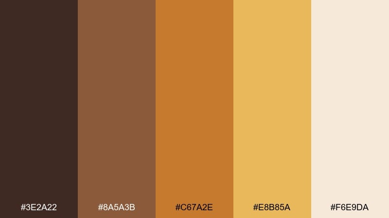
HEX: #3E2A22 #8A5A3B #C67A2E #E8B85A #F6E9DA
Mood: comforting, mellow, café-warm
Best for: coffee shop loyalty card and stamp design
Comforting and mellow, it reads like espresso crema and cinnamon foam. Use it for loyalty cards, café signage, or social templates that should feel familiar and low-pressure. Pair with creamy neutrals and a single dark brown text color to keep everything readable. Tip: set the golden tone as the stamp color so the reward marks feel inviting instead of harsh.
Image example of spiced latte generated using media.io
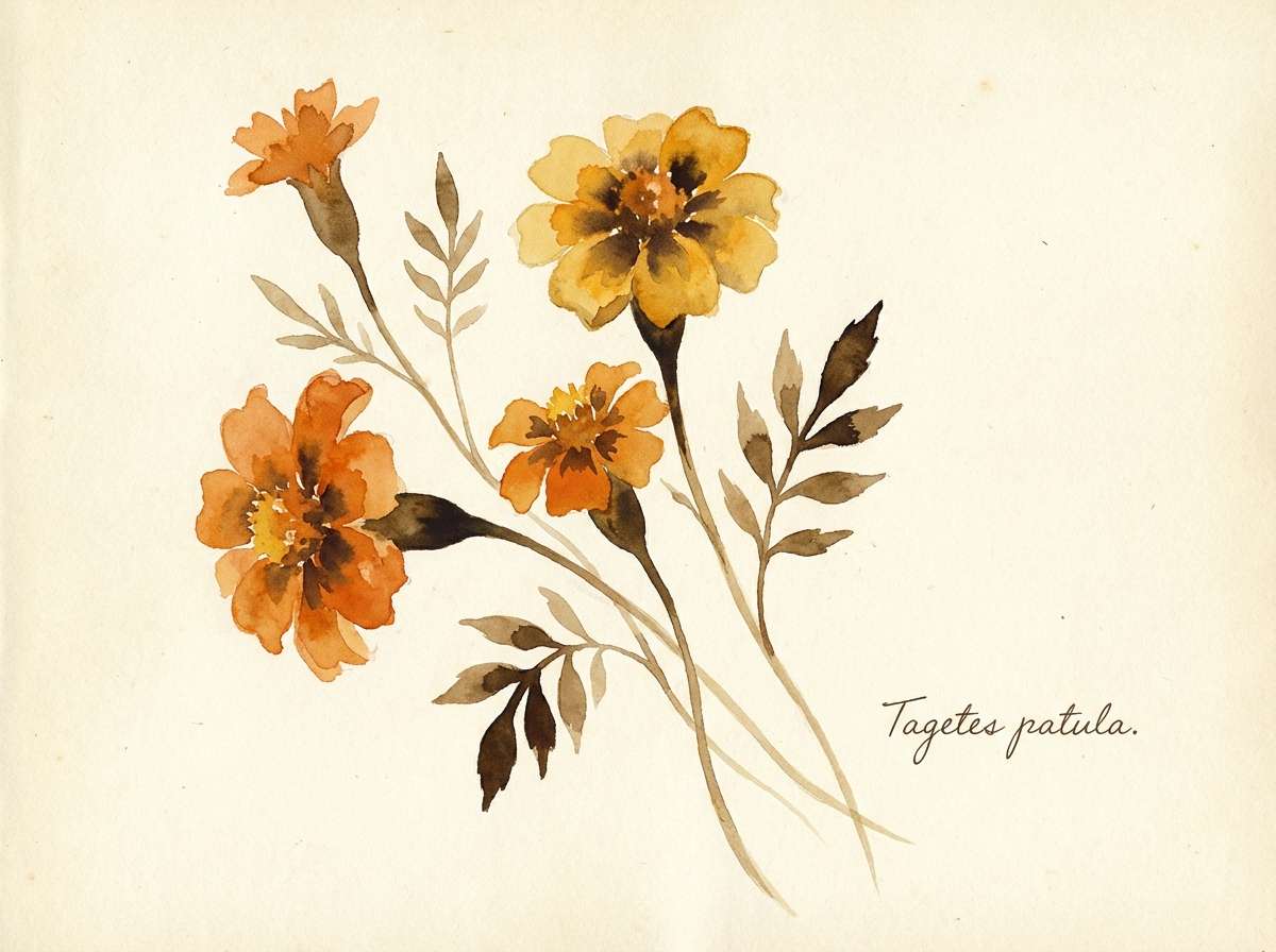
5) Marigold Grove
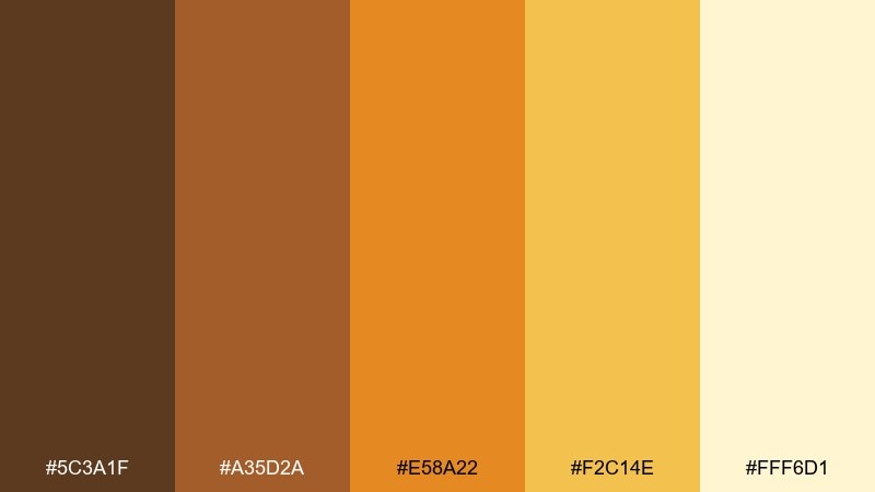
HEX: #5C3A1F #A35D2A #E58A22 #F2C14E #FFF6D1
Mood: cheerful, botanical, bright
Best for: watercolor botanical illustration set
Cheerful and botanical, it feels like marigolds in a sunlit garden bed. It suits illustrated stationery, floral patterns, and spring-to-fall marketing where warmth matters more than pastels. Pair with a soft ivory background and let the darkest brown define stems and outlines. Tip: limit the bright orange to petals and focal blooms so the pattern stays calm.
Image example of marigold grove generated using media.io
6) Canyon Clay
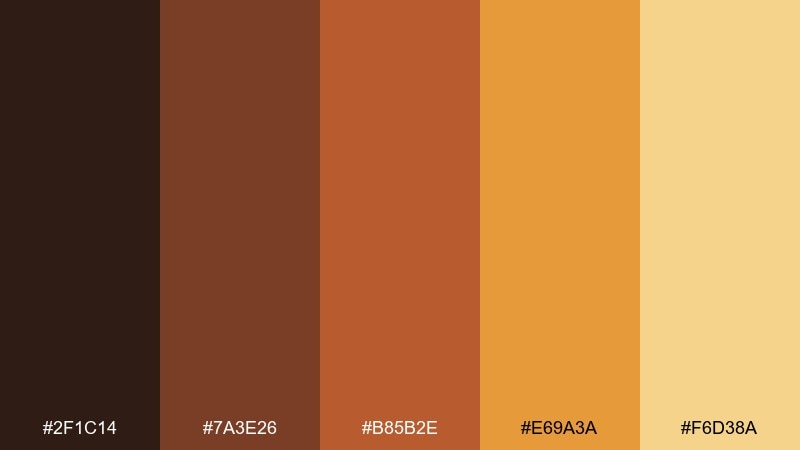
HEX: #2F1C14 #7A3E26 #B85B2E #E69A3A #F6D38A
Mood: rugged, grounded, outdoorsy
Best for: outdoor gear product ad banner
Rugged and grounded, it recalls rock layers, leather straps, and dust in golden light. It fits outdoor ads, landing pages, and seasonal promos that need grit without looking dark. Pair with crisp white for copy blocks and use the amber tone for buttons or discount badges. Tip: keep gradients subtle so the clay reds do not overpower the product photo.
Image example of canyon clay generated using media.io

7) Golden Maple
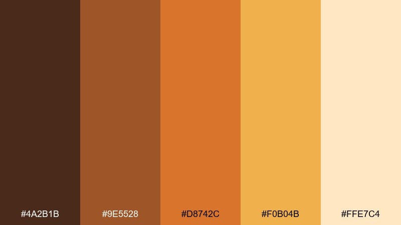
HEX: #4A2B1B #9E5528 #D8742C #F0B04B #FFE7C4
Mood: nostalgic, autumnal, uplifting
Best for: seasonal email header and promo tiles
Nostalgic and autumnal, it looks like maple leaves caught in warm sunlight. The mix makes a reliable brown yellow orange color palette for fall emails, promo tiles, and store banners. Pair with a light cream background and use the darkest brown for headings to avoid muddy contrast. Tip: keep the orange to small highlights so the layout feels airy and premium.
Image example of golden maple generated using media.io

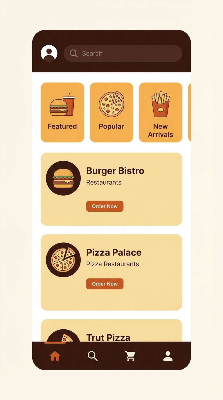
8) Toasted Saffron
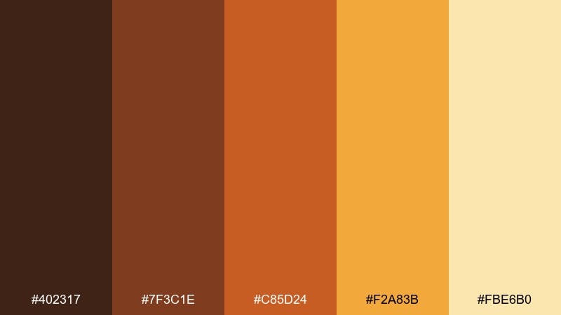
HEX: #402317 #7F3C1E #C85D24 #F2A83B #FBE6B0
Mood: spicy, energetic, appetizing
Best for: food delivery app UI screens
Spicy and energetic, it suggests toasted spices, street food stalls, and a lively dinner rush. Use the darker browns for navigation and the saffron orange for key actions so taps feel obvious. A pale warm yellow helps cards and panels look friendly without turning stark white. Tip: test contrast on small labels and keep the brightest hue for one primary CTA per screen.
Image example of toasted saffron generated using media.io
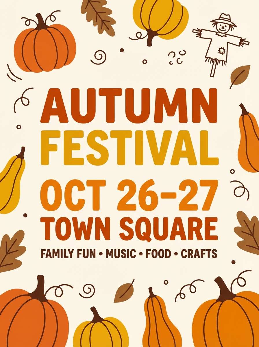
9) Pumpkin Patch
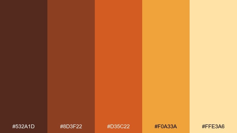
HEX: #532A1D #8D3F22 #D35C22 #F0A33A #FFE3A6
Mood: playful, festive, family-friendly
Best for: kids autumn festival flyer
Playful and festive, it feels like pumpkins lined up at a roadside stand. It works for family events, school flyers, and community posts where you want warmth without looking formal. Pair with chunky typography and plenty of light space so the bright orange pops cleanly. Tip: use the yellow for icons and badges, not long text blocks.
Image example of pumpkin patch generated using media.io
10) Amber Dusk
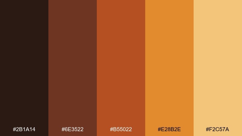
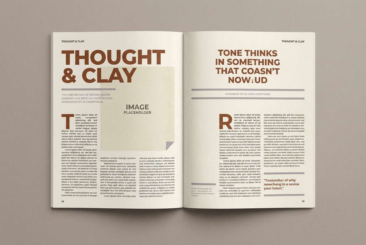
HEX: #2B1A14 #6E3522 #B55022 #E28B2E #F2C57A
Mood: moody, cinematic, refined
Best for: editorial magazine spread layout
Moody and cinematic, it reads like lamplight against dark wood at dusk. Use it in editorial layouts, lookbooks, and feature pages that need warmth without losing sophistication. Pair with clean white margins and use the amber tone for pull quotes or section dividers. Tip: keep body text near-black to preserve readability on warm backgrounds.
Image example of amber dusk generated using media.io
11) Caramel Orchard
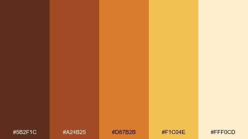
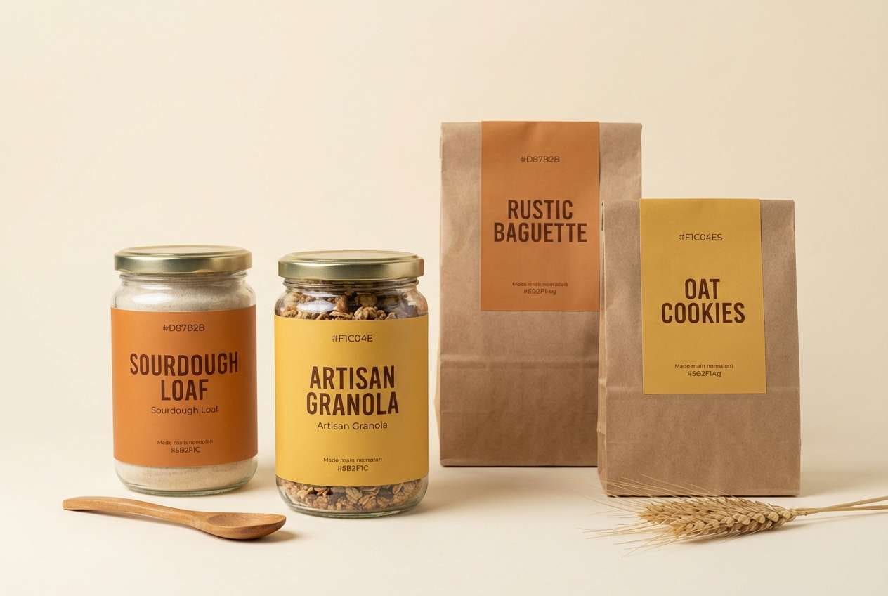
HEX: #5B2F1C #A24B25 #D87B2B #F1C04E #FFF0CD
Mood: sweet, rustic, inviting
Best for: bakery product label set
Sweet and rustic, it brings caramel apples, paper bags, and a cozy counter display to mind. It is ideal for bakery labels, jam jars, and seasonal gift sets where warmth signals homemade quality. Pair with simple serif type and let the pale cream hold ingredient lists. Tip: use the darker brown for brand marks so they stay sharp on warm oranges.
Image example of caramel orchard generated using media.io
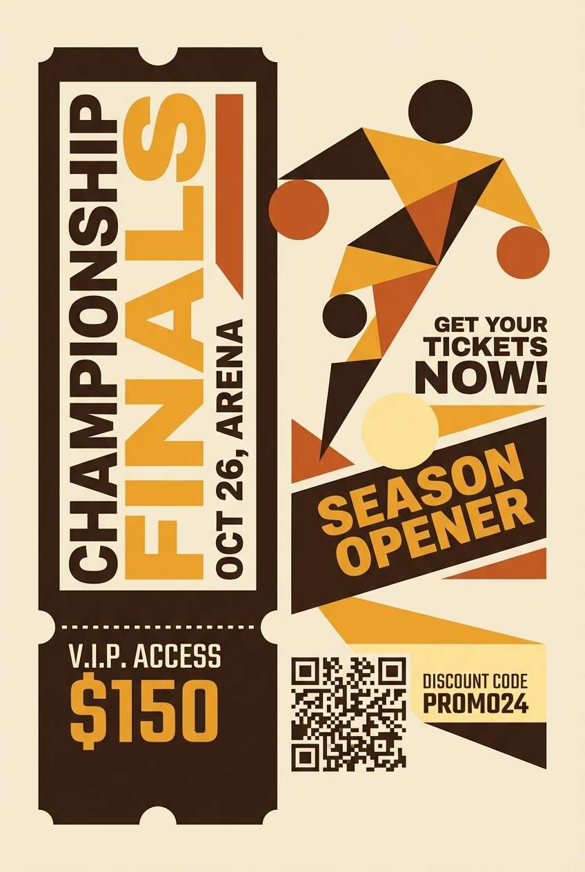
12) Bronze Sunbeam
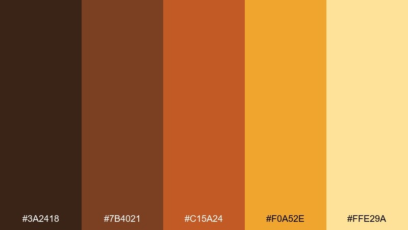
HEX: #3A2418 #7B4021 #C15A24 #F0A52E #FFE29A
Mood: confident, bold, high-contrast
Best for: sports event ticket and promo graphic
Confident and bold, it feels like bronze medals catching a stadium spotlight. It works well for tickets, promo graphics, and announcement posts that need instant hierarchy. Pair with strong condensed type and keep the light yellow for separators and small highlights. Tip: avoid large flat blocks of orange; use it as a stripe or badge for a punchier look.
Image example of bronze sunbeam generated using media.io
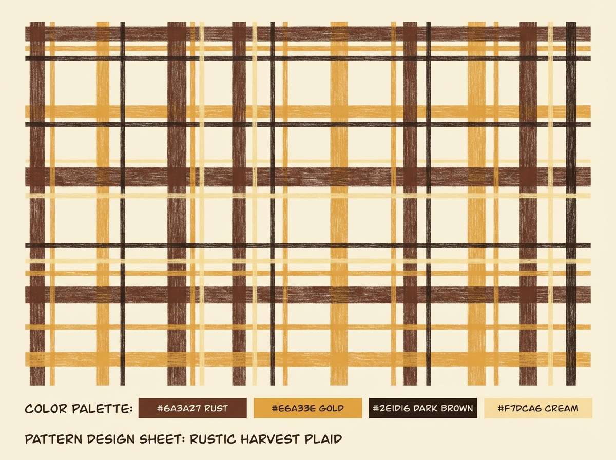
13) Autumn Plaid

HEX: #2E1D16 #6A3A27 #B85F2F #E6A33E #F7DCA6
Mood: heritage, cozy, textured
Best for: pattern design for apparel packaging
Heritage and cozy, it channels plaid blankets and a well-worn cabin weekend. Use it for pattern work, apparel packaging, and lifestyle branding where texture is part of the story. Pair with simple black linework and a warm cream base to keep the pattern breathable. Tip: scale the darkest stripes down so the design stays light and giftable.
Image example of autumn plaid generated using media.io
14) Sunbaked Adobe
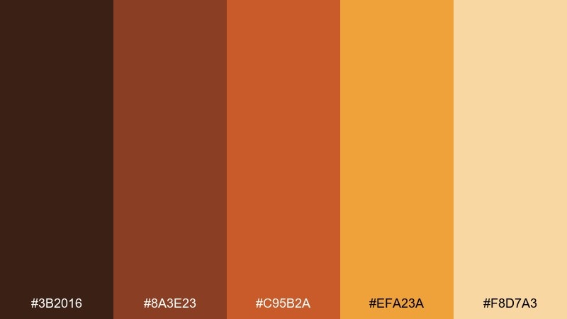
HEX: #3B2016 #8A3E23 #C95B2A #EFA23A #F8D7A3
Mood: warm, architectural, earthy
Best for: architecture studio website hero section
Warm and architectural, it suggests sunbaked walls, clay tiles, and bright desert light. It fits studio websites, portfolio heroes, and case study pages where you want grounded confidence. Pair with generous whitespace and thin dividers in the light sand to keep the layout modern. Tip: use the mid orange sparingly for hover states and key links.
Image example of sunbaked adobe generated using media.io

15) Butterscotch Brick
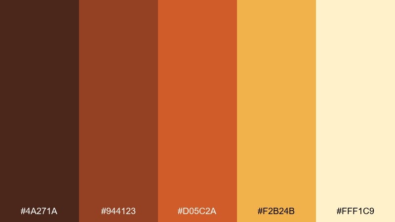
HEX: #4A271A #944123 #D05C2A #F2B24B #FFF1C9
Mood: urban, warm, approachable
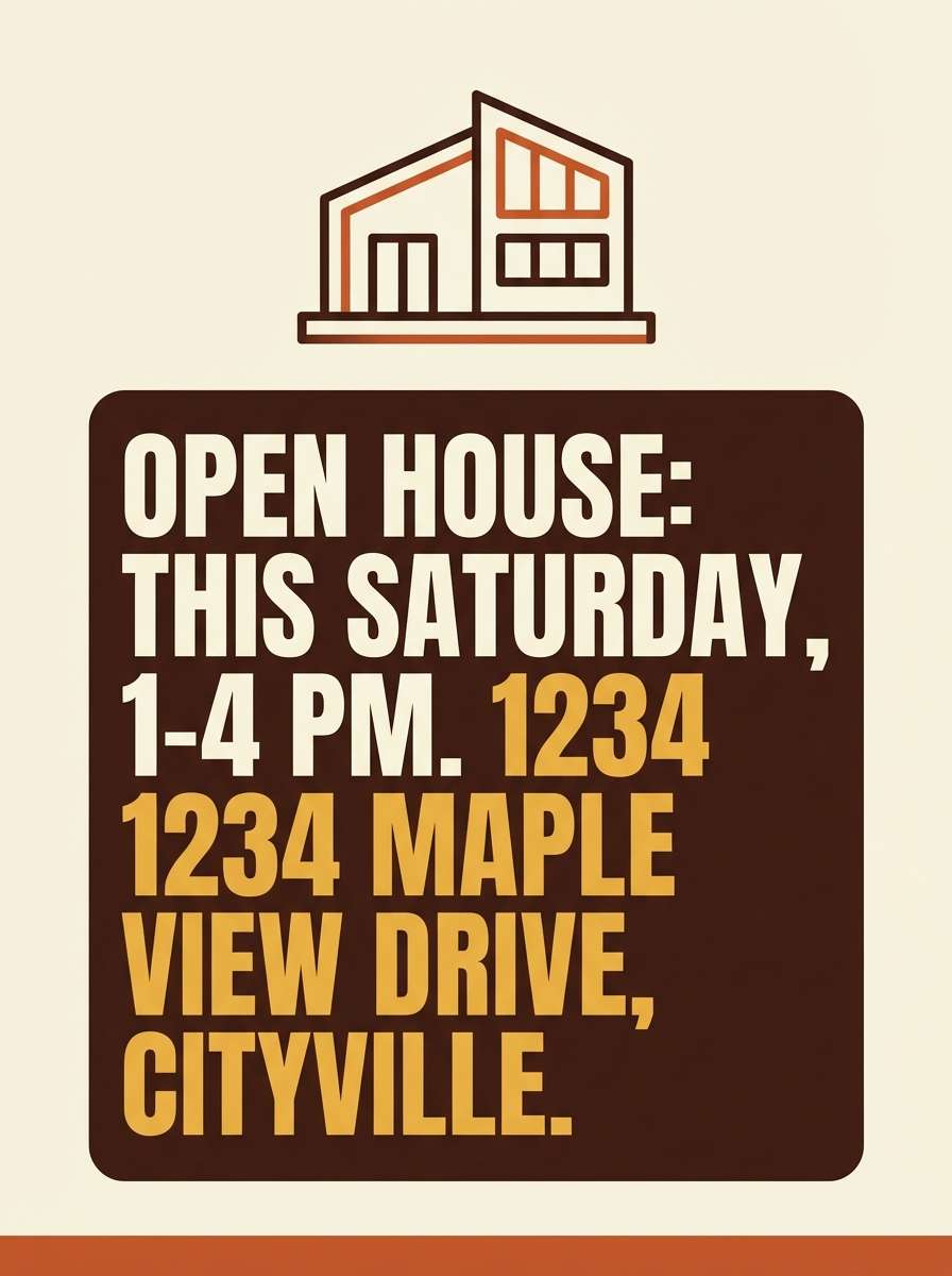
Best for: real estate open house poster
Urban and warm, it feels like brick facades lit by evening windows. One of the easiest brown yellow orange color combinations for real estate posters is to lean on the deep brown for copy and the butterscotch for highlights. Pair with a clean sans-serif and keep imagery warm-toned to avoid clashing. Tip: use the pale cream behind address and date details for quick scanning.
Image example of butterscotch brick generated using media.io
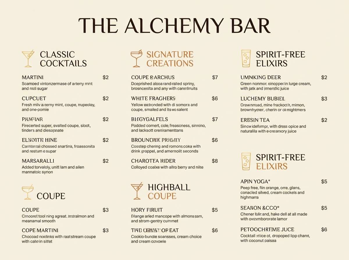
16) Copper Lantern
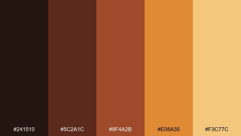
HEX: #241510 #5C2A1C #9F4A2B #E08A35 #F3C77C
Mood: intimate, warm, evening-glow
Best for: cocktail bar drink menu
Intimate and glowing, it evokes copper lanterns and polished wood in a dim bar. Use it for drink menus, bar signage, and social promos where a warm night vibe helps the offer feel elevated. Pair with plenty of negative space and keep the amber as a highlight for featured cocktails. Tip: print on textured stock so the dark tones look rich, not flat.
Image example of copper lantern generated using media.io
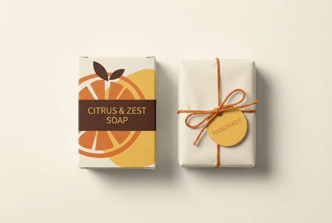
17) Rustic Citrus
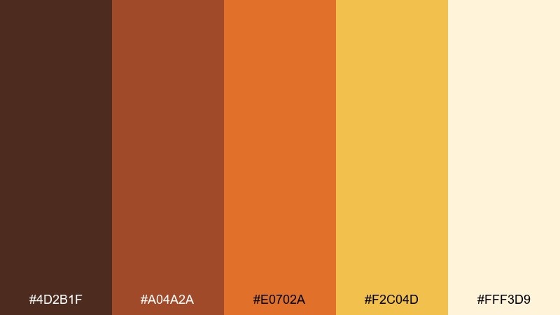
HEX: #4D2B1F #A04A2A #E0702A #F2C04D #FFF3D9
Mood: zesty, rustic, sunny
Best for: citrus soap packaging and product photo
Zesty and rustic, it feels like orange peel oils on warm hands and sunlit kitchen counters. These tones work especially well for bath products, eco packaging, and small-batch brands. Pair with kraft textures and simple botanical illustrations to reinforce the natural feel. Tip: use the bright yellow as a small scent marker so multiple variants stay consistent.
Image example of rustic citrus generated using media.io
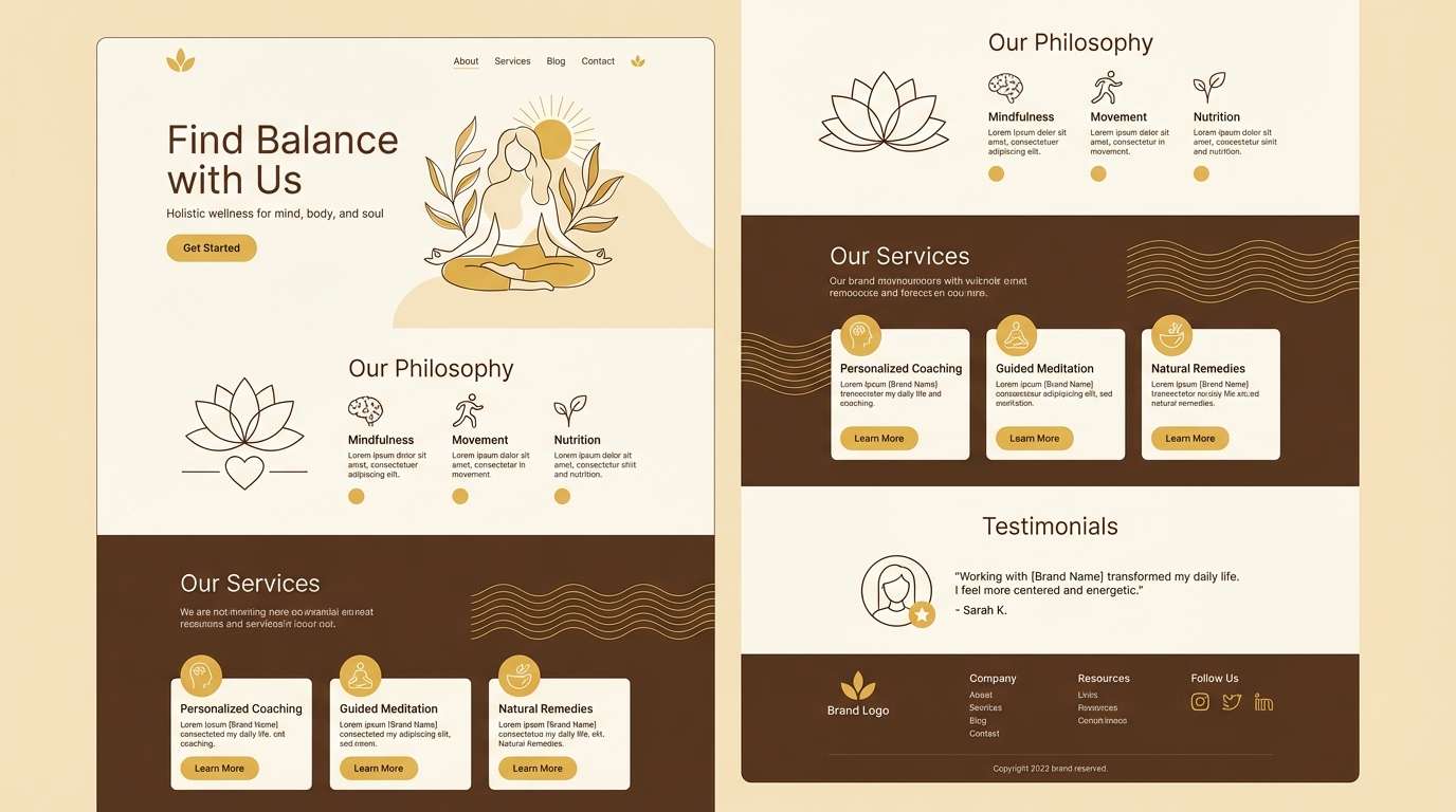
18) Wheat and Walnut
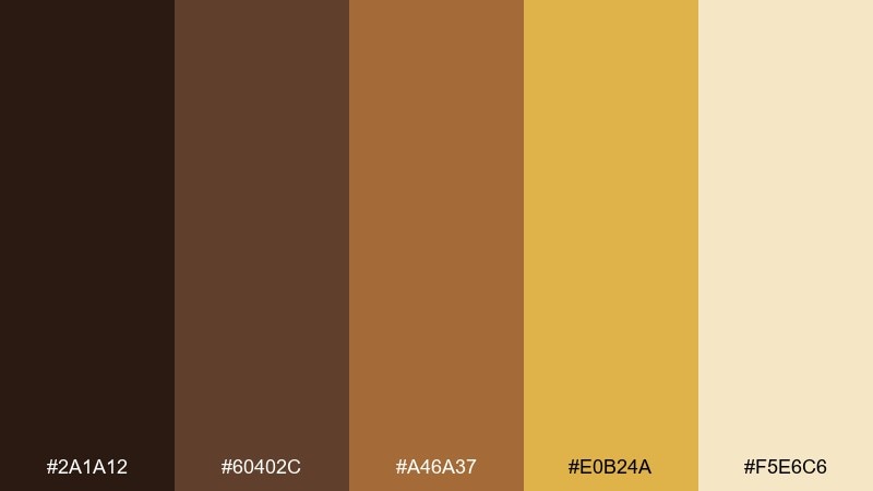
HEX: #2A1A12 #60402C #A46A37 #E0B24A #F5E6C6
Mood: calm, natural, understated
Best for: wellness brand landing page
Calm and natural, it suggests wheat fields, walnut shells, and soft morning light. It is a strong fit for wellness landing pages and blog themes that need warmth without a loud accent color. Pair with lots of cream space and subtle dividers in the light tan. Tip: keep buttons in the deeper walnut so they read clearly against pale sections.
Image example of wheat and walnut generated using media.io
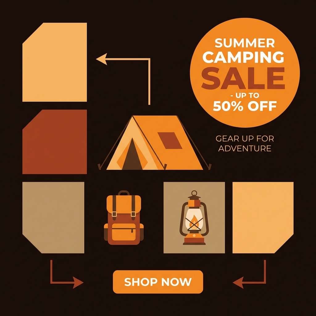
19) Campfire Glow
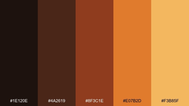
HEX: #1E120E #4A2619 #8F3C1E #E07B2D #F3B85F
Mood: bold, warm, adventurous
Best for: camping gear social ad set
Bold and warm, it captures sparks rising from a campfire and the glow on a tent at night. Use it for outdoor social ads, story templates, and product highlights where contrast needs to be strong. Pair with black or near-black for dramatic backgrounds and use the bright orange for price tags and buttons. Tip: keep imagery warm-toned so the palette feels intentional rather than filtered.
Image example of campfire glow generated using media.io
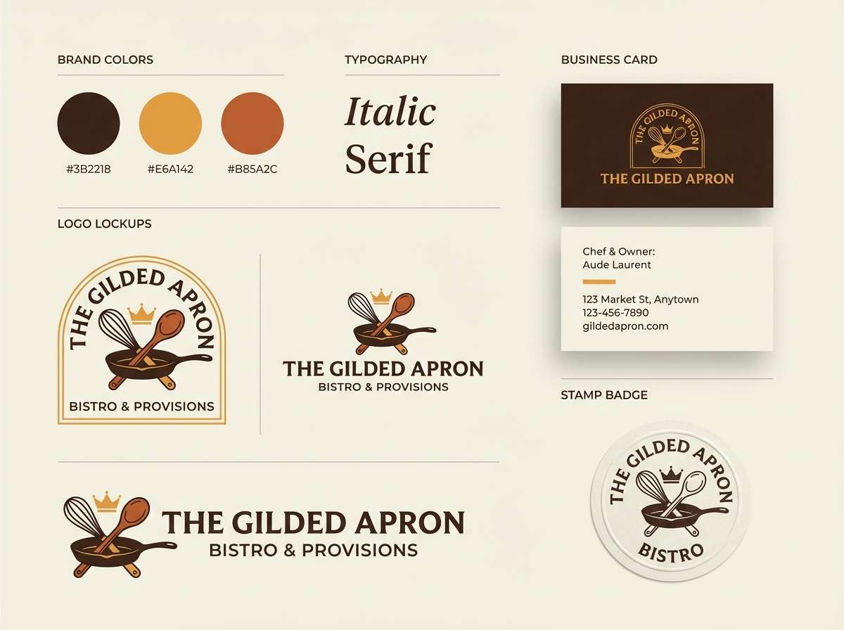
20) Vintage Bistro
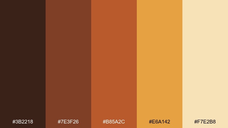
HEX: #3B2218 #7E3F26 #B85A2C #E6A142 #F7E2B8
Mood: classic, inviting, slightly retro
Best for: bistro logo and brand kit
Classic and inviting, it feels like a small bistro sign painted by hand and aged in the sun. For a cohesive brown yellow orange color combination, keep the deep brown for the logo mark and use the golden tone for secondary accents. Pair with a muted cream background and simple badge shapes for a timeless look. Tip: limit the mid orange to one brand element, like a stamp or underline, to avoid visual noise.
Image example of vintage bistro generated using media.io
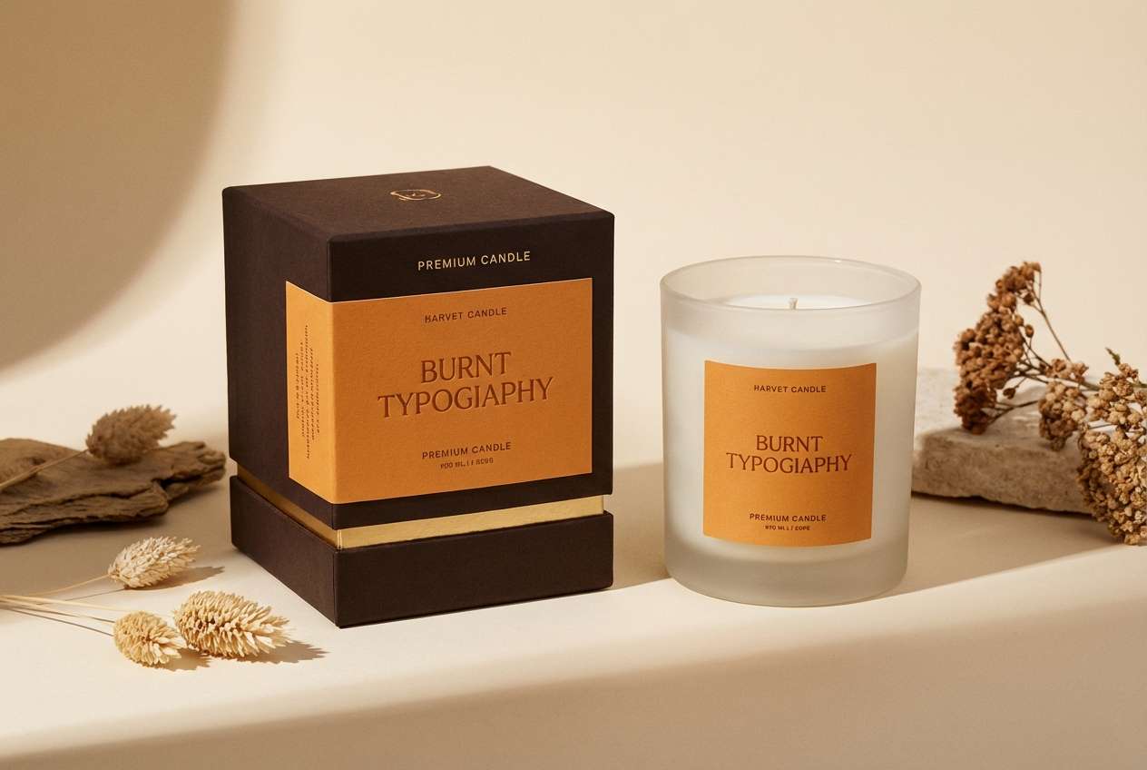
21) Gilded Ember
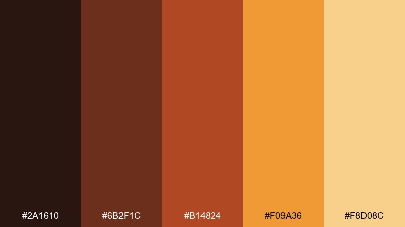
HEX: #2A1610 #6B2F1C #B14824 #F09A36 #F8D08C
Mood: luxurious, warm, dramatic
Best for: premium candle packaging design
Luxurious and dramatic, it brings to mind glowing embers and gilded foil catching light. It is perfect for premium candle boxes, gift sets, and product pages that want warmth with depth. Pair with matte black type and small foil-like accents in the light gold. Tip: keep the background light and let the darkest shade frame the brand mark for a high-end finish.
Image example of gilded ember generated using media.io
What Colors Go Well with Brown Yellow Orange?
Creams and warm off-whites are the easiest match because they brighten the palette and create clean negative space. For typography, near-black or espresso brown typically reads better than pure black, which can feel too harsh against warm hues.
Cool complements can add modern contrast: muted teal, deep navy, and dusty blue make orange accents pop without turning the design neon. For a softer look, try sage or olive green to keep things botanical and grounded.
If you need a premium finish, add small metallic cues (golden beige) and keep saturation controlled. The key is to maintain a wide light-to-dark range so your UI and print layouts stay legible.
How to Use a Brown Yellow Orange Color Palette in Real Designs
Start by assigning roles: use cream as the background, deep brown for text and dividers, orange for primary highlights, and yellow as a small accent for icons or badges. This prevents the warmer mid-tones from competing for attention.
For branding and packaging, consider texture-friendly treatments—kraft paper, subtle grain, or matte finishes—because browns and terracottas look richer with tactile cues. In digital designs, keep large areas light and reserve saturated orange for CTAs.
Always check contrast at small sizes (prices, labels, navigation). If orange sits on yellow, readability drops fast—swap to dark brown text or add a cream container behind the copy.
Create Brown Yellow Orange Palette Visuals with AI
If you want to preview these palettes in posters, packaging, or UI screens, generating quick mock visuals helps you validate contrast and mood before committing to a full design system. It’s also a fast way to test multiple creative directions for the same campaign.
With Media.io’s text-to-image tool, you can paste a prompt, specify a layout (like “menu,” “hero banner,” or “label set”), and guide the output with your HEX colors. Iterate by adjusting lighting, texture, and typography style until it matches your brand.
Once you like a direction, reuse the same prompt structure across variants (email header, social ad, product label) to keep the look consistent.
Brown Yellow Orange Color Palette FAQs
-
What does a brown yellow orange color palette communicate in branding?
It usually signals warmth, comfort, and earthiness—often associated with food, craft, autumn, and natural materials (wood, leather, clay). It can also feel energetic and friendly when orange and yellow are used as accents. -
How do I keep brown and orange from looking muddy together?
Increase value contrast by adding a light cream background and reserving the darkest brown for text. Avoid placing mid orange on mid brown without a light buffer (like a cream card, outline, or shadow). -
What text color works best on warm yellow backgrounds?
Use a deep espresso/near-black brown for readability. White text on warm yellow often fails contrast, so keep white for dark brown or deep orange areas instead. -
What are good complementary accent colors for brown yellow orange?
Muted teal, deep navy, and dusty blue create clean contrast without clashing. For a natural pairing, sage/olive green works well, especially in botanical or wellness designs. -
Is this palette suitable for UI design?
Yes, if you assign clear roles: light cream for surfaces, brown for typography/navigation, orange for primary actions, and yellow for small highlights. Always test contrast for buttons, labels, and disabled states. -
How can I use these colors in packaging without making it too loud?
Let brown and cream do most of the work (base + type), then use orange/yellow as controlled accents like seals, stripes, or small badges. Matte finishes and subtle paper textures also help keep the look premium. -
Can I generate on-brand visuals for these palettes quickly?
Yes. Use Media.io text-to-image with a prompt describing the layout (poster, label, hero section) and include your key HEX colors; iterate by tweaking texture, lighting, and typography style until it matches your brand direction.
Next: Russet Color Palette


