

Brown red orange palettes bring instant warmth, comfort, and a grounded “human” feel to digital and print designs. They’re a go-to when you want cozy energy without the loudness of neon brights.
Below are 20 curated brown red orange color palette ideas with HEX codes, plus quick use cases and AI prompts you can copy to generate matching visuals.
In this article
- Why Brown Red Orange Palettes Work So Well
-
- desert ember
- clay market
- autumn brickwork
- spiced cider poster
- canyon sunset ui
- rustic terracotta wedding
- copper kettle ad
- pumpkin patch illustration
- chili pepper branding
- sienna leather editorial
- warm timber workspace
- paprika social tiles
- amber ceramic glaze
- fired clay map
- harvest picnic
- redwood cabin signage
- burnt apricot cosmetics
- molten lava gradient
- dusty terracotta ui kit
- sunbaked trail flyer
- What Colors Go Well with Brown Red Orange?
- How to Use a Brown Red Orange Color Palette in Real Designs
- Create Brown Red Orange Palette Visuals with AI
Why Brown Red Orange Palettes Work So Well
Brown, red, and orange sit in a naturally harmonious range—earth, clay, brick, leather, firelight—so they feel familiar and trustworthy. That familiarity translates well to branding where you want audiences to feel welcomed, safe, and engaged.
These tones also create strong hierarchy: deep browns anchor navigation and typography, red-browns add depth and premium cues, and brighter oranges handle attention (CTAs, highlights, badges). You get contrast and clarity without needing harsh black-and-white extremes.
Because the palette is warm by default, it’s easy to make designs feel seasonal (especially autumn), handcrafted, or “made with care.” With the right neutrals, brown red orange can also look modern and minimal rather than rustic.
20+ Brown Red Orange Color Palette Ideas (with HEX Codes)
1) Desert Ember
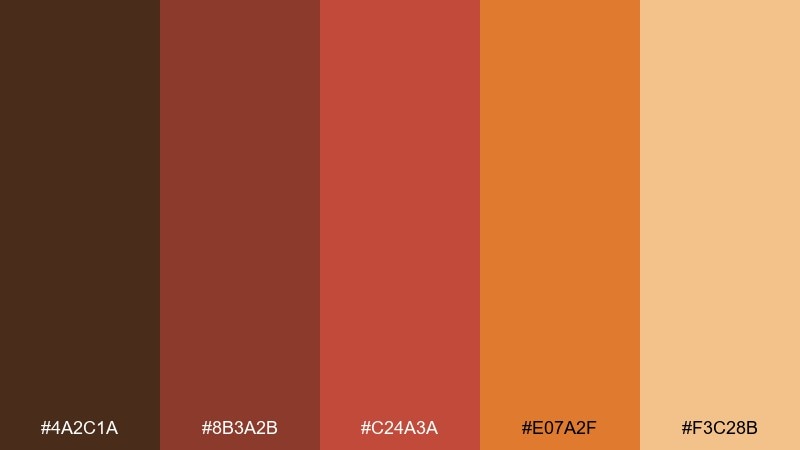
HEX: #4a2c1a #8b3a2b #c24a3a #e07a2f #f3c28b
Mood: sunbaked, rugged, adventurous
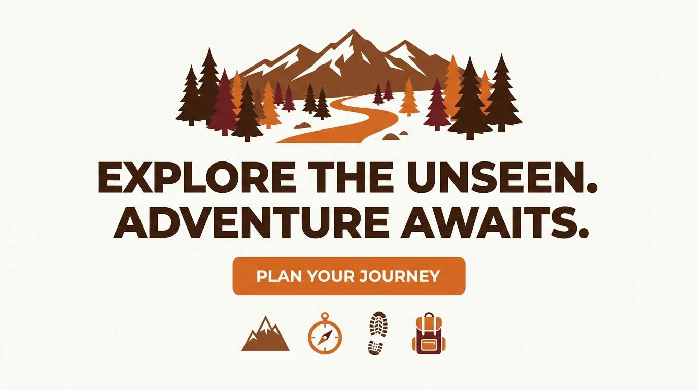
Best for: website hero section for an outdoor or travel brand
Sunbaked warmth and campfire glow make this feel like a desert sunset after a long hike. It works beautifully for outdoor brands, travel landing pages, and bold hero sections where you want instant heat and energy. Pair it with off-white typography and a charcoal UI neutral to keep the page readable. Usage tip: let the deep brown anchor headers and navigation while the orange drives primary CTAs.
Image example of desert ember generated using media.io
Media.io is an online AI studio for creating and editing video, image, and audio in your browser.

2) Clay Market
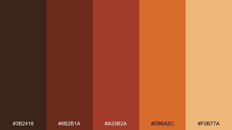
HEX: #3b2418 #6b2b1a #a33b2a #d86a2c #f0b77a
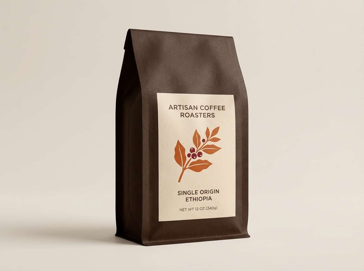
Mood: artisan, cozy, handcrafted
Best for: artisan coffee or spice packaging
Handcrafted and toasty, these tones evoke clay bowls, roasted beans, and warm market stalls. They shine on packaging where you want a premium feel without going glossy or cold. Pair with matte cream stock, dark-brown ink for copy, and a small metallic copper accent for seals. Usage tip: keep the brightest orange for a single focal badge like roast level or flavor notes.
Image example of clay market generated using media.io
3) Autumn Brickwork
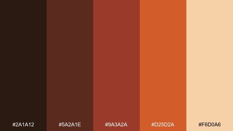
HEX: #2a1a12 #5a2a1e #9a3a2a #d25d2a #f6d0a6
Mood: grounded, homey, architectural
Best for: living room accents and interior moodboards
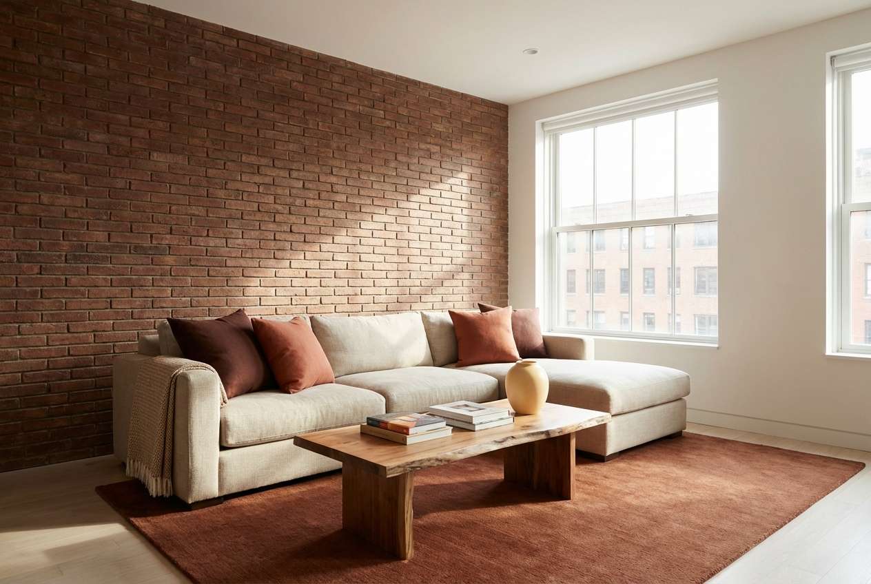
Grounded brick and timber tones create a lived-in, architectural warmth. Use it for interiors, moodboards, and decor collections that lean rustic-modern rather than farmhouse. Pair with natural linen, black metal fixtures, and plenty of texture like woven rugs or raw wood. Usage tip: repeat the mid red-brown on two or three small objects to make the space feel intentional.
Image example of autumn brickwork generated using media.io
4) Spiced Cider Poster
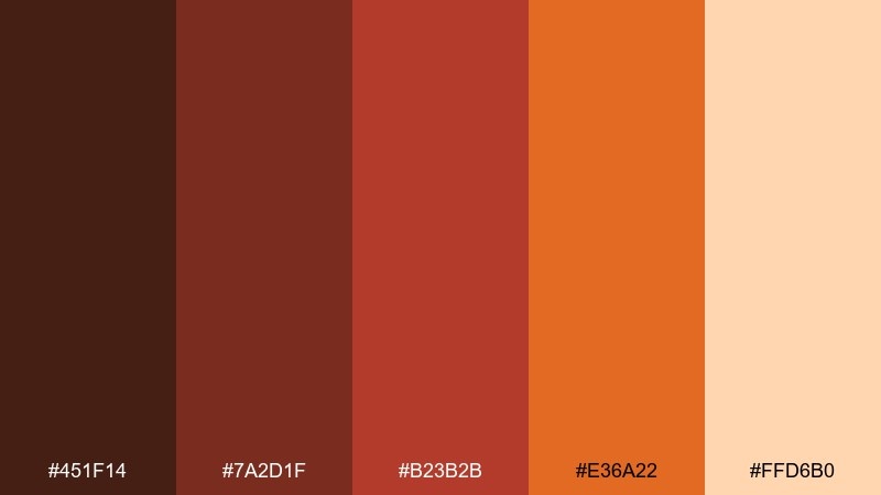
HEX: #451f14 #7a2d1f #b23b2b #e36a22 #ffd6b0
Mood: festive, inviting, seasonal
Best for: fall festival or cafe event poster
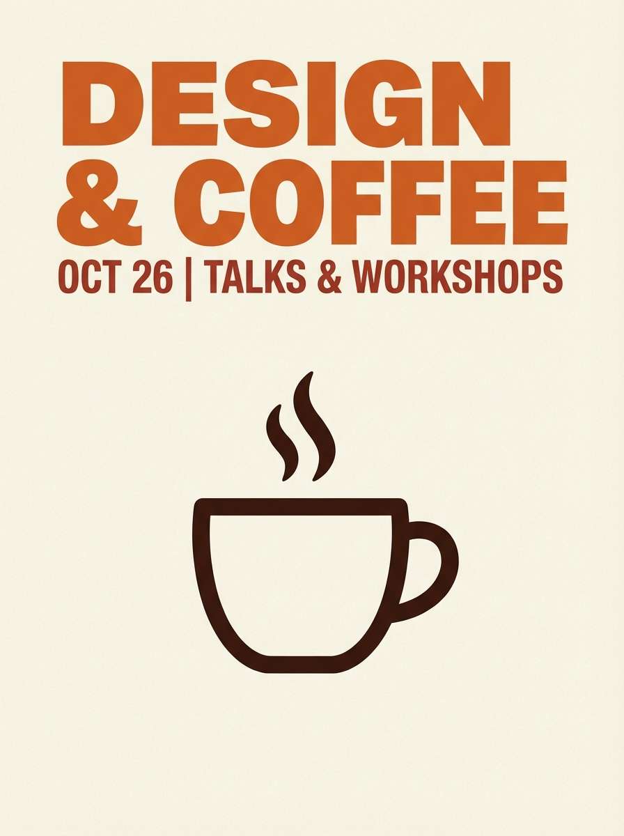
Festive and inviting, it feels like spiced cider steam and amber streetlights. It is great for seasonal posters, cafe promos, and event graphics that need warmth without looking childish. Pair with a creamy background and dark brown type for strong contrast. Usage tip: build a simple two-color headline system and reserve the light peach for dates and details.
Image example of spiced cider poster generated using media.io
5) Canyon Sunset UI

HEX: #2f1b14 #6a2a22 #b0432f #f07b2b #f7c59a
Mood: bold, modern, energetic
Best for: dashboard UI for fintech or analytics
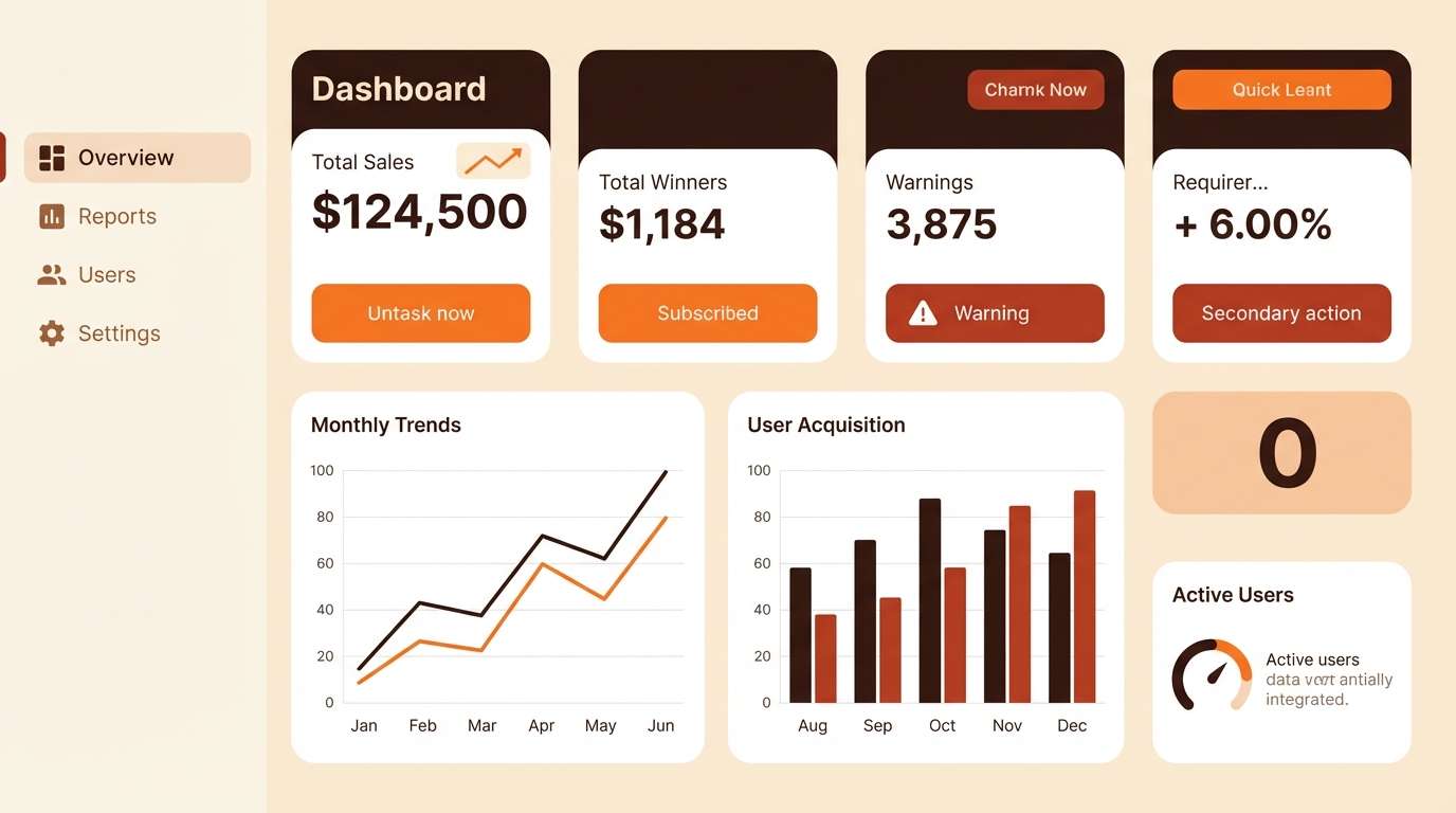
Bold canyon light and heat-haze energy give this a modern, high-contrast punch. A brown red orange color palette like this works well for dashboards when you need clear hierarchy and confident highlights. Pair it with warm grays and a soft cream canvas to prevent eye fatigue. Usage tip: limit the brightest orange to alerts and primary actions so it stays meaningful.
Image example of canyon sunset ui generated using media.io
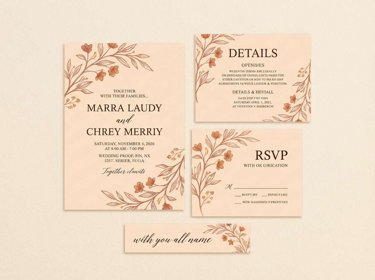
6) Rustic Terracotta Wedding
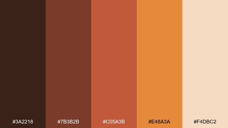
HEX: #3a2218 #7b3b2b #c05a3b #e48a3a #f4dbc2
Mood: romantic, earthy, intimate
Best for: wedding invitation suite and day-of stationery
Romantic earth tones and soft terracotta glow feel intimate, like candlelight on linen. This pairing is ideal for invitations, menus, and place cards with a handmade or Tuscan vibe. Pair with textured paper, warm white ink, and a simple serif to keep it timeless. Usage tip: use the pale cream as the main background and add terracotta only to borders and monograms.
Image example of rustic terracotta wedding generated using media.io
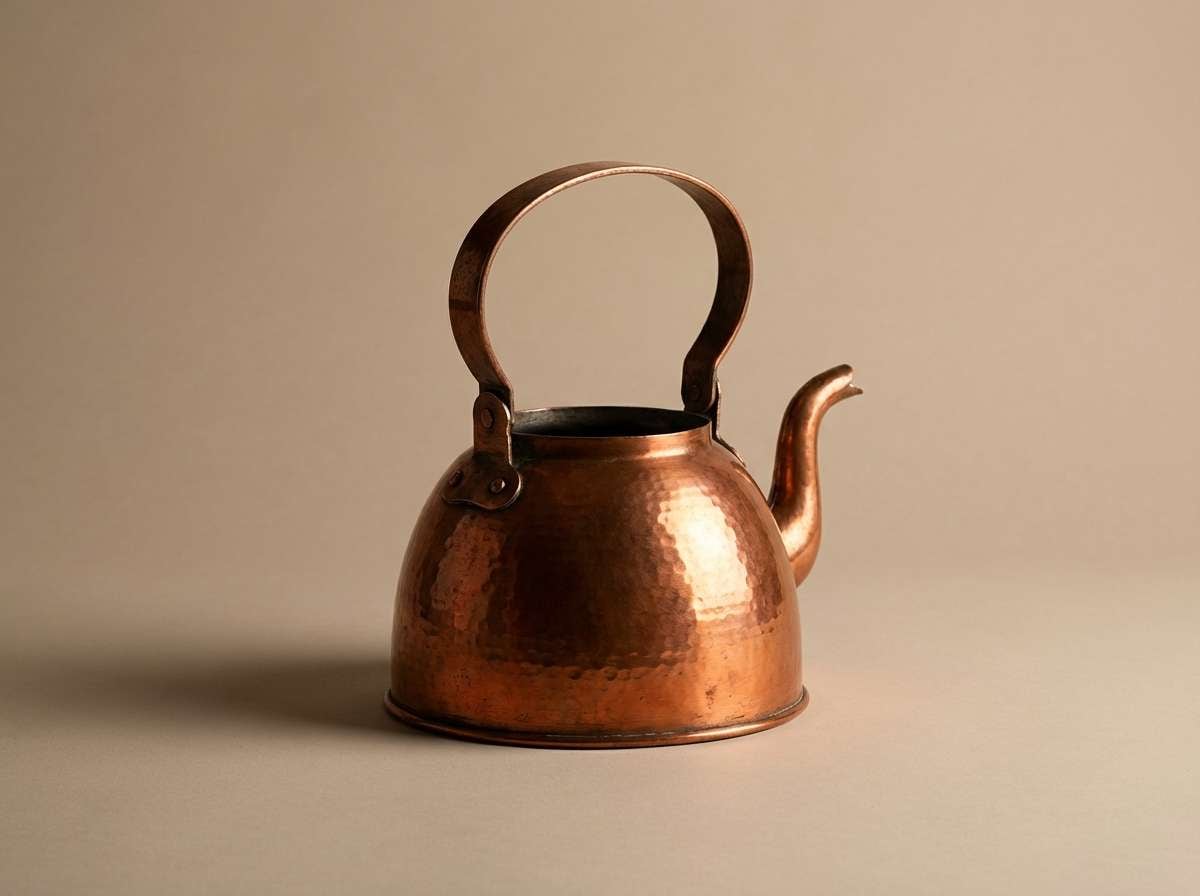
7) Copper Kettle Ad
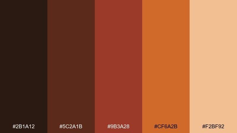
HEX: #2b1a12 #5c2a1b #9b3a28 #cf6a2b #f2bf92
Mood: warm, premium, kitchen-cozy
Best for: cookware ads and kitchen product pages
Premium warmth and kitchen comfort come through like polished copper and dark wood. Use it for cookware ads, product pages, or culinary brands that want an elevated, cozy tone. Pair with clean white space and a restrained type palette to keep the look contemporary. Usage tip: echo the copper-orange in one hero highlight, then let deep brown carry the rest of the layout.
Image example of copper kettle ad generated using media.io
8) Pumpkin Patch Illustration
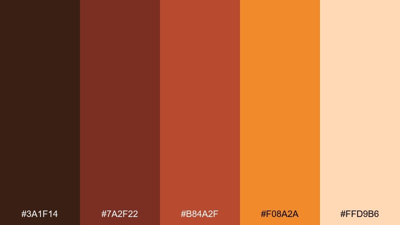
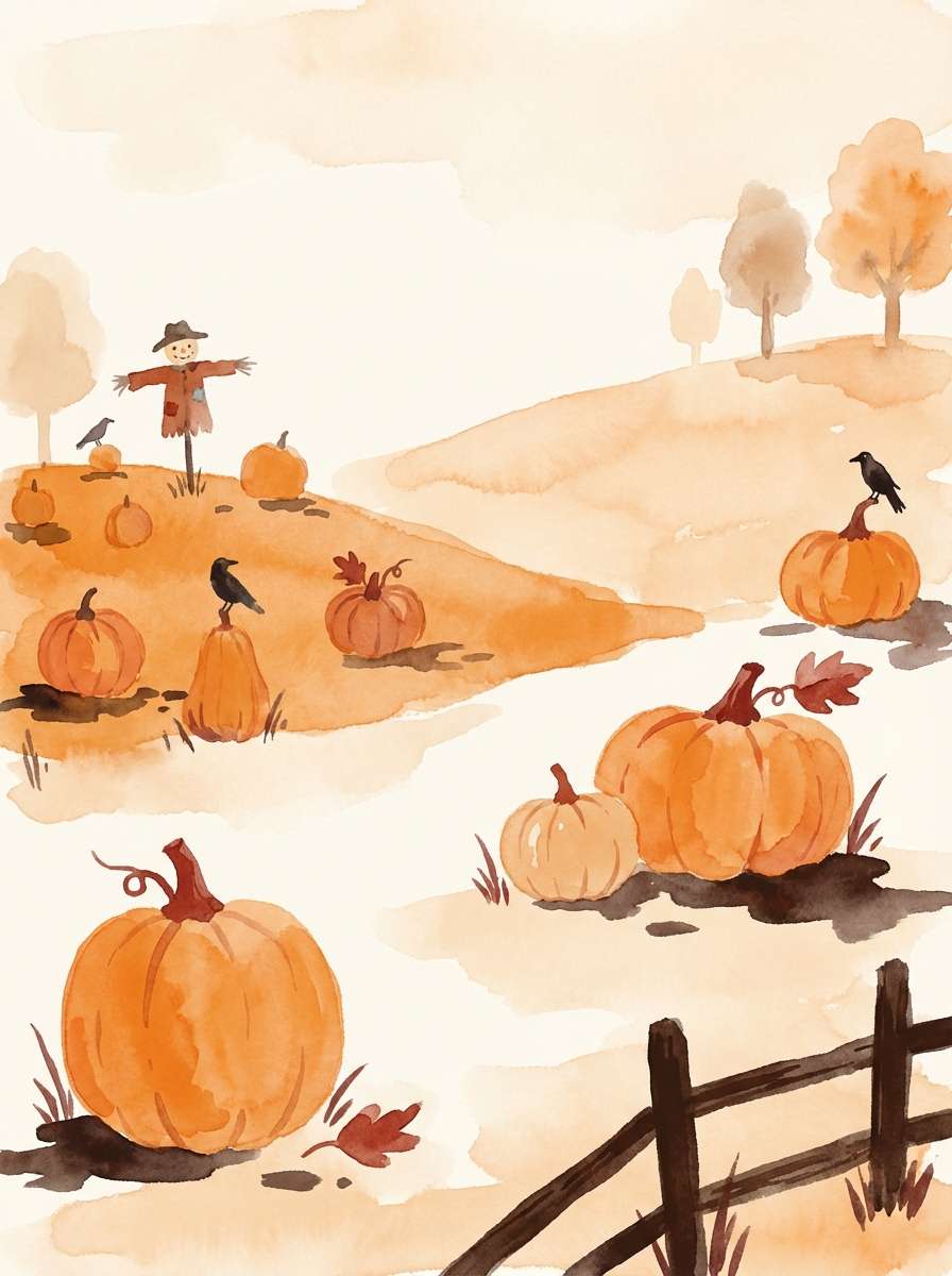
HEX: #3a1f14 #7a2f22 #b84a2f #f08a2a #ffd9b6
Mood: playful, wholesome, storybook
Best for: childrens book or seasonal blog illustration
Playful pumpkin warmth and storybook charm make it feel wholesome and friendly. It is perfect for illustrated blog headers, kids printables, and autumn-themed graphics. Pair with soft cream paper texture and rounded typography for extra approachability. Usage tip: keep outlines in the darkest brown so the bright orange can stay clean and cheerful.
Image example of pumpkin patch illustration generated using media.io
9) Chili Pepper Branding
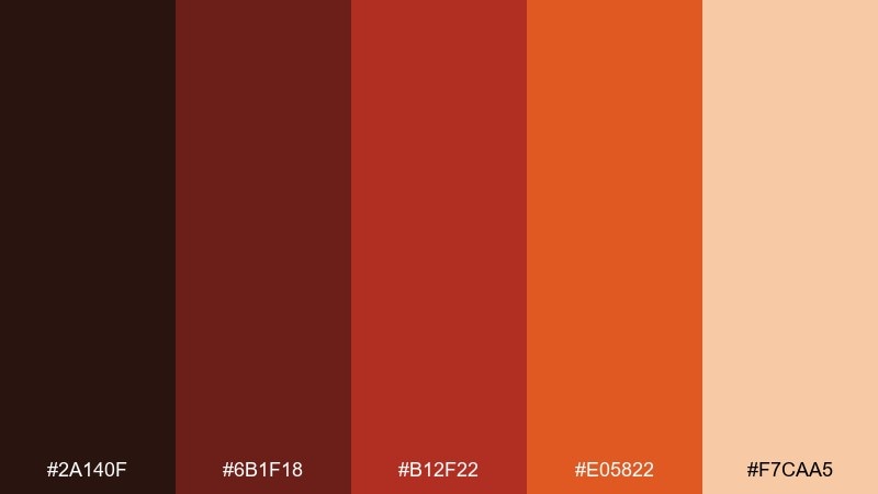
HEX: #2a140f #6b1f18 #b12f22 #e05822 #f7caa5
Mood: spicy, confident, punchy
Best for: restaurant branding, menu, and takeout labels
Spicy and confident, these tones evoke roasted chiles, sizzling pans, and bold signage. For modern restaurants, brown red orange color combinations like this can look premium when you keep the layout minimal and the contrast high. Pair with a warm off-white and a single dark neutral for type-heavy menus. Usage tip: use the brightest orange for callouts like specials or spice level, not for body text.
Image example of chili pepper branding generated using media.io
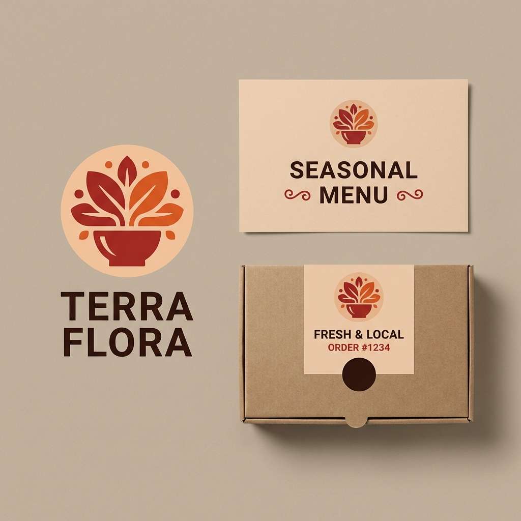
10) Sienna Leather Editorial
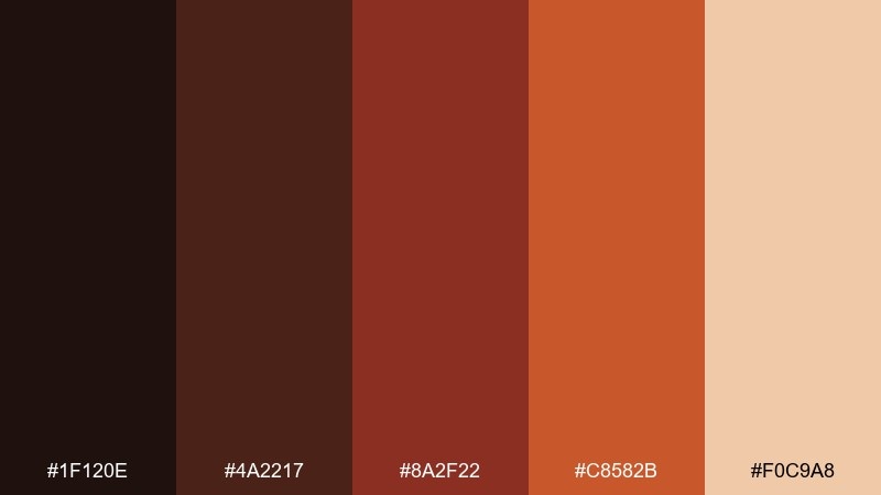
HEX: #1f120e #4a2217 #8a2f22 #c8582b #f0c9a8
Mood: luxury, moody, editorial
Best for: fashion lookbook or magazine spread design
Moody luxury and leather richness give this an editorial edge. It works for fashion lookbooks, boutique campaigns, and long-form layouts where typography needs to feel elevated. Pair with lots of negative space, thin rules, and warm gray for captions. Usage tip: make the darkest shade your text color and use the copper tone only for section headers or pull quotes.
Image example of sienna leather editorial generated using media.io
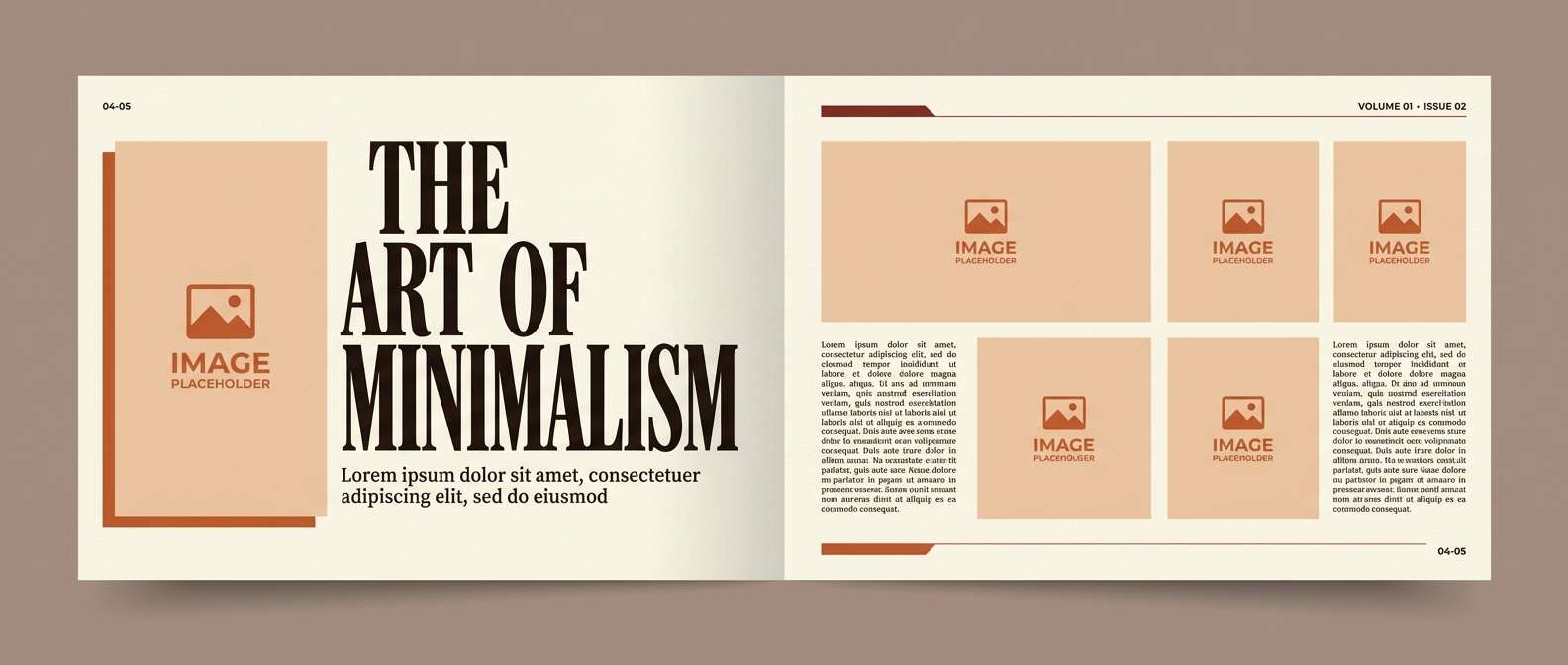
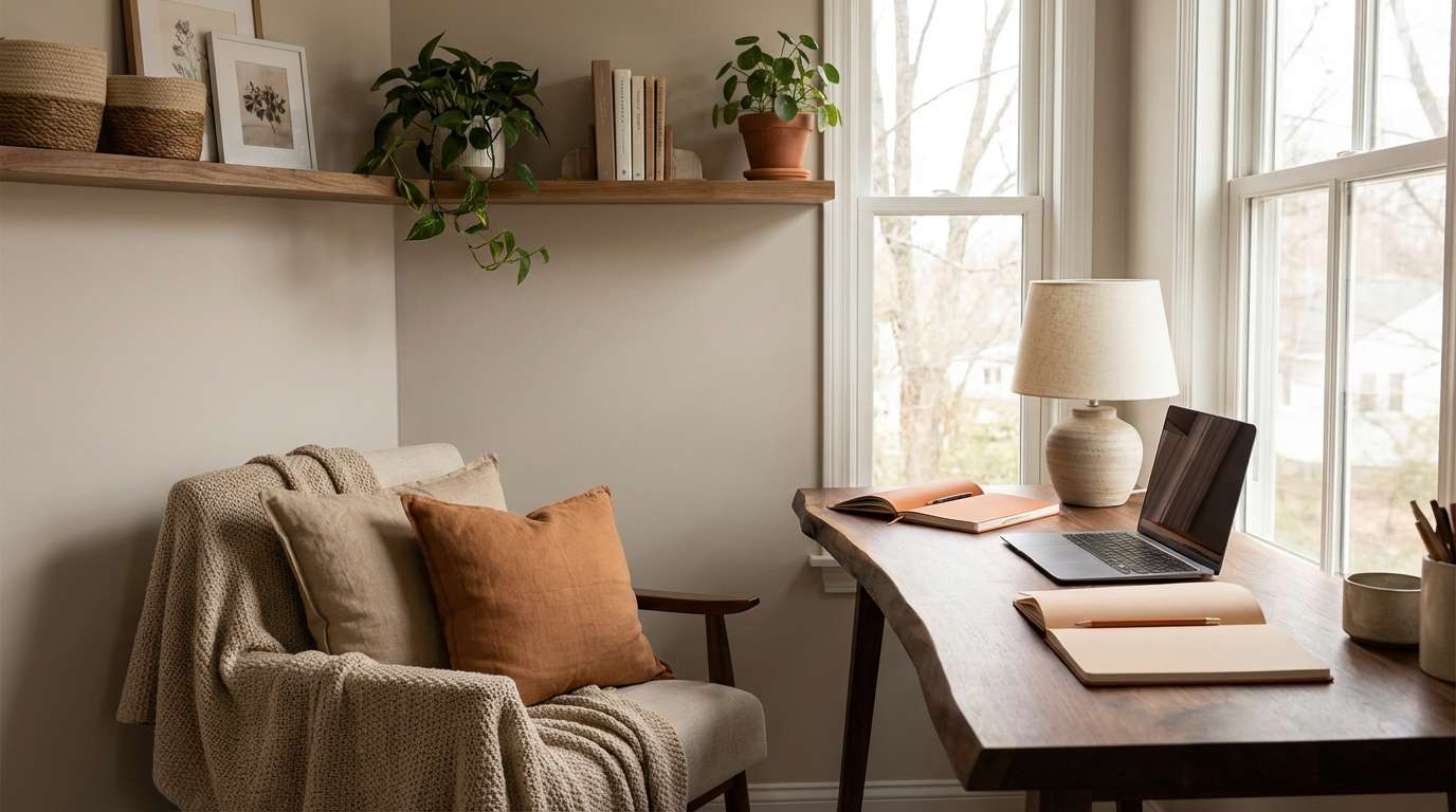
11) Warm Timber Workspace
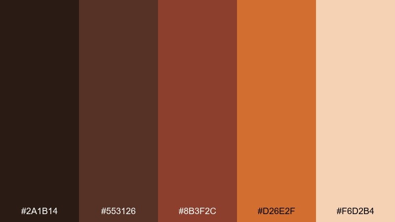
HEX: #2a1b14 #553126 #8b3f2c #d26e2f #f6d2b4
Mood: productive, cozy, grounded
Best for: home office styling and moodboard visuals
Cozy timber warmth makes this feel grounded and quietly productive. Use it for home office styling, creator workspaces, or lifestyle content that leans natural and calm. Pair with matte black desk accessories and creamy walls so the warm tones do not overwhelm. Usage tip: use the soft peach as the main wall or background tone and bring in the darker browns through furniture.
Image example of warm timber workspace generated using media.io
12) Paprika Social Tiles

HEX: #331c14 #6a2a20 #a83a2b #f0742a #ffd1ad
Mood: lively, friendly, scroll-stopping
Best for: social media promo tiles and story templates
Lively paprika tones feel energetic, friendly, and made for quick attention. A brown red orange color palette like this is ideal for social tiles because it stays warm even on small screens. Pair with simple geometric shapes, generous padding, and a cream backdrop for clean readability. Usage tip: pick one dominant card color per post and rotate accents to keep the feed cohesive.
Image example of paprika social tiles generated using media.io
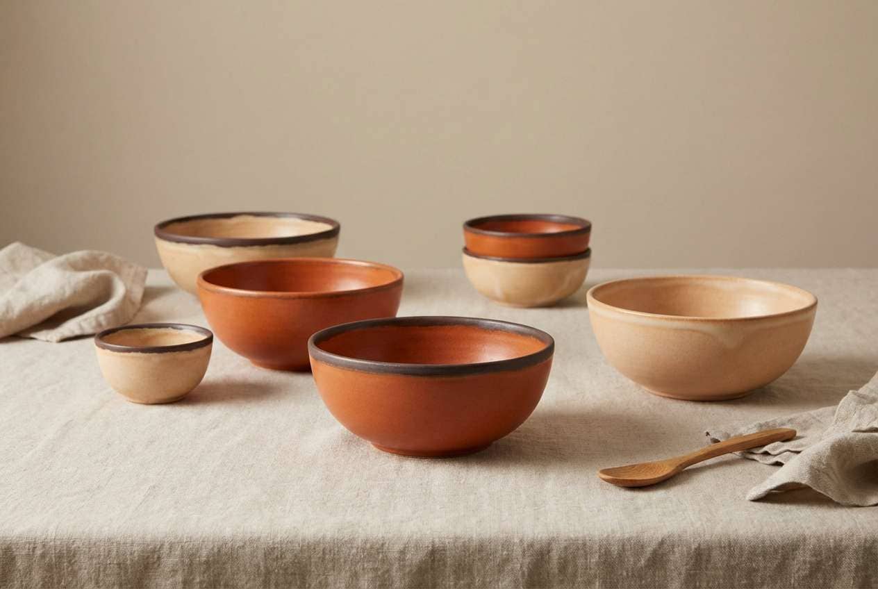
13) Amber Ceramic Glaze

HEX: #2a1611 #5b261c #943424 #d0602a #f8d0aa
Mood: artful, tactile, studio-warm
Best for: pottery studio product photography and shop pages
Tactile studio warmth comes through like fresh glaze and kiln heat. It is a strong fit for handmade ceramics, Etsy-style storefronts, and product pages that rely on texture. Pair with soft beige backgrounds and subtle shadows to keep the work looking premium. Usage tip: use the light peach as the backdrop and let the deep red-brown appear in small typography and stamps.
Image example of amber ceramic glaze generated using media.io
14) Fired Clay Map

HEX: #26140f #512018 #8e2f22 #df6a28 #f6c9a2
Mood: adventurous, informative, vintage-modern
Best for: travel infographics and map visuals
Adventurous fired-clay tones feel like vintage trail maps with a modern finish. Use it for travel infographics, campus maps, or data visuals where you want warmth without losing clarity. Pair with thin linework, plenty of cream space, and one dark tone for labels. Usage tip: reserve the bright orange for routes and highlights so users can scan quickly.
Image example of fired clay map generated using media.io
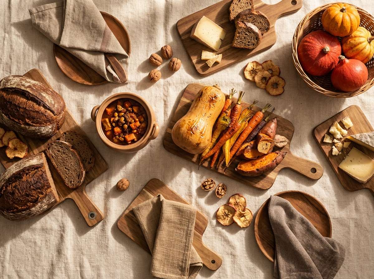
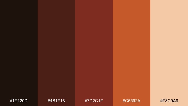
15) Harvest Picnic
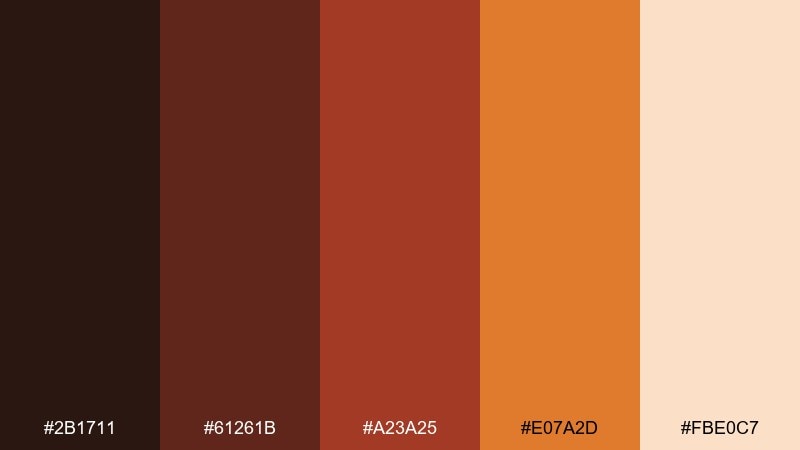
HEX: #2b1711 #61261b #a23a25 #e07a2d #fbe0c7
Mood: comforting, appetizing, sunny
Best for: food blog hero images and recipe cards
Comforting harvest warmth makes everything feel more appetizing and sunny. It suits food blog hero images, recipe cards, and restaurant features where rich color sells flavor. Pair with a creamy background and dark brown text for a clean, cookbook-like look. Usage tip: keep props neutral so the orange and red tones in the food stay in control.
Image example of harvest picnic generated using media.io
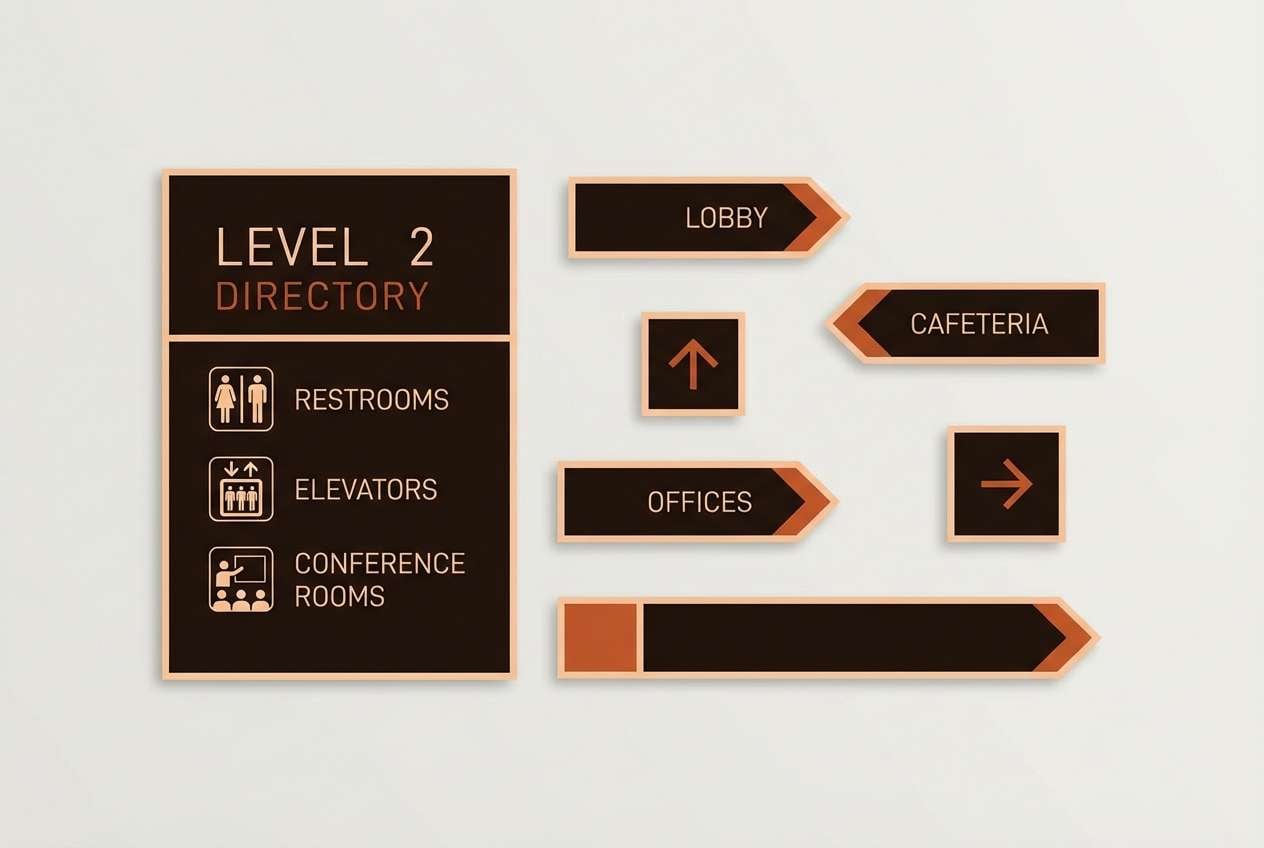
16) Redwood Cabin Signage
HEX: #1e120d #4b1f16 #7d2c1f #c6592a #f3c9a6
Mood: heritage, outdoorsy, reliable
Best for: wayfinding signage and park visitor materials
Heritage warmth and redwood depth make it feel reliable, like a well-worn cabin sign. Use it for wayfinding systems, visitor centers, and guide materials that need to read clearly at a distance. Pair with simple iconography and a light background to keep legibility high. Usage tip: choose one accent color for directional arrows and keep the rest of the system neutral and consistent.
Image example of redwood cabin signage generated using media.io
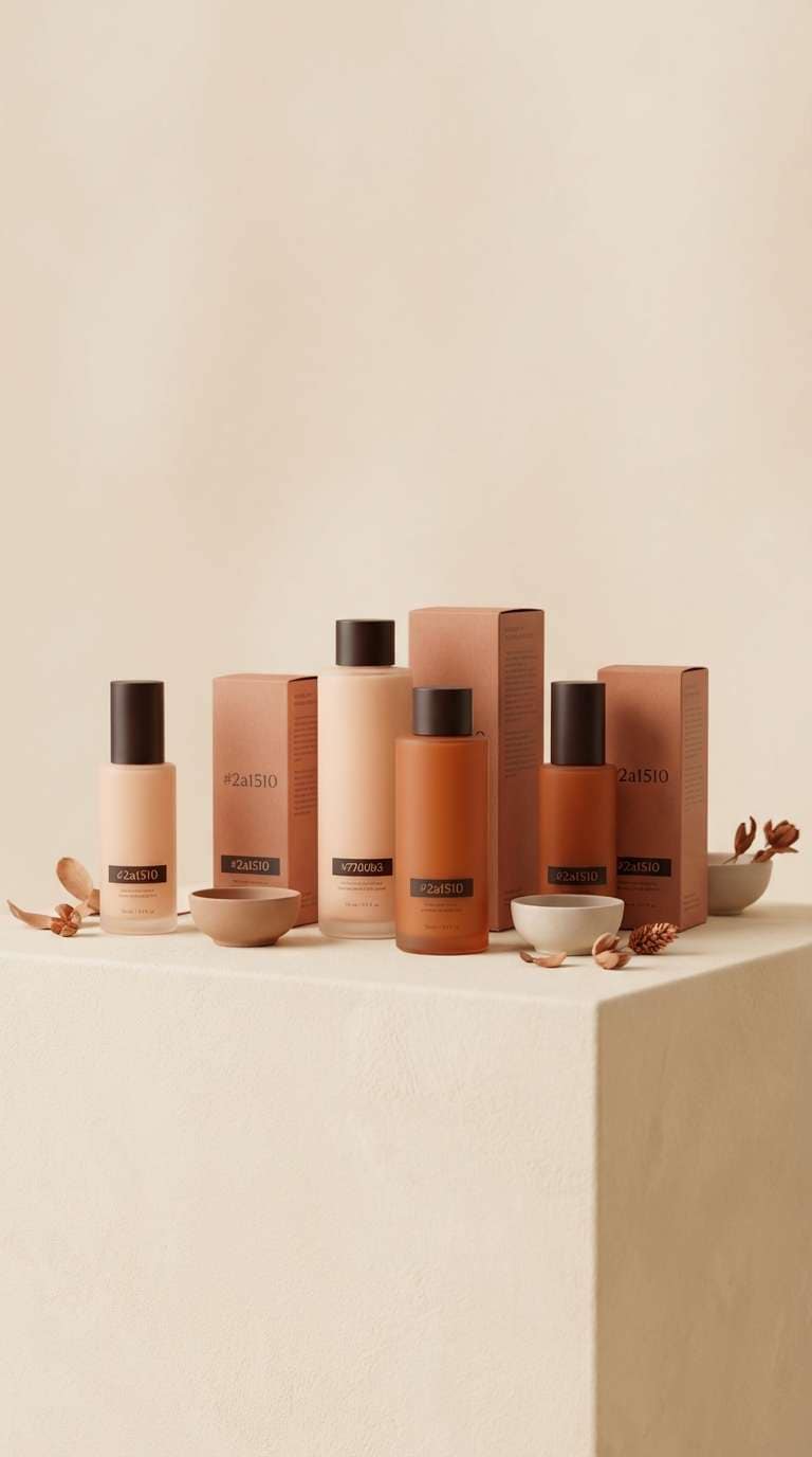
17) Burnt Apricot Cosmetics
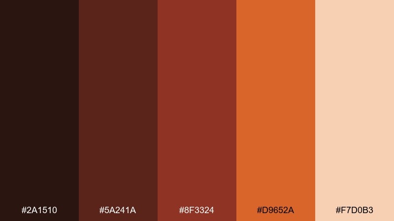
HEX: #2a1510 #5a241a #8f3324 #d9652a #f7d0b3
Mood: soft, modern, beauty-forward
Best for: skincare packaging and beauty product ads
Soft burnt-apricot warmth feels modern and beauty-forward, like a golden-hour glow. It works for skincare packaging, clean cosmetics ads, and product pages that want warmth without harsh contrast. Pair with minimal sans-serif type and a lot of breathing room so it stays premium. Usage tip: put the peachy light tone on the bottle and use the deeper red-brown for caps and labels.
Image example of burnt apricot cosmetics generated using media.io
18) Molten Lava Gradient
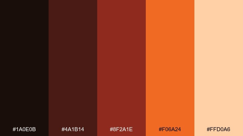
HEX: #1a0e0b #4a1b14 #8f2a1e #f06a24 #ffd0a6
Mood: dramatic, fiery, high-impact
Best for: streaming thumbnails and bold video graphics
Dramatic and fiery, it looks like molten lava against dark rock. For creators and campaigns that need instant impact, brown red orange color combinations can deliver urgency without resorting to neon. Pair with heavy-weight type, sharp shapes, and lots of dark space to frame the heat. Usage tip: keep the gradient confined to one focal area so thumbnails stay readable.
Image example of molten lava gradient generated using media.io

19) Dusty Terracotta UI Kit
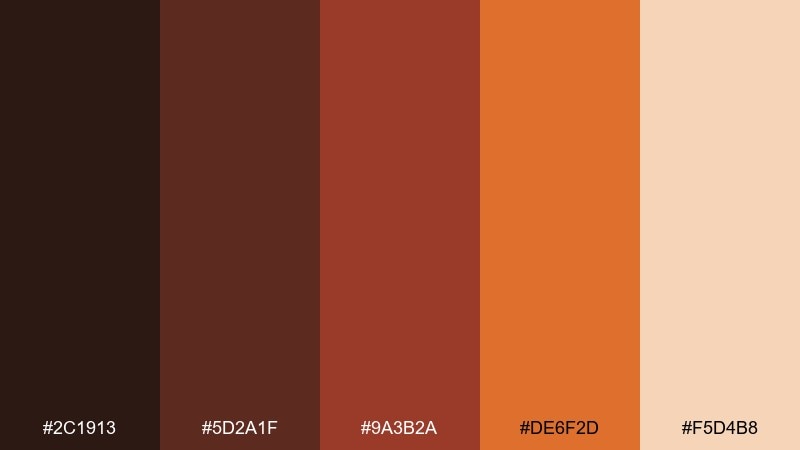
HEX: #2c1913 #5d2a1f #9a3b2a #de6f2d #f5d4b8
Mood: calm, earthy, product-focused
Best for: UI kit components for ecommerce or SaaS
Calm dusty terracotta feels earthy but still product-focused, like a warm minimalist studio. It is a great choice for UI kits where you need consistent states across buttons, chips, and badges. Pair with warm grays for borders and a cream base for surfaces to keep contrast predictable. Usage tip: assign one role per shade, such as primary, hover, and warning, and document it in your design tokens.
Image example of dusty terracotta ui kit generated using media.io
20) Sunbaked Trail Flyer
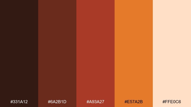
HEX: #331a12 #6a2b1d #a93a27 #e57a2b #ffe0c6
Mood: active, welcoming, community-focused
Best for: community hike flyer and local meetup promo
Sunbaked warmth and friendly contrast make it feel active and welcoming. Use it for community flyers, local meetups, and outdoor club promos where you want energy without looking aggressive. Pair with a clean cream background and simple icons to keep information scannable. Usage tip: set the headline in the darkest tone and use orange only for time, location, and key action points.
Image example of sunbaked trail flyer generated using media.io
What Colors Go Well with Brown Red Orange?
Warm neutrals are the easiest pairing: cream, ivory, warm gray, and charcoal help these hues feel modern and readable. They also keep the palette from becoming too heavy, especially in UI layouts and long-form pages.
For contrast, try cool counterpoints like deep teal, dusty blue, or muted sage—small doses can make orange CTAs pop while still feeling natural. If you want a premium look, add metallics (copper or brass) as accents and keep saturation controlled.
When in doubt, choose one “cool” supporting color and keep it subtle, then let brown/red/orange do the storytelling. This avoids a chaotic mix while still giving you a distinct brand signature.
How to Use a Brown Red Orange Color Palette in Real Designs
Start by assigning roles: darkest brown for text and navigation, mid red-brown for secondary surfaces, and bright orange for primary actions or highlights. This simple system makes the palette feel intentional and prevents “everything looks like a CTA.”
In print, lean into texture: uncoated paper, linen, kraft stock, and soft shadows make these tones look rich. In digital, balance warmth with generous whitespace and warm neutrals so the interface stays calm and accessible.
Finally, check contrast early—orange-on-cream can be beautiful but may fail readability. Use the deepest shade for body text and reserve bright oranges for buttons, icons, and small emphasis moments.
Create Brown Red Orange Palette Visuals with AI
If you already have HEX codes, you can generate consistent mockups, posters, and product-style images by reusing the same palette across prompts. This is especially useful for building a cohesive set of brand visuals quickly.
With Media.io, you can paste a prompt (like the examples above), control the vibe, and iterate until the lighting, textures, and composition match your design goals. It’s a fast way to preview how brown red orange tones look in real-world contexts.
Use one palette per campaign and keep a repeatable prompt format (subject + style + dominant colors + background + aspect ratio) to produce a clean, consistent set.
Brown Red Orange Color Palette FAQs
-
What does a brown red orange color palette communicate?
It typically signals warmth, comfort, craftsmanship, and appetite appeal. Depending on saturation, it can feel rustic and earthy (muted clay tones) or bold and energetic (high-contrast orange highlights). -
Is brown red orange good for UI design?
Yes—use deep browns for text and structure, and reserve bright orange for primary actions, alerts, or key highlights. Pair with warm grays or cream backgrounds to reduce eye fatigue and maintain contrast. -
How do I keep brown red orange from looking “too autumn”?
Add modern neutrals (warm white, greige, charcoal) and keep oranges more copper/terracotta than pumpkin-bright. Introducing a muted cool accent like teal or slate blue can also shift the vibe away from seasonal. -
What are the best background colors for brown red orange palettes?
Soft cream, ivory, warm beige, and very light warm gray are the most versatile. They preserve the palette’s warmth while keeping designs readable and premium. -
What’s a strong accent color to pair with brown red orange?
Muted teal, deep navy, and desaturated sage are reliable accents because they contrast temperature without clashing. Use them sparingly for icons, links, or small UI states. -
Can I use #c24a3a as a brand primary color?
Yes—#c24a3a reads like modern terracotta/brick and works well as a recognizable brand anchor. Pair it with a deep brown for typography and a light cream background for a clean, consistent system. -
How can I generate images that match my palette consistently?
Reuse the same 5 HEX codes in your prompt, specify which colors are dominant vs accents, and keep the background neutral. Keeping aspect ratio and lighting style consistent across prompts also improves cohesion.
Next: Forest Color Palette


